
Figures & data
Table 1. Protocols followed during the different periods in this study. Adapted from Malviya et al. Citation2011
This schematic diagram shows the patient’s progression through different components of the Enhanced Recovery program.
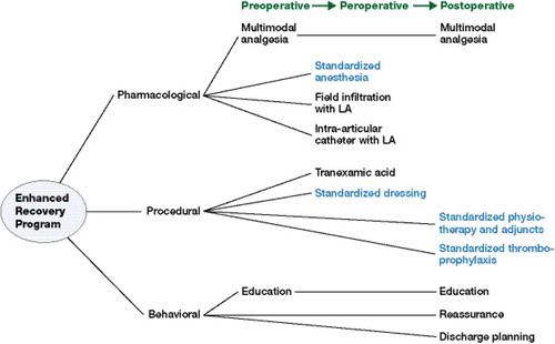
Table 2. A comparison of demographics and comorbidities between the two cohorts
Table 3. A comparison of surgical endpoints and medical complications in the 2 cohorts