
Figures & data
Figure 1. CONSORT diagram.
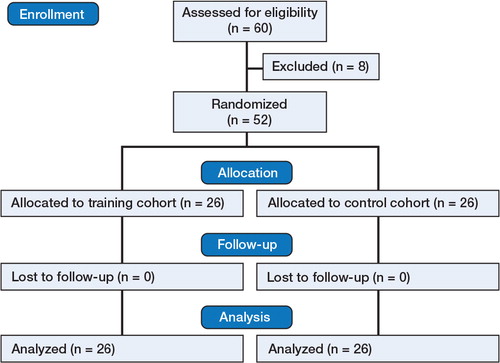
Figure 2. Box and whisker plot showing improvement in metrics in time (s) (A), fluoroscopy (s) (B), number of radiographs (C), number of retries (D), tip-apex distance (mm) (E), and cut-out (%) (F). Dots indicate max outliers. Boxes show the median value (red) and interquartile range (IQR) and whiskers show Q1–1.5×IQR and Q3+1.5×IQR.
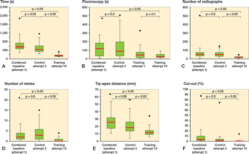
Figure 3. Box and whisker plot to show improving global score from first (pooled) to last attempts for both cohorts. Dots indicate min outliers. For definitions, see Figure 2.
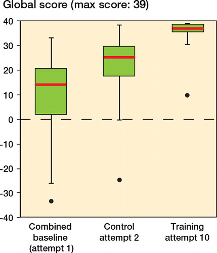
Table 1. Comparison of metrics for training and control groups before and after training. Values are mean (SD)
Figure 4. Learning curve for objective metrics per attempt.
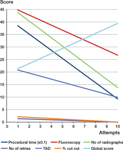
Table 2. Correlation coefficients and coefficients of determination for all objective metrics