Figures & data
Figure 1. Overview of the 21-gene assay cost-effectiveness model structure. ESBC, early-stage breast cancer; ODX, 21-gene assay; M, Markov node. Squares represent decision nodes, circles represent chance nodes (or Markov nodes where designated) and triangles represent transitions to health states. Health states are designated using block capitals.
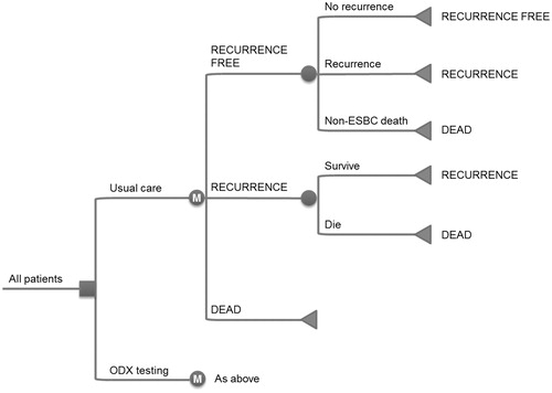
Table 1. Changes in adjuvant therapy recommendations for breast cancer patients in Germany following 21-gene assay testing.
Table 2. Summary of mean costs of adjuvant chemotherapy per patient in breast cancer patients in Germany.
Table 3. Summary of distributions used in the probabilistic sensitivity analysis.
Table 4. Summary of cost-effectiveness outcomes for the base case analysis of 21-gene assy testing vs standard care.
Figure 2. Cost-effectiveness scatterplot of the probabilistic sensitivity analysis. The cost-effectiveness scatterplot shows incremental costs vs incremental effectiveness expressed in quality-adjusted life years (QALYs) for the comparison of 21-gene assy with standard care. Each point represents one iteration of the probabilistic sensitivity analysis (with data based on sampling from distributions around clinical and cost parameters).
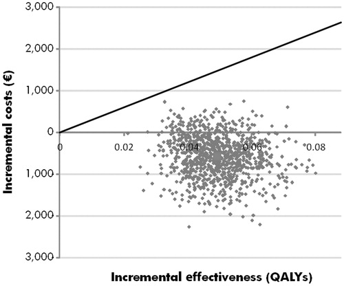
Figure 3. Cost-effectiveness acceptability curve for 21-gene assay vs standard care from the probabilistic sensitivity analysis. The acceptability curve shows the percentage of points from the probabilistic sensitivity analysis (see ) that fall below a range of willingness-to-pay values from €0 to €40,000 per quality-adjusted life year gained.
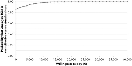
Table 5. Summary of sub-group and sensitivity analysis outcomes for 21-gene assay testing vs standard care.