Figures & data
Figure 1. Model diagram of relevant health states.
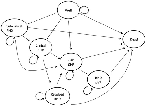
Table 1. Initial state distributions and Echo screen results.
Table 2. Annual transition probabilities.
Table 3. Costs by health state per person per year in 2010 Australian dollars.
Table 4. Cost inputs per person per event in 2010 Australian dollars.
Table 5. Average per person costs (2010 Australian dollars) and QALYs.
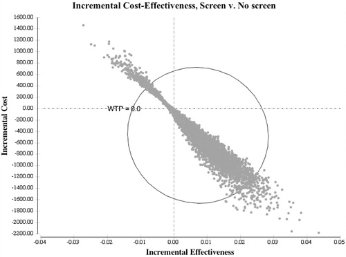
Figure 2. Cost-effectiveness plane for incremental change of Screen strategy over No screen. Incremental benefit is along the x-axis and incremental cost in on the y-axis. Toward the right indicates more QALYs and toward the top indicates higher cost.