
Figures & data
Table 1 Distribution (%) of person-years by age group, sex, and neighborhood, 2009–2011
Fig. 1 Percentage of people dying from each group of causes according to the type of neighborhood (Percentage calculated on 485 deaths in formal neighborhoods and 547 deaths in informal neighborhoods).
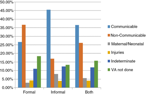
Table 2 Cause-specific mortality fraction (%) by neighborhood, 2009–2011
Table 3 Cause-specific mortality rates (per 1,000 person-years) by neighborhood and age group, 2009–2011
Fig. 2 Mortality fraction from communicable diseases or non-communicable diseases by age group and type of neighborhood.
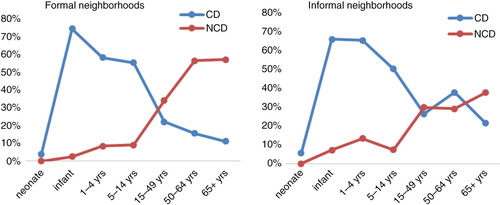
Table 4 Contributions (%) of the grouped causes to the risk of death by neighborhood and age group, 2009–2011