Figures & data
Table I. Description of the study population
Fig. 1. The prevalence of students commuting actively (walking or cycling combined) to school (%) according to the distance to school. Results are presented separately for different seasons and age groups: spring/fall (circle) and winter (square), grades 4–6 (single line) and grades 7–9 (dashed line).
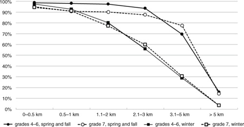
Fig. 2. The prevalence of students walking (A) or cycling (B) to school according to the distance to school. Results are presented separately for different seasons and age groups: winter (W; squares) and spring and fall (SF; circles) months for grades 4–6 (single line) and 7–9 (dashed line).
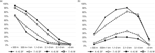
Fig. 3. The potential targets and gains for interventions to promote physically active commuting to school in relation to the whole student population. The total height of the bar represents the proportion of the student population living 0–1.0 km, 1.1–2.0 km and 3.1–5.0 km from school. The values on the black bars indicate the proportion of passive commuters (expressed as % of whole student population). Next to the bicycle and walker symbols are the minutes of daily physical activity that would be added for both transportation modes and for each distance (calculated as an average of each range).
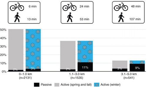
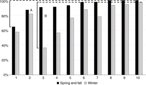
Fig. 4. The prevalence of active commute to school in 10 suburban schools in different seasons for students living 1–2 km from school. Differences between schools with the highest and lowest ACS prevalences in spring/fall (A) and winter (B).