Figures & data
Fig. 1. Map of locations of the rain gauge data used in the analysis with number of wet days greater than 1000. The points are colour coded according to the 95th percentile estimated according to .

Table 1. List of RCMs from the ENSEMBLES projects. All these runs were forced with ERA40
Fig. 2. Quantile–quantile plot, plotting against the corresponding empirical estimate for estimated 95% quantile. The colour coding indicates the mean precipitation (wet + dry days). The data include GDCN for US stations as well as ECA&D, whose locations are shown in . The points are colour coded according to the 95th percentile estimated according to the mean (wet + dry) precipitation. The black-dashed lines are confidence intervals determined through Monte-Carlo simulations. Light grey contours show the point density.
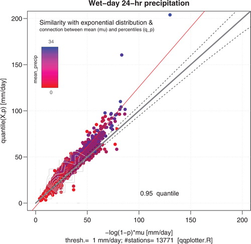
Fig. 3. Same as but for the 99% quantile. The red line shows a linear best fit to the points based on linear regression. A cutoff of 200 mm d–1 was used here, and for 8 locations the 99% quantile exceeded this limit ().
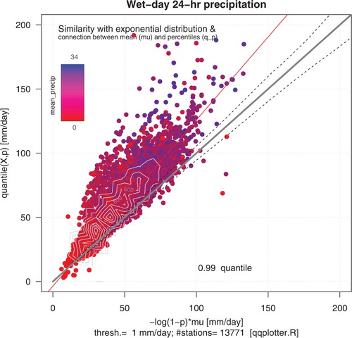
Fig. 4. Same as , but contrasting results from the ENSEMBLES RCMs against corresponding analysis based on European ECA&D data (grey symbols). Only the rain gauge data with quantiles of similar range as the RCMs are shown.
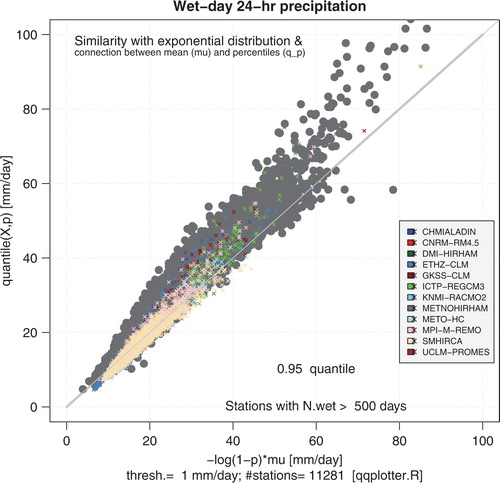
Fig. 5. X-y boxplot plotting against the corresponding empirically estimated quantile. The plot shows a range of different quantiles, from 50% to 99%. The boxes deviating strongly from the diagonal above 200 mm d–1 represent 18 of the quantiles found from the observations, representing only 8 locations.
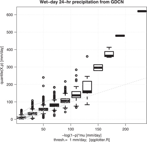
Fig. 6. The leading mode of the PCA of the points in (black solid line) is shown on top of the cloud of points (grey) from all the GDCN stations (N=13549), whereas the dashed lines show the effect of the second mode (mode 1 ± mode 2).
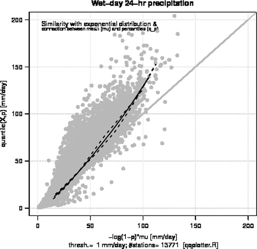
Fig. 7. Reconstruction of the spread in the qq-plot from the two leading PCAs X=α i E, where index i refers to the station number. A linear regression analysis between the grey points in the scatter plot and the leading PCA mode (red curves) suggests that the leading mode could reproduce 98.4% variance. A similar regression analysis applied to the sum of the two leading PCA modes (blue curves) explained 99.7%.
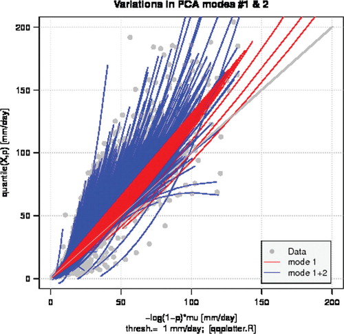
Fig. 8. Scatter plot showing values for q 0.99 from observations compared with corresponding reconstructed values based on modes 1 and 2 from the PCA. The red dashed line shows the best fit based on a regression analysis.
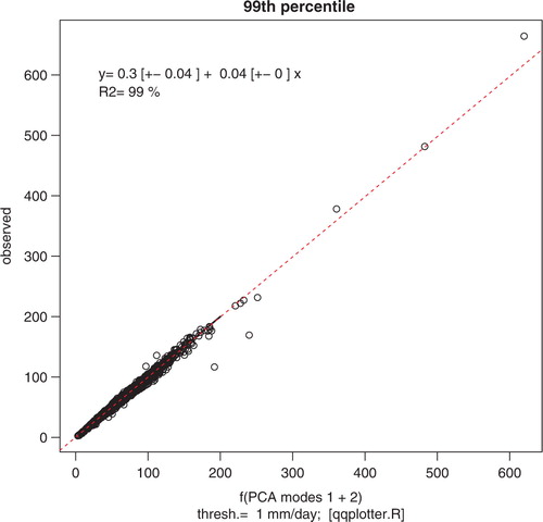
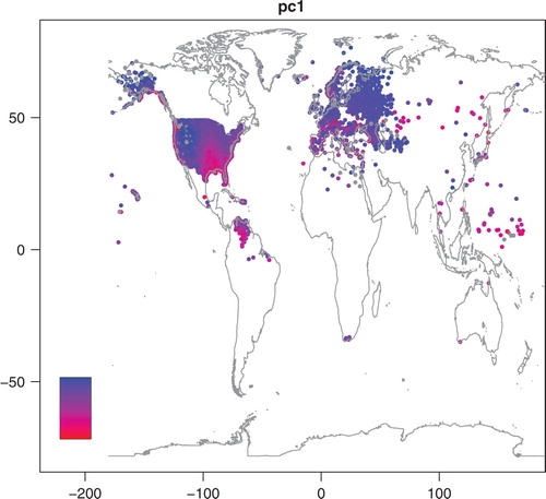
Fig. 9. Map showing the distribution of the leading PC loadings. No scale is given to the colourbar, as the value of the PC loadings is meaningless without the other components of the PCA (eigenvalue and mode).