Figures & data
Fig. 1 Map of Eastern Australia showing the airborne (blue) flight patterns and ground vehicle-based measurements (brown, dotted). Coal-fired power stations are marked with a symbol and red text, the daily flight sections and airfields are identified by black text. The arrows show the main wind direction during the survey days. Background colour contours show the decadal trend of rainfall between 1970 and 2010, brown decreasing, green increasing annual rainfall (data provided by the Australian Bureau of Meteorology).
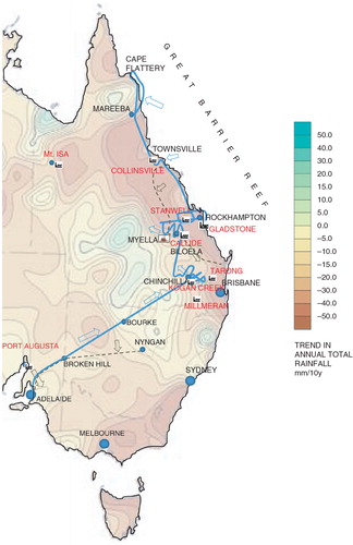
Table 1. Overview of flight- and vehicle-based measurements
Fig. 2 (a) Average size distribution of ultrafine particles between Broken Hill and Bourke (NSW) (averages over more than 100 size distributions). Blue bars: Average size distribution of the background particle size distributions (55 size distributions) for the road transect 50–100 km south of the flight path under northerly winds between Nyngan and Broken Hill – for comparison. (b) Red: Average distribution for the first 2 hours of the leg from Bourke to Chinchilla. Blue: average size for the last hour before landing. Black: last 30 min. Black dotted line: highest number concentration (13 200 cm−3) size distribution for the last hour. Numbers indicate the size in nm of individual modes. Distance to Port Augusta power station for the graphs in both panels: Panel (a) 350–800 km; Panel (b) red 850–1100 km, blue 1200–1400 km. For more details, see text and Fig. 1.
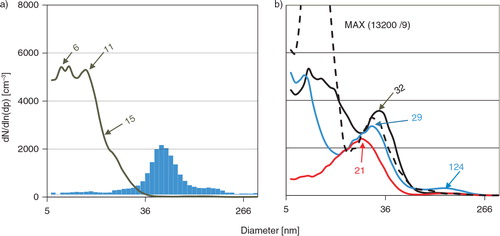
Fig. 3 Top: Airborne survey in the vicinity of the Kogan Creek Power Station near Chinchilla, Qld. Shown are data from an evening flight on 25 August 2012 (blue) around sunset with prevailing south-westerly winds (three plume cross-sections between 30 and 54 km distance) and from the morning flight (take-off at 11:00 local time) on 26 August 2012 with prevailing south-easterly winds (yellow, plume cross-sections at 12, 48 and 130 km downwind of the power station). Numbers inside the plume cross-sections indicate the maximum particle concentration cm−3 in the plume centre and the geometric mean diameter of the particle size distribution. Also shown is the flight track (red). Bottom: Size distributions measured within the centre of the first (12 km) and last (130 km) plume crossing, blue line with yellow infill for daytime and blue line with blue infill for the sunset survey. The colours indicate the respective plume study, yellow/orange first transect, red last transect, aged plume.
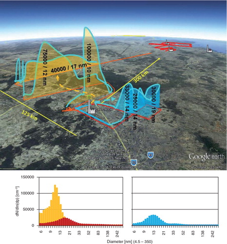
Fig. 4 Airborne survey in the vicinity of the Biloela (Callide) and Gladstone power stations, for the survey flight on 26 August 2012 from Thangool to Rockhampton, take-off at 11:00 local time. Top: Plume cross-sections for the Callide power station (yellow, 20, 50 and 80 km downwind of the power station) and for the combination of sources at Gladstone (green). The dashed lines show the HYSPLIT back-trajectories and the modelled age of the three plumes. The star marks Myella Farm, the location for ground-based measurements shown in Fig. 5. Bottom: Size distributions measured in the centre of the plumes (using the same colour scheme as in the top diagram, yellow – Callide, green – Gladstone). Shown are averages of the three size distributions with the highest number concentration in the plume centre. The colours indicate the respective plume study, yellow/orange: first transects; red: last transect – ageing Callide plume; green: Gladstone plume.
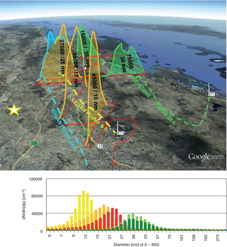
Fig. 5 Average size distributions measured on the ground at Myella Farm (see Figs. 1 and 3 for locations), ~100 km west of Biloela (Callide power station) during daylight hours. Blue: first hour; green: average of low concentration (<6000 cm−3) measurements; red and purple: averages of two half hour episodes with >12 000/cm−3. Black: average of all measurements during the day. HYSPLIT trajectories indicate that Stanwell and Callide power stations are the major ultrafine particle sources. The filled blue curve shows the background size distribution inland between Rockhampton and Cairns (average over 50 size distributions/from about 2 flight hours or 200 km) – for comparison.
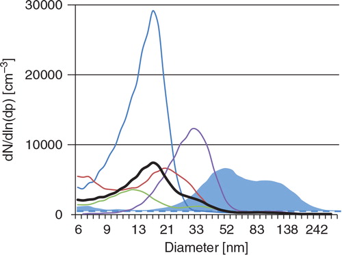
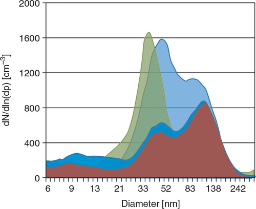
Fig. 6 Background size distributions over the rain forest north of Cairns (red) during the flight to Cape Flattery (Lizard Island) and the return flight to Cairns over the open water (dark blue). Also shown are background size distributions measured over the hinterland forests north of Rockhampton (light blue) and during the vehicle transect in inland northern NSW (green) (average over 50 size distributions/about 2 flight hours or 200 km, road transect – 80 distributions ~500 km or ~8 hours).