Figures & data
Fig. 1 Location of the Shangri-La station and the four World Meteorological Organization/Global Atmosphere Watch (WMO/GAW) stations (Mt. Waliguan global station, Shangdianzi, Lin'an and Longfengshan regional station). Currently, these stations are running with in situ CO2/CH4 observation systems.
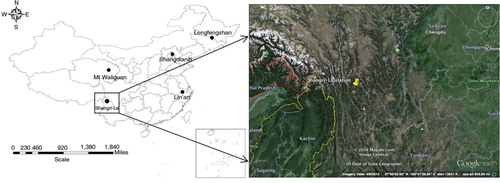
Fig. 2 Differences of the measured and assigned CO2 and CO mole fractions in reference tank (T) during the observation period at Shangri-La station.
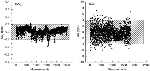
Fig. 3 Mean diurnal variations of CO2 and CO mole fractions in the four seasons. Spring: March–May (MAM); summer: June–August (JJA); autumn: September–November (SON); winter: December–February (DJF). (a) CO2, (b) CO versus surface wind speed. Error bars indicate the standard errors with 95 % confidence intervals.
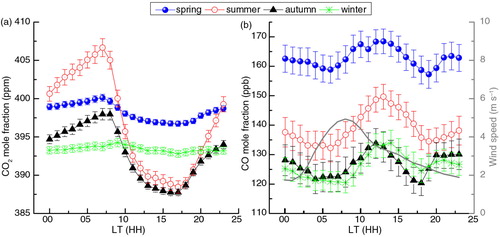
Fig. 4 Variations of hourly CO2 and CO mole fractions at Shangri-La station. (a) Long-term CO2 variations. (b) Long-term CO variations. The blue closed circles are regional records and the grey open circles are local representative. The red dots in the upper chart are the curve-fitted results to the background CO2 using the method by Thoning et al. (Citation1989). The red dots in the lower chart are curve-fitted results to the regional CO using the Robust Extraction of Baseline Signal technique according to Ruckstuhl et al. (Citation2012).
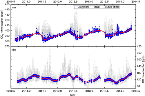
Table 1. Annual mean regional CO2 and CO mole fractions at Shangri-La station from 2011 to 2013, compared with the background data at Mt. Waliguan station in China
Fig. 5 Monthly regional CO2 and CO mole fractions at Shangri-La station. (a) Also compared with the monthly values at Mt. Waliguan station and surface values computed at the Marine Boundary Layer (MBL). (b) Also compared with the values at Mt. Waliguan station.
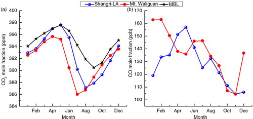
Fig. 6 Cluster analysis of 120-h back trajectories for hours when both CO2 and CO mole fractions are regional representative. The average CO2 and CO mole fractions on each cluster are also calculated and the relative occurrences are given. The ranges represent the standard errors of the mean with a confidence interval of 95 %. The red dots in the figure represent cities (>100,000 inhabitants).
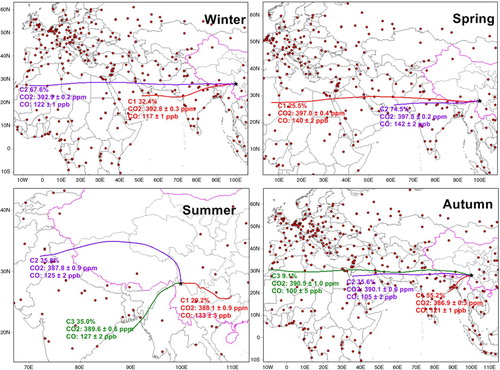
Table 2. Cluster analysis of the trajectories in all seasons and the average regional CO2 and CO mole fractions on each cluster
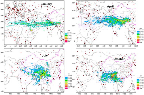
Fig. 7 The Weighted Potential CO Sources Contribution Function (WPSCF) regions calculated from trajectory statistics in January, April, July and October during the observation period (from September 2010 to May 2014). The WPSCF values have an arbitrary unit; higher value indicates a higher probability for a grid cell of CO sources (the largest value is 1). The red dots on the map represent big cities.