Figures & data
Fig. 1 Locations where air samples were collected (small stars) onboard MIRAI for the period 5 September–15 October 2012 (red) 29 August–6 October 2013 (blue), and 1 September–9 October 2014 (green). Locations of Ny-Ålesund Station, Svalbard, Norway, and Sendai, Japan, are also shown (large purple stars).
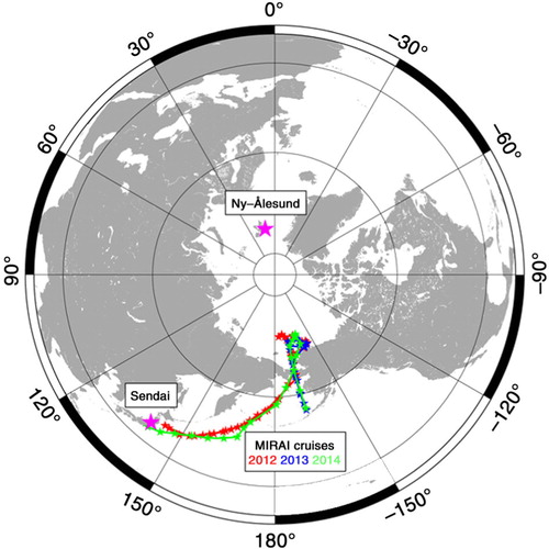
Fig. 2 Temporal variations in δ(O2/N2), CO2 concentration and δ13C of CO2 observed onboard MIRAI for the period 5 September–15 October 2012 (black filled circles). Temporal variation in CO concentration (grey crosses), latitude and longitude of the cruise are also shown.
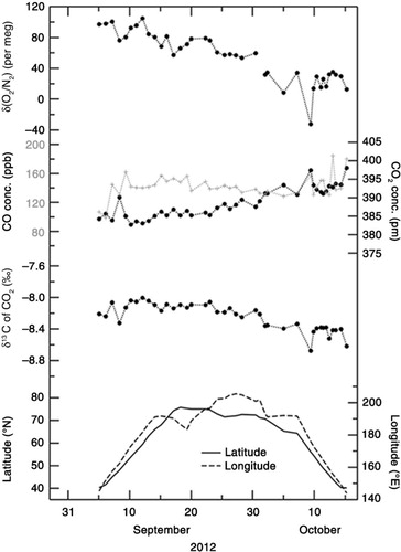
Fig. 3 Same as in but for the period 29 August–6 October 2013.
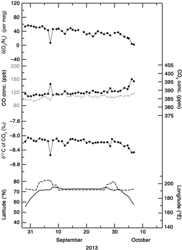
Fig. 4 Same as in but for the period 1 September–9 October 2014.
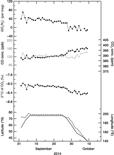
Fig. 5 Relationships of (a) δ(O2/N2) and (b) δ13C of CO2 with CO2 concentration observed onboard MIRAI for the period 5 September–15 October 2012, 29 August–6 October 2013, and 1 September–9 October 2014.
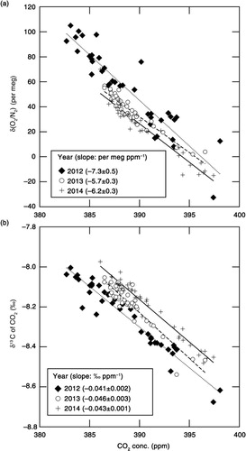
Fig. 6 Temporal variations in APO (filled black circles) and air–sea O2 flux observed onboard MIRAI (FO2_obs; green dots, positive value denotes flux emitted from the ocean to the atmosphere) for the period 5 September–15 October 2012. Corresponding APO values simulated using the STAG model that incorporated the monthly air–sea O2 (N2) flux climatology (blue crosses), and the climatological air–sea O2 flux along the observation route (FO2_cli; blue dots) are also plotted. Simulated APO values calculated by including the contribution of air–sea CO2 flux are also shown by the blue dotted line (see text). Green crosses denote temporal variations in APO calculated by using FO2_obs (see text). Chlorophyll-a concentration, partial pressure of O2 and CO2 in surface water, heights of planetary boundary layer (PBLH), wind speed at 25-m heights, latitude and longitude of the cruise are also shown.
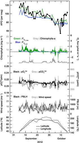
Fig. 7 Same as in but for the 29 August–6 October 2013.
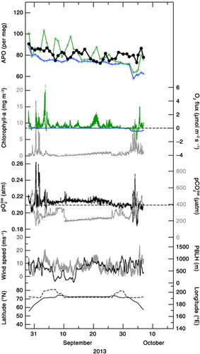
Fig. 8 Same as in but for the period 1 September–9 October 2014.
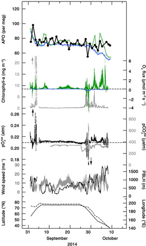
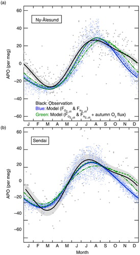
Fig. 9 Seasonal components of the observed APO (grey dots) and the simulated APO (blue dots) by STAG model incorporated with FO2_cli and FN2_cli at (a) Ny-Ålesund, Svalbard, for the period 2001–2010 (Ishidoya et al., Citation2012a) and (b) Sendai, Japan, for the period 1999–2009 (Ishidoya et al., Citation2012b). Best-fitted curves to the observed and simulated data consisting of two-harmonics are also shown by black and blue solid lines, respectively. Blue dashed lines denote the same best-fitted curves to the simulated data but for including the contribution of air–sea CO2 flux. Green dashed lines denote the APO values calculated as a sum of the simulated APO and changes in APO expected from a uniform mixing of the sea-to-air O2 fluxes, emitted from the northern hemispheric ocean at a uniform rate of 0.3 µmol·m−2·s−1 for the period from mid-September to the end of November. Green dashed-dot-dot lines denote the best-fitted curves to the simulated APO produced by the adjusted FO2_cli values. See text for details.