Figures & data
Table 1. Baseline subject characteristics for males (n = 12), females (n = 11) and all subjects (n = 23). Data is presented as mean ± SEM. For details on the training program see Figure S1.
Figure 1. Effects of endurance exercise training are mirrored by alterations in DNA methylation and gene expression. The significant (* = P < 10−4) effect of training in the trained leg is shown by the increase in a 15 min performance test (A) and the citrate synthase activity in muscle biopsies (B) in T2 (after training) vs. T1 (before training). For comparison, the untrained leg is also shown, where a smaller change is observed in performance and no change in CS activity. # indicates significant differences between the changes in the 2 legs. Additional physiological measurements are shown in Figure S1B-C. The physiological changes are mirrored by modifications in DNA methylation (C) and gene expression (D). For DNA methylation, the effect size is measured as the difference in M-values and points in black correspond to DMPs with FDR < 0.05. For gene expression, the log2 (Fold Change) is plotted against the average log2(Counts Per Million) and red points correspond to genes with FDR <0.05. Correlation between changes in DNA methylation and CS activity exists and results are shown in Figure S5. The clustering of the samples is shown in (E) using either DNA methylation (upper panels) or gene expression (lower panels). A segment connects to measurements from the same subject obtained before and after training. Samples are alternatively colored by group (T1 = blue, T2 = red) or by gender (M = green, F = magenta). For DNA methylation, Principal Component Analysis was employed using only autosomal DMPs, while for gene expression the top 1000 genes with largest biological variation were chosen and the biological coefficient of variation used to produce a multidimensional scaling plot.
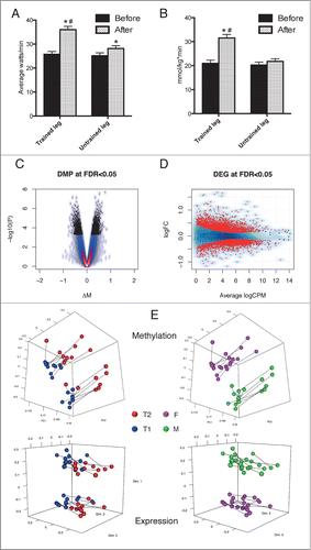
Figure 2. DNA methylation changes are primarily localized in enhancers. (A–C) For each annotation category, the relative fraction of positions located within each feature type is calculated for DMPs (red bars), non-DMPs (blue bars) and the entire position on the array (green bar). Panels A-B were obtained using Illumina annotation, while for panel C we used Illumina annotation (Enhancers) or publicly available ChIP-seq experiments on HSMM cells from which we derived H3K4me1 and H3K27ac peaks. The presence of H3K27ac mark denotes an active regulatory element, while H3K4me1+H3K27ac marks active enhancers and other distal elements. (D) The log2 fold enrichment for DMPs vs. the array was calculated for the relative fraction of probes falling in each category; data from chromatin segmentation algorithms in HSMM cells were used. For additional information, see Supplementary Methods S9. Significance codes: *P < 0.05; ***P < 0.001; Fisher's exact test.
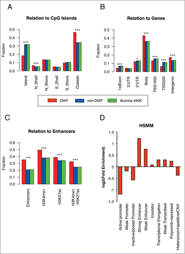
Figure 3 (See previous page). Muscle related processes and factors are enriched in the up-methylated DMPs. GREAT analysis was performed to retrieved functional categories associated with DMPs increasing or decreasing methylation after training. Up to top 5 categories passing the threshold (see Supplementary Methods S9) are shown for GO Molecular Function, Biological Process and Cellular Component. We tested the presence of known enriched motif on a symmetrical 200 bp window around each DMP (P < 10−10, consensus motif shown). Known profiles were clustered and a familial logo was drawn. For a corresponding ontology analysis of gene expression, see Figures S2-S3.
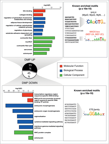
Figure 4. Identification of regions exhibiting positive or negative correlations between methylation and expression. (A) Distribution of Spearman correlation between DNA methylation and gene expression calculated either including all pairs of genes/methylation positions (gray line) or only pairs formed by a DMP and a DEG (black line). The 2 distributions are strongly different (P < 2.2e-16 Kolmogorov-Smirnov Test) and peaks of positive and negative correlation are highlighted after selecting changing sites after training. (B) The distribution of the Spearman correlation was stratified according to the genomic location of the DMP with respect to the linked gene. (C) A Q-Q plot was obtained by plotting the observed P-values from the above correlation analysis against those obtained under a uniform distribution. (D) A starburst plot illustrates the relationship between DNA methylation and expression changes, with a color density representation of the scatterplot of the pairs of genes/methylation positions. The horizontal axis is the FDR for each gene multiplied by the sign of the fold change, while the vertical axis is the FDR for methylation multiplied by the sign of the fold change. Green dots correspond to pairs where FDR<0.05. Numbers on each quadrant show the pairs (black) or genes (red) that fall in each region. Examples of expression/methylation pairs are given for the indicated probes and genes. Points represent samples and are colored as shown on the corresponding legends (training: T1 = black, T2 = red; gender: M = blue, F = red). The correlation for the cases taken from the significant quadrants is visually explained by the training, while the correlation obtained for non-significant cases may be explained because of the individual levels of methylation and gene expression being correlated at the subject level.
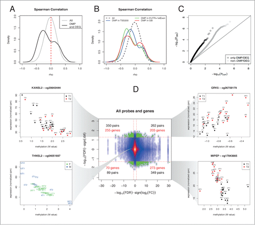
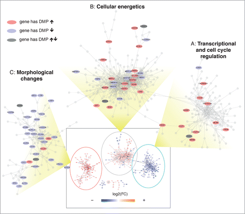
Figure 5. Transcriptional network analysis reveals coordinated alternations in methylation and gene expression. A transcriptional network was reconstructed using RNA expression data, showing 3 major domains (see Supplementary Methods S9 and Figure S7). The whole network is shown inside the rectangle at the bottom of the figure, where each node is colored according to the corresponding fold change. The 3 major domains (A, B, C) are zoomed and only genes with corresponding significant changes in DNA methylation are labeled. The color indicates whether the gene has corresponding DMPs that significantly increase (red) or decrease (blue) their methylation levels. A dark gray color indicates that the gene has significant but discordant changes in DNA methylation.