Figures & data
Figure 1 (A) Design of the peptide array used in this study (detailed information on the sequence and modification of each peptide is given in Sup. Table 1). Here the image obtained with antibody #1 is used for illustration. (B) Antibody binding to independently synthesized peptides. Spot intensities were averaged from the two internal repeats of the array and compared between arrays that were synthesized independently. One image obtained with H3K4me3 is chosen for illustration. The scatter plots show a comparison of the intensity of peptide binding in both arrays. The r value refers to the Pearson correlation coefficient of both intensities. (C) Reproducibility of peptide binding intensities between different peptides on the same array. For several antibodies, the binding intensities to all peptides containing the primary epitope (after exclusion of false negatives) were averaged and plotted in log scale (orange columns, the error bars display the standard deviations). As background, binding intensities to the 100 weakest spots were used (blue columns, the error bars display the standard deviations). For antibody numbers cf. Supplemental Table 2.
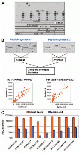
Figure 2 Internal reproducibility of the peptide binding. Spot intensities were quantified on the two internal repeats of the array and compared. One image obtained with H3K4me3 is chosen for illustration. Examples of the results are given for several antibodies. The box plots show the number of pairs of spots within certain error margins obtained after normalization to the maximum binding. The scatter plots show a comparison of the intensity of each peptide in both arrays. The r value refers to the Pearson correlation coefficient of both intensities.
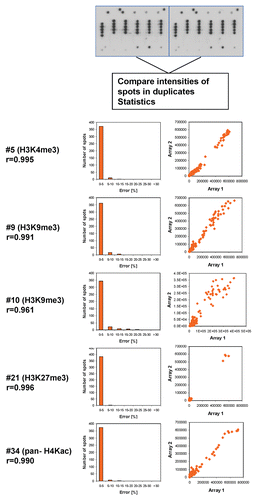
Figure 3 Examples of antibody specificity analysis. The upper part of each panel shows the image of the array. Peptide spots are annotated on the left copy of the duplicates, color coded as described below the image. On the left side, spots are annotated as follows: all peptides containing the primary PTM are shaded in green, false negatives (or very weakly bound peptides which contain the primary PTM) are highlighted with red arrows. False positives are encircled in orange or violet color. The secondary PTMs present in the false negative, and false positive spots are specified below the pictures. In the lower part a scatter plot of the binding intensities to both repeats is shown.
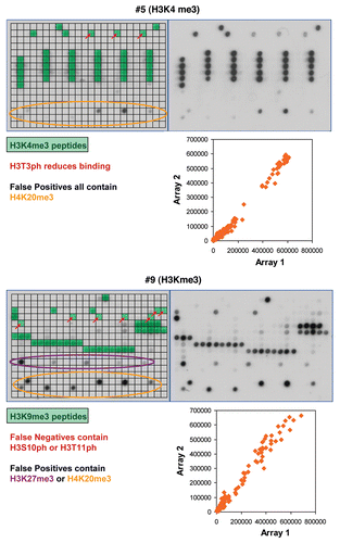
Figure 4 Examples of results obtained with different antibodies binding to H3K27me3. Peptide spots are annotated on the left copy of the duplicates, color coded as described next to the image.
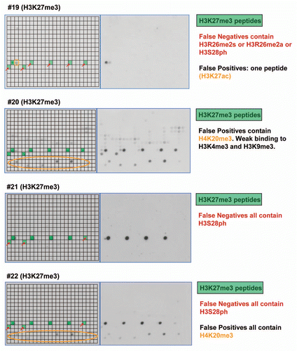
Figure 5 Summary of antibody specificities. In this graph, the specificity factor for binding at the target site (SFT) is plotted on the y-axis and the ratio of the specificity factors for binding at the target site and the best non-target site (SFT/SFN) on the x-axis. Best antibodies are located in the upper right corner of the graph. Some examples of antibodies are shown on the right side, for coloring cf. Supplemental Table 1.
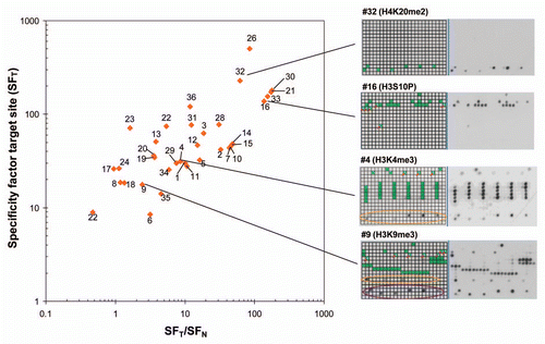
Table 1 Compilation of the results of the specificity analyses with different antibodies