
ABSTRACT
“Data science” is a useful catchword for methods and concepts original to the field of statistics, but typically being applied to large, multivariate, observational records. Such datasets call for techniques not often part of an introduction to statistics: modeling, consideration of covariates, sophisticated visualization, and causal reasoning. This article re-imagines introductory statistics as an introduction to data science and proposes a sequence of 10 blocks that together compose a suitable course for extracting information from contemporary data. Recent extensions to the mosaic packages for R together with tools from the “tidyverse” provide a concise and readable notation for wrangling, visualization, model-building, and model interpretation: the fundamental computational tasks of data science.
The familiar mathematical topics of introductory statistics—means, proportions, t-tests, normal, and t-distributions, chi-squared, etc.—are a product of the first half of the 20th century. Naturally, they reflect the statistical conditions of that era: scarce data originating in benchtop or agricultural experiments; algorithms communicated via algebraic formulas. Today, applied statistics relates to a different environment: software is the means of algorithmic communication, observational and “unplanned” data are interpreted for causal relationships, and data are large both in the number of rows and the number of variables. This change in situation calls for a thorough rethinking of the topics in and approach to statistics education.
In this article, I present a set of 10 organizing blocks for intro stats that, I claim, are better suited to today's environment. These include: data tables; data graphics; model functions; model training; effect size and covariates; displays of distributions; bootstrap replication; prediction error; comparing models; and generalization and causality.
The extent of each block and the division of the whole into 10 blocks has been made with an eye toward covering each in roughly 1 week of a standard course. Keeping in mind that one of the drivers of change in statistics has been the transition from algebra to software as the mode of describing algorithms, computing should be integrated thoroughly across blocks. I will illustrate the sorts of algorithms that support the themes using two new packages for R: ggformula and mosaicModel. These packages integrate data-science software such as the tidyverse (Wickham and Grolemund Citation2016) with the pedagogical approach of the mosaic package (Pruim 2017).
The discussion and computer commands in this article are oriented toward instructors. An implementation of the blocks for students would take another form, one with much more basic and expository narrative and interactive scaffolding for computer commands.
Block 1: Data Tables
Start with data tables: the standard row-and-column, case-and-variable organization. Important concepts to cover are: tidy data (Wickham and Grolemund Citation2016; Broman and Woo Citation2017); the physical meaning of a unit of observation, for example, a person, a person at a medical checkup, etc.; the distinction between quantitative and categorical variables; the difference between a data table and the “presentation” of the information.
Do not assume that the concept of a data table is so obvious that it does not need to be taught. For instance, consider , a problem from an open-source statistics textbook (Diez et al. 2014).
Figure 1. A conventional textbook problem that uses a cross-tabulation of data rather than a tidy data table.

One might argue that the table in can be construed as a data table, but for our purpose consider a pragmatic approach to defining what constitutes the sorts of data used in data science. In particular, focus on data that contain many rows and are available in machine-readable form. Or, stated another way, we will work with data before they have been aggregated into the sort of presentation seen in .
How to see that the table in is not tidy data? Try to answer these questions: What is the unit of observation? What are the variables? Are the variables quantitative or categorical?
It is easy to imagine what the disaggregated data table that underlies this presentation might look like.
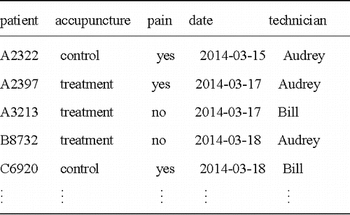
The tools for working with data tables enable the information in easily to be reconfigured into the cross-tabulation in . But the tools are more general and allow the exploration of other possible explanations for the variation in pain, such as the effectiveness of the technician or the day of the week.
Figure 2. The underlying data table from might have looked like this table, where the unit of observation is an occasion of a person receiving a treatment.
Block 2: Data Graphics
The crucial goal for data science is to transform data into information suited for human consumption. Visualization provides one of the most readable and compelling forms of information as well as a highly motivating early experience for beginning students. This block covers the display of relationships among variables. Pruim, Kaplan, and Horton (Citation2017) argued that it is best to put off displays of a single variable until after introducing notation for two or more variables. Accordingly, the topic of distributions of a single variable will be deferred until a later block.
The proper notation and terminology is important to describing and creating graphics. The “Grammar of Graphics” an effective way to start. The well-regarded ggplot2 package (Wickham Citation2009) is standard implementation of the grammar of graphics. Unfortunately, the notation can be difficult for beginners and is not closely connected with other notation for statistical calculation. Here, we will use ggformula (Kaplan and Pruim 2017) which provides a formula-based interface to ggplot2.
Many of the graphical displays covered in introductory statistics date from a time when graphics were made by putting pen to paper. Modern computer graphics can include aspects such as color, opacity, facets, and jittering. uses faceting and opacity to display height versus age and sex for the people included in the National Center for Health Statistics data.
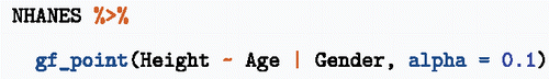
Figure 3. Relationships among height, age, and sex in the NHANES data from the R package of the same name.
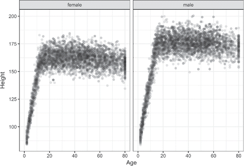
The commands making are simple, yet there are important display choices being made: the mode of graphics, the graphical roles of the different variables, use of color, and faceting. The ggformula/ggplot2 framework used for graphics can scale nicely to handle more than the three variables in . As such, graphics like these reflect the new emphases on statistical thinking advocated by the GAISE report (Citation2016).
| a. | Teach statistics as an investigative process of problem-solving and decision-making. | ||||
| b. | Give students experience with multivariable thinking. | ||||
If students are to engage with a process of decision-making, there need to be decisions that they can make. Starting with the graphics commands here, there are several questions that students are in a position to answer through experiment. Doi color/fill contribute to the graphic? Are the right variables being used for the axes and facets? How do such decisions affect the “story” told by the graphics? How could the height versus age graph be improved to highlight the differences between the sexes in children? (Hint: Try interposing the wrangling command filter(Age < 18) before the gf_point() command.)
Block 3: Model Functions
Statistics helps us describe relationships between different variables. This block introduces the notion of representing relationships by mathematical functions that have one or more variables as input and one variable as output. These are often called the explanatory variables and the response variable, respectively.
High-school mathematics classes study, almost exclusively, functions of only one input variable. Models of real-world phenomena are more complicated, involving two or more input variables. I submit that it is a good practice to start with functions of two variables. That way it is easy to generalize to more inputs or to simplify to a single (or no) inputs.
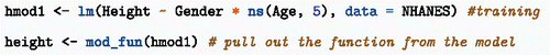
Block 4 deals with training models. But for the student, all that is needed in Block 3 is the function that relates the explanatory inputs—Gender and Age here—to the response variable. Let us call that function, height(). The following commands show how height() is being extracted from a statistical model using mod_fun(), but imagine that it is the height() function, rather than the training command, that is being provided for the students.
There are two inputs to the height() function: Gender and Age. One of the main things one does with functions is to evaluate them: supplying inputs and receiving an output, for example,
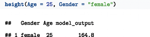
In this format, the model output is shown along with the corresponding inputs.
Another important way to present models is graphically. For this, supply the height() function with a range of inputs, creating a data table of inputs and outputs. This data table can be graphed with the usual tools.
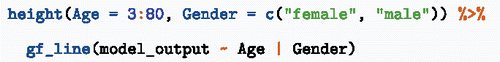
Figure 4. A model of height as a function of Age and Gender.
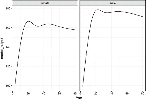
Reading such graphs is not trivial for newcomers to statistics. It is advisable to take time to help students learn what to look for. Note the connections to previous blocks: the function creates a data table; choices about the variables need to be made, for example, should one use faceting or color to represent Gender? There are different ways one might present the model that are suited to different purposes. For example, is another graphical depiction of the same model that directly compares women's and men's heights at different ages.
Figure 5. Another depiction of the height() function.
Block 4: Model Training
Functions such as those shown in the previous section need to be constructed before they can be used. The verb “fit” is used to identify this process, as in choosing the right size clothing. Extend the metaphor to include a variety of different types of clothing—clothing for formal wear versus clothing for sports. The different types of clothing are made of different materials to serve different purposes.
In modeling, there are different types or architectures of model functions for different purposes. It is helpful to cover at least two architectures: a regression model and a classifier. The modern computational environment gives considerable freedom here.
For the purposes of discussion, consider these three model architectures.
Linear regression such as provided in R by lm().
Recursive partitioning, for instance rpart() in the rpart package.
Logistic regression, as with glm(..., family = binomial)
This set of three architectures satisfies a couple of important desiderata for use in teaching; the calling syntax is highly similar and the explanatory variables can be a mix of quantitative or categorical.
The student's choice of architecture is largely set by the kind of response variable. lm() is suited to quantitative response variables, rpart() to either quantitative or categorical, and glm(..., family = binomial) to response variables with only two levels.
The functions of height versus age (and other variables) shown in were trained with lm(). Nonetheless, they are not “straight-line” functions but follow the data in a natural way. This points to a third desideratum
| 3 | Model architectures should provide a means to generate functions that can flexibly follow the data. | ||||
For lm(), such flexibility can be introduced by wrapping terms with ns() and connecting terms with * rather than +. I do not want to suggest that the mathematics behind natural splines or interactions ought to be included in a first course, just that by using these techniques a natural-looking function becomes a choice available to the modeler. So think of ns() as standing for “not straight,” with the parameter indicating the extent of flexibility.
In the days when statistical algorithms were communicated by algebraic formulas, it made sense to start with “simple regression.” Today, simple regression is not any simpler than other kinds of model building (Gould Citation2017). In hand-drawing a function through the data in , it is unnatural to prefer a straight-line function to one that can bend with the data. Avoid the suggestion that statistical models are always stiff; the question of how much bending is appropriate can itself become an opportunity for teaching statistical thinking.
Block 5: Effect Size and Covariates
One important use for statistical models is to describe how one variable depends on another. It is unnecessary to talk about “coefficients” in an introductory course. Instead, perform simple experiments on models: changing an input and observing how the output changes. For instance, to see the effect of 1 year's age on the growth of young children, evaluate the model at ages 5 and 6, and compare the outputs.
Consider hmod1, the model of height versus age and sex displayed in and . Suppose we want to find out how children's height changes with age. Simply evaluate the model at two different ages, say:
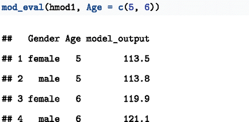
Evidently, both boys and girls grow by about 7 cm/year.
Once students are introduced to interrogating a model in this way, the operation can be streamlined:
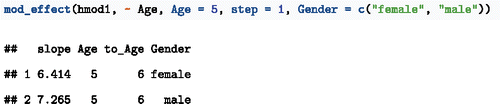
The argument ~ Age specifies which variable to use when looking at the effect size. Being able to calculate effect sizes easily supports a nuanced discussion of covariates.
Effect sizes are an appropriate way of describing classifier models, that is, models whose output is a category rather than a number. For the effect size, classifiers are configured to return a probability of each possible output. To illustrate, consider data on smoking and mortality, specifically the Whickham data provided through the mosaic package (Kaplan 2011; Committee Citation2016; Pruim 2017). The Whickham study involved interviews with registered voters 1972–1974 with follow-up 20 years later. Some of the interviewees had died in the interim, providing data to assess the association between smoking and mortality.
In traditional introductory courses, probabilities are usually a matter of counting and cross-tabulation, not part of a modeling framework. For instance, here is a tabulation of conditional probabilities of mortality outcome given smoking status. Smoking is associated with a reduction in mortality from 31.4% to 23.9%, that is, a decrease of 7.5 percentage points.
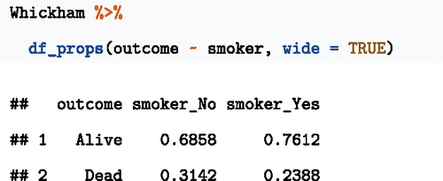
Such cross-tabulations have their place, but they do not generalize well to including covariates. In this example, smoking is misleadingly associated with lower mortality. This is the result of failure to adjust for age.
Using a modeling framework empowers students to consider covariates. The following command trains a model that recapitulates the information in the cross-tabulation. Linear regression would do, but here I will use logistic regression with an eye toward eventually adding a covariate.
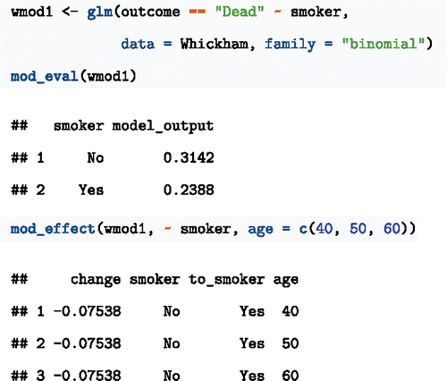
As before, smoking is associated with lower mortality by about 7 percentage points unless the covariate age is included as an explanatory variable:
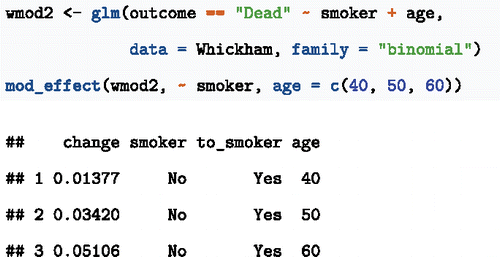
Even if the primary interest is in the effect of smoking, age is a relevant variable to include. Appendix B of the GAISE report (Citation2016) uses the Whickham example to illustrate how to “account for the possible impact... confounding variables.” Their starting point is a course cross-tabulation splitting age into two categories: 18–65 and 65+. Statistics for data science should build results from tidy data, not cross-tabulations. And who really thinks an 18-year old and a 65-year old are to be regarded as the same when it comes to 20-year mortality?
Block 6: Displays of Distributions
Early in traditional statistics courses, students are introduced to ways of displaying and quantifying variation. I have deferred the topic to Block 6 because there are more compelling motivating topics to begin with. But we are now at the point where we need to consider random variation.
Traditional courses cover this is considerable depth, going in to shapes of distributions, presentations such as histograms, box-and-whisker plots, calculations such as standard deviations, interquartile intervals, the five-number summary, etc. It is unclear to me how much of this is really useful for understanding data and how much is a set-up for later traditional techniques that build on standard deviations and the central limit theorem.
Some of these traditional topics are clearly oriented to doing calculations by hand, as opposed to generating insight into data. For instance, histograms and box-and-whisker plots may not be as useful as density plots. To illustrate, presents the distribution of heights across genders in the NHANES data.
Figure 6. Displaying density using transparency and jittering (left). The violin plot (right) gives a more compact display.
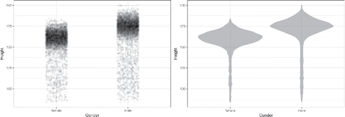
These displays are meant to help see patterns or tell a story. For instance, the story here might be that men tend to be somewhat taller than women, but that many women are taller than many men.
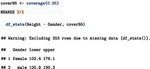
Later in the course we will want to quantify precision and investigate whether adding features to a model improves it. For these purposes, the coverage interval can provide a compact numerical description (see, e.g., Cumming and Finch Citation2005).
First, create a function to compute the coverage interval at the desired level. Then use
Block 7: Bootstrap Replications
A bright spot in statistics education has been the introduction to the mainstream of simulation and resampling approaches to statistical inference. (See, e.g., Lock et al. 2012.) The concise commands provided by the mosaic R package (Pruim 2017) provide commands such as do() and resample() that make bootstrapping concise.
The mosaicModel package creates even stronger connections of bootstrapping to model analysis. The primary interface is to create bootstrap ensembles of a model. These ensembles can then be used with model-analysis functions such as mod_effect(). To illustrate, in the following, the mod_ensemble() function is being used to create an ensemble of 100 for the model of height introduced earlier. The mod_effect() function, when applied to the ensemble, computes the effect size for each member of the ensemble.
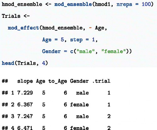
The 95% confidence interval on the slope is the 95% coverage interval of the trials:
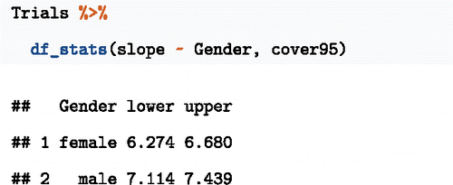
Note that the confidence intervals do not overlap. Given the recent statement from the American Statistical Association encouraging use of confidence intervals and de-emphasizing p-values (Wasserstein and Lazar Citation2016), reasoning using confidence intervals may be preferred (see Cumming and Finch Citation2005).
Block 8: Prediction Error
Prediction error refers to the discrepancy between the model output for a given set of inputs and the actual value of the response variable for those inputs. To calculate the prediction error, evaluate the model and consider the squares of the differences between response and output.
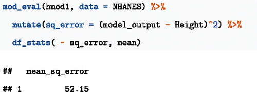
Once the concept has been introduced, it is helpful to condense the operation with a purpose-specific function:
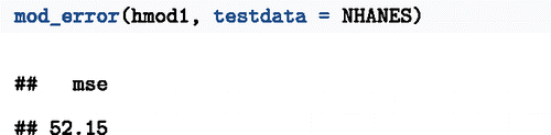
Error measured in this way on the same data used for training the model can be misleadingly optimistic. Fixing that over-optimism is the purpose of the next section.
Block 9: Comparing Models
Cross-validation refers to a process of withholding a fraction of the cases when training, then evaluating the prediction error using the withheld cases. The withheld cases are called “test data,” whereas the cases used for training are the “training data.” The prediction error using the same data in two roles, for training and for testing, is called the “in-sample” prediction error. The “out-of-sample” prediction error refers to using the training data to train the model and the test data to find prediction errors.
A good place to start is to divide a dataset up into training and testing components, train the model, then compare the in-sample and out-of-sample prediction error. The following commands do this in a rather verbose way, suitable for a demonstration that in-sample prediction error is biased to be low.
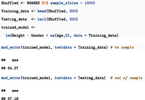
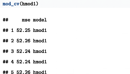
This is one random trial of splitting into training and testing data. The specific prediction error values will vary from trial to trial. Thus, it is advisable to run several trials.
The mod_cv() function carries out several random trials and reports the results. By using k-fold cross-validation, the entire dataset can be used in training the model, as with hmod1 from Block 3.
An important use of cross-validation is to compare two or more models. Consider testing a model hmod2 with more nonlinearity than hmod1:
mod_cv() can take multiple models as arguments. The following command performs 50 cross-validation trials for each model and displays coverage intervals:
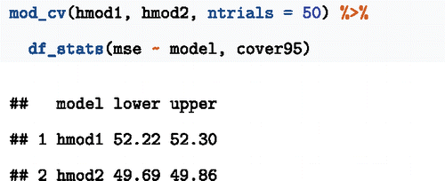
The confidence intervals do not overlap; hmod2 has a smaller prediction error than hmod1.
The prediction error encountered in a traditional statistics course is the in-sample error. Much technical apparatus—degrees of freedom, t-distributions, etc.—is applied to correct for the optimistic bias of in-sample error. But in an era when data are plentiful and computation is cheap, there is no reason to muddy the conceptual waters with this apparatus. It is simple enough to find the out-of-sample error and simple and reliable to compare the distributions of a few trials when comparing models.
Block 10: Generalization and Causality
What is a representative sample? What are common sources of bias in surveys and experiments? How can one make reasonable inferences about causation?
These are important questions to cover in introductory statistics, and there are many existing resources that approach them at an introductory level. Unconventionally, I suggest putting this block at the end of the course, allowing the instructor to use the techniques introduced earlier to illustrate problems and possible solutions. For instance, bias in sampling can be demonstrated with sampling, as can the use of covariates to improve estimates. Another suggestion emphasizes contemporary practice. Many of the areas of application of data science are based in a concern with elucidating causal influences from observational data. We ought to be teaching students responsible methods to addressing this. See, for instance, the discussions in Wainer (2015), Pearl (2016), and Kaplan (2011).
Discussion
The term “data science” reflects concepts and techniques useful for drawing conclusions from large and complex datasets. This differs from the traditional conception held by many instructors; that the purpose is to introduce differences in means and proportions, the t-test, the χ2 test, etc. Such tests were developed for posing simple questions about small datasets.
There is a widespread recognition that the era of data science calls for a radical rethinking, (Cobb Citation2015), for instance, returning to the GAISE (Citation2016) emphasis on decision-making as part of statistical thinking:
Teach statistics as an investigative process of problem-solving and decision-making. Students should not leave their introductory statistics course with the mistaken impression that statistics consists of an unrelated collection of formulas and methods. Rather, students should understand that statistics is a problem-solving and decision-making process that is fundamental to scientific inquiry and essential for making sound decisions.
In the traditional course, the primary decision to be made is which one of the many named tests to apply. With the 10 conceptual blocks described here, students are given considerably more scope for decision-making such as the choice of covariates to include in a model and the model architecture. The operations to be applied each reflect a different part of the process of statistical thinking: modeling is about constructing a description from data, effect size is about summarizing that description, bootstrapping addresses the issue of precision, and cross-validation informs choices about what explanatory variables or model architectures should be used. Importantly, the techniques, concepts, and vocabulary the students learn are consistent with contemporary statistical practice, relate to key elements of data science such as wrangling and visualization, and provide an introduction to machine learning techniques.
References
- Broman, K., and Woo, K. (2018), “Data Organization in Spreadsheets,” The American Statistician, this issue.
- Cobb, G. (2015), “Mere Renovation Is Too Little Too Late: We Need to Rethink Our Undergraduate Curriculum From the Ground up,” The American Statistician, 69, 266–282.
- Committee, GAISE ASA Revision (2016), “Guidelines for Assessment and Instruction in Statistics Education College Report,” available at http://www.amstat.org/education/gaise.
- Cumming, G., and Finch, S. (2005), “Inference by Eye: Confidence Intervals and How to Read Pictures of Data,” American Psychologist, 60, 170–180.
- Gould, R. (2017), “Data Literacy Is Statistical Literacy,” Statistics Education Research Journal 16, 22–25. Available at https://iase-web.org/documents/SERJ/SERJ16(1)_Gould.pdf.
- Pruim, R., Kaplan, D. T., and Horton, N. J. (2017), “The Mosaic Package: Helping Students to ‘Think With Data’ Using R,” The R Journal, 9, 77–102. Available at https://journal.r-project.org/archive/2017/RJ-2017-024/index.html.
- Wasserstein, R. L., and Lazar, N. A. (2016), “The ASA's Statement on P-Values: Context, Process, and Purpose,” The American Statistician, 70, 129–133.
- Wickham, H. (2009), Ggplot2: Elegant Graphics for Data Analysis, New York: Springer-Verlag. Available at http://ggplot2.org.
- Wickham, H., and Grolemund, G. (2016), R for Data Science, Sebastopol, CA: O’Reilly Media.