
 ?Mathematical formulae have been encoded as MathML and are displayed in this HTML version using MathJax in order to improve their display. Uncheck the box to turn MathJax off. This feature requires Javascript. Click on a formula to zoom.
Abstract
The graphical representation of the correlation matrix by means of different multivariate statistical methods is reviewed, a comparison of the different procedures is presented with the use of an example dataset, and an improved representation with better fit is proposed. Principal component analysis is widely used for making pictures of correlation structure, though as shown a weighted alternating least squares approach that avoids the fitting of the diagonal of the correlation matrix outperforms both principal component analysis and principal factor analysis in approximating a correlation matrix. Weighted alternating least squares is a very strong competitor for principal component analysis, in particular if the correlation matrix is the focus of the study, because it improves the representation of the correlation matrix, often at the expense of only a minor percentage of explained variance for the original data matrix, if the latter is mapped onto the correlation biplot by regression. In this article, we propose to combine weighted alternating least squares with an additive adjustment of the correlation matrix, and this is seen to lead to further improved approximation of the correlation matrix.
1 Introduction
The correlation matrix is of fundamental interest in many scientific studies that involve multiple variables, and the visualization of the correlation coefficient and the correlation matrix has been the focus of several studies. Hills (Citation1969) proposed Multidimensional Scaling (MDS), using distances to approximate correlations. Rodgers and Nicewander (Citation1988) review multiple formulas for the correlation coefficient, showing visualizations that use slopes, angles and ellipses. Murdoch and Chow (Citation1996) proposed to visualize correlations using a table of elliptical glyphs. Friendly (Citation2002) proposed corrgrams that use color and shading of tabular displays to represent the entries of a correlation matrix. Trosset (Citation2005) developed the correlogram, which capitalizes on approximation of correlations by cosines. Obviously, a correlation matrix can be visualized in multiple ways, using different geometric principles. In the statistical environment R (R Core Team Citation2022), visualizations by means of vector diagrams or biplots can be obtained using the R packages FactoMineR (Lê, Josse, and Husson Citation2008) and factoextra (Kassambara Citation2017; Kassambara and Mundt Citation2020); corrgrams can be made with the R packages corrgram (Wright Citation2021) and corrplot (Wei and Simko Citation2021). The visualization of the correlation matrix by means of a Principal Component Analysis (PCA) is facilitated by many statistical programs, among them the R packages FactoMineR and factoextra. shows two popular pictures of the correlation matrix of the myocardial infarction or Heart attack data (Saporta Citation1990), a colored tabular display or corrgram () and correlation circle (i.e., a correlation biplot, ) obtained by PCA.
Fig. 1 Displays of the correlation matrix of the Heart attack data obtained in R by using the corrplot, FactoMineR, and factoextra packages. A: Colored tabular display or corrgram. B: Correlation circle or correlation biplot. See Section 2 for the abbreviations of the names of the variables.
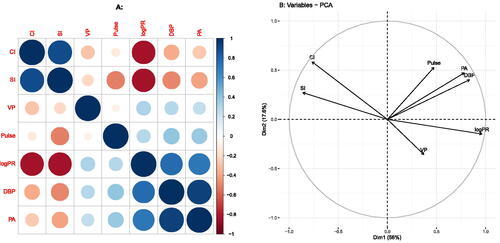
Both plots reveal two groups of positively correlated variables ((CI, SI) and (Pulse, DBP, PA, VP, logPR)) with negative correlations between the groups. In this article we focus on the visualization of correlations by means of vector and scatter diagrams, refraining from colored tabular representations as in . Despite the popularity of the correlation circle, from a statistical point of view, PCA gives a suboptimal approximation of the correlation matrix. PCA provides a least-squares low-rank approximation to the data matrix (centred or standardized), and the visualization of the correlation matrix can be seen as a by-product of the analysis, but not its main goal. Principal Factor Analysis (PFA) and correlograms (Trosset Citation2005) are multivariate methods more specifically designed for approximation and visualization of the correlation matrix. The main point of this article is to emphasize and illustrate the improvements offered by these and other methods and to stimulate their use over just using standard PCA for representing correlations. Also, as argued in Section 4, the correlation matrix requires goodness-of-fit measures that are different from ones shown in .
2 Materials and Methods
In this section we briefly summarize methods for the visualization of the correlation matrix using a well-known multivariate dataset, the Heart attack data (Saporta Citation1990, pp. 452–454). The original data consists of 101 observations of patients who suffered a heart attack, and for which seven variables are registered: the Pulse, the Cardiac Index (CI), the Systolic Index (SI), the Diastolic Blood Pressure (DBP), the Pulmonary Artery Pressure (PA), the Ventricular Pressure (VP) and the pulmonary resistance (logPR). Pulmonary resistance was log-transformed in order to linearize its relationship with the other variables. We successively address the representation of correlations by Principal Component Analysis (PCA), the Correlogram (CRG), Multidimensional Scaling (MDS), Principal Factor Analysis (PFA), and Weighted Alternating Least Squares (WALS). An additive adjustment to the correlation matrix is proposed to improve its visualization by PCA and WALS.
2.1 Principal Component Analysis
Principal component analysis is probably the most widely used method to display correlation structure by means of a vector diagram as given in . A correlation-based PCA can be performed by the singular value decomposition of the standardized data matrix (, scaled by
)
(1)
(1) where the left singular vectors are identical to the standardized principal components, and the right singular vectors are eigenvectors of the sample correlation matrix
since
(2)
(2)
where the eigenvalues of the correlation matrix are the squares of the singular values. The vectors (arrows) in the correlation circle are given by
, and represent the entries of the eigenvectors scaled by the singular values. A well-known property of this vector diagram is that cosines of angles θij between vectors approximate correlations, as from
it follows that
(3)
(3)
where
is the ith row of
. This equation holds true exactly in the full space when using all eigenvectors, but only approximately so if a subset of the first few (typically two) is used. Alternatively, one can use a PCA biplot (Gabriel Citation1971) to approximate the correlation matrix. We define a biplot as a joint display of the rows and the columns of a matrix that is optimal in a (weighted) least squares sense. In biplots it is common practice to use scalar products to approximate the entries of a data matrix of interest; the entries of the matrix are approximated by the length of the projection of one vector onto another, multiplied by the length of the vector projected upon. The PCA biplot of the data matrix (centred or standardized), with observations represented by dots and variables by vectors, is most well-known, though PCA also allows the approximation of the correlations by using scalar products between vectors. In the case of a correlation matrix, we have, using (2),
(4)
(4)
where
is the projection of
onto
. Biplots have been developed for all classical multivariate methods, and several textbooks describe biplot theory and provide many examples (Gower and Hand Citation1996; Yan and Kang Citation2003; Greenacre Citation2010; Gower, Gardner Lubbe, and Le Roux Citation2011). A goodness-of-fit measure, based on least-squares, of the correlation matrix is given by
(5)
(5)
where
is the rank two approximation obtained from (2) by using two eigenvectors only. We note that this measure is based on the squares of the eigenvalues, as detailed in the seminal paper by Gabriel (Citation1971), whereas the eigenvalues themselves are used to calculate the goodness-of-fit of the centered data matrix (See Section 3).
2.2 The Correlogram
The correlogram, proposed by Trosset (Citation2005), explicitly optimizes the approximation of correlations in a two or three dimensional subspace by cosines, by minimizing the loss function
(6)
(6) where
is a vector of angles with respect to the x axis, one for each variable, the first variable being represented by the x axis itself. EquationEquation (6)
(6)
(6) can be minimized numerically, using R’s function nlminb of the standard R package stats (R Core Team Citation2022). In a correlogram, vector length is not used in the interpretation, and all variables are therefore represented by vectors that emanate from the origin, and that have unit length, falling all on a unit circle (see ). A linearized version of the correlogram was proposed by Graffelman (Citation2013).
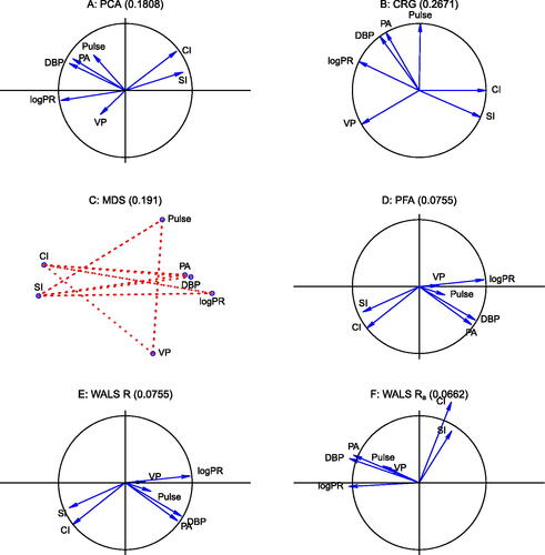
Fig. 2 Visualizations of correlation structure, using the Heart attack data. A: PCA biplot of the correlation matrix; B: Trosset’s correlogram; C: MDS map, with negative correlations indicated by dotted lines; D: Biplot obtained by PFA; E: Biplot obtained by WALS; F: Biplot obtained by WALS with scalar adjustment δ. The RMSE of the approximation is given between parentheses in the title of each panel.
2.3 Multidimensional Scaling
Hills (Citation1969) proposed to represent correlations by distances using MDS, and suggested to transform correlations to distances by using the transformation , after which they are used as input for classical metric multidimensional scaling (Mardia, Kent, and Bibby Citation1979, chap. 14), also known as principal coordinate analysis (PCO; Gower Citation1966). As a historical note, in order to reproduce Hills’ result, one actually needs to use the transformation
, implying Hills’ article referred to the squared distances. Importantly, with this transformation the relationship between correlation and distance is ultimately nonlinear. Using this distance, tightly positively correlated variables will be close (
), and tightly negatively correlated variables will be remote (
), whereas uncorrelated variables will appear at intermediate distance (
). Obviously, the diagonal of ones of the correlation matrix will always be perfectly fitted with this approach. In MDS, goodness-of-fit is usually assessed by looking at the eigenvalues. However, in this case the squared eigenvalues will be indicative of the goodness-of-fit of the double-centered correlation matrix, not of the original correlation matrix. In order to assess goodness-of-fit in terms of the Root Mean Squared Error (RMSE), as we will do for other methods, we will use the distances fitted by MDS (in two dimensions), and backtransform these to obtain fitted correlations in order to calculate the RMSE. A classical metric MDS of correlations transformed to distances by Hills’ transformation is equivalent to the spectral decomposition of the double-centered correlation matrix, which can be obtained from the ordinary correlation matrix by centering columns and rows with a centering matrix
. For the double-centered correlation matrix
, we have that
(7)
(7) with
. It follows that
is positive semidefinite, with rank no larger than
, and consequently, a configuration of points whose interpoint distances exactly represent the correlation matrix in at most p – 1 dimensions can always be found (Mardia, Kent, and Bibby Citation1979, sec. 14.2).
2.4 Principal Factor Analysis
The classical orthogonal factor model for a p-variate random vector , is given by
, where
is the matrix of p × m factor loadings,
the vector with m latent factors, and
a vector of errors. This model can be estimated in various ways. Currently, factor models are mostly fitted using maximum likelihood estimation, which also enables the comparison of different factor models by likelihood ratio tests. PFA is an older iterative algorithm for estimating the orthogonal factor model (Harman Citation1976; Johnson and Wichern Citation2002). It is based on the iterated spectral decomposition of the reduced correlation matrix, which is obtained by subtracting the specificities from the diagonal of the correlation matrix. A classical factor loading plot is in fact a biplot of the correlation matrix, since the factor model implicitly decomposes the correlation matrix as
(8)
(8) where
is the diagonal matrix of specificities (variances not accounted for by the common factors). A low-rank approximation to the correlation matrix, say of rank two, is obtained by
after estimating the two-factor model. This approximation is known to be better than the approximation offered by PCA, for it avoids the fitting of diagonal of the covariance or correlation matrix (Satorra and Neudecker Citation1998).
2.5 Weighted Alternating Least Squares
In general, a low-rank approximation for a rectangular matrix can be found by weighted alternating least squares, by minimizing the loss function
(9)
(9) where
is the ith row of
the jth row of
a matrix of weights and where we seek the factorization
. The unweighted case (wij = 1) is solved by the singular value decomposition (Eckart and Young Citation1936). Keller (Citation1962) also addressed the unweighted case, and explicitly considered the symmetric case. Bailey and Gower (Citation1990) considered the symmetric case with differential weighting of the diagonal. A general-purpose algorithm for the weighted case based on iterated weighted regressions (“criss-cross regressions”) was proposed by Gabriel and Zamir (Citation1979), Gabriel (Citation1978) also presented an application in the context of the approximation of a correlation matrix, where we have that
. Pietersz and Groenen (Citation2004) present a majorization algorithm for minimizing (9) for the correlation matrix. The fit of the diagonal of the correlation matrix can be avoided by using a weight matrix
, where
is a p × p matrix of ones, and
a p × p identity matrix. This weighting gives weight 1 to all off-diagonal correlations and effectively turns off its diagonal by assigning it zero weight. An efficient algorithm and R code for using WALS with a symmetric matrix has been developed by De Leeuw (Citation2006). The WALS approach can outperform PFA, for not being subject to the restrictions of the factor model. Communalities in factor analysis cannot exceed 1, which implies that the rows of the matrix of loadings
are vectors that are constrained to be inside, or in the limit, on the unit circle. In practice, PFA and WALS give the same RMSE if all variable vectors in PFA fall inside the unit circle, but WALS achieves a lower RMSE whenever a variable vector reaches the unit circle in PFA. This typically happens when a variable, in terms of the factor model, has a communality of one, or equivalently, zero specificity, a condition known as a Heywood case in maximum likelihood factor analysis (Heywood Citation1931; Johnson and Wichern Citation2002). In WALS, the length of the variable vectors is unconstrained, and vectors can obtain a length larger than one if that produces a better fit to the correlation matrix. Indeed, if a factor analysis produces a Heywood case, then this indicates that a representation of the correlation matrix by WALS that outperforms PFA is possible.
2.6 Weighted Alternating Least Squares with an Additive Adjustment
We propose a modification of the WALS procedure in order to further improve the approximation of the correlation matrix. By default, all vector diagrams (i.e., biplots) of the correlation matrix have vectors that emanate from the origin, the latter representing zero correlation for all variables; the fitted plane is constrained to pass through the origin. This does generally not provide the best fit to the correlation matrix. We propose an additive adjustment to improve the fit of the correlation matrix. By using an additive adjustment δ, the origin of the plot no longer represents zero correlation but a certain level of correlation. Consequently, the scalar products between vectors represent the deviation from this level. The optimal adjustment (δ) and the corresponding factorization of the adjusted correlation matrix can be found simultaneously by minimizing the loss function
(10)
(10) where the notation is again kept general (for rectangular
; in this article
and n = p). The adjustment amounts to subtracting an optimal constant δ from all entries of the correlation matrix, and factoring the so obtained adjusted correlation matrix
. The minimization can be carried out using the R program wAddPCA developed by de Leeuw (https://jansweb.netlify.app/), and included in the Correlplot package for the purpose of this article. For a correlation matrix, the minimization does, in general, yield
, though unique biplot vectors for each variable are easily obtained by a posterior spectral decomposition:
with
. The weighted least-squares approximation to
is then given by
, and the WALS biplot is made by plotting the first two columns of
; the origin of that plot represents correlation δ (See ).
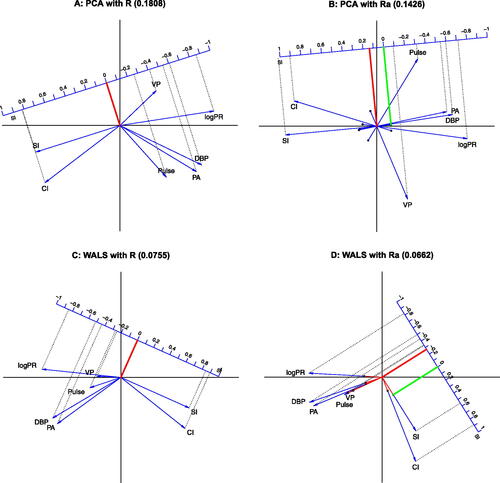
Fig. 3 Adjustment of the correlation matrix. All biplots have a calibrated correlation scale for SI. A: PCA biplot; B: PCA biplot using the δ adjustment; C: WALS biplot; D: WALS biplot using the δ adjustment. The interpretation of the biplot origin is shown by its projection (in red) onto the calibrated scale. Black dots on biplot vectors correspond to zero correlation for the corresponding variable. The interpretation of the black dot for SI is shown by its projection (in green) onto the calibrated scale. For positive δ, biplot vectors are extended beyond the biplot origin toward their zero point. For negative δ, tails of biplot vectors are colored in red for the negative part of the correlation scale.
We note that the additive adjustment is different from the usual column (or row) centering operation, employed by many multivariate methods like PCA, consisting of the subtraction of column means (or row means) from each column (or respectively, each row). It is also different from the double centering operation, used in MDS, that subtracts row and column means, but adds the overall mean. The adjusted correlation matrix preserves the property of symmetry. The additive adjustment can also be used in the unweighted approximation of the correlation matrix by the iterated spectral decomposition of , calculating δ on each iteration as
containing the scaled eigenvectors of
(analogously to (2)) in which case it can improve the fit to the correlation matrix obtained by PCA (See for an example), though this will not solve PCA’s problem of fitting the diagonal. It is thus most appealing to use the additive adjustment in the weighted approach.
3 Results
We present some examples of biplots of correlation matrices obtained by PCA and by using WALS with the δ adjustment. First, we successively apply all methods reviewed in the previous section to the Heart attack data, whose correlation matrix is given in , and compare them in terms of goodness-of-fit. Second, we provide some additional illustrative examples, using the Aircraft data (Gower and Hand Citation1996), the Swiss banknote data (Weisberg Citation2005) and an artificial equicorrelation matrix.
Table 1 Correlation matrix of the Heart attack data.
3.1 Heart Attack Data
We use the root mean squared error (RMSE) of the off-diagonal elements of the correlation matrix given by as a measure of fit for those methods that do not aim to approximate the diagonal (PFA and WALS), whereas we will include the diagonal for those methods that do try to fit the diagonal (PCA, CRG, and MDS). The panel plot in shows the results for PCA, CRG, MDS, PFA, WALS, and WALS with scalar adjustment δ.
shows a PCA biplot of the correlation structure, where correlations are approximated by the scalar products between vectors. The RMSE when using scalar products is 0.1808, whereas the RMSE obtained in PCA by cosines is 0.2945. shows the correlogram for the Heart attack data, which capitalizes on the representation by cosines. This representation decreases the RMSE to 0.2671 in comparison with cosines in PCA. shows an MDS plot of the correlation structure. To facilitate interpretation, intervariable distances larger than are marked with dotted lines to stress that they represent negative correlations. Variables that are not connected thus have a positive correlation. The plot indicates that SI and CI are positively correlated, and that these variables have negative correlations with all other variables. The plot also shows that PA, DBP, and PR form a positively correlated group. shows the factor loading plot obtained by PFA; this achieves a considerably lower RMSE of 0.0755 for not fitting the diagonal. Note that variable CI reaches the unit circle.
In we show the WALS biplot, which also avoids fitting the diagonal, but is also freed from the constraints of the factor model. Variable CI is now seen to slightly move out of the unit circle. The RMSE of WALS is the lowest of all methods in comparison with all previous methods; its RMSE is slightly below the RMSE obtained by PFA (0.075519 vs. respectively 0.075523). Maximum likelihood factor analysis of the data produces a Heywood case, with precisely CI achieving a communality of 100%. When an additive adjustment is used, we obtain . The corresponding biplot is shown in . With the adjustment, CI appears to stretch further, and the obtuse angles between the pair CI and SI and the remaining variables become smaller. The scalar adjustment further reduces the RMSE of the approximation to 0.06622, providing the best approximation to the correlation matrix.
The effect of the proposed adjustment is illustrated in more detail in , by using biplot axis calibration (Graffelman and van Eeuwijk Citation2005), for both PCA and WALS. Calibration of a biplot axis refers to the process of drawing tick marks with numeric labels along (mostly oblique) biplot vectors. Calibration can be used to illustrate the biplot interpretation rules, and to highlight a particular variable of interest. The earliest example of biplot calibration stems from Gabriel and Odoroff (Citation1990); formulas for carrying out the calibration have been developed by several authors (Gower and Hand Citation1996; Graffelman and van Eeuwijk Citation2005; Gower, Gardner Lubbe, and Le Roux 2011). In the R environment, calibration can be carried out with the package calibrate. In all panels of , variable SI has been calibrated in order to show the change in interpretation, and the calibrated scale for SI is shifted toward the margin of the plot (Graffelman Citation2011) to improve the visualization. Note that in the analyses with the δ adjustment (panels B and D), the origin of the scale for SI is no longer zero, but shifted by δ, as is emphasized by the projection of the origin onto the calibrated scale. The origin of the plot, where the biplot vectors emanate from, is represented by the values and
for panels B and D, respectively. The sample correlations of SI with all other variables and the approximations by the different types of analysis are shown in ; generally WALS with the adjusted correlation matrix most closely approximates the sample correlations, and has the lowest RMSE. The RMSE of all variables are shown in ; this shows that WALS considerably lowers the RMSE in comparison with PCA and that the representation of variable Pulse benefits from using the adjustment.
Table 2 Sample correlations () of SI with all other variables, and estimates of the sample correlations according to four biplots.
Table 3 RMSE of all variables for four methods.
Finally, we map observations onto the WALS correlation biplot by regression, as shown in , and compare the results with those obtained by PCA in . In PCA, the goodness-of-fit of the standardized data matrix is calculated from the eigenvalues and is 0.736; the goodness-of-fit of the correlation matrix (including the diagonal), calculated from the squared eigenvalues is 0.913. The correlation matrix thus has better fit than the standardized data matrix (see Section 4). In PCA, both principal components contribute to the goodness-of-fit, and these contributions neatly add up. shows the contributions of both axes to both the representation of the standardized data matrix (0.560 + 0.176 = 0.736) and to the correlation matrix (0.832 + 0.082 = 0.913). For WALS, the goodness-of-fit of the standardized data matrix is 0.729, only slightly below the maximum achieved by PCA. The scores of the patients for the principal components in have been scaled by multiplying by ; this way the unit circle drawn for the variables coincides exactly with the 95% contour of a multivariate normal density for the principal components. PCA actually provides a double biplot, since the projections of dots onto vectors approximate the (standardized) data matrix, and the projections of vectors onto vectors approximate the correlation matrix.
Fig. 4 Comparison of the double biplots of PCA and WALS. A: PCA biplot, reporting goodness-of-fit of both data and correlation matrix on each axis using eigenvalues. B: WALS biplot (without δ adjustment).
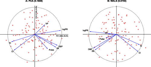
The WALS solution has different properties. First of all, there is no nesting of axes, that is, the first dimension obtained of a two-dimensional approximation is different from the single dimension obtained in a one-dimensional solution. Moreover, extracted axes are generally not uncorrelated. The goodness-of-fit of the correlation matrix is best judged by the RMSE of the off-diagonal correlations. In PCA the RMSE is 0.181 if the diagonal is included. By using WALS, the RMSE is more than halved, giving 0.0755 or 0.0662 if the adjustment is used. In this case, one could say the WALS solution halves the RMSE of the correlations at the expensive of sacrificing less than 1% of the goodness-of-fit of the standardized data matrix in comparison with PCA. WALS reduces the RMSE of all variables with respect to PCA (see ), VP, PA, DBP, and Pulse in particular. In the WALS biplot, the vectors for Pulse and VP appear shorter, reducing the exaggeration observed in PCA of the correlations of these two variables with DBP and PA, and CI and SI, respectively. The supplementary materials provide approximations of the correlation matrix obtained by all methods discussed.
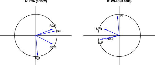
3.2 Aircraft Data
The Aircraft data consists of four variables, the specific power (SPR), the flight range factor (RGF), the payload (PLF) and sustained load factor (SLF), registered for 21 fighter aircrafts. This data has been described and analyzed by Gower and Hand (Citation1996). We here focus on the correlations between these four variables. shows the biplot of the correlation matrix obtained by a PCA of the standardized data. The RMSE of the representation of the correlation matrix (ones on the diagonal included) is 0.1362. If we apply WALS with the additive adjustment, we obtain an estimate for δ that is almost zero (3.3e-05), indicating that for this data, there is no benefit in using the adjustment. The corresponding biplot is shown in , and has a RMSE that is very small (0.0003), meaning the correlation structure is virtually perfectly represented in this two dimensional display. All variable vectors fall within the unit circle. For this case, the WALS representation is equivalent to the factor loading plot obtained in PFA. The biplot vectors obtained by WALS are shorter, which translates into smaller scalar products and therefore lower estimates of the correlation coefficients. Because PCA tries to fit the diagonal of the correlation matrix, it tends to stretch the biplot vectors toward unit length, and thereby exaggerates the correlations between the variables.
Fig. 5 Biplots of the correlation matrix of the Aircraft data. A: PCA biplot B: WALS biplot. The RMSE of the approximation is given in the title of each panel.
3.3 Swiss Banknote Data
The Swiss banknote data consists of six measurements of different size aspects of a banknote: the top margin (Top) and the bottom margin (Bottom) surrounding the image, the diagonal of the image on the banknote (Diagonal), the left and right height of the banknote (Left and Right respectively) and the horizontal length (Length) of the banknote. The original data consists of counterfeits and non-counterfeits (a hundred of each), of which we use the counterfeits only. shows the PCA correlation circle, and the correlation circle obtained by WALS with zero weights for the diagonal and using the δ adjustment. By using WALS we obtain a considerable lower RMSE (0.0467), and the origin of the WALS biplot represents a correlation of . To facilitate the interpretation of the WALS biplot, zero correlation is marked on the biplot vector of each variable with a black dot and the positive part of the correlation scale is shown in blue. Variable Bottom appears stretched outside the unit circle with respect to PCA; the dataset would have a produced a Heywood case in ML factor analysis. PCA and WALS biplots show two quite interpretable dimensions in the data: an apparent banknote size dimension represented by the outer size measurements Left, Right and Length, and an vertical centering of the image dimension represented by the opposition between Top and Bottom. Detailed RMSE statistics for each variable in show all variables improve their representation when the WALS biplot is used. The largest improvement is due to avoiding the fit of the diagonal of the correlation matrix. The PCA biplot exaggerates the negative correlation between Top and Diagonal, and also exaggerates the positive correlations of the group (Left, Right and Length). In general, WALS reduces the estimates of the correlations obtained by PCA toward zero. When a rank three approximation to the correlation matrix is considered, the RMSE obtained by PCA with three principal components decreases to 0.1447, whereas WALS obtains an almost perfect representation of
with a RMSE below 0.0002.
Fig. 6 Biplots of the Swiss banknote data. A: PCA biplot; B: WALS biplot. The RMSE of the approximation is given in the title of each panel.
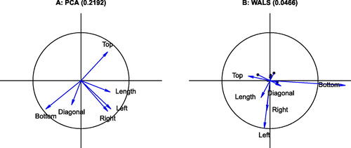
Table 4 RMSE of all variables for four methods.
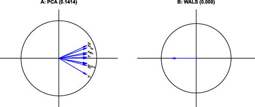
3.4 The Equicorrelation Matrix
We analyze a 10 × 10 equicorrelation matrix with a correlation of 0.5 between all pairs of variables. The PCA and WALS biplots are shown in . The RMSE of the approximation obtained with two principal components is 0.1414, whereas for WALS a the approximation of the correlation matrix turns out to be perfect (RMSE = 0). Though we use two-dimensional plots in , we show a rank one approximation for WALS, which already achieves a perfect approximation to . Quite obviously, the perfect rank one approximation is obtained by 10 coincident biplot vectors with norm
. Note that in order to achieve zero RMSE in PCA, all 10 dimensions would be needed. Again, PCA is hampered by having to fit the diagonal of ones of the correlation matrix.
Fig. 7 Biplots of a 10 × 10 equicorrelation matrix. A: PCA biplot; B: WALS biplot. Variable labels for the WALS biplot are not shown, as the 10 vectors coincide.
4 Discussion
Principal component analysis is widely used for making graphical representations, correlation circles, better termed biplots, of a correlation matrix. However, as shown in this article, the approximation to the correlation matrix offered by using the first two dimensions extracted by PCA is suboptimal, and a weighted alternating least squares algorithm that avoids the fitting of the diagonal outperforms PCA and other approaches. It is commonplace to analyze and visualize a quantitative data matrix by PCA, but it is questionable if that is really the best way to proceed. Indeed, it is shown with an example that an approximation of the correlation matrix by WALS and adding the observations to the biplot of the correlation matrix posteriorly by regression may be more interesting than PCA itself, because it capitalizes on the display of the correlation structure, possibly at the expense of only sacrificing a minor portion of explained variance of the data matrix. The WALS algorithm is powerful and deserves more attention; we suggest it as the default method for depicting correlation structure. The various approaches detailed in the article are all available in the R environment combined with the Correlplot R package. The examples in the article show the largest reduction in RMSE is obtained by turning off the diagonal of the correlation matrix; an additional but smaller gain results from using the proposed adjustment. The adjustment, when different from zero, changes the interpretation rules of the biplot: orthogonal vectors no longer correspond to correlation zero, but to correlation δ. Consequently, biplot vectors with sharp and obtuse angles no longer necessarily correspond to positive and negative correlations. To facilitate interpretation, marking the zero on the biplot vector is therefore recommended (See ). More practical data analysis, and eventually some simulation studies, will provide more insight on the benefit of the adjustment.
In a correlation-based PCA, the first eigenvalue is always larger or at worst equal to 1, as the first component will have a variance larger than that of one standardized variable. Trailing eigenvalues are smaller than 1, because the eigenvalues sum to p, the number of variables. Consequently, when eigenvalues are squared, the relative contribution of the first dimension increases. This implies that PCA generally does a better job at representing the correlation matrix than it does at representing the standardized data matrix, as is also the case for the Heart attack data studied in this article, at least if the diagonal of ones is included. The “variables plot” of the FactoMineR and factoextra R packages report, on its axes, the explained variability of the standardized data matrix, not of the correlation matrix (See ), for which the squared eigenvalues (, second entry on each axis) are needed. Ultimately, to report the goodness-of-fit (or error) of the approximation to the correlation matrix, the off-diagonal RMSE is the preferred measure for avoiding the unnecessary approximation of the ones, and for being directly interpretable as the average amount of error in the correlation scale.
Principal components are usually centered, therefore, have zero mean, they are orthogonal and uncorrelated. The axes extracted by the WALS algorithm generally do not have these properties. A centering of the WALS solution is not always convenient, because scalar products are not invariant under the centering operation, and centering the solution can therefore worsen the approximation. The scores obtained by WALS can, if desired, be orthogonalized by using the singular value decomposition; this has been used for most WALS biplots shown in this article.
The elegance and power of the WALS algorithm resides in its generality, as it encompasses most, if not all, types of analysis considered in this article. PCA can be performed by applying the WALS algorithm (9) to the column-centred data matrix. Hills (Citation1969) MDS of the transformed correlations can be carried out by WALS of a double-centred correlation matrix.
With regard to the preprocessing of the correlation matrix prior to analysis, obvious alternatives to using the proposed δ adjustment are column (or row) centering or a double centering operation prior to biplot construction. Column (or row) centering alone is not recommended, because this yields a nonsymmetric transformed correlation matrix. For biplot construction, the singular value decomposition of this matrix would be needed, leading to different biplot markers for rows and for columns. Consequently, each variable would be represented twice, by both a column and a row marker that differ numerically, leading to a more dense plot that is less intuitive to interpret. A double centering of the correlation matrix retains symmetry, but due to the double centering operation the origin no longer has a unique interpretation and represents a different value for each scalar product. If double centering is applied, then the representation of the correlations by distances, as proposed by Hills (Citation1969), is more convenient than the use of scalar products. The proposed additive adjustment retains symmetry and preserves the use of the scalar product for interpretation.
4 Supplementary Materials
R-package Correlplot: R-package Correlplot (version 1.0.8) contains code to calculate the different approximations to the correlation matrix and to create the graphics shown in the article. The package contains all datasets used in the article. R-package Correlplot has a vignette containing a detailed example showing how to generate all graphical representations of the correlation matrix (GNU zipped tar file).
Approximations: The file approximations.pdf contains the approximations to the correlation matrix of the Heart attack data. Each table in the supplement gives the sample correlations above the diagonal, and the approximations obtained with a particular method on and/or below the diagonal (PDF file).
Supplemental Material
Download Zip (262.4 KB)Acknowledgments
Part of this work (Graffelman Citation2022) was presented at the 17th Conference of the International Federation of Classification Societies (IFCS 2022) at the” Fifty years of biplots” session organized by professor Niël le Roux (Stellenbosch University) in Porto, Portugal. We thank two anonymous reviewers whose comments on the manuscript have helped to improve it.
Disclosure Statement
The authors report there are no competing interests to declare.
Additional information
Funding
References
- Bailey, R., and Gower, J. (1990), “Approximating a Symmetric Matrix,” Psychometrika, 55, 665–675. DOI: 10.1007/BF02294615.
- De Leeuw, J. (2006), “A Decomposition Method for Weighted Least Squares Low-Rank Approximation of Symmetric Matrices,” Department of Statistics, UCLA. Available at https://escholarship.org/uc/item/1wh197mh.
- Eckart, C., and Young, G. (1936), “The Approximation of One Matrix by Another of Lower Rank,” Psychometrika, 1, 211–218. DOI: 10.1007/BF02288367.
- Friendly, M. (2002), “Corrgrams: Exploratory Displays for Correlation Matrices,” The American Statistician, 56, 316–324. DOI: 10.1198/000313002533.
- Gabriel, K. R. (1971), “The Biplot Graphic Display of Matrices with Application to Principal Component Analysis,” Biometrika, 58, 453–467. DOI: 10.1093/biomet/58.3.453.
- Gabriel, K. R. (1978), “The Complex Correlational Biplot,” in Theory Construction and Data Analysis in the Behavioral Sciences, eds. S. Shye, pp. 350–370, San Francisco, CA: Jossey-Bass.
- Gabriel, K. R., and Odoroff, C. L. (1990), “Biplots in Biomedical Research,” Statistics in Medicine, 9, 469–485. DOI: 10.1002/sim.4780090502.
- Gabriel, K., and Zamir, S. (1979), “Lower Rank Approximation of Matrices by Least Squares with any Choice of Weights,” Technometrics, 21, 489–498. DOI: 10.1080/00401706.1979.10489819.
- Gower, J. C. (1966), “Some Distance Properties of Latent Root and Vector Methods used in Multivariate Analysis,” Biometrika, 53, 325–338. DOI: 10.1093/biomet/53.3-4.325.
- Gower, J. C., Gardner Lubbe, E., and Le Roux, N. (2011), Understanding Biplots, Chichester: Wiley.
- Gower, J. C., and Hand, D. J. (1996), Biplots, London: Chapman & Hall.
- Graffelman, J. (2011), “A Universal Procedure for Biplot Calibration,” in New Perspectives in Statistical Modeling and Data Analysis, Studies in Classification, Data Analysis and Knowledge organization, eds. S. Ingrassia, R. Rocci, and M. Vichi, pp. 195–202, Berlin, Heidelberg: Springer-Verlag.
- Graffelman, J. (2013), “Linear-Angle Correlation Plots: New Graphs for Revealing Correlation Structure,” Journal of Computational and Graphical Statistics, 22, 92–106.
- Graffelman, J. (2022), “Fifty Years of Biplots: Some Remaining Enigmas and Challenges,” in 17th Conference of the International Federation of Classification Societies (IFCS 2022). Classification and Data Science in the Digital Age. Book of Abstracts, CLAD - Associação Portuguesa de Classificação e Análise de Dados (ed.), p. 40. Available at https://ifcs2022.fep.up.pt
- Graffelman, J., and van Eeuwijk, F. A. (2005), “Calibration of Multivariate Scatter Plots for Exploratory Analysis of Relations Within and between Sets of Variables in Genomic Research,” Biometrical Journal, 47, 863–879. DOI: 10.1002/bimj.200510177.
- Greenacre, M. J. (2010), Biplots in Practice, Bilbao: BBVA Foundation. Rubes Editorial.
- Harman, H. H. (1976), Modern Factor Analysis (3rd ed.), Chicago, IL: University of Chicago Press.
- Heywood, H. (1931), “On Finite Sequence of Real Numbers,” Proceedings of the Royal Society of London, Series A, 134, 486–501.
- Hills, M. (1969), “On Looking at Large Correlation Matrices,” Biometrika, 56, 249–253. DOI: 10.1093/biomet/56.2.249.
- Johnson, R. A., and Wichern, D. W. (2002), Applied Multivariate Statistical Analysis (5th ed.), Hoboken, NJ: Prentice Hall.
- Kassambara, A. (2017), Practical Guide To Principal Component Methods in R: PCA, M (CA), FAMD, MFA, HCPC, factoextra (Vol. 2), STHDA.
- Kassambara, A., and Mundt, F. (2020), factoextra: Extract and Visualize the Results of Multivariate Data Analyses. R package version 1.0.7. https://CRAN.R-project.org/package=factoextra
- Keller, J. (1962), “Factorization of Matrices by Least-Squares,” Biometrika, 49, 239–242. DOI: 10.1093/biomet/49.1-2.239.
- Lê, S., Josse, J., and Husson, F. (2008), “FactoMineR: A Package for Multivariate Analysis,” Journal of Statistical Software, 25, 1–18. DOI: 10.18637/jss.v025.i01.
- Mardia, K. V., Kent, J. T., and Bibby, J. M. (1979), Multivariate Analysis, London: Academic Press.
- Murdoch, D., and Chow, E. (1996), “A Graphical Display of Large Correlation Matrices,” The American Statistician, 50, 178–180. DOI: 10.2307/2684435.
- Pietersz, R., and Groenen, P. J. F. (2004), “Rank Reduction of Correlation Matrices by Majorization,” Quantitative Finance, 4, 649–662. DOI: 10.1080/14697680400016182.
- R Core Team (2022), R: A Language and Environment for Statistical Computing, Vienna, Austria: R Foundation for Statistical Computing. https://www.R-project.org/
- Rodgers, J. L., and Nicewander, W. A. (1988), “Thirteen Ways to Look at the Correlation Coefficient,” The American Statistician, 42, 59–66. DOI: 10.2307/2685263.
- Saporta, G. (1990), Probabilités analyse des données et statistique, Éditions technip, Paris.
- Satorra, A., and Neudecker, H. (1998), “Least-Squares Approximation of Off-Diagonal Elements of a Variance Matrix in the Context of Factor Analysis,” Econometric Theory, 14, 156–157.
- Trosset, M. W. (2005), “Visualizing Correlation,” Journal of Computational and Graphical Statistics, 14, 1–19. DOI: 10.1198/106186005X27004.
- Wei, T., and Simko, V. (2021), R Package ’corrplot’: Visualization of a Correlation Matrix. (Version 0.92). https://github.com/taiyun/corrplot
- Weisberg, S. (2005), Applied Linear Regression (3rd ed.), Hoboken, NJ: Wiley.
- Wright, K. (2021), corrgram: Plot a Correlogram. R package version 1.14. https://CRAN.R-project.org/package=corrgram
- Yan, W., and Kang, M. (2003), GGE Biplot Analysis: A Graphical Tool for Breeders, Geneticists, and Agronomists, Boca Raton, FL: CRC Press.