
Abstract
Online interactive 3D visualizations can enhance understanding of the built environment, including non-physical aspects such as property value and price. With access to large-scale open datasets, a key challenge in building such interactive 3D mapping interfaces is the efficiency of visualization methods. Modern GPU-accelerated front-end mapping libraries present a solution to this problem. This research proposes a ‘front-end’ native approach to create a web-based visual analytics framework for large scale spatiotemporal data. The Australian Property Market Explorer exemplifies this framework by visualizing a large dataset of property sales in New South Wales, Australia. This tool allows users to explore and analyse property market patterns at various geographic scales. The proposed framework offers advantages over traditional methods such as scalability and reliability while promising use-cases such as aiding planners in infrastructure and transportation decisions and assisting property valuation professionals in analysing property price trends.
Introduction
Online interactive 3D visualization has always been a valuable tool in the field of urban planning and design. It enables designers and planners to visualize the built environment in a way that not possible through other mediums such as maps, charts, tables etc. A good 3D visualization allows the users to explore complex characteristics of built environment with ease and gain actionable insights about them. Although traditionally 3D visualizations are created and used to understand and communicate the physical characteristics of the built environment, it also has a wide variety of uses in understanding the other intrinsic characteristics of the built environment such as quality, age, value, price etc. and dynamic characteristics such as usage, occupancy, flow of people and services etc. With availability of detailed, large scale, open datasets pertaining built environment is becoming increasingly freely available, there is immense value in using the 3D visualization techniques for visualizing non-physical characteristics.
There has been significant work done in the fields of geography, Geographic Information Systems (GIS), cartography, computer aided design (CAD) on creating and publishing 3D visualizations of spatial data. Although they have been built for visualizing physical form, traditional geographic tools such as QGIS, ArcGIS, CityEngine etc. have intrinsic capabilities in visualizing non-spatial characteristics of natural and built environment in 3D dimensions. Specialized 3D modelling tools such Lumion, 3Ds Max, Rhino etc. could also create data-driven 3D visualizations they need to interface with equally specialized complex coding platforms such as grasshopper. While the GIS based tools can handle large scale datasets, they suffer from not being able to use the native 3D visualization capabilities enjoyed by specialized 3D software. On the other hand, 3D modelling tools can produce aesthetically pleasing and accurate representations but suffer from scalability issues where they cannot be used to visualize large national or regional level datasets. Both these approaches also have issues in publishing the outputs to the users in an interactive online format where they rely on web-based mapping libraries such as Google Maps, MapBox etc. The region where the paradigms from these two sets of 3D visualization tools converge is where modern Graphics Processing Unit (GPU) accelerated front-end mapping libraries shine. Front-end 3D mapping libraries such as MapBoxGL and DeckGL are extremely good at both creating aesthetically pleasing 3D artifacts and rendering them at large scale in the order of points in multiple of millions. They achieve this by building on top of graphics libraries such as OpenGL, LumaGL which uses the efficiencies offered by the GPUs of computers. They also use the interoperability offered by web-based technologies such as WebGL, protocol buffers to able to create outputs which can be accessed by users over the internet and used interactively through their browsers.
This research focusses on the question – Can we utilize GPU based techniques to create aesthetically pleasing and useful interactive visualizations using large scale datasets related to built environment?. The research explores using one such GPU accelerated 3D mapping library – DeckGL to create a framework for creating seamless, web-based, interactive 3D visualizations driven by large scale geo-spatial data for use within the field of urban planning and design. This framework was created by selecting multiple modules each handling one aspect of the visualization such as database, vector tiling, REST API etc. and combining them using a micro-services architecture. This provides the benefit of using tools which are the most efficient in the given task and allowing applications built using framework to scale up seamlessly with an increase in the size of data and number of users. The research implements the framework to create an online, web-based 3D tool – Australian Property Market Explorer (APME) to visualize a large dataset of property sales in the state of New South Wales, Australia. The tool demonstrates the efficiencies offered by the framework and enables multiple stakeholders in the property industry such as urban planners, buyers, sellers, lenders etc to explore the large dataset easily and derive insights to inform their decisions. This paper shows two such use cases where a planner can perform visual analytics on vast amounts of data quickly and understand the spatio-temporal evolution of property markets across the state and a valuation expert can explore the dataset to identify patterns in the sales which are readily apparent in traditional methods of analysis and visualization.
The rest of the paper is structured as follows – The literature section reviews prior work in creating and sharing 3D visualizations of geo-spatial data with a particular focus on web-based front-end tools. The methodology section describes the proposed visualization framework along with a detailed description of the implementation of the APME tool. This is follwed by discussion on two specific use cases for the framework and the tool while exploring the current limitations and potential future work.
Literature
A scoping review of literature was conducted to ascertain the need and scope of the prior work in using 3D visualizations for studying aspects of built environment beyond their physical look. The review was conducted broads under 3 key topics – 3D visualization approaches across various fields relating to built-environment, latest developments in GPU accelerated visualization techniques and finally application of such technologies in areas such as urban planning and property development.
3D visualization for study of built environment
Spatial and geographic data visualization is a critical aspect of geographic information systems (GIS) that involves the use of interactive and immersive data visualization techniques. It plays a significant role in information exchange, decision-making, problem-solving and analytical processing in various industries, especially in urban planning, property management, environmental science, health, transport and homeland security (Krygier and Wood Citation2016). In the last two decades, the development of web mapping services and GPU accelerated front-end mapping platforms which utilize graphics libraries such as WebGL have significantly improved the efficiency of spatial data visualization (Zunino et al. Citation2020). Web mapping has emerged as an important tool because it provides an intuitive way of accessing and using spatial data and geographical information available on the web. It allows users to interact with spatial data on the web, enabling the visual display, querying, and analysis of maps that are dynamically generated (Smith Citation2016). With the deluge of open data across the world relating to cities, the quick and easy visualization of such vast dataset is a significant first step in realizing the value offered by these large datasets (Hawken, Han, and Pettit Citation2020). One of the significant limitations in creation and widespread utilization of such systems has been the increasing scale and complexity of the datasets which makes it challenging to create a multi-scale spatiotemporal analysis framework (Davis, Kimo, and Duarte-Figueiredo Citation2009; Tsou Citation2015). In this context, there is immense value in the use of technological advancements, in particular, GPU accelerated front-end mapping platforms to overcome this challenge.
Latest developments in visualization technologies
There have been several advancements in the field of geographic visualization in the last decade which are improving the usability, access and efficiency of displaying large amounts of spatial data in a clearly, legible manner. GPU-accelerated computing leverages the power of graphics processing units to perform computation in applications traditionally handled by the CPU. The GPU accelerated libraries such as MapBoxGL (Eriksson and Rydkvist Citation2015), Cesium JS (Larsen et al. Citation2017) and Deck.gl (Yang Citation2019) have improved the efficiency of web mapping on 3D canvas on client side browsers by allowing large amounts of data to be rendered, manipulated and analyzed quickly (Gui et al. Citation2020). Their capability to handle multiplicity of layers, varying resolutions and transformations has changed the way we work with geographic data. There have also been advancements in broader computer science and software engineering such as containerization (Pittard and Li Citation2020) and component-based UI (Bhalla, Garg, and Singh Citation2020) which support these graphics libraries to be created and deployed with an unprecedented scale and ease. All these developments pose a unique opportunity for us to reimagine the web mapping and interactive data visualization by developing a framework which utilizing front-end GPU rendering and microservices/containerization at the backend. Despite this, there are several challenges in spatial and geographic data visualization including in data dimensionality, quality of data, representation of uncertainty, and user interaction with the data (MacEachren and Kraak Citation2001). There is also the challenge of visualizing dynamic spatial phenomena such as movement and change (Robinson Citation1960). Other modern challenges include ensuring cross-platform compatibility, data privacy and accessibility (Dransch, Rotzoll, and Poser Citation2010).
Applications in urban planning & decision-making
In urban planning and the property industry, spatial data visualization plays a pivotal role. Town planners utilize these tools to visualize and present information about the urban landscape. Planners can illustrate complex urban issues through interactive visualization methods, which assist in data exploration, problem understanding and communication with different stakeholders (Allam and Dhunny Citation2019). Decisions made using these visual insights tend to be more efficient, as they harness the power of place-based data (Pettit et al. Citation2012; Pettit, Lieske, and Jamal Citation2017). Recent studies show that online interactive visualization contributes immensely to urban planning and property management such as comparative mapping and visualization of urban data from different cities (Batty Citation2013; Davern et al. Citation2023) and online visualization systems for real-time monitoring of urban dynamics (Kitchin, Lauriault, and McArdle Citation2015). Similarly, the property industry benefits from spatial visualization. Property evaluators can appraise and present data visually, revealing patterns and helping in the decision-making process. The field of property assessment, acquisition and marketing are empowered by the advancements in spatial visualization, particularly when dealing with extensive data (Lorenz and Dollner Citation2010).
To conclude, spatial and geographic data visualization has seen impressive advancements and plays a crucial role in urban planning and property management. Although various challenges exist, the innovations in web mapping and GPU-accelerated front-end mapping platforms allow for the efficient and effective visualization of data. Literature shows that there are significant value additions in applications such as urban planning and property management when these advancements are used to visualize and interpret vast amounts of data in a user-friendly and informative manner.
Methodology
This study addresses the above-mentioned research need by developing a visualization framework using a ‘unified processes’ framework along with a component-based model that is implemented on an incremental basis (Mnkandla Citation2009). This approach aims to provide a systematic method for developing the visualization framework and the subsequent tool – Australian Property Market Explorer. Evaluation of this tool is conducted through qualitative discussion, using case studies to demonstrate its practicality and efficiency in real-world applications. The overall methodology involves the following steps – delineation of components, selection of tools, composition of tools, choosing the use case and relevant data and finally, implementation of the visualization tool.
Visualization framework
To establish a framework for visualization, the initial step is to delineate the components involved. The primary component is the raw data, which can exist in various formats and does not necessarily need to be incorporated into the operational aspects of the framework. These data should be stored persistently, in a data storage medium such as a disk or a cloud storage service such as simple storage service (s3) and need to undergo processing to be transformed into a more easily attainable format, such as a database. Additionally, the data must be geocoded and merged based on geographical attributes to facilitate efficient visualization. This is accomplished using various programming languages, such as R or Python, and it may be suitable to incorporate native tools like GDAL during certain stages of the processing. These tools can be organized and connected using a versatile scripting language, such as bash, Perl or PowerShell. Given that this processing occurs in a singular direction, complex input formats and protocols are not required. This leads us to the data transformation component which takes the raw data as input and produces tables for the database as output. This component is also responsible for writing the data into the database after the creation of the appropriate structure for it.
The subsequent and critical component is the database, which must be capable of executing geographic functions and linking with other services, such as tile-servers, tiling software, or REST API servers. A relational database possessing geographic capabilities, such as PostgreSQL (with the PostGIS extension) or MySQL/MariaDB would be suitable for this purpose. The tile-server component is responsible for translating the data into tiles, which are discrete packets that pertain to the specific geographic area displayed on a map. This process significantly reduces the volume of data handled by the visualization at any given moment, thus enhancing responsiveness for the end user. The tile-server filters the database data based on the viewport (bounds/latitude-longitude-zoom), generalizes the data according to the zoom level, and excludes non-essential geographies in the case of numerous small geometries. Several dynamic tile servers are available, such as Martin and PG_Tile_Serve, as well as static tile generators like Tippecanoe and TileMill. Establishing a connection between the database and a REST API server could prove valuable, as it would allow querying of the data from the front-end without necessitating direct access to the database. An example of such a server is Postgrest for PostgreSQL. Additionally, custom REST API endpoints can be developed. The front-end application combines geographic data from the tile server with other data obtained from REST APIs, merging them with user interface (UI) elements to constitute a comprehensive application. For drawing maps, front-end libraries like Deck.gl and MapBoxGL can be employed, while frameworks like React, Angular and Vue can be utilized for the development of the UI. Lastly, a web server can be leveraged to route requests to each component at the front-end level, and to cache query results to improve application speed and reduce the load on individual services. To scale the services and components to include substantial number of users, each component can be containerized and multiple instances of them can be instantiated and orchestrated using tool such as Docker or Kubernetes. The framework is illustrated in Figure .
Figure 1. The proposed visualization framework.
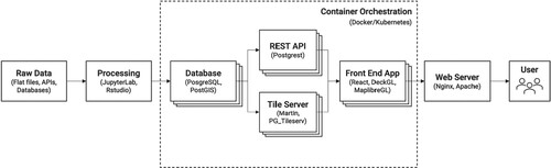
The biggest advantage of such ‘micro-services’ based architecture is that each component in the framework can be independently selected based on the most suitable tool for a given task. Furthermore, they can be updated, maintained, and scaled independently without disrupting the overall system. They can also be scales by adding more ‘clones/instances’ in line with the number of users of the systems. However, such framework increases the complexity which requires meticulous orchestration and proper networking between the components to ensure a smooth operation. It also makes it much more challenging to identify, troubleshoot and fix issues in the system.
Australian Property Market Explorer (APME)
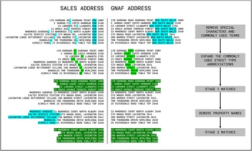
This theoretical framework was implemented as an openly available, online, interactive application – Australian Property Market Explorer, a system that visualizes property sales data for New South Wales, Australia. The data on property sales were released by the Office of the Valuer General, NSW as open dataset from their website where they update and publish these sales and valuations in weekly basis. The historical extract of this dataset covering sales of properties from 1990 is also available for download from the website (NSW Citation2022). Although the dataset is extensive in the historical coverage and details of the property sale, the first challenge in using this data was the lack of ready to use location data in them. Each record is identified a text-based address field which needs to be geo-coded into geographic coordinates. This process was conducted using a simple, bespoke address matching algorithm which matches the address text to Geocoded National Address File – GNAF database (Geoscape Citation2022) in multiple steps such as cleaning the text for special characters, standardizing abbreviations, removing specialized property names, and possibly removing non-standard address information to standardize the address field across the Valuer General and GNAF datasets. A summary of this process has been illustrated in Figure . This matching algorithm resulted in a 96% hit rate where most of the errors occurring in urban areas with large high-rise developments and frequently changing addresses. After geo-coding, the dataset was further cleaned to create a standardized and consistent information on the classification of the property under sale in terms of its current use and zoning.
Figure 2. Summary of the algorithm which matches address from VG sales to GNAF.
This core dataset was augmented from boundary information from Australian Bureau of Statistics (ABS). The boundaries included were – ABS structures from State to Statistical Areas 1, non-ABS structures such as suburbs and postcode. These boundaries were organized according to their overall hierarchy. The previous large dataset on sales in then linked to the boundaries at every level using their geographic coordinates. This when implemented as a relational database, allows the users to query the sales and price for every boundary area in a dynamic manner. In addition to ABS boundaries, the sales dataset was also aggregated to a 500 m × 500 m grid and yearly volume (number of sales) and median price were pre-calculated for every year since 1990.
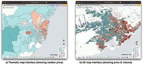
With the core dataset selected and set up, the next step in implementing the framework is to select and customize tools for each component. The tools selected were – Postgres with PostGIS extension for the database, martin for the tile-server, Postgrest for the RESTAPI, nginx for webserver, Deck.gl for front-end, docker for containerization and docker-compose for orchestration. When combined with the front-end user interface (UI) elements, the APME system can create and display thematic maps of property sales across New South Wales in an easy to use, seamless and useful manner. The 500 × 500 m grid was implemented as a 3-Dimensinal layer where the height of the grid shows the number of sales and colour shows the median price. The final published version of the visualization which allows the users to conduct visual analytics on the dataset with 15 million datapoints as shown in Figure .
Figure 3. The screenshots of the Australian Property Market Explorer. Image source: Australian Property Market Explorer, 2023.
Discussion
The primary advantage of the APME toolkit is the efficiency and effectiveness it offers the users while looking at large datasets compared to a traditional web mapping interfaces such as Google Maps or Leaflet (Yang Citation2019; Zunino et al. Citation2020). The framework and subsequently APME tool’s ability to handle vast amounts of data is exemplified by its ability to process 15 million records without any perceptual delay while interacting with the map. Furthermore, the ‘front-end’ based design of the tool allows it to scale seamlessly, accommodating increasing user numbers effortlessly since the most compute intensive tasks are handed over to the users’ systems. The GPU based libraries are optimized to use the user’s graphics processors and can provide comparable results even in low power systems such as mobiles and tablets. The deployment architecture, which utilizes containers, further supports scalability for a larger user base by independently increasing the number of containers that service each component. Importantly, the system being developed possesses a data-agnostic nature, which means it can adapt to several types of data sets. The tool offers remarkable efficiencies in visual analytics as it allows the users to visualize and explore datasets and arrive at insights which would traditionally take multiple days to accomplish thus streamlining the process while greatly enhancing productivity and efficiency. This versatility of the tool allows for the extension of its functionality beyond its current scope, enabling it to cater to multiple use cases. In its current form, APME has notable applications such as property price/value modelling and urban planning.
Use case 1 – property value modelling
Understanding the value of properties holds significant importance in several contexts, including decision-making, investment strategies and economic analysis. To successfully model property value, advanced statistical methods are employed comparing property sales information with various property characteristics in both spatial and temporal dimensions. A crucial aspect of this modelling process involves leveraging effective visual analytics techniques which can enable users to gain valuable insights pertaining to the factors that influence property prices within specific locations. Through a granular and comprehensive analysis of the volume and pricing of property sales, patterns and anomalies can be identified, prompting further investigation.
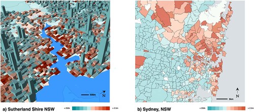
For instance, Figure a showcases a visual representation of the median price of residential properties in Sydney in relation to their proximity to the coastline. Evidently, a clear negative correlation between these two variables can be observed. This insight was further confirmed and quantified by the study carried out by (Gao et al. Citation2022)., who utilized advanced machine learning-based modelling techniques to establish the significance of this factor in the valuation of properties. Another example is illustrated in Figure b, where a simple visual exploration reveals a larger regional phenomenon. By examining the median price at the SA2 level, a distinct division between the Northeast and Southwest areas of Sydney becomes apparent which suggests the presence of underlying disparities in terms of demographics, infrastructure, employment opportunities and housing affordability, necessitating further exploration and analysis (Lee, Piracha, and Fan Citation2018; Ng et al. Citation2022).
Figure 4. Visual analytics assisting property value modelling in Sydney. Image source: Australian Property Market Explorer, 2023.
Use case 2 – urban planning
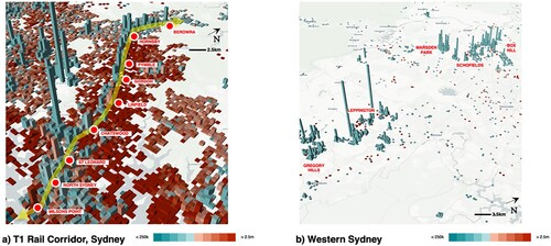
In the field of urban planning, the application of visual analytics has become increasingly important in understanding and analyzing property sales data. By utilizing visual representations such as maps, charts and diagrams, urban planners can gain insights into the patterns and trends of property sales in specific areas, aiding in making informed decisions for future urban development. This can be particularly useful when examining the growth along transport corridors, as demonstrated by the example of the ‘North Shore T1’ Railway line in Sydney which connects Berowra to Redfern.
Figure a provides a visual representation of the residential property volume along the T1 line in Sydney. It highlights a higher density of apartments across the railway stations along this corridor. The visualization enables urban planners who are doing Transit Oriented Design (TOD) to identify areas with higher population density and smaller apartment sizes, suggesting a potential need for infrastructure improvements or adjustments in urban planning strategies. By examining this data, planners can focus on these areas to ensure adequate housing supply and consider the implications for transportation and other services. Furthermore, Figure b displays the sales of vacant land in Sydney, providing insights into major upcoming developments and population growth in the future which would require significant transport infrastructure to service them. The visualization identifies areas such as Box Hill, Marsden Park, Schofields in the north-western region, and Leppington, Gregory Hills in the southwestern region as locations with a considerable number of new houses being constructed. This information can assist urban planners in predicting future housing demands, allowing for proactive planning and infrastructure development to accommodate the growing population.
Figure 5. Use of APME in Urban Planning Applications. Image source: Australian Property Market Explorer, 2023.
Moreover, visual analytics can also help in tracking the impact of infrastructure on property sales and identifying outlier areas. For instance, the example of Strathfield, a low-density neighbourhood connected by a fast train from the CBD, demonstrates a significant difference in median price compared to neighbouring Homebush. By employing visual analytics, urban planners can observe these variations and delve deeper into the reasons behind them. This information can guide planners in understanding the impacts of infrastructure development on property values and inform future decisions regarding investment in similar areas. This visual analytics approach fosters evidence-based planning, ultimately leading to more efficient and sustainable urban environments and forms the basis for a deeper data-driven modelling approach (Pettit et al. Citation2020).
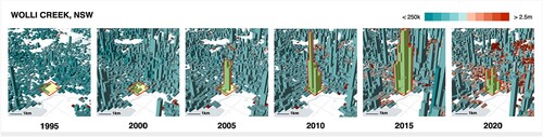
Furthermore, an analysis of property markets on a broader scale can be conducted using the Australian Property Market Explorer (APME). Figure displays the volume and price of property sales specifically in the suburb of Wolli Creek in New South Wales. The data reveals distinct patterns in the trajectory of property market in Wolli Creek. The process of urban densification, along with increased apartment construction, commenced around 2005. This concerted effort continued until 2015, during which a substantial number of new properties were sold. An interesting aspect to note is that despite this surge in supply, property prices in Wolli Creek have remained relatively stable throughout the years, even as recent as 2020. The effect of change in planning policy and controls in the area of Wolli Creek is evident in the tool, which shows the potential for planners to identify and monitor the results of their decision-making on a regular basis.
Figure 6. Evolution of property market in Wolli Creek, NSW (1990–2020). Source: Australian Property Market Explorer.
Limitations
A major limitation of this project is the availability of open data and the licensing of large longitudinal comprehensive datasets. The state of New South Wales (NSW) serves as a prime example of how the release of such data in an open manner can greatly enhance its value. However, when attempting to scale this project to a national level, several challenges arise. Firstly, the way data is collected and released differs between jurisdictions, making aggregation and analysis difficult while data aggregation is often performed at various levels to safeguard the privacy of homeowners. Additionally, some jurisdictions have commercialized the data (Land Services SA Citation2023), thereby restricting its use by the community in an open manner.
On the technical side, the primary weakness of the framework lies in the complexity of building and maintaining a scalable system of this nature. The continuous operation of such an online tool necessitates expertise in orchestration and ongoing resources dedicated to ensuring its uptime. Furthermore, since the system components are deployed as containers, it becomes challenging to identify and resolve issues within the production environment.
The current iteration of the tool is limited to the visual display of information, offering various filtering options. However, it lacks an interactive feedback mechanism that would enable users to manipulate elements on the map and observe their impact. For example, by integrating a population projection model and an editable layer of infrastructure, the system could allow individuals to modify existing infrastructure or population numbers and observe how these changes interact with one another. This interactive feature would greatly enhance the user experience and provide a more dynamic and customizable tool.
Furthermore, it is important to note that the current implementation of the tool has a cut-off date of 2020. To ensure its ongoing relevance and usefulness, an automated data ingestion mechanism should be put in place. This would enable the tool to stay updated with the latest data automatically, providing users with the most accurate and up-to-date information.
Conclusions
In conclusion, this work explores the use of online interactive 3D visualization to make property valuation data more accessible geospatially across a city so that visually trends and patterns can be explored by property analyst and others who shape the fabric of the built environment. It highlights the value of using 3D visualizations to understand not only the physical characteristics of the built environment but also the non-physical and dynamic characteristics and the ways it would enhance the value offered by large, comprehensive, longitudinal open datasets pertaining built environment. The paper focuses on the use of GPU accelerated 3D mapping library, DeckGL, to create a framework for creating web-based, interactive 3D visualizations driven by large-scale geospatial data. This framework is implemented in the Australian Property Market Explorer (APME) tool, which visualizes a large, longitudinal, and open dataset of property sales in New South Wales, Australia. The paper presents the methodology of the framework, which involves various components such as data processing, database, tile-server, REST API, front-end application and web server. The framework is designed to be scalable, allowing it to handle large datasets and accommodate increasing user numbers. The APME tool demonstrates the efficiency of the framework by processing 15 million records without significant delay and highlights the versatility of the tool in property value modelling and urban planning.
The use cases discussed in the paper illustrate how the APME tool enables users to gain valuable insights from large datasets quickly and efficiently. Property value modelling can be enhanced by visualizing the correlation between property prices and numerous factors such as proximity to the waterfront or regional disparities. Urban planning can benefit from visual analytics by understanding patterns and trends in property sales, tracking the impact of infrastructure on property values, and making informed decisions for future development. Overall, the paper highlights the advantages of the framework and the APME tool in handling large-scale geospatial data and providing efficient visual analytics capabilities. It also shows that the framework and tool presented offer a valuable contribution to the field of urban planning and property valuation by providing a seamless, web-based, interactive 3D visualization solution for large-scale geospatial data.
Future work could involve exploring additional functionalities and enhancements for the framework and tool such as inclusion of elements where the users can modify objects in the visualization and see the results of the change in real-time thus making the visualization suitable for collaborative urban planning and design processes such as ‘Geo-Design’. Such extension could also be enhanced by introducing components to the framework which can run property valuation models and display the results. The front-end and UI aspects of the framework could be further improved by conducting user evaluations to validate the effectiveness of the visualization approach and objectively benchmarking the efficiency of the framework compared to traditional web mapping and visualization platforms.
Disclosure statement
No potential conflict of interest was reported by the author(s).
Data availability statement
The data that support the findings of this study are available in Housing Data Exchange at https://housing-data-exchange.ahdap.org/dataset/nsw-valuer-general-sales. These data were derived from the following resources available in the public domain https://valuation.property.nsw.gov.au/embed/propertySalesInformation and https://www.abs.gov.au/census/find-census-data/datapacks.
References
- Allam, Z., and Z.A. Dhunny. 2019. “On Big Data, Artificial Intelligence and Smart Cities.” Cities 89:80–91. https://doi.org/10.1016/j.cities.2019.01.032.
- Batty, M. 2013. “Big Data, Smart Cities and City Planning.” Dialogues in Human Geography 3 (3): 274–279. https://doi.org/10.1177/2043820613513390.
- Bhalla, A., S. Garg, and P. Singh. 2020. “Present day web-development using reactjs.” International Research Journal of Engineering and Technology 7 (5): 1154–1157.
- Davern, M., A. Both, K. Murray, R. Roberts, and F. Norzahari. 2023. “Liveability Research Creating Real World Impact: Connecting Urban Planning and Public Health Through the Australian Urban Observatory.” Cities & Health 7 (5): 1–14.
- Davis, C.A., Y.J. Kimo, and F.L.P. Duarte-Figueiredo. 2009. OGC Web Map Service Implementation Challenges for Mobile Computers. s.l., s.n., 1–6.
- Dransch, D., H. Rotzoll, and K. Poser. 2010. “The Contribution of Maps to the Challenges of Risk Communication to the Public.” International Journal of Digital Earth 3 (3): 292–311. https://doi.org/10.1080/17538941003774668.
- Eriksson, O., and E. Rydkvist. 2015. An In-depth Analysis of Dynamically Rendered Vector-based Maps with WebGL Using Mapbox GL JS.
- Gao, Q., V. Shi, C. Pettit, and H. Han. 2022. “Property Valuation Using Machine Learning Algorithms on Statistical Areas in Greater Sydney, Australia.” Land Use Policy 123: 106409. https://doi.org/10.1016/j.landusepol.2022.106409.
- Geoscape. 2022. Australian Address Data – Every Physical Address – GNAF [Online]. Accessed 2022. https://geoscape.com.au/data/g-naf/.
- Gui, Z., Y. Wang, F. Li, S. Tian, D. Peng, and Z. Cui. 2020. “High Performance Spatiotemporal Visual Analytics Technologies and Its Applications in Big Socioeconomic Data Analysis.” In Spatial Synthesis: Computational Social Science and Humanities, 221–255.
- Hawken, S., H. Han, and C. Pettit. 2020. “Introduction: Open Data and the Generation of Urban Value.” In Open Cities | Open Data, edited by Hawken S., Han H., and Pettit C., 1–25. Singapore: Palgrave Macmillan.
- Kitchin, R., T.P. Lauriault, and G. McArdle. 2015. “Knowing and Governing Cities Through Urban Indicators, City Benchmarking and Real-Time Dashboards.” Regional Studies, Regional Science 2 (1): 6–28. https://doi.org/10.1080/21681376.2014.983149.
- Krygier, J., and D. Wood. 2016. Making Maps: A Visual Guide to Map Design for GIS. London: Guilford Publications.
- Land Services SA. 2023. Land Services SA – Data Solutions [Online]. Accessed 2023. https://www.landservices.com.au/products-and-services/data-solutions.
- Larsen, K.W., A.W. DeWolfe, D. Nguyen, F. Sanchez, and D.M. Lindholm. 2017. 3D Planetary Data Visualization with CesiumJS. s.l., s.n., IN31D–04.
- Lee, C.L., A. Piracha, and Y. Fan. 2018. “Another Tale of Two Cities: Access to Jobs Divides Sydney along the ‘Latte Line’.” The Conversation.
- Lorenz, H., and J. Dollner. 2010. “3D Feature Surface Properties and Their Application in Geovisualization.” Computers, Environment and Urban Systems 34 (6): 476–483. https://doi.org/10.1016/j.compenvurbsys.2010.04.003.
- MacEachren, A.M., and M.-J. Kraak. 2001. “Research Challenges in Geovisualization.” Cartography and Geographic Information Science 28 (1): 3–12. https://doi.org/10.1559/152304001782173970.
- Mnkandla, E. 2009. About Software Engineering Frameworks and Methodologies. s.l., IEEE AFRICON 2009.
- Ng, M.K.M., J. Roper, C.L. Lee, and C. Pettit. 2022. “The Reflection of Income Segregation and Accessibility Cleavages in Sydney’s House Prices.” ISPRS International Journal of Geo-Information 11 (7): 413. https://doi.org/10.3390/ijgi11070413.
- NSW, V.G. 2022. Valuer General NSW Valuation Portal [Online]. Accessed 2022. https://valuation.property.nsw.gov.au/embed/propertySalesInformation.
- Pettit, C., S.N. Lieske, and M. Jamal. 2017. “CityDash: Visualising a Changing City Using Open Data.” Planning Support Science for Smarter Urban Futures 15:337–353. https://doi.org/10.1007/978-3-319-57819-4_19.
- Pettit, C., Y. Shi, H. Han, M. Rittenbruch, M. Foth, S. Lieske, R. van den Nouwelant, et al. 2020. “A new Toolkit for Land Value Analysis and Scenario Planning.” Environment and Planning B: Urban Analytics and City Science 47 (8): 1490–1507. https://doi.org/10.1177/2399808320924678.
- Pettit, C., I. Widjaja, P. Russo, R.I. Sinnott, R. Stimson, and M.A. Tomko. 2012. Visualisation Support for Exploring Urban Space and Place. ISPRS Annals of the Photogrammetry, Remote Sensing and Spatial Information Sciences 1:153–158.
- Pittard, S., and S. Li. 2020. “The Essential Toolbox of Data Science: Python, R, Git, and Docker.” In Computational Methods and Data Analysis for Metabolomics, 265–311.
- Robinson, A.H. 1960. “Elements of Cartography.” Soil Science 90 (2): 147. https://doi.org/10.1097/00010694-196008000-00022.
- Smith, D.A. 2016. “Online Interactive Thematic Mapping: Applications and Techniques for Socio-Economic Research.” Computers, Environment and Urban Systems 57:106–117. https://doi.org/10.1016/j.compenvurbsys.2016.01.002.
- Tsou, M.-H. 2015. “Research Challenges and Opportunities in Mapping Social Media and Big Data.” Cartography and Geographic Information Science 42 (sup1): 70–74. https://doi.org/10.1080/15230406.2015.1059251.
- Yang, W. 2019. Deck. gl: Large-scale Web-based Visual Analytics Made Easy. Preprint, arXiv:1910.08865.
- Zunino, A., Guillermo Velázquez, Juan Celemín, Cristian Mateos, Matías Hirsch, and Juan Rodriguez. 2020. “Evaluating the Performance of Three Popular Web Mapping Libraries: A Case Study Using Argentina’s Life Quality Index.” ISPRS International Journal of Geo-Information 9 (10): 563. https://doi.org/10.3390/ijgi9100563.