
ABSTRACT
In this article, I review considerations and techniques for approaching cartographic design as visual storytelling. Stories, like maps, are a method for documenting and explaining, for meaningfully abstracting our experiences, for communicating and sharing, and for asserting a particular worldview. I argue that visual storytelling offers an entry point for hybridization in cartography, uniting technology with praxis, product with process, and design with critique while opening rich new avenues for transdisciplinary research and design. I begin by introducing influences on map-based visual storytelling and review ten recurring themes that make visual storytelling different from traditional perspectives on cartographic design. I then offer three of potentially many ways to articulate and organize the design space for map-based visual storytelling: foundational narrative elements and their adaptation to geographic phenomena and processes, visual storytelling genres delineating different story experiences, and visual storytelling tropes used to advance narratives across text, maps, images, and other multimedia. I conclude with a call for future research on visual storytelling in cartography, including visual design, visual ethics, and visual literacy.
Introduction: cartographic design as visual storytelling?
Stories, like maps, are a method for documenting and explaining, for meaningfully abstracting our experiences, for communicating and sharing, and for asserting a particular worldview. Energy is surging around ‘spatial narratives’, ‘story maps’, and ‘visual storytelling’ in cartography and related fields, due in part to geoweb technologies that make maps responsive across display devices, personalized to the viewer's content and context, and viral across social media (Haklay et al., Citation2008; Sui and Goodchild, Citation2011; Sieber et al., Citation2016). Spatial narratives are an emerging research thrust in geography and cartography alike, with scholarship drawing from an eclectic set of disciplines and methods (Elwood, Citation2006; Caquard and Cartwright, Citation2014). Story maps are now a commercial platform, inviting a diverse and non-expert user group to participate in the mapmaking process, to tell their own place-based stories (Kerski, Citation2015; Buckley and Butler, Citation2018). Visual storytelling has transformed the cartographer into a ‘data journalist’ at major news companies, with professional practice outpacing research and education as a generation of cartographer/journalist experiments with new combinations of technology and multimedia, new forms of presentation and rhetoric, and new dimensions of the user experience (Wallace, Citation2016; Cairo, Citation2017). But, are ‘spatial narratives’, ‘story maps’, and ‘visual storytelling’ merely academic buzzwords or company slogans? What can storytelling actually tell us about cartography and design?
Following Caquard (Citation2013), I argue that visual storytelling offers an entry point for hybridization in cartography, illuminating conceptual and epistemological tensions and offering rich new avenues for transdisciplinary research and design. While we often claim cartography as both art and science, data-driven and map-based storytelling truly realizes this autobiography, generating new hypotheses for scientific inquiry (e.g., Ma et al., Citation2012; Boy et al., Citation2015) while also making space for a ‘digital’, ‘spatial’, and ‘geo’ humanities (e.g., Knowles et al., Citation2015; Dodge, Citation2017; Kallaher and Gamble, Citation2017). Visual storytelling combines the primarily quantitative and analytical approaches developed from journalism, information visualization, and visual analytics with the primarily qualitative and reflexive approaches developed from critical cartography, Indigenous mapping, and participatory GIS. Visual storytelling gives cartography multiple ways to unite technology with praxis, product with process, and design with critique. In these ways, my experience researching and teaching visual storytelling has revealed new cartographies to me and reshaped my understanding of maps.
In this article, I review considerations and techniques for approaching cartography as visual storytelling. While there is an important and growing corpus of work on the history, application, and critique of narrative and story in cartography and related fields, my contribution here is to design: how can a hybrid approach drawing on storytelling influence a cartographer’s design decisions and push cartographic conventions in new ways? I begin by synthesizing the broad, transdisciplinary influences on visual storytelling generally and story maps specifically. Rather than reviewing all aspects of storytelling potentially relevant to maps and graphics, I focus on ten themes recurring across disciplines that often separate spatial narratives, story maps, and visual storytelling from traditional perspectives on cartographic design. Drawing on literature in cartography and adjacent disciplines, I then offer three of potentially many ways to articulate and organize the design space for map-based visual storytelling: foundational narrative elements and their adaptation to geographic phenomena and processes, visual storytelling genres delineating different audience experiences, and visual storytelling tropes used to advance narratives across text, maps, images, and other multimedia. With a few exceptions, I focus my literature review onto storytelling that is explicitly visual, cartographic, and geographic. I conclude with a call for future research on visual storytelling in cartography, including visual design, visual ethics, and visual literacy.
Influences and definitions: what is visual storytelling?
Interest in narrative and storytelling is not new to cartography, as many of the most celebrated maps from antiquity worked not because they were accurate or complete, but because they aligned with a dominant oral tradition or cultural narrative (Woodward and Harley, Citation1987; Crampton, Citation2011). Storytelling was used as an organizing metaphor in formative texts establishing cartography as an academic discipline, such as Brown’s (Citation1949) Story of Maps presenting cartography in a historical ‘chronicle’ and Robinson’s (Citation1952) foreword to The Look of Maps presenting cartography as a story still ‘unravelling’. Storytelling also was used as a primary critique of these early works, contesting a cartography presented as singular and neutral while calling for a narrative approach that reveals the intentions of the map/story and mapmaker/storyteller (e.g., Wood, Citation1987; Harley, Citation1989). Arguably, Western cartography’s twentieth-century search for objectivity was an effort to hide the storyteller during map design.
Today, cartographic research on narrative and storytelling draws from an eclectic set of disciplines and methods. Caquard and Cartwright (Citation2014) outline three storytelling forms – oral, written, and audio-visual – for which maps provide spatial structure to enhance the storytelling experience. Each exchange between maps and an alternative story form has disciplinary influences and emerging spaces of hybridization: oral storytelling drawing from anthropology, folklore, and history and taking shape in Indigenous (e.g., Chapin et al., Citation2005; Pearce and Louis, Citation2008) and participatory (e.g., Elwood, Citation2006; Miller, Citation2006) cartographies, written storytelling building upon linguistics, literature, and cartooning and forming in literary (e.g., Moretti, Citation2005; Bushell, Citation2012) and imaginative (e.g., Joliveau, Citation2009; Caquard, Citation2011) cartographies, and audio-visual storytelling integrating art, music, and film for cinematic (e.g., Caquard and Taylor, Citation2009; Muehlenhaus, Citation2014) and multimedia (e.g., Monmonier, Citation1992; Cartwright, Citation1999) cartographies. Taken together, these roots ground narrative cartography, and the intersections of maps with oral, written, and audio-visual storytelling frame a cartographic research agenda for the digital, spatial, and geo humanities.
In addition to the humanities, visual stories and story maps increasingly are created through code by technical professionals working in computer science, user experience (UX) design, and web development (Roth, Citation2015). Visual storytelling is now a cardinal research topic in cartography’s sibling discipline of information visualization (Kosara and Mackinlay, Citation2013), with much of this work calibrated to support the growing profession of data journalism, or news reporting with a blending of text, images, and data-driven graphics (Gray et al., Citation2012). Storytelling also is a theme in geovisual analytics (Robinson et al., Citation2017), where visual and computational methods are used to glean patterns and trends from non-visual stories (e.g., Correll et al., Citation2011; Reuschel and Hurni, Citation2011), extract story elements from unstructured records (e.g., MacEachren et al., Citation2011; Straumann et al., Citation2014; Tateosian et al., Citation2019), and summarize insights from analytical reasoning into a coherent story for presentation (e.g., Pirolli and Card, Citation2005; Eccles et al., Citation2008). Designers from information visualization, data journalism, and visual analytics often develop on and contribute to geoweb technologies (e.g., Haklay and Weber, Citation2008; Bostock et al., Citation2011), enabling broad distribution of interactive maps and inviting the public to participate in the storytelling process.
But, what is visual storytelling? The concepts of ‘narrative’ and ‘story’ are so fundamental to the human experience that the terms often are not explicitly defined in the literature, and when they are, their definitions vary widely given their truly transdisciplinary treatment described above. Narrative is the combination of story with discourse, with narrative being ‘the presentation of [a] story in a particular way […] shaped by temporality and [having] a beginning, middle, and an end, although not necessarily presented in that order’ (Pearce, Citation2008: 20–21). In the following, I use story to describe an account of specific events, places, and people, and I use narrative to describe the structure and presentation of this content that shapes the meaning of the story. A data-driven story then draws – at least in part – on quantitative and/or qualitative information to find the narrative structure and develop the story content. While the term ‘story map’ was first used to juxtapose authoritative, planimetric, and sterile ‘grid maps’ with deep, imaginative, and personal alternative representations (Macfarlane, Citation2007), I adopt a more inclusive definition of story map to consider any cartographic representation that exhibits narrative elements. Finally, I use visual story to describe stories communicated through illustrations, graphics, imagery, and video instead of or in addition to oral, written, and audio formats (Segel and Heer, Citation2010), with a map potentially just one scene in the overall story.
Some common visual storytelling themes
While offering definitions is useful for clarity in the remaining discussion, delineating the exact bounds of a visual story or story map is not productive given their broad disciplinary influences and diverse treatment. However, amid this variability, I noticed some repeating (though at times contested) ways these concepts are evoked and discussed in the literature, offering opportunities for hybridity. In the following, I present ten common themes in visual storytelling with maps. No single characteristic separates a ‘visual story’ from a ‘visualization’ or a ‘story map’ from a ‘map’, and arguably the following characteristics apply to any map or visualization to a degree. But taken together, these visual storytelling themes serve as both background review on narrative cartography and creative inspiration for designers. To this end, visual stories commonly are described as:
1. Designed: Making a visual story, much like making a map, is a deliberate process that draws on the designer’s understanding of and interests in the represented phenomena and target audience (Pearce, Citation2008). Again like a map, a visual story has an intended purpose, with the designer making intentional decisions about composition to develop the broader lesson or moral. In this way, the goal of visual storytelling is not just to ‘show’ but also to ‘explain’ (Tufte, Citation1997). In addition to the wide range of cartographic design decisions for traditional maps, visual stories also typically enforce an order and pacing to the reading of visual elements, with the designer creatively choosing this sequence to advance the narrative (Ormeling, Citation1995).
2. Partial: Visual stories prioritize essential information needed to follow the narrative, often emphasizing a small set of key characters, places, and events while ignoring others. Visual stories privilege brevity over completeness, with story maps often containing cropped geographic extents, interior holes or occluded features, and inconsistent cartographic scales and levels of detail (Pearce, Citation2009, Citation2014). A small assemblage of actors can be selected to exemplify broader patterns and trends, serving as an anecdotal lead that helps to make sense of complex, big data through a tidy, small story (Moore et al., Citation2019). However, Cronon (Citation1992: 1349) warns that ‘in the act of separating story from non-story, we wield the most powerful yet dangerous tool of the narrative form,’ calling into question whose voices are heard in the story and whose are not.
3. Intuitive: For many, visual stories are more grokable than other modes of communication, offering a more approachable way to mix hard numbers with anecdotal descriptions (Gershon and Page, Citation2001). That visual stories are partial abstractions generally makes them easier to understand due to reduced information complexity. However, visual storytelling also closely reflects the human experience of place-based events, serving as a congruent metaphor to improve communication (Cartwright, Citation1999). Our abilities to follow narratives and glean meaning from stories have been explained from both social-cultural (e.g., Mink, Citation1978; White, Citation1984) and biological-cognitive perspectives (e.g., Schank and Abelson, Citation1977; Carr, Citation1986). Regardless of aetiology, visual storytelling operationalizes these abilities, establishing a clear entry point to start the story and clean transitions between scenes to mark unambiguous story progression (Segel and Heer, Citation2010).
4. Compelling: Not just intuitive, visual stories also are considered a more meaningful way to communicate a message, offering a deep, contextualized account versus a superficial, sanitized overview (Macfarlane, Citation2007). Visual stories often capture our attention through a vivid array of graphics, images, and other multimedia, that, when combined with maps, develop a richer sense of place than vector linework alone (Cartwright, Citation1999). Creating a visual story that is both intuitive and compelling requires a keen design sense, and designs that slip to one extreme risk becoming either understated or sensationalized (Muehlenhaus, Citation2012), obfuscating the narrative and masking the designer’s intentions.
5. Relatable: Visual stories promote empathy; the audience puts themselves into the story setting, assumes the roles of the characters, and draws from personal experience to add context (Gershon and Page, Citation2001). In this way, visual storytelling humanizes maps, ‘bringing to life’ the real people imperfectly captured by the data (Caquard et al., Citation2009: 90). Visual storytelling often is described as more appealing approach to cartography and visualization, but these feelings need not be pleasant if the story deserves a somber, irritated, or even enraged mood. Story and narrative are central to cartographic research on affect and emotion (e.g., Kwan, Citation2007; Kwan and Ding, Citation2008; Nold, Citation2009; Roberts, Citation2014), with visual stories designed both to represent the emotions of people in the story and evoke emotions from the audience (Griffin and McQuoid, Citation2012). Accordingly, visual stories perhaps should be judged less on how efficiently or effectively they are read or understood, but instead how they make the audience feel about and connect to other people and places.
6. Memorable: Visual stories – through their intuitive, compelling, and relatable designs – tie seemingly unrelated information together in a memorable way through logical continuity (van Elzakker, Citation1993; Kosara and Mackinlay, Citation2013). Oral, written, and, more recently, audio-visual storytelling forms have served as much to document and explain as remember and share across generations (Caquard et al., Citation2009). Story maps and geoweb technologies capture memories as traces through the landscape, providing a record of where we have been and thus who we are becoming (Tasker, Citation1999 in Caquard and Cartwright, Citation2014). But visual stories do not just capture memories, they also shape them. Embellishments once considered superfluous ‘chart junk’ may help to remember the contents of a map or visualization (Borkin et al., Citation2013), particularly if they support a narrative (Bateman et al., Citation2010). However, there also is preliminary evidence that not all storytelling elements may be remembered equally, with detailed information about specific events, places, and people sacrificed for the story broader problem and resolution (Song Citation2017).
7. Situated: Visual stories present meaning from a grounded perspective (Pearce, Citation2014), from ‘somewhere’ and ‘someone’ in contrast to the objective view from ‘nowhere’ and ‘no one’ often assumed in cartography and related design fields (Haraway, Citation1991; Rose, Citation1997; Elwood and Leszczynski, Citation2018). Visual storytelling offers opportunities to fold feminist interventions into cartographic design practice. First, visual storytelling invites designers to be reflexive about their positionality and subjectivity (Ricker, Citation2017; Kelly, Citation2019). Just as data cannot speak for themselves (Gould, Citation1981), stories cannot tell themselves, and stories that include the designer’s voice in the telling can be more compelling and relatable (e.g., Hermann and Pearce, Citation2010; Pearce and Hermann, Citation2010). Second, visual storytelling embraces pluralism and varying perspectives (D’Ignazio and Klein, Citation2016; D’Ignazio and Klein, Citation2020). Arguably, visual stories welcome multiple interpretations more than other authoritative forms of documentation, allowing individuals to draw from their personal backgrounds when developing multiple, equally valid story meanings. Finally, the cardinal promise of geoweb storytelling tools is empowerment of the public to share their own stories (Warf and Sui, Citation2010), promoting multiplicity of both designer and audience while embracing our different lived experiences.
8. Persuasive: Visual stories do not only ‘explain’, they also ‘argue’ from their situated positions (Harley, Citation1989). As Cronon (Citation1992: 1374) writes, ‘We tell stories with each other and against each other in order to speak to each other’ (original emphasis). Persuasive maps and graphics employ rhetorical techniques to advance the narrative and suggest a specific interpretation (Tyner, Citation1982). Visual methods of persuasion tie directly to emerging practices in data journalism, with research on rhetoric in cartography and visualization commonly drawing examples from online news media (e.g., Segel and Heer, Citation2010; Hullman and Diakopoulos, Citation2011; Muehlenhaus, Citation2011; Vujaković, Citation2014; Knight, Citation2015); it is no wonder that the design of maps for news reporting is sometimes described as ‘editorial’ cartography (Monmonier, Citation1989). But this persuasion goes beyond just the framing of meaning, as persuasive visual stories also mobilize the audience to act in a specific way (Caquard, Citation2013). Accordingly, it is necessary to question if such persuasive visual storytelling without an accompanying visual ethics is doing more harm than good to our collective geographic understanding and global citizenship (Kent, Citation2017).
9. Political: That visual stories are partial, situated, and persuasive also means they are inherently political, exercising power by promoting particular voices and interpretations while obscuring others (Cronon, Citation1992). While all mapping is political, visual storytelling and spatial narratives often are employed to confront rather than edify inequities and marginalization (e.g., Peluso, Citation1995; Elwood, Citation2006; Counter Cartographies Collective et al., Citation2012). Story maps stake new claims, empowering people and communities to reassert control over their surroundings (Nold, Citation2009; Caquard, Citation2013). In addition to their political objectives, visual stories often foreground the politics of their creation through transparency in the design process (Cattoor and Perkins, Citation2014). Perhaps the first tenet of ethical visual storytelling is to ‘show your work’ by documenting the design process and releasing all datasets (Cairo, Citation2017; Rooney et al., Citation2017) while also recognizing the labour involved in completing the design (D’Ignazio and Klein, Citation2020).
10. Fluid: Finally, the meanings of visual stories – both those intended by the designer and interpreted by the audience – are not static, and change across cultures and through time (Pearce, Citation2014). Maps do not tell stories in themselves, but instead ‘stories are thrust upon the map’ (Denil, Citation2017: 19), shaped by context and experience. In this way, visual stories are ‘living’, with interactive geoweb technologies enabling continuous curation of visual stories and story maps as they evolve (Caquard et al., Citation2009). Such an emphasis on process over product in visual storytelling aligns with calls for ontogenetic (Kitchin and Dodge, Citation2007) and post-representational (Caquard, Citation2015) cartographies, presenting additional outlets for hybridity between design and critique.
Elements of a linear three-act spatial narrative
A first way to describe the design space for visual storytelling is by the narrative sequence used in the story. Narrative often is described as an ordering of basic elements common to most stories (Cohn, Citation2013). In film, journalism, and literature alike, the narrative sequence typically is defined by the temporal order of events, which together form the plotline (Phillips, Citation2012). A narrative that hangs upon a temporal plot explicitly evokes one-dimensional linearity in its organization, although storytellers can break dramatically from the temporal order of events to foreshadow or surprise (Muehlenhaus, Citation2014). However, maps and other visualizations using a spatial metaphor are inherently two-dimensional and thus often lack a temporal sequence or relevant linear axis to inform a plotline (Mocnik and Fairbairn, Citation2018). Therefore, the designer must select narrative elements and enforce linearity in the reading of the visual story (Gershon and Page, Citation2001; Hullman et al., Citation2013).
What, then, should the designer seek when ‘finding the narrative’? Narrative elements and sequences often are discussed in relation to a linear, three-act narrative (a). Dating to Aristotle’s Poetics (335 BCE), a three-act narrative has distinct plot sections (i.e., acts) forming the beginning, middle, and end. Each act contains narrative elements recurring across stories that can be visualized as unique symbols within a single graphic or separate frames within a larger, multi-scene story (Thöny et al., Citation2018).
Figure 1. Linear three-act spatial narratives. (A) Classic elements of a three-act narrative. While visual storytelling often departs from a linear narrative, it is helpful during design to consider the classic three-act narrative comprising the set-up, conflict, and resolution. Individual narrative elements (the setting, characters, problem context, etc.) can be visualized as unique symbols within a single graphic or separate frames within a larger, multi-scene story. The figure presents a mixture of narrative elements drawn from literary and film studies, which are presented in a typical rather than fixed order and relative rather than absolute location within the narrative arc. (B) Spatial narrative arcs. Phillips (2012) identified eight narrative arcs commonly used in geography and the geosciences, with the narrative arcs differing in how conflict is resolved. Four narrative arcs focus on a single protagonist – commonly a place or region – with conflict arising from either internal or external forces: destruction, genesis, emergence, and metamorphosis. Four narrative arcs emphasize the conflict between two or more characters, sometimes evolving from or resulting in a third state: cause-effect, convergence, divergence, and oscillation.
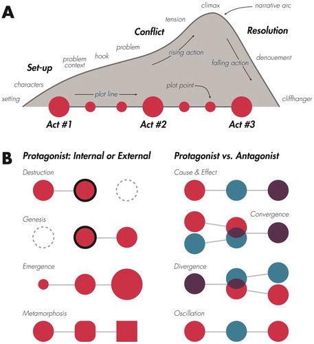
Act 1: set-up
A three-act narrative begins with the set-up, introducing the setting, characters, and the problem context. The set-up opens by describing the setting, putting the audience into a specific place, time, and social context and giving the story a geography that constrains the plotline (Burke, Citation1969). The setting makes a narrative explicitly spatial, with a story map serving as a spatial reference for the setting and the actions of characters within it (Caquard and Cartwright, Citation2014). The setting defines not just the story location, but also the geographic scale of the spatial narrative, with story maps often needing to be multi-scalar to properly frame the narrative across space and through time (Weber Reuschel et al., Citation2014).
The set-up then inserts characters into the setting who embody the narrative and act-out the plot (Ryan, Citation2003). Characters can include protagonists, the leading or hero roles featured by the narrative, antagonists, the oppositional or foil roles who contend with the protagonists, and other supporting roles that provide context and advance the narrative (Fontaine, Citation2015). Character-driven storytelling presents alternative, situated motivations and perspectives, helping the audience assume multiple perspectives (Pearce, Citation2014). For spatial narratives, places as well as people can be treated as characters, enabling critical juxtaposition of different places who serve as exemplars for broader geographic patterns.
The set-up also provides problem context, or additional – often qualitative – background information needed to interpret the story later in the narrative sequence (Fontaine, Citation2015). Problem context draws from ancillary or supplemental geospatial datasets to describe contingent information about the characters, setting, and their activities, as well as the broader story purpose and theme. Accordingly, problem context is a primary way that the designer shapes the meaning of the story through selective inclusion and omission, with the problem context often fully erased from authoritative maps and visualizations (Muehlenhaus, Citation2012). Vujaković (Citation2014: 15) provides a useful taxonomy of geographic problem contexts, described as ‘news map themes’, within and against which the majority of story maps are framed ().
Table 1. Geographic problem contexts.
Finally, the set-up often includes a hook, or an early scene (i.e., the ‘teaser’ or ‘click-bait’) that captures attention and builds buy-in from the audience (Kosara and Mackinlay, Citation2013; Roth, Citation2015). In data journalism, the hook is the lede to an ‘inverted pyramid’ or ‘inverted triangle’ model of storytelling, presenting the most compelling piece of information first using persuasive rhetoric and moving from critical to mundane information as the narrative progresses (Kosara, Citation2017). The hook can be interactive for visual storytelling, drawing on geoweb technologies to support non-linear, user-driven story map exploration before entering the linear narrative; such a design strategy is consistent with Segel and Heer’s (Citation2010) ‘drill-down’ narrative structure.
Act 2: conflict
A three-act narrative then progresses into the conflict, introducing the problem, building tension, and incrementally advancing the plot (Fontaine, Citation2015). The conflict begins with the problem, or central confrontation, obstacle, or setback driving the story, which produces a tension in character-driven storytelling either between characters (typically the selected protagonist and antagonist), internally within a single character, or externally between a single character and a larger force. Such character development humanizes the story for the audience, with personifications differing in their appeals to emotion (pathos), ethics (ethos), and reason (logos) to sharpen the narrative continuity and persuade the audience.
Characters are developed following the problem through plot points, or pauses along the linear narrative that incrementally introduce new or complicate prior information about the evolving setting, characters, and problem context. Plot points are anchored and grounded in place (Roberts, Citation2014). For story maps, a plot point can be a single ‘point’ on the map, symbolized and annotated to fit within the linear narrative, or a stand-alone map ‘plot’, sequenced within a series of maps and graphic panels. Plot points are paced for rising action in a narrative arc (Pearce, Citation2008), intensifying the tension and galvanizing the characters (and perhaps the audience as well) to build interest and suspense.
Literary scholars recognize a number of traditional plotlines or narrative arcs based on recurring strategies for imposing conflict (see Booker, Citation2004 for an overview). Importantly, Phillips (Citation2012: 156) describes ‘eight basic plots’ specific to geography and geosciences – thus defining spatial narrative arcs available for visual storytelling – that differ by the way characters develop in response to the conflict (b). Articulating different spatial narrative arcs provides designers with story templates for assembling narrative elements into visual sequences; however, there are two important caveats to the practical use of these templates. First, the same geographic problem context could be described using all eight spatial narrative arcs, resulting in markedly different rhetoric and conclusions (). While this flexibility is useful and demonstrates the potential of visual storytelling, designers may abuse control over the narrative by selecting an arc not fully evinced by the available information or by suppressing alternative arcs also supported by information. Second, the spatial narrative arcs assume some form of character evolution beginning in the second act, making a visual storytelling approach best suited for explaining change rather than stability in geographic phenomena and processes (Cronon, Citation1992; Ma et al., Citation2012).
Table 2. Eight visual stories about climate change.
Act 3: resolution
A three-act narrative ends with the resolution, bringing the narrative arc to its culminating moment and presenting concluding (re)solutions to the problem. The resolution opens with the climax, a final plot point bringing characters together to face their tension and consider competing solutions to the problem (Fontaine, Citation2015). Through this final character development, the climax again helps the audience assume multiple perspectives, enriching their understanding of how solutions to the problem will have a differential impact on people and places. Like the hook, visuals also can be interactive for the climax, with the maps and visualizations not provided to gain an initial overview through exploration (as in the hook), but instead to directly interrogate competing scenarios and outcomes at the most critical point in the narrative arc (Proulx et al., Citation2006).
Following the climax, the designer may choose to impose a single solution, arguing for one interpretation of the story – and thus of the mapped information – over others. This rhetorical structure connecting evidence to a central claim is common in data journalism, where the closing resolution ‘ties together the events of the story and provides a form of closure’ (Kosara, Citation2017: 1). Such resolution is a final way in which the designer shapes the meaning of the visual story through persuasive rhetoric. Arguably, most maps and visualizations created outside of a storytelling framework present only the resolution, obscuring the full story and how the designer came to such a conclusion.
The narrative arc then concludes with falling action in the denouement, in which all remaining matters with the setting, characters, and problem context are explained or resolved. One common form of denouement in visual storytelling is a credits section, in which all sources are listed and data provenance provided. The denouement also is a third narrative element that lends itself well to interactivity, with the audience invited to explore the data most relevant to their context after experiencing the linear narrative (Kosara and Mackinlay, Citation2013); such a design strategy is consistent with Segel and Heer’s (Citation2010) ‘martini glass’ narrative structure.
In contrast, the designer may choose not to side with any solution, instead leaving the narrative arc unresolved as a cliffhanger, encouraging the audience to ‘fill the gaps’ using their own experiences (Gershon and Page, Citation2001). Cliffhangers make the visual story compelling and memorable as well as situated and fluid. As Pearce (Citation2008: 29) writes, ‘Without closure, the reader or viewer must become personally involved in the narrative in order to close the gap, in turn energizing the narrative’.
Should all visual stories follow a three-act narrative and are all narrative elements needed for effective visual storytelling? Absolutely not. For many visual storytelling contexts, the three-act narrative is either an idealized or overly-formulaic structure, and there are many other narrative sequences and elements not reviewed here. Hullman et al. (Citation2013) and Thöny et al. (Citation2018) provide an additional discussion on alternative linear, parallel, and non-linear narrative structures. However, the basic narrative elements and possible structures for combining them gives cartographers new ways to think about data and design for visual storytelling, ultimately presenting new opportunities for cartographic research and practice (e.g., ; Song Citation2017). Additionally, drawing on familiar narrative sequences and elements, such as the linear, three-act narrative, further reinforces the intuitive, relatable characteristics of visual stories described above.
Table 3. Comparison of narrative elements in two scripts.
Visual storytelling genres
A second way to describe the design space for visual storytelling is by the composition technique used to construct the narrative for the story, described by Segel and Heer (Citation2010: 1139) as different ‘genres of narrative visualization’. First used to refer to storytelling in cartography by Cartwright (Citation1999), a genre is a category of literature, music, or other kind of art exhibiting similarities in form and style. For instance, Esri Story Maps supply a growing array of templates that offer different default layouts and user interactions for organizing narrative elements and story content (Austin, Citation2018). Segel and Heer delineate visual storytelling genres by the number and order of unique frames, or individual sections, panels, slides, etc., that comprise narrative elements and plot points. Segel and Heer then employ seven genres in their analysis of visual storytelling, each of which can be made interactive: magazine style, annotated chart, partitioned poster, flow chart, comic strip, slide show, and film/video/animation.
While foundational, the genres proposed by Segel and Heer (Citation2010) have several limitations restricting practical use for design. First, the number of frames does not cleanly define the genres, with all proposed genres potentially supporting a similar number of frames and thus the same visual story. Arguably, the only important distinction in the number of frames for visual storytelling is between one and many, resulting in a fluid versus fragmented layout (see Dondis, Citation1973; Muehlenhaus, Citation2011). Further, the important distinction for spatial narratives and story maps is not how many frames, but if the map frame plays a central or supporting role in the narrative compared to other text, images, and graphics (McCloud, Citation1993).
Second, the Segel and Heer (Citation2010) taxonomy does not capture visual storytelling genres now possible with new media and geoweb technologies. While the majority of proposed genres are based on the print design (Kosara and Mackinlay, Citation2013), it is evident now that designers are not simply porting existing techniques to a web environment, but rather rethinking composition entirely to leverage the interactive and mobile possibilities of the web (Muehlenhaus, Citation2013). Building on Segel and Heer, I propose a revised taxonomy of visual storytelling genres, with the genres defined only by the visual or interactive technique used to enforcing linearity in the narrative sequence (). discusses a visual example of each genre while summarizes their relative advantages and limitations.
Figure 2. Visual storytelling genres. Visual storytelling genres differ by the visual or interactive technique used to enforce linearity in the narrative sequence. The black components of each genre diagram represent prototypical visual or interactive elements used by the genre to enforce linearity. (A) Static visual stories. Linearity is enforced through partitioning of the layout into frames and clarifying reading with annotation, the latter of which may include any of the visual accenting techniques illustrated in . (B) Longform Infographics. Linearity is enforced through vertical reading and browser scrolling. (C) Dynamic Slideshows. Linearity is enforced by advancement through a series of slides, which may include horizontal swiping or ‘next’ and ‘back’ buttons. (D) Narrated Animations. Linearity is enforced by the progression of digital display time, with the animation starting either on page load or through a play control. (E) Multimedia Visual Experiences. Linearity is enforced by anchor tags and hyperlinking, with content often activated dynamically while scrolling. (F) Personalized Story Maps. Linearity is enforced by the order that an individual contributes content to the map, with the story often presented from older to newer updates. (G) Compilations. Linearity is enforced unfolding events in near real-time or major updates to the design, with maps often organized in a stack from newer to older with links to the full story.
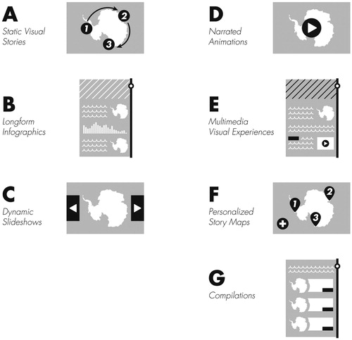
Table 4. Comparison of visual storytelling genres.
Static visual stories
Static visual stories enforce linearity through partitioning of the layout into frames (through neatlines, deadpsace, etc.) and use of annotation to clarify reading (e.g., arrows, numbering, and other visual accenting techniques) (a). Static visual stories encapsulate many of Segel and Heer’s (Citation2010) genres based on print design, including magazine style, annotated chart, partitioned poster, flow chart, and comic strip. These sub-genres differ primarily by their mixture of partitioning and annotation. Annotated charts have fluid layouts, with call-out annotation positioned around a central graphic to enforce linearity. The magazine style and flow charts are more fragmented, using whitespace to segment content. Magazine or newspaper layouts enforce linearity through cultural reading convention (e.g., left-to-right, top-to-bottom in Western cultures) while flow charts add arrow annotation to enforce linearity. Finally, partitioned posters and comic strips are heavily fragmented, so much so that techniques exist to ‘break the frame’ to enforce linearity and relate plot points (McCloud, Citation2011).
For spatial narratives, static visual stories typically employ maps using one of three strategies: small multiple maps, a central map with internal annotation, or a supporting map in a multi-frame visual story. Small multiples work best for visual storytelling with spatiotemporal data, fitting the narrative to the temporal dimension. Small multiples support nonlinear comparison of any pair of individual frames, but are relatively less effective than animations for identifying movement and trends from start to finish across frames (Griffin et al., Citation2006), often the purpose in visual storytelling. Therefore, small multiples may be most effective when only including a few frames, such as before-and-after maps and imagery providing visual comparison around the conflict (Ormeling, Citation1995). Further, small multiples include a large amount of redundant information (Fish, Citation2018), producing a small, highly generalized sequence of graphics that emphasizes stability rather than change and eliminates the embellishments that make visual stories compelling, relatable, and memorable.
Static visual stories anchored upon a central map mostly follow existing cartographic design principles, particularly flow mapping (see Kraak, Citation2014 for discussion). Supporting maps in static visual stories closely resemble locator or inset maps and are particularly useful for introducing the setting and providing spatial structure for plot points (Caquard and Cartwright, Citation2014). Static visual stories have the advantage of being familiar to the audience given their traditional use in print. These also do not require web development skills to customize. Static visual stories can have interactive elements, with data-driven geoweb dashboard tools (e.g., Carto, Esri, and Tableau) supporting interactive versions of Segel and Heer’s (Citation2010) partitioned poster. However, static visual stories are the most susceptible genre to a breakdown in linearity and rely on visual accenting techniques (see below) that may impede map reading or be missed by the audience. Static visual stories also do not respond well for small screen and mobile viewing (Ricker and Roth, Citation2018), resulting in decreasing use in web-based data journalism.
Longform infographic
Longform infographics – not to be confused with longform journalism – enforce linearity through vertical reading and browser scrolling (b). Although many longform infographics are simply large image files, they draw on convention in modern web design by stacking text, graphics, and multimedia with a constrained width for a single scrolling direction. Longform infographic designs are digitally native and mobile-first, with the genre often described as ‘scrollytelling’ by data journalists (Stolper et al., Citation2016). Longform infographics can be fluid, with the map, timeline, or other graphic extending throughout the visual story, or fragmented to delineate transitions in the narrative.
For spatial narratives, longform infographics can resemble strip maps, a cartographic technique that follows a single linear corridor and omits detail away from the corridor (MacEachren, Citation1986; MacEachren and Johnson, Citation1987). Strip maps commonly distort the orientation of geographic features similarly to a linear cartogram (Kraak, Citation2014), converting configural knowledge about absolute spatial relationships into procedural knowledge of the sequence of places encountered along a route (MacEachren, Citation1995), with the sequential order of places then intuitively defining the narrative arc. Thus, longform infographics using a central strip map are particularly well purposed for ‘quest’ plotlines in which characters move through the landscape from an origin to a destination (Booker, Citation2004).
Compared to other genres, the dimensions of longform infographics are optimized for small screen and mobile viewing, with grab-and-drag scrolling particularly intuitive on post-WIMP (windows, icons, menus, pointers) mobile devices (Ricker and Roth, Citation2018). The exaggerated dimensions keep the majority of content offscreen at any time, a constraint that can be used dramatically for visual storytelling. The audience also interactively controls the narrative pacing through continuous scrolling, drawing them into the story. However, eyetracking studies on webpage design suggest that the continuous scrolling may result in skimming, producing an F-pattern for textual stories (Nielsen, Citation2006) and potentially leading the audience to miss important plot points in longform information graphics. Finally, the inclusion of a ‘slippy’ multiscale web map providing panning, zooming, and detail retrieval (Sample and Ioup, Citation2010) at the start or end of the longform infographic supports Segel and Heer’s (Citation2010) drill-in and martini glass narrative structures, respectively. However, embedding a slippy web map as a single frame in a longform infographic causes the ‘quicksand’ issue when scrolling with a mousewheel, shifting input focus from the webpage to the map and initiating unwanted zooming of the map (Tolochko, Citation2016).
Dynamic slideshow
Dynamic slideshows, a genre from the Segel and Heer (Citation2010) taxonomy, enforce linearity by advancement through a series of slides, or discrete visual panels of consistent size and format (c). Drawing on the metaphor of a physical slide deck, passive slideshows are common for scholarly presentation, industry pitches and project updates, and higher education (Kosara and Mackinlay, Citation2013), despite their known problems (Tufte, Citation2003). User-driven interactive slideshows are increasingly popular for web ‘listicles’ as well as image carousels and other aggregated collections on social media (Lieb, Citation2015). Compared with the vertical scrolling of longform infographics, dynamic slideshows have a conceptual horizontal scrolling, but with extreme fragmentation due to the lack of conventional side-to-side scrolling in modern web design. For spatial narratives, dynamic slideshows share similarities with bounded atlases, progressing page-by-page through a series of maps intentionally ordered to introduce and describe with increasing depth a fixed range of places and people (van Elzakker, Citation1993; Ormeling, Citation1995), albeit often without many standard elements of a three-act narrative (e.g., a single problem and resolution).
Like longform infographics, the majority of story content is offscreen in dynamic slideshows. However, the interface for accessing offscreen content is different between the genres: the narrative advances using discrete clicking, tapping, keying, or swiping for dynamic slideshows, rather than continuous scrolling or dragging in longform infographics (Ricker and Roth, Citation2018). Such interaction gives the designer more control over pacing, limiting skimming by regularizing delivery of plot points. However, such discrete interaction can be frustrating for long slide decks due to the increased pointing workload and difficulty in advancing or backtracking multiple frames at once (Harrower and Sheesley, Citation2005). Further, dynamic slideshows often load frames individually upon user request, saving mobile data plans when the audience does not want to review the entire story, but also causing loading lags, breaking audience attention, and ultimately leading in reduced retention and preference for slideshows (Song Citation2017). Importantly, a portion of the slideshow layout or interface can remain persistent across slides to indicate progress or support non-linear breaks from the narrative.
Narrated animations
Narrated animations, the final genre treated by Segel and Heer (Citation2010), enforce linearity by the progression of digital display time (d). Animation is a longstanding research topic in cartography (see Campbell and Egbert, Citation1990; Harrower, Citation2004 for reviews), with data-driven animated maps having a temporal scale in addition to a spatial scale that relates real-world time to display time (e.g., 1 second = 1 year) (Harrower and Fabrikant, Citation2008). Such animated maps congruently represent dynamic phenomena using dynamic visuals (Tversky et al., Citation2002), and are generally considered more intuitive and enjoyable than static spatiotemporal representations (Olson, Citation1997). However, animated maps need not represent real-world time, with display time instead used to explain a geographic process or fly-through a landscape (Lobben, Citation2003), or fluidly transition between frames in a linear narrative (Heer and Robertson, Citation2007). Animation is fundamental to emerging cinematic cartography, combining film techniques with audiovisual content to make the story more compelling (Caquard, Citation2009; Muehlenhaus, Citation2014). Narrating over data-driven animations also is a powerful way to embed the designer’s voice and situated perspectives into a visual story, a technique introduced to cartography by Monmonier (Citation1992) as ‘graphic scripts’ and made popular in visualization by the Rosling et al. (Citation2005) commentaries on GapMinder.
However, evidence exists that data-driven animated maps often exceed our cognitive limits (Harrower, Citation2007). While animations are more effective for following movement and trends across frames compared to small multiples (Griffin et al., Citation2006), the ability to compare any two frames in the animation is severely inhibited due to the complexity and speed of the animation (Fish et al., Citation2011). Further, animations passively enforce the linear narrative, with the pacing of offscreen content controlled by the designer rather than the audience. As a result, the audience might miss key narrative elements, becoming biased by the first and last frame when interpreting and recalling the visual story. Both narration and interaction are recommended strategies to reduce cognitive load and focus attention in animations (Slocum et al., Citation2009), and overall increased familiarity with new media may offset some cognitive load issues with cartographic animations. Finally, narrated animations remain difficult to create, requiring special software and technical skills, although this barrier continues to decrease in new media and geoweb technologies.
Multimedia visual experiences
Multimedia visual experiences are a relatively new, web-enabled visual storytelling genre that enforce linearity by anchor tags and hyperlinking (e). Hyperlinked text and multimedia make the internet a ‘web’ (Kraak and van Driel, Citation1997), and, in the simplest form, dynamic hyperlinking divides the visual story into chapters on multiple webpages. However, multimedia visual experiences also use hyperlinking to activate an immersive array of images, graphics, audio, and video that accompany a central textual narrative, a strategy first employed in the map-heavy visual story ‘Snow Fall: The Avalanche at Tunnel Creek’ (Branch, Citation2012). Accordingly, the genre sometimes is described as ‘snowfalling’ by data journalists (Usher, Citation2016; Cairo, Citation2017).
Multimedia visual experiences mashup well with other genres and can include slippy web maps at the start or end to support drill-down or martini glass narrative structures (Segel and Heer, Citation2010). Like longform infographics, the audience interactively controls the pacing through continuous scrolling, although resulting in the same quicksand issue for embedded slippy maps (Tolochko, Citation2016). As with narrated animations, the multimedia content can include the designer’s voice, as well as embody the situated perspectives of the people in the visual story. They also develop a deep sense of place through rich integration of images, maps, videos, and sounds. However, multimedia visual experiences typically support longform journalism and include more text than other genres, with most content offscreen and fragmented across multiple webpages. Accordingly, multimedia visual experiences can lose the succinct, partial quality that makes them relatable and memorable, potentially leading to a higher attrition or ‘bounce’ rate before completing the narrative than other genres. For spatial narratives, the maps are included only to support the narrative rather than as a centrepiece for the narrative. Finally, multimedia visual experiences draw from a rich set of quantitative and qualitative primary information that the designers need to collect and thus may not be available for all visual stories.
Personalized story maps
Personalized story maps enforce linearity by the order that an individual contributes content to the story. Personalized story maps collapse the distinction between designer and user – storyteller and audience – inviting non-designers to create visual accounts of their lived experiences and to share these stories collectively through easy-to-use geoweb technologies (Caquard, Citation2014). In doing so, they embrace pluralism, empowering individuals to voice their situated perspectives (Pearce and Hermann, Citation2010; Warf and Sui, Citation2010; D’Ignazio and Klein, Citation2016). Personalized story maps can depict individual accounts or aggregated experiences, the latter serving as a collaborative and place-based storytelling alternative to traditional media (Kelly, Citation2016). Personalized story maps align with calls for ‘amateur cartography’ (McConchie, Citation2015), ‘citizen science’ (Haklay, Citation2013), ‘crowdsourced cartography’ (Dodge and Kitchin, Citation2013), ‘democratized cartography’ (Rød et al., Citation2001), ‘neogeography’ (Turner, Citation2006), and ‘volunteered’ (Goodchild, Citation2007) or ‘contributed’ (Harvey, Citation2013) geographic information, and personalized story maps carry with them the same opportunities and challenges discussed in these arenas (see Crampton, Citation2009; Elwood and Leszczynski, Citation2013; for reviews).
Non-experts can create visual stories in any genre, and, as stated above, barriers to using new media and geoweb technology are continuing to decrease. However, the personalized story maps genre tends to be defined by a simplified, fluid layout with a central slippy map displaying georeferenced point symbols for interactive access to all content. While the basic design invites participation from a wide audience, it also limits creative flexibility compared to other genres. Personalized story maps often (although not always) are facilitated by web-enabled, mobile-first story mapping services that use smartphone GPS receivers to automate the georeferencing of contributed content. The audience interactively controls the linear narrative, although the pacing typically is regularized by a point-based story mapping service. Further, personalized story maps often exhibit elements of gamification and play – such as level- or point-based reward systems, augmented and immersive displays, collaborative mapping and peer-rating, and unlockable features or locations – and maps supporting first-person narrative and roleplaying is one of many research opportunities for integrating narrative cartography and video game design (Ahlqvist, Citation2011; Thorn, Citation2018).
Personalized story maps are growing in popularity for use cases in k-12 and higher education (e.g., Battersby and Remington, Citation2013; Strachan and Mitchell, Citation2014; Marta and Osso, Citation2015) as well as scientific outreach (e.g., Silbernagel et al., Citation2015; Eanes et al., Citation2018), but are not without concerns. Designers warn that non-expert design can lead to visual stories with poor data quality, misleading symbolization, and ultimately incoherent narratives, although many initial fears have been allayed with smart default choices and design support ‘help’ resources (Mead, Citation2014; Austin, Citation2018). However, the intimate, multisensory, and spatialized content that make visual stories compelling, relatable, and situated also impose new concerns around power, privacy, and surveillance (Elwood and Leszczynski, Citation2011; Wilson, Citation2012).
Compilations
Finally, compilations enforce linearity through unfolding events in near real-time or major updates to the design. Pioneered by The New York Times as ‘map stacks’ (Wallace, Citation2018), compilations provide a ‘visual abstract’ often with a link to other story content (visual or non-visual) and stack the visual abstracts vertically or in a grid for rapid browsing. In data journalism, compilations primarily are created for extreme events requiring critical attention or recurrent themes spanning numerous news cycles, with each new entry representing a new plot point. Outside of data journalism, compilations make sense for organizing otherwise disparate visual stories around common activities, themes, or places.
Compilations provide a visual index of changing conditions, putting the audience into the narrative as it takes place and inviting them to return to the compilation for updates. Compilations are explicitly temporal in their linearity, with the narrative and pacing emerging only from the events rather than the designer or audience. For spatial narratives, the visual abstracts usually are maps with a similar spatial extent and cartographic design, but with updated information, mimicking small multiples as introduced above. The layout is heavily fragmented, dividing content across a number of pages. However, this strategy does utilize and organize existing content presented in other genres, allowing for easy integration of new content as it becomes available.
Visual storytelling tropes
The final way to describe the design space for visual storytelling presented in this article is by the emerging suite of visual design techniques applied not to represent data, but to enhance the narrative and its elements (Gershon and Page, Citation2001; Pearce, Citation2009). In the following, I suggest the term ‘tropes’ to capture this range of storytelling techniques. Derived from the Greek ‘tropos’ meaning to turn in direction, a trope is a rhetorical device used to advance a plotline. Smith (Citation1996) established the relationship between literary tropes and spatial narratives, interpreting each of Burke’s (Citation1969) master tropes for geographic phenomena. Smith’s (Citation1996) treatment of tropes for spatial narratives is non-visual, and my use of ‘tropes’ is an imperfect translation of the concept to visual design. However, I think the concept best evokes the purpose of these visual design techniques without confusing established design terminology (e.g., figure/figure-ground, symbolism/symbolization). In the following, I propose seven visual storytelling tropes and paired design techniques, with each trope delineated by the work they do to advance the narrative and develop narrative elements.
Continuity
Continuity unifies otherwise disparate visual elements into a logical structure (Gershon and Page Citation2001). As discussed above, continuity makes visual stories more memorable than other kinds of maps and visualizations. Continuity can be promoted through a linear three-act narrative and enforced using one of the pacing solutions from different visual storytelling genres (e.g., by visual layout, browser scrolling, slide advancement, display time progression, hyperlinking, user contributions, near real-time updates). However, continuity does not simply mean linearity, with non-linear continuity between narrative elements also promoted through annotation (see discussion of visual accenting techniques below) or interaction, particularly sequencing, panning, zooming, and detail retrieval (see Roth, Citation2013). Continuity as a trope also glues or even blends frames in the sequence together (Ormeling, Citation1995). Such visual transition techniques include static and dynamic strategies (see the McCloud, Citation1993 taxonomy of transition types in cartooning). Dynamic transitions such as fading, panning, swiping, and tweening (see Gersmehl, Citation1990; Battersby and Goldsberry, Citation2010) are potentially applicable to genres beyond narrated animations to promote continuity between narrative elements.
Mood
Mood sets a visual tone congruent with the narrative and its elements (Gershon and Page, Citation2001). Mood influences the audience’s immediate, visceral reaction to the visual story (Norman, Citation2004), and therefore should be established at the start of the narrative when introducing the setting, characters, and problem context. The visual mood also suggests how the audience should cognitively and emotionally react to a particular plot points, and thus the mood can change with each act, foreshadowing upcoming frames (Pearce, Citation2008). For spatial narratives, the mood often is set through design of map elements (e.g., legend, north arrow, title) and inclusion of other map adornments described as marginalia (Caquard and Cartwright, Citation2014). Such embellishments not only set a visual mood, but also make the map more memorable (Bateman et al., Citation2010; Borkin et al., Citation2013).
Beyond specific map elements and marginalia, mood broadly refers to the story’s visual style, or aesthetically cohesive and distinct set of visual design characteristics (Kent and Vujaković, Citation2009). Each style evokes a different set of emotions, draws on different design influences, and suggests different story interpretations – all of which contribute to mood – although lived experience and personal taste still result in different reactions across the audience. Aesthetics, style, and taste are topics of increased interest in cartography (e.g., Kent, Citation2005; Buckley and Jenny, Citation2012; Denil, Citation2012) and recent cartographic work has identified common persuasive (Muehlenhaus, Citation2011, Citation2012) and pastiche (Christophe and Hoarau, Citation2012; Knoppke-Wetzel, Citation2014) visual styles potentially useful in specific storytelling contexts. While visual style has potentially infinite facets, I find it helpful to organize the planning and design a visual style by:
form: variation in the linework generalization and symbolization (e.g., line weights, cap and join styles, tapering);
colour: the overall palette of primary and accent colours (see McCandless, Citation2014 for a cross-cultural guide to the social connotation of colours);
type: the selected typefaces, their placement (e.g., compression, leading, tracking), and their internal microaesthetics (e.g., case, posture, serifs, strokes, weight; Guidero, Citation2017); and
texture: additional embellishments that give features a flat, raised, tactile, shiny, etc., look and feel (e.g., pattern fills, gradients, overlays, dashing).
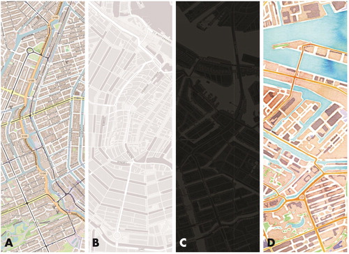
Geoweb technologies have made it possible to develop unique visual styles for digital maps and graphics. deconstructs four basemaps by their stylistic dimensions of form, colour, type, and texture and the associated mood they might evoke when used for a visual story.
Figure 3. Mood as a visual storytelling trope. The visual style of maps and graphics set the mood for a story, influencing the audience’s affective and emotional reaction. The following deconstructs four basemap designs by the stylistic elements of form, colour, type, and texture. (A) OpenStreetMap. The default OpenStreetMap design is similar to a reference road map. The linework form is complex, using precise, thin strokes to outline roads, buildings, and other built infrastructure. The colour palette is similarly complex to symbolize the numerous layers, producing a visual hierarchy that emphasizes major roads over other features. The type is dense, using a simple sans serif font to communicate a sense that there are many features in the landscape. There are few textures, particularly for natural features. Overall, the visual style likely activates the audience affectively, giving an authoritative sense (perhaps too much so) of the accuracy and trustworthiness of the basemap. (B) Esri World Gray Canvas. Esri’s various grey styles are designed specifically to layer thematic information on top. The linework form is simpler, with most features removed and roads given subtle outlines; as a result, the water features and other aspects of the natural environment are more visible. Per the name, a greyscale colour palette is used, with most colours on the lower half of the value range. The type is sparse, using a thin sans serif in uppercase for major throughways. There are few textures (e.g., the railroad), further subduing the palette. Overall, the visual style likely deactivates the audience affectively, leading them to ignore the basemap. (C) CARTO Dark Matter. There are many similarities of CARTO’s Dark Matter to the Esri World Gray Canvas. The linework form is simple, the palette is in greyscale, the type is sparse (although using a thicker sans serif in lowercase), and there are few textures. However, the colours are dark, almost ominous, allowing for any added bright, saturated thematic layers to contrast markedly against the basemap. Because of the dark palette and high contrast, the visual style likely activates rather than deactivates the audience, and, depending on other aspects of design, could evoke an angry, anxious, or otherwise unpleasant reaction, a response that can be used purposefully to build suspense in the visual story. D: Stamen Watercolor. Stamen’s Watercolor is a creative departure from most slippy basemaps. The linework form again is simple, with many features outlined in a white stroke for contrast and their lines whimsically varying as if brushed by hand. The colour palette is bright, using many primary colours while balancing lights and darks. The textures mimic the movement of watercolour on the canvas – pooling at edges and spreading in a gradient over large expanses – and thus give the audience the impression of a physical material rather than a digital map. There is no type, allowing the symbols to take lead. Overall, the visual style likely activates the audience, creating a pleasant experience that invites the audience to get lost in the map and its many arrangements of form, colour, and texture.
Dosing
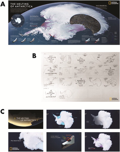
Dosing reduces the overall complexity of story content into incremental chunks of information. Thus, dosing as a design trope makes the visual story partial and intuitive (Gershon and Page, Citation2001), emphasizing specific characters or places rather than overall patterns and layering related visuals to build interest and understanding with the rising narrative arc (Ma et al., Citation2012). At a broad scale, information dosing includes dividing the story into sequential frames for a linear narrative. Dosing also refers to organizing unique narratives into individual modules (e.g., Caquard et al., Citation2009), as with the personalized story maps or compilation genres. Dosing is facilitated by the process of storyboarding, or the organization and sketching of narrative elements and story content into a sequence of visual panels (Thöny et al., Citation2018). While storyboards may lead directly to unique sections in longform infographics or slides in dynamic slideshows, they can be used to model and plan the audience experience for any visual storytelling genre. Tierney (Citation2018) provides a useful discussion of converting content static visual story into a narrated animation using storyboarding as a dosing technique ().
Figure 4. Storyboarding to plan information dosing. ‘The Melting of America’ published by National Geographic (Tierney and Treat, Citation2017) explains the increased susceptibility of Antarctic ice to climate change. Tierney (Citation2018) describes the process the National Geographic team completed to design the original static visual story for the printed magazine and then convert the visual story into a narrated animation for digital consumption. (A) Static Visual Story. The original static visual story was designed to fill a double-gatefold spread within the magazine. The print design effectively enforces linearity using a 12-column layout, balanced arrangement of negative space to separate major visual elements, and text annotation to clarify reading. (B) Storyboarding. The National Geographic team used storyboarding as a technique to dose the original static visual story into a series of five chapters for inclusion in the narrated animation. The storyboard roughly follows the sequence of narrative elements illustrated in . The storyboard first sets-up the visual story through an initial hook (the title sequence) and introduces problem context about the geophysical processes underpinning glacial melt, stressing the key problem that glaciers are breaking apart (Chapter 1). The storyboard then paces plot points about the conflict using rising dramatic action, building concern about glacial acceleration (Chapter 2) and glacial melting from above and below (Chapter 3). The storyboard reaches its climax – that there is no way to stop the melting (Chapter 4) – concluding with a cliffhanger about the future of Antarctica (Chapter 5). (C) Narrated Animation. The resulting 3:40 minute narrated animation uses display time to enforce linearity across the five chapters. The maps and graphics are individually less complex than the original static visual story to optimize viewing on smaller screen mobile devices. However, the maps and graphics are animated to aid interpretation of the dynamic geophysical processes. The text annotation largely is replaced by the audio narration, embedding the voice of expert scientists into the visual story.
At a finer scale, dosing controls the pacing of each individual piece of information, visual or non-visual, within the frame (Pearce, Citation2008). Static dosing includes clarifying the entry point to the story through layout and visual hierarchy (Roth, Citation2015) and subsequent visual partitioning techniques using neatlines, negative space, and other annotations that segment and organize the layout content (Segel and Heer, Citation2010). Dynamic dosing techniques include selective pausing or slow motion in the narrative animation genre to emphasize content visually or expand time for voice over (Monmonier, Citation1992; Harrower, Citation2007) as well as the interactive pacing solutions specific to other genres (e.g., browser scrolling, slide advancement, hyperlinked text). Information pop-ups in slippy maps are a common interactive dosing solution for the drill-down and martini glass narratives structures, allowing the audience to self-dose by retrieving details on demand.
Attention
Attention emphasizes important or unusual information that cannot be missed in the story (Gershon and Page, Citation2001). In psychology, ‘visual attention’ describes the portion of the visual field on which the eye-brain system is focused (Ware, Citation2004). Our visual attention is controlled by both bottom-up (e.g., relative contrast, emergent gestalt features) and top-down (e.g., cognitive tasks, cultural reading conventions) processes (MacEachren, Citation1995). Designers focus attention through the visual hierarchy such that certain features rise to figure and others recede to ground (Tait, Citation2018). Attention as a visual storytelling trope is related to focalization in cinema, a visual complement to audible voice (see below) that together develop a subjective point of view (Pearce, Citation2008). Thus, focusing attention shapes the visual hierarchy around a particular perspective – or reshapes the hierarchy around multiple perspectives – rather than or in addition to the visualized information itself (Cattoor and Perkins, Citation2014).
Perhaps the most common technique for focusing attention is framing the map extent, narrowing the view to a localized setting and eliminating surrounding context (Pearce, Citation2008). Attention also can be focused through visual accenting, or design techniques used to direct the eye to particular features in the display while preserving surrounding context (). For instance, highlighting manipulates one or several ‘visual variables’ – or the perceptible dimensions of a visual scene and thus the basic building blocks of any graphic representation (Bertin, Citation1967/Citation1983) – non-uniformly across visualized features to draw attention. Robinson (Citation2011) provides a useful discussion in the context of coordinated, multiview visualization of the relative strengths and limitations of each visual variable as a solution for interactively highlighting a subset of features rather than encoding information about the features. Interestingly, while interactive highlighting is no longer common in mobile-first design using post-WIMP interfaces and touchscreen devices (where probing or ‘mouse over’ are not intuitive; Ricker and Roth, Citation2018), insight from interactive highlighting remains relevant in visual storytelling for focusing attention on important narrative elements.
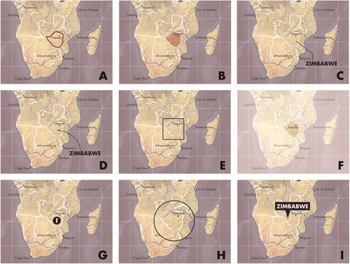
Figure 5. Visual accenting techniques for focusing attention. I use the term ‘visual accenting’ to describe a range of design techniques used to focus visual attention on specific features in the display. The figure provides nine visual accenting solutions for focusing attention on Zimbabwe in Southern Africa. (A) Highlighting on polygon stroke (colour hue). (B) Highlighting on polygon fill (colour hue). (C) Leader lines with label. (D) Flow arrow with label. (E) Geometric frame. (F) Opacity mask. (G) Numbering. (H) Scale change. (I) Call-out with label. Many dynamic techniques also exist for focus attention (not illustrated), such as blinking or flickering, dynamic panning and zooming, and focus + context visualization.
Rather than manipulating the visual variables within maps and graphics, a second visual accenting technique focuses attention by adding an annotation layer conceptually atop all other visual content (Pearce, Citation2008). Essential for enforcing continuity in static visual stories, annotation techniques include leader lines and flow arrows indicating relationships, appended geometric frames or opacity masks enclosing features and delineating regions, numbering or enumerated bullets suggesting linear sequence, changes in map scale or variable levels of detail, and call-outs and other labelling clarifications. Finally, many dynamic techniques exist for focusing attention, such as blinking or flickering (Evans, Citation1997), dynamic panning and zooming (Gershon and Page, Citation2001), and focus + context visualization (Weber Reuschel et al., Citation2014).
Redundancy
Once attention is focused, redundancy then repeats important or unusual information to develop story themes (Gershon and Page, Citation2001). Effective redundancy makes visual stories more memorable compared to traditional maps and visualizations. As Pearce (Citation2014: 117) writes, ‘repetition is a form of mental economy; it condenses the amount of information that the listener must remember’. Effective redundancy also makes visual stories more intuitive, signalling transitions between plot points and reinforcing the linear narrative. In this way, redundancy teaches the audience a single visual syntax for acquiring critical information in the opening scene and then consistently applies this syntax throughout the story (Segel and Heer, Citation2010). Finally, effective redundancy makes visual stories more compelling, combining the visual style with the story content into visual motifs that are repeated throughout the visual story and can hold symbolic meaning (). Such visual motifs can be clever and playful, explicitly reinforcing the theme through figural depictions, as well as political and persuasive, connoting the designer’s subjective position towards the story and potentially subverting the story altogether.
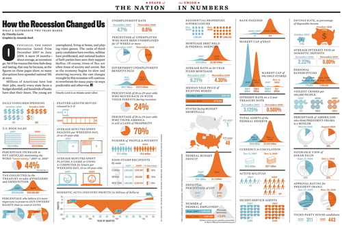
Figure 6. Redundancy and continuity as visual storytelling tropes. ‘How the Recession Changed Us’ published in The Atlantic (Lavin and Buck, Citation2011) uses a series of frames to compare the US before and after the ‘Great Recession’, which lasted December 2007 to June 2009. The designers establish a recurring motif across all panels, redundantly encoding pre-recession in light blue and post-recession in dark orange. In this way, the visual grammar of the story is learned once by the audience, with this redundancy contributing to the rising action as the panels move from livelihoods to (sometimes nefarious) activities to political viewpoints. Note also how the ‘Federal Budget Deficit’ graphic breaks the frame, with the bell curve extending into the maps above. This visual transition technique promotes continuity, suggesting a top-down rather than left-right reading of the visual story.
Because redundancy is the repetition of attention on narrative elements, the visual hierarchy and accenting techniques describe above largely apply. Accordingly, designers need to consider three ways for using the visual variables for map-based storytelling that work in harmony: representing information in the maps and graphics (Bertin, Citation1967|Citation1983 only considered use of the visual ‘variables’ for encoding information and not as visual dimensions for design embellishments), highlighting narrative elements within the maps and graphics, and establishing a coherent style and recurring visual motifs across the maps and graphics.
Metaphor
Metaphor brings together seemingly unrelated concepts in a single frame to facilitate understanding of complex narrative elements (Fontaine, Citation2015). Metaphor is common in cartography, particularly in the design of associative point symbols that resemble a concept related to the symbolized feature (e.g., a balloon to represent the location of a party) rather than directly mimic the feature in a literal way (MacEachren, Citation1995). Such use of metaphor is essential when the represented feature itself is an abstract concept lacking a material or embodied form (e.g., a clenched fist to represent solidarity). In visual storytelling, metaphors often draw from ancillary or supporting materials for problem context, calculate or derive original information, generate non-traditional visual representations, or leverage natural interfaces to add something new and creative into the story. As with redundancy, metaphors when repeated create motifs and embed symbolic connotations into the visual story (Vujaković, Citation2014).
Visual storytelling often emphasizes visual juxtaposition techniques for the purpose of metaphor. The simplest juxtaposition is an overlay of two or more layers of information. Such overlays include visual benchmarks showing the minimum, maximum, average, etc., values for context (Harrower, Citation2003) or alternative scenarios enabling critical consideration of multiple propositions, or for visual storytelling, multiple voices (Ormeling, Citation1995). More compelling juxtapositions use cartooning and illustration to set embodied figures, impossible objects, and apparent motion against the data-driven components of the visual story (Caquard and Dormann, Citation2008). In contrast, equally compelling juxtapositions make use of realism and hyperrealism, shocking and even fooling the audience by viewing abstract statistical information in a metaphorical landscape (). Complex juxtapositions of caricature and hyperrealism develop into collages (within one frame) and montages (across frames) (Salimian et al., Citation2013; Cattoor and Perkins, Citation2014), techniques used in cinema to introduce a large amount of information quickly, speeding some plot points in order to slow the pacing for others.
Figure 7. Metaphor as a visual storytelling trope. ‘Earth at Night, Mountains of Light’ published by Petrichor Geovis Studio (Wasilkowski, Citation2019) visualizes nighttime light emissions as a hyperrealistic, psuedo-3D surface, with brighter locations represented as taller mountain peaks in a metaphorical terrain. Such use of a metaphorical landscape is one way to make any visual story explicitly spatial, and arguably all thematic maps of abstract statistical information employ such a landscape metaphor to some degree. Other examples of a landscape metaphor include ‘The Two Americas of 2016’ published in The New York Times (Wallace, Citation2016) and ‘Human Terrain’ published by The Pudding (Daniels, Citation2018).
Notably, metaphor as a visual storytelling trope often includes hints of humour, irony, and satire (see Caquard and Dormann, Citation2008), providing comedic relief within the narrative arc. I am clearly biased, but I often say that cartographers are the funniest, most engaging people I know, and think that many of the ways that we present ourselves in everyday life through anecdotes and yarns can translate into intuitive and relatable visual metaphors in our designs.
Voice
Finally, voice embeds situated experiences, opinions, and values into the visual story to clarify meaning (Pearce, Citation2009). Prior to the twentieth-century Western push for objectivity, cartographers used stories from the field to ‘fill in the blanks on their maps’ (Caquard, Citation2013: 136). Accordingly, voice is a primary way in which storytelling can be reintegrated into cartographic design.
There are at least three kinds of voices that can be present in a visual story: designer, character, and audience. First, the designer can serve as the narrator in visual storytelling, helping to enforce continuity and focus attention, while also establishing their politics and revealing their judgments (Cronon, Citation1992). Following feminist perspectives in mapping, embedding the designer’s voice also can serve as a reflexivity statement, making space in the visual story to critically acknowledge their own situated relationship to the mapped people and places and thus the information about these people and places (Ricker, Citation2017; Kelly, Citation2019).
Giving voice to key characters in the visual story builds tension while also makes the story more human and relatable, creating intimacy with and encouraging empathy from the audience. Giving voice to characters also can confront inequities and marginalization. The challenge is allowing marginalized voices to speak without appropriating or misrepresenting these voices to fit the designer’s intentions (England, Citation1994). To this end, D’Ignazio and Klein (Citation2016) forward principles of feminist visualization that inform the design process and work towards more equitable design products, including rethink the binaries in data, embrace pluralism, examine power and aspire to empower, consider context, legitimize embodiment and affect, represent uncertainties, and make labour visible. Voice as a trope is one approach for making each of these principles explicit in a visual story, to speak truth to power.
Geoweb technologies now make it possible for the audience to insert their own voices into the visual story through commenting and social media, enabling collective and collaborative storytelling (Caquard, Citation2013). In this way, the audience now can ‘fill in the blanks on their maps’ themselves, resolving ambiguity and arriving at closure on their own terms, even publishing new takes on the narrative using personalized story maps. This expression of audience voice makes visual stories fluid over time and space. As Pearce (Citation2014: 119) writes, ‘The last piece of the map, of course, is you’.
Typography is the primary static technique used for embedding voice (Hermann and Pearce, Citation2010; Pearce and Hermann, Citation2010). Replacing abstract symbols with textual commentary and quotations shifts control of the narrative from the designer to specific people and places referenced in the story as well as slows the pace of the visual story for greater engagement. The text also can vary in colour, size, style, etc., to represent different voices, distinguishing among designers, characters, and the audience (). As described above, voice combined with focalization produces a unique vantage point, which, for spatial narratives, shifts the map scale and projection from a planimetric, north-up view to be grounded from ‘somewhere’ and ‘someone’ (Pearce, Citation2008). Dynamic techniques for voice draw from cinematic cartographies and include audio or audiovisual solutions common to the narrated animation and multimedia visual experience genres, respectively.
Figure 8. Voice as a visual storytelling trope. ‘They Would Not Take Me There; People, Places, and Stories from Champlain’s Travels in Canada, 1603–1016’ published by the University of Maine Canadian-American Center (Pearce and Hermann, Citation2010) follows the explorations of Samuel de Champlain through what would become New France. Drawing from his journals, the designers insert Champlain’s voice into the map using typography (blue Garamond). Alongside Champlain’s voice is an imagined Indigenous voice (green Garamond), ‘add[ing] context to a landscape that Champlain often refers to as empty or barren’ (Citation2010: 46). The designers’ voice also is inserted into the map for narration and context (black Univers Light), resulting in a juxtaposition of different perspectives, time periods, and power structures.
![Figure 8. Voice as a visual storytelling trope. ‘They Would Not Take Me There; People, Places, and Stories from Champlain’s Travels in Canada, 1603–1016’ published by the University of Maine Canadian-American Center (Pearce and Hermann, Citation2010) follows the explorations of Samuel de Champlain through what would become New France. Drawing from his journals, the designers insert Champlain’s voice into the map using typography (blue Garamond). Alongside Champlain’s voice is an imagined Indigenous voice (green Garamond), ‘add[ing] context to a landscape that Champlain often refers to as empty or barren’ (Citation2010: 46). The designers’ voice also is inserted into the map for narration and context (black Univers Light), resulting in a juxtaposition of different perspectives, time periods, and power structures.](/cms/asset/d9beaab7-caf2-4eeb-a2d2-0fac3e418aba/ycaj_a_1633103_f0008_oc.jpg)
Outlook: cartographic design as visual storytelling
So, what can storytelling actually tell us about cartography and design? In this article, I adopt visual storytelling as an entry point for hybridization in cartography, opening new avenues for transdisciplinarity. My focus is on design, teasing out new considerations and techniques when approaching cartography as visual storytelling. To this end, I identify three of potentially many ways to articulate and organize the design space for visual storytelling – narrative elements, genres, and tropes – synthesizing related transdisciplinary work and linking storytelling concepts to potential design techniques. Highlights from the survey include:
Cartographic research on narrative and storytelling draws from an eclectic set of disciplines, ranging from primarily quantitative and analytical approaches to primarily qualitative and reflexive approaches. Because ‘narrative’ and ‘story’ are so fundamental to the human experience, they offer important sites for hybridization in cartography, and related fields: they allow us to speak to each other, despite our theoretical, methodological, and artistic differences.
While definitions for ‘narrative’ and ‘story’ vary widely across disciplines, there are some repeating themes in how these concepts are evoked and discussed in the literature. Visual stories commonly are described as: designed, partial, intuitive, compelling, relatable, memorable, situated, persuasive, political, and fluid. While no single characteristic separates a ‘visual story’ from a ‘visualization’ or a ‘story map’ from a ‘map’, these visual storytelling themes serve as both background review on narrative cartography and creative inspiration for designers.
Oral, written, and audio-visual narratives often evoke one-dimensional, temporal linearity in their organization, but maps and other visualizations using a spatial metaphor are inherently two-dimensional, complicating linear storytelling. To this end, elements of a linear three-act narrative give cartographers new ways to think about data and design for visual storytelling (). Some useful narrative elements include (setup) the setting, key characters, problem context, and the hook; (conflict) the problem, tension between characters, and plot points; and (resolution) the climax, denouement, and cliffhanger ().
Visual storytelling genres are defined by the visual or interactive technique used to enforce linearity in the narrative sequence. I identify seven genres that make use of maps, and more will become possible as new media and geoweb technologies evolve: static visual stories, longform infographics, dynamic slideshows, narrated animations, multimedia visual experiences, personalized story maps, and compilations (). Delineating visual storytelling genres helps designers weigh the pros and cons of different solutions for enforcing linearity (), as well as explore innovative genre mashups to push cartographic design and visual storytelling in new directions.
Visual storytelling tropes describe an emerging suite of visual design techniques applied not to represent data, but to enhance narrative and its elements. I propose seven tropes applicable to map-based visual storytelling: continuity (), mood (), dosing (), attention (), redundancy (), metaphor (), and voice (). Tropes elucidate a new suite of cartographic design techniques for visual storytelling, such as visual transitions (continuity), visual style (mood), visual partitioning (dosing), visual accenting (attention), visual motifs (redundancy), visual juxtaposition (metaphor), and vantage point (voice), among many others ().
Table 5. Visual storytelling tropes.
Where do we go from here? In the following, I outline three avenues for research on visual storytelling derived from the above survey that I find to be particularly pressing for cartography and related fields moving forward:
Visual Design: Above, I reviewed a range of prospective visual storytelling techniques that seem reasonably well-suited for cartography. Where possible, I draw from the literature to assemble some preliminary considerations and guidelines for employing these techniques in story maps and spatial narratives, for treating cartographic design as visual storytelling. This review is an opening act, not the denouement, and future research and design are needed to substantiate and advance these claims. A starting point could be an assessment of different narrative arcs, different genres, and different tropes to understand the relative utility and limitations of these techniques for map-based visual storytelling. Additional opportunities regarding visual design include content analyses of existing visual storytelling design practices in different media and for different audiences, as well as capture of expert experience and opinion from cartographers working in data journalism, information visualization, and visual analytics, among others.
Building upon a ‘digital’, ‘spatial’, and ‘geo’ humanities, research also is needed from artistic, literary, and critical perspectives to inform visual design. This includes new design techniques that augment or replace traditional mapping with oral, written, and audio-visual forms established in critical cartography, Indigenous mapping, participatory GIS, and other influential domains on narrative cartography. Further, new measures of success are needed, with the ten visual storytelling themes reviewed above providing a potential blueprint for future design evaluation. New outcomes also are needed, shifting ‘what counts’ as research and design on map-based visual storytelling, and may include live performances, video documentaries, zines, and physical installations as well as engagement with immersive technology such as video games and other virtual environments. Finally, new collaborations are needed to get designers, thinkers, and storytellers with different backgrounds and skillsets together on cross-cutting projects centered upon pressing and important geographic problems, truly hybridizing cartography through collective visual storytelling.
Visual Ethics: I continually asked myself while completing this survey if visual storytelling is something we should pursue at all. From my review, I am convinced that visual storytelling, spatial narratives, and story maps can do a great amount of good, but without a visual ethics, can and likely will do more harm than good. Of course, cartography, data journalism, and visual storytelling will continue with or without any singular voice of reason, adding to the urgency in this moment to hybridize theory and practice, forge partnerships across sectors, and together move towards a more equitable future. Cartographers must search outwardly for insight into these guidelines, drawing from critical theory as well as professional standards to establish tent poles of ethical visual design.
The survey identified several principles that may seed an ethics for visual storytelling, map-based or otherwise. As discussed above, ‘show your work’ may be a first tenet of ethical visual storytelling. Following feminist critiques, ‘show yourself’ may be another ethical obligation, encouraging designers to be reflexive about their situated positionality and subjectivity to the story and its mapped people and places. ‘Speak to power’ is an ethical responsibility in all cartographic design and visual storytelling, and we must constantly confront rather than edify inequities and marginalization when using data to find narrative structure and develop story content. ‘Speak to each other’ may be a final ethical tenet derived from the survey, and visual stories perhaps should be judged less on how efficiently or effectively they are read or understood, but instead how they make the audience feel about and connect to other people and places.
Visual Literacy: The processes of visual storytelling already are at work in our maps and graphics, even if we lack a uniform lexicon to discuss these processes during design. One of the great personal revelations of this survey was how little I noticed map-based narrative elements, genres, and tropes until I really started looking for them in popular examples. In an era of fake news and post-truth, we need to leverage insight from design and ethics to promote visual literacy among our audiences. In other words, we need an audience capable of identifying inaccuracies and bias in what they see while also fully aware of the potential to tell their own story in a way that is deep and meaningful.
Promoting visual literacy starts with curriculum and pedagogy. Specifically, we need a reimagined ‘map use’ curriculum that approaches visual stories, spatial narratives, and story maps as visual culture that unevenly confines and expands our individual lived experiences and collectively shapes our geographic understandings. This map use curriculum must itself be hybridized, uniting technology with praxis, product with process, and design with critique through experimental mapping and storytelling assignments. The curriculum also should adapt pedagogical strategies from additional fields that influence data journalism, such as creative writing, film studies, and photography. However, promoting visual literacy is not limited to educators, as all storytelling is an exercise in teaching. As designers, it is not enough just to ‘show’, as we must also ‘explain’. Additional narrative components of the visual story can be used in part to evoke the designer’s voice and educate the audience about how to use the included maps and visualizations. As Cronon (Citation1992: 1375) writes, we need to tell ‘stories about stories’ to the end of promoting literacy and enhancing understanding.
For my own reflexivity statement – my own story about the story presented in this article – I had attempted to write this survey article three times before actual submission: once in 2011 as a newly minted professor at UW‒Madison trained in social science methods but redesigning an advanced cartographic design class to recruit journalism students and support a startup visual cultures certificate, again in 2013 to integrate exciting new developments on visual storytelling into my research on user experience design, and once more in 2016 after advising a dozen outstanding graduate students whose diverse interests across cartography were unbounded by any prior assumptions, definitions, or traditions, especially my own. In many ways, this article was the most difficult I have written to-date as, in my experience, embracing hybridity means to be constantly at the edges of your comfort zone, to slow down the pace of scholarship, and to fold-in rather than cut-out. It was only after my 2017–2018 sabbatical in Europe – utterly defeated upon departure by the US political context and fully rejuvenated upon return from the bright conversations with many new colleagues and friends – that I finally was ready to challenge myself to finish this article (or at least, to find some closure). My story of this survey anecdotally illustrates the power and potential of this line of thinking: there are innumerable ways to approach cartographic design as visual storytelling, any of which reflect the situated perspectives derived from our ever-accumulating lived experiences and the shifting, hybridizing, and unravelling possibilities of cartography and design.
Acknowledgments
I wish to thank Meghan Kelly for providing feedback on a draft of this article and the anonymous reviewers for their useful input. I also wish to thank Menno-Jan Kraak, Britta Ricker, and Corné van Elzakker for hosting my sabbatical visit to ITC Twente, during which I reframed and focused the survey. This research was funded by NSF CAREER #1555267 and the Wisconsin Alumni Research Foundation.
Disclosure statement
No potential conflict of interest was reported by the author(s).
Additional information
Funding
Notes on contributors

Robert E. Roth
Robert Roth is an Associate Professor of Cartography at the University of Wisconsin–Madison and the Faculty Director of the University of Wisconsin Cartography Lab. His research focuses on interactive, online, and mobile map design and visualization. He currently serves as the Chair of the ICA Commission on the User Experience and the Section Editor for Cartography and Visualization in the Geographic Information Science and Technology (GIS&T) Body of Knowledge.
References
- Ahlqvist, O. (2011) “Converging Themes in Cartography and Computer Games” Cartography and Geographic Information Science 38 (3) pp.278–285 DOI: 10.1559/15230406382278.
- Austin, B.G. (2018) “Investigating the Influence of Esri Story Map Design on Partcipation in Sustainability-Related Activities” (MS thesis) Western Kentucky University.
- Baptista, F., Gibbons, D., Mason, V. W. and Morris, R. (2015) “Amazonia under Threat” National Geographic. Available at: https://www.nationalgeographic.com/climate-change/explore-amazonia/.
- Bateman, S., Mandryk, R.L., Gutwin, C., Genest, A., McDine, D. and Brooks, C. (2010) Proceedings of the SIGCHI Conference on Human Factors in Computing Systems, Atlanta: 10th–15th April.
- Battersby, S.E. and Goldsberry, K.P. (2010) “Considerations in Design of Transition Behaviors for Dynamic Thematic Maps” Cartographic Perspectives (65) pp.16–32 DOI:10.14714/cp65.127.
- Battersby, S.E. and Remington, K.C. (2013) “Story Maps in the Classroom” ArcUser Magazine pp.62–65.
- Bertin, J. (1967/1983) Semiology of Graphics: Diagrams, Networks, Maps Madison: University of Wisconsin Press.
- Booker, C. (2004) The Seven Basic Plots: Why We Tell Stories New York: A&C Black.
- Borkin, M.A., Vo, A.A., Bylinskii, Z., Isola, P., Sunkavalli, S., Oliva, A. and Pfister, H. (2013) “What makes a Visualization Memorable?” IEEE Transactions on Visualization and Computer Graphics 19 (12) pp.2306–2315 DOI:10.1109/tvcg.2013.234.
- Bostock, M., Ogievetsky, V. and Heer, J. (2011) “D³ Data-Driven Documents” IEEE Transactions on Visualization and Computer Graphics 17 (12) pp.2301–2309 DOI:10.1109/tvcg.2011.185.
- Boy, J., Detienne, F. and Fekete, J.-D. (2015) “Storytelling in Information Visualizations: Does it Engage Users to Explore Data?” Proceedings of the 33rd Annual ACM Conference on Human Factors in Computing Systems. Seoul: 18th–23rd April, DOI:10.1145/2702123.2702452.
- Branch, J. (2012) “Snow Fall: The Avalanche at Tunnel Creek” New York Times. Available at: http://www.nytimes.com/projects/2012/snow-fall/index.html.
- Brown, L.A. (1949) The Story of Maps New York: Dover Publications, Inc.
- Buckley, A. and Jenny, B. (2012) “Letter from the Guest Editors” Cartographic Perspectives (73) pp.1–11 DOI:10.14714/cp73.786.
- Buckley, A.R. and Butler, K.A. (2018) Proceedings of The 22nd International Research Symposium on Computer-based Cartography and GIScience Madison: 22nd–24th May.
- Burke, K. (1969) A Grammar of Motives Berkeley: University of California Press.
- Bushell, S. (2012) “The Slipperiness of Literary Maps: Critical Cartography and Literary Cartography” Cartographica 47 (3) pp.149–160 DOI:10.3138/carto.47.3.1202.
- Cairo, A. (2017) “Nerd Journalism: How Data and Digital Technology Transformed News Graphics” (PhD thesis) Universitat Oberta de Catalunya.
- Campbell, C.S. and Egbert, S.L. (1990) “Animated Cartography/Thirty Years of Scratching the Surface” Cartographica 27 (2) pp.24–46 DOI:10.3138/v321-5367-w742-1587.
- Caquard, S. (2009) “Foreshadowing Contemporary Digital Cartography: A Historical Review of Cinematic Maps in films” The Cartographic Journal 46 (1) pp.46–55 DOI:10.1179/000870409×415589.
- Caquard, S. (2011) “Cartographies of Fictional Worlds: Conclusive Remarks” The Cartographic Journal 48 (4) pp.224–225 DOI:10.1179/000870411×13203362557264.
- Caquard, S. (2013) “Cartography I: Mapping Narrative Cartography” Progress in Human Geography 37 (1) pp.135–144 DOI:10.1177/0309132511423796.
- Caquard, S. (2014) “Cartography II: Collective Cartographies in the Social Media Era” Progress in Human Geography 38 (1) pp.141–150 DOI:10.1177/0309132513514005.
- Caquard, S. (2015) “Cartography III: A Post-Representational Perspective on Cognitive Cartography” Progress in Human Geography 39 (2) pp.225–235 DOI:10.1177/0309132514527039.
- Caquard, S. and Cartwright, W. (2014) “Narrative Cartography: From Mapping Stories to the Narrative of Maps and Mapping” The Cartographic Journal 51 (2) pp.101–106 DOI:10.1179/0008704114z.000000000130.
- Caquard, S. and Dormann, C. (2008) “Humorous Maps: Explorations of an Alternative Cartography” Cartography and Geographic Information Science 35 (1) pp.51–64 DOI:10.1559/152304008783475670.
- Caquard, S., Pyne, S., Igloliorte, H., Mierins, K., Hayes, A. and Taylor, D.F. (2009) “A ‘Living’ Atlas for Geospatial Storytelling: The Cybercartographic Atlas of Indigenous Perspectives and Knowledge of the Great Lakes region” Cartographica 44 (2) pp.83–100 DOI:10.3138/carto.44.2.83.
- Caquard, S. and Taylor, D.F. (2009) “What is Cinematic Cartography?” The Cartographic Journal 46 (1) pp.5–8 DOI:10.1179/000870409×430951.
- Carr, D. (1986) “Narrative and the Real World: An Argument for Continuity” History and Theory 25 (2) pp.117–131 DOI:10.2307/2505301.
- Cartwright, W. (1999) “Extending the Map Metaphor using Web Delivered Multimedia” International Journal of Geographical Information Science 13 (4) pp.335–353 DOI:10.1002/9780470979587.ch25.
- Cattoor, B. and Perkins, C. (2014) “Re-Cartographies of Landscape: New Narratives in Architectural Atlases” The Cartographic Journal 51 (2) pp.166–178 DOI:10.1179/1743277413y.0000000076.
- Chapin, M., Lamb, Z. and Threlkeld, B. (2005) “Mapping Indigenous Lands” Annual Review of Anthropology 34 pp.619–638 DOI:10.1146/annurev.anthro.34.081804.120429.
- Christophe, S. and Hoarau, C. (2012) “Expressive Map Design based on Pop Art: Revisit of Semiology of Graphics?” Cartographic Perspectives (73) pp.61–74 DOI:10.14714/cp73.646.
- Cohn, N. (2013) “Visual Narrative Structure” Cognitive Science 37 (3) pp.413–452 DOI:10.1111/cogs.12016.
- Correll, M., Witmore, M. and Gleicher, M. (2011) “Exploring Collections of Tagged Text for Literary Scholarship” Computer Graphics Forum 30 (3) pp.731–740 DOI: 10.1111/j.1467-8659.2011.01922.x.
- Counter Cartographies Collective, Dalton, C. and Mason-Deese, L. (2012) “Counter (Mapping) Actions: Mapping as Militant Research” ACME: An International Journal for Critical Geographies 11 (3) pp.439–466.
- Crampton, J.W. (2009) “Cartography: Maps 2.0” Progress in Human Geography 33 (1) pp.91–100 DOI:10.1177/0309132508094074.
- Crampton, J.W. (2011) Mapping: A Critical Introduction to Cartography and GIS Chichester: John Wiley & Sons.
- Cronon, W. (1992) “A Place for Stories: Nature, History, and Narrative” The Journal of American History 78 (4) pp.1347–1376 DOI:10.2307/2079346.
- Daniels, M. (2018) “Human Terrain: Visualizing the World's Population, in 3D” The Pudding. Available at: https://pudding.cool/2018/10/city_3d/.
- Denil, M. (2012) “A Disquisition on Cartographic Style and Taste: With Attendant Remarks Upon Aesthetics, Clarity, Design, and Mapicity” Cartographic Perspectives (73) pp.75–88 DOI:10.14714/cp73.711.
- Denil, M. (2017) “Storied Maps” Cartographic Perspectives (84) pp.5–22 DOI:10.14714/cp84.1374.
- D’Ignazio, C. and Klein, L. (2020) Data Feminism Boston, MA: MIT Press.
- D’Ignazio, C. and Klein, L.F. (2016) “Feminist Data Visualization” Proceedings of the Workshop on Visualization for the Digital Humanities (VIS4DH) Baltimore: 23rd October.
- Dodge, M. (2017) “Cartography I: Mapping Deeply, Mapping the Past” Progress in Human Geography 41 (1) pp.89–98 DOI:10.1177/0309132516656431.
- Dodge, M. and Kitchin, R. (2013) “Crowdsourced Cartography: Mapping Experience and Knowledge” Environment and Planning A 45 (1) pp.19–36 DOI:10.1068/a44484.
- Dondis, D.A. (1973) A Primer of Visual Literacy Boston: MIT Press.
- Eanes, F.R., Silbernagel, J.M., Hart, D.A., Robinson, P. and Axler, M. (2018) “Participatory Mobile-and Web-based Tools for Eliciting Landscape Knowledge and Perspectives: Introducing and Evaluating the Wisconsin Geotools Project” Journal of Coastal Conservation 22 (4) pp.399–416 DOI:10.1007/s11852-017-0589-2.
- Eccles, R., Kapler, T., Harper, R. and Wright, W. (2008) “Stories in Geotime” Information Visualization 7 (1) pp.3–17 DOI:10.1057/palgrave.ivs.9500173.
- Elwood, S. (2006) “Beyond Cooptation or Resistance: Urban Spatial Politics, Community Organizations, and GIS-based Spatial Narratives” Annals of the Association of American Geographers 96 (2) pp.323–341 DOI:10.1111/j.1467-8306.2006.00480.x.
- Elwood, S. and Leszczynski, A. (2011) “Privacy, Reconsidered: New Representations, Data Practices, and the geoweb” Geoforum 42 (1) pp.6–15 DOI:10.1016/j.geoforum.2010.08.003.
- Elwood, S. and Leszczynski, A. (2013) “New Spatial Media, New Knowledge Politics” Transactions of the Institute of British Geographers 38 (4) pp.544–559 DOI:10.1111/j.1475-5661.2012.00543.x.
- Elwood, S. and Leszczynski, A. (2018) “Feminist Digital Geographies” Gender, Place & Culture 25 (5) pp.629–644 DOI:10.1080/0966369x.2018.1465396.
- England, K.V. (1994) “Getting Personal: Reflexivity, Positionality, and Feminist Research” The Professional Geographer 46 (1) pp.80–89 DOI:10.1111/j.0033-0124.1994.00080.x.
- Evans, B. (1997) “Dynamic Display of Spatial Data-Reliability: Does it benefit the Map User?” Computers & Geosciences 23 (4) pp.409–422 DOI:10.1016/s0098-3004(97)00011-3.
- Fish, C. (2018) “Spatiotemporal Representation” In Wilson, J.P. (Ed.) The Geographic Information Science & Technology Body of Knowledge DOI:10.1007/978-3-319-77525-8_100319.
- Fish, C., Goldsberry, K.P. and Battersby, S. (2011) “Change Blindness in Animated Choropleth Maps: An Empirical Study” Cartography and Geographic Information Science 38 (4) pp.350–362 DOI:10.1559/15230406384350.
- Fontaine, L. (2015) “Pictographic Storytelling for Social Engagement” Proceedings of the 3rd International Conference for Design Education Researchers Chicago: 28th–30th July.
- Gamio, L. and Keating, D. (2016) “How Trump Redrew the Electoral Map, from Sea to Shining Sea” The Washington Post (9th November).
- Gershon, N. and Page, W. (2001) “What storytelling can do for information visualization” Communications of the ACM 44 (8) pp.31–37 DOI:10.1145/381641.381653.
- Gersmehl, P.J. (1990) “Choosing Tools: Nine Metaphors of Four-Dimensional Cartography” Cartographic Perspectives (5) pp.3–16 DOI:10.14714/cp05.1122.
- Goodchild, M.F. (2007) “Citizens as Sensors: The World of Volunteered Geography” GeoJournal 69 (4) pp.211–221 DOI:10.1002/9780470979587.ch48.
- Gould, P. (1981) “Letting the Data Speak for Themselves” Annals of the Association of American Geographers 71 (2) pp.166–176 DOI:10.1017/cbo9781139013345.006.
- Gray, J., Chambers, L. and Bounegru, L. (2012) The Data Journalism Handbook: How Journalists can Use Data to Improve the News Sebastopol: O'Reilly.
- Griffin, A. and McQuoid, J. (2012) “At the Intersection of Maps and Emotion: The Challenge of Spatially Representing Experience” Kartographische Nachrichten 62 (6) pp.291–299.
- Griffin, A.L., MacEachren, A.M., Hardisty, F., Steiner, E. and Li, B. (2006) “A Comparison of Animated Maps with Static Small-Multiple Maps for Visually Identifying Space-Time Clusters” Annals of the Association of American Geographers 96 (4) pp.740–753 DOI:10.1111/j.1467-8306.2006.00514.x.
- Guidero, E. (2017) “Typography” In Wilson, J.P. (Ed.) The Geographic Information Science & Technology Body of Knowledge DOI:10.22224/gistbok/2017.3.2.
- Haklay, M. (2013) “Citizen Science and Volunteered Geographic Information: Overview and Typology of Participation” In Sui, D.Z., Elwood, S., and Goodchild, M.F. (Eds) Crowdsourcing Geographic Knowledge Heidelberg: Springer pp.105–122 DOI:10.1007/978-94-007-4587-2_7.
- Haklay, M., Singleton, A. and Parker, C. (2008) “Web mapping 2.0: The neogeography of the GeoWeb” Geography Compass 2 (6) pp.2011–2039 DOI:10.1111/j.1749-8198.2008.00167.x.
- Haklay, M. and Weber, P. (2008) “Openstreetmap: User-Generated Street Maps” IEEE Pervasive Computing 7 (4) pp.12–18 DOI:10.1109/mprv.2008.80.
- Haraway, D. (1991) Simians, Cyborgs, and Women: The Reinvention of Nature New York: Routledge DOI:10.4324/9780203873106.
- Harley, J.B. (1989) “Deconstructing the Map” Cartographica 26 (2) pp.1–20 DOI:10.3138/e635-7827-1757-9t53.
- Harrower, M.A. (2003) “Visual Benchmarks: Representing Geographic Change with Map Animation” (PhD thesis) The Pennsylvania State University.
- Harrower, M. (2004) “A Look at the History and Future of Animated Maps” Cartographica 39 (3) pp.33–42 DOI:10.3138/7mn7-5132-1mw6-4v62.
- Harrower, M. (2007) “The Cognitive Limits of Animated Maps” Cartographica 42 (4) pp.349–357 DOI:10.3138/carto.42.4.349.
- Harrower, M. and Fabrikant, S. (2008) “The Role of Map Animation for Geographic Visualization” In: Dodge, M., McDerby, M., and Turner, M. (Eds) Geographic Visualization: Concepts, Tools and Applications Chichester: Wiley pp.49–65 DOI:10.1002/9780470987643.ch4.
- Harrower, M. and Sheesley, B. (2005) “Designing Better Map Interfaces: A Framework for Panning and Zooming” Transactions in GIS 9 (2) pp.77–89 DOI:10.1111/j.1467-9671.2005.00207.x.
- Harvey, F. (2013) “To Volunteer or to Contribute Locational Information? Towards Truth in Labeling for Crowdsourced Geographic Information” In Sui, D.Z., Elwood, S., and Goodchild, M.F. (Eds) Crowdsourcing Geographic Knowledge Heidelberg: Springer pp.31–42 DOI:10.1007/978-94-007-4587-2_3.
- Heer, J. and Robertson, G. (2007) “Animated Transitions in Statistical Data Graphics” IEEE Transactions on Visualization and Computer Graphics 13 (6) pp.1240–1247 DOI:10.1109/tvcg.2007.70539.
- Hermann, M. and Pearce, M. (2010) “‘They would not take me there’ People, Places, and Stories from Champlain's Travels in Canada 1603–1616” Cartographic Perspectives (66) pp.41–46 DOI:10.14714/cp66.96.
- Hullman, J. and Diakopoulos, N. (2011) “Visualization Rhetoric: Framing Effects in Narrative Visualization” IEEE Transactions on Visualization and Computer Graphics 17 (12) pp.2231–2240 DOI:10.1109/tvcg.2011.255.
- Hullman, J., Drucker, S., Riche, N.H., Lee, B., Fisher, D. and Adar, E. (2013) “A Deeper Understanding of Sequence in Narrative Visualization” IEEE Transactions on Visualization and Computer Graphics 19 (12) pp.2406–2415 DOI:10.1109/tvcg.2013.119.
- Joliveau, T. (2009) “Connecting Real and Imaginary Places through Geospatial Technologies: Examples from Set-Jetting and Art-Oriented Tourism” The Cartographic Journal 46 (1) pp.36–45 DOI:10.31219/osf.io/jshwz.
- Kallaher, A. and Gamble, A. (2017) “GIS and the Humanities: Presenting a Path to Digital Scholarship with the Story Map App” College & Undergraduate Libraries 24 (2–4) pp.559–573 DOI:10.1080/10691316.2017.1327386.
- Kelly, M. (2016) “Collectively Mapping Borders” Cartographic Perspectives (84) pp.31–38 DOI:10.14714/cp84.1363.
- Kelly, M. (2019) “Mapping Syrian Refugee Border Crossings: A Feminist Approach” Cartographic Perspectives (93) pp.34–64 DOI:10.14714/CP93.1406.
- Kent, A.J. (2005) “Aesthetics: A Lost Cause in Cartographic Theory?” The Cartographic Journal 42 (2) pp.182–188 DOI:10.1179/000870405×61487.
- Kent, A. (2017) “Trust Me, I’m a Cartographer: Post-Truth and the Problem of Acritical Cartography” The Cartographic Journal 54 (3) pp.193–195 DOI:10.1080/00087041.2017.1376489.
- Kent, A.J. and Vujaković, P. (2009) “Stylistic Diversity in European State 1: 50 000 Topographic Maps” The Cartographic Journal 46 (3) pp.179–213 DOI:10.4324/9781351191234-28.
- Kerski, J.J. (2015) “Geo-Awareness, Geo-Enablement, Geotechnologies, Citizen Science, and Storytelling: Geography on the World Stage” Geography Compass 9 (1) pp.14–26 DOI:10.1111/gec3.12193.
- Kitchin, R. and Dodge, M. (2007) “Rethinking Maps” Progress in Human Geography 31 (3) pp.331–344 DOI:10.1177/0309132507077082.
- Knight, M. (2015) “Data Journalism in the UK: A Preliminary Analysis of Form and Content” Journal of Media Practice 16 (1) pp.55–72 DOI:10.1080/14682753.2015.1015801.
- Knoppke-Wetzel, V. (2014) “How Technology Changes Aesthetically Defined pre-1990s Maps: A Stylistic Look at Woodblock, Copperplate, & Lithographic Print Maps” (MS thesis) University of Wisconsin−Madison.
- Knowles, A.K., Westerveld, L. and Strom, L. (2015) “Inductive Visualization: A Humanistic Alternative to GIS” GeoHumanities 1 (2) pp.233–265 DOI:10.1080/2373566x.2015.1108831.
- Kosara, R. (2017) “An argument structure for data stories” Proceedings of Eurographics Conference on Visualization (EuroVis) Barcelona: 12th–16th July.
- Kosara, R. and Mackinlay, J. (2013) “Storytelling: The Next Step for Visualization” Computer 46 (5) pp.44–50 DOI:10.1109/mc.2013.36.
- Kraak, M.-J. (2014) Mapping Time: Illustrated by Minard's map of Napoleon's Russian Campaign of 1812 Redlands: Esri Press.
- Kraak, M.-J. and van Driel, R. (1997) “Principles of Hypermaps” Computers & Geosciences 23 (4) pp.457–464 DOI:10.1016/s0098-3004(97)00010-1.
- Kwan, M.-P. and Ding, G. (2008) “Geo-Narrative: Extending Geographic Information Systems for Narrative Analysis in Qualitative and Mixed-Method Research” The Professional Geographer 60 (4) pp.443–465 DOI:10.1080/00330120802211752.
- Kwan, M.P. (2007) “Affecting Geospatial Technologies: Toward a Feminist Politics of Emotion” The Professional Geographer 59 (1) pp.22–34 DOI:10.1111/j.1467-9272.2007.00588.x.
- Lavin, T. and Buck, A. (2011) “How the Recession Changed Us” The Atlantic, January/February.
- Lieb, T. (2015) Editing for the Digital Age Singapore: CQ Press.
- Lobben, A. (2003) “Classification and Application of Cartographic Animation” The Professional Geographer 55 (3) pp.318–328 DOI:10.1111/0033-0124.5503016.
- Ma, K.-L., Liao, I., Frazier, J., Hauser, H. and Kostis, H.-N. (2012) “Scientific Storytelling using Visualization” IEEE Computer Graphics and Applications 32 (1) pp.12–19 DOI:10.1109/mcg.2012.24.
- MacEachren, A.M. (1986) “A Linear View of the World: Strip Maps as a Unique Form of Cartographic Representation” The American Cartographer 13 (1) pp.7–26 DOI:10.1559/152304086783900185.
- MacEachren, A.M. (1995) How Maps Work New York: The Guilford Press.
- MacEachren, A.M., Jaiswal, A., Robinson, A.C., Pezanowski, S., Savelyev, A., Mitra, P., Zhang, X. and Blanford, J. (2011) “Senseplace2: Geotwitter Analytics Support for Situational Awareness” Proceedings of IEEE Conference on Visual Analytics Science and Technology (VAST), Providence: 25th–26th October.
- MacEachren, A.M. and Johnson, G.B. (1987) “The Evolution, Application and Implications of Strip Format Travel Maps” The Cartographic Journal 24 (2) pp.147–158 DOI:10.1179/caj.1987.24.2.147.
- Macfarlane, R. (2007) The Wild Places New York: Penguin.
- Marta, M. and Osso, P. (2015) “Story Maps at School: Teaching and Learning Stories with Maps” Journal of Research and Didactics in Geography 2 (24) pp.61–68 DOI:10.4458/6063-05.
- McCandless, D. (2014) Knowledge is Beautiful New York: Harper Collins.
- McCloud, S. (1993) Understanding Comics: The Invisible Art Northampton: Harper Collins.
- McCloud, S. (2011) Making Comics Northampton: Harper Collins.
- McConchie, A. (2015) “Hacker Cartography: Crowdsourced Geography, OpenStreetMap, and the Hacker Political Imaginary” ACME: An International Journal for Critical Geographies 14 (3) pp.874–898.
- Mead, R. (2014) “Expert Perspectives on the Design and Use of Learning Materials for Neocartographic Interfaces” (MS thesis) University of Wisconsin−Madison.
- Miller, C.C. (2006) “A beast in the Field: The Google Maps mashup as GIS/2” Cartographica 41 (3) pp.187–199 DOI:10.3138/j0l0-5301-2262-n779.
- Mink, L.O. (1978) “Narrative Form as a Cognitive Instrument” In Canary R.H., and Kozicki, H. (Eds) The Writing of History: Literary Form and Historical Understanding Madison: University of Wisconsin Press pp.129–149.
- Mocnik, F.-B. and Fairbairn, D. (2018) “Maps Telling Stories?” The Cartographic Journal 55 (1) pp.36–57 DOI:10.1080/00087041.2017.1304498.
- Monmonier, M. (1989) Maps with the News: The Development of American Journalistic Cartography Chicago: University of Chicago Press.
- Monmonier, M. (1992) “Authoring Graphic Scripts: Experiences and Principles” Cartography and Geographic Information Systems 19 (4) pp.247–260 DOI:10.1559/152304092783721240.
- Moore, S.A., Roth, R.E., Rosenfeld, H., Nost, E., Vincent, K., Arefin, M.R. and Buckingham, T.M. (2019) “Undisciplining Environmental Justice Research with Visual Storytelling” Geoforum 102 (1) pp.267–277. DOI:10.1016/j.geoforum.2017.03.003.
- Moretti, F. (2005) Graphs, Maps, Trees: Abstract Models for a Literary History London: Verso.
- Muehlenhaus, I. (2011) “Genealogy that Counts: Using Content Analysis to Explore the Evolution of Persuasive Cartography” Cartographica 46 (1) pp.28–40 DOI:10.3138/carto.46.1.28.
- Muehlenhaus, I. (2012) “If Looks Could Kill: The Impact of Different Rhetorical Styles on Persuasive Geocommunication” The Cartographic Journal 49 (4) pp.361–375 DOI:10.1179/1743277412y.0000000032.
- Muehlenhaus, I. (2013) Web Cartography: Map Design for Interactive and Mobile Devices Boca Raton: CRC Press.
- Muehlenhaus, I. (2014) “Looking at the Big Picture: Adapting Film Theory to Examine Map Form, Meaning, and Aesthetic” Cartographic Perspectives (77) pp.46–66 DOI:10.14714/cp77.1239.
- Nielsen, J. (2006) “F-Shaped Pattern for Reading Web Content” Alertbox: Current Issues in Web Usability. Available at: https://www.nngroup.com/articles/f-shaped-pattern-reading-web-content-discovered/
- Nold, C. (2009) Emotional Cartography: Technologies of the Self London: Softhook.
- Norman, D.A. (2004) Emotional Design: Why We Love (or Hate) Everyday Things New York: Basic Civitas Books.
- Olson, J.M. (1997) “Multimedia in Geography: Good, Bad, Ugly, or Cool?” Annals of the Association of American Geographers 87 (4) pp.571–578 DOI:10.1111/1467-8306.00068.
- Ormeling, F. (1995) “New Forms, Concepts, and Structures for European National Atlases” Cartographic Perspectives (20) pp.12–20 DOI:10.14714/cp20.890.
- Pearce, M. and Louis, R. (2008) “Mapping Indigenous Depth of Place” American Indian Culture and Research Journal 32 (3) pp.107–126 DOI:10.17953/aicr.32.3.n7g22w816486567j.
- Pearce, M.W. (2008) “Framing the Days: Place and Narrative in Cartography” Cartography and Geographic Information Science 35 (1) pp.17–32 DOI:10.1559/152304008783475661.
- Pearce, M.W. (2009) “Place Codes: narrative and Dialogical Strategies for Cartography” Proceedings of the 24th International Cartographic Conference Santiago: 15th–21st November.
- Pearce, M.W. (2014) “The Last Piece is You” The Cartographic Journal 51 (2) pp.107–122 DOI:10.1179/1743277414y.0000000078.
- Pearce, M.W. and Hermann, M.J. (2010) “Mapping Champlain's Travels: Restorative Techniques for Historical Cartography” Cartographica 45 (1) pp.32–46 DOI:10.3138/carto.45.1.32.
- Peluso, N.L. (1995) “Whose Woods are These? Counter-Mapping Forest Territories in Kalimantan, Indonesia” Antipode 27 (4) pp.383–406 DOI:10.1111/j.1467-8330.1995.tb00286.x.
- Phillips, J. (2012) “Storytelling in Earth Sciences: The Eight Basic Plots” Earth-Science Reviews 115 (3) pp.153–162 DOI:10.1016/j.earscirev.2012.09.005.
- Pirolli, P. and Card, S. (2005) “The Sensemaking Process and Leverage Points for Analyst Technology as Identified through Cognitive Task analysis” Proceedings of the International Conference on Intelligence Analysis McLean, VA: 2nd–4th May.
- Proulx, P., Tandon, S., Bodnar, A., Schroh, D., Harper, R. and Wright, W. (2006) Proceedings of the IEEE Symposium on Visual Analytics Science and Technology Baltimore: 31st October–2nd November.
- Reuschel, A.-K. and Hurni, L. (2011) “Mapping Literature: Visualisation of Spatial Uncertainty in Fiction” The Cartographic Journal 48 (4) pp.293–308 DOI:10.1179/1743277411y.0000000023.
- Ricker, B. (2017) “Reflexivity, Positionality and Rigor in the Context of Big Data Research” In Thatcher, J., Shears, A. and Eckert, J. (Eds) Thinking Big Data in Geography: New Regimes, New Research Lincoln: University of Nebraska Press pp.96–118 DOI:10.2307/j.ctt21h4z6m.9.
- Ricker, B. and Roth, R.E. (2018) “Mobile Mapping & Responsive Design” In Wilson, J.P. (Ed.) The Geographic Information Science & Technology Body of Knowledge DOI:10.22224/gistbok/2018.2.5.
- Roberts, L. (2014) “The Bulger Case: A Spatial Story” The Cartographic Journal 51 (2) pp.141–151 DOI:10.1179/1743277413y.0000000075.
- Robinson, A.C. (2011) “Highlighting in Geovisualization” Cartography and Geographic Information Science 38 (4) pp.373–383 DOI:10.1559/15230406384373.
- Robinson, A.C., Demšar, U., Moore, A.B., Buckley, A., Jiang, B., Field, K., Kraak, M.-J., Camboim, S.P. and Sluter, C.R. (2017) “Geospatial Big Data and Cartography: Research Challenges and Opportunities for Making Maps that Matter” International Journal of Cartography 3 (Sup. 1) pp.32–60 DOI:10.1080/23729333.2016.1278151.
- Robinson, A.H. (1952) The Look of Maps: An Examination of Cartographic Design Madison: University of Wisconsin Press.
- Rød, J.K., Ormeling, F. and van Elzakker, C. (2001) “An Agenda for Democratising Cartographic Visualisation” Norsk Geografisk Tidsskrift 55 pp.38–41 DOI:10.1080/002919501300061427.
- Rooney, C., Beecham, R., Dykes, J. and Wong, W. (2017) “Dynamic Design Documents for Supporting Applied Visualizations” Proceedings of the IEEE Conference on Information Visualisation Phoenix: 1st–6th October.
- Rose, G. (1997) “Situating Knowledges: Positionality, Reflexivities and Other Tactics” Progress in Human Geography 21 (3) pp.305–320 DOI:10.1191/030913297673302122.
- Rosling, H., Rosling, R.A. and Rosling, O. (2005) “New Software Brings Statistics Beyond the Eye” In Statistics, Knowledge and Policy: Key Indicators to Inform Decision Making Paris: OECD Publishing pp.522–530.
- Roth, R.E. (2013) “An Empirically-Derived Taxonomy of Interaction Primitives for Interactive Cartography and Geovisualization” IEEE Transactions on Visualization and Computer Graphics 19 (12) pp.2356–2365 DOI:10.1109/tvcg.2013.130.
- Roth, R.E. (2015) “Interactivity and Cartography: A Contemporary Perspective on User Interface and User Experience Design from Geospatial Professionals” Cartographica 50 (2) pp.94–115 DOI:10.3138/cart.50.2.2427.
- Roth, R.E., Young, S., Nestel, C., Sack, C., Davidson, B., Janicki, J., Knoppke-Wetzel, V., Ma, F., Mead, R. and Rose, C. (2018) “Global Landscapes: Teaching Globalization through Responsive Mobile Map Design” The Professional Geographer 70 (3) pp.395–411 DOI:10.1080/00330124.2017.1416297.
- Ryan, M.-L. (2003) “Cognitive Maps and the Construction of Narrative Space” In Herman, D. (Ed.) Narrative Theory and Cognitive Sciences Chicago: University of Chicago Press, pp.214–242.
- Salimian, M.H., Brooks, S. and Reilly, D. (2013) “Geo-Clouds: Visualizing News Over Geographical Maps” Proceedings of the 4th ACM SIGSPATIAL International Workshop on GeoStreaming Orlando, FL: 5th November.
- Sample, J.T. and Ioup, E. (2010) Tile-based Geospatial Information Systems: Principles and Practices New York: Springer.
- Schank, R.C. and Abelson, R.P. (1977) Scripts, Plans, Goals, and Understanding: An Inquiry into Human Knowledge Structures Hillsdale, NJ: Lawrence Erlbaum Associates.
- Segel, E. and Heer, J. (2010) “Narrative Visualization: Telling Stories with Data” IEEE Transactions on Visualization and Computer Graphics 16 (6) pp.1139–1148 DOI:10.1109/tvcg.2010.179.
- Sieber, R.E., Robinson, P.J., Johnson, P.A. and Corbett, J.M. (2016) “Doing Public Participation on the Geospatial Web” Annals of the American Association of Geographers 106 (5) pp.1030–1046 DOI:10.1080/24694452.2016.1191325.
- Silbernagel, J., Host, G., Hagley, C., Hart, D., Axler, R., Fortner, R., Axler, M., Smith, V., Drewes, A. and Bartsch, W. (2015) “Linking Place-based Science to People through Spatial Narratives of Coastal Stewardship” Journal of Coastal Conservation 19 (2) pp.181–198 DOI:10.1007/s11852-015-0380-1.
- Slocum, T.A., McMaster, R.B., Kessler, F.C. and Howard, H.H. (2009) Thematic Cartography and Geographic Visualization (3rd ed.) Upper Saddle River: Pearson Prentice Hall.
- Smith, J.M. (1996) “Geographical Rhetoric: Modes and Tropes of Appeal” Annals of the Association of American Geographers 86 (1) pp.1–20 DOI:10.1111/j.1467-8306.1996.tb01743.x.
- Song, Z. (2017) “Map-Based Visual Storytelling: An Assessment of Emerging Genres and Tropes” (MS thesis) University of Wisconsin−Madison.
- Stolper, C.D., Lee, B., Riche, N.H. and Stasko, J. (2016) “Emerging and Recurring Data-Driven Storytelling Techniques: Analysis of a Curated Collection of Recent Stories” Washington: Microsoft Research.
- Strachan, C. and Mitchell, J. (2014) “Teachers’ Perceptions Of Esri Story Maps as Effective Teaching Tools” Review of International Geographical Education Online 4 (3) pp.195–220.
- Straumann, R.K., Cöltekin, A. and Andrienko, G. (2014) “Towards (Re) constructing Narratives from Georeferenced Photographs through Visual Analytics” The Cartographic Journal 51 (2) pp.152–165 DOI:10.1179/1743277414y.0000000079.
- Sui, D. and Goodchild, M. (2011) “The Convergence of GIS and Social Media: Challenges for GIScience” International Journal of Geographical Information Science 25 (11) pp.1737–1748 DOI:10.1080/13658816.2011.604636.
- Tait, A. (2018) “Visual Hierarchy and Layout” In Wilson, J.P. (Ed.) The Geographic Information Science & Technology Body of Knowledge DOI:10.22224/gistbok/2018.2.4.
- Tasker, N. (1999) “Chairman's message” The Society of Cartographers Newsletter (July) p.1.
- Tateosian, L., Glatz, M. and Shukunobe, M. (2019) “Story-Telling Maps Generated from Semantic Representations of Events” Behaviour & Information Technology pp.1–23 DOI:10.1080/0144929x.2019.1569162.
- Thöny, M., Schnürer, R., Sieber, R., Hurni, L. and Pajarola, R. (2018) “Storytelling in Interactive 3D Geographic Visualization Systems” ISPRS International Journal of Geo-Information 7 (3) pp.123 DOI:10.3390/ijgi7030123.
- Tierney, L. (2018) “How we made ‘The Melting of Antarctica’” Cartographic Perspectives (89) pp.44–52 DOI:10.14714/cp89.1469.
- Tierney, L., and Treat, J. (2017) “The Melting of Antarctica” National Geographic Magazine (July).
- Thorn, R. (2018) “How to Play with Maps” (MS thesis) University of Wisconsin−Madison.
- Tolochko, R.C. (2016) “Contemporary Professional Practices in Interactive Web Map Design” (MS thesis) University of Wisconsin−Madison.
- Tufte, E.R. (1997) Visual Explanations: Images and Quantites, Evidence and Narrative Cheshire: Graphics Press.
- Tufte, E.R. (2003) The Cognitive Style of PowerPoint Cheshire: Graphics Press.
- Turner, A.J. (2006) Introduction to Neogeography Sebastopol, CA: O'Reilly.
- Tversky, B., Morrison, J.B. and Betrancourt, M. (2002) “Animation: Can It Facilitate?” International Journal of Human-Computer Studies 57 (4) pp.247–262 DOI:10.1006/ijhc.2002.1017.
- Tyner, J.A. (1982) “Persuasive Cartography” Journal of Geography 81 (4) pp.140–144 DOI:10.1080/00221348208980868.
- Usher, N. (2016) Interactive Journalism: Hackers, Data, and Code Urbana: University of Illinois Press.
- van Elzakker, C. (1993) Proceedings of the ICA Seminar on Electronic Atlases Visegrád, Hungary: 27th–29th April.
- Vujaković, P. (2014) “The State as a ‘Power Container’: The Role of News Media Cartography in Contemporary Geopolitical Discourse” The Cartographic Journal 51 (1) pp.11–24 DOI:10.1179/1743277413y.0000000043.
- Wallace, T.R. (2016) “Cartographic Journalism: Situating Modern News Mapping in a History of Map-User Interaction” (PhD thesis) University of Wisconsin−Madison.
- Wallace, T. (2018) “ Map stacks” The New York Times. Available at: https://timwallace.net/following/timwallace.net/Map-Stacks/.
- Ware, C. (2004) Information Visualization: Perception for Design (2nd ed.) San Francisco: Morgan Kaufmann.
- Warf, B. and Sui, D. (2010) “From GIS to Neogeography: Ontological Implications and Theories of Truth” Annals of GIS 16 (4) pp.197–209 DOI:10.1080/19475683.2010.539985.
- Wasilkowski, J. (2019) Earth at Night, Mountains of Light. Available at: https://petrichor.studio/2019/02/14/earth-at-night-mountains-of-light/.
- Weber Reuschel, A.-K., Piatti, B. and Hurni, L. (2014) “Data-Driven Expansion of Dense Regions–A Cartographic Approach in Literary Geography” The Cartographic Journal 51 (2) pp.123–140 DOI:10.1179/1743277414y.0000000077.
- White, H. (1984) “The Question of Narrative in Contemporary Historical Theory” History and Theory 23 (1) pp.1–33 DOI:10.2307/2504969.
- Wilson, M.W. (2012) “Location-Based Services, Conspicuous Mobility, and the Location-Aware Future” Geoforum 43 (6) pp.1266–1275 DOI:10.1016/j.geoforum.2012.03.014.
- Wood, D. (1987) “Pleasure in the Idea/The Atlas as Narrative Form” Cartographica 24 (1) pp.24–46 DOI:10.3138/3163-659q-j502-w858.
- Woodward, D. and Harley, J.B. (1987) The History of Cartography, Volume 1: Cartography in Prehistoric, Ancient, and Medieval Europe and the Mediterranean Chicago: University of Chicago Press.