
ABSTRACT
Maps are frequently combined with data displays in the form of coordinated and multiple views (CMV). Although CMV are valuable geovisualization tools, novice users may find them complex and thus require explanation. However, no tutorial guidelines have been developed that indicate what is helpful in understanding CMV geovisualization tools. We therefore conducted a study on the learnability of a CMV tool, informed with eye-tracking data, talk-aloud and interaction logs. We have investigated how untrained users work with a CMV geovisualization tool. The study revealed that: (1) despite their initial confusion, users found the tested tool pleasant to play with while getting to grips with how dynamic brushing works, (2) when examining the tool’s interface, participants mainly looked freely at explanatory elements, such as labels and the legend, but they explored interactive techniques only to a limited degree. We conclude with tips about tutorial design and layout design for CMV tools.
Introduction
With the growing abundance and complexity of spatial data, the approach to geographic visualization (geovisualization) based on coordinated and multiple views (CMV) is considered to be one of the dominant approaches in geovisualization (Koua et al., Citation2006). CMV tools show multivariate data in separate but dynamically linked views (), and display data simultaneously in these views by means of interaction techniques (Roberts, Citation2007). Dynamic linking enables users to select objects in one view and to investigate the objects simultaneously in other views, where they are highlighted (Dykes, Citation1997). Multiple views show data using maps, tables and diagrams, each of them providing a different perspective on the data (Koua et al., Citation2006). This approach integrates multiple visualization with different interactive capabilities and facilitates an understanding of spatially referenced data when examined through different visual components (Roberts, Citation2007). Thus, juxtaposing and dynamically linking various displays can be more helpful than using them separately (Edsall, Citation2003; Golebiowska et al., Citation2017).
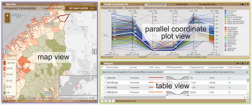
Figure 1. The tested CMV tool with marked Areas of Interest.
Although CMVs feature unique advantages, people are not aware that such tools may help them solve various tasks. Instead, users tend to perceive CMVs as complex, unintuitive, ‘too scientific’ (Opach and Rød, Citation2013) and causing confusion and cognitive overload (Baldonado et al., Citation2000). Andrienko et al. (Citation2002) stated that the issue of accessibility relates to users’ ability to get started with an application, since only a little training is needed for individuals to use CMVs successfully (Andrienko and Andrienko, Citation2001). Therefore, it has been claimed (for instance, by Edsall, Citation2003; Robinson et al., Citation2005; Opach and Rød, Citation2014) that a tutorial, guidance, or an introductory explanation is essential for users to start working with CMVs. For such a tool to be developed, it is necessary to evaluate its learnability – that is, the ability of users to understand its purpose and make sense of how to use it (Nielsen, Citation1993).
Although the literature provides clues for designing tutorials (Bennett and Flach, Citation2011) and examples of tutorials more specifically for CMVs (e.g. Andrienko and Andrienko, Citation2001; Plaisant, Citation2005), there are no insights into how first-time users freely explore CMV geovisualization tools, nor how they learn to use them. Facing this gap, we conduct a user-centred design study on the learnability of a CMV geovisualization tool with a map as a central component. We believe this insight will help to identify which features and functionalities of CMVs need to be explained in tutorials and which elements of CMVs can be skipped because users explore them intuitively. Moreover, we try to understand which elements and interactive functions of CMVs are helpful for those who are getting started with the application. Based on these goals, we want to align our investigations with the user-centred design study approach (Sedlmair et al., Citation2012). The following questions drive the study design:
RQ1 Which features are helpful for novice users to understand how a CMV tool works?
RQ2 Which interaction techniques do users willingly explore?
RQ3 Which features attract the attention of individuals when they learn a CMV tool on their own?
To achieve our goals, we use eye tracking, which has already proved to be valuable in providing insights into how people work with geovisualizations (Fabrikant et al., Citation2008; Çöltekin et al., Citation2010; Opach et al., Citation2014). Eye tracking is commonly supplemented with other methods: usability metrics (Çöltekin et al., Citation2009), user logging (Ooms et al., Citation2015), and talking aloud (Ooms et al., Citation2017). Similarly, we use eye tracking together with interaction logs and talk-aloud to investigate how untrained individuals work with a CMV tool. We hope our investigation will contribute to GIScience in developing tips for CMV tutorials.
Related work
Coordinated and multiple view tools and their tutorials
CMV tools have attracted the attention of GIScience, resulting in a number of empirical studies on the effectiveness of different visualization methods, such as a map, a parallel coordinated plot (PCP), a self-organizing map (SOM), a scatterplot (Edsall, Citation2003; Koua et al., Citation2006; Golebiowska et al., Citation2017). The studies show that different visualization methods favour different task types – for example, a SOM 2D/3D surface for visual grouping, or maps for distinguishing tasks (Koua et al., Citation2006). Therefore, CMVs should be tested with end users, and the tests should cover various issues, including learnability (Andrienko et al. Citation2002).
Although the above studies reported CMVs to be valuable for certain tasks, Andrienko and Andrienko (Citation2007) question why these tools have a limited application. Apart from technical and content-related issues, there are also user-oriented reasons as to why the use of CMV tools is uncommon. McGuiness (Citation1994) notes that new visualization tools are usually designed for, and used exclusively by, experts, whereas second-generation users are likely to include a wider, untrained community. Professionals have formal training, while the general public likely has no such training (Mead, Citation2014), hence taking users into account becomes important when designing tools and training for their use. Andrienko et al. (Citation2002) found that once users are shown how to work with CMVs, they are able to do so effectively. CMVs are novel interfaces for many, but if we help users to get started with a CMV, we can enable them to use these tools effectively (Harrower et al., Citation2000).
Learning materials vary in different aspects: type (e.g. tutorials, tooltips), time of implementation, integration into the interface, type of knowledge supported, and type of media used (Mead, Citation2014). For example, Kang et al. (Citation2003a, Citation2003b) introduced a tutorial which explains where to focus, whereby sticky notes appearing at functional places can be adapted to users’ needs, with the user enabling them if guidance is needed. In another solution, Andrienko and Andrienko (Citation2001) propose guidance based on scenarios of data analysis consisting of a hierarchy of tasks and subtasks that refer to the primitive operations involved in the tasks. Kang et al. (Citation2003a, Citation2003b) have also tested a multi-layered design for the tutorial in which the interface is launched with limited views and functionality. Once the user has understood the basic functions, the interface gradually enables more complex functions. Slingsby et al. (Citation2014) successfully applied this kind of progressing tutorial, relating to playful design in gaming (Ferrara, Citation2012), where players are guided by tutorial versions of a game that gradually increase in complexity. However, there is a risk that a user never ‘discovers’ more advanced levels and never gets to know that some features are implemented into an application. Kang et al. (Citation2003b) also presented a video demonstration of the interface, which is helpful if there is a need to introduce speech for explanation (or subtitles for users with hearing difficulties), or to highlight the mouse cursor, mouse clicks and key presses. However, as Kang et al. (Citation2003a, Citation2003b) claim, such a demonstration is only effective if it is short and refers directly to the way users are going to apply a tool.
Although the mentioned studies provide concrete solutions, they do not reveal what should be explained (i.e. which CMV features are of primary importance when learning the tool – as formulated in RQ1). Nielson (Citation1993) indicates learnability as the most fundamental component of usability. We believe that an insight into learnability may help to develop effective guidance for CMV geovisualization tools.
Working with CMVs, including learning the tool, involves interaction – a dialogue between a human and a geovisualization mediated through a computing device (Roth, Citation2012). The essential elements of this dialogue are the interaction operator primitives – the interfaces that make manipulation of the representation possible. A number of taxonomies of interaction primitives have been developed (Roth, Citation2012; Zhang et al., Citation2016); however, they partially overlap. Despite classification ambiguities, users (especially novices) may perceive various operators differently in terms of difficulty and accessibility. It is therefore vital for CMV designers to understand to what extent first-time users explore the interaction operators, and which operators are easily accessed (as addressed in RQ2).
Lastly, as CMVs are typically complex, it is of particular importance to make informed decisions when developing tools. There is a wide range of available solutions that can be applied into the layout, highlighting being just one example (Robinson, Citation2011). Nevertheless, not all solutions are similarly effective and not all have been sufficiently exploited (Griffin and Robinson, Citation2015). It is therefore important to understand which features of CMV tools attract the attention of individuals who are learning the tools on their own, and which features the individuals refer to when seeking to understand a CMV’s complex layout (as targeted in RQ3).
Gaining insights into users’ visual behaviour as a way to identify unclear features and functionalities of CMV geovisualization tools
Although there are many methods for collecting empirical data on user behaviour when working with CMVs, which can also be of value for tutorial design, not all of them enable researchers to investigate user behaviour in an unobtrusive manner. One method is eye tracking, which allows the tracking of the locations of an individual’s points of regard (PORs) (Duchowski, Citation2007). PORs are the points a user is looking at; these are registered with screen coordinates at a certain sampling rate (e.g. 120 per second). According to the ‘mind-eye hypothesis’ (Nielsen and Pernice, Citation2010), people tend to look at things they are thinking about; users’ visual behaviour can therefore be retrieved from analysis of PORs. Most often, eye tracking metrics are analysed based on fixation locations (Duchowski, Citation2007). A fixation is a POR which is stable over a certain time span and indicates that an individual is reading the content at this location. In contrast to the fixation is the saccade, which is an eye movement between two fixations. The movement during a saccade is so fast that it is impossible to read any content during these moments (Poole and Ball, Citation2006).
Eye tracking has been successfully applied in empirical studies on geovisualization tools of different types (Kiefer et al., Citation2017). In our study, we examine how users spontaneously explore an unknown CMV interface, which is analogous to the free examination task (Yarbus, Citation1967). Yarbus allowed users to explore a painting without any specific task, which enabled him to gain insight into how users intuitively directed their attention within the painting. More recently, a free examination task was applied to the analysis of fixations and saliency of image (Humphrey and Underwood, Citation2009; Borji et al., Citation2013). In cartography and GIScience, this kind of task was used by Dobson (Citation1979), and more recently by Opach et al. (Citation2014) and Dupont et al. (Citation2016).
Empirical study
Visualizing vulnerability to natural hazards
As study material, we used a CMV tool containing information on vulnerability and exposure to natural hazards for Norwegian municipalities (Opach and Rød, Citation2014; http://folk.ntnu.no/opach/tools/viewexposed/). The tool is designed to enable decision makers to identify the location of vulnerable areas in order to undertake adaptation strategies. Moreover, the tool provides local stakeholders with an understanding of what makes a local community vulnerable (Opach and Rød, Citation2013). The tool consists of three views: a map display showing univariate choropleth maps (emphasizing the ‘where’ aspect of the presented vulnerability), a PCP (presenting why the place is vulnerable), and a table with raw data (). Map displays and tables are known to most users, whereas the PCP is understood to be challenging and therefore requires explanation (Robinson et al., Citation2005).
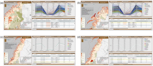
The three views of the study material are dynamically linked. When selecting an object in one view – for example, a polygon representing a municipality on the map – the corresponding objects are also selected (here, a row in the table and a polyline in the PCP) (). Additionally, the tool contains functionalities for transient and durable highlighting (Andrienko et al., Citation2002). Transient highlighting appears when hovering over an object (e.g. a polyline in the PCP) and switches off just after the mouse cursor is moved away from it. Durable highlighting appears when objects are selected with the cursor, and the corresponding objects in the other views are highlighted.
Figure 2. Dynamic linking functionality of the tested CMV tool: (a) all objects are displayed in default view; when selecting (b) a polyline in the PCP, (c) a polygon in the map, or (d) a row in the table, the corresponding objects in other views are also selected.
Study design
Gaining an insight into individuals’ visual behaviour when working with a CMV without any particular task could be of value for recognizing which of its features are particularly helpful for users when learning the tool. We therefore conducted an empirical study with eye tracking as the primary data collection technique. We allowed individuals to explore the CMV tool without: (1) having received an explanation of how to use the tool’s interactive functions, and (2) having any particular tasks to solve. We designed the empirical study to check how individuals behaved (visually): what attracted their visual attention, in what order (and to what extent) they interacted with the tool’s visual components, and how their attention evolved over time.
Methods
To explore the research questions we conducted a user-centred empirical study. Eye tracking was the principal method used, as it allowed us to investigate (in unobtrusive manner) how untrained individuals get started with a CMV interface. However, as converging methods are important for assessing complex geospatial interfaces (Buttenfield, Citation1999), we also used interaction logs and the talking aloud technique. This combination of methods provided us with a comprehensive insight into how first-time users explore a CMV geovisualization tool. We employed the interaction logs technique (Behrens et al., Citation2015) to analyse what interaction functions individuals were using when working with the tool. Since an increasing diversity of functionalities are being implemented in visual interfaces, such as those used in CMV tools, identifying the interaction operators that are not entirely clear to users is important, as it can help developers to design effective tutorials.
In turn, talking aloud helps to determine problem-solving strategies, because individuals are asked to talk aloud during task completion (Ericsson and Simon, Citation1992). Although the method is used for cognitive testing of how mental schemata are employed to solve complex problems (Howard and MacEachren, Citation1996), it is also valuable for getting individual users’ comments on a tool’s interface (Robinson et al., Citation2005). However, there are drawbacks associated with applying talking aloud together with eye tracking. For example, it may alter visual patterns, since speech is slower than eye movements. Nevertheless, combining talking aloud with eye tracking can give a valuable insight into the reasons behind participants’ visual behaviour, as they explain directly why they are looking at particular places. Other studies in GIScience that combine eye tracking with talking aloud (e.g. Ooms et al., Citation2017) show that this approach can reveal new insights. Since we are primarily interested in the process of task execution, not in one particular answer, such direct explanation is valuable to us. This can be unachievable when applying the retrospective think-aloud method, as many details may be forgotten (Gog et al., Citation2005).
Participants
Twenty-nine participants (11 females, 18 males) aged between 22 and 41 years old (27 years old on average) took part in the study voluntarily. All of them were either master’s degree students (79%) or PhD candidates in geography (21%). The same sessions with the participants were also used to collect data for another study; however, both the data and the results from that study are excluded from this article.
We recruited participants from students of geography, so they represented an educated group with knowledge and skills in map reading and interpretation. They reported a moderate level (2.8) of training in cartography (from 1 – no training, to 5 – full training), and a slightly higher level of training in GIS (3). None of them had used a CMV tool before. We believe that those who have already developed skills in terms of reading geovisualization methods might be easily convinced to start using CMV geovisualization tools, despite the initial complexity of these tools.
Set-up and procedure
We conducted the experiment in an area for controlled audio and visual perception experiments: the Speech, Cognition and Language Laboratory (SCaLa) at the Department of Psychology of the Norwegian University of Science and Technology (NTNU). We used the eye tracker SMI RED500 with the recording sample set at 120 Hz. The stimulus was displayed on a 21-inch screen with a resolution of 1680 × 1024 pixels.
After welcoming each participant, we informed them about the general goal of the study. Next, before viewing the tool, the participant filled in a paper and pencil background questionnaire. In the next step, we calibrated the eye tracker; we used Google Chrome to display the stimuli. The task instructions were as follows: ‘Play with the tool in order to familiarize yourself with it. Speak aloud about which features are interesting to you, and which are discouraging.’ The time available for free examination was set to 3 minutes. Participants were not informed of the time limit to avoid them rushing, which might have influenced their behaviour. We decided to introduce the time limit based on the results from the pilot sessions, which revealed that free exploration of the tool for more than three minutes resulted in boredom. When participants fell silent, the experimenter reminded them to talk aloud about their impressions and opinions at the same time as playing with the tool. This kind of prompt to keep talking is commonly used during verbal sessions. At the end of each session, the facilitator thanked the participant for attending.
Data analysis
We used different methods to analyse the collected data. In the analysis of the eye tracking data, we first delineated three Areas of Interest (AOIs). Each AOI reflected one view of the tool (): the map display that occupied 34.5% of the tool’s interface, the PCP (30.9%), and the table view (22.5%). The remaining 12.1% was occupied by elements such as copyright information and the web browser’s URL bar. We used SMI BeGaze software to calculate fixation and eye tracking metrics, and SPSS for statistical analysis. We obtained an overview of the tool’s usage, examining time to first fixation and total fixation lengths for each AOI. To analyse the way in which users explored the CMV layout, we identified the parts of the interface that attracted attention (high fixation density). Lastly, we checked how visual behaviour changed over time. We divided task execution into equal time intervals to investigate how users split their visual attention into the AOIs during each interval.
We used interaction logs to examine which interaction operators were used and by how many participants. We divided the interaction operators into the three views. Finally, we used verbalizations to analyse whether participants had given positive, negative or neutral feedback on the tested tool, paying special attention to the issues crucial for users to go into the tool.
Results
Visual behaviour
The PCP view attracted the participants’ attention the most. The PCP was the AOI that had the shortest time to first fixation, followed by the map and the table (see ). A one-way ANOVA analysis shows a significant difference (F = 3.123, p < 0.05) in the entry time for two AOIs: the PCP and the table view. Regarding the average fixation duration, users fixated the longest on the map, then on the PCP, and the least on the table. However, these differences are not statistically significant (F = 3.123, p > 0.05).
Table 1. Attention given to each Area of Interest (AOI).
When participants looked at the map, they focused on the centre ((a)). There is also a high fixation density on the upper part of the map legend ((b)) and in the locations of the two pop-up windows: the information panel ((c)) that pops up after the user selects a municipality, and the map layer menu ((d)) that pops up after releasing the drop-down menu.
Figure 3. Fixation heat map for all participants. An interpolated fixation density surface is superimposed on the tool’s interface.
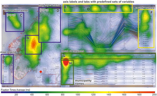
Regarding the PCP and the table, participants looked mainly at the peripheral parts – the explanatory elements and the buttons. In the PCP, most participants focused on the labels of the axis and the tabs used to change the variable sets presented on the axes ((e)) and the list of counties ((f)). Participants also tended to follow the shape of the polyline showing the average values (a white, bold polyline). Finally, in the table, users most frequently looked at the column headers ((g)) and the first column of the table, which contains the municipality names ((h)).
We also analysed how visual behaviour evolved over time. We divided the set time of 3 min into six intervals of 30 s each and calculated the mean fixation time on each view and the mean number of saccades between views ().
Figure 4. Changes in visual behaviour over time.
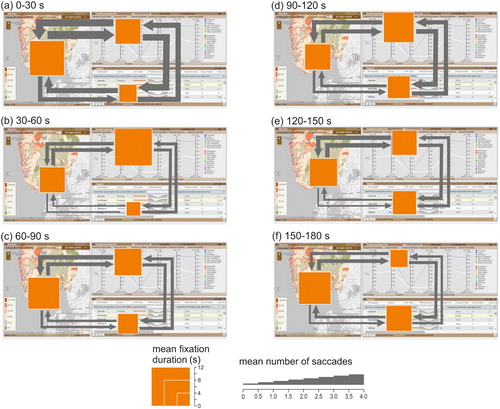
Different views received the longest attention in each time interval. At the beginning, during the 0–30 s time interval ((a)), the map was fixated on the longest (mean fixation duration = 10.8 s). Furthermore, participants often moved their visual attention between views. The highest number of saccades between views occurred during the 30–60 s interval, when participants also fixated the longest on other views – in the 30–60 s and 90–120 s time intervals ((b, d)) participants looked mainly at the PCP (11.6 and 9.4 s, respectively). Later, the table received the highest mean fixation duration (rising from 4.4 s in the 30–60 s interval to 7.9 s in the 150–180 s interval) ((b–f)). In all time intervals except 90–120 s, participants moved their attention most often from the map to the PCP and vice versa. Transitions between the map and the table were less frequent.
Interaction with the tool
In general, participants needed some time to start interacting with the tool. Initially, they looked at the layout. They needed more than one minute on average to decide to try out its interactive functions; the average time to the first mouse click was 61.4 s (SD = 40.1 s). The map was the view that participants most often started with. The average time to first mouse click for each view was 45.4 s (SD = 31.8), 67.1 s (SD = 44.2) and 71.5 s (SD = 44.3) for the map, PCP and table views, respectively. All participants clicked on at least one of the views, but 7% of participants clicked on one view only (either the map or the PCP), and 38% of participants clicked on two views only. There were participants who did not click on some of the views: 21% of participants did not click on the map, 17% of participants did not click on the PCP, while 14% of participants did not click on the table.
Based on the recorded interaction logs, we identified 23 different interaction operators (). The majority of participants only used three kinds of interactions: (1) select a municipality on the map, (2) pan (i.e. scroll) the table, and (3) select a row in the table.
Figure 5. Interaction operators applied by participants during the free examination task. Red outline indicates interaction initiated by clicking the predefined buttons.
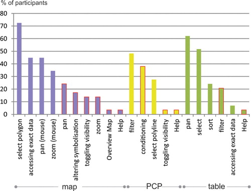
Municipality selection on the map was the first operation for 45% of participants, and 72% of participants executed this operation at least once during the free examination task. Users often obtained exact information on municipalities by hovering over them on the map (45% of participants) and adjusted the map by panning and zooming. Only 14% toggled the visibility of the choropleth maps, using the ‘Set map layers’ button.
The majority of participants performed object selection in the map (clicking on a polygon) and in the table (clicking on a row) – 72% and 52% of participants, respectively. Fewer participants (27%) did so in the PCP (clicking on a polyline) since, we assume, the overlapping polylines in the PCP cause visual clutter (Golebiowska et al., Citation2017). This may make the selection of individual polylines difficult compared with selecting a row in the table or a polygon in the map. Filtering by county was the type of interaction most used for the PCP (48% of participants). This filter removes polylines from the PCP and reduces its visual clutter (Heinrich and Weiskopf, Citation2013). Participants also toggled the visibility of the presented data (37%) using the tabs with predefined sets of variables. Clicking on one of the three tabs (‘exposure indexes’, ‘vulnerability indexes’ or ‘custom settings’) alters the variables represented on the parallel axes.
Regarding the table view, participants most often (62%) scrolled the table to see rows not displayed in the default setting. When selecting a row, 52% of participants expected the tool to highlight the corresponding objects in other views (as it did). Moreover, none of the participants used the search bar. Finally, 24% of participants sorted data in the table, while 20% checked how the slider for data filtering worked.
Only one participant used the ‘Help’ button available in each view to get explanations. This confirms the common opinion that people generally do not read manuals and do not use them even if they need help to understand how a certain functionality works. Moreover, while exploring the tool, most participants clicked with the left mouse button. Only one participant performed a right mouse button click on one occasion when searching for a particular option.
Finally, participants preferred using the mouse left-click or the mouse wheel to using the buttons (see the bars with the red outline in ). This supports the results of Manson et al. (Citation2012). For example, for panning and zooming, participants used the left mouse button and the mouse wheel (45% and 34%, respectively) about twice as often as the pan and zoom button operations (24% and 14%, respectively). This suggests that the interface could be ‘lightened up’ by removing redundant elements – omitting the buttons for functions triggered by mouse clicks and the mouse wheel, for instance.
User feedback
We asked individuals to comment aloud when using the tool. From the resulting verbal reports, we calculated the proportion of positive, negative and neutral feedback. 39% of statements presented negative opinions; participants claimed that the initial impression was quite chaotic, due to the amount of data presented at once. They also expressed the need for hints on how to start working with the tool. Participants often referred to the PCP as a confusing visualization technique. They claimed the PCP was hard to read because there were too many lines, and too much detailed information presented at once; it was hard to identify a particular line. Participants found PCP to be a technique that one would need training in, in order for it to be understandable.
Meanwhile, 37% of statements provided positive feedback. Once participants started to play with the tool, they usually found it easier to use. For interaction with the tool, it was important to understand how the dynamic linking between views works. However, participants admitted that it took some time for them to become aware of the dynamic linking. Participants especially appreciated the option to filter polylines in the PCP by selecting a municipality on the map.
In the neutral statements (24%), participants were either reading aloud information from the tool or expressing personal thoughts about the part of Norway they were looking at.
Going into the tool
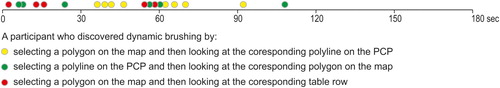
Participants reported that once they discovered dynamic linking, they perceived the CMV as less complex. We therefore investigated the ways in which participants spontaneously discovered dynamic linking – in other words, if and when they realized that the tool offered dynamic linking for data exploration. We used ELAN 3.7.2 (Auer et al., Citation2010) to synchronize eye-gaze recordings with video recordings of users verbalizing their thoughts.
It turned out that only 66% of participants realized that the views were dynamically linked. The rest continued to analyse the views separately. This suggests that not all untrained CMV geovisualization tool users are able to spontaneously discover dynamic linking. Furthermore, participants varied in terms of time needed to discover the dynamic linking. Most did so in the first minute of playing with the tool (). The dynamic linking was discovered in various ways. While 53% of participants clicked on the map to select a municipality and analysed the corresponding polyline in the PCP, 26% selected a municipality on the map and looked at the corresponding table row. Finally, 21% of these participants clicked on a polyline in the PCP and looked at the corresponding municipality on the map.
Figure 6. Time taken by participants to discover dynamic linking. One dot represents one participant.
We also analysed whether visual behaviour changed after participants had discovered dynamic linking. Due to the uneven time ‘before’ and ‘after’ each discovery, we calculated percentage of fixations by view before and after participants discovered the dynamic linking. In addition, we calculated the percentage of saccades between views (). It turned out that no considerable change in visual behaviour occurred when participants recognized dynamic linking. They fixated on each view in similar proportions and they moved their attention at a similar frequency (). We assume that this happened because participants had no particular task to solve. It would therefore be interesting to study visual behaviour when a participant discovers dynamic linking while solving a specific task.
Table 2. Division of visual attention between views before and after discovering dynamic linking.
Discussion
Since many authors have claim that a tutorial or an introduction is needed for the effective use of CMV geovisualization tools (Edsall, Citation2003), we conducted an empirical study to gain an insight into how first-time users get started with a CMV. This insight is useful when preparing CMV tutorials as it enables designers to develop empirically justified clues about the features of CMVs that need to be explained ().
Table 3. Implications from the empirical study on the design of CMV geovisualization tool tutorials.
Features helpful for novice users to understand how a CMV tool works
Firstly, we tried to indicate which features are helpful for novice users to learn a CMV tool (RQ1). Based on feedback from participants, similarly to Baldonado et al. (Citation2000), we found that the CMV tool is confusing at first sight for untrained users. Users found the CMV layout complicated due to many elements ‘popping up’ at once. Therefore, we should provide users with clear hints on how to start using the tool and how to filter its data input – especially by explaining how dynamic linking works, since not all participants discovered it spontaneously. Dynamic linking filters data and makes a visually encoded message less complicated and easier to explore (Roberts, Citation2007). When users realized how dynamic linking worked, they reported that the tool was easy to work with.
When exploring the interface, individuals often directed their attention to explanatory elements to understand how the tool worked: the map legend ((b)) and the information panel ((c)) in the map, the table column headers ((g)), the list of counties, and the PCP tabs ((e)). Only one participant used the ‘help’ button to get extra explanations, supporting the opinion that users are reluctant to refer to manuals (Plaisant, Citation2005). Most participants focused on labels and other explanatory elements, without referring to the explanations provided via the ‘help’ buttons. This finding suggests that in the design of a CMV, its explanatory elements should be informative and large, since users focus on them first to get an overview of the available functionalities.
Furthermore, the change in visual behaviour in the subsequent time intervals (section 3.6.4) confirms the ‘Information Seeking Mantra’ (Shneiderman, Citation1996), which reflects the process of exploratory data analysis (Andrienko and Andrienko, Citation2006). At the beginning of the free exploration task, participants found that the map was a convenient way to get an overview of the content. Later, they focused on the PCP, which enabled them to explore how each municipality scores on several variables. The table was viewed for longer, as this component was the most convenient for reading precise data.
Interaction techniques willingly explored
When analysing the collected data, we sought to examine which interaction techniques users willingly explored (RQ2). It turned out that participants were keen to view and click on the map, since they were familiar with this kind of data visualization. Participants zoomed and panned the map more often using a mouse scroll and left mouse button click than using the on-screen button equivalents of those functions. Instead of, or in addition to, supplementary zoom and pan buttons, it may be useful to implement common user interaction techniques known from popular apps such as Google Maps. This would help keep the interface simple and save space for buttons for less intuitive functionalities.
Participants found the table the least tempting visual component. It was viewed and clicked on, but it had the shortest average fixation time. Although the table provided exact scores, it did not attract participants’ attention as much as other visual components. However, as stated by Golebiowska et al. (Citation2017), when users need to retrieve exact values from a CMV, they often refer to a table.
Participants used a limited range of interaction techniques. The majority applied three operations: selecting a municipality on the map, selecting a table row, and scrolling the table. Only few participants switched map layers; however, we suspect that many participants did not find this somewhat hidden functionality, since the layer switcher displays after clicking the ‘Set map layer’ button. It may therefore be useful for a guidance system to make the layer switcher visible after running the tool, even though this would occupy some of the display area.
The participants did not explore the tool with the right mouse button. Therefore, it is not recommended to employ this button for essential functionalities, since it is not intuitive. The right mouse button could be reserved for more advanced functions, and those functions that are rarely used. On the other hand, our observation is that CMV users should be able to access most (or all if possible) functionalities using the left mouse button.
Features attracting the attention of individuals when learning a CMV
Finally, we wanted to learn which features attract users’ attention when they are learning CMVs on their own (RQ3). As already mentioned, the exploratory elements, such as the table column headers and the map legend, were the features that participants focused on. Moreover, during the initial contact with the tool, users tended to look at uncommon visual components – the PCP, in this case. This confirms Edsall and Deitrick’s (Citation2009) finding that atypical designs grab people’s attention. Nevertheless, although participants focused their attention on the PCP, they seldom interacted with it. Individuals reported that numerous polylines made the PCP illegible, which supports the opinion of Heinrich and Weiskopf (Citation2013) on visual clutter. Therefore, visual clutter reduction should be considered when implementing PCPs – for example, retaining just one polyline and showing the rest as faded or transparent.
Participants learned the tool mainly by reading its labels, not by clicking and interacting with it. It is therefore worth providing informative and easily visible labels that may encourage users to interact with a CMV. Once they start using the tool, they discover dynamic linking, which greatly enhances their understanding of how the tool works.
Conclusions
CMV users require initial training or an introduction to combat their reluctance to use such tools. We believe that CMVs need tutorials because of their visual complexity. The insight gained into the process that users go through to learn a CMV tool, and the identification of the sources of confusion and issues that users find problematic, can serve as guidance for CMV tutorials.
We employed eye tracking, interaction logs and verbal reports to investigate how people work with a CMV geovisualization tool to which they are not accustomed. This diversity of empirical data enabled us to gain a comprehensive insight into participants’ free examination of the tool. The participants willingly explored the complex CMV interface. Recognizing how the dynamic linking worked was a crucial stage that enabled them to find the tool pleasant to learn and to work with. To comprehend the ‘unknown’ interface, participants focused on its explanatory elements: the map legend, the tabs of the PCP view, or the table column headers. When working with the tool, they looked at all of its views – even the PCP, which is rarely used in visual interfaces. The PCP’s uncommon form attracted attention and therefore, participants often focused on it during the first viewing. However, they were reluctant to interact with this view.
Based on the collected data, we have drawn up a set of guidelines for CMV interface design to help make it understandable for untrained users (). We think that, with a carefully designed layout using empirically justified hints, these users will be able to perceive even complex and function-rich CMV tools as easy to understand and use. Although our results relate to one specific CMV geovisualization tool, it features commonly used geovisualization methods, so we believe that our findings may be transferable to other CMV tools.
We hope that our study contributes to the body of science on how to build ‘legible’ CMV geovisualization tools. However, some usability aspects and research questions still need to be addressed with other user groups and other CMVs, as well as with other than free examination tasks. Our findings can serve as the starting point for such further explorations.
Disclosure statement
No potential conflict of interest was reported by the authors.
Notes on contributor
 Izabela Golebiowska is a researcher at the Department of Geoinformatics, Cartography and Remote Sensing at the University of Warsaw. She received her MSc and PhD degrees in cartography from the University of Warsaw in 2007 and 2011, respectively. Her research interests are GIScience and cognition. Since starting her PhD project she has developed a research interest in effective graphical user interface design of maps and geovisualization tools. She is also involved in utilizing GIS and geovisualization in research within other disciplines, such as historical hydrology, planetary geology and analog Mars simulation.
 Tomasz Opach holds a PhD in geography. He is a researcher at the Department of Geography at the Norwegian University of Science and Technology (NTNU), Trondheim, Norway, and a visiting senior lecturer at the Department of Thematic Studies, Linköping University, Sweden. His current research interests cover geovisualization tools with coordinated and multiple views, climate services, and map-based tools supporting decision making processes in general, and facilitating climate change adaptation in particular.
 Jan Ketil Rød is a professor in geographic information systems and science at the Department of Geography at the Norwegian University of Science and Technology (NTNU), Trondheim, Norway. His research interest is broadly in applying GIS and geovisualization to address issues related to climate change, vulnerability, environmental hazards, accessibility of health services, disaggregated studies of armed conflicts, urban planning and the use of GIS in education.
Additional information
Funding
References
- Andrienko, N. and Andrienko, G. (2001) “Intelligent Support for Geographic Data Analysis and Decision Making in the Web” Journal of Geographic Information and Decision Analysis 5 pp.115–128 DOI:10.1.1.465.805.
- Andrienko, N. and Andrienko, G. (2006) Exploratory Analysis of Spatial and Temporal Data Heidelberg: Springer.
- Andrienko, G. and Andrienko, N. (2007) “Coordinated Multiple Views: a Critical View” Fifth International Conference on Coordinated and Multiple Views in Exploratory Visualization Zurich, Switzerland: 2nd July Los Alamitos: IEEE Computer Society, pp.72–74.
- Andrienko, N., Andrienko, G., Voss, H., Bernardo, F., Hipolito, J. and Kretchmer, U. (2002) “Testing the Usability of Interactive Maps in CommonGIS” Cartographic and Geographic Information Science 29 (4) pp.325–342 DOI:10.1559/152304002782008369.
- Auer, E., Russel, A., Sloetjes, H., Wittenburg, P., Schreer, O., Masnieri, S., Schneider, D. and Tschöpel, S. (2010) “ELAN as flexible annotation framework for sound and image processing detectors” Seventh Conference on International Language Resources and Evaluation (LREC'10) Valetta, Malta: 17th–23rd May Malta: European Language Resources Association, pp.890–893.
- Baldonado, M.Q.W., Woodruff, A. and Kuchinsky, A. (2000) “Guidelines for using multiple views in information visualization” 5th International Working Conference on Advanced Visual Interfaces AVI’2000 Palermo, Italy: 24th–26th May, New York: ACM Press, pp.110–119.
- Behrens, J., van Elzakker, C.P.J. and Schmidt, M. (2015) “Testing the Usability of OpenStreetMap's iD Tool” The Cartographic Journal 52 (2) pp.177–184 DOI:10.1080/00087041.2015.1119457.
- Bennett, K.B. and Flach, J.M. (2011) Display and Interface Design: Subtle Science, Exact Art Boca Raton: CRC Press, Taylor & Francis Group.
- Borji, A., Sihite, D.N. and Itti, L. (2013) “What Stands Out in a Scene? A Study of Human Explicit Saliency Judgment” Vision Research 91 (18) pp.62–77 DOI:10.1016/j.visres.2013.07.016.
- Buttenfield, B. (1999) “Usability Evaluation of Digital Libraries” Science & Technology Libraries 17 (3–4) pp.39–59 DOI:10.1300/J122v17n03_04.
- Çöltekin, A., Heil, B., Garlandini, S. and Fabrikant, S.I. (2009) “Evaluating the Effectiveness of Interactive Map Interface Designs: A Case Study Integrating Usability Metrics with Eye-movement Analysis” Cartography and Geographic Information Science 36 (1) pp.5–17 DOI:10.1559/152304009787340197.
- Çöltekin, A., Fabrikant, S.I. and Lacayo, M. (2010) “Exploring the Efficiency of Users’ Visual Analytics Strategies based on Sequence Analysis of Eye Movement Recordings” International Journal of Geographical Information Science 24 (10) pp.1559–1575 DOI:10.1080/13658816.2010.511718.
- Dobson, M.W. (1979) “The Influence of Map Information on Fixation Localization” The American Cartographer 6 (1) pp.51–65 DOI:10.1559/152304079784022772.
- Duchowski, A.T. (2007) Eye Tracking Methodology – Theory and Practice. London: Springer.
- Dupont, L., Ooms, K., Antrop, M. and Van Eetvelde, V. (2016) “Comparing Saliency Maps and Eye-tracking Focus Maps: The Potential Use in Visual Impact Assessment based on Landscape Photographs” Landscape and Urban Planning 148 pp.17–26 DOI:10.1016/j.landurbplan.2015.12.007.
- Dykes, J.A. (1997) “Exploring Spatial Data Representation with Dynamic Graphics” Computers & Geosciences 23 (4) pp.345–370 DOI:10.1016/S0098-3004(97)00009-5.
- Edsall, R.M. (2003) “Design and Usability of an Enhanced Geographic Information System for Exploration of Multivariate Health Statistics” The Professional Geographer 55 (2) pp.146–160 DOI:10.1111/0033-0124.5502003.
- Edsall, R.M. and Deitrick, S. (2009) “Case studies demonstrating the utility of unconventional designs for geographic problem solving” 24th International Cartographic Conference Santiago de Chile, Chile: 15th–21st November.
- Ericsson, K.A., Simon, H.A. (1992) Protocol Analysis: Verbal Reports as Data Cambridge, MA: MIT Press.
- Fabrikant, S.I., Rebich-Hespanha, S., Andrienko, N., Andrienko, G. and Montello, D.R. (2008) “Novel Method to Measure Inference Affordance in Static Small Multiple Displays Representing Dynamic Processes” The Cartographic Journal 45 (3) pp.201–215 DOI:10.1179/000870408X311396.
- Ferrara, J. (2012) Playful Design Sebastopol, CA: O’Reilly Media.
- Golebiowska, I. Opach, T. and Rød, J.K. (2017) “For Your Eyes Only? Evaluating a Coordinated and Multiple Views Tool with a Map, a Parallel Coordinated Plot and a Table Using an Eye-tracking Approach” International Journal of Geographical Information Science 37 (2) pp.237–252 DOI:10.1080/13658816.2016.1191636.
- Gog, T., Paas, F., Van Merriënboer, J.J.G. and Vitte, P. (2005) “Uncovering the Problem-solving Process: Cued Retrospective Reporting Versus Concurrent and Retrospective Reporting” Journal of Experimental Psychology: Applied 11 (4) pp.237–244 DOI:10.1037/1076-898X.11.4.237.
- Griffin, A.L. and Robinson, A.C. (2015) “Comparing Color and Leader Line Highlighting Strategies in Coordinated View Geovisualizations” IEEE Transactions on Visualization and Computer Graphics 21 (3) pp.339–349 DOI:10.1109/TVCG.2014.2371858.
- Harrower, M., MacEachren, A.M. and Griffin, A.L. (2000) “Developing a Geographic Visualization Tool to Support Earth Science Learning” Cartography and Geographic Information Science 27 (4) pp.279–293 DOI:10.1559/152304000783547759.
- Heinrich, J. and Weiskopf, D. (2013) “State of the Art of Parallel Coordinates” In Sbert, M. and Szirmay-Kalos, L. (Eds) Eurographics 2013: STAR – State of the Art Report Geneva: The Eurographics Association pp.95–116.
- Howard, D.L. and MacEachren, A.M. (1996) “Interface Design for Geographic Visualization: Tools for Representing Reliability” Cartography and Geographic Information Science 23 (2) pp.59–77 DOI:10.1559/152304096782562109.
- Humphrey, K. and Underwood, G. (2009) “Domain Knowledge Moderates the Influence of Visual Saliency in Scene Recognition” British Journal of Psychology 100 (2) pp.377–398 DOI:10.1348/000712608X344780.
- Kang, H., Plaisant, C. and Shneiderman, B. (2003a) “Helping users get started with visual interfaces: multi-layered interfaces, integrated initial guidance and video demonstrations” Annual National Conference on Digital Government Research Boston, USA: 18th–21st May, Boston: Digital Government Society of North America, pp.790–794.
- Kang, H., Plaisant, C. and Shneiderman B. (2003b) “New approaches to help users get started with visual interfaces: multi-layered interfaces and integrated initial guidance” Annual National Conference on Digital Government Research Boston, USA: 18th–21st May, Boston: Digital Government Society of North America, pp.1–6.
- Kiefer, P., Giannopoulos, I., Raubal, M. and Duchowski A. (2017) “Eye Tracking for Spatial Research: Cognition, Computation, Challenges” Spatial Cognition & Computation 17 (1–2) pp.1–19 DOI:10.1080/13875868.2016.1254634.
- Koua, E.L., MacEachren, A. and Kraak, M.-J. (2006) “Evaluating the Usability of Visualization Methods in an Exploratory Geovisualization Environment” International Journal of Geographical Information Science 20 (4) pp.425–448 DOI:10.1080/13658810600607550.
- Manson, S.M, Kne, L., Dyke K.R, Shannon, J. and Eria S. (2012) “Using Eye-tracking and Mouse Metrics to Test Usability of Web Mapping Navigation” Cartography and Geographic Information Science 39 (1) pp.48–60 DOI:10.1559/1523040639148.
- McGuinness, C. (1994) “Expert/Novice Use of Visualization Tools” In MacEachren, A.M., Taylor, D.R.F. (Eds) Visualization in Modern Cartography Oxford: Elsevier Science Ltd., pp.185–199.
- Mead, R. (2014) “Expert Perspectives on the Design and Use of Learning Materials for Neocartographic Interfaces” (M.Sc. thesis) University of Wisconsin-Madison Available at: https://minds.wisconsin.edu/bitstream/handle/1793/74981/Mead%20Rashauna%202014.pdf?sequence=1&isAllowed=y (Accessed: 3rd July 2019).
- Nielsen, J. (1993) Usability Engineering Boston, Boston MA: Academic Press, Inc.
- Nielsen, J. and Pernice, K. (2010) Eyetracking Web Usability Berkeley: New Riders.
- Ooms, K., Çöltekin, A., De Maeyer, P., Dupont, L., Fabrikant, S., Incoul A., Kuhn, M., Slabbinck, H., Vansteenkiste P. and Van der Haegen, L. (2015) “Combining User Logging with Eye Tracking for Interactive and Dynamic Applications” Behavior Research Methods 47 (4) pp.977–993 DOI:10.3758/s13428-014-0542-3.
- Ooms, K., Dupont, L. and Lapon, L. (2017) “Mixing Methods and Triangulating Results to Study the Influence of Panning on Map Users’ Attentive Behaviour” The Cartographic Journal 54 (3) pp. 196–213 DOI:10.1080/00087041.2016.1213517.
- Opach, T., Golebiowska, I. and Fabrikant, S.I. (2014) “How Do People view Multi-component Animated Maps?” The Cartographic Journal 51 (4) pp.330–342 DOI:10.1179/1743277413Y.0000000049.
- Opach, T. and Rød, J.K. (2013) “Cartographic Visualization of Vulnerability to Natural Hazards” Cartographica 48 (2) pp.113–125 DOI:10.3138/carto.48.2.1840.
- Opach, T. and Rød, J.K. (2014) “Do Choropleth Maps Linked with Parallel Coordinates Facilitate an Understanding of Multivariate Spatial Characteristics?” Cartography and Geographic Information Science 41 (5) pp.413–429 DOI:10.1080/15230406.2014.953585.
- Plaisant, C. (2005) “Information Visualization and the Challenge of Universal Usability” In Dykes, J., MacEachren, A.M., Kraak, M.-J. (Eds) Exploring Geovisualization Amsterdam: Elsevier Ltd, pp.53–82.
- Poole, A. and Ball, L.J. (2006) “Eye Tracking in human Computer Interaction and Usability Research: Current Status and Future Prospects” In Ghaoui, C. (Ed.) Encyclopaedia of Human Computer Interaction Pennsylvania: Idea Group, pp.211–219.
- Roberts, J.C. (2007) “State of the Art: Coordinated & Multiple Views in Exploratory Visualization” Fifth International Conference on Coordinated and Multiple Views in Exploratory Visualization Zurich, Switzerland: 2nd July, Los Alamitos: IEEE Computer Society, pp.61–71.
- Robinson, A.C., Chen, J., Lengerich, E.J., Meyer, H.G. and MacEachren, A.M. (2005) “Combining Usability Techniques to Design Geovisualization Tools for Epidemiology” Cartography and Geographic Information Sciences 32 (1) pp.243–255 DOI:10.1559/152304005775194700.
- Robinson, A.C. (2011) “Highlighting in Geovisualization” Cartography and Geographic Information Science 38 (4) pp.373–383 DOI:10.1559/15230406384373.
- Roth, R. (2012) “Cartographic Interaction Primitives: Framework and Synthesis” The Cartographic Journal 49 (4) pp.376–395 DOI:10.1179/1743277412Y.0000000019.
- Sedlmair, M., Meyer, E. and Munzer, T. (2012) “Design Study Methodology: Reflections from the Trenches and the Stacks” IEEE Transactions on Visualization and Computer Graphics 18 (12) pp.2431–2440 DOI:10.1109/TVCG.2012.213.
- Shneiderman, B. (1996) “The eye have it: a task by data type taxonomy for information visualization” IEEE Symposium on Visual Languages Boulder, USA: 3–6 September IEEE Computer Society Press: Pictaway, pp.336–343.
- Slingsby, A., Dykes, J., Wood, J. and Radburn, R. (2014) “Designing an Exploratory Visual Interface to the Results of Citizen Surveys” International Journal of Geographical Information Science 28 (10) pp.2090–2125 DOI:10.1080/13658816.2014.920845.
- Yarbus, A.L. (1967) Eye Movements and Vision New York: Plenum Press.
- Zhang, Q., Kraak, M.-J. and Blok, C.A. (2016) “Structuring Relations between User Tasks and Interactive Tasks Using a Visual Problem-Solving Approach” In Gartner, G., Jobst, M. and Huang, H. (Eds) Progress in Cartography Cham: Springer International Publishing pp.101–114.