
Is this cartography’s defining moment of the century? The year 2020 has so far been dominated by the impact of COVID-19, the disease associated with the novel coronavirus SARS-CoV-2.Footnote1 With global cases exceeding 30 million and leaving almost one million dead by August, humanity has not suffered such a devastating pandemic for over a hundred years.Footnote2 Maps have come to play a greater role in communicating spatiotemporal information to mass audiences since the ‘Spanish’ influenza pandemic of 1918–1919. Today, maps of the present pandemic are everywhere, and their makers have the advantage of using dynamic methods for mapping dynamic phenomena (such as disease) across time and space. Access to multi-scale digital base maps, the processing of ‘big data’ and their dissemination via the World Wide Web to provide up-to-date information in near-real time have enabled the communication of information about the spread of the disease to millions of people around the globe. Understanding the impact of COVID-19 has grown proportionately with the use of mapping across the public and private sectors, particularly via near-real-time dashboardsFootnote3 (Rosenkrantz et al., Citation2020). The COVID-19 dashboard hosted by the Center for Systems Science and Engineering (CSSE) at Johns Hopkins University (JHU, Citation2020) (), for example, which was first shared publicly on 22nd January, illustrates the location and number of confirmed COVID-19 cases, deaths and recoveries for all affected countries and was developed to provide researchers, public health authorities and the general public with a user-friendly tool to track the outbreak as it unfolds (Dong et al., Citation2020). The JHU dashboard has been imitated worldwide – even by creators of malware – and is possibly the leading apparatus of global situational awareness regarding COVID-19.
Figure 1. COVID-19 dashboard by the Center for Systems Science and Engineering (CSSE) at Johns Hopkins University (JHU) (https://coronavirus.jhu.edu/map.html) (Accessed: 3rd June 2020). © 2020 by Johns Hopkins University & Medicine. All rights reserved. Reproduced with permission.
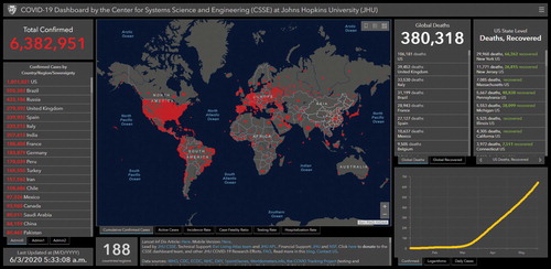
Design matters. The way information is presented and organized becomes as important as content (Wurman et al., Citation2001). Sporting an interface that would not look out of place onboard the starship USS Enterprise, the JHU dashboard features a large world map surrounded by ranked tables and by graphs that resemble cardiograms, while its aesthetic belongs firmly to the digital era; its light-on-dark colour scheme, fluid multi-scale zoom and seamless pan lying in stark contrast to their white, static epidemiological paper cartographic predecessors of the previous century. But its authority is no less derived from the focus placed on its map (however well-tuned to the aesthetic ‘high ground’ of technological prowess) than from the dashboard's impressive ability to display near-real-time data from around the world simultaneously in different formats. Indeed, Skarlatidou et al. (Citation2011) note that users prefer large map interfaces (which support greater spatial cognition because they present more spatial elements on the same map tile), possibly because they provide users with more control, confidence and satisfaction – all of which could subsequently increase their trust in the system. As if designed for surveilling a volatile planet Earth from the safety of orbit, the JHU dashboard reinforces the sense of remoteness between observer and observed, which perhaps also lends to the user a privileged (if false) sense of immunity.
It is not difficult to see why maps have taken centre stage in the visual communication of information about the pandemic. They offer an unbeatable combination of implied authority (as derived from their assumed objectivity and unauthoredness) with a unique capacity for presenting spatial patterns in an instant. Nevertheless, mapping COVID-19 on a global scale presents its own significant challenges. Methods of reporting vary by country and how deaths attributed to the disease are counted in some countries has changed since deaths were first recorded,Footnote4 while data gathered from various organizations within and beyond government departments need to be configured and integrated (Zhou et al., Citation2020). Moreover, gaining users’ trust is essential at a time when social media are routinely regarded as news providers. The potential of maps to inform, misinform or disinform is greatest when there is an urgent demand for information, especially as a news story is breaking. Maps are perhaps most successful in ‘going viral’ at this point of ‘information anxiety’,Footnote5 by conveying a believable impression that both appeals and conforms to what users imagine could be true. It is not uncommon for successful dissemination to be unintentional, as was demonstrated in the early stages of the pandemic when several news agencies misinterpreted a map showing routes of global air travel as indicating where residents of Wuhan (the Chinese city where the first outbreak of SARS-CoV-2 was recorded in December 2019) had travelled during the two weeks prior to their three-month lockdown (BBC Reality Check, Citation2020).
Cartographers regularly express concern about the potential of maps to mislead (e.g. Kent, Citation2017; Robinson, Citation2019). This is often accompanied by a sense of dread at the ease by which maps can be created and disseminated today, since map consumers have become map prosumers that produce and publish content. As Rosenkrantz et al. (Citation2020: 1) explain, mapmaking is accessible to ‘just about anyone with a with a computer and some technical know-how’ and Griffin (Citation2020: 6) asserts that ‘anyone with access to the Internet and a basic computer can now make maps to serve their own interests, whatever they may be’. Long-standing initiatives such as the British Cartographic Society’s Better Mapping campaign have aimed to educate those working with geospatial data in order to improve standards in cartographic quality, and attempts to illustrate specific methods for mapping COVID-19 have been offered (e.g. Field, Citation2020; Mocnik et al., Citation2020), urging makers of would-be-viral virus maps to demonstrate a commitment to communicating both effectively and responsibly.
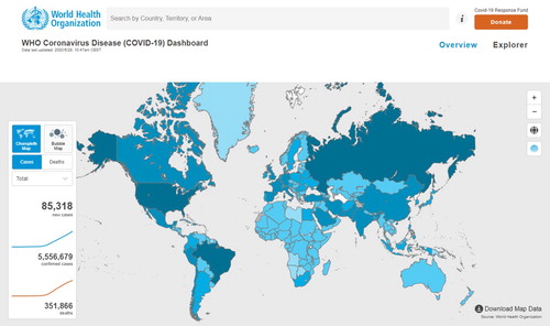
The issue, however, lies beyond the realm of the prosumer. A limited knowledge of the language of mapping (including an understanding of the connotative power of its symbology) is not the exclusive preserve of cartographically illiterate mapmakers who yearn to see their latest creations ‘go viral’. Rozenkrantz et al. (Citation2020: 1) warn that the proliferation of ‘out of the box’ mapping solutions has led to a plethora of mediocre COVID-19 maps that serve little real benefit and distort reality, whether intentionally or not.Footnote6 The prevalence of the Web Mercator projection for global maps – including the those incorporated in the COVID-19 dashboards of JHU and of WHO (World Health Organization) – lies at odds with widely circulated arguments against the suitability of the projection for making global comparisons due to its distortion of area.Footnote7 The scarcity of equal-area projections in mapping COVID-19 is exacerbated by the implementation of area-based cartographic techniques, such as graduated circles, to indicate the number of cases or deaths by country. A similar indication of cartographic naivety is the proliferation of choropleth maps that use absolute values (i.e. raw totals).Footnote8 For example, the WHO COVID-19 dashboard opens with a global choropleth map using absolute values of the number of cases of infection (), which replaced its global map of graduated circles (or ‘bubble map’) as the main view on 28th May.Footnote9
Figure 2. WHO coronavirus disease (COVID-19) dashboard world choropleth map. Geneva: World Health Organization, 2020 (https://covid19.who.int/) (Accessed: 28th May 2020). © 2020 World Health Organization. All rights reserved. Licence: CC BY-NC-SA 3.0 IGO.
Improving cartographic literacy is important if we want to create and use maps that advance our understanding of the spatial dimensions of phenomena. This is critical for mapping COVID-19, when policy makers and the wider public alike require access to accurate and timely information that is presented using the most suitable techniques. There is also scope to visualize more complex spatiotemporal analyses. However, Olsen et al. (Citation1996) argue that maps tend to be misinterpreted in the context of diseases, particularly regarding the identification of spatial clusters, the estimation of absolute and relative numbers and cognitive overload due to the complexity inherent in the data. In examining the choropleth mapping of epidemiological data, Brewer and Pickle (Citation2002: 679) suggest that facilitating a comparison between maps is more important than optimizing classification for a single map. Nevertheless, while dashboards provide coordinated and multiple views to provide situational awareness, Golebiowska et al. (Citation2020) recommend that tutorials should be offered because of their visual complexity.
Avoiding complexity, however, does not necessarily lead to better understanding. As Tufte (Citation1990: 51) explains, simpleness is not an information display strategy or a guide to clarity, and what is sought instead is ‘a rich texture of data, a comparative context, an understanding of complexity revealed with an economy of means’. The use of absolute values in choropleth maps may aim to give users what they want, i.e. a way of finding out the number of infections and/or deaths associated with their area or country, but not what they actually need, i.e. a meaningful way of comparing rates of infection and/or death to assess risk. Such data could be presented more efficiently using ranked tables or graphs.
However, tables and graphs do not appeal to the imagination or communicate the same quality of situational awareness as maps, with their promise of surveillance – as if they were a window on the world. For COVID-19, that appeal is further enhanced with the use of red hues; exciting, dramatic and associated with threat. Indeed, Griffin (Citation2020: 14) suggests that the success of the JHU dashboard, apart from its early release, owes in part to its choice of colour to connote danger and urgency, i.e., the use of saturated red symbols as opposed to the ‘rather staid, neutral appearance of the WHO map’. Strong empirical evidence for the perceived link between red and danger has been provided by Pravossoudovitch et al. (Citation2014), although red means good luck and happiness in China and is the symbol of life in Japan (Pater, Citation2016). In their investigation to determine what makes an image popular on Flickr, Khosla et al. (Citation2014: 870) suggest that more striking colours (like red) tend to catch the eye of the observer and lead to a higher number of views. Hence, there is a need for the better education of map readers to be critical consumers of visual media (Muehlenhaus, Citation2012), even if the act of consumption implies more of a superficial understanding rather than any deep learning or immersive study.
Indeed, mapping is never solely about design, since it involves questions of ethics and aesthetics in deciding what to show and how to show it. The manipulation of data on maps to serve political ends is hardly separable from the history of mapping. If counter-mapping aims to reverse power asymmetries (Crampton, Citation2008), the wider availability of information technologies, including the Internet as ‘the great equalizer’, has seemingly enabled individuals to challenge organizations with equal cartographic clout. Certainly, the combination of up-to-date mapping software (including ‘out of the box’ solutions with pre-set cartographic styles) with access to public datasets and the means of global dissemination via the World Wide Web, has served to reduce the visible distinction between maps and counter-maps, particularly those associated with COVID-19.
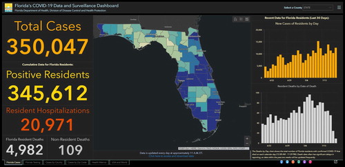
We can therefore expect standards of ethics – as opposed to aesthetics – increasingly to distinguish professional from amateur mapmakers. At face value, dashboards may seem to provide greater transparency and accountability in policy- and decision-making (Çöltekin et al., Citation2019). However, as with any crisis, the production and control of storylines and framing is shot through with power and knowledge struggles (Dodds et al., Citation2020: 294), which are often manifested in the creation of alternative and opposing cartographic perspectives. This is illustrated by the counter-mapping initiative by former Florida government data scientist Rebekah Jones, who created her own COVID-19 dashboard () after claiming that the official version maintained by Florida’s Department of Health (DoH) () had ‘tried to hide or restrict from public view’ certain data, partly in an effort to speed up the state’s economic re-opening (Mansoor, Citation2020). The new dashboard Jones developed includes the positive results of antibody tests in cumulative totals, therefore showing higher numbers of cases and deaths (Gabbatt, Citation2020) and challenging the authority of the DoH dashboard – and of Florida’s government – in their view that the state was ready and open for business.
Figure 3. Florida COVID Action dashboard by Rebekah Jones. Available at: https://floridacovidaction.com/ (Accessed: 20th July 2020). Permission sought; reproduced as fair use.
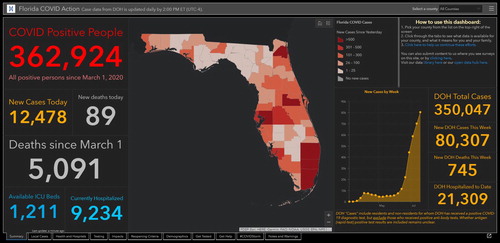
Figure 4. COVID-19 dashboard by Florida Department of Health, Division of Disease Control and Health Protection. Available at: https://experience.arcgis.com/experience/96dd742462124fa0b38ddedb9b25e429/ (Accessed: 20th July 2020). Permission sought; reproduced as fair use.
As well as illustrating the aesthetic convergence between mapping and counter-mapping, the issue serves to highlight the political pressure facing public health organizations in handling the pandemic. Dodds et al. (Citation2020: 292) recognize that political and medical leaderships in government, national agencies and international bodies have scrambled to take control of data and figures, to ‘flatten the curve’ and to communicate public health measures that will command consent and support from their populations. Whether or not most users would recognize the difference in counting methods that lies behind the two dashboards illustrated above, maps play an important role in building (or dismantling) society’s confidence in its leadership. Governmental and non-governmental organizations therefore need to demonstrate a greater awareness of the ethical principles of cartography and to promote them.Footnote10
In responding to the need for greater honesty and openness in mapmaking, the availability of multiple visualizations and data sources are steps in the right direction and also raise user expectations. Of course, people look to maps to provide certainty, but, as Griffin (Citation2020) points out, a knowledge of uncertainty can be paralysing and lead to inaction. Nevertheless, there is greater scope to develop cartographic language for communicating uncertainty, and responding to calls for systematizing future empirical studies on uncertainty visualization (e.g. by Kinkeldey et al., Citation2014) is therefore crucial. Mapping and counter-mapping COVID-19 raises deeper questions concerning the fundamental relationship between maps and user expectations and requires new research into what makes maps believable, and, ultimately, trusted. It is tempting to speculate whether the ever-greater reliance on automated mapping and the onward march of GeoAI (see Janowicz et al., Citation2020), for example, will lead to non-human cartographies of the future that provide us with trustworthy maps – achieved through the optimization of sound cartographic methods – as multiple, immersive and dynamic visualizations that invite user engagement, exploration and customization and enhance our capacity to understand spatial trends at global, national and local scales. The future of maps is, and perhaps has always been, the future of wisdom in how we learn to apply spatial knowledge.
Yet there is something about the creative process of mapping that is unique to the human condition. Our maps shape and reflect our values, whether they are created corporately or independently. The continuum of the concept of scale extends to the individual and seeing the world through the lens of the cartographer’s eye provides insights that resonate with our personal experience and invoke our emotions. There is more, therefore, to be gained from the processes of mapping and counter-mapping COVID-19 than calculating risk and resolving information anxiety. While securing and maintaining trust is particularly important when limitations on personal liberties have been imposed by governments around the world, maps can also express the spatial limitations of the experience of lockdown. Bliss and Martin (Citation2020), whose project invited people to share homemade maps of their lives during the pandemic, noted that making maps of your own world can amplify that experience, ‘because [the map] asks you to sort out what you think, feel, see, hear, and even desire in a place’. One such example, amongst over 400 maps received, was created by Arthur Beaubois-Jude, a freelance cartographer working in Paris. In finding his map especially distinctive, I asked Arthur to explain what motivated him to make his map () and what it signifies (Beaubois-Jude, pers. comm. 18th May 2020):
I completed this map of my confined world, ‘within a maximum radius of one kilometre around the home’, after my first month of confinement due to COVID-19. In France, people had to stay at home unless they had a professional reason to go out or an emergency, but they could still take a walk within a one-kilometre radius. As a freelance cartographer, I had no professional reason to go beyond this circle and as I realized with my map, everything I needed was just here. Surprisingly, the idea for the map came very easily to me; it seems natural for humankind to want to draw its ecumene. I wanted to represent this strictly defined circle that I found so interesting. It is literally a mappa mundi, where the centre of the world is home. The labels are imprecise and written with French humour, as if my mind counterbalanced the rigour of my confinement. The map is very individual and personal, but universally understood, since this unprecedented sensitivity to space was imposed on everyone.
Figure 5. Detail from Carte de mon monde confiné (Map of my confined world), a ‘world map’ created by Arthur Beaubois-Jude under the conditions of lockdown. © 2020 Arthur Beaubois-Jude. Reproduced with permission.
More broadly, the global experience of facing the common threat posed by the pandemic bears some resemblance to waging a world war, at least in its capacity to disrupt lives and liberties around the globe. As Robinson (Citation1947: vi) noted, war provides a great stimulus to cartography. Maps serve on the front line as weapons against fear of the unknown, especially in meeting the growing demand for accurate information at a range of scales. The maps produced during the course of the pandemic range from a globalization of cartographic style via dashboards whose aesthetic canon extends to counter-mapping and malware, to unique creations that speak of the disruption of personal worlds with intimate detail. In its genesis of so many maps associated with a single theme worldwide, the pandemic has few parallels. It is sure to provide a rich and fertile ground for investigating different approaches to mapping COVID-19 over time and space, as well as new corridors of insight into cartography more generally. These opportunities include examining the various data visualization techniques that have been adopted and their proliferation, exploring the use of colour and other graphical variables and their perception, and, perhaps most importantly, identifying the ingredients of cartographic authority and their relative influence on how trust is constructed in maps. In a world where social media platforms are seen as a source of news, to what extent have maps become any more or less believable? How and why do they appeal to the imagination? When maps produced by individuals can be designed and disseminated as effectively as those produced by governments and other agencies, there is a renewed urgency for empirical research into the psychology of visual communication and its applications within cartography. There is also scope for cartography to develop further as a unique discipline that draws on perspectives from both art and science to embrace different levels of complexity in revealing new insights towards a better understanding of our internal and external worlds.
The COVID-19 pandemic is raising fundamental questions about what makes a community, a population and a nation sustainable (Dodds et al., Citation2020: 290). It has served to remind us of our vulnerability and wrought sufficient impact to make us re-discover what really matters in our lives. If the next few years will see massive transformation in society as a whole but also in geospatial technology (Dangermond and Goodchild, Citation2020: 8), there are opportunities to rethink how we redraw our maps and why. Certainly, maps have regained their role as the supreme vehicle of graphic communication in this traumatic episode of the human journey. Looking towards the future, it will be interesting to see how maps reflect and shape our values as we move forward together, as cartographers and as a global community, but, perhaps most importantly, as a post-COVID people.
Notes on the cover
The map entitled Carte de mon monde confiné (Map of my confined world) that appears on the front cover of this Issue was made by Arthur Beaubois-Jude; a freelance cartographer based in Calais, France, and one of the many millions of people living in lockdown due to COVID-19 in 2020.
Notes on the contributor
 Alexander J. Kent is Reader in Cartography and Geographic Information Science at Canterbury Christ Church University in the UK, where he lectures on map design, GIS, remote sensing and on European and political geography. His research explores the relationship between maps and society, particularly the intercultural aspects of topographic map design and the aesthetics of cartography. He is also Chair of the ICA Commission on Topographic Mapping and Immediate Past President of the British Cartographic Society.
Notes
1 Severe acute respiratory syndrome coronavirus 2.
2 The ‘Spanish’ influenza pandemic of 1918–1919 infected around 500 million people (one third of the global population at the time) and is believed to have caused at least 50 million deaths, possibly up to 100 million (Taubenberger and Morens, Citation2006).
3 The term ‘dashboard’ inherently has its origins in the vehicle dashboard where the driver has critical information provided to them via a series of dials and indicators (Pettit and Leao, Citation2017). As MacEachren et al. (Citation2004: 14–15) note in their pioneering development of multiple-linked geovisualization tools, ‘geospatial data about health outcomes, interventions, and risk factors offer an opportunity to understand (and do something about) the varied geographic distribution of disease’.
4 On 12th April, the UK changed its method of counting deaths attributed to COVID-19 by introducing a cut-off date of 28 days after a positive test result.
5 A useful term to describe ‘what is produced by the ever-widening gap between what we understand and what we think we should understand. […] the black hole between data and knowledge’ (Wurman et al., Citation2001: 14).
6 Rozenkrantz et al. (Citation2020) proceed to argue that the small (often global) scale of many examples is insufficient to inform prevention or mitigation efforts at the local level. There is, however, an ongoing evolution of mapping towards finer granularity during the pandemic, with access to data at increasingly local scales. For example, on 16th April, the UK’s Office for National Statistics (ONS) released data for the number of deaths registered each month in England and Wales, including deaths involving COVID-19, by age, sex and country. On 1st May, provisional counts of the number of deaths and age-standardized mortality rates involving COVID-19 between 1st March and 17th April 2020 in England and Wales were released, with figures provided by age, sex, and geographies down to local authority level and deprivation indices (ONS, Citation2020).
7 The Flemish cartographer Gerardus Mercator (1512–1594) devised his map projection in 1569 for navigational purposes, since it allows rhumb lines (i.e. constant bearings) to be plotted as straight lines. However, its treatment of area towards the poles introduces significant distortion. For example, Greenland and Africa appear to be similar in size although the latter is approximately 14 times larger. Although there is virtually no perceivable difference between Mercator and Web Mercator projections at smaller, global scales (Battersby et al., Citation2014), the Web Mercator projection is used in web mapping because it allows simpler calculations, the continuous panning and zooming-in to any area regardless of the location or scale, and a fixed north (Lapon et al., Citation2020). See Jenny (Citation2012) for a summary of the unsuitability of the projection for web map servers and Monmonier (Citation2004) for a broader analysis of the use (and misuse) of Mercator’s projection. The continued adoption of (Web) Mercator in mapping COVID-19 appears to reiterate the notion that countries in the northern hemisphere are ‘more important’ due to their inflated size, although the recent study by Lapon et al. (Citation2020) involving over 130,000 participants worldwide found no evidence for the so-called ‘Mercator effect’ – an impact on the geographical knowledge and cognitive map of the world caused by the user’s familiarity with this projection.
8 The use of absolute values in choropleth maps is unrevealing, since geographical areal units tend to be irregular in both size and population. Cartographic texts and resources (e.g. Robinson et al., Citation1995; Kraak and Ormeling, Citation2003; Tyner, Citation2010; Buckley, Citation2013; Darkes and Spence, Citation2017) have therefore reiterated the suitability of ratio data in choropleth mapping (where, for example, indicating the number of infections per million people would normalize the data and specify the rate of infection). Moreover, since choropleth maps standardize values across each areal unit, intra-unit spatial variations are lost. Mapping with smaller (e.g. local) areal units is therefore preferable for identifying meaningful patterns associated with epidemiology and informing policy.
9 Although a global choropleth map showing raw totals is the initial view presented to users by the WHO dashboard, the ‘bubble map’ and other choropleth map options remain available, including the use of normalized data (e.g. Total per 1 million population; % change in the last seven days; newly reported in the last seven days, newly reported in the last 24 hours, and a transmission classification) (WHO, Citation2020).
10 For example, the British Cartographic Society established its Code of Ethics in 2018 (see https://www.cartography.org.uk/members/code-of-ethics/).
References
- Battersby, S.E., Finn, M.P., Usery, E.L. and Yamamoto, K.H. (2014) “Implications of Web Mercator and Its Use in Online Mapping” Cartographica 49 (2) pp.85–101 DOI:10.3138/carto.49.2.2313.
- BBC Reality Check (2020) “Coronavirus: How a Misleading Map Went Viral” Available at: https://www.bbc.co.uk/news/world-51504512 (Accessed: 3rd June 2020).
- Bliss, L. and Martin, J.L. (2020) “How 2020 Remapped Your Worlds” Bloomberg CityLab (18th June) Available at: https://www.bloomberg.com/features/2020-coronavirus-lockdown-neighborhood-maps/ (Accessed: 18th June 2020).
- Brewer, C.A. and Pickle, L.W. (2002) “Evaluation of Methods for Classifying Epidemiological Data on Choropleth Maps in Series” Annals of the Association of American Geographers 92 (4) pp.662–681.
- Buckley, A. (2013) “Understanding Statistical Data for Mapping Purposes” Available at: https://www.esri.com/about/newsroom/wp-content/uploads/2018/11/mapstatdata.pdf (Accessed: 3rd June 2020).
- Crampton, J.W. (2008) “Will Peasants Map? Hyperlinks, Map Mashups, and the Future of Information” In Turow, J.J. and Tsui, L. (Eds) The Hyperlinked Society: Questioning Connections in the Digital Age Ann Arbor: The University of Michigan Press, pp.206–226.
- Çöltekin, A., Griffin, A.L., Slingsby, A., Robinson, A.C., Christophe, S., Rautenbach, V., Chen, M., Pettit, C. and Klippel, A. (2019) “Geospatial Information Visualization and Extended Reality Displays” In Guo, H., Goodchild, M.F. and Annoni, A. (Eds) Manual of Digital Earth Singapore: Springer Nature, pp.229–277.
- Dangermond, J. and Goodchild, M.F. (2020) “Building Geospatial Infrastructure” Geo-spatial Information Science 23 (1) pp.1–9 DOI:10.1080/10095020.2019.1698274.
- Darkes, G., and Spence, M. (2017) Cartography: An Introduction (2nd ed.) London: British Cartographic Society.
- Dodds, K., Broto, V.C., Detterbeck, K., Jones, M., Mamadouh, V., Ramutsindela, M., Varsanyi, M., Wachsmuth, D. and Woon, C.Y. (2020) “The COVID-19 Pandemic: Territorial, Political and Governance Dimensions of the Crisis” Territory, Politics, Governance 8 (3) pp. 289-298 DOI:10.1080/21622671.2020.1771022.
- Dong, E., Du, H. and Gardner, L. (2020) “An Interactive Web-Based Dashboard to Track COVID-19 in Real Time” The Lancet: Infectious Diseases 20 (5) pp.533–534 DOI:10.1016/S1473-3099(20)30120-1.
- Field, K. (2020) “Mapping coronavirus, responsibly” (25th February) Available at: https://www.esri.com/arcgis-blog/products/product/mapping/mapping-coronavirus-responsibly/ (Accessed: 3rd June 2020).
- Gabbatt, A. (2020) “Scientist produces own Florida Covid-19 count after being fired by state” The Guardian (15th June) Available at: https://www.theguardian.com/us-news/2020/jun/15/florida-coronavirus-cases-counter-rebekah-jones-fired-scientist (Accessed 7th July 2020).
- Golebiowska, I., Opach, T. and Rød, J.K. (2020) “Breaking the Eyes: How Do Users Get Started with a Coordinated and Multiple View Geovisualization Tool?” The Cartographic Journal 57 (3) pp.235–248 DOI:10.1080/00087041.2019.1660513.
- Griffin, A.L. (2020) “Trustworthy Maps” Journal of Spatial Information Science 20 pp.5–19 DOI:10.5311/JOSIS.2020.20.654.
- Janowicz, K., Gao, S., McKenzie, G., Hu, Y. and Bhaduri, B. (2020) “GeoAI: Spatially Explicit Artificial Intelligence Techniques for Geographic Knowledge Discovery and Beyond” International Journal of Geographical Information Science 34 (4) pp.625–636 DOI:10.1080/13658816.2019.1684500.
- Jenny, B. (2012) “Adaptive Composite Map Projections” IEEE Transactions on Visualization and Computer Graphics 18 (12) pp.2575–2582.
- Johns Hopkins University & Medicine (2020) “COVID-19 Dashboard” Available at: https://coronavirus.jhu.edu/map.html (Accessed: 3rd June 2020).
- Kent, A.J. (2017) “Trust Me, I’m a Cartographer: Post-truth and the Problem of Acritical Cartography” The Cartographic Journal 54 (3) pp.193–195 DOI:10.1080/00087041.2017.1376489.
- Khosla, A., Das Sarma, A. and Hamid, R. (2014) “What Makes an Image Popular?” Proceedings of the International World Wide Web Conference 7th to 11th April, Seoul, pp.867–876 DOI:10.1145/2566486.2567996.
- Kinkeldey, C., MacEachren, A.M. and Schiewe, J. (2014) “How to Assess Visual Communication of Uncertainty? A Systematic Review of Geospatial Uncertainty Visualisation User Studies” The Cartographic Journal 51 (4) pp.372–386 DOI:10.1179/1743277414Y.0000000099.
- Kraak, M.-J. and Ormeling, F. (2003) Cartography: Visualization of Geospatial Data (2nd ed.) Harlow: Pearson Education.
- Lapon, L., Ooms, K. and De Meyer, P. (2020) “The Influence of Map Projections on People’s Global-Scale Cognitive Map: A Worldwide Study” International Journal of Geo-Information 9 (196) pp.1–19 DOI:10.3390/ijgi9040196.
- MacEachren, A.M., Gahegan, M., Pike, W., Brewer, I., Cai, G., Lengerich, E. and Hardisty, F. (2004) “Geovisualization for Knowledge Construction and Decision Support” IEEE Computer Graphics and Applications 24 (1) pp.13–17 DOI:10.1109/MCG.2004.1255801.
- Mansoor, S. (2020) “Fired Florida Data Scientist Creates Competing COVID-19 Tracking Site and Suggests State Is Hiding Important Information” TIME (15th June) Available at: https://time.com/5853398/florida-fired-scientist-coronavirus-data-rebekah-jones/ (Accessed: 7th July 2020).
- Mocnik, F.-B., Raposo, P., Feringa, W., Kraak, M.-J. and Köbben, B. (2020) “Epidemics and Pandemics in Maps – the Case of COVID-19” Journal of Maps 16 (1) pp.144–152 DOI:10.1080/17445647.2020.1776646.
- Monmonier, M.S. (2004) Rhumb Lines and Map Wars: A Social History of the Mercator Projection Chicago: University of Chicago Press.
- Muehlenhaus, I. (2012) “If Looks Could Kill: The Impact of Different Rhetorical Styles on Persuasive Geocommunication” The Cartographic Journal 49 (4) pp.361–375 DOI:10.1179/1743277412Y.0000000032.
- Olsen, S.F., Martuzzi, M. and Elliott, P. (1996) “Cluster analysis and disease mapping – why, when, and how? A step by step guide” British Medical Journal 313 pp.863–866 DOI:10.1136/bmj.313.7061.863.
- ONS (2020) “Coronavirus (COVID-19)” Available at: https://www.ons.gov.uk/peoplepopulationandcommunity/healthandsocialcare/conditionsanddiseases (Accessed 3rd June 2020).
- Pater, R. (2016) The Politics of Design: A (Not So) Global Manual for Visual Communication Amsterdam: BIS Publishers.
- Pettit, C.J. and Leao, S.Z. (2017) “Dashboard” In Schintler, L.A. and McNeely, C.L. (Eds) Encyclopedia of Big Data Cham, Switzerland: Springer International Publishing, pp.1–6 DOI:10.1007/978-3-319-32001-4.
- Pravossoudovitch, K., Cury, F., Young, S.G. and Elliot, A.J. (2014) “Is Red the Colour of Danger? Testing an Implicit Red–Danger Association” Ergonomics 57 (4) pp.503–510 DOI:10.1080/00140139.2014.889220.
- Robinson, A.C. (2019) “Elements of Viral Cartography” Cartography and Geographic Information Science 46 (4) pp.293–310 DOI:10.1080/15230406.2018.1484304.
- Robinson, A.H. (1947) “Foundations of Cartographic Methodology” (PhD thesis) Ohio State University.
- Robinson, A.H., Morrison, J.L., Muehrcke, P.C., Kimerling, A.J. and Guptill, S.C. (1995) Elements of Cartography (6th ed.) New York: John Wiley & Sons.
- Rosenkrantz, L., Schuurman, N., Bell, N. and Amram, O. (2020) “The Need for GIScience in Mapping COVID-19” Health & Place DOI:10.1016/j.healthplace.2020.102389.
- Skarlatidou, A., Haklay, M. and Cheng, T. (2011) “Trust in Web GIS: The Role of the Trustee Attributes in the Design of Trustworthy Web GIS Applications” International Journal of Geographical Information Science 25 (12) pp.1913–1930 DOI:10.1080/13658816.2011.557379.
- Taubenberger, J.K. and Morens, D.M. (2006) “1918 Influenza: The Mother of All Pandemics” Emerging Infectious Diseases 12 (1) pp.15–22 DOI:10.3201/eid1201.050979.
- Tufte, E.R. (1990) Envisioning Information Cheshire, CT: Graphics Press.
- Tyner, J.A. (2010) Principles of Map Design New York: Guilford Press.
- WHO (2020) “WHO Coronavirus Disease (COVID-19) Dashboard” Available at: https://covid19.who.int/ (Accessed: May to August 2020).
- Wurman, R.S., Leifer, L., Sume, D. and Whitehouse, K. (2001) Information Anxiety 2 Indianapolis: Que.
- Zhou, C., Su, F., Pei, T., Zhang, A., Du, Y., Luo, B., Cao, Z., Wang, J., Yuan, W., Zhu, Y., Song, C., Chen, J., Xu, J., Li, F., Ma, T., Jiang, L., Yan, F., Yi, J., Hu, Y., Liao, Y. and Xiao, H. (2020) “COVID-19: Challenges to GIS with Big Data” Geography and Sustainability 1 pp.77–87 DOI:10.1016/j.geosus.2020.03.005.