
ABSTRACT
3D cartographic visualization of a continuous time-dependent phenomenon is not an easy task. The focus of this research is motivated by the struggle to visualize such a phenomenon. Based on the current state of the art, we implemented new visualization methods to visualize continuous time-dependent phenomena. All visualizations are based on the use case of road-traffic-generated noise in outdoor urban areas. These visualizations utilize the third dimension of the map scene. The first two methods focus on the variations of the noise in the vertical dimension (i.e. height). The third method is based on the idea of space–time cube and therefore utilizes the time variable as the third dimension. For demonstration purposes, all methods were implemented in an online application. Furthermore, user testing of those applications was conducted. This paper thus describes design, implementation and user evaluation of newly proposed methods for third dimension visualization.
Introduction
This research paper is motivated by the challenge of visualizing continuous 3D and time-dependent phenomenon. The challenge is caused by the amount of information that needs to be depicted in a 3D scene while maintaining the map scene comprehensible for the users.
Thematic mapping in 3D
A prevailing use of thematic maps is to show the spatial distribution of an examined phenomenon in relation to its surroundings. When depicting a 3D phenomenon there are two approaches to its visualization. One approach is to project the 3D scene onto a plane and thus create a 2D map. This approach’s limitation is the absence of insight into the vertical relation between objects since the 2D map represents only a single layer/plane of 3D data (Shepherd, Citation2008). 2D methods of thematic mapping have been well described in Slocum et al. (Citation2008) and Kraak and Ormeling (Citation2013) and are not the focus of this paper. However, the other approach, consisting of using a 3D thematic map also has to deal with various problems, e.g. occlusion of the scene due to the abundance of data or distinctly different map scales in the foreground and background of the scene (Shepherd, Citation2008). On the contrary, its advantage lies in depicting the phenomenon in all its spatial dimensions and thus allowing the map reader to understand its effects on the surrounding environment.
This paper proposes new methods of using the third dimension to visualize continuous phenomena such us urban noise generated by the road traffic. Reasons for this choice are listed in section ‘Noise as a civilization phenomenon’. Despite the focus on urban noise mapping, all of the presented 3D visualizations can be adapted into different phenomena such as air pollution, heat distribution, etc.
Noise as a civilization phenomenon
Urban noise is currently one of the main health risks for city residents. Long-term exposure to high noise levels has been proved to have many ill effects on the health of individuals such as insomnia, stress or higher risk of cardiovascular disease: United Nations (Citation2014), Dratva et al. (Citation2010) and Ising et al. (Citation1999). Due to these health risks, it is obvious that city governments invest many of its resources to decrease noise impact on its citizens. As noise is a spatial phenomenon, a widely adopted output of noise analytics studies are strategic noise maps which are usually 2D, showing noise levels for one specific height. So far, there have been few successful attempts to describe possible advantages of 3D noise visualization (to show how noise levels vary across 3D space). In addition, few scholars have focused on challenges that the transition to 3D holds (further discussed in the second section). This paper focuses on the design of new 3D noise visualizing methods and their implementation in web applications to address this gap of knowledge.
The paper is structured as follows: current 3D visualization methods including those adopted by noise mapping studies are described in the second section together with an overview of various spatial–temporal visualization techniques that utilize the third dimension in a map scene. The third section describes the process of creating and implementing newly proposed 3D visualizations. The third section ends with the description of the user testing method. The results of the proposed visualization alongside with user testing results are described in the fourth section of this paper. Observed benefits of newly proposed methods and possible direction for follow-up research are discussed in the fifth section. The sixth section concludes this paper.
Related work
As mentioned in the introductory section, the focus of the paper is to design and evaluate new visualization methods for a 3D continuous time-dependent phenomenon. As an example of such data, we have chosen traffic-generated noise in building exteriors. This section summarizes current noise visualization methods in 3D space (section ‘Existing approaches to noise visualization in 3D’), including some short research on existing methods for time-dependent data visualization using the third dimension (section ‘Time visualization using the third dimension’). Each of these two subsections ends with a short summarization on possible disadvantages of the described visualizations methods and point out specific aspects that could be improved.
Existing approaches to noise visualization in 3D
Estimation of noise transmission is inherently a spatial problem and therefore is usually visualized as a map. From a cartographic point of view, the noise level is a continuous phenomenon. Regarding 2D visualization of noise, two cartographic visualization methods are adopted by the noise mapping community: isopleth maps (also called contour maps) and rasterized maps. Examples of both are listed and referenced further in this section. Note that 2D visualization can be done from 2D or even from a 3D noise distribution calculation. 2D visualization simply does not imply that the calculation ran in 2D. At least some 3D (or 2.5D) data (e.g. terrain model and building models) are often used. However, when discussing noise in 3D, it is important to point out that a 3D visualization of noise should be applied only on noise distribution calculated in 3D.
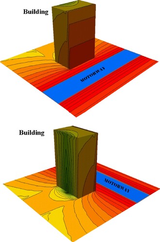
Several existing papers are describing possible benefits of implementing 3D noise calculation: Pamanikabud and Tansatcha (Citation2010), Stoter et al. (Citation2008), Law et al. (Citation2011), Law et al. (Citation2006) and Ranjbar et al. (Citation2012). To visually demonstrate the results, all of these papers have adapted some 2D cartographic methods and used them to portray noise on several surfaces (not only the ground surface but also on building facades or vertical cuts). An example of a noise map on building facades can be seen in .
Figure 1. Terrain and building facades as a canvas for portraying noise distribution (Pamanikabud and Tansatcha, Citation2010).
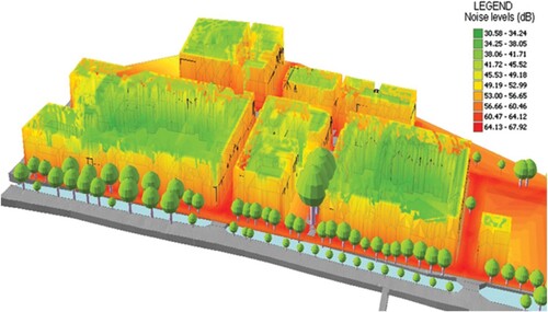
Noise facade visualization is adopted for several reasons: it uses familiar, already existing geometric objects and therefore allows to create 3D view only with additional 2D textures with noise level information (Pamanikabud and Tansatcha, Citation2010). Secondly, the visualization of a noise map on building facades is sensible because it shows noise levels near the indoor spaces where people are exposed to the traffic noise itself. As mentioned above, this paper focuses only on external noise levels. Precise indoor noise modelling would require additional information about individual building such as the height of floors, number of windows and their noise characteristics, material and thickness of walls, etc.
There are several methods to create noise facade visualization. One method that also utilizes building facades for visualization was proposed by Stoter et al. (Citation2008). The authors have set a small offset in the XY plane for observation points near building facades. Thus, 2D interpolation can be calculated, and the facades stay approximately vertical. This approach cleverly works around a common problem in facade noise mapping, which is the absence of a 3D interpolation tool for GIS data that would create a 3D surface with interpolated values. See details about this method in Stoter et al. (Citation2008) ().
Figure 2. Noise visualization using building facades (Stoter et al., Citation2008).
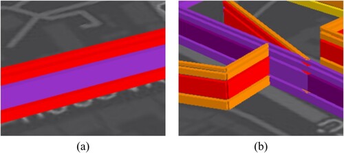
Another similar visualization method consists of a cut by a vertical plane. This method offers a good solution for use cases regarding motorways and the surrounding noise barriers. Perpendicularly placed vertical cut can then visualize the difference between various noise attenuation structures () (e.g. Law et al., Citation2011; Ranjbar et al., Citation2012). These methods use the same cartographic principles (isopleths or raster) as the building facades method but do not use an already existing 3D object for the noise depiction.
Figure 3. Noise visualization using cut by a vertical plane (Ranjbar et al., Citation2012).
The two above-mentioned methods (i.e. noise facade visualization and cut by vertical plane) use the same principle. They both use a part of a plane to convey information about the vertical distribution of a continuous phenomenon. And they both have the ability to show the change of noise levels in the vertical direction.
However, they are limited to the profile plane (or surface) and thus, in principle, do not show the noise levels fully in all three dimensions but rather only its projection onto a plane. This limitation disallows users to fully understand the phenomenon because they are either forced to look at a fraction of vertical space or multiple map views with differently chosen positions and rotations of vertical cuts. The main goal of this paper is to overcome this shortcoming and propose a new way of visualizing 3D noise data (see section ‘Methodology’).
Time visualization using the third dimension
This section’s focus lies in the opportunity to utilize the third dimension (the Z-axis) of a scene for the representation of time instead of vertical dimension (height). This approach to time visualization in mapping does not have a universally accepted cartographic term. However, there are many examples of such an approach in data visualization. Therefore, please note that in this paper we call ‘3D’ all methods using the Z-axis for height (as they are described in section ‘Existing approaches to noise visualization in 3D’) and we call the method using Z-axis for time space-time cube (STC).
The STC was first proposed by Hägerstrand (Citation1970). In that time, his STC was a new method for visual analysis of the movement of people. This concept was later adopted in cartography in several applications, e.g. Kraak (Citation2003) and Kraak and Kveladze (Citation2017). The attempted adoption of the STC in cartography for visualizing trajectories in time was summarized in Kveladze et al. (Citation2013). Other studies have tried to use similar approaches to map different types of data. Thakur and Rhyne (Citation2009) propose a two-dimensional graph representation called Data Vases which was later extended to three dimensions for visualizing time-dependent data on maps. This allows a single view representation of census data throughout many years and many geographical places. A similar approach was chosen in Tominski and Schulz (Citation2012), where time is also represented by a Z-axis, which results in a visualization called Great Wall of Space–Time. For clarity, we will continue to call any method that uses the concept of Z-axis time representation by the original Hägerstrand’s terminology, i.e. space-time cube. (STC).
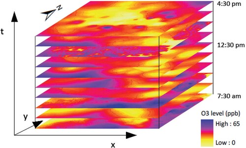
All of the papers mentioned so far only apply STC’s principle for trajectories or positions in space. There is only one paper (Fang and Lu, Citation2011) that focuses on mapping continuous phenomenon (specifically air pollution) and chooses STC as a possible visualization method. The problem with applying STC for continuous data is occlusion of layers as they (unlike a trajectory) cover the whole time frame and thus disallow the user to see changes of phenomena (see ). In this paper, we aim to overcome this problem by proposing additional changes to visualize continuous data with STC (see section ‘Methodology’).
Figure 4. STC method used for continuous data (Fang and Lu, Citation2011).
Methodology
This section describes the newly designed visualizations of noise proposed by this paper. Each visualization comprises two steps: first, an estimation of noise (section ‘Estimation of noise’), then, its portrayal using a selected method (sections ‘3D visualization methods with Z-axis for portraying heights’ and ‘Space–time cube visualization of noise’ of the third section). As stated in the previous section, this paper is based on the idea that current methods for noise visualizations using the third dimension can be improved in the two aspects mentioned above:
better utilization of the third dimension by depicting noise levels in 3D by portraying the phenomena itself, not just its reflection on other objects (e.g. on facades or vertical planes, as mentioned in section ‘Time visualization using the third dimension’) (described in section ‘3D visualization methods with Z-axis for portraying heights’) and
application of the STC method for visualization of a continuous phenomenon in time (section ‘Space–time cube visualization of noise’ in the third section).
Therefore, both of the following methods (sections ‘3D visualization methods with Z-axis for portraying heights’ and ‘Space–time cube visualization of noise’ in the third section) aim to overcome those limitations and offer a new way of seeing the data.
Estimation of noise
This section describes data acquisition (in our case, data about traffic generated noise) for the designed visualization methods. Data acquisition is the first necessary step for any visualization. In this study, the acquired data consisted of several lattices of 3D points with noise level attribute (e.g. acoustic decibels). In any noise study, noise levels can be measured and/or estimated by considering surrounding noise sources. Since this paper’s focus is not to improve current noise estimation methods, but rather the proposition of new visualization methods, the measurement of each point with physical audio equipment was dismissed, and noise levels were estimated from accessible traffic data.
The NMPB-Routes-2008 (Dutilleux et al., Citation2010) methodology with implementation in OrbisGIS Noise Modelling software was used (Fortin et al., Citation2012). The source of data used for the noise modelling was automobile traffic data, which was inclusive of traffic volumes, traffic road capacity and the approximate speed of vehicles. All aforementioned traffic data were provided by Správa Informačních Technologií města Plzně (Administration of Information Technology of Pilsen)Footnote1 and EDIP s.r.o.Footnote2 as part of PoliVisu project.Footnote3 Data used to calculate noise dissemination consisted of digital terrain and surface models (DTM/DSM), 2.5D build structures models and 2.5D road networks. As mentioned beforehand, the calculation was focused on exterior areas only. The reason for that is the difficulty of interior noise calculation and lack of data for such modelling. The area of interest lies in the centre of the city of Pilsen. It is approximately 1.5 km2 of the urban area with a dense road network. The last data source was a set of 3D points for which noise levels were estimated.
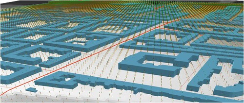
When calculating noise level for a point in space, that point is referred to as a virtual microphone or a receiver point. The regular lattice of virtual microphones was defined by 10 m spacing in both horizontal directions. This spacing was chosen as a compromise between maximum data resolution and reasonable computing time. The density of virtual microphones is further discussed in Stoter et al. (Citation2008), Stoter (Citation1999) and Kurakula et al. (Citation2007). Overall, 21,000 points were generated for each lattice. Four lattices were calculated for four heights: 4, 8, 16 and 20 m above the terrain (considering that a majority of the population of Pilsen lives in houses of max. four floors). All types of the input data (microphones, road network, buildings and terrain) used for the calculation can be seen in . In addition, three lattices were generated for three noise scenarios for different time periods: day (6 am–6 pm), evening (6 pm–10 pm) and night (10 pm–6 am).
Figure 5. Types of data used for noise modelling, i.e. digital terrain model, 2.5D building models, 2.5D road networks and a 3D lattice of virtual microphones (four levels in Z dimension).
When the noise phenomenon was calculated, two groups of visualization methods of 3D data were designed. Both groups work with three dimensions, however each group in a different way. The first group uses the Z-axis for portraying height; the second group uses the Z-axis for portraying time dimension.
3D visualization methods with Z-axis for portraying heights
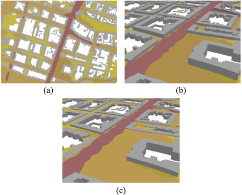
The 3D visualizationFootnote4 techniques have several advantages, compared to 2D visualization; however they also suffer from several disadvantages. In this section, we focus on challenges that come with visualization in the 3D space. To demonstrate the difference between 2D and 3D noise visualization, we first created 2D visualization (see (a)). The process of creating this visualization was fairly straightforward. Two layers were used: building layer and noise level layers categorized in 10 dB intervals. Since interior noise modelling was not part of this study, those layers never overlap. The map user’s view is therefore never obstructed, and all layers are always visible. Clarity of this visualization can be lost when the observation angle for user view is changed. In the example in (b), the map view starts to be partially occluded by the building models extruded to 2.5-dimensional objects. This problem is only worsened by adding more noise layers for various heights (see (c)). The 3D scene comprises four noise layers at four heights, but only the top layer remains clearly visible because the others are hidden under it.
Figure 6. (a) 2D noise map, (b) Extruded building models and tilted observation angle, (c) Extruded building models and tilted observation angle with additional layers of noise for various heights.
This occlusion of layers is not a specific problem of 3D visualization of noise. It is a problem of 3D visualization in general (Elmqvist and Tsigas, Citation2008). Elmqvist and Tsigas (Citation2008) describe what causes this occlusion and offers possible solutions. These solutions are classified into five broad categories: Multiple views, Tour planners, Virtual X-ray, Virtual probe and Projection distorter. Multiple views, Tour planner and Projection distorter categories focus on camera position, angle and projection used to observe the model. Virtual X-ray and Virtual probe focus on the scene and its attributes.
Our research aims to overcome the above-described scene occlusion by designing new visualization methods, visualizing noise as an example of the continuous phenomenon. The first method uses the aforementioned isopleth map with several improvements. These improvements are composed of two scene layer attributes and one application feature. The first layer attribute is semi-transparency which allows a user to look through layers. Secondly, to enhance individual layers, an extrusion of 1 m was used for each layer. Lastly, noise layers were separated into smaller noise intervals by 10 dB. For an example of an application that uses this method, please see section ‘3D visualization of noise: isopleths and virtual microphone spheres’. We should also state that our visualization method is based on the idea of vertical space segmentation, meaning that we are showing the noise levels in 3D space, but only at predetermined heights. This limitation is further addressed in the fifth section ‘Discussion’.
The second method designed and used in our research is based on the idea that the user does not need to see a continuous noise layer, but showing only samples of 3D space could be sufficient for a certain application. This simplification creates a vacancy in the 3D space that allows us to see the lower height levels. Please see section ‘3D visualization of noise: isopleths and virtual microphone spheres’ for examples of the application using this method.
Space–time cube visualization of noise
The following section shifts focus from traditional 3D visualization to the STC method, which uses the third dimension for time representation. Similarly to the previous section, the data consists of noise level layers. Another similarity with the 3D noise visualization is that the goal is to help users understand the data in all three dimensions. The difference is that the relative height above ground of the virtual microphones does not change, but the time interval for which the noise levels were estimated does. We can apply the same visualization principles described in the previous subsection with several improvements motivated by the data source difference.
Firstly, it is important not to use 3D building models in the scene. This would confuse the user since it would combine two different types of Z-axis variables, i.e. height for buildings and time for noise level layers. Thus, only building footprints were used in the visualization. Layers of noise levels are given vertical height by extrusion (similar to the 3D noise visualization). Extrusion, besides providing improved visibility of the layer, also has its main purpose: it indicates the time interval which the layer represents.
User testing of noise visualization methods
User testing has been conducted to verify the comprehensibility of used noise visualization methods. The technique of screen-recording has been selected for this testing. According to Burian et al. (Citation2018), this user evaluation technique might be qualitative and quantitative. It depends on which type of data is gathered, and on the way the data is analysed.
The user testing was designed as a between-subject study containing five pairs of tasks, each pair comparing two different methods on one type of task. In the beginning, the participants were randomly assigned to Group A or Group B. After that, they opened the version of the experiment corresponding to their group. The whole experiment was created using the Esri story map platform using the Story Map Journal Web App,Footnote5 where each page of the App was occupied by one task in the experiment, plus some introductory pages. Some of the test questions required features that are not part of the Story Map Journal itself. These features were the ability to draw in a picture to depict where the noise levels are extreme and a simple radio button to mark the answer. The authors implemented the desired functionality using html code inserted into the Web App source code.
At the beginning of the experiment, participants were instructed to start screen-recording. For that, the tool ‘Bewisse Screen Recorder’Footnote6 was used. Since this moment, every action they did in the experiment was recorded. The first section of the experiment contained instructions about the experiment and information about noise visualization presented in a short movie clip.
The experiment contained five tasks, whereas each task contained two sub-tasks: A and B. These sub-tasks were presented to the participants in the order according to their group. Participants from group A started with sub-task A and continued with sub-task B and vice versa.
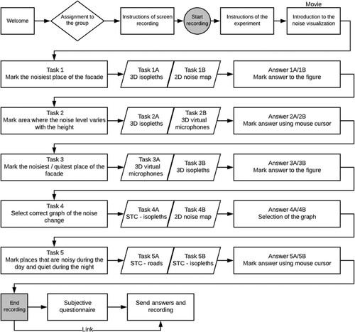
All tasks are described in the scheme of the experiment in . The tasks were selected to analyse different aspects of noise visualization methods such as estimating the noisiest part of a building and finding an area with significant changes in noise levels across different heights. Participants answered in different ways. In tasks 1 and 3, they were marking their answer into the figure placed in the story map environment. In tasks 2 and 4, the answer was marked using the mouse cursor’s circular movement, which was later identified from the recording. In the last task, participants selected one of three graphs using the radio-button.
Figure 7. The scheme of the user experiment.
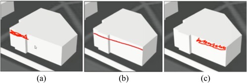
Tasks 1 and 3, in which the user was asked to draw extreme noise levels on a building facade, were evaluated with three possible grades: correct, partially correct and incorrect. This grading system allows differentiating between users precisely understanding the noise distribution, users with a rough estimate, and users unable to understand the noise distribution using the given visualization method. See for examples.
Figure 8. The user in image (a) was graded as correct since they accurately identified that the extreme noise levels occurring at the upper-left part of the façade; the user in the image (b) was partially correct (correct height, but not the specific part of the building), and the user in the image (c) was graded as incorrect.
Tasks 2, 4 and 5 were graded binary with possible grades being correct and incorrect. Another grade was not needed as tasks 2 and 4 involved finding a location with significant changes in noise levels, and thus, the user either found the location or not. Task 5 was a multiple answer question with three options and only one correct answer. Each option represented one graph of noise levels in time.
The time required to solve the tasks was measured for each of the tasks. After the last task, participants were asked to fill a short questionnaire about their subjective attitudes towards used noise visualization methods, add their comments, and share the link to the screen-recording.
A total of 14 participants conducted the experiment. All participants were current or past students in the field of geomatics. All of them had previous experience with 3D and 2D web applications, but little to no experience with noise maps specifically.
Results
This section offers an overview of all five web map applications that were developed using the methods described in the third section. The first three of these applications portray the spatial distribution of noise and focus on the visualization of noise in all three dimensions (section ‘3D visualization of noise: isopleths and virtual microphone spheres’). The last two applications use the focus on emphasizing the time variability of noise, using the third axis for portraying time, and the STC method for noise visualization (section ‘Space–time cube visualization of noise’ in the fourth section). All visualization methods were subject to user testing. Observations and remarks from the user testing are summarized at the end of each subsection. To get a clear understanding of used visualization methods, application of these methods and related user testing tasks, please see .
Table 1. Overview of presented methods, applications and user test tasks.
All the above-described web visualization are openly accessible here.Footnote7
3D visualization of noise: isopleths and virtual microphone spheres
This section focuses on three applications developed using the 3D visualization methods described in section ‘3D visualization methods with Z-axis for portraying heights’ and tested with user tasks 1, 2 and 3. First, a description of all three developed applications is given. Then, results from user testing are presented. The first application demonstrates the 3D visualization of noise using the method of isopleths. As stated in the section above (section ‘3D visualization methods with Z-axis for portraying heights’) the main struggle with 3D visualization of noise (or any other continuous phenomenon) lies in the self-occlusion of multiple layers. We aimed to reduce this problem in our method’s design and the application implementation. This is shown in , which demonstrates the ability to switch layers on and off and choose the level of noise they would like to explore.
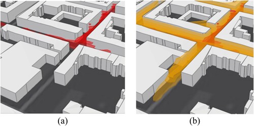
Figure 9. Noise levels with a minimum at 65 dB (red isopleth) (a) and noise levels with a minimum at 55 dB (orange isopleth) (b).
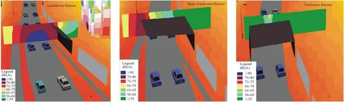
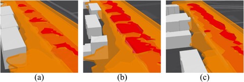
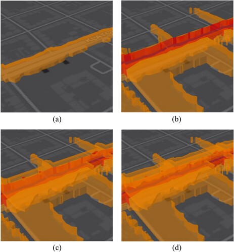
The same method is used in the second application but with a special use case: noise barrier area. This test area consists of a four-lane road and alongside standing building blocks protected from noise by the noise barriers. Three noise barriers were modelled with heights: 3, 4 and 5 m. Noise levels were estimated at three heights: 2, 4 and 8 m. Images from this visualization can be seen in . In the image (a) showing an area near the 3 m barrier, the user can see that the only noise layer significantly affected is the 2 m layer (lowest in the 3D scene). Still, layers 4 and 8 m reach the building facade and thus may influence the quality of living in corresponding floor levels. Image (b) showing a 4 m area near the 4 m barrier also depicts that at 2 m the noise transmission is affected, but also shows a significant effect on the noise layer at 4 m. Finally, in the image (c), both noise layers at 2 and 4 m are affected and stop at the barrier, but the noise at 8 m still reaches nearby building blocks.
Figure 10. Difference in noise transmission with different noise barriers heights – noise levels affected by 3 m tall barrier (a), noise levels affected by 4 m tall barrier (b) and noise levels affected by 5 m tall barrier (c).
The developed applications were tested using the first three tasks of user testing. Task 1 compared 3D isopleth visualization with classic 2D noise map and task 2 and 3 compared 3D isopleth visualization with 3D virtual microphones.
In task 1 of the experiment, both 2D and 3D isopleth noise maps proved to be useful as most of the users were able to correctly mark the noise levels on the building facade (see ). The noticeable difference was observed in the case of the accuracy of the answers, as even the total amount of correct and partially correct answers was higher in 3D (9) then in 2D (8), the uncertainty in 3D was significantly higher – in the 3D view, eight out of nine correct answers were partially correct, compared to only three out of eight in the 2D view. Another observation is that since users were always tested on both 2D and 3D maps (with the equal number of users for both possible orders), it is not surprising that users were in most cases faster with the second map they used (10/14 users). It is also noticeable that the fastest times were measured for users that first saw a 2D map and 3D map afterwards – an average of 1:40 min per task. On the other hand, slowest times were measured when users started with the 3D map – an average of 3:50 min. The overall average was 2:28 min per task. However, comparing responses altogether, it is a draw. Half of the participants were faster in 2D and the other in 3D.
Figure 11. Task 1 user testing results – in the bar chart, see the number of faster participants using the corresponding visualization method. The pie chart shows the correctness of the answers.
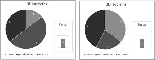
Therefore, our findings are that it is better for the user to be introduced to the noise map in 2D and then move to 3D view as it offers a faster, although possibly rushed overview of the situation. This finding is also supported by the user questionnaire, where nine participants confirmed that they prefer 3D, two of them preferred 2D, and the remaining three participants had no preference.
Additional observations were made by examining video captures. When using a 3D scene, the user must explore different data views to see that the noise level changes in the XY plane. Almost half of the users failed to effectively move in the scene and relied on a single tilted view. It is clear that 3D scene handling requires more user experience to master. On the other hand, the 2D map proved to be confusing for some users as they did not realize that noise levels were not consistent across the Y-axis and thus marked the facade incorrectly.
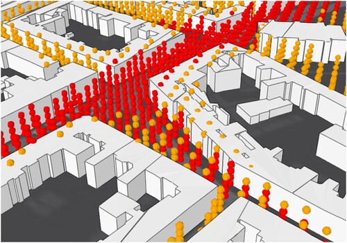
Third 3D visualization was created using the virtual microphones spheres method. See the example in . This method can also be enriched with the applications feature to turn on and off layers based on the minimum noise level. We believe that this method of noise visualization can be useful in depicting the noise precisely at the position of noise estimation.
Figure 12. Virtual microphones spheres.
Tasks 2 and 3 of the user testing focused on comparing 3D isopleths and 3D virtual microphones applications. In task 2, users were asked to find areas with significant vertical noise change and in task 3, similarly to task 1, users were asked to mark extreme noise levels on the building facade. See and for an overview of the results.
Figure 13. Task 2 user testing results.
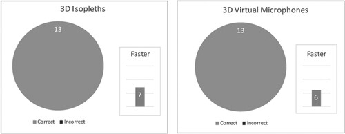
Figure 14. Task 3 user testing results.
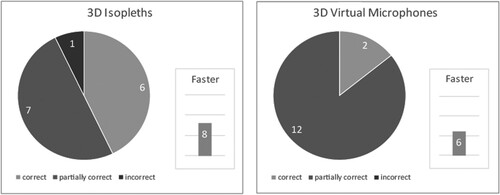
In user testing, it was proven that both visualization methods are usable as users were able to complete the tasks. It is worth pointing out that for task 3, users were slightly more precise when using the 3D isopleth application which correlates with the fact that five participants preferred isopleth visualization and only one preferred virtual microphone visualization. The remaining eight participants had no preference.
The video screen capture suggests that higher precision of answers when using 3D isopleth is caused by the fact that the isopleths touch the building facade directly unlike the virtual microphones.
Space–time cube visualization of noise
This section deals with adaptations of the STC method (section ‘Space–time cube visualization of noise’ in the third section). The first STC application focuses on noise at its source location, i.e. the road network (see section ‘Estimation of noise’). This method omits the visualization of noise transmission but provides more clarity in the scene for daily noise level variations. Images from this visualization can be seen in .
Figure 15. STC at traffic roads – only roads emitting over 75 dB (a), over 65 dB (b) and over 55 dB (c).
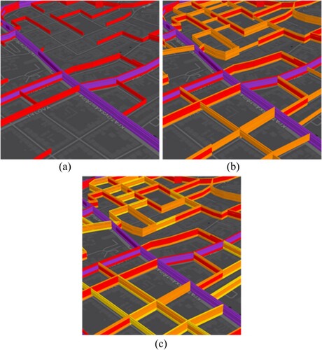
This application was tested in task 4 against the STC isopleth method with noise emission. In this task, users were asked to find areas with daily noise above 75 dB and a significant decrease during the evening and night. The original hypothesis was that STC for the road network would be easier to use as layer occlusion is less present. Unfortunately, this task has proven to be misleading, as five participants did not understand it (). Instead of selecting a single segment that fits the assignment (see example in on the left), they rather choose a crossroad where two segments with significant differences in noise volumes meet. This is technically the correct answer, but it was not the intended one. This misunderstanding, alongside the significant time difference for the two methods in this task, is in line with participants’ critique of these methods. They found it very different from the rest, and thus they struggled with them.
Figure 16. Task 4 user testing results.
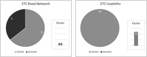
Figure 17. Correct answer to task 4 on the left (a) and example of an incorrect answer on the right (b).
The second STC application can be seen in . Each image in the figure shows the STC scene with noise levels and with different time layers. The first image (a) shows only noise levels at morning time interval (12 am–6 am), the second image (b) shows morning and day time interval (6 am–6 pm), and the following two images (c) and (d) add one more layer each. Image (c) adds evening (6 pm–10 pm) and image (d) night (10 pm–12 am).
Figure 18. STC method with layers for different time intervals – (a) noise levels at a morning time interval (12 am–6 am), (b) morning and day time interval (6 am–6 pm), (c) morning, day and evening time interval (6 am–10 pm) and (d) morning, day, evening and night-time interval (10 pm–12 am).
STC isopleth application was tested against 2D map in task 5, where users had to choose the correct graph representing noise change throughout a day. The time needed to choose an answer was almost identical for both methods. Two users choose the wrong option when using the STC method, contrary to all correct answers when using the 2D map (). When considering that for most users this was their first experience with the space-time cube concept, as stated in the interviews, this seems to be promising.
Figure 19. Task 5 user testing results.
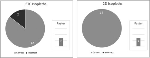
The interpretation of video captures shows that the two incorrect answers for this task when using STC isopleth can be credited to a combination of two factors: colour scheme and layer semi-transparency which resulted in users confusing two semi-transparent orange layers on top of each other with red colour as the colour value was summed up for the orange layers resulting in a darker shade.
The analysis of the video shows that user testing was successful in proving the usability of the proposed methods as all tasks had a high percentage of successful completion. It also proved the designed user test as a helpful tool in discovering existing shortcomings of the methods. These shortcomings can be mainly attributed to the third dimension’s added complexity and increased demands on the user experience. It appears that 3D visualization is thus better suited to either noise modelling experts or even non-specialist users but only for special use cases where the changes of noise across the Z-axis are significant.
Discussion
This section elaborates some already mentioned limitations of approaches and methods shown in the paper.
The first limitation is in the method of noise estimation which was done to provide a hypothetical noise distribution – as the focus of this paper lies in designing new visualization methods for a 3D continuous time-dependent phenomenon, taking noise as an example. We assume that the designed visualization methods tested for the phenomenon of noise can be used for other types of 3D continuous time-dependent phenomena such as air pollution, pollen or heat transmission within an urban area.
It should also be acknowledged that even though the third dimension usage enriches the visualization with more data, it also makes it more demanding for the user to comprehend all of the information as suggested by the user testing results. These demands apply especially to the STC method, where the users have to get used to the third dimension. Usability of the STC could be improved by dynamic text annotation (e.g. individual layers could be annotated with time interval or height according to the method).
As presented in this paper, all of the designed visualization methods utilize the third dimension, either for height or time (the other being static). If one wanted to explore the dynamics of a phenomenon in all four dimensions (x, y position, height and time) at once, they would need to integrate the fourth dimension by an animation.
The conducted user testing has proven to be very useful for initial feedback regarding the methods. However, it would be beneficial to increase the testing in the number of participants and also use other methods of gathering data such as eye-tracking techniques as shown in a similar use case in Popelka et al. (Citation2019).
As mentioned in section ‘3D visualization methods with Z-axis for portraying heights’, the approach that we have used to depict noise in the third dimension was the segmentation of space into predetermined layers. These layers were represented by the height layers in 3D visualization and the time interval layers in the STC methods. This segmentation creates ambiguity about what is happening with the phenomenon in between layers. A possible answer to this issue might be a step from isopleths towards 3D isosurfaces. These isosurfaces would also have to represent predetermined dB levels but no longer in predetermined height/time intervals, thus. Thus possibly further improving the understanding of the phenomenon. We consider this approach to be a possible future direction of the research in this area.
Conclusion
This paper proposes and implements new methods (3D visualization of noise with isopleths, 3D visualization of noise with virtual microphones spheres, STC visualization of noise with isopleths and STC visualization of noise on the road network) to visualize four-dimensional phenomenon. The aim of these visualization methods is not to replace the already existing 2D visualization methods. The aim of the proposed methods is to portray the phenomenon without projecting it onto a 2D space but rather showing the phenomenon in three dimensions. The depiction in 3D allows the user to see directly how the phenomenon relates to its surroundings and thus understand the impact of the phenomenon. We tested the methods on the example of traffic-generated noise outdoors in urban areas because noise is a continuous phenomenon with great importance for the quality of life in a modern city.
We believe that we were able to point out specific use cases that are promising in helping to understand the data in a new and better way than current visualization methods through conducted user testing.
Acknowledgements
The first author was supported by Project SGS-2019-015 Application of Mathematics and Informatics in Geomatics IV, second author by EU Horizon 2020 projects PoliVisu and DUET.
Disclosure statement
No potential conflict of interest was reported by the author(s).
Additional information
Funding
Notes on contributors
Daniel Beran
Daniel Beran graduated from the University of West Bohemia (UWB) at Faculty of Geomatics in 2018 with an Ing. degree (eq. to MSc). Since 2014 he has been active in various H2020 projects (OpenTransportNet, PoliVisu, DUET, S4allCities). In 2015 Daniel joined the Traffic Modeller team working as data manager and GIS analyst. Since 2018 he has been undergoing a PhD study programme at the UWB exploring classification of lidar point clouds. In 2018 and 2020 Daniel was a guest researcher at TU Delft and TU Wien respectively. He is a part-time GIS teacher at Pilsen high school of civil engineering. He has experience in GIS, traffic modelling, 3D visualization and point cloud processing .
Notes
1 Správa informačních technologií města Plzně, https://www.sitmp.cz/
2 EDIP s.r.o., http://www.edip.cz/cs/
3 PoliVisu project, https://www.polivisu.eu/
4 Authors are aware that, rigidly speaking, the portrayal method used in the article is in fact a perspective visualisation of three dimensional data on a two dimensional computer screen. However, any fully three dimensional visualisation (no matter if based on a stereo projection or a true hologram), will have the same advantages and will be affected by the same occlusion issues as described below in the chapter. Therefore, we speak about 3D visualisation in general.
5 ESRI Story Map Journal, https://storymaps-classic.arcgis.com/en/app-list/map-journal
6 Bewisse Screen Recorder, https://record.bewisse.com
References
- Burian, J. Popelka, S. and Beitlova, M. (2018) “Evaluation of the Cartographical Quality of Urban Plans by Eye-Tracking” ISPRS International Journal of Geo-Information 7 (5) p.192 DOI:10.3390/ijgi7050192.
- Dratva, J., Zemp, E., Dietrich, D.F., Bridevaux, P.O., Rochat, T., Schindler, C. and Gerbase, M.W. (2010) “Impact of Road Traffic Noise Annoyance on Health-Related Quality of Life: Results from a Population-Based Study” Quality of Life Research 19 (1) pp.37–46 DOI:10.1007/s11136-009-9571-2.
- Dutilleux, G., Defrance, J., Ecotière, D., Gauvreau, B., Bérengier, M., Besnard, F. and Duc, E.L. (2010) “NMPB-ROUTES-2008: The Revision of the French Method for Road Traffic Noise Prediction” Acta Acustica United with Acustica 96 (3) pp.452–462 DOI:10.3813/AAA.918298.
- Elmqvist, N. and Tsigas, P. (2008) “A Taxonomy of 3D Occlusion Management for Visualization” IEEE Transactions on Visualization and Computer Graphics 14 (5) pp.1095–1109 DOI:10.1109/TVCG.2008.59.
- Fang, T.B. and Lu, Y. (2011) “Constructing a Near Real-Time Space-Time Cube to Depict Urban Ambient Air Pollution Scenario” Transactions in GIS 15 (5) pp.635–649 DOI:10.1111/j.1467-9671.2011.01283.x.
- Fortin, N., Bocher, E., Picaut, J., Petit, G. and Dutilleux, G. (2012) “An opensource tool to build urban noise maps in a GIS” Open Source Geospatial Research and Education Symposium (OGRS) Yverdon-les-Bains: 25th October: HAL, p.9. Available at: https://hal.archives-ouvertes.fr/hal-00845701.
- Hägerstrand, T. (1970) “What about People in Regional Science?” Papers of the Regional Science Association 24 (1) pp.6–21 DOI:10.1007/BF01936872.
- Ising, H., Babisch, W. and Kruppa, B. (1999) “Noise-Induced Endocrine Effects and Cardiovascular Risk” Noise and Health 1 (4) p.37.
- Kraak, M.J. (2003) “Geovisualization Illustrated” ISPRS Journal of Photogrammetry and Remote Sensing 57 (5–6) pp.390–399 DOI:10.1016/S0924-2716(02)00167-3.
- Kraak, M.J. and Kveladze, I. (2017) “Narrative of the Annotated Space–Time Cube – Revisiting a Historical Event” Journal of Maps 13 (1) pp.56–61 DOI:10.1080/17445647.2017.1323034.
- Kraak, M.J. and Ormeling, F.J. (2013) Cartography: Visualization of Spatial Data London: Routledge.
- Kurakula, V. (2007) “A GIS Based Approach for 3D Noise Modelling Using 3D City Models” (MSc thesis) International Institute for Geo-Information Science and Earth Observation (ITC), The Netherlands Available at: https://webapps.itc.utwente.nl/librarywww/papers_2007/msc/gem/kurakula.pdf (Accessed: 9th August 2021).
- Kveladze, I., Kraak, M.J. and van Elzakker, C.P. (2013) “A Methodological Framework for Researching the Usability of the Space-Time Cube” The Cartographic Journal 50 (3) pp.201–210 DOI:10.1179/1743277413Y.0000000061.
- Law, C.W., Lee, C.K. Lui, A.S.W., Yeung, M.K.L. and Lam, K.C. (2011) “Advancement of Three-Dimensional Noise Mapping in Hong Kong” Applied Acoustics 72 (8) pp.534–543 DOI:10.1016/j.apacoust.2011.02.003.
- Law, C.W., Lee, C.K. and Tai, M.K. (2006) Visualization of Complex Noise Environment by Virtual Reality Technologies Hong Kong, China: Environment Protection Department (EPD), p.76.
- Pamanikabud, P. and Tansatcha, M. (2010) “Virtual visualization of traffic noise impact in geospatial platform” 2010 18th International Conference on Geoinformatics. Beijing, China: 18th–20th June: IEEE, pp, 1–6 Available at: https://ieeexplore.ieee.org/document/5567664.
- Popelka, S., Herman, L., Řezník, T., Pařilová, M., Jedlička, K., Bouchal, J., Kepka, M. and Charvát, K. (2019) “User Evaluation of Map-Based Visual Analytic Tools” ISPRS International Journal of Geo-Information 8 p.363 DOI:10.3390/ijgi8080363.
- Ranjbar, H.R., Gharagozlou, A.R. and Nejad, A.R.V. (2012) “3D Analysis and Investigation of Traffic Noise Impact from Hemmat Highway Located in Tehran on Buildings and Surrounding Areas” Journal of Geographic Information System 4 (4) pp.322–334 DOI:10.4236/jgis.2012.44037.
- Shepherd, I.D. (2008) “Travails in the Third Dimension: A Critical Evaluation of Threedimensional Geographical Visualization” In Dodge, M., McDerby, M., and Turner, M. (Eds) Geographic Visualization: Concepts, Tools and Applications Chichester: Wiley, pp.199–222.
- Slocum, T.A., McMaster, R.M., Kessler, F.C., Howard, H.H. and McMaster, R.B. (2008) Thematic Cartography and Geographic Visualization (3rd ed.) Upper Saddle River: Prentice Hall.
- Stoter, J. (1999) “Noise prediction models and geographic information systems, a sound combination” The 11th Annual Colloquium of the Spatial Information Research Centre University of Otago, Dunedin. (Vol. 60).
- Stoter, J., De Kluijver, H. and Kurakula, V. (2008) “3D Noise Mapping in Urban Areas” International Journal of Geographical Information Science 22 (8) pp.907–924 DOI:10.1080/13658810701739039.
- Thakur, S. and Rhyne, T. M. (2009) “Data vases: 2D and 3D plots for visualizing multiple time series” International Symposium on Visual Computing. Las Vegas, USA: 20th November-2nd December Berlin: Springer, pp.929–938 Available at: https://link.springer.com/chapter/10.1007%2F978-3-642-10520-3_89.
- Tominski, C. and Schulz, H.J. (2012) “The Great Wall of Space-Time” DOI:10.2312/PE/VMV/VMV12/199-206.
- United Nations (2014) “World Urbanization Prospects: The 2014 Revision (Highlights) Department of Economic and Social Affairs” Population Division, United Nations.