
The year 1931 saw the inception of what has become arguably the world’s most successful cartographic design. Henry C. Beck, a technical draughtsman who had been laid off by the Underground Electric Railways of London (UERL), devised a new diagrammatic mapFootnote1 of the network () in his spare time. Beck’s radical approach favoured topology over topography – connectivity over geographical fidelity – which he achieved primarily by straightening out the lines and limiting changes in their direction to 45° and 90°. Beck submitted a presentation copy () of his map to the board of the Publicity Office of the UERL that same year, and, although his solution was initially rejected as being too revolutionary (Garland, Citation1994), Beck re-submitted his design in 1932 and it was accepted. The map was eventually issued as a pocket edition in January 1933; its first print run of 750,000 copies reflecting the board’s new-found confidence in its design and an enthusiastic reception by the public secured a further printing of 100,000 copies in February and a poster edition in March (Dobbin, Citation2012).
Figure 1. Sketch for a new diagrammatic map of the London Underground network by Henry C. Beck in 1931, drawn in pencil and coloured ink on squared paper in an exercise book. It incorporates the basic principles of his design and indicates the location of the River Thames, as well as spaces for the legend and the Underground logotype as if designed for a pocket-sized edition. Size: 240 × 190 mm (© TfL from the V&A collection).
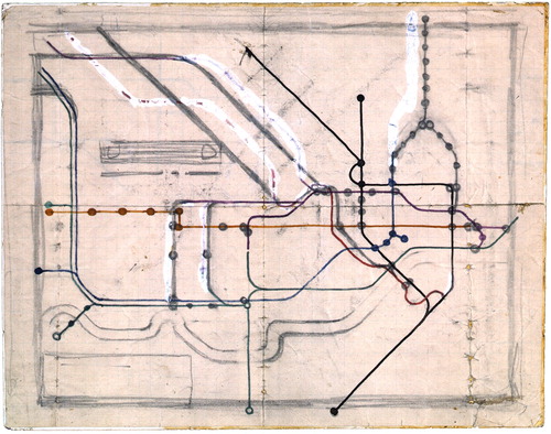
Figure 2. Beck’s hand-drawn presentation copy of 1931, with amendments (such as the removal of Down Street from the Piccadilly Line) made in 1932 for its re-consideration by the board of the Publicity Office. The design’s capacity to accommodate modifications as the Underground network itself evolved provided an early demonstration of its versatility, which is perhaps its most enduring quality. Size: 241 × 190 mm (© TfL from the London Transport Museum collection).
Today, the ‘Tube map’ needs hardly any introduction. It has been hailed as a supreme example of information design; it has been implemented in transit mapping around the globe (with varying levels of success); it has been venerated, analysed and parodied; and it has been transformed into countless artefacts, souvenirs and merchandise – from mugs to face masks. Instantly recognizable and used by millions of travellers daily, it came second only to Concorde in a BBC poll in 2006 of favourite British designs of the twentieth century and is widely regarded as an icon of London itself (Pike, Citation2002; Vertesi, Citation2008; Merrill, Citation2013). If the success of a cartographic design is measured by its use over space and time, Beck’s map certainly hits the mark with its worldwide imitation and marathon longevity. Ninety years after its inception, it is worth reflecting on how and why his design became an icon, and whether this can offer some insights about the nature of cartographic innovation that can inspire us today.
As is now more widely known, the map’s journey to stardom and recognition for Beck were less than straightforward or timely. Although his map was well received by the public, Beck had an uneasy relationship with London TransportFootnote2 over its design, and, despite returning to their employ in 1932, he struggled to maintain control over the map’s ongoing development (for a detailed account, see Garland, Citation1994). After Beck produced his final map for London Transport in 1959, the introduction of a more angular version in 1960 created by Harold F. Hutchison, the new Publicity Officer, brought an unwelcome departure – both from Beck’s involvement in the evolution of the map and from the elegance and flow of his design. A sympathetic attempt to restore these elements by Paul E. Garbutt was first published in 1964 and managed to earn recognition in the San Francisco Chronicle as a ‘work of art’ (Berger, Citation1975). Nevertheless, while Hutchison’s map seems to have served as the catalyst for a reappraisal of Beck’s design principles and a greater appreciation of their value, it did not lead to his regaining control over the map.
In terms of bringing public recognition to Beck and his contribution to the map’s design, much is owed to graphic designer Ken Garland. He interviewed Beck in 1965, a year after Garbutt’s homage was published, and Garland championed the man and his map in an article for The Penrose Annual (Garland, Citation1969) and later in his seminal contribution Mr Beck’s Underground Map: A History (Garland, Citation1994). Garland’s photographs of Beck and of his initial sketch mapFootnote3 () were included in the exhibition ‘Classics of Modern Design’ at Camden Arts Centre in 1977 (see Gay, Citation1977), along with later editions of the map. At the time, the map was ‘only just beginning to be recognized as a classic of twentieth century graphic design’ (Walker, Citation1977: 103), and Harry Beck – as he became more commonly known – gradually gained renown as the creator of ‘a masterpiece of twentieth century graphic art’ (Walker, Citation1979: 2). Beck and his map were featured in a 25-minute BBC documentary Design Classics in 1987 and were highlighted in a 1990 exhibition entitled ‘Finding the Way – 100 Years of London’s Transport Maps’ at the London Transport Museum. This official recognition was galvanized by their naming of the Museum’s new map gallery after Beck in 1993, and today, a large display in the Museum’s ‘London by Design’ exhibition is devoted to maps of the Underground and emphasizes Beck’s role in their evolution.Footnote4 In recognizing the debt owed to Beck after his death in 1974, Walker (Citation1979: 2) urged London Transport to acknowledge him by printing a credit to Beck on the then-current design by Garbutt. Yet it was not until 2001 that Transport for London (TfL) incorporated the statement ‘This diagram is an evolution of the original design conceived in 1931 by Harry Beck’ on the Tube map, cementing his association with the map and his unique role in its creation.
Beck’s original design, however, was itself an evolution of the designs of previous maps of the Underground, particularly in their migration towards a more diagrammatic approach. Schematic maps of railway networks were already in use by the late nineteenth century and linear route diagrams, such as those designed by George Dow, were commonplace in commuter trains – including those used by Beck (see Leboff and Demuth, Citation1999; Dow, Citation2005). This tends to be overlooked by appraisals of Beck’s design that exaggerate the scope of its innovation, promulgating the myth that his map emerged fully fledged as an isolated, single stroke of genius. Beck’s map is regularly lauded as a radical departure from previous Underground maps (e.g. Lueder, Citation2012; London Transport Museum, Citation2016), with their confusing surface detail and poor legibility.Footnote5 It is, however, always easier to evaluate an innovation from our perspective looking back, rather than from the innovator's perspective looking forward.
The UERL was formed in 1902 and had produced its first map showing the Underground as a coordinated system by 1908 (). Beck’s design incorporated several successive innovations, which included the removal of surface detail, the enlargement of the central area, and the use of Johnston-style lettering (). In 1920, the map’s first named designer, MacDonald (Max) Gill, who had been commissioned to create several striking pictorial maps for the Underground in the previous decade (see Kent, Citation2019 and Walker, Citation2020), had taken the bold step to remove all surface features (including the River Thames) from the map (). This achieved a greater sense of clarity and freed the map from any reference to street-level detail – a transformative move in directing the evolution of its design away from maintaining geographical fidelity. Gill also gave the map its own distinctive visual style and identity, focusing its purpose and strengthening its association with its subject. Following Gill’s removal of all surface features, Fred H. Stingemore (a draughtsman in the Publicity Manager's Office) expanded the map’s central area slightly and compressed its periphery (). His re-insertion of the Thames restored the map’s geographical context, which aided orientation and renewed its visual association with London. But it was Stingemore’s introduction of the Johnston typefaceFootnote6 (with his simple, hand-drawn uppercase letters replacing Gill’s flamboyant calligraphic style), which perhaps signalled a new aesthetic direction that would align the map to the wider visual language of the Underground, including Charles Holden’s architecture of 1923–1942.
Figure 3. Pocket edition of the first map to show all Underground lines as a coordinated system, issued by the UERL in 1908 and printed by Jonathan Riddle & Company Ltd. Although the map includes surface features for reference, some geographical distortion has been introduced below the legend to ensure that the Metropolitan Railway (in red, top left) remains visible. Size: 270 × 220 mm (reproduced courtesy of the David Rumsey Map Collection).
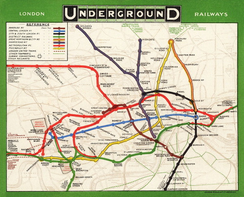
Figure 4. Pocket edition of MacDonald Gill’s map of the Underground, which eliminated surface detail and paved the way for a radical re-thinking of the map’s structure and composition. This example was issued in 1922 and printed by the Dangerfield Printing Company Ltd. Size: 330 × 250 mm (reproduced courtesy of the David Rumsey Map Collection).
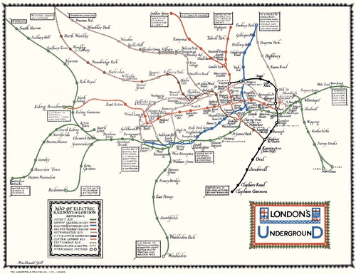
Figure 5. Tenth edition of Fred H. Stingemore’s pocket map of the London Underground network, issued in 1931 by the Underground Electric Railways of London (UERL) and printed by the David Allen Printing Company Ltd. It was in circulation when Beck first presented his prototype to the UERL’s Publicity Office. Note the smaller size of 167 × 144 mm compared with earlier pocket maps (private collection).
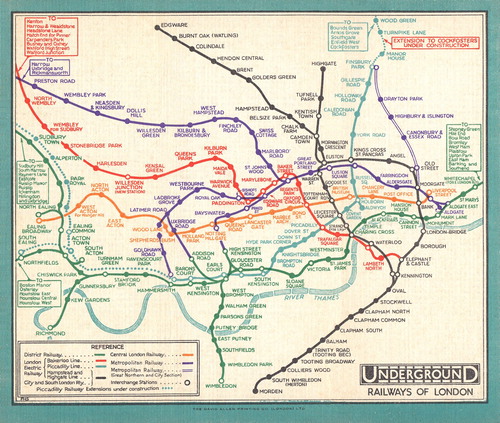
Table 1. Key innovations in the design of London Underground maps introduced by Beck and his predecessors.
Gill’s omission of surface features and Stingemore’s approach to lettering had therefore set the stage for a radical re-arrangement of the map. If its predecessors were ‘tied to the geography of London above ground’ (Cartwright, Citation2015: 524), Beck’s first published design of 1933 () finally tipped the balance towards topology and embraced the new cartographic possibilities that this offered. As Beck himself justified, it simply ‘seemed common sense. If you’re going underground, why do you need to bother about geography? It’s not so important. Connections are the thing’ (Hadlaw, Citation2003: 32). Gill and Stingemore also allowed scope for a more holistic aesthetic to emerge – one that could mimic the bold geometry of the uppercase letters of Johnston’s sans serif typeface. The close visual association between the microaesthetics of the lettering and the macroaesthetics of the map’s structure utilizes their similar vertical, horizontal and diagonal forms to create a sense of unity and conformity that permeates from the first impression to closer reading.Footnote7 As Gill’s calligraphic lettering had echoed the organic, fluid form of what Beck had called the ‘vermicelli’ of Underground lines,Footnote8 so Johnston’s modern typeface heralded a new approach that would be based upon clarity, directness and simplicity.
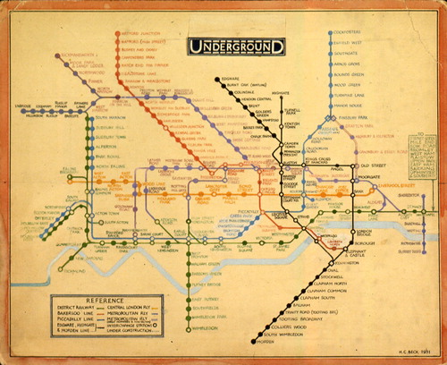
Figure 6. First pocket edition of Beck’s map, issued in January 1933 and printed by Waterlow & Sons Ltd. According to Garland (Citation1994: 19), Beck was paid ten guineas for its design and artwork, and five guineas for the subsequent quad royal poster artwork. Size: 155 × 128 mm (private collection).
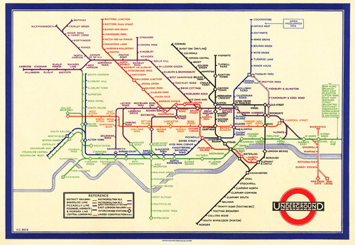
There are many reasons for the success of Beck’s design and the magnitude of its enduring impact. When it was first published in 1933, the map presented a sufficient departure from previous designs to warrant an official plea for user feedback.Footnote9 Its enthusiastic reception by the public, however, not only expunged any lingering doubts, but managed to eclipse the impact of its previous designers. Garland (Citation1969: 70) described the map as ‘so obviously useful’, with Roberts (Citation2012) identifying that its usability is ultimately derived from the simplicity of its design. Others, such as Pike (Citation2002: 112–113), ascribe the success of the map to the colour-coding of its lines: ‘the primary feature that Beck borrowed from the failed attempts of his predecessors to conceptualize the Underground as a modernist space’. Certainly, the success of Beck’s design is due to a combination of factors, which include an internal structure that offered enhanced usability; an aesthetic appeal that resonated sufficiently with society to facilitate its positive reception; and its agency to transform the negative image of the Underground within the minds of its would-be users. Beck therefore produced the right map at the right time and in the right place, but he also ensured that it would affect its users in the right way by promising a modern experience of urban travel that they desired.
Bain (Citation2010) considers the most significant trait of transit maps to be their geographical distortion, which is what makes them practical. For Garland (Citation1994: 7), the distortion in Beck’s map was ‘purposeful, straightforward and skilful’. The exclusion of surface features allowed Beck to introduce a level of distortion that could achieve greater clarity and balance without incurring excessive disorientation (for a geometric analysis, see Jenny, Citation2006). Indeed, passengers can sometimes find too much distortion unacceptable, with the 1972 subway map of New York City abandoned for this reason (Guo, Citation2011). More specifically, the architecture of Beck’s design, as constructed by straightening the lines and limiting changes in their direction to 45° and 90° angles (termed octolinearityFootnote10), served to reduce the inherent complexity of the network, enhancing the map’s usability. As Roberts (Citation2012: 39) explains, ‘[b]y casting away irrelevant details, [Beck] presented the routes as simple, straight lines, minimising their kinks, maintaining interchanges, and making overall trajectories […] easier to identify’. Since straighter lines induce a lower cognitive load than twisting ones, journeys become easier to plan and remember. In addition, maps with the simplest line trajectories tend to be judged as the most usable, although octolinearity does not always offer the most effective solution (Roberts et al., Citation2017). Beck’s map was not the first octolinear transit map to be published, e.g. Cartwright (Citation2015) presents a map of the Berlin S-Bahn that was published in 1931, but the global influence of Beck’s design has ensured that octolinearity remains the most frequent choice for schematic maps in which line trajectories are depicted as linear (Ovenden, Citation2015; Roberts et al., Citation2017).
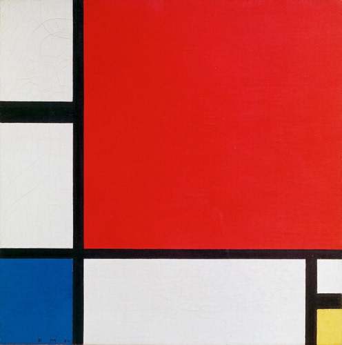
If these inherent advantages were ever apparent to the board of the Publicity Office in 1931, they were probably overshadowed by the startling geometric abstraction of Beck’s design. The map has been called ‘the most original work of avant-garde art in Britain between the wars’ (Hobsbawm, 1999: 38–39 quoted in Pike, Citation2002: 101) and is regularly compared with the paintings of Piet Mondrian (1872–1944), the Dutch pioneer of abstract art (), particularly with regard to the use of graphic rules (Berger, Citation1975; Garland, Citation1994; Pike, Citation2002; Lueder, Citation2012). Some believe that this strategy demonstrates an association with modernist cultural frameworks that were prevalent at the time of its inception (Merrill, Citation2013: 248), while others assert that Beck ‘knew little about modern art’ and simply created his map with ‘the same logic and care that he employed to draw an electrical circuit diagram’ (Wilkinson, Citation2019: 65). The latter is often cited as the source of Beck’s inspiration (e.g. Christianson, Citation2014), with Illiinsky (Citation2010) observing that the conventions Beck brought to his map were derived from electrical circuits and not from cartography, since (according to Lueder, Citation2012: 35), his design ‘recalls the graphics of electrical wiring diagrams’. The visual association was made right from the start, with Beck producing a spoof of his map as a rebuff in the March 1933 edition of the Train, Omnibus and Tram staff magazine, entitled ‘The Underground “Straight Eight” All-Electric Skit-Set Circuit Diagram’. As Hornsey (Citation2012: 688) notes, ‘this clever self-parody had a robust logic, for since the electrification of its railway lines, the Underground had effectively been an ensemble of electrical circuits’. Nevertheless, there remains no evidence that Beck drew his inspiration from the design of circuit diagrams, even if he had created them while working in the UERL’s Signalling Department (Roberts, Citation2012).
Figure 7. Composition II in Red, Blue, and Yellow (1930) by Piet Mondrian. Oil on canvas. Housed at the Kunsthaus Zürich. Size: 46 cm × 46 cm (Wikimedia Commons).
Regardless of the source of his inspiration, Beck’s design principles created a graphic identity and ensured a continuity that remains unparalleled in any other metropolitan subway diagram (Lueder, Citation2012). They also exhibit an aesthetic appeal that generates positive connotations for would-be users of the Underground. Walker (Citation1979: 4) identified principles that are historically associated with Classicism, i.e. order, unity, harmony, stability, purity, clarity, economy, anonymity of finish, and rationality. More recently, Roberts et al. (Citation2017) define the principles of successful transit map design as simplicity, coherence, balance, harmony, and topographicity. If Beck knew intuitively that the most elementary and simple of forms, if well-proportioned and of graceful contour, are the most pleasing (Williams, Citation1849 cited in Friel and Friel, Citation2013), he applied a graphical approach that tempered the visual harshness of lines changing their direction by using tight curves instead of angular joins (unlike the later attempt by Hutchison), to create a perception of flow. Together with the regularity of straight lines and evenly spaced stations, this presented an image of London for the modern era.
The public welcomed this new, utopian image of the city. In the grip of an economic depression, the financial argument for modern industrial design grew and a machine aesthetic began to emerge in the design vocabulary of British products; clean modern lines reflected a new industrial functionalism (Friel and Friel, Citation2013). Beck’s regular angles and vibrant colours met the public taste for the machine aesthetic and were in step with the Art Deco style (Kent, Citation2005). For London in the 1930s, the requirements of mass-production had elevated efficiency, functionality, and standardization as new social values to which Beck’s map presented ‘an ideal image of modern time and space: orderly, lucid, regular, efficient, and entirely functional’ (Hadlaw, Citation2003: 35). Central to the map’s success, then, was the transformative possibility it offered to re-imagine the Underground, and, ultimately, London itself. As Pike (Citation2002: 106) puts it, the ‘outmoded, filthy underground of mining and slums’ gave way to the ‘inorganic, ordered space of modernism’. To those encountering the map, it therefore communicated in that first half-second a fresh and positive image of the city as a whole. For Garland (Citation1994: 7, 9), the map transcends its navigational purpose, since ‘the optimistic vision it offered of a city that was not chaotic […]. Its bright, clean and colourful design exuded confidence in every line’. The map, therefore, served to replace negative connotations of the Underground with positive connotations (), affecting users’ perceptions and behaviour. More simply, the image of the map aligned to what users of the Underground wanted it to be – a clean, straightforward and efficient way of getting around the city.
Table 2. Semantic pairs of antonyms where the holistic aesthetic of Beck’s map projects a contrasting view of the Underground and transforms the perception and experience of travel.
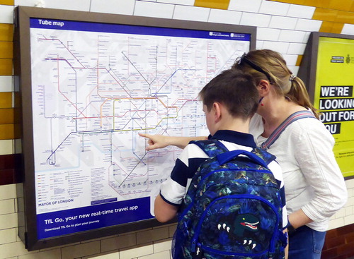
Giving people confidence to use the Underground was the ultimate purpose of Beck’s map, and this particular motivation – to give users confidence – perhaps lies at the very heart of cartographic design. As Berger (Citation1975: 21) noted, Beck’s map gives ‘mastery and power’, providing the user with ‘the illusion of control, somehow of this vast entity’. Beyond this, Hornsey (Citation2012: 691–692) believes that the map ‘sought to revise how individual passengers responded to the corporate built environment, so that they might learn to align their behaviour with the spatial requirements of the dynamic system’, drawing a comparison, for example, with the introduction of escalators in 1924 to regulate passenger movement. Penrice (Citation1975, cited in Walker, Citation1979) suggests that map and traveller become a working model of the railway, and not a static representation. Indeed, although maps can empower users, their performative function includes their agency to influence user behaviour (see Kent and Hopfstock, Citation2018), and the map’s continued use () serves to reinforce this agency. Perhaps more so for Beck’s map than for its predecessors, this agency is derived from an impression of unauthoredness; its inorganic, abstract form contrasts with their organic, representative design while its rationalization of the chaos of the Underground network and machine aesthetic suggest that the map is a product of the Underground network itself. As Walker (Citation1979: 2) observed, passengers look through it rather than at it (emphasis original). For them, the map is the network.
Figure 8. Travellers using a wall-mounted Tube map to plan a journey at Regent’s Park Underground Station in 2021. Photograph by the author and included with the permission of TfL.
The capacity of Beck’s design to accommodate change as the network has evolved has ensured that its basic principles have remained in use, reiterating its spatial organization and causing a deeper effect on users’ mental maps of London. People see the map as a ‘graphical user interface’ to the city (Vertesi, Citation2008: 25), with Guo (Citation2011) finding that even the most experienced passengers tend to trust the map more than their own travel experience when deciding the ‘best’ travel path. Moreover, its stations become part of an individual’s identity (Berger, Citation1975) so that by showing what is and is not on the map, the map defines what is and is not London, bearing in mind that many of the poorest areas of the city in the south-east do not have Underground stops (Vertesi, Citation2008). Beck’s map has indeed become so embedded in users’ mental maps that even geographically accurate maps of the city can appear radically different and therefore incorrect. As Barber and Board (1993: 151, quoted in Cartwright, Citation2015: 536) note, ‘it has virtually replaced the true-to-scale maps […] as the correct map because the latter look unfamiliar and therefore suspect, even wrong’.
The continued success of Beck’s map has, however, also hindered its own evolution. For some, the map possesses such exceptional richness and social utility that it serves as ‘a model for the role of art in a future society’ (Walker, Citation1979: 4), whereas Roberts (Citation2005), for example, has since complained that there has been an erosion of the clarity and usability of the map, as successive designers have pursued different priorities. Despite the expansion of the Underground network and the incorporation of new transit networks, those developing the map have preferred to retain Beck’s principles instead of introducing new design solutions. Yet, it is worth noting that Beck was always trying out experiments (Garland, Citation1969) and regarded the map as ‘a living and changing thing’ (Garland, Citation1994: 23). If fear of moving away from Beck’s principles eliminates scope for creativity and innovation, this would go against Beck’s ultimate objective to pursue greater clarity for the benefit of the user. Although creativity and innovation have been applied to Beck’s design, they have perhaps been more visible in the map's various guises as an organizing framework for virtually anything. It has become ‘a seductive visual template for every kind of network’ (Elliman, Citation2006: 175), with its ‘exploitation’ for mapping other phenomena drawing particular condemnation (Field and Cartwright, Citation2014). As Iliinsky (Citation2010) notes, in the worst cases, novel design is nothing more than the product of ego and the desire to create something visually impressive, regardless of the intended audience, use, or function. By contrast, Beck’s ‘single-minded search for clarity’ is what characterized his work (Garland, Citation1969: 79), as well as his continual dedication to its improvement – a fleeting glimpse of which was perhaps captured by his colleague Bryce Beaumont ().
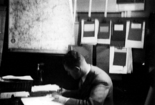
Figure 9. Photograph of Henry C. Beck working at his desk in the Publicity Office of the LPTB headquarters at 55 Broadway, c.1938, by Bryce Beaumont (© TfL from the London Transport Museum collection).
Beck’s concern for the user and for meeting their ever-changing needs has provided a model approach for cartographic design, more so in an era when user-centred design has become an established process for the development of new products. As Norman (Citation2002: 155) proclaims, ‘[t]here is no substitute for interaction with and study of actual users of a proposed design’. For transit maps, Bain (Citation2010) recognizes the need to bring transit users into the design process, which should not be left to designers and publishers alone. Roberts et al. (Citation2017: 127) take this a step further by asserting that ‘[o]nly extensive objective usability tests can hope to identify the designs most suitable for official adoption’. Nevertheless, Beck’s solution was ‘largely intuitive’ and the method by which it developed was empirical (Garland, Citation1969: 79). In this way – and voluntarily – Beck still managed to unite what the public and the Publicity Office desired: to see the prospect of travelling by Underground with fresh eyes and the confidence to do so. Indeed, what do maps present us with if not new possibilities and challenge us to act on them? Beck made the challenge of planning journeys by Underground easier to accomplish for millions of users.
The enduring success of Beck’s map is due to a combination of factors, but the purity of his motivation to make things better for users and his dedication to innovation – together with his persistence in the face of rejection and ridicule – is truly inspiring. His iconic design demonstrates that cartography will always require a combination of creativity, innovation and understanding users' requirements in order to be successful in meeting the needs of society. Ninety years after Beck devised his transformational design, perhaps cartographers in a post-COVID world, where accelerating innovation will be crucial, can gain more from imitating his attitude, if not his map.
Notes on the cover
The cover image is a modified detail from the first pocket edition of Beck’s map of the London Underground, published in January 1933. The process of its inception and eventual printing is described by Beck (quoted in Garland, Citation1994: 17) as follows:
Looking at the old map of the Underground railways, it occurred to me that it might be possible to tidy it up by straightening the lines, experimenting with diagonals and evening out the distance between stations. The more I thought about it the more convinced I became that the idea was worth trying, so, selecting the Central London Railway as my horizontal base line I made a rough sketch. I tried to imagine that I was using a convex lens or mirror, so as to present the central area on a larger scale. This, I thought, would give a needed clarity to interchange information. […] The design was duly submitted, but, to my surprise and disappointment the very idea of a 45- and 90-degree schematic treatment was thought to be too ‘revolutionary’: my Underground map was handed back to me and that, it seemed, was to be the end of it. […] About a year later I had another look at the drawing, and decided, without much hope, to try again. This time, Mr Patmore of the Publicity Department sent for me, after the Publicity meeting at which it was considered, and greeted me with the words, ‘You’d better sit down: I’m going to give you a shock. We’re going to print it!’ Thus it was, and only, as I believe, through my pertinacity, that the London Underground diagram was born.
Without Beck’s conviction in the success of his solution and the encouragement of his colleagues, a map of the London Underground may never have evolved to become both the undisputed design classic and the internationally recognized icon of the city it is today.
Acknowledgements
I am especially grateful to the London Transport Museum for their cooperation in providing some of the images for this editorial and for securing permission from TfL to reproduce them.
Additional information
Notes on contributors

Alexander J. Kent
Alexander J. Kent is Reader in Cartography and Geographic Information Science at Canterbury Christ Church University in the UK, where he lectures on map design, GIS, remote sensing and on European and political geography. His research explores the relationship between maps and society, particularly the intercultural aspects of topographic map design and the aesthetics of cartography. He is also Chair of the ICA Commission on Topographic Mapping and formerly President of the British Cartographic Society.
Notes
1 Cartwright (Citation2015) gathered expert opinions on whether the term ‘map’ or ‘diagram’ was most appropriate, which was also the subject of a debate at the British Cartographic Society-Society of Cartographers Conference in Cheltenham, 2016; both resulting with the term ‘map’ being generally preferred. As per my response to Cartwright (Citation2015), I consider a diagram to be principally concerned with layout and a map principally concerned with navigation (though not necessarily requiring geographical fidelity). Since Beck’s intention was to aid the user in planning journeys, I place his work within the realms of the map, even though his graphical strategy was essentially diagrammatic in leaning towards geometric simplicity and in placing topology over topography. Beck, however, referred to his creation consistently as a diagram (Garland, Citation1994: 2).
2 The London Passenger Transport Board was inaugurated on 1st July 1933 and was effectively nationalized when it became the London Transport Executive in 1948. These public corporations enjoyed monopoly rights over the city’s entire passenger transport provision (Hornsey, Citation2012) and were branded consistently as ‘London Transport’ until 2000, when ownership passed to Transport for London (TfL).
3 Ken Garland inherited the initial sketch and other drawings from Beck, who died in 1974. Garland presented them to the Victoria and Albert Museum (V&A) in 1979.
4 In explaining the map’s significance, the exhibition panel ‘Celebrating the map’ reads
Beck’s Underground map holds a special place in people’s hearts. It is an undisputed design icon and is recognised as a landmark achievement in the history of design. The map has influenced transport systems around the world, it features on a multitude of products, souvenirs, books and magazines and has inspired artists and designers alike (London Transport Museum, Citationn.d.).
5 Note also, for example, Hornsey (Citation2012: 684): ‘Before 1933 depictions of the system had usually been printed on top of ordinary street plans’, and Wilkinson’s (Citation2019: 65) description of Stingemore’s design as ‘a complicated map with snaking lines and a crowded central section […] the system was not easy to navigate’.
6 Edward Johnston was commissioned by Frank Pick (Commercial Director of the UERL) in 1913 to create a new typeface for the Underground, which was introduced in 1916 and incorporated in the Underground roundel logo from 1917. As with Beck’s map, Johnston's typeface has demonstrated a remarkable versatility and longevity, and has undergone revision while retaining its distinctive character. Similarly iconic, it is often referred to as ‘London’s handwriting’ (London Transport Museum, Citation2016: 32).
7 As yet, there is no evidence that Johnston’s sans serif typeface directly inspired Beck’s design, and Beck's hand-drawn version of Johnston’s lettering was applied somewhat loosely, with some labels condensed. However, Beck’s appointment in 1947 to teach typography at the London School of Printing and Kindred Trades signals his enthusiasm for, and expertise in, matters of typographic design. Lettering, after all, provides the ‘voice’ of a map (Tyner, Citation2010) and perhaps expresses its aesthetic tone more intimately than other elements of cartographic design. The importance of lettering when using and interpreting maps also ensures a high number of visual fixations, which serves to reinforce the map’s particular aesthetic signature. Beck’s use of ticks (instead of filled circles) for denoting intermediate stations directed users' attention to their labels and therefore emphasized the typeface in the overall visual hierarchy of the map.
8 See Garland (Citation1994). Beck’s delightful description of the Underground lines as long strands of thin spaghetti suggests connotations of the map’s previous designs as organic, chaotic and complex structures.
9 The 1933 pocket edition includes these rather sceptical words on its cover: ‘A new design for an old map. We should welcome your comments’. If any were received at the headquarters of the UERL at 55 Broadway, they unfortunately do not appear to have been kept (Dobbin, Citation2012). Frank Pick, whilst Vice Chairman and Chief Executive of the newly formed LPTB, noted in a memo about the quad royal map: ‘I confess that upon a large scale this looks very convenient and tidy and is a better map than any we have had so far’, with Garland (Citation1994) suggesting that Pick’s choice of the word ‘confess’ implies a change of heart after Beck’s design had been rejected in 1931. It is plausible that Stingemore played a key role in persuading Pick to accept Beck's design, given Stingemore's position as a draughtsman in the Publicity Manager's Office, and that (according to Garland, Citation1994) he encouraged Beck to re-submit his design after it was first rejected.
10 As derived from the number of different directions that linear features are permitted to use according to the underlying structure of the design. Octolinear designs allow eight, whereas rectilinear designs (using only 90° angles) allow four.
References
- Bain, P. (2010) “Aspects of Transit Map Design” Parsons Journal for Information Mapping 2 (3) pp.1–6.
- Berger, A. (1975) “London’s Underground as a Work of Art” San Francisco Chronicle (This World magazine) 18th May, p.21.
- Cartwright, W. (2015) “Rethinking the Definition of the Word ‘Map’: An Evaluation of Beck’s Representation of the London Underground through a Qualitative Expert Survey” International Journal of Digital Earth 8 (7) pp.522–537 DOI:10.1080/17538947.2014.923942.
- Christianson, S. (2014) 100 Diagrams that Changed the World London: Batsford.
- Dobbin, C. (2012) London Underground Maps: Art, Design and Cartography Farnham: Lund Humphries.
- Dow, A. (2005) Telling the Passenger Where to Get Off: George Dow and the Evolution of the Railway Diagrammatic Map London: Capital Transport.
- Elliman, P. (2006) “Signal Failure” In Abrams, J. and Hall, P. (Eds) Else/Where: Mapping – New Cartographies of Networks and Territories Minneapolis: University of Minnesota Design Institute, pp.166–175.
- Field, K. and Cartwright, W. (2014) “Becksploitation: The Over-use of a Cartographic Icon” The Cartographic Journal 51 (4) pp.343–359 DOI:10.1179/0008704114Z.000000000150.
- Fiell, C. and Fiell, P. (2013) The Story of Design London: Goodman Fiell.
- Garland, K. (1969) “The Design of the London Underground Diagram” The Penrose Annual 62 pp.68–82.
- Garland, K. (1994) Mr Beck’s Underground Map: A History Harrow: Capital Transport.
- Gay, B. (1977) Classics of Modern Design (Exhibition Guide) London: Camden Arts Centre.
- Guo, Z. (2011) “Mind the Map! The Impact of Transit Maps on Path Choice in Public Transport” Transportation Research Part A 45 pp.625–639.
- Hadlaw, J. (2003) “The London Underground Map: Imagining Modern Time and Space” Design Issues 19 (1) pp.25–35 DOI:10.1162/074793603762667674
- Hornsey, R. (2012) “Listening to the Tube Map: Rhythm and the Historiography of Urban Map Use” Environment and Planning D: Society and Space 30 pp.675–693 DOI:10.1068/d1410.
- Iliinsky, N. (2010) “On Beauty” In Steele, J. and Iliinsky, N. (Eds) Beautiful Visualization: Looking at Data through the Eyes of Experts Sebastopol California: O’Reilly Media, pp.1–13.
- Jenny, B. (2006) “Geometric Distortion of Schematic Network Maps” The Bulletin of the Society of Cartographers 40 (1,2) pp.15–18.
- Kent, A.J. (2005) “Aesthetics: A Lost Cause in Cartographic Theory?” The Cartographic Journal 42 (2) pp.182–188 DOI:10.1179/000870405X61487.
- Kent, A.J. (2019) “The Wondermaps of Max Gill” The Ephemerist 184 (Spring) pp.12–19.
- Kent, A.J. and Hopfstock, A. (2018) “How Topographic Maps Affect: Experiencing Washington, DC through the Maps of the ‘Other’” Cartographic Perspectives 91 pp.81–95.
- Leboff, D. and Demuth, T. (1999) No Need to Ask! Early Maps of London’s Underground Railways Harrow: Capital Transport.
- London Transport Museum (2016) London by Design: The Iconic Transport Designs that Shaped our City London: Ebury Press.
- London Transport Museum (n.d) “Celebrating the Map” (Exhibition Panel) London Transport Museum, Covent Garden, London.
- Lueder, C. (2012) “London Underground Diagram, UK” In Lees Maffei, G. (Ed.) Iconic Designs: 50 Stories About 50 Things London: Bloomsbury, pp.34–37.
- Merrill, S. (2013) “The London Underground Diagram: Between Palimpsest and Canon” The London Journal 38 (3) pp.245–264 DOI:10.1179/0305803413Z.00000000033.
- Norman, D.A. (2002) The Design of Everyday Things New York: Basic Books.
- Ovenden, M. (2015) Transit Maps of the World (2nd ed.) New York: Penguin Books.
- Penrice, L. (1975) “The London Underground Diagram” Graphic Lines 1 pp.19–22.
- Pike, D.L. (2002) “Modernist Space and the Transformation of Underground London” In Gilbert, P.K. (Ed.) Imagined Londons Albany, New York: State University of New York Press, pp.101–119.
- Roberts, M.J. (2005) Underground Maps After Beck Harrow: Capital Transport.
- Roberts, M.J. (2012) Underground Maps Unravelled: Explorations in Information Design Wivenhoe, Essex: Maxwell J. Roberts.
- Roberts, M.J., Gray, H. and Lesnik, J. (2017) “Preference Versus Performance: Investigating the Dissociation Between Objective Measures and Subjective Ratings of Usability for Schematic Metro Maps and Intuitive Theories of Design” International Journal of Human-Computer Studies 98 pp.109–128 DOI:10.1016/j.ijhcs.2016.06.003.
- Tyner, J.A. (2010) Principles of Map Design New York: Guilford Books.
- Vertesi, J. (2008) “Mind the Gap: The London Underground Map and Users’ Representations of Urban Space” Social Studies of Science 38 (1) pp.7–33 DOI:10.1177/0306312707084153.
- Walker, C. (2020) MacDonald Gill: Charting a Life London: Unicorn.
- Walker, J.A. (1977) Glossary of Art, Architecture and Design Since 1945 (2nd ed.) London: Clive Bingley.
- Walker, J.A. (1979) “The London Underground Diagram” Icographic 14/15 pp.2–4.
- Williams, W.S. (1849) “Importance of the Study of Design (On the Importance of a Knowledge and Observance of the Principles of Art by Designers)” The Art Journal 11 p.95.
- Wilkinson, P. (2019) Great Designs: The World’s Best Designs Explored and Explained (2nd ed.) London: Dorling Kindersley.