
 ?Mathematical formulae have been encoded as MathML and are displayed in this HTML version using MathJax in order to improve their display. Uncheck the box to turn MathJax off. This feature requires Javascript. Click on a formula to zoom.
ABSTRACT
This paper reports findings of a laboratory study that attempts to establish the limits of legibility for fundamental cartographic symbology on modern smartphone screens of varying pixel density. In a controlled setting, participants were asked to discriminate different types of cartographic symbology, while stimulus size was gradually reduced. From the collected results, the limits of discriminability for each symbol type and screen resolution are derived. The paper gives a detailed report and statistical analysis of the results of the experiment and proposes updated guidelines for minimum cartographic symbol sizes for settings in which a high-density display device can be reliably provided.
Introduction
It is widely acknowledged among cartographers today that computer screens limit the graphical detail of maps displayed on such devices, as compared to printed maps. Cartographic design guidelines therefore generally demand that maps intended for screen presentation use larger or coarser symbology than paper-based maps (Brühlmeier, Citation2000; Neudeck, Citation2001; Lobben and Patton, Citation2003; Jenny et al., Citation2008; Muehlenhaus, Citation2014). However, many such recommendations were based on the state of technological development of display hardware around the turn of the millennium, when desktop monitors were generally limited at pixel densities below 100 pixels per inch (ppi) (Malić, Citation1998), and the modern smartphone had not been invented. In the two decades since, display technology has evolved dramatically, with high-resolution and ultra-high-resolution screens becoming widely available both for desktop and handheld devices, accompanied by marketing claims that these devices have now surpassed the capabilities of humans to discriminate individual pixels. Does this mean that the constraints imposed on cartographers by the insufficient resolution of digital display devices are now a thing of the past?
It is not trivial to answer the question of whether modern digital displays have indeed surpassed the capabilities of humans by theoretical considerations alone. In contrast to technical sensors, the human eye is not a sampling device that works uniformly across the entire visual field and across all potential stimuli. Therefore, no single global model of the eye’s visual acuity exists; depending on the type of stimulus, fine details far exceeding the density of light-sensitive cells on the retina may be discriminated by humans. As a rule of thumb, a visual resolution capability of one arc-minute (logMARFootnote1 0.0 or 20/20 vision) or better is often assumed in healthy adults under the age of 60 (International Council of Ophthalmology, Citation2002), which would correspond to a required pixel density of about 290 ppi at 30 cm viewing distance (as typically assumed for mobile devices) to produce a stimulus at such spatial frequency. However, it remains unclear how this model translates into practical design guidelines for visual information. Lacking a definitive, globally valid model of human visual acuity, human visual performance has to be empirically tested in order to draw valid conclusions about its limits with respect to specific types of stimuli.
In recent years, screens for mobile devices, but also desktop screens, have become available with ever higher pixel densities. Today, the manufacturing of displays of ultra-high-pixel densities is not constrained by technical factors any more, as devices with pixel densities of several thousand pixels per inch have been produced for special purposes (Katsui et al., Citation2019). What ultimately limits the pixel density of display devices manufactured today is the logic of the market, which requires a ‘selling point’, ultimately grounded in the promise of some advantage for the buyer to sell a sufficient number of devices that justify the cost of setting up the necessary production processes. Apple famously created such a marketable selling point when introducing the iPhone 4 with its ‘retina display’ in 2010, offering twice the number of pixels than its predecessor for each inch of its screen at a pixel density of 326 ppi, indeed surpassing the theoretical limit mentioned above. The fact that the increased pixel density had been used as one of the main selling points for the new device indicates that it did make a noticeable difference for prospective buyers of the phone, and the chosen marketing term suggested that the display had reached or surpassed the resolution of the human eye.
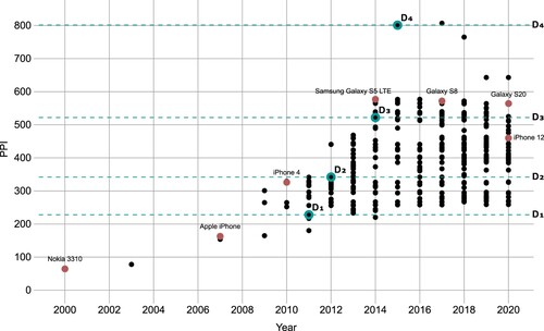
Pixel density continued to be a ‘selling point’ for mobile phones and the original ‘retina display’ would actually lie in the lower range of pixel densities of devices marketed today (see ). In 2015, Sony released the Xperia Z5 Premium phone, with a pixel density of 801 ppi, which corresponds to each pixel spanning about ⅓ arc-minutes of the retina at a typical viewing distance of 30 cm, and clearly beyond the eye’s theoretical capabilities. As of today, the Xperia Z5 Premium, together with its successor Xperia XZ Premium, are still the phones with the highest pixel density ever sold commercially. One may take as an indication that the manufacturer itself doubted that such an extreme pixel density would actually provide a noticeable benefit for the consumer by the fact that the phone’s full resolution was actually not enabled by default, but the system has to be reconfigured in ‘developer mode’ to actually enable the full resolution (GSM Arena, Citation2015). No manufacturer has marketed a phone display of matching or higher pixel density since the introduction of these ultra-high-resolution phones.
Figure 1. Development of pixel densities of mobile phones over the past 20 years. The dashed horizontal lines indicate the pixel densities of displays D1–D4 selected for this study. Data sources: pixensity.com, wikipedia.org.
The technological development of displays has not been constrained to just increases of pixel density in recent years. The introduction of OLED (organic light-emitting diode) technology allowed for non-orthogonal subpixel arrangements and increased contrast ratios in low-light conditions (Chen et al., Citation2018). In the realm of desktop and laptop monitors, similar developments have been taking place, although less uniformly, and, due to the typically increased viewing distance, at lower absolute pixel counts per inch. As of 2021, the highest pixel density for a commercially available desktop monitor, the Dell UltraSharp UP3218K, lies at 280 ppi, equal to a pixel size of ½ arc-minute at a typical viewing distance of 60 cm. However, in contrast to mobile phones, devices with ultra-high-pixel densities are not yet as widely available, and for the top end of the resolution spectrum require a more significant investment to acquire.Footnote2
In the light of these developments, with mobile phones possibly having reached a peak, and desktop monitors becoming available in a wide range of pixel densities, it is timely to ask: what does this development of display capabilities mean for screen-based cartography? Established guidelines for cartographic symbology have not yet been updated to reflect the changing landscape of digital display devices. Does the dramatically increased fidelity of digital displays observed in recent years mean that cartographers can now simply revert to the minimum dimensions that had been established for printed maps? Can even smaller symbol sizes than on paper be used for smartphones due to the increased contrast ratio and the reduced viewing distance? Or does the recommendation to use larger symbology still hold even for high-resolution screens, due to other factors? Also, do cartographic depictions benefit from extreme pixel densities at the top end of the available spectrum, making them a potential selling point for such devices, or is there a point at which further increase of fidelity does not result in increased legibility of cartographic symbology due to the physiological limitations of human perception?
This paper reports on an attempt to derive initial answers to those questions through an empirical investigation in a controlled laboratory setting. One of the main goals of the study was to establish experimentally a set of (new) minimum dimensions for cartographic symbology, as applicable to current high-resolution displays.
Related work
Minimum dimensions and distances of cartographic symbology for printed maps have been widely established in the twentieth century (e.g., Imhof, Citation1972; Schweizerische Gesellschaft für Kartografie, Citation1980; Hake et al., Citation2002). For ideal conditions of viewing and reproduction, these typically specify a distance of parallel lines of 0.25 mm and a minimum size of point symbols of 0.3 mm for printed maps (Schweizerische Gesellschaft für Kartografie, Citation1980: 13). Although such specifications can be found throughout cartographic literature, we could not find a basis for these guidelines in any rigorous empirical studies – the recommended dimensions seemed to have evolved from cartographers' own observations, anecdotal evidence gathered from colleagues, and a consensus from practitioners.
The guidelines established for printed maps were not based on perceptual factors alone. The technical means of reproduction of the time were indeed taken into account, with minimal distances and guidelines for generalization justified by the behaviour of ink flowing on a page during the printing process and other factors (Schweizerische Gesellschaft für Kartografie, Citation1980: 15). Töpfer (Citation1974) established the achievable media- and observer-dependent fidelity as a foundation of his theory of generalization, with the parameters of more complex cartographic operations ultimately based on the capability of the map medium and the map user to resolve fine details. This underlines the relevance of establishing minimum dimensions, on top of which more complex operations and designs can be based.
At the first introduction of digital map displays, these were obviously hugely inferior to printed maps in terms of visual fidelity, and so cartographers directed their attention towards other aspects of the new medium. In an early attempt to establish a framework for designing screen-based maps, Brown (Citation1993: 130) states that increased display resolution would be of ‘ultimate importance’ for reproducing the fine details of maps. Concluding with a wish-list for future developments, Brown suggests (p.135) that ‘very high resolution’, good-quality colour reproduction, large format and portability ‘without necessarily having to be attached to a bulky computer’ are among the most wanted improvements. What must have seemed a hypothetical wish-list taken from a sci-fi novel at the time can be considered virtually fulfilled 25 years later, with today’s availability of ultra-high-resolution tablet devices.
Around the turn of the millennium, display devices were sufficiently developed to inspire research into the limits of what was achievable. Malić (Citation1998) developed a set of recommendations, including minimal dimensions, based on a survey of available technology at the time and theoretical considerations. Neudeck (Citation2001) also bases his detailed recommendations for various cartographic symbol types on the size of a typical pixel at the time and suggests that if pixel densities should ever reach 300 ppi, the conventional guidelines for printed maps would simply come back into effect.
The advent of the web offered an exciting new mode of distribution for digital maps, at the cost of uncertainty about the display that would be available for presenting the map. Except for installations in a controlled setting such as museums, map creators would have to settle for the least common denominator and had to adjust their guidelines accordingly (e.g., Jenny et al., Citation2008). Recently, researchers have acknowledged the increasing availability of high-resolution screens, lamenting the ‘big mess’ the current heterogeneous landscape of devices and pixel densities entails (Muehlenhaus, Citation2014). High-resolution screens are acknowledged to facilitate crisper and higher fidelity graphics, but it is left unclear what should be the consequences and guidelines for map designers creating cartographic displays for such devices. An initial investigation by Mańk (Citation2019) of symbology for high-resolution screens was inconclusive due to difficulties of precisely controlling the display output in a browser-based environment.
Hence, it is now timely to conduct an investigation of the limits of cartographic symbology on current state-of-the-art displays by way of a rigorous, controlled study. Researching map symbols in isolation has been criticized as having low validity for applied, real-world application scenarios (see Montello, Citation2002 for a summary of this debate). However, because the fundamental properties of current technology have not yet been investigated in detail in an empirical setting, it is necessary to begin by establishing the fundamental limits of the maps user’s capability of perceiving and correctly discriminating the building blocks of cartographic symbology on such devices. The validity of the findings of such an isolated approach in the context of real-world maps and map-use contexts may require verification in subsequent studies.
Study design
As stated in the introduction, pixel densities of mobile phone displays may have surpassed the resolution capabilities of the human visual system in recent years. If this could be confirmed, as a consequence it would imply that any guidelines established for screens that reach or surpass human resolution capabilities would hold as the optimal case for the foreseeable future, not just as a snapshot of current technological development. Therefore, the three main goals of this study were established as: (1) verify if mobile phone screens of the highest pixel density have indeed surpassed human visual capabilities as relevant for cartographic symbology, meaning that it makes no difference for the user to increase the pixel density even further beyond a certain point for the display of cartographic information; (2) establish the lower limits of size of cartographic symbology to be discernible at the highest pixel density available under ideal viewing conditions, from which size guidelines for less than ideal viewing conditions can be derived; and (3) establish a model of the effect of screen pixel density on the minimum discernible size of cartographic symbology, starting at the limits established for the highest pixel densities, so that cartographic symbology can be adapted by the cartographer or the system for lower resolution screens.
The central methodology of this study is to compare the effect of the pixel density of four different displays on the participants’ capability to recognize and discriminate cartographic symbology, under constant, good viewing conditions. As a consequence, participants with good visual acuity were considered for the study, and the tests should be done under good lighting conditions, using the maximum contrast accomplishable by all displays. The goal of this study is not to investigate the effect of diminished contrast, reflections, environmental distractions or limited capabilities of the map viewer – the potential effects of such factors must of course be taken into account by any map designer but should be derived from models taken from the available literature, or need to be established empirically in subsequent studies.
The study design adopts an alternative-forced-choice (AFC) approach as its core methodology – a stimulus is shown to the user, and the user is subsequently asked to choose from a number of available options a response that best matches the stimulus. (A classic example for an AFC task would be the eye chart at your doctor’s surgery – a letter is indicated to the patient, and the patient’s task is to say which of the 26 letters (choices) of the alphabet best matches the letter.) AFC designs do not offer the participant a ‘don’t know’ option – they are forced to make a choice among the available options, or are permitted to simply choose a response at random if they truly cannot discriminate among the options. This has been shown to be conducive for establishing the true limits of participants’ capabilities (Cunningham and Wallraven, Citation2011).
Four mobile phones of varying pixel densities were chosen for stimulus presentation, at 228, 342, 522 and 801 pixels per inch, respectively (covering roughly the entire spectrum of pixel densities commercially available today, with a factor of ≈1.5 between each increase). These pixel densities will be denoted as D1–D4 subsequently. Candidate phone models at the desired target resolutions were identified using three online sources: pixensity.com, gsmarena.com and Wikipedia, and the phones were acquired from an online marketplace, in the period from January to April 2021 ().
Table 1. Devices used in the study and their display pixel densities. Devices have been specifically acquired for each increase in pixel density to be by a factor of ≈1.5.
Participants complete six AFC tasks T1–T6, corresponding to six different stimulus types related to cartographic symbology, at all four displays, assigned in random order. During each task, the stimulus size is adapted using a staircase method (see below). In this way, the individual’s limit of correctly discriminating among the stimuli for each task and display l(Di, Tj) is established, and the overall mean of all participants’ limits for each task and display L(Di, Tj) can be calculated. The overall procedure allows for a within-subject comparison of the effects of display pixel density for various symbology types while keeping the duration for the experiment for each participant at under 45 minutes.
Given the technological developments set out in the introduction, our goals for the study and its design described above, the following hypotheses were formulated a priori:
(H1) Increased pixel density is never detrimental for the reproduction of cartographic symbology. We would therefore expect L(D1, Ti) ≧ L(D2, Ti) ≧ L(D3, Ti) ≧ L(D4, Ti) for each task i.
(H2) Pixel density of mobile phones has already reached or surpassed the limit of perceivable difference for humans. We would therefore expect L(D4, Ti) to not be significantly lower than L(D3, Ti) for all tasks.
(H3) Visual acuity is known to not be normally distributed across the population (Laitinen et al., Citation2005). We, therefore, expect a non-normal distribution of thresholds across participants and expect to adapt the statistical analysis accordingly.
(H4) Participants with excellent visual acuity will benefit more from higher pixel densities than those with average or poor visual acuity.
(H5) Since the limit of discriminability is thought to be based on low-level psychophysical properties of the visual system, we do not expect to find any significant learning effects (improved performance of participants in later repetitions of the same task) during the course of the experiment.
(H6) We also do not expect to find any significant fatigue effects, meaning that participants’ performance diminishes in later repetitions of the same task.
Apparatus
The study was conducted in a room adapted as a laboratory for the duration of the study. To ensure identical lighting conditions for each participant, the room’s window was shuttered and only the installed artificial light, consisting of a series of fluorescent light tubes arranged linearly at a height of approximately 290 cm, was used to illuminate the room during the experiment. Two desks were positioned along one of the walls, in parallel to the light source. An exposure meter was used to verify that the illuminance across the length of both desks was of constant value, at 205 lux ±2.5%. At this ambient light level, the maximum contrast ratios of LCD (liquid-crystal display) and OLED displays should be within a range of 8% (Chen et al., Citation2018).
On top of the desks, two wooden racks were constructed, each providing a vertical mounting surface for two displays. To accommodate for the different sizes of the phones, four adapter blocks of identical size were constructed from corrugated cardboard, with a suitable opening cut out of the cardboard so that each phone could be positioned with its display centred precisely at the midpoint of the adapter block, and flush with the surface of the block (see , bottom left). By constraining the placement of the adapter blocks on the mounting surface with a horizontal slat, the position of the phones’ displays could be aligned within 2 mm of precision. The phones’ power cables were routed through the back of the adapter block through a hole in the mounting surface to a USB power supply mounted behind the construction.
Figure 2. Lab setup for the study. Top left: The four viewing stations of the experiment, with phones covered by bezels, a guide rail to ensure constant viewing distance and a black curtain to minimize reflections. Top right: pose of the participant during the experiment. Bottom left: phones D1 and D3 mounted in their adapter blocks at stations C and D. Bottom right: stimulus and response displays from the participant’s point of view (staged with increased stimulus size for illustration purposes).
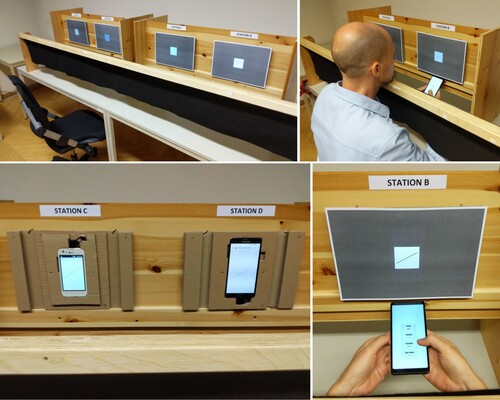
The four locations of the phones are referred to stations A–D, and corresponding labels were attached on top of the mounting surface. For each display, a 50% grey bezel made from cardboard, revealing only a 48 × 48 mm area at the centre of the screen (the size being mandated by the width of the smallest display used in the study), was mounted with the help of magnets embedded in the adapter blocks. This allowed the adjustment of the bezel’s position with sub-millimetre accuracy to align with the centre of the display using a calibration image on the screen.
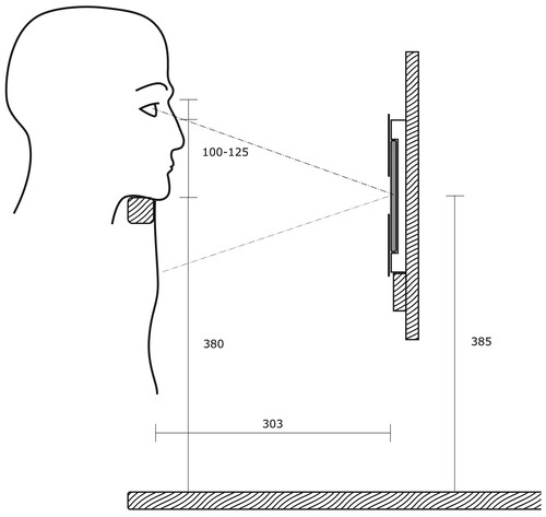
Participants would be asked to look at the displays while sitting on a standard, height-adjustable office chair. To ensure consistent viewing distance at each of the four displays, a wooden rail was mounted in front of the displays, parallel to the mounting surface. Participants were asked to position their chin comfortably on the rail, adjusting the height of the chair as needed, to maintain an identical pose at each display station (see , top right). This arrangement allowed for a rapid transition of participants from station to station while maintaining an approximately constant distance from each of the displays. While this design did not enforce precisely identical viewing distances between participants, it was chosen over a more constrained design which would have required a more rigid, individually adjustable head support at each station and would have significantly increased the overall duration of the experiment for each participant. The distance between the bottom of the chin (menton) and the deepest point of the nose between the eyes (sellion) has been reported to measure between 10.5 and 13 cm for 95% of adults (Gordon et al., Citation1989: 291). With a horizontal distance of 30 cm ± 2 cm between the eyes and the phone screen, the distance from the eyes to the midpoint of each screen has been calculated to lie between 28.5 and 33 cm for all participants (see for a cross-section of the experiment setup).
To prevent reflections on the displays interfering with the stimuli, the displays were mounted below participants’ eye level (mounting horizontally in front of their eyes would have caused the face of the participant to reflect in the display), and a curtain of black, non-reflecting fabric was attached to the inside of the chin rail. This way it was ensured that only the black curtain was within the reflection frustum of the display when viewed by the participant. While such an arrangement means that the viewing direction is not precisely perpendicular to the display, this matches natural behaviour in which users have been shown to adjust the angle and position of mobile phone displays intuitively to avoid reflections (Kelley et al., Citation2006).
Participants were handed a separate mobile phone, which they took from station to station with them, that presented to them the user interface to select their responses. The response device could be held in a comfortable location by participants by slipping their arms underneath the curtain and positioning the device under the bezel of the current station (see , top and bottom right). The requirement to enter responses on a different device from the one that presented the stimulus had considerable consequences for designing the software for the experiment, since no solution supporting these requirements was readily available. This led to the development of our own software framework for running distributed experiments across multiple devices, stimsrv, which has been described in detail elsewhere (Ledermann and Gartner, 2021).
In order to prevent participants from forming expectations about the quality of each display, participants would not only be assigned to the stations in random order but also the assignment of displays to physical locations was shuffled, in the order Station A – D2, Station B – D4, Station C – D1, Station D – D3. In addition to the stations presenting the stimuli, a computer monitor labelled ‘main monitor’ was set up at a separate desk where participants would start and end the experiment. This monitor was used for giving written instructions to the participants before the experiment and for completing the pre-test questionnaire.
Stimuli
As explained in the introduction, this study aims to present isolated and simple stimuli in order to allow generalized conclusions, while at the same time being related to cartographic symbology in order to establish initial guidelines for minimum dimensions of cartographic symbology. For establishing those guidelines, the principle of ‘ideal conditions – difficult task’ is proposed. While viewing conditions should be favourable, the stimuli used in the experiment do not aim for optimal cartographic design (which would strive for maximizing the differences between symbols) but are designed to make the discrimination of stimuli somewhat difficult, while staying within a reasonably realistic cartographic scenario. For example, the discriminability of a continuous line and a dashed line could always be increased by making the gaps between the dashes wider – but a minimum size thus established would be of limited applicability for potentially more constrained symbology designs. By creating stimuli which are not designed for optimal discriminability, the derived guidelines should provide some ‘safety margin’ for the design of symbology, while providing some room for further optimization through ideal symbology design.
Figure 3. Cross-section of the experiment setup and participant’s head position, drawn to scale (dimensions in mm).
The following six types of stimuli have been included in this study (see for a depiction of all six stimulus types):
‘Tumbling Es’: a shape resembling the letter ‘E’, rotated in any of the 4 cardinal directions. This stimulus is not directly related to cartographic symbology but is used as a classical test to assess the participant’s visual acuity (Vimont, Citation2021). The participant’s performance can be directly converted to their logMAR score (base-10 logarithm of the minimum angle of resolution), the standard measure for visual acuity. In our study, the average of a participant’s two best logMAR scores across all displays is used to classify the visual acuity of the participant.
‘Lateral line pattern’: a straight line, structured as three parallel black lines, four parallel black lines or a solid grey line; each parallel line was drawn at 1/9th of the overall line width, spaced equally across the overall width. The lightness of the solid grey line was adjusted to result in similar overall intensity than the four parallel lines. Line orientation was randomized for each trial in the range of ±90°.
‘Longitudinal line pattern’: dotted, dashed, dot-dash or a solid black line; For a given line width w, the length of the dashes and gaps were chosen at 1w/2w for the dotted line, 3w/1w for the dashed line, and 3w/2w/1w/2w for the dot-dash line. Line orientation was randomized for each trial in the range of ±90°.
‘Point symbols’: instead of established cartographic symbology, in which the difference between pairs of symbols may vary widely, the ‘Auckland Optotypes’ (TAO) symbol set (Hamm et al., Citation2018) is used for this task. TAO symbols were specifically designed for tests of visual acuity, as a set of 10 symbols that can be easily remembered and named by participants, appear of similar overall darkness, and feature groupwise partial similarity of prominent features (for example, both the ‘butterfly’ and the ‘bunny’ symbols feature two symmetrical elongated shapes at the top, the ‘butterfly’, ‘house’, ‘car’ and ‘rocket’ symbols feature a dent at the bottom centre).
‘Vanishing symbols’: the TAO symbols, drawn with a white–black-white outline against a grey background (‘vanishing’ into grey when beyond legibility). This requires the participant to discriminate high-frequency details against a background of similar overall brightness.
‘Word variants’: short words (made up to look plausible as a toponym without being a dictionary word or a well-known toponym), rendered in black, with a white outline against grey background. Sets of words were defined, which differed only in one or two characters of similar appearance (e.g., e–a, m–n–nn–rn, ff–ll–fl–lf, ll–li–il – for an example see ). The font ‘Roboto Regular’, a sans-serif font similar to the widely used fonts Arial or Helvetica, was chosen among the alternatives available on Android devices. The orientation of the text was randomized for each trial in the range of ±90°. Stimulus size would specify the font size – for the selected font, a given font size would result in a majuscule height (the height of capital letters) of 75% of the specified font size.
Figure 4. The six classes of stimuli which participants were asked to discriminate in the presented study, corresponding to tasks T1–T6. (1) Tumbling Es; (2) lateral line pattern (solid grey line, three/four parallel black lines); (3) longitudinal line pattern (solid line, dashed/dotted/dot-dash lines); (4) ‘Auckland Optotypes’ symbols; (5) ‘vanishing’ Auckland Optotype symbols; (6) word variants (only one set of words shown, see text for details).
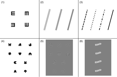
Stimuli 2–6 have been designed such that conclusions of relevance to cartographic symbology can be made – line symbology (stimuli 2, 3, 5), point symbology (stimuli 4, 5) and map labels (stimulus 6).
For the experiment, each stimulus class was incorporated in a corresponding AFC task T1–T6. For each trial (display of stimulus + recording of response), a stimulus was chosen at random from the set of stimuli for the class. All stimuli of the class were presented as choices on the response device, showing a graphical representation of each choice and a textual label (see , bottom right, for an example). Stimuli were initially presented at a size that proved to be clearly legible in the pilot study, and sizes were adjusted using a 3-down 1-up staircase procedure (Cornsweet, Citation1962). Stimulus size was decreased by a factor of 1.2 after three consecutive correct responses, and increased by a factor of 1.2 after a single incorrect response. After the first incorrect response, the factor was adjusted to for more fine-grained testing. After four reversals of the staircase (usually at the beginning of the third streak of wrong responses), the task would end and the experiment would commence with the next task on the same display.
Procedure
Thirty participants were recruited voluntarily among students of our group’s master courses. Three participants failed to show up, all others completed the experiment. Because our courses are taught as part of an international Master's programme, we could recruit participants from a range of cultural backgrounds. The male-to-female ratio of participants was 14 to 13. Sixteen participants were in the 16–25 age group, 10 in the 26–35 age group, and one participant in the 36–45 age group.Footnote3 All participants were asked to come to the experiment wearing any vision correction (glasses or contact lenses) they would normally wear for near-field vision tasks (e.g., reading a book or looking at their phone) and 13 participants wore vision correction during the experiment.
At the start of each day of the study, all four displays were cleaned and their absolute brightness was calibrated to lie at 328 cd/m2 ± 2% using an X-Rite i1Display Pro Plus display calibration sensor and the brightness control of the Android operating system (the brightness level was mandated by the maximum brightness of the least bright display in the study, D3, with the brightness of the other displays reduced accordingly). After calibrating the brightness, the bezel was attached in front of each display and adjusted to precisely reveal the central portion of the screen.
Participants were invited for individual timeslots, three in the morning and three in the afternoon. Each participant was asked for written consent to participate and given a brief introduction, without revealing details of the experiment or the goal of the study. Participants were told that they could take as much time as they want and can take a break any time they want. They were then led to the main monitor, where additional written instructions were given and the pre-test questionnaire was conducted, consisting of four questions about their age, gender, native language, and self-assessment of their visual capability.Footnote4 After completing the questionnaire, participants were instructed to begin the experiment at the first randomly assigned station and adjust the chair to be able to comfortably position their chin on the guard rail.
At each of the four stations, assigned in random order to each participant, participants completed tasks T1–T6 in this fixed order. After completing all six tasks, participants were then asked to move to the next station, where they were reminded by an on-screen message that they could take a short break before continuing with the experiment. After completing all tasks at the final station, participants were directed back to the main monitor, where they were informed that the experiment was complete.
After the first 3 participants, it was discovered that a change for the stimuli of task 2 had not been implemented as planned in the final version of the experiment. The change was applied in the break after participant 3, so the results data for T2 for participants 1–3 has been discarded.
Results
Each trial of each participant, including the station/display number, stimulus shape, stimulus size and the participant’s response, was recorded electronically through our stimsrv platform. From this raw data, the individual size threshold for each combination of task, display and participant was derived by taking the smallest stimulus size for which the participant gave at least three consecutive correct responses. In contrast to psychophysical tradition, in which the estimation of the precise parameters of a psychometric function is often the goal of an experiment, we were more interested in establishing the threshold at which the task could still be reliably performed. For an AFC task with n choices, the probability of submitting three correct responses in a row by chance lies at , which puts the chances of success based on pure guessing at about 3.7% for a three-choice task (T2) and at below 1.6% for four choices or more. For the threshold to decrease even further by guessing, the same success would have to be repeated for the next stimulus size, at a probability of ≈0.1% even for the three-choice task. It can therefore be considered safe to assume that the thresholds calculated in this way are at most one level off the true threshold of the participant.
shows the threshold levels derived in this way for all six tasks. Each dot in each of the diagrams represents the threshold reached for a participant at one of the four stations. Furthermore, the box plots show the median, and the 25% and 75% quantiles of participants’ thresholds.
Figure 5. Beeswarm/box-plots of participants’ thresholds for correctly identifying stimuli. Stimulus size is given on the y-axis in mm (log scale, note the different levels of the y-axis depending on the task), with smaller values considered better performance. Results from participants with poor visual acuity scores were excluded from the analysis and are shown as hollow circles (○). ![]()
 indicates a significant result contrary to H1.
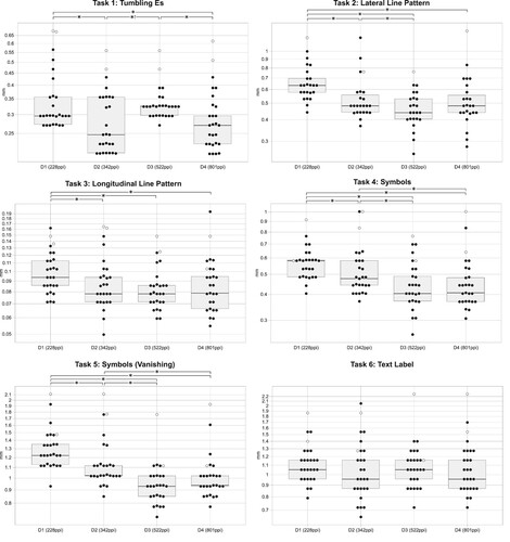
The average of the two best performances across displays D1–D4 of each participant in task T1 (tumbing Es) was taken as a basis to calculate the participant’s logMAR score. In accordance with psychophysical literature (Goldstein and Brockmole, Citation2016), we classified the visual acuity of participants with a logMAR score of 0 (corresponding to the commonly used standard of ‘20/20 vision’) or lower as ‘good’ (25 participants), and those larger than 0 as ‘reduced’ (2 participants). Within the ‘good’ group, we furthermore classified a logMAR score of <−0.25 as ‘exceptional’ (14 participants), and a logMAR score within −0.25 to 0 as ‘regular’ (11 participants). Results of participants with ‘reduced’ visual acuity were excluded from subsequent analysis of the results.
Statistical analysis
To test for normalcy of the results (hypothesis H3), a Lilliefors test for normal distribution was performed on the threshold data for each task and display, both in original and log-transformed form. For the untransformed data, the null hypothesis (normal distribution) was rejected for 15 of the 24 distributions. For log-transformed thresholds, the hypothesis of normal distribution was rejected eight times.
With normal distribution being rejected with high significance in some cases, further analysis proceeded with Friedman’s ANOVA, a method that does not require assumptions about the underlying distribution of the data (Field, Citation2017). Pairs of displays for which a significant one-tailed difference of thresholds (p < 0.05) has been found are indicated in . Display D1 with the lowest pixel density was outperformed significantly by the one of next higher pixel density D2 in five out of six tasks. Display D3 outperformed D2 significantly in three tasks (lateral line pattern T2, point symbols T4 and vanishing symbols T5), while, contrary to hypothesis H1, performing significantly worse than D2 in the tumbling Es task T1. The display with the highest pixel density, D4, outperformed D3 significantly only in the tumbling Es tasks (with no significant improvement over D2 in that task) and outperformed D2 in two tasks (point symbols T4 and vanishing symbols T5). For the text recognition task T6, no display performed significantly better than any other display, and the null hypothesis of equal distribution of thresholds across displays was retained (p = 0.124).
Hypothesis H1 holds for five of the six tasks but is clearly rejected for the results of D3 in task T1, with L(D2, T1) ≪ L(D3, T1) (p < .001). H2 (no significant improvement of D4 over D3) is supported by five out of six results. Remarkably, a worse mean performance of D4 over D3 was observed in four out of six tasks, but no statistically significant difference in results has been detected in these cases. The poor performance of D3 in task T1 mandates a rejection of both H1 and H2 for this specific task, with a strongly significantly worse result of D3 as compared to D2, and significant improvement of D4 over D3. No significant improvement of D4 over D2 has been found for this task, supporting the interpretation that the result of D3 in this task can be considered an outlier. The device with the highest pixel density in the study, D4, was the only display on which participants did not perform significantly worse in any task than on any other display.
The order in which participants were assigned to the four displays of the experiment was randomized. To control for any learning of fatigue effects (H5, H6), the relative threshold for each participant, task and display was calculated by dividing the participant’s threshold by the geometric mean of all participants’ thresholds for that task and display. A Kruskal–Wallis test of the effect of the order in which the participant was assigned to a particular display on their relative threshold found no significant differences (H(3) = 0.84, p = 0.840).
Discussion and conclusions
Although the ‘tumbling Es’ task has no direct relevance for cartographic symbology and was mainly included as a standardized test of visual acuity, the most immediately striking outcome has to be the results for D3 for this particular task. Why would participants confronted with a simple and standardized stimulus perform significantly worse at a display of higher resolution?
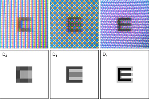
Upon closer inspection of the stimuli as actually presented on the displays (see for microscopic photographs and corresponding bitmap images), it becomes apparent that D2 is indeed reproducing the stimulus with poor fidelity at sizes smaller than 5 physical pixels (0.37 mm). However, for the particular type of stimulus, this causes the middle bar of the E to ‘disappear’, making it easier for the participant to guess the orientation at those smaller sizes. In contrast, the particular resolution and subpixel arrangement of D3 causes the shape between the top and bottom bar of the E to appear filled out, making it harder than it should be for participants to detect the orientation. Only the display of highest resolution is capable of somewhat accurately reproducing the stimulus. This is explained by the Nyquist–Shannon sampling theorem, which mandates a sampling rate of at least twice the amplitude for the sampling of any signal, lest interferences may occur. While the implications for the orthogonal-shaped stimuli of T1 are striking, this specific aspect will only affect cartographic applications when small geometrical shapes aligned with the pixel grid are used. Although we could not directly observe such amplification/obfuscation phenomena with any of the other stimuli, the underlying effect may play a role in actually improving performance for low-resolution displays, when the participant detects not the signal but interferences of the signal, at lower frequencies, to correctly infer the stimulus.
Figure 6. Microscopic image and bitmap pattern of stimulus 1 at size 0.270 mm on displays D2-D4 (from left to right). Despite the lower fidelity of D2, stimulus orientation appears amplified, resulting in higher success rates than on the display of higher resolution D3. Stimuli of this size were presented to 78% of participants on display D2, with 84% of all responses being correct, and to 85% of participants on D3, with only 37% correct responses. Overall success rate on D4 at this stimulus size was 79%.
The second result that stands out is the virtually identical performance across participants on all four displays in the word variants task T6. Contrary to our expectations that accurate reproduction of high-frequency visual details would contribute to the differentiability of geometrically similar letters, we did not see any significant effect of pixel density in the results. Like for T1, aliasing may play a role in improving the performance of low-pixel-density phones. Since we also do not see any advantage of low-resolution displays in the results, any such effect would have to be compensated by the higher fidelity of high-pixel-density displays for both effects to cancel each other out. Also, the varying difficulty of the task across different sets of words may have introduced too much random noise in the results for identifying significant differences across displays. Further investigation of the matter seems justified. In any case, the study seems to confirm that text can be reliably read on all devices at sizes considerably smaller than conventionally recommended.
Most other results are in line with our expectations and hypotheses. Increasing the pixel density from D1 to D2, a step comparable to the introduction of the iPhone 4 for which the term ‘retina display’ was coined, improved mean performance significantly in five of the six tasks. The next step from D2 to D3, another increase in pixel density by a factor of 1.5, significantly improved performance further for point symbols (T4) and vanishing symbols (T5), while performing significantly worse in the tumbling Es task, as discussed above. Only the display of the highest resolution D4 was apparently not prone to such aliasing effects, ensuring performance near the maximum for all tasks. Because we did not see any significant improvement in the performance of D4 besides the outlier T1, it can be assumed that the limit of pixel density which has an effect on the user’s capability to differentiate cartographic symbols has in fact been reached with D3 at 522 ppi, with the caveat of the possibility of aforementioned aliasing effects.
The results do not suggest a simple and clear model for quantifying the benefit of increased pixel densities for different types of cartographic symbology. It seems somewhat safe to assume a possible reduction of symbol size of 10–15% is facilitated by each of the first two increases in pixel density, for the tested resolutions. While this may seem modest, it does enable a significant update of cartographic practices when designing for resolutions of 500 ppi and beyond (for mobile phones, corresponding to resolutions of 250 ppi for desktop monitors). The main exception seems to be text, which, at least for the difficult challenge we posed to participants which, however, is not unrelated to cartography where previously unknown toponyms should be accurately decoded by the map user, did not benefit at all from an increase in screen resolution.
Recommendations for cartographic applications
Participants’ thresholds established by our experiment (shown in ) exhibit large variance and include several outliers, making it difficult to establish definitive overall safe thresholds. For this reason, we are making the raw results available in the form of beeswarm plots, for practitioners to draw their own conclusions for how much of a ‘safety margin’ they want to consider for their designs. A translation of the results, taking into account the worst performances of all participants with good vision but ignoring outliers, into a set of minimal dimensions for cartographic symbology, has been undertaken in . Dimensions are given in metric units, which need to be converted to appropriate pixel sizes for the target output device. The dimensions listed are valid for optimal viewing conditions, optimal contrast and good visual acuity of the map user, and need to be adapted to any expected deviation from such optimal conditions. On the other hand, the proposed dimensions may be reduced further in cases where accurate recognition of the symbol is not required, or for symbol sets with larger mutual visual contrast than the ones that were tested in our study.
Table 2. Proposed minimum dimensions for cartographic symbology under ideal viewing conditions, as derived from the presented study, compared with guidelines for printed maps derived from the cartographic literature.
What is the value of such a guideline? First of all, the obvious needs to be pointed out: this is certainly not a recommendation to use these extreme dimensions for representing the main information of interest of a map. The specified dimensions may form the basis for establishing lowest level of a map’s visual hierarchy (Dent et al., Citation2008; Muehlenhaus, Citation2014), for depicting contextually relevant information such as graticules or boundaries, which should be clearly discernible but also clearly distinct from the map’s main content. Used in this way, the proposed minimal dimensions may lead to improved map designs which can put to use a larger continuum of symbol sizes. The problem remains that for maps distributed digitally to a wide audience, neither the display nor the visual capabilities of the map user are known. In this case, the actual resolution of the display device would have to be queried either by software APIs or by user preferences, and the map rendering adapted accordingly. For web maps, the ‘medium resolution’ and ‘high resolution’ categories of correspond roughly to a 2x or 3x device-pixel ratio, which can be queried in HTML/CSS to adapt content (Rivoal and Atkins, Citation2020). In case such information is not available, the minimum dimensions for the lowest pixel density would have to be used across all devices, which still lie somewhat below the sizes that have conventionally been recommended for screen-based maps. The capability of digital maps to interactively adapt to the user’s viewing conditions and preferences could also be put to use by initially presenting symbology that should work for most users and devices while offering the user adapting the style to their own needs and preferences.
In scenarios where a controlled deployment of hardware is possible (e.g., in professional settings or public installations), and maybe even the visual acuity of maps users can be assessed (e.g., for pilots and other specialists), appropriate symbology can be designed for the specific displays in use. In some settings, the visual acuity of the map user could even be determined by software before the map is shown, to adapt the presentation accordingly. However, the caveats discussed above for the ‘tumbling Es’ task apply, and suitable tests for reliably assessing visual acuity in situ would have to be developed.
Can the deployment of displays of the highest resolution be generally recommended, or can cartographic applications even be a ‘selling point’ for such devices? The results did not show a significant increase in performance for cartographically relevant stimuli of D4 over D3, which indicates that there may not be a practical advantage of those highest resolutions in most applications. However, the results of T1 are somewhat troubling, showing that there exists a set of stimuli for which performance on displays with pixel sizes of more than ⅓ arc-minute can be seriously diminished due to aliasing and resampling phenomena. Further research into the specific circumstances under which these phenomena occur seems justified.
Future work
This study has shown that for some symbol types, maps presented on modern high-resolution screens can use similar minimal dimensions as have been commonly recommended for printed maps. However, the exact conditions for which these previously established guidelines have been derived remain unclear. It would therefore be desirable to directly compare screen-based and printed stimuli under similar viewing conditions in future research, to fully settle the question of whether screens can now be considered a cartographic display medium of equal fidelity.
The study was intentionally limited to participants with good visual acuity in order to establish the limits of legibility under near-ideal viewing conditions. While a theoretical model of the degradation of visual acuity with age could be derived from medical studies (e.g., Laitinen et al., Citation2005) to adjust dimensions of cartographic symbology, it appears desirable to include a wider demographics, or to focus on specific groups of the population such as elderly people, in subsequent studies.
The assumption remains that the full potential of ultra-high-resolution displays has not been utilized by the stimuli presented in our study. As can be seen in , the bitmap presented on D4 does not reproduce edges with optimal contrast but produces a slightly blurred image due to anti-aliasing. While anti-aliasing has been shown to dramatically improve legibility for conventional displays (Neudeck, Citation2001), it may be counter-productive for the ultra-high resolutions which became available nowadays. Rendering stimuli without anti-aliasing, and other means of contrast enhancement for displays of the highest pixel densities, should therefore be investigated.
As mentioned in the introduction, some scholars have questioned the applicability of studies of cartographic symbols in isolation to actual cartographic applications. While we do believe that the presented minimal dimensions are a contribution of relevance for practically applied cartographic design, as a next step these guidelines should be verified in the context of stimuli more closely resembling real-world cartographic applications and tasks. While we do expect the effect of pixel density to be of less relevance for tasks that involve overview or quick grasping of the totality of information on a map (due to the dramatically diminished acuity of peripheral vision), we do expect the proposed dimensions to hold for the legibility of individual cartographic symbols in real-world application scenarios.
While we did not see any short-term learning effects within the short duration of the experiment, visual acuity and hyperacuity are known to be subject to long-term learning effects (Saarinen and Levi, Citation1995). It would therefore be interesting to investigate whether repeated exposure to stimuli presented on ultra-high-resolution displays could have the potential to increase participants’ performance. The potential of training map users for further improving their map reading ability on specific devices may be of relevance in certain professional settings.
Finally, with the described affordable experiment setup and the accompanying open-source software implementation, we hope to enable researchers and students to conduct similar research into perceptual and cognitive aspects of cartography, both at our own group and elsewhere.
Acknowledgements
The author would like to thank the Pilot Research Ethics Committee of TU Wien for helpful suggestions for improvements during the ethics review of the study, and all colleagues who took part in the pilot study for their time and helpful feedback.
Disclosure statement
No potential conflict of interest was reported by the author(s).
Data availability statement
In the spirit of reproducible research (Nüst and Pebesma, Citation2020), all software, configuration and results data for the presented study are made openly available. An online notebook, including the results data and code for analysis is available at https://observablehq.com/@floledermann/pixel-density. The experiment results data can be obtained from https://doi.org/10.5281/zenodo.5520609. Stimsrv, the software framework used for implementing the experiment is available at https://github.com/floledermann/stimsrv and is described in more detail in Ledermann and Gartner (Citation2021). The code for the experiment is available at https://github.com/floledermann/experiment-pixel-density. The code of the experiment, frozen at the state when the lab study was conducted, is available at https://github.com/floledermann/experiment-pixel-density/tree/LAB-STUDY-1.
Additional information
Funding
Notes on contributors

Florian Ledermann
Florian Ledermann is a researcher and lecturer at the Research Unit Cartography, Department of Geodesy and Geoinformation at TU Wien. He received his Dipl.-Ing. (MSc.) Degree from TU Wien in 2004 and has previous research experience in the fields of augmented reality, information visualization and interactive online cartography. Florian’s current research interest lies in exploring the potential of modern digital display hardware for cartographic applications.
Notes
1 Logarithm (base 10) of the minimum angle of resolution in arc-minutes, a standard measure of visual acuity.
2 As of August 2021, the list price of the Dell UltraSharp UP3218K lies above €3000.
3 As explained above, this study aims to establish a baseline under ideal viewing conditions, including good visual acuity of the user – therefore, we did not aim to include a wider range of demographics with respect to age in our study. Models for how visual acuity diminishes with age can be found in other scientific studies, e.g., Laitinen et al. (Citation2005) and could be used to adjust our recommendations for the intended target demographics.
4 See the section at the end of this paper for a link to the experiment source code, which includes the exact phrasing of the pre-test instructions and questionnaire.
References
- Brown, A. (1993) “Map Design for Screen Displays” The Cartographic Journal 30 (2) pp.129–135 DOI: 10.1179/000870493787860030.
- Brühlmeier, T. (2000) “Interaktive Karten – adaptives Zoomen mit Scalable Vector Graphics” (Master’s thesis) Universität Zürich Available at: https://old.carto.net/papers/tobias_bruehlmeier/2000_10_tobias_bruehlmeier_diplomarbeit_adaptives_zoomen.pdf (Accessed: 13th November 2021).
- Chen, H.-W., Lee, J.-H., Lin, B.-Y., Chen, S. and Wu, S.-T. (2018) “Liquid Crystal Display and Organic Light-Emitting Diode Display: Present Status and Future Perspectives” Light: Science & Applications 7 17168 pp.1–13 DOI: 10.1038/lsa.2017.168.
- Cornsweet, T.N. (1962) “The Staircase-Method in Psychophysics” The American Journal of Psychology 75 (3) pp.485–491 DOI: 10.2307/1419876.
- Cunningham, D.W. and Wallraven, C. (2011) Experimental Design: From User Studies to Psychophysics Boca Raton, Florida: CRC Press.
- Dent, B., Torguson, J. and Hodler, T. (2008) Cartography: Thematic Map Design (6th ed.) New York: McGraw-Hill Education.
- Field, A. (2017) Discovering Statistics Using IBM SPSS Statistics (5th ed.) Thousand Oaks, California: SAGE.
- Goldstein, E.B. and Brockmole, J. (2016) Sensation and Perception (10th ed.) Boston, Massachusetts: Cengage Learning.
- Gordon, C.C., Churchill, T., Clauser, C.E., Bradtmiller, B., McConville, J.T., Tebbetts, I. and Walker, R.A. (1989) “1988 Anthropometric Survey of U.S. Army Personnel: Summary Statistics Interim Report” Technical Report NATICK/TR-89/027 Natick, Massachusetts: U.S. Army Natick RD&E Center.
- GSM Arena (2015) “Sony Explains Why the Z5 Premium only Uses Its Native 4K Resolution When Needed” Available at: https://www.gsmarena.com/sony_explains_why_the_z5_premium_only_uses_iti_native_4k_resolution_when_needed-news-14078.php (Accessed: 1st April 2021).
- Hake, G., Grünreich, D. and Meng, L. (2002) Kartographie: Visualisierung raum-zeitlicher Informationen (8th ed.) Berlin: De Gruyter.
- Hamm, L.M., Yeoman, J.P., Anstice, N. and Dakin, S.C. (2018) “The Auckland Optotypes: An Open-Access Pictogram Set for Measuring Recognition Acuity” Journal of Vision 18 (3) p.13 DOI: 10.1167/18.3.13.
- Imhof, E. (1972) Thematische Kartographie Berlin: Walter de Gruyter.
- International Council of Ophthalmology (2002) “Visual Standards – Aspects and Ranges of Vision Loss” Available at: http://www.icoph.org/downloads/visualstandardsreport.pdf (Accessed: 7th July 2021).
- Jenny, B., Jenny, H. and Räber, S. (2008) “Map Design for the Internet” In Peterson, M.P. (Ed.) International Perspectives on Maps and the Internet Berlin: Springer, pp.31–48 DOI: 10.1007/978-3-540-72029-4_3.
- Katsui, S., Kobayashi, H., Nakagawa, T., Tamatsukuri, Y., Shishido, H., Uesaka, S., Yamaoka, R., Nagata, T., Aoyama, T., Nei, K., Okazaki, Y., Ikeda, T. and Yamazaki, S. (2019) “A 5291-ppi Organic Light-Emitting Diode Display Using Field-Effect Transistors Including a c-Axis Aligned Crystalline Oxide Semiconductor” Journal of the Society for Information Display 27 (8) pp.497–506 DOI: 10.1002/jsid.822.
- Kelley, E.F., Lindfors, M. and Penczek, J. (2006) “Display Daylight Ambient Contrast Measurement Methods and Daylight Readability” Journal of the Society for Information Display 14 (11) pp.1019–1030 DOI:10.1889/1.2393026.
- Laitinen, A., Koskinen, S., Härkänen, T., Reunanen, A., Laatikainen, L. and Aromaa, A. (2005) “A Nationwide Population-Based Survey on Visual Acuity, Near Vision, and Self-Reported Visual Function in the Adult Population in Finland” Ophthalmology 112 (12) pp.2227–2237 DOI: 10.1016/j.ophtha.2005.09.010.
- Ledermann, F. and Gartner, G. (2021) “Towards Conducting Reproducible Distributed Experiments in the Geosciences” AGILE: GIScience Series 2 p.33 DOI: 10.5194/agile-giss-2-33-2021.
- Lobben, A.K. and Patton, D.K. (2003) “Design Guidelines for Digital Atlases” Cartographic Perspectives 44 pp.51–62 DOI: 10.14714/CP44.515.
- Malić, B. (1998) “Physiologische und technische Aspekte kartographischer Bildschirmvisualisierung” (PhD thesis) Rheinische Friedrich-Wilhelms-Universität Bonn.
- Mańk, A.K. (2019) “Cartographic Symbolization for High-Resolution Displays” (Master’s thesis) TU Wien.
- Montello, D.R. (2002) “Cognitive Map-Design Research in the Twentieth Century: Theoretical and Empirical Approaches” Cartography and Geographic Information Science 29 (3) pp.283–304 DOI: 10.1559/152304002782008503.
- Muehlenhaus, I. (2014) Web Cartography Boca Raton, Florida: CRC Press.
- Neudeck, S. (2001) “Zur Gestaltung topografischer Karten für die Bildschirmvisualisierung” (PhD thesis) Universität der Bundeswehr München.
- Nüst, D. and Pebesma, E. (2020) “Practical Reproducibility in Geography and Geosciences” Annals of the American Association of Geographers 111 (5) pp.1300–1310 DOI: 10.1080/24694452.2020.1806028.
- Rivoal, F. and Atkins, T. (2020) “CSS Media Queries Level 4 – Display Quality Media Features” Available at: https://www.w3.org/TR/mediaqueries-4/#resolution (Accessed: 3rd August 2021).
- Saarinen, J. and Levi, D.M. (1995) “Perceptual Learning in Vernier Acuity: What is Learned?” Vision Research 35 (4) pp.519–527 DOI: 10.1016/0042-6989(94)00141-8.
- Schweizerische Gesellschaft für Kartografie (1980) Kartographische Generalisierung: Topographische Karten (2nd ed.) Bern, CH: Schweizerische Gesellschaft für Kartografie.
- Töpfer, F. (1974) Kartographische Generalisierung Gotha, Leipzig: Haack.
- Vimont, C. (2021) “All About the Eye Chart” American Academy of Ophthalmology Available at: https://www.aao.org/eye-health/tips-prevention/eye-chart-facts-history (Accessed: 7th July 2021).