
Abstract
Geographic Information Systems (GIS) have been used in various fields and disciplines to summarize and analyse spatial patterns and distributions for the purpose of understanding how geographic and non-geographic entities interact with each other over space and time. Although honey bees are directly related to and influenced by their local environment, few studies have incorporated honey bee data into GIS for the purposes of gauging these spatial relationships. This paper will briefly discuss some of the types of spatial analyses and GIS methods that have been used for bees, and also, how some methodologies developed to study non-managed bees could be applied to honey bee research. With this paper, we aim to stimulate spatial thinking processes and thus the future use of GIS and spatial analyses to better understand the relationships between environmental characteristics and honey bee health and abundance. We will introduce the framework and some important basic concepts of GIS, as well as provide detailed instructions for becoming familiar and comfortable in using the GIS software ArcGIS Pro and Quantum GIS (QGIS) (commercial and free GIS packages, respectively) for the basics of geospatial research.
Uso estándar de las técnicas del Sistema de Información Geográfica (SIG) en la investigación de la abeja de la miel 2.0 Los Sistemas de Información Geográfica (SIG) se han utilizado en diversos campos y disciplinas para resumir y analizar patrones y distribuciones espaciales con el fin de comprender cómo interactúan entre sí entidades geográficas y no geográficas a lo largo del espacio y el tiempo. Aunque las abejas melíferas están directamente relacionadas con su entorno local e influidas por él, son pocos los estudios que han incorporado datos sobre ellas a los SIG con el fin de calibrar estas relaciones espaciales. En este artículo se expondrán brevemente algunos de los tipos de análisis espaciales y métodos SIG que se han utilizado para las abejas, y también cómo algunas metodologías desarrolladas para estudiar abejas no manejadas podrían aplicarse a la investigación de las abejas melíferas. Con esta contribución pretendemos estimular los procesos de reflexión espacial y, por ende, el uso futuro de los SIG y los análisis espaciales para comprender mejor las relaciones entre las características ambientales y la salud y abundancia de las abejas melíferas. Presentaremos el marco y algunos conceptos básicos importantes de los SIG, así como instrucciones detalladas para familiarizarse y sentirse cómodo en el uso de los programas informáticos SIG ArcGIS Pro y Quantum GIS (QGIS) (paquetes SIG comercial y gratuito, respectivamente) para los fundamentos de la investigación geoespacial
在蜜蜂研究中规范使用地理信息系统 (GIS) 技术 2.0 地理信息系统 (GIS) 已被用于各个领域和学科, 用于总结 和分析空间模式和分布, 以了解 地理实体和非地理实体在空间和时间上如何相互作用。 虽然蜜蜂与当地环境直接相关并受其影响, 但是很少有研究将蜜蜂数据纳入地理信息系统, 以衡量这些空间关系。本文将简要讨论一些用于蜜蜂的空间分析类型和地理信息系统方法, 以及如何把一些为研究非人工饲养的蜜蜂开发的方法应用于蜜蜂研究。本文旨在激发空间 思维过程, 从而在未来利用地理信息系统和空间分析更好地理解环境特征与蜜蜂健康和数量 之间的关系。我们将介绍地理信息系统的框架和一些重要的基本概念, 并详细说明如何熟悉和自如地使用地理信息系统软件 ArcGIS Pro 和 Quantum GIS (QGIS)(分别为商业和免费的地理信息系统软件 包) 进行地理空间研究的基础知识。
1. Introduction
Due to the close relationship between honey bees and their surroundings, and because of recent increases in colony mortality in many regions of the world (Carreck & Neumann, Citation2010; Williams et al., Citation2010), there is an urgent need to better understand how environmental changes affect habitat, life patterns, and overall health of honey bees. This type of research can be facilitated through the use of Geographic Information Systems (GIS), which can briefly be described as a software system for handling and analysing map data through the use of coordinate systems and georeferenced information to aid in the analysis of spatial patterns that may exist between entities on the Earth’s surface (Burrough & Mcdonnell, Citation1998). Because of its broad application, GIS methods are used in a diverse array of disciplines, including geoscience (Bonham-Carter, Citation1994), economics (Pogodzinski & Kos, Citation2012), and biology (Kozak et al., Citation2008). For example, GIS has been used extensively to undertake spatial analyses of the effects of land-use and climate change on declines of non-managed bee abundance and health (Arthur et al., Citation2010; Biesmeijer et al., Citation2006; Chifflet et al., Citation2011; Choi et al., Citation2012; Fitzpatrick et al., Citation2007; Giannini et al., Citation2012; Kremen et al., Citation2002, Citation2004; Watson et al., Citation2011; Williams et al., Citation2012). Through the use of spatial analyses, researchers using GIS were able to determine that non-managed bees were more efficient crop pollinators when access to nearby forests was provided (Arthur et al., Citation2010; Kremen et al., Citation2004; Watson et al., Citation2011). Additionally, relationships between climate and non-managed bee species richness and abundance have been identified using GIS modelling procedures (Giannini et al., Citation2012). When this paper was initially written (Rogers & Staub, Citation2013), there were a limited number of honey bee studies that integrated GIS into their research (Berardinelli & Vedova, Citation2004; Henry et al., Citation2012; Naug, Citation2009). Since that time, there has been an increase in the use of GIS and spatial analyses for honey bee investigations which have increased visibility in the use of GIS for this topic and uncovered new insights about the relationships between honey bees and their environment across space and time (e.g., Calovi et al., Citation2021; Douglas et al., Citation2020, Citation2022; Insolia et al., Citation2022; Jordan et al., Citation2021; Ochungo et al., Citation2021; Overturf et al., Citation2022; Quinlan et al., Citation2022, Citation2023; Rajagopalan et al., Citation2024; Richardson et al., Citation2023; Robinson et al., Citation2021; Switanek et al., Citation2017; Von Büren et al., Citation2019). Specifically, recent studies that have integrated spatial data sets to understand insect contributions to the economic value of crops across large geographic scales (Jordan et al., Citation2021), the spatial distribution of pesticide use and risk to bees (Douglas et al., Citation2020, Citation2022), foraging resources for bees (Ochungo et al., Citation2021), the contribution of land use, habitat quality, land management, weather and climate to honey production (Quinlan et al., Citation2022, Citation2023) and honey bee health (e.g., Calovi et al., Citation2021; Insolia et al., Citation2022; Overturf et al., Citation2022; Richardson et al., Citation2023). With this paper, we aim to continue to stimulate spatial thinking processes and thus the future use of GIS analyses to better understand the relationships between environmental characteristics and honey bee health and abundance for a broader geographic overview of the mechanisms affecting their plight (Naug, Citation2009). This paper introduces the framework and some important basic concepts of GIS and provides detailed instructions for using the GIS software ArcGIS Pro and Quantum GIS (QGIS) for the spatial analyses of honey bees. In this updated version of the paper, we have revised the original tutorials. We hope that the knowledge gained from this paper will further the field of honey bee science, but also promote the use of GIS in other fields of study.
2. What is GIS?
2.1. Definition
Geographical Information Systems (GIS) are computer systems based on hardware, software, and georeferenced data that can be used to collect, store, manage, process, analyse, and visualize both spatial and non-spatial information representing real-world geographic phenomena (Burrough & Mcdonnell, Citation1998; Neteler & Mitasova, Citation2008). Georeferenced data refers to any data that are linked to a location on the Earth’s surface through the use of a geographic or projected coordinate system. GIS data are digital objects which represent real-world entities (Longley et al., Citation1999) and are defined by: their geometric properties (spatial location), their attributes (characteristics associated with each object), and their topology (definition of how entities are related to others in space) (Burrough & Mcdonnell, Citation1998). In other words, data provide means to locate them in space and can be overlaid, calculated, manipulated, visualised and analysed along with other data layers that use the same coordinate system. Each entity in the real world is represented by a data layer with geometric and topologic properties and an associated set of attributes, in the form of a table, which define the characteristics of that entity. GIS facilitates the analysis of spatial relationships within datasets based on the topological properties within the data. Topology refers to the interconnectivity and interrelated properties between data and defines and describes how spatial objects relate to their neighbours in space. This geographic descriptor is what sets GIS data apart from other data types (Burrough & Mcdonnell, Citation1998) (for a list of free GIS books and other information sources see ).
Table 1. Publication names, authors, and websites of free GIS Books and information sources.
2.2. GIS framework
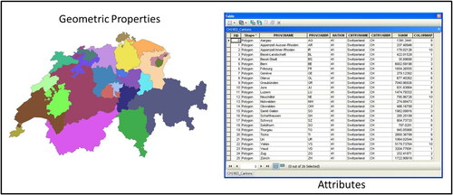
The main principles of GIS (geometric properties, attributes, and topology) are built into two data structures: vector (e.g., points, lines, and polygons) and raster (e.g., climatic, altitude, or satellite imagery). The terms “layer” or “dataset” are used to denote a raster or a vector file type that contains a similar theme, for example, varying elevations across a terrain or locations of honey bee colonies, respectively. It is possible to convert a raster layer to a vector layer and vice versa, depending on what type of analysis will be conducted with the data. Each layer contains information about its geometric properties and a table of attributes associated to and linked with, its respective geometric properties (). You can view each layer’s properties in GIS to see the resolution, file type, size of the file, and other information of importance.
Figure 1. The GIS data framework is made up of both geometric properties and attributes associated with the geometry. A row in the attribute table exists for every polygon on the map. Some of the attributes for this Swiss layer include the names of cantons and their abbreviations, the country code, the country name and abbreviation, and the area. Reproduced with permission of Swisstopo (BA13016).
2.2.1. Vector data structure
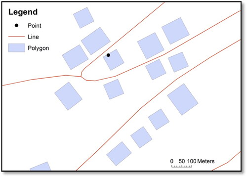
Vector layers represent discrete features in space in the forms of points, lines, and polygons. They represent unchanging static entities and do not contain spatial or temporal information (Burrough & Mcdonnell, Citation1998). For example, a polygon layer could represent the extent of an apiary, and a point layer could represent a honey bee colony on a map. Line layers can represent rivers, roads, tracks, and any other linear features. In , a polygon, point, and line layer are shown as examples.
Figure 2. A map displaying a point, lines, and polygons. Reproduced with permission of Swisstopo (BA13016).
2.2.2. Raster data structure
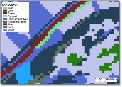
Raster layers represent continuous features such as aerial and satellite imagery, as well as Digital Elevation Models (DEM), which store elevation data across a surface (see “Digital elevation model (DEM)” section for more information). The value of each pixel of a thematic raster layer represents the attribute value. For satellite imagery, pixel values represent physical values of surface reflectances and for terrain-model data pixel values represent absolute topographic heights (Campbell, Citation2002). For example, if the resolution of the image is 25 m, then each 25 m pixel in the image will be representative of the average value of that 25 m on the ground. In , a land cover vector layer was transformed to a raster to visualize the pixel differences and value types.
Figure 3. A map displaying the raster data structure of a landcover layer which was converted from vector format. The legend denotes the landcover properties which are displayed. Reproduced with permission of Swisstopo (BA13016).
2.3. GIS functionalities
The main functionalities of GIS include interfaces for database management, geoprocessing and spatial analysis, as well as visualisation and map creation. Here, these functionalities are introduced, and the specific tools will be discussed more in-depth in further sections.
2.3.1. Database management
A GIS database is used to store, create, organize, manipulate, and query spatial and their linked non-spatial datasets (Burrough & Mcdonnell, Citation1998). GIS facilitates the link between geographic and non-geographic data and enables the comparison and assessment of various data types (Rigaux et al., Citation2002). Compared to traditional (non-spatial) databases (e.g., those without geographic coordinates), geographic databases make explicit locational distinctions for each dataset stored in the database, that is, all geographic information is linked to a location on the earth’s surface through coordinates (Arctur & Zeiler, Citation2004).
2.3.2. Geoprocessing and spatial analysis
GIS can be used to calculate, analyse, and manipulate spatial data to examine spatial relationships and to create new data (De Smith et al., Citation2007). Basic manipulations of geographic datasets such as extracting new information from existing layers or clipping specific geographic extents can be referred to as geoprocessing. Geoprocessing refers to the process of creating a new geographic data layer after the calculation of an input layer(s) (Wade & Sommer, Citation2006).
Spatial analysis is a central concept in GIS and refers to more complex calculations which have been developed from various quantitative methodologies outside of GIS and incorporated into GIS over time (Conolly & Lake, Citation2006; De Smith et al., Citation2007; Longley et al., Citation1999). Spatial analyses can be used to summarize and analyse the spatial properties of geographic distributions, to solve spatial problems through modelling, and finally, to aid in spatial decision making (Longley et al., Citation1999). Because this is a basic introduction to GIS, we will focus more on the geoprocessing aspects of GIS and touch briefly on more complex spatial analyses.
2.3.3. Data visualisation and map creation
One of the main benefits of GIS is that it gives researchers the ability to visualize their data in a variety of formats, which enables the creation of new links and relationships between spatial entities while discovering spatial interactions that were perhaps unknown before. GIS is also a common cartographic platform which facilitates the production of maps, either to present a geographic area or the results of data analysis using spatial data. The results of GIS analysis can be displayed as maps using a variety of symbolisations and annotation features as the final step in a GIS investigation.
3. Geographic data
GIS data represent real-world phenomena based on their geometric properties, attributes, and topology (Burrough & Mcdonnell, Citation1998).
3.1. File types and extensions
Often, GIS software has its own file types for vector and raster data. For example, the Environmental Systems Research Institute’s (ESRI) commercial ArcGIS software most commonly uses shapefiles for vector data and grids for raster data. Shapefiles and grids have come to be some of the most commonly known GIS formats and can often be read by and incorporated into other GIS programs without the need for conversion, as is the case for Quantum GIS (QGIS). It is important to note that most layers are made up of multiple files with different file extensions. For example, a shapefile may look like a single file in the GIS, but actually, it is composed of multiple file extensions. It is detrimental to the data layer if one of these extensions gets lost or deleted. Some of the extensions often associated with shapefiles are: *.shp (required file that stores the feature geometry), *.shx (required file that stores the index of the feature geometry), *.dbf (database table that stores the attribute information) or *.prj (file that stores the coordinate system information).
Multiple raster dataset file formats including ASCII (*.asc), GeoTiff (*.tif), JPEG (*.jpg), and GIFs (*.gif), to name only a few, can be supported in most GIS software. Again, it is important to keep all files when copying and moving data. For example, a Geotiff file often comes with two files, *.tif and *.tfw. The *.tif holds the image, and the *.tfw holds the information about the georeference.
3.2. Common GIS data types
The geometric aspect associated with GIS data is what separates geographic databases from other databases (Burrough & Mcdonnell, Citation1998). Geographic databases are sometimes referred to as geodatabases, which refer to databases specific to geographic data. Until recently, most GIS data were generated and distributed by government or private industries and had to be purchased. Now, there are many sources for downloading free data (). The amount of available data largely depends on the area of interest, as urban areas tend to have more data available than rural or remote areas. Another important aspect of geographic data is the metadata. Metadata are the information provided about the data, thus, data about data (Burrough & Mcdonnell, Citation1998). When downloading data online or receiving data from an outside source, metadata are important for obtaining knowledge about when the data were created, for what purpose, by whom, and using which coordinate system, among other things. Without this information, data would be of limited use only. In the following section we will introduce some of the common file formats and extensions, as well as some geographic data examples. The possibilities of types of data in GIS are becoming broader as the technology develops. The following is a non-exhaustive list that shows some of the data types you may encounter when using GIS.
Table 2. Names, websites, and types of data available from some of the various free data sources.
3.2.1. Maps
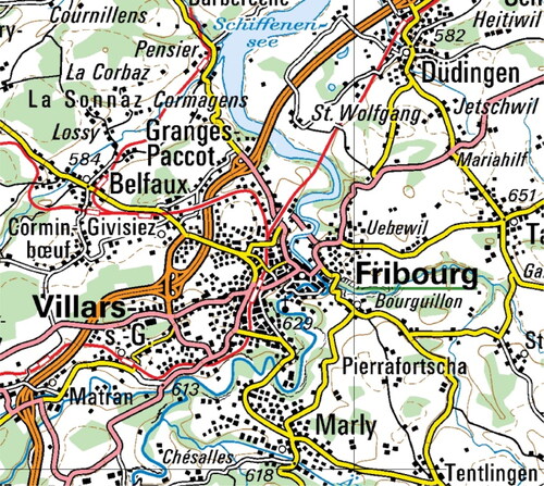
Topographic maps () are representations of the terrain which include both natural and human-made features, including, relief (in the form of contour lines), towns, villages, roads, and other geographic characteristics (Burrough & Mcdonnell, Citation1998). They are those maps which people are most familiar with. In GIS, topographic maps are stored in raster format in their entirety but can also be broken down into their respective categories (rivers, buildings, roads, etc.) in vector layers.
Figure 4. A sample topographic map (scale 1: 200 000) covering the study area of Fribourg, Switzerland. This map comes from Swisstopo (Citation2013) and must only be used for visualization purposes in this paper. Reproduced with permission of Swisstopo (BA13016).
3.2.2. Aerial imagery
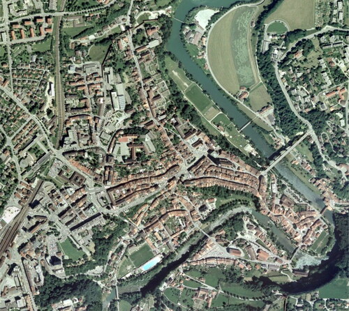
Photos taken from the air, usually from an aircraft, are referred to as aerial imagery or photographs (). These images provide valuable information about landscape changes by comparing photos over time. When aerial images are georeferenced, i.e., located with respect to a geographic or projected coordinate system, they can be used as raster layers in GIS (Burrough & Mcdonnell, Citation1998). The different types of aerial images include black and white, true colour, panchromatic, and infrared and can each be used for different purposes (Campbell, Citation2002).
Figure 5. A sample orthophoto, with a resolution of 50 cm, showing the study area of Fribourg, Switzerland. This photo comes from Swisstopo (Citation2013) and must only be used for visualization purposes in this paper. Reproduced with permission of Swisstopo (BA13016).
3.2.3. Satellite imagery
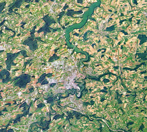
Satellite images are those that have been taken from satellites. Landsat () is one of the longest running platforms for image acquisition using the Thematic Mapper (TM) or the Enhanced Thematic Mapper (ETM) satellite image acquisition systems (http://landsat.gsfc.nasa.gov/) which provide multispectral imagery for the whole world (Campbell, Citation2002). Satellite imagery is often expensive to buy as the equipment is difficult to operate and maintain, but conveniently, Landsat and other satellite images can be added as raster layers directly into the GIS interface.
Figure 6. A section of the Swisstopo (Citation2013) Landsat image with a resolution of 25 m, covering the study area of Fribourg, Switzerland. Reproduced with permission of Swisstopo (BA13016).
3.2.4. Digital Elevation Model (DEM)
A DEM () is a raster dataset that represents the altitude of the terrain. Depending on the resolution of the image, each pixel represents the average altitude of the terrain covered by that pixel. For example, if the image resolution is 30 m, the altitude of the terrain on the ground that is covered by that pixel within that 30 m square is averaged and the value is assigned to that pixel.
Figure 7. A sample digital elevation model (DEM) (30 m resolution) covering the study area of Fribourg, Switzerland. This map was a free download from ASTER GDEM which was projected to the Swiss projected coordinate system (CH1903 LV03).
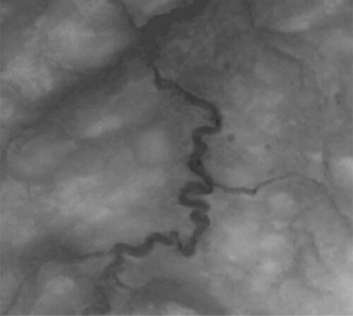
With a DEM, numerous calculations can be performed including the calculation of slope (in degrees or percent) of the terrain, the direction each slope is facing (aspect), and where shadows exist when the sun is hitting the terrain from a certain angle (hillshade). A DEM is also the base dataset for calculations of solar radiation, hydrographic, and various modelling calculations.
3.2.5. Thematic vector data
Vector () data represent a broad range of information, as they include all layers represented by points, lines, or polygons. In a GIS database, common vector layers might represent administrative boundaries (the locations of countries, provinces, states, cantons, etc.), hydrography (rivers, dams, lakes, etc.), built-up areas (buildings, stations, airports, etc.), and land cover.
4. Coordinate systems
This section will briefly introduce the concept of coordinate systems in GIS. For any analysis, it is important to know the coordinate system of the data which represent the study area (region of interest) and to ensure that all of your data layers are already in, or can be converted to, that coordinate system. Basic knowledge about coordinate systems is recommended before any type of spatial analysis is conducted as they can affect the resulting outputs. It is also important to know the capabilities and weaknesses of each specific coordinate system used in analysis. For more in-depth information about coordinate systems in GIS see Seeger (Citation1999).
4.1. Geographic coordinate systems
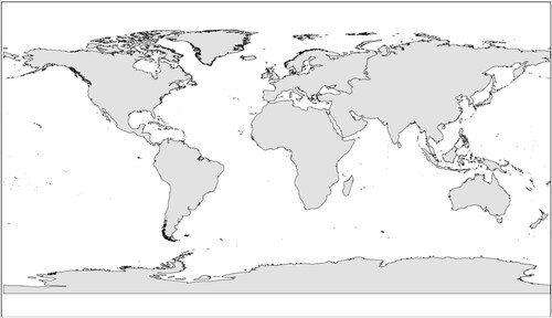
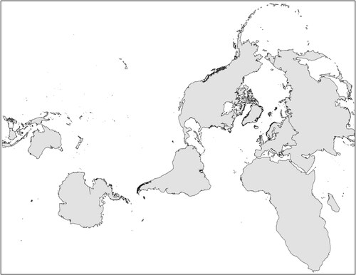
A geographic coordinate system is defined by the ellipsoid and datum that are used to calculate longitudes and latitudes which represent locations on the Earth’s surface (Snyder, Citation1987). It is represented in degrees, minutes, and seconds north or south of the equator (latitude) or east and west of the equator (longitude) (i.e., Fribourg, Switzerland is at 46° 48′ 00′’ N, 7° 09′ 00′’ E), and is the simplest solution for representing places on the globe (Burrough & Mcdonnell, Citation1998). Decimal degrees are also used to represent latitude/longitude coordinates and can be calculated with the following equation: Decimal Degrees = Degrees + Minutes/60 + Seconds/3,600 (http://support.esri.com/en/knowledgebase/techarticles/detail/27215) (i.e., same location above would be represented as 46.8 N, 7.15 E). There are various online sources for calculating conversions between latitude/longitude and decimal degrees (e.g., http://transition.fcc.gov/mb/audio/bickel/DDDMMSS-decimal.html). The most commonly used geographic coordinate system is the World Geodetic System (WGS) 1984 (). However, geographic coordinate systems do not transfer nicely into two dimensions, causing major distortions in distance, area, shape, or direction (Snyder, Citation1987; Seeger, Citation1999) on a map or computer screen. To solve these issues, projected coordinate systems are used.
Figure 8. A map of the world shown in the WGS 84 geographic coordinate system.
4.2. Projected coordinate systems
Projected coordinate systems are created to allow a two-dimensional representation on a screen or map sheet (Snyder, Citation1987). Latitudes and longitudes are converted to meters with respect to the centre of projection by applying calculations to geographic coordinate systems to counteract and offset the distortions on the map. Map projections have been developed for both local and regional scales. There is a large body of research based on the calculations of map projections (see Snyder, Citation1987 or Seeger, Citation1999 for more information). One of the most important things to remember is that all map projections create distortion of a least one parameter of the following: distance, direction, scale, conformity (shape), and area (Snyder, Citation1987; Seeger, Citation1999). The goal of map projections is to show specific areas with the least amount of distortion. For specific regions, take Switzerland as an example, a map projection has been created (CH 1903 LV03 – the coordinates for Fribourg in the CH1903 LV03 projection are 577965.97 m E, 183244.73 m N) to display the least amount of distortion for the country, but very high levels of distortion elsewhere ().
Figure 9. A map of the world shown in the CH 1903 projected coordinate system.
5. Types of GIS software
Various types of GIS software exist, each with their own strengths and weaknesses. For the purpose of this paper, we will focus on and discuss one commercial off-the-shelf GIS (COTS GIS) software, ArcGIS Pro, and one Free and Open Source GIS (FOSS GIS) software, QGIS. These two software suites were chosen due to their popularity and use in the field of GIS. Throughout the next sections, some basic functions of GIS will be introduced and explained.
5.1. COTS GIS – ArcGIS Pro 3.0
One of the most well-established and popular GIS software providers is ESRI. Since this article was initially published, ESRI’s GIS products have upgraded from the ArcGIS Desktop suite of products (ArcMap, ArcCatalog, etc.) to ArcGIS Pro. ESRI was established in 1969 originally as a research group focused on landuse planning initiatives (ESRI, Citation2013). Since then, ArcGIS has grown exponentially and is now the leading commercial GIS software which incorporates mobile, desktop, server, and online platforms. However, one major problem with ArcGIS and other ESRI products are cost, which can often only be afforded by large corporations, universities, and government agencies. Students or research groups can often acquire versions for free, or at reduced costs, respectively. However, the price is often a deterrent when a company or individual is choosing which GIS software to purchase, although free trials are available (https://www.esri.com/en-us/arcgis/products/arcgis-pro/trial) as are licenses at reduced costs for personal (non-commercial) use (https://www.esri.com/en-us/store/overview). Also, various online training courses (http://training.esri.com/) and other resources (https://www.esri.com/en-us/arcgis/products/arcgis-pro/resources) are available online to help with specific tasks.
5.2. FOSS GIS – QGIS 3.22.2
Open Source software is gaining ground in the GIS software business. The scientific community is coming together to use, create, and enhance open source GIS tools. The development of open source GIS is usually driven by very active communities closely collaborating with different university-level institutions and thus oriented to concrete solutions, e.g., in environmental science or modelling and on technological improvements. Besides that, most open source software is available for free and the users can benefit from the availability and transparency of the open source (program) code, which may be adapted for specific consumer needs and can again be shared within the community. Furthermore, open source software becomes more and more platform-independent and integrative between various projects, libraries, and standards. Some of the software that exists for open source GIS includes the System for Automated Geoscientific Analysis (SAGA, http://www.saga-gis.org), the Geographic Resources Analysis Support System (GRASS, http://grass.osgeo.org), and Quantum GIS (QGIS, http://www.qgis.org/). QGIS is based on an intuitive mapping interface with optional plugins (supplementary program code providing additional functionalities) for geoprocessing, analysis, and interoperability with various other software, standards, and data types. GRASS is more advanced in terms of its inherent spatial analytical ability especially for raster data, but some programming knowledge is of advantage for more sophisticated analysis and script automation. The integration of GRASS applications in QGIS through a plugin has a long tradition in the QGIS history, meaning that one can benefit from the strengths of both systems at once. Chapter 7 provides a tutorial for QGIS with basic applications adapted to honey bee research. For further information about open source GIS software and the different projects mentioned above see the Open Source Geospatial Foundation website http://www.osgeo.org.
5.3. Tutorial data
The following sections contain step by step information on how to complete certain GIS tasks using both ArcGIS and QGIS. To follow these steps, the zip file “BeebookGIS_data_update.zip”, can be downloaded from https://aub.ie/beebook_gis_data. Unzip the data and save them in a location with a few gigabytes of space available. Within the BeebookGIS_data_update folder, there are two sub-folders, one for ArcGIS and one for QGIS, each containing the same original data. When working through each tutorial, it is recommended that you save your outputs in the respective software’s folder to help with file and data organization. Both folders are located within the BeebookGIS_data_update folder. The BeebookGIS_data_update zip file contains the two folders (ArcGIS and QGIS) with the following data layers in each:
Text file used to make a point file: This file was created solely for the purpose of this exercise and does not represent the actual locations of honey bee colonies.
A comma-separated text file (*.csv) containing the point locations: colony_points.csv.
A shapefile containing county information: AL_counties_NAD83UTM.shp (plus 6 other file extensions which must stay together). This data comes from the US Census and is known as a Tigerline Shapefile.
30 m DEM:
Located within the DEM folder: AL_DEM_30m_UTM16N.tif (along with 4 other extensions that should be kept together with this file for georeferencing purposes). This DEM was a free download from the National Map data repository managed by the United States Geological Survey (USGS).
6. Using ArcGIS Pro (version 3.0)
6.1. Main components of ArcGIS Pro
In the older desktop version of ArcGIS, ArcMap (data visualization, analysis, and mapping interface) and ArcCatalog (data creation and management) were standalone entities, which merited discussing them as separate components in the previous version of this article. Currently in ArcGIS Pro, all functionality is integrated into one interface with enhanced 3D mapping and analysis capabilities, which used to be conducted in ArcScene and ArcGlobe.
6.2. Navigating the software
At first, the multiple functionalities and options within ArcGIS Pro may seem overwhelming, but there are a lot of resources that exist to help navigate the software and search for help if there are problems.
6.2.1. Licensing
Upon opening ArcGIS Pro for the first time, you will be prompted to login with your ESRI username and password. ArcGIS Pro has migrated to a named-user license system rather than the original single or concurrent users license system (https://pro.arcgis.com/en/pro-app/latest/get-started/licensing-arcgis-pro.htm). If you are part of an ArcGIS Organizational Account, contact your account administrator to obtain your username and password. Your license and all other permissions will be linked to your username and password thus they are critical pieces of information. Activation of extensions like Spatial Analyst or 3D Analyst also happens through the administrative personnel of your organizational account.
6.2.2. Help menus
There are extensive help menus and documentation for ArcGIS Pro. A good place to start is to visit the online platform (https://pro.arcgis.com/en/pro-app/latest/help/main/welcome-to-the-arcgis-pro-app-help.htm) where you can search for specific topics. Help can also be displayed for every tool you use by clicking the question mark button ( ) in the tool interface.
6.2.3. Search
The Command Search bar, located at the top of the map project can be used to locate data, tools, or anything else located within your map project. The shortcut of Alt + Q can also be used to take you directly to the search function.
6.2.4. Windows
There are a variety of different Windows that you can add to your map project, depending on the tasks you are undertaking. To display different Windows, go to the View tab > Windows and there you will find options for opening a Catalog pane (where you can see all of your data, similar to ArcCatalog in previous ArcGIS versions) or the Geoprocessing window, among others. These windows can be docked in your map project for easy access.
6.3. Opening ArcGIS Pro, setting the coordinate system, and adding data
Upon opening ArcGIS Pro, you may be asked to login. Please refer to “Licensing” section for information on licensing. Next, the welcome screen will allow you to browse to an existing project to open or to start from a blank template. Open a new “Map” template. You will be asked to name your project. This will create a new folder in the location you select. All project materials will be saved in this folder. Before adding data, it is good practice to set the coordinate system to match the data which will be added, but this step is not required as the system will take on the same coordinate system as the first layer that is added. All subsequent data will be projected “on-the-fly” to the coordinate system specified in the first layer. This will become more apparent later.
6.3.1. Setting a coordinate system and saving a new project (*.aprx)
Setting the correct map units is important for all types of quantitative analysis and for appropriate cartography. Despite “on-the-fly" projection capabilities, if layers are in different coordinate systems, this will pose major problems in the display and analysis of data.
To set the coordinate system of the project:
Right click on Map under the Contents window.
Select Properties.
Open the Coordinate System tab.
For the remainder of this paper, we will use data from Alabama in the United States, therefore we will use the projected coordinate system called NAD83 UTM Zone 16. Double-click Projected Coordinate Systems.
Double-click UTM.
Double-click NAD (North American Datum) 1983.
Select the NAD 1983 UTM Zone 16N.
Click OK. Or:
Using the search bar, directly type in the following: NAD 1983 UTM Zone 16N.
Choose the respective coordinate system and click OK.
To save these properties in the project, go to the Project tab from the main menu.
Click Save.
6.3.2. Add data button
Data can be added by right-clicking Map > Add Data from the Contents window or by selecting the Add Data symbol  from the Map tab located in the Layer group. Alternatively, data can be added via drag and drop from the Catalog pane or from any open folder in File Explorer. There are also the options of adding base map and other data from ArcGIS online. In the Add Data window, select Portal from the left menu pane and choose ArcGIS Online or Living Atlas where you can search through different data layers from each. Caution: the layers available in ArcGIS Online have been shared by other users and their quality may not be controlled.
6.3.2.1 Connecting to folders
To access the tutorial data, first the BeebookGIS_data_update folder must be connected to. Using the Catalog pane on the right, right click on Folders, select the “Add Folder Connection” icon  . Browse to the location of the BeebookGIS_data_update folder. This path to the BeebookGIS_data_update folder is now saved for the next time data are added from the same folder. Another method is using the top toolbar, click the Insert tab, and select the Add Folder icon
  . Browse to the BeebookGIS_data_update folder to establish the folder connection.
6.3.3. Importing vector and raster data
Vector data are point, line, and polygon features on the map which represent real world entities while raster data represent continuous features such as altitude or satellite imagery (see “Common GIS data types” section for data explanations). Here, we will add a polygon layer, which represents the county boundaries in the state of Alabama, and a DEM from the same area.
To add a vector layer:
Click the Add Data button.
Browse to the AL_counties_NAD83UTM shapefile.
Depending on the type of vector added, it will have a point
 , line
  , or polygon
  icon. This one is a polygon layer.
Single-click the AL_counties_NAD83UTM shapefile.
Click OK.
Now the vector layer can be seen in the Contents pane and in the map.
Now would also be a good time to save your work. Click the Save icon
 in the top left corner (or use the shortcut Ctrl + s).
To add a raster layer:
Click the Add Data button.
Open the Elevation sub-folder in the BeebookGIS_data_update folder.
Double-click the AL_DEM_30m_UTM16N.tif file to add it to the map.
In ArcGIS rasters are represented by this icon  . Now the DEM can be seen in the Contents pane and on the map.
6.3.3.1. Importing XY data from text files
Many people work with spatially related data even without recognizing it, for example when dealing with observation or address data from multiple locations. It is easy to make use of spatial information also from data stored in text files, spreadsheets or any database. Often, point data representing X, Y, and sometimes Z (elevation) coordinates in the real world are contained within text files and can be imported into ArcGIS as an Excel spreadsheet (*.xls or *.xlsx), a text file (*.txt), or comma separated value (*.csv) file. To ensure that this is done without problems or annoyances, ensure the data are properly formatted. For example, the field names in the header line of the text file should not use spaces or special characters, nor should the filename.
To add points from a text file:
Go to Map.
Select Add Data dropdown.
Select XY Point Data.
Browse to the BeebookGIS_data_update folder.
Double-click the colony_points.csv file.
Double-click OK.
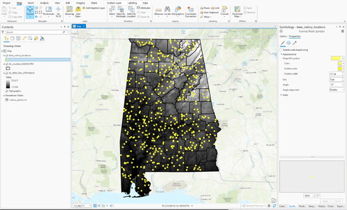
The Output Feature Class will be automatically filled (e.g., colony_points_XYTableToPoint), however you can re-name it if needed (e.g., bees_colony_locations).
Choose the respective fields that hold the X and Y data (or longitude and latitude, depending on which coordinate system is used). If the file contains altitude information, add that field in the Z field. In this case:
X Field: POINT_X
Y Field: POINT_Y
Choose the NAD 1983 UTM Zone 16N coordinate system (copy and paste name into search bar).
Click Run.
Now the points can be seen in the map and the layer can be seen in the Contents pane. This layer is temporary and needs to be saved to be accessible in the future. To do so:
Right-click the “bees_colony_locations” layer in the Contents pane.
Select Data.
Select Export Features to export these temporary points and make a permanent shapefile.
Choose to use the layer’s source data as the correct coordinate system should have already been set in the previous steps.
Browse to the BeebookGIS_data_update/ArcGIS folder to name the files intuitively, for example, we will name this layer bees_colony_locations.shp.
Click OK.
We now have the permanent shapefile, so this temporary layer is no longer needed ().
To change the symbology of the point layer to make the points more visible, either:
Single-click on the symbol in the Contents pane and choose the new symbol and size.
Go into the properties of the layer by right-clicking Layer.
Select Symbology.
Change the symbol to a yellow circle for example.
Click Apply.
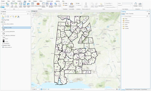
Figure 10. A map with the colony location point data, the DEM, and the county boundary layer displayed in ArcGIS. The symbology of the polygon layer has been changed to hollow polygons so the DEM is visible even though it is technically under the county layer.
6.3.4. Layer properties
The properties of one specific layer can be accessed by right clicking the layer and selecting Properties from the context menu, or simply by double-clicking the layer name. The Layer Properties might vary between different file formats, but every layer will at least have tabs for General settings and provide metadata in the Source tab. Look at the metadata of the layer AL_counties_NAD83UTM by opening the Source tab in the Layer Properties. Apart from the extent (maximum and minimum values for X and Y), data source, and geometry type, there is also information about the coordinate system and projection used.
6.4. Database investigations and editing
Some databases have hundreds, if not thousands or millions, of entries. This makes manual searching almost impossible. Like any other form of database management system, ArcGIS offers a number of options to efficiently browse, select, export and edit these records.
6.4.1. Queries
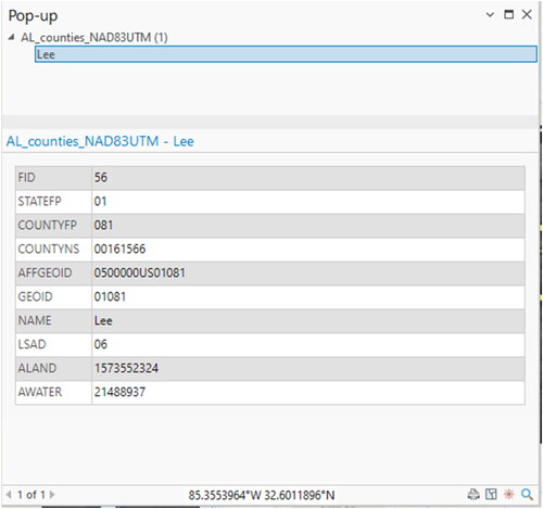
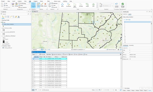
One of the characteristics of GIS is the possibility to combine information about several layers and datasets by using a geographic reference, e.g., a given point, a set of polygons or specific grid cells in a raster image. Queries are used to locate specific records from tables or places on the map based on the shared properties of layers. In GIS, a query can refer to two different functions. The first is a very basic GIS function that enables the user to interactively obtain information about a specific location in the GIS, using the Explore cursor 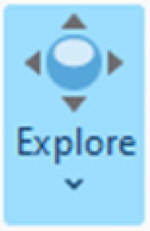 under the Map tab in the Navigate group. The Explore cursor is used to get information about specific pixel values within a raster image or to look at the attribute values of vector feature. In the example (), the location on the map which was clicked is somewhere in Lee County. This information comes from the county layer and the DEM that are currently in the ArcGIS *.aprx.
Figure 11. The pop-up dialog box displaying the results of clicking the screen using the Explore Cursor for all of the visible layers on the map. The results of the query show that the attributes of the clicked location, which was located in Lee County, AL. The remaining fields in the table are representative of those available in the attribute table.
The second, more advanced, type of query in GIS refers to the database query. This type of query uses a structured query language (FSQL), adopted from database management systems, which allows the retrieval of information from the database (Longley et al., Citation1999). In ArcGIS, the tool that incorporates SQL is the Select Layer by Attributes (6.4.1.1.) tool. To go beyond the database search, the Select by Location (6.4.1.2.) tool can be used for geographic or locational queries of data. Selections can also be conducted manually using the Select tool (6.4.1.3.). These three selection methods can also be used in combination by changing the method of selection (Create new selection, Add to current selection, Remove from current selection, Select from current selection) in each respective dialog box. Any selection can be removed by clicking the Clear Selected Features button.
6.4.1.1 Select by attributes
The Select by Attributes tool is located on the map tab in Selection > Select by Attributes, or also within the attribute table of each layer: Right-click layer > Attribute Table > Select by Attributes  . This tool allows the user to select a set of data from a layer based on the attribute properties of the layer. In the following example, all the. Counties within the state of Alabama that contain honey bee colonies.
From the main menu, go to Selection.
Click Select by Attributes.
The input layer is the layer from which data will be selected. In this case, choose the AL_counties_NAD83UTM layer as input.
There are multiple Selection Types available:
New selection,
Add to current selection,
Remove from current selection,
Select subset from the current selection.
Switch the current selection.
Clear the current selection.
Choose New selection.
In the next section, there is a list of attributes corresponding to those of the input layer.
Select the AL_counties_NAD83UTM layer by right-clicking on the name and selecting Attribute Table.
Click Select By Attributes
 .
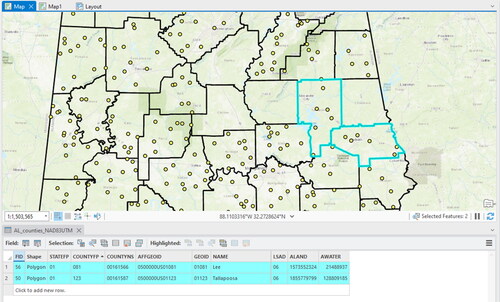
.Click the New Selection option for the Selection Type. Select Where “COUNTYFYP” “is equal” to “081”. In this example, 081 was clicked because that is the county number for Lee County in Alabama.
The goal is to produce a map that shows the counties of Lee and Tallapoosa, so click the Add Clause button and select “Or” and set the remaining values to the same as above but with “123” for the county number ().
Click Apply.
Click the Show selected records button to view the records corresponding to the selection
 .
.The selected records (2 of 67) in the table match those selected on the map ().
Now the selection can be cleared using the Clear icon
 to begin a new selection in the next section.
Figure 12. The select by attributes dialog box with the county layer as the input and the SQL builder and resulting equation shown. In this example, the equation will select all records in the table with the county number (countyfp) of 081 or 123.
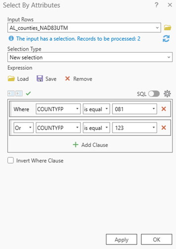
Figure 13. The results of the Select by Attributes query () are shown on the map and in the attribute table of the county boundary layer. The turquoise highlights represent all the selected data which represent Lee and Tallapoosa counties in Alabama.
6.4.1.2. Select by location
Now two layers will be used to select the counties which have colonies inside them. To do this ():
Figure 14. The select by location dialog box which shows that the features will be selected from the counties boundary layer where the layer intersects with the colony locations layer.
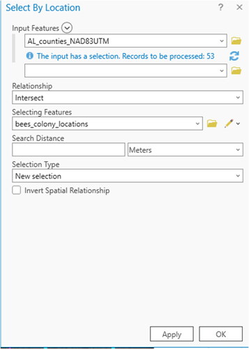
Go to Selection.
Choose Select by Location
 .
.Input features: select features from the target layer: AL_counties_NAD83UTM.
Select the Relationship method: Intersect (this tool has various options for spatially querying data and applying search distances to discover geographic relationships).
Select the Selecting Features layer: bees_colony_locations.
Click Apply.
The selected results: 53 records out of 67 (), meaning 53 had colonies inside their boundaries.
Figure 15. The results of the Select by Location query () which show the selected counties that intersect with colony locations, thus, all the county polygons with colony location points inside of them.
6.4.1.3. Manual selection
Data can also be selected manually with the Select tool  in the Selection toolbar. With this tool, you can select the data by various shapes (rectangle, polygon, circle, etc.) and export the selected items to their own shapefile (see “Creating new layers from selected data” section).
6.4.2. Creating new layers from selected data
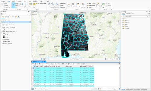
If a selection of data has to be exported, to send to someone who needs only a part of a data layer, for instance, a new data layer can be created with the selected features. We will create a new layer with the data selected in “Select by location” section.
Perform step 6.4.1.2.
Close the Select by Location dialog box.
Right-click on the AL_counties_NAD83UTM layer in the Contents pane.
Go to Data.
Select Export features.
Save as a new shapefile in the ArcGIS BeebookGIS_data_update folder. Call it colony_counties.
Click OK.
Clear the selected features, go to Selection.
Click Clear.
Turn off the AL_counties_NAD83UTM and AL_DEM_30m_UTM16N.tif layers in the Contents pane.
Right-click on the colony_counties layer.
Click Zoom to layer () to focus the map on that layer.
Figure 16. The results of exporting the selected data to a new shapefile. The new shapefile, colony_counties, depicts only the counties that have colonies inside them.
6.4.3. Attribute table data editing
Not only can the attributes of layers be displayed and used for selection, but they may also be changed or removed. The data in tables can be edited and new fields can be added and populated. The attribute table for the bees_colony_locations layer has one field with no data. To populate information about the site location and the apiary number (as examples), the table can be edited.
To edit attribute tables:
Right-click the bees_colony_locations shapefile.
Go to Attribute Table.
Open the Edit toolbar.
Click Attributes.
Select Layers.
Choose the bees_colony_locations layer to be edited.
Previously, the column names in the attribute table were grey; when in editing mode they will turn blue when you hover over the attributes which means they are editable ().
Click in the cell to edit and type the information. Information can be manually typed or if the information exists in a text file, copy and paste them into the table while in editing mode.
Click Apply when done.
Periodically save your edits: Click Edit toolbar.
Click Save.
Figure 17. An example of table editing using the edit toolbar. Information has been added to the Apiary field of the colony locations point file by manually typing the information into the attribute table.
6.4.4. Add new field
To add a new field to the table:
Open the Attribute Table
 .
.Select Add
 . Note: Fields can only be added outside of the editing mode!!
Name the new field you would like to add.
Select the type of data which will populate it (see to learn about data types).
Click Save.
To manually add information to the new attribute field, go into the editing mode and type them into the new field.
Table 3. Description of data types which are found in attribute tables, as well as the range of numbers or text they store and their uses. Adapted from the ArcGIS help menu (ESRI, Citation2013).
6.4.4.1. Advanced table calculations
For more advanced table management:
Use the field calculator to calculate the inputs in the field:
Click Calculate (or right-click new field name and select Calculate Field).
Select Calculate.
Use computer programming code to write the equation for the calculation.
Use the calculate geometry option to calculate the x and y coordinates of point layers, or areas, and centroids of polygon layers:
Right-click on New Field Name.
Select Calculate Geometry
 .
.Choose one of the calculation options.
6.5. Basic vector tools
The following section shows how to perform selected vector data calculations. The name of the tool will be given and the name of the toolbox in which the tool is located in Geoprocessing Pane will be given in brackets (tool (toolbox)).
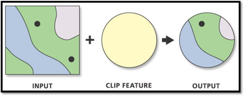
6.5.1. Clip
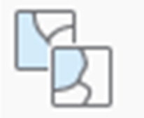
Using the Clip tool, two layers can be overlaid with each other. The output layer (which has to be specified as a new vector file) will contain the content of the first layer (Input vector layer) reduced to the geometry and extent of the second layer (Clip feature) (). A similar process is also followed when clipping raster data, but the Clip (Data Management) tool is used instead. This tool is also useful if you require all data layers to have the same spatial extent, for example if you are working with a specific region and only need a small piece of a bigger layer. Note: A specific example is not shown here, but this is how the tool would be used.
Figure 18. A visualisation of how the clip tool works in ArcGIS taken from the help menu (ESRI, Citation2013).
To use the Clip tool:
Open the Geoprocessing pane by clicking the Tools icon
Type “clip” (or browse to Analysis Tools > Extract > Clip in the Geoprocessing Tools pane).
Choose the Clip (Analysis) tool. This one is for vector data.
The Input features layer is the layer that will be clipped.
The Clip Feature will be the new extent of the clipped layer.
Name and save the new clipped layer.
Click Run.
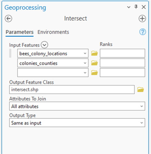
6.5.2. Intersect
The Intersect (Analysis) tool computes a geometric intersection of the layers. Only those input features which overlap will be included in the output layer. This tool is useful for connecting multiple layers and joining their attributes together, by discarding the portions which do not overlap. In the next example, we will intersect the bees_colony_locations layer (colony locations) with the colony_counties layer so that the intersected layer will have the point locations but also the commune information for each point.
To use the intersect tool ():
Figure 19. The dialog box of the intersect tool.
Open the Geoprocessing pane by clicking the Tools icon
Type “intersect” (or browse to Analysis Tools > Overlay > Intersect in the Tools search bar).
Choose the Intersect (Analysis) tool.
The Input Features will be all of those to intersect, in this case the bees_colony_locations and colony_counties layers.
Save the output as intersect.shp.
Leave the defaults for the rest of the options.
Click Run.
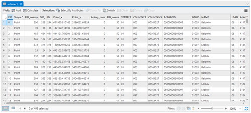
In this case, the resulting geometry of the point file has not changed, but the attribute table of the intersected layer now includes the colony locations and county information ().
Figure 20. The attribute table showing the results of intersection between the bees_colony_locations and colony_communes layers.
6.5.3. Union
The Union (Analysis) tool is used to create a geometric connection between polygon layers where all features and geometries will be added to the resulting layer. The union function is useful when the geometries and attributes of different layers should be merged. In ArcGIS, all input polygons will be transferred to the output layer, regardless as to whether they spatially overlap or not, leaving the resulting dataset with three feature types: those found only in the first input layer, those found only in the second input layer, and those found in both the first and second input layers (Ormsby et al., Citation2010).
6.5.4. Spatial join
In “Queries” section, spatial queries were performed. In a similar manner, multiple layers can be spatially linked to each other using the Spatial Join (Analysis) tool. Spatial joins allow the attributes of features in separate layers to be linked together based on their shared spatial locations. This is useful for amalgamating different types of information into the same layer. The Spatial join (Analysis) tool can be used to perform this task. The Target Features can be any spatial data source supported by ArcGIS and will be transferred to the Output Feature Class along with the Join Features. The Join Operation determines how joins between target and join features will be handled if multiple join features have the same spatial relationship with a single target feature; one-to-one or one-to-many (search spatial join in the ArcGIS online help menu for more information).
6.5.5. Buffer(s)
Buffers are one of the most important geoprocessing operations and frequently used for data analysis and cartography. A buffer increases the features area by a given radius, exactly following its original geometry (point, line or polygon). Buffers are also useful for determining proximities. For honey bees, this tool could be useful for determining the extent of the foraging radius with regards to various land covers, for example.
6.5.5.1. Single buffer
To create a single buffer ():
Figure 21. The dialog box of the buffer tool.
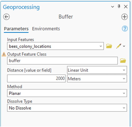
Type “buffer” into the Geoprocessing window (or browse to Analysis Tools > Proximity > Buffer in the Tools search bar.
Select the Buffer (Analysis) tool.
Input features will be the colony locations: bees_colony_locations.
Create a new output feature class: buffers.shp.
Choose “2000 m” as the distance.
Leave the default options for the remaining.
Click Run.
The results show the buffered area surrounding each point ().
Figure 22. The resulting 2000 m buffers around each colony location.
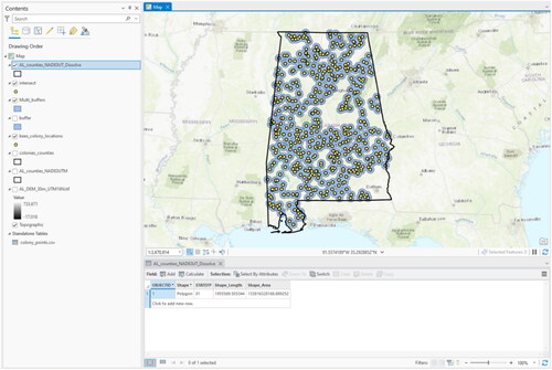
6.5.5.2. Multiple ring buffers
To create multiple ring buffers ():
Figure 23. The dialog box of the multiple ring buffer tool.
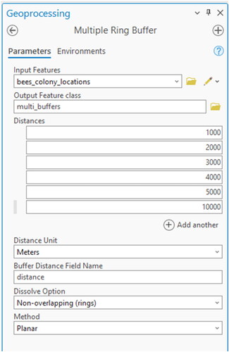
Type “buffer” into the Geoprocessing window (or browse to Analysis Tools > Proximity > Multiple Ring Buffer in the Tools search bar.
Select the Multiple Ring Buffer (Analysis) tool.
Input features will be the colony locations: bees_colony_locations.
Create a new output feature class: multi_buffers.shp.
Type “1000” for distance.
Click the Add another (+).
Do the same for 2000, 3000, 4000, 5000, and 10000 m.
Choose the buffer unit (meters in this case).
Keep the field name of “distance” for the new attribute table of the multiple buffer layer.
Keep the default for the dissolve option, otherwise all buffers will be aggregated to one single feature without the different attributes (see “Dissolve” section for more information about Dissolve).
Keep method Planar.
Click Run.
The results show the multiple buffers created surrounding the points ().
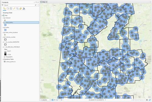
Figure 24. The resulting multiple ring buffers in 1000, 2000, 3000, 4000, 5000, and 10000 m increments around the colony locations.
6.5.6. Summary statistics
A Summary Statistics (Analysis) tool exists in ArcGIS and is useful for performing basic calculations on fields in an attribute table. This can be valuable for summarizing large quantities of data within GIS (similar to basic statistics that can be calculated in Excel). For example, the sum, mean, min, max, range, standard deviation, and count can be calculated for each selected attribute. The results are saved in an output table and can be viewed directly in ArcGIS. Also, to access the statistics of single fields in an attribute table, Right-click the layer in the Contents pane > Attribute table and then Right-click field name and choose the Statistics option.
6.5.7. Dissolve
Dissolve is another very useful function that merges several features together, based on their attributes. All features within a given vector layer containing the same attribute value will be combined to one single feature (one entry in the Attribute table). Shared borders between these geometries will disappear and in the case of spatially divided (geometrically non-adjacent) input features, the result will be a so-called “multipart” feature. The Dissolve (Data Management) tool is useful for portraying or visualizing specific information from a shapefile. For example, here we used the AL_counties_NAD83UTM layer for Alabama. The geometry of the layer currently represents the counties of Alabama, but we want to visualize the whole state instead of counties. In the attribute table, there is a column indicating which county each belongs to, thus we can “dissolve” the administrative boundaries based on that field. In the next example, the attributes in the county layer will be dissolved to create a new layer based on the state geometry.
To use the dissolve tool ():
Figure 25. The dialog box of the dissolve tool.
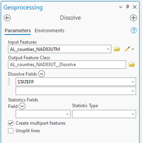
Type “dissolve” into the Geoprocessing window (or browse to Data Management Tools > Generalization > Dissolve in the Tools.
Select the Dissolve (Data Management) tool.
The Input features will be the AL_counties_NAD83UTM (for all of Alabama) in this case.
Name and save the output layer as a shapefile.
In this case we will dissolve based on the STATEFP attribute.
Leave the default options for the remaining.
Click Run.
The result () shows that the geometry and the attributes represent only the state of Alabama.
Figure 26. The results of the dissolving by the STATEFP attribute.
6.5.8. Project
Data layers often need to be “projected” to get them into the same coordinate system as other layers. For example, if data comes from different places (e.g., online, governmental agencies) or represents different areas on the map, there is a good chance that the coordinate systems between layers will differ, therefore a projection of the data is required. If layers are not in the same coordinate system and not overlapping correctly, there will be errors in the resulting layers created after analyses. The Project (Data Management) tool is used to change a vector layer from one coordinate system to another. The same process can also be used for raster layers, but the Project Raster (Data Management) tool is used instead. If the layer’s coordinate system is unknown, it must first be defined, either in the layer properties or by using the Define Projection (Data Management) tool in ArcGIS. In this example, we will project the colonies_counties layer from the UTM NAD_83 to WGS 1984 and import the results into Google Earth (KML file) (“Layer to KML and import to Google earth” section).
To use the project tool ():
Figure 27. Dialog box of the project tool.
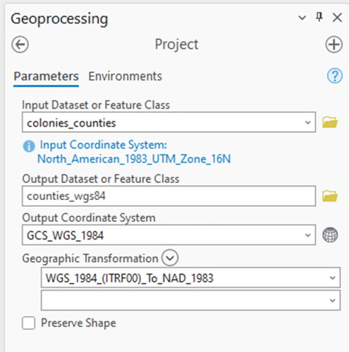
Type “project” in the Geoprocessing pane (or browse to Data Management Tools > Projections and Transformations > Project in the Tools).
Select the Project (Data Management) tool.
Input layer: colony_counties.
Save the output as: counties_wgs84.
Indicating the new coordinate system in the name is useful for layer organisation.
Choose the output coordinate system.
Click the Browse button.
Expand the Geographic coordinate systems option.
Click World.
Select the WGS 1984 coordinate system.
Select a transformation from the predefined list. In this case, the first is sufficient.
Click Run.
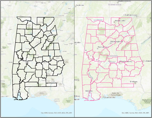
As another example of the differences in coordinate systems, shows an example from Alabama between the WGS 1984 coordinate system (a) and the UTM_NAD_83 (b).
Figure 28. World Geodetic System (WGS 84) versus Universal Transverse Mercator North American Datum of 1983 (UTM NAD 83).
6.5.9. Layer to KML and import to Google earth
A KML (Keyhole Markup Language) file is a geographic data layer which was developed for use with Google Earth. Using these steps, any layer (shapefile or raster) from GIS can be imported to Google Earth (conversely, the KML to Layer tool can be used to bring data from Google Earth into ArcGIS). This conversion is useful for sharing geographic information with people who do not use GIS. In previous ArcGIS versions, a shapefile needs to be saved first as a “layer” file before converting it to KML to export a layer from ArcGIS for import into Google Earth ():
Figure 29. The layer to KML dialog box.
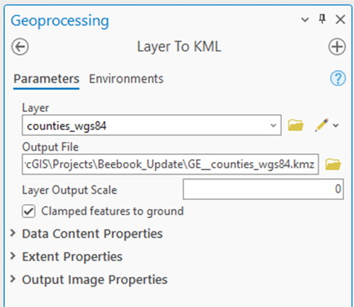
Type “kml” in the Search window.
Select the Layer to KML (Conversion) tool.
Input layer: counties_wgs84.
Output: GE_counties_wgs84.kmz.
Leave the other options with their default values.
Click Run.
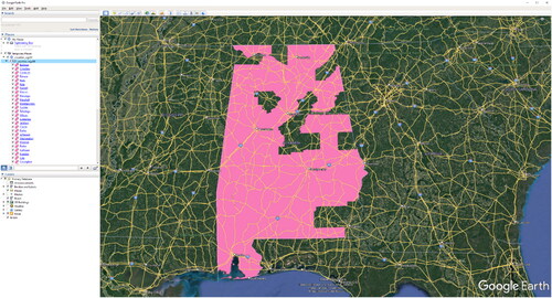
Open Google Earth (if not already installed, it can be downloaded from: http://www.google.com/earth/index.html.)
In Google Earth go to File.
Click Open.
Select the GE_counties_wgs84.kmz layer.
Click OK.
The layer created in ArcGIS should now be displayed and correctly georeferenced in Google Earth ().
Figure 30. The results of Layer to KML tool imported into Google Earth.
6.6. Basic raster tools
Some of the previously mentioned vector data tools also exist specifically for rasters, for example, Clip and Project. However, most raster tools have different names and functionalities which are unrelated to vector analyses. Below, we will briefly touch on some of the basic raster calculations that can be performed, specifically some of the most commonly used tools for terrain analysis and raster file management.
6.6.1. Mosaic
The Mosaic (Data Management) tool allows multiple raster layers to be combined with an existing raster dataset, while the Mosaic to New Raster (Data Management) tool allows multiple raster layers to be combined together to create a new raster dataset. The input raster images can vary in resolution and extent, but the defined output resolution may cause some input images to increase or decrease in resolution, sometimes leading to a loss in information. Also, the input rasters must have the same predefined coordinate system and the same number of bands.
6.6.2. Surface analysis
The Surface Toolset in ArcGIS allows you to calculate and visualize different properties of the terrain from an input DEM. The surface toolset is part of the Spatial Analyst toolbox in ArcGIS. In the following section, we will perform calculations based on the same 30 m DEM introduced earlier.
6.6.2.1. Slope
The Slope (Spatial Analyst or 3D Analyst) tool calculates the slope of the terrain, either in degrees or percentage rise.
To calculate the slope of the terrain ():
Figure 31. The slope tool dialog box.
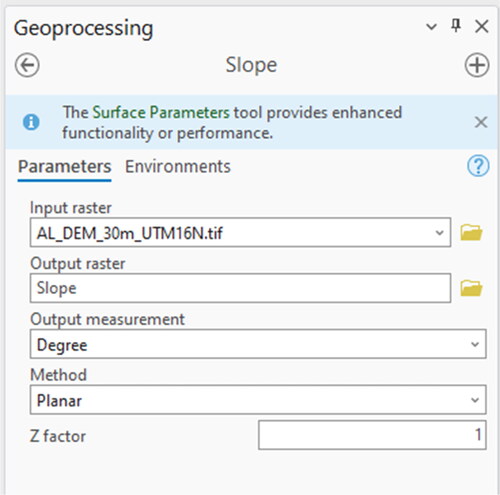
Type “slope” into the Search window (or browse to Spatial Analyst Tools > Surface > Slope in the Tools).
Select the Slope (Spatial Analyst or 3D Analyst) tool.
Choose the DEM as the input raster (AL_DEM_30m_UTM16N.tif).
Save the output raster as “Slope_AL_DEM”.
Choose the output measurement to be used, here we will use degrees.
If the X, Y, and Z (altitude) coordinates are all in meters, leave the Z factor as 1. Otherwise click the Show Help button in the tool to read about how to convert the Z factor.
Click Run.
Turn off all other layers in the Contents pane, hold CTRL and unclick any of the layers in the Contents pane.
Turn on the new slope raster in the Contents pane.
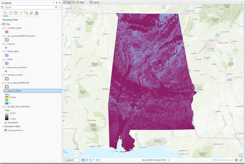
The results show the default classification scheme in degrees ranging from 0 to about 90 degrees in 11 categories ().
Now the results will be classified in a different way by opening the layer properties ().
Right-click slope layer in the Contents pane.
Select the Symbology.
Choose the “stretch” option in the Show dialog box.
Select a colour ramp.
Choose the stretch type of Minimum Maximum.
Figure 32. The result of slope calculation from the DEM.
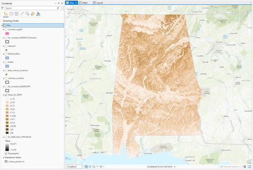
Figure 33. The symbol properties dialog box for the calculated slope layer.
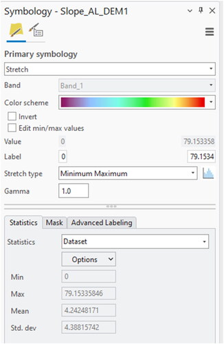
The results () show that the region is not so diverse in terms of slope.
Figure 34. The results of changing the symbology of the slope layer.
6.6.2.2. Aspect
The Aspect (Spatial Analyst or 3D Analyst) tool calculates the direction in which slopes are facing. Values are given in degrees corresponding to the degrees on a compass (with north as 0 and 360 degrees).
To calculate the aspect of the terrain ():
Figure 35. The aspect tool dialog box.
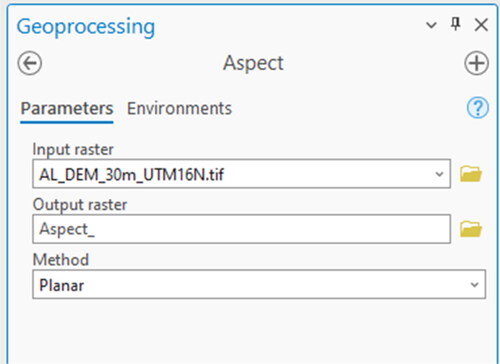
Type “aspect” into the Search window (or browse to Spatial Analyst Tools > Surface > Aspect in the Tools).
Select the Aspect (Spatial Analyst or 3D Analyst) tool.
Choose the DEM as the input raster.
Save the output raster as aspect.
Click Run.
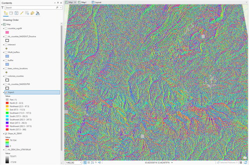
In the Contents pane the results () can be seen in degrees.
Figure 36. The result of the aspect calculation from the DEM.
6.6.2.3. Hillshade
Shaded relief rasters (also called hillshade) are frequently used for visualization and cartographic purposes and are calculated from a DEM and predefined values for the azimuth (horizontal deviation from north, clockwise) and the solar elevation angle (vertical inclination between the sun and the horizon). The Hillshade (Spatial Analyst or 3D Analyst) tool calculates the shaded relief of the terrain in ArcGIS This tool is useful for determining which areas of the terrain are shaded and which are not, during certain hours of the day, month, or year.
To calculate the hillshade of the terrain ():
Figure 37. The Hillshade tool dialog box.
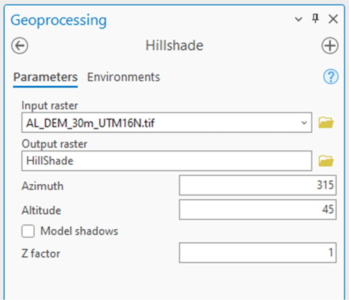
Type “hillshade” into the Search window (or browse to Spatial Analyst Tools > Surface > Hillshade in the Tools).
Select the Hillshade (Spatial Analyst or 3D Analyst) tool.
Choose the DEM as the input raster.
Save the output raster as hillshade.
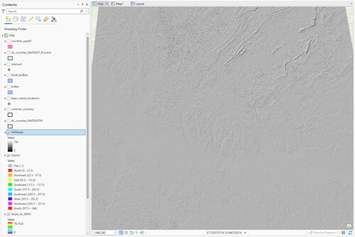
Click Run.
The results will be shown in a greyscale with values ranging from 0 to 254 (), where 0 is black, representing completely shaded areas, 254 is white, representing illuminated areas, and all values in between representing an increasingly lighter shade of grey, thus different levels of illumination from the sun.
Figure 38. The result of the hillshade calculation from the DEM.
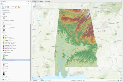
Hillshade rasters are good for visualizing terrain under different layers. To display the terrain properties under the DEM:
Drag the hillshade layer to the bottom of the layer list in the Contents pane.
Turn off all of layers except for the hillshade and the DEM.
Go to the Raster Layer toolbar on the main menu.
Set the transparency to 50%.
Go to the Symbology tab.
Select a different colour ramp.
The resulting image () enables a more intuitive view of the terrain with high elevations in red, low elevations in green, and the ability to see shadows from the hillshade.
Figure 39. Example of a transparent DEM draped over the hillshade raster to show terrain definition.
6.6.2.4. Contour
The Contour (Spatial or 3D Analyst) tool generates an output vector file containing elevation levels (contour lines) from an input raster (in most cases a DEM). Contour lines are frequently used in cartography as they can easily be combined with other raster images (like aerial photos or pixel maps).
To generate contour lines from a DEM:
Open the Search window.
Type “contour” (or browse to Spatial Analyst Tools > Surface > Contour in the Tools).
Use a DEM as the Input raster.
Choose a location to save the Output polyline features (vector format).
Define the Contour interval which will be the distance between the contours (if you are using the Swiss projection this will be in meters).
Set the optional Base contour value, if desired (contours will start after the base value).
If using a different unit than meters, click the Z factor input box.
Click Show Help to learn about Z factor conversions.
Click Run.
The new vector line file will be generated and added to the document. To achieve better results for visualisation, a smoothing algorithm could be performed on the line feature, e.g., with the tool Simplify Line or Smooth Line (Cartography Tools > Generalization > Simplify Line or Smooth Line from the Tools).
6.6.3. Zonal statistics
The Zonal Statistics (Spatial Analyst) tool calculates the statistics on values of a raster within the zones of another dataset. For example, buffers could be used as input zones to calculate the statistics from any raster layer (DEM, slope, aspect, etc.) to determine the mean, majority, maximum, median, minimum, minority, range, standard deviation, sum, or variety of the raster pixels which are located within the buffer confines. The results are contained in a new raster layer and this should be conducted for each statistic required. To obtain multiple statistics at one time, the Zonal Statistics as Table (Spatial Analyst) tool can be used to generate the statistical results in table form for either all or selected statistic types. For an example of the use of the zonal tools, see the case study in “Case study – zonal statistics with land cover properties” section.
6.6.4. Raster calculator
The raster calculator is used for more advanced raster calculations, including raster math and building conditional and trigonometric expressions. It can be found using the search window or in the Spatial Analyst > Map Algebra toolset. For example, the formula “AL_DEM_30m_UTM16N.tif" * 3.28084” would convert the elevation data in the DEM from meters into feet by creating a new raster image. For more information search “raster calculator” in the help menu (https://www.esri.com/en-us/arcgis/products/arcgis-pro/resources).
6.7. Format conversions
ArcGIS provides a variety of different conversion functions between vector and raster data formats similar to other GIS software. As both of these formats have their advantages and disadvantages (see “GIS framework” section) in terms of data management, analysis, and display options, format conversions should be clearly linked to a precise purpose (e.g., when an elevation model is only available as raster data, but a map containing contour curves has to be created). There are various tools available to switch between data formats. See the Conversion Tools toolbox to view all options. The most common conversions are between raster and vector formats. Conversion operations can lead to data loss or decreased precision – so apply these functions with care.
6.7.1. Vector to raster
This function rasterizes vector geometries () into the band(s) of a raster image ().
To convert to a raster from a vector:
Expand the Conversion Tools in the Tools.
Select To Raster.
Depending on the type of vector data you want to convert, select either Feature to Raster, Multipatch to Raster, Point to Raster, Polygon to Raster, Polyline to Raster, or Raster to Other Format.
Indicate where the output will be saved.
Click Run.
6.7.2. Raster to vector
To convert to a vector from a raster:
Expand the Conversion Tools in the Geoprocessing pane.
Select From Raster.
Depending on the type of vector data you want to convert to, select either Raster to ASCII, Raster to Float, Raster to Point, Raster to Polygon, or Raster to Polyline.
Indicate where the output will be saved.
Click Run.
6.8. Spatial statistics
The purpose of this section is to introduce the Spatial Statistics toolset in ArcGIS so that researchers are aware of its existence. Since most of the same tools can be found in other statistical packages, they will not be explained here in-depth, but their geographic links will be discussed. For more information on these tools see the overview in the ArcGIS online help menu by typing “An overview of the Spatial Statistics toolbox” into the search window. Additionally, see Lee and Wong (Citation2001) or Wong and Lee (Citation2005) for further tool descriptions. Be aware that these texts used previous versions of ArcGIS so the tutorials are not completely compatible. Unfortunately, these are the most updated versions available.
6.8.1. Analyzing patterns
This toolset includes: Average Nearest Neighbour, High/Low Clustering (Getis-Ord General G), Incremental Spatial Autocorrelation, Multi-Distance Spatial Cluster Analysis (Ripley’s K Function), and Spatial Autocorrelation (Global Moran’s I). These tools can be used for analysing spatial patterns based on features, or the values associated with features.
6.8.2. Mapping clusters
Cluster and Outlier Analysis (Anselin Local Morans I), Grouping Analysis, and Hot Spot Analysis (Getis-Ord Gi*) are located in this toolbox and can be used to identify statistically significant hot spots, cold spots, and outliers.
6.8.3. Measuring geographic distributions
These tools enable the researcher to ask spatially defined questions about their data by using the Central Feature, Directional Distribution (Standard Deviational Ellipse), Linear Directional Mean, Mean Center, Median Center, and Standard Distance tools.
6.8.4. Modelling spatial relationships
This toolset can be used to conduct regression analyses or creating spatial weights matrices. The tools include Exploratory Regression, Generate Network Spatial Weights, Generate Spatial Weights Matrix, Geographically Weighted Regression, and Ordinary Least Squares.
6.9. Case study – zonal statistics with land cover properties
Until now, several concepts and tools in ArcGIS have been introduced. Now, to combine some of the different tasks discussed, a case study will be presented. Within this short case study, geostatistical relationships between honey bee colonies and land cover properties will be calculated. The content of this case study is equal to the one for QGIS (see “Case study – zonal statistics with land cover properties” section) but adapted to the tools of ArcGIS. The prerequisite for this case study is opening an ArcGIS project with a point vector layer (e.g., the honey bee colony locations bees_colony_locations.shp, created in “Importing XY data from text files” section) and a buffer polygon layer (e.g., buffer.shp, created in “Single buffer” section). This case study will go through the process of downloading, manipulating, and analyzing the National Land Cover Data (NLCD) of the state of Alabama. First, land cover data for the region surrounding Auburn will be extracted.
Open the Catalog pane.
Navigate to the folder containing all initially downloaded files and browse to the land cover raster nlcd_al_utm16.tif. Open the Properties of the raster layer by right-clicking the layer name and selecting Properties.
From the Raster Information in the Source tab in the layer properties, you see that nlcd_al_utm16 is a 1 band raster dataset with 8 Bit integer values at 30 m horizontal resolution. Because it covers all of Alabama, the nlcd_al_utm16 raster is quite large and the rendering on the screen may take some time. We will improve the performance by clipping to the extent of interest to Lee County.
Add the nlcd_al_utm16 layer into a new blank *.aprx by dragging the layer from the Catalog pane into ArcGIS directly, or using the Add Data button in ArcGIS.
We will use the AL_counties_NAD83UTM to define the output extent of the clipped land cover raster layer so add the layer to the map now. Add the counties layer to the map and open Attribute Table of the county layer.
Select Select by Attribute.
Select “Where” “COUNTYFP” “is equal” to “081” to select Lee County.
Select “OK” to close the window. Right-click the AL_counties_NAD83UTM layer in the Contents pane and select Selection > Make Layer From Selected Features.
A new layer called Al_counties_NAD83UTM selection will appear in the Contents pane.
Save the *.aprx to keep these changes (Project > Save As…).
Now you will clip the landcover raster to the extent of Lee County.
Open the Clip Raster (Data Management) tool (Analysis > Tools > Toolboxes > Data Management Tools > Raster > Raster Processing > Clip Raster).
Input Raster: nlcd_al_utm16.tif
Output Extent:AL_counties_NAD83UTM selection. The X and Y maximums and minimums will be automatically populated based on the output extent layer.
Check the Use Input Features for Clipping Geometry option.
Save the Output Raster Dataset as AL_landcover_clip.
Click Run ().
Turn off the nlcd_al_utm16.tif and AL_counties_NAD83UTM selection layers (uncheck in Contents pane).
Right-click the AL_landcover_clip layer.
Select Zoom To layer to view the result ().
Next, you will calculate the percentages of forested and “other” landcover types within the study area.
Open the Con tool (Analysis > Tools > Toolboxes > Spatial Analyst Tools > Conditional > Con).
For Input the conditional raster use the AL_landcover_clip layer.
Use the expression “Where” “NLCD_Land” “is equal to” “Hay/Pasture” ().
Set the Input true raster or constant value to 1 and the Input false raster to 0. The expression is a conditional statement (Con) which literally means: if the value of a pixel from the AL_landcover_clip.tiff layer is Hay/Pasture, assign that pixel a new value of 1. If not, assign a value of 0. This will create a binary raster.
Specify an output raster, e.g., Con_Hay, which denotes that the new layer will represent the Hay/Pasture land cover type.
Click Run.
Repeat steps 21 to 24 with the following raster categories: Deciduous Forest and Evergreen Forest.
The newly created raster images contain zones with the value 1 (where the Raster calculator expression was true) and 0, where the expression was false. This binary classification can now be used to do a simple statistical analysis of the land cover within each buffer polygon layer, e.g., the honey bee colony buffers created in “Single buffer” section.
Open the Zonal Statistics as Table Tool (Spatial Analyst Tools > Zonal > Zonal Statistics as Table).
Input raster or feature zone data: buffer.shp (browse to or add to *.aprx).
Zone Field: OID (Unique identifier).
Input Value Raster: one of the newly created binary raster images (e.g., Con_Hay.
Output table: statsHay.
Check the Ignore NoData in Calculations option.
Choose the Statistics type MEAN ().
Click Run.
Repeat steps 29 to 33 for the other input rasters by altering the input dialog for the classes Deciduous Forest and Evergreen Forest (choosing appropriate filenames for the results).
Now look at the table results (). If you cannot see the tables in the Contents pane, make sure you are in List by Source view instead of List by Drawing Order (“Layer properties” section). In each table you will see columns for OBJECTID, OID (unique identifier corresponding to buffer ID), COUNT (number of pixels of particular land cover class inside the buffers), AREA (calculation of square meters of land cover class within the buffers), and MEAN (in percentage).
Now we will do a table join to connect the statistical information directly to the buffer.shp shapefile based on the unique identifier in both the statistics table and the attribute table of the colony locations layer.
Right-click on the buffer layer in the Contents pane.
Select Joins and Relates.
Click Add Join.
Choose the OID_ as the fields on which to base the join with the statsHay table ().
Check Keep All Target Features.
Click OK.
Open the Attribute Table for buffer.shp and scroll over to the right. You will see the values from the statsHay table have been added to the end. Since we are only interested in the MEAN, turn off the other fields (right-click column name >Hide Field). For table organisation purposes, other fields can also be turned off (this is not permanent – Right-click a field > check the Visible box next the field > Save changes)).
To distinguish this MEAN column from the other 2 other mean value columns, which we will add in the next steps, let’s rename the column (Right-click column name > Fields).
In the Alias field, change the name to “HAYMEAN” in the Alias option.
Exit the Fields table.
Repeat 35 – 44 for the Deciduous and Evergreen Forests statistics tables.
Now we will calculate another column in the table for all of the “other” land cover classes. Open the Attribute Table.
Select Click the Add Field button from the top menu of the table.
Field Name: LC_other.
Choose the Data Type Float.
Use the field calculator to populate this column. Right-click on LC_other field name > Calculate Field.
Fill out the dialog box according to with the equation: 1 – (!StatsHay.MEAN! + !StatsDecFor.MEAN! + !StatsEveFor.MEAN!)]) which calculates the percentage of “other” land cover types in relation to the three we have already used. Your stats table names might be different from the ones listed above.
Figure 41. The result of the clip performed in . The land cover layer is now clipped to the extent of the Lee County layer.
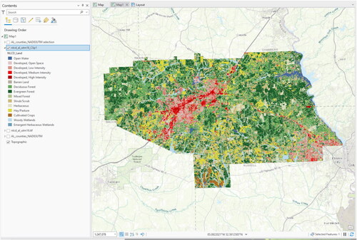
Figure 44. The results of the Zonal Statistics as Table calculation.
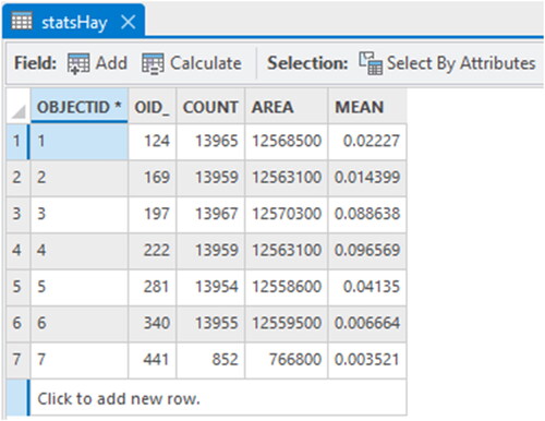
Figure 40. The dialog box from clipping the land cover data (nlcd_al_utm16.tif) layer to the extent of the Lee county layer.
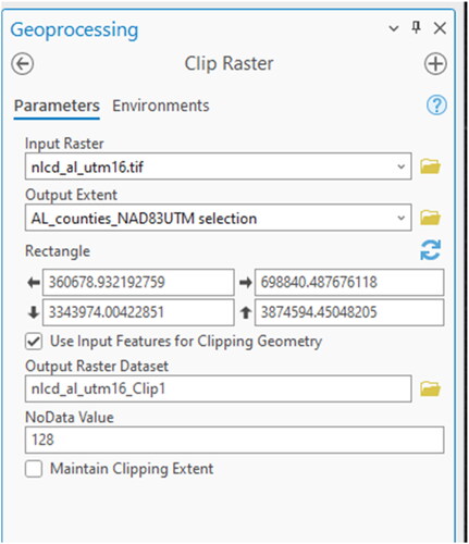
Figure 42. The Con Tool dialog box showing the equation used to select all of the Hay/Pasture land cover type from the entire raster.
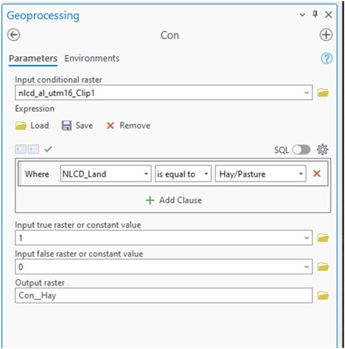
Figure 43. The Zonal Statistics as Table dialog box.
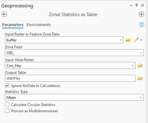
Figure 45. The Join Data dialog box.
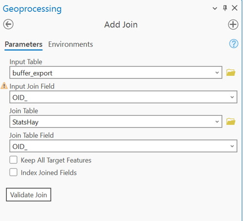
Figure 46. The Calculate Field dialog box used to create the “other” landcover classification in the buffer attribute table.
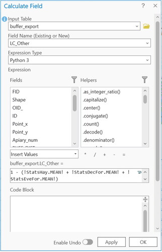
To visualise the statistical data another way, graphs and charts can also be created in ArcGIS. To create a graph similar to that in , right click on the buffer layer in the contents pane > Create Chart > Bar Chart. Click properties, and choose the land cover categories as the numeric fields. Play around with the other options in the properties dialog box to make it look nice. In the next section, a final map will be created showing the case study results.
Figure 47. A sample graph created in ArcGIS Pro using the land cover statistics values.
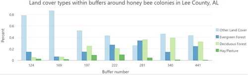
6.10. Map creation
Map creation is one of the main functionalities in ArcGIS. Here we will give a brief tutorial about how to create a map as the final product of the GIS analysis. This task assumes that all layers created in the previous steps are already in the map document (including the results of the case study).
6.10.1. Symbology
First you will want to make sure that your layers are organized and cartographically sound before you begin the final map creation process. Layer symbology can be changed within the properties of each layer under the Symbology tab (click on the layer in your Contents pane > Feature Layer > Symbology or right click layer in Contents > Symbology). Depending on the type of data you want to symbolize, there are various options. For example, layers can be symbolized based on one set of features (Features), categories of attributes based on unique values or unique values using many fields (Categories), or quantities of attributes (Quantities). As an example, we will use the AL_counties_NAD83UTM layer and change the symbology so that each county is represented by a different colour.
To change symbology to represent unique features:
Right-click AL_counties_NAD83UTM layer.
Select Symbology.
Select the drop-down arrow under Primary symbology.
Select Unique Values.
For the Value Field choose the attribute to be symbolized. In this case it is NAME. The results show each commune represented by a different colour ().
Figure 48. The results of symbolizing a layer based on the values of an attribute. In this example, each color represents a different county in Alabama.
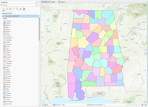
6.10.2. Labels
Labels can be automatically added for any layer.
To add labels to a layer:
Right-click the AL_counties_NAD83UTM layer.
Click the Label option.
Now the name of each county can be seen ().
To make the label larger or change the font right-click the layer > Labelling properties.
Figure 49. The result of turning the labels on for the AL_counties_NAD83UTM layer.
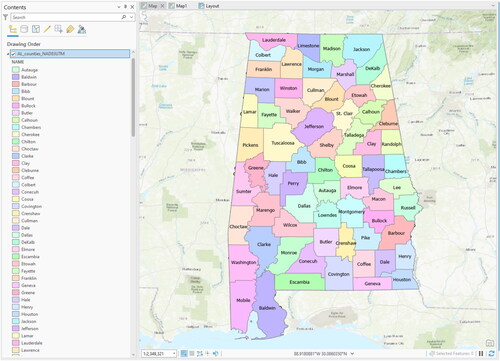
6.10.3. Advanced symbolization
In this step, the statistical results of the case study will be symbolized using pie charts.
To begin, open the Symbology tab of buffer layer.
Choose Charts under Primary Symbology and make sure Pie is selected.
Add the MEAN attributes (including LC_other) to the Symbol/Field box. Change the colours to correspond with the original land cover values ().
Click OK.
The map should now look something like but this is not the final step.
Figure 50. The creation of pie charts from the buffer layer properties symbology tab.
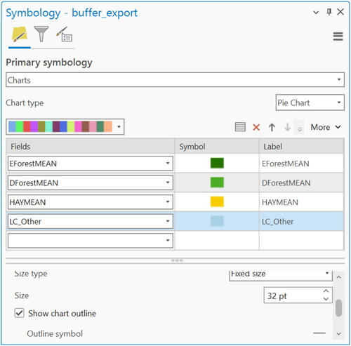
Figure 51. The resulting pie charts of the buffer areas shown on top of Lee County.
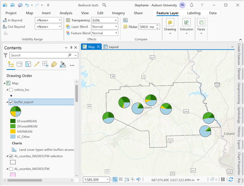
6.10.4. Creating a map layout
When you are ready to make a final map, you will need to add a new Layout to your project. To do so, from the main menu choose Insert > New Layout > choose page size > click on Map Frame and select the map you would like to add to the layout. Draw a box on the page and your map will populate (). For further information on this process visit https://pro.arcgis.com/en/pro-app/latest/get-started/add-maps-to-a-layout.htm.
Figure 52. Example of a map layout.
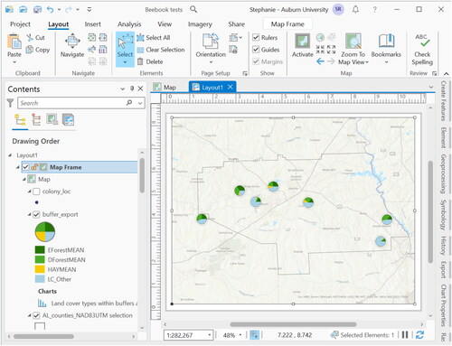
6.10.5. North arrow, scale bar, legend, title, text
To add a north arrow:
From the Layout tab, click Insert >North Arrow.
Choose the style from the dropdown menu.
Click on the map to place to arrow.
To add a scale bar:
Click Scale Bar under Insert.
Choose the style.
Click the map to add.
Double-click on the scalebar to change the properties.
To add a legend:
Click Legend under Insert.
Double click the legend to change the properties.
Turn the layers On/Off in the Contents pane to add or remove from legend.
Once added to the map, you can double-click on any feature in the layout view to open its properties. Also, the scale bar and legend are linked directly to the map, therefore they change as the map changes. For example, the scale bar will adjust to the scale of the map, and the legend items will adjust if the symbologies or names of layers change in the Contents pane. To adjust these features manually they must first be converted into graphics and ungrouped.
To manually change the legend:
Right-click the legend.
Select Convert To Graphics (this unlinks the feature from the map).
Right-click the legend again.
Select Ungroup to have the ability to select individual features and edit them (some features required a second “ungrouping” to be editable, e.g., the symbols and labels).
Select the item to edit.
Note: once the item has been converted to graphics, there is no going back (you would have to insert the item again from scratch) and, the item is no longer dynamically linked to the map contents. Therefore, changing layers and map scales will no longer change legend items or scales. It is recommended that conversion to graphics is the final step in the map creation process. Play around with the other map options until you are happy with the final output.
6.10.6. Exporting a map
To export the final map product:
Go to Share.
Select Export Layout.
Name it and choose the format (JPEG, PDF, etc.).
Choose the resolution (high quality resolution is 300 dpi (dots per inch))
Click Export.
Browse to the exported map.
Open it to view the results and see if any changes are needed (see to view the exported map).
Figure 53. Final exported map.
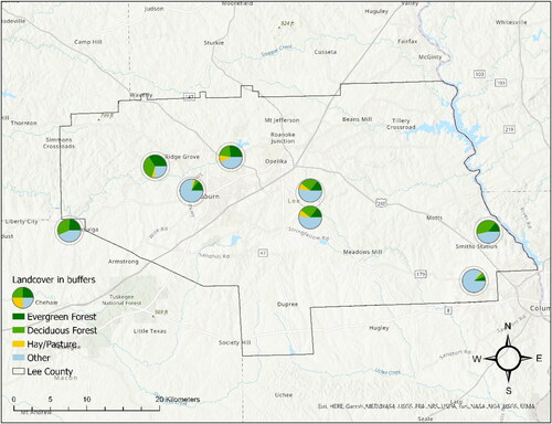
6.10.7. ArcGIS online
ArcGIS also has a cloud mapping platform online which allows users to share their maps and data with others, access their maps online, on their desktop, and on mobile devices through the use of the cloud. On ArcGIS online, users can create maps by adding their own data, choose from different base layers, and use other people’s shared data that has been uploaded to the site. This site is useful for map creation when you do not have access to the ArcGIS software but want to make a basic map. All you need is an ESRI Global Account which is free to sign up for. For more information about ArcGIS online visit https://www.arcgis.com/home/.
7. Using Quantum GIS (version 3.22.6.)
This section provides a brief hands-on tutorial as an introduction to Quantum GIS (QGIS) and shows examples of how open source GIS can be used instead of proprietary software for the same research applications as demonstrated in the previous chapter. QGIS is licensed under the GNU General Public License (http://www.gnu.org) and is an official project of the Open Source Geospatial Foundation (http://www.osgeo.org). This tutorial is based on QGIS version 3.22.6. “Białowieża” that was the latest stable release as of early 2022 and runs on the 64-bit Microsoft Windows 7 operating system. Detailed information about QGIS, its functionalities, and the installation procedure on different platforms is well documented on the project website (http://www.qgis.org) and in the manual to version 3.22.6 (QGIS Development Team, Citation2013).
7.1. Main components of QGIS
QGIS includes the main program QGIS Desktop, QGIS Browser for data management, and a variety of optional plugins that provide specific functionalities.
7.1.1. QGIS Desktop
QGIS Desktop is the main interface for data collection, analysis, and presentation on the client-side and is similar to ArcGIS Pro (see “Main components of ArcGIS Pro” section). The language of the GUI is chosen automatically by the system defaults, but it can be changed within the menu Settings > Options > Locale. Most of the menus and symbols () are self-evident and should be easy to use for anyone with basic knowledge in GIS techniques, but in particular the menu “Plugins” is different than other software and will be discussed more in detail (see “Plugins” section). Projects (equivalent to projects within ArcGIS Pro, see “Setting a coordinate system and saving a new project (*.aprx)” section) saved within QGIS are stored using the XML-Standard (Extensible Markup Language, machine and human-readable) and with the extension *.qgs.
Figure 54. The graphical user interface of QGIS Desktop (version 3.22.6 “Białowieża”, running on Windows). The legend corresponds to the terms used in the official QGIS user Guide: Menu Bar (1), Tool Bar (2), Map Legend (3), Map View (4), Status Bar (5).
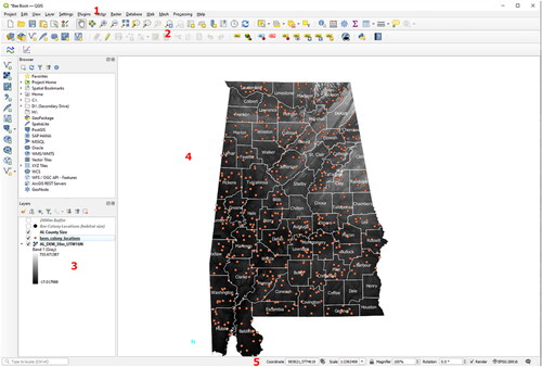
7.1.2. QGIS browser
Starting in version 1.7., a new feature has been added to QGIS: The QGIS Browser (). This browser is a data management program and simplifies file navigation within the file system, and provides preview options for various file types. Items can be easily added to the Map View of QGIS Desktop by drag and drop.
Figure 55. QGIS Browser serves as data manager. It can be added as a separate panel directly within QGIS Desktop.
7.1.3. Plugins
In addition to its core functionalities, QGIS can be extended modularly with additional features and functionalities, downloadable from so-called repositories through the internet. At the beginning of 2022, about 1637 plugins were listed on the project website provided by various authors (http://plugins.qgis.org/plugins). Because the application is open source, everyone is authorized to change or add features for special purposes by programming in the languages C++ or Python. Often, popular external plugins that have a big impact on the user community are implemented into the core functionalities of QGIS in the following release.
Plugins can be loaded and unloaded from the main menu Plugins > Manage and Install Plugins () from various internet repositories directly into the QGIS Desktop. Some of the plugins might require additional software packages or libraries, or are still marked as “experimental”, indicating an early stage of development.
Figure 56. The QGIS Python Plugin Installer can be used to download and install additional program code from different repositories.
Within this tutorial the plugins listed in will be used, so it is recommended to install them now:
Table 4. QGIS plugins and repositories list used or mentioned in this tutorial.
Open QGIS, go to the Start Menu.
Go to All Programs.
Open the Quantum GIS Lisboa folder.
Select Quantum GIS Desktop 3.22.6.
From the main menu go to Plugins.
Select Manage and Install Plugins.
Select the All option on the left side menu.
Over the years many of the most widely used plugins have been incorporated into QGIS as core functionality. However, new plugins are constantly being created and this is where you would enable those.
Switch to the tab Settings.
Activate the checkbox Check for updates on startup.
Set the allowed plugins to Show also experimental plugins, Switch back to the tab Plugins within the QGIS Python Plugin Installer.
To remain focused on the most important functionalities for your daily work, it is recommended to make use of the Plugin Manager ():
Figure 57. The QGIS Plugin Manager can be used to enable (if they are already installed) or disable (without being uninstalled) plugins.
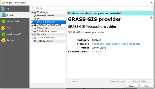
Open Plugins.
Select Manage Plugins.
Click Select All.
Click OK.
For more detailed information about managing and troubleshooting QGIS plugins on different platforms, see the QGIS user guide (QGIS Development Team, Citation2013).
7.2. Navigating the software
One motivation for the development of QGIS was to provide a user friendly GIS software with a simple and straightforward graphical user interface (GUI, QGIS Development Team, Citation2013). This was also one major motivation for why we chose QGIS as the representative for open source GIS within this tutorial.
7.2.1. Help menu and tooltips
The Help menu is placed at the right of the main menu bar in QGIS Desktop () or can be opened with the shortcut F1 on your keyboard (on Windows). The majority of the functions and tools are well documented in the user guide (QGIS Development Team, Citation2013) and additional information is accessible at the QGIS project website (http://www.qgis.org). Useful information is provided by the tooltips (that usually appear when the mouse cursor is placed over an icon for a few seconds) indicating the name or functionality of the buttons and plugins. In addition, several functions and plugins have their own help button like the example in . Thanks to a huge effort from the community, the GUI and large parts of the help menu have already been translated into many different languages.
7.2.2. User guide and documentation
All documentation for QGIS can be found on the project website http://www.qgis.org, (or by selecting F1 on the keyboard on windows) divided into several categories: “For Users” (containing user guides and tutorials) and “For Developers” (providing programming help for developers). The official manual, the QGIS user guide 3.22 (QGIS Development Team, Citation2013) cited in this tutorial, was released on the 1st of April 2022 and might have changed since then.
7.3. Adding data and working with different file formats
Adding geodata to QGIS Desktop is as easy as with ArcGIS Pro (see “Opening ArcGIS Pro, setting the coordinate system, and adding data” section): a variety of file formats can simply be dragged and dropped, for example, from a folder within the file system directly into the Map Layers panel on the left of QGIS Desktop. The following hints and remarks will provide a start-up aid for users new to GIS and for some specific data types.
7.3.1. Setting a coordinate system and saving the new QGIS project (*.qgs)
Similar to the ArcGIS section (Setting a coordinate system and saving a new project (*.aprx) section), it is important and recommended to first set the coordinate system according to the data used for the analysis or the target projection of the final map product, respectively (). QGIS uses “on-the-fly" CRS transformation by default, which means that regardless of the data’s coordinate system, QGIS will automatically transform your data into a common CRS defined for your project. The CRS can be defined by:
Figure 58. The Coordinate Reference System (CRS) of the project has to be defined within the Project Settings or Project Properties. On-the-fly CRS transformation is the default functionality in QGIS.
Go to Settings.
Select Options.
Select Coordinate Reference Systems (CRS) in the left pane.
Under CRS for Projects select “Use CRS from First layer added”.
Under CRS for Layers, select the radio button for “Use Project CRS”.
Click OK to apply these settings and close the Properties dialog.
By completing the above, the first layer that is added to your map will determine the CRS for your project. Data will be displayed in this CRS. Alternatively, the user can also select a pre-defined CRS for the project which is independent of the added layers:
Select Project.
Select Properties.
Select CRS on the right-hand side of the window. In the CRS search bar, type in the EPSG number associated with the desired CRS. Here, we’ll use 26916 corresponding to NAD83 UTM zone 16N.
Click OK to apply these settings and close the Properties dialog.
Verify by checking if the EPSG-code 26916 is written in the Status Bar.
Note: This step is very important for the rest of this tutorial, because choosing the wrong CRS may lead to various problems in geoprocessing.
Advanced users who deal with a variety of different projections might appreciate the possibility to filter the list of all coordinate systems () by names or the identification number of the EPSG Geodetic Parameter Dataset (http://www.epsg-registry.org).
Save the new project and settings, go to Project.
Select Save As, or click the button
 to the desired destination folder (A QGIS project file with the extension *.qgs will then be created).
It can be reopened directly by a double-click on the file or within the QGIS main menu File > Open Project or the open project button
 from the File toolbar.
7.3.2. Add data to the project
Most of the functions to add and remove data or to change layer properties and appearance can be accessed through the main menu Layer. Of particular interest are the functions (listed in ) contained in the Manage Layers toolbar:
Table 5. The most important functions of the Manage Layers toolbar. This toolbar can be enabled and disabled by the main menu View > Toolbars > Manage Layers.
Only data of the appropriate type (see “Vector data structure” and “Raster data structure” sections) will be selectable as a source for adding vector or raster data, respectively. In case the data type or the file extension is unknown, try to drag and drop the files directly from the source folder into the Map Layers in QGIS Desktop (). Take into consideration that some common file formats consist of multiple files and that the main file has to be chosen (e.g., the file with the extension *.shp for a shapefile or the *.tif for a raster in GeoTIFF format, respectively, see also “File types and extensions” section). Due to the Geospatial Data Abstraction Library (GDAL) for raster data translation GDAL (http://www.gdal.org) and the OGR Simple Feature Library (http://www.gdal.org/ogr), QGIS has excellent data interoperability capabilities and almost every geodata file format from any source can be loaded into the Map View.
7.3.3. Importing vector and raster data
Now it is time to add some data to the new empty QGIS project:
Choose Layer.
Hover over Add Layer.
Select Add Vector Layer.
Browse to the source folder of your Geodata by pressing the Bread Crumb button
 under Source (for example, select AL_counties_NAD83UTM.shp, see “Tutorial data” section).
Press Open to load the shapefile and then Add to place it in the map frame.
As an intermediate result, a polygon layer (see “Vector data structure” section) representing different administrative districts, called counties, within the State of Alabama appears ().
Figure 59. A polygon layer containing administrative districts (counties) for the state of Alabama has been loaded to the QGIS project.
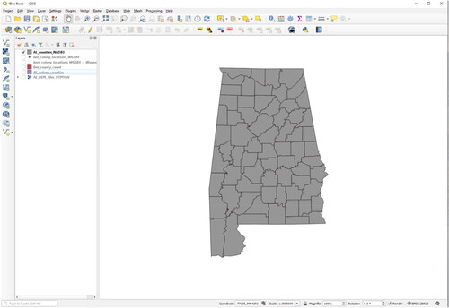
In the same way, but with the Add Raster Layer function, a DEM (see “Digital elevation model (DEM)” section) can be added to the map:
Open Layer.
Select Add Layer.
Select Add Raster Layer.
Browse to the source folder of your Geodata (for example select AL_DEM_30m_UTM16N. tif).
Click Open to load the DEM into QGIS followed by Add at the bottom of the window.
A greyscale raster image appears in the map frame which is slightly larger than the State of Alabama outline ().
The new data will be added to the top of the map, thus probably hiding some other content behind it (the display order is defined by the hierarchy in the Map Legend). Considering the current map display, we see that the raster image has a larger extent than the vector layer and only a few details are visible at this scale. To zoom to a region of interest, suitable operations are:
Using the Zoom and Pan icons in the Map Navigation toolbar or the same functions in the menu View
 .
.Right-click on the raster image in the Map Legend (in our example called AL_DEM_30m_UTM16N) and choose the option Zoom to Layer(s).
Zoom with the mouse wheel placing the cursor at the centre of an area of interest.
When zoomed into an area of interest, the topography of the region is visible (). First of all, from this step we learn that QGIS has several tools for similar applications, and every user will find and choose the most efficient manner to achieve their goals. Second, it is beneficial to use (or even try) the right mouse button, for example to set the Map View to the extent of one specific layer or to the access the Layer Properties. Advanced users might be comfortable using the mouse wheel to change the zoom level while other tools stay activated (e.g., during digitisation).
Figure 60. Result after adding the digital elevation model and zooming to its extent.
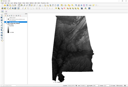
7.3.3.1. Add delimited text layer (*.txt, *.csv)
In this section, a simple text file will be added to QGIS to visualize and analyse it spatially (for more information about this refer to “Importing XY data from text files” section):
Open Layer.
Hover over Add Layer.
Choose Add Delimited Text Layer or click the appropriate button from the Manage Layers toolbar ().
Choose the source text file (in our case the comma delimited textfile colony_points.csv).
Give a name to the output layer (e.g., bees_colony_locations).
Select the appropriate delimiters (e.g., semicolon or comma) and the columns containing the coordinates in point_x(X) and point_y(Y) according to .
Be sure to specify the CRS of your new point dataset if it is not automatically added. Use the drop-down menu located next to Geometry CRS to select EPSG:26916 – NAD83/UTM Zone 16N.
Click Add.
Go to Project.
Click Save.
Figure 61. Create a Layer from delimited text files: By the use of coordinates stored in different columns of a delimited text file, point vector files can be created.
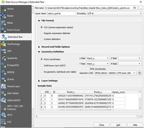
As a result, the honey bee colonies are shown as point information in the Map View (). It is important to note, that this layer is loaded into QGIS and available for any display and map creation purpose and also some basic analysis, but not physically stored as geodata in the file system. To get the full functionality of a point vector file, save this layer, e.g., as a shapefile by performing the following steps:
Figure 62. The map result after import of the honey bee colony locations (orange dots).
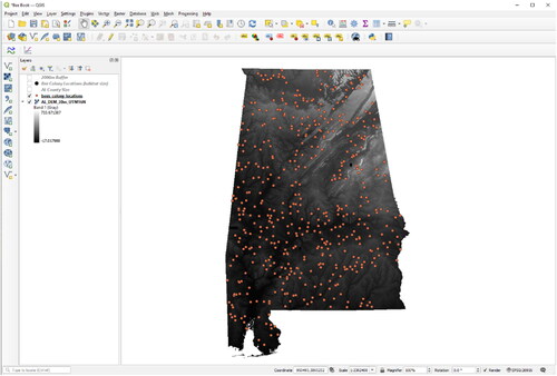
Right-click the layer in the Map Legend ().
Choose the Export option in the context menu and select Save Feature As.
Select a file format (in our case it will be an ESRI Shapefile).
Select a target destination folder within the file system (e.g., with the filename bees_colony_locations.shp) by clicking the bread crumbs button next to File Name
If special text characters are included, choose an encoding that is suitable (e.g., for Western Europe UTF-8 or latin1 are good options).
Select the correct CRS (in our case it is NAD83/UTM Zone 16N).
Specify the Geometry type as Point using the drop-down menu.
Enable the option Add saved file to map ().
Click OK.
A message (“Layer Exported: Successfully saved vector layer”) will appear, and the layer will be added on top of the Map Legend.
Right click the old text file from the Map Legend Press the button remove layer(s) (see ) to remove it from the project – we will only need our newly created shapefile for all future steps.
Figure 63. Dialog window to save an existing layer as a new vector layer. By the use of this function, file format conversions and even transformations between different coordinate reference systems are possible (defining the target CRS).
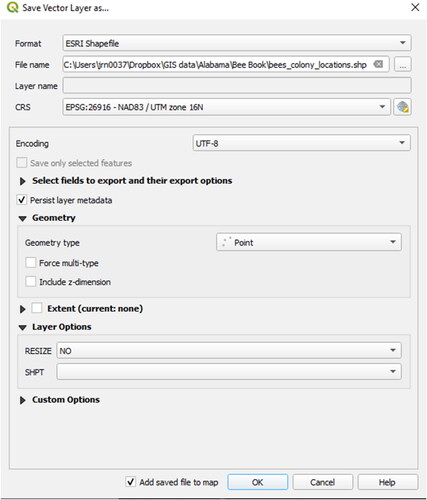
7.3.3.2. GPS and KML data, working with different coordinate systems
Other important functionalities of modern GIS are those to import and export GPS data (e.g., those acquired by handheld GPS devices), and the transformation between different coordinate systems. Because the GPS eXchange Format *.gpx is common and integrated within the OGR library (see “Add data to the project” section), the import of existing GPS data is as simple as adding other vector data (see “Importing vector and raster data” section). Assuming that our point vector layer added in the previous step represents colony locations of honey bees we would like to locate in the field, this vector layer needs to be exported to a new *.gpx-file to be uploaded onto a handheld GPS device. This can be done with the same function used to save a layer to a new shapefile (), but modified settings:
Right-click on the layer in the Map Legend.
Choose the Export option in the context menu and select Save Feature As.
Choose the GPS eXchange Format (supported by a majority of GPS devices).
Specify a name and location to save the GPX file.
Set the coordinate system (CRS) to “WGS84” (because GPS devices are natively working in World Geodetic System 1984).
Click OK and verify if the new file (e.g., with the file name bees_colony_locations_WGS84.gpx) has been created within the chosen destination folder.
Behind this, two very important technical GIS functionalities are working: first, the translation from a source file format (*.shp) to a target file (*.gpx) format and second, a precise transformation between two different coordinate systems, even with different map units. If you have software like Google Earth for instance, you can easily verify if the coordinate transformation to WGS84 worked correctly (if you do not have Google Earth installed, you can skip this paragraph, or download the software from http://www.google.com/earth/index.html).
Open Google Earth.
To open the *.gpx-file in Google Earth, go to File.
Click Open.
Browse to the location of *.gpx file.
Beside the File name box, choose the Gps option from the dropdown menu.
Click Open.
The GPS data Import dialog window will appear asking if KML tracks should be created from the GPS data. Check the options Create KML Tracks and Adjust altitudes to ground height (with this function, all elements are attached on top of the elevation model behind Google Earth and you are sure that all features will be visible) and confirm with OK.
Google Earth will do a file format conversion that results in a new temporary layer named “GPS device” in the panel Places > Temporary Places. The new created placemarks in Google Earth should be at the same location as in the QGIS project.
Right-click on the layer GPS device.
Click Save Place As to save this temporary layer to the file system in the KML format (, make sure to choose KML instead of the zipped KMZ format).
Figure 64. Save “Temporary Places” within Google Earth as KML-files to the file system.
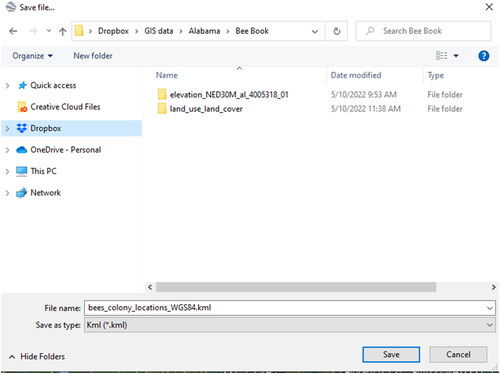
The Keyhole Markup Language (KML) is another file format supported by the OGR library. It provides great possibilities to share spatial information of vector based geodata with people who are not familiar with GIS software, since almost everybody can handle software like Google Earth. Of course, it is also possible to import the KML file back to QGIS. We will see if the coordinate transformation from WGS84 back to the UTM CRS of Alabama works fine:
Just drag the KML file from its data source to the Map Legend in your QGIS project.
By activating and deactivating the checkbox to the left of the layers you can check if the geometries are congruent.
If there is a lateral shift between the point layers or an error in scale, the CRS project option was probably not enabled properly – you can fix this by navigating to the main menu Settings > Options where you choose the tab Coordinate Reference Systems (CRS).
7.3.4. Layer organisation and navigation
Managing layers with QGIS is very similar to ArcGIS, thus the following hints are complementary to “Layer properties” section:
The drawing order of one specific layer relative to the others can be changed in the Map Legend (): click on the layer and hold the left mouse button to move layers upwards or downwards in the hierarchy.
Within a large project it is recommended to make groups (right-click on the Map Legend > Add Group), to be more flexible to turn a whole group of layers on and off together, for instance, or to get more space in the layer hierarchy by collapsing multiple legends.
To avoid losing the most important buttons and menus, have a look at the main menu View > Panels and Toolbars: Here you can enable additional panels or toolbars to the QGIS GUI (e.g., the Overview or the QGIS Browser window) and show or hide several toolbars and buttons (the most essential toolbars are Attributes, Manage Layers, and Map Navigation).
To achieve a good visualization result, changes in the Layer Properties are often required – the topic of the following section.
7.3.5. Layer properties
The properties of one specific layer can be accessed by the main menu Layer > Layer Properties, a right-click on the layer name and choosing the entry Properties in the context menu or simply by double-clicking the layer name. The Layer Properties might vary between different file formats, but every layer will at least have tabs for Symbology options, General settings and provide Information about the layer. Let’s first have a look at the Information: opening the Information tab for the layer AL_counties_NAD83.shp, the following information appears ():
Figure 65. Information for the layer AL_counties_NAD83.shp in the Layer Properties.
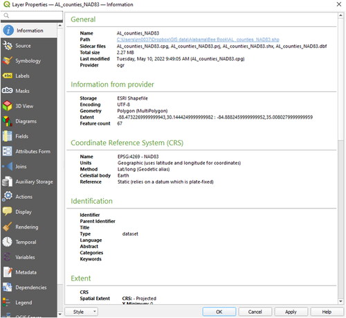
Apart from the file format, data source, and geometry type, we can also learn something about the number of features (n = 67), the coordinate reference system (CRS) used for projection and the spatial extent (minimal and maximal values for X and Y). The administrative districts are digitized as polygons, displayed with a solid colour fill. To combine them with our elevation model, the fill colour could be removed and the border set to a bright colour:
Open the Layer Properties window by a method of your choice (see above).
Switch to the tab Symbology.
Select an appropriate Symbol layer type in the Symbol properties window (dropdown-menu). By default, polygon layers are visualized by a “simple fill” with a uniform colour for the fill area and black lines representing the polygons boarders. Change the layer type, e.g., to Outline: simple line () with a color of your choice
Select Apply to commit the changes.
Close the Layer Properties with OK.
Move the polygon layer one level higher in the Map Legend on top of the elevation model if it is not already there.
Figure 66. Symbol properties for QGIS vector layers. Different Symbol layer types can also be combined for more advanced visualization tasks (Button Add symbol layer)).
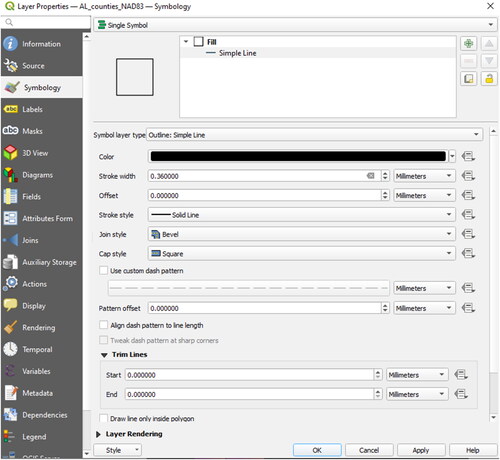
7.4. Data selection and editing
This section presents the most important selection queries and editing tasks using different techniques in QGIS.
7.4.1. Spatial query and select by location
Similar to ArcGIS (“Queries” section), different functions exist to obtain information for defined locations:
The Identify Features button  is the same as the Identify tool of ArcGIS (see “Queries” section) and is used to obtain information about specific pixel values within a raster image or to look at the attribute values of a vector feature. Before applying the Identify Features tool, it is necessary to activate and select the appropriate layer in the Map Legend. In addition, various spatial operations are provided within the main menu Vector. Of particular interest is the function Spatial Query that allows more advanced queries by using vector geometries. To demonstrate this functionality with QGIS we will ask for all counties that contain at least one honey bee colony.
0. Choose Vector from the main menu.
1. Select Research Tools and find Select by Location (a dialog window will appear).
2. Select features from AL_counties_NAD83.shp where the features contain the features from the bee colony locations.
3. Choose to create a New Selection (alternatively, it could be added to or removed from an existing selection).
4. Click Run and close the dialog, if the result looks similar to .
Figure 67. Result after performing a spatial query: The honey bee colonies are located within 53 different administrative districts around Alabama. The grey polygon represents the only county where no colonies are located.
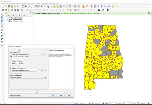
In practice, spatial selection operations are frequently used to assign attributes of one layer to another layer and for raster calculation tasks or modelling tasks.
7.4.2. Select by attributes
Let’s have a look at the result of the spatial query from the last section: In total 53 features were highlighted (that means selected) within the Alabama county layer. So far so good, but what if the research question was to get the names of all counties containing honey bee colonies? To achieve this goal:
Right-click the AL_counties_NAD83.shp layer.
Choose Open Attribute Table or use the button
 within the Attributes toolbar.
It is written in the headline of the Attribute table that the selected layer contains 67 entries in total (representing counties). Because they are topologically correct (see “Definition” section), none of these counties intersect with another and all the borders are congruent (that means that there are no blank “islands” in between).
To focus on the selected features within a large dataset, use the dropdown menu at the bottom of the window and select Show Selected Features (). Within the column called “Name”, the name of each county is given.
The Attribute table can stay open while other functions are performed, e.g., during digitizing or editing tasks.
Figure 68. Selected features (one single feature corresponds to one table entry) within the Attribute table. All in all, the layer consists of 67 features.
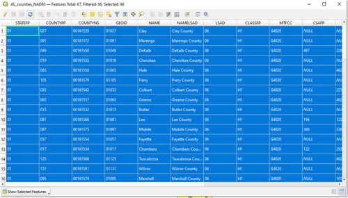
Assuming that the goal is to produce a map that shows only Lee and Tallapoosa counties, the following workflow can be applied:
Right-click the AL_counties_NAD83 layer.
Select Filter.
The Filter dialog opens (). The attribute "COUNTYFP" contains an ID that represents the counties in Alabama. In the case for Lee County, it is 081 and for Tallapoosa County, it is 123. So, it is now our goal to restrict the features by means of a formula like "COUNTYFP" = 081 OR “COUNTYFP” = 123 (QGIS will then perform a restriction on the polygons displayed similar to an SQL Selection-Query by the use of a “where clause” (http://www.w3schools.com/sql/sql_where.asp).
Try to rebuild the formula mentioned above by activating the options Fields, Operators and Values (otherwise it can also be written manually).
Confirm the query with OK.
Right-click on layer and Zoom to Layer extent.
Figure 69. The Filter is used to restrict the features to those that meet the query (by the SQL where clause “COUNTYFP” = 081 OR “COUNTYFP” = 123).
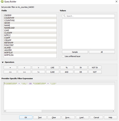
Two polygons in the central-east side of Alabama are shown, the rest of the counties have disappeared from the Map View and will also no longer be selectable within the Attributes table (there are only 2 features left, ). However, they are not deleted from the file and can be restored by removing any SQL “where clause” in the Query Builder.
Figure 70. Result after the SQL Query is performed: There is only 4one polygon that meets the criteria of containing number 081 within the field “COUNTYFP”.
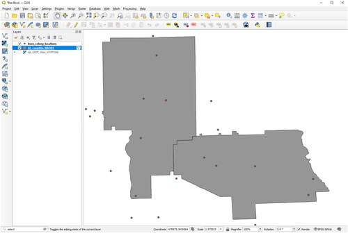
For other applications where a section of a vector file should be selected without blanking out all the other features, a similar Query Builder dialog can be accessed in the Attribute Table toolbar button for Select by Expression  . Of particular use is the combination of different “where clauses”, e.g., selecting attributes above or below a certain threshold or containing a given text string.
7.4.3. Manual selection
Sometimes the easiest way to select geometries or entries in the Attribute Table is by hand, especially for digitizing or editing tasks. To create new selections, use the selection button 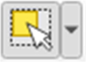 within the toolbar. Clicking on the little black arrow to the right, a drop-down menu opens, containing some more options for the selection using rectangles, polygons, freehand forms, or a radius. To select multiple features or to remove some from a given selection, hold the CTRL key (Windows) down while selecting or deselecting the features with the left mouse button (see the manual for the same function on Mac and Linux). Any selection can be removed using the deselect button
 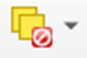 within the Attributes toolbar.
7.4.4. Creating new layers from selected data
If a given selection has to be exported into a new layer, e.g., to share the file with business colleagues, this can be done by saving a vector layer (see “Importing vector and raster data” section): open the layers context menu by a right-click within the Map Legend > Export > Save Selected Features As. Choose all the polygons in the layer Alabama county layer that contain at least one of the honey bee locations with a selection tool of your choice and load the new created layer into the QGIS project ().
Figure 71. Save a selection to a new vector layer.
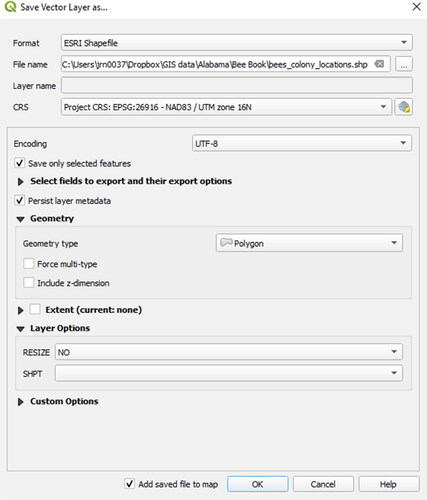
The newly created polygon layer will only contain 53 features and will again be symbolized by a non-transparent simple fill pattern.
7.4.5. Attribute table data editing
QGIS provides a set of editing tools and conventions similar to ArcGIS (see “Attribute table data editing” section). To edit a vector layer, it has to be set into “edit mode” by the Toggle Editing function. As usual, this function is accessible by several buttons and menu entries:
Main menu Layer > Toggle Editing.
The button Toggle Editing
 within the Digitizing toolbar or the Attribute table.
The context menu within the Map Legend > Toggle Editing.
If the Toggle Editing function is greyed out, the selected layer is probably not in an editable vector file format (not all the file formats that can be imported and displayed with QGIS may also be changed, so that in some cases a file conversion is necessary first) or accessed by another program or other users.
Set the newly created layer containing all municipalities where colonies of honey bees were sighted into the Edit mode.
In the Map Legend a pencil will appear to the left of the layers name.
Open the Attribute table and look at the buttons on the top (see ):
Now add a new field (column in the Attribute table) with the button
 , where additional values (e.g., the number of honey bee colonies) can be filled in.
Within the Add column dialog, choose appropriate settings for name (avoiding special characters and blanks, e.g., “bees_colonies”), data type (e.g., integer, only whole numbers will be needed) and width (2 digits are sufficient as there will not be more than 99 colonies per entry).
Now, fill in some numbers into the newly created fields as a test ().
Because of the restriction to integer values of 2 digits maximum width, all types of characters and also numbers higher than 99 will be refused. This is one of the ways GIS systems deal with aspects of data integrity.
Click the Save Edits button
 to make the changes permanent, i.e., written to the file system.
Figure 72. Editing attributes in QGIS.
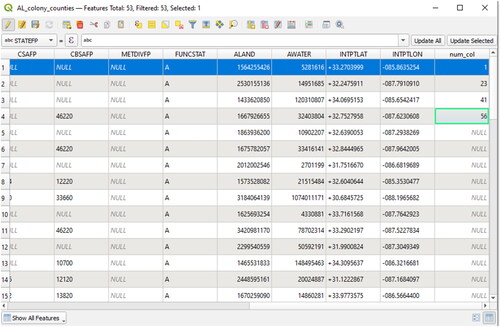
Table 6. The most important functions and the corresponding buttons for editing tasks.
Save often to avoid data loss and finish successful edit sessions by turning the edit mode off (Toggle Edits button again > save all changes).
The number of honey bee colonies could be counted and written to the table manually, but of course QGIS provides several tools for this task that run automatically, even when the editing mode is not active or no empty field has been created before:
Go to Vector.
Choose Analysis Tools.
Select Count Points in Polygon.
Choose the appropriate input layers and a name for the new attribute field (e.g., “bee_colony”)
Specify a path and a name for the new shapefile that will be created ().
Click OK.
The new layer is automatically to the Map Layers with all original attributes and the newly created count field.
Figure 73. Function Count Points in Polygon in QGIS.
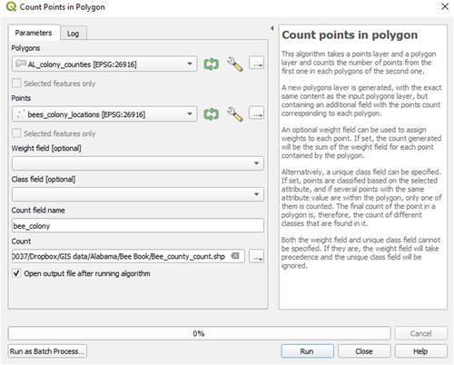
In which commune are most honey bee colonies located?
Switch back to the Attribute Table of the new shapefile.
Sort the attributes by descending in the field “bee_colony” (click the column name to toggle sorting).
Within the county of “Mobile”, with the “COUNTYFP” = 097, 17 colonies of honey bees were found.
7.4.5.1. Using the field calculator and adding geometry columns
As the counties in this example have different areal extents, one could also ask for the area in relation to the number of honey bee colonies. With GIS software, this kind of problem is easy to solve. Also, the extraction of statistical information about geometries like point coordinates, line length, perimeter or area from the features of a vector layer can be efficiently processed.
Let’s demonstrate this with the polygon layer already containing the attribute “bee_colony” created in the previous section:
Open the Attribute table.
Again, toggle on the Edit mode.
Open the Field Calculator.
Activate the checkbox to Create a new field.
Set the output field name to something like “area_bee” and the other parameters as follows: field type (decimal number), length (10) and precision (3).
Search now for “area” within the Function List > geometry and select the function with the name $area by a double click.
Click the appropriate button for a division operation and select the field containing the number of honey bee colonies.
Confirm with OK, if the resulting Expression corresponds to “$area/bee_colony” (, “bee_colony” represents the column name, selectable by Function List > Fields and Values).
Figure 74. Calculate with attributes and geometrical statistics in the Field calculator.
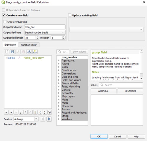
The values in the field “area_bee” (to the right within the Attribute table, ratio area per bee colonies) could be a first indicator about the occurrence of honey bees (of course with strong limitations, as the polygon layer only represents administrative boundaries): The minimum value belongs to the county of “Morgan” with the “COUNTYFP” 103.
We learned in this section to calculate the area of a polygon layer and write these values into an attribute field. Another possibility to add standard geometry information (e.g., point coordinates, line length, perimeter or area) is the function Export/Add geometry columns. This function is of particular use in combination with different coordinate reference systems (CRS), which can easily be demonstrated with the KML file created in “GPS and KML data, working with different coordinate systems” section. (e.g., bees_colony_locations_WGS84.kml):
Go to Vector.
Select Geometry Tools ().
Choose Add geometry columns.
Select bees_colony_locations_WGS84 as Input vector layer.
Choose to calculate the geometry columns using the Layer CRS (e.g., WGS84).
Specify the path and filename for the destination file that will contain the geometry columns (it is the best to convert it back to a shapefile again).
Click OK and wait until the progress bar is at 100%.
Confirm to import this new shapefile by clicking Yes on the next dialog and close the Add geometry columns window.
Open the Attribute table of the new shapefile.
Figure 75. Add geometry columns to an existing or a new shapefile.
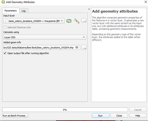
Like its origin (the KML file), the shapefile is referenced in WGS84 but because of the “on-the-fly” CRS transformation, the points representing the honey bee colonies are still congruent with those referenced in the projected coordinate system (which is defined as NAD83/UTM 16 N). Within the Attribute table two new fields have been created that show the latitude and longitude in degrees (according to WGS84).
7.5. Format conversions and projections
QGIS provides a variety of different conversion functions between vector and raster data formats similar to other GIS software like ArcGIS (“GIS framework” and “Format conversions” sections). In previous QGIS versions, transformation required an additional plugin, but much of this functionality is now included as core plugin function.
7.5.1. Vector to raster
The Rasterize function converts vector geometries into the band(s) of an existing or a new raster image.
Go to Raster.
Select Conversion.
Choose Rasterize (Vector to Raster).
Choose the input shapefile (e.g., the layer AL_counties_NAD83UTM.shp) and a suitable attribute field (e.g., “ALAND”).
Be aware that any layer intersection (different features overlaying each other) cannot be transformed to raster data without data loss (in the intersecting areas).
Specify an output raster file and a resolution (Height/Vertical Resolution and Width/Horizontal Resolution) in pixel value as shown in .
Launch the conversion by clicking Run.
Figure 76. Vector to raster conversion using QGIS.
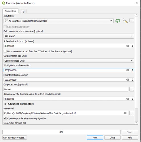
The newly created raster image will probably be displayed in uniform grey colour. To apply different colours for the corresponding values (generated by the shape area of each polygon) proceed as follows:
Open the Layer Properties.
Select Symbology.
Choose Render Type Singleband pseudocolor.
Select the Color ramp dropdown menu.
Select a color palette of your choice.
Click Apply.
Close the Layer Properties with OK, if the result looks similar to .
Figure 77. Symbolized raster image using five classes ranging from dark red (representing the county with the largest land area) to light red (representing counties with the smallest land area). In this case we set the Burn in Value to be ALAND which is the total area of the counties. Each pixel is symbolized using this value.
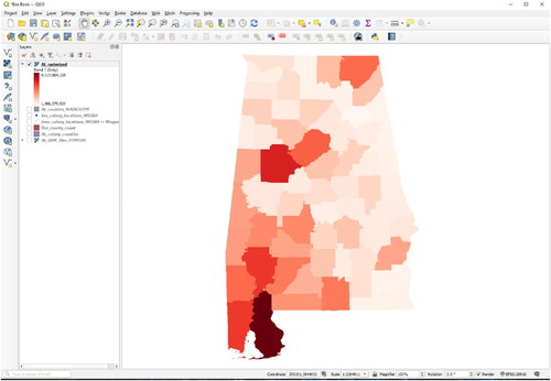
7.5.2. Raster to vector
As the name of this function suggests, a polygon layer will be created according to the different raster values (contrary to the function Contour demonstrated in “Contour” section, which creates a line vector layer based on raster grid values).
Go to Raster.
Select Conversion.
Choose Polygonize (Raster to vector).
Choose the newly created raster from the previous section (“Vector to raster” section) and convert it back to a vector file (so specify an output shapefile, see ).
Start the conversion by clicking OK.
Open the newly created shapefile.
Figure 78. Raster to vector conversion using QGIS.
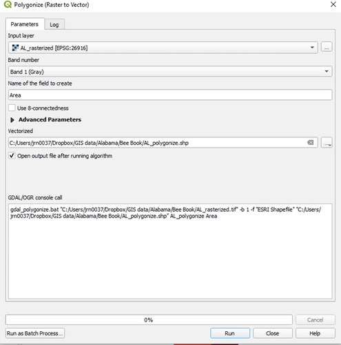
An attribute field containing the former raster values will be created.
Beside the fact that the geometry became coarser (the boundaries are no longer smooth), we see that many of the original attributes have been lost (e.g., as seen with the Identify tool or within the Attribute table).
7.5.3. Reproject data to a new coordinate reference system (CRS)
Sometimes, not only one raster file needs to be converted to another coordinate reference system, but a whole folder with many raster images. In this example, the AL_DEM_30m_will be projected to CRS NAD83State Plane Alabama East.
Go to Raster.
Select Projections.
Choose Warp (Reproject).
Select the input layer to be the AL_DEM_30m_UTM16N.
Specify both the Source and Target Coordinate Reference System (CRS).
Choose bilinear or cubic as Resampling method ().
Start the projection by clicking Run.
Figure 79. Project a raster dataset to a new target coordinate reference system (CRS).
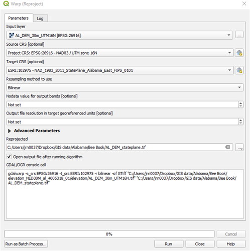
Depending on the type of the raster image values different Resampling methods should be used (e.g., nearest neighbour for categorized thematic data and bilinear or cubic for continuous data such as raster images like elevation models). In addition, it might be useful to define a value for pixels without data (so that they can be made transparent afterwards). Remove the newly reprojected raster from your map frame.
7.6. Basic vector tools
The standard tools for data processing and analysis provided by different GIS software have a similar appearance. All tools described in the following sections can be accessed by the main menu Vector > Geoprocessing Tools.
7.6.1. Buffer(s)
In QGIS, the Buffer tool can be accessed in the following way (see “Buffer(s)” section for a description of the tool):
Go to Vector.
Select Geoprocessing Tools.
Choose Buffer.
Select a realistic Distance for honey bees (e.g., 2000 meters).
Leave the dissolve result blank (otherwise all buffers will be aggregated to one single feature without the different attributes, see ).
Specify the path and name for the destination file.
Click Run.
Figure 80. Adding a buffer of 2000 m to the honey bee colonies locations.
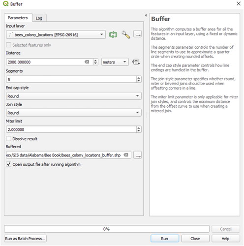
One should consider the use of the buffer function may lead to topologically incorrect vector files, e.g., when the distances between the features of origin are closer than the double buffer radius, leading to overlaps between different features. The circle polygons created in this step are visible in .
7.6.2. Clip
See “Clip” section, for a description of the Clip tool. As an example, the clip operation could be performed between the honey bee locations and the counties of Alabama.
Activate the layer AL_counties_NAD83UTM.shp in the Map Legend.
First select the polygon that represents the county containing Auburn (“COUNTYFP” = 081) with an appropriate selection tool (see “Data selection and editing” section).
Go to Vector.
Select Geoprocessing Tools.
Choose Clip.
Choose the point layer containing the honey bee colony locations as Input layer and the county layer as Overlay layer.
Make sure that the checkbox the Input Vector Layer Selected features only (with this the operation could be performed on a selection of features only) remains blank (there is no selection), and that the one for the Selected features only Overlay Layer (beneath) is checked ().
Launch the Clip operation by clicking Run.
Click YES to confirm loading the newly created vector layer (containing only 6 points) to the project.
Figure 81. Clip the honey bee locations to the boundaries of Lee County.
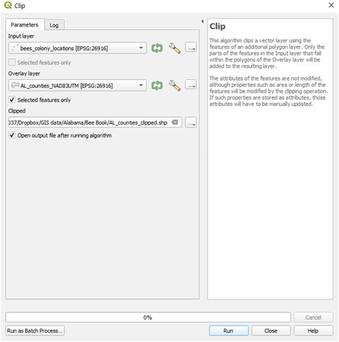
7.6.3. Intersect
Identically to ArcGIS, the intersect operation in QGIS computes a geometric overlap of two layers. This can be best demonstrated by the use of two polygon layers with different geometries:
Go to Vector.
Select Geoprocessing Tools.
Choose Intersection.
Choose the newly created buffer layer as Input layer.
Leave the checkbox beneath Use only selected features blank.
Select the layer AL_counties_NAD83UTM.shp (where Lee County should still be selected).
Check Selected features only of this layer of the city of Fribourg ().
Click Run.
Figure 82. Using the Intersect Tool, overlapping areas are written to the resulting layer (the attributes of both original layers will be preserved).
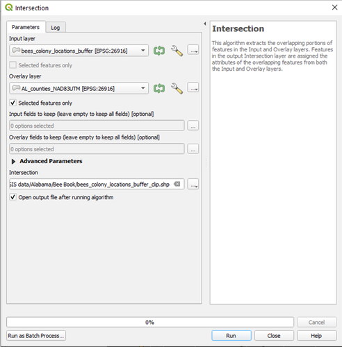
The new layer contains only the common area of the two polygons (the geometry of the buffer within Lee County).
7.6.4. Dissolve
In “Select by attributes” section, a definition query was set from the polygon layer representing different counties within the state of Alabama. To aggregate all features that contain the same attribute “STATEFP” by producing a vector layer of all counties, the Dissolve function is a good option (see “Dissolve” section. for further explanation about the dissolve tool):
Open the Filter for the county layer you want to use by right-clicking.
Make sure that no restriction is made within the SQL “where clause” (If you use the layer commune_boundary_FR.shp, delete the entry "COUNTYFP" = 081 OR “COUNTYFP” = 123, if this still exists).
Confirm with OK.
Go to Vector.
Select Geoprocessing Tools.
Choose Dissolve.
Locate the layer AL_counties_NAD83UTM.shp as Input vector layer.
Leave the checkbox Selected features only blank (with this the operation could be performed on a selection of features only, but in our case no selection has to be applied).
Select an attribute (e.g., “STATEFP”) as Dissolve field.
Choose a path and name for the destination file to be created ().
Finish by clicking Run.
Now the whole state of Alabama is selectable at once (representing only one line within the Attribute Table). What happened to the attributes? – Of course, some of the attributes are no longer thematically correct: the dissolve function allocates the attributes from the first line of each value that was aggregated. What we are left with is a single feature representing all of Alabama. The display of the new layers can be improved:
Open the Layer Properties for AL_counties_NAD83UTM layer.
Select Style.
Set a categorized symbol style with different fill colours for all counties (by using the column “COUNTYFP”).
Choose a colour ramp.
Click Classify.
Apply the changes.
Open Layer Properties for your dissolved county layer.
Use an outline only to symbolize this layer.
Apply changes.
Close the Layer Properties dialog by clicking OK.
The result will look similar to when zoomed in.
Figure 83. Dissolving polygons by the attribute “STATEFP”: The new layer will contain aggregated polygons based on this attribute.
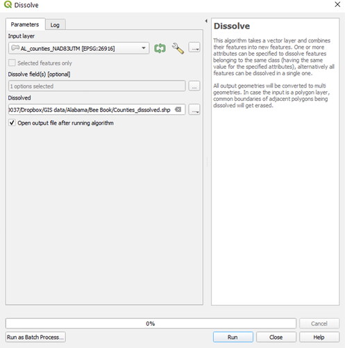
Figure 84. After applying the Dissolve tool, the polygon layer is transformed into a state outline (Blue). The white circles were created using a radial buffer of 2000 m around of all the honey bee colony locations.
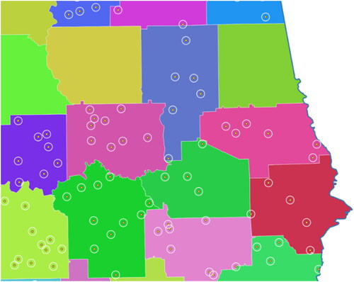
7.6.5. Union
In QGIS the Union tool can be found within Vector > Geoprocessing Tools > Union (see “Union” section for an explanation of the Union function).
7.6.6. Join attributes by location
In “Spatial query and select by location” section, spatial queries were performed. In a similar manner, different layers and their features can also be spatially linked to each other, e.g., to relate thematic data to known coordinates or geometries:
Go to Vector.
Select Data Management Tools.
Choose Join Attributes by Location.
Select a base layer (e.g., bees_colony_locations.shp) and a Join Layer (where the attributes are taken from, e.g., AL_counties_NAD83UTM.shp).
Select the join Type "Take attributes of the first matching feature only (one-to-one)”. This associates each point with the attributes of the county in which it falls.
Set the path and name for the destination shapefile ().
Click Run.
Figure 85. Attributes of a given layer can be attached to another by the use of a spatial join.
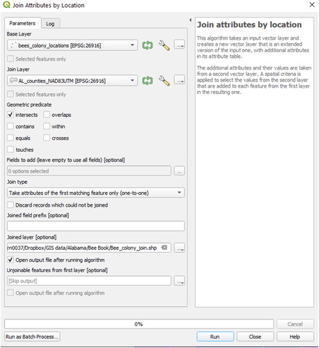
Within the Attribute table of the new shapefile, the attributes of the county layer will be added to each Bee colony point.
7.6.7. Basic statistics, list unique values
Especially for large vector data files containing a variety of attribute fields and features, it can be useful to display some statistical information before performing calculations with these attribute values.
To display basic statistics based on attributes,
Go to Vector.
Select Analysis Tools.
Choose Basic Statistics for Fields.
Any vector layer can be chosen within the QGIS project as Input Vector Layer.
Select a Field to calculate statistics on, where the statistics (mean value, standard deviation, sum, minimum, maximum etc.) should be performed.
Click Run ().
The result will be displayed in the tool processing window under the Log tab.
Figure 86. Basic statistics of a specific vector layer attribute field.
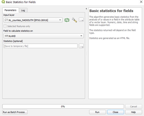
Sometimes the total number of attribute values within a given field are not important, but the different values themselves are:
Go to Vector.
Choose Analysis Tools.
Select List Unique Values.
Select a target vector layer and an attribute field.
Click Run to perform the calculation.
It is possible to export the values to the clipboard if they are used in another program (e.g., calculation spread sheet or text editor).
7.7. Basic raster tools
In the following section, some basic raster functionalities in QGIS will be discussed.
7.7.1. Merge
The Merge function is similar to the mosaic tool of ArcGIS Pro, where several raster layers and files can be combined to a new raster dataset (see “Mosaic” section for more information).
Go to Raster.
Select Miscellaneous.
Choose Merge.
Select the Input layers (or even a whole directory).
Create one single output raster file in a destination folder.
Enable the lowermost checkbox so that the new raster image will be added directly to the project.
Click Run to generate a new raster dataset.
7.7.2. Terrain analysis
Beneath the elevation information itself, DEMs can serve as a source of data for various terrain analysis operations to calculate geometrical properties (e.g., slope or aspect) and other derivatives (e.g., clear sky factor). All functions for terrain analysis are accessible by the menu Raster > Analysis. In some cases, these functions are also useful for analysis or visualisation of thematic raster data.
7.7.2.1. Slope
The Slope tool calculates the slope angle of each raster cell in degrees.
To calculate the slope of the terrain ():
Figure 87. Calculating slope with QGIS.
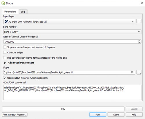
Go to Raster.
Select Analysis.
Choose Slope.
Choose the DEM as the Input layer.
Browse for a destination path and save the output raster as “AL_slope”.
Click Run.
Adapt the raster symbolization if necessary (Layer Properties > Symbol).
7.7.2.2. Aspect
The Aspect (Analysis) tool uses a DEM to calculate the direction in which slopes are facing (see “Aspect” section for more information). To calculate the aspect based on a DEM:
Go to Raster.
Select Analysis.
Choose Aspect.
Select the DEM as the Input layer.
Browse for a destination path to save the output raster as “AL_aspect.tif”.
Some optional settings can be activated or deactivated in the checkboxes, to make flat areas (that do not have a valid aspect value by default) zero values, for instance. See for this setting.
Click Run.
Adapt the raster symbolization if necessary (Layer Properties > Symbol).
Figure 88. Calculating aspect with QGIS.
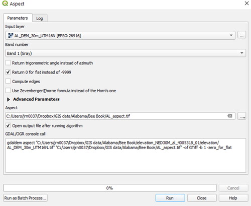
7.7.2.3. Hillshade
Hillshade rasters are useful for determining which areas on the terrain are shaded from the sun and which are not and are calculated from a DEM (see “Hillshade” section) for further information about the tool.
To calculate the hillshade based on a DEM:
Go to Raster.
Select Analysis.
Choose Hillshade.
Select the DEM as the Input layer.
Specify an output (raster) layer.
Choose reasonable values for the horizontal and vertical angle of the illumination (in degrees), the Z factor can usually stay at 1 (otherwise the terrain will be super-elevated when working in a CRS). The Altitude of the light can also be changed. Here we accept the default value of 55.
Click Run.
Adapt the raster symbolization if necessary (Layer Properties > Symbology, notice that the results are shown in degrees ()).
Figure 89. Hillshade tool to create shaded relief rasters based on a DEM.
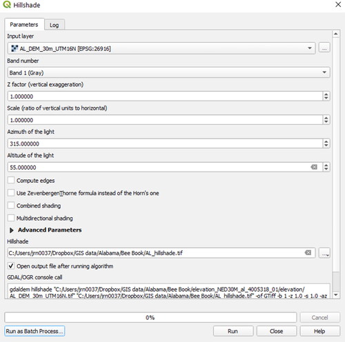
7.7.2.4. Contour
This function generates an output vector file containing elevation levels (contour lines) from an input raster (see “Contour” section for more information). To create contours from a DEM:
Go to Raster.
Select Extraction.
Choose Contour.
Specify the Input Layer and the output vector file.
Choose an appropriate interval between the different contours (e.g., 100 meters) and accept the default name for the attribute name for the elevation field ().
Click Run.
Load the resulting vector layer into QGIS.
Figure 90. Compute elevation levels (isolines) based on a digital elevation model using the Contour function.
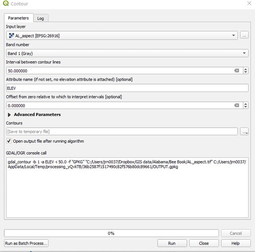
To achieve better results for visualisation, a smoothing algorithm could be performed on the line feature, e.g., with the tool Simplify (Vector > Geometry Tools > Simplify) or the Generalizer plugin (Vector > Generalizer).
Contour lines can also be created by the Contour plugin that provides some more options (e.g., minimal and maximal height). After the installation (see “Plugins” section) it can be started in the menu Vector > Contour.
7.7.3. Raster calculator
The raster calculator is a very flexible and useful tool to combine raster images with conditional and trigonometric expressions and any other task that requires raster math operations. It can be found within the menu Raster > Raster Calculator. The formula “"AL_DEM_30m_UTM16N@1" * 3.28084” would convert the elevation data in the DEM from meters into feet by creating a new raster image (with an elevation range from −45.14 to 2,210.12 feet).
7.8. Spatial statistics and scientific modelling
QGIS provides several tools for spatial statistics and interfaces to statistical software like R (http://www.r-project.org). This section demonstrates some introductory examples of how statistics of spatially related data can be processed, as well as suggestions for useful plugins and software to perform more sophisticated spatial analysis. If you search for a specific application linked to spatial statistics, browse through the QGIS Plugins (see “Plugins” section) and have also a look at the projects and their features listed on the OSGEO website (http://www.osgeo.org). A more general introduction to statistics in honey bee research is provided in the BEEBOOK paper on statistics (Pirk et al., Citation2013).
7.8.1. Example 1: computing mean coordinates
A very basic analysis could be to compute the mean coordinates of the honey bee locations. Of course, this could be done by computing the X and Y coordinates into an attribute first, but now we will use the tool mean coordinate(s):
Go to Vector.
Select Analysis Tools.
Choose Mean Coordinate(s).
Select the Input layer (e.g., bees_colony_locations.shp).
Specify the output shapefile as colony_mean_coords.shp ().
Start the calculation with Run.
Figure 91. Compute mean coordinates from a point vector layer.
The new shapefile will contain one point at the coordinates 507577.297/3629956.457.
7.8.2. Example 2: nearest Neighbour Analysis and Distance matrix
Is the spatial distribution of our honey bee colonies dispersed or clustered? – The level of clustering in a point vector layer can be assessed by Nearest Neighbour Statistics (Analysis tools):
Go to Vector.
Select Analysis Tools.
Choose Nearest Neighbour Analysis.
Select the Input layer representing the bee’s locations.
Click Run to view the result. You can also find the associated html file containing the results by clicking on the link in the Results Viewer window ().
Figure 92. Output log from the point clustering nearest neighbour analysis.
In this case, the observed mean distance between nearest neighbours is 8010.86 meters. With an expected value of 9030.37, a z-score of −4.79, and a nearest neighbour index (NN_Index) of .88 the distribution of points is significantly clustered.
If the distances between different points (or groups of points) are of interest, the Distance Matrix function can be useful:
Go to Vector.
Select Analysis Tools.
Choose Distance Matrix.
Select the bees_colony_locations.shp as both Input and Target point layer.
Select the field ID as unique field ().
This function could also be performed using two different point layers or using the same layer but different ID fields.
Click Run to perform the calculation and view the result.
Figure 93. Generating a distance matrix between point vector layer(s).
The resulting delimited text file contains a list of all point combinations and the distance (computed in map units, thus meters in our example) in-between these points. In case of our honey bee locations, the maximal distance (528.17 kilometres) is between the honey bee colony Nr. 181 and 294, the minimal distance is only 815.21 meters (between ID 144 and 219).
7.8.3. Example 3: computing intersections between a DEM and planes
GIS is very useful for applications in natural sciences and a variety of tools are provided, e.g., for visibility analysis or to delimit watersheds, calculate flow paths, or even simulate natural hazards. This example demonstrates a very specific function, based on the qgSurf plugin for QGIS:
Load and activate the plugin qgSurf (see “Plugins” section).
Go to Plugins.
Select qgSurf then select DEM-Plane intersection.
Select the AL_DEM_30m_UTM16N_clip_resamp from the data folder. The plugin performs better with smaller DEM datasets. Choose source point for the plane (e.g., around Auburn 649546.29/3604795.57/184.76).
Play around with the values for orientation and inclination of the plane and calculate the intersections ().
Save the output as point or line shapefile.
Figure 94. Spatial analysis computing the intersection between a DEM and an inclined plane with the QGIS plugin qgSurf.
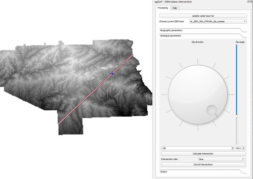
To analyse spatially related processes in more detail or for modelling, functions within GRASS GIS (http://grass.osgeo.org, Neteler & Mitasova, Citation2008) or SAGA (http://www.saga-gis.org) can be useful. In the latest versions of QGIS these come as core functionality.
7.9. Case study – zonal statistics with land cover properties
Until now, several concepts and tools in QGIS have been introduced. Now, to combine some of the different tasks discussed, a case study will be presented. Within this short case study, geostatistical relationships between honey bee colonies and land cover properties will be calculated. The content of this case study is equal to the one for ArcGIS (see “Case study – zonal statistics with land cover properties” section) but adapted to the tools of QGIS. The prerequisites for this case study include an opened QGIS project (see “Setting a coordinate system and saving the new QGIS project (*.qgs)” and “Importing vector and raster data” sections) with a point vector layer (e.g., the honey bee colony locations bees_colony_locations.shp, created in “Add delimited text layer (*.txt, *.csv)” section) and a buffer polygon layer (e.g., bees_colony_locations_buffer.shp, created in “Buffer(s)” section).
First, we need land cover information for the region around Auburn. If you have already downloaded the landcover dataset for the ArcGIS case study (see “Case study – zonal statistics with land cover properties” section), skip the following paragraph and continue with step 4.
Unzip the dataset land_use_land_cover.zip located in the QGIS data folder.
Unzip the file folder with a file archiving program of your choice (if you need additional software for this task, the program “7-zip” is a good choice: www.7-zip.org) into your QGIS working directory (e.g., “BeeBook_data”).
Navigate to the raster nlcd_al_utm16.tif in QGIS Browser to open file in your map. Open the layer properties and inspect the layer information ().
From step 3 you see that the landcover dataset is a 1 band raster dataset with 8-bit unsigned integer values (that correspond to different land cover categories) at 30 m horizontal resolution. Because it covers all of Alabama, the raster is quite big, and the rendering on the screen may take some time. We will improve the performance by clipping to an extent of interest (Lee County).
The raster covers all of Alabama, so we will now clip it to the extent of interest.
With the layer AL_count_NAD83UTM open in the map viewer, select Lee County using one of the methods previously covered.
Open Raster.
Select Clip Raster by Mask Layer.
Select nlcd_al_utm16.tif as Input layer.
Use AL_counties_NAD83UTM as the Mask Layer. Make sure the box for Selected features only is checked.
Set the CRS for target and source as NAD83/UTM zone 16N.
Accept the other defaults.
Choose “AL_landcover_clip.tif” as Clipped (mask) name ().
Click Run to start the clipping process.
After the clipping has finished, remove the big landcover layer from the Map Legend.
The result should then look similar to .
The layer AL_landcover_clip.tif is now quite handy for our purpose, but so far, we do not know for what the numbers (raster values) stand for (see ). Luckily, a colour map is provided with the dataset and can be loaded into QGIS (similar to the ArcGIS layer file, see “Layer to KML and import to Google earth” section):
Double-click on the layer AL_landcover_clip in the Map Legend to open its Layer Properties.
Navigate to the Symbology Menu and Click the Style button at the bottom of the window. Select Load Style
 .
.Navigate to the folder that you have unzipped in step 2 (e.g., land_use_land_cover), select the file nlcd.qml file and click Open.
Click Apply (see ) and close the Layer Properties with OK.
In the following tasks we will make use of the landcover values corresponding to each landcover type. Let’s now perform some statistical analysis using this data.
Open the menu Raster > Raster Calculator.
Combine Raster bands and Operators until the Raster Calculator expression equals “"AL_landcover_clip@1 = 81” (81 is the raster value for “pasture/hay in the landcover dataset).
Specify an Output layer, e.g., AL_class81.tif.
Activate the Raster band AL_landcover_clip@1 again and click Current layer extent to make sure that the output layer has the same extent as the source.
Verify that the parameters are set according to and click OK to start the calculation.
Double-click on the new greyscale Layer AL_class81 to open the Layer Properties > Symbology.
Expand the Min/Max Value setting dialog. Select Min/Max radio button and Check Estimate (faster) for the Accuracy setting and Stretch to MinMax in the Contrast enhancement (see “Importing vector and raster data” section).
Click Apply to make the layer styling effective and close the Layer Properties dialog with OK.
Repeat steps 29 to 36 with the following raster values: 41 (Deciduous forest) and 42 (Evergreen forest).
The newly created raster images contain zones with the value 1 (where the Raster calculator expression was true) and 0, where the expression was false. This binary classification can now be used to make a little statistical analysis of the land cover within any polygon layer, e.g., the honey bee colony buffers that we clipped to match the extent of Lee County (7.6.2):
Open the menu Processing > Toolbox. Expand the Raster Analysis toolbox and select Zonal statistics.
Choose the clipped bee colony buffer layer as the Input layer.
Choose one of the newly created binary raster images (e.g., AL_class81.tif) as input Raster layer.
Select the type of statistics you would like to compute. The default is count, sum and mean, but feel free to add others. Choose an appropriate Output column prefix (e.g., the land cover class “81”)
Click OK.
Repeat steps 38 to 41 for the other input rasters (choosing appropriate filenames for the results, see ).
Three new shapefiles should be added to the map, each containing the statistics of the underlying land cover.
Opening the attribute table of the new zonal statistics layers you see new fields at the end. For example, the field “42mean” represents the average percentage of the land cover category “Deciduous Forest” within the respective buffer (honey bee colony). The proportion of these land cover categories can be used for any symbolisation and vector calculation, but also visualized within a simple chart:
Open the Processing Toolbox.
Expand the Plots toolbox and select Vector Layer scatterplot
Select one of the zonal statistics layers.
Set the attribute fields for the X and Y axis you want to display (e.g., the ID for X and a land cover percentage for Y).
Select Run.
This will produce an interactive HTML file that displays the mean landcover value for each buffer (see ).
If you want, you can save the chart as picture file.
Although we have used the build in Plots toolbox, plugins may also be used to increase functionality. Data Plotly is one plugin with expanded abilities to customize your charts.
Within most of the honey bee colony buffers there are also other land cover categories and for visualisation purpose (see map creation in “Map creation” section) we must calculate the remaining area covered, e.g., by urban area or water and join all these attributes to the original point layer bees_colony_locations.shp. To do this:
Right-click on bees_colony_locations_buffer_clip.shp in the Map Legend > Properties.
Select the Join option on the left of the window.
We need to combine the results from the zonal stats into a single layer. To do this, press the “+” button at the bottom of the window.
Select AL_class_41 as the join layer. Use ID as both the Join Field and the Target Field.
Check the box for Joined fields and select 41mean.
Press OK and a new join will be added to the buffer layer. Repeat the previous steps for the two other zonal statistics layers ().
Press OK.
Open up the buffer layer attribute table. Three new columns should be added to the end containing the percent landcover of each type within each buffer.
Next, toggle on the editing mode
 .
.Open the Field Calculator
 .
.Make sure the checkbox “Create a new field” is activated and specify an Output field name (e.g., “other”).
Change the Output field type to decimal.
Increase the Precision to 3.
Combine the Attribute Fields and Values and different operators so that the resulting Expression equals 1-("42mean"+"24mean"+"81mean") (see ).
Click OK to perform the calculation.
Repeat steps 51 to 56 and add a new field (type decimal) called “sum” that summarizes all 3 land use categories 42, 24 and 81 (the Expression should equal 42mean"+"24mean"+"81mean").
Toggle off the editing mode
 .
.Double-click on bees_colony_locations.shp in the Map Legend to open its Layer Properties.
Switch to the Joins menu ().
Click the + button
 to add a join to another vector layer.
Select bees_colony_locations_buffer_clip.shp as Join layer
Make sure the Join and Target fields are set to their identifier “ID”.
Leave unchecked both of the checkboxes and click OK.
Click OK to close the Layer Properties and add the buffer information to the point locations.
Figure 95. Raster information for the landcover dataset from Alabama.
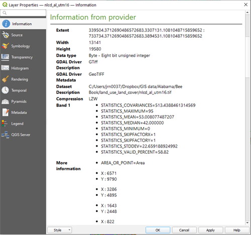
Figure 97. Intermediate result showing the counties and honey bee colonies on the Land Cover data set for the region within Lee County.
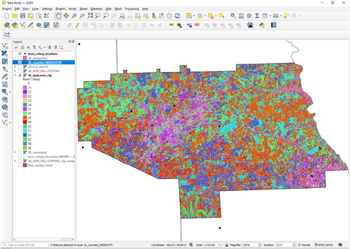
Figure 98. Setting the Colormap for the land cover data: for each integer value of the raster image a colour and a label is assigned.
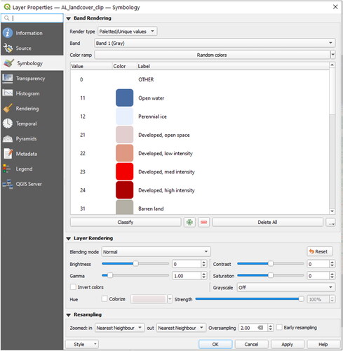
Figure 96. Clipping the Land Cover raster to the area of interest.
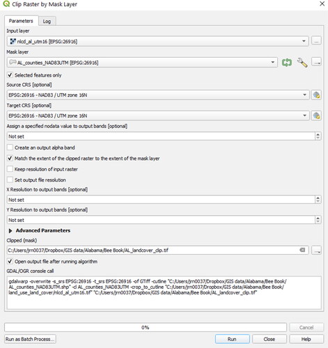
Figure 99. Separating bands of interest out of the Alabama Land Cover data set. The raster value 81 equals the land use category for “pasture/hay”.
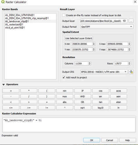
Figure 100. Performing zonal statistics from raster values based on a polygon vector layer.
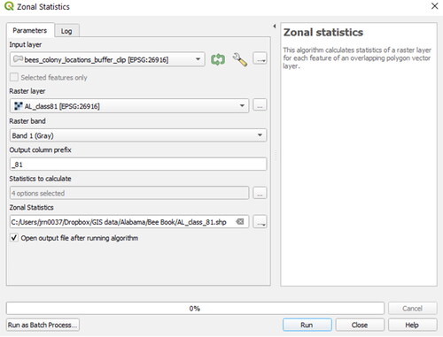
Figure 101. Visualising the percentage of different land cover categories within the honey bee buffers.
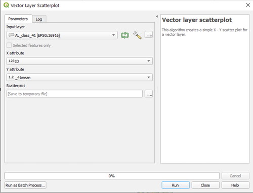
Figure 102. Calculate the percentage land use categories with the field calculator.
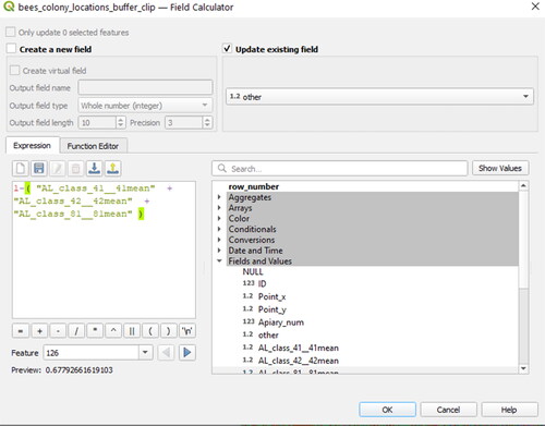
Figure 103. Join the zonal statistics output into the buffer layer.
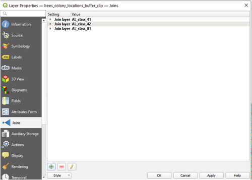
Congratulations, you have finished your first geo-statistical analysis with QGIS. The next section is about the creation of maps.
7.10. Map creation
Creating maps with QGIS is similar to the procedure with other GIS software like ArcGIS. This section collects the most important steps from managing geographic data to its visualisation (see “Data visualisation and map creation” section) and requires the results of the case study (see “Case study – zonal statistics with land cover properties” section).
7.10.1. Layer styling and labelling
Some basic settings in the Layer Properties for styling were already discussed in this tutorial (see “Layer organisation and navigation” and “Layer properties” sections). Based on this experience, we will look at some more techniques to visualise different geometry types and attribute information together:
Add the vector layer AL_counties_NAD83UTM.shp to the QGIS project (see “Importing vector and raster data” section).
Double-click this layer in the Map Legend to open the Layer Properties.
Select Symbology.
Use the top drop down menu to select Graduated instead of Single Symbol.
Choose a Value (e.g., “ALAND”).
Choose a number of Classes (e.g., 7), and the Mode “Natural Breaks (Jenks)”.
Choose colour ramp (e.g., “BuPu”).
Click Classify.
Click Apply (the Layer Properties can stay open).
As an intermediate result, all polygons (representing different municipalities) are filled with a colour from the chosen spectrum corresponding to the chosen attribute (e.g., “ALAND”). This is already a good start, but perhaps the map should also provide the names of the counties?
Switch to the Label tab ().
Activate the checkbox to display Single Labels.
Choose a Value that should be displayed (e.g., “NAME”).
Feel free to adjust font size and colour or the placement options below.
Click OK.
Activate and select the layer “bees_colony_locations_buffer_clip.shp” created in “Buffer(s)” section.
Place it at least one level higher than the county layer.
Open again the Layer Properties for the colony location buffer layer.
Select the Symbology tab.
Click the button Change.
Choose Fill: Simple Fill as Symbol layer type.
Select a dark Color (e.g., black), a Stroke width of about 0.25 and Dot Line as Stroke style. Confirm with OK.
Set the Opacity to about 30%.
Close the Layer Properties of bees_colony_locations_buffer_clip.shp.
Move the layer bees_colony_locations.shp on top of the Map Legend and open its Layer Properties.
Not only do colors and attributes matter for the visualisation of spatial data but also size. To demonstrate this, select Graduated from the top drop-down menu. Select the drop down for Method and select size. Select an attribute to scale the symbols by using the drop down for Value (e.g., “sum”).
Adjust the Size From to reach a good result on the Map View. The honey bee point symbols should now be of different sizes depends on the value for “sum”.
Switch to tab Diagrams ().
From the drop down menu at the top, choose Pie chart.
Set the Fixed size to about 8 mm, the Placement Around Centroid with a Distance of 6.
Now add some content for the pie charts: Use the Button
 to add the fields 41mean, 42mean, 81mean and other (see “Case study – zonal statistics with land cover properties” section). The colours can be adjusted by double-clicking on the coloured bar.
Make the changes permanent by clicking Apply and close the Layer Properties with OK.
Save the QGIS project (and all the layer styling you have done so far) by the menu File > Save.
Figure 104. Setting labels based on attributes.
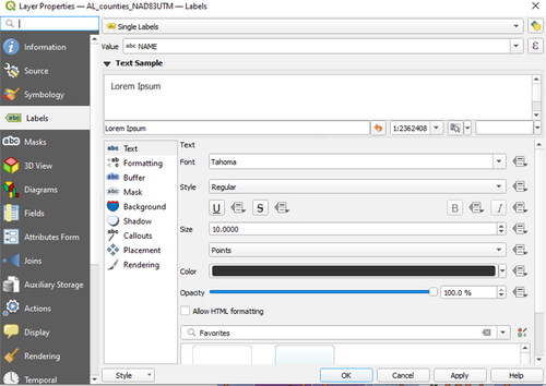
Figure 105. Creating diagrams based on layer attributes.
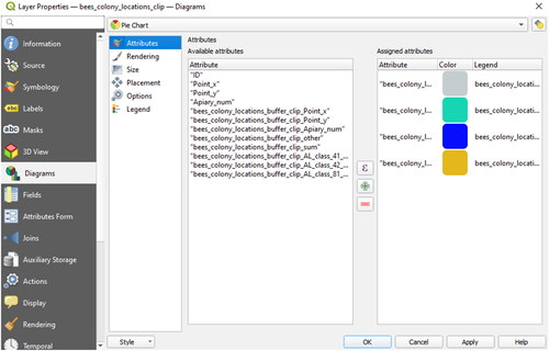
The result () is already a good start for a first visualization of geodata and it will serve as an example for the next paragraphs describing map creation functions.
Figure 106. Map view after changing layer style properties and labelling options.
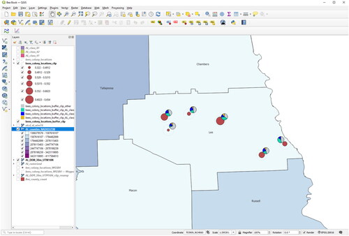
In some cases, it makes sense to save the layer symbology not only within a project, but also for different layers. This can be done layer by layer at the bottom of the Layer Properties dialog (see ) using the drop down for Style at the very bottom of the window. This will safeguard all styling information in a *.qml-file. You can import these styles later into other projects, and apply the styles to more layers (Layer Properties > Load Style) – so this is probably the most important time-saver for larger mapping projects within QGIS.
7.10.2. Print composer
The Print Layout is the main mapping program within QGIS, equivalent to the layout view of ArcGIS (see “Symbology” section).
Click Project.
Select New Print Layout.
Enter a title for the new layout.
Click OK, and a new window opens.
Select Add Items in the top toolbar.
Choose Add Map.
Draw a rectangle to the map canvas below to define the map position and size.
Within the Item Properties to the right, you can now see the dimensions and the scale of your map. To get familiar with the Print Layout (), look at all the buttons on top and try to:
Figure 107. The QGIS print composer.
Move or change the map extent using the Select/Move Item button
Move the map content within the frame with the Move Item button
Save the current map as template using the button
 .
.
A map like this may be suitable for certain tasks, but it is not complete. In the next section, it will be shown how additional map elements can be added.
7.10.3. North arrow, scale bar, legend, title, labels
The final map should provide information about the map scale and orientation and explain the map content. Let’s now add the most common map elements using the QGIS Print Composer:
Open the menu Add Item.
Choose Add North Arrow and click somewhere on the map canvas (all items can be moved afterwards).
Now add a scale bar (Add Item> Add Scalebar) and click somewhere on the map. A basic scale bar will show up and within the Item Properties the unit label must be defined (e.g., mi or miles). There are a lot of other optional settings.
Up to now we have no information about the different map elements shown, so we add a map legend. Go to Add Item.
Select Add Legend, click somewhere on the map canvas and customize the items listed.
The names of the different layers can be changed in QGIS desktop by a right clicking on the Map Legend and selecting Item Properties.
In the window, deselect “Auto Update” Double click on a legend item. The layer properties dialog will open and provides the ability to change the legend item names.
A map needs a title, or sometimes additional labels to explain some features. Go to Add Item.
Click Add Label and place it on top of the map. Labels and legend items can also be formatted and changed within the Item Properties Panel. Title your map with something informative.
Last but not least, try to also add a grid according to the CRS used (in this case it is metric, UTM 16N). Click with the Item selection tool on the map frame and locate within the Item Properties the drop down for Grid.
Select the + sign to add a new Grid. Select Modify Grid and the experiment with the settings. Specify a X and a Y interval (e.g., the interval the grid will be placed at in map units, start with 10,000). At the end, the map should look similar to .
Save the template again and be proud of your first map made with QGIS!
Figure 108. Final map with title, legend, north arrow, scale and coordinate grid in the QGIS print layout.
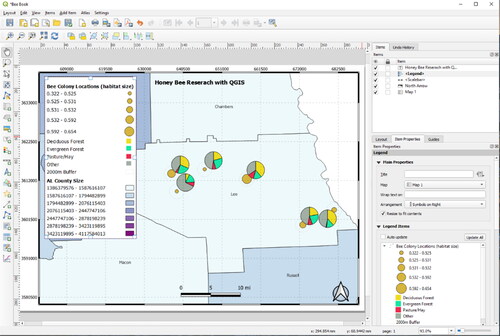
7.10.4. Exporting a map
Maps can be exported from the QGIS Print Composer in different ways:
In most cases the aim will be to create a printable PDF file. Go to Layout and select Export as PDF. By default, the settings should be already in the range for good printing results.
For special map dimensions or to change the resolution settings, go to the Layout tab beside the Item Properties.
Of course, a map can also directly be sent to a printer device (Layout> Print).
For a special purpose it might make sense to export a map to a vector or raster image. The two corresponding functions are File > Export as SVG > Export as Image, respectively.
7.10.5. Cloud mapping and sharing maps online
By the means of the QGIS Cloud plugin (see “Plugins” section and ) developed by Sourcepole (http://www.qgiscloud.com), users can easily publish their own maps directly from QGIS desktop to a PostGIS 2.0 database within a cloud online storage. There are also many other ways to share geodata and maps produced by open-source GIS using Web Map (WMS) and Feature Services (WFS), for example by the means of the open-source projects OpenLayers, MapServer or degree. The official website of the Open Source Geospatial Foundation (OSGEO, http://www.osgeo.org) provides a good overview about the different projects and their technical capabilities.
8. Future perspectives
The main purpose of the paper was to stimulate spatial thinking in honey bee research by introducing the basic principles and methods of GIS. With an introduction to the basics of GIS, we hope that more honey bee researchers will build on techniques already developed in the non-managed bee domain and discover new geospatial methods for exploring the relationships between honey bees and their environment. As of now, relatively few honey bee researchers have studied the effects of how environmental characteristics and mechanisms have affected honey bee health, abundance, and honey production (Berardinelli & Vedova, Citation2004; Henry et al., Citation2012; Naug, Citation2009). Because of the recent colony losses in many parts of the world (Carreck & Neumann, Citation2010; Williams et al., Citation2010), it is important to mechanistically study and attempt to discover new factors which directly and indirectly affect honey bee populations (Insolia et al., Citation2022; Overturf et al., Citation2022; Naug, Citation2009) from both broad and local scales.
GIS and spatial analyses have been used to make great progress in regard to studying the effects of landscape characteristics in research about non-managed bees (Arthur et al., Citation2010; Biesmeijer et al., Citation2006; Chifflet et al., Citation2011; Choi et al., Citation2012; Fitzpatrick et al., Citation2007; Giannini et al., Citation2012; Kremen et al., Citation2002; Kremen et al., Citation2004; Watson et al., Citation2011; Williams et al., Citation2012). Various researchers have looked at the links between land cover properties and their effects on bees using satellite imagery to perform land cover classifications (Arthur et al., Citation2010; Kremen et al., Citation2004) and aerial imagery to quantify land cover properties (Watson et al., Citation2011) using GIS. Positive correlations were established between non-managed bees and their surrounding landscapes, perhaps most notably the link between wooded areas and the increase in bee populations and abundance. In terms of climate, Giannini et al. (Citation2012) have used GIS to help reveal that non-managed bee populations are decreasing because of a changing climate and are projected to continue to decline in the future due to the loss of suitable habitats.
Because of the obvious similarities between non-managed bees and honey bees, it is assumed that similar relationships will be found between honey bees and their surrounding landscapes and changing climate. Naug (Citation2009) was one of the first to use GIS to test the effects of land cover changes on honey bee colony health and productivity. By looking at the effects of nutritional stress due to habitat loss in the U.S.A., Naug (Citation2009) established that the relative extent of open land area is an important predictor of colony losses, and that states with the largest open area proportions had higher honey yields, meaning that their honey bees were more productive. It is necessary to study these types of relationships from a broad scale to get a better general understanding of the overall processes linking honey bees to the surrounding environments. Research of this type can and should be expanded upon to explore more specific geographic regions as well as local scales. Climate research, similar to the work by Giannini et al. (Citation2012), can also be conducted in GIS to study not only its effects on honey bees directly, but how changes in climate affect honey bee pathogens.
In conclusion, there are numerous opportunities for expanding geospatial analyses in the honey bee domain and we hope that this paper will motivate and stimulate spatial thinking for researchers.
Acknowledgements
The COLOSS (Prevention of honey bee COlony LOSSes) Association aims to explain and prevent massive honey bee colony losses. It was originally funded through the COST (European Cooperation in Science and Technology) Action FA0803. The COLOSS Association is now supported by the Ricola Foundation – Nature & Culture.
We would like to acknowledge Swisstopo for the use of their data through a contract with the University of Fribourg for research purposes for the initial version of this paper (some of the figures have remained the same). We would also like to thank Robert Gipson for testing out the tutorials and providing feedback in the updated version of this document.
Disclosure statement
No potential conflict of interest was reported by the author(s).
References
- Arctur, D. K., & Zeiler, M. (2004). Designing geodatabases: Case studies in GIS data modeling (pp. 411). ESRI Press.
- Arthur, A. D., Li, J., Henry, S., & Cunningham, S. A. (2010). Influence of woody vegetation on pollinator densities in oilseed Brassica fields in an Australian temperate landscape. Basic and Applied Ecology, 11(5), 406–414. https://doi.org/10.1016/j.baae.2010.05.001
- Berardinelli, I., & Vedova, G. D. (2004). Use of GIS in the management of apiculture: Preliminary note. APOidea – Rivista Italiana di Apicoltura, 1(1), 31–36. http://agris.fao.org/agris-search/search/display.do?f=2007/IT/IT0639.xml
- Biesmeijer, J. C., Roberts, S. P. M., Reemer, M., Ohlemüller, R., Edwards, M., Peeters, T., Schaffers, A. P., Potts, S. G., Kleukers, R., Thomas, C. D., Settele, J., & Kunin, W. E. (2006). Parallel declines in pollinators and insect-pollinated plants in Britain and the Netherlands. Science (New York, N.Y.), 313(5785), 351–354.https://doi.org/10.1126/science.1127863
- Bonham-Carter, J. M. (1994). Geographic information systems for geoscientists: Modelling with GIS (pp. 420). Elsevier.
- Burrough, P. A., & Mcdonnell, R. A. (1998). Principles of geographical information systems (pp. 333). Oxford University Press.
- Calovi, M., Grozinger, C. M., Miller, D. A., & Goslee, S. C. (2021). Summer weather conditions influence winter survival of honey bees (Apis mellifera) in the northeastern United States. Scientific Reports, 11(1), 1553. https://doi.org/10.1038/s41598-021-81051-8
- Campbell, J. B. (2002). Introduction (3rd ed., pp. 621). Guilford Press.
- Campbell, J., & Shin, M. (2011). Essentials of geographic information systems—Open textbook library. Saylor. https://open.umn.edu/opentextbooks/textbooks/essentials-of-geographic-information-systems
- Carreck, N., & Neumann, P. (2010). Honey bee colony losses. Journal of Apicultural Research, 49(1), 1–6. https://doi.org/10.3896/IBRA.1.49.1.01
- Chifflet, R., Klein, E. K., Lavigne, C., Le Féon, V., Ricroch, A. E., Lecomte, J., & Vaissière, B. E. (2011). Spatial scale of insect-mediated pollen dispersal in oilseed rape in an open agricultural landscape. Journal of Applied Ecology, 48(3), 689–696. https://doi.org/10.1111/j.1365-2664.2010.01904.x
- Choi, M.-B., Kim, J.-K., & Lee, J.-W. (2012). Increase trend of social hymenoptera (wasps and honeybees) in urban areas, inferred from moving-out case by 119 rescue services in Seoul of South Korea. Entomological Research, 42(6), 308–319. https://doi.org/10.1111/j.1748-5967.2012.00472.x
- Conolly, J., & Lake, M. (2006). Geographical information systems in archaeology (pp. 338). Cambridge University Press.
- CORINE Land Cover. (2024, May 28). https://land.copernicus.eu/en/products/corine-land-cover
- De Smith. M. J., Goodchild, M. F., & Longley, P. A. (2007). Geospatial analysis: A comprehensive guide to principles. Techniques and software tools (pp. 418). Troubador Publishing.
- Douglas, M. R., Baisley, P., Soba, S., Kammerer, M., Lonsdorf, E. V., & Grozinger, C. M. (2022). Putting pesticides on the map for pollinator research and conservation. Scientific Data, 9(1), 571. https://doi.org/10.1038/s41597-022-01584-z
- Douglas, M. R., Sponsler, D. B., Lonsdorf, E. V., & Grozinger, C. M. (2020). County-level analysis reveals a rapidly shifting landscape of insecticide hazard to honey bees (Apis mellifera) on US farmland. Scientific Reports, 10(1), 797. https://doi.org/10.1038/s41598-019-57225-w
- Environmental Systems Research Institute (ESRI). (2013). www.esri.com.
- Fitzpatrick, Ú., Murray, T. E., Paxton, R. J., Breen, J., Cotton, D., Santorum, V., & Brown, M. J. F. (2007). Rarity and decline in bumblebees – A test of causes and correlates in the Irish fauna. Biological Conservation, 136(2), 185–194. https://doi.org/10.1016/j.biocon.2006.11.012
- Giannini, T. C., Acosta, A. L., Garófalo, C. A., Saraiva, A. M., Alves-DOS-Santos, I., & Imperatriz-Fonseca, V. L. (2012). Pollination services at risk: Bee habitats will decrease owing to climate change in Brazil. Ecological Modelling, 244, 127–131. https://doi.org/10.1016/j.ecolmodel.2012.06.035
- Hengl, T. (2011). A practical guide to geostatistical mapping. Lulu. https://www.lulu.com/shop/tomislav-hengl/a-practical-guide-to-geostatistical-mapping/ebook/product-17389015.html
- Henry, M., Fröchen, M., Maillet-Mezeray, J., Breyne, E., Allier, F., Odoux, J.-F., & Decourtye, A. (2012). Spatial autocorrelation in honeybee foraging activity reveals optimal focus scale for predicting agro-environmental scheme efficiency. Ecological Modelling, 225(0), 103–114. https://doi.org/10.1016/j.ecolmodel.2011.11.015
- Insolia, L., Molinari, R., Rogers, S. R., Williams, G. R., Chiaromonte, F., & Calovi, M. (2022). Honey bee colony loss linked to parasites, pesticides and extreme weather across the United States. Scientific Reports, 12(1), 20787. https://doi.org/10.1038/s41598-022-24946-4
- Jordan, A., Patch, H. M., Grozinger, C. M., & Khanna, V. (2021). Economic dependence and vulnerability of United States agricultural sector on insect-mediated pollination service. Environmental Science & Technology, 55(4), 2243–2253. https://doi.org/10.1021/acs.est.0c04786
- Kozak, K. H., Graham, C. H., & Wiens, J. J. (2008). Integrating GIS-based environmental data into evolutionary biology. Trends in Ecology & Evolution, 23(3), 141–148. https://doi.org/10.1016/j.tree.2008.02.001
- Kremen, C., Williams, N. M., Bugg, R. L., Fay, J. P., & Thorp, R. W. (2004). The area requirements of an ecosystem service: Crop pollination by native bee communities in California. Ecology Letters, 7(11), 1109–1119. https://doi.org/10.1111/j.1461-0248.2004.00662.x
- Kremen, C., Williams, N. M., & Thorp, R. W. (2002). Crop pollination from native bees at risk from agricultural intensification. Proceedings of the National Academy of Sciences of the United States of America, 99(26), 16812–16816. https://doi.org/10.1073/pnas.262413599
- Lee, J., & Wong, D. W. S. (2001). Statistical analysis with ArcView GIS (pp. 192). John Wiley & Sons.
- Longley, P., Goodchild, M. F., Maguire, D. J., Rhind, D. W. (eds.). (1999). Geographical information systems: Principles, techniques, applications and management (2nd ed., Vol. 1, pp. 580), Wiley.
- Naug, D. (2009). Nutritional stress due to habitat loss may explain recent honeybee colony collapses. Biological Conservation, 142(10), 2369–2372. https://doi.org/10.1016/j.biocon.2009.04.007
- Neteler, M., & Mitasova, H. (2008). Open Source GIS: A GRASS GIS approach. The International Series in Engineering and Computer Science (3rd ed., Vol. 773, pp. 406). Springer.
- Ochungo, P., Veldtman, R., Abdel-Rahman, E. M., Raina, S., Muli, E., & Landmann, T. (2021). Multi-sensor mapping of honey bee habitats and fragmentation in agro-ecological landscapes in Eastern Kenya. Geocarto International, 36(8), 839–860. https://doi.org/10.1080/10106049.2019.1629645
- Ormsby, T., Napoleon, E. J., Burke, R., Groessl, C., & Bowden, L. (2010). Getting to know ArcGIS: Desktop (pp. 584). ESRI Press.
- Overturf, K. A., Steinhauer, N., Molinari, R., Wilson, M. E., Watt, A. C., Cross, R. M., Vanengelsdorp, D., Williams, G. R., & Rogers, S. R. (2022). Winter weather predicts honey bee colony loss at the national scale. Ecological Indicators, 145, 109709. https://doi.org/10.1016/j.ecolind.2022.109709
- Pirk, C. W. W., De Miranda, J. R., Fries, I., Kramer, M., Murray, T., Paxton, R., Nazzi, F., Shutler, D., van der Steen, J. J. M., & van Dooremalen, C. (2013). Statistical guidelines for Apis mellifera research. In V. Dietemann, J. D. Ellis, & P. Neumann (Eds.), The COLOSS BEEBOOK, Volume I: standard methods for Apis mellifera research. Journal of Apicultural Research, 52(4). http://doi.org/10.3896/IBRA.1.52.4.13
- Pogodzinski, J. M., & Kos, R. M. (2012). Economic development and GIS (pp. 229). ESRI Press.
- QGIS Development Team. (2013). QGIS User Guide for Release 1.8.0., Licensed under the GNU Free Documentation License. http://docs.qgis.org/pdf/QGIS-1.8-UserGuide-en.pdf
- Quinlan, G. M., Miller, D. A. W., & Grozinger, C. M. (2023). Examining spatial and temporal drivers of pollinator nutritional resources: Evidence from five decades of honey bee colony productivity data. Environmental Research Letters, 18(11), 114018. https://doi.org/10.1088/1748-9326/acff0c
- Quinlan, G. M., Sponsler, D., Gaines-Day, H. R., Mcminn-Sauder, H. B. G., Otto, C. R. V., Smart, A. H., Colin, T., Gratton, C., Isaacs, R., Johnson, R., Milbrath, M. O., & Grozinger, C. M. (2022). Grassy–herbaceous land moderates regional climate effects on honey bee colonies in the Northcentral US. Environmental Research Letters, 17(6), 064036. https://doi.org/10.1088/1748-9326/ac7063
- Rajagopalan, K., Degrandi-Hoffman, G., Pruett, M., Jones, V. P., Corby-Harris, V., Pireaud, J., Curry, R., Hopkins, B., & Northfield, T. D. (2024). Warmer autumns and winters could reduce honey bee overwintering survival with potential risks for pollination services. Scientific Reports, 14(1), 5410. https://doi.org/10.1038/s41598-024-55327-8
- Richardson, R. T., Conflitti, I. M., Labuschagne, R. S., Hoover, S. E., Currie, R. W., Giovenazzo, P., Guarna, M. M., Pernal, S. F., Foster, L. J., & Zayed, A. (2023). Land use changes associated with declining honey bee health across temperate North America. Environmental Research Letters, 18(6), 064042. https://doi.org/10.1088/1748-9326/acd867
- Rigaux, P., Scholl, M. O., & Voisard, A. (2002). Spatial databases: With application to GIS (pp. 411). Morgan Kaufmann.
- Robinson, A. C., Peeler, J. L., Prestby, T., Goslee, S. C., Anton, K., & Grozinger, C. M. (2021). Beescape: Characterizing user needs for environmental decision support in beekeeping. Ecological Informatics, 64, 101366. https://doi.org/10.1016/j.ecoinf.2021.101366
- Rogers, S. R. & Staub, B. (2013). Standard use of Geographic Information System (GIS) techniques in honey bee research. In V. Dietemann, J. D. Ellis, & P. Neumann (Eds.), The COLOSS BEEBOOK, Volume I: standard methods for Apis mellifera research. Journal of Apicultural Research, 52(4). http://doi.org/10.3896/IBRA.1.52.4.08
- Schmandt, M. (2009). GIS commons: An introductory textbook on Geographic Information Systems. http://giscommons.org/
- Seeger, H. (1999). Spatial referencing and coordinate systems. In Longley, P., Goodchild, M. F., Maguire, D. J., & Rhind, D. W. (eds.), Geographical Information Systems: Principles, Techniques, Applications and Management (2nd ed., Vol. 1, pp. 427–436). Wiley.
- Snyder, J. P. (1987). Map projections – A working manual (pp. 410). United States Government Printing Office.
- Swisstopo. (2013). Federal office of topography. www.swisstopo.ch.
- Switanek, M., Crailsheim, K., Truhetz, H., & Brodschneider, R. (2017). Modelling seasonal effects of temperature and precipitation on honey bee winter mortality in a temperate climate. Science of the Total Environment, 579, 1581–1587. https://doi.org/10.1016/j.scitotenv.2016.11.178.
- Von Büren, R. S., Oehen, B., Kuhn, N. J., & Erler, S. (2019). High-resolution maps of Swiss apiaries and their applicability to study spatial distribution of bacterial honey bee brood diseases. PeerJ, 7, e6393. https://doi.org/10.7717/peerj.6393
- Wade, T., & Sommer, S. (2006). A to Z GIS: An illustrated dictionary of geographic information systems (pp. 268). ESRI Press.
- Watson, J. C., Wolf, A. T., & Ascher, J. S. (2011). Forested landscapes promote richness and abundance of native bees (Hymenoptera: Apoidea: Anthophila) in Wisconsin Apple Orchards. Environmental Entomology, 40(3), 621–632.https://doi.org/10.1603/EN10231
- Williams, N. M., Regetz, J., & Kremen, C. (2012). Landscape-scale resources promote colony growth but not reproductive performance of bumble bees. Ecology, 93(5), 1049–1058.https://doi.org/10.1890/11-1006.1
- Williams, G. R., Tarpy, D. R., Vanengelsdorp, D., Chauzat, M.-P., Cox-Foster, D. L., Delaplane, K. S., Neumann, P., Pettis, J. S., Rogers, R. E. L., & Shutler, D. (2010). Colony collapse disorder in context. BioEssays: News and Reviews in Molecular, Cellular and Developmental Biology, 32(10), 845–846.https://doi.org/10.1002/bies.201000075
- Wong, D. W. S., & Lee, J. (2005). Statistical analysis of Geographic Information with ArcView GIS and ArcGIS (pp. 446). Wiley.