
 ?Mathematical formulae have been encoded as MathML and are displayed in this HTML version using MathJax in order to improve their display. Uncheck the box to turn MathJax off. This feature requires Javascript. Click on a formula to zoom.
Abstract
Phase I or retrospective process monitoring plays a key part in an overall statistical process monitoring (SPM) regime and is increasingly emphasized in the recent literature. At present, a lot of the data in a variety of settings (public and private sector organizations) are collected individually and sequentially and thus are serially correlated (or autocorrelated). Though a reasonable amount of work is available in the control charting literature for prospective (Phase II) autocorrelated data monitoring, very little work exists for the retrospective phase (Phase I). In this article, we present a Shewhart-type control chart for Phase I monitoring of individual autocorrelated data, assuming normality, with estimated parameters. The methodology, while developed and presented for the first-order autoregressive (AR(1)) model for simplicity, may be adapted to more general time series models. The correct charting constants, adjusted for autocorrelation and parameter estimation, are derived, and tabulated for a nominal in-control (IC) false alarm probability (FAP). Simulation results show that the proposed chart is favorably IC FAP robust and effective for reasonably small sample sizes, moderate autocorrelation, and some model miss-specifications, compared to other approaches. An illustration using some public health data involving prescription fentanyl transactions is provided to show the potential for broader areas of applications of the proposed methodology. Along with a summary and recommendations, some future research areas are indicated. An R package is developed and made available for implementing the proposed methodology on demand.
1. Introduction
Statistical process monitoring (SPM) is commonly divided into two phases: Phase I, the retrospective phase, and Phase II, the prospective phase. In Phase I, often, historical (retrospective) data are collected, studied, and analyzed to glean information about the phenomenon of interest. The aim of this phase, sometimes referred to as the exploratory stage, is to better understand the process, establish process stability and detect outliers using a control chart while maintaining an acceptable overall rate of false alarms. Phase I control charts are often applied on a trial and error basis (Montgomery Citation2005) to flag and remove potential out of control (OOC) points, identify assignable causes, and take any corrective actions. This process continues with control limits being updated as necessary for the remaining data, until all plotted points fall within the control limits and display a random pattern. At this point, the process is declared to be in-control (IC) and the final set of data is called the reference or baseline data, which is then used to fit a parametric distribution and estimate any of its unknown parameters. In case a parametric distribution can’t be assumed, that is in the non-parametric case, the reference data can be used to estimate the underlying unknown distribution. With this initial phase completed, the control chart is deployed and prospective (new, incoming) data are monitored, sequentially, in Phase II. Chakraborti, Human, and Graham (Citation2008), Capizzi and Masarotto (Citation2013), (denoted CM), Jones-Farmer et al. (Citation2014), Chakraborti and Graham (Citation2019b) and others have discussed the importance and utility of a Phase I analysis, where control charts play an important role. In fact, Jones-Farmer et al. (Citation2014) stated that “In some cases, the process knowledge and resulting process improvement from a Phase I analysis is sufficient and there may be no need for on-going Phase II monitoring except to ensure that the process improvement is sustained.”
There has been a large amount of work done on control charts for autocorrelated data over the last few years. We summarize the current state of the art from an extensive literature review, in Table S1, provided in the Supplementary Materials, for the univariate case, citing some of the key papers including both normal distribution and distribution-free methods. Note that the data in Table S1 reveal that only a very few Phase I control charts are currently available and they are mostly for the case of independent and identically distributed (i.i.d.) data. While the i.i.d. case is an important step forward, a significant amount of the data collected for monitoring are autocorrelated in many areas of applications. As far back as 1992, Alwan (Citation1992) stated “it appears that the assumed underlying ideal of statistical control, that is, iid behavior, is rarely attained; substantial autocorrelated behavior is very common.” Almost thirty years later, Perry and Wang (Citation2020) noted that industry processes today “are often computerized, and therefore, data acquisition via sensor technology is quite common. Data captured in modern industry are often collected very rapidly, thus inducing autocorrelation into the data sequence.” The point is that the autocorrelation, when it exists and is not removable, should be properly accounted for while designing the control charts, otherwise, many more false alarms may be observed which may disrupt and erode the efficacy of the overall monitoring process. Findings from Maragah and Woodall (Citation1992), Köksal et al. (Citation2008), Capizzi (Citation2015) and Dasdemir et al. (Citation2016) support the same premise: when the effects of autocorrelation are ignored, the odds of false alarms and degraded detection capability are increased.
While SPM with autocorrelated data has been studied in the literature, our literature review summarized in Table S1 of the Supplementary Materials indicates that the vast majority of these are for subgrouped data in Phase II and with i.i.d. observations. In fact, Jones-Farmer et al. (Citation2014) stated “It is important to note that most Phase I statistical methods can only be applied with subgrouped observations; however, process-quality characteristics are often observed and recorded as individual observations (n = 1).” Even so, there have been only a few papers on monitoring individual autocorrelated data. For example, Dasdemir et al. (Citation2016) and Weiß et al. (Citation2018) considered the effects of autocorrelation, Shewhart-type charts and analyzed the impact of Phase I sample size on Phase II chart performance. However, in the current literature, there is no Phase I control chart focusing on (1) monitoring individual autocorrelated data with unknown parameters, designed using the false alarm probability (FAP) metric, which is defined as the probability of at least one false alarm and is recommended in Phase I (see Chakraborti and Graham Citation2019b; Jones-Farmer et al. Citation2014; Yao and Chakraborti Citation2021b), and (2) the area of public health, where a clear separation of Phases I and II is recommended (Woodall Citation2006). Motivated by this, we consider a Shewhart-type Phase I control chart for individual data following an autoregressive order 1 (AR(1)) process, which is one of the simpler and popular models for autocorrelated data, with unknown parameters. The charting constants of the proposed chart are determined for a nominal FAP value. We also provide an R package for an easy deployment of this methodology in practice, on demand. More details about our specific contributions are provided later.
At present, there are two main approaches for statistical monitoring of autocorrelated data. The first is to fit a class of time series models (such as ARMA: autoregressive moving average) to the data and monitor the resulting residuals (see, e.g., Alwan and Roberts Citation1988; Apley and Tsung Citation2002; Box, Jenkins, and Reinsel Citation2008; Lee and Apley Citation2011; Lu and Reynolds Citation1999; Montgomery and Mastrangelo Citation1991; Qiu, Li, and Li Citation2020; Wardell, Moskowitz, and Plante Citation1992, Citation1994; Zhang Citation1997, Citation1998, Citation2000) with a control chart. Alwan and Roberts (Citation1988) called this type of charts the special-cause chart (SCC), also known as a residual chart. Although popular in the literature, questions have been raised about the residual chart, for example, about their interpretability, insufficiency in detecting some assignable causes, efficiency, effect of model misspecification, dependence among the residuals and loss of information (see, e.g., Faltin and Woodall Citation1991; Knoth and Schmid Citation2004; Macgregor Citation1991; Ryan Citation1991; Schmid Citation1995). Note however that, currently there is no available Phase I chart based on residuals. The second approach is to monitor the observations directly, assuming specific time series models, such as ARMA models, for the data, paying particular attention to the variance-covariance structure while constructing the control limits (see, e.g., Apley and Lee Citation2003, Citation2008 (denoted by AL); Alshraideh and Khatatbeh Citation2014; Garza-Venegas et al. Citation2018; Lu and Reynolds Citation1999; Vasilopoulos and Stamboulis Citation1978; Weiß et al. Citation2018). This type of chart has been referred to as the common-cause chart (CCC) in Alwan and Roberts (Citation1988). We consider this direct approach and our charts may be viewed as a generalization of the charts in Champ and Jones (Citation2004), Yao, Hilton, and Chakraborti (Citation2017) and Yao and Chakraborti (Citation2021a, Citation2021b), from the case of i.i.d. subgroup and individual normal data to the case of autocorrelated individual normal data from an AR(1) process with unknown parameters. Further generalizations can be made for observations from other time series processes.
The article is organized as follows. In Section 2, we first review the Phase I Shewhart-type control chart for i.i.d. individual normal data with unknown parameters and then consider the proposed Phase I chart for individual data from an AR(1) process, also with unknown parameters. In Section 3, we develop the methodology and determine the charting constants. In Section 4, we examine the effects of model misspecification on the proposed chart and adjusted versions of some existing charts in the literature. In Section 5, we illustrate the proposed methodology using a real-world dataset. Finally, in Section 6, we conclude with a summary and some recommendations.
2. Retrospective (phase I) monitoring of individual observations (measurements) with unknown parameters
We start with a quick review of the existing charts for i.i.d. individual data and then discuss the rationale of the proposed methodology by examining the implications for autocorrelated individual data from an AR(1) process. To this end, note that once a statistical model is chosen for the process output that is being monitored, one of the important considerations for setting up control charts is to determine whether the underlying parameters are known (specified) or unknown (to be estimated; most common situation). In addition to the choice and the adequacy of the model, it is now well-understood that parameter estimation plays a vital role in the success of the monitoring regime. Estimation generally degrades chart performance (more false alarms, for example) relative to the nominal, sometimes significantly, which can create major issues with chart implementation and interpretation. Two important assumptions are independence and the data distribution, typically assumed to be normal. Both may be of concern for individual data, which arises in many modern monitoring environments. It is well-known that when the data are dependent or not normally distributed, the performance of standard (traditional) control charts may be compromised in terms of the false alarm rate and shift detection ability.
2.1. Basic Shewhart model: independent and identically distributed (i.i.d.) normal observations
Let denote a sample of
individual observations, where the i-th observation can be written as
with
being the mean and
being the random error. The random error terms are assumed to be i.i.d. normally distributed with mean 0 and variance
(
). In the IC case,
(say) and the model reduces to
(1)
(1)
Eq. [Equation1(1)
(1) ] is referred to as the basic (Shewhart) model in Montgomery (Citation2005, p. 438). For this model, when the values
and
are known (denoted Case K), the standard Shewhart chart for the mean is given by
(2)
(2)
When the parameters and
are unknown (denoted Case U), they are estimated from some data. Letting
and
denote the estimates of
and
respectively, the Shewhart chart for the mean in Case U is given by
(3)
(3)
where
is the charting constant that needs to be determined.
It is now well-known that “3” is not always the correct charting constant, so that the 3-sigma chart is not the correct Shewhart control chart, in both phases I and II, in the sense that the constant 3 generally leads to a higher rate of false alarms (see, e.g., Quesenberry Citation1993. Jardim, Chakraborti, and Epprecht Citation2020) than a typical nominal value. Thus, in Case U, the correct charting constants need to be derived, adjusting for the effects of parameter estimation. This derivation depends on the type of data at hand (i.i.d. or not, subgroup or individual), the phase of monitoring, the monitoring framework (e.g., the type of control chart, change-point, or self-starting formulations), the assumed distribution, the estimators used and an appropriate IC performance metric.
2.2. Individual phase I data (observations) from a stationary AR(1) process
When individual observations are collected sequentially, in close physical (spatial) and/or temporal proximity, there is often a natural (serial) dependence (autocorrelation) among the observations. Given this fact, a time series model is often more appropriate for the analysis of such data. Also, the known (Case K) or the unknown (Case U) status of the parameters is an important consideration.
For simplicity, consider data from a stationary AR(1) process which has been a popular choice in the literature. In this case, in contrast to Eq. [Equation1(1)
(1) ], the
-th observation in Case K is given by
(4)
(4)
where
is the true IC process mean,
is the true IC autoregressive parameter, and
is the random error assumed to follow a normal distribution with mean 0 and variance
the quantity
is the true IC variance of random errors. In the sequel, it is convenient to work with the standardized observation defined by
(5)
(5)
where
is the true IC process variance of
The standardized IC AR(1) process in Case K may be rewritten as
(6)
(6)
where
is the normal random error with mean 0 and variance
The Shewhart-type control chart is given by plotting
with the control limits
(7)
(7)
where
is the charting constant. The
are referred to as the charting (plotting) statistics. Transforming back, the control limits for the original observations
in Case K, may be calculated from
(8)
(8)
and the control chart may be equivalently deployed by plotting the
against these limits.
In practice, the parameters are often unknown (Case U) and must be estimated to set up the control chart based monitoring regime. The related topic continues to be a very active research area in recent years. Some disadvantages of existing control charts for autocorrelated Phase I data are: (1) The control charts (see, e.g., Schmid Citation1995; Vasilopoulos and Stamboulis Citation1978) are mainly designed and adjusted using the IC average run length (ARL) as the performance metric instead of the false alarm probability (FAP), which is well-known to be more appropriate in Phase I (see, e.g., Chakraborti, Human, and Graham Citation2008; Jones-Farmer et al. Citation2014) and (2) The effect of the parameter estimation needs to be considered when building the control charts (Dasdemir et al. Citation2016; Garza-Venegas et al. Citation2018; Jones Citation2002). However, there are several choices for the estimators. For example, Schmid (Citation1995) discussed a modified Shewhart chart by estimating and
using the sample mean and the sample standard deviation
and
(9)
(9)
respectively. Garza-Venegas et al. (Citation2018) considered
and
to be known and recommended
to be estimated using the CSS (conditional sum of squares or least-square) estimator. Dasdemir et al. (Citation2016) considered estimating the parameters using the MLE (maximum likelihood estimation) due to the robustness of the estimators.
Following these findings and considering the popularity of different estimators in the literature, we select and use a relatively robust method to estimate the unknown parameters. The method estimates and
using the method of moments (MOM) (Schmid Citation1995) and
using the MLE due to its better robustness (Dasdemir et al. Citation2016) and being more accurate especially for small samples (Box, Jenkins, and Reinsel Citation2008, p. 245). Note that we also studied a method where the parameters are all estimated using the MLE and one where the
and
are estimated using the MOM and
using the CSS. Results for these two methods are not presented since they do not outperform the proposed method.
This article makes three major contributions. First, the Phase I Shewhart control chart for individual data is developed for the AR(1) process, “corrected” for parameter estimation and autocorrelation, under the normality assumption and using the FAP metric. This involves finding the charting constants currently unavailable in the literature. Second, the IC FAP-robustness of the proposed chart is studied with respect to sample size, magnitude of autocorrelation and model miss-specification. The proposed chart is compared with some existing charts originally proposed for Phase II applications, adapted for use in Phase I, using a Bonferroni adjustment for the FAP (see, e.g., Champ and Jones Citation2004). This includes the traditional I-MR control chart (Montgomery Citation2005; referred to as the classic chart hereafter), the modified EWMA chart with a smoothing constant which is a Shewhart-type chart (Apley and Lee Citation2008, referred to as the AL chart hereafter), and the residual control chart (see, e.g., Alwan and Roberts Citation1988). Additionally, a distribution-free Phase I chart for i.i.d. data, the recursive segmentation and permutation (RS/P) chart (Capizzi and Masarotto Citation2013, referred to as the CM chart hereafter), is included in the comparison. Third, the proposed methodology is illustrated using some opioid-related retail transaction data from the US Drug Enforcement Administration’s Automated Reports and Consolidated Ordering System (ARCOS) (Rich et al. Citation2020) database. This should help broaden the applicability of the proposed Phase I monitoring method in practice. Finally, some conclusions, recommendations and areas of future research are presented.
3. Methodology
A key to studying the properties of a control chart is to consider the so-called non-signaling event (NSE) and its probability. The NSE in Phase I, is the event where the control chart does not signal, that is, when the charting statistics all plot between the control limits. The is equal to one minus the probability of the NSE.
3.1. Phase I control chart for the individual data from an AR(1) process in case U
In Case U, the three unknown parameters are estimated using the proposed method described above. Thus the NSE, in Case U, for the Phase I chart with the original observations is given by
(10)
(10)
where
denotes the charting constant in Case U. The probability of the NSE is given by
(11)
(11)
where
denotes the vector of estimated standardized observations,
is the
th standardized observations.
and
are the MOM estimators as in Eq. [Equation7
(7)
(7) ],
is the ML (maximum likelihood) estimator,
denotes the p.d.f. of
and
denotes a column vector with
ones. Using the well-known Yule–Walker equation (see, e.g., Box, Jenkins, and Reinsel Citation2008, p. 60) or AR(1) correlation (see, e.g., Højsgaard, Halekoh, and Yan Citation2006), the estimated covariance matrix, which is a function of
is given by
(12)
(12)
Using Eq. [Equation11(11)
(11) ], we set
(13)
(13)
where
is the nominal false alarm probability, typically taken as 0.05 or 0.1. The Phase I charting constant
is obtained by solving Eq. [Equation13
(13)
(13) ] numerically. As shown in Eq. [Equation11
(11)
(11) ], the distribution of
is necessary to obtain the charting constant
It is well-known that
as the ML estimator, is asymptotically a normal random variable (see, e.g., Anderson Citation1994, p. 186). However, we do not consider the asymptotic normal distribution since the required sufficient length of many processes in practice, such as that in the application of the monthly-collected opioid process, may be unavailable, being excessively costly and time-consuming. Instead, the exact distribution of
is considered in our case. It is well-known that the ML estimators
and
have no closed analytical form and are solved using some nonlinear optimization methods, given by (see, e.g., Hamilton Citation1994, p. 122; Anderson Citation1994, p. 237, Hyndman et al. Citation2020)
(14)
(14)
where
is the likelihood function with respect to
using Eq. [Equation4
(4)
(4) ]. A general formulation of the likelihood function can be found in Hyndman and Khandakar (Citation2008), which can be written in the AR(1) case, as
Recall that our method estimates the and
using the MOM and
using the MLE. The exact distribution of
is approximated using a special bootstrapping method and involves the approximation of Eq. [Equation11
(11)
(11) ]. The steps of the bootstrapping method are divided into two levels as follows
The first level of bootstrapping for generating the empirical distributions of the estimators: Generate
samples of
From the data generated in step 1, calculate
The second level of bootstrapping for generating the empirical distributions of AR(1) Processes: Using each set of estimates obtained in step 2, generate
Estimate the probability of the NSE in Eq. [Equation13
In the next section, the charting constants using the proposed method are compared to those using the 3-sigma rule.
3.2. Proposed charting constants and comparison to the classical value 3
This section compares the charting constants using the proposed method to 3 in the classic 3-sigma rule. In the i.i.d. case of Phase I, Yao and Chakraborti (Citation2021b) showed that the classic 3-sigma rule did not perform well. Thus, it is not surprising that the classic rule also does not have a good performance in the autocorrelated case of Phase I. An evidence can be found from the charting constants using the proposed method. It becomes clear that, generally speaking, the classic chart using the 3-sigma rule is not appropriate to set up the Phase I control chart. To explain this aspect in more detail, the relationship among the FAP, the charting constant, the autocorrelation and the sample size is shown and explored visually in the four panels of , via the contours obtained using Eq. [Equation13
(13)
(13) ], carried out using the accompanying R package.
Figure 1. contours calculated for different values of
and
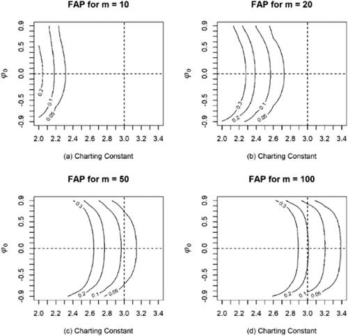
The horizontal and vertical dashed lines in all panels of represent the i.i.d. case () when the charting constant equals 3, respectively. Hence, the intersection of these two lines represents the situation for the classic individual control chart using the 3-sigma rule. Many interesting observations can be made from . First, it is seen that the Phase I charting constants for a given
do not converge to 3 or some other fixed value, as
increases. This can be observed from the
contours in all the panels. For a specific
value, the contours gradually move to the right (meaning that the charting constant increases) as
increases. Second, and as noted earlier, the 3-sigma chart is not appropriate in Phase I. For this, observe that from panels (a) and (b), it is seen that for
= 10 and 20, the 3-sigma rule corresponds to a much larger
than those from
to
(which are common choices for
in practice). From panels (c) and (d), for
= 50 and 100, the 3-sigma rule is seen to work in a narrow range of
values, from 0.05 to 0.1 and from 0.1 to 0.2, respectively, especially when
closes to zero or it is the i.i.d. case. By comparison, however, the proposed Phase I control chart always maintains the
at the nominal
Third, the
contours become more symmetric around
as
increases. For example, in panel (d) for
the contours are almost symmetric and the curvature is much lower compared to those for
20 or 50 as seen in panels (b) and (c), respectively. This means that the required charting constants are related to the magnitude (absolute value) of
and the effect of the sign is small when
In summary, shows that in addition to normality, the required charting constant depends on several other factors, such as the magnitude of the autocorrelation, the sample size and the nominal
value and therefore needs to be determined on a case-by-case basis.
The classical constant 3 may work in one or two special cases, where the data are independent, the sample size is medium-large and the nominal is well-chosen (such as
and
), but not in general. Thus, the classic 3-sigma chart is not recommended for retrospective monitoring of individual, normally distributed, autocorrelated data from an AR(1) process. As noted earlier, the required charting constants for the proposed Phase I chart can be conveniently found using the accompanying R package in Yao et al. (Citation2021).
Capizzi (Citation2015) noted that the ability of Phase I charts to correctly identify the outliers is “unavoidably related to the correct specification of the underlying IC model. Many Phase I points may fall outside the control limits because the wrong model was assumed for the process variable…” Thus, since both the direct and the residual-based monitoring of autocorrelated data depend on fitting a suitable model to the data, which includes the assumption of a time series process, an important question is the effect of process miss-specification and hence of the model on the performance of the control chart. In the next section, we study the performance differences between the proposed chart and some charts available in the literature in this context using simulated data.
4. Model misspecification analysis: IC robustness and OOC performance
The charts used in the performance comparisons are the classic (I-MR) chart (Montgomery Citation2005), the residual chart (Alwan and Roberts Citation1988) and the corrected residual control chart (the AL chart, Apley and Lee Citation2003, Citation2008). As noted earlier, these charts are designed for Phase II applications and therefore they need to be adapted here for Phase I to be comparable to the proposed chart, that is, their charting constants need to be obtained for a specific time series process (discussed below) using a Bonferroni adjustment to maintain the FAP. Thus, the adjusted nominal false alarm rate for these charts is set equal to and this is used to find the charting constants for these charts as in Champ and Jones (Citation2004). Vasilopoulos and Stamboulis (Citation1978) considered a control chart for AR(1) data, but since their chart is for sub-grouped data, it is not included in the comparison. Another, more recent approach to control charting is the distribution-free approach (see, e.g., Capizzi and Masarotto Citation2013; Chakraborti and Graham Citation2019a, Citation2019b; Jones-Farmer, Jordan, and Champ, Citation2009; Kim et al. Citation2007; Li and Qiu Citation2016; Perry and Wang Citation2020). However, these distribution-free approaches mainly focus on Phase II monitoring, except for the CM chart which is the only available Phase I control chart for i.i.d. data with an accompanying software. Thus, the CM chart is included in the comparisons; both the IC and OOC cases are considered.
Jones-Farmer, Jordan, and Champ (Citation2009) define two types of OOC conditions, namely an isolated shift and a sustained shift in the process mean. The isolated shift is a mean shift of size in units of the population standard deviation only in the first observation. The sustained shift is a shift in the mean, which is set to start two thirds of the way into the sample and continues until the end. In Phase I, the interest is to detect isolated shifts (like outliers) and examine the corresponding assignable causes, which present short-term unusual disturbance in the process mean. Following Graham, Human, and Chakraborti (Citation2010) and Yao and Chakraborti (Citation2021a, Citation2021b), we assume that
is an ARMA process with the isolated shift at the
-th observation and, thus, the process is OOC.
is normally distributed with mean
where
is the standard shift size and variance
the other observations (those except for the
-th observation) follow a normal distribution with mean
and variance
The probability of at least one signal (
) is used as an OOC performance metric in Phase I. As in Eq. [Equation13
(13)
(13) ], this is given by
(16)
(16)
where
is the standardized OOC process. Note that when the process is IC, the
reduces to the
in Eq. [Equation13
(13)
(13) ]. Without loss of generality and simplicity,
and
are set to be 0 and 1, respectively.
is assigned to be 20 and 100 and, correspondingly,
is assigned to be the first observation and the first observation after the first quarter observation of
That is,
and
for
and
and
for
Note that other
’s including the first observations after the second quarter, the third quarter and the last observations of
have been studied. The results are fairly similar to those mentioned above, so they are ignored. In the performance comparison, various types of time series processes are studied. The AR(1) processes, written as Eq. [Equation4
(4)
(4) ], with
are considered for the IC situation. In order to study the effects of model miss-specification, the underlying process is assumed to be an MA(1) process, which is written as
and the charts are constructed under an AR(1) process assumption. Note that
is equal to
for the MA(1) process, different from that for the AR(1) process, where
is the coefficient for the first-order moving average term. Though some other common processes including an ARMA(1, 1), which is written as
and an AR(2), which is written as
have been studied, the results are provided in Figures A1–A3 of the Appendix. Also, note that the CM chart is used in the comparisons since as claimed by the authors, it can detect “single or multiple mean and/or scale shifts” (Capizzi and Masarotto Citation2013) and the results are obtained using the rsp function in the R package dfphase1 (Capizzi and Masarotto Citation2018). The computations for the CM chart are controlled by the maximum number of step shifts and the minimum length of each step, and these are set to 1 and 2, which are the smallest values for the two parameters in the rsp function, respectively, in order to better accommodate the one-isolated-shift situation considered in our simulations. Finally, each parameter combination for different processes generates 1000 realizations in the simulation.
From , it can be seen that:
Figure 2. Performance comparison under the AR(1) process when the process goes OOC on the first observation.
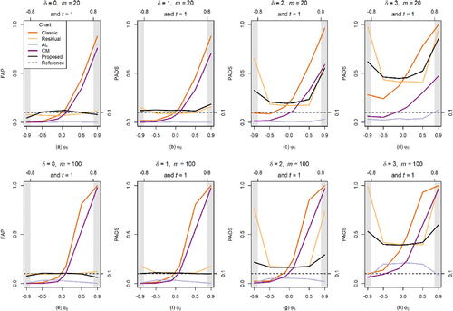
The proposed charts are IC FAP robust for different
The AL chart performs worse than the other charts. When
The proposed chart performs better when the sample size is small, such as
Performance of the proposed chart is similar to that of the residual chart when the sample size is large such as
In summary, the proposed chart is recommended for monitoring individual data from an AR(1) process based on its IC FAP-robustness and OOC performance (in terms of particularly for smaller sample sizes (
), except for some cases of extremely high autocorrelation, such as
However, note that for such high values of
the process is close to being non-stationary, which poses additional modeling and monitoring challenges.
Next, we study and compare the effects of model misspecification on the performance of the charts, designed for the AR(1) process, when the data are simulated using the “miss-specified” MA(1) process. For the MA(1) process, the range is considered for satisfying invertibility. The results are displayed in .
Figure 3. Performance comparison under the MA(1) process when the process goes OOC on the first observation.
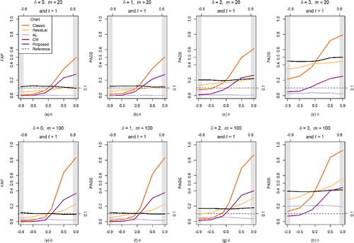
From , it is seen that:
The classic, the AL, the residual and the CM charts are all problematic to monitoring the MA(1) data. Recall that in the IC case (when
By contrast, the proposed chart shows a much more reasonable IC performance for the MA(1) data. When
Next, we study the performance of the charts when the process goes OOC on the first observation after the first quarter of observations in .
Figure 4. Performance comparison under the AR(1) and MA(1) processes when the process goes OOCs on the first observation after the first quarter of observations.
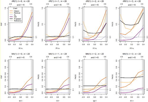
From , it can be seen that all charts perform in a manner similar to what is seen in and . In fact, similar performances are observed when the process goes OOC on the first observation after the second, the third quarter of observations and the last observation, respectively, and are therefore not shown here due to the space limitations. These results suggest that the chart performance is not affected by the locations of the OOC observations.
To conserve space, results for the OOC model miss-specification analysis using observations from the AR(2) and the ARMA(1, 1) processes are shown in Section A2 of the Appendix. Similar conclusions can be drawn as those for the MA(1) process discussed above; that is, the proposed chart is (1) sensitive to large shifts in means and (2) fairly FAP-robust for both the AR(2) and ARMA(1, 1) processes. By comparison, the residual charts are not IC FAP-robust. In summary, the classic, the AL and the CM charts are not recommended for monitoring individual autocorrelated data in Phase I. The proposed chart is a safer and better choice in practice from the perspective of IC FAP-robustness since in general there is no guarantee that the model is specified correctly.
5. Illustration
In this section, we discuss an application of the proposed methodology to a real-world dataset in the public health sector where retrospective monitoring is routinely done and yet much of the existing methodology is based primarily on a descriptive analysis, which raises the need for more sophisticated tools. It is well-known that the United States is (has been) experiencing an opioid epidemic. It is in this context of analyzing prescription opioid usage related data, the SPM methodology can add significant capabilities to fight the epidemic, by helping to objectively monitor the data, both in retrospective and prospective phases, which will allow taking appropriate, timely and statistically valid actions by the appropriate authorities. The data for this illustration are the prescription fentanyl (PF) (fentanyl is one of the most well-known opioids) transactional data from the DEA (Drug Enforcement Authority)’s ARCOS database. This is a comprehensive drug reporting system that monitors the supply chain of DEA controlled substances (more information can be found on https://www.deadiversion.usdoj.gov/arcos/index.html) and the selected dataset is a subset of the data from the ARCOS database. It is expected that the proposed Phase I (retrospective) monitoring methodology can be applied to other datasets involving other drugs in similar contexts, which can be a potent and beneficial strategy for effective public health surveillance systems.
Note that the unit of dosage for opioid drugs is reported in milligrams and the strength of the dosage of different opioid drugs is typically transformed to a unified measurement, called the morphine milligram equivalent (MME), using the conversion factor table provided by Centers for Medicare & Medicaid Services (Citation2018). In many opioid-related studies, practitioners are more interested in the MME per capita which is an average of the MME over a population in a specific region such as a county (see, e.g., Guy et al., Citation2019). We work with the MME per capita transaction data and for illustration, we use the PF transactional data in Preston County, West Virginia (WV), between January 2009 and December 2013. Note that the state of West Virginia has been identified as the the state where the drug overdose is increasing considerably (West Virginia Department of Health and Human Resources, Citation2021) and the Preston County is selected, since the county is ranked 29 out of the 55 in the vulnerability ranking (West Virginia Department of Health and Human Resources Citation2020) and thus stands for a typical county in WV in terms of opioid transactions. The dataset is provided in Section A3 of the Appendix along with a time series plot, a histogram and a boxplot in Figure A4.
The solid curve with circles in Figure A4 of the Appendix shows the PF transactional data series (in the MME per capita). From the time series plot, we observe a clear peak around April 2009 and a drop around June 2009. This indicates that the underlying process may have shifted to a different level, which may raise some concerns. From the histogram it is seen that the data distribution is almost symmetric, which is also seen in the boxplot. The latter indicates two outliers, both occurring on the high side, in March and April 2009, respectively. Stationarity of the process is tested using the augmented Dickey–Fuller test provided by the function adf.test in the R package tseries (Trapletti, Hornik, and LeBaron Citation2019). The value of the test statistic is with a p-value less than 0.01, so that the stationarity is not rejected at a significance level 0.05. Continuing the analysis of the data, following the Box–Jenkins time series methodology, we next show the autocorrelation function (ACF) and the partial autocorrelation function (PACF) for the PF transactional data in .
Figure 5. ACF and PACF of the PF transactional data in Preston County, WV, from January 2009 to December 2013.
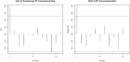
From , it is seen that both the ACF and PACF both have a “cut-off” at lag 1. Thus, several models such as the AR(1), MA(1), ARMA(1, 1) and AR(2) can be contemplated under the Box–Jenkins analysis. We check goodness-of-fit for all these models using the Akaike information criterion (AIC), the corrected Akaike information criterion (AICc) and the Bayesian information criterion (BIC). For AR(1), MA(1), ARMA(1, 1) and AR(2) models, the values using the criteria are, (-6.84, −6.41, −0.56), (-6.65, −6.22, −0.36), (-5.37, −4.65, 3.01) and (-5.8, −5.08, 2.57), respectively. Based on these figures (the criteria values are smaller) and the fact that these are real data, the AR(1) appears to be a reasonable first choice. Note that at some other lags, such as at lag 10 in panels (a) and (b), the ACF and the PACF values are close to but do not exceed the dashed lines which are the critical values at the 95% confidence level. This may raise some concerns with respect to the model identification. However, this is not unexpected for a real dataset such as this one and therefore we do not pursue this point further (and do not consider other models for these data here, which could be a topic for future investigations). After fitting the AR(1) model using MLE, the means and the standard deviations for the intercept and the slope for the auto-regressor are and (1.0462, 0.0453), respectively. The normality of the residuals is tested by the Shapiro–Wilk test using the function shapiro.test in the R package stats. This yielded a test statistic 0.9803 with a p-value 0.4448. Hence, no significant evidence against normality is observed and we continue toward finding the proposed Phase I charting constant based on the fitted AR(1) model.
Proposed chart: The charting constant is calculated and our software. For
Residual chart: Using the Bonferroni adjustment, for
The two control charts are shown in along with the plotted data.
Figure 6. The residual and the proposed control charts for AR(1) model. The solid, dashed and dotted lines are for 0.1 and 0.2, respectively. In both charts, the charting statistics are shown by open circles and the circles are connected by straight lines for better visualization.
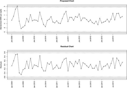
It is seen that at both charts support the IC status of the process, since no charting statistic plots outside the control limits and no systematic pattern seems to be present. However, the two other pairs of the control limits, for
and
respectively, show a different result. Both of these proposed charts signal in April 2009. By comparison, the residual chart shows no signal. To the best of our knowledge, no one has reported this signal in the literature, and this may be an interesting point of investigation in a future study.
When a chart signals, that is a point plots outside the control limits, typically a careful examination is conducted as to any assignable causes and once that is confirmed, the point may be removed and the chart is redone (limits recalculated, remaining points plotted). This process is repeated until the process is declared to be IC (all points plot within the control limits with a random pattern). This is a common strategy for i.i.d. data (Montgomery Citation2005). To this end, Dasdemir et al. (Citation2016) suggested an iterative way to handle the Phase I OOC observations from an ARMA process. However, the autocorrelation value may change after eliminating the observation(s). In Dasdemir et al., the initial value is 0.387 compared to 0.535 of the final filtered value. This change may lead to a different time series model and hence, a different chart (charting constant) using the proposed method. Also, the effect of the iterative elimination and the imputation of the resulting missing values remain unknown at this point. This will be studied elsewhere.
In summary, the proposed control chart can help in an objective retrospective monitoring (surveillance) of the PF data, which, in turn, can help researchers identify anomalies, make decisions, take corrective actions if any, and generate reference data, to be subsequently used (for model building, parameter estimation, developing control charts, etc.) in prospective (on-line/Phase II) monitoring.
6. Summary and recommendations
In this article, we present a Shewhart-type Phase I control chart for retrospective monitoring of individual autocorrelated data. Such data frequently arise in modern monitoring environments, for example, when data are collected at a high rate of speed by automatic sensors. An AR(1) process is used to model the data with the assumption of normality in the unknown parameter case. The proposed chart accounts for the effects of parameter estimation and autocorrelation and is designed for a nominal IC FAP, a metric typically recommended for Phase I applications to control the overall false alarm rate. We derive the required charting constants, and some tabulation is presented in Table A1 of the Appendix. The accompanying R package PH1XBAR will facilitate the on-demand deployment of the proposed control chart in practice. A simulation study is conducted for monitoring a number of different time series processes in the ARMA family. Findings strongly suggest that it is ill-advised to use a Phase I Shewhart-type chart for i.i.d. data in case of autocorrelated data because of the risk of increased or decreased false alarms. This may cause a disruption in process monitoring, which may result in an inefficient use of resources to situations that are actually in control. The autocorrelation, if it exists in the data, cannot be ignored and must be accounted for in the determination of the appropriate control limits along with the issue of estimated parameters. Also, the proposed chart is more robust to the ARMA processes compared to those in the literature.
Given the normality assumption which needs to be thoroughly examined before deployment, some adaptations may be necessary for practical applications. For example, the errors may be non-normal in which case a “quick and dirty” solution will be to transform the data using say the Wilson–Hilferty (Wilson and Hilferty Citation1931) transformation or the Box–Cox transformations (Box and Cox Citation1964) and then applying the proposed charts on the transformed data. In general, one could also develop a model for non-normal errors such as some skewed parametric distribution, like the lognormal, or, use a distribution-free method to build a control chart. As previously noted, although some distribution-free methodology, including control charts, have been considered in the literature, the autocorrelated data case has not been studied. We believe these are all interesting topics to be studied in the future.
Also, note that other common attributes of time series data that may be helpful in the modeling process, such as seasonality, non-stationarity and additional regressors (co-variates) are not accounted for in the proposed methodology. Thus, if these are present, users may need suitable adaptations such as appropriate differencing (to deal with non-stationarity and seasonality), which will be incorporated in a future update of the R package. Finally, the development of the online counterpart for this methodology, useful for Phase II surveillance, is in progress and will be reported elsewhere.
Supplemental Material
Download MS Word (30 KB)Acknowledgments
The authors thank two anonymous reviewers and the editor for their encouragement and comments that have improved the article.
Disclosure statement
No potential conflict of interest was reported by the authors.
References
- Anderson, T. W. 1994. The statistical analysis of time series. Hoboken, NJ: John Wiley & Sons.
- Alshraideh, H., and E. Khatatbeh. 2014. A Gaussian process control chart for monitoring autocorrelated process data. Journal of Quality Technology 46 (4):317–22. doi: 10.1080/00224065.2014.11917974.
- Alwan, L. C. 1992. Effects of autocorrelation on control chart performance. Communications in Statistics – Theory and Methods 21 (4):1025–49. doi: 10.1080/03610929208830829.
- Alwan, L. C., and H. V. Roberts. 1988. Time-series modeling for statistical process control. Journal of Business & Economic Statistics 6 (1):87–95. doi: 10.2307/1391421
- Apley, D. W., and F. Tsung. 2002. The autoregressive T 2 chart for monitoring univariate autocorrelated processes. Journal of Quality Technology 34 (1):80–96. doi: 10.1080/00224065.2002.11980131.
- Apley, D. W., and H. C. Lee. 2003. Design of exponentially weighted moving average control charts for autocorrelated processes with model uncertainty. Technometrics 45 (3):187–98. doi: 10.1198/004017003000000014.
- Apley, D. W., and H. C. Lee. 2008. Robustness comparison of exponentially weighted moving-average charts on autocorrelated data and on residuals. Journal of Quality Technology 40 (4):428–47. doi: 10.1080/00224065.2008.11917747.
- Box, G. E. P., and D. R. Cox. 1964. An analysis of transformations. Journal of the Royal Statistical Society: Series B (Methodological) 26 (2):211–43. doi: 10.1111/j.2517-6161.1964.tb00553.x.
- Box, G. E. P., G. M. Jenkins, and G. C. Reinsel. 2008. Time series analysis: Forecasting and control. 4th ed. Hoboken, NJ: John Wiley & Sons.
- Capizzi, G., and G. Masarotto. 2013. Phase I distribution-free analysis of univariate data. Journal of Quality Technology 45 (3):273–84. doi: 10.1080/00224065.2013.11917938.
- Capizzi, G. 2015. Recent advances in process monitoring: Nonparametric and variable-selection methods for phase I and phase II. Quality Engineering 27 (1):44–67. doi: 10.1080/08982112.2015.968046.
- Capizzi, G., G. Masarotto. 2018. Phase I Distribution-Free Analysis with the R Package dfphase1. In Frontiers in Statistical Quality Control, ed. S. Knoth, W. Schmid. Cham: Springer. doi: 10.1007/978-3-319-75295-2_1
- Centers for Medicare & Medicaid Services. 2018. Opioid oral morphine milligram equivalent (MME) conversion factors. Accessed October 28, 2022. https://www.cdc.gov/opioids/providers/prescribing/guideline.html.
- Chakraborti, S., and M. Graham. 2019a. Nonparametric statistical process control. Hoboken, NJ: John Wiley & Sons.
- Chakraborti, S., and M. A. Graham. 2019b. Nonparametric (distribution-free) control charts: An updated overview and some results. Quality Engineering 31 (4):523–44. doi: 10.1080/08982112.2018.1549330.
- Chakraborti, S., S. W. Human, and M. A. Graham. 2008. Phase I statistical process control charts: An overview and some results. Quality Engineering 21 (1):52–62. doi: 10.1080/08982110802445561.
- Champ, C. W., and L. A. Jones. 2004. Designing phase I X-bar charts with small sample sizes. Quality and Reliability Engineering International 20 (5):497–510. doi: 10.1002/qre.662.
- Dasdemir, E., C. Weiß, M. C. Testik, and S. Knoth. 2016. Evaluation of Phase I analysis scenarios on Phase II performance of control charts for autocorrelated observations. Quality Engineering 28 (3):293–304. doi: 10.1080/08982112.2015.1104540.
- Faltin, F. W., and W. H. Woodall. 1991. Some statistical process control methods for autocorrelated data – Discussion. Journal of Quality Technology 23 (3):194–7. doi: 10.1080/00224065.1991.11979322.
- Garza-Venegas, J. A., V. G. Tercero-Gomez, L. L. Ho, P. Castagliola, and G. Celano. 2018. Effect of autocorrelation estimators on the performance of the X control chart. Journal of Statistical Computation and Simulation 88 (13):2612–30. doi: 10.1080/00949655.2018.1479752.
- Graham, M. A., S. W. Human, and S. Chakraborti. 2010. A Phase I nonparametric Shewhart-type control chart based on the median. Journal of Applied Statistics 37 (11):1795–813. doi: 10.1080/02664760903164913.
- Guy, G. P., Jr., K. Zhang, L. Z. Schieber, R. Young, and D. Dowell. 2019. County-level opioid prescribing in the United States, 2015 and 2017. JAMA Internal Medicine 179 (4):574–6. doi: 10.1001/jamainternmed.2018.6989
- Hamilton, J. D. 1994. Time series analysis. Princeton, NJ: Princeton University Press.
- Hyndman, R., G. Athanasopoulos, C. Bergmeir, G. Caceres, L. Chhay, M. O'Hara-Wild, F. Petropoulos, S. Razbash, E. Wang, F. Yasmeen, R Core Team, Ihaka, R. Reid, D. Shaub, D. Tang, Y. Zhou, Z. 2020. Forecasting functions for time series and linear models. Accessed October 28, 2022. https://cran.r-project.org/web/packages/forecast/forecast.pdf.
- Hyndman, R. J., and Y. Khandakar. 2008. Automatic time series forecasting: The forecast package for R. Journal of Statistical Software 27 (3):1–22. doi: 10.18637/jss.v027.i03.
- Højsgaard, S., U. Halekoh, and J. Yan. 2006. The R package geepack for generalized estimating equations. Journal of Statistical Software 15:1–11. doi: 10.18637/jss.v015.i02
- Jardim, F. S., S. Chakraborti, and E. K. Epprecht. 2020. Two perspectives for designing a phase II control chart with estimated parameters: The case of the Shewhart X Chart. Journal of Quality Technology 52 (2):198–217. doi: 10.1080/00224065.2019.1571345.
- Jones, L. A. 2002. The statistical design of EWMA control charts with estimated parameters. Journal of Quality Technology 34 (3):277–88. doi: 10.1080/00224065.2002.11980158.
- Jones-Farmer, L. A., V. Jordan, and C. W. Champ. 2009. Distribution-free phase I control charts for subgroup location. Journal of Quality Technology 41 (3):304–16. doi: 10.1080/00224065.2009.11917784.
- Jones-Farmer, L. A., W. H. Woodall, S. H. Steiner, and C. W. Champ. 2014. An overview of phase I analysis for process improvement and monitoring. Journal of Quality Technology 46 (3):265–80. doi: 10.1080/00224065.2014.11917969.
- Kim, S. H., C. Alexopoulos, K. L. Tsui, and J. R. Wilson. 2007. A distribution-free tabular CUSUM chart for autocorrelated data. IIE Transactions 39 (3):317–30. doi: 10.1080/07408170600743946.
- Köksal, G., B. Kantar, T. Ali Ula, and M. Caner Testik. 2008. The effect of Phase I sample size on the run length performance of control charts for autocorrelated data. Journal of Applied Statistics 35 (1):67–87. doi: 10.1080/02664760701683619.
- Knoth, S., and W. Schmid. 2004. Control charts for time series: A review. In Frontiers in statistical quality control, vol. 7, 210–36. Heidelberg: Physica.
- Lee, H. C., and D. W. Apley. 2011. Improved design of robust exponentially weighted moving average control charts for autocorrelated processes. Quality and Reliability Engineering International 27 (3):337–52. doi: 10.1002/qre.1126.
- Li, J., and P. Qiu. 2016. Nonparametric dynamic screening system for monitoring correlated longitudinal data. IIE Transactions 48 (8):772–86. doi: 10.1080/0740817X.2016.1146423.
- Lu, C. W., and M. R. Reynolds, Jr. 1999. Control charts for monitoring the mean and variance of autocorrelated processes. Journal of Quality Technology 31 (3):259–74. doi: 10.1080/00224065.1999.11979925.
- Macgregor, J. F. 1991. Some statistical process control methods for autocorrelated data – Discussion. Journal of Quality Technology 23 (3):198–9. doi: 10.1080/00224065.1991.11979323.
- Maragah, H. D., and W. H. Woodall. 1992. The effect of autocorrelation on the retrospective X-chart. Journal of Statistical Computation and Simulation 40 (1–2):29–42. doi: 10.1080/00949659208811363.
- Montgomery, D. C., and C. M. Mastrangelo. 1991. Some statistical process control methods for autocorrelated data. Journal of Quality Technology 23 (3):179–93. doi: 10.1080/00224065.1991.11979321.
- Montgomery, D. C. 2005. Introduction to statistical quality control. Hoboken, NJ: John Wiley & Sons.
- Perry, M. B., and Z. Wang. 2020. A distribution-free joint monitoring scheme for location and scale using individual observations. Journal of Quality Technology 1–18. doi: 10.1080/00224065.2020.1829213
- Qiu, P., W. Li, and J. Li. 2020. A new process control chart for monitoring short-range serially correlated data. Technometrics 62 (1):71–83. doi: 10.1080/00401706.2018.1562988.
- Quesenberry, C. P. 1993. The effect of sample size on estimated limits for X-bar and X control charts. Journal of Quality Technology 25 (4):237–47. doi: 10.1080/00224065.1993.11979470.
- Ryan, T. P. 1991. Some statistical process control methods for autocorrelated data – Discussion. Journal of Quality Technology 23 (3):200–2. doi: 10.1080/00224065.1991.11979324.
- Rich, S., A. B. Tran, A. Williams, J. Holt, J. Sauer, and T. M. Oshan. 2020. arcos and arcospy: R and Python packages for accessing the DEA ARCOS database from 2006–2014. Journal of Open Source Software 5 (53):2450. doi: 10.21105/joss.02450.
- Schmid, W. 1995. On the run length of a Shewhart chart for correlated data. Statistical Papers 36 (1):111–30. doi: 10.1007/BF02926025.
- Trapletti, A., K. Hornik, and B. LeBaron. 2019. Time series analysis and computational finance. https://cran.r-project.org/web/packages/tseries/tseries.pdf.
- Vasilopoulos, A. V., and A. P. Stamboulis. 1978. Modification of control chart limits in the presence of data correlation. Journal of Quality Technology 10 (1):20–30. doi: 10.1080/00224065.1978.11980809.
- Wardell, D. G., H. Moskowitz, and R. D. Plante. 1992. Control charts in the presence of data correlation. Management Science 38 (8):1084–105. doi: 10.1287/mnsc.38.8.1084.
- Wardell, D. G., H. Moskowitz, and R. D. Plante. 1994. Run length distributions of residual control charts for autocorrelated processes. Journal of Quality Technology 26 (4):308–17. doi: 10.1080/00224065.1994.11979542.
- Weiß, C. H., D. Steuer, C. Jentsch, and M. C. Testik. 2018. Guaranteed conditional ARL performance in the presence of autocorrelation. Computational Statistics & Data Analysis 128:367–79. doi: 10.1016/j.csda.2018.07.013.
- West Virginia Department of Health and Human Resources. 2020. County-level vulnerability to overdose deaths in West Virginia. Accessed October 28, 2022. https://oeps.wv.gov/HCV/documents/data//WV_OD_Vulnerability_Assessment.pdf.
- West Virginia Department of Health and Human Resources. 2021. Accessed October 28, 2022. https://dhhr.wv.gov/News/2021/Pages/West-Virginia-Experiences-Increase-in-Overdose-Deaths;-Health-Officials-Emphasize-Resources.aspx
- Wilson, E. B., and M. M. Hilferty. 1931. The distribution of chi-square. Proceedings of the National Academy of Sciences of the United States of America 17 (12):684–8. doi: 10.1073/pnas.17.12.684.
- Woodall, W. H. 2006. The use of control charts in health-care and public-health surveillance. Journal of Quality Technology 38 (2):89–104. doi: 10.1080/00224065.2006.11918593.
- Yao, Y., C. W. Hilton, and S. Chakraborti. 2017. Designing Phase I Shewhart X charts: Extended tables and software. Quality and Reliability Engineering International 33 (8):2667–72. doi: 10.1002/qre.2225.
- Yao, Y., and S. Chakraborti. 2021a. Phase I process monitoring: The case of the balanced one-way random effects model. Quality and Reliability Engineering International 37 (3):1244–65. doi: 10.1002/qre.2793.
- Yao, Y., and S. Chakraborti. 2021b. Phase I monitoring of individual normal data: Design and implementation. Quality Engineering 33 (3):443–56. doi: 10.1080/08982112.2021.1878220.
- Yao, Y., S. Chakraborti, T. Thomas, J. Parton, and X. Yang. 2021. Phase I Shewhart X-bar chart. Accessed October 28, 2022. https://cran.r-project.org/web/packages/PH1XBAR/PH1XBAR.pdf.
- Zhang, N. F. 1997. Detection capability of residual chart for autocorrelated data. Journal of Applied Statistics 24 (4):475–92. doi: 10.1080/02664769723657.
- Zhang, N. F. 1998. A statistical control chart for stationary process data. Technometrics 40 (1):24–38. doi: 10.1080/00401706.1998.10485479.
- Zhang, N. F. 2000. Statistical control charts for monitoring the mean of a stationary process. Journal of Statistical Computation and Simulation 66 (3):249–58. doi: 10.1080/00949650008812025.