
ABSTRACT
This study investigates how different visual representations of price facilitate learning in upper secondary social science education. Three lessons on pricing were given to four classes (n = 94 students). Two classes had lessons based on graphs and two on a causal loop diagram. Written pre- and post-test answers were analysed phenomenographically and results arising from the two visual representations were compared. Results suggested that a causal loop diagram facilitated a more complex way of understanding the causal relationships in pricing than the graph. The traditional way of introducing price, through the use of supply/demand graphs, is thereby problematised. The study extends knowledge by identifying a synergy between phenomenography and research on visual representations and has specific implications for teaching and learning.
1. Introduction
This paper presents an intervention study examining choice of visual representation in teaching, focusing on how students understand pricing in economics. Previous research has suggested that it is challenging for students to grasp the deeper structures of dynamic processes (Reingewertz, Citation2013), such as pricing. One way to help students develop an understanding of dynamic processes and relations is through the use of visual representations (Carney & Levin, Citation2002; Wheat, Citation2007a), including graphs and diagrams. However, previous research has shown that students face problems when learning about price with supply/demand graphs (Colander, Citation1995; Strober & Cook, Citation1992), which are traditionally used in teaching. This study builds on earlier research on students’ conceptions of price (Pang & Marton, Citation2003, Citation2005) and of graphs illustrating price (Cohn et al., Citation2001), as well as the suggestion that different visual representations of the same content facilitate different ways of understanding phenomena (Airey & Linder, Citation2009; Danielsson & Selander, Citation2014). The study provides new evidence about how teachers’ choice of diagrams affects students’ understanding of pricing. It approaches the problem using a phenomenographic perspective. The study focuses on students’ conceptions of the causal relationships between supply, price and demand. The research questions are as follows:
How do students’ conceptions of causality in price develop in relation to two different visual representations of price (a graph and a loop diagram) used in teaching?
What aspects of causal relationships in price are made possible for students to discern through these visual representations?
The paper is outlined as follows: Section 2 reviews earlier research on learning about price through visual representations. Section 3 presents the theoretical perspectives used, followed in Section 4 by presentation and justification of the methods. The results are presented in Section 5 and discussed in Section 6.
2. Earlier Research: Learning About Price Through Visual Representations
Economics teaching frequently uses graphs to help students understand complex relationships (Cohn et al., Citation2004; Reimann, Citation2004; Wheat, Citation2007a). This presumes that graphs facilitate learning about pricing by illustrating and simplifying complex processes and relations (Wheat, Citation2007b). However, research has identified challenges posed to students by this practice and has questioned whether students’ learning is helped or hindered by the use of graphs (see, for instance, Cohn et al., Citation2001, Citation2004; Colander, Citation1991; Davies, Citation2012; Davies & Mangan, Citation2013; Estrada, Citation2013; Kourilsky & Wittrock, Citation1987; Reingewertz, Citation2013; Strober & Cook, Citation1992; Zetland et al., Citation2010).
A critical problem with supply/demand graphs is that they portray dynamic relationships in terms of “comparative statics”. Each diagram presents one or more equilibrium positions. For instance, shows a change from one equilibrium position (at P1Q1) to another (at P2Q2). The causal process is represented by a shift in the demand curve and a movement along the supply curve.
Figure 1. Supply/demand graph illustrating pricing as a function of supply and demand.
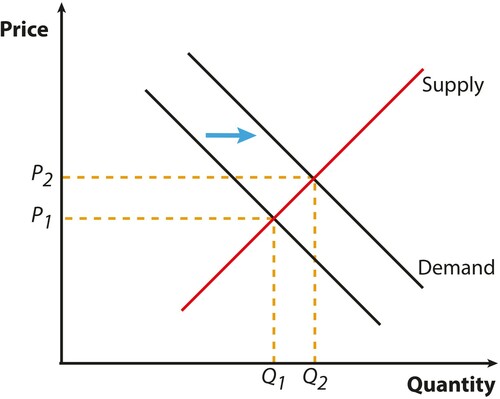
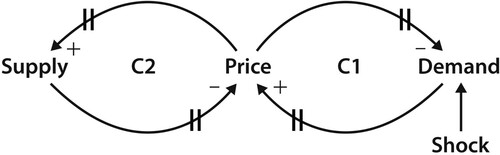
This representation does not easily draw attention to the dynamics of causation: an effect of an increase in demand on price interacting with the effect of an increase in price on supply (Colander, Citation1991; Lundholm, Citation2018). Wheat (Citation2007a, Citation2007b) proposed that this problem could be addressed by using a causal loop diagram from system dynamics (). His studies provide evidence that the causal loop diagram is more effective than the graph in improving students’ understanding of price. However, he did not use the extensive phenomenographic evidence of conceptions of price in defining this improvement. Using a phenomenographic analysis makes it possible to examine how the type of diagram used influences change in understanding, that is in what way students’ conceptions of price develop when a causal loop diagram or graphs are used in teaching.
Figure 2. Causal loop diagram illustrating pricing as a function of supply and demand, with + and − illustrating negative and positive correlation, respectively, and the vertical lines indicating delayed effect (Reprinted from Wheat, Citation2007a, p. 396, with permission from John Wiley & Sons).
3. Theoretical Frameworks
3.1. Visual Representations Highlighting Certain Aspects of a Phenomenon
Several scholars suggest that different visual representations of the same content may communicate different aspects of the content and thereby facilitate different conceptions of it (Danielsson & Selander, Citation2014; Kress, Citation2010; Kress & Van Leeuwen, Citation2006). It is thus argued that how a visual representation is composed is important for what aspects of the phenomenon/knowing are given primacy and thereby are made possible for students to discern (Airey & Linder, Citation2009; Danielsson & Selander, Citation2014). Similarly, McDermott and colleagues (McDermott et al., Citation1990) suggest that different aspects of a concept are emphasised in different representations. The idea of different representations having different potentials for communication and for providing access to disciplinary knowledge has been identified by some as “affordances” (Gibson, Citation1979), or “disciplinary affordances” of a visual representation (Fredlund et al., Citation2012), suggesting that different representations of the same phenomenon may “provide access to different disciplinary-relevant aspects” (Fredlund et al., Citation2012, p. 658). This implies that different aspects of the content may be possible to discern through different visual representations.
With this background, a visual representation is, in the present study, defined in line with that of Ingerman et al. (Citation2009, p. 275): “a model that represents a phenomenon, situation or construct (or parts of them) in a particular way, namely bringing certain aspects of the phenomenon, situation or construct to the fore while allowing other aspects to recede into the background”. Identifying disciplinary-relevant aspects of a phenomenon and selecting representations that illustrate them are suggested to be two of the factors that can enhance learning through visual representations (Fredlund, Airey, et al., Citation2015).
Empirical research, as well as theoretical discussions, concerning learning through visual representations has been given some focus in the field of science teaching and learning (see, for instance, Fredlund et al., Citation2012; Fredlund, Airey, et al., Citation2015; Fredlund, Linder, et al., Citation2015; Ingerman et al., Citation2009). For example, it has been suggested that all representations are partial in terms of (i) all representations only being able to illustrate parts of a phenomenon and also (ii) in terms of representations often being “disciplinary rationalised”, resulting in certain aspects being implicit, rather than explicitly illustrated in the representation (Fredlund et al., Citation2014). This rationalisation could be considered very constructive for communicating within the discipline and between experts. However, for students who cannot easily discern the important aspects that lie beyond what is explicitly visualised in the representation, this rationalisation may cause problems in the learning situation (Fredlund et al., Citation2014).
Following the reasoning mentioned above, the supply/demand graph and the causal loop diagram, which each illustrate causal relationships in pricing, but in different ways, may highlight different aspects of the relationships and thereby affect what understanding of the concept that students develop.
3.2. Phenomenography and Variation Theory
This study uses phenomenography and variation theory to define learning, identify critical aspects and analyse data. Learning is understood as developing a more complex way of understanding or experiencing a specific subject content (Marton & Booth, Citation1997). A basic assumption in phenomenography is that any phenomenon can be understood, or experienced, in a number of qualitatively different ways, known as “conceptions” (or “categories of descriptions”). These are often organised in a hierarchy, an “outcome space”, describing the variation in conceptions of a phenomenon. The difference between a less sophisticated and a more sophisticated conception is critically important for teaching and learning. These differences are in variation theory referred to as “critical aspects” (Marton, Citation2015; Pang & Ki, Citation2016). A more complex conception is thus contrasted with less complex ones and the conceptions are distinguished by (critical) aspects of the phenomenon that the student needs to discern in order to develop a more qualified way of understanding the phenomenon (Marton, Citation2015; Pang & Ki, Citation2016). Variation theory suggests that in order for students to develop a more complex understanding of the phenomenon, teaching should be designed in a way that helps them to experience, or discern, the critical aspects (Åkerlind, Citation2005; Marton, Citation2015).
Traditionally, language has played an important role in variation theory and in the identification of critical aspects, whereas other semiotic resources such as images and diagrams have been underexplored as resources for identifying critical aspects (Fredlund, Linder, et al., Citation2015). Conceptions identified through a phenomenographic analysis are not be considered stable cognitive conceptions, but as different ways of understanding or experiencing a phenomenon. One person can express an understanding belonging to more than one category of conception. Furthermore, a phenomenographic analysis focuses on possible ways of understanding a phenomenon and does not rule out the possibility that changing the context could encourage an individual to see the phenomenon in a different way.
Previous research has suggested different dimensions of variation in conceptions of price. A dimension of variation could be understood as an aspect of a phenomenon that an individual may or may not be aware of and may be highlighted in one or more conceptions of a phenomenon. For instance, supply as a dimension of variation in pricing is highlighted both in a conception of price as being dependent on supply only as well as in a conception of price being dependent on both supply and demand (Marton, Citation2015). Dahlgren (Citation1984) and Pang and Marton (Citation2005) provided evidence of variation in conceptions of how quantity demanded or supplied was related to price. Researchers in social psychology (e.g., Leiser & Halachmi, Citation2006; Thompson & Siegler, Citation2000) have reported similar categorical differences. Pang and Marton (Citation2003) provided evidence of variation in conceptions of how a given change in price might affect quantity demanded or supplied, and other studies identified price as the decision of an individual producer or as an outcome of market forces (Davies, Citation2011, Citation2019; Durden, Citation2018). This study focuses on variation in conceptions of causation in pricing, which was identified by Jägerskog et al. (Citation2019) as a distinct dimension in conceptions of price. This dimension focuses on the interaction between demand, supply and price, whereby causation runs in both directions (see Jägerskog et al., Citation2019, for further elaboration on how the different conceptions of causation in price may relate to each other). Causation in pricing really matters in conceptions of economics phenomena because everyday reasoning typically uses unidirectional conceptions of causation, although conceptions suggested by the discipline of economics emphasise bidirectional views of causation within economic systems (e.g., Leijonhufvud, Citation1969).
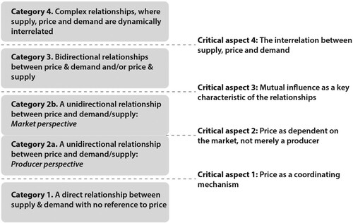
Following the conventions of phenomenography, Jägerskog et al. (Citation2019) identified four qualitatively different conceptions of causation in pricing, presented in . The conceptions were derived from 328 written student answers. When analysed independently by two researchers, the application of the agreed categories was high, resulting in a high interrater reliability (r = 0.94). presents the hierarchy of conceptions of causation in pricing revealed by Jägerskog et al. (Citation2019). It also highlights the critical aspects: the way in which a more complex conception shows greater awareness of variation than the simpler conception. Following Marton (Citation2015), breaks down the categories of description to highlight the critical aspects: the necessary awareness that can be observed in a more complex conception (above the dotted line) which is not observed in the less complex conception (below the dotted line). The categories are thus inclusive, which means that when a student expresses an understanding of causal relationships in pricing in terms of dynamic interrelation between supply, price and demand (category 4) all critical aspects have been discerned. This intervention study uses the conceptions and critical aspects illustrated in in analysing students’ developed conceptions of causality in price.
Figure 3. Phenomenographic “outcome space” of students’ conceptions of the causal relationships in pricing and associated critical aspects.
In summary, this study investigates what conceptions of causal relationships in price are made possible through the use of two different visual representations of price, using a phenomenographic perspective on learning and an idea of the compositional structure of a visual representation being central for what learning is being made possible (Airey & Linder, Citation2009; Danielsson & Selander, Citation2014; Kress, Citation2010).
4. Methods
4.1. Study Design
An intervention consisting of three introductory lessons on pricing was conducted with four upper secondary classes, of which two had lessons based on traditional supply/demand graphs and two on a causal loop diagram (Wheat, Citation2007b). Students’ conceptions of the relationships between supply, price and demand, as expressed in their written answers to open response questions before and after the intervention, were analysed in terms of change in understanding of the subject content between the pre- and post-test and in light of what visual representation the lessons were based on. The results were analysed using both qualitative and quantitative methods.
4.2. Materials
The study compared two visual representations: a supply/demand graph (see ), and a causal loop diagram (see ). The latter was slightly modified from Wheat’s original loop diagram () in order to make it more accessible for upper secondary students. Signs for delayed effects were excluded and arrows illustrating how the different variables correlate with each other were added.
Figure 4. Causal loop diagram used in the study, illustrating pricing as a function of supply and demand, with red arrows illustrating how one variable changes when the other changes (i.e., same or different directions), such as demand increasing when price decreases (different directions) and price decreasing when demand decreases (same direction).
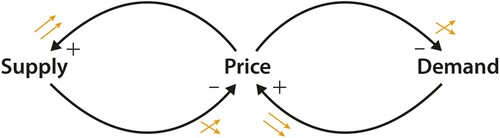
A graph and a causal loop diagram differ in several respects. Supply/demand graphs are commonly used in teaching economics whereas the causal loop diagram is less commonly used, but was created in order to help students grasp the dynamic processes in pricing (Wheat, Citation2007b). In addition, the graph is a mathematical structure, which facilitates calculation of the magnitude of effects of changes, whereas the causal loop diagram shows the structures in the relationships but cannot function as a tool for analysis of price in numbers. That said, they both visualise relationships between supply, demand and price (although with the term “quantity” is also made explicit in the graph).
Students’ conceptions of causality in price was assessed through two previously piloted open response questions (see Jägerskog et al., Citation2019). The validation of the questions showed that they were understood by the students and that they allowed the students opportunities to elaborate on the causal relationships between supply, price and demand, which was the aim. One question focused on the effect on movie ticket prices when there is an increase in film downloads and the other focused on the effect on prices of ecological and non-ecological hamburgers when the demand for the former increases (see Appendix). Open-ended questions were used instead of multiple-choice items that have been used in previous studies investigating students’ understanding of a visually presented content (see, for instance, Cohn et al., Citation2001; Wheat, Citation2007a). This is because multiple-choice questions presuppose that possible student conceptions of a certain phenomenon are already known, resulting in a risk of missing other possible conceptions (Davies, Citation2011). Therefore, open-ended questions were implemented to avoid imposing an incomplete, pre-determined set of alternatives. Right and wrong scoring assessments measure students’ recognition of the correct answer but not their own way of expressing their understanding of the concept or phenomena studied (Bruno, Citation1989). With a phenomenography perspective on learning, open-ended questions were considered more suitable, as this method has the potential to make visible different ways of understanding a phenomenon.
4.3. Participants
Ninety-four students (36 boys and 58 girls), aged 16–18 years, participated in the study. Three students (from three different classes), chose not to participate. Twelve students (six from graph-based classes and six from loop diagram-based classes) only attended the first lesson or only answered the pre-test questions, and their data were therefore removed from the analysis.Footnote1 Accordingly, answers from 82 students were included in the analysis (see ). The study included two schools, both with diverse catchment areas. All students took the social studies course, which includes an introduction to economics and financial literacy. Three teachers, all experienced social studies teachers, were involved in the study, teaching their own classes as part of their regular social studies teaching. The classes thus consisted of students that the teachers met on a weekly basis. Two of the teachers taught one class each, and one teacher taught two classes. One of the teachers was also involved in planning the intervention. In the intervention planning, the researcher allocated the different classes to one or the other of the visual representations, without knowing the groups or the students.
Table 1. Number of students in the study.
4.4. Procedure and Design of the Intervention
The intervention was carried out through three successive lessons taught over one and a half weeks. The lesson plan was the same in all classes (see ) and was detailed in terms of the lecture structure, what content would be covered in what order, how the instruction should be carried out (e.g., in terms of drawing the visual representation step by step on the white board during the introduction lecture) and what goods to use as examples. The teachers started with the same products when exemplifying different aspects of the relationships in pricing, although different products were also introduced by the students through input and questions during the lessons, which opened up for other goods and examples to be discussed in class.
Table 2. Content focused upon and examples used in lessons with the graph group and causal loop diagram group, respectively. Differences between the groups are shown in italics.
Before the first lesson, all students answered two pre-test questions (Q1 and Q2) individually and in writing, to investigate their conceptions of causality in price before the lesson sequence. During Lesson 1, an introduction was given on pricing and competitive markets, and the teacher explained the relationships between supply, price and demand by drawing one of the two visual representations step by step on the whiteboard (graphs in two classes and the causal loop diagram in two classes). Lesson 2 started with a re-cap of the introduction from Lesson 1, followed by the students answering Q2 individually and in writing. The students were then engaged in small group discussions, which were summarised and followed up in class at the end of the lesson.
During Lesson 3, classes that had lessons based on the causal loop diagram were briefly introduced to the graph and how it could be understood in relation to the loop diagram, as it was considered important that the students were at least introduced to the graph as a commonly used illustration within the discipline. Classes that had lessons based on graphs further discussed graphs with a focus on changes in supply and demand. There were two reasons why the graph group was not in a similar way introduced to the causal loop diagram at the end of the intervention. First, the aim was not to investigate if the order of introducing different visual representations of the same content mattered for developing a qualified understanding of the causal relationships in pricing. Second, the aim was to compare a loop diagram intervention with an intervention designed as an average introductory lesson sequence on pricing in an upper secondary social studies classroom, which traditionally includes graphs but not a causal loop diagram.
Finally, the students answered Q1 individually and in writing. Q1 and Q2 were not introduced or discussed by the teachers during the intervention so that the study results would not be affected. An analysis of the filmed lessons and small group discussions, focusing on what teaching practices were created in the classroom depending on what diagrammatic tool was being used, will be reported elsewhere.
4.5. Data and Analysis
The students’ conceptions of causal relationships in price was operationalised as what was expressed in their written pre- and post-test answers. The data analysed consisted of 280 written answers (see for detailed numbers). Only cases where there was a written answer to both pre- and post-test questions were included in the analysis.Footnote2 Half of the answers were from the pre-test and half were from the post-test.
Table 3. Number of included and excluded answers on the pre- and post-tests for the causal loop diagram group and graph group respectively.
The categories in were used to assess how causation in pricing was expressed in each answer. The outcome space () serves as an outset for identifying (i) the development of students’ conceptions of causality in price in relation to the two different visual representations used in the intervention and (ii) what aspects of the causal relationships in price are made possible for the students to discern through the use of these visual representations. The former analysis is mainly quantitative, whereas the latter is qualitative.
In both the pre- and post-test answers, a student could express more than one way of understanding the relationships in pricing, which resulted in different parts of the answers being coded as different conceptions. Phenomenography recognises that a student may display awareness of dimensions of variation of a phenomenon like price in one context but not in another (Durden, Citation2018; Pong, Citation1998). Therefore, when using responses to more than one question, the researcher has to decide how to code a student at any one point in time. Pang and Marton (Citation2005, p. 175) dealt with this problem by recording each student’s capability by only using the most complex category each student had expressed when they compared students in different groups. This study instead records the mean value of the categories expressed by each student. This strategy is used in order to retain more information in the scoring than is achieved by only retaining one category for each student. For example, there were instances of a student expressing Conception 1 and Conception 3. How should we compare this student with another who has expressed Conception 2? When comparing the conceptions expressed across the two groups of students, we estimate the likelihood that teaching in one way rather than another will yield a greater improvement in understanding. The mean value for each student captures a similar comparison at the student level.
Two-tailed t-tests with 95% confidence intervals, reported through p-values and Cohen’s d (effect size), were used to compare the (i) pre-test means, (ii) post-test means and (iii) post-test – pre-test means for the two groups. The results from each group were also analysed through matrices showing the number of pre- and post-test responses in each category for each group. In light of the analyses, conclusions were drawn concerning what critical aspects of causal relationships in price the different visual representations seemed to make possible for the students to discern.
5. Results
There was no statistical difference in the prior understanding of price between the loop diagram and graph groups. The results are presented in two sections: differences in the development of conceptual understanding between pre- and post-tests in relation to the visual representation used (Section 5.1, focusing on Research Question 1) and what aspects of the causal relationships in price seem to be made possible to discern through the use of different visual representations (Section 5.2 focusing on Research Question 2). As the results from Q1 and Q2 were similar in terms of the distribution of students’ conceptual understanding, the results from the two questions were merged.
5.1. Learning of the Causal Relationships in Pricing Related to the Visual Representation Used
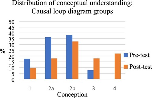
The results show that the intervention based on a causal loop diagram facilitated more qualified conceptions of causal relationships in pricing than the intervention using graphs (see and ). This can be seen in the statistically significant differences between the two groups in terms of better results on the post-test for the causal loop diagram group (M = 3.53, SD = 0.97) compared to the graph group (M = 2.56, SD = 0.55, p < 0.001, d = 1.23). Introducing graphs to the causal loop diagram group at the end of the intervention could not explain this difference, as the results for the two post-test questions answered by the causal loop diagram group (one before introducing the supply/demand graphs and one after) did not differ significantly (t < 1).
Figure 5. Distribution of conceptual understanding of price on the pre- and post-test respectively, for the graph group.
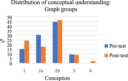
Figure 6. Distribution of conceptual understanding of price in pre- and post-test respectively, for the causal loop diagram group.
5.1.1. Patterns on an Individual Level
An analysis of the direction and magnitude of an individual’s developed understanding of pricing was conducted in order to deepen the understanding of the patterns seen on a group level. In terms of direction, and as shown in , a majority of students in the causal loop diagram group expressed a more qualified conception of the causal relationships in pricing in their post-test answers compared to pre-test answers. In the graph group, approximately half of the students expressed a more developed conception in their post-test answers compared to pre-test answers, yet for half of the students the reversed pattern was demonstrated: a less qualified conception was expressed after the intervention than before it (see, for instance, the distribution of answers to Category 1 in ).
Table 4. Percentage of student answers expressing a changed understanding of the relationships in price between the pre- and post-test.
There was a larger development in the conception of causal relationships in price between the pre- and post-test for the causal loop diagram group (M = 1.11, SD = 0.99) compared to the graph group (M = −0.07, SD = 0.85, d = 1.27). Some students in the causal loop diagram group developed their understanding of pricing from one category to the next, but in many cases the students in this group developed their understanding across several conceptions and thus showed a major development (see ). This was not the case in the graph group (see ). Also, in the causal loop diagram group, even some students who had scored at the lowest level on the pre-test provided evidence of the highest level of understanding of causation on the post-test.
Table 5. Causal loop diagram group distribution of student answers to the five conceptions on pre- and post-test, respectively.
Table 6. Graph group distribution of student answers to the five conceptions on pre- and post-test, respectively.
5.2. Analysis of Critical Aspects Made Possible to Discern Through the Visual Representations
To answer Research Question 2, focusing on what aspects of the causal relationships in price are made possible for students to discern through the different visual representations, the results presented in Section 5.1 could be related to the critical aspects identified and pointed out in the phenomenographic outcome space presented earlier (see ). In the following section each critical aspect will be discussed in light of the results for the two groups and examples will be given where students seem to have discerned the different critical aspects.
5.2.1. Critical Aspect 1: Price as a Coordination Mechanism
Answers belonging to Category 1 expressed an idea of a direct relationship between supply and demand. For the students to develop their understanding of the relationships in pricing it was necessary to discern price as a coordinating mechanism in the relationship. The difference between the two groups in terms of the number of answers neglecting price as a coordinating mechanism on the pre- and post-tests, could suggest that the two visual representations to different extents facilitated for the students to discern this aspect. This is not very surprising, as price in the causal loop diagram is placed at the centre of the illustration, connected to supply and demand. In contrast, in the supply/demand graph, although price is theoretically placed at the centre, where the supply and demand curve meet, it is visually spelled out in the upper left corner. A student who seems to have discerned this critical aspect during the intervention wrote Utterances 1 and 2 below.
[1] “The increase in film downloads can affect the selling of cinema tickets negatively. The increased access to film downloading makes people feel less of a need to go to see new films at the cinema”. (pre-test, Student A, causal loop diagram group)
[2] “The price on cinema tickets will decrease because the demand decreases. If you have the possibility to see the same film at home as at the cinema, more people will do that. When the supply increases, the price will decrease. Even if the increase is not of exactly the same kind (in this case more cinemas), prices will decrease, because there is competitiveness”. (post-test, Student A, causal loop diagram group)
Some students in the graph-based intervention missed this critical aspect in their post-test answers, although before the intervention they had expressed an understanding where price was included (see the distribution of answers to Category 1 in ).
5.2.2. Critical Aspect 2: Price as Dependent on the Market Rather Than Merely the Producer
Answers in Category 2 expressed an understanding of the relationships in pricing being unidirectional between price and demand/supply. However, these unidirectional relationships could be considered either from a producer perspective, or a market perspective. In order to develop an understanding towards the latter, which is an expression of a more qualified understanding, students needed to understand price as dependent on the market rather than merely the producer, which is the second critical aspect. For both groups, there was a decrease in the number of answers expressing a producer perspective (Category 2a) after the intervention as compared to before. This suggests that independently of the visual representation used in the intervention, the students seemed to discern this critical aspect. Accordingly, both visual representations seemed to facilitate an understanding of price being part of a larger structure. An example of a student developing his/her understanding from a producer to a market perspective is exemplified in Utterances 3 and 4 below.
[3] “Prices of the ecological hamburgers will probably decrease, since the demand for those hamburgers has increased. Prices of the non-ecological hamburgers will probably increase if the demand decreases. This is because when fewer people buy it, the price needs to be increased. When there is a high demand, many will buy the product and you will earn money on it, but if demand is low, it is more difficult to make money and prices must increase”. (pre-test, Student C, causal loop diagram group)
[4] “When the demand for ecological hamburgers increases, price will also increase, because there will be many consumers willing to buy the ecological hamburgers. The demand for non-ecological hamburgers will decrease and this will affect the price, which will also decrease”. (post-test, Student C, causal loop diagram group)
Interestingly, there were students in the graph group for whom the producer perspective was predominant in both the pre- and post-tests, but in the post-test the student tried to explain the relationships in light of the graph. This is exemplified in Utterances 5 and 6 below.
[5] “As the supply increases, I think that the price with time will increase when they get the opportunity to earn more money, but then I also think that people will choose the non-ecological hamburgers”. (pre-test Student D, graph group)
[6] “Those who produce the ecological hamburgers want to make money on them and sell them for as much money as possible in order to earn money on them and then you must draw graphs where the supply and the demand meet in the middle and then use that price”. (post-test, Student D, graph group)
5.2.3. Critical Aspect 3: Mutual Influence as a Key Characteristic of the Relationships
For students to develop their understanding of price from seeing it as a unidirectional relationship between price and supply/demand (Category 2) to seeing it as bidirectional relationships (Category 3), they needed to discern mutual influence as a key characteristic of the relationships. In other words, they needed to understand that demand/supply not only influences price, but also that price also influences demand/supply. To some extent, this critical aspect was discerned by students in the graph group. However, to a much larger extent, this development in understanding was seen in the causal loop diagram group. With arrows explicitly visualising a two-way relationship between supply/demand and price, the causal loop diagram may more easily facilitate for students to discern this critical aspect. In the graph, this bidirectionality is implicit, and students need to understand the underlying structure of the graph in order to understand the bidirectionality, which could be difficult for novice learners of economics. Utterances 7 and 8 are written by a student who seems to have discerned this critical aspect during the intervention.
[7] “When film downloads increase, fewer cinema tickets will be sold, because you can see the films at home, and then it is unnecessary to go to the cinema because you can stay in bed and watch them. Therefore, it must be more expensive to go to the cinema, because fewer people go there and they still need to earn enough money”. (pre-test, Student E, graph group)
[8] “The effect of an increase in downloading film will be that cinema tickets get cheaper, because the demand decreases, and if the tickets get cheaper, the demand for going to the cinemas will increase”. (post-test, Student E, graph group)
5.2.4. Critical Aspect 4: The Interrelation Between Supply, Price and Demand
For students to develop the most qualified understanding of the causal relationships in pricing, it seems critical to discern the interrelation between supply, price and demand. This critical aspect includes an understanding of how supply, price and demand are interrelated and dynamically influenced by each other. Very few students in the graph group, but many in the causal loop diagram group, seemed to discern this critical aspect. As the causal loop diagram explicitly visualises the interrelations with arrows, this illustration may more easily facilitate for students to discern that supply, price and demand are dynamically interrelated. The graph also illustrates this aspect, but for a novice learner of economics, who is not used to reading supply/demand graphs, it may be more difficult to discern. Utterances 9 and 10 are written by a student who seems to have discerned this critical aspect during the intervention.
[9] “As the demand for ecological hamburgers increases, prices will decrease. The demand for non-ecological hamburgers will also decrease, since the interest for ecological products increases. This will lead to companies having to increase prices in order to gain enough money to keep the company going. If demand increases, the price decreases. If demand decreases, prices will increase”. (pre-test, Student F, causal loop diagram group)
[10] “As demand on ecological hamburgers increases, prices will increase and then supply will also increase. The fact that demand increases leads to higher prices, because they know that people are willing to buy the product. The supply will also increase, which leads to the product being less exclusive and the price will then decrease”. (pre-test, Student F, causal loop diagram group)
6. Discussion
6.1. Relevance for Teaching and Learning in Economics
The results suggest that the compositional structure of the visual representation used to illustrate pricing fundamentally matters for what understanding is made possible for students to develop. This has implications for teaching economics and designing course materials on price, as it questions the use of graphs as the most efficient way of introducing price. In line with earlier research (Cohn et al., Citation2001; Strober & Cook, Citation1992), the results of this study suggest that graphs can create problems, or even be counterproductive, for students when learning about price. This study extends earlier research in terms of identifying why, or in what way, supply/demand graphs can cause problems in a learning situation: for novice learners of economics, some critical aspects that seem necessary to discern in order to develop a more qualified conception of causality in price are not necessarily explicitly made visible through the graph. Such aspects are understanding price as a coordinating mechanism, understanding the mutual influence as a key characteristic and understanding the interrelation between supply, price and demand. This does not mean that those critical aspects are not possible to discern through graphs or that graphs are not a useful illustration of pricing. The critical aspects identified are all inherent in the graphs, though seemingly not easily discerned by novice learners of economics.
Also, graphs are, for instance, central for calculating price and elaborating on elasticity and may very well be useful as a second step, in order to further elaborate on the relationships in pricing. This result could be understood in light of Fredlund’s (Fredlund et al., Citation2014) discussion on “disciplinary rationalised” representations. The supply/demand graph may be an example of a visual representation being “disciplinary rationalised”, with several important aspects being implicit in the representation. In that sense, the supply/demand graph may be very constructive for communicating within the discipline and among non-novices, but not for communicating the foundations of causality in pricing to novice learners in the field. Accordingly, this study does not mainly extend the debate of whether or not supply/demand graphs facilitate learning, which has been the focus of many studies (see, for instance, Cohn et al., Citation2001; Kourilsky & Wittrock, Citation1987; Strober & Cook, Citation1992). However, it does extend the understanding of what understanding is made possible through the use of the graph and suggests that supply/demand graphs only to a limited extent facilitate novice upper secondary learners’ development of a qualified conception of the causal relationships in pricing.
This study also extends the understanding of the benefit of using a causal loop diagram in helping novice learners of economics to understand the causal relationships in pricing. The findings confirm the favour of the causal loop diagram suggested by Wheat (Citation2007b), but they also extend Wheat’s research in two ways. First, the results show that the causal loop diagram is very useful as a static visual representation and does not have to be used as a dynamic computer simulation model, as was the case in Wheat’s (Citation2007b) study, in order to facilitate a more qualified understanding of pricing. Interestingly, this suggests that an illustration of price, although static, can be designed in a way that captures the dynamics involved and thereby facilitates a complex understanding of the processes and relations involved. Second, the results do not only suggest that the causal loop diagram facilitates learning of pricing, but in what way it does, in other words what critical aspects the illustration seems to facilitate for learners to discern.
The results have implications for teachers introducing price to novice learners of economics, suggesting the use of a causal loop diagram, rather than supply/demand graphs, when introducing the underlying structures of the causal relationships in pricing to upper secondary students, in order to facilitate a more qualified understanding of the dynamic relationships involved. Accordingly, the strong tradition of graphical and algebraic models that have come to serve as an intellectual framework in economy (Kennedy, Citation2000) does not always seem to be fruitful in the learning situation and needs to be problematised. We might thus need to re-think how complex processes and relations could be visualised in a way that enables students to develop complex understandings of the phenomenon in focus. This may be relevant not merely in relation to pricing, but also in relation to other areas in economics dealing with dynamic interrelations, such as setting of wage rates and understanding environmental costs.
6.2. Relevance for Teaching and Learning Through Visual Representations in General
This study indicates the importance of reflecting on how visual representations facilitate conceptual understanding. The results support the idea suggested in previous literature that the composition of a visual representation can have a significant influence on how the content is understood (Danielsson & Selander, Citation2014; Fredlund et al., Citation2012; Kress, Citation2010; Kress & Van Leeuwen, Citation2006; McDermott et al., Citation1990). It thus seems important, in each case of the use of visual representations in teaching and learning, to note what aspects of the phenomenon are communicated, placed in the foreground versus background and made possible to discern, as different aspects of the content may be possible to discern through different visual representations.
The results also imply that creating visual representations in a subject is theoretical work, as it involves deciding what relations and concepts to highlight and how, work that preferably should take students’ conceptions into consideration. It may be that the design of a visual representation is not a determinant for how a specialist within a field, who has already discerned different critical aspects of a certain phenomenon, understands it, but that the design is of great importance for a novice in the field (Danielsson & Selander, Citation2014). This study also identifies a useful synergy between phenomenography and research on visual representations, as the notion and use of “critical aspects” can further deepen the understanding of what learning is facilitated through different visual representations of a phenomenon. Critical aspects can be a useful tool both when investigating what learning is facilitated through certain visual representations and in creating visual representations in order for students to develop their understanding of a certain concept or phenomenon.
6.3. Reflections on Methodology
It is possible that the different student outcomes might have been due to differences between the teachers. Although the different teachers all applied the same basic lesson plan, they may have expressed themselves differently and engaged with the students in different ways. However, one of the teachers taught two classes (one in the graph-based intervention and one in the loop diagram intervention), which would minimise the risk of the teacher being the reason for differences in understanding developed by the students in the two groups. The fact that the causal loop diagram was new to the teachers could have caused them to put even more effort into communicating its structure and meaning to the students than the teachers in the graph intervention, which in turn could be a factor that affected students’ conceptions of price in a positive direction. On the other hand, both teachers teaching in the causal loop diagram intervention expressed that they found it challenging and a bit difficult to teach pricing with a representation they had never used before. Only students’ written answers were analysed in this study.
It cannot be ruled out that students would have expressed their understanding of causality in price in a more elaborated way if they were interviewed, with follow-up questions encouraging the students to nuance and develop their answers in more depth, or if group discussions were analysed. It can also not be ruled out that students may have expressed a partly different understanding of causality in price if the questions posed were differently formulated, as the context may affect what understanding of a concept that students express. However, as all students answered the same two questions and all did it in writing, those methodological changes would most likely not have affected the conclusions drawn from this study.
6.4. Future Research
One possible explanation for why the loop diagram-based intervention resulted in more qualified understanding among the students than the graph-based intervention could be that the teaching and learning situation, although the two groups had the same lesson plan and used the same examples, was formed partly differently by the visual representation used, in terms of concepts and terms used by the teachers, kinds of questions asked by the students, etc. This aspect, how the teaching and learning practices are formed in the classroom depending on visual representation used, is of interest for future research. Other aspects worth looking into in future studies are the effects of visual representations on student understanding among younger students and also the effects of visual representations with different subject contents.
6.5. Conclusions
To conclude, the aim of this study was to investigate how students’ understanding of causality in price develops in relation to two different visual representations of price and what aspects of causal relationships in price are made possible for students to discern through these visual representations. The results have implications for teaching in economics as well as the design of course material on price in suggesting that the use of graphs needs to be complemented with a causal loop diagram in order for novice upper secondary students to develop a more qualified understanding of the causal relationships between supply, price and demand. The study also extends the understanding of how the composition of a visual representation can have a significant influence on how novice learners understand the content, as different representations of the same content seem to facilitate different understandings.
Acknowledgements
I am very grateful to Peter Davies and Cecilia Lundholm for their helpful input and comments on earlier drafts of this paper.
Disclosure Statement
No potential conflict of interest was reported by the author(s).
Notes
1 As there was no significant difference between the results of the dropout group and the remaining group (t < 1), nor between dropouts from the graph group and dropouts from the causal loop diagram group (t < 1), the dropout is not considered to affect the results and conclusions drawn from the study.
2 For 24 of the students (10 from the graph-based group and 14 from the loop diagram-based group), a post-test answer was missing for either Q1 or Q2 due to the student not answering the question at all or only answering “I don’t know”. In those cases, also the pre-test answer was also removed from the analysis, as both pre- and post-test answers were needed in order to analyse change in conceptions of price. Consequently, 48 answers (14,6% of all answers) were missing/excluded from the analysis. To ensure that the removed answers did not differ from the remaining sample, they (M = 2.96, SD = 0.88) were compared with those that were included (M = 2.96, SD = 0.96). An independent samples t-test showed that they did not differ significantly (t < 1). The exclusion of the 24 answers thus did not affect the results.
References
- Airey, J., & Linder, C. (2009). A disciplinary discourse perspective on university science learning: Achieving fluency in a critical constellation of modes. Journal of Research in Science Teaching: The Official Journal of the National Association for Research in Science Teaching, 46(1), 27–49. https://doi.org/https://doi.org/10.1002/tea.20265
- Åkerlind, G,S. (2005). Variation and commonality in phenomenographic research methods. Higher Education Research & Development, 24(4), 321–334. https://doi.org/https://doi.org/10.1080/07294360500284672
- Bruno, J. E. (1989). Monitoring the academic progress of low-achieving students: An analysis of right-wrong (RW) versus information referenced (MCW-APM) formative and summative evaluation procedures. Journal of Research and Development in Education, 23(1), 51–61.
- Carney, R. N., & Levin, J. R. (2002). Pictorial illustrations still improve students’ learning from text. Educational Psychology Review, 14(1), 5–26. https://doi.org/https://doi.org/10.1023/A:1013176309260
- Cohn, E., Cohn, S., Balch, D. C., & Bradley, J., Jr. (2001). Do graphs promote learning in principles of economics? The Journal of Economic Education, 32(4), 299–310. https://doi.org/https://doi.org/10.1080/00220480109596110
- Cohn, E., Cohn, S., Balch, D. C., & Bradley, J. (2004). The relation between student attitudes toward graphs and performance in economics. The American Economist, 48(2), 41–52. https://doi.org/https://doi.org/10.1177/056943450404800203
- Colander, D. (1991). Why aren’t economists as important as garbagemen? Essays on the state of economics. Routledge.
- Colander, D. (1995). The stories we tell: A reconsideration of AS/AD analysis. Journal of Economic Perspectives, 9(3), 169–188. https://doi.org/https://doi.org/10.1257/jep.9.3.169
- Dahlgren, L. (1984). Outcomes of learning. In F. Marton, D. Hounsell, & N. Entwistle (Eds.), The Experience of Learning (pp. 19–35). Scottish Academic Press.
- Danielsson, K., & Selander, S. (2014). Se texten! Multimodala texter i ämnesdidaktiskt arbete. Gleerups Utbildning AB.
- Davies, P. (2011). Students’ conceptions of price, value and opportunity cost: Some implications for future research. Citizenship, Social and Economics Education, 10(2-3), 101–110. https://doi.org/https://doi.org/10.2304/csee.2011.10.2.101
- Davies, P. (2012). Threshold concepts in economics. In G. Hoyt & K. McGoldrick (Eds.), The international handbook on teaching and learning economics (pp. 250–256). Edward Elgar Press.
- Davies, P. (2019). The construction of frameworks in learners’ thinking: Conceptual change and threshold concepts in economics. International Review of Economics Education, 30, 1–9. https://doi.org/https://doi.org/10.1016/j.iree.2018.05.002
- Davies, P., & Mangan, J. (2013). Conceptions of graphs and the progression of students’ understanding. Korean Journal of Economics Education, 4, 189–210.
- Durden, G. P. (2018). Accounting for the context in phenomenography-variation theory: Evidence of English graduates’ conceptions of price. International Journal of Educational Research, 87, 12–21. https://doi.org/https://doi.org/10.1016/j.ijer.2017.11.005
- Estrada, M. A. R. (2013). Is it possible to apply multidimensional graphical methods in the teaching and learning of economics? Contemporary Economics, 7(4), 123–138. https://doi.org/https://doi.org/10.5709/ce.1897-9254.127
- Fredlund, T., Airey, J., & Linder, C. (2012). Exploring the role of physics representations: An illustrative example from students sharing knowledge about refraction. European Journal of Physics, 33(3), 657–666. https://doi.org/https://doi.org/10.1088/0143-0807/33/3/657
- Fredlund, T., Airey, J., & Linder, C. (2015). Enhancing the possibilities for learning: Variation of disciplinary-relevant aspects in physics representations. European Journal of Physics, 36(5), Article 055001. https://doi.org/https://doi.org/10.1088/0143-0807/36/5/055001
- Fredlund, T., Linder, C., & Airey, J. (2015). A social semiotic approach to identifying critical aspects. International Journal for Lesson and Learning Studies, 4(3), 302–316. https://doi.org/https://doi.org/10.1108/IJLLS-01-2015-0005
- Fredlund, T., Linder, C., Airey, J., & Linder, A. (2014). Unpacking physics representations: Towards an appreciation of disciplinary affordance. Physical Review Special Topics-Physics Education Research, 10(2), Article 020129. https://doi.org/https://doi.org/10.1103/PhysRevSTPER.10.020129
- Gibson, J. J. (1979). The theory of affordances. The ecological approach to visual perception (pp. 127–143). Houghton Miffin.
- Ingerman, Å., Linder, C., & Marshall, D. (2009). The learners’ experience of variation: Following students’ threads of learning physics in computer simulation sessions. Instructional Science, 37(3), 273–292. https://doi.org/https://doi.org/10.1007/s11251-007-9044-3
- Jägerskog, A., Davies, P., & Lundholm, C. (2019). Students’ understanding of causation in pricing: A phenomenographic analysis. Journal of Social Sciences Education, 18(3), 89–107. https://doi.org/https://doi.org/10.4119/jsse-1421
- Kennedy, P. E. (2000). Macroeconomic essentials: Understanding economics in the news. The MIT Press.
- Kourilsky, M., & Wittrock, M. C. (1987). Verbal and graphical strategies in the teaching of economics. Teaching and Teacher Education, 3(1), 1–12. https://doi.org/https://doi.org/10.1016/0742-051X(87)90030-8
- Kress, G. (2010). Multimodality. A social semiotic approach to contemporary communication. Routledge.
- Kress, G. R., & Van Leeuwen, T. (2006). Reading images: The grammar of visual design. Routledge.
- Leijonhufvud, A. (1969). Keynes and the classics: Two lectures on the contribution of Keynes to economic theory. Institute of Economic Affairs.
- Leiser, D., & Halachmi, R. B. (2006). Children’s understanding of market forces. Journal of Economic Psychology, 27(1), 6–19. https://doi.org/https://doi.org/10.1016/j.joep.2005.06.008
- Lundholm, C. (2018). Conceptual change and the complexity of learning. In T. Amin & O. Levrini (Eds.), Converging perspectives on conceptual change: Mapping an emerging paradigm in the learning sciences (pp. 34–42). Routledge.
- Marton, F. (2015). Necessary conditions of learning. Routledge.
- Marton, F., & Booth, S. (1997). Learning and awareness. Lawrence Erlbaum Associates.
- McDermott, L. C., Gardner, M., Greeno, J., Reif, F., & Schoenfeld, A. H. (1990). Toward a scientific practice of science education. Lawrence Erlbaum Associates.
- Pang, M. F., & Ki, W. W. (2016). Revisiting the idea of “critical aspects”. Scandinavian Journal of Educational Research, 60(3), 323–336. https://doi.org/https://doi.org/10.1080/00313831.2015.1119724
- Pang, M. F., & Marton, F. (2003). Beyond “lesson study”: Comparing two ways of facilitating the grasp of some economic concepts. Instructional Science, 31(3), 175–194. https://doi.org/https://doi.org/10.1023/A:1023280619632
- Pang, M. F., & Marton, F. (2005). Learning theory as teaching resource: Enhancing students’ understanding of economic concepts. Instructional Science, 33(2), 159–191. https://doi.org/https://doi.org/10.1007/s11251-005-2811-0
- Pong, W. Y. (1998). Students’ ideas of price and trade. Economic Awareness, 9(2), 6–10.
- Reimann, N. (2004). First-year teaching-learning environments in economics. International Review of Economics Education, 3(1), 9–38. https://doi.org/https://doi.org/10.1016/S1477-3880(15)30147-X
- Reingewertz, Y. (2013). Teaching macroeconomics through flowcharts. International Review of Economics Education, 14, 86–93. https://doi.org/https://doi.org/10.1016/j.iree.2013.10.004
- Strober, M. H., & Cook, A. (1992). Economics, lies, and videotapes. The Journal of Economic Education, 23(2), 125–151. https://doi.org/https://doi.org/10.1080/00220485.1992.10844747
- Thompson, D. R., & Siegler, R. S. (2000). Buy low, sell high: The development of an informal theory of economics. Child Development, 71(3), 660–677. https://doi.org/https://doi.org/10.1111/1467-8624.00174
- Wheat, I. D. (2007a). The feedback method of teaching macroeconomics: Is it effective? System Dynamics Review, 23(4), 391–413. https://doi.org/https://doi.org/10.1002/sdr.386
- Wheat, I. D. (2007b). The feedback method. A system dynamics approach to teaching macroeconomics [Doctoral dissertation, University at Bergen]. http://bora.uib.no/handle/1956/2239
- Zetland, D., Russo, C., & Yavapolkul, N. (2010). Teaching economic principles: Algebra, graph or both? The American Economist, 55(1), 123–131. https://doi.org/https://doi.org/10.1177/056943451005500113
Appendix
Pre- and Post-Test Questions
Q1. Over the last decade there has been a significant increase in film downloads. What effects may this have on the price of movie tickets at Stockholm cinemas and why? Explain and give arguments for your answer and use both words and a diagram to explain your thoughts.
Q2. Over the last years, the demand for ecological hamburgers has increased as a result of a greater concern for the environment. What effects will this have on the price of ecological as well as non-ecological hamburgers and why? Explain and give arguments for your answer and use both words and a diagram to explain your thoughts.