
 ?Mathematical formulae have been encoded as MathML and are displayed in this HTML version using MathJax in order to improve their display. Uncheck the box to turn MathJax off. This feature requires Javascript. Click on a formula to zoom.
ABSTRACT
Data visualisation software provides the ability to create highly customisable choropleth maps. This presents an abundance of design choices. The colour legend, one particular aspect of choropleth map design, has the potential to effectively convey data points’ absolute magnitudes (how large or small they are). Colour legends present the mapping between a specific range of colours and a specific range of numerical values. In this experiment, we demonstrate that manipulating this range affects interpretations of the plotted values’ absolute magnitudes. Participants (N = 100) judged the urgency of addressing pollution levels as greater when the colour legend’s upper bound was equal to the maximum plotted value, compared to when it was significantly larger than the maximum plotted value. This provides insight into the cognitive processing of plotted data in choropleth maps that are designed to promote inferences about overall magnitude.
1. Introduction
To make sense of statistics presented in newspaper articles or scientific reports, it is often important to interpret their meaning in context. This may involve determining whether the presented values represent large or small numbers. Data visualisations are often used to convey statistics, so understanding how these tools may communicate data points’ magnitudes is crucial.
Numerical values in choropleth maps are often encoded using the entire range of the chosen colour palette, in order to aid discrimination and facilitate identification of spatial patterns. Thus, the range of values in the accompanying colour legend typically consists of only those values which were observed. However, this is not the only application for a choropleth map. In certain cases, displaying values’ absolute magnitudes may be considered more pertinent than displaying their relative magnitudes. This would allow a viewer to gauge, on the whole, how large or small presented values are, in context. To communicate this, the range of values in the accompanying colour legend may include values which were not observed but remain relevant nonetheless. Designers may wish to sacrifice discrimination ability for an overt display of magnitude, in order to convey their intended message.
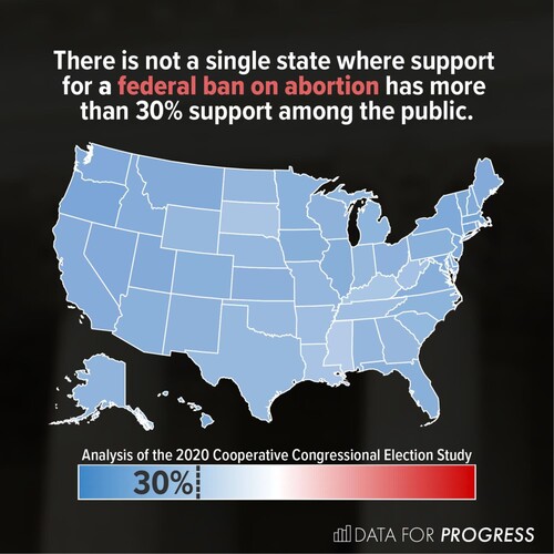
Indeed, choropleth maps displaying overall magnitudes have been used in practice. depicts data concerning public support for a federal ban on abortion in the U.S. The accompanying colour legend presents the entire range of possible values: from 0% to 100% support. Since plotted values do not exceed 30%, their magnitudes appear small, in context. In addition, whereas a typical colour scale would amplify differences between regions, this design presents variability between states as low. This lends credibility to the notion that, for this aspect of a divisive issue, public support is consistently low across the U.S.
Figure 1. A choropleth map displaying data from an analysis of state-level public support for a federal ban on abortion in the U.S (Fischer and Ali Citation2021). The colour legend employs a diverging blue-red colour palette, with white in the centre, showing the full range of possible values. The 30% point is marked with a dotted line and labelled to indicate that no state exceeds this level of support. Reproduced with permission.
The map may appear homogenous, but choropleth maps present opportunities for conveying information beyond relative geographical differences, just as line charts may show stagnant wages. By presenting a wider numerical context, the accompanying legend imbues the map with meaning, illustrating low variability and small magnitudes. The simplicity of this message does not preclude its visualisation; as well as illuminating complex patterns, data visualisations are also designed to improve retention and engagement (Bertini, Correll, and Franconeri Citation2020), and support cognition (Hegarty Citation2011).
This paper explores cognitive processing of overall magnitude in choropleth maps. Through an empirical study, we demonstrate that colour legends, which depict the mapping between colours and numerical values, can imply how large or small plotted values’ absolute magnitudes are. Even when the mapping between colour and numerical value remains the same, the range of the colour legend provides a crucial source of context. The relationship between this range and the plotted data influences viewers’ interpretations of magnitude.
2. Related work
2.1. Choropleth maps
Choropleth maps are thematic maps which employ colour to symbolise numerical values, conveying quantitative data in a spatial manner. Choropleth mapping uses datasets where each data point corresponds to a discrete area, typically defined by administrative boundaries (e.g. national or local government regions). Ratios, proportions and averages are plotted to enable appropriate comparisons between regions (Dent, Torguson, and Hodler Citation2009).
Dent, Torguson, and Hodler (Citation2009) discuss several considerations for choropleth map design, including data pre-processing, spatial resolution, and appropriate accompanying text. However, data classification is a particularly prominent theme in guidance on choropleth mapping. To better convey patterns in the spatial distribution of data, values can be classified into discrete classes (Kraak and Ormeling Citation2013). Decisions around classification involve trade-offs between clarity of patterns in the map and clarity of the legend. Natural Breaks methods (e.g. Jenks optimisation; (Jenks and Caspall Citation1971)) identify class boundaries according to the distribution of data, ensuring clusters of similar values appear homogenous. The Equal Frequency method ensures uniform prevalence of each class within the map, whereas the Equal Interval method simply employs the same numerical range for each class (Dent, Torguson, and Hodler Citation2009). Unclassed choropleth maps (Tobler Citation2010), which do not employ discrete groups at all, are an alternative option. Legends are not divided into classes, meaning each unique value is represented distinctly. This may increase estimation error, yet avoids the impression that similar values either side of a class boundary are substantially different (Kraak and Ormeling Citation2013).
Regarding the minimum and maximum values used in the labels for each class, two options are available. Continuous class ranges include non-observed values to create a continuous sequence of numbers. This provides consistency when re-using a legend for multiple maps. However, this may increase the chance that viewers make imprecise estimations of specific values, compared to non-continuous class ranges which include only observed values (Dent, Torguson, and Hodler Citation2009). The use of open-ended categories at a legend’s extremes (Paul Citation1993) is an additional consideration, generating a similar generalisability-precision trade-off.
Dykes, Wood, and Slingsby (Citation2010) explored several creative approaches to map legend design, providing alternatives to conventional implementations. One such design, displaying statistical information within a legend, has been implemented in several forms, for communicating distributions (Cromley and Ye Citation2006; Kumar Citation2004) and uncertainty (Retchless and Brewer Citation2016) in choropleth maps. Several studies have illustrated the influence of legend design on cognitive processing for a range of maps. Proximity between icons and corresponding text within a legend was found to be the most influential aspect of spacing on visual search (Li and Qin Citation2014). For thematic maps showing several geographical features, overall task performance was found to be similar across three different legend arrangements (list legend, grouped legend, natural legend), but user preferences depended on legends’ suitability for specific tasks (Gołębiowska Citation2015). Consistent with left-hemisphere specialised language processing, legends presented on the right of a map were processed faster than those presented on the left (Edler et al. Citation2020). Eye-movement tracking has revealed that fixation on map legends decreases with repeated exposure, illustrating the role of legends for developing initial cognitive representations (Hepburn et al. Citation2021). This body of research provides evidence that legend design influences various aspects of map interpretation.
2.2. Communicating absolute magnitude through data visualisation
Empirical studies in various scientific fields have explored how interpretations of magnitude are influenced by data visualisation design choices.
Recently, the practice of y-axis truncation has enjoyed attention in experiments at the intersection of the disciplines of data visualisation and psychology. Y-axis truncation refers to the practice of minimising the range of values that appear on the y-axis. This typically involves starting the y-axis at a value greater than zero (Correll, Bertini, and Franconeri Citation2020). However, some experiments on y-axis truncation have employed axes that are roughly symmetrical about the plotted data (Witt Citation2019). Truncation effects are therefore not just associated with the exclusion of a zero value, but also the exclusion of values above the observed data, which make differences appear smaller. Thus, more generally, truncation effects illustrate people’s treatment of axes as implicit scales for making qualitative judgments about presented data.
Research on the effects of y-axis truncation has focused on how this practice can alter people’s interpretations of the magnitude of the difference between plotted values. Demonstrating the effect of y-axis truncation with a large online sample, Pandey et al. (Citation2015) found that ratings of the magnitude of the difference between values were greater when a truncated axis was used to display the difference between safe drinking water levels in two towns. In both bar charts and line charts, increasing the degree of truncation produces increasing estimations of the severity of the difference between values (Correll, Bertini, and Franconeri Citation2020). Encouraging careful attention to plotted data (by ensuring that numerical values are read precisely) does not eliminate this effect (Correll, Bertini, and Franconeri Citation2020). Warnings somewhat reduce, but do not eradicate, the difference between interpretations of truncated and non-truncated charts (Yang et al. Citation2021). Visual indicators of truncation are also ineffective (Correll, Bertini, and Franconeri Citation2020).
Witt (Citation2019) demonstrated that using the widest possible y-axis range diminishes a viewer’s sensitivity, which is the ability to distinguish between different degrees of separation between values. On the other hand, using the smallest possible y-axis range increases bias in interpretation (i.e. the extent to which judgments of the magnitude of difference deviate from actual effect sizes). To maximise sensitivity and minimise bias, and to ensure correspondence between the appearance of the difference and the reality, Witt suggests using a range of 1–2 standard deviations for y-axis limits.
Witt’s (Citation2019) recommendations are prescribed for disciplines which use standardised effect sizes (e.g. Cohen’s d) in the reporting of data and statistics. Correll, Bertini, and Franconeri (Citation2020) provide more general advice relevant to those in all disciplines: the appearance of differences in a visualisation should be appropriate for the specific data. Therefore the decision whether or not to truncate an axis depends on the real-world magnitude of the difference, and ultimately designers should ensure they represent this faithfully. Evidence suggests that viewers interpret the axis range as a representation of the relevant numerical context within which plotted data should be assessed. When an axis only just contains a pair of values, they will generally be considered to be highly divergent. When an axis easily contains these values, they will generally be considered similar, because the difference between values will be dwarfed by the vastness of the scale. Arbitrary rules will not absolve a chart designer’s responsibility to consider what their visualisation implies (Correll, Bertini, and Franconeri Citation2020).
As Yang et al. (Citation2021) discuss, one explanation for these effects draws on Grice’s co-operative principle (Grice Citation1975). This theory, originally concerning linguistic utterances, would suggest that components of a chart, such as axes, will be considered to communicate relevant information about plotted data. Thus, a viewer will derive a designer’s intended message from the features of the visualisation. Changing one’s interpretation of magnitude in accordance with changes to axis range could therefore be considered a coherent response.
Research on risk communication has also explored how visualisation design choices affect interpretations of presented information. A set of experiments relevant to the present investigation originated with empirical data which suggested that icon arrays were more effective than text at promoting risk-averse behaviour (Stone, Yates, and Parker Citation1997). Further research (Stone et al. Citation2003) suggested that this occurred because the data visualisations only displayed the number of people affected by the negative outcome. Therefore, unlike the text, the icon arrays made the numerator more salient than the denominator (the total number of people in the sample). This was demonstrated empirically in the same study, using bar charts: the difference between numerators (15 vs. 30) appeared much bigger when the larger numerator (30) was used for the upper axis limits, compared to when the denominator (5000) was used for the upper axis limits. Risk reduction (the degree of difference between plotted values) was perceived as smaller when bar charts were extended to incorporate the denominator. Unlike studies on y-axis truncation (Correll, Bertini, and Franconeri Citation2020; Driessen et al. Citation2022; Pandey et al. Citation2015; Witt Citation2019; Yang et al. Citation2021), the lower axis limit was not manipulated, and remained fixed at zero. This pattern of results has been replicated using icon arrays (Garcia-Retamero and Galesic Citation2010) and pie charts (Hu et al. Citation2014), and a similar effect has been reported for line charts (Taylor and Anderson Citation1986) suggesting this phenomenon is driven by a common mechanism independent of chart type.
Stone et al.’s (Citation2003) experiment demonstrated that extending the upper limit caused participants to interpret the difference between values as smaller. Unfortunately, the design of this experiment leaves uncertainty as to whether this extension affected interpretations of the magnitude of the values themselves, because participants only compared risks between charts in the same condition, not across conditions. However, this issue was addressed by Okan et al. (Citation2020), who found that icon arrays which did not display the denominator increased perceived risk relative to those which did (with larger increases at smaller probabilities). Including the denominator also resulted in more accurate estimates of the underlying risk probabilities. This accords with the finding that the apparent magnitude of risk decreases when the upper limit is extended in a risk ladder visualisation (Sandman, Weinstein, and Miller Citation1994). This implies that interpretations of magnitude are informed, in part, by the data point’s position within the risk ladder’s limits.
2.3. Colour legends
In data visualisations employing geometric encodings (e.g. position, extent), axes are the dimensions along which data are plotted. In colourmap visualisations, a different type of axis is present, which is not used to display data directly, but presents the mapping between colours and numerical values, henceforth referred to as a ‘colour legend’. Default settings in popular visualisation tools, such as ggplot2 (Wickham Citation2016) and Matplotlib (Hunter Citation2007) tend to employ colour legends which use the minimum and maximum values in the data at their extremes. Thus, the potential for values smaller than the minimum, or larger than the maximum, is not encoded by these colour legends. This facilitates comparison between values, since using a wide range of colours improves discrimination ability. Crucially, however, it does not facilitate magnitude judgments. Consider, for example, a heatmap showing profits for each quarter over the course of five years. Using the darkest colour on the colour legend to represent the highest profits could conceal the fact that profits in general have been poor for the entirety of this period, because the colour legend is agnostic towards real-world magnitude.
Research involving colour legends has often focused on assessing the appropriateness of different colour scales and capturing colour discriminability through colour difference models. Harrower and Brewer (Citation2003) developed a tool for selecting suitable colour scales for particular forms of data: sequential scales for ordinal or numerical data, qualitative scales for categorical data, and diverging scales for highlighting midpoints. Using choropleth maps, Brychtova and Coltekin (Citation2015) determined the minimum colour distance required for reliably detecting differences between two regions. Other work has identified specific features which make for an effective colour scheme, from low-level properties such as uniform luminance (Dasgupta et al. Citation2020) to high-level properties such as consistency with semantic colour associations (Lin et al. Citation2013). Researchers have also modelled the impact of mark size on colour discriminability (Stone, Szafir, and Setlur Citation2014) and demonstrated adaptation of colour difference models to specific viewing conditions (Szafir, Stone, and Gleicher Citation2014).
Choropleth maps are one of several types of colourmap visualisation which map colour to numerical data (see also, heatmaps and neuroimaging visualisations). Schiewe (Citation2019) illustrates that impressions of quantity are positively associated with the proportion of a choropleth map occupied by darker colours. The size of geographical regions and the classification of values can both influence the extent to which a map displays colours on the darker end of the chosen colour scale, which impacts judgments of presented data. Whilst this study manipulated the appearance of plotted data in maps, other research has held the appearance of plotted data constant in order to study how the context surrounding a colour legend affects viewers’ inferences. Schloss et al. (Citation2019) observed that viewers’ spontaneous interpretations of the relationship between colour and quantity can depend on which background colour is used. Their experiment attempted to reconcile contrasting theories about which aspects of a colour stimulus are associated with greater quantities (‘dark-is-more’; ‘contrast-is-more’; ‘opaque-is-more’). They found that viewers associate darker colours with greater quantities when there is no apparent variation in the colour scale’s opacity. However, when the colour scale does appear to have varying degrees of opacity, an ‘opaque-is-more’ association prevails. For example, black–white colour scales appear to have low opacity against a blue background (so lighter greys are more readily associated with smaller quantities), but high opacity against a black background (so lighter greys are more readily associated with larger quantities).
Different interpretations of the same dataset can also arise through modified displays of the same colour scale. Empirical research has compared colour legends which only indicate uncertainty using colour features (e.g. increasing luminance and decreasing saturation), to colour legends which also signal uncertainty through increasing reduction in the range of possible colours, termed Value-Suppressing Uncertainty Palettes (VSUPs; Correll, Moritz, and Heer Citation2018). In Correll et al.’s study, participants played a ‘Battleship’ style game which involved reducing risk by balancing danger and uncertainty. Participants were more likely to favour riskier but more certain options over uncertain options when using VSUPs. Constraining the range of colours at higher uncertainty levels may have reduced the impression that these data points could represent desirable low-danger magnitudes. The experiment we report below examines directly how the range of values in a colour legend affects interpretations of magnitude.
3. Methodology
3.1. Outline
The present experiment investigates the influence of colour legend range on the cognitive processing of magnitude. We manipulated the colour legend’s upper bound, such that it was equal to the maximum plotted value (truncated range) or it was equal to double the maximum plotted value (extended range). We employ the term ‘truncated’ in a broad sense, referring to a scale that is constrained such that potentially relevant values are omitted, not simply a scale that excludes a zero value. Using a lower bound of zero reduced the number of differences between the two conditions, so that only the upper bound was manipulated. This also meant that plotted values’ variability appeared smaller, assisting participants in judging the overall magnitude of these values. For each item, the colour palette, geographic regions, and the mapping between colours and numerical values, were identical across conditions. Therefore, the only difference between versions of a given item was the range of the colour legend: the map itself remained unchanged.
Rather than asking participants to make abstract judgments about the size of abstract values, we presented fictitious pollution data, and asked how urgently action should be taken to address the pollution levels displayed in each data visualisation. This captures participants’ assessments of magnitude through the type of judgments which can drive behaviour. In addition to increased ecological validity, we also anticipated that pollution data might be able to generate a balanced set of responses to the question of urgency. A variable evoking an extreme negative reaction may have elicited responses at ceiling and one too trivial may have elicited responses at floor. We expected participants to recognise that a sufficient degree of pollution would require action, but also understand that low levels may require less urgent action. We did not provide a specific definition of urgency for participants to use when making their responses. Therefore, different participants’ responses may reflect different notions of urgency. However, the within-participants design accounts for individual variation. Each participant’s ratings are compared against their own ratings for the alternative condition, allowing for meaningful comparison between conditions.
Pollution levels were displayed in choropleth maps, which use colour encoding to display data aggregated at the level of geographic areas. Note that we do not consider the designs of choropleth maps in this experiment to reflect best practice for plotting pollution statistics. Rather, these designs were motivated by the desire to examine the role of colour legends in the interpretation of magnitude. Previous research has illustrated that the size of geographical regions can influence ensemble coding in choropleth maps (Schiewe Citation2019). However, we did not control for this aspect, instead we prioritised ecological validity by using maps with real geographical regions. These maps appeared identical across conditions in order to avoid this bias confounding results.
To control for the possibility that participants used the colour legend’s numerical labels, rather than the range of values displayed, as a reference for their magnitude judgments, we omitted the colour legend’s numerical labels in half of trials. This allowed us to test whether the presence of numerical labels affected the degree to which magnitude judgments were influenced by the colour legend’s upper bound.
3.2. Pre-registration
We predicted that urgency ratings would be higher for truncated legends, compared to extended legends. In addition, we planned to compare whether any difference between these two conditions was moderated by the presence or absence of numerical labels, but made no predictions about existence or direction of any main effect or interaction. Participants completed Garcia-Retamero et al.’s (Garcia-Retamero et al. Citation2016) Subjective Graph Literacy scale, therefore we also planned to test whether any observed effects (or lack of) could be explained by differences in data visualisation literacy. This five-item scale is a quick, reliable measure that is correlated with scores on Galesic and Garcia-Retamero’s (Galesic and Garcia-Retamero Citation2011) test-based measure of data visualisation literacy. The pre-registration, plus materials, experiment script, data, analysis code, and Dockerfile are available at https://osf.io/qe9hf/. This repository contains the requisite resources to generate a fully-reproducible version of this paper.
3.3. Design
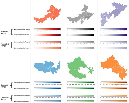
In each trial, we independently manipulated two aspects of the choropleth map. When the colour legend had a truncated range, its upper bound was equal to the maximum value displayed in the map. When the colour legend had an extended range, its upper bound was equal to double the maximum value (and the maximum value displayed in the map appeared at the legend’s halfway point). Numerical labels on the colour legend were either present or absent. This resulted in four unique combinations of conditions. We employed a Latin-squared design, ensuring that each participant was exposed to each combination of conditions throughout the experiment, but only saw one combination for each given map. There were a total of 54 trials (48 experimental trials, six attention check trials). Example stimuli are shown in .
Figure 2. Example stimuli: six choropleth maps showing fictitious pollution data. Four colour legends are displayed below each map, but only one colour legend accompanied the map in each trial. Colour legends with extended ranges have a maximum value equal to double the maximum plotted value (top row: 400; bottom row: 1800). Colour legends with truncated ranges have a maximum value equal to the maximum plotted value in the map (top row: 200; bottom row: 900). During the experiment, all six colour scales were used in conjunction with all maximum values.
3.4. Participants
We recruited participants using prolific.co. The experiment was advertised to users with English language fluency, normal or corrected-to-normal vision, and no experience of colour deficiency, who had previously participated in more than 100 studies on Prolific. Participants were paid £3.50. Ethical approval was granted by The University of Manchester’s Division of Neuroscience and Experimental Psychology Ethics Committee (Ref. 2022-11115-23778).
In our pre-registration, we planned to exclude participants who failed more than one attention check question, in order to exclude those who were not sufficiently engaged in the task. However, when many more participants than expected failed more than one attention check question, this criteria was deemed too stringent and we instead awarded payment to all participants who returned data, regardless of their responses to attention check questions. Consequently, due to practical constraints, we were unable to obtain a sample which met our originally-specified sample size (N = 160) and our pre-registered inclusion criteria. Therefore, we terminated data collection once the sample of those who satisfied the attention check criteria was balanced across all four Latin-squaring lists (N = 100; 25 participants per list). We used this sample for our main analysis. As a compromise for the reduction in experimental power, we also demonstrate below that the pattern of effects is largely the same when analyzing the entire dataset (those who satisfied attention check criteria and those who did not; N = 165). In the Discussion, we discuss a possible reason for the higher-than-expected rate of incorrect responses to attention check questions. Demographic information is shown in .
Table 1. Demographic Information.
3.5. Procedure
The experiment was programmed using PsychoPy (Peirce et al. Citation2019, version 2022.1.4) and hosted on pavlovia.org. A link to an interactive version of this experiment is available in this project’s online repository: https://osf.io/qe9hf/. Participants were instructed to use laptop or desktop computers, rather than another type of device and were told that the experiment was about using information to make decisions. We did not calibrate or measure colour display on participants’ own screens, but using a within-participants design prevents this from influencing our results. Each participant was exposed to both experimental conditions under the same display conditions. Participants were informed that in each map, each region’s colour reflected its pollution level, and that data on different types of pollution were shown throughout the experiment, with pollution levels presented using standardised units.
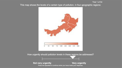
In every experimental trial, the text above the map read ‘This map shows the levels of a certain type of pollution, in four regions’. Participants were advised to read the question, which was presented below the map: ‘How urgently should pollution levels in these regions be addressed?’ This question was used in all experimental trials, where the left anchor on the visual analogue response scale was labelled ‘Not very urgently’ and the right anchor was labelled ‘Very urgently’. The instructions stated that higher pollution levels need to be addressed more urgently than lower pollution levels. Participants were permitted to move the response scale marker as many times as they wished before continuing to the next trial. An example trial is shown in .
Figure 3. An example of a single experiment trial, showing a choropleth map with a truncated colour legend, plus a response marker on the visual analogue scale.
Attention check items resembled normal trials except for the text displayed. Participants were asked to move the marker to one of three locations: ‘to the middle of the scale’, ‘all the way to the ‘Not very urgently’ end of the scale’ or ‘all the way to the ‘Very urgently’ end of the scale’. In experimental trials, response scale granularity was set to 0, which permitted participants to place the marker at any location along the response scale. In attention check trials, response scale granularity was set to 0.5, so participants were only permitted to place the marker at one of three locations specified in the question: the leftmost point, the centre of the scale, or the rightmost point.
Following the final trial, participants were informed that both the data presented, and the standardised units used, were fictitious. Finally, participants were presented with a text box and the prompt ‘What strategies did you use during the study? Do you have any comments about the study? (optional)’. Average completion time was 13.57 min (SD = 6.24 min) for those who satisfied the pre-registered attention check criteria and 12.56 min (SD = 6.20 min) for the full sample.
3.6. Materials
Materials were generated using Python (version 3.9.12). Matplotlib (version 3.5.1) was used to generate colour legends and geoplot (version 0.5.1) was used for plotting geospatial data.
Each visualisation contained a unique combination of four neighbouring Chinese provinces (except the six attention check items, which employed six existing combinations used in the experimental items). China was chosen to reduce the potential impact of prior knowledge, as Prolific’s participants tend to be located outside China. However, the choice of country was not disclosed to participants and regions were not labelled. The pollution data used were entirely fictitious, as were the ‘standardised units’ used to present the data.
The maximum value in the plotted data ranged from 200 to 900 (in multiples of 100), and the values for the other three provinces were between 10 and 30 units below this maximum value. Six Matplotlib colour scales (‘Reds’, ‘Greys’, ‘Purples’, ‘Blues’, ‘Greens’, ‘Oranges’) were each used once per maximum value. These scales exhibited monotonic and approximately linear variation in lightness (L*). Monochromatic sequential scales were used for simplicity, avoiding additional differences between conditions, such as the relative amounts of different hues (multi-hue scales) or midpoints’ positions (diverging scales). shows the start and end colours in CIEL*a*b* space, using CIE standard illuminant D65.
Table 2. CIELab values for colour legends’ start and end colours.
For each item, a ‘mappable’ object defined the mapping between numerical values and colours for both truncated and extended colour legends. The lightest colour in the scale was mapped to zero and the darkest colour to double the maximum value. This range was employed in the extended colour legend. The truncated colour legend, on the other hand, terminated at the maximum value in the data, so the range was halved (but the mapping between numerical values and colours was retained). No classification was employed in the legends, for maximum consistency across conditions. Where numerical labels were present, an identical number of labels (between six and ten) appeared on both versions of a colour legend. Tick marks were absent from all colour legends.
4. Analysis
4.1. Analysis methods
Analysis was conducted in R (R Core Team Citation2022, version 4.2.1).
Linear mixed-effects models were constructed using lme4 (Bates et al. Citation2015, version 1.1.32). Random effects structures were determined using buildmer (Voeten Citation2022, version 2.7), which after identifying the most complex random effects structure that could successfully converge (see Barr et al. Citation2013), then removed random effects terms which did not significantly contribute towards explaining variance. In a diversion from the pre-registered analysis plan, we excluded the interaction term from the models used to test the main effects of colour legend range and numerical label presence.
4.2. Part 1: Participants satisfying attention check criteria (N = 100)
4.2.1. Colour legend ranges and numerical labels
shows the distribution of responses for colour legends with truncated and extended ranges.
Figure 4. Visual analogue scale responses to the question ‘How urgently should pollution levels in these regions be addressed?’. Distributions for the two conditions are shown using histograms, boxplots, and raw data points representing individual observations. In the ‘Extended Range’ condition, the colour legend’s upper bound was equal to double the maximum plotted value. In the ‘Truncated Range’ condition, the colour legend’s upper bound was equal to the maximum plotted value.
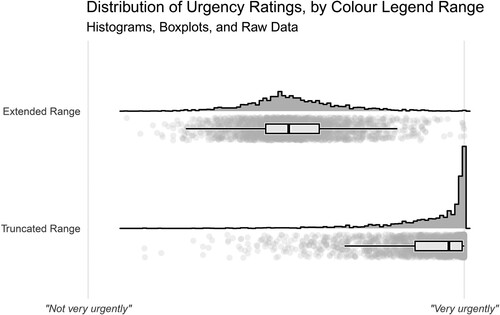
Linear mixed-effects modelling revealed that urgency was rated as significantly higher when the colour legend had a truncated range (its upper bound was equal to the maximum value in the dataset) compared to when the colour legend had an extended range (its upper bound was equal to double the maximum value): (1) = 225.41, p < .001,
= 0.90.
Ratings were not significantly different when numerical labels were present, compared to when they were absent: (1) = 0.35, p = .556,
< 0.01.
There was no interaction between colour legend range and numerical labels: (1) = 1.73, p = .189,
= 0.02. These models all employed random intercepts for participants with random slopes for colour legend range, numerical label presence, and the interaction between these terms, plus random intercepts for items.
4.2.2. Data visualisation literacy
Adding participants’ data visualisation literacy as an additional fixed effect did not remove the significant effect of colour legend range: (1) = 260.93, p < .001,
= 0.89. This indicates that differences in data visualisation literacy cannot explain this effect. The numerical label manipulation remained non-significant when accounting for literacy (
(1) = 0.30, p = .586,
< 0.01). The interaction remained non-significant when accounting for literacy (
(1) = 3.21, p = .073,
< 0.01). These models employed random intercepts for participants with random slopes for colour legend range and numerical label presence, plus random intercepts for items with random slopes for colour legend range.
4.3. Part 2: All participants (N = 165)
4.3.1. Colour legend ranges and numerical labels
The above analysis was conducted using data from the 100 participants who satisfied the pre-registered attention check criteria. However, smaller samples are associated with lower statistical power. Below, we conduct the same analysis on the full sample of 165 participants (those who satisfied the pre-registered attention check criteria and those who did not).
Urgency was rated as significantly higher when a truncated colour legend range was used, compared to when an extended colour legend range was used: (1) = 272.40, p < .001,
= 0.87. Ratings were not significantly different when numerical labels were present, compared to when they were absent:
(1) = 1.95, p = .163,
= 0.01. These models employed random intercepts for participants with random slopes for colour legend range, numerical label presence, and the interaction between these terms, plus random intercepts for items with random slopes for colour legend range.
There was a significant interaction between colour legend range and numerical label presence: (1) = 6.41, p = .011,
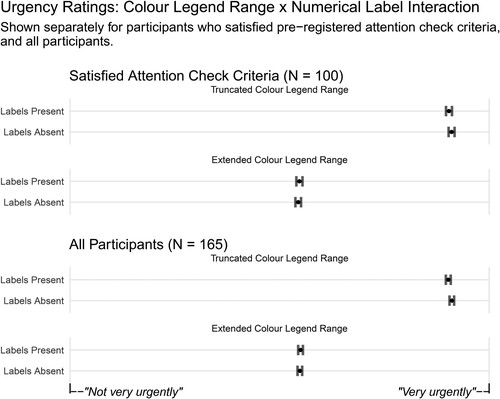
< 0.01. This model employed random intercepts for participants with random slopes for colour legend range and numerical label presence, plus random intercepts for items with random slopes for colour legend range. We conducted pairwise comparisons with Sidak adjustment using the emmeans package (Lenth Citation2021). For choropleth maps with extended colour legend ranges, there was no difference between ratings for labelled and unlabelled colour legends: z = 0.59, p = .962, Cohen’s d = 0.02. For choropleth maps with truncated colour legend ranges, higher ratings were awarded when numerical labels were absent, compared to when they were present: z = 2.99, p = .011, Cohen’s d = 0.10. displays the means and 95% confidence intervals for each combination of conditions, for both samples of participants: those who satisfied the pre-registered attention check criteria, and the full sample.
Figure 5. Mean urgency ratings showing the interaction between colour legend range and numerical label presence, displayed separately for the different samples of participants. Error bars show 95% confidence intervals around the means.
4.3.2. Data visualisation literacy
The same pattern of results was observed when accounting for differences in data visualisation literacy. There was a significant effect of colour legend range ((1) = 272.45, p < .001,
= 0.87) and no effect of numerical label presence (
(1) = 2.09, p = .148,
= 0.01). The interaction between colour legend range and numerical label presence remained:
(1) = 6.47, p = .011,
< 0.01. These models employed random intercepts for participants with random slopes for colour legend range and numerical label presence, plus random intercepts for items with random slopes for colour legend range.
4.4. Exploratory analysis
Our pre-registered analysis did not detect an effect of the presence of numerical values on urgency ratings. However, a more fine-grained analysis can explore the role of numerical labels with greater sensitivity. This exploratory analysis examines whether urgency ratings are influenced by the actual numerical values displayed. We systematically varied the maximum value displayed in each map, which ranged from 200 to 900. Other plotted values were defined in relation to this value: between 10 and 30 units less than the maximum value. Modelling the effect of different maximum values on ratings will reveal whether judgments were informed by the numerical values displayed.
When considering only maps with numerical labels present, ratings increased as a function of maximum value ((1) = 27.90, p < .001,
= 0.48). This model employed random intercepts for participants with random slopes for colour legend range, plus random intercepts for items with random slopes for colour legend range. However, ratings also increased as a function of maximum value even when numerical labels were absent (
(1) = 16.85, p < .001,
= 0.32). This model employed random intercepts for participants with random slopes for colour legend range, plus random intercepts for items. There was no significant interaction between maximum value and numerical label presence (
(1) = 2.22, p = .137,
< 0.01). This model employed random intercepts for participants with random slopes for colour legend range and numerical label presence, plus random intercepts for items with random slopes for colour legend range.
This suggests that the numerical labels themselves were not responsible for the effect of maximum value. Instead, this effect may have been driven by the appearance of the choropleth map. The colour for the maximum value was identical in each map with the same colour palette, but the three accompanying values in each map were always between 10 and 30 units less than the maximum value. Consequently, these values were represented by darker colours when the maximum value was higher, thus conveying greater overall magnitude. Colour legend range ( = 0.89) remains a greater influence than maximum value (
= 0.44).
In the models for participants who satisfied the pre-registered attention check criteria and those who did not (N = 165), there were significant effects of maximum value, for both maps with labelled colour legends ((1) = 28.55, p < .001,
= 0.50) and also maps with unlabelled colour legends (
(1) = 16.27, p < .001,
= 0.32). These models employed random intercepts for participants with random slopes for colour legend range, plus random intercepts for items with random slopes for colour legend range. There was no significant interaction between maximum value and numerical label presence (
(1) = 3.51, p = .061,
< 0.01). This model employed random intercepts for participants with random slopes for colour legend range and numerical label presence, plus random intercepts for items with random slopes for colour legend range. Colour legend range (
= 0.87) remains a greater influence than maximum value (
= 0.45).
5. Discussion
Choropleth maps are typically used to convey spatial variability, but may alternatively be employed to convey overall magnitude. This experiment clearly demonstrated that the range of the accompanying colour legend influences interpretations of absolute magnitude in such choropleth maps. When the colour legend’s upper bound was equivalent to the maximum plotted value, participants rated the urgency of addressing pollution levels as higher, compared to when the colour legend’s upper bound was equal to double the maximum plotted value. This illustrates that viewers use colour legends to put numbers’ magnitudes into perspective, interpreting magnitude with respect to the range of the colour legend. A colour legend does not only provide a mapping between numerical values and colours, it also provides a range of values relevant for considering the absolute magnitude of presented data.
Crucially, the colours used to display the data in the maps, as well as the underlying numerical values, were identical across conditions. Therefore, differences in participants’ judgments between conditions were not due to these factors. Instead, participants formed different impressions of these data based on the context in which they were presented. We do not suggest that one colour legend arrangement used in this experiment was misleading and the other truthful. Rather, we suggest that, under certain circumstances, either could be characterised as misleading. Thus, doctored data and deliberate deception are not the only practices behind problematic visualisations.
Colour legends simultaneously encode changes in number through both colour and physical position. Different values are represented by different colours and occupy different positions on the colour legend. In the present experiment, plotted values’ analogous positions in the truncated colour legend were on the far right hand side, and their corresponding colours were among the darkest in the legend. On the other hand, plotted values’ analogous positions were in the middle of the extended colour legend, and their corresponding colours were neither the darkest nor the lightest in the legend. This experiment cannot determine whether the location of plotted values on the legend, the range of colours included in the legend, or both of these factors, influenced processing of magnitude. The manipulation of numerical labels does not assist in answering this question because colour legends still encode changes in number even when these changes are not labelled. However, this question may have little practical relevance since these aspects are intrinsically linked in a typical colour legend.
In this experiment, the width of truncated and extended colour legends was identical. In the truncated colour legend, a smaller range of colours spanned the same distance: there was less variation in colour over the same amount of space. We have not identified any way in which this could explain the present set of results.
5.1. Additional analyses
Accounting for subjective data visualisation literacy did not change the pattern of results. This suggests that data visualisation literacy is not responsible for the observed effect of colour legend range on interpretations of magnitude. This accords with the finding that data visualisation literacy levels did not explain the bias in judgments caused by truncated axes (Yang et al. Citation2021). Yang et al. (Citation2021) suggest that data visualisation literacy measures capture whether an individual has the skills required for comprehending typical chart formats. However, they do not appear to extend to aspects of visualisation comprehension which are informed by intuitive judgments rather than basic training.
Our results demonstrate that numerical labels did not influence judgments. Our pre-registered analysis found that there was no difference between ratings for maps with and without numerical labels on the colour legend. An exploratory analysis examining this further also indicates that increases in the numerical values displayed on the colour legend were not responsible for greater urgency ratings. Instead, it is likely that increased urgency ratings associated with higher maximum values were related to the presence of darker colours in the maps. This was a consequence of accompanying data points’ increased proximity to the maximum value at higher maximum values (see ).
For data quality reasons, we conducted our main analysis on a sample of 100 participants who met our pre-registered attention check threshold (no more than one of six attention check questions answered incorrectly). However, we also conducted the same analysis on the full sample of 165 participants, in the interest of validity. The pattern of results in the two samples was extremely similar, indicating similar levels of engagement with the task regardless of attention check scores. Participants may have withdrawn attention from the accompanying text and question once they were aware that these did not change across experimental trials, consequently failing to notice attention-check trials.
The only difference between the pattern of results for these two samples was the interaction between colour legend range and numerical label presence. This interaction was not observed in the more selective sample but observed in the full sample. However, illustrates that the pattern of responses was remarkably similar. In both samples, the difference between ratings for the labelled and unlabelled versions of the truncated colour legend was very small, which suggests the significant result was driven by low variance within conditions and increased statistical power in the larger sample. The inconsistency in inferential statistics between samples suggests that this interaction, if not spurious, is not particularly robust.
5.2. Relationship to prior work
Recommendations for best practice in choropleth map design are focused on conveying plotted values’ relative magnitudes (Dent, Torguson, and Hodler Citation2009; Kraak and Ormeling Citation2013). In this work, we suggest that efficiently conveying relative magnitudes is a sufficient condition for choropleth mapping, but not a necessary condition. We demonstrate that encoding plotted values with a smaller range of colours, and including a wider range in the accompanying legend, informs judgments about absolute magnitude. This is consistent with other experiments demonstrating that legend design can affect cognitive processing of an accompanying map (Edler et al. Citation2020; Gołębiowska Citation2015; Hepburn et al. Citation2021; Li and Qin Citation2014).
Investigations into chart design have revealed that the range of values surrounding plotted data influences interpretations. Several experiments have observed that participants use axes as a source of context for assessing the magnitude of difference between values (Correll, Bertini, and Franconeri Citation2020; Pandey et al. Citation2015; Witt Citation2019; Yang et al. Citation2021). The present experiment provides further evidence for a less-frequently explored phenomenon: that design choices can affect judgments of the magnitude of values themselves. Like Stone et al. (Citation2003) and Sandman, Weinstein, and Miller (Citation1994), we demonstrate that plotted values seem greater when they are closer to a data visualisation’s upper bound. However, this experiment also demonstrates that these types of effects are not unique to data visualisations using geometric encodings. Choropleth maps, where the range of values is presented in a colour legend, can also elicit this bias. Arguably, the manipulation in choropleth maps is even more subtle, because of the unique way that choropleth maps separate encoded data from the colour legend. In data visualisations such as bar charts, changing the range of values alters the appearance of the data itself (an extended y-axis results in a compressed bar). The present experiment’s findings are particularly striking given that the appearance of data remained consistent despite changes to the colour legend’s upper bound. This suggests differences in judgments were not driven by the visual appearance of the data, but by the interpretation of the data in relation to the range of values in the colour legend.
This finding is also connected to research on the interpretation of quantity in colourmap visualisations. Schiewe (Citation2019) observed that assessment of values presented in choropleth maps are influenced by the coverage of different colours within a map (i.e. the relationship between colour and region size). We expand upon this work by identifying another factor which biases judgments of data in choropleth maps, yet does not change the appearance of the map itself. Like Correll, Moritz, and Heer (Citation2018), we demonstrate that manipulating a colour legend is sufficient to influence participants’ responses. Schloss et al.’s (Citation2019) results demonstrated that a colourmap’s background colour is interpreted as corresponding to the smallest quantity when a scale appears to vary in opacity. That is, background colour provides a cue to the size of data points when taken to represent the minimum value. The present experiment demonstrates that, like quantity judgments, magnitude judgments are also driven by visual cues to the minimum and maximum values.
A bias wherein the same values are judged differently depending on their surrounding context is often described as a framing effect (Tversky and Kahneman Citation1981). This bias involves using inessential accompanying information to inform one’s judgment, rather than discounting this information in order to generate a wholly disinterested assessment. Other research has also demonstrated that the interpretation of numerical values depends on their placement within a range. For example, the same salary is rated as more desirable when it appears near the top rather than the bottom of a range (Brown et al. Citation2008). The present experiment translates this effect to the visual domain. As Yang et al. (Citation2021) suggest, biases in viewers’ processing of information in data visualisations can be explained with reference to Grice’s (Citation1975) cooperative principle. Applied to the present experiment, this suggests that viewers would interpret the implication of certain magnitudes through the colour legend design as indicative of the designer’s intention to communicate values’ true magnitudes.
5.3. Limitations and future research directions
Choropleth maps are typically designed to communicate differences between values, rather than values’ absolute magnitudes. Discrimination between values is facilitated when the colour legend’s bounds are equal to the minimum and maximum values in the dataset. Therefore, designers may have to make a trade-off between conveying absolute magnitude and conveying differences. Which aspect of the data a designer wishes to emphasise will depend on the purpose of their data visualisation. For example, a designer may wish to highlight the geographical differences in the construction of new houses, or may wish to highlight the fact that there is no region where targets are being met. The work reported here suggests that extending the range of the colour legend beyond the range of the observed data would promote the latter message.
It is important to recognise that a colour scale’s bounds may not always be interpreted as a complete and accurate source of context for assessing magnitude. Pollution measurements are likely not among the most intuitive numbers to interpret, and in the present experiment, even viewers well-versed in pollution data were prohibited from applying their knowledge, since the fictitious data were presented using fictitious units. The influence of existing knowledge was eliminated to facilitate examination of the cognitive mechanism involved in magnitude judgments. Therefore, in this experiment, there were no external cues to magnitude. Consequently, our findings are most relevant for understanding interpretation of magnitude where units are unfamiliar or insignificant. Familiarity with a data visualisation’s subject matter will typically provide an ability to independently assess magnitudes based on presented values only, which may reduce the influence of design choices. In addition, certain forms of number may carry cues to magnitude even in the absence of existing knowledge. For example, when assessing certain proportions, viewers are likely to be aware that 100% is the maximum possible value and 0% the minimum. Future work should explore the degree to which these scenarios affect how colour legends inform magnitude judgments.
Future work should quantify the difference between different colour legend ranges in concrete units (e.g. a specific difference in financial investment, or a specific time-frame for resolving an issue). The visual analogue scale used in our investigation does not permit this. However, it was able to reveal that interpretations of magnitude differed between conditions, reflecting the type of inferences that are likely to precede decision-making. The within-participants design ensures that participants’ different notions of urgency do not interfere with comparisons between experimental conditions. Future work should also examine a wider variety of topics beyond pollution data in order to examine generalisability. However, our investigation has nonetheless produced informative results, and the observed bias, a framing effect, occurs widely.
Numerical labels at the extremes of colour legends are sometimes open-ended. That is, a label at the lower bound may be ‘<30’ rather than ‘30’. This interrupts the one-to-one mapping between colours and values. Instead, a specific position and colour on the colour legend may represent multiple corresponding numerical values. Consequently, more extreme values may exist in the data than those represented by the extremes of the legend. This introduces ambiguity regarding the relevant range of values to consider when assessing magnitude, making the colour legend a less informative reference. Future research should examine whether the present findings are replicated when a colour legend uses this type of numerical label at its extremes, or whether viewers treat colour legends with these labels as a weaker cue to plotted values’ magnitudes. Experiments varying the range of values included in classified and multi-hue legends would also be beneficial.
5.4. Implications
The present experiment contributes to our understanding of cognitive mechanisms involved in assessing magnitudes in choropleth maps. We observed that assessments are informed by the range of the colour legend, demonstrating that colour legends can be exploited to influence viewers’ judgments of data points’ absolute magnitudes. Further work is required in order to identify various factors influencing the strength of this effect, but the essential implication entails designers considering how magnitude appears as a result of their chosen colour legend’s range. Without deliberate consideration about the choice of value for a colour legend’s upper bound, misleading visualisations may emerge. However, like Correll, Bertini, and Franconeri (Citation2020), we argue there can be no a priori system for identifying a range of values that guarantees an unbiased visualisation. Instead, the range of the colour legend should be appropriate for the data displayed, the intended message, and the task. There are also implications for data visualisation software developers in facilitating designers’ ability to specify a custom colour legend range when required.
6. Conclusion
Understanding the consequences of design choices is crucial for understanding how to present data effectively. In choropleth maps, the upper bound of the accompanying colour legend influences how large or small plotted values appear to viewers. Data points’ proximity to the upper bound increases impressions of their absolute magnitude. This finding provides insight into the processing of choropleth maps designed to convey overall magnitude, and promotes use of a suitable range of values on a colour legend.
Acknowledgements
The authors would like to thank anonymous reviewers for their helpful suggestions.
Disclosure statement
No potential conflict of interest was reported by the author(s).
Data availability statement
The pre-registration, plus materials, experiment script, data, analysis code, and Dockerfile are available at https://osf.io/qe9hf/. This repository contains the requisite resources to generate a fully-reproducible version of this paper.
Additional information
Funding
References
- Barr, D. J., R. Levy, C. Scheepers, and H. J. Tily. 2013. “Random Effects Structure for Confirmatory Hypothesis Testing: Keep it Maximal.” Journal of Memory and Language 68 (3): 255–278. doi:10.1016/j.jml.2012.11.001.
- Bates, D., M. Mächler, B. Bolker, and S. Walker. 2015. “Fitting Linear Mixed-Effects Models Using lme4.” Journal of Statistical Software 67 (1). doi:10.18637/jss.v067.i01
- Bertini, E., M. Correll, and S. Franconeri. 2020. “Why Shouldn’t All Charts Be Scatter Plots? Beyond Precision-Driven Visualizations.” In 2020 IEEE Visualization Conference (VIS), 206–210. Salt Lake City: IEEE.
- Brown, G. D. A., J. Gardner, A. J. Oswald, and J. Qian. 2008. “Does Wage Rank Affect Employees’ Well-Being?” Industrial Relations 47 (3): 355–389. doi:10.1111/j.1468-232X.2008.00525.x.
- Brychtova, A., and A. Coltekin. 2015. “Discriminating Classes of Sequential and Qualitative Colour Schemes.” International Journal of Cartography 1 (1): 62–78. doi:10.1080/23729333.2015.1055643.
- Correll, M., E. Bertini, and S. Franconeri. 2020. “Truncating the Y-Axis: Threat or Menace?” In Proceedings of the 2020 CHI Conference on Human Factors in Computing Systems, 1–12. Honolulu, HI: ACM.
- Correll, M., D. Moritz, and J. Heer. 2018. “Value-Suppressing Uncertainty Palettes.” In Proceedings of the 2018 CHI Conference on Human Factors in Computing Systems, 1–11. Montreal, QC: ACM.
- Cromley, R. G., and Y. Ye. 2006. “Ogive-Based Legends for Choropleth Mapping.” Cartography and Geographic Information Science 33 (4): 257–268. doi:10.1559/152304006779500650.
- Dasgupta, A., J. Poco, B. Rogowitz, K. Han, E. Bertini, and C. T. Silva. 2020. “The Effect of Color Scales on Climate Scientists’ Objective and Subjective Performance in Spatial Data Analysis Tasks.” IEEE Transactions on Visualization and Computer Graphics 26 (3): 1577–1591. doi:10.1109/TVCG.2018.2876539.
- Dent, B. D., J. Torguson, and T. W. Hodler. 2009. Cartography: Thematic Map Design. New York: McGraw-Hill Higher Education.
- Driessen, J. E. P., D. A. C. Vos, I. Smeets, and C. J. Albers. 2022. “Misleading Graphs in Context: Less Misleading Than Expected.” PLOS ONE 17 (6): e0265823.
- Dykes, J., J. Wood, and A. Slingsby. 2010. “Rethinking Map Legends with Visualization.” IEEE Transactions on Visualization and Computer Graphics 16 (6): 890–899. doi:10.1109/TVCG.2010.191.
- Edler, D., J. Keil, M.-C. Tuller, A.-K. Bestgen, and F. Dickmann. 2020. “Searching for the ‘Right’ Legend: The Impact of Legend Position on Legend Decoding in a Cartographic Memory Task.” The Cartographic Journal 57 (1): 6–17. doi:10.1080/00087041.2018.1533293.
- Fischer, J., and A. Ali. 2021. A Federal Ban on Abortion is Wildly Unpopular in All 50 States. Data For Progress.
- Galesic, M., and R. Garcia-Retamero. 2011. “Graph Literacy: A Cross-Cultural Comparison.” Medical Decision Making 31 (3): 444–457. doi:10.1177/0272989X10373805.
- Garcia-Retamero, R., E. T. Cokely, S. Ghazal, and A. Joeris. 2016. “Measuring Graph Literacy Without a Test: A Brief Subjective Assessment.” Medical Decision Making 36 (7): 854–867. doi:10.1177/0272989X16655334.
- Garcia-Retamero, R., and M. Galesic. 2010. “Who Profits From Visual Aids: Overcoming Challenges in People’s Understanding of Risks.” Social Science & Medicine 70 (7): 1019–1025. doi:10.1016/j.socscimed.2009.11.031.
- Gołębiowska, I. 2015. “Legend Layouts for Thematic Maps: A Case Study Integrating Usability Metrics with the Thinking Aloud Method.” The Cartographic Journal 52 (1): 28–40. doi:10.1179/1743277413Y.0000000045.
- Grice, P. 1975. “Logic and Conversation.” In Syntax and Semantics Vol.3: Speech Acts, edited by P. Cole, and J. L. Morgan, 41–58. New York: Academic Press.
- Harrower, M., and C. A. Brewer. 2003. “ColorBrewer.org: An Online Tool for Selecting Colour Schemes for Maps.” The Cartographic Journal 40 (1): 27–37. doi:10.1179/000870403235002042.
- Hegarty, M. 2011. “The Cognitive Science of Visual-Spatial Displays: Implications for Design.” Topics in Cognitive Science 3 (3): 446–474. doi:10.1111/j.1756-8765.2011.01150.x.
- Hepburn, J., D. Fairbairn, P. James, and A. Ford. 2021. “Do We Need Legends? An Eye Tracking Study.” Presented at the 29th Annual GIS Research UK Conference (GISRUK). Cardiff, Wales, UK (Online).
- Hu, T.-Y., X.-W. Jiang, X. Xie, X.-Q. Ma, and C. Xu. 2014. “Foreground-Background Salience Effect in Traffic Risk Communication.” Judgment and Decision Making 9 (1): 83–89. doi:10.1017/S1930297500005015.
- Hunter, J. D. 2007. “Matplotlib: A 2D Graphics Environment.” Computing in Science & Engineering 9 (3): 90–95. doi:10.1109/MCSE.2007.55.
- Jenks, G. F., and F. C. Caspall. 1971. “Error on Choroplethic Maps: Definition, Measurement, Reduction.” Annals of the Association of American Geographers 61 (2): 217–244. doi:10.1111/j.1467-8306.1971.tb00779.x.
- Kraak, M.-J., and F. J. Ormeling. 2013. Cartography: Visualisation of Spatial Data. Routledge.
- Kumar, N. 2004. “Frequency Histogram Legend in the Choropleth Map: A Substitute to Traditional Legends.” Cartography and Geographic Information Science 31 (4): 217–236. doi:10.1559/1523040042742411.
- Lenth, R. V. 2021. Emmeans: Estimated Marginal Means, Aka Least-Squares Means.
- Li, Z., and Z. Qin. 2014. “Spacing and Alignment Rules for Effective Legend Design.” Cartography and Geographic Information Science 41 (4): 348–362. doi:10.1080/15230406.2014.933085.
- Lin, S., J. Fortuna, C. Kulkarni, M. Stone, and J. Heer. 2013. “Selecting Semantically-Resonant Colors for Data Visualization.” Computer Graphics Forum 32 (3pt4): 401–410. doi:10.1111/cgf.12127.
- Okan, Y., E. R. Stone, J. Parillo, W. Bruine de Bruin, and A. M. Parker. 2020. “Probability Size Matters: The Effect of Foreground-Only versus Foreground Background Graphs on Risk Aversion Diminishes with Larger Probabilities.” Risk Analysis 40 (4): 771–788. doi:10.1111/risa.13431.
- Pandey, A. V., K. Rall, M. L. Satterthwaite, O. Nov, and E. Bertini. 2015. “How Deceptive are Deceptive Visualizations? An Empirical Analysis of Common Distortion Techniques.” In Proceedings of the 33rd Annual ACM Conference on Human Factors in Computing Systems – CHI ‘15, 1469–1478. Seoul: ACM Press.
- Paul, B. K. 1993. “Choropleth Map Review: A Class Exercise.” Journal of Geography 92 (5): 227–230. doi:10.1080/00221349308979658.
- Peirce, J., J. R. Gray, S. Simpson, M. MacAskill, R. Höchenberger, H. Sogo, E. Kastman, and J. K. Lindeløv. 2019. “PsychoPy2: Experiments in Behavior Made Easy.” Behavior Research Methods 51 (1): 195–203. doi:10.3758/s13428-018-01193-y.
- R Core Team. 2022. R: A Language and Environment for Statistical Computing.
- Retchless, D. P., and C. A. Brewer. 2016. “Guidance for Representing Uncertainty on Global Temperature Change Maps.” International Journal of Climatology 36 (3): 1143–1159. doi:10.1002/joc.4408.
- Sandman, P. M., N. D. Weinstein, and P. Miller. 1994. “High Risk or Low: How Location on a “Risk Ladder” Affects Perceived Risk.” Risk Analysis 14 (1): 35–45. doi:10.1111/j.1539-6924.1994.tb00026.x.
- Schiewe, J. 2019. “Empirical Studies on the Visual Perception of Spatial Patterns in Choropleth Maps.” KN – Journal of Cartography and Geographic Information 69 (3): 217–228. doi:10.1007/s42489-019-00026-y.
- Schloss, K. B., C. C. Gramazio, A. T. Silverman, M. L. Parker, and A. S. Wang. 2019. “Mapping Color to Meaning in Colormap Data Visualizations.” IEEE Transactions on Visualization and Computer Graphics 25 (1): 810–819. doi:10.1109/TVCG.2018.2865147.
- Stone, E. R., W. R. Sieck, B. E. Bull, J. Frank Yates, S. C. Parks, and C. J. Rush. 2003. “Foreground: Background Salience: Explaining the Effects of Graphical Displays on Risk Avoidance.” Organizational Behavior and Human Decision Processes 90 (1): 19–36. doi:10.1016/S0749-5978(03)00003-7.
- Stone, M., D. A. Szafir, and V. Setlur. 2014. An Engineering Model for Color Difference as a Function of Size. Boston: Society for Imaging Science; Technology.
- Stone, E. R., J. F. Yates, and A. M. Parker. 1997. “Effects of Numerical and Graphical Displays on Professed Risk-Taking Behavior.” Journal of Experimental Psychology: Applied 3 (4): 243–256. doi:10.1037/1076-898X.3.4.243.
- Szafir, D. A., M. Stone, and M. Gleicher. 2014. Adapting Color Difference for Design. Boston: Society for Imaging Science; Technology.
- Taylor, B. G., and L. K. Anderson. 1986. “Misleading Graphs: Guidelines for the Accountant.” Journal of Accountancy 162 (4): 126–135.
- Tobler, W. R. 2010. “Choropleth Maps Without Class Intervals?” Geographical Analysis 5 (3): 262–265. doi:10.1111/j.1538-4632.1973.tb01012.x.
- Tversky, A., and D. Kahneman. 1981. “The Framing of Decisions and the Psychology of Choice.” Science 211 (4481): 453–458. doi:10.1126/science.7455683.
- Voeten, C. C. 2022. Buildmer: Stepwise Elimination and Term Reordering for Mixed-Effects.
- Wickham, H. 2016. ggplot2: Elegant Graphics for Data Analysis. Cham: Springer International Publishing.
- Witt, J. K. 2019. “Graph Construction: An Empirical Investigation on Setting the Range of the Y-Axis.” Meta-Psychology 2: 1–20.
- Yang, B. W., C. Vargas Restrepo, M. L. Stanley, and E. J. Marsh. 2021. “Truncating Bar Graphs Persistently Misleads Viewers.” Journal of Applied Research in Memory and Cognition 10 (2).