
 ?Mathematical formulae have been encoded as MathML and are displayed in this HTML version using MathJax in order to improve their display. Uncheck the box to turn MathJax off. This feature requires Javascript. Click on a formula to zoom.
Abstract
Using both “off the shelf” remote sensing software, machine learning and computational algorithms, this article details a new methodology to extract building and urban footprints from historical maps. We applied these methods to create the first dataset of all built-up areas (BUA) in Britain in the early nineteenth century, covering all locations with buildings in England, Wales, and Scotland. The developed methods can now be applied to other maps and regions to provide useful quantitative data for analyzing long-term urban development. The code and data created are made available with this article.
1. Introduction
Early-Modern Europe was fundamentally agrarian, with only a few pockets that were more densely populated and where secondary and especially tertiary-sector activities were particularly concentrated. By 1500, Europe had just over 150 towns inhabited by more than 10,000 people (de Vries Citation1984). A handful of very large cities existed (only four had more than 100,000 inhabitants by 1500), but they were exceptions and relied on extensive rural hinterlands that exclusively fed and fueled an urban population that could not sustain itself. In Europe, only the Low Countries and Italy achieved higher rates of urbanization. Over the sixteenth century and then again in the eighteenth and nineteenth centuries, however, Europe experienced an urban demographic boom, which was especially sustained in a previously underdeveloped region of North-Western Europe: the British Isles. During the first half of the nineteenth century Britain transitioned to a predominantly urban society; this article provides new empirical evidence to document this phenomenon between the late eighteenth and the first third of the nineteenth centuries.
Looking at the development, growth, stagnation, or decay of towns and cities over a long period offers a unique window into the spatial concentration of economic activities, the formation of agglomeration economies, and the resulting economic and social changes. The particular pattern of urban development visible in regions and nations also results directly from political choices and institutional determinants (Davis and Henderson Citation2003). For these reasons, obtaining long-run granular data on urban development has always been a key desideratum for economic historians, new urban geographers, and urban economists. Documenting the existence and size of larger cities is a task historians have been able to accomplish relatively easily because of the limited number of them and the abundance of historical records related to these places where power and money concentrated. For the very numerous smaller settlements however – thousands of them in each country – de Vries himself, author of the main historiographical reference in the field, concluded that “the investment of time and effort searching for sources would yield so little, and leave a data base so full of holes that no dependable conclusion could be drawn from it.” (de Vries Citation1984, 50). This article details a methodology based on the extraction of built-up areas (BUA) from historical maps to fulfill this need and create the first full urban coverage dataset for the UK in the early nineteenth century.
This new methodology bridges this archival gap by providing spatial data on historical land use, but also, and perhaps this will have a more profound impact, changes the type of questions that can be answered regarding past urban growth. The acquisition of this data will pave the way for innovative empirical approaches to comprehending, modeling, and visualizing long-term urban development. By integrating the data we have created with the CamPop data from c.1900 and the ONS data for 2022, we will now be able to enhance the temporal depth and resolution of urban analysis.
This makes it possible to investigate complex spatial configurations, such as polycentric urban areas, and the relationships between the expansion of larger towns and smaller urban satellites which progressively gravitated toward the urban core. This has been a consistent blind spot of the radial models used by “new” urban geographers. We hope that the new time-dynamic BUA data we offer in this article will lead to new theoretical formulations for multiple nuclei urban growth. Finally, while individual case studies and town micro-histories can illustrate the specific mechanisms that operated in specific settlements, large-scale quantitative studies aimed at identifying similarities and differences among smaller towns were until now impossible.
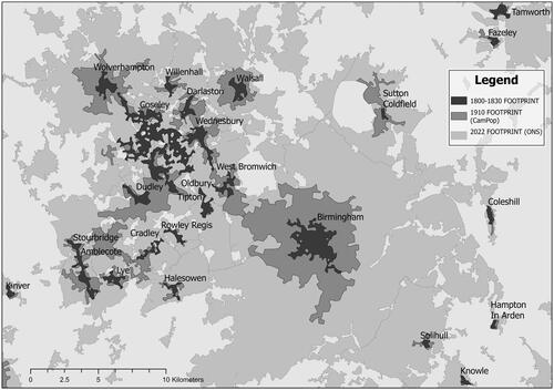
is a telling example of how these new high-resolution data can offer new empirical bases for the analysis of urban growth in Britain. It shows the evolution of the Birmingham metropolitan area between 1800 and 2022; the darker gray area represent the urban footprint in the first third of the nineteenth century, the medium shade of gray its extent in 1910, and the lighter gray today’s urban area. This map immediately highlights the spatial process of urban growth: first, the quasi-radial expansion of urban cores (Birmingham, Wolverhampton, West Bromwich, Walsall, Dudley and Sutton Coldfield) with little growth in the other urban settlements, second the creation of a key urban development axis between Wolverhampton and Birmingham, and finally the progressive incorporation of peripheral villages into the urban core.
Figure 1. Two centuries of urban growth: the Birmingham urban area, 1830–2022.
Past works have been limited by both the availability of sources and the difficulty in applying methodologies developed for more recent types of data to historical documents. Remote sensing plays an integral part in creating modern land-use maps, but it is limited temporally (Schneider and Woodcock Citation2008; Balk et al. Citation2018). Recent studies have attempted to remedy this by combining a range of sources. The use of cadastral alongside orthographic or satellite imagery has been integral to creating datasets for the US (Leyk and Uhl Citation2018), Spain (Uhl et al. Citation2023), and Osgouei, Sertel, and Kabadayı (Citation2022) showed how a combination could be used to create historic land-use change maps. Similarly, Uhl et al. (Citation2021) used a combination of datasets derived from remote sensing and unsupervised image segmentation to map historical BUA. Although a significant step forward in the production of temporally rich data, these methods are limited to large areas, without the use of fine-grained cadastral data. Efforts have been made in France to create a national historic database of buildings using nineteenth-century État-Major maps, but only 16 out of 95 departments in Metropolitan France have been completed so far (IGN Citation2021). Also, this method requires data to be manually cleaned after unsupervised image segmentation.
In this article, we offer a method applicable to a particular type of historical map, often drawn between the late eighteenth and mid-nineteenth centuries, which shares a common representation of buildings marked in red ink. This specific semiotic representation of buildings allows the extraction of low-level built-up information from hundreds of historical maps using algorithmic solutions. Here, we detail the methodology and show how we created the first dataset of built-up coverage in Great Britain between 1750 and 1850. As part of this article, we have made available the code used for the extraction, hoping that others may use it to extract buildings from similar historical maps.
The first section of the article describes the sources used, the second details the methodology followed to extract the built up environment, and the third explains how we created urban footprints from the data extracted. Finally, the article offers some perspective on the usefulness of the data for future analyses of urbanization.
2. Data
The following section describes the cartographic material used to create the Nineteenth-Century British BUA dataset: the Ordnance Survey drawings for Southern England and Wales, County Maps for Northern England, the Roy Survey for Scotland, and a series of three maps for London (Rocque, Horwood, and Greenwood) covering the entire temporal range (1746–1830) of our study (see ). Over this period, London experienced very rapid growth, with its population rising from c.700,000 inhabitants in the mid-eighteenth century to almost a million by 1801, and 1.6 million by 1831. Therefore, we decided to produce three different datasets for London, one for 1746, one for 1799, and one for 1830, to cover the dynamics of London’s expansion.
2.1. Ordnance Survey Drawings (1789–1838)
To achieve a comprehensive urban footprint over the full spatial extent of Great Britain, we selected maps from the late eighteenth and early nineteenth centuries, choosing the series with both the most homogeneous coverage and the highest resolution to ensure consistency and a high level of detail. The first source we used, which comprised the majority of maps in this dataset, was the Ordnance Survey Drawings (OSD). This series of maps is currently held at the British Library and scans were provided by Gethin Rees, the library’s lead digital mapping curator. All scans are now available on WikiMedia.Footnote1
Due to the fear of invasion from Revolutionary and later Napoleonic France, British military surveyors from the Board of Ordnance created 351 “preliminary” drawings. These drawings were made with military considerations, such as lines of communication (roads and rivers) and terrain for tactical movements/ambushes (contouring and woodlands) (Barber Citation2008). The earliest surveys covered the south coast, the area most vulnerable to French invasion, and then continued northwards, covering the south of England and Wales up to Crewe, Nottingham, and Hull, with the exception of London, which was not surveyed, and a couple of gaps in eastern England and Cornwall. shows the spatial extent of the dataset, while provides an example of each of the cartographic sources. The areas in turquoise are not covered by the OS drawings.
Figure 2. Coverage of sources used to compile the full dataset.
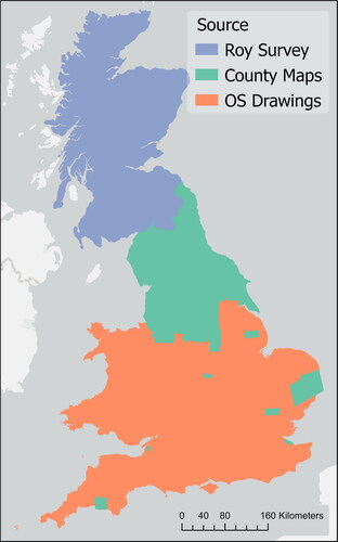
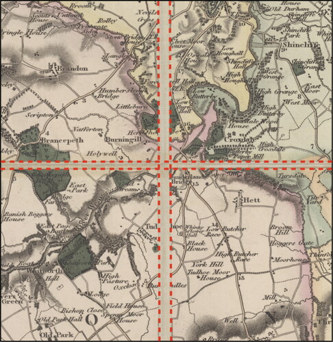
Figure 3. From top to bottom: examples from the Roy Survey, county maps, and OS drawings.
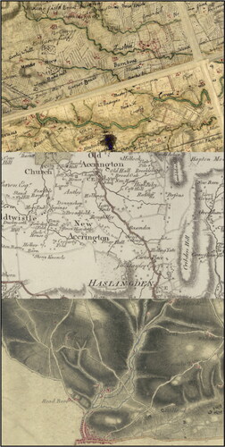
Figure 4. Training data, image and mask.
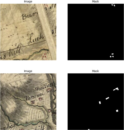
Figure 5. Cutting and stitching county maps sheets.
2.2. Nineteenth-century county maps (1823–1832)
To provide a coverage of part of Midland and Northern England, and to fill the gaps identified in Norfolk and Cornwall, we supplemented these maps with a series of ten maps of English counties by Christopher Greenwood, Andrew Bryant and George Hennet, listed in .Footnote2 Similar to the maps created by the Board of Ordnance, private maps were created with the ambition of documenting every county in England and Wales. Many of these “new” mapmakers were not part of a military operation, such as those of the OSD or the Roy Survey, but instead were making maps for sale to an audience with a more general interest. Features from these maps were meant to show broader features in the counties, such as those relating to transport and agriculture, of interest to the landowning class of counties that would be more likely to travel. Thus, while these maps have a slightly different emphasis or intention to demonstrate the density and position of buildings, they can still provide an accurate representation of the built environment.
Table 1. Maps covering the Northern counties of England. Courtesy of the national Library of Scotland (NLS) and David Rumsey collection (DR).
Table 2. County maps with cell size and RMS. Map scale calucated as cell size x 2 x 1000, based off tobler’s rule.
Additionally, these maps differed from their predecessors in their methods, specifically the use of triangulation rather than “the obsolete method of road traverse” (Harley Citation1965, 56). The use of more sophisticated tools heralded the importance of triangulation in creating accurate portrayals of a region. Despite contemporaneous and modern accounts that have criticized the accuracy of these “diagrammatic maps’, evaluations of the geodetic and topographic merits of these maps have challenged these accusations. Laxton (Citation1976, 44) summarizes: “At a general level, allowing for the constraints of scale, the published map is a reasonable record of major features – woodland, roads, settlement, heaths and commons.” Thus, despite the concerns over administrative boundaries or field bounds, geodetic and topographical evaluations show that the maps are a good representation of settlements at the time of the survey, fitting our aims.
2.3. Rocque’s map of London (1746)
The third source used covers central London and is derived from John Rocque’s 1746 map. Footnote3 The map was the result of eight years of surveying. Davies (Citation2011b) points out that despite having issues with the “precise layout of buildings and roads in the landscape” and not including all “the buildings and boundaries present in the mid-century,” it is still “the most detailed and accurate representation of 18th-century London.” The survey was carried out using both theodolite and chain alongside a later triangulation from the church towers of the city, meaning that the two counteracted each other, and the earlier ground survey (using the theodolite) had to be repeated. Davies (Citation2011a) remarked that different techniques were better suited to different areas of the city. The densely built-up City and West End, with many church towers, were well suited to the trigonometric method, while the sparser coverage of church towers in the eastern and western portions of the city made it more difficult. As our map coverage from the OSDs comes up to both the eastern and western portions of the city and has a later date, this is less concerning. The Rocque 1746 map was the best for demonstrating the built environment for our purposes.
2.4. Horwood’s map of London (1790–1799)
After Rocque’s 1746 map, the first to survey London was Richard Horwood, culminating in his “PLAN of the Cities of LONDON and WESTMINSTER the Borough of SOUTHWARK, and PARTS adjoining. Shewing every HOUSE” at a 26 inches to mile scale. Horwood began the survey in 1790 with a section of Leicester Square and continued to publish sheets until finally completing the plan in 1799. Having originally gained experience as a surveyor for his brother’s Stafford private estate, Horwood adopted the same focus on detail to map London, depicting individual (numbered) properties. The plan was funded through private subscription, though Baignet (Citation1994) argues that Horwood’s frequent requests for a Royal Society premium showed the financial burden of such a long surveying period. The correspondence between the Royal Society committee also indicates that the reviewers were disappointed with the lack of parish boundaries and the backs of buildings. After Horwood’s death in 1803, the engraver William Faden created three more series of the map, encompassing the years 1807, 1813, and 1819 (Laxton Citation1990). The Horwood plan was generously made available to us by Matthew Davies and Stephen Gadd of the Locating London’s Past project. Footnote4
2.5. Greenwood’s map of London (1827)
Alongside his work making individual county maps, Christopher Greenwood also created a survey of London at a scale of eight inches to one mile (Laxton Citation2004). This map provides a useful foil to the two earlier maps of London. We thank the librarians at the Harvard Map Collection who allowed us to use their stitched digital copy of Greenwood’s map. Footnote5
2.6. Roy’s Survey of Scotland (1747–1755)
The final source used, covering the entirety of Scotland, is a series of maps created by William Roy in the mid-eighteenth century. Roy began his career with maps in 1747 as a civilian assistant quartermaster to Colonel David Watson, working on creating the eventual Military Survey of Scotland. The survey was commissioned by the Duke of Cumberland in 1747, as a consequence of the Jacobite Rebellion in 1745. Anderson summarized the methods of the survey as follows: “Rather than triangulation, the surveyors worked along sets of measured traverses using circumferentors [also called a surveyor’s compass] and chains. The remaining landscape features – towns and settlements, enclosures and woodland, and relief – were sketched in by eye or, during the fair drawing, copied from existing maps and brought together by the Survey’s artists” (Anderson Citation2009, 18; Fleet and Kowal Citation2007, 196). Thus, the survey method was not designed to accommodate an inherently higher mapping standard. Whittington and Gibson (Citation1986, 11) argue that the use of the circumferentor instead of the well-established plane table suggests a deliberate decision to sacrifice accuracy for speed and economy. However, they conclude that “the Military Survey is a very good statement on the overall morphology and on the details of some [urban] features, especially for example on isolated and distinct street blocks.” (Whittington and Gibson Citation1986, 22). Thus, despite some discrepancies surrounding topographic features, the Roy maps can be seen as an effective representation of the built environment of Scotland.
3. Methodology
Extracting data from maps in the past mostly consisted of manual digitization. Needless to say, this was a laborious and expensive task. With the advancement of computer vision techniques and geographic information science, tools have now become available for automatically extracting data from historical maps. In the case of the OSD and Roy maps, the process of extraction used both “off the shelf” remote sensing software, deep learning for semantic segmentation and more traditional algorithmic solutions for color extraction and classification. We then developed a solution to remove unwanted boundary lines and walls, and cleaned the data to create a GIS dataset.
3.1. Georeferencing and data preparation
The foundation for accurate geospatial technology and analysis is good georeferencing. In this process, plain images are assigned spatial attributes in the form of geographic positions. In the case of the OSD dataset, this was undertaken by the British Library and a pool of volunteers using the Georeferencer tool (Rees Citation2022). This platform allowed the OSD collection to be manually georeferenced through crowd sourcing, while also allowing for easy verification by library staff. We used a slightly modified version of a script written by Gethin Rees to apply the georeferencing extracted from the Georeferencer to the image files provided to us by the British Library.
Similarly, Roy Survey maps were provided as fully georeferenced files. Fleet and Kowal (Citation2007) described the process of preparing and georeferencing the Roy Survey maps. The original survey maps were photographed in the 1990s and made available to the public through a subscription service provided by the Scottish Cultural Resources Access Network (SCRAN). From 2006, the individual photographs stored by SCRAN were mosaiced and stitched together so that overlapping sections were removed, merged together to create composite maps, organized in geographic areas (Highland vs. Lowland), and georeferenced using a first-order polynomial affine transformation on ERDAS Imagine ER Mapper. It has been noted that because a higher polynomial transformation was not used to avoid warping the image, there are areas of these maps that are geographically misaligned. Although this is not ideal, as we are using maps to garner a nationwide picture, the misalignment is tolerable.
The Rocque map was digitized for the Locating London’s Past project and was generously made available to us by Matthew Davies and Stephen Gadd. The map was stitched into one composite from 24 individual maps sheets using Adobe Photoshop to trim the overlapping sections and correct for shrinkage. A set of 48 ground control points were used on a modern Ordnance Survey map but resulted “in the effect of substantially stretching the map in the upper-left and lower right-hand corners” (Davies Citation2011b). This stretching is not a direct concern for our purpose since these areas are covered by the OS drawings, and thus the effect is mitigated.
However, county maps were provided as plain images. Furthermore, these maps were created by cutting individual tiles and gluing them onto a linen back with small gaps between the tiles. As shown in , we first cut each tile and georeferenced it separately on modern Ordnance Survey 1:50K maps, with an average of 12 ground control points per tile. The maps were rectified using either a first- (affine) or second-order polynomial transformation to produce GeoTiff files. We adopted the “rule of thumb” for a residual mean squared error (RMS or RMSE) within a 1:3000 proportion to scale defined by Conolly and Lake (Citation2006), and the results are shown in . Individual map tiles were then stitched together using ER Mapper to create a homogeneous and continuous layer for building extraction. A conceptual demonstration of how the individual tiles were ′stitched’ is provided in .
3.2. Using a deep learning approach to extract buildings from OS drawings
To extract buildings from OSDs, we decided to use recent machine learning approaches (deep learning-based systems). Such approaches rely on a training dataset (used for learning) and different processing methods to select and refine the results. provides an example of how the approach would move from the raw image to a binary mask of the desired result. To extract buildings from OSDs, we decided to use recent machine learning approaches (deep learning-based systems). Such approaches rely on training a model from a dataset (used for learning) and various processing methods to select and refine results. Deep learning approaches for building segmentation use supervised learning (i.e., teaching the computer to learn patterns from manually labeled datasets) with semantic segmentation for class differentiation and instance segmentation. These “neural networks,” such as Mask R-CNN and its variants, allow to predict detailed class and instance identification. However, these methods yield irregular segmentation masks owing to data noise (reflections and shadows in modern satellite imagery and damage to the image in our case) and require significant post-processing (Zorzi, Bittner, and Fraundorfer Citation2021). Regularization, as proposed by Tang et al. (Citation2018) and Šanca et al. (Citation2023), covers a series of techniques used to prevent overfitting of a model to training data. Overfitting occurs when a model learns the details and noise in the training data so well that it then negatively impacts the performance of the model on subsequent data. Regularization addresses this issue by adding a penalty to the learning process and improving segmentation by constraining the model to produce smoother and more defined building footprints. Unlike these studies, our constraint lies in conducting end-to-end detection on historical maps, where dataset annotation is complex and at times probabilistic, and the image quality is significantly lower than the high resolution used in recent research.
A similar approach has been successfully applied to historical maps to perform a variety of classification tasks, most notably by the Living with Machine Project (Hosseini et al. Citation2022). Others are currently working on improving the machine learning workflow to classify historical maps, and their preliminary results (see Zylberberg et al. (Citation2020)) indicate that further technological leaps are to be expected in the near future. Deep Learning tools are nowadays also available in some popular GIS solutions, such as ESRI’s ArcGis Pro. However, we did not compare our results to ArcGis Pro’s output for a similar task since it is a proprietary software with a high entry-cost.
3.2.1. Creating ground truth training data for machine learning
To create training data, we used Clark Lab’s IDRISI TerrSet to extract vector files from the raster images. TerrSet is an “off the shelf” software package primarily used for remote sensing. Typically, TerrSet software tools are used to process and extract vector files from satellite images. Because this software offers easy access to pretrained neural networks for image segmentation, we processed 179 OSD maps using this software. We then corrected each of these manually to ensure that undesirable features (bridges, walls, and boundary dotted lines) were not included in the annotated data. Once this process was completed, we split the data (both the original images and the corresponding annotated masks) into 34,556 patches of 256 pixels 256 pixels, as shown in .
3.2.2. Training a base model using U-Net architecture
The U-Net architecture (Ronneberger, Fischer, and Brox Citation2015) is a popular convolutional neural network (CNN) architecture commonly used for image segmentation tasks. It was originally designed for biomedical image segmentation but has since been used for various other applications, including historical map analysis (Chazalon et al. Citation2021). U-Net performs well in image-segmentation tasks, particularly when images have complex structures. Using an encoder-decoder structure with skip connections (a design that allows the neural network to learn and process concomitantly high-level and low-level features from input images often used in image segmentation tasks), it is possible to preserve the fine details of the input image, which is important for accurate building classification. To train our first model, we shuffled the patches to reduce the risk of overfitting (that is, a model becoming too specialized and therefore losing its predictive powers for unseen data), and selected 10,000 random images for testing and 20,000 images for the training and validation data. The relative size of each subset of the data (for training, validation, and testing) varies depending on the nature of the Machine Learning tasks performed. Our test set is perhaps somewhat larger than usual, which offers a more accurate measure of the model’s performance. We then applied a cross-validation technique using 5-k folds (which means that we selected five different subsets of the data to produce five different models that can then be compared to each other). The best performer was selected from the five models obtained for further processing.
The first surprise was that the data produced by the base model were of better quality than the human-annotated data, in which some buildings were missed or poorly digitized. Therefore, we decided to use the base model to create more and better data to serve as the input for training the second U-Net model. The accuracy of each trained model is listed in . For each model, it indicates the Intersection Over Union ratio (IoU), and the precision and recall ratios. The IoU reflects the ratio of the area of overlap to the area of union between the predicted and validation datasets. Precision is the ratio of true positives (correctly detected pixels) to all positives (true positives plus false positives). Recall, however, is the ratio of true positives to the sum of true positives and false negatives (expected pixels that were not detected).
Table 3. Comparison of models.
3.2.3. Training a customized model using U-Net architecture
We applied the same principles; however, the predictions generated by the base model were used as inputs. We used 10,000 images to train, validate, and test the proposed model. For the Roy dataset, we then fine-tuned this model using a second set of annotations (comprising 3,424 patches) to create a custom Roy model.
3.2.4. Pre-processing OSD maps
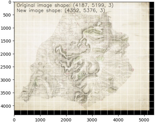
The original maps were split into patches of 256 by 256 pixels to apply the customized model. Because the maps rarely had a width and height that were multiples of 256, some patches produced would have been of different sizes. This would, in turn, cause a problem, as the predicted mask (the output of the model, always 256 256) would not match exactly with the original map. Therefore, when all patches were reassembled, the overall dimension of the full map and the prediction would not have matched, making it impossible to apply the projection of the map to the prediction. To circumvent this problem, we first extended each map by adding a suitable number of black pixels on the right-hand side and at the bottom of each image such that the overall dimension became a multiple of 256, as shown in . We then used the Patchify library to create the map chips, conserving their position as metadata and allowing for map recomposition once the image had been processed.
Figure 6. Making map dimensions divisible by 256.
3.2.5. Applying the CNN custom model to map patches and consensus prediction
We applied the custom model to predict the building location on each map patch. The CNN returns for each pixel a confidence ratio between 0 and 1, indicating its confidence that the pixel belongs to a building. In order to obtain a flat image of the buildings it is necessary to decide what cutoff point should be applied. A high cutoff point will result in higher accuracy (fewer false positives), but lower recall (higher false-negative), and conversely a low cutoff point will result lower accuracy but higher recall. In order to decide what the most suitable cutoff point is, we created predictions for all thresholds between 0 and 1 by incremental steps of 0.001, using our validation sample. We then compared the output to the expected data and selected the range of seven values which allowed to maximize accuracy and recall separately and then jointly. We did not select only the ”best” value, as when images differ, even ever so slightly, different thresholds will provide the best result. Using the range of threshold, we then recorded predictions for all seven threshold values (0.3, 0.4, 0.5, 0.6, 0.7, 0.8, and 0.9) and used a method called consensus evaluation to decide which pixels should be considered as buildings. This means that, for each pixel in each patch, the voting algorithm chooses whether the pixel was a building based on the highest voting result from the seven predictions. A pixel was considered part of a building if and only if four of the prediction threshold values predicted it. The accuracy of the custom model is listed in .
3.2.6. Applying a color extraction algorithm to increase quality of building outlines
Finally, we applied a red-color extraction algorithm to each patch and merged the neural network prediction and color extraction output for components identified as buildings by the CNN. The color extraction algorithm produces a more refined (smoother) extraction of red features than the CNN; however, it captures too many features that are not buildings. Therefore, we fused the two outputs, conserving only the color-extracted outline for buildings already detected by the CNN. The improvement in accuracy is presented in . Thus, the first phase of the extraction was concluded.
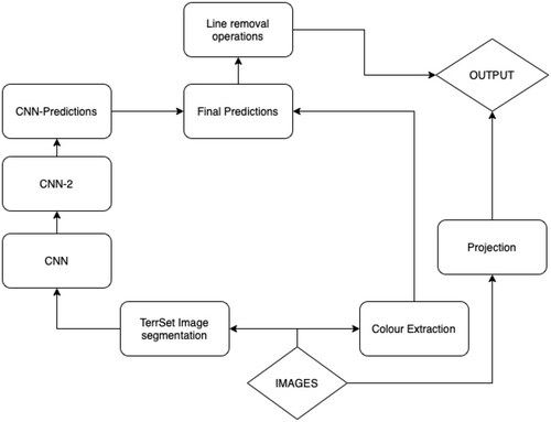
shows how both elements of the extraction process are combined to create separate predictions that inform the final output.
Figure 7. Workflow for extraction.
3.3. Image post-processing
Once we had “unpatchified” each predicted image and removed the additional black borders to reconstitute the original mask for each map, we still faced a number of mislabeled elements, including red textual marks, and dotted boundary lines. Therefore, we applied image processing techniques to remove these features from the masks. We used two approaches: the first using FLASH (Fast Line Analyzer by local thresholding) developed by Yannick Faula, and a second, more traditional morphological approach.
3.3.1. Boundary lines detection and removal
Originally, the FLASH algorithm (Faula, Bres, and Eglin Citation2018a) was designed to detect cracks in the images of concrete surfaces. It is perfectly adaptable to the detection of boundary lines. The principle of FLASH can be summarized in three steps:
Analysis of local pixels in images to detect points on potential lines.
Connection of all detected points according to distances and orientation, to create coherent graphs representing lines or part of lines.
Analysis of these graphs to filter them and detect different kinds of considered lines.
Several parameters were adjusted to obtain the best scores in the validation dataset. The predicted maps were not sensitive to all parameters; however, we retained the default parameters proposed by Faula, Bres, and Eglin (Citation2018b). Because of the variety of line widths, we performed multiscale image processing and merged the results. Further details are provided by Faula, Bres, and Eglin (Citation2018b) about the principle and parameters. Finally, the mislabeled elements were removed from the predicted maps using logical operations. This step proved not to be significantly robust to remove all the dotted boundary lines, and we had to adopt a morphological approach to separating them from the buildings.
3.3.2. Morphological operations applied for the removal of walls, administrative boundaries and triangulation lines
To remove all non-desired artifacts, we applied a series of morphological operations to the images obtained from the machine learning part (also called masks below) of the workflow. The full description is available in the code deposited on Zenodo, and what follows is a non-technical description of the steps required to remove these objects.
We started by removing large shapes corresponding to dense urban areas from the mask to avoid including them on any line detection performed on this image. To do this, we simply detected connected components (i.e., groups of pixels connected to each other) in the mask, and calculated the building density (that is, the white pixel ratio) in the bounding envelope (a convex shape) corresponding to this component. Using criteria based on the shape of the envelope (more precisely, the relationship between its long and short axes) and building density in the envelope, we removed all densely built areas from the mask.
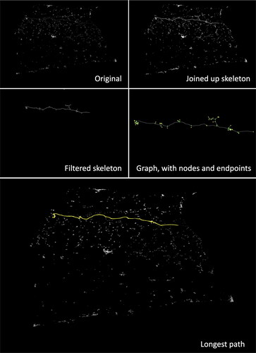
We then skeletonized the masks obtained, thinning every group of pixels to keep only their core structure. This operation makes the geometry and relations between the elements more visible and easier to work with. This can be considered the wire frame of the original image. At this stage, the dotted lines are still the disconnected elements.
We then detected again all connected components on this skeleton and applied morphological circles to the end of each component (with increasing radii) to join the segments of dotted lines. The use of circles to extend lines allowed us to connect lines even with sudden and sharp angular variations. The result of this operation is a series of nodules (morphological circles) joining the segments of the skeleton. Not all the segments thus joined were part of the dotted boundaries or wall structures.
In order to remove only the long linear elements and not the buildings, we skeletonized once more all the joined-up segments of the skeleton, and used this second-skeleton to detect the newly connected components. This allowed us to create a continuous skeleton that corresponded to the longest connected structures in the image. This corresponds to the top right image on .
For each one of the components on this second skeleton, we filtered those that were too small, and then converted the remaining components separately into a graph by identifying algorithmically endpoints, and nodes, and using the path of the skeleton as edges. We then calculated the distance between each node following the skeleton, and assigned this value as an attribute to the corresponding edge on the graph. This allowed us to obtain a symbolic representation of the relationships among all points containing the distances between each pair of points on the graph. We then calculated the matrix containing the shortest distance between each pair of points on the graph.
Using this matrix, we were able to calculate the longest path possible between each pair of endpoints on the graph. We then maintained only the longest possible path for each connected component on the merged skeleton.
Once we found the longest path, we drew it over a mask containing the contours of the connected components detected on the original image with the densely built areas removed and checked which of these contours intersected with the longest path. We then removed any intersecting contours from the original image.
Figure 9. Footprints for England and Wales, and closer view of London and Bristol urban areas.
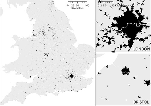
Figure 10. From BUA to urban footprints, the example of Cambridge and Shrewsbury – 200 m contiguity threshold.
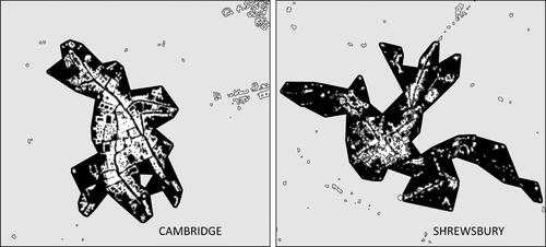
Figure 11. Cambridge urban area at different thresholds from 50 m to 1 km.
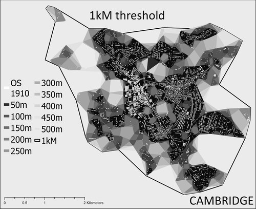
Figure 8. Illustration of the morphological operations applied.
3.4. From raster to vector
Once all stages were completed, the individual rasters were converted to vector data. To do this, we extracted the projection from each original Geotiff file provided by the British Library and applied it to the corresponding mask. The projected mask raster was then converted into vector data, imported, and manually cleaned to remove overlapping features. We also filtered any elements covering less than 150 square meters, and finally, the data were aggregated and merged into a single feature class. This completed the extraction process.
4. From BUA to urban footprints
The data we have described thus far provide a snapshot of the overall building stock at a given date, but it does not immediately translate into a suitable classification of land use; in particular, it does not allow distinguishing between urban and rural areas. To establish this dichotomy, another operation is required to provide an empirical basis for grouping buildings into two classes (urban and non-urban). It would be interesting to apply sophisticated multivariate models (considering factors such as relief, transport infrastructure, occupational profile, economic activity, and historical path dependency in settlement distribution) to perform this operation, but this is well beyond the scope of this methodological study. Here, we aim to offer a rudimentary but robust categorization of BUA using the data extracted in this exercise (buildings). For this purpose, only two metrics can be applied: contiguity (uninterrupted building presence) and density (share of BUA in a given spatial unit). In both cases, the main question was where the threshold should be placed. Because the answer to this question varies significantly depending on the nature of the data surveyed and its intended use, we decided to produce two main classifications of our data: one based on modern remote sensing and urban delineation literature, which will make our data comparable to modern land cover datasets, and the second, based on historical data, to make our data comparable to existing urban footprints created for other periods.
It is also important to note that the approach detailed above for creating detailed BUA data is a strict precondition for footprint production. Footprints cannot be detected from historical maps because they are anachronistic conceptual objects derived from BUAs, and this latter operation is the focus of the second half of this article.
4.1. Producing data in line with recent urban delineation literature
Urban economists and geographers have been arguing how best to classify urban areas as long as their discipline has existed. Focusing on recent literature, Montero, Tannier, and Thomas (Citation2021) highlight four ways of delineating cities: density measures, classification of remote sensing images, clustering methods, and analyses of a statistical distribution across scales. Usui (Citation2019) argues that these measures can be broken up into “bottom-up” and “top-down” approaches.
Top-down approaches are primarily based on remote sensing and satellite imagery. Although very effective, these techniques are also prone to error, and both fundamentally depend on the quality of the imagery used and the threshold adopted to produce the delineation. In their survey of four distinct urban classifications produced for Egypt and Taiwan, Chowdhury, Bhaduri, and McKee (Citation2018) show that there were marked differences in both the methodology and extent of urban areas. They overlapped the four datasets to determine a shared core urban area between them, which they considered as the true urban core. The use of light pollution density at night alongside remote imagery has also proven useful as a method for defining urban areas in developing countries (Dingel, Miscio, and Davis Citation2021; Henderson, Storeygard, and Weil Citation2012). However, as highlighted by Abed and Kaysi (Citation2003), the satellite imagery resolution used in these studies can drastically affect delineations.
Bottom-up approaches instead look at internal connectivity metrics to determine urbanity. These methods use complex statistics to recursively determine the threshold of what constitutes an urban area based on the distributions of connectivity features (Usui Citation2019; Montero, Tannier, and Thomas Citation2021). The “natural cities” (Jiang and Jia Citation2011) approach uses road intersections to trace urban core outward expansion. Similarly, (Duranton Citation2015; Sotomayor-Gómez and Samaniego Citation2020) used commuter routes, especially those derived from telecommunications networks, to determine urban delineations. These algorithmic approaches do not require setting an arbitrary threshold; therefore, they are less sensitive to the modifiable area unit problem common to top-down methods (MAUP) (Openshaw Citation1983, Citation1984; Briant, Combes, and Lafourcade Citation2010). However, they are not transparent to users, and it is not always clear why a particular delineation has been adopted.
Combining bottom-up and top-down approaches, some studies have focused on density measures (often through a kernel operation) to determine urban delineations. Early studies were interested in the economics inherent in urban agglomerations, so the population and industrial statistics of administrative units were generally utilized (Cottineau et al. Citation2018). Recently, hybrid algorithmic approaches such as the City Clustering Algorithm (CAA) have combined built-up and population information to locate urban areas. In this case, a population cluster is made of contiguous populated sites within a prescribed distance l that cannot be expanded: all sites immediately outside the cluster have a population density below a cutoff threshold” (Rozenfeld et al. Citation2011, 2206). These methods have become the standard approach for most official statistical agencies, although the prescribed distance varies across studies. Global comparisons using clustering studies have used distances between 1.5 and 2.5 kilometers (Arribas-Bel, Garcia-López, and Viladecans-Marsal Citation2021). Some bottom-up techniques, such as “natural cities,” require a threshold of at least 300 meters (Jiang and Jia Citation2011), while work undertaken on Spain by Perez, Ornon, and Usui (Citation2020) shows that using a bottom-up approach resulted in applying a threshold close to 150 meters. These values are roughly comparable to the standard distance (200 m) set by the CORINE Land Cover dataset (European Environmental Agency Citation2018), the French Statistics Agency (INSEE) (Perez, Ornon, and Usui Citation2020; de Bellefon et al. Citation2021), and the ONS in the UK (Office for National Statistics Citation2015).
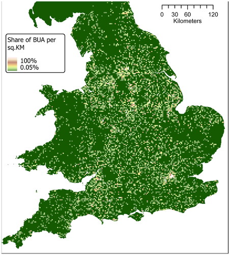
With this in mind, we produced a variety of footprints based on a series of thresholds: 1.5 km, 300 m, 200 m, 150 m, with a minimum threshold of 8 buildings per footprint. We then simplified the resulting outline with a sensitivity of 100 m. shows an example of the footprints produced for Cambridge and Shrewsbury using a 200-metre contiguity threshold. The footprints correspond to the black area and the buildings are visible in white. Finally, we used historical town point data from J. Adams’ 1680 Index Villaris (Gadd and Litvine Citation2021) and W. Owen’s 1813 New book of fairs (Satchell et al. Citation2017) to add name attributes to each footprint and then filter all named outlines to create our urban footprint dataset. demonstrates our footprints at a national scale while and demonstrate the sensitivity in choosing an appropriate distance threshold.The data produced is a marked improvement on the best available historical data, from the History database of the Global Environment (HYDE) dataset (Klein Goldewijk et al. Citation2017). As and show, our data offers a significantly improved resolution.
Figure 12. Share of the built-area, HYDE model for 1830.
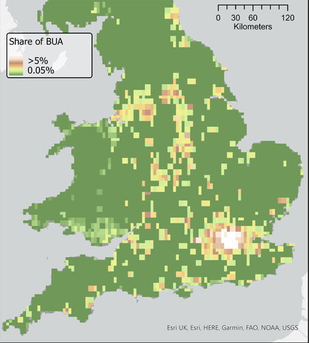
Figure 13. Share of built-up area, our data aggregated in hexagonal tiles of 1 sq.KM.
4.2. Producing footprints comparable to existing historical data
The only existing dataset of historical footprints is the Cambridge Group for the History of Population and Social Structure (CamPop) urban footprint dataset created by Leigh Shaw-Taylor and Max Satchell and a team of research assistants (Mischa Davenport, Annette McKenzie and Rachel Reid) in 2015 using manual tracing of all potentially urban areas corresponding to the CamPop candidate towns database created by Shaw-Taylor and Satchell on the Six-inch Ordnance Survey Maps (1888–1913). The dataset contains 1,672 footprints corresponding to 1,672 candidate towns. The candidate towns represent every settlement in England and Wales, which might be considered urban based on any of the different definitions used by historians. In practice, this means any settlement with either a recorded market in the 17th, 18th, or 19th centuries or which had a population of 2,500 or above at any point between 1801 and 1911. The CamPop footprint dataset was produced by following the modern census approach of treating two settlements as distinct if there was a continuous distance of more than 200 m without buildings between them. To define the edges of potential urban settlements, we included garden plots attached to houses. Because the data were produced by different operators and manually (rather than algorithmically, like ours), we decided to compare the footprints created by Shaw-Taylor et al. to what our algorithmic approach would have yielded.
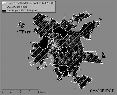
We selected four candidates of varying importance, ranging from the hamlet to a large town, from different areas of the country (Cambridge, Marshfield in Gloucestershire, Carlton in Nottinghamshire, and Methwold in Norfolk), for which we manually drew every building on the corresponding County Series 1st Revision maps dated between 1891 and 1914, available from Edina Historic Digimap Service. We then applied the methodology described above to create footprints for each threshold from 50 m to 1 km with incremental steps of 50 m. shows the effect of the contiguity threshold on the footprints produced for Cambridge. Then, we compared the area of each footprint polygon produced at each threshold with the original CAMPOP footprints. We calculated the ratio of the intersection of the two polygons over the union of the two polygons (IoU) to provide an idea of the best-fitting thresholds. Based on these observations, as shown in , we confirmed that the most comparable dataset was produced by using a threshold of 200 m. shows the overlap between the manual digitization of buildings on the OS1910 basemap, the CamPop footprint, and our algorithmic output (for the chosen 200-meter threshold) using the manually digitized built-up area. It is important to note, however, that not all these footprints correspond to what we would call a town today, and many may never have been a town at all. We do not pretend to give a definition of what a town is or was, but by using early-modern place from Index Villaris (1680) and more contemporaneous town points from Owens (1813), we are hoping to offer footprints for both the cases of the more ”successful” urban growth and those that did not exhibit any long-term development. Having both is a requirement for any future explanatory model of the long-term urban growth determinants.
Figure 14. Approximating the threshold comparable to the CamPop dataset.
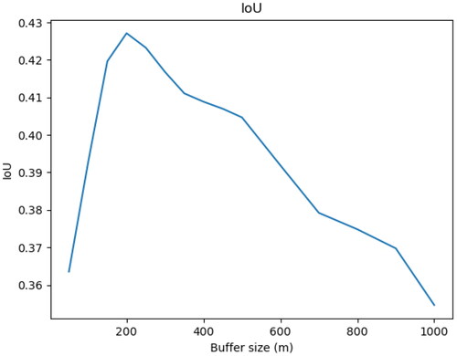
Figure 15. Cambridge’s footprint: manual CamPop detouring in black, algorithmic comparison in gray, buildings from OS1910 in white.
5. Data created and the “urban system”
and illustrate how the data may be used to study the evolution of urban systems over two centuries. This final section provides a quantitative summary of the distribution of footprints within our dataset, and serves to support our initial assertion that the new dataset and methodology offer the advantage of capturing a more comprehensive range of urban experiences than previous studies, which typically focused on the upper echelon of the distribution, were able to achieve.
Figure 16. Distribution of footprints area by rank.
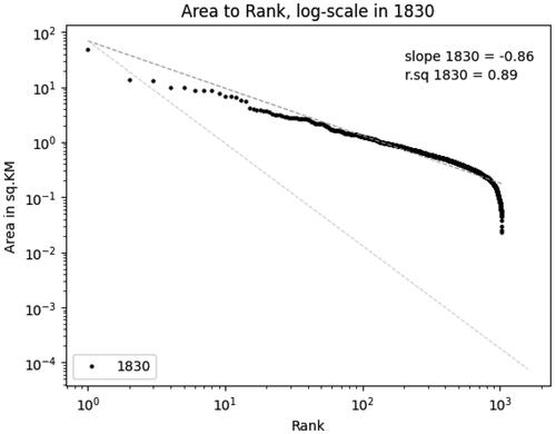
Figure 17. Upper-tail rank distribution.
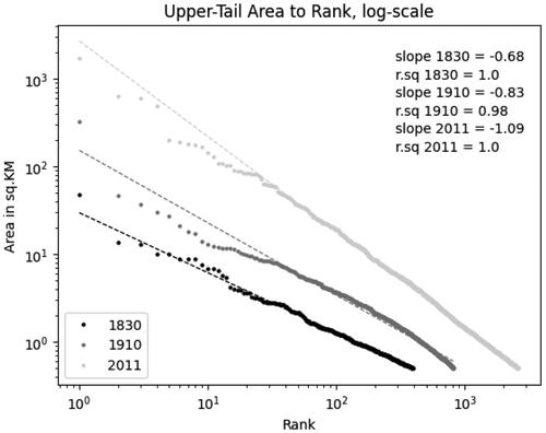
The data produced contains 1,033 individual “urban shapes,” ranging from an area of 47.3 sq.KM (London) to a mere 0.02 sq.KM (Hickling in Norfolk). As shows, the distribution of our footprints is somewhat consistent with a lognormal distribution, and the linear relationship between rank and area is particularly strong for the upper tail of the distribution (Gabaix Citation1999). Interestingly, a comparison between our data, the CamPop footprints, and the ONS BUA footprints for 2011 illustrates a very high level of regularity in the urban system over time. This stability has already been documented (Cura et al. Citation2017; de Vries Citation1984), but our work confirms this, using, for the first time, both directly comparable and highly granular data available over two centuries. As shown in , the distribution of urban areas became more “Zipfian” during this period of rapid urban and population growth.
Zipf’s Law, named after the American linguist George Kingsley Zipf, is an empirical observation that the frequency of an element in a given dataset is inversely proportional to its rank. In other words, the most frequent element occurs approximately twice as often as the second most frequent element, three times as often as the third most frequent element, and so on. This can be described as particular lognormal distribution, with a slope of −1. Zipf’s Law has been observed in a wide range of phenomena, including the frequency of words in a language, the size of cities in a country, and the distribution of income or wealth. In the context of urban studies, Zipf’s Law is often used to describe the rank-size distribution of cities. This empirical regularity has been found to hold for many different countries and regions, and has sometimes been described as the standard for “modern” urban systems.
Based on this metric, as shown on , the larger towns in England and Wales were “too small” to follow Zipf’s Law in the early nineteenth century. By 1900, the gargantuan rise of London had captured most of the urban growth while the second-tier urban areas remained too small. Over the twentieth century, however, these towns expanded faster than London, and urban footprints nowadays display a quasi-perfect Zipfian distribution. What this distribution means is more ambiguous. As pointed out by Batty (Citation2003), regularity does not necessarily entail stability in the urban hierarchy over time, which is clearly visible in the evolution documented here and should be interpreted very carefully (de Vries Citation1984).
Figure 18. Counter-cumulative distribution of footprint area.
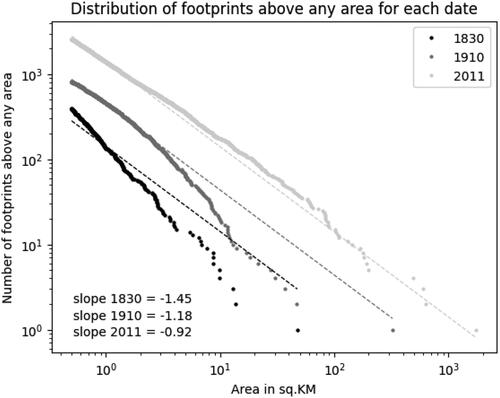
Furthermore, our data do not include (at this stage) information on population. What we capture here does not reflect the varying levels of density across and within urban areas, but simply their rate of expansion over time and the patterns that characterize their spatial distribution. Sprawling low-density peri-urban areas are currently indistinguishable from the areas with higher population density in urban cores, which obviously skews the data in favor of less dense areas. By combining information on population and BUA, our future research will look at the relationship between city size and population in the context of a period of very fast urban growth.
In future work, we will use our data to improve estimates for the urban expansion of earlier centuries. Using the method outlined by de Vries (Citation1984) it would be possible to improve the calibration of his model of rank-size distribution based on data covering the full distribution of urban areas (and not only, as in his dataset, cities with a population over 10,000 inhabitants) to refine his estimates of urban population back to 1500. It will then be possible to analyze the relative growth of urban areas by comparing their respective growth rates over two centuries, and identify the factors that may have contributed to their growth or decline. Since all our footprints are linked to unique identifiers stable over time, we could then also observe changes in the urban hierarchy and detect morphological outliers.
6. Conclusion
This article presents a methodology for classifying and extracting buildings from historical maps. It is a tool developed specifically to answer key questions in the fields of economic history, geography, and urban economics. We hope that it will also serve other purposes and be used for other types of maps.
Although this study focused on the UK as a test case, we experimented with maps similar to those of other countries. The models trained for this exercise were immediately able to detect and extract building from a series of similar historical maps: military maps covering Galicia and Austrian Silesia (the Second Military Survey of the Habsburg Empire, courtesy of Dominik Kaim), and France (the “Carte de l’État-Major”). If any reader of this article holds digital images of such historical maps and wants to extract buildings from them, we would gladly offer our assistance.
Acknowledgements
We thank Chiaki Yamamoto, Yanos Zylberberg, Stephan Heblich and the L3i lab at the Université de La Rochelle for providing funding that allowed this project to go ahead, and Gethin Rees from the British Library and Chris Fleet from the National Library of Scotland for allowing us to use their beautiful map collections and providing us with the necessary image files. We also thank the community of British Library georeferencers for their work on OS Drawings. Finally we thank Chris Fleet, Joseph Chazalon, Julien Perret, Rémi Lemoy, Marion Le Texier, and Johannes Uhl for their insightful comments and Ruth Murphy for her patient proofreading. We are also grateful to the three anonymous referees for their contributions.
Disclosure statement
No potential conflict of interest was reported by the author(s).
Data availability
The footprints are available on Zenodo as the Nineteenth-Century BUA of Britain dataset, 10.5281/zenodo.5534676, and the code used produce them at 10.5281/zenodo.10651817.
Notes
2 sourced from the National Library of Scotland or the David Rumsey collection.
References
- Abed, J., and I. Kaysi. 2003. Identifying urban boundaries: Application of remote sensing and geographic information system technologies. Canadian Journal of Civil Engineering 30 (6):992–9. doi: 10.1139/l03-051.
- Anderson, C. J. 2009. State imperatives: Military mapping in Scotland, 1689–1770. Scottish Geographical Journal 125 (1):4–24. doi: 10.1080/14702540902873899.
- Arribas-Bel, D., M. A. Garcia-López, and E. Viladecans-Marsal. 2021. Building(s and) cities: Delineating urban areas with a machine learning algorithm. Journal of Urban Economics 125:103217. doi: 10.1016/j.jue.2019.103217.
- Baignet, E. 1994. Richard Horwood’s Map of London: 18th Century cartography and the Society of Arts. RSA Journal 142 (5455):49–51.
- Balk, D., S. Leyk, B. Jones, M. R. Montgomery, and A. Clark. 2018. Understanding urbanization: A study of census and satellite-derived urban classes in the United States, 1990-2010. PLoS One 13 (12):e0208487. doi: 10.1371/journal.pone.0208487.
- Barber, P. 2008. Ordnance survey drawings: Curator’s introduction. https://www.webarchive.org.uk/wayback/archive/20210507130059/http://www.bl.uk/onlinegallery/onlineex/ordsurvdraw/curatorintro23261.html.
- Batty, M. 2003. The emergence of cities: Complexity and urban dynamics. Accessed March 30, 2023. https://discovery.ucl.ac.uk/id/eprint/231/.
- Briant, A., P. P. Combes, and M. Lafourcade. 2010. Dots to boxes: Do the size and shape of spatial units jeopardize economic geography estimations? Journal of Urban Economics 67 (3):287–302. doi: 10.1016/j.jue.2009.09.014.
- Chazalon, J., E. Carlinet, Y. Chen, J. Perret, B. Duménieu, C. Mallet, T. Géraud, V. Nguyen, N. Nguyen, J. Baloun, et al. 2021. ICDAR 2021 competition on historical map segmentation. In Document analysis and recognition–ICDAR 2021: 16th International Conference, Lausanne, Switzerland, September 5–10, 2021, Proceedings, Part IV, 693–707. Springer.
- Chowdhury, P. K. R., B. L. Bhaduri, and J. J. McKee. 2018. Estimating urban areas: New insights from very high-resolution human settlement data. Remote Sensing Applications: Society and Environment 10:93–103. doi: 10.1016/j.rsase.2018.03.002.
- Conolly, J., and M. Lake. 2006. Geographical information systems in archaeology. Cambridge: Cambridge University Press.
- Cottineau, C., O. Finance, E. Hatna, E. Arcaute, and M. Batty. 2018. Defining urban clusters to detect agglomeration economies. Environment and Planning B: Urban Analytics and City Science 46 (9):1611–26.
- Cura, R., C. Cottineau, E. Swerts, C. A. Ignazzi, A. Bretagnolle, C. Vacchiani-Marcuzzo, and D. Pumain. 2017. The old and the new: Qualifying city systems in the world with classical models and new data. Geographical Analysis 49 (4):363–86. doi: 10.1111/gean.12129.
- Davies, M. 2011a. John Rocque’s survey of London, Westminster I& Southwark, 1746. https://www.locatinglondon.org/static/Rocque.html
- Davies, M. 2011b. Mapping methodology. https://www.locatinglondon.org/static/MappingMethodology.html.
- Davis, J. C., and J. V. Henderson. 2003. Evidence on the political economy of the urbanization process. Journal of Urban Economics 53 (1):98–125. doi: 10.1016/S0094-1190(02)00504-1.
- de Bellefon, M. P., P. P. Combes, G. Duranton, L. Gobillon, and C. Gorin. 2021. Delineating urban areas using building density. Journal of Urban Economics 125:103226. doi: 10.1016/j.jue.2019.103226.
- de Vries, J. 1984. European Urbanization, 1500-1800. Cambridge, MA: Harvard University Press.
- Dingel, J. I., A. Miscio, and D. R. Davis. 2021. Cities, lights, and skills in developing economies. Journal of Urban Economics 125:103174. doi: 10.1016/j.jue.2019.05.005.
- Duranton, G. 2015. A proposal to delineate metropolitan areas in Colombia. Revista Desarrollo y Sociedad (75):223–64. doi: 10.13043/dys.75.6.
- European Environmental Agency. 2018. CORINE land cover. https://land.copernicus.eu/pan-european/corine-land-cover.
- Faula, Y., S. Bres, and V. Eglin. 2018a. FLASH: A new key structure extraction used for line or crack detection. In Proceedings of the 13th International Joint Conference on Computer Vision, Imaging and Computer Graphics Theory and Applications (VISIGRAPP 2018) - Volume 4: VISAPP, Funchal, Madeira, Portugal, January 27-29, 2018, edited by A. Trémeau, F.H. Imai, and J. Braz, 446–52. Madeira, Portugal: SciTePress. doi: 10.5220/0006656704460452.
- Faula, Y., S. Bres, and V. Eglin. 2018b. FLASH: A new key structure extraction used for line or crack detection. In Proceedings of the 13th International Joint Conference on Computer Vision, Imaging and Computer Graphics Theory and Applications, Funchal, Madeira, Portugal, 446–52. SCITEPRESS - Science and Technology Publications.
- Fleet, C., and K. C. Kowal. 2007. Roy Military Survey map of Scotland (1747-1755): Mosaicing, geo-referencing, and web delivery. E-Perimetron 4 (7):194–208.
- Gabaix, X. 1999. Zipf’s law for cities: An explanation. The Quarterly Journal of Economics 114 (3):739–67. http://www.jstor.org/stable/2586883. doi: 10.1162/003355399556133.
- Gadd, S., and A. Litvine. 2021. Index Villaris, 1680. doi: 10.5281/zenodo.4749505.
- Harley, J. B. 1965. The re-mapping of England, 1750–1800. Imago Mundi 19 (1):56–67. doi: 10.1080/03085696508592267.
- Henderson, J. V., A. Storeygard, and D. N. Weil. 2012. Measuring economic growth from outer space. The American Economic Review 102 (2):994–1028. doi: 10.1257/aer.102.2.994.
- Hosseini, K., D. C. S. Wilson, K. Beelen, and K. McDonough. 2022. MapReader: A computer vision pipeline for the semantic exploration of maps at scale. In Proceedings of the 6th ACM SIGSPATIAL International Workshop on Geospatial Humanities, GeoHumanities ‘22, 8–19. Association for Computing Machinery. Accessed November 29, 2023. doi: 10.1145/3557919.3565812.
- IGN. 2021. BD CARTO® État-major: Descriptif de contenu et de livraison.
- Jiang, B., and T. Jia. 2011. Zipf’s law for all the natural cities in the United States: A geospatial perspective. International Journal of Geographical Information Science 25 (8):1269–81. doi: 10.1080/13658816.2010.510801.
- Klein Goldewijk, K., A. Beusen, J. Doelman, and E. Stehfest. 2017. Anthropogenic land use estimates for the Holocene – HYDE 3.2. Earth System Science Data 9 (2):927–53. doi: 10.5194/essd-9-927-2017.
- Laxton, P. 1976. The geodetic and topographical evaluation of English County Maps, 1740-1840. The Cartographic Journal 13 (1):37–54. doi: 10.1179/caj.1976.13.1.37.
- Laxton, P. 1990. Richard Horwood’s plan of London: A guide to editions and variants, 1792-1819. In London topographical record V. 26, edited by A. L. Saunders, London: London Topographical Society..
- Laxton, P. 2004. Greenwood, Christopher (1786–1855), land surveyor and map maker. https://doi.org/10.1093/ref:odnb/41108.
- Leyk, S., and J. H. Uhl. 2018. HISDAC-US, historical settlement data compilation for the conterminous United States over 200 years. Scientific Data 5 (1):180175. doi: 10.1038/sdata.2018.175.
- Montero, G., C. Tannier, and I. Thomas. 2021. Delineation of cities based on scaling properties of urban patterns: A comparison of three methods. International Journal of Geographical Information Science 35 (5):919–47. doi: 10.1080/13658816.2020.1817462.
- Office for National Statistics. 2015. Built-up areas - Methodology and guidance. https://geoportal.statistics.gov.uk/documents/built-up-areas-user-guidance-1/explore.
- Openshaw, S. 1983. The modifiable areal unit problem: Concepts and techniques in modern geography 38. Norwich: GeoBooks.
- Openshaw, S. 1984. Ecological fallacies and the analysis of areal census data. Environment & Planning A 16 (1):17–31. doi: 10.1068/a160017.
- Osgouei, P. E., E. Sertel, and M. E. Kabadayı. 2022. Integrated usage of historical geospatial data and modern satellite images reveal long-term land use/cover changes in Bursa/Turkey. Scientific Reports 12 (1):9077. doi: 10.1038/s41598-022-11396-1.
- Perez, J., A. Ornon, and H. Usui. 2020. Classification of residential buildings into spatial patterns of urban growth: A morpho-structural approach. Environment and Planning B: Urban Analytics and City Science 48 (8):2402–17.
- Rees, G. 2022. Georeferencer. https://www.bl.uk/projects/georeferencer.
- Ronneberger, O., P. Fischer, and T. Brox. 2015. U-Net: Convolutional networks for biomedical image segmentation. In Medical image computing and computer-assisted intervention – MICCAI 2015, edited by N. Navab, J. Hornegger, W. M. Wells, and A.F. Frangi, 234–41. Cham: Springer International Publishing.
- Rozenfeld, H. D., D. Rybski, X. Gabaix, and H. A. Makse. 2011. The area and population of cities: new insights from a different perspective on cities. American Economic Review 101 (5):2205–25. doi: 10.1257/aer.101.5.2205.
- Satchell, M., E. Potter, L. Shaw-Taylor, and D. Bogart. 2017. Candidate towns of England and Wales c.1563-1911 a GIS shapefile. http://www.geog.cam.ac.uk/research/projects/occupations/datasets/documentation.html.
- Schneider, A., and C. E. Woodcock. 2008. Compact, dispersed, fragmented, extensive? A comparison of urban growth in twenty-five global cities using remotely sensed data, pattern metrics and census information. Urban Studies 45 (3):659–92. doi: 10.1177/0042098007087340.
- Sotomayor-Gómez, B., and H. Samaniego. 2020. City limits in the age of smartphones and urban scaling. Computers, Environment and Urban Systems 79:101423. doi: 10.1016/j.compenvurbsys.2019.101423.
- Tang, M., F. Perazzi, A. Djelouah, I. B. Ayed, C. Schroers, and Y. Boykov. 2018. On regularized losses for weakly-supervised CNN segmentation. In Proceedings of the European Conference on Computer Vision – ECCV 2018, edited by V. Ferrari, M. Hebert, C. Sminchisescu, and Y. Weiss. Cham: Springer.
- Uhl, J. H., S. Leyk, Z. Li, W. Duan, B. Shbita, Y. Chiang, and C. A. Knoblock. 2021. Combining remote-sensing-derived data and historical maps for long-term back-casting of urban extents. Remote Sensing 13 (18):3672. doi: 10.3390/rs13183672.
- Uhl, J. H., D. Royé, K. Burghardt, J. A. A. Vázquez, M. B. Sanchiz, and S. Leyk. 2023. HISDAC-ES: Historical settlement data compilation for Spain (1900–2020). Earth System Science Data 15 (10):4713–47. doi: 10.5194/essd-15-4713-2023.
- Usui, H. 2019. A bottom-up approach for delineating urban areas minimizing the connection cost of built clusters: Comparison with top-down-based densely inhabited districts. Computers, Environment and Urban Systems 77:101363. doi: 10.1016/j.compenvurbsys.2019.101363.
- Šanca, S., S. Jyhne, M. Gazzea, and R. Arghandeh. 2023. An end-to-end deep learning framework for building boundary regularization and vectorization of building footprints. The International Archives of the Photogrammetry, Remote Sensing and Spatial Information Sciences XLVIII-4/W7-2023:169–75. doi: 10.5194/isprs-archives-XLVIII-4-W7-2023-169-2023.
- Whittington, G., and A. J. S. Gibson. 1986. The military survey of Scotland 1747-1755: A critique. Royal Geographical Society: Historical Geography Research Series, London: London Topographical Society.
- Zorzi, S., K. Bittner, and F. Fraundorfer. 2021. Machine-learned regularization and polygonization of building segmentation masks. In 2020 25th International Conference on Pattern Recognition (ICPR), 3098–105.
- Zylberberg, Y., C. Gorin, G. Duranton, and L. Gobillon. 2020. (Decision) trees and (random) forests: Urban economics, historical data, and machine learning. Accessed November 29, 2023. https://cepr.org/voxeu/columns/decision-trees-and-random-forests-urban-economics-historical-data-and-machine.