
Abstract
Background: Patient representatives are increasingly engaged in quality in health care, and even though quality data are publicly available, correct interpretation may be challenging. We designed a randomized study with the primary aim to examine the association between preferred data presentation format and the interpretation of quality data among cancer patients and relatives.
Material and methods: Surveys were distributed to the Danish Cancer Society Citizens’ Panel between 31 March and 14 April 2019 and 55% completed the survey (N = 464) including six storyboards that presented authentic quality data in table format, league table and point estimates. The storyboards were randomized to expose participants to the data in the three different formats and in varying presentation order. Logistic regression models were used to calculate Odds Ratios (ORs) and 95% confidence intervals (CIs) for the association between preferred presentation format, health literacy, education and cohabitation status as exposures and interpretation of quality data as outcome.
Results: The majority of participants (97%) had high literacy and 57% had a medium or long higher education. A total of 60% found the questions difficult or very difficult and 33% were not able to correctly interpret at least one format. Correct interpretation was associated with preferred league table (OR = 1.62; 95% CI = 1.04–5.52) and if the data was presented in the preferred format. Medium and long education were associated with correct interpretation of at least one format (OR = 1.93; 95% CI = 1.16–3.21 and OR = 3.89; 95% CI = 1.90–7.95, respectively) while health literacy and cohabitation status were not.
Conclusions: More than one third of the participants were not able to correctly interpret the data and the understanding of quality data improved with longer education and if the data was presented in the preferred format. Decision-makers should carefully consider displaying quality data according to preferred presentation format and to guide interpretation for individuals with short education.
Background
With a growing interest in user perspectives to improve quality of care, patient representatives including both patients and relatives are increasingly invited to define, discuss and evaluate quality measures in health care. Within cancer care, a study based on views from healthcare professionals, patients and relatives identified coordinated care, access to care, timeliness of the first treatment and communication as the four most important quality indicators [Citation1] to evaluate, benchmark and identify areas for improvements of cancer care. The rapid developments in cancer care in parallel with a strengthened focus on quality and equity in care implies that patient representatives and patient advocacy groups request access to quality data. Though such data are often publicly available, correct interpretation especially related to the meaning and impact of various indicators and the interpretation of the presentation format may be challenging.
Graphs in different formats may visualize and assist the understanding of quality indicators as they provide an overview, an immediate visual perception and reduce cognitive load [Citation2]. Graph presentation formats vary and may include e.g. league tables, pie charts, bar charts and funnel plots and presentation format has been suggested to influence data interpretation [Citation2,Citation3], but are sparsely described. Hence, patient and relative’s interpretation of graph formats needs further attention and visualization should be optimized for usability, to support correct interpretation and increase likelihood for appropriate actions by various stakeholders. Furthermore, patient and relative’s preferences for graph formats may be relevant to raise interest and successfully engage patients and their relatives in quality development and to secure information processing and knowledge sharing [Citation4]. Information on health risks has been suggested to be preferred in clock, pie or bar chart by patients, though bar charts and tables are more intuitive and easier to understand [Citation2]. Still, to our knowledge, no previous studies have investigated patient and relative’s preferred graph presentation formats and how presentation format influences correct interpretation of quality data in cancer care.
A recurring challenge is that patient and relative’s involvement in quality improvement may be time-consuming and challenging for the lay person [Citation5,Citation6]. These difficulties may be particularly evident among individuals with low socioeconomic position (SEP), living alone and with lower health literacy [Citation7,Citation8] and thus with a lowered ability to acquire, understand and use information to maintain good health [Citation9], and to receive support from a partner in understanding and finding relevant health care information [Citation10,Citation11]. To achieve representativeness, it is important to ensure that the involvement process is accessible also to patient and relatives living alone with low SEP and health literacy.
We designed a randomized study to evaluate whether different data presentation formats influence how cancer patients and their relatives interpret quality indicators. We hypothesize that understanding is influenced by preferred data presentation format and that presentation format may influence correct interpretation with more pronounced effects according to low SEP, cohabitation status and health literacy.
Material and methods
Study population
We invited participants from the Danish Cancer Society Citizens’ Panel by e-mail with two following reminders between 31 March and 14 April 2019. The panel includes 849 members aged 18–80 years who had either been diagnosed with cancer or who had a relative diagnosed with cancer during 2010–2020. Cancer diagnoses include head and neck cancer (6%), breast cancer (27%), gastrointestinal cancer (13%), pancreatic cancer (2%), cancer in the respiratory system (7%), cancer of the urinary tract (3%), gynecologic cancers (7%), bladder cancer (8%), lymph and haematological cancers (9%), cancers in the neurological system (3%), malignant melanoma (3%) and other cancers (12%). The panel members came from all geographical regions of Denmark with a majority being female (75%) and being patients with a diagnosis of cancer (current or previous) (71%). The main purpose of the panel is to inform the Danish Cancer Society as an NGO on patient and relatives perspectives related to the cancer treatment and survivorship journey via questionnaires or focus group interviews.
No ethical approval was necessary for this study, as participation was anonymous. The final number of participants who completed the survey was 464 (55%).
Survey development and data collection
The survey was developed first by selecting the main formats used to visualize quality data in the literature and then by consulting the layout and content with an expert within the Danish Clinical Quality Program – National Clinical Registries (RKKP) and with a Patient Panel within the Danish Cancer Society Research Center including 7–10 cancer patients and relatives, who are engaged to include the patient and public perspective in research. Data was collected electronically through SurveyXact accessed through e-mail link.
Storyboards
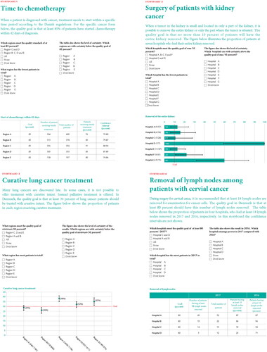
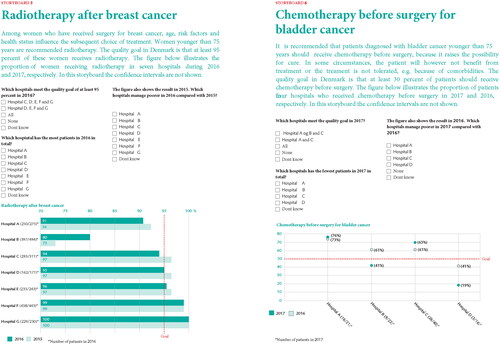
Participants were introduced to six different storyboards, all of which represented authentic data from six Danish quality registers in cancer care [Citation12], i.e. the Danish Bladder Cancer Database [Citation13], the Danish Breast Cancer Group [Citation14], the database of the Danish Renal Cancer Group [Citation15], the Danish Lung Cancer Registry [Citation16] and the Danish Gynaecological Cancer Database [Citation17] (cervical cancer) (). The storyboards presented the following scenarios: (1) time to start of chemotherapy, (2) percentage of patients undergoing kidney-preserving surgery for renal cancer, (3) percentage of patients with lung cancer who were treated with curative intent, (4) percentage of cervical cancer patients undergoing surgery with lymph node dissection, (5) percentage of breast cancer patients receiving adjuvant radiotherapy after breast-conserving surgery and (6) percentage of bladder cancer patients receiving neoadjuvant chemotherapy ().
Figure 1. Examples of the six storyboard versions.
Presentation format and storyboard questions
The six storyboards presented quality data in three different formats: table format, league table and point estimates with two storyboards for each of the three formats (). There were three questions related to the data presented in each of the 6 storyboards, i.e. 6 questions for each format in 1 storyboards and 18 questions in total. Of the 18 questions, 6 were concerning a comparison of the number of patients in different regions or hospitals, e.g. ‘Which hospital has the fewest patients in total?’, 6 questions were concerning different scenarios on whether the different regions or hospitals meet the quality goal, e.g. ‘Which regions meet the quality goal of at least 30 percent?’, 3 questions were concerning interpretation of random variation in the quality goal using confidence intervals (CI), e.g. ‘Which region is with certainty below the quality goal of 85 percent?’, and finally 3 questions were concerning variation of the quality goal over time, i.e. ‘Which hospitals are managing worse in 2017 compared with 2016?’.
Randomization
Participants were exposed to the quality data in the three different formats (1. Table format, 2. League table and 3. Point estimates) in varying presentation order (i.e. format presentation order 1-2-3, 1-3-2, 2-1-3, 2-3-1, 3-1-2, and 3-2-1) resulting in a total of six different storyboard versions. This strategy was chosen to avoid bias, and to allow evaluation of whether the format changed the interpretation. The participants were randomly allocated to receive the 6 storyboards versions using computer-generated block randomization with a size of 12 surveys in each block.
Measurements of preferred presentation format, education, health literacy and cohabitation status (exposures)
Participants were asked to mark which format they preferred, e.g. whether they preferred league tables, point estimates or tables when interpreting the questions from the storyboards and to provide information on cohabitation status (living with spouse or partner (yes; no)) and educational level (no higher education; short higher education (<3 years); medium higher education (3–4 years); long higher education (>4 years)). Health literacy was measured using the Japanese Functional Health Literacy scale developed by Ishikawa [Citation18] including five items concerning how people generally experience reading and understanding information related to health, illness and medical care. The functional aspects of health literacy refers to basic skills in understanding texts, figures and numbers in health information [Citation19]. The participants indicated on a five-point Likert scale ranging from ‘never’ to ‘always’, how often they found it difficult to e.g. read and understand health information. The five items were summed into a total score (continuous). We also included categories of high (’never’ or ‘rare’) and low health literacy (’sometimes’, ‘often’ and ‘always’) based on guidelines for use of the scale [Citation20] in the descriptive table, but due to low numbers, it was not possible to include a binary version of health literacy in the regression analysis.
Measurements of correct interpretation (outcome)
Correct interpretation of quality data was defined as (1) degree of correct interpretation within each format calculated by the sum (0–6) of correct answers, (2) having answered all questions correctly in a given format (table format, point estimates and league table, respectively) (yes; no) and (3) having answered all questions within at least one of any format correctly (yes; no).
Measurements of potential confounding factors
Information on potential confounding factors such as such as age (continuous) and gender (male; female) were retrieved from the survey in addition to cohabitation status and education (see categories of the latter two under exposures).
Statistical methods
To characterize the study population we calculated frequencies and percentages of sociodemographic factors, health literacy level, the general difficulty level of all questions in the survey and preferred data presentation format according to correct interpretation of a given format or at least one of any format. Plots were computed with the mean score of the sum (0–6) of correct answers within each format and according to preferred presentation format. We used logistic regression models to calculate odds ratios (ORs) with 95% CI to examine associations between (1) preferred presentation format, health literacy level, educational attainment, cohabitation status (exposures) and interpretation of quality data of a given format or at least one of any format (outcome) and (2) health literacy level (exposure) and preferred presentation format (outcome). The ORs were further mutually adjusted for potential confounding factors such as gender (male; female), age (continuous), educational attainment (no higher education; short higher education (<3 years); medium higher education (3–4 years)) and cohabitation status (living with spouse or partner (yes; no)).
Significance was set at p < 0.05. Statistical analyses were performed using SAS.
Results
The block randomization balanced the allocation of participants to each of the six storyboard versions: Storyboard A = 66, storyboard B = 73, storyboard C = 75, storyboard D = 87, storyboard E = 84 and storyboard F = 79 (data not shown). Sociodemographic characteristics of the 464 panel members of the Danish Cancer Society patient panel are shown in stratified by correct interpretation of the quality data. The vast majority of participants (97%) had high literacy and 57% had a medium or long higher education. A total of 67% correctly interpreted at least one format with correct responses in 43% for table format, 40% for point estimates and 38% for league tables. The majority (60%) considered the questions to be difficult or very difficult. When asked about the preferred presentation format, 56% reported that they preferred league tables (56%). The distribution of correct interpretation of at least one format is shown for table format, league tables and point estimates in Supplemental Figures 1–3.
Figure 2. Mean scores of correctly interpreted storyboards by preferred presentation format among 464 cancer patients and relatives.
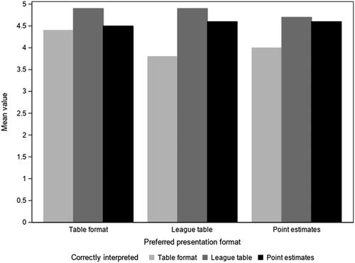
Table 1. Characteristics of the panel of 464 cancer patients and relatives by correct interpretation of at least one format and each format.
The mean score for correct interpretation of storyboards was highest for league table and lowest for table format irrespective of patient’s preference for presentation format (). The highest mean scores of correct interpretation of table format were seen among patients who also preferred table format compared with patients who preferred league table or point estimates ().
Preferred presentation format and correct interpretation
Correct data interpretations of at least one format were more often provided by participants who preferred league tables (OR = 1.62; 95% CI = 1.04–5.52) compared with participants who preferred table format (). However, this tendency did not persist when restricting correct interpretation of storyboards to table format (league table preferred OR = 1.06; 95% CI = 0.69–1.62) (). Participants who preferred table format had a lower odds ratio of correct interpretation of league table (OR = 0.45; 95% CI = 0.29–0.71) compared with participants who preferred league table ().
Table 2. Patient’s and relative’s preferred presentation format associated with correctly interpreted quality data.
Table 3. Patient’s and relative’s preferred presentation format associated with correctly interpreted quality data by presentation format.
Health literacy, education and cohabitation status and correct interpretation
Health literacy did not seem to play a role for correct interpretation of at least one format (OR = 1.02; 95% CI = 1.01–1.04) and estimates did not differ when stratified by correct answers in each presentation format (table format: OR 1.02; 95% CI = 1.00–1.03, league format: 1.02; 95% CI = 1.00–1.03, for point estimate OR 1.03; 95% CI = 1.02–1.05) (data not shown). Neither did health literacy seem to play a role for preferred presentation format (table format: OR 1.00; 95% CI = 0.98–1.01, league format: 1.00; 95% CI = 0.99–1.01, point estimate: OR 1.01; 95% CI = 0.99–1.03) (data not shown). However, the number of participants in the study population categorized as having low health literacy were limited (N = 16) ().
Participants with medium (3–4 years) or long (≥4 years) higher education had a higher odds ratio of correct interpretation of at least one format compared with panel members with no higher education (OR = 1.93; 95% CI = 1.16–3.21 and OR = 3.89; 95% CI = 1.90–7.95, respectively) (). The same tendency was seen in analyses stratified by correct interpretation of storyboards in table format, point estimates and league table format, respectively (). We found no association between participant’s cohabitation status and correct data interpretation, irrespective of data format (data not shown).
Table 4. Patient’s and relative’s highest attained education associated with correctly interpreted quality data.
Table 5. Patient’s and relative’s highest attained education associated with correctly interpreted quality data by presentation format.
Discussion
This randomized study is the first to investigate how various data presentation formats might influence the interpretation of quality data among patients with cancer and their relatives. Despite that a large proportion of participants had high health literacy and medium or long education, more than one third did not correctly interpret at least one format and almost 60% found that the questions were difficult or very difficult to answer, which serves as a reminder of support and explanations when involving patients and relatives in work related to quality data interpretation. Most patients and relatives preferred league table format and the understanding of quality data on cancer care improved with longer education and if the data was presented in the preferred format.
We found that preferred presentation format does influence understanding of health care indicators. A possible explanation of this finding is that preferred format may reflect higher familiarity and meaningfulness, which may improve how health care information was processed, and understood [Citation2]. In contrast to our study, a systematic review reported that patients and public groups tended to prefer bar charts, but this format seemed to be the least understood whereas tables and pictographs improved the understanding of healthcare providers’ performance [Citation21]. Previous studies on the understanding of health risk information have also reported that preferred formats such as pie, clock and bar charts did not seem to enhance individual’s ability to correctly interpret the information [Citation2,Citation22,Citation23]. However, the decisional context, presentation formats and study population in these studies were different from our study, which may explain the conflicting findings. Additional studies are needed to explore preferred formats as prerequisite for improved understanding of cancer quality indicators. Correct interpretation also increased with longer education, irrespective of presentation format. We did, however, not find any association between health literacy and cohabitation status, respectively and correct interpretation of quality data.
The majority of participants in our study preferred league table format and this format also had the highest mean scores of correct interpretations. A randomized comparison of formats among 345 Swedish health care decision-makers comparing hospital performance within cancer care found that league table was associated with increased Type 1 errors compared with funnel plots resulting in inappropriate actions by unsupported information [Citation3]. However, decision-makers more often missed to react when using funnel plots [Citation3]. The authors suggested that explanations and visualization aids are warranted to further guide appropriate decisions. In our study, even among participants who were able to correctly interpret cancer quality indicators in league table format, there were 52% who found the questions very difficult or difficult. This indicates a significant challenge for engaging patients and relatives in work related to quality parameters, indicator outputs and suggest that data presentation should be greatly simplified to ease correct interpretation and support understanding. Participants in our study were asked to interpret quality data with confidence intervals, which may be a very difficult assignment, even among highly educated individuals. Patients and relatives who are making hospital provider choices based on benchmarked quality indicators are likely to be unfamiliar with the information and the difficulty level may exceed their information processing skills [Citation24]. A systematic review on how presentation formats influence decision-making concluded that health care performance reports could be enhanced using user-defined formats while limiting the amount of information presented and testing the preference and understanding of presentation formats prior to use [Citation25].
Patient involvement in quality improvement may be demanding for the lay person, especially for individuals with lower education and health literacy [Citation26]. Both education and health literacy have been shown to be negatively associated with active provider choice suggesting a disadvantage for the less educated with lower health literacy [Citation7]. Therefore, it is important to consider both presentation formats and additional assistance strategies to guide understanding for individuals with lower skill levels [Citation24,Citation27]. Our study did not suggest that any specific format improved the understanding among participants with short education. Previous studies have suggested that adding illustrations or plain language describing the numerical information depicted in graphs might improve understanding among individuals with low health literacy [Citation27–29]. Alternatively, a tailored approach with support from healthcare professionals or family members may be more effective when involving patients with low health literacy in health care quality improvement [Citation27].
The strengths of our study included the randomized comparison of formats making it possible to evaluate whether the format changed the interpretation of the quality data. The Danish quality registers in cancer care allowed use of authentic data to be interpreted by real consumers reflecting real decision situations. Moreover, the participants were recruited from the Danish Cancer Society panel representing all Danish regions and patients had been diagnosed with a broad range of different cancer diagnoses making it possible to generalize our results to patient representatives with various cancer diagnoses in Denmark. Our study also had some limitations. We did not measure the ability to understand probabilistic and mathematical concepts (numeracy) and the ability to evaluate meaning form graphical representation of numerical information (graph literacy), which are important components of the individual’s ability to accurately understand information about hospital performance [Citation2,Citation30,Citation31]. Since the vast majority of the participants had high health literacy, there were not sufficient variation in our data to meaningfully interpret the association of health literacy with understanding of quality data. In addition, it has been demonstrated that the selection of cancer survivors from patient organizations may not be fully representative of the general cancer population, since they are usually somewhat higher educated [Citation32]. When comparing education levels in our study population with that of the general Danish population, we also see higher levels among the study participants [Citation33]. Thus, we may overestimate the proportion of correct interpretations and underestimate question difficulty. Finally, the response rate was modest (55%), and non-responders may be those having most difficulties in responding to questionnaires and understanding the quality data leading to overestimation of the level of correctly interpreted storyboards in our study.
Future perspectives
Overall, the challenges and shortcoming identified indicate a need for optimized presentation formats to achieve equal cooperation and meaningful interaction with patients and relatives in the development, interpretation and benchmarking of quality data in cancer care. Involving patient and relatives with short education in the development of presentation formats for cancer quality data may further the understanding.
Conclusion
It is noteworthy from our results that patients and relatives found it difficult to interpret the cancer quality data even though the majority had high education and health literacy. Decision-makers within cancer care should carefully consider displaying quality data according to preferred presentation format. Moreover, when engaging patients and relatives in work related to quality parameters, the data presentation should be simplified to lower the difficulty level and improve the understanding. This may be done e.g. by opting out confidence intervals or variation of the quality goal over time.
Supplemental Material
Download Rich Text Format File (737 B)Supplemental Material
Download JPEG Image (13.2 KB)
Supplemental Material
Download JPEG Image (13.2 KB)
Supplemental Material
Download JPEG Image (12.6 KB)
Acknowledgements
The authors thank the Danish Cancer Society Citizens’ Panel for participating in the study as well as the Danish Cancer Society for support during the study.
Disclosure statement
No potential conflict of interest was reported by the author(s).
Data availability statement
The data that support the findings of this study are available from the corresponding author, [RL], upon reasonable request.
References
- Williams KE, Sansoni J, Morris D, et al. A Delphi study to develop indicators of cancer patient experience for quality improvement. Support Care Cancer. 2018;26(1):129–138.
- van Weert JCM, Alblas MC, van Dijk L, et al. Preference for and understanding of graphs presenting health risk information. The role of age, health literacy, numeracy and graph literacy. Patient Educ Couns. 2021;104(1):109–117.
- Anell A, Hagberg O, Liedberg F, et al. A randomized comparison between league tables and funnel plots to inform health care decision-making. Int J Qual Health Care. 2016;28(6):816–823.
- Fortin JM, Hirota LK, Bond BE, et al. Identifying patient preferences for communicating risk estimates: a descriptive pilot study. BMC Med Inform Decis Mak. 2001;1(1).
- Høeg BL, Tjørnhøj-Thomsen T, Skaarup JA, et al. Whose perspective is it anyway? Dilemmas of patient involvement in the development of a randomized clinical trial – a qualitative study. Acta Oncol. 2019;58(5):634–641.
- Thompson J, Bissell P, Cooper C, et al. Credibility and the 'professionalized’ lay expert: reflections on the dilemmas and opportunities of public involvement in health research. Health (London). 2012;16(6):602–618.
- Rademakers J, Nijman J, Brabers AE, et al. The relative effect of health literacy and patient activation on provider choice in The Netherlands. Health Policy. 2014;114(2–3):200–206.
- Elbel B, Gillespie C, Raven MC. Presenting quality data to vulnerable groups: charts, summaries or behavioral economic nudges? J Health Serv Res Policy. 2014;19(3):161–168.
- IUHPE. IUHPE position statement on health literacy: a practical vision for a health literate world. Paris: IUHPE Global Working Group on Health Literacy; 2018.
- Høeg BL, Frederiksen MH, Andersen EAW, et al. Is the health literacy of informal caregivers associated with the psychological outcomes of breast cancer survivors? J Cancer Surviv. 2021;15(5):729–737.
- Yuen EYN, Knight T, Ricciardelli LA, et al. Health literacy of caregivers of adult care recipients: a systematic scoping review. Health Soc Care Community. 2018;26(2):e191–e206.
- https://www.rkkp.dk/.
- Hansen E, Larsson H, Nørgaard M, et al. The Danish bladder cancer database. Clin Epidemiol. 2016;8:439–443.
- Møller S, Jensen MB, Ejlertsen B, Danish Breast Cancer Cooperative Group, et al. The clinical database and the treatment guidelines of the Danish Breast Cancer Cooperative Group (DBCG); its 30-years experience and future promise. Acta Oncol. 2008;47(4):506–524.
- Petersen AC, Søgaard M, Mehnert F, et al. The database of the Danish Renal Cancer Group. Clin Epidemiol. 2016;8:725–729.
- Jakobsen E, Rasmussen TR. The Danish lung cancer registry. Clin Epidemiol. 2016;8:537–541.
- Sørensen SM, Bjørn SF, Jochumsen KM, et al. Danish gynecological cancer database. Clin Epidemiol. 2016;8:485–490.
- Ishikawa H, Takeuchi T, Yano E. Measuring functional, communicative, and critical health literacy among diabetic patients. Diabetes Care. 2008;31(5):874–879.
- Wångdahl JM, Mårtensson LI. Measuring health literacy – the Swedish Functional Health Literacy scale. Scand J Caring Sci. 2015;29(1):165–172.
- Mårtensson LI, Wångdahl JM. S-FHL scale for functional health literacy – Swedish version. Guidelines for Use of the Scale. Sweden: Uppsala University and University of Gothenburg; 2015.
- Hildon Z, Allwood D, Black N. Impact of format and content of visual display of data on comprehension, choice and preference: a systematic review. Int J Qual Health Care. 2012;24(1):55–64.
- McCaffery KJ, Dixon A, Hayen A, et al. The influence of graphic display format on the interpretations of quantitative risk information among adults with lower education and literacy: a randomized experimental study. Med Decis Making. 2012;32(4):532–544.
- Nayak JG, Hartzler AL, Macleod LC, et al. Relevance of graph literacy in the development of patient-centered communication tools. Patient Educ Couns. 2016;99(3):448–454.
- Hibbard JH, Peters E. Supporting informed consumer health care decisions: data presentation approaches that facilitate the use of information in choice. Annu Rev Public Health. 2003;24:413–433.
- Kurtzman ET, Greene J. Effective presentation of health care performance information for consumer decision making: a systematic review. Patient Educ Couns. 2016;99(1):36–43.
- Damman OC, De Jong A, Hibbard JH, et al. Making comparative performance information more comprehensible: an experimental evaluation of the impact of formats on consumer understanding. BMJ Qual Saf. 2016;25(11):860–869.
- Zwijnenberg NC, Hendriks M, Damman OC, et al. Understanding and using comparative healthcare information; the effect of the amount of information and consumer characteristics and skills. BMC Med Inform Decis Mak. 2012;12:101.
- Meppelink CS, Smit EG, Buurman BM, et al. Should We be afraid of simple messages? The effects of text difficulty and illustrations in people with low or high health literacy. Health Commun. 2015;30(12):1181–1189.
- Hibbard JH, Peters E, Slovic P, et al. Making health care quality reports easier to use. Jt Comm J Qual Improv. 2001;27(11):591–604.
- Peters E. Beyond comprehension: the role of numeracy in judgments and decisions. Curr Dir Psychol Sci. 2012;21(1):31–35.
- Galesic M, Garcia-Retamero R. Graph literacy: a cross-cultural comparison. Med Decis Making. 2011;31(3):444–457.
- Vromans RD, van Eenbergen MC, Geleijnse G, et al. Exploring cancer survivor needs and preferences for communicating personalized cancer statistics from registry data: qualitative multimethod study. JMIR Cancer. 2021;7(4):e25659.
- https://www.statistikbanken.dk/HFUDD11. Statistics Denmark; [22-04-2022].