Abstract
This paper describes the changes in inequality in South Africa over the post-apartheid period, using income data from 1993 and 2008. Having shown that the data are comparable over time, it then profiles aggregate changes in income inequality, showing that inequality has increased over the post-apartheid period because an increased share of income has gone to the top decile. Social grants have become much more important as sources of income in the lower deciles. However, income source decomposition shows that the labour market has been and remains the main driver of aggregate inequality. Inequality within each racial group has increased and both standard and new methodologies show that the contribution of between-race inequality has decreased. Both aggregate and within-group inequality are responding to rising unemployment and rising earnings inequality. Those who have neither access to social grants nor the education levels necessary to integrate successfully into a harsh labour market are especially vulnerable.
1. Introduction
This paper maps out key dimensions of money-metric inequality in South Africa over the post-apartheid era. It does this using data from the 2008 first wave of the National Income Dynamics Study (NIDS) and benchmarks this contemporary picture with the situation as it was in 1993 as measured by data from the Project for Statistics on Living Standards and Development (PSLSD) for 1993 (SALDRU, Citation1994b, 2008).Footnote1 Both are regular living standards measurement instruments with similar income and expenditure modules. We begin with an assessment of data comparability in Section 2. Having clearly defined the nature of the 1993 and 2008 datasets that are to form the basis of the comparison, in Section 3 we then present an overview of aggregate income inequality in the two years. This shows conclusively that inequality has increased over the post-apartheid period, both on aggregate and within each racial group. It also shows significant increases in the shares of income coming from social grants for individuals in the lower income deciles. Given this, in Section 4 we use an income source decomposition of the Gini coefficient to ascertain the relative importance of income sources in driving aggregate inequality in each of the two years. This shows that lack of access to labour market incomes and the inequality of these incomes were the main drivers of aggregate inequality in 1993 and remain so in 2008.
While there are many ways to decompose and analyse inequality, it is understandable that the most common feature of post-apartheid studies is the focus on changes in inequality by racial group. We maintain this tradition in the analysis in Section 5, making use of a new methodology to ensure that measured between-group contributions are comparable over time. This exercise shows that the between-race component of inequality has fallen. We conclude in Section 6 by summarising our most important findings.
2. The construction of income and expenditure measures
Quantitative comparisons of well-being over time are useful only to the extent that the data being used to make the comparisons are actually comparable. This section of the paper addresses this issue. A comprehensive overview of the sampling and the fieldwork as well as the construction of the income and expenditure variables in the 1993 data can be found in the Project for Statistics on Living Standards and Development (SALDRU, Citation1994a). The sampling and fieldwork for the 2008 data are described in Woolard et al. Citation(2010), and the derivation of the 2008 aggregate income and expenditure variables, respectively, in Argent Citation(2009) and Finn et al. Citation(2009). Here we discuss some of the areas that could confound comparisons over time, and explain how income and expenditure measures were adjusted in order to make them consistent. This is not a trivial exercise. Although the 1993 and 2008 datasets have income and expenditure modules that are broadly consistent with each other, the fact that we are comparing separate sets of cross-sectional survey data over a 15-year period means that methodological differences could cloud a comparison of income and expenditure measures.
Starting with the measurement of income and expenditure, the questionnaires in 1993 and 2008 asked respondents to report on income they received over the 30 days before the interview and about expenditure made ‘last month’. The advantage of measuring income and expenditure in this way is that it mitigates the recall bias that would be present if an annual figure was asked for. The main drawback to this method is that it may mask large one-off incomes or expenditures – for example, inheritance income or funeral expenses – that occur at other times of the year and affect household welfare dramatically.
In both 1993 and 2008 a single individual in each household answered all the questions on expenditure on behalf of all members of the household. However, the same is not true for income. In the 1993 survey, a single individual answered all the questions on income on behalf of all members of the household, whereas in 2008 each member of the household answered individual income questions. The result is that the 2008 data are probably a better measure of income due to less measurement error. However, it is difficult (if not impossible) to determine the size and direction of the biases caused by the differing methods without designing a survey explicitly for this purpose. A more effective way to improve comparability is to assess the comparability of all of the component variables that are aggregated into total income and expenditure. The two most important variables here are implied rental income and income from agricultural sources.
It is always difficult to deal with implied rental income and expenditure (Deaton, Citation1997; Deaton & Zaidi, Citation1999) and this was particularly the case when comparing the 1993 and 2008 datasets. Individuals who occupy homes that they own (or simply do not rent) derive significant welfare from this, so it is important to include implied rental income to ensure that the aggregated household income figure does not understate the welfare thus accruing. However, the implied rental figures for 1993 were imputed using a rule-based method, combining a set rate of return with the price of the house, while those for 2008 figures were imputed by using a regression-based method that tried to capture more broadly the true opportunity cost of living in one's own house (Argent, Citation2009). Unfortunately it is not possible to apply a uniform treatment to implied rental income across both datasets, and including these figures as they currently stand would lead to significant differences that are driven by measurement error. For this reason, the inequality analysis in this paper is conducted on a measure of household per capita income and expenditure that excludes implied rental income.
As far as income from agricultural sources is concerned, the 1993 data contain a number of very high household-level agricultural income figures and these clearly belong to commercial farmers. In the 2008 survey, commercial farmers were explicitly excluded from the agricultural income module. The upshot of this is that the distributions and summary statistics of agricultural income for the two datasets are not comparable in any meaningful way and so these are also excluded from the analysis of inequality in this paper. While this is unfortunate, the data show that agricultural income is not a major component of total income in either 1993 or 2008, so this exclusion is not a major concern.Footnote2
Given the exclusion of these two factors, aggregate household income was defined as the sum of five broad components: income gained through the labour market (for wage earners and the self-employed) net of tax, income received in the form of various government grants, remittance income received, income of a capital nature, and all ‘other’ income.
Although income is by far the most common measure of inequality, it is also instructive to analyse the distribution of household expenditure. Abstracting from measurement error, income and expenditure should generally be consistent in the data and should capture approximately the same level of household welfare. Once implied rental figures are removed from total household expenditure, methodologically the 1993 and 2008 datasets are broadly comparable. In both cases total household expenditure is made up of the sum of food and non-food expenditures, which themselves are clearly divided into smaller sections in the questionnaires for both years.
A serious problem arises when we try to use both income and expenditure to tell a story of changes over time. Whereas the income and expenditure data for 2008 tell a very consistent story of the 2008 situation, the 1993 data do not. Mean expenditure in 1993 is notably lower than mean income, mostly due to the expenditure of the white group being lower than measured white income. This also makes measured expenditure inequality lower then income inequality in 1993. Thus the picture that forms the baseline for our changes over time is not completely consistent and it is more sensible to conduct the comparisons over time in terms of either income or expenditure. Given that a number of the exercises in this paper use only income data, it is expedient to proceed with income. In addition, there is some analytic support for this choice. Leibbrandt and Levinsohn Citation(2011) show that 1993 and 2008 income data give a picture of income growth between 1993 and 2008 that benchmarks well with macroeconomic growth rates for this period. The NIDS 2008 income data (and expenditure data) have also benchmarked well against other datasets covering the same period (Argent, Citation2009; Wittenberg & Argent, Citation2011). Thus, the rest of this paper focuses on changes in inequality measured in terms of income alone.
3. A descriptive comparison of 1993 and 2008 income inequality
Having settled on comparable data for comparing well-being over time, in this section we provide initial summary statistics of the main changes in income. Throughout the paper, we use household per capita income as the measure of well-being. Each person in each household is given this per capita measure. All figures are weighted up to the relevant national population totals using the appropriate weights.Footnote3 Thus, we are using the sample data to describe inequality trends for the South African population.
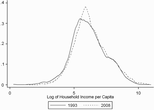
The figures in present mean and median real income by racial group for both 1993 and 2008. The mean and median of overall household per capita income displayed an upward trend over the 15-year period. Indeed, plots the full distributions of income for both years and shows clear rightward shifts at both the lower and upper ends of the income spectrum.
Table 1: Income summary statistics
Figure 1: Overlaid kernel densities of per capita income FootnoteNotes.
The deep racial disparities of South African societies are evidenced once again by the data, with African mean income increasing from R539 to R816 in real terms, while the corresponding figures for whites are R4632 and R6275. The ratio of income share divided by population share increased marginally for Africans over the 15-year period from 0.47 to 0.56. We return to a more detailed analysis of the role of race in South African inequality later in the paper when we conduct a within-race and between-race decomposition exercise.
and provide breakdowns of the components of aggregate household income in South Africa by income decile for 1993 and 2008. This is an important part of identifying compositional differences in household income across the distribution and, as the figures clearly show, the composition of household income changed significantly between those two years.
Figure 2: Composition of income by decile – 1993 FootnoteNotes.
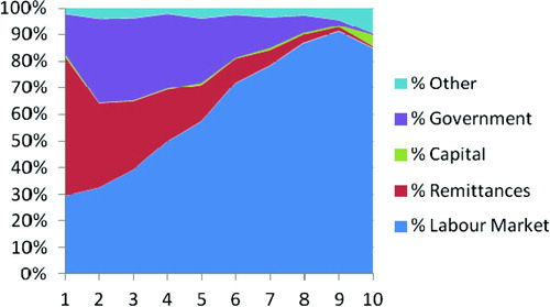
Figure 3: Composition of income by decile – 2008 FootnoteNotes.
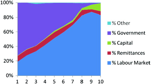
The main driver of the compositional change was the increasing weight of government grants in household income for those in the lowest deciles. It appears that income from these grants has crowded out remittances to a certain extent. For the poorest decile, the share of government grants increased from 15% in 1993 to about 73% in 2008. The importance of labour market earnings for the highest deciles is obvious and it is interesting to note the virtually linear increase in the proportional share of labour market earnings from deciles 1 to 9 in 2008. Income of a capital nature was a small component in both years, although it stood at 11% for the top decile in 2008.
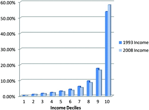
To analyse the dynamics of inequality more finely, a good first step is to assess whether or not income has become more concentrated at the upper end of the distribution. does this by reporting the share of overall income accruing to each decile and then comparing the 1993 figures to those of 2008. The results indicate that income has become increasingly concentrated in the top decile. In fact, in 2008 the wealthiest 10% accounted for 58% of total income. This trend is evident even within the top decile itself, as the richest 5% maintain a 43% share of total income, up from about 38% in 1993. Furthermore, the cumulative share of income accruing to the poorest 50% dropped from 8.32% in 1993 to 7.79% in 2008.
Figure 4: Shares of total income by decile FootnoteNotes.
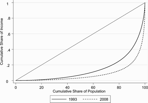
This analysis begins to suggest that income inequality in South Africa increased between 1993 and 2008. To confirm this, provides Lorenz curves for both years (Fields, Citation2001). The closer a curve is to the 45° line of perfect equality, the more equal the income distribution. As we can see in the figure, the curves do not cross at any stage, with the 2008 curve lying further away from the 45° line of perfect equality. It is this picture of inequality dominance that allows us to conclude definitively that the distribution of income in 2008 was more unequal than was the case in 1993 (Fields, Citation2001).
Figure 5: Income Lorenz curves for total income, 1993 and 2008 FootnoteNotes.
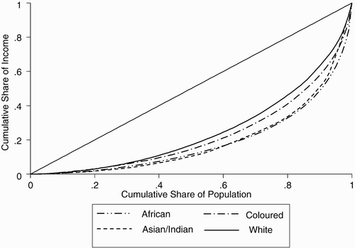
undertakes the same exercise for each racial group for 2008. It shows that inequality is highest amongst Africans, then coloureds and then whites. Because the Asian/Indian curve crosses the African and coloured curves, we cannot infer anything about overall Asian/Indian inequality dominance on the basis of these curves alone. Although we do not show this here, Leibbrandt et al. Citation(2009) show that the 1993 data reveal the same racial inequality ranking.
Figure 6: Income Lorenz curves by race, 2008 FootnoteNotes.
These Lorenz curve diagrams become unwieldy in interrogating changes in inequality by race between 1993 and 2008. If we have one Lorenz curve for each racial group in each year the diagram becomes cluttered, making it is hard to see whether or not there is inequality dominance. Thus, we now go on to derive Gini coefficients for 1993 and 2008 for each racial group and for the country. These are presented in and the results indicate that the overall Gini coefficient on income rose from 0.66 to 0.70 between 1993 and 2008. As expected, the measure also confirms that inequality is highest among Africans and lowest among whites. We assess the robustness of these coefficients by deriving a bootstrapped standard error for each Gini coefficient.Footnote4 The standard errors are very small relative to the Gini coefficients and relative to the change in the Gini coefficients. This means we can be confident that the sample data imply genuine increases in inequality on aggregate and within each racial group between 1993 and 2008.
Table 2: Gini coefficients of per capita income, overall and by race
4. An income source decomposition of South African inequality
We have seen above that there are dramatic changes between 1993 and 2008 in the relative income of individuals in different income deciles from the different income sources. It is possible to further analyse this to show how the relative importance of these sources has changed in driving the aggregate increase in inequality. One of the strengths of the Gini coefficient is that it allows us to assess the importance of different income sources in determining overall inequality.
The method described in Leibbrandt et al. Citation(2009) can be summarised as follows. If South African society is represented as n households deriving income from K different sources or components, then Shorrocks Citation(1983) shows that the Gini coefficient (G) for the distribution of total income can be derived as:
where
Sk is the share of source k income in total income (i.e. Sk = μk/μ), | |||||
Gk is the Gini coefficient measuring the inequality in the distribution of income component k, and | |||||
Rk is the Gini correlation of income from source k with total income. Rk is a form of rank correlation coefficient, as it measures the extent to which the relationship between Yk (the income from source k) and the cumulative rank distribution of total income coincides with the relationship between Yk and its own cumulative rank distribution. | |||||
The larger the product of these three components, the greater the contribution of income from source k to total income inequality. While Sk and Gk are always positive and less than one, Rk can fall anywhere on the interval [–1,1]. When Rk is less than zero, income from source k is negatively correlated with total income and thus serves to lower the overall Gini measure for the sample.
The results of this decomposition for 1993 and 2008 are presented in and . The most obvious conclusion to be drawn from these tables is that the labour market is the driving force behind aggregate inequality in the country, with the share of labour market income in the overall Gini coefficient being between 85% and 88%. The reasons for this can be seen by referring back to the formula for the decomposition presented in the equation above. While the real mean monthly income from the labour market was largely unchanged, income from this source was the most significant contributor to total household income. Indeed, the proportion of households receiving income from the labour market hovered at just over 70% in 1993 and 2008. Then, even if members of a household have paid employment, the distribution of income within the labour market is very unequal.
Table 3: Decomposing the Gini coefficient by income source – 1993
Table 4: Decomposing the Gini coefficient by income source – 2008
The biggest change in the composition of household income has been the fact that the share of households receiving income from state grants more than doubled between 1993 and 2008. Income from grants increased as a share of total household income from 5.4% to 7.9% and also increased significantly in real terms. As shown in earlier figures, it was the households in the lowest deciles that experienced a surge in income from government grants. However, despite income from government grants generally accruing to the poor in South Africa, the increasing level of income from the state has not changed this factor's importance in determining overall inequality. The very weak correlation between state transfers and total household income seems to suggest that these transfers are effectively reaching poorer households as grant recipients. Despite this, however, it appears that state grants had virtually no effect on overall inequality in the country (see the final column of and ). The most plausible explanation for this is that receipt of the grants moved the recipients up from the bottom of the income distribution and into the lower-middle sections.
The role of remittances in inequality changes from being clearly equalising in 1993 to being a slightly positive contributor to inequality in 2008. This is for two reasons. First, the percentage of households receiving remittance income falls from 24% to 14%. We saw this dramatically in and above. Then, although remittances are higher on average in 2008, the Gini coefficient for remittance income increases from 0.55 to 0.75, showing that remittances are more unequally distributed in 2008. It is possible that the increase in unemployment between 1993 and 2008 explains why fewer people were sending remittances, but we do not have the data on remitters to verify this. This possibility serves to highlight the fact that the changes in remittance income are likely to be tied to labour market developments and could therefore be regarded as a form of labour market impact on inequality.Footnote5
As shown by Lerman & Yitzhaki Citation(1994), the Gini coefficient for a particular income source (Gk) is driven by the inequality among those earning income from that source (GA) and the proportion of households that have positive income from that source (Pk), or, more accurately, the proportion of households with no access to a particular income source (1 – Pk). Explaining this with respect to the 1993 situation, it can be seen that:
Gwage = Pwage GA + (1 – Pwage) = (0.73)(0.60) + (1 – 0.73) = 0.43 + 0.27 = 0.70
In this case 38% of the wage inequality is because 27% of households have zero wage income and 62% of the wage inequality is because of the inequality of wage income among the 73% of households that do have access to some wage income.
By 2008 this same decomposition is as follows:
Gwage = Pwage GA + (1 – Pwage) = (0.72)(0.64) + (1 – 0.72) = 0.46 + 0.28 = 0.74
The aggregate wage income Gini coefficient has increased. This outcome reflects both an increase in the share of zero wage income households (28%) and an increase in the wage income inequality among the 72% of households that do have access to wage income. The net share of these two components of wage income inequality is unchanged from 1993 at 38% and 62%, respectively.
5. A between-race and within-race decomposition of South African inequality
Although the Gini coefficient is decomposable by income sources, the generalised entropy (GE) class of inequality measures has an advantage that the Gini does not; namely, it is additive across different groups. Such a decomposition is illuminating in assessing how much inequality is a result of differences between specified groups, and how much is because of differences within these groups. Following Duclos & Araar Citation(2006), the general formula is given by:
where
is mean household income/expenditure per capita. The GE measures range from 0 (perfect equality) to any higher number representing increasing inequality. The α parameter represents the sensitivity of the GE measure to differences in income at different parts of the distribution. A low value of α implies a GE measure that is more sensitive to changes at the bottom end of the distribution, while a high value is more sensitive to changes at the top. For the purposes of this paper, and indeed in most work on the subject, the value of α is restricted to 0 (also known as the Theil L Index and the mean log deviation) or 1 (also known as the Theil T Index).Footnote6
The aggregate values of these measures are presented in . The table confirms that overall income inequality in South Africa increased between 1993 and 2008.
Table 5: General entropy measures of income inequality
Inequality by racial group increased by all measures, with African income inequality displaying the strongest upward trend. As noted previously, one of the attractive applications of the GE measures is that they are readily decomposable into ‘within’ and ‘between’ group components, where the latter is usually interpreted as the level of inequality that would be measured if everyone was assigned the mean income of their group (Cowell & Jenkins, Citation1995). Such a decomposition is particularly interesting for an analysis of the changing contribution of race in South African inequality.
Using this method, we see that by 2008 inequality within each racial group was a bigger contributor to overall inequality than inequality between the groups. This was also the case in 1993, but the dominance of ‘within’ inequality has become stronger over time. For example, looking at the GE(1) measure for income, we see that inequality within racial groups made up about 48% of overall inequality in 1993 and that this had increased to almost 62% by 2008.
Comparing inequality over time, as in the table above, is a standard technique in the academic literature. However a recent paper by Elbers et al. Citation(2008) suggests that conventional methods need to be extended in order to get a more accurate understanding of how between-group inequality has changed over time. The authors argue that varying underlying population structures confound the ability to compare traditional between-group inequality measures accurately. That is to say, traditional between-group measures are implicitly not unit free because they are based on the number and relative sizes of the selected groups (in our case, race). Another way of thinking about this is shown in , where we calculate the contribution of between-group inequality to total inequality by taking the ratio of between-group inequality to total inequality (0.39/0.91 as in column 1, for example). The usual between-group measure is therefore simply:
where I
B
is the measure of between-group inequality, I is overall inequality and
is the partition according to which the population is divided.
Total inequality can be thought of as ‘the between-group inequality that would be observed if every [individual] in the population constituted a separate group’ (Elbers et al., Citation2008). The authors argue that comparing measured between-group inequality for a small number of groups (four in this paper) against a much larger benchmark (about 40 000 and 28 000 for the 1993 and 2008 data, respectively) biases the conventional measures downward.
The new measure they propose complements the traditional method by asking what the ratio is between measured between-group inequality and the maximum possible level of between-group inequality that can be counterfactually constructed from the data while retaining the same number of observations, the same number of groups, and the same relative sizes of the different groups. The advantage of this measure is that it allows for a more natural comparison of inequality across different times and settings because the measure itself is normalised by parameters that are present (and changing) in the data. The index is defined for observations across J sub-groups in the partition of size j(n) as:
Calculating the denominator of the expressions above involves reassigning individuals to four non-overlapping groups that maintain the size (and relative size) of the original racial groups. So, for example, in the 2008 data the population shares were approximately 79%, 9%, 3% and 9% for Africans, coloureds, Asians/Indians and whites respectively. The household per capita income data are then sorted and assigned to groups A, B, C and D, where group A receives the lowest 79% of the sorted data, group B the next 9% and so on. Inequality is then decomposed into within and between-group components for this new distribution and the new ‘maximum possible’ level of between-group inequality is recorded and compared to the ‘measured’ level present in the data. This implies that when comparing 1993 with 2008 we interpret the measured level of inequality relative to the maximum possible level that could be achieved while keeping the number of groups, their sizes and the distribution of income constant.
As shows, there was a significant decline in the measured between-group income inequality as a proportion of the maximum possible between 1993 and 2008. However, the figures remain very high and serve to temper the results in . While one might be tempted to say that ‘only’ 38% of overall income inequality was made up of between-group dynamics in 2008, according to the GE(1) measure in , the new measure shows that the income distribution in South Africa in 2008 was almost 50% of the way to being as unequal as it possibly could be, given the conditions outlined earlier. Nevertheless, the findings using this new method complement those using the traditional method qualitatively by providing some evidence that inequality between racial groups is less pervasive than it was in 1993, even though it is still very high. The conclusion, then, is that inequality dynamics in South Africa are increasingly being driven by growing inequality within racial groups in general and within the African population specifically.
Table 6: Measured ‘between income inequality’ as a percentage of maximum possible
Perhaps the basic schism in South African society lies along the white/non-white line, rather than between all population groups. Using data from the South African Income and Expenditure Survey of 2000, Elbers et al. Citation(2008) found that taking a broader partition of two groups (white and non-white) raised the inequality observed as a proportion of maximum possible to 80%. This is far higher than the 56% found when the division is made according to four population groups.
Our findings, using data from 1993 and 2008, show that the white/non-white division is starker than the division into four population groups. However, the decrease in observed between-group inequality is not as significant as found by Elbers et al. Citation(2008). Our results are presented in and their main feature is the fact that white/non-white between-group inequality as a percentage of the maximum possible decreased substantially between 1993 and 2008. This suggests that the white/non-white division may have been the key division along which to analyse racial inequality in the past, but its ability to provide a distinctly different dynamic to a four-way population group division has decreased markedly over time.
Table 7: Measured ‘between income inequality’ as a percentage of maximum possible – division into white/non-white groups
6. Conclusion
The comparison over time of money-metric inequality is only useful if it is based on accurate and comparable data. Both the 1993 PSLSD survey and the 2008 NIDS survey were explicitly designed to give detailed attention to money-metric well-being and there is much about these surveys that encourages their use for comparative analysis of inequality. Nonetheless, Section 2 of the paper details a number of specific assumptions that we made to increase the comparability of these datasets. Even after these changes, we noted that the 2008 income and expenditure figures were closer to each other than the respective 1993 figures. In this paper we therefore compared changes in income inequality only.
Having defined the data, the next section of the paper focused on measuring the changes in aggregate income inequality between 1993 and 2008. These data show that South Africa's high aggregate level of income inequality increased between 1993 and 2008. The same is true of inequality within each of South Africa's four major racial groups. A major driver of this situation was shown to be the increased share of income going to the top decile. These trends accord with the findings of Bhorat and Van der Westhuizen Citation(2009) using expenditure data from the Income and Expenditure surveys of 1995 and 2005. Also in line with their findings is our finding that the level of inequality was the highest within the African group in both 1993 and 2008 and increased the most within the African group between 1993 and 2008. This accords well with our formal decompositions exercises that show a declining between-race component of inequality over the post-apartheid period.Footnote7
From a policy point of view it is important to flag the fact that intra-race and, in particular, intra-African inequality trends are playing an increasingly influential role in driving aggregate inequality in South Africa. The majority of the population is beginning to exert majority influence and we must pay increasing attention to policies that stem and reverse the increasing inequality within each racial group and especially within the African group. For example, in this paper we show that the contemporary South African labour market operates in a way that is not facilitating the equalisation of income either across racial groups or within racial groups.
Indeed, rising inequality within the labour market – due both to rising unemployment and rising earnings inequality – lies behind these rising levels of aggregate and within-group inequality. Leibbrandt and Levinsohn Citation(2011) and Branson et al. Citation(2011) give us some sense of the underlying mechanisms here. There have been real improvements in average years of schooling of South Africans and especially among those who were previously disadvantaged. However, these improvements have not yet seen a significant increase in people with complete secondary schooling and there has been no increase in people with tertiary qualifications. It is most unfortunate therefore that the demand for labour has moved in such a way as to strongly favour only those with complete secondary schooling and even higher levels of education. Thus, most South Africans who have been trying to enter the labour market have not been well educated enough to gain employment or, if employed, to earn decent wages. Only those who are very highly skilled have been able to move into the labour market and to move up the earnings distribution.
On the other hand, we showed how important social grants (mainly the child support grant and the old-age pension) have become to those in the bottom half of the income distribution. Our income source decomposition exercises go further in suggesting that access to these grants shifts many South Africans from the lowest deciles into the lower-middle deciles. Those left at the bottom of the distribution in post-apartheid South Africa are those who do not have access to social grants nor the education levels necessary to integrate successfully into a harsh labour market.
Finally, it is important not to forget that, even if it is declining, the between-race component of South African inequality is still at world beating levels and serves as a stark reminder of the lingering footprint of apartheid. We are still trying to shrug off this legacy, for example by dealing with the educational inequities that seem to play such an important role in perpetuating inequality even today. Clearly, the direction of between-group and within-group changes is not inexorable, but rather the product of actual socioeconomic developments in the post-apartheid period. We have highlighted the role of the labour market and of social grants in this regard.
Acknowledgements
The authors acknowledge financial support for this paper from the National Income Dynamics Study in the South African Presidency and from the Social Policy Division of the Organization for Economic Cooperation and Development. Murray Leibbrandt acknowledges the Research Chairs Initiative of the Department of Science and Technology and National Research Foundation for funding his work as the Research Chair in Poverty and Inequality. The authors are particularly grateful to Michael Förster of the OECD Social Policy Division, to Charles Meth of SALDRU for detailed written comments, and to participants at the conference on ‘Overcoming structural poverty and inequality in South Africa: Towards inclusive growth and development’, Boksburg, Johannesburg, 20–22 September 2010, and to seminar participants at the OECD Expert Seminar and at SALDRU for their comments.
Notes
1The paper draws heavily on the working paper by Leibbrandt et al. Citation(2010).
2For a more comprehensive overview of the comparison of the 1993 and 2008 agricultural income variables see Leibbrandt et al. Citation(2010).
3Details of the weighting procedures can be found in SALDRU (1994a) and Wittenberg Citation(2009).
4See Duclos & Araar Citation(2006) for a description of the derivation and use of these standard errors.
Source: SALDRU (1994b, 2008). Own calculations.
Source: SALDRU (1994b). Own calculations.
Source: SALDRU (2008). Own calculations.
Source: SALDRU (1994b, 2008). Own calculations.
Source: SALDRU (1994b, 2008). Own calculations.
Source: SALDRU (2008). Own calculations.
5We thank an anonymous referee for this interesting point.
6See Cowell (Citation2011:155) for the relevant formulas.
7Surprisingly, given the general consistency between our findings, Bhorat and Van der Westhuizen's formal decomposition analysis suggests that the declining between-race component may actually have stalled.
Related Research Data
References
- Argent, J , 2009. (2009), Household Income: Report on NIDS Wave 1. SALDRU (Southern Africa Labour and Development Research Unit), Cape Town.
- Bhorat, H , and Van der Westhuizen, C , 2009. Income and non-income inequality in post-apartheid South Africa: What are the drivers and possible policy interventions? DPRU Working Paper 09/138 . Cape Town: Development Policy Research Unit; 2009.
- Branson, N , Garlick, J , Leibbrandt, M , and Lam, D , 2011. (2011), Education and inequality: The South African Case. Unpublished paper, SALDRU (Southern Africa Labour and Development Research Unit), Cape Town.
- Cowell, F , 2011. Measuring Inequality . New York: Oxford University Press; 2011.
- Cowell, F , and Jenkins, S , 1995. How much inequality can we explain? A methodology and an application to the United States , The Economic Journal 105 (1995), pp. 421–30.
- Deaton, A , 1997. The Analysis of Household Surveys: A Microeconometric Approach to Development Policy . Baltimore: Johns Hopkins University Press; 1997.
- Deaton, A , and Zaidi, S , 1999. "Guidelines for constructing consumption aggregates for welfare analysis". In: Technical Report, Development Studies . Princeton: Woodrow Wilson School; 1999.
- Duclos, J , and Araar, A , 2006. Poverty and Equity: Measurement, Policy and Estimation with DAD . New York: Springer; 2006.
- Elbers, C , Lanjouw, P , Mistiaen, J , and Özler, B , 2008. Reinterpreting between-group inequality , Journal of Economic Inequality 6 (2008), pp. 231–45.
- Fields, G S , 2001. Distribution and Development, A New Look at the Developing World . Cambridge, MA: MIT Press; 2001.
- Finn, A , Franklin, S , Keswell, M , Leibbrandt, M , and Levinsohn, J , 2009. (2009), Expenditure: Report on NIDS Wave 1. NIDS Technical Paper, SALDRU (Southern Africa Labour and Development Research Unit), Cape Town.
- Leibbrandt, M , and Levinsohn, J , 2011. "Fifteen years on: Household incomes in South Africa". In: National Bureau of Economic Research Working Paper No. 16661 . Cambridge: NBER; 2011.
- Leibbrandt, M , Woolard, C , and Woolard, I , 2009. "Poverty and inequality dynamics in South Africa: Post-apartheid developments in the light of the long-run legacy". In: Aron, J , Kahn, B , and Kingdon, G , eds. South African Economic Policy under Democracy . Oxford: Oxford University Press; 2009.
- Leibbrandt, M , Woolard, I , Finn, A , and Argent, J , 2010. (2010), Trends in South African income distribution and poverty since the fall of apartheid. OECD Social, Employment and Migration Working Paper 101, Organization for Economic Cooperation and Development, Paris.
- Lerman, R , and Yitzhaki, S , 1994. Effect of marginal changes in income sources on US income inequality , Public Finance Review 22 (1994), pp. 403–17.
- SALDRU (Southern Africa Labour and Development Research Unit), 1994a. "Project for Statistics on Living Standards and Development, 1994". In: South Africans Rich and Poor: Baseline Household Statistics . Cape Town: SALDRU; 1994a.
- SALDRU (Southern Africa Labour and Development Research Unit), 1994b. Project for Statistics on Living Standards and Development. SALDRU, Cape Town. www.saldru.uct.ac.za/home/index.php?/PSLSD/pslsd Accessed 21 November 2011..
- SALDRU (Southern Africa Labour and Development Research Unit), 2008. National Income Dynamics Study. SALDRU, Cape Town. www.nids.uct.ac.za/home/ Accessed 21 November 2011..
- Shorrocks, A , 1983. The impact of income components on the distribution of family income , Quarterly Journal of Economics 98 (1983), pp. 311–26.
- Wittenberg, M , 2009. (2009), Weights: Report on NIDS Wave 1. SALDRU (Southern Africa Labour and Development Research Unit), Cape Town.
- Wittenberg, M , and Argent, J , 2011. (2011), Report on the Living Conditions Survey. Unpublished report, DataFirst Resource Unit, Cape Town.
- Woolard, I , Leibbrandt, M , and de Villiers, L , 2010. The South African National Income Dynamics Study: Design and methodological issues , Studies in Economics and Econometrics 34 (2010), pp. 7–24.