
Abstract
The study of income inequality and income mobility has been central to understanding post-apartheid South Africa's development. This paper uses the first two waves of the National Income Dynamics Study to analyse income mobility using longitudinal data, and is the first to do so at a nationally representative level. We investigate both the correlates and root causes of moving up and down the income distribution over time. Using both absolute and relative changes as reference points, we highlight some of the factors associated with South Africans moving into and out of poverty.
1. Introduction
The title of the National Income Dynamics Study (NIDS) makes it clear that one of the major reasons for undertaking South Africa's first national panel study is to gain an understanding of income mobility. In 2008, a nationally sampled set of South African residents were visited for the first time in wave 1 of NIDS. During this visit, the baseline information was gathered to track and understand changes in their well-being going forward. This sample was nationally representative in order for NIDS to provide an assessment of these changes at the aggregate level and also so that NIDS could provide information on key sub-sets of this national story. We need to know who is making progress in terms of escaping poverty or at least increasing their real income and why. Also, we need to know who is persistently poor or persistently well-off and why.
In 2010/11 these individuals were visited for a second time in order to collect key data to track changes in their well-being two years after they were first interviewed. Thus, with the release of wave 2 of NIDS, there is an opportunity to study changes in the incomes of individuals and households across the country in contemporary South Africa for the first time.
This paper reports on some of the key findings in this regard. We begin with an analysis of observed changes in real income per capita over the period covered by the first two waves of NIDS.Footnote4 We then add some detail to these changes in Section 2 by describing a set of key income transitions; including those into and out of poverty. Against this backdrop of changes, we investigate one component underlying these transitions by comparing those who changed their residence (movers) over the two-year period with those who did not (stayers).
This is a national profile and the discussion is at a fairly aggregated level. There are many complex dynamics undergirding these income changes. Labour-market dynamics, human capital dynamics (education and health) and the role of social grants are given detailed attention in other papers that use the first two waves of NIDS.Footnote5 It is important to remember that income is not the only dimension that is important in assessing well-being. As such, other papers address wealth and subjective well-being explicitly.Footnote6 The role of this paper is to set the context by presenting the broad findings on income mobility.
The global financial crisis that hit the world in 2008 still casts its shadow over economic growth rates both internationally and in South Africa. The fact that the base wave of NIDS gathered data on a representative sample of South Africans in 2008 and then revisited these same individuals in 2010/11 implies that it is uniquely able to tell us the story of the impact of this environment on ordinary people in this country, as well as what people have done to cope in this economic climate.
In this paper we uncover a number of interesting findings. Overall, our sample of panel members experienced small negative real-income per-capita changes between wave 1 and wave 2, on average. Although the mean of income change was negative, the distribution of change is very wide. The relationship between income in both waves is fairly strong, as one would expect. Seventy per cent of respondents who were poor in wave 1 were poor again in wave 2, according to a poverty line of R515 per capita per month in real terms. For those who escaped poverty, the ‘distance’ travelled in terms of income changes tended to be rather small. A similar number of respondents entered and escaped poverty, although the aggregate change was an improvement in the poverty headcount.
A total 1793, or about 8.5%, of respondents moved between wave 1 and wave 2, and their outcomes differed substantially to those who remained where they were. Movers moved to smaller households, found work more easily, and received and gave a higher value of remittances than stayer households. Countering this, however, was the fact that movers generally earned lower wages than stayers – even if finding a job was easier. The value of panel data is that it allows us to analyse the reasons for these transitions. Once we have future waves of data we will be able to answer such questions as whether the poverty status of a household is temporary, regular or chronic. Before unpacking some of the finer details of income mobility, we present a broad overview of the direction and magnitude of income changes between waves.
2. Changes in real incomes between waves 1 and 2: Did South Africans get ahead or fall behind between 2008 and 2010/11?
With two real-income per-capita observations for each panel member, we can measure the change in well-being for each person as the change in real per-capita income over the relevant period. This is a statistic that is unique to panel data and NIDS is South Africa's first national picture of this sort. illustrates the importance of this by calculating means and medians for real income per capita in wave 1 and wave 2 and then calculating mean and median changes in income. Means and medians of levels are effectively cross-sectional statistics, whereas income changes and means and medians of these changes require panel data. The tables and figures in this paper reflect members of the balanced sample of respondents, and panel weights are used in all of the analysis.
Table 1: Mean and median changes in real incomes (2008 Rand) from wave 1 to wave 2
Starting with the aggregate figures in the first column, we know that the distribution of income is skewed in South Africa, so that median income is less than mean income in each of the two years. This is not surprising and has been seen in every South African dataset since 1993. Also not surprising, given the economic climate in which the two waves of NIDS took place, is that fact that the mean reflects a decrease in real monthly per-capita income in 2010/11 compared with 2008 for our panel of individuals. The median, however, rose slightly. The income changes confirm this situation, with the mean and median changes in real income per capita being –R5 and R17 per capita per month respectively.
The rest of the table breaks down this aggregate picture by race, by wave 1 income quintile and by rural and urban categories, in order to interrogate how widely diffused into South African society is this positive change in real incomes. The columns of mean and median changes suggest that this improvement in well-being is widely spread. There are positive mean and median income changes across African and coloured respondents, while mean incomes decreased for white members of the panel.Footnote7 This decrease may be driven by the fact that attrition was highest amongst whites, and highest amongst those whites at the top of the income distribution. This pattern of attrition, combined with the panel weights not ‘closing the gap’ at the top of the distribution, may explain this decrease in real income per capita.
That said, the quintile comparisons show quite clearly that it is not inevitable for there to be positive income changes. Neither is it inevitable for the best-off to experience the largest real-income changes. The bottom two quintiles experienced the largest average and median changes in real income per capita. The top quintile experienced the worst changes. Indeed, median changes declined consistently from the bottom quintile to the top, becoming negative for quintiles three to five. It is worth reiterating here that the upper sections of the wave 1 income distribution had especially high attrition rates and it is possible that those who would have done well over time (had the biggest changes in real income per capita) are missing. Thus, we should not make too much of this pro-poor bias in real-income improvements. However, there is no reason to question the fact that the bottom quintiles experienced positive real-income gains.
The rural/urban breakdowns make two useful points. First, they show that even those residing in tribal authority and urban informal areas experienced positive average and median changes in real incomes. However, the fact that the median changes are so much smaller than the mean changes (and even negative for those living in rural commercial farming areas) makes the crucial point that the averages do not tell one about the dispersion of changes in well-being within any of these categories and, if one is to ascertain whether there are significant pockets of people who did not get ahead, then we also need to interrogate the distribution of income changes. The next two figures address this directly.
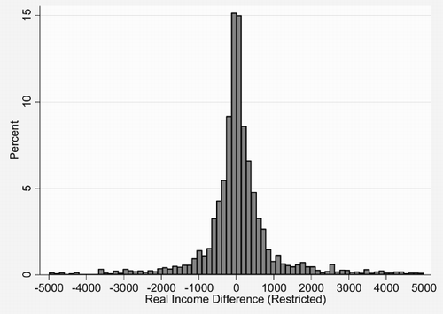
presents a histogram of the changes in real per-capita incomes. The two highest bars are either side of zero and the next two are either side of these. Thus it is clear that smaller positive and negative changes in real incomes are the most commonly experienced changes. Nearly all of the changes are crowded in the range between –R1000 and R1000. However, as these are real-income changes per capita per month, changes of R1000 are already large over a two-year period. While it was useful to start our discussion of income changes with these figures, it is clear that they are both missing a lot of the action. In particular, this figure shows that there are groups losing and gaining more than R1000.
Figure 1: Changes in real income (2008 Rand) per capita for balanced panel members
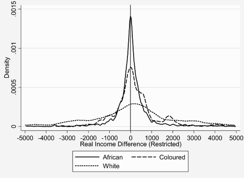
We go on in the paper to unpack these movements in more detail. But before we do, presents kernel density estimates of these real-income changes in Africans, coloureds and whites. The African density is the solid line and it maps very closely to the national distribution, which was shown in the histogram. This makes the important point that, to a large extent, national income changes are being driven by the majority African population. The coloured density (long dashes) shows slightly fewer people with changes narrowly clustered around zero change and, therefore, a wider dispersion than the national and African changes. This point is greatly accentuated by the white density (short dashes). Here the rand values of real-income changes are much more widely dispersed. We showed earlier in that white incomes are very much higher than other racial groups. Thus these larger changes may not represent the same impact on livelihoods as smaller changes for other racial groups.
Figure 2: Kernel densities of changes in real income (2008 Rand) per capita by race
3. Income transitions
In the previous section we saw that, on average, South Africans fell behind a little in terms of changes in real incomes. We also learnt that simple summary statistics such as the mean and the median lack the ability to describe some of the more subtle aspects of the distribution of income changes. Panel data can do more to identify specifically vulnerable people or successful people. In this section we look more closely at income transitions, with particular emphasis on movements into and out of poverty.
People can move relative to others and/or in absolute income terms. We explore both kinds of movements. We start with a global picture of income mobility across the two waves of NIDS. provides a view of the relationship between real household per-capita income in waves 1 and 2 for balanced panel members. To ensure that the picture is revealing, we restrict it to households with less than R5000 income per capita per month. This is not a particularly strong restriction, as the majority of South African households fall into this category. The lines parallel to the vertical and horizontal axes represent poverty lines of R515 per month – a figure that has been widely used as a ‘cost of basic needs’ poverty line on NIDS wave 1 data.Footnote8 Those who escaped poverty between waves 1 and 2 are in the top-left quadrant of the figure (to the left of the line parallel to the y axis, and above the line parallel to the x axis), while those who entered poverty are in the bottom-right quadrant.
Figure 3: Scatterplot of wave 1 and wave 2 real (2008 Rand) income per capita with poverty lines
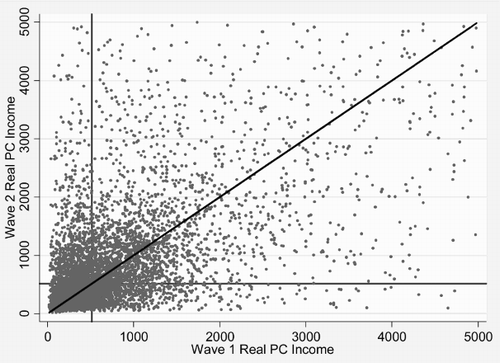
The 45° line represents constant real incomes in wave 1 and wave 2 – the darker the cloud of points around this line, the lower the income mobility in that area. In general, shows that there was a fair amount of upward and downward mobility between waves. The heavy concentration around the 45° line in the south-west quadrant suggests relatively little inter-wave change for those with particularly low incomes. There is some evidence of a general improvement in income levels, as the real median for this sub-sample increased from about R470 to R500 between waves. The proportion of this sub-sample of respondents in poverty in wave 1 was 52.8%, and this dropped to 49.7% by wave 2. The average normalised poverty gap remained identical. While the headcount ratio gives attention only to whether a person was above and below the poverty line, the poverty gap also gives attention to the depth of poverty. The fact that this measure remained constant suggests that the gains in headcount poverty reduction were not matched by a decrease in the depth of poverty.
is a picture of absolute income transitions. While this gives us an overall view, it is too detailed to illuminate specific transitions in which we are interested. An absolute transition matrix allows us to unpack the movement across a set of real-income thresholds of interest. Particularly interesting are transitions – or the lack thereof – across a set of poverty lines. In the transition matrix in , we split our balanced sample into four categories – less than the lower poverty line of R515, between the lower poverty line of R515 and the upper poverty line of R949, between the upper poverty line and twice this value (R1898), and real household income per capita above R1898.
Table 2: Movements into and out of poverty across the two waves
Times were tough between 2008 and 2010/11, and 70% of those who were the poorest of the poor in 2008 had not been able to escape this poverty over two years. Of the 30% who moved out of this category by wave 2, two-thirds moved only one category higher. That said, there was a great deal of movement for those in category 2 in wave 1 (between the upper and lower poverty lines). By wave 2, 26% of this group climbed out of poverty, while 42% entered ‘deeper’ poverty by falling below the R515 per month threshold. There was a lot of movement in both directions for respondents in the R949 to R1898 category in wave 1, with 22% moving into the highest category by wave 2. Notably, the category displaying the least movement is that corresponding to an income of more than R1898 per capita per month – three-quarters of respondents remained in this income group in both waves.
The cells on the diagonal of this matrix represent those who stayed in the same income category in wave 2 as they were in wave 1. This is equivalent to those on the 45° line in , although here we are talking about staying in the same income group rather than the exact income level. In general, it was the poorest and the best-off who displayed the least mobility between the waves. Those in the middle groups exhibited more mobility, which is not surprising given that these middle categories can move up as well as down.
To be clear as to whether this mobility situation represents an increase or a decrease in poverty, the transition matrix can also be presented so that each cell provides the proportion of the overall sample in that cell (rather than conditioning on the wave 1 category as above). Thus, there is no necessity for any row or column to sum to 100%. This situation is presented in . We see that the proportion of our balanced sample in the poorest category dropped from 49% in wave 1 to 46% in wave 2. Only 34% of the sample was below the R515 threshold in both waves. 14% of respondents moved from the lowest category into a higher category, while 12% fell from a higher category back into poverty. Most of the movement that occurred was over a ‘short’ distance. Although the gainers and the losers were nearly equal, overall measured poverty dropped amongst these respondents.
Table 3: Proportion (%) of the sample in wave 1 and wave 2 income categories
An alternative view of the distance moved by low-income households between waves is provided in , which is a two-dimensional representation of real household per-capita income in both waves, and can be regarded as the continuous analogue to the absolute transition matrix presented earlier. The figure is to be interpreted in much the same way that a topographical map is read – except now the contours represent points of equal frequency, rather than points of equal height (Baulch & Schutes, Citation2008). The contour plot has the lower poverty line (R515) super-imposed, and the four quadrants mirror those of in that they are poor:poor, non-poor:poor, poor:non-poor and non-poor:non-poor. The ranges of the x and y axes have been restricted to R2000, so that we can focus on those in relatively low-income households.
Figure 4: Contour plot of joint real income (2008 Rand) per capita densities with poverty lines
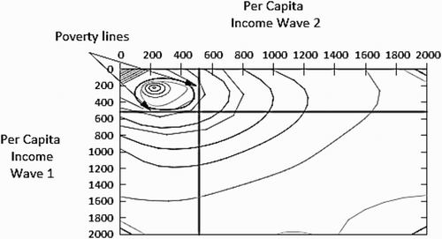
The peak of the contours is well within the top-left quadrant – lending further support to our finding that the majority of the poor in wave 1 were still poor by wave 2. The top-right quadrant represents the 30% of poor wave 1 respondents who were non-poor in wave 2, according to the lower poverty line. These are counter-balanced by those who entered poverty between waves, given by the contours in the bottom-left quadrant.
In contrast to these absolute transitions, the relative transition matrix in gives us a sense of how much positional income mobility there was between waves. Each cell of the highlighted leading diagonal of the matrix gives us the percentage of respondents who were in the same income quintile in wave 2 as in wave 1. So, for example, we see that 31% of respondents were in the third quintile in wave 1 and wave 2. The leading diagonal is particularly strong for the richest 20% of the sample, with almost three-quarters of those who were in the top quintile in wave 1 still present in that quintile in wave 2. Quintiles 2, 3 and 4 display a slightly weaker association between waves. Much of the movement that took place was restricted to relatively short ‘distances’. This is not surprising, considering the fact that only about two years separated the data collection points for most respondents.
Table 4: Relative income mobility – a quintile transition matrix
summarises the relationship between household per-capita income between waves for our balanced sample. The inter-wave correlation of income is 61% (rising to 73% when we correlate the log of income), and this is very similar to the rank correlation of 58%. The degree of mobility presented in the previous table is summarised by the percentage of respondents on the leading diagonal of the decile transition matrix. A figure here of 100% represents total immobility, while a figure of 0% represents perfect mobility. As it stands, we have a figure of 27, suggesting that there is a fair deal of mobility, although we know this to be concentrated in the middle of the income distribution rather than at the top of the bottom. The mean absolute change in real income per capita over the two waves was a decrease of R5.
Table 5: Summary statistics of real-income per-capita mobility
4. Mover–stayer analysis
The previous section presented a lot of information about the patterns of income mobility in the country across the waves. In this section we now go on to ascertain some of the key characteristics associated with moving up or down or staying the same. In particular, one of the key determinants driving the decision to move is increased access to the labour market and wage income. In this section of the paper we identify the relative welfare gains and losses associated with changing where you live (moving) in the two years between NIDS waves 1 and 2. We do this by investigating changes in household per-capita income for movers and stayers, by assessing the probability of changing employment status, and by identifying changes in individual-level labour-market earnings. All analysis is performed on a balanced sample of respondents from both waves of the data (i.e. respondents who were interviewed successfully in both waves), and all observations are weighted using the wave 2 panel weights, unless otherwise stated.
Of the balanced sample of 21 068 individuals, 1793 reported moving between waves. Of the movers, 389 moved to a new province, while the rest remained in the same province they were in during wave 1. Movers were also about 3.5 years younger, on average, than stayers.Footnote9
presents average changes in real household income per capita for movers and stayers in the balanced sample of respondents. As we have already seen, overall changes were negative, on average. However, in we see that this average was positive for movers (R17) compared with stayers (–R8). Also, the spread of changes was far wider for movers than for stayers. When we restrict our analysis to those who experienced positive income changes between waves, we see that movers fared significantly better than stayers. However, when we consider only those who were worse-off in wave 2, movers had nearly R600 less than stayers, on average. There is enough of interest here for us to go on to probe further into the distribution of real-income changes for movers and stayers.
Table 6: Comparing changes in real income (2008 Rand) per capita for movers and stayers
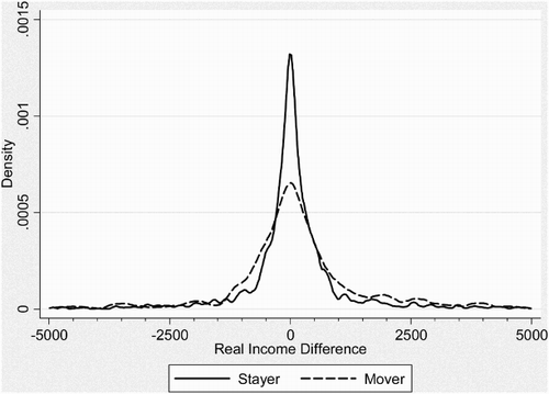
presents a kernel density plot of real-income per-capita changes for movers and stayers. As before, changes are restricted to the range from –R5000 to +R5000. We see that a far greater proportion of stayers are clustered around small changes in real per-capita income, compared with movers. It seems that moving is associated with large income gains for a few people. More generally, moving was associated with a loss of real income.
Figure 5: The distributions of real income (2008 Rand) per capita for those who moved versus those who stayed
It is important to bear in mind that we are dealing with real household per-capita income in this analysis, and changes in this measure are probably being driven by both the numerator (real income) and the denominator (household size). In order to investigate the household composition effect, presents changes in household size for movers and stayers.
Table 7: Wave 2 household sizes for movers and stayers
Household sizes differ considerably between movers and stayers. In wave 2, movers lived in households that had about two fewer people than stayers, on average. Splitting the sample into those who experienced positive and negative real per-capita income changes reveals an even greater difference between movers and stayers for respondents whose income increased between waves. For stayers, the size of the household in wave 2 was very similar regardless of income changes. On average, household size increased by 0.29 individuals for stayers, and reduced by 1.04 individuals for movers. This suggests that the overall positive real-income change is driven by income changes for stayers but largely driven by changes in household size for movers.
An analysis of remittance flows to and from mover and stayer households between waves yields some interesting patterns. provides figures for remittances per capita for our balanced sample. In wave 1, the amount of per-capita remittance income received was roughly the same for those respondents who would move and those who would stay by wave 2. In wave 2, however, the mean amount of remittance income received by movers more than doubled, to R784, while it dropped from R349 to R239 for stayers. It appears that movers rely quite heavily on their originating households for financial support immediately after moving. A detailed analysis of the source of movers' remittance income is certainly worth exploring but is beyond the scope of this paper.
Table 8: Remittances received and sent for movers and stayers
While movers experienced a boost in real remittances per capita, they also gave a higher value of remittances to other households, compared with stayers. On average, movers contributed R870 more per capita than in wave 1, while stayers contributed R249 more.
Moving to the labour market, it is informative to investigate how successful movers were at finding or retaining employment, compared with stayers. provides separate transition matrices of employment status for waves 1 and 2 for movers and stayers aged between 25 and 60 in wave 2. Movers experienced more labour-market ‘churning’ than stayers, conditional on not being employed in wave 1. However, of those who were employed in wave 1, three-quarters of movers were still employed in wave 2, versus 71.6% of stayers. The key point of the two panels in the table is to show how much more successful movers were in finding jobs. Of those who were unemployed (discouraged) in wave 1, 56% of movers had a job by wave 2, versus 24% of stayers. For the strict definition of unemployment, 42% of movers had a job in wave 2, compared with 30% of stayers.
Table 9: Labour-market status for movers and stayers
A final and important part of the mover–stayer analysis investigates changes in formal labour-market earnings. If a non-trivial proportion of our respondents moved because they expected to find a higher-paying job, their success or failure should be apparent in the data on earnings from primary and secondary employment. We investigate these dynamics below, and restrict ourselves further from our balanced sample to a sub-sample of respondents that reported labour-market income in both waves.
shows that although labour-market outcomes improved significantly more for movers than for stayers, real earnings showed the opposite trend. Movers who earned in wave 1 earned R955 less in wave 2, on average. The corresponding trend for stayers was a R97 increase. For those respondents who experienced an increase in wages, the mover–stayer difference was rather more muted as both groups had mean real increases of between R2100 and R2225. For those with falling real labour-market earnings, movers saw a mean reduction of about R5900 while stayers saw a reduction of about R3300.
Table 10: Changes in real (2008 Rand) wages for movers and stayers
In summary, we see that the outcomes for movers are far more spread out than for stayers. Of the 1793 respondents who moved between waves, some did much better in wave 2 than wave 1, while others were much worse off. Movers tended to move to smaller households, and received and gave remittances that far exceeded the amounts flowing into and out of stayer households. Movers tended to achieve more favourable labour-market outcomes than stayers, in terms of employment status, but labour-market earnings were lower for movers than for stayers, on average.
5. Conclusion
The data in first two waves of NIDS allow for a detailed description of what is pushing South Africans up and down the income distribution. This longitudinal analysis takes place at a nationally representative level for the first time. At a very aggregated level we see that the economic slowdown between 2008 and 2010 shifted real mean incomes down somewhat. Median incomes rose slightly, however, and this was particularly true of the African and coloured populations in the country. Changes at the top end of the distribution were muted by high attrition amongst white respondents in general, and amongst rich white respondents in particular.
For a real poverty line of R515 per capita per month, 70% of respondents who were poor in wave 1 were still poor in wave 2. Movements out of poverty outweighed movements into poverty, however, and this is reflected in a slight drop of the national poverty headcount ratio.
Those respondents who moved households between waves tended to find work more easily than those who remained. They also sent a received a higher value of remittances. Determining the relationship between moving and finding employment is a fruitful topic for future research.
In future waves of NIDS we will be able to ascertain the nature of poverty experienced by respondents. We will be able to answer questions such as whether a household is in poverty for a brief period, regularly or at every point of observation. Knowing the nature of longer-term well-being is crucial to designing policy interventions to effectively tackle poverty. Future waves of panel data will allow us to do just this.
Notes
4 See Finn et al. (Citation2012) for our assessment that the data are able to stand up to this task.
5 See Branson et al. (Citation2012), Ardington et al. (Citation2012) and Cichello et al. (Citation2012).
6 See Daniels et al. (Citation2012) and Posel (Citation2012).
7 We do not report on Asian/Indians. As noted in Brown et al. (Citation2012), even in wave 1 there were too few Asian/Indian individuals to support such within-group calculations and, as this group had significant attrition across waves, there is even less basis for cross-wave comparisons.
8 Further details of the use of this poverty line in a South African context can be found in Leibbrandt et al. (Citation2010).
9 The mean age for stayers in the balanced panel is 29.4, while for movers it is 25.8.
Related Research Data
References
- Ardington, C & Gasealahwe, B, 2012. Health: Analysis of the NIDS wave 1 and 2 datasets. SALDRU Working Paper No. 80. Southern Africa Labour and Development Research Unit, Cape Town.
- Baulch, B, & Shutes, S, 2008. Creating and interpreting contour plots using DASP and Gnuplot. Chronic Poverty Research Centre Toolkit Note. Chronic Poverty Research Centre, London.
- Branson, N, Lam, D & Zuze, L, 2012. Education: Analysis of the NIDS wave 1 and 2 datasets. SALDRU Working Paper No. 81. Southern Africa Labour and Development Research Unit, Cape Town.
- Brown, M, Daniels, R, de Villiers, L, Leibbrandt, M & Woolard, I, 2012. NIDS Wave 2 User Guide. University of Cape Town, Southern Africa Labour and Development Research Unit, Cape Town.
- Cichello, P, Leibbrandt, M & Woolard, I, 2012. Labour market: Analysis of the NIDS wave 1 and 2 datasets. SALDRU Working Paper No. 78. Southern Africa Labour and Development Research Unit, Cape Town.
- Daniels, R, Finn, A & Musundwa, S, 2012. Wealth in the National Income Dynamics Study wave 2. SALDRU Working Paper No. 83. Southern Africa Labour and Development Research Unit, Cape Town.
- Finn, A, Leibbrandt, M & Levinsohn, J, 2012. Income mobility in South Africa: Evidence from the first two waves of the National Income Dynamics Study. SALDRU Working Paper No. 82. Southern Africa Labour and Development Research Unit, Cape Town.
- Leibbrandt, M, Woolard, I, Finn, A & Argent, J, 2010. Changes in income and poverty over the post-apartheid period: An analysis based on data from the 1993 Project for Statistics on Living Standards and Development and the 2008 base wave of the National Income Dynamics Study. Studies in Economics and Econometrics 34(3), 25–43.
- Posel, D, 2012. Self-assessed well-being: Analysis of the NIDS wave 1 and 2 datasets. SALDRU Working Paper No. 79. Southern Africa Labour and Development Research Unit, Cape Town.