Abstract
This study evaluates the impact of South Africa's long-term economic growth on household poverty and inequality between 1995 and 2005. We find a decline in aggregate levels of poverty, but increasing levels of inequality. The evidence suggests that the growth model provides substantial redistributive income support to the poor through the social grant programme, whilst offering few returns to those in the middle of the distribution.
Keywords:
1. Introduction
The post-1994 period in the South African economy is characterised, perhaps most powerfully, by the fact that the economy recorded one of its longest periods of positive economic growth in the country's history. Indeed for the period 1994–2008 (inclusive of the early recession in 2008) South Africa's annual growth in real gross domestic product averaged 3.57% per annum. However, one of the more vexing issues within the economic policy terrain in post-apartheid South Africa has been the impact of this consistently positive growth on social welfare. In particular, there has been a rich debate around the impact of economic growth on poverty and inequality after 1994.
The aim of this study is therefore to evaluate the impact of this long-term economic growth on household poverty and inequality in South Africa. Section 2 begins by providing a brief overview of the shifts in poverty and inequality between 1995 and 2005, before estimating how the growth in the expenditures of the poor have fared relative to the rich over this period. Section 3 analyses the role of state social assistance in generating the observed growth-distribution outcomes, in particular how the provision of social grants has slowed the increasing income inequality over the period. Section 4 concludes.
2. Assessing the nature of pro-poor growth in South Africa, 1995–2005
The objective of this section is to firstly provide a brief overview of the shifts in poverty and inequality in South Africa over the period 1995–2005.Footnote4 Secondly, and more importantly, in trying to understand the critical interactions between economic growth, poverty and inequality, an attempt will be made to estimate and determine whether the positive growth rates recorded since 1994 have managed to improve broad indicators of social welfare. Put differently, we interrogate the extent to which the trajectory of positive economic growth has been ‘pro-poor’ in nature.
2.1 Data
The two sources of data utilised in the analysis are 1995 and 2005/06 Income and Expenditure Surveys (IESs). The IES is a national household sampled survey conducted quinquennially to capture the incomes earned, as well as the goods and services spent, by the household. The detailed cross-sectional, information collected is used to calculate the weights of the basket of goods and services for deriving the Consumer Price Index, which makes it a useful source of data for measuring detailed poverty and inequality of households of various income and expenditure sources in South Africa.
The proxy indicators used for measuring welfare in this study are per-capita household income and per-capita household expenditure. This means that total household income and expenditure have been adjusted for household size. It should be noted here (and again later in the text) that private consumption expenditure is often accepted as a more appropriate measure of welfare. Indeed, it is fairly uncommon to utilise income to provide poverty and inequality estimates. We do so, however, noting that the purpose of the paper is to provide a long timeline of shifts in household poverty and inequality since the onset of democracy, and for measuring the impact of social grants on welfare – which is only achievable using the detailed income data provided in the IES.
We also note in the first instance that, due to the vast differences in the methodologies used to collect data on expenditure between the two surveys, consumption expenditure as a measure of welfare is less desirable: the 1995 IES was conducted over the duration of one month only and all data were collected during a single visit to the subject households in the sample. The recall method was used, meaning that the respondents were asked to indicate the amount spent on an item over the past month or year (the time period depended on the item). Expenditure items were classified using the Standard Trade Classification (StatsSA, 1995; Yu, Citation2011). In contrast, the 2005/06 IES was conducted during a one-year period with each household to receive five separate visits during the survey month. The survey also adopted the diary method in replacement of the recall method, so the households had to complete a total of four weekly diaries recording household expenditures. In 2005/06, consumption items were classified using the Classification of Individual Consumption According to Purpose (StatsSA, 2010/11).
On the income side, the methodologies used to collect data are more comparable, with the recall method used in both 1995 and 2005/06 IESs. The sources of income items recorded are also very similar. Total household income was constructed from income from salaries and wages, income from social welfare grants and then from other sources of comparable income such as royalties, investment, private pensions, remittances, and so on. One of the main reasons for our use of income as welfare measure, of course, is that in Section 3 of the study we examine the role of income from social grants in possibly reducing poverty and inequality. We accomplish this by examining the levels of poverty and inequality when grant income is excluded from total income.
2.2 Shifts in poverty: 1995–2005
presents the poverty headcount rate and the poverty gap ratio in 1995 and 2005, both nationally and by race, for two chosen poverty lines. Two standard poverty lines were used in our analysis. The R322 line (in 2000 prices) has been derived using a cost-of-basic needs approach, while the R174 line is equivalent to $2 dollars a day (again in 2000 prices) (see Hoogeveen & Ozler, 2006). The 2000 poverty lines were adjusted for the impact of inflation both in 1995 and 2005 and then used to calculate poverty levels in the two years. All poverty measures have been calculated using individual per-capital household expenditure,Footnote5 and the indicators are based on the standard class of poverty measures, first defined by Foster et al. (Citation1984).
Table 1: Poverty shifts by race of household head, 1995–2005
The results show that at the aggregate level, and notably for African individuals, poverty as measured by the headcount rate declined in the first decade of democracy. Specifically, at the higher poverty line of R322 a month (in 2000 prices), aggregate poverty declined by 3.5 percentage points, from 52.5% in 1995 to 49% in 2005, while at the lower poverty line of R174 (also in 2000 prices) the decline was from 31% to 24%. The larger decline at the lower poverty line suggests that those in deeper poverty experienced a relatively larger improvement in their welfare over the period.
Changes in the poverty gap display a similar trend at the aggregate. At the R322 line, the poverty gap index declined from 26% to 21%, which means that the position of the average poor person relative to the poverty line improved over the period. At the lower poverty line, the poverty gap ratio declined from 12% to approximately 8%.
The results by race indicate that only African individuals experienced statistically significant declines in their levels of poverty, according to all measures and for both poverty lines, over the period. In fact, for Africans the decline in the headcount index was larger than the decline at the national level. At the R322 line the headcount rate declined by more than five percentage points from 63% to just below 58%, whilst at the R174 line the headcount rate declined by more than 10 percentage points to 28%. Over the same period, relative poverty levels, as measured by the poverty gap, also declined. At the R322 line the poverty gap ratio decreased from 32% to 25%, while it decreased from 15% to 9% at the lower poverty line. The other three population groups did not experience any statistically significant changes in their levels of poverty over the period.
While Africans did become better off they remained poorer than the other racial groups. For example, in 2005 at the upper poverty line, the national headcount rate was 49%, while the African headcount rate was almost nine percentage points higher at 58%. In contrast, the coloured headcount was 35%, while 8% of Asians were poor at this line. Less than 1% of whites were poor, at both lines and in both years.
In addition to race, gender remains a key marker of vulnerability in the South African context. Consonant with the national trends, and those for the African population group, both male-headed and female-headed households experienced a decline in poverty levels as measured by the headcount rate at both poverty lines.Footnote6 While individuals living in male-headed households experienced a relatively larger decrease of more than 6% in their headcount rate at the upper-bound poverty line, female-headed households experienced a slightly larger decline in their headcount rate at the lower poverty line. This is a key result: it suggests that at the lower poverty line poverty reductions of the ex-ante more vulnerable category of households – female-headed households – were greater than those of their male-headed counterparts. Whilst the severity of poverty declined irrespective of the gender of the head, the evidence shows slightly larger improvements for those living in female-headed households.
Despite the greater reduction in female-headed household poverty, it is important to note that individuals living in households headed by females remained more deprived in absolute terms than those in male-headed households, at both poverty lines. For example, at the upper poverty line in 2005, the headcount index for female-headed households was still 22 percentage points higher than for households headed by males, whilst at the lower poverty line this differential was more than 13 percentage points.
2.3 Poverty shifts without poverty lines: 1995–2005
The poverty estimates presented above show that at a national level both the headcount and the poverty gap indices declined based on two specified poverty lines. Another way to examine changing patterns of poverty, which is not hamstrung by debates around the choice of the poverty line, is to derive cumulative distribution functions (CDFs) of per-capita expenditure. The vertical axis of the CDF shows the cumulative proportion of all individuals with a monthly per-capita expenditure value less than or equal to the corresponding monthly per-capita expenditure value on the horizontal axis. CDFs allow us to compare changes in poverty between two time periods independent of any poverty line. Visually, if a CDF for period t+1 lies at any point on the horizontal axis below the CDF for period t, this means that poverty has decreased. presents one such CDF.
Figure 1: Cumulative distribution functions, 1995 and 2005
Notes: 1. Per-capita expenditure as converted to real per-capita expenditure (expressed in 2000 prices) using the Consumer Price Index. 2. The population in 1995 has been weighted by population weights according to the 1996 Census. The population in 2005 has been weighted by the household weight multiplied by the household size. The 2005 weights are based on the 2001 Census.
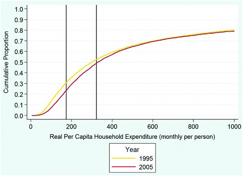
The CDFs in show that for South Africans spending less than about R600 a month (in 2000 prices) poverty has clearly declined between 1995 and 2005. The two vertical lines represent the lower and upper bound poverty lines stipulated at the outset. Note that the larger gap between the 1995 CDF and the 2005 CDF at the R174 poverty line confirms the larger decline in poverty as measured by the R174 headcount rate relative to the R322 poverty line, illustrated in .
For those individuals spending between R600 and R800 the gap between the two CDFs is small, reflecting minor or possibly no change in absolute poverty, and for those spending above R800 poverty levels remained relatively constant. Importantly, the overall decline in poverty (or the lack of significant change in poverty levels for those spending more than about R600 a month) is not subject to our choice of poverty line. The result thus confirms that poverty levels have at best declined or at worst not increased in South Africa between 1995 and 2005.
presents the CDFs of male and female-headed households, for 1995 and 2005, and confirms the results reported using the poverty lines. The CDFs show that poverty declined for individuals living in both male-headed and female-headed households in the 10-year period, irrespective of any chosen poverty line. The CDFs also show larger declines in poverty for households headed by females at the lower poverty line. In addition, it is clear that in both years the CDF for male-headed households lies below the CDF for female-headed households, confirming that individuals living in households headed by females experienced significantly higher absolute levels of poverty in both years. In fact, in 2005, with the exception of the bottom 20% of the distribution, the CDF for female-headed households remains above the 1995 CDF for male-headed households, implying that for the most part individuals living in female-headed households were worse off in 2005 than those who were living in male-headed households in 1995.
Figure 2: Cumulative distribution functions by gender of household head, 1995 and 2005
Notes: 1. Per-capita expenditure as converted to real per-capita expenditure (expressed in 2000 prices) using the Consumer Price Index. 2. The population in 1995 has been weighted by population weights according to the 1996 Census. The population in 2005 has been weighted by the household weight multiplied by the household size. The 2005 weights are based on the 2001 Census.
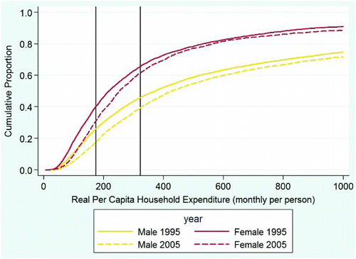
To reiterate, the value of a CDF analysis is its non-dependence on the oft-debated poverty line. Irrespective of the poverty line, our results in show that in general the proportion of poor individuals in South Africa declined over the period, and only at high poverty lines (in excess of R500 per person per month) did poverty remained unchanged. Poverty amongst female-headed households declined significantly across any range of feasible poverty lines. This was also the case for Africans who experienced a larger than average decrease in poverty, relative to the other racial groups (not shown here).
To conclude, it is clear that gains in poverty reduction at the national level have been recorded in the first decade of democracy and that both absolute and relative poverty in the period 1995–2005 declined significantly. These results are robust to the choice of poverty line. However, the data also illustrate that challenges remain when considering markers of vulnerability – race and gender. In terms of race, despite reductions in African poverty, individuals living in households headed by Africans account for a disproportionate share of South Africa's poor. In parallel, (predominantly African) female-headed households yield vastly higher headcount and poverty gap ratio estimates in both 1995 and 2005, reflecting the strong gender dimension to the country's poverty profile.
2.4 Shifts in inequality: 1995 and 2005
While national poverty levels declined in the first decade of democracy, the income inequality trends are more worrying. On the basis of per-capita expenditure, and using the Gini coefficient as our measure of inequality, the data suggest that inequality rose over the period 1995–2005. Specifically, the economy's Gini coefficient increased from 0.64 in 1995 to 0.69 in 2005. This is a deeply disturbing result for a number of reasons. Firstly, measures of income inequality by international experience do not change significantly over time in either direction. It takes large shifts in economic growth, for example, to influence an economy's income distribution, or a very particular pattern of growth (Kanbur, Citation2005). Secondly, the result is disturbing given that South Africa has historically been ranked as an extremely unequal country. This new result would suggest that South Africa remains one of the most unequal countries in the world, for which data are available.
The inequality data by race are interesting. Africans were the only group that experienced large, comprehensive declines in poverty (as shown in ), and the evidence presented in suggests that Africans were also the only population group that did not experience a significant increase in inequality between 1995 and 2005. Despite these changes, African inequality remained high in both years. Coloured individuals experienced the largest increase in inequality, with their Gini coefficient increasing from 0.49 in 1995 to 0.58 in 2005. As a result, by 2005 coloureds had the highest levels of inequality, relative to the other race groups. Asian inequality increased from 0.45 to 0.53 in 2005. White inequality increased from 0.39 to 0.45, but this population group remains the most equal.
Table 2: Inequality shifts by race – Gini coefficients for 1995 and 2005
In the South African context, inequality between racial groups, as a result of apartheid, has always been a significant driver of aggregate inequality (Leibbrandt et al., Citation2001). However, studies using the 1996 and 2001 Census data, or the 1995 and 2000 IES data, found an increase in the contribution of within-group inequality to total inequality over time – driven to a large extent by increasing inequality within the African population (Leibbrandt et al., Citation2005; Hoogeveen & Ozler, 2006; Ngepah, Citation2011). In order to estimate between-group and within-group inequality we utilise the well-known Theil Index.Footnote7 Given the trends referred to above, the results presented in are notable. Specifically, our estimates suggest that between 1995 and 2005 the contribution of within-group inequality to total inequality declined. Thus the key driver of income inequality over the longer period since 1995 has in fact been between-group inequality; the share of between-group inequality increased from 46.9% to 49.7%. In fact, by 2005, within-group and between-group inequality contributed in almost equal measure to aggregate inequality.
Table 3: Inequality within and between race groups, 1995 and 2005
This is a crucial result. It suggests that income differences between the race groups – rather than those within – have contributed to South Africa's growing inequality levels in the decade since 1995. While it is not the focus of the chapter, this result suggests a reassessment of the view that growing African affluence alongside rising African unemployment has been the driver of income inequality in South Africa. Indeed, on the face of this admittedly provisional evidence, it would appear that divergent income gains between the different race groups have been the key determinant of rising aggregate income inequality in the South African economy. The results by gender of household head show that while declining very slightly over the period, within-group inequality has been almost the sole driver of total inequality over the period. In other words, the inequality between male-headed and female-headed households contributed very little to overall inequality.
To conclude, then, the data show a decline in poverty levels between 1995 and 2005 at the aggregate level, and specifically for the African population, at both poverty lines. While these results capture an improvement in social welfare over the period, the estimates for the Gini coefficient suggest that inequality increased at the aggregate level and for all population groups except Africans. Finally, our analysis of the drivers of inequality suggests that it is in fact between-race inequality that has been increasing over time. Put differently, the key determinant of South Africa's rising maldistribution of income inequality since 1995 has not been the inequality within the African population as often assumed – but rather a growing disparity between the different racial groups.
While we have analysed the shifts in poverty between 1995 and 2005 using the standard Foster, Greer and Thorbecke (FGT) class of poverty measures, it remains important to estimate how the growth in the expenditures of the poor have fared relative to the rich over this period. In the following section we therefore examine growth rates at various points across the expenditure distribution.
2.5 The nature of economic growth: 1995–2005
There is very little debate, if any, amongst economists about the notion that a high level of economic growth is essential for poverty reduction. Indeed, increased growth rates, measured by rising per-capita incomes, appear to make this link clear and simple: if you increase economic growth, poverty levels in the society will fall. However, a more detailed assessment of experiences around the world indicates that there are two important caveats to the generalised view that ‘growth is always good for the poor’. Firstly, the impact of economic growth on poverty differs significantly across countries. Research from the World Bank indicates that a 2% increase in the rate of economic growth results in poverty falling by between 1% and 7% – depending on the country (Ravallion, Citation2001). Secondly, as incomes grow, there is a high likelihood that this will affect the overall distribution of income. Put differently, economic growth often brings with it some change in the levels of income inequality, and if the result is an increase in inequality the gains from growth to the poor may be reduced. Higher inequality levels dilute the impact of economic growth on poverty. Given these two caveats to the growth–poverty nexus, the critical insight is that economic growth may be necessary but it is certainly not a sufficient condition for poverty reduction in a society.
As a starting point for this analysis we use growth incidence curves (GICs) to examine the growth in expenditures over the period, and how this differed according to a set of covariates. Methodologically, we draw on the work of Ravallion & Chen (Citation2003) and Ravallion (Citation2004). The GIC approach allows us to determine whether the growth in expenditure from 1995 to 2005 has been ‘pro-poor’, by plotting expenditure growth rates across each centile of the distribution.
Although the GIC approach is extremely useful in determining the distributional nature of growth, it has some mechanical drawbacks. Firstly, in the absence of panel data, it is a rather aggregate measure over a given distribution and does not track individual movements in and out of poverty during the review period. Secondly, the GIC is sensitive at the tail of the percentiles, where it may show high volatility in growth rates between the two periods due to measurement or sampling errors in the surveys.
The GIC in plots the growth in total per-capita expenditure for South Africa, arranged in ascending centiles of the expenditure distribution. It is clear from this GIC that growth in per-capita expenditure was pro-poor in the absolute sense – all individuals across the distribution experienced positive growth between 1995 and 2005.Footnote8 Those at the very bottom of the distribution clearly benefited more from the increased growth in expenditure than individuals up to the 70th percentile. However, relative pro-poor growth was not evident – from around the 70th percentile, individuals in the top 10% of the distribution enjoyed the highest average annual growth rates in society.Footnote9 It is important to note that at the bottom of the distribution only the poorest 30% of individuals experienced average annual increases in expenditure above the mean growth rate of around 8%. Individuals between the 60th and 70th percentiles experienced the lowest growth rates at around 6%.
Figure 3: Growth incidence curve for South Africa, expenditure: 1995–2005
Notes: 1. The population in 1995 has been weighted by population weights according to the 1996 Census. The population in 2005 has been weighted by the household weight multiplied by the household size. The 2005 weights are based on the 2001 Census. 2. Figures are annualised growth rates.
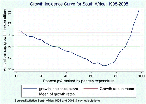
This result means that economic growth, as measured by rising per-capita expenditure in the first decade of democracy, was pro-poor in absolute terms. The average annual growth in the mean of per-capita expenditure was just above 9%, while the mean of the growth rate at each percentile was 8% over the period.
The GICs for each race group are not shown here but they confirm that all individuals, irrespective of race, experienced increases in per-capita expenditure, meaning that growth was pro-poor in absolute terms for all race groups between 1995 and 2005. Those at the bottom of the distribution experienced relatively lower average annual growth rates in expenditure than those higher up the distribution, although for Africans this difference was minor. It is also useful to note that nowhere in the upper-end of the distribution over the first decade of democracy do we see African expenditure growing as rapidly as white expenditure. Put differently, the estimates suggest that over the period 1995–2005 it has been coloured and white individuals at the top of the expenditure distribution who have continued to benefit more from economic growth than others at the bottom end. At the aggregate level, these two race groups and to a lesser extent Asians and Africans in the very top percentiles account for the relatively higher growth rates in the top 10% of the distribution as illustrated by the GIC for South Africa (). Indeed, this racial difference in expenditure growth at the top end must be part of the explanation for the result noted earlier – a rising share of between-group inequality in national income inequality.
GICs for those living in male-headed and female-headed households (also not presented here) confirm the earlier result that growth was pro-poor irrespective of the gender of the household head. The GICs for male and female household heads display a similar trend to the overall GIC for South Africa, with individuals at the bottom of the distribution experiencing higher growth rates than those up to the 70th percentile (for male-headed households) and the 80th percentile (for female-headed households). Overall, male-headed households experienced a higher growth rate in mean expenditure as well as a higher mean growth rate. In addition, the growth rates for individuals in the bottom 30% of the expenditure distribution confirm that individuals living in poor male-headed households experienced slightly higher growth rates than those living in poor households headed by females.
In summary, the results presented here suggest that all individuals, irrespective of race or gender of the household head, experienced positive growth in their expenditure in the first decade after democracy. The results from the GICs suggest that those at the bottom of the distribution and those at the very top of the distribution experienced the highest growth rates. The growth in the expenditure of the rich exceeded that of the poor, however, and this certainly contributed to the rise in income inequality. Growth was pro-poor in the absolute sense, but not in the relative sense. In addition, the stagnation of expenditure growth in the middle of the distribution is a key feature of not only the rising Gini coefficient since 1994, but also evidence of how employed, ‘blue-collar’ households may have inadvertently been excluded from the growth process, relative to those at the top and bottom of the expenditure distribution.
Trying to understand the low growth in the middle of the distribution is extremely difficult given the nature of the data at our disposal, and several challenging analytical issues. However, the changes at the bottom of the expenditure distribution are equally important. In the following section we provide a detailed analysis of changes experienced at the bottom of the distribution; in particular, we are interested in the role of government grants in improving the expenditures of the poor over the period.
3. The role of social grants in generating the growth-distribution outcomes
In addition to steady economic growth, the first decade of democracy in South Africa has been characterised by a rapid widening and deepening of the government's social security system. This system targets the most vulnerable members of society, specifically the disabled, the elderly, and the youth.Footnote10
A study by Pauw & Mncube (Citation2007) shows that since 1994 not only have the grant values increasedFootnote11 (see Table A1 in Appendix A), social grant expenditure has grown as a share of gross domestic product, but also the number of grant recipients has more than trebled. In 1996/97 social grant transfers accounted for approximately 2.5% of gross domestic product, and by 2005/06 this share increased to over 3%. The total number of beneficiaries grew from approximately three million in 1997 to 9.4 million in 2005, an average annual growth rate of more than 15%. Recent estimates suggest that by the end of the 2010/11 fiscal year, almost 13.4 million individuals will be receiving some form of social grant, which translates into an aggregate growth rate of almost 365% in the total number of recipients between August 1997 and March 2011.
The bulk of this increase occurred in the period after 2000, driven largely by the progressive extension of the Child Support Grant. By 2013/14, children will be eligible for the grant up to their 18th birthday (National Treasury, Citation2011). The number of child support grant recipients increased from just over 400 000 in 1997 to 5.6 million in 2005, and to 9.4 million in 2010. In 2005, these recipients accounted for 60% of all grant beneficiaries and by the end of March 2011 this share was projected to have increased to approximately 68%.
illustrates the increase in provision of social grants between 1995 and 2005, as measured by the share of households with access to a grant. The access rate is simply the percentage of households in each income decile that received grant income in each of the years.
Figure 4: Household access to social grants per household income decile, 1995–2005
Notes: 1. The population in 1995 has been weighted by population weights according to the 1996 Census. The population in 2005 has been weighted by the household weight multiplied by the household size. The 2005 weights are based on the 2001 Census.
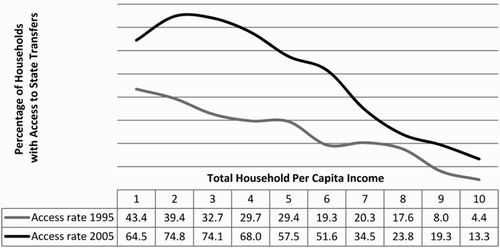
There has been a significant increase in the access rate across all deciles between 1995 and 2005. For example, the share of households in the first decile with access to grant income increased from 43.4% in 1995 to 64.5% in 2005. However, access to grant income not only increased significantly among the bottom deciles, but also in the middle of the income distribution. For example, in the sixth decile the share of households with access to grant income increased from 19% to over 50%. This is an important change, showing that grant income not only supported the very poor but also a large portion of households in the middle of the income distribution. In fact, between 50 and 75% of households in the bottom six deciles of the total income distribution received income from grants in 2005.
presents the impact of social grants by plotting the share of households with access to social grants in each year across income deciles. shows what proportion of total income in each of the deciles can be attributed to social grants in 1995 and 2005. It is clear that as access to social grants increased, the contribution of grant income to total household income also increased significantly over the period.
Figure 5: Per-capita grant income as proportion of total household income, South Africa, 1995 and 2005
Notes: 1. The population in 1995 has been weighted by population weights according to the 1996 Census. The population in 2005 has been weighted by the household (HH) weight multiplied by the household size. The 2005 weights are based on the 2001 Census.
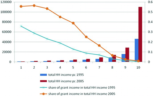
In 1995 the contribution of grant income to total household income was relatively low in all deciles. In the bottom decile, grant income contributed approximately 35% to total income and this contribution declined across the income distribution. By 2005 income from social transfers had become a very important source of income for all the lower income deciles. For households in the bottom three deciles, grant income contributed between 50 and 60% to total household income. More than one-half of the households in the middle of the income distribution received some form of grant income in 2005 and the results above confirm the importance of grant income to those households. For example, social transfers accounted for almost 40% of total income among households in the fifth income decile.
Based on this initial evidence it appears that the rapid widening and deepening of the state's social security system lies at the heart of the rapid growth in the expenditure levels of the poor. The child support grant, the old age pension, and the disability grant are probably the key individual drivers of absolute pro-poor growth in South Africa over the 1995–2005 period. Growth at the bottom end, however, must be juxtaposed against the phenomenal non-grant=related growth rates observed for individuals in the 80th percentile and above. This trend yields higher returns firstly for whites, and then for coloureds; a stark reminder not only of the distributional consequences that economic growth has, but also its powerful racial manifestations. In the following section the specific impact that the expansion of social security has had on inequality will be considered.
3.1 Impact of the state social assistance on the levels of income inequality
While the poverty estimates show a decline in poverty levels between 1995 and 2005, the inequality estimates confirm an increase in the levels of inequality over the same period. In addition, the GIC curves suggest that those at the bottom of the distribution and those at the very top of the distribution experienced the highest growth rates between 1995 and 2005, with the government's increased provision of social grants playing a critical role in the income growth of those at the bottom.
The aim of this section is to specifically evaluate the role of social grants in the growth-distribution outcomes between 1995 and 2005. In order to do this we estimate and compare the Gini coefficient, the Lorenz curve, and the GIC for South Africa as a whole, and also by population group, using total per-capita household income, first including and then excluding grant income. Put differently, we calculate two sets of measures; one set based on total income, and the second set based on total income less grant income.Footnote12
shows that grant income played a crucial role in mitigating the impact of income inequality over the period. The results are striking: the Gini coefficient increases significantly (irrespective of year or race group) when grant income is excluded from total per-capita household income. This result is the first indication that the social security system in South Africa has contributed to lowering the overall levels of inequality in the country.
Table 4: Gini coefficient for total per-capita income with and without grant income by race, 1995 and 2005
In 2005 the Gini coefficient at the aggregate increases from 0.72 to 0.77 when grant income is excluded from total household income, meaning that the Gini coefficient would have been 0.05 higher if the government did not provide social grants to the almost 9.5 million beneficiaries in that year. Not surprisingly, the difference in the value of the two Gini coefficients is much smaller in 1995, given the much smaller social security net in that year. The results also confirm that the increasing inequality over the period would have been larger in the absence of social transfers. Our estimates suggest that in the absence of social grants the Gini coefficient would have increased by 0.11 over the period, whereas the data show the Gini coefficient actually increased by 0.08.
The results also confirm that the provision of social grants has played a particularly important role in mitigating income inequality within the African population group. In 2005, the Gini coefficient for Africans would have been 0.71 without income from social grants. In contrast, the Gini coefficient inclusive of grant income is 0.61. However, the results suggest that the inclusion of grant income did not contribute to a statistically significant change in the levels of inequality of the other population groups.
The Lorenz curves for Africans in graphically illustrate the relatively higher levels of income inequality in the absence of social grants for 1995 and 2005.
Figure 6: Lorenz curves for Africans: with and without grant income, 1995 and 2005
Notes: 1. The population in 1995 has been weighted by population weights according to the 1996 Census. The population in 2005 has been weighted by the household (HH) weight multiplied by the household size. The 2005 weights are based on the 2001 Census.
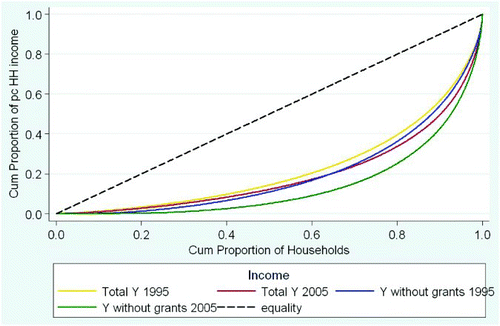
In each year the Lorenz curve for income without grants lies further from the ‘equality line’ than the curve for total income (including grants). In addition, the relatively larger gap between the two curves in 2005 captures the significant impact of increased social transfers over time. For example, in 2005 the curves illustrate that when grant income is excluded from total income, the bottom 80% of individuals would have received only about 20% of total income; but when grant income is included, the bottom 80% of individuals received more than 30% of total income.
The results for the Gini coefficient, with and without grant income, by province and gender of household head are presented in . The results show that grant income made a significant difference to income inequality irrespective of geographical location or gender of the household head. Grant income played an especially important role in the mitigation of income inequality in the Eastern Cape, where the Gini coefficient increases from 0.69 to 0.80 in 2005 if grant income is excluded from total income. The provision of grants also had a relatively larger impact on inequality for individuals living in households headed by females. Specifically, the Gini coefficient declines from 0.80 to 0.68 when grant income is included as a source of income for individuals living in a household headed by a female, while the Gini coefficient for individuals living in male-headed households only decreases from 0.73 to 0.70 when grant income is excluded.
Table 5: Gini coefficient including and excluding grant income from total income by province and gender of household head, 1995–2005
The results above clearly illustrate that while the South African government's social grant system did not contribute to an overall reduction of inequality in the country over the period, the levels of inequality at the aggregate, and particularly for Africans, would have been significantly higher in the absence of social transfers. In the remainder of this section we compare the GICs for income, with and without social grants. This allows us to examine the impact of social grants on the growth rates at the different percentiles of the income distribution. It also allows us to specifically determine the impact of the provision of social grants on the growth in the incomes of the poor.
and present the GICs for total income including grant income and for total income excluding grant income, respectively. When grant income is included, all individuals experienced positive growth in their incomes between 1995 and 2005. This growth was pro-poor in the absolute sense but not in the relative sense, given that those at the bottom of the distribution experienced lower growth rates than those at the top of the distribution.Footnote13
Figure 7: Growth incidence curve for total income (including grant income), 1995–2005
Notes: 1. The population in 1995 has been weighted by population weights according to the 1996 Census. The population in 2005 has been weighted by the household weight multiplied by the household size. The 2005 weights are based on the 2001 Census. 2. Figures are annualised growth rates.
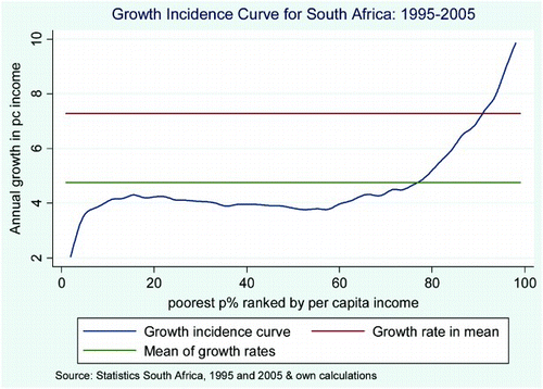
Figure 8: Growth incidence curve for total income (excluding grant income), 1995–2005
Notes: 1. The population in 1995 has been weighted by population weights according to the 1996 Census. The population in 2005 has been weighted by the household weight multiplied by the household size. The 2005 weights are based on the 2001 Census. 2. Figures are annualised growth rates.
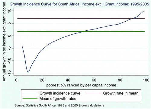
The GIC for income without social grant income looks startlingly different. The average annual growth rates for those at the bottom of the income distribution become negative in the absence of social grants. In fact, the percentile growth rates are negative up to about the 40th percentile of the distribution. In other words, in the absence of grant income, growth would not have been pro-poor even in the absolute sense over the period.
The mean percentile growth rate is also significantly lower at 1.7% when grant income is excluded, compared with 4.8% when grants are included as a source of income. The growth rate in the mean income is 7%, as compared with 7.3% when grant income is included, while the growth rate at the median is 1.5% in comparison with 3.8% when total income includes grants. From the 80th percentile upwards the two GICs display a similar trend, confirming that those at the top of the distribution experienced strong growth in their incomes regardless of the social grant system.
The GIC for Africans (data not shown) looks very similar to the GIC for South African households in general, with all African individuals experiencing positive growth in their incomes between 1995 and 2005 when grant income is included. When grants are excluded the GIC illustrates that the provision of social grants had an even larger positive impact on the welfare of African individuals (similar to the results from the Gini coefficient). In fact, in the absence of grant income, all Africans in the bottom half of the distribution would have experienced negative growth in income over the period. Hence growth would again not have been pro-poor in the absolute or relative sense.
Furthermore, the mean growth rate for Africans would have been less than 1% in the absence of grant income, while it reached almost 5% as a result of the government's system of social transfers. Lastly, in the absence of social grants the growth rate at the median would have been almost zero, while it was just over 4% when grants are included.Footnote14
The final two figures illustrate that grant income plays a particularly important role for individuals living in rural households. The GIC for income including grants shows that all individuals living in rural areas experienced positive growth in their incomes between 1995 and 2005, with those between the 10th and 60th percentile, along with those at the very top of the distribution, experiencing the highest levels of growth ().
Figure 9: Growth incidence curve for rural households: income including grant income, 1995–2005
Notes: 1. The population in 1995 has been weighted by population weights according to the 1996 Census. The population in 2005 has been weighted by the household (HH) weight multiplied by the household size. The 2005 weights are based on the 2001 Census. 2. Figures are annualised growth rates.
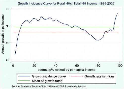
In the absence of the social grant system the GIC presented in suggests that the bottom 70% of the rural population would have experienced a decline in their incomes over the period. In fact, the mean of the percentile growth rates would have been negative, in comparison with approximately 4% when grant income is included. This result reveals the significance of social grants in the government's fight against poverty and inequality in rural areas, where, in general, unemployment rates are higher and employment opportunities are more limited than in urban areas.
Figure 10: Growth incidence curve for rural households: income excluding grant income: 1995–2005
Notes: 1. The population in 1995 has been weighted by population weights according to the 1996 Census. The population in 2005 has been weighted by the household (HH) weight multiplied by the household size. The 2005 weights are based on the 2001 Census. 2. Figures are annualised growth rates.
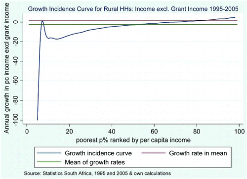
In summary, all of the GICs confirm that the poor would have experienced negative growth rates in their incomes between 1995 and 2005 in the absence of the government's system of social transfers. In addition, the provision of social grants played a particularly strong role in supporting Africans, and those living in rural households.
4. Conclusion
The results presented in this paper clearly show that both absolute and relative levels of poverty have fallen on aggregate (irrespective of the gender of the household head) as well as for African-headed households. This result is invariant to the choice of poverty line. However, the results also show that race and gender remain overwhelming determinants of the poverty profile in South Africa. The trends in inequality suggest that one of the world's most unequal societies has become more unequal over the period. In addition, it is evident that income inequality between racial groups – specifically between Africans and Whites – has driven this overall increase.
Our analysis of the nature of economic growth since 1995 suggests that while all South Africans have benefitted from positive economic growth, individuals at the top end of the distribution gained most from the post-apartheid growth dividend. Furthermore, the evidence suggests that the country's current democratic growth model is crafted around providing substantial redistributive income support to the bottom end of the distribution through an extensive social grant programme, whilst offering few returns to those in the middle of the distribution. In fact, when inequality measures were estimated using income instead of expenditure the results clearly illustrate the importance of social grants as a source of income, and how social transfers have offset potentially greater increases in income inequality over the period. This was especially true for those living in African households and individuals living in rural areas. While appearing to be an effective policy in at least limiting the rise in income inequality, a large-scale expansion of the social security net is not viable as a policy option, and this highlights the importance of other interventions – particularly those aimed at job creation for the poor and the unskilled.
Notes
4The lack of more recent comparable data makes it impossible to provide more up-to-date poverty and inequality estimates. At the time of writing, the 2010/11 Income and Expenditure Survey has not been released. Also, IES2000 was excluded in the analysis because of discovered serious and unnatural collapses in the shares of some of the consumption items of households.
5Per-capita total household expenditure was created by dividing total household expenditure by the number of people in the household (or household size).
6Tabled results are not shown here but are available from the authors.
7The Theil Index is a measure of inequality that, unlike the Gini coefficient, allows us to examine the contribution of ‘within-group inequality’ and ‘between-group inequality’ to overall inequality
8Pro-poor growth can be considered ‘absolute’ if the change in income/expenditure levels of the poor (as defined by a chosen poverty line) over a given time period is larger than zero; that is, the income/expenditure levels of the poor have increased in absolute terms.
9Pro-poor growth can be considered ‘relative’ if the change in the income/expenditure levels of the poor is larger than the change in the income/expenditure levels of the non-poor.
10For each type's social assistance eligibility criteria, visit: http://www.services.gov.za/services/content/Home/ServicesForPeople/Socialbenefits/en_ZA.
11The rand value for the old age pension increased from R410 per month in July 1995 to R820 in April 2006; the disability grant also increased by the same amount; the war veterans grant increased from R428 to R838; foster care from R288 to R590; care dependency from R410 to R820; and maintenance (both child and parent) was replaced by the child support grant, which came into effect in 1998, and in April 2006 the grant value in rand was R190 per month.
12While empirical work on the distribution of welfare can be done using expenditure or income data, the international norm is to use private consumption expenditure as opposed to income when calculating changes in poverty and inequality. In addition, the recording of consumption expenditure is usually more reliable and stable than income, especially amongst the poor. However, since our specific aim here is to evaluate the contribution of income from social grants to the growth-distribution outcomes, per-capita household income is utilised.
13While GICs are usually calculated utilising per-capita expenditure, we are specifically interested here in presenting the contribution of grant income to the overall growth in incomes over the period.
14More research can be devoted to investigating the substitution effect of shifts in public expenditure and tax implications of removing the social grant system, which is not within the scope of this study.
References
- Foster, JE, Greer, J & Thorbecke, E, 1984. A class of decomposable poverty measures. Econometrica 52(3), 761–6. doi: 10.2307/1913475
- Hoogeveen, J & Özler, B, 2006. Not separate, not equal: Poverty and inequality in post-apartheid South Africa. In Bhorat, H & Kanbur, R (Eds.), Poverty and Policy in Post-apartheid South Africa. HSRC Press, Pretoria.
- Kanbur, R, 2005. Growth, inequality and poverty: Some hard questions. Journal of International Affairs 58(2), 223–32.
- Leibbrandt, M, Poswell, L, Naidoo, P, Welch, M & Woolard, I, 2005. Measuring recent changes in South African inequality and poverty using 1996 and 2001 Census data. Development Policy Research Unit Working Paper No 05/94, June, University of Cape Town, Cape Town.
- Leibbrandt, M, Woolard, I & Bhorat, H, 2001. Understanding contemporary household inequality in South Africa. In Bhorat, H, et al. (Eds.), Fighting Poverty: Labour Markets and Inequality in South Africa. UCT Press, Landsdowne.
- National Treasury, 2011. Budget Review 2011, 23 February, http://www.treasury.gov.za/documents/national%20budget/2011/review/default.aspx Accessed 22 November 2012.
- Ngepah, N, 2011. exploring the impact of energy sources on production, inequality and poverty in simultaneous equations models for South Africa. African Development Review 23(3), 335–51. doi: 10.1111/j.1467-8268.2011.00290.x
- Pauw, K & Mncube, L, 2007. Expanding the social security net in South Africa: Opportunities, challenges and constraints. Development Policy Research Unit Working Paper 07/127, University of Cape Town, Cape Town.
- Ravallion, M, 2001. Growth, inequality and poverty: Looking beyond averages. World Development 29, 1803–15. doi: 10.1016/S0305-750X(01)00072-9
- Ravallion, M, 2004. Pro-poor growth: A primer. World Bank Policy Research Working Paper 3242, The World Bank, March.
- Ravallion, M & Chen, S, 2003. Measuring pro-poor growth. Economic Letters 78(1), 93–99. doi: 10.1016/S0165-1765(02)00205-7
- Statistics South Africa (StatsSA), 1995. Income and Expenditure Survey (IES).
- Statistics South Africa (StatsSA), 2005. Income and Expenditure Survey (IES).
- Statistics South Africa (StatsSA), 2010/11. Income and Expenditure Survey (IES).
- Yu, D, 2011. The comparability of Income and Expenditure Surveys 1995, 2000 and 2005/2006. Stellenbosch Economic Working Papers 11/08, Department of Economic and the Bureau for Economic Research, University of Stellenbosch.
