
Abstract
Poverty alleviation remains a pressing concern for South African policy-makers. Implementing effective anti-poverty policies requires a clear understanding of the nature and extent of poverty. The extant literature on South African poverty dynamics shows a decline in the headcount ratio over the first decade of the twenty-first century. However, the prior research largely adopts a narrow money-metric approach, or uses multi-dimensional indices that include welfare indicators based on private assets (e.g. television sets) or those that are provided publicly (e.g. access to water). This paper uses multiple correspondence analysis to measure non-income poverty trends for the period 2005–12. The novelty in this undertaking lies in an attempt to include a measure of the perceived quality of public assets and services to complement the standard indices. This provides some measure of ‘success’ of public service delivery, accounting for both changes in access and quality.
1. Introduction
The system of apartheid was named for its emphasis on the differential allocation of resources and opportunities to citizens by race. The social and economic outcomes for marginalised groups under this regime have proven to be both stark and enduring. Two decades after the end of apartheid, race remains a commonly used predictor of who is likely to be considered poor and who not. The South African government has committed to addressing poverty and inequality (Department of Minerals and Energy, Citation2003; National Treasury, Citation2003) and, as such, tracking the success of policies to alleviate poverty has received much attention from local and international researchers.
Initially, much of the local literature focused on the money-metric approach to measuring changes in the rates of poverty and inequality over time, while more recently composite welfare measures have been emphasised. Sometimes studies considered one dimension or variable of poverty at a time; they found non-income poverty to have declined (see Bhorat et al., Citation2004; Yu, Citation2009; Finn et al., Citation2013). Others have used multi-dimensional approaches (see Bhorat et al., Citation2006, Citation2007; Bhorat & Van der Westhuizen, Citation2013); they used factor analysis to derive an asset index by taking into consideration various private and public asset variables. Van der Walt (Citation2004) and Burger et al. (Citation2004) both used the fuzzy sets approach to derive an index of deprivation also taking household income into consideration.
The outcome of this literature can be summarised as follows: after the end of apartheid, household poverty rates have declined continuously since 2000 – in large part due to well-targeted pro-poor policy interventions.Footnote4 In contrast, inequality worsened in the 1990s, before exhibiting a slight downward trend since 2000. The aforementioned positive findings since 2000 are over-shadowed by the rise in what is now popularly termed ‘service delivery protests’.Footnote5 These protests question whether government has in fact been successful in meeting the expectations of the poorest citizens who feel aggrieved enough to protest, often violently.
This study is a first attempt at understanding the potential sources of the recently expressed dissatisfaction with public service delivery, by evaluating welfare changes emanating from public goods and services delivery between 2005 and 2012. The study expands on the existing literature relating to the government's impact on multi-dimensional poverty by deriving an index that captures changes in the quality of public assets and services, enabled by the inclusion of questions relating to quality in the General Household Survey (GHS). Households that have gained access to poor-quality public assets and services would have experienced little or no improvement in welfare resulting from the provision of these services. Determining whether the reported improvement in non-income welfare has, to some degree, been scuppered by a deterioration in the quality of assets and services provided is thus of value for future policy direction.
2. Data and methodology
2.1 Data
The GHS, a nationwide survey conducted annually by Statistics South Africa since 2002, is used to construct two multi-dimensional welfare indices because it contains information on public asset and service delivery, as well as questions relating to the quality of these assets and services. It gathers information ranging from education, health and labour market activities to ownership of private assets as well as access to public assets and services. It is ‘specifically designed to measure multiple facets of the living conditions of South African households, as well as the quality of service delivery in a number of key service sectors’ (Statistics South Africa, Citation2012:1). This latter feature makes the survey data particularly suited to the analysis conducted in this paper.
Ideally the analysis would span the period from 2002 (the first GHS) to 2012 (the most recently released data, at the time of writing). However, the absence of questions relating to public service quality prior to 2005 precludes this option, limiting our analysis to compare changes between 2005 and 2012. The 2008 survey is also included to consider potential interesting dynamics over the seven-year period. The data allow for comparisons by race and province.Footnote6 The second index (to be discussed in detail in the following) contains a mix of objective and subjective variables, and results from this index must be interpreted accordingly. For instance, if the results from the quality index show a decline, this implies that respondents report a decline in the quality of services received rather than the quality of services has declined.
2.2 Methodology: multiple correspondence analysis
Two indices are constructed; the first is aimed at measuring the change in access to public services, while the second index measures any changes in the quality of these services.Footnote7 Principal components analysis has commonly been used in the literature to derive the indices. This approach, however, is not well suited for the analysis of categorical data because it requires the assumption of normally distributed variables (Booysen et al., Citation2008:5) and it imposes linear constraints on the categories (Blasius & Greenacre, Citation2006:30). Principal components analysis furthermore employs the Euclidean metric to measure distances between variables, again suggesting poor compatibility with categorical variables – that is, variables that are ordinal. Multiple correspondence analysis (MCA) is thus a more suitable method for the construction of our indices because all variables included are categorical. MCA ‘imposes no constraints on the data’ (Blasius & Greenacre, Citation2006:30) and computes chi-squared distances between variables, making measurement of ordinal level data meaningful. MCA can be described as an extension of ‘simple’ correspondence analysis (CA) to datasets containing more than two discrete variables (Abdi & Valentin, Citation2007:1).Footnote8 In other words, MCA is merely the application of CA to an indicator matrix or Burt matrix with more than two categories (Greenacre, Citation1984:126). Following Abdi & Valentin (Citation2007:3–5), if we take a given dataset containing I observations on K categorical variables, each variable having JK levels (with ), then the indicator matrix (which can be considered as a table listing the respondents by categories) can be denoted by X (with I rows and J columns). The Burt matrix is then given by B = XTX.
CA is a geometric-based technique for data analysis that involves viewing the columns of an indicator matrix as multiple points in some high-dimensional space. The outcome of applying CA on such a dataset is then to reduce the dimensionality (usually to two or three) of the space occupied by these points, and in doing so preserving the dimensions that account for most of the variation between different columns (or points). Similarities and differences between responders could then be determined by evaluating the relative proximity of their respective locations in the low-dimensional space based on relevant categories that differentiate them. The total distance between points in the low-dimensional space (the total inertia) is determined by finding the sum of squared deviations from a centroid of the matrix of standardised residuals. Thus, MCA has similarities to other multivariate techniques that rely on minimising the sum of squared deviations of observations from the mean or ‘fitted’ values.
The total inertia can be decomposed into contributions by the different column vectors (or categories) of the indicator matrix. The outcome of MCA is thus a decomposition of weighted sum of squared deviations from a centralised and normalised average or expected value for a given category where the weights are determined by the chi-squared distance between categories in the N-dimensional space.
Asselin & Tuan Anh (Citation2008:5) suggest that as a ‘by product’ the application of MCA to categorical household data containing welfare variables produces a ‘composite indicator of multi-dimensional poverty’. Moreover, the derived composite indicator possesses several desirable features of a poverty indicator, including the monotonicity axiom as well as the feature that categories with fewer observations receive a higher weighting in the indicator score (Ezzrari & Verme, Citation2012:5). The composite indicator referred to comes about by using the coordinate vector for the first dimension (the dimension explaining most of the variation in the data) to assign weights to the various categories of each variable.
In our analysis, the MCA algorithm is applied to two distinct sets of variables (presented in ), yielding two indices. Each variable corresponds to a given survey question. For instance, ‘dwelling type’ constitutes a variable while the different responses of dwelling type each constitute a category, which in this case are ‘formal’, ‘single room or flatlet’ and ‘informal’. The construction of these indices incorporates all categories of each variable. The index obtained from using the MCA algorithm ranks observations in relation to a barycentre derived from the data reduction process. It is therefore not required that a reference category be omitted when using MCA. Index 1 comprises eight variables and measures the types of assets and services to which households have access. Index 2, derived using five variables, attempts to measure the quality of public service delivery. These two indices allow for a nuanced evaluation on whether the vaunted ‘success’ in poverty reduction through public services is matched by a similar decline in poverty, as measured by the perceived quality of public assets and services received.
Table 1: Variables used to derive each index
The variable selection criteria must be clarified: the narrow focus on public assets and services delivery necessarily implies a smaller number of variables than is commonly observed in other studies using multi-dimensional welfare indicators. Also, the variables selected for the derivation of Index 2 (the ‘quality’ index) do not correspond directly with a variable in Index 1 (the ‘type’ index). The choice of variables used in the construction of the indices is constrained by the questions in the surveys. An obvious example is the absence of a question relating to the quality of electricity up to 2009.
3. Descriptive overview
This section documents changes in the ‘type’ and ‘quality’ of public assets and services received.Footnote9 As a precursor to the detailed analysis of the three surveys, Figure A1 in Supplemental data illustrates the trends in access to selected public assets and services in all available GHSs from 2002 to 2013. Overall, there is an improvement in access over the period.
Turning our attention to the three surveys containing common questions on the quality of assets and services, we now investigate whether greater access to service delivery is matched by an improvement in the level of the perceived quality of these assets and services, and whether this trend is more pronounced for those most at risk of experiencing poverty; that is, black South Africans residing in poor provinces.
Table A1 in the Supplementary data presents the racial composition of the population in each survey, while and Table A2 in Supplemental data present the proportion of the population with access to assets and services by race and province respectively, and show a general improvement in all eight variables comprising Index 1. For each variable, there are multiple categories ranging from the bestFootnote10 to the worst type of asset or service. Indicators that saw noteworthy improvements for the overall population include access to formal dwelling (8 percentage point increase), use of electricity for cooking and lighting (14 and 8 percentage point increases, respectively) and access to tap water on premises (7 percentage point increase). The increase in access was more pronounced for blacks, as other racial groups already had relatively higher levels of access in 2005.
Table 2: Access to public assets and services by race
The pattern of access to the best category of public assets and services by blacks is considerably less reassuring. In 2005 only 23% of blacks had access to piped water on the premises. Despite a modest increase in the share, the proportion remained low in 2012 at 31.5%. This sobering number emphasises the challenge of ensuring basic services to the poor. Serious shortfalls were also evident among blacks when considering access to flush toilets and refuse removal.
places into perspective the magnitude of the gains in public assets and service delivery, but highlights the disparity between the different race groups. While there has been unambiguous progress in service delivery in general, these advancements seem modest given the scale of those without access to services. The rate of progress also seems to have slowed more recently: rapid improvements occurred during the first three years of the study period.
While access to assets and services say much about the relative state of individual deprivation, the often ignored quality thereof is the focus of the subsequent discussion. and Table A3 in Supplemental data show the proportion of the population receiving the ‘best’Footnote11 perceived quality of public assets and services in each survey. As in the data reflect, for the most part, a general improvement over time. There are, however, some noteworthy differences between trends observed in access to and quality of public assets and services.
Table 3: Access to the best quality category of public assets and services by race
The increased dissatisfaction with the perceived quality of municipality water services is especially notable: there was an 8 percentage point decrease in the proportion of respondents selecting the ‘good’ category rating. The categories that do reflect an improvement had only modest increases in comparison with the magnitudes apparent in . Furthermore, a clear pattern gleaned from is the divergence between blacks and other race groups in their responses to quality questions. In three of the five categories there is a slight increase in the proportion of non-blacks expressing dissatisfaction with the quality of public assets and services. Blacks, in contrast, showed increased dissatisfaction for only one category (i.e. quality of municipality water service).
If the data in tell a story of positive changes in welfare, serves to attenuate optimism about the progress made through public provision of goods and services. With the exception of an ‘exclusive-use’ sanitation facility, all ‘quality’ variables reflect small increases over the seven-year period. Taken together, and may indicate that the extent of ‘silent success’ in eradicating poverty and improving the welfare of disadvantaged South Africans could be more modest than has been claimed in past studies which did not consider quality variables. To further explore this contention, the MCA results are presented in the next section.
4. Derivation of the two non-income welfare indices
MCA was performed on the three datasets to create the two indices. The resulting ‘scoring coefficients’ or ‘asset weights’ for Index 1 are presented in . Positive data imply that access to assets is associated with higher welfare.
Table 4: Scoring coefficients of each dummy variable for deriving Index 1
The largest positive weights were derived for bricks or tile as roof material, having a tap in the dwelling as the water source, a toilet facility for sanitation and having refuse removal. Other positive weights included residing in a formal dwelling, good wall material and having electricity as the fuel source for cooking and lighting. As the categories of certain variables worsen, the scoring coefficients became smaller or even negative: for example, the single room category has a smaller coefficient than informal dwelling.
The scoring coefficients for Index 2 are presented in . In this case, positive data demonstrate that access to better quality assets and services is associated with higher welfare. As expected, the best category of each variable would have the largest positive weight, such as the roof or wall being in a ‘very good’ condition, ‘refuse is removed at least once a week’, as well as having ‘good water service’ from the municipality.
Table 5: Scoring coefficients of each dummy variable for deriving Index 2
5. Changes in non-income welfare
The analysis in this section focuses on poverty estimates. This decision is based on evidence from Wittenberg (Citation2013), who emphasises that both the levels and trends of inequality indicators will not be robust in the event of a linear shift of the index to make it non-negative (which is applied in MCA).
presents the mean values for each index by race and province. Overall, mean values for Index 1 and Index 2 show increases over time, implying that general welfare between 2005 and 2012 has increased on average, although Index 2 experienced a relatively smaller improvement relative to Index 1. Comparing the mean values in each year by race shows that the changes are largely driven by welfare improvements amongst blacks, for whom the mean of Index 1 increased from 2.17 to 2.44.
Table 6: Mean of Index 1 and Index 2 by race and province
For all other race groups, welfare has largely stagnated. In fact, Index 1 welfare among non-blacks has a less clear pattern because there is initially an increase between 2005 and 2008 which is followed by a negligible decrease between 2008 and 2012 for all minority race groups. Despite these developments, the mean index values for blacks lie below the mean values of the general population, indicating that a majority of blacks have a level of welfare below the average South African.
The provincial decomposition in shows a mixed pattern. The Western Cape, North West, Gauteng and Mpumalanga all observed a modest incline (between 0 and 0.1 points) in Index 1 welfare. The Eastern Cape, KwaZulu-Natal, Free State and Limpopo all saw more significant increases (larger than 0.18 points) in mean Index 1 welfare. Only one province, the Northern Cape, had a slight decline in Index 1 between 2005 and 2012.
Index 2 welfare has had a less inspiring trend. The results for race are mixed: blacks and whites had an increase, although the former group experienced a larger gain in welfare. None of the nine provinces experienced a continuous and statistically significant increase in the mean value. Furthermore, the Western Cape and Gauteng had highest mean value in all three surveys, whereas Limpopo had the lowest mean value.
To facilitate the analysis of poverty dynamics over the study period, poverty lines were derived at the 20th and 40th percentile of each index's distribution in 2005. These poverty lines, while arbitrary, allow for a perspective on any differences in the welfare indicator. Adopting the Foster–Greer–Thorbecke poverty headcount measure, a decline in poverty for the overall population is observed for both indices, as presented in . This result is consistent with all of the recent findings in the literature on South African poverty trends.
Table 7: Poverty headcount ratios by race and province
shows the cumulative density function (CDF) of the population for Index 1 of each survey year (the vertical lines indicate the 20th and 40th percentile poverty lines). The rightward shift of the CDF over time suggests that Index 1 welfare has improved for the population in general during this period. also disaggregates the headcount ratios by race and province. The table shows a decline in poverty amongst most of the race groups: for example, at the 20th percentile poverty line, blacks experienced a 30% decline between 2005 and 2012, while for whites it decreased from 0.043% to 0.11%. At both poverty lines and in all three surveys, the non-black poverty headcount ratios were much lower. Furthermore, Table A4 in Supplemental data presents the racial composition of the poor, and it is very clear that blacks accounted for more than 90% of the poor in all three surveys.
Figure 1: Cumulative density functions for Index 1, 2005–12
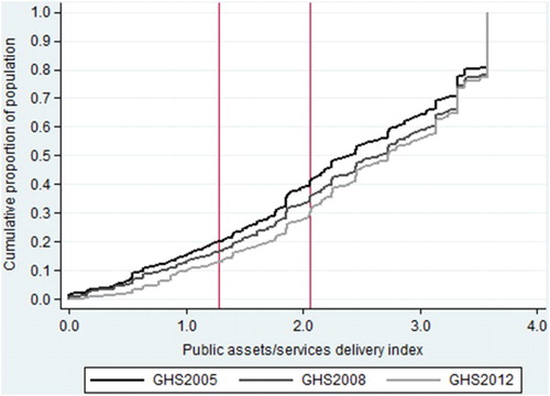
Most of the provinces experienced a decline in the poverty headcount ratios using both poverty lines. Despite these findings, Western Cape and Gauteng had the lowest poverty ratios, whereas the Eastern Cape, KwaZulu-Natal and Limpopo had the highest ratios. Table A5 in Supplemental data shows the provincial composition of the poor: the Eastern Cape and KwaZulu-Natal had the highest share of the poor.
Some clear differences are evident when comparing changes in poverty across the two indices. plots the CDF for Index 2: the 2005 and 2008 CDFs are clearly more compressed compared with those in . This indicates that the perceived quality of public assets and service delivery has changed very little for the population as a whole between 2005 and 2008, despite the fact that there was a distinct decline in poverty between 2008 and 2012.
Figure 2: Cumulative density functions by race for Index 2, 2005–12.
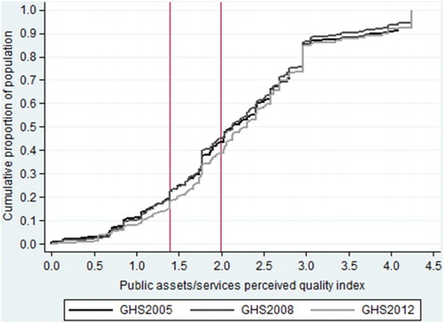
Results from Index 2 (see ) reflect that when comparing 2005 and 2008, in general poverty ratios increased slightly across all races. In the subsequent period, there was a significant decline in poverty for blacks, but the decrease was negligible for other races. Table A4 in Supplemental data shows that, in all surveys, blacks accounted for more than 90% of the poor.
Poverty headcount ratios by province using Index 2 indicate that Eastern Cape exhibited the greatest decline between 2005 and 2012 (nearly 12 and 8 percentage points respectively at the 20th and 40th poverty lines). However, three provinces (Northern Cape, Gauteng and Mpumalanga) saw an increase in their respective poverty headcount ratios during the same period. A peculiar result is observed for Gauteng: the poverty headcount ratios increased in the case of Index 2, whereas Index 1 shows declining poverty ratios for this province. The former finding indicates that the perceived quality of public assets and services is deteriorating. Finally, Table A5 in Supplemental data shows that once again the Eastern Cape and KwaZulu-Natal accounted for the greater proportions of the poor.
6. Conclusion
Determination of the extent to which the provision and perceived quality of public asset and service delivery has improved the welfare of South Africans is of significant value to policy-makers. This article used three GHS surveys to construct two indices: one measured the access to types of public assets and services, while the other index measured their perceived quality. The results affirm what has been asserted elsewhere: overall, poverty as measured by our two indices decreased between 2005 and 2012, although mixed results are evident across race and province. The welfare improvement is primarily experienced by blacks, but they still account for the highest share of the poor. In addition, although the Eastern Cape had experienced continuous improvements in both access and perceived quality, it remains one of the provinces with the highest level of poverty as well as the share of the poor.
These results are not trivial. Improvements in access coupled with poor-quality service delivery would imply ineffective policy implementation and a diminutive-to-zero welfare gain to households. While this study does not support the notion that this has been the case in aggregate, it does soften the common narrative that ‘remarkable strides’ have been made. The demonstrated public dissatisfaction coupled with rising measured welfare highlights the difficulty in quantifying relative deprivation. Confidence in the proxies designed to measure these intangible characteristics must therefore be tempered and caution exercised when interpreting the results derived from their use. Furthermore, our indices are silent on the expectations of people, an important variable in determining their perceived deprivation. Further investigations into the observed dissatisfaction of South Africans may benefit from ethnographic or mixed-method approaches.
Supplemental data
Supplemental data for this article can be accessed online: http://dx.doi.org/10.1080/0376835X.2015.1063986
Supplemental Tables A1–A5
Download PDF (103.5 KB)Supplemental Figure A1
Download PDF (43.8 KB)Disclosure statement
No potential conflict of interest was reported by the authors.
Notes
4Even though different poverty lines were used in past studies, they indicated a decline in poverty rates. For example, Bhorat & Van der Westhuizen (Citation2012) found that poverty rates declined when comparing the Income and Expenditure Surveys of 1995 and 2005. They used the R174 and R322 per capita per month (2000 prices) poverty lines.
5Both Atkinson (Citation2007:58) and Alexander (Citation2010:32) allude to the fact that poor-quality service delivery is one of the factors associated with an increase in service delivery protests since 2004.
6The variable connoting the municipal district of observations was discontinued in 2007, which restricts geographic and administrative comparisons to the provincial level. The urban/rural designation variable was also omitted in surveys between 2004 and 2012, again constricting the analysis from areas germane to the South African poverty landscape.
7This section is merely descriptive of the method. See Greenacre (Citation1984), as well as Blasius & Greenacre (Citation2006) – from whom this section borrows extensively – for a more formal and comprehensive exposition.
8CA is applied in the analysis of two-variable datasets.
9Person weights are used in the data analysis.
10‘Best’ refers to the top level of each category. For example, in the case of dwelling, ‘formal’ would be a better type of asset than ‘informal’.
11In this case, the best category refers to ‘very good’ and/or ‘good’ quality.
References
- Abdi, H & Valentin, D, 2007. Multiple correspondence analysis. In Salkind, NJ (Ed.), Encyclopedia of measurement and statistics. SAGE Publications, Thousand Oaks, 651–657.
- Alexander, P, 2010. Rebellion of the poor: South Africa's service delivery protests – a preliminary analysis. Review of African Political Economy 37(123), 25–40. doi: 10.1080/03056241003637870
- Asselin, LM & Tuan Anh, V, 2008. Multidimensional poverty and multiple correspondence analysis. In Kakwani, N & Silber J (Eds.), Quantitative approaches to multidimensional poverty measurement. Palgrave MacMillan, New York, 80–103.
- Atkinson, D, 2007. Taking to the streets: has developmental local government failed in South Africa? In Buhlungu, S, Daniel, J, Southall, R & Lutchman, J (Eds.), State of the nation: South Africa 2007. Human Sciences Research Council, Pretoria, 53–77.
- Bhorat, H & Van der Westhuizen, C, 2012. Poverty, inequality and the nature of economic growth in South Africa. DPRU Working Paper 12/151. Development Policy Research Unit, Cape Town.
- Bhorat, H & Van der Westhuizen, C, 2013. Non-monetary dimensions of well-being in South Africa, 1993–2004: a post-apartheid dividend? Development Southern Africa 30(3), 295–314. doi: 10.1080/0376835X.2013.817308
- Bhorat, H, Poswell, L & Naidoo, P, 2004. Dimensions of poverty in post-apartheid South Africa, 1996–2001. A Poverty Status Report. Development Policy Research Unit, Cape Town.
- Bhorat, H, Naidoo, P & Van der Westhuizen, C, 2006. Shifts in non-Income welfare in South Africa: 1993–2004. DPRU Working Paper 06/108. Development Policy Research Unit, Cape Town.
- Bhorat, H, Van der Westhuizen, C & Goga, S, 2007. Welfare shifts in the post-apartheid South Africa: A comprehensive measurement of changes. DPRU Working Paper 07/128. Development Policy Research Unit, Cape Town.
- Blasius, J & Greenacre, MJ, 2006. Correspondence analysis and related methods in practice. In Greenacre, MJ & Blasius, J (Eds.), Multiple correspondence analysis and related methods. Chapman and Hall, Boca Raton, 4–40.
- Booysen, F, Van der Berg, S, Burger, R, Von Malitz, M & Du Rand, G, 2008. Using an asset index to assess trends in poverty in seven sub-Saharan African countries. World Development 36(6), 1113–1130. doi: 10.1016/j.worlddev.2007.10.008
- Burger, R, Van der Berg, S, Van der Walt, SJ & Yu, D, 2004. Geography as destiny: Considering the spatial dimensions of poverty and deprivation in South Africa. Proceedings of the DPRU/TIPS (Development Policy Research Unit / Trade and Industrial Policy Strategies) Conference, 13–15 October, Somerset West.
- Department of Minerals and Energy, 2003. Frequently asked questions regarding the proposed policy of providing free basic electricity (FBE), 23 April. [Online]. www.dme.gov.sa/energy/faq_energy.htm Accessed 15 February 2015.
- Ezzrari, A & Verme, P, 2012 . A multiple correspondence analysis approach to the measurement of multidimensional poverty in Morocco, 2001–2007. World Bank Policy Research Working Paper No. 6087. The World Bank, Washington DC.
- Finn, A, Leibbrandt, M & Woolard, I, 2013. What happened to multidimensional poverty in South Africa between 1993 and 2010? SALDRU Working Paper Series Number 99. Southern African Labour and Development Research Unit, Cape Town.
- Greenacre, MJ, 1984. Theory and application of correspondence analysis. Academic Press Inc., London.
- National Treasury, 2003. Intergovernmental Fiscal Review 2003, April. Government Printer, Pretoria.
- Statistics South Africa, 2012. General Household Survey 2011: Statistical release P0318. www.statssa.gov.za/publications/P0318/P0318June2010.pdf. Accessed 20 June 2013.
- Van der Walt, SJ, 2004. A multidimensional analysis of poverty in the Eastern Cape Province, South Africa. Stellenbosch Economic Working Papers: 03/2004. Stellenbosch University, Stellenbosch.
- Wittenberg, M, 2013. Non-monetary dimensions of well-being: A comment. Development Southern Africa 30(6), 826–829. doi: 10.1080/0376835X.2013.860875
- Yu, D, 2009. The comparability of Census 1996, Census 2001 and Community Survey 2007. Stellenbosch Economic Working Papers: 21/2009. Stellenbosch University, Stellenbosch.