
 ?Mathematical formulae have been encoded as MathML and are displayed in this HTML version using MathJax in order to improve their display. Uncheck the box to turn MathJax off. This feature requires Javascript. Click on a formula to zoom.
ABSTRACT
Most of the literature on statistical process monitoring (SPM) concerns a single process or a few of them. Yet, in a modern manufacturing plant there may be thousands of process measurements worth monitoring. When scaling up, supporting software should provide three important capabilities. First, it should sort by appropriate summary measures to allow the engineer to easily identify processes of most concern. Second, it should show process health of all processes in one graph. Third, it should meet the challenges of big data for test multiplicity, robustness, and computational speed.
This article describes the summaries and graphs that can be especially useful when monitoring thousands of process measures that are to be analyzed retrospectively. This article's goal is to propose these for routine reports on processes and invite discussion as to whether these features belong in the mainstream.
Introduction
Now is the age of ubiquitous data; in manufacturing, now is the age of ubiquitous process measurements. Many manufacturing processes are complex with many steps and with many responses to measure. For quality monitoring, there is too much to look at. Engineers do not have time to look at thousands of control charts and other reports. What is needed is to find out which of our processes need scrutiny, and examine them.
Consider three areas: process capability, process change, and process stability.
First, process capability: quality engineers need a view that gives them a good perspective of which processes are meeting specifications, and how other processes are not. The capability index itself can be compared across process variables, but it does not tell us in which way a process fails to meet specifications, whether by high variability or being off-target, or a combination. Process histograms with inscribed specification limits give a good picture of processes, but for only one process at a time. This article advocates the Capability Goal Plot to give a good picture for many process variables.
Second, process change: quality engineers need a better way to look at which process variables change in response to engineering changes, with appropriate adjustments for multiple-tests, and appropriate screening with respect to the size of a difference you should care about.
Third, process stability: quality engineers need to find which processes are unstable and to find process shifts and drifts. Engineers also want to find patterns across process variables, such as times where there are simultaneous shifts across several process variables.
Our new age requires resourceful investigative tools and a new outlook adapted to the increased scale of quality monitoring.
Characterizing conformance for many processes: Capability Goal Plot
What is the best presentation to characterize capability (how well a process is keeping within its specification limits)?
The following discussion refers to the measure Ppk, but easily applies to either Cpk or Ppk. These two measures differ only in whether you use a short-run local estimate of sigma (Cpk), or a long-run classical estimate of sigma (Ppk). The Ppk tells you how wellyou are doing, and the Cpk tells you how well you could be doing if you resolve any drift issues.
Ppk (and Cpk) are defined in terms of estimated mean, , the estimated standard deviation, s, and the lower and upper specification limits, LSL and USL:
This formula depends on the mean and standard deviation estimate in relation to the specification limits. The challenge is to decompose this so that process variables with different specification limits can live in the same graph meaningfully. Compute specification-limits-scaled versions of the mean and standard deviation to plot:
where target is (USL + LSL)/2, i.e., symmetric.
Plotting this, there is the X coordinate, , (which represents how far off target), and the Y coordinate,
(which represents the standard deviation), both relative to the specification range. Next, determine how X and Y values in the graph correspond to a given Ppk. Pick Ppk = 1. Solving out the two arms of the Min in the formula, the contour function is:
Drawing this in the graph of by
yields a triangle where Ppk = 1 along the lines of the triangle, as shown in .
Figure 1. Capability Goal Plot construction with inscribed defect probability contour.
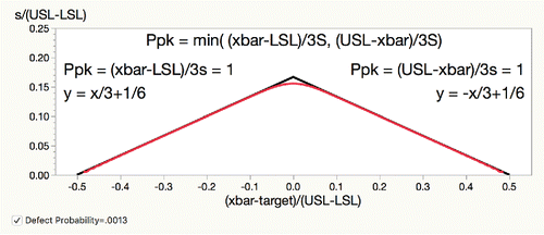
If a {mean, standard deviation} combination maps to inside the triangle, the Ppk is greater than 1 and the process is “capable.” If the process maps to outside the triangle, the process is “incapable.” Not only that, but there is a sense of the way in which a process is incapable: being off target, of high standard deviation, or a combination.
A Ppk of 1 corresponds to a defect rate of .0013, and you can see this by inscribing the contour at 1 − .0013 of F((x + 0.5)/y) - (1 - F((0.5 − x)/y)) where F is the Normal Cumulative Distribution function. You see that this contour closely follows the lines of the triangle except for where mean = target ( = 0). This confirms that Ppk is a well-crafted measure that maps to a given defect rate very well. In general, given a Ppk, the goal lines are:
provides an example with many incapable process variables shown in the red shaded area for Ppk < 1.33, a common criterion in manufacturing:
Figure 2. Capability Goal Plot for semiconductor data.
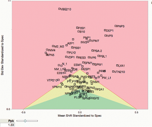
The Goal Plot, with its two dimensions, shows the ways to bring a process into conformance, either by shifting the mean toward the target, which is often easy, or reducing the variation, which is usually harder and more costly, or by combination of the two. Any process that is above the peak of the triangle will never be made capable by shifting the mean, and any process that is left or right of the triangle's base will never be made capable by reducing the variation.
By adding green and yellow areas, one can see which processes have a Ppk that is greater than the inner Ppk boundary (green), which is 2.66 here, or greater than the outer Ppk boundary (yellow).
The Goal Plot is proposed as the presentation to characterize many processes with respect to their capability. This plot has been part of JMP software for many releases now (Sall et al. Citation2003–2013), but has not, to my knowledge, been in the scholarly literature.
The Goal Plot satisfies the objective of a compact, clear presentation to characterize the capability of a large number of process variables. The Goal Plot inspires the search for similarly compact and clear ways to present characterizations of other aspects of process health.
Goal Plot special cases
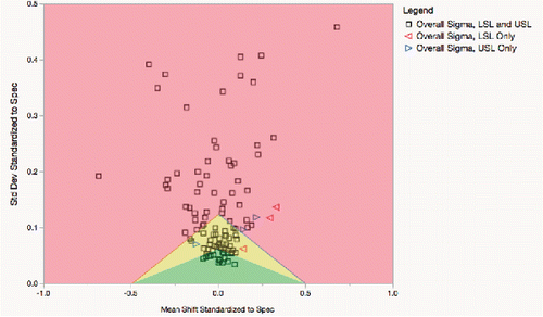
How do you plot a process when there is only an upper specification limit (USL) or only a lower specification limit (LSL)? In either case, the two goal lines are used differently for the one-sided limits. When there is a lower specification limit, but not an upper, use the left boundary only for these points, and color those points and the left boundary red with leftward-pointing triangles for markers. Conversely, when there is an upper specification limit, but not a lower, use the right boundary only for these points, and color those points and the right boundary blue, with rightward-pointing triangles for markers. The specification range in the calculations becomes twice the difference of the limit from target.
shows a subset of the previous data with several LSLs and USLs removed so that they have one-sided specification limits, but with targets. You see the red points well within the left red boundary, but several of the blue points do violate the right blue boundary, and thus are incapable and have high defect rates.
Figure 3. Goal Plot with several one-sided specification limits.
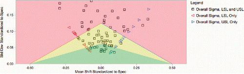
If you have only one limit, without a target, then points can still be plotted by arbitrarily picking a slope from the origin. It was decided to use a slope of 0.5. Note these points along a line from the origin in .
Figure 4. Goal Plot with one-sided specification limits, no target.
Table
The one-sided formulas above do not work in the special case is when mean goes far beyond the specification limits, making Ppl or Ppu negative enough to flip the points below zero, or if near −2/3 reaching to infinity. You have to bound the points; use a lower limit of −.6 for the Ppl or Ppu in the above formulas.
The Goal Plot was designed for symmetric specification limits, where target = (USL + LSL)/2, and the Ppk contours approximating normal-distribution contours. When the target is not in the middle, use a conservative specification range of 2*min(USL-target, target-LSL), and again, the limits are less meaningful (Sall et al. Citation2003–2013).
Characterizing changes for many processes: Change screening
Next, consider how to characterize the change in many response measurements with respect to a change in the process. This ought to be easy, since the calculations implement the usual basic statistical tests. However, doing this at scale introduces a few complications.
Many one-way ANOVAs
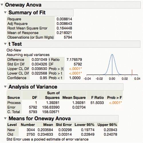
To illustrate, consider a semiconductor example “probe” with 388 responses across a process change. If one wanted the full details of each comparison test, one must get all the traditional output of a one-way analysis of variance, or if there are only two levels, a t-test ().
Figure 5. Typical ANOVA report.
Obviously, it is impractical to look at all 338 pages of this detail for all the responses. First consider making a table of ANOVA output with a row for each test ().
Figure 6. Extracted ANOVA results.
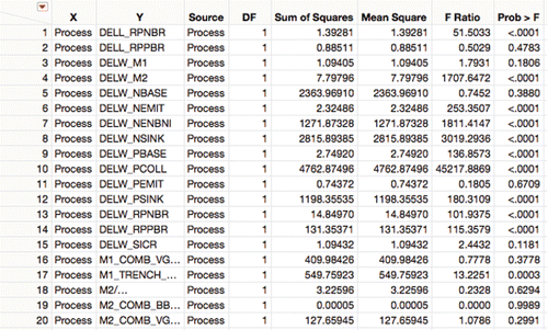
The goal can be to know what change was the most significant, so sort by ascending p-values. In this software, small p-values are represented by “<.0001” so change the format of the p-value column to distinguish between small p-values.
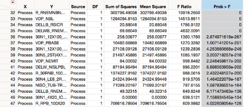
After reformatting and sorting (), notice that the first 35 process values have p-values of zero, which is clearly wrong. The problem is that machine floating point representations have a lower limit of about 2.2 × 10−308; floating points cannot represent values smaller than that. The scale must be transformed to represent them. With sample sizes getting larger as processes are measured more often, having unrepresentable p-values will be a common problem. In such cases p-values cannot be used for ranking when they are mostly zero. Refer to the next section for a proposal in dealing with that situation.
Figure 7. ANOVAs sorted where 35 p-values are zero.
False-discovery-rate adjustments
Obviously with many tests being calculated and sorted, the p-value is no longer meaningful, because it suffers from selection bias. The selection bias needs to be corrected. There is a rich literature of multiple-test adjustments. The Bonferroni correction is appealing for its simplicity, dividing the significance criterion for the p-value by the number of tests, but if there are thousands or millions of tests, the Bonferroni correction is too strict, and nothing may qualify as significant. Rather than control for experimentwise error rate, it is more practical to only control for the false-discovery rate (FDR), the expected rate of declaring something significant when the actual difference is zero. The FDR adjustment has become very widespread in genomics, where there may be hundreds of thousands or millions of gene expressions to screen. The classic FDR adjustment is the Benjamini-Hochberg adjustment (Benjamini and Hochberg Citation1995), which involves ranking the p-values and adjusting from the largest to the smallest, such that the adjustment for the largest is equivalent to the unadjusted p-value, and the adjustment for the smallest is equivalent to the Bonferroni p-value.
is an example of a set of sorted p-values for 377 measures against “lot,” where there should be no difference. The Y axis is the p-value and the X axis is the rank as a fraction. Notice that the red markers for the p-values follow the diagonal, characteristic of a Uniform(0,1) distribution, the distribution of a p-value for a zero effect.
Figure 8. The FDR p-value plot when all effects are inactive.
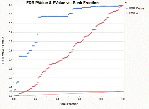
shows the same plot as , but for 377 measures across a process change where many differences are not zero. Here, there are about 35% of the p-values that seem to follow a uniform distribution on the right, but the rest are very small.
Figure 9. FDR p-value plot with 35% of effects declared inactive.
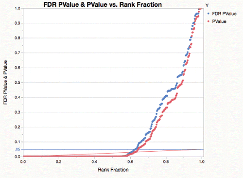
The Benjamini-Hochberg false-discovery-rate adjustment is represented by the red line ramp that goes from .05 on the right, for the largest p-value (unadjusted criterion) to .05/377 on the left for the smallest p-value (Bonferroni criterion). These graphs are a combination of ideas from Schweder and Spjotvoll (Citation1982), and a tutorial on the FDR by Genovese (Citation2004). The p-values as red markers need to get under the red ramp line to be significant at .05 using the FDR adjustment. None of the red markers make it under the red ramp for the lot-to-lot differences, but 65% of the p-values make it under the red ramp for the process change p-values.
Instead of changing the criterion and using the p-values directly against a ramped criterion, Benjamini and Hochberg (Citation1995) provide a p-value FDR adjustment mechanism to increase the p-values themselves. The FDR-adjusted p-values are shown above in blue. Notice that the blue adjusted p-values go under the nominal .05 blue line at the same place that the red unadjusted p-values go under the red ramp line.
These proposed FDR p-value plots provide a good summary of the proportion of significant changes.
Log-based p-value graphs
Now that the FDR p-value plot has helped judge how many of the processes have real differences, the next challenge is to assess the most significant changes.
A transformation that separates out the very small, most significant p-values is the logarithm. Representing p-values in the log is needed anyway, because floating point hardware cannot represent the most important p-values (i.e., those under 2.2 × 10−308). With the log transform, the significant p-values separate nicely and the non-significant p-values clump at the top ().
Figure 10. FDR p-value plot with log axis.
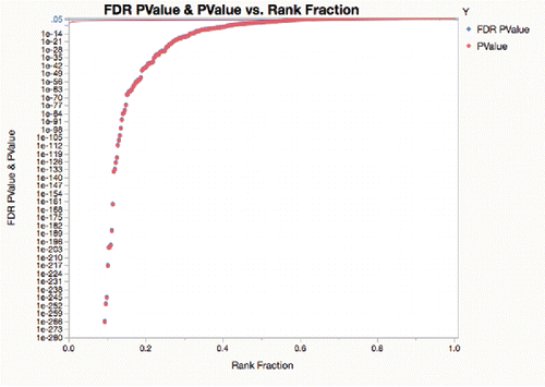
In summarizing many independent tests, such as the above, –log10(p-value) is a useful representation. With this scale, it is no longer necessary to use scientific notation, and with the scale reversed, the significant p-values are large, not small. Neville (Citation2002) called this representation the “log worth.” It is easy to translate back to p-value scale: a log worth of 100 is a p-value of 10−100. A common signpost for significance is a p-value of .01, which is equivalent to a log worth of 2; a horizontal line is drawn at this value.
In , see the separation of R_TRENCH, DELW_PCOLL and P_RNEMNBNBL_100 × 20 as more highly significant and VDP_PBL has having the biggest effect size. The red line is at 2. Note that the processes in the top 90% of the vertical scale could not be represented as p-values in hardware floating point.
Figure 11. FDR log worth by effect size.
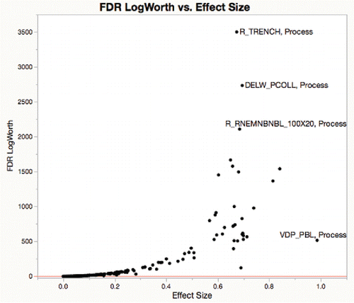
Plotting FDR-adjusted –log10(p-value) by signed effect has become a standard plot for gene expression studies, pioneered in Jin et al. (Citation2001), and now described by the Wikipedia article “Volcano plot.”
In summary, these two plots are proposed for routine use for showing the effect in many responses of a process change: the p-value plot of FDR adjustment, and the FDR log worth (−log10(p-value)) by effect size.
Practical difference and equivalence tests
After recognizing which responses have changed, the question needs to be refined.
Rather than care about a change being significantly different from zero, which is easy when the sample size is large, one must determine if the change is significantly greater than a relevant threshold. This is the question of “practical difference.” A typical threshold difference is 10% of the specification range. If a change is significantly greater than 10% of the specification range, then it is important to notice.
Also, one must determine if the change is significantly less than the relevant threshold. This is the question of “equivalence.” If the change is significantly within some fraction (10%) of the specification range, it is unlikely that the process change will be worth worrying about.
Thus, after picking a threshold, there are three possible outcomes for a process difference, “practically different,” “equivalent,” and “inconclusive.” For large numbers of samples, “inconclusive” will be rare.
These practical tests, which do not use zero-difference hypotheses, and where outcomes are almost always conclusive, have little need of the log scale or FDR adjustments.
If there are no specification limits, then it is reasonable to choose a practical difference that is 10% of where
is estimated robustly, using IQR/1.3489795, which is sigma for the normal distribution;
corresponds the specification range of a process with Cpk = 1. A user option can choose a different percent of the specification range.
To illustrate, the demonstration graphs ( and ), show that an estimated difference of 4 is significantly (0.048) different from zero (), but not significantly different (0.305) in absolute value from a practical threshold of 2 ().
Figure 12. t-test for absolute differences equal to 0.
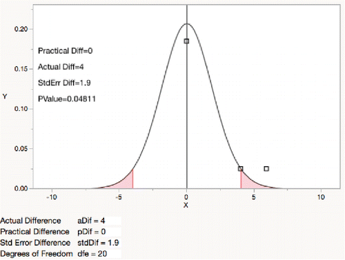
Figure 13. t-test for absolute difference less than 2.
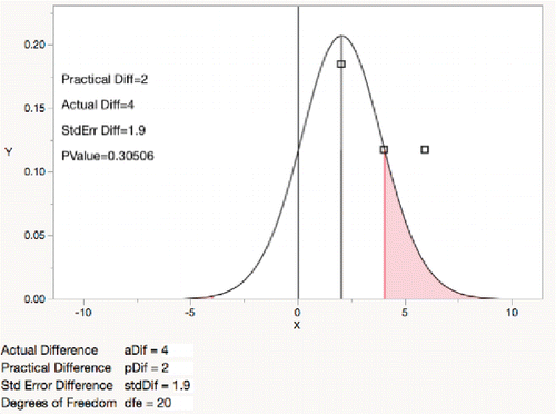
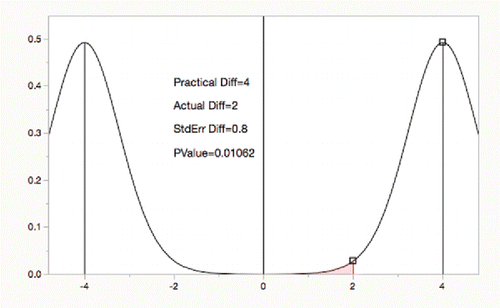
Changing values and perspectives to the “TOST” equivalence test (two one-sided t tests) (Schuirmann Citation1981, Westlake 1981), demonstrates that an actual difference of 2 is significantly equivalent for a practical threshold absolute difference of 4.
Figure 14. Two one-sided t-tests (TOST) for equivalence.
In our software, the “Practical Difference” default is 10% of the specification range, or if there are no specification limits, a fraction of a quantile range for each variable.
shows a partial listing of the three-way outcomes. Of the 377 process variables, 247 had differences significantly different from zero (in blue), while only 48 had differences of practical significance (red). 332 responses were practically equivalent across the change (green), including 195 of the 247 that were significantly different from zero. Only 7 were inconclusive. Only the first 30 responses are shown in .
Figure 15. Practical difference and corresponding equivalence test.
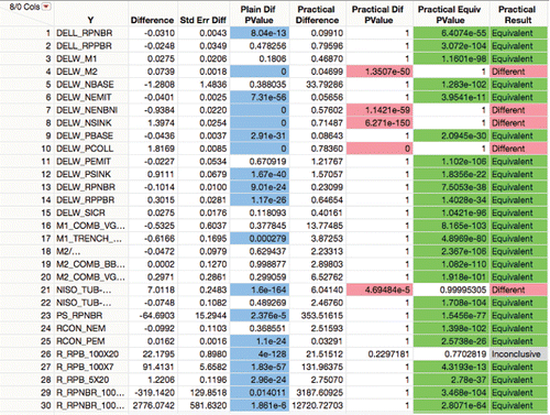
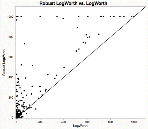
Figure 16. With (Huber) robust tests, the portion that is significant rises from 65% to 75%.
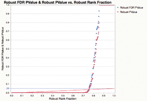
Figure 17. For probe data, most process variables are more significant with a robust test, i.e., above the diagonal in this graph.
Thus, it is recommended that process engineers use the practical (non-zero null hypothesis) significance tests and equivalence tests for screening large numbers of process variables across a process change.
Robust tests
In many industries, process data suffer from the presence of outliers. Some of the outliers may actually be error codes that the measuring devices are putting out when they cannot measure something. In the semiconductor industry, it is common for very different voltage measurements to be the result of an electrical short. Thus it becomes important to either clean the data when the outliers can be recognized or to use a robust comparison. The software offers the robust Huber test (Huber and Ronchetti Citation2009, using k = 2). The software also offers an option “Cauchy” that fits using the Cauchy distribution, which is even more robust, with a 50% breakdown point.
The robust analysis of the Probe data is shown in and . In one case (DELW_M1), the original test p-value was .18, but the robust test p-value was 2.15*10−15 (log worth 14.6). The standard errors of the means went from about 0.015 to about .001, a 15-fold reduction, as sigma went from 0.78 to 0.042, and 18-fold reduction by discounting outliers.
It is proposed that process engineers use the Huber test as a routine option to make the tests more robust to outliers.
Characterizing stability for many processes: Process screening
Now consider process measurements that are a time series of production data, the realm of process monitoring and control charts.
The topic for characterization is stability: is each process variable in reasonable control over time? If the process is not stable, then is it subject to sudden shifts, or, alternatively, to slower drifts? The literature and practice of statistical process monitoring are very rich on this topic, but retrospectively reporting on thousands of process variables still requires some innovation.
Process control chart measures
The literatureof statistical process monitoring is very focused on the issue of signaling when a process goes out of control; it is less focused on compact characterizations of process instability. Quality professionals expect software to support the classic set of control chart types, each of which produces an estimate of short-run sigma: the and R charts, the
and S charts, and the individual and moving range charts. They need a centerline, either specified or estimated from stable process data, and control limits, usually 3-sigma, where sigma is either specified, or estimated relative to the chosen control chart type. From this, control violations can be counted as the number of points outside the control limits. Some of practitioners also want an expanded set of control tests, the 4 in the Western Electric set, or expanded further to the 8 in the Nelson set, and further still with signals from the range, standard deviation, or moving range limit violations.
Of course, now the engineers are burdened with two choices. First, they must choose which control chart type and subgrouping to use. Second, they must choose which control chart rules to monitor.
As a default decision, our software choses the IMR (Individual and Moving Range) chart metrics, because it is a common choice, also because there is no additional decision on the subgroup. Woodall (Citation2016) and many others show that a local standard deviation would be much more efficient, so there are serious regrets on choosing the IMR default. For example, for a sample size of 200, the MR based estimate of sigma is about 80% as efficient as the “ and S” estimate of sigma using a subgroup size of 5. Happily, users can easily change to an S-based estimate of the standard deviation.
As to the default rules, our software now uses a single rule: one point beyond the 3-sigma control limits. So the first summary metric for the software to produce for thousands of processes is the out-of-control alert rate.
Process stability measures
The alert rate presupposes that the process is stable, yet many processes are not. Moreover, an alert count is a crude measure. Consider the ratio of the long-run to short-run variance estimates as a good overall stability measure:
This is the measure named by Ramirez and Runger (Citation2006) as the “Stability Ratio.” Szarka (Citation2016) uses the square root reciprocal of that, which perhaps better earns the name “Stability Ratio”; the Ramirez-Runger formulation is bigger as the process becomes more unstable, thus suggesting it might have been called the “Instability Ratio.”
With hundreds or thousands of processes, it is good to make a report with the processes sorted so that the ones of greatest concern are at the top. Sort by Stability Ratio. shows the “Semiconductor Capability” data used with the Goal Plot, but now presented for process monitoring.
Figure 18. Process summary report sorted by Stability Ratio.
Process capability and the process performance graph
If specification limits have been provided, then a Goal Plot characterizing the rate of in-specification process values can be created. However, it is even better if both Capability and Stability can be shown in one graph. This is the innovation from Ramirez and Ramirez (Citation2016), which they call the “Process Performance Graph.”
It closely follows the ideas from Wheeler's teachings about the four possibilities for any process (Wheeler and Chambers Citation1992).
| • | Ideal State — stable and conforming. | ||||
| • | Threshold State — stable but not conforming. | ||||
| • | Brink of Chaos — unstable but conforming. | ||||
| • | State of Chaos — unstable and not conforming. | ||||
Ramirez and Ramirez (Citation2016) chose more descriptive labels and colored the regions.
| • | Ideal State — green: stable and conforming. | ||||
| • | Yield Issue — red: stable but not conforming. | ||||
| • | Predictability Issue — yellow: unstable but conforming. | ||||
| • | Double Trouble — black: unstable and not conforming. | ||||
It was decidedto adopt a similar theme, with green as the good zone, and red as the worst. It seems that a Ppk of 1.33 is a fairly common standard for capability, so that divides the vertical scale. It is not clear that any particular value for Stability Ratio is best, but a choice has to be made, and it was decided that 1.5 would be the border. Of the 464 process variables in , 391 are in the green area, 24 are capable but unstable (yellow), 35 are stable but incapable (orange), and 14 are both incapable and unstable (red).
Figure 19. Process performance graph.
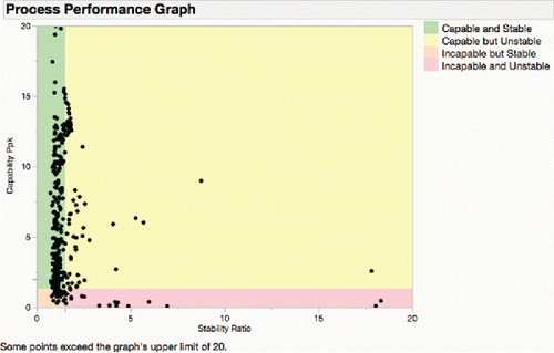
Ramirez and Ramirez (Citation2016) recommended using a significance level to form a boundary for the stability ratio, but this graph uses a fixed boundary, which is not distorted by sample size; large samples can make processes always appear unstable from a significance point of view.
Process shift detection
The next task is to look more closely at the processes that are not stable. Of particular interest are the sudden shifts in means for which an attributable cause at the time of the shift can be identified. Obviously, control charts were designed to do this, and CUSUM charts, in particular, were designed to detect persistent shifts above a given threshold. Control chart signals are often implemented in manufacturing systems to alert operators when processes go out of control.
But JMP software is not typically used for online monitoring — rather it is used retrospectively. This led to a change in thinking, because for shift detections the future is known as well as the past. The goal is not to signal an alert, but rather to find when and how big the shift was with offline data. Working with the assumption that the process was stable before and after the shift, then the difference in means would be the best estimate. But suppose it is necessary to detect sudden shifts when the mean may also be subject to slow drifts or other shifts. In that case, the better estimate on both sides of a shift would be a local estimate, and it was decided to use the EWMA estimate.
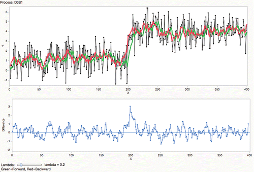
This is done by first running an EWMA in the forward direction and then in the reverse direction, looking for a big difference in the backward EWMA from one period earlier in the forward EWMA (Ali, Falton, and Doganaksoy Citation1998). Any difference that is greater than, say, 3-sigma will be flagged (using short-run sigma).
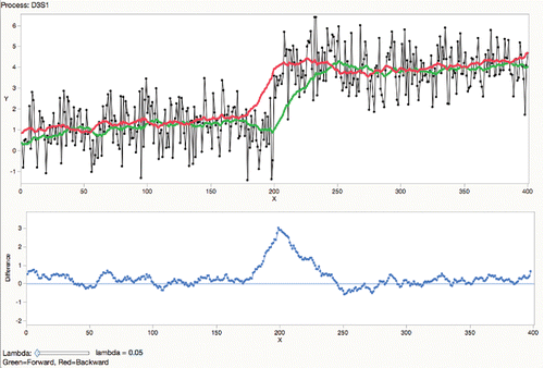
illustrates a process with standard deviation 1 and mean 1 for 200 observations, shifting by 3-sigma up for the rest of the series. Using a smoothing constantof 0.2, the green line shows the forward EWMA smoother and the red line shows the backward EWMA smoother. Notice that the green line going forward takes a few periods to adjust to the new mean, and the red line similarly in the other direction. The difference of the two smoothers is shown in the blue line, which reaches a nice peak, barely above the 3-sigma threshold, at the shift point.
Figure 20. Bidirectional EWMA difference at λ = 0.2.
The choice of the smoothing constant certainly affects the result. If the process is stable, then more smoothing is good ().
Figure 21. Bidirectional EWMA difference at λ = 0.05.
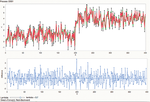
If the process has drift or multiple shifts, then a more-local smooth is better, but produces more spurious shift signals ().
Figure 22. Bidirectional EWMA difference at λ = 0.7.
The engineer user can adjust the smoothing constant λ, noting that the average lag for the EWMA is 1/λ. The default smoothing constant is set at .3 and report shifts greater than 3; these are user controllable.
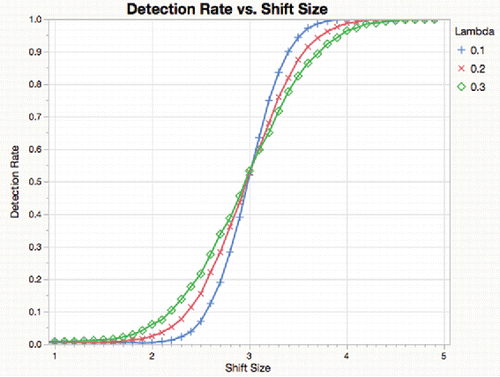
As expected, the detection of 3-sigma shifts improves in precision as the smoother has a longer average lag (smaller λ), but that is a tradeoff with responding to multiple shifts and other local behavior, as shown in .
Figure 23. Detection rate for 3σ shift by shift size for a shift at point 100 of 200, simulated for 10,000 trials.
Large-scale shift detection and outlier handling
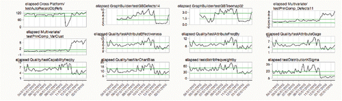
When the stability and shift detection were tried on a large data set, it was quickly realized that outliers needed to be handled — automatically, given the size of the problem. As a software developer, our shop has hundreds of thousands of tests that are run periodically to make sure all the components of the software are working properly and are producing reference-standard statistics. Among these is a test suite of 2,052 scripts that are run every day. One task of interest is to study the CPU times from the test runs to become aware of any dramatic changes in these times. If a CPU time suddenly takes much longer, perhaps some code was changed to make it too slow. If a CPU time is suddenly much faster, perhaps it is failing to calculate all the results. A complication is that these 2,052 scripts are run on different operating systems on different machines, and they are only comparable when the running environment is the same; there are 34 such combinations. Thus, there are 6.3 million rows in the table of daily data over a year for nearly 60,000 processes. But many times the computers have unusual workloads or other situations, which means the CPU time measure becomes an outlier. The outliers are rare enough so that when there is one, the neighboring points immediately preceding and following the outlier are not outliers.
JMP developed several outlier-handling features. For the estimation of the centerline and short-run and long-run sigma, JMP offers median-based methods. For and R, and IMR, JMP estimates sigma using the scaled median of the ranges. For this it is necessary to calculate the unbiasing coefficient, d2, for medians, using simulation, shown in the Appendix. For
and S, JMP uses the scaled median of the standard deviations, using our calculated c4 unbiasing coefficient for medians, also in the Appendix. This works well for most processes with real natural variation. It falls apart when the variation is too deterministic or granularly coarse. There were a number of processes among the 60,000 process CPU time data in which the median moving range was zero or very small. These processes yielded a short-run sigma that was huge, thus not usable to measure stability or shifts, as they sorted high and distorted things. Now these anomalous estimates are revised.
For shift detection calculations only, to find outliers, look at the differences of each point from the points immediately preceding and following. If the minimum of those distances is greater than 5 × short-run sigma, then replace the value with one that is only one sigma away from its closest neighbor. The idea is that if there is a shift, then the shift will continue for more than one point. Options offers other values than 5-sigma.
Focusing in on only the CPU time of the scripts in the “Platform” category that ran at least 150 times on one machine still yields 1,241 processes to look at. For this, produce a “Shift Graph” () that shows all the processes that had shifts, when the shifts occurred, and if they were shifts up (green) or down (red). Note that many of the shifts seem to line up at the same time—some of these were tests of the same “platform,” but some may reflect code changes that were common across platforms.
Figure 24. Shift graph showing processes with 3σ shifts.
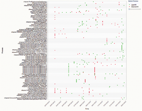
There were a number of sustained shifts on November 25 in a variety of places, the processes shown in detail in . It is now possible to investigate to see if these shifts were due to an engineering change in the code. In this case, some tests for principal components ran slower, probably indicating adding a feature, while others that were downshifts were probably due to code optimization.
Figure 25. Details on processes with November 25 shifts.
Note that even for the large version of the study, with 6.3 million values over roughly 60,000 processes, it only took about 4 seconds on a desktop computer to do all the calculations.
Process drift detection
Shift detection is not designed to detect slower changes: slow drifts in the mean. To look for that, one must refer to the literature in drift detection. Obviously for alert purposes, CUSUM charts are very good at detecting drifts after they have achieved the specified threshold, but what if a characterization measure to show the drift over the whole time series is needed? Knoth (Citation2012) looked at a number of prospective ideas and concluded that none of them designed for drifts were worth the effort. However, one of the ideas (Knoth references Sweet Citation1988 and Gan Citation1991) looked promising from our point of view. Having just used single-exponential smoothing in drift detection, it appeared that double-exponential smoothing (Holt Citation1957) provided the appropriate measure. In the Knoth paper, it is written as:
In the expressions above, St is the estimate of the current level, and Bt is the estimate of the current slope. The level estimate is the EWMA using the previous smoothed value updated with the slope. The slope estimate is the EWMA with the previous value being the difference in smoothed levels.
This is the classic double-exponential smoothing model of Holt (Citation1957). It is not to be confused with the double exponential smoothing model of Brown, which is equivalent when the two smoothing constants in Holt smoothing are the same according to Hyndman. A great reference book is Hyndman et al. Citation2008, which shows the smoothing models as “innovation state space” models, which have many advantages over the Box-Jenkins formulation. The Holt model has been popular for many decades for forecasting time series.
Since the smoother is being used for characterization, rather than forecasting, and “the future is known” with off-line data, the method will put it to work both backwards and forwards, as is done in shift detection.
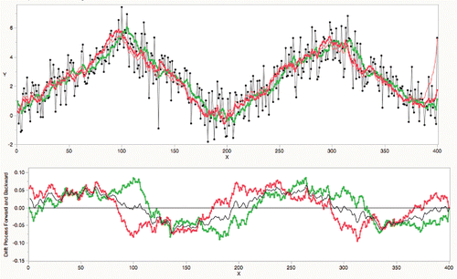
For example, consider simulating a process as a series of sustained up and down ramps. Using a λS of .15 and a λB of .05, do the Holt double-exponential smoothing. The first graph () shows the actual process in black, the forward Holt model in green, and the reversed Holt model in red; notice that it takes a while for each smoother to shift directions at the drift change points at 100, 200, and 300. The slope process is shown in the second panel. In the middle of the drift segment, they agree with positive or negative drift values. Around a drift change point, they disagree a lot, but when the two slope processes are averaged, they accurately show a crossing at zero. The average is shown as the black line in the second graph.
Figure 26. Bidirectional double exponential smoothing difference.
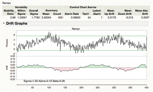
The slope estimate, Bt, is now used to characterize drift. For summary numbers, JMP reports the means of the absolute drift, the positive drifts, and the negative drifts are reported. shows the packaged summary with the drift columns and the details shown in the shaded drift chart, which immediately show green and red areas where it is drifting up and down, respectively.
Figure 27. Drift reports.
The measures depend now on two smoothing constants: one for the level, the other for the slope.
While testingthis approach, it was found that it was very important to use good smoothing constants. After studying various options, it was decided on a default behavior of estimating the level λ to minimize the error, and holding the slope λ at .05, which allows the slope to change fairly slowly. JMP provides alternate options to optimize over both λs, or to optimize such that both λs were the same (Brown method).
Hazards of double-exponential smoothing
As an example of estimates going wrong with bad λ values, consider the BLS time series on banana prices (Bureau of Labor Statistics Citation2006) normalized to year 2002. There is considerable autocorrelation and seasonality in the series, which is typical of economic series. Setting the two λs at .3 results in the drift characterization shown in .
Figure 28. Banana time series with mismatched drift.
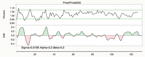
With these smoothing values, the characterization is perfectly wrong, with the drift signaling up when the series goes down and vice versa. shows that if the drift chart has both λs at .5, then everything is characterized right, showing the direction of the correctly.
Figure 29. Banana time series better drift-characterized.
The reason for the bad behavior with λs at 0.3 is that they capture the behavior with lags that match up with the periodicity to pile up at the wrong time, as you can see in with the smoothers in the top graph and the individual slope estimates in bottom graph.
Figure 30. How the banana drift went bad.
It is extremely important to estimate the λs for the drift characterization, at least the level λ, λS, if not both.
For the banana time series, the smoothing constants that have smallest prediction error use a very short-horizon level λ (.85) with a fairly long-horizon slope λ (.05) shown in . But this does not capture the short-term behavior that one might want to discover.
Figure 31. Banana drift oversmoothed.
Perhaps Knoth (Citation2012) is right—finding a good drift characterization is not easy.
Fortunately, industrial process series generally are better behaved than those found in business time series.
Summary
The goal of statistical analysis is to produce reports to effectively and efficiently portray the behavior of processes in context. When there are many processes to portray, effective summaries and graphs that give a fair picture of process health are needed. Engineers want to start with the overall picture and then dig into the details as justified by the summaries. Engineers want good default analyses so that they do not have to spend time making decisions about the methods and details to use in the analysis. A good report communicates an understandable portrait of what the data say.
First, this article presented the Capability Goal Plot for conformance with specification limits. One graph shows not only which processes are capable, but also how other processes can be incapable, either by being off target, or having high variance, or a combination.
Second, this article presented several graphs to show which processes changed with respect to an engineering change. One graph showed how the Benjamini-Hochberg false-discovery-rate p-value adjustments were applied to find out how many changes were significant after accounting for selection bias with multiple tests. Another graph showed the adjusted p-values on a negative log-scale (“log worth”) to highlight the large changes. Another technique used a fraction of the specification range to show which measures changed with respect to a difference that is cared about, the practical difference. Also, it is shown how to use this same practical difference to test the reverse, the equivalence tests to show which process variables changed significantly less than the practical difference.
Third, this article presented variations on traditional control-chart metrics to sort out which process measures were the most unstable, using the stability ratio. The process performance graph shows the capability (Ppk) by the stability ratio for many processes in one graph. Another section used bi-directional EWMA smoothing for shift-detection, and the slope process for a Holt double-exponential smoother for drift characterization.
Along the way, this article showed some variations of the methods to make the presentations more robust to outliers. All these techniques were chosen so that engineers could efficiently look at the characteristics of thousands of processes in an effective way. Research into process monitoring should consider scale when designing measures and presentations. There is plenty more to do, especially when the process becomes complicated.
Additional information
Notes on contributors
John Sall
John Sall earned a bachelor's degree in history from Beloit College and a master's degree in economics from Northern Illinois University (NIU). Both NIU and NC State awarded him honorary doctorates. In 1976 he was an establishing member of SAS Institute and currently heads the JMP business division, which created interactive and highly visual statistical discovery software for scientists and engineers. In 1997 he helped found the Cary Academy.
He is a Fellow of the American Statistical Association, the American Association for the Advancement of Science, serves on the World Wildlife Fund board, the Smithsonian Institution's National Museum of Natural History advisory board, and is a former board member of The Nature Conservancy. He is also a former trustee of North Carolina State University.
References
- Ali, F. O. G., F. W. Faltin, and N. Doganaksoy. 1998. System and method for estimating a change point time in a manufacturing process. US Patent 5,841,676, expired 2006. Alexandria, VA: U.S. Patent and Trademark Office.
- Benjamini, Y., and Y. Hochberg. 1995. Controlling the false discovery rate: A practical and powerful approach to multiple testing. Journal of the Royal Statistical Society B 57 (1): 289–300.
- Bureau of Labor Statistics. 2006. www.bls.gov, Consumer price index – Average price index 1996–2006, extracted September 8, 2006. Washington, DC: Bureau of Labor Statistics.
- Gan, F. F. 1991. EWMA control chart under linear drift. J. Stat. Comput. Simulation 38(1–4):181–200.
- Genovese, C. R. 2004. A tutorial on false discovery control. A talk given at Hannover Workshop. http://www.stat.cmu.edu/∼genovese/talks/hannover1-04.pdf
- Holt, C. C. 1957. Forecasting trends and seasonal by exponentially weighted averages. Office of Naval Research Memorandum. 52. reprinted in Holt, C. C. (January–March 2004). Forecasting trends and seasonal by exponentially weighted averages. International Journal of Forecasting 20 (1): 5–10. https://doi.org/10.1016/j.ijforecast.2003.09.015. (reference from Wikipedia).
- Huber, P., and E. Ronchetti. 2009. Robust statistics. 2nd ed. Hoboken, NJ: John Wiley & Sons.
- Hyndman, Koehler, Ord, and Snyder. 2008. Forecasting with exponential smoothing, the state space approach, Berlin: Springer Verlag.
- Jin, W., R. Riley, R. D. Wolfinger, K. P. White, G. Passador-Gurgel, and G. Gibson. 2001. Contributions of sex, genotype and age to transcriptional variance in Drosophila melanogaster. Nature Genetics 29: 389–95.
- Knoth, S. 2012. CUSUM, EWMA, and Shiryaev-Roberts under drift. Frontiers in Statistical Quality Control 10: 53–67.
- Neville, P. 2002. Personal correspondence on the term “logworth” as used in the early versions of SAS Enterprise Miner. Further information in de Ville and Neville (2013) “Decision Trees for Analytics Using SAS Enterprise Miner” by SAS Institute Inc, Cary NC.
- Ramirez, B., and G. Runger. 2006. Quantitative techniques to evaluate process stability. Quality Engineering 8(1): 53–68.
- Ramirez 2016. and earlier, Personal Communication and presentations to JMP user events.
- Sall, J., I. Cox, A. Zangi, L. Lancaster, and L. Wright. 2003–2013. Discussions and implementation work on the Goal Plot and predecessors. Ian Cox developed the “IDC plot”, showing the mean and standard deviation normalized by the specification limits, but with a rectangular goal. Leo Wright says that a similar chart, the “Cr/Tz Hatchart,” was developed at Procter and Gamble, and a search on the web for this leads you to Busitech.
- Schuirmann, D. L. 1981. On hypothesis testing to determine if the mean of a normal distribution is contained in a known interval. Biometrics 3: 589–93.
- Schweder, T., and E. Spjotvoll. 1982. Plots of P-values to evaluate many tests simultaneously. Biometrika 69 (3): 493–502.
- Sweet, A. L. 1988. Using coupled EWMA control charts for monitoring processes with linear trends. IIE Transactions, 20:404–408.
- Szarka, J. 2016. Personal communication.
- Westlake, W. J. 1981. Response to T.B.L. Kirkwood: Bioequivalence testing—a need to rethink. Biometrics 3: 589–94
- Wheeler, D., and D. S. Chambers. 1992. Understanding statistical process control. Knoxville, TN: SPC Press, page, 15.
- Woodall, W. H. 2016, Bridging the Gap between Theory and Practice in Basic Statistical Process Monitoring, Quality Engineering, 29 (1):2–15.
Appendix: Scaling factors for using medians to estimate sigma
When you select the option Use Medians instead of Means, sigma is estimated using a scaled median range or median standard deviation. gives the scaling factors, which were obtained using Monte Carlo simulation on one million samples. For subgroups of size n drawn from a normal distribution.
| • | The median of the ranges is approximately d2_Median× σ, for use in robust | ||||
| • | The median of the standard deviations is approximately c4_Median× σ, for use in robust | ||||
Table A1. Unbiasing factors for using medians.