
Abstract
Scatterplots are essential tools for data exploration. However, this tool poorly scales with data-size, with overplotting and excessive delay being the main problems. Generalization methods in the attribute domain focus on visual manipulations, but do not take into account the inherent nature of information redundancy in most geographic data. These methods may also result in alterations of statistical properties of data. Recent developments in spatial statistics, particularly the formulation of effective sample size and the fast approximation of the eigenvalues of a spatial weights matrix, make it possible to assess the information content of a georeferenced data-set, which can serve as the basis for resampling such data. Experiments with both simulated data and actual remotely sensed data show that an equivalent scatterplot consisting of point clouds and fitted lines can be produced from a small subset extracted from a parent georeferenced data-set through spatial resampling. The spatially simplified data subset also maintains key statistical properties as well as the geographic coverage of the original data.
1. Introduction
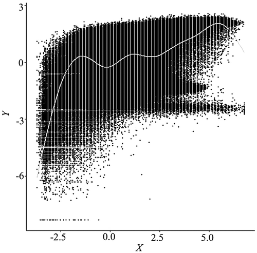
A scatterplot is a statistical graph that uses a point symbol to depict a corresponding value pair in the Cartesian plane. Typically with two graphic layers, a point cloud, and global/local fitted lines, a scatterplot is able to reveal various aspects of the relationship between two variables, based upon which researchers can specify more realistic statistical models. However, while this graphic tool works well for small size data-sets, it loses its effectiveness when the number of data points becomes so large that points overlap, forming an indiscernible clump (Figure ). Because each point symbol needs to be plotted on a graphic device, the time to render a scatterplot can be so long that interactive exploration becomes impossible. For example, a well-equipped MacBook Pro needed about 170 s to complete plotting 9000,000 data points, for a pair of 3000-by-3000 raster variables. Because fitting a LOESS (LOcal regrESSion) line on these data with a typical 70% span would take hours, we resorted to fitting a more restrictive GAM (Generalized Additive Model) line, losing some exploration powers and requiring an additional 45 s. Any typical interactive moves, such as zooming and panning, would cause the entire canvas to repaint the graphic elements, leading to another painful wait. The problems of overplotting and excessive delay prevent a scatterplot from being used in exploring large size data-sets, a common task in spatial data analysis and modeling. Cressie, Olsen, and Cook (Citation1997) noted that statistical tools initially designed for small data-sets may be challenged by and ultimately fail with massive data-sets.
Figure 1. Scatterplot and a GAM fitted line for Normalized Difference Vegetation Index (NDVI) (Y) and ETM + Band 4 (X). Data are standardized. The R package mgcv was used to fit the GAM (Wood Citation2006; Hastie and Tibshirani Citation1990).
To overcome the overplotting problem, researchers have developed numerous techniques, including alpha blending (Figure ), kernel smoothing (Figure ), contouring (Figure ), and binning (Figures and ) (Unwin, Theus, and Hofmann Citation2007; Wand and Jones Citation1994; Carr et al. Citation1987). Among them, the nested lattice binning, by Carr et al., and the binned kernel smoothing, by Wand and Jones, are particularly effective in stratifying massively overlapped points, hence revealing the density structure of a scatterplot. Rendering speeds are also very fast. These benefits, however, are achieved at the cost of over-generalization, as a bin size needs to be sufficiently large. Equivalent to categorization, in most cases, binning continuous variables leads to a loss of information (Dinero Citation1996; MacCallum et al. Citation2002).
Figure 2. Alpha blending scatterplot of a subset (1000 × 1000) of the same data in Figure 1, with alpha value set to 0.05. The alpha value specifies the level of transparency for the data points, ranging from 1 for opaque to 0 for black. Even at such a low alpha level, excessive overplotting remains a problem.
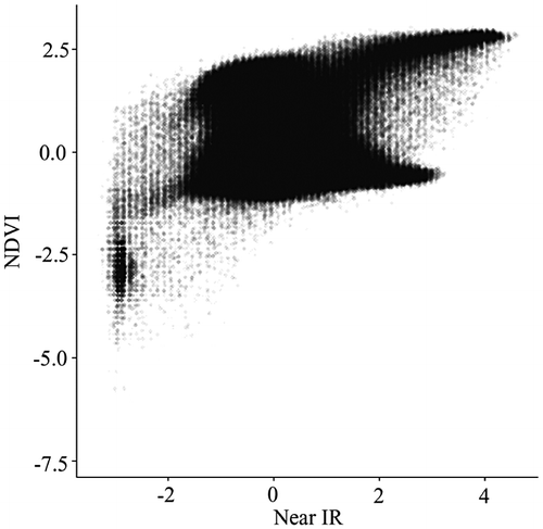
Figure 3. Two-dimensional binned kernel smoothing scatterplot.
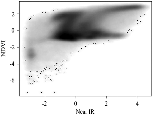
Figure 4. Scatterplot with contours. Due to the lack of sufficient memory to render the plot with the large data-set in Figure 2, 10,000 data points are randomly generated from a standard normal distribution.
Figure 5. Binned scatterplot with the same data in Figure 2.
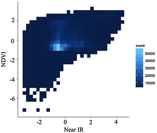
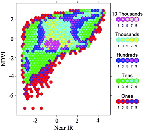
Figure 6. Nested lattice hexagon binning with the same data in Figure 2.
Limited options seem to remain – that is, if data are independent and each data point contributes a unique amount of information. Fortunately, this data characterization is not the case for most spatial data-sets for which data often are highly autocorrelated. The two variables used for generating Figure , for example, have Moran coefficients of 0.92 (X) and 0.90 (Y), respectively. Such high spatial autocorrelation indicates a large amount of redundancy in the data, providing an opportunity to achieve a substantial reduction in data size. Although data generalization has long been a research domain in geography, the focus has been on cartographic representation (Monmonier Citation1983; Buttenfield and McMaster Citation1991; McMaster and Shea Citation1992; Mackaness, Ruas, and Sarjakoski Citation2011). The theoretical foundation to exploit this unique characteristic of spatial data was not established until recently, when Griffith (Citation2003, Citation2005) systematically introduced the mathematical formula for calculating the effective sample size of a given spatial data. Exploratory applications of Griffith’s methods show a 99% reduction in sample size of a remotely sensed data-set.
Based on an approximation of effective sample size, we can extract a subset from an original data-set through spatial sampling while maintaining much of the data-set’s information. The resulting simplified data-set can be used to generate a scatterplot as well as fitted lines. To achieve such a goal, however, we need to overcome a number of methodological as well as computation challenges. This paper reports our initial experiments for developing a spatially simplified scatterplot for large raster data-sets. The remaining sections provide a review of related work, our research design, the outcomes, and a discussion of the remaining issues.
2. Effective sample size
Spatial data-sets often exhibit strong spatial autocorrelations, which means a large amount of information contained in the data are redundant. Accordingly, a subset of the data exists containing independent information equivalent to that in the original data-set. Such a subset can be considered the effective sample, which was characterized by Clifford, Richardson, and Hémon (Citation1989) as effective degrees of freedom. Recently, Griffith (Citation2005) systematically developed theories and methods for estimating the effective sample size for georeferenced data, which can serve as an index of information content. This section describes the relevant concepts and methods furnishing the experiment summarized in this paper.
A georeferenced Gaussian variable Y can be expressed as:
(1)
where Y is an n-by-1 vector for a normally distributed random variable; the population mean; 1 a vector of 1 with size n; e the spatially autocorrelated error; e* the independently and identically distributed unautocorrelated error () and V the n-by-n matrix containing the covariation structure of the error, which takes different forms. For the simultaneous autoregressive model (SAR), which is used in this study, the matrix V is expressed as
, where W is the row-standardized spatial weight matrix; I is an n-by-n identity matrix; and ρ is the spatial autocorrelation parameter. Without considering spatial autocorrelation, the variance of the sample mean of Y is formulated as:
where superscript T denotes matrix transpose, and which can be rearranged as:(2)
where TR denotes matrix trace; the term TR(V−1)/n is the variance inflation factor; and the denominator becomes the general expression of effective sample size,
(2A)
When no spatial autocorrelation is present, V = I, and n* = n. When the observations are spatially autocorrelated, n* < n. Depending on the objectives of geographic inquiries, n* takes different forms. If the interest is on estimating the mean of a single variable, the effective sample size can be approximated with the following empirical equation:
(3)
where n is the size of the original data-set, and is the spatial autocorrelation parameter estimate for a SAR model with the following form (Gelfand et al. Citation2010):
(4)
which is the same specification as Equation (Equation1(1) ). For a remotely sensed image of size 100-by-100, n = 10,000, with an SAR spatial autocorrelation estimate
, the effective sample size is approximately 183. In other words, less than 2% of the original data points contain all of the attribute information in the original data-set.
When the research interest is on estimating bivariate relationships, the effective sample size is a function of the effective sample sizes of the respective variables (
), and needs to account for the spatial autocorrelation estimates of both variables (
) as well as the correlation coefficient (ρXY) between them:
(5)
For the same hypothetical image in the previous example, denoted as variable Y, if we are interested in the correlation coefficient between it and another data-set of the same extent and resolution, denoted as X, which has an SAR spatial autocorrelation estimate of 0.96 and correlation coefficient 0.25 with Y, the effective sample size would be around 652, about 7% of the original data.
Griffith (Citation2005) also derived the exact formula for the cases of two and more sample means as well as the equivalent specifications of effective sample sizes based on geostatistical models. Unlike the cases of a single mean, the calculations of effective sample sizes for estimating joint means involve the variances of the variables and do not have a simplified empirical form similar to Equations (Equation3(3) ) and (Equation5
(5) ). Therefore, finding the exact effective sample size requires substantially more complex computations such as matrix multiplications and inversions, which becomes a barrier for large spatial data-sets. Similarly, semivariogram-based models not only require the calculation of a full distance matrix, but also the fitting of a variogram; both processes need large amounts of RAM and CPU time that easily exceed the capacity of conventional research computers. Although all spatial statistical models more or less face similar computational challenges, methods recently were developed to alleviate some of the key bottlenecks, which substantially shortens the calculations of Equations (Equation3
(3) ) and (Equation5
(5) ) on conventional desktop computers.
3. Computational issues
The SAR spatial autocorrelation coefficient , which appears in the calculations of effective sample size, can be estimated by solving the following maximum likelihood normal equation (Griffith Citation2015):
(6)
with the constant mean and variance specified as:
where is the jth eigenvalue of matrix W. Finding the eigenvalues is computationally intensive, which for a long time had been a major barrier to applying spatial autoregressive modeling, before a series of algorithms were developed to exploit the special characteristics of different types of matrices (Pan and Chen Citation1999; Bivand, Hauke, and Kossowski Citation2013). Topologically based spatial weights matrices for raster data, in particular, often are symmetrical and sparse, which provides an opportunity for substantial optimization. With a sufficient amount of RAM, a desktop computer can find
for a raster data-set as large as 3000-by-3000, with a 30,002 × 30,002 corresponding W matrix, although it would still take hours. If the data structure is a regular square tessellation and the data cover an entire rectangular region, such as the case for many remotely sensed data and raster data-sets, the eigenvalues of the spatial weights matrix can be approximated by (Griffith Citation2000):
(7)
where P and Q denote the number of rows and the number of columns; h = 0, 1, 2, … , P−1 and k = 0, 1, 2, …, Q−1; and sign represents the sign of an eigenvalue, either positive or negative. γ is the inflation exponent which approaches 1 as P and Q increase to infinity. Based on simulations with a range of P and Q values, Griffith (Citation2015) put forth the following approximation of γ:
(8)
Griffith (Citation2004a) subsequently showed that, for a regular square tessellation, the Jacobian term in Equation (Equation6
(6) ) can be approximated by the following equation:
(9)
Another simplification is possible (Griffith Citation2004b):
(10)
The coefficients ω, δ, q2, q4, and q20 in (9) and (10) can be calibrated using Equation (Equation7(7) ) for raster data of different sizes and different contiguity specifications. With these empirical coefficients, no eigenvalues need to be numerically calculated. The polynomials in both (9) and (10) are relatively simple to solve, making the calculation of the Jacobian term very fast and highly scalable.
4. Spatial resampling
Selecting a subset of the original data while maintaining the geographic extent is an act of resampling, although it may be different from the common use of the term that refers to such procedures as bootstrap and jackknife, which are performed to assess the precision of statistical estimates (Chun and Griffith Citation2011). Our primary goal of resampling, meanwhile, is to extract a judiciously selected subset to represent the key statistical and graphical characteristics of the original data as shown by a scatterplot. Once the sample size is determined through an effective sample size calculation, methods of spatial sampling can be adopted to resample the original data-set.
Research about spatial sampling is abundant, as reviewed by Wang et al. (Citation2012). In the classic scheme, four broad categories of sampling exist – random, systematic, stratified, and clustering; all four designs seek to represent some aspects of the statistical characteristics of a population. For raster data, simple random sampling uses a pseudo-random number generator to identify random coordinate pairs (row and column) within a given geographic extent. Systematic sampling, also referred to as regular sampling, selects data points at equal geographic intervals determined by the sample size. Spatially stratified sampling extracts data within geographic regions. In a simple stratified random design, stratification is with a regular tessellation whose number of cells equals the sample size, and a single data point is selected within each stratification unit. In a simulation study, Chun and Griffith (Citation2013) report that while all three sampling schemes are able to produce subsets containing the mean and variance of the original data, the hexagon stratified random sampling design produces the best results. More sophisticated methods are needed as spatial heterogeneity increases.
GIS and remote sensing software programs often provide a set of functions for resampling raster data. The primary objective is to enable integrated analysis of data at different spatial resolutions. Common methods include nearest neighbor, bilinear interpolation, and cubic convolution (ERDAS, Inc. Citation1999). In nearest neighbor resampling, the value of the source cell closest to the center of a target cell is selected. This sampling often is used for nominal data. Bilinear interpolation generates a new value for a target cell through a weighted distance average of its four nearest source cells. Cubic convolution finds a new value by fitting a spline through 16 nearest source cells. Both bilinear interpolation and cubic convolution result in a certain level of smoothing, resulting in loss of information, and undesirable alteration of the original data.
5. Research design
Our objective is to find a solution to the problems of overplotting and excessive delays in generating scatterplots for large spatial data-sets, particularly for remotely sensed data and their derivatives. We hypothesize that a small subset of the original georeferenced data-set contains sufficient information for producing a scatterplot with the capacity for visual exploration equivalent to the original plot, because raster data in general and remotely sensed data in particular often exhibit substantial spatial autocorrelation. We contend that the effective sample size provides the critical guideline for generating such a subset. Classic spatial sampling designs (random, systematic, and stratified) will be evaluated individually and in combination for their effectiveness in uncovering the effective samples.
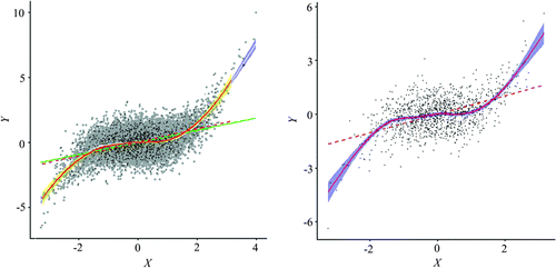
A simulated data-set and a remote sensing data-set were used in an experiment. The simulated data-set has two randomly generated raster variables in a 100-by-100 rectangular tessellation. The two variables have a nonlinear relationship (cubic polynomial), and each has a significant level of spatial autocorrelation (Table , Figures and ). The simulated data-set was used to obtain a more controlled result, which furnishes a guide to real data applications. The real-world data-set includes the NDVI (Normalized Difference Vegetation Index) and Band 4 image from the Landsat Enhanced Thematic Mapper, acquired on 16 July 2002, near Palisades, Idaho. The NDVI is a popular measure of plant “greenness,” and ETM Band 4 captures the spectral range (wavelength) from 0.77 to 0.90 mm and is characterized as the “near infrared band (NIR)” that is sensitive to biomass content. Therefore, the two variables should be highly positively correlated. The size of the image is 3000-by-3000 pixels, with a spatial resolution of 30 m (Figure ). Table summarizes the statistical characteristics of these two variables, in which ρ is the SAR spatial autocorrelation coefficient and ρxy is the correlation coefficient.
Table 1. Summary statistics of the simulated data-set.
Figure 7. Simulated data-set X (left) and Y (right).
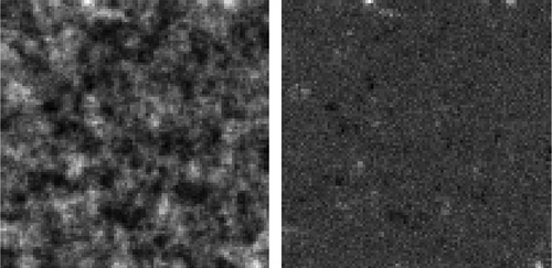
Figure 8. Scatterplot with a local regression fit for the simulated data-set X and Y.
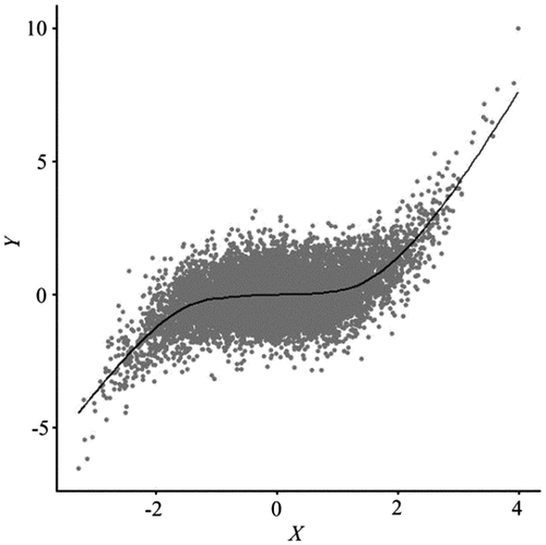
Figure 9. Remote sensing data-set used in the experiment.
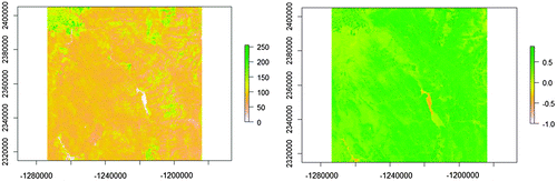
Table 2. Summary statistics of the remote sensing data-set.
The experiments were conducted with the following steps. Using the simulated data, we first calculated the SAR spatial autocorrelation coefficients for both variables, and then computed the effective sample size for each variable as well as the effective sample size for the bivariate correlation case. The latter is used to perform a spatial sampling and generate a simplified scatterplot, overlaid with a local regression line and a linear regression line, along with the same visual features for the original data. Both data-sets may be described by a range of statistics, including the mean, standard deviation, skewness, kurtosis, Moran coefficient, and SAR spatial autocorrelation coefficient. A Kolmogorov-Smirnov test evaluates if the resampled set and the original set represent the same population. Resampling, comparison between the spatially simplified scatterplot with the original plot, as well as statistical summary and testing are repeated for three spatial sampling designs: random, systematic, and hexagon stratified random. Results from all three schemes are evaluated, followed by subsequent experiments with the remote sensing data-set using the same procedures.
6. Results
Given ρx = 0.9658, ρy = 0.5136, ρxy = 0.4688, and n = 10, 000, the effective sample sizes for the simulated data are ,
, and
. Clearly, effective sample size is very sensitive to the SAR coefficient – at a lower level of spatial autocorrelation, variable Y has far fewer redundant data points than X. Also worth noting is that the sample sizes need to be slightly adjusted for regular sampling and hexagon stratified random sampling in order for the resampling to cover the entire geographic region. Figure depicts the sample sites for all three schemes, with X in the background for reference purpose (except for the hexagon case).
Figure 10. Illustrations of sample sites for three sampling schemes: random (left), regular (center), and hexagon stratified random (right). The background image is for the variable X, with 100 rows by 100 columns. Variable Y is not shown here. Effective sample size () was calculated based on ρx = 0.9658, ρy = 0.5136, ρxy = 0.4688. Due to geometric restrictions, actual sample sizes are 2809, for regular sampling, and 2438, for hexagon stratified random sampling.
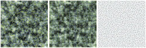
Table summarizes the resampling results with the simulated data. The large p-values and small D for the K–S tests for all three resampled sets are good indications of similarities with the original data. In addition, the confidence intervals of the means, standard deviations, and correlation coefficients, although varying in width, all contain the corresponding statistics of the original data. Skewness and kurtosis, though not affecting the visual characteristics of the scatterplot, are included for completeness, and show some variation among different sampling schemes. For skewness, random sampling and hexagon stratified random sampling result in relatively large deviations from the original data. For kurtosis, the stratified sample set stands out as an outlier. Overall, however, statistical measures indicate the resampled subsets from all three spatial sampling schemes are close representations of the original data, with hexagon stratified random sampling showing a better performance.
Table 3. Summary statistics for simulated variables from the resampled sets.
Figures and confirm the statistical summaries. The point clouds of the resampled data capture the general distribution characteristics of the original data, but with a substantial reduction in overplotting. The three sampling schemes produce similar patterns, but regular sampling seems to be slightly more representative, being able to identify outliers the other two methods may have missed. That small advantage may have to do with its still high sampling density.
Figure 11. Spatially simplified scatterplot consisting of the point cloud and local/global fitting lines overlays on the same graphic features from the original data.
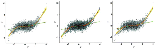
Figure 12. Spatially simplified scatterplots (point clouds with local/global fits) from three resampling schemes (left: random sampling; center: regular sampling; right: hexagon stratified sampling).
The fitted lines, another important feature of a scatterplot, virtually overlap with those of the original data, with noticeable deviations toward the two ends, because errors of the local fitting function typically increase in the border region of the X variable. In all, the spatially simplified scatterplots, regardless of how the subsets are extracted using the three spatial sampling methods, generate fitted lines virtually identical to those for the original data.
As Table shows, the resampled sets have a much lower level of spatial autocorrelation, which is expected. However, they are higher than what the effective sample size suggests. We attribute this discrepancy to several factors. First is the normality assumption for the variables when specifying the effective sample sizes. For the two simulated variables, X was generated from a normal density function but Y was derived from a polynomial of X that results in a departure from normality. Furthermore, we used relatively simple sampling schemes that are unable to remove redundancy completely. Both, however, tend to increase the effective sample size without negatively affecting the representativeness of resulting simplified scatterplots.
The existence of substantial levels of spatial autocorrelation in the resampled set does lead us to speculate the possibility of performing a second round reduction. For example, given ρx = 0.8539, ρy = 0.3490, ρxy = 0.4533, and n = 2438, a new effective sample sizes becomes . A simple random selection of 1326 data points (Figure ) from the 2438 samples extracted in the previous step (through hexagon stratified random sampling) shows some interesting results, as summarized in row Hex2 of Table and Figure . The K–S statistics show the resulting subset, though only half of the size of the initial resampled set, still constitutes a good representation of the original data. The means, standard deviations, and correlation coefficient start to deviate from those of the population but the amount of departure is very small (Figure ). We repeated the experiments for the resampled sets from the other two schemes, and the results were similar.
Figure 13. A random sample (n = 1326, right) of the hexagon stratified random sample set (n = 2438, left).
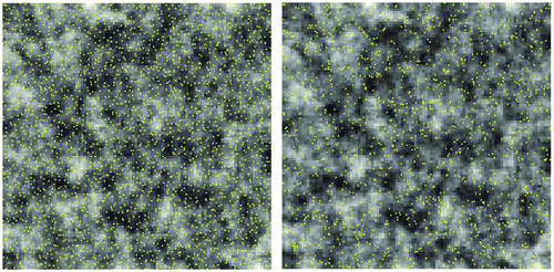
Figure 14. Spatially simplified scatterplot of the simulated data using a two-stage resampling scheme.
For the remote sensing data-set, we adopted a slightly different two-stage resampling design where hexagon stratified random sampling was first performed with the correlation-based joint effective sample size, followed by a second round of resampling using the random, systematic, and stratified schemes. Initial experiments with hexagon stratified random sampling showed advantages over the other methods, similar to the published research that suggested it to be a superior design (Chun and Griffith Citation2013). Rectangular stratified sampling was included for comparison.
Table summarizes the statistical characteristics of the two-stage resampling experiment. At stage one, the effective sample size was calculated based on the SAR spatial autocorrelation coefficients, ρNIR = 0.9839, ρNDVI = 0.9852, n = 9000,000, ρNIR−NDVI = 0.2281, and . More digits for ρnir and ρNDVI = 0.9852 are included in the calculation because for such a large n, a small increase in precision in these coefficients would result in a substantial change in the effective sample size. The number of corresponding hexagons constructed was 174,212, within each of which one data point was randomly chosen for each variable. As the two rows “Hex stratified” in Table show, the summary statistics (mean, standard deviation, skewness, and kurtosis) from this much smaller subset (2% of the original data) are almost identical to those of the original data, with a strong confirmation by the K–S tests. The correlation coefficient slightly deviates. This outcome is expected because there are clearly non-linear components in the relationship that may become more dominating in the resampled set.
Table 4. Summary of resampling statistics for the remote sensing data-set.
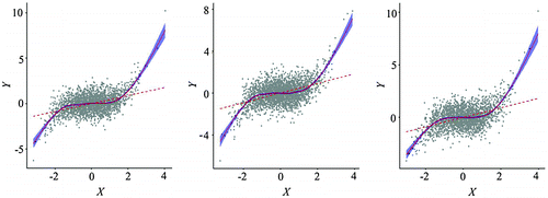
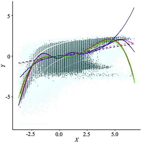
Figure shows an overlay of the point clouds and the fitted lines (linear, GAM/LOESS, and quartic polynomial). The point cloud from the resampled set captures the general visual structure of the original data, with much less overlap. The GAM/LOESS lines are virtually identical, except for the upper region of the NIR (X axis) variable. The OLS fits show similar patterns. The quartic polynomial fits are a complete overlap, while the cubic polynomial from the resampled set provides a good generalization of the relationship, and may alleviate the possible problem of overfitting in the lower and upper regions. These results clearly show the spatially simplified scatterplot, using a fraction of the original data, can sufficiently represent the key characteristics of the original scatterplot, making it possible to perform interactive exploration.
Figure 15. An overlay of scatterplots from the original data and the resampled set.
Despite a substantial reduction in sample size and a general increase in spacing among data points, spatial autocorrelations in the resampled set are still quite strong, which offers the opportunity for further reduction. Based on the SAR coefficients and the correlation coefficient (ρNIR = 0.8084, ρNDVI = 0.8579, n = 174,212, ρNIR−NDVI = 0.2571), a new sample size was calculated as 42,128, about 25% of the initial resampled set and 0.5% of the original data. Actual sampling sizes for regular and stratified schemes vary slightly, due to the geometric restrictions to cover the geographic region.
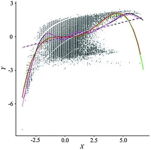
As Table shows, the stage-two resampled set from all three spatial sampling methods produced summary statistics virtually identical to not only its parent data-set (initial resampling), but also the original set; the K–S tests again confirm the data-sets are from the same population. Although the SAR autocorrelation coefficients were only reduced by a small amount, the Moran coefficients have dropped considerably. The simplified scatterplots from all three stage-two resampled data-sets were almost identical, so we selected the one generated from regular sampling as representative. Figure depicts an excellent portrayal of the original point cloud from the parent data-set and all fitted lines are overlapped with little deviation from those of the original data-set. With less than 45,000 data points, it took a conventional desktop computer less than a second to generate the scatterplot constituting a distinguishable point cloud and the local and global fitting lines.
Figure 16. Scatterplot of data from the stage-two regular resampling.
7. Discussion
Experiments with simulated data and a remote sensing data-set support the hypothesis that overplotting and excessive delay in generating scatterplots for large spatial data-sets can be resolved through exploiting the information redundancy in the data, as measured by spatial autocorrelation. Though the original intended use of effective sample size was to determine the correct sample size for estimating different statistical properties of a population (Griffith Citation2005), the concept can serve as an approximation of the true information content contained in the data-set, and as a guide for extracting a small subset closely representing the original data on the corresponding scatterplot. As the experiment shows, when the Moran coefficients are as high as 0.98, less than 1% of the original data can render scatterplots identical to the original. As such levels of spatial autocorrelation are common among raster data, especially for remotely sensed data and their derivatives, the prospects of a spatially simplified scatterplot are promising.
Calculating the effective sample size involves computational tasks that can be highly complex. Effective sample size is a function of the SAR spatial autocorrelation coefficient whose estimation involves the calculation of the eigenvalues of the spatial weights matrix that is the square of the data size. The amount of RAM required often exceeds even a well-equipped desktop computer, not to mention the hours of processing time it would take. Other methods, such as Monte Carlo approximation and LU decomposition, can accommodate large sizes but would still be unable to handle a W matrix as large as 9000,000 × 9000,000 within a reasonable range of response time. The computation issues with finding the SAR coefficient, fortunately, were largely resolved for raster data, thanks to the approximation methods developed by Griffith, as described in the previous section. Because these estimations do not require numerically intensive calculations of the eigenvalues, we can obtain the SAR coefficient within minutes instead of hours. For other geospatial data types, fast approximation of eigenvalues has yet to be developed.
Throughout the course of our experiment, we adopted a two-stage resampling design because the resampled data-set, although substantially smaller than the original data-set (2%), still exhibited a high level of spatial autocorrelation. The information redundancy is likely due to the relatively simplistic sampling design where hexagons or rectangles are regularly laid out, and where sample sites are either systematically or randomly selected, without considering the spatial associations among data elements. For example, a large and elongated water body, which should likely be sampled just once because of its homogeneity, may end up being sampled many times. Meanwhile, an area with a high level of heterogeneity, which should be sampled more densely, would have only one sample to represent its rich variation. Adopting more sophisticated sampling methods, such as those reviewed by Wang et al. (Citation2012), will help reduce spatial autocorrelation and hence improve the quality of the resampled set.
However, because the purpose of a spatially simplified scatterplot is to generate a close match to the original plot by extracting a small subset, the level of spatial autocorrelation serves as an indicator of potential reduction, instead of a criterion. Among various statistical measures we monitored, the K–S test serves as a good threshold of substantial deviation from the original data set. Confidence intervals of such fitting functions as GAM and LOESS are also potential candidates for formulating the simplification tolerance parameters. After the second stage resampling, these measures actually showed there was more room for further reduction, because there was minimum departure from the original data-set and the level of spatial autocorrelation was still relatively high. A sequential resampling, or multi-stage resampling, will result in a smaller subset and a lower level of spatial autocorrelation, but greater deviation from the original data, a tradeoff that is to be determined by researchers.
The fact that sequential resampling can produce a data subset smaller than the effective sample size while maintaining a close match with the original data, in the attribute domain, suggests we may not need all the independent samples to represent the key characteristics of a scatterplot. Further research is needed to characterize these controlling data points and to develop methods to identify them.
8. Conclusions
The spatially simplified scatterplot presented in this paper serves as an addition to the continuous efforts in enhancing the usability of the scatterplot for large data-sets. While most of the current methods tend to focus on generalization in the attribute domain, the spatially simplified scatterplot is originated in the simplification in the spatial domain. Although both approaches exploit redundancies in data, attribute generalization methods seem to emphasize visual manipulations, while the spatially simplified method seeks a balance between both domains with a sound theoretical basis. We are optimistic that it will gain acceptance as a tool for exploring large spatial data-sets.
The methods presented in this paper are tailored to rectangular tessellated interval/ratio scale spatial data and with an inclination toward normally distributed variables. For vector data with interval/ratio scale attributes, different sampling methods are needed. Calculating the SAR spatial autocorrelation coefficient will be a major bottle neck if the data size jumps to millions, because currently there is no approximation method similar to those for raster data. Converting data from vector to raster offers a possible solution.
Notes on contributors
Bin Li is a professor at Central Michigan University. He has a PhD in Geography from Syracuse University, an MS from University of Nebraska, and a BS from South China Normal University. He conducts research in GIS with a current focus on applying spatial statistical methods to solve theoretical as well as application problems in Geography.
Daniel A. Griffith is an Ashbel Smith professor at University of Texas-Dallas. He has a PhD in Geography from University of Toronto, an MS in Statistics from Pennsylvanian University, an MA in Geography and a BS from Indiana University of Pennsylvania. His main research interests are in spatial statistics, quantitative urban and economic geography, and spatial epidemiology. He publishes extensively and his scholarly contributions are recognized world-wide.
Brian Becker is a professor at Central Michigan University. He has a PhD in Geography from Michigan State University, an MS from University of Illinois, and a BS from East Illinois University. His research interests are in remote sensing and its applications in wetland ecology.
References
- Bivand, R., J. Hauke, and T. Kossowski. 2013. “Computing the Jacobian in Gaussian Spatial Autoregressive Models: An Illustrated Comparison of Available Methods.” Geographical Analysis 45 (2): 150–179.10.1111/gean.2013.45.issue-2
- Buttenfield, B. P., and R. B. McMaster. 1991. Map Generalization: Making Rules for Knowledge Representation. New York: Longman Scientific & Technical.
- Carr, D. B., R. J. Littlefield, W. L. Nicholson, and J. S. Littlefield. 1987. “Scatterplot Matrix Techniques for Large N.” Journal of the American Statistical Association 82 (398): 424–436.
- Chun, Y., and D. A. Griffith. 2011. “Modeling Network Autocorrelation in Space-Time Migration Flow Data: An Eigenvector Spatial Filtering Approach.” Annals of the Association of American Geographers 101 (3): 523–536.10.1080/00045608.2011.561070
- Chun, Y., and D. A. Griffith. 2013. Spatial Statistics and Geostatistics: Theory and Applications for Geographic Information Science and Technology. London: Sage.
- Clifford, P., S. Richardson, and D. Hémon. 1989. “Assessing the Significance of the Correlation between Two Spatial Processes.” Biometrics 45 (1): 123–134.10.2307/2532039
- Cressie, N., A. Olsen, and D. Cook. 1997. “Massive Data Sets: Problems and Possibilities, with Application to Environmental Monitoring.” In Massive Data Sets: Proceedings of a Workshop, 115–119. Washington, DC: National Academies.
- Dinero, T. E. 1996. “Seven Reasons Why You Should Not Categorize Continuous Data.” Journal of Health & Social Policy 8 (1): 63–72.
- ERDAS, Inc. 1999. ERDAS Field Guide 5th ed. Atlanta, GA: ERDAS.
- Gelfand, A. E., P. Diggle, P. Guttorp, and M. Fuentes. 2010. Handbook of Spatial Statistics. London: CRC Press.10.1201/CHHANMODSTA
- Griffith, D. A. 2000. “Eigenfunction Properties and Approximations of Selected Incidence Matrices Employed in Spatial Analyses.” Linear Algebra and Its Applications 321 (1–3): 95–112.10.1016/S0024-3795(00)00031-8
- Griffith, D. A. 2003. Spatial Autocorrelation and Spatial Filtering: Gaining Understanding through Theory and Scientific Visualization. Berlin: Springer-Verlag.10.1007/978-3-540-24806-4
- Griffith, D. A. 2004a. “Extreme Eigenfunctions of Adjacency Matrices for Planar Graphs Employed in Spatial Analyses.” Linear Algebra and Its Applications 388: 201–219.10.1016/S0024-3795(03)00368-9
- Griffith, D. A. 2004b. “Faster Maximum Likelihood Estimation of Very Large Spatial Autoregressive Models: An Extension of the Smirnov–Anselin Result.” Journal of Statistical Computation and Simulation 74 (12): 855–866.10.1080/00949650410001650126
- Griffith, D. A. 2005. “Effective Geographic Sample Size in the Presence of Spatial Autocorrelation.” Annals of the Association of American Geographers 95 (4): 740–760.10.1111/j.1467-8306.2005.00484.x
- Griffith, D. A. 2015. “Approximation of Gaussian Spatial Autoregressive Models for Massive Regular Square Tessellation Data.” International Journal of Geographical Information Science 29 (12): 2143–2173.10.1080/13658816.2015.1068318
- Hastie, T. J., and R. J. Tibshirani. 1990. Generalized Additive Models. vol. 43. London: CRC Press.
- MacCallum, R. C., Z. Shaobo, K. J. Preacher, and D. D. Rucker. 2002. “On the Practice of Dichotomization of Quantitative Variables.” Psychological Methods 7 (1): 19–40.10.1037/1082-989X.7.1.19
- Mackaness, W. A., A. Ruas, and L. T. Sarjakoski. 2011. Generalisation of Geographic Information: Cartographic Modelling and Applications. Amsterdam: Elsevier.
- McMaster, R. B., and K. S. Shea. 1992. Generalization in Digital Cartography. Washington, DC: Association of American Geographers.
- Monmonier, M. S. 1983. “Raster-Mode Area Generalization for Land Use and Land Cover Maps” Cartographica: The International Journal for Geographic Information and Geovisualization 20 (4): 65–91.10.3138/X572-0327-4670-1573
- Pan, V. Y., and Z. Q. Chen. 1999. “The Complexity of the Matrix Eigenproblem.” In Proceedings of the Thirty-First Annual ACM Symposium on Theory of Computing, 507–516. New York: ACM.
- Unwin, A., M. Theus, and H. Hofmann. 2007. Graphics of Large Datasets: Visualizing a Million. Berlin: Springer Science & Business Media.
- Wand, M. P., and M. C. Jones. 1994. Kernel Smoothing. London: CRC Press.
- Wang, J. F., A. Stein, B. B. Gao, and Y. Ge. 2012. “A Review of Spatial Sampling.” Spatial Statistics 2 (1): 1–14.10.1016/j.spasta.2012.08.001
- Wood, S. 2006. Generalized Additive Models: An Introduction with R. London: CRC Press.