
ABSTRACT
The spatial diffusion of information is a process governed by the flow of interpersonal communication. The emergence of the Internet and especially social media platforms has reshaped this process and previous research has studied how online social networks contribute to the diffusion of information. Understanding such processes can help devise methods to maximize or control the reach of information or even identify upcoming events and social movements. Yet activities in cyberspace are still confined to physical locations and this geographic connection tends to be overlooked. In this research, we focus on geographic regions instead of individuals and study how the underlying hierarchical structure of regions relates to their response to the information. We examined the top 30 populated cities and metropolitan areas in the U.S. and retrieved Twitter data related to two selected topics from these regions, the 2015 Nepal Earthquake and the #JesuisCharlie hashtag in response to the Paris attacks on the Charlie Hebdo offices. We analyzed the similarity among regions of their response using multiple statistical methods and three urban classifications. Our results indicate that the diffusion of information is impacted by the hierarchy of urban regions and that the Twitter responses act more similar when the populated regions are positioned at the same level in the urban hierarchy.
1. Introduction
Spatial dependence is the propensity of nearby locations to influence each other and to possess similar attributes (Goodchild Citation1992). It is one of the key concepts for the understanding and analysis of spatial phenomena. The concept of spatial dependence is essential for recognizing spatial autocorrelation and is also important to studying the diffusion of information. Early studies of information diffusion looked into the spatial relationships among places where information had spread. By reviewing and mapping the patterns of diffusion of agricultural innovations, Hägerstrand (Citation1967) described spatial diffusion as governed by the flow of inter-personal information and suggested three diffusion stages: (a) an initial stage with local concentrations of early acceptances; (b) a second stage showing radial outward dissemination of adoptions, a rise of secondary agglomerations, and continued growth of initial agglomerations; and (c) a saturation stage. Research by Hägerstrand noted that spatial dependency in diffusion included two phases of the phenomenon: the hierarchical diffusion and the neighborhood effect. The neighborhood effect assured outward spread in space from an initial point, while hierarchical spread added new spatial structures as additional geographic regions joined the base source of information spread.
New technologies have reshaped the diffusion of innovation and information. The advance of Information Communication Technology (ICT) and the emergence of the Internet not only changed the way people interact with others but also led to the notion of the death of distance (Cairncross Citation1997). While the statement was more on the new era of international economic development and trade, it does provide a preview of how social media changed the speed and the scale of information sharing in the early 21st century. Social media is a communication platform built upon mobile and web-based technologies that have created highly interactive means through which individuals and communities share, co-create, discuss, and modify user-generated content (Kaplan and Haenlein Citation2010; Kietzmann et al. Citation2011). The abundant user-generated content on social media and its real-time interaction capability have introduced substantial and pervasive changes to communication between communities and individuals. Furthermore, its low-cost data accessibility and Application Programming Interface (API) open up opportunities for scientists to study individual behavior in real time in a way that is both fine-grained and massively global in scale (Lazer et al. Citation2009; Leetaru et al. Citation2013; Tsou Citation2015).
Using social media such as Twitter, the usually private and fleeting communication between individuals can now be captured, and information sharing is no longer limited by barriers of location and time. Cairncross’s statement seems to be valid in this case, which suggests that spatial dependence is not a factor in the diffusion of information. However, how spatial dependence of regions in physical space shapes the information diffusion processes in virtual space has not yet been fully investigated. Social media-based diffusion research has mostly focused on the interactions between users in network space. Although some included the temporal dimension of how these interactions change through time (Kossinets and Watts Citation2006; Lewis et al. Citation2008), few studies have yet to thoroughly examine the impacts of the spatial dimension in their scope. Moreover, the modeling of information diffusion has not included spatial dependence. Existing diffusion models, e.g. the Linear Threshold model (Granovetter Citation1978) and the Independent Cascade model (Goldenberg, Libai, and Muller Citation2001), are built on the basis of node-edge graph structures where the distance between actors is the geodesic distance, i.e. the shortest path between two nodes. This distance has been suitable for graph modeling purposes; however, it ignores the fact that human activities happen at a specific location in geographic space. Understanding how location influences diffusion is important to quantify any spatial dependence for the development of diffusion models.
This research aims to examine the relationship between information diffusion patterns and the urban hierarchy. Our overall assumption is that the response behavior of an urban region to new information is related to its position in the urban hierarchy. The urban hierarchy is a function of the population of the regions as defined by Hägerstrand (Citation1966), and the response behavior in a region is defined by the frequency of responses and the diffusion pattern over time. Geotagged conversations from Twitter were collected from the top 30 populated U.S. cities and Metropolitan Statistical Areas (MSAs) reflecting two selected topics. The response behavior of urban areas was examined with multiple statistical methods and two Diffusion Rate Indexes (DRI) over time. The contributions of this work are as follows:
We demonstrate a framework and procedures for understanding the diffusion of information using geotagged Twitter data. This framework is not limited to Twitter data and can be adjusted to conversation posts from other location-based social media data.
We examine the Twitter activities between different types of urban hierarchy (city and MSA) at multiple temporal resolutions to create baseline behavior and suggest two Diffusion Rate Indexes (DRI) that can be derived from the baseline.
We suggest multiple statistical featuresFootnote1 that can be extracted from geotagged Twitter posts to study diffusion behavior. These represent different aspects of conversations and can be separately analyzed depending on the purpose of the research.
We implement four distance metrics to formalize dissimilarity of the response behavior over time between urban regions. In addition, procedures for comparing response behavior across urban hierarchy classes are introduced.
The remainder of this paper is organized as followed: section two introduces the related work focusing on studies of information diffusion, the nodes and links in diffusion studies, and the characteristics of the diffusion nodes. After describing the data collection and pre-processing procedures, section three introduces the statistical features that represent Twitter conversation and the two Diffusion Rate Indexes (DRI) for measuring response behavior over time. The results of baseline behavior and topic-based response pattern are presented in section four. The research is concluded with discussions of the key findings and suggestions for future research in this domain.
2. Related works
2.1. Information diffusion
Diffusion was first studied as a descriptive concept by the sociologist Gabriel Tarde (Citation1897) when the process of people imitating beliefs, desires or motives transmitted from one individual to another was theorized as diffusion in the social system. Applying the diffusion concept, researchers started to examine how innovations are diffused with empirical data when agricultural technology was advancing. Ryan and Gross (Citation1943) investigated how independent farmers were adopting new hybrid seeds in the state of Iowa, US. Their work considered the diffusion of innovation as a social process, and they focused on the relative influence of economic versus social factors on adopting a technological innovation. Works by Hägerstrand (Citation1966, Citation1967) provided innovation diffusion with a spatial context and also served as early examples of quantitatively modeling the diffusion process. The concept of diffusion of innovation has been applied to different type of innovations such as the diffusion of knowledge about news stories through media (Deutschmann and Danielson Citation1960), the diffusion of a medical drug among doctors (Coleman, Katz, and Menzel Citation1966), the diffusion of Smart Card technology in a medical system (Aubert and Hamel Citation2001), the diffusion and adoption of new policy and technology in schools (McCormick, Steckler, and McLeroy Citation1995; Frank, Zhao, and Borman Citation2004), the adoption of hashtags by social media users (Romero, Meeder, and Kleinberg Citation2011), the diffusion of microfinance through social network (Banerjee et al. Citation2013), and the diffusion patterns of scientific articles that are shared on social media platform (Alperin, Gomez, and Haustein Citation2019), to name but a few.
2.2. Links and nodes in diffusion
Analysis of the diffusion phenomenon can be categorized as the study of the links or the study of the nodes (Hägerstrand Citation1967). In the sense of information diffusion, the links represent the connections where information is passed along, and the nodes are the individuals that react to the information. In the study of the links category, different types of network derived from Twitter data were studied to understand the diffusion of information among users. Yang and Counts (Citation2010) analyzed the mentioning network with Twitter data and measured the diffusion of information with speed, scale, and range. Suh et al. (Citation2010) considered retweeting as the important indicator of diffusion in Twitter’s network. In search of the factors that impact a tweet being diffused, they found that content features such as URLs and hashtags have strong relationships with retweetability. Focusing on following-follower networks, Kwak et al. (Citation2010) looked at trending topics on Twitter and analyzed diffusion by retweet activities. In their work, influential users were ranked similar by either the number of followers or by PageRank. For the study of nodes, much research has tried to quantify the influence of Twitter users. In contrast to the traditional concept of opinion leaders in diffusion on innovation, research in this domain has found that ordinary users may also have strong impacts on the diffusion of information (Cha et al. Citation2010; Bakshy et al. Citation2011). This branch also gained lots of tractions recently due to the popularity use of social media for information propagation. Efforts have been done in examining the sharing of true and false information on the social network platform (Vosoughi, Roy, and Aral Citation2018), the role and impact of social bots (Ferrara et al. Citation2016; Shao et al. Citation2018), and the influence of nodes in the network during major election events (Bovet and Makse Citation2019; Grinberg et al. Citation2019). Besides links and nodes, content features such as the use of hashtags and the topic of the message are also considered as important factors that contribute to the diffusion of information (Romero, Meeder, and Kleinberg Citation2011).
2.3. Diffusion node characteristics
In the early studies of the diffusion of agricultural innovations, the size of the farm was recognized as one of the key factors related to the acceptance of a diffusing innovation (Ryan and Gross Citation1943; Gross Citation1949; Gross and Taves Citation1952), which Hägerstrand (Citation1967) later described as an economic factor in the diffusion process. The size of a city was first included to explain the spread of the Rotary Club movement in the Scandinavian countries in which Hägerstrand (Citation1966) found that innovation diffusion moved down the central place hierarchy in Sweden. In this instance, innovations were initially spread to the places highest in the hierarchy system of city rankings and then diffused to places at lower ranks. The urban hierarchy was considered as the ranking of cities by population in the case study. In addition to the size of the diffusion nodes, such as farm size and city population, density is another factor that had been examined in diffusion case studies. Graham’s law of diffusion (Citation1829) highlights the role of density in the diffusion of gases, and this concept can also be found in Hägerstrand’s work (Citation1967) where population density was used to categorize sub-regions for the simulations.
This research follows the concept of innovation diffusion as a spatial process and falls into the study of the node category. In contrast to previous studies, instead of looking at interpersonal diffusion in social networks, we extend the scope to the study of geographic regions and the urban hierarchy that connects them. Furthermore, instead of using raw counts of responses or normalizing the responses by the regional population, we first analyze the baseline behavior of study regions over time and then derive statistical features that can reflect the response intensities. Lastly, in addition to using population as a node variable as suggested by previous research, we also classify urban regions with both population density and GDP to test the underlying type of urban hierarchy in the diffusion process. Population density is selected as many considered it may have impacts on the post frequencies in social media. The GDP-based urban ranking is included as an alternative urban hierarchy that represents the economic perspective compared to the traditional population-based indexes.
3. Methods
3.1. Urban hierarchy
Two types of urban hierarchy were used in this research to establish the geographic regions of interest: population ranked by city boundaries and by Metropolitan Statistical Areas (MSAs). For the first approach, we constructed the urban hierarchy using the top 30 U.S. cities based on the Census 2010 city population. These cities are referenced to the incorporated places as defined by the United States Census Bureau, which includes a variety of designations, including city, town, village, borough, and municipality. The second approach builds the urban hierarchy with the top 30 populated Metropolitan Statistical Areas defined by the United States Office of Management and Budget (OMB). The OMB defines a MSA as one or more adjacent counties or county equivalents that have at least one urban core area of more than 50,000 population, plus adjacent territory that has a high degree of social and economic integration with the core. MSAs usually extend over wider areas than cities.
3.2. Data collection
This research uses Twitter data to study the diffusion of information in urban regions. The Twitter Search API was utilized to collect tweet messages that are reacting to the following two selected topics, the Nepal Earthquake and #JesuisCharlie, using pre-selected keywords defined by domain expertise (the topic datasets). The two topics were selected because they both represent events that draw attention all over the world and with an epicenter that is not in the U.S., which reduces the impacts of local and regional interests that can be seen when analyzing domestic topics. Data collection for the two topics was initiated at the start of the events and also retrospectively traced back to the time before the events. The Streaming API was used for collecting geotagged tweets from the top U.S. populated regions to generate the baseline behavior (the baseline dataset). There are several types of location information that could be available in a given tweet object for location-based analysis including geotagged location, user profile hometown, and place names appearing in the tweet text. Although geotagged tweets are often a fraction of the entire dataset, this type of location presents less uncertainty comparing to the others when assigning tweets to urban regions and thus this research focused on geotagged tweets only.
Topic dataset 1 – Nepal Earthquake (refer as NE from now on): The Nepal earthquake (also known as the Gorkha earthquake) happened on 25 April 2015, at an epicenter east of the district of Lamjung, Nepal. The 7.8Mw (or 8.1Ms) magnitude main earthquake and its aftershocks caused major damage to lives and properties in the affected area. To understand the spread of information about this disaster and the responses from the U.S., 20 keywordsFootnote2 were selected to collect Twitter messages. From 21 April 2015, to 31 May 2015, we retrieved 1,135,638 tweets from 474,746 unique users. 60,297 (5%) of them contains geotagged latitude/longitude coordinates and 32,454 of them were from the U.S.
Topic dataset 2 – #JesuisCharlie (refer as JC from now on): #JesuisCharlie was the trending hashtag on Twitter adopted by supporters of freedom of speech and freedom of the press after an attack on Jan 7th, 2015, at the offices of the French satirical weekly newspaper Charlie Hebdo in Paris, France. The hashtag was first posted on Twitter and then went viral to other social media platforms. The #JesuisCharlie hashtag was selected as one of the topics for this research to examine the diffusion of a trending term over social media at a global scale. From 7 January 2015, to 26 January 2015, we retrieved 6,368,131 tweets from 2,174,805 unique users that contain the hashtag #JesuisCharlie. Over 45% of the tweets are in French and nearly 30% were English tweets. Of these 88,693 (2%) tweets came with geotagged coordinates and 48,693 tweets were from the U.S.
Baseline dataset: To properly normalize topic-related conversations for each geographic region, baseline behavior dataset was established. We used the minimal bounding boxes of the top 30 U.S. cities and MSAs as spatial filters to capture random samples of geotagged tweets from these regions. Over a two-month time frame (17 April 2016, to 20 June 2016), a total of 11.2 million posts were harvested from the defined bounding boxes. All geotagged posts were first clipped by the top 30 study region boundaries (city and MSA) in a geographic information system. The timestamps of posts are originally in Coordinated Universal Time (UTC) but were assigned local timestamps using the geotagged coordinates of each post to obtain the matching time zone and its UTC offsets.
3.3. Noise filtering from raw data
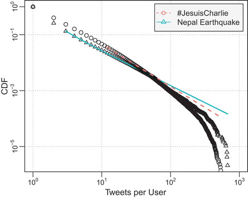
To focus on the overall trend of information diffusion, potential noise including Twitterbots and overly active users were filtered from the dataset. A Twitterbot produces automated posts or automatically follows other Twitter user accounts. Previous studies (Chu et al. Citation2012; Stringhini, Kruegel, and Vigna Citation2010) on detecting Twitterbots have provided some starting points but this remains to be a significant challenge in social network research working with social media. We analyzed the source attribute of the post and removed tweets that were not posted via the official Twitter mobile applications or from the Twitter website to filter out potential Twitterbots that might be programmed by third-party clients. Users who generate a large number of topic-related tweets are considered as overly active users and can possibly be Twitterbots as well. The overall distributions of user-tweet counts for both topics show a long tail indicating some users contributing a very high number of topic-related tweets, which aligns well with the identified common characteristic of Twitter data (Asur and Huberman Citation2010; Longley and Adnan Citation2016). We are more interested in the general patterns of diffusion instead of the extreme cases, thus users with post counts above the 90th percentile of posting frequencies are removed. The 90th percentile for the NE topic is 676.2 tweets and the 90th percentile for the JC topic is 543.3 tweets. ) shows the Empirical Cumulative Distribution Function (ECDF) of both topics after data filtering, and ) plots the user counts by tweets of both topics. Although there are some users with a large number of tweets in the NE dataset, the majority of users contributing to this topic tweeted less when compared to the JC dataset. When fitting the CDF of tweet per user to power law distribution, the NE dataset shows overall better fitting according to the Kolmogorov-Smirnov (KS) test. indicates the fitted power law distributions with an exponent of 2.22 for the JC dataset and an exponent of 2.5 for the NE dataset.
Figure 1. Distribution of tweets per user and user counts by tweets after filtering potential Twitterbots and overly active users. The red line in both charts represents the JC dataset and the green line represents the NE dataset.
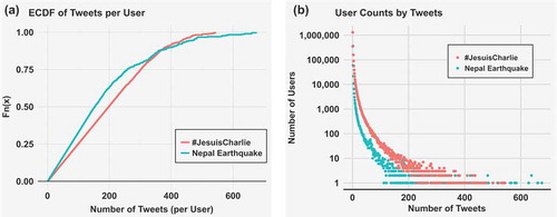
Figure 2. Plots of CDFs and Power Law best fit lines after noise filtering. The lines indicate the best fit Power Law of the dataset. The red line represents the JC dataset fitting with α of 2.22; and the green line represents the NE dataset fitting with α of 2.5.
3.4. Representing conversation aspects
In addition to the number of geotagged responses (Geo) about a topic, there are several other aspects of the conversation that can be retrieved to represent different types of response to the two topics in urban areas. The numbers of Unique Users (UU) represents the number of users that responded to this topic (Kryvasheyeu et al. Citation2016), and the average number of posts by unique users (Post-User) can be treated as the intensity of engagement from the users. Retweeting activities have been used in Twitter-based diffusion studies as the indicator of diffusion (Yang and Counts Citation2010; Suh et al. Citation2010), and thus the total number of retweets (RT) and non-retweets (noRT) are included. Tweets with URLs (URL) may have higher credibility (Duan et al. Citation2010) or spur more retweets (Suh et al. Citation2010); however, tweets without URLs (noURL) may correlate better with real-world events such as influenza outbreaks (Nagel et al. Citation2013; Aslam et al. Citation2014). For each city and MSA, active users within the region were filtered and thus a set of advanced filtered features can be used (Filt_noRT, Filt_noURL, and Filt_All). Furthermore, these chosen statistical variables were normalized by the number of unique users to generate an additional five variables (noRT_UU, URL_UU, noURL_UU, Filt_noRT_UU, and Filt_noURL_UU). In addition to Post-User, four derived variables are selected including the percentage of non-retweets (noRT%), the percentage of tweets without URL (noURL%), and the normalization by unique users of these two (noRT_UU% and noURL_UU%). These 19 statistical features give us an overview of the responses from the study region.
3.5. Measuring similarity by response behavior over time
Adding the temporal dimension, we analyze diffusion for each region by measuring the frequency of responses over time using two measurements: (1) the frequency of social media postings related to a topic, and (2) the number of unique social media users accounted for in these posting. These two measurements were represented by two Diffusion Rate Indexes (DRI).
Diffusion Rate Index by Posting Frequency (DRIp): DRIp considers the frequency of social media posts about a topic as the indicator of diffusion. It represents the intensity of information diffusion in a given area. Within a time frame, the diffusion rate of a given topic at a region is the ratio of the frequency of topic-related posts (Postt) to the average frequency of posts at the same temporal resolution (AvgPostt).
Diffusion Rate Index by Unique Social Media Users (DRIu): DRIu considers the increase of social media users who had topic-related posts as an indicator of information being more diffused. It represents the number of users in the region that are aware of the information. Within a time frame, the diffusion rate of a given topic at a region is the ratio of unique users who had topic-related posts (Usert) to the average number of unique users during the same time frame (AvgUsert).
In this study, the values of AvgPostt and AvgUsert were derived by monitoring the baseline behavior of geotagged posts in each study region. Calculating DRIp and DRIu over time generates time series observations for each region, which we used to analyze whether regions show similar diffusion patterns in response to the same topic. It’s worth notice that the distance metrics should be selected based on the aspect of diffusion patterns that are being studied. If responses happen at the same temporal time points, Euclidian distance and other correlation-based distance may offer the differences of the diffusion magnitude. However, regions may respond to information differently and at different temporal intensity, thus we formalize dissimilarity of response behavior with four distance metrics that focus on the overall pattern and better account for the time skew in the time series data: Dynamic Time-Warping (DTW) (Berndt and Clifford Citation1994), Earth Mover’s Distance (EMD) (Rubner, Tomasi, and Guibas Citation1998), Fréchet Distance (FD) (Alt and Godau Citation1995), and Hausdorff Distance (HD) (Huttenlocher, Klanderman, and Rucklidge Citation1993).
4. Results
4.1. Baseline behavior of posts and users in urban regions
Baseline behavior for each region was established to properly normalize the responses of each geographic region and create the two DRI measurements. We first examined the posting and user behavior in the baseline dataset with multiple temporal resolutions to see if they correspond with the daily activity (commuting and work) and the capability constraints (sleep and eat) at local time.
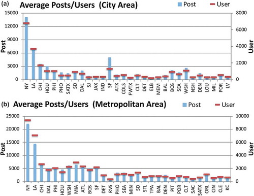
Daily activity: Among the top 30 cities, the average number of posts drops as the population of the city decreases. ) indicates the daily average of posts/user behavior in the top U.S. cities. However, several cities stand out with much higher average posts comparing to the equivalent rank cities. For example, San Francisco is ranked 13th by population but its daily average post number is between Los Angeles (2nd) and Chicago (3rd). Boston, Seattle, and especially Washington are lower ranked cities but are in fact very active in tweeting behavior. The daily average numbers of unique users showed a similar trend to the average posts for the cities. San Francisco has the largest difference between the two measurements, which means that San Francisco has a higher post per user behavior than all the other cities. ) indicates the daily average of posts/user behavior in MSA areas. Several MSAs stand out from the trend, such as Miami, San Diego, and Orlando, showing higher activity than MSAs with similar populations. Riverside has the lowest daily average post and the lowest unique users while being ranked 13th by population. These MSAs suggest that there are other factors affecting their baseline behavior, such as (a) Riverside is one of the satellite regions of the greater Los Angeles metropolitan areas where many residents commute and work at the Los Angeles MSA on a daily basis; or (b) Miami, San Diego, and Orlando are popular tourist destinations so additional posts could be contributed by tourists instead of residents. San Francisco, by comparing its behavior across city and MSA, presents a very interesting case where its city area is relatively small but has most of the tweeting behavior of the whole MSA.
Figure 3. Average posts/user behavior in the top 30 U.S. populated cities and MSAs. In both sub-figures, the x-axis represents the list of urban regions descending by population from left to right. The first y-axis on the left represents the average number of posts, with its value shown as blue. The secondary y-axis is for the average user behavior with value indicated by red horizontal bars.
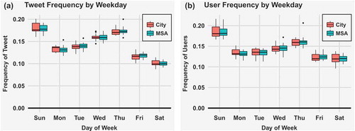
Activity by day of the week: The cyclical temporal patterns of weekday behavior and hourly behavior are also similar across the two urban types. ) shows a boxplot of average tweet frequency by weekday in our study regions. Both urban types show the same patterns, with the highest post frequency on Sundays and the lowest on Saturdays. However, the variances between regions are much higher among the cities than among the MSAs, especially on Sundays. As shown in ), the order of user frequency by weekday is exactly the same as the tweet frequency. However, the figure shows that there is a higher variation of user frequency over the weekends for cities than MSAs. This is possibly because several cities have only a small portion of residential areas, and thus the commuting population is not tweeting in those city areas during weekends.
Figure 4. Twitter activity by day of the week. The red boxes represent activity of the top 30 U.S. populated cities, and activities for the MSAs are shown by blue boxes.
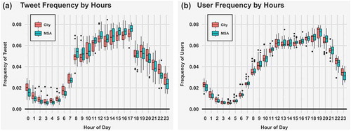
Hourly activity: Tweet frequency and user frequency act similarly for cities and MSAs when posts and number of unique users are aggregated to the hourly temporal resolutions. ) indicates the baseline post frequency behavior in the urban areas by hours of the day. The behavior is consistent in both urban types, which basically follow the human daily activity patterns with three time blocks: (a) people wake up in the morning and activities increase throughout the day, (b) activities decrease after getting off work followed by a steady decline during the night, and (c) activity reaches the lowest during the mid-night hours when most people are sleeping. One significant difference between the two urban types is that the posting frequency varies more among cities at night. In addition, cities have a higher portion of nighttime activities and nighttime activities decline slower than for the MSAs. The baseline behavior of total unique users by hours are very similar between cities and MSAs ()). There are large increases in the early morning (7 AM to 8 AM), and large decreases during evening commuting hours (5 PM to 6 PM), which can be interpreted as: (a) users tend to post multiple tweets early in the morning and (b) the evening commute is the least favored time for posting multiple tweets.
Figure 5. Hourly tweet and user activity in top U.S. populated regions. The red boxes represent activity of the top 30 U.S. populated cities, and activities for the MSAs are shown by blue boxes.
4.2. Spatial patterns of the topic dataset
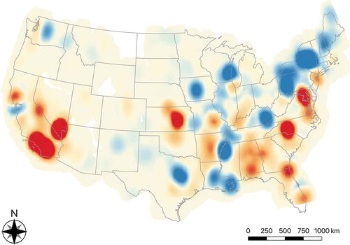
The point distribution of geotagged tweets for both topics generally follow the population distribution patterns in the U.S. A closer look, however, reveals some variation across the two topics. Geotagged tweets for each topic were then mapped into distribution heatmaps using Kernel Density Estimation (KDE), which calculates the density of features in a neighborhood around those features. In addition, when multiple heatmaps apply the same radius and total numbers of cells for calculating the KDE, a differential information landscape map (Tsou et al. Citation2013) can be created to illustrate the geospatial fingerprints of the two topics in different regions of the U.S., as shown in . The intensity of the differential values is visualized by the shading of the red/blue color, where red indicates more attention to the NE topic than to the JC topic in the region and blue indicates the opposite. On the West coast, responses to the NE topic were significantly higher in Southern California compared to the other topic. In general, the East coast shows a slightly more evenly distributed pattern of the conversation hot spots, while the NE hot spots dominated the South-East regions, changing to the JC topic in the states closer to the Canadian border and New Orleans where most French-speaking population resides. Conversations about the two study topics were then spatially aggregated into the two urban area types and compared to the population of each selected region. The total counts of responses to both topics are highly correlated to the population in the urban regions. The Pearson’s correlation coefficients are high for the NE topic (city: 0.76 & MSA: 0.82) and for the JC topic (0.89 & 0.92).
Figure 6. Differential information landscape map of geotagged tweets for two topics; red indicates more Nepal Earthquake attention than #JesuisCharlie; blue indicates more #JesuisCharlie than Nepal Earthquake.
4.3. Diffusion patterns for the top U.S. populated urban areas
4.3.1. Feature reduction and classification of urban areas
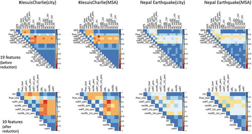
The 19 statistical features calculated from the topic dataset were normalized by the tweeting behavior established from the baseline dataset. We then analyze the correlations of these statistical features and remove the highly correlated ones. This is important as highly correlated features may provide very similar information about the phenomenon under study. Including these features in the analysis may place extra weight on specific features and thus impact the overall results. shows the correlation matrixes before and after the step of variable reduction. The first row is the correlation matrix of all 19 statistical variables for both topics and for both urban types. After variable reduction, 10 out of 19 statistical variables were preserved for analyzing the diffusion similarity among the study regions, including 5 count-based features (UU, RT, URL, noRT, noURL) and 5 derived features (Post_User, noRT%, noURL%, noRT_UU%, noURL_UU%). We implemented multidimensional scaling (MDS) with the 10 remaining variables to analyze and visualize the similarities among urban regions. These variables represent different aspects of the twitter responses and each of them was used as one dimension in the MDS. Furthermore, the 30 cities and MSAs were separately grouped into four classes using Jenks’ Natural Breaks method to examine whether the size of the urban regions impacts their response similarities. Often used in GIS, this method tries to reduce the within-class variance and maximize the variance among classes. We apply Jenks’ Natural Breaks classification method to group the study regions by population, population density, and GDP (MSAs only). The classification of cities and MSAs was used as an additional aspect in the MDS graphs. The next step was to analyze the similarities among the urban regions with MDS, which utilized visualizations of multivariate data points in a two-dimensional space.
Figure 7. Correlation matrix of the statistical features. First row: correlation matrix of all features before reduction (19 features); Second row: showing all features after reduction (10 features).
4.3.2. Similarity among urban regions
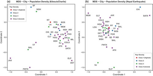
Top 30 U.S. cities: shows the MDS results with colors indicating the population classes. Overall, one major cluster can be found across both topics, where class members included a mixture of cities from all four population classes. For both topics, New York and Los Angeles are very close in MDS distance, which means that they behave more similarly based on the 10 aspects of responses to the two topics than other cities. Cities that responded differently than others are Fort Worth and Jacksonville, both positioned further away from the cluster in both topics. Washington and San Francisco form another very similar set across the response to both topics. However, this pair is distant from the main cluster in the JC topic, while being right at the center in the NE topic. Overall, cities in class 2 and class 3 seemed to be more similar to other within-class cities, which is not true for the lowest class 4. In , point colors are changed to represent the population density classes. For the JC topic, cities of the lower classes (class 3 and class 4) are scattered in the MDS graph. Although the class 1 city and class 2 cities are relatively closer to each other, they are less similar than the MDS using population. Population density explains very well the cluster of class 3, in which cities are very similar besides San Jose. This is also true for class 2 with only Chicago being dissimilar to most cities.
Figure 8. Multidimensional scaling of the top 30 U.S. cities; color indicates population class of each urban region.
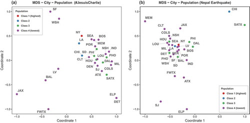
Figure 9. Multidimensional scaling of the top 30 U.S. cities; color indicates population density class of each urban region.
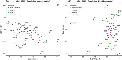
Top 30 U.S. MSA: depicts the MDS of twitter response behavior of the top 30 U.S. MSAs to both topics, where the color of the points indicates the population class of the MSAs. For the JC topic, a loose cluster formed by lower populated MSAs (class 4) can be seen in the center. Around that cluster, higher populated MSAs (class 1 and 2) are nearby with class 3 MSAs scattered further away from the cluster. For the NE topic, class 3 and class 4 MSAs create two clusters. Among the higher classes, New York and Los Angeles are very similar in terms of their responses to both topics although in different classes. Chicago is more similar to them in the JC topic while being far away from the cluster for the NE topic. Another interesting MSA is Washington, which is classified as class 3 but is actually more similar to New York and Los Angeles than to other MSAs of its class.
Figure 10. Multidimensional scaling of the top 30 U.S. MSAs; color indicates population class of each urban region.
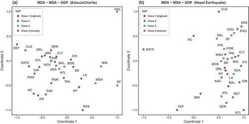
Switching from population to population density () better explains the closeness within classes. New York and Los Angeles form the only MSAs in class 1 and show very high similarity in term of their response behavior to the two topics. More MSAs are included in class 2 and three out of four MSAs are relatively similar in both topics. Lower density classes (class 3 and 4) also benefit from the use of population density. The main cluster formed by class 4 in the JC topic is denser than before, and the class 3 MSAs are also more concentrated at both topics. While several MSAs switched classes in the case of grouping by GDP (), the across-classes patterns in the MDS did not change significantly from the two population-based MDS results. One significant change is that class 3 MSAs are more separated from class 4 MSAs and starting to form the second cluster, which is happening in the NE topic as the distances among class 3 MSAs are shrinking.
Figure 11. Multidimensional scaling of the top 30 U.S. MSAs; color indicates population density class of each urban region.
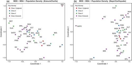
Figure 12. Multidimensional scaling of the top 30 U.S. MSAs; color indicates GDP class of each urban region.
4.3.3. Within-class similarity
The MDS visualizations demonstrate the similarity among urban regions based on multiple aspects of their twitter responses to the topic. The next step is to examine whether the response behavior of these regions over time reflects the urban hierarchy. We focus on whether urban regions that are categorized in the same class respond similarly to a topic over time. The two diffusion indexes (DRIp and DRIu) were calculated for each region as time series data, and then pairwise distances among the regions are created using the four selected distance metrics. To examine within-class regions similarity, two mean metrics are created:
Within-class mean: The mean of pairwise distances between all regions in each class.
Random sample mean: The mean of pairwise distances between 10 random samples picked from all regions. Calculated for 1000 iterations.
The combinations of two topics, three class types (population, population density, and GDP for MSAs), and four region classes (class 1 to class 4) resulted in 16 within-class mean/random sample mean pairs for cities and 24 pairs for MSAs. For each pair, we checked if the within-class mean was smaller than the random sample mean. In the cases where the within-class mean is smaller, the response behaviors over time are interpreted as more similar among the urban regions classified in the same class. indicates the comparative results for cities and shows the results for MSAs. Note that besides the population density class for MSAs, the other class 1 comparison is tagged as NA, as there was only one region alone in that class so the within-class mean cannot be calculated.
Figure 13. Comparison of within-class city similarity to random sampled city similarity. Red indicates that within-class mean is smaller than random sampled mean more than 800 times out of the 1000 iterations.
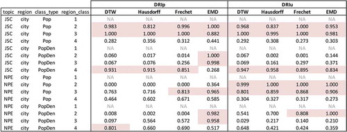
Figure 14. Comparing within-class MSA similarity to random sampling MSA similarity. Red indicates that within-class mean is smaller than random sampled mean in more than 800 times out of the 1000 iterations.
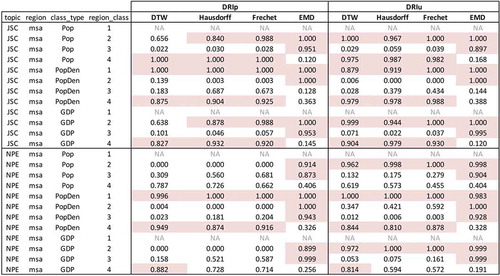
DRIp and DRIu as a Diffusion Index: When it comes to representing the response behavior over time, the differences are not very significant using either DRIp or DRIu. However, DRIu seems to work better as it results in more within-class similarity than DRIp. Especially for the MSAs, DRIu contributes to more cases where the within-class mean is smaller than the random sample mean. For example, MSAs in the highest region class (excluding NA) are always more similar than random samples. In addition, representing regions with DRIu also makes the within-class similarity more stable across the four selected distance metrics.
Distance Metrics for Region Similarity: Among the four distance metrics, EMD performs the best in terms of showing the within-class similarity. EMD works well with DRIp for the cities, and especially for higher region classes (class 2 and class 3) as 7 of the 8 classes have smaller means than random. The same finding holds true for the MSAs, where MSAs belonging to the two higher region classes have very similar response behavior over time with both DRIp and DRIu (24 out of 24 region classes). The rest of the three distance metrics do not support finding within-class similarity in most cases as EMD does. However, the four distance metrics are in agreement in places including cities by population (class 2 and class 3 with DRIu) and MSAs of the highest region classes with DRIu (class 2 of population, class 1 of population density, and class 2 of GDP). Another interesting finding is that more agreements can be found among the distance metrics in either the highest region class (class 1 or 2) or the lowest region class (class 4), especially with DRIu.
5. Discussion and future work
In this research the relationship between information diffusion patterns and the urban hierarchy has been explored. We assumed that the diffusion of information can be captured by the response behavior of an urban region and hypothesized that this behavior is related to the region’s position in the urban hierarchy. We presented a research framework for analyzing diffusion with the urban hierarchy that demonstrated procedures of data collection and filtering, establishing and examining baseline behavior, engineering conversation features, and analyzing diffusion patterns of selected topics at urban regions. Social media postings from Twitter about two topics during 2015: Nepal earthquake and #JesuisCharlie are collected for the top 30 populated cities and the top 30 populated metropolitan areas (MSA) in the U.S. We first examined the baseline behavior and then analyzed the similarity of how urban regions responded to the Twitter information.
The regional baseline behavior showed that cities and MSAs show very similar posting and unique users activity behavior patterns in both daily (day of the week) and hourly (hour of the day) temporal resolutions. In addition, the baseline hourly tweeting activity aligns well with human daily activity patterns known as the capability constraint. Overall, the average number of posts and unique users from each city and MSA gradually decreased as the regional population decreased. We introduced 19 variables to represent different aspects of communication on the Twitter platform, including personal opinions, echoing other messages, and references to external sources. We used Multidimensional Scaling (MDS) to analyze the similarities among urban regions with three urban variables (population, population density, and GDP for MSAs). For the top 30 U.S. cities, population seems to be the better variable to explain the similar response behavior. However, population density exceeds the other two variables for the MSAs. The results also showed that: (1) some regions have very different interests in the two study topics, such as Chicago; (2) New York and Los Angeles are very similar in both topics and in both city and MSA scale; and (3) although Washington D.C. and San Francisco are not really close to Los Angeles/New York in the urban hierarchy by all three classification variables (population, population density, and GDP), they are the most similar urban regions to them in terms of their Twitter responses to new information. These cases suggest future work should examine other factors that influence the diffusion of information. For instance, how connected a region is to the others, or further examine why a region is specifically interested in the given topics.
We introduced Two Diffusion rate Indexes (DRI) to analyze the twitter response from urban regions to a new topic over time. To formalize the dissimilarity among the response behavior, four distance metrics were designed to compare the cities. As a result, cities that are classified in the same class by population are very likely to share similar response behavior over time, especially for the higher populated cities at the top of the urban hierarchy. For the MSAs, the within-class similarity is shown in the highest and lowest classes in all classification variables. Overall, the diffusion rate index with unique users (DRIu) is the better measurement to analyze response behavior over time. Earth Mover’s Distance (EMD), among the four distance metrics, has the best performance when comparing within-class region similarities to random sampling region similarities. Furthermore, the MSA is more suitable than the city to demonstrate the impact of the urban hierarchy on the diffusion of information. MSAs in the same class have higher chances of responding similarly to new information to twitter over time.
Three limitations of this study merit acknowledgment. First, the framework was demonstrated with geotagged tweets that could be a fraction of the whole conversation population on Twitter. The framework can be applied to non-geotagged posts as well if some geocoding algorithms are involved to assign proper locations to enrich the location information of each post. Although the often short and noisy text content remains to be the main challenge of geocoding tweets (Zheng, Han, and Sun Citation2018), efforts have been made in this domain to infer the location of the social media users with help of user profiles (Hecht et al. Citation2011), with text content and timestamp (Li et al. Citation2011), and with models that combine multiple components (Mahmud, Nichols, and Drews Citation2012; Rodrigues et al. Citation2013; Ghahremanlou, Sherchan, and Thom Citation2014; Miura et al. Citation2017). In addition, future works applying this proposed framework using data other than tweets would also need to reconstruct the 19 conversation variables to represent their selected data source. Second, the diffusion patterns that we discovered is based on the 19 variables generated by raw and derived counts of the tweets to represent different aspects of communication. It would be interesting to add variables that carry the context of communication such as the sentiment of posts or other features from the Natural Language Processing (NLP) of text. In addition, this research removed high correlation variables for the MDS and other feature reduction methods such as random forest and PCA could be applied when more conversation variables are included. Third, the spatiotemporal diffusion patterns and their relation to the three urban hierarchies are the results of the two selected information topics and defined keywords. Applying the research framework to examine the spatial and temporal diffusion patterns of more topics would make the findings more general.
Summing up, this research used two types of urban hierarchy, cities and MSAs, to study information diffusion over time. The results show that the urban hierarchy does impact the diffusion of information in virtual space with diffusion channel such as Twitter. Such an impact is rooted in the higher similarity of the response behavior among regions when they are positioned closer in the urban hierarchy. This is especially significant when the urban regions are at the top of the urban hierarchy. Future research will involve expanding the dataset to include additional topics that represent the variety of information each region is exposed to, and other forms of social media. Another direction is related to constructing the urban hierarchy, which involves expanding the numbers of regions to build a more complete urban hierarchy or introducing other metrics that can rank cities and regions differently. Other possible indexes can include the Creative City Index (Hartley et al. Citation2012) or the economic performance and network connectivity of cities (Pain et al. Citation2015). The hierarchy of political importance in the country may also be important, as Washington, D.C. clearly stands out in this research. Furthermore, to better estimate the responses from local residents in each region, future work should separate tourists from locals using user profiles, past geotagged post locations, or content of the historical posts of the user. Moreover, future research that utilizes global topics as in this study can also analyze the worldwide spatiotemporal diffusion and investigate the role of time zone delay in response behavior. While the studied cities and MSAs have very similar baseline behavior, some responded very differently to the two topics. This aligns with the argument of the local nature of information and the role of space and place can facilitate the social engagement from the Physical-Cyber-Social point of view (Sheth, Anantharam, and Henson Citation2013). The potential differences in social, cultural, religious, and economic characteristics among these urban regions might provide insights into the dissimilarity in their responding behaviors. We would like to explore the theory and mechanism behind those differences in follow-up studies. Lastly, we also suggest future research to examine the patterns of diffusion at different spatial resolutions. While this study is specifically interested in diffusion at aggregated regions, future research can utilize the fine-grained spatial data to identify the types of location that diffusion would most likely take place or to analyze the Neighborhood Effects (Hägerstrand Citation1967) in diffusion across nearby regions.
Additional information
Notes on contributors
Jiue-An Yang
Jiue-An Yang earned his PhD in Geography from the San Diego State University/University of California, Santa Barbara. He is currently a postdoctoral research scientist at the Center for Wireless and Population Health Systems (CWPHS) and the Qualcomm Institute (QI) of University of California, San Diego. His research interests include information diffusion in cyberspace, geospatial perspectives of personal and public health, spatiotemporal analysis of big geo-data, and geospatial artificial intelligence.
Ming-Hsiang Tsou
Ming-Hsiang Tsou is a Professor of Geography and the Director of the Center for Human Dynamics in the Mobile Age at San Diego State University. He received a Ph.D. (2001) in Geography from the University of Colorado at Boulder. His research interests are in Big Data, Human Dynamics, Social Media, Cancer Disparity, Visualization, Web GIS, and Cartography. He has published one academic book (Internet GIS) and over 76 refereed academic papers. Dr. Tsou led on multiple NSF projects as PIs or Co-PIs (over $4 million awards since 2010) and served on the editorial boards of the Annals of GIS, Cartography and GIScience, and the Professional Geographers.
Krzysztof Janowicz
Krzysztof Janowicz earned his PhD in Geoinformatics from the University of Muenster, Germany. He is currently an associate professor at the University of California, Santa Barbara and associate director of the center for spatial studies. His research interest include knowledge graphs, geosemantics, geographic information retrieval, and cyberinfrastructure. He has (co)-authored over 200 scientific publications, including a book on internet security.
Keith C. Clarke
Keith C. Clarke is a research cartographer and professor, with the M.A. and PhD from the University of Michigan, specializing in Analytical Cartography. His research covers environmental simulation modeling, modeling urban growth, terrain mapping and analysis, and visualization. He is the author of three textbooks in eight editions, and about 300 book chapters, journal articles, and papers in the fields of cartography, remote sensing, and geographic information systems. He was elected an AAAS Fellow in 2017.
Piotr Jankowski
Piotr Jankowski earned his PhD from the University of Washington. He is currently a professor and chair of the Department of Geography at San Diego State University. His research focuses on spatial decision support systems, participatory geographic information systems, and sensitivity analysis in spatial models. He is an author of over 100 peer-reviewed journal papers and the co-author of two books: Geographic Information Systems for Group Decision Making and GIS for Urban and Regional Environments: A Spatial Decision Support Approach.
Notes
1. Not to mix up with the term feature in Cartography and GIS; the use of feature in this article refers to statistical variables.
2. Keywords of the Nepal Earthquake topic: #NepalQuake, #NepalEarthQuake, #Nepal, #EarthQuakeAgain, #EarthQuake, #NEPQuake, #BeSafe, #EarthQuakeInNepal, #NepalEarthQuake2015, #Kathmandu, #WeStandNepal, #KathmanduQuake, #HoldOnToHope, #Everest, #EverestBaseCamp, #EqNp, #EqResponseNp, #EqImpactNp, #EqNeedNp, #SafeEq.
References
- Alperin, J. P., C. J. Gomez, and S. Haustein. 2019. “Identifying Diffusion Patterns of Research Articles on Twitter: A Case Study of Online Engagement with Open Access Articles.” Public Understanding of Science 28 (1): 2–18. doi:10.1177/0963662518761733.
- Alt, H., and M. Godau. 1995. “Computing the Fréchet Distance between Two Polygonal Curves.” International Journal of Computational Geometry & Applications 05 (01n02): 75–91. doi:10.1142/S0218195995000064.
- Aslam, A. A., M.-H. Tsou, B. H. Spitzberg, A. Li, J. M. Gawron, D. K. Gupta, K. M. Peddecord, et al. 2014. “The Reliability of Tweets as a Supplementary Method of Seasonal Influenza Surveillance.” Journal of Medical Internet Research 16 (11): e250. doi:10.2196/jmir.3532.
- Asur, S., and B. A. Huberman. 2010. “Predicting the Future with Social Media.” In 2010 IEEE/WIC/ACM International Conference on Web Intelligence and Intelligent Agent Technology (WI-IAT), Toronto, Canada, August 31–September 3.
- Aubert, B. A., and G. Hamel. 2001. “Adoption of Smart Cards in the Medical Sector: The Canadian Experience.” Social Science & Medicine 53 (7): 879–894. doi:10.1016/S0277-9536(00)00388-9.
- Bakshy, E., J. M. Hofman, W. A. Mason, and D. J. Watts. 2011. “Everyone’s an Influencer: Quantifying Influence on Twitter.” In Proceedings of the Fourth ACM International Conference on Web Search and Data Mining, Hong Kong, February 9–12.
- Banerjee, A., A. G. Chandrasekhar, E. Duflo, and M. O. Jackson. 2013. “The Diffusion of Microfinance.” Science 341: 1236498. doi:10.1126/science.1236498.
- Berndt, D., and J. Clifford. 1994. “Using Dynamic Time Warping to Find Patterns in Time Series.” In 3rd International Conference on Knowledge Discovery and Data Mining, Seattle, WA, July 31–August 01 citeulike-article-id:7234780.
- Bovet, A., and H. A. Makse. 2019. “Influence of Fake News in Twitter during the 2016 US Presidential Election.” Nature Communications 10 (1): 7. doi:10.1038/s41467-018-07761-2.
- Cairncross, F. 1997. The Death of Distance: How the Communications Revolution Will Change Our Lives. Boston, MA: Harvard Business School Press.
- Cha, M., H. Haddadi, F. Benevenuto, and P. K. Gummadi. 2010. “Measuring User Influence in Twitter: The Million Follower Fallacy.” In The 4th International Conference on Weblogs and Social Media (ICWSM), George Washington University, Washington, May 23–26.
- Chu, Z., S. Gianvecchio, H. Wang, and S. Jajodia. 2012. “Detecting Automation of Twitter Accounts: Are You a Human, Bot, or Cyborg?” IEEE Transactions on Dependable and Secure Computing 9 (6): 811–824. doi:10.1109/TDSC.2012.75.
- Coleman, J. S., E. Katz, and H. Menzel. 1966. “Medical Innovation: A Diffusion Study.” American Journal of Sociology 73 (4): 520–521. doi:10.1086/224515.
- Deutschmann, P. J., and W. A. Danielson. 1960. “Diffusion of Knowledge of the Major News Story.” Journalism & Mass Communication Quarterly 37 (3): 345–355. doi:10.1177/107769906003700301.
- Duan, Y., L. Jiang, T. Qin, M. Zhou, and H.-Y. Shum. 2010. “An Empirical Study on Learning to Rank of Tweets.” In Proceedings of the 23rd International Conference on Computational Linguistics, Beijing, China, August 23–27.
- Ferrara, E., O. Varol, C. Davis, F. Menczer, and A. Flammini. 2016. “The Rise of Social Bots.” Communication of the ACM 59 (7): 96–104. doi:10.1145/2818717.
- Frank, K. A., Y. Zhao, and K. Borman. 2004. “Social Capital and the Diffusion of Innovations within Organizations: The Case of Computer Technology in Schools.” Sociology of Education 77 (2): 148–171. doi:10.1177/003804070407700203.
- Ghahremanlou, L., W. Sherchan, and J. A. Thom. 2014. “Geotagging Twitter Messages in Crisis Management.” The Computer Journal 58 (9): 1937–1954. doi:10.1093/comjnl/bxu034.
- Goldenberg, J., B. Libai, and E. Muller. 2001. “Talk of the Network: A Complex Systems Look at the Underlying Process of Word-Of-Mouth.” Marketing Letters 12 (3): 211–223. doi:10.1023/A:1011122126881.
- Goodchild, M. F. 1992. “Geographical Information Science.” International Journal of Geographical Information Systems 6 (1): 31–45. doi:10.1080/02693799208901893.
- Graham, T. 1829. “A Short Account of Experimental Researches on the Diffusion of Gases through Each Other, and Their Separation by Mechanical Means.” Quarterly Journal of Science, Literature and Art 27: 74–83.
- Granovetter, M. 1978. “Threshold Models of Collective Behavior.” American Journal of Sociology 83 (6): 1420–1443. doi:10.1086/226707.
- Grinberg, N., K. Joseph, L. Friedland, B. Swire-Thompson, and D. Lazer. 2019. “Fake News on Twitter during the 2016 U.S. Presidential Election.” Science 363 (6425): 374–378. doi:10.1126/science.aau2706.
- Gross, N. 1949. “The Differential Characteristics of Accepters and Non-Accepters of an Approved Agricultural Technological Practice.” Rural Sociology 14 (2): 148.
- Gross, N., and M. J. Taves. 1952. “Characteristics Associated with Acceptance of Recommended Practices.” Rural Sociology 17 (1): 321.
- Hägerstrand, T. 1966. “Aspects of the Spatial Structure of Social Communication and the Diffusion of Information.” Regional Science 16 (1): 27–42. doi:10.1111/j.1435-5597.1966.tb01326.x.
- Hägerstrand, T. 1967. Innovation Diffusion as a Spatial Process. Chicago, IL: University of Chicago Press.
- Hartley, J., J. Potts, T. MacDonald, C. Erkunt, and C. Kufleitner. 2012. “Creative City Index.” Cultural Science Journal 5 (1). doi:10.5334/csci.41.
- Hecht, B., L. Hong, B. Suh, and E. H. Chi. 2011. “Tweets from Justin Bieber’s Heart: The Dynamics of the Location Field in User Profiles.” In Proceedings of the ACM SIGCHI Conference on Human Factors in Computing Systems. Vancouver, BC, May 7–12.
- Huttenlocher, D. P., G. A. Klanderman, and W. A. Rucklidge. 1993. “Comparing Images Using the Hausdorff Distance.” IEEE Transactions on Pattern Analysis and Machine Intelligence 15 (9): 850–863. doi:10.1109/34.232073.
- Kaplan, A. M., and M. Haenlein. 2010. “Users of the World, Unite! the Challenges and Opportunities of Social Media.” Business Horizons 53 (1): 59–68. doi:10.1016/j.bushor.2009.09.003.
- Kietzmann, J. H., K. Hermkens, I. P. McCarthy, and B. S. Silvestre. 2011. “Social Media? Get Serious! Understanding the Functional Building Blocks of Social Media.” Business Horizons 54 (3): 241–251. doi:10.1016/j.bushor.2011.01.005.
- Kossinets, G., and D. J. Watts. 2006. “Empirical Analysis of an Evolving Social Network.” Science (New York, N.Y.) 311 (5757): 88–90. doi:10.1126/science.1116869.
- Kryvasheyeu, Y., H. Chen, N. Obradovich, E. Moro, P. Van Hentenryck, J. Fowler, and M. Cebrian. 2016. “Rapid Assessment of Disaster Damage Using Social Media Activity.” Science Advances 2 (3). doi:10.1126/sciadv.1600375.
- Kwak, H., C. Lee, H. Park, and S. Moon. 2010. “What Is Twitter, a Social Network or a News Media?” In Proceedings of the 19th International Conference on World Wide Web, Raleigh, North Carolina, USA, April 26–30.
- Lazer, D., A. Pentland, L. Adamic, S. Aral, A.-L. Barabási, D. Brewer, N. Christakis, et al. 2009. “Computational Social Science.” Science 323 (5915): 721–723. doi:10.1126/science.1167742.
- Leetaru, K., S. Wang, G. Cao, A. Padmanabhan, and E. Shook. 2013. “Mapping the Global Twitter Heartbeat: The Geography of Twitter.” First Monday 18 (5). doi:10.5210/fm.v18i5.4366.
- Lewis, K., J. Kaufman, M. Gonzalez, A. Wimmer, and N. Christakis. 2008. “Tastes, Ties, and Time: A New Social Network Dataset Using Facebook.Com.” Social Networks 30 (4): 330–342. doi:10.1016/j.socnet.2008.07.002.
- Li, W., P. Serdyukov, A. P. de Vries, C. Eickhoff, and M. Larson. 2011. “The Where in the Tweet.” In Proceedings of the 20th ACM International Conference on Information and Knowledge Management, Glasgow, Scotland, UK, October 24–28. doi:10.1145/2063576.2063995.
- Longley, P. A., and M. Adnan. 2016. “Geo-Temporal Twitter Demographics.” International Journal of Geographical Information Science 30 (2): 369–389. doi:10.1080/13658816.2015.1089441.
- Mahmud, J., J. Nichols, and C. Drews. 2012. “Where Is This Tweet From? Inferring Home Locations of Twitter Users.” In The Sixth International AAAI Conference on Weblogs and Social MediaIn ICWSM, Dublin, Ireland, June 4–7.
- McCormick, L. K., A. B. Steckler, and K. R. McLeroy. 1995. “Diffusion of Innovations in Schools: A Study of Adoption and Implementation of School-Based Tobacco Prevention Curricula.” American Journal of Health Promotion 9 (3): 210–219. doi:10.4278/0890-1171-9.3.210.
- Miura, Y., M. Taniguchi, T. Taniguchi, and T. Ohkuma. 2017. “Unifying Text, Metadata, and User Network Representations with a Neural Network for Geolocation Prediction.” In Proceedings of the 55th Annual Meeting of the Association for Computational Linguistics, Vancouver, Canada, July 30–August 4.
- Nagel, A. C., M.-H. Tsou, B. H. Spitzberg, L. An, J. M. Gawron, D. K. Gupta, J.-A. Yang, S. Han, K. M. Peddecord, and S. Lindsay. 2013. “The Complex Relationship of Realspace Events and Messages in Cyberspace: Case Study of Influenza and Pertussis Using Tweets.” Journal of Medical Internet Research 15 (10): e237. doi:10.2196/jmir.2705.
- Pain, K., G. Van Hamme, S. Vinciguerra, and Q. David. 2015. “Global Networks, Cities and Economic Performance: Observations from an Analysis of Cities in Europe and the USA.” Urban Studies 53 (6): 1137–1161. doi:10.1177/0042098015577303.
- Rodrigues, E., R. Assuncao, G. L. Pappa, R. Miranda, and W. Meira. 2013. “Uncovering the Location of Twitter Users.” In Intelligent Systems BRACIS 2013 -Brazilian Conference On Intelligent Systems. Fortaleza, Ceará, Brazil, October 19–24. doi:10.1109/BRACIS.2013.47.
- Romero, D. M., B. Meeder, and J. Kleinberg. 2011. “Differences in the Mechanics of Information Diffusion across Topics: Idioms, Political Hashtags, and Complex Contagion on Twitter.” In WWW’11 Proceedings of the 20th International Conference on World Wide Web, Hyderabad, India, March 28–April 01. doi:10.1145/1963405.1963503.
- Rubner, Y., C. Tomasi, and L. J. Guibas. 1998. “A Metric for Distributions with Applications to Image Databases.” In Proceedings of the Sixth International Conference on Computer Vision (ICCV ’98), Bombay, India, January 4–7.
- Ryan, B., and N. C. Gross. 1943. “The Diffusion of Hybrid Seed Corn in Two Iowa Communities.” Rural Sociology 8 (1): 15–24. https://doi.org/citeulike-article-id:1288385.
- Shao, C., G. L. Ciampaglia, O. Varol, K.-C. Yang, A. Flammini, and F. Menczer. 2018. “The Spread of Low-Credibility Content by Social Bots.” Nature Communications 9 (1): 4787. doi:10.1038/s41467-018-06930-7.
- Sheth, A., P. Anantharam, and C. Henson. 2013. “Physical-Cyber-Social Computing: An Early 21st Century Approach.” IEEE Intelligent Systems 28 (1): 78–82. doi:10.1109/MIS.2013.20.
- Stringhini, G., C. Kruegel, and G. Vigna. 2010. “Detecting Spammers on Social Networks.” In The 26th Annual Computer Security Applications Conference, Austin, Texas, USA, December 6–10.
- Suh, B., L. Hong, P. Pirolli, and E. H. Chi. 2010. “Want to Be Retweeted? Large Scale Analytics on Factors Impacting Retweet in Twitter Network.” In 2010 IEEE Second International Conference on Social Computing, Minneapolis, Minnesota, USA, August 20–22. doi:10.1109/SocialCom.2010.33.
- Tarde, G. 1897. L’opposition Universelle: Essai d’une Théorie Des Contraires. Paris: F. Alcan.
- Tsou, M.-H. 2015. “Research Challenges and Opportunities in Mapping Social Media and Big Data.” Cartography and Geographic Information Science 42 (sup1): 70–74. doi:10.1080/15230406.2015.1059251.
- Tsou, M.-H., J.-A. Yang, D. Lusher, S. Han, B. Spitzberg, J. M. Gawron, D. Gupta, and L. An. 2013. “Mapping Social Activities and Concepts with Social Media (twitter) and Web Search Engines (yahoo and Bing): A Case Study in 2012 US Presidential Election.” Cartography and Geographic Information Science 40 (4): 337–348. doi:10.1080/15230406.2013.799738.
- Vosoughi, S., D. Roy, and S. Aral. 2018. “The Spread of True and False News Online.” Science 359 (6380): 1146–1151. doi:10.1126/science.aap9559.
- Yang, J., and S. Counts. 2010. “Predicting the Speed, Scale, and Range of Information Diffusion in Twitter.” In The 4th International Conference on Weblogs and Social Media, Washington, DC, May 23–26.
- Zheng, X., J. Han, and A. Sun. 2018. “A Survey of Location Prediction on Twitter.” IEEE Transactions on Knowledge and Data Engineering 30 (9): 1652–1671. doi:10.1109/TKDE.2018.2807840.