
 ?Mathematical formulae have been encoded as MathML and are displayed in this HTML version using MathJax in order to improve their display. Uncheck the box to turn MathJax off. This feature requires Javascript. Click on a formula to zoom.
ABSTRACT
Most of the current existing accessibility measures quantify the potential of reaching desirable opportunities across space and time. Nevertheless, these potential measurements only illustrate the maximum possible accessibility a person can have, which may not accurately measure real-world transit accessibility in urban areas. This paper introduces a novel methodology to measure positive public transit accessibility based on multi-source big public transit data such as Smart Card Data (SCD) and Global Navigation Satellite System trajectory data, which embed rich travel information and real-world spatio-temporal constraints. First, we use multi-source transit data to reconstruct trip chains, which are used to extract popular destinations. A novel transit accessibility measure is defined to account for latent trip information such as mode/route preference, opportunity attraction, and travel impedance that are difficult to capture explicitly via traditional normative measures. Finally, we produce accessibility maps to visualize time-varying and heterogeneous accessibility patterns distributed over the study region. We performed an empirical evaluation on real-world transit data collected in Shenzhen City, China, demonstrating the applicability and effectiveness of the proposed method in mapping positive transit accessibility over large metropolitan areas. The results and findings of the empirical study demonstrate that the proposed positive accessibility measure can better capture travel behavior characteristics and constraints than traditional normative measures. The measurement method can be used as a practical high-resolution mapping tool for transit decision makers in evaluating public transit systems, supporting strategic transit planning, and improving daily transit management.
1. Introduction
In many metropolitan areas across the world, public transit services offer an affordable transportation option that enables regular citizens to access employment and various public services. Accessibility has long been used as an indicator to measure the quality of public transit services (Murray et al. Citation1998; Lei and Church Citation2010; Tribby and Zandbergen Citation2012; Benenson et al. Citation2017; Zhang et al. Citation2018; Zuo, Liu, and Fu Citation2020). With the advances of modern information technologies, it is possible to measure public transit accessibility at unprecedented high spatio-temporal resolutions. Nevertheless, most existing studies focus on the measurement of potential accessibility (i.e. normative or perceived measures) while neglecting actual travel behaviors, which can be measured by positive accessibility measures (Páez, Scott, and Morency Citation2012). Traditional normative accessibility measurements assume that individual passengers exhibit uniform travel behaviors across space and time, which does not hold in the real world. Normative measures evaluate how far a person can potentially reach whereas positive measures focus on actual travel behaviors and quantify actual capabilities or benefits of reaching specific opportunities via specific transportation systems. Traditional normative accessibility measures assume that a person can always reach desired opportunities and tend to oversimplify individual travel experience. As normative measures have been extensively used in transit planning studies and practices, positivistic measures are seldom implemented and used in the literature, despite their advantages in capturing actual accessibility patterns (Páez, Scott, and Morency Citation2012). While normative measures have long been used as a convenient tool to evaluate urban transit services by accounting for explicit and static elements such as locations of opportunities, transit layouts, and schedules, they lack the abilities to reflect latent factors that affect transit accessibility, such as personal preferences of travel mode, individual spatio-temporal constraints, and quality of transit services. When compared with traditional accessibility maps, positive measurement results can reveal particular accessibility issues that traditional normative measures cannot identify. The two types of measures combined can deliver a more holistic view of public transit accessibility than each alone.
Behavior-aware positivistic accessibility measurements are mostly based on travel survey data, and have the drawbacks of small sample sizes, short time spans, and high per-respondent cost. The fast development of Information and Communication Technologies delivers novel means to collect individual mobility data at low cost and high spatio-temporal resolutions. These data include mobile phone communications, check-ins of location-based social services, GPS trajectories of individuals or vehicles, and smart card records collected from public transit ticketing systems. The wide availability of individual mobility data promotes the study on urban accessibility with unprecedented high spatio-temporal resolutions (García-Albertos et al. Citation2019). Recently, Smart Card Data (SCD) have been extensively used for passenger mobility pattern analysis, which is of practical importance for transit planning and operation management (Pelletier, Trepanier, and Morency Citation2011; Nassir, Hickman, and Ma Citation2015; Zhao et al. Citation2017; Shen et al. Citation2020). Using SCD, we can extract highly disaggregated individual mobility behavior patterns that reflect actual transit travel demands. We believe SCD provide a reliable and extensive data resource to capture public transit travel behavior patterns. It is then plausible to use SCD and other sources of transit data to measure public transit accessibility in a positive manner across a large metropolitan area, which is rarely performed in the literature. In this study, we develop an accessibility measurement procedure to capture actual transit demands and behaviors, aiming to quantify positive public transit accessibility over the study region. We make the following contributions:
A novel location-based public transit accessibility measure is defined to account for actual aggregated individual travel dynamics based on massive SCD and other transit data. Compared with traditional normative measurements, the proposed transit accessibility measure is able to describe actual dynamic travel demands and patterns over a large metropolitan area by accounting for actual travel time, stay duration, destination attractiveness, and trip frequency;
A practical implementation of positive public transit accessibility measurement is developed. To handle large amounts of big transit data, we use groups of equally-sized grid cells as basic spatial units and employ a statistical method to extract popular destinations to compute positive accessibility. Compared with traditional accessibility measures, the proposed method identifies the most essential opportunities from real-world trip data, thereby avoiding the arbitrary selection of opportunities in traditional accessibility computation;
The proposed accessibility measure and implementation method were evaluated using SCD and other sources of transit data collected in Shenzhen City, China. Extensive analyses reveal many interesting time-varying transit travel patterns across the city, demonstrating the applicability and advantages of the proposed measure and computational approach for evaluating complex multi-modal transit services in large cities.
2. Public transit accessibility
Studies on public transit accessibility have proliferated over the past decades as transit policy makers worldwide have been endeavoring to promote and improve public transit services. These studies can be roughly categorized into two types: (1) the improvement of transit accessibility measures; (2) application-oriented quantification of public transit accessibility toward particular types of opportunities. The first type aims to model the complexities of public transit services over spatial and temporal dimensions, including layouts of transit lines/stops (O’Sullivan, Morrison, and Shearer Citation2000), operational schedules (Lei and Church Citation2010; Cheng et al. Citation2018), travel directions (Lei and Church Citation2010; Lee and Miller Citation2018), transfer activities (Xu, Li, and Wang Citation2016), and travel time variations (Zhang et al. Citation2018). The second type of studies measure and analyze accessibility to specific opportunities via public transit services, such as employment (Boisjoly and El-Geneidy Citation2016), health care (Martin, Jordan, and Roderick Citation2008), and commercial services (Farber, Morang, and Widener Citation2014). These research efforts define or adopt various accessibility measures. We can also classify these measures based on the scheme proposed by Geurs and Van Wee (Citation2004). Examples of Infrastructure-based measures include the work of Hillman and Pool (Citation1997) and Polzin, Pendyala, and Navari (Citation2002). While most previous studies fall into the category of location-based measures, there are only a few examples that develop person-based public transit accessibility measures (García-Palomares and Gutiérrez Citation2013) due to limited availability of individual travel data. Some efforts have been made to measure utility-based accessibility of public transit services (Rastogi and Rao Citation2003; Gulhan et al. Citation2013).
Upon the availability of high spatio-temporal resolution GIS and human mobility data, it is feasible to perform highly disaggregate accessibility analysis for public transit services, down to the scale of Census Block Group (Tribby and Zandbergen Citation2012) or even to the building level (Benenson et al. Citation2017). Nevertheless, most existing studies only measure perceived or desired accessibility regardless of actual travel demands and personal travel characteristics. These measurement approaches only account for normative geospatial constraints (e.g. opportunity locations, public transit networks, and road networks) and temporal constraints (e.g. transit schedules and travel time variations) (Cheng et al. Citation2018). Utility-based accessibility measurements capture passenger behavior preferences by accounting for different travel impedance (Nassir et al. Citation2016). But these measurements only quantify subjective perceptions of passengers while do not consider opportunity attractiveness.
Despite that recent studies have started to estimate dynamic public transit accessibilities by explicitly modeling travel time variations based on SCD (Zhang et al. Citation2018), other implicit and latent influencing factors, such as personalized attractions of opportunities and preferences over different transportation modes, are not sufficiently considered. Starting from the same origin and at the same time point, different passengers may manifest distinct transit travel behaviors that cannot be captured by traditional normative accessibility measures, which assume uniform attitude and preference toward opportunities and public transit services. Historical positive approaches mostly rely on small-sized travel survey data to calibrate ad-hoc travel cost functions (Páez, Scott, and Morency Citation2012). As travel survey data have limited spatial and temporal coverage, these positive approaches can hardly produce holistic transit accessibility maps over a large metropolitan area. Studies using mobile phone data have been reported to measure transit accessibility (Cai et al. Citation2017; Lee, Sohn, and Heo Citation2018), with the limitations of coarse spatio-temporal resolutions and sampling bias.
3. Measuring positive public transit accessibility
In this study, we focus on passengers who use smart cards to pay for transit fare because they are probably local residents who ride public transit regularly. Short-term visitors also tend to use smart card since they can enjoy the discounts offered by the card. This study quantifies public transit accessibility by accounting for actual travel behaviors of these regular passengers. The availability of massive SCD facilitates the understanding of public transit-based mobility patterns with high spatio-temporal coverage (Pelletier, Trepanier, and Morency Citation2011; Nassir, Hickman, and Ma Citation2015; Zhao et al. Citation2017). The proposed accessibility measure is based on trip chain data reconstructed from original SCD. We follow the data pre-processing and trip reconstruction methods used in our previous work (Zhang et al. Citation2020). In Sections 3.1 and 3.2, we briefly introduce the steps of data pre-processing and trip chain reconstruction.
3.1. Data description and pre-processing
Shenzhen City, China was selected as the study region. The city has 13 million inhabitants living in an area of approximately 2000 km2. It comprises 9 administrative districts and one functional district (). Over the past ten years, Shezhen City has experienced rapid urban sprawl, expanding its urbanization areas from Luohu, Futian, Nanshan and Yantian districts to Baoan, Longgang, and Longhua districts. In addition to these seven highly urbanized districts, the city plans to develop the other two districts (Guangming and Pingshan) and the Dapeng new functional district over the next decade. The current highly populated downtown areas cover entire Luohu, Futian, Nanshan and Yantian districts and parts of Baoan, Longgang, and Longhua districts. Generally, downtown areas have decentralized and mixed land use landscape: residential, commercial, and business areas are often co-located in adjacent neighborhoods. Job opportunities and leisure centers are highly concentrated in the central areas of Luohu, Futian, and Nanshan districts. In recent years, a large number of high technology jobs have been created in the southern region of Longhua district and the western region of Longgang district. Most manufacturing and warehousing activities have been relocated from the downtown areas into suburbs.
Figure 1. Study region and the public transit network of Shenzhen City. We excluded Dapeng New District (green region in the bottom right overview map) because this area has very limited public transit services. The remaining nine districts are shown in the map. Within the overview map, area in purple represents the downtown of Shenzhen City
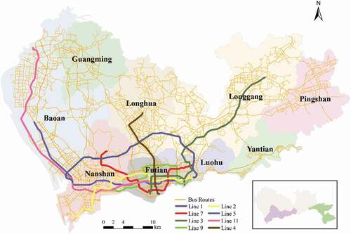
Multi-source datasets were used in the computation of positive public transit accessibility, including SCD, road network, public transit network, and bus trajectory datasets (). These datasets were collected from the transportation authorities, Metro Group Co. Ltd., and local bus companies of Shenzhen City. We collected SCD and bus trajectory data for an entire week (April 3–9, 2017). The entire public transit networks contain 8 subway lines, 199 subway stations, 808 bus routes, and 10,427 bus stops (). Based on the method proposed by Nassir, Hickman, and Ma (Citation2015), Transit stops in other datasets were matched to the stops in the public transit network dataset so as to guarantee the consistency of stop names and locations.
Table 1. Data description
The original datasets are massive in size: for each day, there are 6.2–8.6 million smart card records and 63–73 million GPS records for bus vehicles. Erroneous and inconsistent records were deleted from the original SCD and trajectory data to improve the data quality:
SCD and bus trajectory records without bus line ID or license plate information were deleted since we need this information to recover transit trips;
For those records with missing critical information (e.g. card logic number, tapping time, GPS coordinates or subway station numbers), we removed them from the datasets;
Redundant fields were also removed to reduce the overall data size, such as “Terminal number” of bus trajectory and SCD records, as well as altitude, speed, and direction information in the bus trajectory dataset. After pre-processing, SCD retain the information of “Card logic number”, “Tapping time”, “Company name”, “Station name” (for subway-based SCD), “Bus line ID” and “License plate number” (for bus-based SCD), which are necessary to reconstruct trip chains;
After matching the names of stops, inconsistent SCD records were deleted.
The number of deleted records is approximately 3% of the original data. We believe this small ratio of removed data records will not affect the conclusions of the study. We aligned all other dataset with the road network under the same spatial reference framework (i.e. WGS 84 coordinate system and UTM Zone 50). We built spatial indices for bus trajectory and public transit network datasets to facilitate the searching and match of boarding and alighting stops. There are 47,493 bus stops in the original GIS dataset since the same stop for different bus lines is encoded as different stops. We applied the DBSCAN algorithm (Ester et al. Citation1996) to merge multiple stops with the same name into a single stop. Stops with the same name but serve in two opposite directions were saved as two different stops.
3.2. Trip chain reconstruction
The original SCD maintain transactional records of bus/subway rides, which are usually only legs of trip chains. Trip chains have only one main purpose and are more suitable than trip legs for public transit accessibility measurement approach. Thus, a trip chain reconstruction procedure should be performed to link separate trip legs into complete trip chains. Since touch-in and touch-out are both enforced when passing Automatic Fare Gates within subway stations, subway-based SCD have already recorded both boarding and alighting stations, making it straightforward to recover subway-based trip legs. Then the problem boils down to the recovering of bus-based trip legs since subway-based trip legs can be readily recovered from the original SCD. Each bus-based trip leg contains four essential elements: boarding time, boarding stop, alighting time, and alighting stop. However only boarding time is available in the SCD since only touch-in is required when passengers board buses, we need to derive the other three elements for each bus-based trip leg.
Following the trip chaining algorithm proposed by Gordon et al. (Citation2013), we first estimated the boarding stop for each trip leg, and then inferred the alighting stop and time for the leg. Since the original SCD do not contain the location information of bus vehicles, we integrated the bus trajectory dataset with the SCD to identify the most probable boarding stop and in turn to estimate alighting time of each trip leg. The maximum transfer time between two consecutive legs was set to 30 min based on the observation that most transfers were completed less than 30 min in Shenzhen City. If the current trip leg started at a time more than 30 min later than the alighting time of the last trip leg, a new trip chain is constructed starting from the end of the current trip leg. Constrained by this 30-min time limit, trip legs were linked into trip chains, which were stored for positive accessibility measurement. A specific data structure was designed to save the following essential information of trip chains: first boarding stop and time, last alighting stop and time, names of all transit lines en route, and travel direction. The entire trip chain reconstruction procedure was based on two assumptions commonly used and validated in the literature (Trépanier, Tranchant, and Chapleau Citation2007; Gordon et al. Citation2013; Alsger et al. Citation2016): (1) the most probable alighting stop is the one that is closest to the next boarding stop; (2) the last alighting stop during a day is very likely the closest stop to the initial boarding stop in that day.
3.3. Positive transit accessibility measurement
To quantify positive public transit accessibility over the study region, we develop an accessibility measurement procedure to capture actual transit demands and behaviors. In this study, we measure public transit accessibility from the perspective of origin toward opportunities, which has been extensively adopted in the mainstream literature. The study region is partitioned into equally-sized grid cells (100 m × 100 m). The accessibility measurement approach consists of three stages:
To group grid cells that have similar travel patterns and use these groups as origins to measure accessibility toward opportunities. The resulting groups of grid cells are used as the fundamental spatial units to quantify public transit accessibility. The grouping method can significantly reduce computation complexities since the study involves a large metropolitan area;
A set of highly attractive groups of grid cells are identified based on public transit trip data. Intuitively, if a grid cell attracts a large number of passengers during a specific time interval across the study area, it manifests strong attractiveness and should host important opportunities for the attracted passengers;
To compute the public transit accessibility of the cell groups generated in step (1) toward highly attractive grid cell groups obtained in step (2). The results can be visualized as accessibility maps for further analysis. If passengers from a cell group can travel to these highly attractive grid cells in a relatively fast and convenient manner, the cell group should have a high value of accessibility.
3.3.1. Public transit accessibility measure
Accessibility measures typically comprise two basic components: the cost of travel (determined by the spatial distribution of travelers and opportunities) and the quality/quantity of opportunities. In this study, we consider the popularity of destinations and the travel costs to these destinations. The proposed public transit accessibility measure is location-based but meanwhile capable of modeling individual’s travel dynamics. The study region is partitioned into regular grid cells. For each grid cell i, we can compute its transit accessibility as follows:
where n denotes the number of destination grid cells from i, is a global maximum travel budget time (including in-vehicle, waiting, transferring time, and stay duration at destination) based on the maximum travel time in the trip dataset,
represents the average travel time from i to jth destination grid cell. Trips with unusual short (<3 min) or long travel time (> 220 min) are considered as outliers and removed.
is the total number of trips from i to j,
is the count of transit trips originating from i toward all opportunities in all grid cells over the study region,
denotes the attractiveness of j, reflecting the popularity and weight of the jth destination grid cell. Note the proposed measure account for the travel time of the initial leg, i.e. from the origin cell to the first boarding stop. We assume passengers reach the first boarding stops by walking since it is the predominant mode. The proposed measure does not consider the last leg, i.e. from the last alighting stop to the final destination cell since the destinations are difficult to identify.
EquationEquation (1)(1)
(1) measures cumulative opportunities a passenger can reach within a travel time budget threshold. Instead of measuring potential accessible opportunities, we evaluate actually accessed opportunities based on real-world SCD records. By subtracting travel time from a global travel time budget, we obtain potential extra time a passenger can spend in the destination grid cell compared to other passengers. The longer this potential extra duration time, the better flexibility and benefits a passenger can receive, thereby resulting in better accessibility. The multiplication of reflects the importance of each destination grid cell: if a passenger can easily access a highly popular grid cell via public transit services within a short period of time, she would enjoy good transit accessibility. Then EquationEquation (1)
(1)
(1) accounts for both travel cost and the attractiveness of opportunities, making it a qualified positive accessibility measure. Based on our observation from the data, maximum travel time cost does not manifest evident differences between different travel purposes. Therefore, we use a global maximum travel budget time rather than multiple budgets for different travel purposes in EquationEquation (1)
(1)
(1) .
Theoretically, we can compute accessibility to opportunities located in all grid cells over the study region. We can also manually select desired opportunities to compute transit accessibility. However, as we can observe from the SCD, the distributions of destinations are highly skewed: a small number of grid cells attract a large proportion of transit trips. We focus on these attractive grid cells and only consider trips toward these grid cells when computing accessibility for each grid cell. Our data-driven approach identifies opportunities that passengers actually travel to at different time intervals, thereby measuring positive accessibility and providing an accurate description of individual travel characteristics and constraints. In section 3.3.4, we introduce the method of identifying attractive grid cells.
3.3.2. Grouping grid cells with similar trip patterns
The original 100 m × 100 m grid comprises 181,570 cells after removing inland water and inaccessible mountainous areas. In order to reduce computational overhead and to generate contiguous accessibility maps, we merge cells with similar trip patterns into groups. The idea is to group grid cells with similar vectors of possible boarding stops. This grouping method consists of the following steps:
To find possible boarding stops for each grid cell. We set the maximum walking distance to bus stops as 400 m and to subway stations as 1000 m. Constrained by these two thresholds, the algorithm starts from the centroid of each grid cell and computes walking distance from grid cell centroids to nearby stops based on the shortest walking paths using Dijkstra’s algorithm (Dijkstra Citation1959). Each cell centroid and each stop is snapped to its nearest road segment. Note this walking distance includes perpendicular distances from a centroid to the nearest road segment, and from a stop to its nearest road segment, as well as the distance of the shortest path distance on the road between the projected points of the centroid and the stop;
To produce a vector of nearby boarding stops for each grid cell. Based on the walking distances from cell centroids to stops that are computed in the last step, we record the IDs of all stops within walking distance thresholds as a vector for each grid cell. Now we have 64,834 grid cells that have at least one possible boarding stop. Other grid cells that have no boarding stops are classified as inaccessible areas;
To compute the similarity between stop vectors in the neighboring cells. For each grid cell, the algorithm examines its neighboring eight grid cells and computes similarity based on the following equations:
where
is the network-based distance from cell A (B) to stop Si, N is the total number of possible boarding stops shared by cells A and B. w is used to weight the distance difference between a grid cell to the same stop.
To obtain Groups Of Cells (GOCs). If the computed similarity value between the examined cell and one of its eight neighboring cells is the highest, the two grid cells can be merged. The merged cell is labeled as “merged” and will not be examined afterward. The newly created GOC is assigned a new ID. Starting from randomly selected seed grid cell, the algorithm loops through all grid cells and until all cells are scanned and labeled. The grouping method results in n = 18,109 GOCs. The numbers of cells within these GOSs ranges from 2 to 91.
In practice, the detection of attractive destination and the computation of accessibility are based on these GOCs. Merging operations will not cause severe information loss because of the following reasons: (1) the numbers of original regular grid cells within the merged cell typically fall into the range of 2 − 7 (93.58%). On average, a merged group only has 3.58 original cells; 2) The constituent cells within the same merged group only have minor differences in transit accessibility because they share similar boarding transit stops and they are very close in geographic space.
3.3.3. Identifying popular GOCs
In the literature, the computation of accessibility usually requires selecting a fixed set of opportunities or Points of Interests as the destinations of transit trips. However, this ad-hoc and subjective selection of opportunities is not able to capture actual transit travel patterns. This study proposes to identify a set of attractive GOCs based on real-world travel records. We argue that popular GOCs attract passengers who take frequent and long-distance trips to access opportunities located at these GOCs. Also, compared to other places, popular places are more likely to attract trips with long travel time even duration time is limited. Therefore, three key factors are considered in identifying hot GOCs: travel time, travel frequency, and time of duration at destination. For any time interval t, the attractiveness of a GOC i can be computed as,
where represents the attractiveness of a GOC i at time interval t.
represents the number of trips that end at i.
is the travel time of jth trip that arrives at i,
is the average travel time of all trips that finish during t.
denotes the time of duration at i for the jth trip,
is the average duration time during t for all trips in the study region. Tj can be derived by computing the time difference between initial boarding and last alighting of the jth trip.
is calculated as the time difference between the alighting time of the current jth trip and the boarding time of the next trip for the same passenger.
In the following cases, time of duration cannot be readily computed: (1) there is only one trip during a day; (2) a trip is the last trip of a day and does not return to (or close to) the initial boarding stop of the day. Under such circumstances, we estimate time of duration for these trips based on their similarities to those trips that have exact time of duration. For each such trip, we search for trips that have close origin and destination stops. The duration of time can be computed as a weighted average of similar trips that have exact time of duration. Otherwise, if similar trips cannot be found, we assign the average duration time of the destination GOC as the estimated time of duration for these trips.
After computing the attractiveness for all GOCs, we apply a criteria selection method (Louail et al. Citation2014) to identify popular GOCs (). The attractiveness values are sorted in an increasing rank and plotted as a Lorenz curve, with its horizontal axis G representing the cumulative number of GOC (i/n) and its vertical axis A representing the cumulative percent of attractiveness values, which can be computed as:
Figure 2. Discovering popular GOCs based on the Lorenz curve
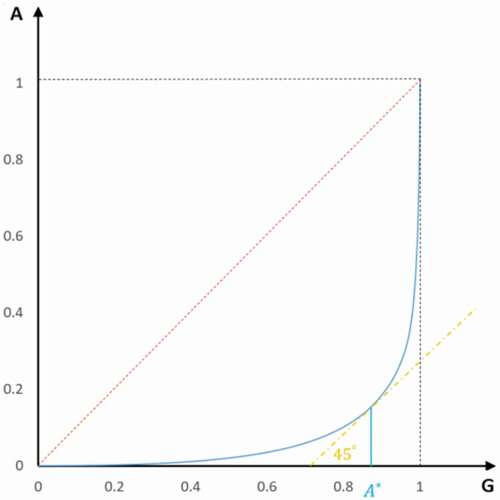
As the Lorenz curve indicates the inequality of data distribution, we can identify a criteria point where the slope is large enough to discover a set of major attractive GOCs. This can be done by finding a point A* at the horizontal axis, whose corresponding point G(A*) on the Lorenz curve is located on a tangent line of 45° (i.e. slope = 1).
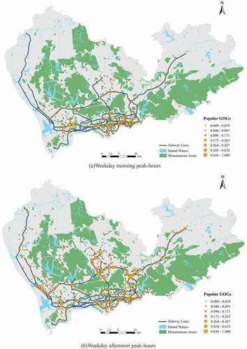
shows two maps of identified popular GOCs in the study region for weekday morning and afternoon peak-hours, respectively. These popular GOCs are mostly located along major subway lines, revealing that the subway system plays a critical role in public transit services of Shenzhen City. In weekday morning, attractive GOCs concentrate in downtown areas, especially in central areas close to subway line 1 in Futian and Luohu districts, as well as in high technology parks in Nanshan district, which are characterized by high-paid jobs. In the afternoon, more popular GOCs can be found in suburb residential areas, including densely populated areas in Longhua, Baoan, and Longgang districts. This is mainly due to regular commute movement between primary employment centers within downtown and residential suburbs: morning trips are mostly toward downtown areas but returning-home trips dominate in the afternoon. Other popular GOCs can be found in central Luohu and Futian districts, where mixed land uses are predominated.
Figure 3. Identified popular GOCs. Dots are placed at the centroid of GOCs to represent identified popular GOCs. The sizes of dots represent the values of attractiveness
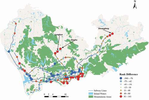
Following the same procedure, we also find popular subway stations and compare the ranking of attractiveness with the ranking of betweenness centrality (Barthelemy Citation2004) of subway stations (). Red and big circles denote stations that have relatively high attractiveness and low centrality rankings. Most of these stations are located in the southeast of the downtown area, indicating that these stations are attractive for transit passengers although they are not so “central” in the network. A few of red stations are at the end of subway lines (e.g. Qinghu, Longhua, and Shuanglong stations), implying that these stations offer critical transit services for residents living nearby. On the contrary, blue ones represent stations with much higher centrality rankings than their ranking of attracting passengers. It means that despite that these stations are located in the central parts of the network, they do not play their expected roles to serve passengers’ needs.
Figure 4. Difference between the rank of central and attractive subway stations. The difference is computed by subtracting the rank of attractiveness by the rank of betweenness centrality for a subway station
3.3.4. Computing walking time to initial boarding stops
The travel time of a transit trip includes three components: walking time from the origin to the first boarding stop, the time interval between first boarding and final alighting of the trip, and the walking time from the last alighting stop to the destination. Note since the final destinations are challenging to estimate, we did not incorporate the walking time from final alighting stops to final destinations. The steps of computing walking time to initial board stops are as follows:
Finding correlated grid cells for transit stops. In section 3.3.2, we have introduced how to extract possible boarding stops for each grid cell. For each stop, we can then find its correlated grid cells by comparing walking distances of these cells and the pre-defined thresholds. If the walking distance is less than the thresholds, the grid cell can be associated with the stop;
Trip assignment. From the reconstructed trip data, we can calculate the number of trips emitting from each stop for any specific time interval. For each stop, we use Kernel Density Estimation (KDE, with Gaussian kernel) to assign trip flow to its associated grid cells based on the length of walking distances. The thresholds are used as the bandwidth in KDE. Then the origin grid cell of each trip can be identified;
Computing walking time before initial boarding. For each trip, the walking time before initial boarding can be computed by dividing the walking distance from the centroid of the origin grid cell to the initial boarding stop by the average walking speed (1 m/s).
4. Computational results and analyses
4.1. Mapping transit accessibilities of weekday and weekend
Based on the proposed accessibility measure and the computational method, we computed and visualized public transit accessibilities for all GOCs over the study region for both weekdays and weekends following Equation (6) ( and 6). GOCs were used as the basic spatial units instead of grid cells. Note only identified popular GOCs (ref. section 3.3.3) were used as destinations to compute transit accessibility for all GOCs. For each specified time interval t, transit accessibility of the ith GOC can be computed as,
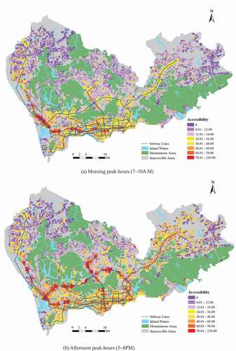
Figure 5. Accessibility maps of weekday peak-hours. Zero accessibility was caused by lack of SCD records or areas having no trips toward popular GOCs
where k denotes the number of popular GOCs accessible from i, is a global maximum travel budget time based on the maximum travel time in the trip dataset,
represents the average travel time from i to the jth popular GOC,
is the total number of trips to j,
is the count of transit trips originating from i toward opportunities located in the popular GOCs (rather than trips toward all grid cells as in EquationEquation.(1
(1)
(1) )),
denotes the attractiveness of the jth GOC, reflecting its popularity.
is normalized in the range of [0, 1]. The global maximum travel budget time
was set as 220 min since the maximum travel time was 203 min in the dataset. Travel time of each trip can be derived based on the reconstructed trip chain dataset by summing the walking time before the initial boarding and the time interval between first boarding and final alighting of the trip. According to the above definition,
holds for all normal trips in the dataset.
As illustrated in , residential areas in the remote north outskirts of the city are characterized by low transit accessibilities in both weekday morning and afternoon peak-hours, mainly due to long-time transit trips with multiple transfers. Residents living in these areas rely heavily on the subway system to reach job opportunities in downtown areas, as revealed by the backbone structure of high accessibility values formed by several subway lines. Even in the downtown areas, salient transit inequalities can be observed, mainly due to the uneven distributions of transit services and opportunities.
also shows that weekday afternoon peak-hours have higher overall accessibilities than morning peak-hours. In particular, we note some areas close to northern stations of subway lines 3, 4, and most stations of line 5 enjoy good accessibilities (central areas in Longhua and Baoan districts), implying that these areas are close to attractive GOCs in afternoon peak-hours. In addition, average travel efficiencies of afternoon peak-hours are higher than that of morning counterparts, since passengers are not as concentrated in afternoon peak-hours as in morning peak-hours. These high-accessibility areas have mixed residential and business land uses with high population densities.
For morning peak-hours, only a few small areas along subway line 1 are close to popular GOCs. These areas are characterized by high-rise residential buildings in Baoan and Nanshan districts. A large majority of residents living in these areas take short trips to work at nearby business centers. depicts the accessibility gaps between weekday morning and afternoon peak-hours. We can observe that most areas in the suburb areas, especially areas close to subway lines have much higher accessibility values in afternoon peak-hours (rendered in dark red) than in the morning. Most downtown areas have high afternoon accessibilities except some areas along lines 1 and 2 (rendered in blue) have better accessibility performance in the morning.
Figure 6. Accessibility differences between weekday morning and afternoon peak-hours (afternoon accessibilities minus morning counterparts)
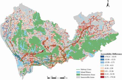
After a close examination of trips of these above-mentioned areas, we can give explanations for the findings obtained from :
Most red areas are suburb residential areas where people travel long distances to work. A large proportion of trips within afternoon peak-hours are short tours for leisure purposes. Therefore, accessibilities of afternoon are better than those of morning;
People living in the blue areas take more constrained trips for work in the morning. But in the afternoon, passengers originate from these areas have dispersed destinations. Morning accessibilities are therefore better than afternoon accessibilities for these areas;
Areas that enjoy good accessibility have relatively high population densities and are close to major employment centers, particularly in the western part of downtown. These areas are usually served by more than one subway line, which dramatically promote transit accessibility during peak-hours when congestion is severe.
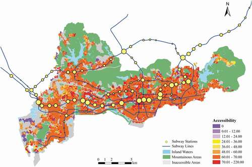
Compared with , reveals similar but less dramatic accessibility difference patterns between morning and afternoon peak-hours on weekends. For weekends, areas with the high levels of accessibility are much more extensive in afternoon peak-hours than in morning peak-hours. In morning peak-hours, only areas along subway line 4 have high values of accessibility. This can be explained by frequent leisure-oriented trips in weekend afternoon. The correlation between accessibility and land use is more evident for the weekends. For example, high-accessibility areas presents a belt shape along subway lines 3, 4, and 5 during weekend afternoon peak-hours. These areas are covered by newly developed residential communities. Residents living in these areas take much shorter trips on weekends than their commute trips on weekdays. Short travel time thereby contributes to good accessibility even if these residents do not actually go to the most popular GOCs. Major recreational centers located close to intersections of at least two subway lines have highest level of accessibility, such as the intersections of subway lines 1 and 2, as well as lines 1 and 4. Generally, afternoon still have higher accessibility values, especially in the areas close to subway lines.
Figure 7. Accessibility maps of weekend peak-hours
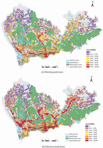
,7 reveals similar but less dramatic accessibility difference patterns between morning and afternoon peak-hours on weekends. For weekends, areas with the high levels of accessibility are much more extensive in afternoon peak-hours than in morning peak-hours. In morning peak-hours, only areas along subway line 4 have high values of accessibility. This can be explained by frequent leisure-oriented trips in weekend afternoon. The correlation between accessibility and land use is more evident for the weekends. For example, high-accessibility areas presents a belt shape along subway lines 3, 4, and 5 during weekend afternoon peak-hours. These areas are covered by newly developed residential communities. Residents living in these areas take much shorter trips on weekends than their commute trips on weekdays. Short travel time thereby contributes to good accessibility even if these residents do not actually go to the most popular GOCs. Major recreational centers located close to intersections of at least two subway lines have highest level of accessibility, such as the intersections of subway lines 1 and 2, as well as lines 1 and 4. Generally, afternoon still have higher accessibility values, especially in the areas close to subway lines.
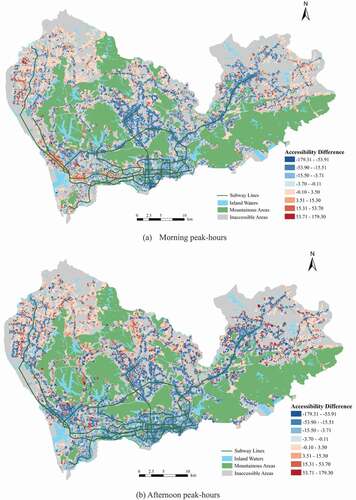
shows the accessibility difference between weekdays and weekends over morning and afternoon peak-hours. Obviously, the accessibilities of weekends are much lower than those of weekdays, indicating that people tend to make few transit trips on weekends. Due to the huge difference of transit volume between weekdays and weekends, the accessibility differences are particularly significant in downtown areas and areas along major subway lines, where passengers are more likely to take long trips on weekdays and travel within their vicinities on weekends.
Figure 8. Accessibility differences between weekdays and weekends (weekday accessibilities minus weekend counterparts)
4.2. Comparison of positive and normative accessibilities
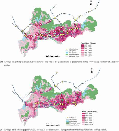
We compared positive accessibilities that are exhibited by actual trips and normative accessibilities based on perceived trip demands. To simplify the comparison, we focused on top-ranking central subway stations and chose them as opportunities to compute transit accessibility. The analysis was narrowed down to downtown areas of Shenzhen City. The proposed positive measure relies on identified popular GOCs to compute accessibilities, making it difficult to perform comparison analysis since these popular GOCs are subject to change over time. To facilitate the comparison, we chose top 100 subway stations based on betweenness centrality values and measured all GOCs’ accessibility to these stations. Data of the whole week were used for the analysis. When computing positive accessibility using Equation (6), betweenness centralities were used as proxy weights.
It can be observed from , normative accessibilities are generally lower than positive accessibilities. Passengers tend to make short trips to nearby opportunities in real life. In a large metropolitan area such as Shenzhen City, there exists multiple city centers. In most cases, residents do not need to take long trips to “central areas” to meet their needs. Since real-world travel times are not significant in short-range trips, duration times at destination are usually longer, leading to better accessibilities than perceived cases.
Figure 9. Normative accessibility to top-ranking central subway stations in the downtown area. The size of the circle symbol is proportional to the betweenness centrality of a subway station
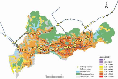
Figure 10. Positive accessibility to top-ranking central subway stations in the downtown area. The size of the circle symbol is proportional to the betweenness centrality of a subway station
Another interesting finding is that normative accessibilities vary much smoother than positive accessibilities. Areas of high normative accessibilities are close to central stations. Actual trips reflect real travel demands, which are not necessarily located in central areas. Aggregating massive trip data, we can obtain a fragmented yet meaningful accessibility map, as shown in .
4.3. Comparison of travel times to popular GOCs and to central stations
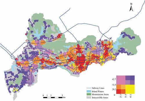
Popular GOCs attract a vast majority of trips, exhibiting uneven travel demands. We further compared travel times to popular GOCs and to central subway stations based on actual trip data. For each GOC located in the downtown area, we computed the average travel time of all trips starting from it to each popular GOC and from it to each central subway station. On the average, travel times to popular GOCs and central stations are close (41.97 vs. 41.46 min). But their spatial distributions are quite distinct. shows that travel times to popular GOCs vary more significantly than those to central stations. This is because popular GOCs reflect land use variations and actual travel demands, which are heterogeneous over space and time. This comparison demonstrates that actual travel demand patterns cannot be captured by ad-hoc pre-defined centrality-based opportunities. Using popular destinations extracted from real-world SCD can reveal actual accessibility variations.
Figure 11. Comparison of travel times to central subway stations and to popular GOCs
shows a bivariate density map that visualizes travel times to both central and popular GOCs. Dark blue areas have long travel times to both central and popular GOCs, implying that these areas may have lowest accessibility in downtown. Areas rendered in brownish-red can access central and popular places conveniently. Light yellow areas are featured with “easy to reach popular GOCs but hard to reach central GOCs”. A few small areas colored in pink can arrive at central GOCs in a short time but may take a much longer time to popular GOCs. These pink areas have high normative accessibilities but actual trips do not favor these areas.
Figure 12. Travel times to both central and to popular GOCs. A bivariate color scheme is shown in the right bottom corner: horizontal axis represents average travel time to central GOCs and vertical axis represents average travel time to popular GOCs
5. Discussion
Based on the above computational and mapping results, we demonstrate that the proposed transit measure and implementation can utilize big transit data to reveal high-resolution travel patterns over a large city. Different from traditional normative accessibility measurement approaches, the proposed novel transit accessibility measure accounts for travel time, destination attractiveness, trip frequency in a joint fashion. The measure considers not only the locations of actual popular opportunities but also the number, duration, and travel time of visits to these places, thereby capturing much more comprehensive profiles of transit trips than traditional normative measures. Although the current state-of-the-art studies have explored transit accessibility at high spatio-temporal resolutions, most of them still measure perceived or desired accessibility, which cannot reflect actual travel demands and personal travel characteristics. In additional to normative geospatial constraints (e.g. opportunity locations, public transit networks, and road networks) and temporal constraints (e.g. transit schedules and travel time variations), our approach manage to capture time-varying changes of actual travel demands and individual preferences on travel destinations. It can present a more accurate illustration of inequalities in public transit services over space and time, compared with traditional normative accessibility implementations.
The proposed method leverages SCD from any time interval to measure positive transit accessibility, regardless of travel purposes. Using reconstructed trip data, the extraction of popular GOCs varies by different time intervals, revealing particular accessibility patterns. For example, a significantly proportion of the transit passengers on weekdays are commuters. But on weekends, travel purposes are varied, including commuting, leisure, or running miscellaneous errands. The popular GOCs are not only dominated by work or residential locations, but reflect actual distributions of attractive opportunities over space and time. Thus, we believe that our accessibility maps can better visualize real-world transit accessibility dynamics than normative accessibility measures and some positive measures if they did not use such comprehensive and massive transit data. Extensive analyses (i.e. sections 4.1–4.3) can be conducted to help decision makers gain deep understanding of macroscopic urban mobility structures and nuance movement patterns. From the mapping results, we can find:
Positive public transit accessibility is largely influenced by attractiveness of trip destinations. Generally, if a place is well connected to popular GOCs, it would enjoy good transit accessibility. Areas with abundant public transit facilities (i.e. easy to access subway services) not necessarily have high positive accessibility values. For a specific time interval, if these areas are not well connected to popular places, they may not achieve high positive accessibility;
Positive accessibility measures can capture accessibility variations over different days of week and different times of day, revealing interesting movement patterns at city scale. In particular, Shenzhen City experiences obvious directional movements in weekday morning and afternoon peak-hours. It can be observed that a large amount of passengers move toward downtown for work from peripheral areas all over the city in the morning and move back home from downtown areas in the afternoon;
Positive accessibility measures can identify spatio-temporal accessibility inequalities. For example, inequalities are particularly notable for commute trips on weekdays. Weekend trips are mostly leisure-oriented and have shorter travel time and distances than weekday trips. While essential and infrastructure facilities are adequate for most residential areas, job-housing imbalance is still a serious issue for most residents living in Shenzhen City.
This research has several implications for transit policy making. Based on real-world trip data, positive accessibility maps are useful for informing decision makers of up-to-date performance of the current transit systems and services, thereby contributing to sustainable transit planning and land use development. Efforts can be made at both strategic planning and daily management levels to mitigate transit problems, in particular inequality issues that now widely exist. Combined with land use data, the positive accessibility maps can help decision makers gain insights into the current mobility patterns and the factors that contribute to the forming of these patterns. For example, positive transit accessibility maps such as can be used to identify areas with low transit accessibility, long travel time, and high trip volume. They can be used to analyze whether this is due to the lack of transit services or other living facilities. For example, for weekday morning peak-hours, we can identify such areas are mostly located in Longgang district, close to subway lines 3 and 5. Residents living in these mono-functional residential areas have to travel a long time to downtown areas for work. While the destinations of these trips are not popular GOCs, it can be speculated that these employees go to work at small-sized business firms. New bus lines or additional bus vehicles can be dynamically allocated for specific areas so as to serve directional travel demands. Essential adjustments on transit timetable are also favored for areas with limited transit services. Consistent policy efforts, such as investments on new transit lines and stops, or restructuring the current transit networks, are needed for those areas where measured public transit accessibilities are poor.
Accessibility measurement results can be also integrated with demographic data to reveal other interesting findings for the city. For example, we can discover low-income residents who rely on public transit services yet have relatively low accessibilities. These findings are particularly useful for the design of incentive plans to promote the use of public transportation. Popular GOC maps can function as a tool to visualize the spatial configuration of essential urban facilities and to enable urban planning to communicate new ideas on future land use development priorities. The imbalance of job and residence is severe and can be reduced with Transit Oriented Development (TOD) policies, which promote mixed land uses and encourage public transit ridership. Positive accessibility maps can also be of interest for the general public, helping residents make decisions on finding their residence or employment places. For example, one can identify areas with the highest accessibility and shortest travel time for herself or her family. These areas may be located along subway line 1, which connects the most important and popular urban facilities and opportunities. Traditional normative accessibility measurements are insufficient to meet the above mentioned needs since only perceived accessibility is modeled.
This study focuses on accessibility measurement using smart card data. However, the results may not reveal all the travel behavior characteristics for the entire public transport system, reflecting a limitation of data bias. For example, the recent success of bike-sharing services in many Chinese cities has changed the way of choosing the most preferable boarding and alighting stops for many passengers. This data bias can be remedied by using other sources of data such as bike-sharing data, which will be addressed in future studies.
6. Conclusion
This study explores the computation and mapping of positive public transit accessibility using big transit data. We propose a novel accessibility measure that accounts for both trip characteristics and destination attractiveness. A practical implementation procedure for computing the proposed positive accessibility measurement approach is introduced to handle massive amount of SCD and other sources of urban transit data. The proposed methodology offers a flexible framework to enable accessibility mapping for any time interval and spatial extent. We believe under this framework, policy makers can explore spatio-temporal travel dynamics efficiently and better understand realistic transit demand rhythms. The case study in Shenzhen city demonstrates the potential of the proposed measurement method as a transit policy evaluation, planning, and management tool. In the future, other sources of data such as travel survey data can also be integrated into the proposed approach so we can identify travel origins and destinations more accurately. We also plan to extend our measurement approach for computing and mapping multi-modal transit accessibility.
Disclosure statement
No potential conflict of interest was reported by the author(s).
Data availability statement
The data that support the findings of this study are available from Transport Bureau of Shenzhen Municipality. Restrictions apply to the availability of these data, which were used under license for this study. Data are available from the authors with the permission of Transport Bureau of Shenzhen Municipality.
Additional information
Funding
Notes on contributors
Tong Zhang
Tong Zhang is a professor at Wuhan University. He received the PhD degree in geography from San Diego State University, San Diego, CA, USA, and the University of California at Santa Barbara, Santa Barbara, CA, USA, in 2007. His research interests include transport geography, urban computing, and machine learning.
Wenyuan Zhang
Wenyuan Zhang is currently a M.S. student in computer science. His research interests are machine learning and big data analytics.
Zhenxuan He
Zhenxuan He is pursuing the M.S. degree at Wuhan University. His research interests are geovisualization and spatio-temporal data analytics.
References
- Alsger, A., B. Assemi, M. Mesbah, and L. Ferreira. 2016. “Validating and Improving Public Transport Origin–destination Estimation Algorithm Using Smart Card Fare Data.” Transportation Research Part C 68: 490–506. doi:https://doi.org/10.1016/j.trc.2016.05.004.
- Barthelemy, M. 2004. “Betweenness Centrality in Large Complex Network.” The European Physical Journal B 38: 163–168. doi:https://doi.org/10.1140/epjb/e2004-00111-4.
- Benenson, I., E. Ben-Elia, Y. Rofé, and D. Geyzersky. 2017. “The Benefits of a High-resolution Analysis of Transit Accessibility.” International Journal of Geographical Information Science 31 (2): 213–236. doi:https://doi.org/10.1080/13658816.2016.1191637.
- Boisjoly, G., and A. El-Geneidy. 2016. “Daily Fluctuations in Transit and Job Availability: A Comparative Assessment of Time-sensitive Accessibility Measures.” Journal of Transport Geography 52: 73–81. doi:https://doi.org/10.1016/j.jtrangeo.2016.03.004.
- Cai, S., D. Wang, and X. Chen. 2017. “A Novel Trip Coverage Index for Transit Accessibility Assessment Using Mobile Phone Data.” Journal of Advanced Transportation 2017: 9754508. doi: https://doi.org/10.1155/2017/9754508
- Cheng, S., B. Xie, Y. Bie, Y. Zhang, and S. Zhang. 2018. “Measure Dynamic Individual Spatial-temporal Accessibility by Public Transit: Integrating Time-table and Passenger Departure Time.” Journal of Transport Geography 66: 235–247. doi:https://doi.org/10.1016/j.jtrangeo.2017.12.005.
- Dijkstra, E. 1959. “A Note on Two Problems in Connexion with Graphs.” Numerische Mathematik, no. 1: 269–271. doi:https://doi.org/10.1007/BF01386390.
- Ester, M., H.-P. Kriegel, J. Sander, and X. Xu. 1996. “A Density-based Algorithm for Discovering Clusters in Large Spatial Databases with Noise.” Paper presented at the Proceedings of the Second International Conference on Knowledge Discovery and Data Mining (KDD-96) (pp. 226–231), Portland, Oregon, August 2–4.
- Farber, S., M. Morang, and M. Widener. 2014. “Temporal Variability in Transit-based Accessibility to Supermarkets.” Applied Geography 53: 149–159. doi:https://doi.org/10.1016/j.apgeog.2014.06.012.
- García-Albertos, P., M. Picornell, M. Salas-Olmedo, and J. Gutiérrez. 2019. “Exploring the Potential of Mobile Phone Records and Online Route Planners for Dynamic Accessibility Analysis.” Transportation Research Part A 125: 294–307.
- García-Palomares, J., and J. Gutiérrez. 2013. “Walking Accessibility to Public Transport: An Analysis Based on Microdata and GIS.” Environment and Planning B: Planning and Design 40: 1087–1102. doi:https://doi.org/10.1068/b39008.
- Geurs, K., and B. Van Wee. 2004. “Accessibility Evaluation of Land-use and Transport Strategies: Review and Research Directions.” Journal of Transport Geography 12 (2): 127–140. doi:https://doi.org/10.1016/j.jtrangeo.2003.10.005.
- Gordon, J., H. Koutsopoulos, N. Wilson, and J. Attanucci. 2013. “Automated Inference of Linked Transit Journeys in London Using Fare-transaction and Vehicle Location Data.” Transportation Research Record: Journal of the Transportation Research Board 2343: 17–24. doi:https://doi.org/10.3141/2343-03.
- Gulhan, G., H. Ceylan, M. Öuysal, and H. Ceylan. 2013. “Impact of Utility-based Accessibility Measures on Urban Public Transportation Planning: A Case Study of Denizli, Turkey.” Cities 32: 102–112. doi:https://doi.org/10.1016/j.cities.2013.04.001.
- Hillman, R., and G. Pool. 1997. “GIS-based Innovations for Modelling Public Transport Accessibility.” Traffic Engineering and Control 38 (10): 554–556.
- Lee, J., and H. Miller. 2018. “Measuring the Impacts of New Public Transit Services on Space-time Accessibility: An Analysis of Transit System Redesign and New Bus Rapid Transit in Columbus, Ohio, USA.” Applied Geography 92: 47–63. doi:https://doi.org/10.1016/j.apgeog.2018.02.012.
- Lee, W., S. Sohn, and J. Heo. 2018. “Utilizing Mobile Phone-based Floating Population Data to Measure the Spatial Accessibility to Public Transit.” Applied Geography 92: 123–130. doi:https://doi.org/10.1016/j.apgeog.2018.02.003.
- Lei, T., and R. Church. 2010. “Mapping Transit-based Access: Integrating GIS, Routes, and Schedules.” International Journal of Geographical Information Science 24 (2): 283–304. doi:https://doi.org/10.1080/13658810902835404.
- Louail, T., M. Lenormand, O. Cantu Ros, M. Picornell, R. Herranz, E. Frias-Martinez, J. Ramasco, and M. Barthelemy. 2014. “From Mobile Phone Data to the Spatial Structure of Cities.” Scientific Reports 4: 5276. doi:https://doi.org/10.1038/srep05276.
- Martin, D., H. Jordan, and P. Roderick. 2008. “Taking the Bus: Incorporating Public Transport Timetable Data into Health Care Accessibility Modelling.” Environment and Planning A 40: 2510–2525. doi:https://doi.org/10.1068/a4024.
- Murray, A., R. Davis, R. Stimson, and L. Ferreira. 1998. “Public Transportation Access.” Transportation Research Part D 3 (5): 319–328. doi:https://doi.org/10.1016/S1361-9209(98)00010-8.
- Nassir, N., M. Hickman, A. Malekzadeh, and E. Irannezhad. 2016. “A Utility-based Travel Impedance Measure for Public Transit Network Accessibility.” Transportation Research Part A: Policy and Practice 88: 26–39.
- Nassir, N., M. Hickman, and Z. Ma. 2015. “Activity Detection and Transfer Identification for Public Transfer Fare Card Data.” Transportation 42: 683–705. doi:https://doi.org/10.1007/s11116-015-9601-6.
- O’Sullivan, D., A. Morrison, and J. Shearer. 2000. “Using Desktop GIS for the Investigation of Accessibility by Public Transport: An Isochrone Approach.” International Journal of Geographical Information Science 14 (1): 85–104. doi:https://doi.org/10.1080/136588100240976.
- Páez, A., D. Scott, and C. Morency. 2012. “Measuring Accessibility: Positive and Normative Implementations of Various Accessibility Indicators.” Journal of Transport Geography 25: 141–153. doi:https://doi.org/10.1016/j.jtrangeo.2012.03.016.
- Pelletier, M., M. Trepanier, and C. Morency. 2011. “Smart Card Data Use in Public Transit: A Literature Review.” Transportation Research Part C 19: 557–568. doi:https://doi.org/10.1016/j.trc.2010.12.003.
- Polzin, S., R. Pendyala, and S. Navari. 2002. “Development of Time-of-day-based Transit Accessibility Analysis Tool.” Journal of Transportation Research Board 1799: 35–41. doi:https://doi.org/10.3141/1799-05.
- Rastogi, R., and K. Rao. 2003. “Defining Transit Accessibility with Environmental Inputs.” Transportation Research Part D: Transport and Environment 8 (5): 383–396. doi:https://doi.org/10.1016/S1361-9209(03)00024-5.
- Shen, P., L. Ouyang, C Wang, Y. Shi, and Y. Su. 2020. “Cluster and Characteristic Analysis of Shanghai Metro Stations Based on Metro Card and Land-use Data.” Geo-spatial Information Science 23 (4): 352–361. doi:https://doi.org/10.1080/10095020.2020.1846463.
- Trépanier, M., N. Tranchant, and R. Chapleau. 2007. “Individual Trip Destination Estimation in a Transit Smart Card Automated Fare Collection System.” Journal of Intelligent Transportation Systems 11 (1): 1–14. doi:https://doi.org/10.1080/15472450601122256.
- Tribby, C., and P. Zandbergen. 2012. “High-resolution Spatio-temporal Modeling of Public Transit Accessibility.” Applied Geography 34: 345–355. doi:https://doi.org/10.1016/j.apgeog.2011.12.008.
- Xu, W., Y. Li, and H. Wang. 2016. “Transit Accessibility for Commuters considering the Demand Elasticities of Distance and Transfer.” Journal of Transport Geography 56: 138–156. doi:https://doi.org/10.1016/j.jtrangeo.2016.09.001.
- Zhang, T., S. Dong, Z. Zeng, and J. Li. 2018. “Quantifying Multi-modal Public Transit Accessibility for Large Metropolitan Areas: A Time-dependent Reliability Modeling Approach.” International Journal of Geographical Information Science 32 (8): 1649–1676. doi:https://doi.org/10.1080/13658816.2018.1459113.
- Zhang, T., Y. Li, H. Yang, C. Cui, J. Li, and Q. Qiao. 2020. “Identifying Primary Public Transit Corridors Using Multi-source Big Transit Data.” International Journal of Geographical Information Science 34 (6): 1137–1161. doi:https://doi.org/10.1080/13658816.2018.1554812.
- Zhao, J., Q. Qu, F. Zhang, C. Xu, and S. Liu. 2017. “Spatio-temporal Analysis of Passenger Travel Patterns in Massive Smart Card Data.” IEEE Transactions on Intelligent Transportation Systems 18 (11): 3135–3146. doi:https://doi.org/10.1109/TITS.2017.2679179.
- Zuo, Y., Z. Liu, and X. Fu. 2020. “Measuring Accessibility of Bus System Based on Multi-source Traffic Data.” Geo-spatial Information Science 23 (3): 248–257. doi:https://doi.org/10.1080/10095020.2020.1783189.