ABSTRACT
Researchers have shown that it is common to use nationalist appeals when marketing food products. Research has also shown that geographical places play an important role in creating feelings of national identity and national belonging. To a much lesser extent, research has shown how these “places” are represented and reproduced in the packaging of food products in specific national environments and to an even lesser extent, compared these representations and reproductions. In this article, using multimodal critical discourse analysis, we examine how butter packaging in Sweden and the UK represents nature in ways that create associations that are linked to the national identity that exists in each country. We argue that commercial interests, through their choice of packaging design, not only exploit cultural and political ideas and values but also reinforce them by connecting to prevailing national sentiments. In times of political and social change, this can be used to strengthen national affiliation and thus ally with political interests.
Introduction
It is common for the food industry to appeal to national sentiments to sell food. Due to globalization and the need to differentiate, food products are often marketed by appealing to nationalist associations of national pride and belonging (Ichijo and Ranta Citation2016). Place plays a central role in such marketing (Connell Citation2006) and is often represented as nature or landscapes (Ichijo and Ranta Citation2016; Hansen Citation2010). However, little research has been done on how “place” is used in the design of the packaging of the same food product in different countries in order to understand how products are loaded with nationalist discourses and how the presentation of a product is affected by the nation's socio-political and cultural context.
In this article, we intend to show how discourses constructed on food packaging serve as a way of reproducing ideas and values closely linked to the nation, commodifying a national nature and landscape, and appealing to the consumer’s sense of national and cultural belonging in order to sell butter. In most Westernised countries, the nation is constantly being flagged in everyday ways. Banal ways of reaffirming or reproducing the nation tend to go unnoticed, however they serve as, according to Billig (Citation1995), a means of mobilizing the nation for moments when more aggressive forms of national identity are called upon. Food packaging is a banal part of our everyday life. Placed on the grocery store shelves, sometimes on the kitchen table as one of the attributes of the meal, the packaging tells stories about food, places, production and consumption (Hollander Citation2003; Freidberg Citation2003; Hawkins Citation2011). Although it can be considered an everyday banality, packaging is considered one of the most important aspects of marketing a product (Silayoi and Speece Citation2007), since we often choose which product to buy based on it (Orth and Malkewitz Citation2008). This makes it interesting to critically examine the meanings expressed on packaging.
As marketing constructions, food packaging serves different discursive aims. Previous research has shown that food packaging design draws on and communicates wider discourses like sustainability (Ledin and Machin Citation2020), health (Chen and Eriksson Citation2019), nationalism (Roberts Citation2014), geographies of place (Kniazeva and Belk Citation2007; Kniazeva Citation2011), often in combination (Andersson Citation2020). It is a way for food producers to add value to both production and consumption, for example, Roberts (Citation2014) has shown how packaging design in post-socialist Russia uses an imperial iconography associated with the Russian national identity to exploit consumer nostalgia for a mythical past. Andersson (Citation2020) has shown how, in a Swedish context, nationally specific discourses on nature, closely connected to the Swedish welfare state, are used to communicate an environmentally friendly and healthy milk production and consumption. And finally, Kniazeva (Citation2011) shows in her study of country of origin construction through food packages that these discourses often contain references to an inspiring national geography and/or a passionate people.
However, apart from the said example, there has been little research on how semiotic packaging choices reflect nationalist discourses in nation-specific cases. Therefore, it is of interest to critically examine the values and ideas that are expressed through choices of design on the packaging of the same type of product in two national contexts. In this article, we look at the semiotic choices in the packaging design of four types of spreadable butter produced by three large dairy companies. Applying multimodal critical discourse analysis (Machin and Mayr Citation2012; Ledin and Machin Citation2018), we analyze how language, images, colours, shapes and layout are used to reproduce ideas and values that are linked to nationalist discourses.
Geographies of national identity
Territorial imagery is important in the construction and reproduction of a nation (D. Storey Citation2001). As socio-historical and semiotic constructions (Jaworski and Thurlow Citation2010), landscapes are often used as a visual trope in order to capture a nation's sense of itself (Kaplan and Herb Citation2011). Each nation has its symbolic landscapes that are part of the nation’s iconography (Meinig Citation1979). Often these landscapes have an ideological dimension linked to them, connected to ideas of community, patriotism, anchoring (Ehn Citation1993) and nostalgia (Storey Citation2016). Britain and Sweden are no exception.
The twenty-first century context for how national identity is formulated and represented in both Britain and Sweden can be traced back to the nineteen century and early twentieth. In Britain, as a response to industrialization and urbanization, Storey (Citation2016) points out that landscape paintings by John Constable were taken to represent “Englishness”. The Romantic movement in literary arts at this time sought the rural idyll as the ideal. In this way, the rural landscape in Southern England with its green, rolling hills and small villages became emblematic of England, this is a time when most people lived in urban areas (Storey Citation2016).
However, it is the First World War that is regarded a starting place for discourses of contemporary British national identity (Smith Citation2013). It is the first war in which the nation as “nation” was called to take part, rather than relying on the army or the navy to defend British interests in some distant land. Today's perception that the nation is a “rural idyll” stems from this period (Smith Citation2013). In particular, the text of the patriotic hymn “Jerusalem” (based on a poem by the Romantic writer and artist, William Blake) became akin to a national anthem for England at this time. It is much quoted for the phrase “England’s green and pleasant land” which is one of the most evoked images of particularly English national identity (noting in particular how “green” is used with positive connotations of nature and arcadia). That another line from this hymn is rarely evoked, the reference to “those dark Satanic mills”, signifies that the image of Englishness is an elitist one (see also, for example Mischi Citation2009; Light Citation2015). In this way, British national identity came to be synonymous with Englishness, and this in turn is commonly represented through the evocation of a Southern English countryside of a pre-industrial age. In the twenty-first century, this rural landscape is very much one that is visited rather than lived in.
Similarly, in Sweden, nature has been important in the construction and representation of the modern nation. Unlike Britain, the concepts of nature are more egalitarian, linked to health, viability and democracy that form the basis of the welfare construction (Sandell and Sörlin Citation1994; Eskilsson Citation1996; Werner and Björk Citation2014), and have had both a symbolic value and a practical significance in the construction of the Swedish welfare state. Contrasting with the British context and its somewhat elitist perspective, nature in Sweden became linked to values such as openness, freedom, equality, and portrayed as a “democratic meeting point” (Mårald and Nordlund Citation2016, 2), a place and space that equalized social differences and crossed class boundaries (Ehn Citation1993; Sandell and Sörlin Citation1994; Werner and Björk Citation2014). Going out into nature during leisure time was regarded as an issue for the whole of society and for public health (Mårald and Nordlund Citation2016).
Although the national Romantic movement in Sweden in the late 1800s contributed to romanticized representations of the Swedish countryside, farmers, traditions and the season of summer that are still valid, today's representations of the Swedish nature or landscapes are not based on nostalgia. Rather, “nature”, the forest, the mountains and the water, at least in promotional material, have come to be represented as the place where modern Swedes embark on their leisure time (Visit Sweden Citation2020), and the nationally and culturally highly esteemed “open landscape” is represented in food marketing as preserved and ensured by modern, safe and sustainable Swedish agriculture (Andersson Citation2019, Citation2020). During the latter part of the twentieth century, Sweden, like the other Nordic countries, declared itself the “world leader in nature and environmental conservation” (Mårald and Nordlund Citation2016, 8). Today, Sweden is building its brand on leading the way in issues related to sustainability where the Swedes’ love for nature is highlighted as a cornerstone (Swedish Institute Citation2020).
As our comparison of food packaging will show, global food producers are no exception compared to other economic or political interests when it comes to justify their existence in society by claiming that they represent national interests and/or identify with a national identity (e.g. Ehn Citation1993). The old landscape connotations remain, but now with the aim of appealing to the consumer's sense of national belonging in order to increase sales. Thus, the commercial forces both take advantage of and benefit from, while helping to keep the nation's image intact.
Data and method
To reveal representations and reproductions of nationalist discourses contained in the discourses constructed on food packaging in the UK and Sweden, we have analyzed butter packaging. The research data consists of four kinds of spreadable butter – Anchor and Country Life in Britain and Bregott and Norrgott in Sweden. The products are manufactured by three different dairy producers: Arla (Anchor and Bregott), Saputo Dairy (Country Life) and Norrmejerier (Norrgott). The selection was made considering production location and market shares, i.e. the product would be manufactured in the country, identified as “national”, and be one of the larger ones in the domestic market. Furthermore, the product would not be a store brand.
In order to understand the representation and reproduction of nationalist discourses, the analysis of the data draws on principles within social semiotics and Multimodal Critical Discourse Analysis, MCDA (Ledin and Machin Citation2018; Machin and Mayr Citation2012). Strategies that are used in packaging design are considered ideological. They are used by designers and producers to shape the representations of events, actions, participants and settings for particular ends (Machin and Mayr Citation2012). Besides protecting its content, packaging is used to communicate the facts about the product, the production and the consumption and to convince the customer about the qualities of the product (Ledin and Machin Citation2018).
In the analysis we have sought to identify which semiotic choices have been used in the construction of these discourses, and how these choices are used, and combined, to create meaning. Semiotic modes such as iconography, form, layout, colour, text and typography are regarded to communicate the interests, values, ideas and/or perspectives of the people that make these choices when combined into a whole (Ledin and Machin Citation2018). In this article, we have analyzed the iconography, which objects, settings and symbols are used. We have also studied the shapes, forms and composition of the design, for example, what principles of structuring that are used.
In this study, discourse is understood “as the re-contextualization of social practices” (van Leeuwen Citation2008, 4). Packaging design and its representation and reproduction of discourses builds on, as well as transforms social practices. The designer must choose how the values and ideas with which the product is to be associated should be expressed through various semiotic choices. The design process thus involves a transformation of social practices. How is the production and consumption of the product expressed in the choice of design? Which values are included and what participants, settings, conditions or processes does the design want to downplay or even exclude? Choices like these mean that different forms of transformation occur in the context of re-contextualization. “Substitutions” means that some semiotic elements are replaced by others; “deletions” that some elements are omitted; “rearrangements” that the order of elements is changed and “additions” that new elements are added, for example, elements that communicate justification, evaluations, purposes and legitimations. In addition to represent social practices, packaging is often also used to explain, justify, legitimate and evaluate the same (see for example Andersson Citation2020).
British dairy products
In Britain, most dairy spreads are purchased in supermarkets. This means that the best sellers are those which are mass produced and not linked to specific farms or geographical areas. The best-selling brand of butter in the UK is Lurpak, with approximately 8.9 m people buying this every year. Some way behind Lurpak are Anchor and Country Life, with supermarket own brand butters making up the rest of the top ten best-selling brands (Statista Citation2019). The most popular dairy spreads are “spreadable butters”. These were introduced to the UK in 1991 and are a mixture of butter and vegetable oil to make it spreadable from the fridge. All the major brands of butter now have “spreadable” products. As this paper is concerned with national identity as found in such packaging, we will be looking at those brands that identify as British, specifically Anchor and Country Life. In particular, we will be looking at how Englishness permeates the packaging, reflecting that pre-industrial rural idyll as described by Mischi (Citation2009), Storey (Citation2016), and Smith (Citation2013), and others.
Anchor
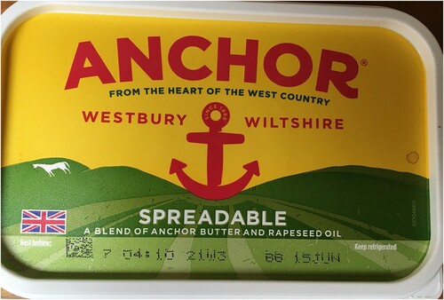
The Anchor Original Butter Co brand arrived in Britain in 1924, however, the original Anchor butter brand was founded in New Zealand in 1886. Initially featuring images of rolling green fields, which could be equally evocative of New Zealand or England, the butter was marketed as being “Direct from New Zealand”. The yellow and green with red text and a centrally placed red anchor against a sunburst changed little over that time, offering connotations of sincerity and authenticity through longevity. However, Arla took over the British part of the Anchor brand, and in 2017 they redesigned the packaging of the dairy spreads as part of a wider strategy to highlight British dairy. This new packaging, shown in , continues to feature the red anchor in a central position, but in tiny print it now declares “since 1886”, borrowing from the original New Zealand brand, whilst also adding to the sense of longevity and established trust whilst retaining the green and yellow colour scheme (or blue and yellow in the case of the “lighter” lower-fat option). The prominent anchor design has positive connotations, with the upward curve of the lower part of the image echoing a human smile.
The geographically ambivalent green rolling hills are now marked with a white horse to the left of the anchor. This is a representation of the Westbury White Horse in the chalk hills of Wiltshire, which is one of the oldest such carvings. The historical origins of the chalk carvings, of which the Westbury Horse is one, have an ambivalence that chimes with the mystical founding myths of Englishness (Hall, Evans, and Nixon Citation1997). The timelessness of landscape and prehistoric endeavour provides a mythical backdrop, as the 1886 company origin invokes the provenance of the nineteenth century apex of British power. As Mischi (Citation2009, 3) has observed, this is typical of such rural images that are Anglo-Saxon in character, and are “white, orderly, pacified, [and] unchanging”. The prevalence of images of the South of England being representative of the whole of Britain is widely found, as Scruton (Citation2000) has explored, and is highlighted here. In common with many other brands, Anchor uses green with the connotations of nature and growth.
Under the name “Anchor”, in smaller green text, is “From the Heart of the West Country”, highlighting an area of Britain that is established as a dairy producing location. The red anchor is also bestridden by “Westbury” and “Wiltshire”, these prominent references being to the main location of Arla’s dairy. The brand logo is therefore pushing the Britishness of a product owned by an international dairy conglomerate and whose brand originates from New Zealand. Just to make sure this Britishness is clear; the front of the packaging also features a small Union Jack flag nestling in the rolling hills. In Billig’s (Citation1995) terms, this is a banal flagging of the nation.
The Britishness of the product is also highlighted on the side of the product, where “Deliciously creamy” appears above “Made with 100% British milk”. The positive adjectives used to describe the taste and texture of the product are thus linked with the nation of origin.
More text is found on the bottom of the tub. Whilst half the space is taken up with nutritional information and the bar code, there is also a subsection relating to storage. This section features what Fairclough (Citation1989) refers to as synthetic personalization: the use of language to address unknown addressees in a way that is informal and familiar. To begin with, the section on storage is set out as a “how to” tip.
How to store: Easy, just pop in the fridge, keeping an eye on the best before date on the lid. Or, keep it in the freezer for up to three months. Then, simply defrost it in the fridge when you need it. No place like home. Arla Foods Ltd, Leeds LS10 1AB
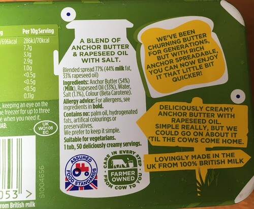
The other half of the bottom of the tub, shown in , features a variety of images and text indexing a traditional form of farming: a milk churn, a tractor, a country signpost.
Centrally, the milk churn is used to contain the listed ingredients. Like the storage and contact information, these foreground a chatty linguistic style, including the second sentence “We prefer to keep it simple”, which links with the overall sense of positivity found elsewhere on the packaging, emphasized also by “Deliciously creamy” and “1 tub, 50 deliciously creamy servings”. The bottom of the milk churn image contains the “Red Tractor mark”, which is a UK food standard mark to signify accepted quality and fairness in production. This is accompanied by a small green logo, “Farmer Owned: care in every step from cow to you”. This image of a cow grazing in a field implies a rural environment rather than factory farming is a logo specific to Arla and is their equivalent of the Red Tractor logo. By placing their own logo beside the nationally recognized one, Arla are giving it equal prestige. This also fits with the colloquial style of the text across packaging, with the consumer being directly addressed through the second person pronoun. The unpretentious, personalized voice, caring and personally involved, sits semiotically alongside the old “tools of the trade” (the churn and the tractor), set in an unchanging English rural landscape.
The right-hand panel of the bottom of the tub features two images in yellow text. The top image portrays a slice of bread thickly covered with yellow butter. Below this image is another in the form of a rustic signpost embedded in some symbolic tufts of grass. The text on this is not about the geographical location, which would collocate text with signpost image, but instead it follows on from the image above: “Deliciously creamy Anchor Butter with rapeseed oil. Simple really, but we could go on about it ‘til the cows come home. Lovingly made in the UK from 100% British milk.” The positive adjectives from the side of the package recur here, including the simulation of spoken language. There is a contrast between “simple” and the implicature that such is the producer’s enthusiasm for the product, they could talk about it for a very long time. This is wittily represented in the idiomatic phrase “til the cows come home”, linking the metaphorical meaning (a long time) with the literal origins related to the making of butter. This also helps to produce an image of cows in the idealized setting of open space, whilst “home” embodies an additional element of cozy familiarity. In both cases, the metaphor is evoking a sense of a time and place where cows are left to roam freely in fields and, as the active agent in this phrase, are willing participants in the dairy industry (they are “coming home” rather than being “brought home”). All the while, this reminds us that this is a product made in the UK and uses British milk.
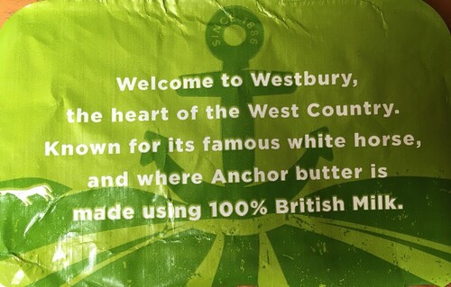
The final element in the packaging of Anchor Spreadable is the inner butter paper, the waxed sheet that covers the spread, shown in . This replicates many of the images on the tub lid: the anchor and the stylized rolling field with the white horse.
Here, the consumer is welcomed not just to the product, but to “the heart” of its mythical origin. The white horse symbol is explicitly referenced as being “famously” associated with this area, and this is collocated with the location of the Anchor dairy. The timelessness and durability of the brand is therefore being articulated once more as is its Britishness. In this way, Arla, through Anchor packaging, offer a product that echoes myths of nation, with a singular mood of pre-industrial rural life, revealed in the layers of packaging. All of this serves to mask the New Zealand origins of the brand and locate the food and its story in “the heart” of England, identified through landscape and myth.
Country life
In the UK, the dairy industry was controlled by the Milk Marketing Board from 1933. A move to market English butter in 1970 saw the development of the “Country Life” brand. In 1996, Dairy Crest became the last state-owned subsidiary to be privatized. In 2019, after the current branding image was conceived in 2017, the company was acquired by the international conglomerate, Saputo. Like Anchor, the Britishness of the brand therefore relies more on the tub than corporate identity. The most prominent components of the contemporary brand are “traditional English oak” in the design, and the concentration on a “British” core identity (Storey Citation2016).
Country Life rebranded their packaging again in 2017. The press release associated with this heralded a “fresh look” which aimed “to brand and showcase its quality, while strengthening its heritage and provenance”. The packaging features gold rather than the more conventional yellow of butter packaging, where the habitual connotation of rich, golden butter contained within is heightened by the use of an exemplary gold wrapping. The company’s brand manager, Emilie Grundy, expands on this:
British provenance is increasingly seen as a signifier of quality, which is a key driver choice within the Butter and Spreadable category. We’re immensely proud to have been making our butter in the UK, using 100% British milk since 1970 […].
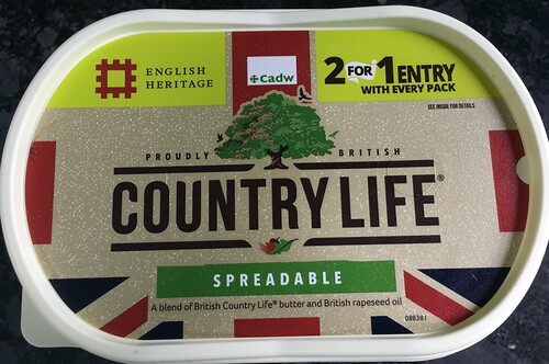
The spreadable version of the butter has the explanatory note that this is “a blend of British Country Life butter and British rapeseed oil”, with the repetition of “British” emphasizing national belonging.
On the corner of each front package is now displayed in red and gold the symbol that a limited number of companies may use to show they are appointed to supply to the Queen’s household. Country Life is the only dairy spread that carries this mark. The common implication of a royal appointment is that a product approved by the Queen carries an elevated national status.
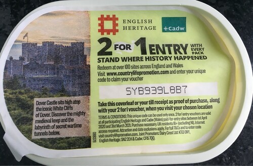
Another aspect of rebranding is the prominent display of logos associated with the British historical heritage through the “2 for 1 entry” offer to sites managed by one of two national heritage charities: English Heritage and Cadw (the Welsh equivalent). These charities manage a variety of historic buildings and other sites. The butter paper within the tub gives details of how and where to apply, along with a unique code to use online. Whilst most of the butter paper is taken up with the “small print” associated with the legal requirements of such an offer, a third of this particular butter paper is taken up with a picture of a medieval castle rising above a wooded hillside and set against a hazy blue sky. The muted colours in this photograph echo the hand-coloured photographs of the early twentieth century, and thus offer another layer of heritage to the packaging. The text informs us this is Dover Castle “Sits atop the iconic White Cliffs of Dover. Discover this might medieval keep and the labyrinth of secret wartime tunnels below”. The text thus links the castle to other aspects of British culture linked to war: White Cliffs of Dover is an iconic World War II song, and the relationship this period of British history is made clearer by further mention of “secret war tunnels”. The logos of English Heritage and Cadw, along with the prominent text detailing the “2 for 1 entry” offer, appear as a banner around the upper part of the body of the tub, shown in , breaking to incorporate the vertical red band of the Union flag that features on both long sides of the tub. This butter paper image is one of several on the same theme used by Country Life.
The two short sides of the tub also reflect the sense of Britishness that the rest of the tub endorses. One side repeats the oak tree logo with added text spanning above this: “Deliciously Creamy”. Below the tree logo is the text: “Made with 100% British countryside milk”. The “100% British” is in large text, centered between the other two-word phrases. The adjective “countryside” also suggests a bucolic idyll for the dairy, whilst semantically linking with the product name. The opposite side of the tub features the nationally specific Red Tractor mark that we saw earlier on the Anchor butter packaging. In the case of Country Life, the additional text reads “At Country Life we are proud of our British countryside heritage. We are Red Tractor assured, which means we only use the finest British ingredients.” Here, Country Life is explicitly linking themselves with the concept of “heritage”, which is the theme that this packaging promotes throughout. The Red Tractor symbol (employed linguistically as an adverbial phrase) is explained as being explicitly related to “the finest British ingredients”, where Britishness is once more flagged as being an indispensable part of the branding.
On the base of the tub, next to the usual statutory items such as ingredients, storage instructions, and a recycling guide, is a text that directs customers to different contact points “(County Life Customer Careline 0800 030 4740 8 www.enjoycountrylife.co.uk * Freepost SAPUTO”. The postal address is geographically vague. Unlike the full postal address, we saw on the Anchor packaging, there is simply a “freepost” address to the corporation Saputo. Thus, the attachment to Big Dairy is underplayed, with the repeated use of myth-laden but deictically broad “British” at every opportunity in the more prominent branding areas of the packaging.
Swedish butter
The dairy industry has been of national concern in Sweden since the 1920s. Today, the milk sector is the branch of Swedish agriculture that has the highest production value. Four companies account for 95% of possible production in Sweden: Arla and Norrmejerier are two of these (Jirskog Citation2020). As in Britain, in Sweden, most spreadable butters are purchased in supermarkets, mass-produced, and not linked to specific farms. As in the UK, the flagging (Billig Citation1995) is present. In the Swedish packaging, this is performed mainly using visual images of the Swedish nature and landscapes: open pastures and cows; dark forests and streaming rivers. However, compared to the British packaging, the Swedish does not reflect a pre-industrial rural idyll and a dairy production characterized mainly by tradition and heritage, but a modern, albeit natural, dairy production that benefits the country, its nature and citizens.
Bregott
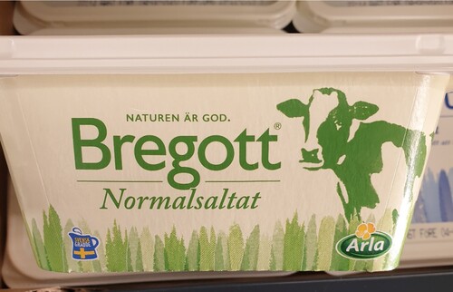
Bregott is the spreadable butter that is the market leader in Sweden. Since 1995, Arla has used an advertising concept called the “Bregott factory”. The concept is largely about showing images of black and white cows on Swedish summer pasture. Anyone who buys Bregott is well acquainted with these commercials, since the concept has had great impact in a Swedish context (Jönsson Citation2005). Consequently, the message that Bregott is a “good Swedish cow product from the good Swedish and summery countryside” is central also to the message that unfolds on the Bregott packaging. The industrial part of the production process is downplayed, instead it is presented as a combination of nature and manual work. Excluded, both visually and textually, are transport, assembly lines and dairy workers. Instead, a stylized cow, a green grass-like pattern and white space adorn the packaging where the green colour binds together the different elements into a “natural” whole. The expression “a pinch”, in “Butter, rapeseed oil & a pinch of salt.” [SW: Smör, rapsolja & en nya salt.], written on the sides of the tub, puts forward the product as a result of manual labor, a craft. Its meaning is accentuated by the choice of font, the use of italics in combination with the decorated amphesand connote creativity and classical simplicity.
Advertisements, or as in this case packaging, do not so much create new meanings or arguments as relying on or tapping into meanings, arguments, emotions and opinions already existing in a culture and among, in this case, consumers (Kjeldsen Citation2007). This also applies to the representation of nature found on the Bregott package. The marketing concept of Bregott has appropriated a type of space, place and time that are closely associated with a nationally and culturally highly valued type of landscape, namely the open landscape in summertime (Sörlin Citation1999; Werner and Björk Citation2014). The cow is, as shown in , drawn as standing in what looks like knee-high grass; its green colour indicates summer. White space surrounds the cow, giving the impression of “openness” or “sky”.
However, names, places, flags and emblems, ie universal signs of particularity (Billig Citation1995), are also used on the Swedish packaging to place production in a national context. The placement of a quality emblem, a blue and yellow milk jug, to the left at the bottom of the two longer sides of the package, also shown in , explicitly frames the nature scenery as Swedish. The jug carries the colours and symbol of the Swedish flag as well as the epithet, “Swedish” in the wording “Swedish cream” [SW: Svensk grädde] printed upon it. The logo's placement, in a linear relationship to the jug and at the bottom right, connects the large, global company to both a national context and to the represented scene. Also, the slogan “The nature is good” [SW: Naturen är god] is recurrent on the packaging. To appeal to nature and/or to use natural claims is common in food marketing. Nature is associated with all that is good; heavily exploited to steer sales (Kniazeva and Belk Citation2007). However, the definite form of the noun (in English the definite article) in the word “Naturen” (the nature) points to a specific nature that when combined with the blue and yellow jug, is interpreted as Swedish.
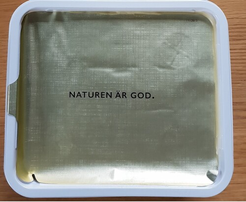
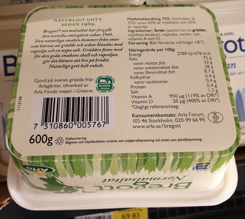
In the manner in which the slogan has been placed on the packaging, at the top shown in , and in the center shown in , it is put forward as an emotionally appealing as well as already known and agreed starting point. The Swedish nature, visually represented by the cow on bait, is foregrounded on the packaging both as the core of the information (Kress and Van Leeuwen Citation2006), and the core of the product. This echoes in the choice of name of the brand/product. “Bregott” is a neologism based on the verb to spread (breda) and the noun good (gott). Written in a green, rounded and uniform font, it connotes, besides softness, also stability and reliability. The same values are found on the back of the package where it states: “Bregott® normally salted has gilded the Swedish sandwich since 1969 … ” [SW: Bregott® normalsaltat har förgyllt den svenska smörgåsen sedan 1969 …]. The verb “gilded” connotes value, quality and reliability, and the time reference evokes associations of duration and stability. The product has been on the Swedish market for over 50 years. The fact that the foil sheet is also gilded reinforces the feeling of something valuable. Its clean and minimalist design, the use of space in combination with the sans-serif font, can be linked back to “openness”.
Also in other writings on the packaging, the banal flagging of the nation (Billig Citation1995) is obvious. In addition to the statutory items on the base of the tub, it states: “Made from Swedish cream from Arla farms, made by Arla Foods dairy in Götene”. [SW: Gjord på svensk grädde från Arlagårdar, tillverkad av Arla Foods mejeri i Götene.]. Both the epithet “Swedish” and the name of the place where the dairy is located, “Götene”, puts production in a national context. However, the agricultural part of the production process is not primarily linked to a specific region but to “Arla farms” in general. Besides the summer season and the agricultural landscape, the farmer and farmer culture have become markers for the Swedish nation, representing cultural continuity (Facos Citation1998; Werner and Björk Citation2014). The importance of the farmer and the farm is also made visible in the Swedish version of the Arla's Farmer owned label shown in . If the cow is assigned the main role in the British version, the farmer and the farm are instead put forward in the Swedish: “Farmer Owned: care in every step – from farm to you” [SW: Bondeägda – omtanke i varje steg. Från gård till dig.]. The fact that the company is an agricultural cooperative and owned by the farmers themselves is emphasized on both versions of the label. Presenting the company as “farmer-owned” can be understood as the large company's way of meeting the criticism of recent years’ low milk prices and the fact that smaller farms have had to shut down production because they could not compete with large farms’ low production costs (Arla Foods Citation2015). However, the Swedish farmer also plays a central role in the marketing of Swedish-made foods in general. Consumption of domestic food is put forward as a way of supporting the Swedish farmer because it is the farmer who above all ensures the values of Swedish-produced food, such as good animal welfare, safe and reliable food, employment, as well as a vibrant countryside and an open landscape (Från Sverige Citation2021).
In sum, relying on intertextuality, the packaging represents the production of Bregott as a nature-friendly and lively dairy production located in the Swedish – and green – open landscape. The packaging can thus be regarded as another banal reproduction of a contemporary national landscape maintained by the company and its farmers.
Norrgott
Swedish nature also plays a prominent role in the message that unfolds on the packaging of NORRGOTT, the spreadable butter produced by Norrmejerier. However, it is another kind of nature drawn upon than the one on the Bregott packaging, and another kind of branding strategy. If the representation on the Bregott package refers to cow pastures throughout the national territory, and a nature that is inherently “Swedish, open and good”, Norrmejerier presents the northern part of the national territory as the one that matters, and the consumption of the spreadable butter as a practice that enable a prosperous “North”. However, it is not the fact that the producer uses nature representations on the butter packaging that reproduces a nationalistic discourse, but rather what kind of nature that is represented and how the chosen type of landscape is put forward. Although the message of the Norrgott package frames consumption and thus indirect production in support of a certain region, “Norrland”, the rhetorical act is based on the alleged Swedish love of nature, forest and water (Mårald and Nordlund Citation2016) and the willingness to take consumer responsibility (Caruana and Crane Citation2008) in order to maintain, protect and even save that region, and that nature. It is a representation of a nature that connotes present times and modernity rather than idealized nostalgia.
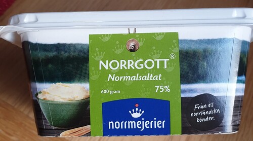
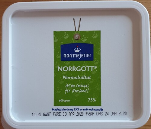
The packaging itself is designed as a gift, “From us northern farmers” [SW: Från oss norrländska bönder] as the writing placed on the two longer sides of the package states. All sides of the rectangular box are, as shown in , covered by a photograph of a river, a dark forest in the background, and in the foreground, a wooden table with a small bowl of butter in it and a butter knife placed next to it. The wooden table is placed outdoors, and with the angle the photograph is taken, the consumer is placed behind the table, viewing the landscape. The representation put forward the forest and the river as a scenery to be visually consumed (Urry Citation1992). Printed on top of the image, in the center of the sides of the package, and on the lid as shown in , is a label. The label appears to be held by a string, giving the impression that the product is wrapped and put forward as a crafted gift, a packaged landscape. The label's colours, green and blue, can be linked back to the colours of the nature in question, the green forest, and the blue water.
Due to the composition and the placement of the logo, shown in and , the company is put forward as the one handing over the gift as well as the one who ensures its survival. The use of “us” in “From us northern farmers” gives the producers of the product an individual voice. “Norrgott” and “Norrmejerier” are combined with dark green forests, raging rivers and outdoor meals that replace cows, dairies, dairy workers, and transport. The use of the prefix Norr (northern) as in “Norrgott” (The northern good) and “Norrmejerier” (The northern dairy) explicitly highlights the northern aspects of the product, production practice and surrounding nature. The name “Norrgott” also functions as a wordplay meaning “to do good in the north” or “to the north”, that “the north is good” and/or that “the northern product tastes good”. The “Norr” in “Norrmejerier” points instead to the location of the production, the territorial core of the practice.
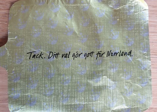
If the Bregott packaging justifies dairy production as a way of maintaining a lively national countryside, Norrgott presents dairy consumption as a prerequisite for a prosperous north. The slogan states: “Eat a sandwich for Norrland” [SW: Ät en smörgås för Norrland!]. The same value is added in the writing on the golden foil sheet placed under the lid, shown in : “Thanks. Your choice is good for Norrland”. [SW: Tack. Ditt val gör gott för Norrland.]. Also, on the back of the tub, the same message is found: “With Norrgott you put a spreadable gold edge on existence. Not just for the good and natural taste, but also for all the good you do on the purchase/as well.” [Med Norrgott sätter du en bredbar guldkant på tillvaron. Inte bara för den goda och naturliga smakens skull, utan också för allt gott du gör på köpet.]. In both writings, synthetic personalization (Fairclough Citation1989) is used to create a sense of a conversation between the identifiable farmer and the responsible, individual consumer. In the same text, directly below, it says that the product is made from “ … locally produced fresh cream from Norrland” [SW: … lokalproducerad färsk grädde från Norrland]. Thus, doing “good” when “choosing” or “purchasing” the product implies to support local production, and by extension the region. In addition to the statutory items at the base of the tub, there is also the contact information and country of origin label. The former places the production in Norrland and in “Umeå”, while the latter clarifies that the product's origin is Swedish.
Consumption and production are thus put forward as necessities for contributing to regional growth, but also as necessities for preserving a certain type of landscape and scenery. The table and the angle of the photograph that places the consumer behind the table with a view of the landscape, symbolizes the people, the modern Swedes, who populate or visit the landscape. Nature is presented as a place/space to enjoy and visually consume, and as such in the interest of the common man (as well as the consumer) to preserve, the democratic meeting place, accessible to all (Mårald and Nordlund Citation2016). It is not a vanishing past or a pastoral idyll that is represented on the packaging, it is a “here and now”. This fits in well with the Swedish self-image as a modern and progressive country (J. Andersson and Hilson Citation2009). Appealing to a regional or local affiliate is of course a way to differentiate with the much larger company Arla. But regardless of the regional appeal, the design of Norrgott's packaging is still based on values and ideas that are linked to Swedish nature and the Swedish welfare state's national identity, a democratic, equal and, above all, modern society (J. Andersson Citation2009).
Conclusion
The British and Swedish butter packaging have many similarities. The fact “big dairy” is hidden; dairy plants and transport are deleted, substituted by bucolic images of green rolling hills or contemporary depictions of open landscapes and vast forests and rivers. Nature and landscapes play a significant role in the representation of dairy production and consumption, and representations of nature, visual and textual, are added to the recontextualizations in order to legitimate and justify these practices, by adding national and cultural value to them. However, there are some differences between the countries. In the Swedish case, there is a great emphasis on a domestic nature being utilized, preserved and ensured by a modern Swedish dairy production and its farmers. Nature is presented as a nationally and culturally highly valued scenery, either the open landscape or the vast forests and rivers. Production and consumption become means to support the nation, its landscapes and farmers. In the British case, on the other hand, there is great emphasis also on other national symbols next to the green rolling landscapes, for example, an extensive use of the Union Jack. Most of the packaging in a wide range of British butter was redesigned in 2016/17, which in turn can be partly explained by the Brexit vote that year. The most prominent stories about the consequences of this related to the future of farming in the UK, as this was heavily subsidized under various EU policies. The same flagging of national identity that we see in times of crisis such as war came to the fore, and the future of British farming became a widely discussed topic. It could, therefore, be argued that Brexit led these dairy producers to reassess their place in the uncertain future of the industry by more overt flagging of national identity in the British food story, hence, putting forward production and consumption as a way of supporting the British farmers.
The claiming of geographical space and the turning it into a place of production, function as a strategy to connect production to a highly evaluated national type of landscape – and by extension, a way to evidence national and regional belonging and to justify consumption. Consuming the product becomes equivalent to supporting a specific location, country or region, a specific kind of nature, and those who belong to it and/or those who utilize it. To use these nationally or regionally framed representations of nature and landscapes allows the food producers to use notions of national belonging to make profit on a capitalist and global arena, while maintaining and reproducing ideas and values central to the nation. However, as the British case shows, “banal flagging” is not always so banal. In times of national change and conflicts, flag waving becomes even more explicit and aggressive – even on something as banal as butter packaging.
Acknowledgements
We would like to thank Professor David Machin at Zhejiang University, China for his valuable comments and recommendations on this paper. We would also like to thank the two anonymous reviewers for their suggestions and comments.
Disclosure statement
No potential conflict of interest was reported by the author(s).
Additional information
Notes on contributors
Helen Andersson
Helen Andersson is a Senior Lecturer in Media and Communication Studies at Örebro University, Sweden. Her research interests include food communication, nature, multimodality and critical discourse analysis.
Angela Smith
Angela Smith is Professor of Language and Culture at the University of Sunderland, UK. She has published extensively in the areas of gender and media discourse, and in particular the uses of politeness theory.
References
- Andersson, Jenny. 2009. “Nordic Nostalgia and Nordic Light: The Swedish Model as Utopia 1930–2007.” Scandinavian Journal of History 34 (3): 229–245. doi:10.1080/03468750903134699.
- Andersson, Helen. 2019. “Recontextualizing Swedish Nationalism for Commercial Purposes: A Multimodal Analysis of a Milk Marketing Event.” Critical Discourse Studies 16 (5): 583–603. doi:10.1080/17405904.2019.1637761.
- Andersson, Helen. 2020. “Nature, Nationalism and Neoliberalism on Food Packaging: The Case of Sweden.” Discourse, Context & Media 34: 100329. doi:10.1016/j.dcm.2019.100329.
- Andersson, Jenny, and Mary Hilson. 2009. “Images of Sweden and the Nordic Countries.” Scandinavian Journal of History 34 (3): 219–228. doi:10.1080/03468750903134681.
- Arla Foods. 2015. “Arla lyfter fram ägarbönderna med ny märkning”.
- Billig, Michael. 1995. Banal Nationalism. London: Sage.
- Caruana, Robert, and Andrew Crane. 2008. “Constructing Consumer Responsibility: Exploring the Role of Corporate Communications.” Organization Studies 29 (12): 1495–1519. doi:10.1177/0170840607096387.
- Chen, Ariel, and Göran Eriksson. 2019. “The Making of Healthy and Moral Snacks: A Multimodal Critical Discourse Analysis of Corporate Storytelling.” Discourse, Context & Media 32: 100347. doi:10.1016/j.dcm.2019.100347.
- Connell, John. 2006. “‘The Taste of Paradise’: Selling Fiji and FIJI Water.” Asia Pacific Viewpoint 47 (3): 342–350. doi:10.1111/j.1467-8373.2006.00310.x.
- De Luca, Vincent Arthur. 1995. “Blake’s Concept of the Sublime.” In Romanticism: a Critical Reader, edited by Duncan Wu, 17–38. Oxford: Blackwell.
- Ehn, Billy. 1993. Försvenskningen av Sverige : det nationellas förvandlingar. Edited by Jonas Frykman and Orvar Löfgren. Stockholm: Natur och kultur.
- Eskilsson, Lena. 1996. “Svenska turistföreningen från fjäll till friluftsliv : från den vetenskaplige vildmarksmannen till den cyklande husmodern.” In Historisk tidskrift (Stockholm). Stockholm : Svenska historiska föreningen, 1881-.
- Facos, Michelle. 1998. Nationalism and the Nordic Imagination: Swedish art of the 1890s. Berkeley, CA: Univ. of California Press.
- Fairclough, Norman. 1989. Language and Power. London: Longman.
- Från Sverige. 2021. “Därför ska du välja svenskt.” Svenskmärkning AB, Accessed 0702. https://fransverige.se/svenska-ravaror-all-varldens-mat/darfor-ska-du-valja-svenskt/.
- Freidberg, Susanne. 2003. “Cleaning Up Down South: Supermarkets, Ethical Trade and African Horticulture.” Social & Cultural Geography 4 (1): 27–43. doi:10.1080/1464936032000049298.
- Hall, Stuart, Jessica, Evans, and Sean, Nixon. eds. 1997. Representation: Cultural Representations and Signifying Practices. London: Sage.
- Hansen, Anders. 2010. Environment, Media and Communication. New York: Routledge.
- Hawkins, Gay. 2011. “Packaging Water: Plastic Bottles as Market and Public Devices.” Economy and Society 40 (4): 534–552. doi:10.1080/03085147.2011.602295.
- Hollander, Gail M. 2003. “Re-naturalizing Sugar: Narratives of Place, Production and Consumption.” Social & Cultural Geography 4 (1): 59–74. doi:10.1080/1464936032000049315.
- Ichijo, Atsuko, and Ronald Ranta. 2016. Food, National Identity and Nationalism: From Everyday to Global Politics. Basingstoke, Hampshire; New York, NY: Palgrave Macmillan.
- Jaworski, Adam, and Crispin Thurlow. 2010. Semiotic Landscapes: Language, Image, Space. London: Bloomsbury.
- Jirskog, Eva. 2020. “Marknadsrapport mjölk och mejeriprodukter - utvecklingen till och med 2019.” In. Jönköping: Jordbruksverket.
- Jönsson, Håkan. 2005. Mjölk : en kulturanalys av mejeridiskens nya ekonomi. Eslöv: B. Östlings bokförlag Symposion.
- Kaplan, David H., and Guntram H. Herb. 2011. “How Geography Shapes National Identities.” National Identities 13 (4): 349–360. doi:10.1080/14608944.2011.629424.
- Kjeldsen, Jens E. 2007. “Visual Argumentation in Scandinavian Political Advertising: A Cognitive, Contextual, and Reception Oriented Approach.” Argumentation and Advocacy: Special Issue on Visual Argumentation 43 (3-4): 124–132. doi:10.1080/00028533.2007.11821668.
- Kniazeva, Maria. 2011. “It All Began with a Kiss, or When Packaging Sells a Country.” International Journal of Culture, Tourism and Hospitality Research 5 (4): 383–395. doi:10.1108/17506181111174664.
- Kniazeva, Maria, and Russell W. Belk. 2007. “Packaging as Vehicle for Mythologizing the Brand.” Consumption Markets & Culture 10 (1): 51–69. doi:10.1080/10253860601164627.
- Kress, Gunther R., and Theo Van Leeuwen. 2006. Reading Images: The Grammar of Visual Design. 2nd ed. London: Routledge.
- Ledin, Per, and David Machin. 2018. Doing Visual Analysis: From Theory to Practice. Edited by David Machin. Thousand Oaks, CA: SAGE Publications.
- Ledin, Per, and David Machin. 2020. “Replacing Actual Political Activism with Ethical Shopping: The Case of Oatly.” Discourse, Context & Media 34: 100344. doi:10.1016/j.dcm.2019.100344.
- Light, Alison. 2015. Common People: The History of an English Family. Harmonsworth: Penguin.
- Machin, David, and Andrea Mayr. 2012. How to Do Critical Discourse Analysis: a Multimodal Introduction. London: Sage.
- Mårald, Erland, and Christer Nordlund. 2016. “Natur och miljö i nordisk kultur: några idéhistoriska nedslag.” Rig 99 (1): 1–13.
- Meinig, Donald William. 1979. The Interpretation of Ordinary Landscapes: Geographical Essays. New York: Oxford UP.
- Mischi, Julian. 2009. “Englishness and the Countryside: How British Rural Studies Address the Issue of National Identity.” In Englishness Revisited, edited by Floriane Reviron-Piegay, 109–124. Newcastle: Cambridge Scholars Press.
- Orth, Ulrich R., and Keven Malkewitz. 2008. “Holistic Package Design and Consumer Brand Impressions.” Journal of Marketing 72 (3): 64–81. doi:10.1509/jmkg.72.3.64.
- Roberts, Graham H. 2014. “Message on a Bottle: Packaging the Great Russian Past.” Consumption Markets & Culture 17 (3): 295–313. doi:10.1080/10253866.2013.791973.
- Sandell, Klas, and Sverker Sörlin. 1994. “Naturen som fostrare : friluftsliv och ideologi i svenskt 1900-tal.” In.: Historisk tidskrift (Stockholm) Stockholm: Svenska historiska föreningen, 1881-.
- Scruton, Roger. 2000. England: An Elegy. London: Chatto and Windus.
- Silayoi, Pinya, and Mark Speece. 2007. “The Importance of Packaging Attributes: A Conjoint Analysis Approach.” European Journal of Marketing 41 (11/12): 1495–1517. doi:10.1108/03090560710821279.
- Smith, Angela. 2013. Discourses Surrounding British Widows of the First World War. London: Bloomsbury.
- Sörlin, Sverker. 1999. “The Articulation of Territory: Landscape and the Constitution of Regional and National Identity.” Norsk Geografisk Tidsskrift - Norwegian Journal of Geography 53: 103–111.
- Statista. 2019. Accessed 190808. https://www.statista.com/statistics/301909/leading-brands-of-butter-in-the-uk/.
- Storey, David. 2001. Territory: The Claiming of Space, Insights into Human Geography. Harlow: Prentice Hall.
- Storey, John. 2016. “The Making of English Popular Culture.” In. London: Routledge.
- Swedish Institute. 2020. “Swedes Love Nature.” Accessed December 20, 2013. https://sweden.se/nature/swedes-love-nature/.
- Urry, John. 1992. “The Tourist Gaze and the ‘Environment’.” Theory, Culture & Society 9 (3): 1–26. doi:10.1177/026327692009003001.
- van Leeuwen, Theo. 2008. Discourse and Practice: New Tools for Critical Discourse Analysis, Oxford studies in sociolinguistics, 99-1448272-4. Oxford: Oxford University Press.
- Visit Sweden. “Freedom to Roam.” Accessed 2020-12-13 kl. 14:42. https://visitsweden.com/what-to-do/nature-outdoors/nature/sustainable-and-rural-tourism/freedomtoroam/.
- Werner, Jeff, and Tomas Björk. 2014. “Blond och blåögd : vithet, svenskhet och visuell kultur = Blond and blue-eyed : whiteness, Swedishness, and visual culture.” In. Göteborg: Göteborgs konstmuseum.

