
ABSTRACT
The Family Smoking Prevention and Tobacco Control Act requires the US government to inform the public about the quantities of toxic chemicals in cigarette smoke. A website can accomplish this task efficiently, but the site’s user interface must be usable to benefit the general public. We conducted online experiments with national convenience samples of 1,451 US adult smokers and nonsmokers to examine the impact of four interface display elements: the chemicals, their associated health effects, quantity information, and a visual risk indicator. Outcomes were perceptions of user experience (perceived clarity and usability), motivation (willingness to use), and potential impact (elaboration about the harms of smoking). We found displaying health effects as text with icons, providing quantity information for chemicals (e.g., ranges), and showing a visual risk indicator all improved the user experience of a webpage about chemicals in cigarette smoke (all p < .05). Displaying a combination of familiar and unfamiliar chemicals, providing quantity information for chemicals, and showing a visual risk indicator all improved motivation to use the webpage (all p < .05). Displaying health effects or quantity information increased the potential impact of the webpage (all p < .05). Overall, interface designs displaying health effects of chemicals in cigarette smoke as text with icons and with a visual risk indicator had the greatest impact on the user experience, motivation, and potential impact of the website. Our findings provide guidance for accessible website designs that can inform consumers about the toxic chemicals in cigarette smoke.
Smoking causes 480,000 deaths in the US annually, mostly from the inhalation of a toxic mix of chemicals in cigarette smoke (United States Department of Health Human Services, Citation2014). Yet smokers have little information about the toxic chemicals in the cigarettes they smoke, leaving them potentially underinformed and susceptible to misinformation. As part of the Family Smoking Prevention and Tobacco Control Act, the US is required to publicly display a list of the harmful and potentially harmful smoke constituents (chemicals) in each brand and subbrand of tobacco products and the quantity of each chemical (Family Smoking Prevention And Tobacco Control Act, Citation2009). This is a challenging task, as the public has never heard of most of these chemicals (e.g., 4-aminobiphenyl) and may have difficulty making sense of their quantities (e.g., 28 µg). Before putting this information on public display, the US needs to determine how best to do so to be clear to lay audiences.
One possibility is a public website that would allow for broad dissemination of information for thousands of products. Consumer health informatics, or the “provision of health information resources to consumers via the Internet,” has the ability to communicate critical information to empower individuals for improved decision-making and health outcomes (Keselman, Logan, Smith, Leroy, & Zeng-Treitler, Citation2008, p. 473). Moreover, compared to other communication methods, such as cigarette pack inserts or point-of-sale displays, a website can convey more information, reach smokers and nonsmokers, be updated as the science evolves, link to other digital content, and most importantly, meet legal requirements for public display.
However, for online health resources about chemicals in tobacco to help consumers, the user interface must be usable (Goldberg et al., Citation2011). Merely creating an online resource will not ensure individuals engage with the critical health information, let alone affect users’ knowledge or behavior. User interfaces are a key component of online communication, conveying the intended meaning of the website’s content through words, images, and structure, all of which contribute to a user’s experience (Islam & Bouwman, Citation2016). User-centered approaches to designing consumer health informatics, with specific attention to user interpretations of the interface, are needed to ensure information is clearly conveyed and used effectively by the target audience (Eysenbach, Citation2000; Goldberg et al., Citation2011). Specifically, user interface designs should be evaluated for their impact on perceptions of the user experience through perceived clarity and usability of the website information, whether the design increases motivation (willingness) to use the website, and the potential impact of the designs to increase cognitive elaboration (thinking) about the health content (Eysenbach, Citation2005; Yang, Linder, & Bolchini, Citation2012). Focusing on user interfaces––as the gateway to critical health information––can increase the likelihood that consumer health websites positively influence health behaviors (Keselman et al., Citation2008).
To address this communication challenge, we sought to determine how to best present information about toxic chemicals in cigarette smoke to lay audiences on a website. Specifically, we examined four user interface display elements: the chemicals, their associated health effects, quantity information, and a visual risk indicator. We examined these approaches in a series of experiments examining how different designs of webpages influenced user interface perceptions.
Experiment 1: Chemicals and health effects
Our first experiment investigated what chemical information should be displayed in terms of amount and familiarity. Cigarette smoke contains over 90 chemicals identified as harmful and potentially harmful (United States Food and Drug Administration, Citation2012b), but displaying a full list may be overwhelming to consumers. How much information is shown can greatly influence consumers’ attention, comprehension, and use of information in health decisions. On the one hand, consumer desires to be informed requires more information to be shown (as does the ethics of informed choice); however, providing less information may allow individuals to focus on the most critical information (Peters, Dieckmann, Dixon, Hibbard, & Mertz, Citation2007). Furthermore, previous studies have found that the public is more concerned about harmful chemicals they are familiar with, such as ammonia, than chemicals they have not heard of before, such as isoprene (Brewer et al., Online first). Thus, we sought to understand the impact of the quantity and familiarity of chemicals in cigarette smoke, by varying the subsets of chemicals we displayed. The outcomes were interface perceptions, which include perceptions of user experience (perceived clarity and usability), motivation (willingness to use), and potential impact (elaboration about the harms of smoking).
H1:
Displaying familiar chemicals or a combination of familiar and unfamiliar chemicals (vs. not displaying chemicals) will lead to more positive user interface perceptions of a webpage about chemicals in cigarette smoke.
Linking chemicals in cigarette smoke to associated health effects is critical to contextualize this information (Rothman & Kiviniemi, Citation1999). These health effects can be effectively conveyed through explicit text-based information and/or with icons as visual cues. Indeed, the combination of simple images and text often increases the effectiveness of health communication (Houts, Doak, Doak, & Loscalzo, Citation2006; Katz, Kripalani, & Weiss, Citation2006). Visual cues such as icons have the potential to illustrate health consequences in a contextualized approach that visually reinforces text, conveys meaning efficiently, and encourages elaboration (Lazard & Atkinson, Citation2015; Lazard & Mackert, Citation2015).
H2:
Displaying health effects as text with icons or text alone (vs. not displaying health effects) will lead to more positive user interface perceptions of a webpage about chemicals in cigarette smoke.
Methods
Participants
We recruited 509 adult participants via Amazon Mechanical Turk (MTurk), a crowdsourcing platform commonly used for research (Buhrmester, Kwang, & Gosling, Citation2011; Casler, Bickel, & Hackett, Citation2013; Crump, McDonnell, & Gureckis, Citation2013). Participants were 19–72 years old (M = 34.66, SD = 10.67), 47% female, and 50% smokers. Most participants (90%) were non-Hispanic and identified as White (83%), African-American (7%), or Asian (8%). Less than half of participants (46%) had a bachelor’s or higher degree.
Procedures
We used a between-subjects 3 (chemicals) × 3 (health effects) factorial design to examine the influence of varying interface designs. The first factor, chemicals, had three levels: no chemicals, familiar chemicals (six chemicals), or a combination of the familiar plus unfamiliar chemicals (20 chemicals total). Familiarity was determined by previous research on whether people had heard the chemical is in cigarette smoke (Brewer et al., Online first). The second factor, health effects, had three levels: no health effects shown, health effects displayed as text only, or health effects displayed as an icon alongside the text.
User interfaces were designed as static webpages about the chemicals in the smoke of a fictitious cigarette brand (). Below the webpage title, information about the chemicals and health effects appeared as applicable to the experimental condition. The chemicals included the 18 that the FDA has required tobacco companies to provide data for, plus two additional familiar chemicals that the FDA has identified as being in smoke, for a total of 20 chemicals (Brewer et al., Online first; United States Food and Drug Administration, Citation2012a). The health effects had five categories: cancers, permanent breathing problems, heart attack and stroke, reproductive organ damage, and addiction. Exemplar diseases within each category were shown.
Figure 1. Example user interfaces to communicate about chemicals in cigarette smoke.
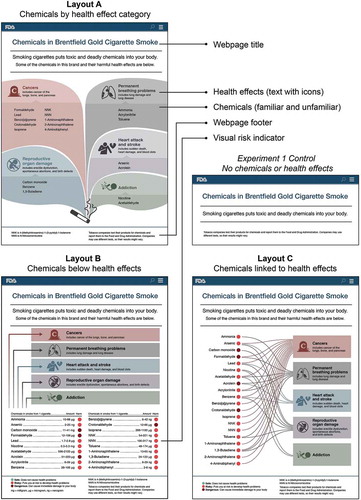
Prior to conducting Experiment 1, we pretested three different user interface layouts. Layout A grouped chemicals by their associated health effect. Layout B showed the health effects at the top of the webpage and the chemicals listed underneath. Layout C listed the chemicals on the left, with lines linking them to the health effects on the right side of the webpage. Layouts A and C allowed participants to determine the health effects caused by each specific chemical, Layout B did not. In pretesting, participants (n = 148) were recruited from MTurk (age: M = 33.65, SD = 9.58; 38% female; 36% smoker) to evaluate the interface designs for perceived credibility (“The webpage looks trustworthy”), believability (“I believe the information on the webpage”), and perceived ease of use (“I could learn to use the webpage quickly”). Response options ranged from “strongly disagree” (coded as 1) to “strongly agree” (5). We did not find differences among the layouts for perceived credibility, F(2, 145) = .17, p = .85 (overall M = 4.26, SD = .94), believability F(2, 145) = 1.76, p = .18, (overall M = 4.52, SD = .70), or perceived ease of use F(2, 145) = .59, p = .56, (overall M = 4.41, SD = .78). With no differences, each layout was used for one of the experiments. For Experiment 1, we used Layout A, with nine variations of the interface as needed for the 3 × 3 design. These webpage designs ranged from having the most information––familiar and unfamiliar chemicals and health effects as text with icons––to our control website with very little information––a short webpage with only the header and footer information ().
After obtaining informed consent, we randomly assigned participants to one of the nine experimental conditions. Participants viewed a static webpage with instructions to “carefully look at the webpage” and were then asked the survey items. The survey concluded with items for participants’ demographics––age, gender, race/ethnicity, education level, and smoking status. Participants in Experiments 1–3 received payment at a rate of around $10 per hour. The University of North Carolina’s institutional review board exempted the study from review.
Measures
Response scales ranged from “strongly disagree” (coded as 1) to “strongly agree” (5), except as noted. Perceived clarity, or how clearly the webpage showed the link between the chemicals and their health effects, was assessed with the item, “This webpage clearly shows the health problems caused by chemicals in cigarette smoke” (M = 3.94, SD = 1.27). Participants reported perceived usability, or whether the webpage’s content was easy to comprehend, with the item, “The webpage content was easy to understand” (M = 4.50, SD = .77) (Yang et al., Citation2012). Willingness to use the webpage (or one like it) to find more information about the chemicals in cigarette smoke was assessed with the item, “If I wanted information about chemicals in cigarette smoke, I’d use a webpage like this” (M = 3.81, SD = 1.12). Lastly, cognitive elaboration, or the amount of thinking about smoking’s harms after viewing the webpage, was assessed with the question, “How much did this webpage make you think about the harmful effects of smoking?” with options that ranged from “not at all” (coded as 1) to “a great deal” (5) (M = 3.90, SD = 1.05) (Fathelrahman et al., Citation2010).
Data analysis
To determine whether chemical and health effect information positively influenced user interface perceptions, we used a 3 × 3 multivariate analysis of variance (MANOVA), 3 × 3 analyses of variance (ANOVAs), and Bonferroni adjusted post-hoc comparisons. The predictor variables were chemicals (none, familiar, combination of familiar and unfamiliar) and health effects (none, text only, text with icon). Analyses also included education (one or more years of college vs. less education) as a moderator. The outcome variables were perceived clarity, perceived usability, willingness to use the webpage, and elaboration. For all tests, we report ANOVAs following statistically significant omnibus multivariate tests (all p < .05). We report interactions that were statistically significant.
Results
User interface perceptions
The chemical display conditions did not differ on perceived clarity, F(2,495) = .20, p = .82 (). Health effects as text or text with icons increased perceived clarity of health problems caused by smoking as compared to not showing health effects, F(2,495) = 103.19, p < .001. Webpages with no chemicals elicited higher perceived usability than webpages with familiar and unfamiliar chemicals, F(2,495) = 4.54, p < .05. Webpages with any chemicals (6 vs. 20) or health effects shown (vs. not shown) did not differ for usability, F(2, 495) = .31, p = .73.
Table 1. Mean (SD) ratings of user experience, Experiment 1 (between subjects).
Motivation
Webpages with familiar and unfamiliar chemicals elicited higher willingness to use the webpage compared to webpages without chemicals, although not more than webpages with familiar chemicals only, F(2,495) = 3.87, p < .05. Showing health effects did not affect willingness to use the webpage, F(2,495) = 1.29, p = .28.
Potential impact
The chemical display conditions did not elicit different levels of elaboration, F(2,495) = 2.41, p = .09. However, participants who saw the webpages with health effects shown as text or text with icons had greater elaboration about the harms of smoking than those who did not see any health effects, F(2,495) = 9.48, p < .001. Correlations for outcomes are in Online Supplemental Materials Appendix A.
Discussion
We found mixed support for H1 (effects of chemical displays) and H2 (effects of health effects displays) on user interface perceptions. Showing the most information––familiar and unfamiliar chemicals––increased the reported likelihood that people would use this website as a resource for information, but it also reduced usability compared to providing no chemical information. However, a website with almost no information (our control condition) would logically not be viewed as a good resource and, of course, it is easier to understand. At the same time, showing any number of chemicals did not reduce webpage clarity. Most importantly, users’ perceptions, motivations, and the potential impact of the webpage were not different for webpages that displayed the additional 14 unfamiliar chemicals alongside the six familiar ones. Since there is no support to exclude the unfamiliar chemicals, we recommend displaying both familiar and unfamiliar chemicals.
Displaying health effects is also important for clearly communicating the link between the chemicals and their harmful effects and increasing the likelihood that users will think about these harms. How these health effects are displayed matters less. Displaying health effects as text with icons may offer a slight advantage. Based on our findings and previous research findings that visuals improve at-a-glance communication and other outcomes (Houts et al., Citation2006), we recommend displaying health effects as text with icons.
Experiment 2: Chemical quantity and visual risk indicator
Scientists struggle with questions of whether and how much quantitative information to present to the lay public. For example, most estimates of risk come as a point estimate (e.g., a midpoint) or with some form of uncertainty, such as a confidence interval. Some research has examined whether point estimates or ranges are preferable, but the literature is too sparse to draw strong conclusions (Brewer, Richman, DeFrank, Reyna, & Carey, Citation2012). Thus, we sought to understand the potential benefits of showing point estimates or ranges of harmful chemicals.
H3:
Displaying quantity information as a point estimate or a range (vs. not providing any quantities) will lead to more positive user interface perceptions of a webpage about chemicals in cigarette smoke.
Many individuals, however, struggle using quantities to make health decisions, as it is hard to determine what the numbers mean (Peters et al., Citation2009). This evaluative meaning can be provided to consumers (e.g., by pairing numbers with labels that indicate if the value is good or bad) to facilitate and even improve health judgments (Brewer et al., Citation2012; Peters et al., Citation2009). Evaluative labels can also highlight important information that may be overlooked in complicated displays (Brewer, Gilkey, Lillie, Hesse, & Sheridan, Citation2012; Dieckmann, Peters, Gregory, & Tusler, Citation2012). Thus, a visual risk indicator that illustrates levels of harm may be an effective interface design strategy to positively influence perceptions and use of quantity information about chemicals in cigarette smoke for lay audiences; including such an indicator is potentially more advantageous than displays that include only numerical information.
H4:
Displaying a visual risk indicator (vs. not displaying it) will lead to more positive user interface perceptions of a webpage about chemicals in cigarette smoke.
Methods
Participants
Participants (n = 487) for Experiment 2 were again recruited through MTurk. Participants’ demographic characteristics were similar to Experiment 1. We used a qualification tool within MTurk to prevent participation in more than one experiment.
Procedures
Experiment 2 used a mixed (between/within) design to examine how the display of chemical quantities and the addition of a color-coded visual risk indicator with evaluative text would affect interface perceptions with Layout B (). The first factor, quantity information, was a within-subjects factor; we hypothesized that seeing webpages in close temporal proximity would increase participants’ ability to evaluate differences in the quantitative information displays (Hsee, Citation1996). Therefore, participants saw three webpages––with no quantities, a single number (e.g., 5 mg), and a range (e.g., 4–6 mg)––in a random order. The second factor, a visual risk indicator, was a between-subjects factor. Half of participants saw these webpages with a visual risk indicator. The visual risk indicator was a colored dot that appeared to the right of each chemical, indicating one of three levels of harm from the indicated quantity: green for “Safe: does not cause health problems,” light red for “Risky: puts you at risk to develop health problems,” and dark red for “Dangerous: can cause immediate damage to your body.” Definitions appeared in a key in the webpage footer. After evaluating the first webpage in their between-subjects condition, participants rated the other two quantity webpage conditions.
Measures
The measures in Experiment 2 were identical to Experiment 1 with two additional items to assess whether the webpage clearly showed chemical amounts and whether the amounts were clearly linked to harm. The additional perceived clarity items were: “This webpage shows the amount of each chemical in a way that I understand” (clarity of amount; M = 3.47, SD = 1.34) and “The webpage clearly shows whether the amount of each chemical is harmful” (clarity that amount is harmful; M = 3.48, SD = 1.43). The perceived clarity item from Experiment 1 (clarity of harm; M = 4.35, SD = .87) was also used. The three perceived clarity items were only asked once after exposure to the first randomly assigned webpage. Response options ranged from “strongly disagree” (coded as 1) to “strongly agree” (5).
The within-subjects portion of Experiment 2 used three of the variables from Experiment 1: perceived usability (M = 4.22, SD = .82), willingness to use the webpage (M = 4.10, SD = .88), and elaboration (M = 4.08, SD = .88).
Data analysis
A MANOVA, 3 × 2 ANOVAs, and Bonferroni adjusted post-hoc comparison were used to analyze the effects of the predictor variables––quantity information (none, midpoint, range) and a visual risk indicator (absence, presence)––on the three perceived clarity measures. A two-way mixed design MANOVA, repeated measures (RM) ANOVAs, and post-hoc pairwise comparisons were used to analyze the effect of the predictor variables on perceived usability, elaboration, and willingness to use the webpage for the within-subjects data. Analyses included education as a moderator.
Results
User interface perceptions
Displaying quantities or the visual risk indicator increased perceived clarity for two of the three measures (). Webpages with midpoints or ranges displayed the amount of each chemical more clearly than webpages without quantity information, F(2,473) = 18.57, p < .001. The visual risk indicator did not increase perceived clarity of the amount of each chemical, F(1,473) = .95, p = .33. The visual risk indicator did increase clarity of the harm associated with the amount of each chemical vs. not showing a risk indicator, F(1,473) = 113.41, p < .001. The clarity of the harm associated with the amount did not differ when quantities were displayed, F(2, 473) = 1.28, p = .28. Neither quantity displays nor the visual risk indicator influenced perceived clarity of harm from chemicals in cigarette smoke, generally, quantities: F(2,473) = .14, p = .87; risk indicator: F(1,473) = .12, p = .74, or perceived usability, quantities: F(2,958) = .99, p = .37; risk indicator: F(1,479) = .22, p = .64.
Table 2. Mean (SD) ratings of user experience, Experiment 2 and 3.
Motivation
Webpages with quantity information––ranges or midpoints––elicited higher willingness to use than those without quantities, F(2,958) = 23.81, p < .001. Quantity information had a larger impact for willingness to use the webpage among participants with more education, F(2,958) = 6.08, p < .01. Displaying ranges or midpoints (vs. neither) increased willingness to use among individuals with high levels of education (both p < .001), but not for those with less education. Showing a visual risk indicator did not have a main effect on willingness to use the webpage, F(1,479) = .71, p = .40, but did affect willingness to use in an interaction with quantity display, F(2,958) = 7.25, p < .01 (Appendix B). Specifically, quantity information increased willingness to use webpages without a visual risk indicator only (p < .05). With the risk indicator, willingness to use was similarly high regardless of quantity information.
Potential impact
Webpages with midpoints elicited greater elaboration of smoking harms than chemical names only or ranges, F(2,958) = 7.27, p < .01.The visual risk indicator did not influence elaboration, F(1,479) = .60, p = .44.
Discussion
Our findings indicated partial support for H3 (effects of quantity information) and H4 (effects of a visual risk indicator) for positive user interface perceptions. In particular, displaying quantity information was beneficial for clearly conveying amounts of chemicals in cigarette smoke; it also positively affected willingness to use the website and encouraged individuals to think about the harms of smoking. Notably, displaying midpoints had a stronger positive impact on user interface perceptions overall than displaying ranges, but the use of ranges is likely preferable for scientific accuracy. Cigarette batches vary in their chemical content, chemical measurements have some margin of error, and individual smokers vary in their smoking topography (puff volume, number of puffs per cigarette, etc.), making it potentially misleading to convey quantity as a single number (Marian et al., Citation2009). Nonetheless, a tradeoff exists between precision of information displayed and the extent of comprehension that will result; decisions about what to present should carefully consider this tradeoff, as well as the potential that having quantities may encourage users to rely on a heuristic––more precision means the information is more credible––without knowledge acquisition or use of the information. The visual risk indicator clarified the meaning of the chemical amounts by linking them to a level of harm and interacted with quantity information for motivation to use the website. Based on these findings and trade-offs, we found two potentially effective formats––ranges and a visual risk indicator––to communicate chemical amounts and harmfulness to lay audiences.
Experiment 3: Ranges and visual risk indicator
Our final experiment used a within-subjects design to compare perceptions of webpages with chemical names only, quantities shown as ranges, and a visual risk indicator without quantity information. Experiment 3 allowed us to further explore the differential effects of quantities (range) and a visual risk indicator found in the previous experiment.
H5:
Displaying quantities (as ranges) or a visual risk indicator will lead to more positive user interface perceptions of a webpage about chemicals in cigarette smoke compared to providing the chemical names only.
Methods
Participants
Participants (n = 455) were recruited via MTurk with the same protocol as the previous experiments and had similar demographic characteristics as in Experiments 1 and 2.
Procedure
Participants viewed three variants of Layout C (range, visual risk indicator, name of chemical only). We randomly assigned participants to view one of the three webpages in the experiment and then asked them to evaluate the user interface. Participants then viewed the remaining two webpages in a random order.
Measures
As in Experiments 1 and 2, participants assessed the user interface for perceived clarity of the amount of each chemical (clarity of amount; M = 3.35, SD = 1.16), perceived clarity of the harm associated with the amount of each chemical (clarity that amount is harmful; M = 3.53, SD = 1.15), perceived usability (M = 3.95, SD = .98), willingness to use the webpage (M = 3.78, SD = 1.02), and elaboration (M = 4.30, SD = .80).
Data analysis
We used an RM MANOVA and post-hoc pairwise comparisons to analyze the effect of the three interface designs––chemical names only, with ranges, and with a visual risk indicator––on perceived clarity, perceived usability, willingness to use, and elaboration. Analyses included education as a moderator.
Results and discussion
Webpages with a visual risk indicator or ranges were perceived as more clearly showing the amount of each chemical and whether that amount is harmful than webpages with chemical names only, amount: F(2,894) = 23.05, p < .001; amount is harmful: F(2,894) = 30.95, p < .001 (). Notably, showing ranges did not increase clarity of amount more than the visual risk indicator (p = .08). Conversely, showing the visual risk indicator increased clarity that the amount is harmful more than ranges (p < .001). The webpage with a visual risk indicator had greater perceived usability than webpages with chemical names only or with ranges, F(2,894) = 20.90, p < .001; ranges did not increase usability compared to chemical names only (p = .13). The visual risk indicator increased willingness to use the webpage over ranges, F(2,894) = 19.58, p < .001. Both the visual risk indicator and ranges increased willingness to use over chemical names alone (p < .05). Elaboration did not differ among the webpages, F(2,894) = 2.88, p = .06.
Our findings confirmed that displaying a visual risk indicator, and to a lesser degree showing chemical ranges, had a positive impact on user interface perceptions (H5). Taking into account the benefits of simpler risk formats (Brewer et al., Citation2012; Peters et al., Citation2007), we recommend having a visual risk indicator of harmfulness instead of chemical amounts.
General discussion
Communicating about chemicals in cigarette smoke is a complex challenge. Our findings suggest that websites may be more usable when they include health effects of chemicals in cigarette smoke, visual risk indicators, and possibly the ranges of chemical quantities. These approaches contextualize information about chemicals in cigarettes in a way that is perceived as usable by the public. Previous research showed that providing a website about the harmful chemicals in smoke increases comprehension of these chemicals and harm perceptions of the products compared to seeing no website (Portnoy, Citation2013). We provide specific guidance to increase the usability of the website.
User interfaces are the gateway to critical health information on consumer health websites; how an interface looks can also greatly influence consumers’ perceptions and use of that information (Eysenbach, Citation2005; Lazard & Mackert, Citation2015). We found that what information is displayed affects user interface perceptions. Displaying contextual cues for meaning––showing health effects associated with the chemicals––improved the perceived clarity of harm and, most importantly, increased their thinking about the harms of smoking. The inclusion of unfamiliar chemicals did not negatively affect users’ perceptions, motivations, or the potential impact of the webpage, and thus, we recommend displaying both familiar and unfamiliar chemicals to provide potentially novel information.
The US is required to display quantity information of toxic chemicals in cigarette smoke. We found that how this information is displayed is important. Showing any quantity information––either as a point estimate or range––positively influences perceived clarity and motivations for use; however, qualitatively representing the quantities––through a visual risk indicator––had the greatest impact for overall user perceptions. Specifically, in our final experiment, displaying a visual risk indicator positively influenced the clarity of the amount and harm of each chemical, usability of, motivations to use, and elaboration of the website. The positive effects of the visual risk indicator are likely due to users’ ability to derive meaning from the interface quickly (Peters et al., Citation2009). Additionally, the use of the risk indicator or numeric ranges are likely preferable to point estimates in terms of scientific accuracy (Marian et al., Citation2009).
Our findings are based on three national online convenience samples; generalizability to the general public remains to be established. MTurk samples tend to be younger and more highly educated than the general US population (Ross, Irani, Silberman, Zaldivar, & Tomlinson, Citation2010). Although education was rarely a moderator, future studies should investigate the roles of low health literacy or numeracy as moderators. Also, we manipulated a limited number of design variables in the webpages. Other webpage variations or experimental designs (e.g., where number of chemicals is not confounded with familiarity) could have greater effects. However, the webpages were designed to test what we believe are the most important variables for the legal requirements and in accordance with best practices for consumer health website design (Eysenbach, Citation2005).
Future research should explore how these interface designs increase knowledge, change behavior, or are misleading to lay audiences, potentially comparing webpage layouts along with the presentation of content. Additionally, following consumer health informatics recommendations, an ideal next step would be to test the impact of tailored information, potentially integrating information about toxic chemicals in cigarette smoke with other individual data (e.g., cigarettes smoked per day) to inform health choices (Eysenbach, Citation2000, Citation2005). Designing tobacco communication to be personalized will likely help consumers process and use information (Alpay, Verhoef, Xie, Te’eni, & Zwetsloot-Schonk, Citation2009).
Conclusion
Clearly communicating about chemicals in cigarette smoke and their health effects to the public is a challenging task for tobacco control. Using a user-centered, iterative design approach, we identified website formats––displaying chemicals with their associated health effects, showing a visual risk indicator––that the public is more likely to (1) perceive as clear and easy to understand, (2) use when looking for information about chemicals in cigarette smoke, and most importantly, and (3) use to think about the harms of cigarette smoke. Our findings provide guidance for how the US government can effectively inform consumers about the toxins in cigarette smoke.
Declaration of potential conflicts of interest
The content is solely the responsibility of the authors and does not necessarily represent the official views of the NIH or the Food and Drug Administration.
Acknowledgments
The authors would like to thank Cori Dymond and Aleah Howell for their design contributions to this project. We also thank Kurt Ribisl and Irina Stepanov for their assistance in this team project.
Funding
Research reported in this publication was supported by grant number P50CA180907-03S1 from the National Cancer Institute and the FDA Center for Tobacco Products (CTP). The content is solely the responsibility of the authors and does not necessarily represent the official views of the NIH or the Food and Drug Administration.
Additional information
Funding
References
- Family Smoking Prevention And Tobacco Control Act. (2009). 111th Congress of the United States of America. Pub. L. No. 111–31, 123 Stat. 1776, Washington, DC: U.S. Government Publishing Office.
- Alpay, L., Verhoef, J., Xie, B., Te’eni, D., & Zwetsloot-Schonk, J. (2009). Current challenge in consumer health informatics: Bridging the gap between access to information and information understanding. Biomedical Informatics Insights, 2, 1–10. doi:10.4137/BII.S2223
- Brewer, N. T., Gilkey, M. B., Lillie, S. E., Hesse, B. W., & Sheridan, S. L. (2012). Tables or bar graphs? Presenting test results in electronic medical records. Medical Decision Making, 32, 545–553. doi:10.1177/0272989X12441395
- Brewer, N. T., Morgan, J. C., Baig, S. A., Mendel, J. R., Boynton, M. H., Pepper, J. K., ... & Ribisl, K. M. (2017). Public understanding of cigarette smoke constituents: three US surveys. Tobacco control, 26, 592–599. doi:10.1136/tobaccocontrol-2015-052897
- Brewer, N. T., Richman, A. R., DeFrank, J. T., Reyna, V. F., & Carey, L. A. (2012). Improving communication of breast cancer recurrence risk. Breast Cancer Research and Treatment, 133, 553–561. doi:10.1007/s10549-011-1791-9
- Buhrmester, M., Kwang, T., & Gosling, S. D. (2011). Amazon’s Mechanical Turk a new source of inexpensive, yet high-quality, data? Perspectives on Psychological Science, 6, 3–5. doi:10.1177/1745691610393980
- Casler, K., Bickel, L., & Hackett, E. (2013). Separate but equal? A comparison of participants and data gathered via Amazon’s MTurk, social media, and face-to-face behavioral testing. Computers in Human Behavior, 29, 2156–2160. doi:10.1016/j.chb.2013.05.009
- Crump, M. J., McDonnell, J. V., & Gureckis, T. M. (2013). Evaluating Amazon's Mechanical Turk as a tool for experimental behavioral research. PLoS ONE, 8, e57410. doi:10.1371/journal.pone.0057410
- Dieckmann, N. F., Peters, E., Gregory, R., & Tusler, M. (2012). Making sense of uncertainty: Advantages and disadvantages of providing an evaluative structure. Journal of Risk Research, 15, 717–735. doi:10.1080/13669877.2012.666760
- Eysenbach, G. (2000). Recent advances: Consumer health informatics. Bmj, 320, 1713–1716. doi:10.1136/bmj.320.7251.1713
- Eysenbach, G. (2005). Design and evaluation of consumer health information web sites. In D. Lewis, G. Eysenbach, R. Kukafka, Z. Stavri, & H. Jimison (Eds.), Consumer health informatics: Informing consumers and improving health care (pp. 34–60). New York, NY: Springer.
- Fathelrahman, A. I., Omar, M., Awang, R., Cummings, K. M., Borland, R., & Samin, A. S. B. M. (2010). Impact of the new Malaysian cigarette pack warnings on smokers’ awareness of health risks and interest in quitting smoking. International Journal of Environmental Research and Public Health, 7, 4089–4099.
- Goldberg, L., Lide, B., Lowry, S., Massett, H. A., O’Connell, T., Preece, J., … Shneiderman, B. (2011). Usability and accessibility in consumer health informatics: Current trends and future challenges. American Journal of Preventive Medicine, 40, S187–S197.
- Houts, P. S., Doak, C. C., Doak, L. G., & Loscalzo, M. J. (2006). The role of pictures in improving health communication: A review of research on attention, comprehension, recall, and adherence. Patient Education and Counseling, 61, 173–190.
- Hsee, C. K. (1996). The evaluability hypothesis: An explanation for preference reversals between joint and separate evaluations of alternatives. Organizational Behavior and Human Decision Processes, 67, 247–257.
- Islam, M. N., & Bouwman, H. (2016). Towards user–Intuitive web interface sign design and evaluation: A semiotic framework. International Journal of Human-Computer Studies, 86, 121–137.
- Katz, M. G., Kripalani, S., & Weiss, B. D. (2006). Use of pictorial aids in medication instructions: A review of the literature. American Journal of Health-System Pharmacy, 63, 2391–2397.
- Keselman, A., Logan, R., Smith, C. A., Leroy, G., & Zeng-Treitler, Q. (2008). Developing informatics tools and strategies for consumer-centered health communication. Journal of the American Medical Informatics Association, 15, 473–483.
- Lazard, A., & Atkinson, L. (2015). Putting environmental infographics center stage: The role of visuals at the Elaboration Likelihood Model’s critical point of persuasion. Science Communication, 37, 6–33.
- Lazard, A., & Mackert, M. (2015). E-health first impressions and visual evaluations: Key design principles for attention and appeal. Communication Design Quarterly, 3, 25–34.
- Marian, C., O’Connor, R. J., Djordjevic, M. V., Rees, V. W., Hatsukami, D. K., & Shields, P. G. (2009). Reconciling human smoking behavior and machine smoking patterns: Implications for understanding smoking behavior and the impact on laboratory studies. Cancer Epidemiology and Prevention Biomarkers, 18, 3305–3320.
- Peters, E., Dieckmann, N., Dixon, A., Hibbard, J. H., & Mertz, C. (2007). Less is more in presenting quality information to consumers. Medical Care Research and Review, 64, 169–190.
- Peters, E., Dieckmann, N. F., Västfjäll, D., Mertz, C., Slovic, P., & Hibbard, J. H. (2009). Bringing meaning to numbers: The impact of evaluative categories on decisions. Journal of Experimental Psychology: Applied, 15, 213–227.
- Portnoy, D. B. (2013). FDA Experimental study on the public display of lists of quantities of HPHCs: Analysis and results. Paper presented at the Risk Communication Advisory Committee & Tobacco Products Scientific Advisory Committee Joint Meeting, Silver Spring, MD.
- Ross, J., Irani, L., Silberman, M., Zaldivar, A., & Tomlinson, B. (2010). Who are the crowdworkers?: Shifting demographics in amazon mechanical turk. Paper presented at the ACM CHI Conference in 2010.
- Rothman, A., & Kiviniemi, M. T. (1999). Treatin8hjjg people with information: An analysis and review of approaches to communicating health risk information. Journal of the National Cancer Institute Monographs, 25, 44–51.
- United States Department of Health Human Services. (2014). The health consequences of smoking—50 years of progress: A report of the Surgeon General. Atlanta, GA.
- United States Food and Drug Administration. (2012a). Guidance for industry: Reporting harmful and potentially harmful constituents in tobacco products and tobacco smoke under Section 904(a)(3) of the Federal Food, Drug, and Cosmetic Act, Draft Guidance. Rockville, MD: Food and Drug Administration.
- United States Food and Drug Administration. (2012b). Guidance for industry: Reporting harmful and potentially harmful constituents in tobacco products and tobacco smoke under Section 904(a)(3) of the Federal Food, Drug, and Cosmetic Act, Draft Guidance. 77 Fed. Reg. 20034. Rockville, MD: Food and Drug Administration.
- Yang, T., Linder, J., & Bolchini, D. (2012). DEEP: Design-oriented evaluation of perceived usability. International Journal of Human-Computer Interaction, 28, 308–346.
Appendix A. Correlations of outcomes in Experiments 1–3
Appendix B. Interaction of quantity information and visual risk indicator in Experiment 2
Note: Bars show standard errors.
