
ABSTRACT
Interactive web documentaries have the potential to engage people with important topics through innovative storytelling approaches. Understanding how users interact with web documentaries and to what extent they consume their content can help documentary filmmakers reach a broader or more engaged audience. In this article, we provide an in-depth and quantitative analysis of an interactive web documentary called iOtok. The 13 episodes of iOtok were launched on an online portal showcasing a variety of features (chat, souvenirs, animated 360 panoramas, etc.), on a weekly basis. Through the analysis of more than 20 000 sessions, newsletter statistics and one online questionnaire, we discuss the impact of serialization and interactivity on audience reception and user engagement. Data show that in the case of iOtok, serialization had a positive impact (large number of sessions over time, long time on site). However, and somehow unexpectedly, every click led to a considerable amount of users dropping off and quitting the web portal before reaching the core videos. This article also addresses other aspects of web documentaries, such as the efficiency of various media to reach and engage users over time and differences in behaviors between registered and unregistered users.
1. Introduction
Over the last two decades, the “battle for the screen,” or battle for people’s attention, called for new ways of reaching and engaging audiences. Documentary filmmakers have also started using the world wide web (just web from here on) to explore new ways of delivering their messages. Web technologies facilitate the distribution of documentaries, both temporally – as documentaries can be watched at any time and remain theoretically permanently available –, and spatially – as documentaries can be accessed from anywhere. The interactivity of web technologies also provides documentary filmmakers with the opportunity to explore and design new forms of documentaries that have the potential to make the audience more engaged.
Over the last 10 years, a growing number of studios or production companies investigated these new forms of documentaries, while scholars started defining and building theoretical frameworks for their analysis and understanding. The interactive and transmedia documentaries have been discussed as an emergent genre, sharing particular characteristics, notably in terms of audience reception and narrative methods, and successful web documentaries have been used as case studies for these conceptual analyses.
However, there is a lack of available empirical data regarding how do users actually consume and interact with web documentaries, as these are mainly produced by private production companies that do not reveal such data. Some organizations such as DocSocietyFootnote1 provide case studies, but these studies focus on the impact of web documentaries at a macro-level (i.e., by measuring press coverage) and do not consider users’ interactions and behaviors. In fact, and as stated in (K. Nash, Citation2014a), “given the current absence of any comprehensive audience research we have only anecdotal evidence about how users do in fact access interactive documentary content.” As a consequence, there are still several questions unanswered such as Is interactivity necessarily a good thing? Can interactive and serialized documentaries grab users’ attention and engage them over time? Can interactivity affect the social impact of the documentary?
In this paper, we address these questions by reporting on an in-depth quantitative analysis of the interactive web documentary called iOtok,Footnote2 directed by Miha Čelar and telling the story of 13 inhabitants of Biševo, a small Croatian island threatened by mass tourism. The design of iOtok relied on two main techniques: (i) the serialization of the web documentary into 13 episodes that were launched every week and (ii) the navigation through 360° animated and interactive scenes (including audio, pictures, text) to access the core videos of each episode. Although these two techniques have already been used in web documentaries, their impact in terms of audience engagement has not been investigated yet.
In order to assess different features of iOtok, and, more generally, the potential of interactive web documentaries, we collected users’ actions on the web portal during the 13 weeks of the documentary official distribution, providing a large database containing observations from more than 20 000 sessions. In addition, a questionnaire was sent to users to collect feedback on their use of different interactive features. These sources of data, alongside newsletter statistics and data from Google Analytics, are used to provide a comprehensive overview and discussion of an in-the-wild study of users’ interaction with this web documentary.
The paper is structured as follows. We first provide an overview of the literature on interactive documentaries, focusing on their main characteristics and different metrics that have been proposed to assess their usability and effectiveness in terms of users’ engagement. We then describe the narrative and interactive methods used in iOtok. In Sections 5, 6 and 7, we present data collected from the website, the questionnaire, and newsletter statistics. In Section 8 and 9, we discuss the main findings and their implication in terms of design and audience reception.
2. Related work
2.1. Linear, interactive, and web documentaries
2.1.1. A new genre of documentaries
Since 2009, the genre of Interactive Documentaries has been largely discussed and theorized by scholars working in the field of digital media and several definitions and core concepts have been proposed and identified (Gifreu-Castells, Citation2017). For example, Galloway defines interactive documentary as “any documentary that uses interactivity as a core part of its delivery mechanisms.” (Galloway et al., Citation2007) Another commonly accepted definition is that “any project that starts with an intention to document the ‘real’ and that uses digital interactive technology to realise this intention can be considered an interactive documentary.” (Aston & Gaudenzi, Citation2012) When delivered over the web, interactive documentaries are often referred to as web documentaries or web-docs (Aston & Gaudenzi, Citation2012). Whether interactivity is an essential characteristic of web-docs or not depends on a particular definition. For example, Nash considers interactivity as an essential characteristic of web-docs (K. Nash, Citation2012a), while Aufderheide does not (Aufderheide, Citation2015). A related term to interactive documentaries is transmedia documentaries, which include the use of multiple formats (e.g., video, text, images, animations, etc.) and/or platforms (e.g., web, mobile applications, books, interactive installations, video games, etc.) to distribute the content (Vázquez-Herrero & Gifreu-Castells, Citation2019). Similarly, transmedia documentaries often include interactive features, but not always (O’Flynn, Citation2012).
In his analysis of the evolution of interactive documentaries, Gifreu-Castells considers that the interactive documentary as a new documentary form has entered the “diversification phase” (Gifreu-Castells, Citation2017), during which more and more interactive documentaries are produced, and with a large range of techniques, platforms, and means of production. The key factor in the emergence of the interactive documentary as a new digital form was the development of the web, which allowed creators to more easily distribute online videos and to experiment new ways of broadcasting their films (Almeida & Alvelos, Citation2010). Nowadays, interactive web documentaries offer an interesting alternative to traditional documentaries distributed on TV or on online platforms, as they have the potential to engage viewers thanks to their interactivity and non-linearity.
2.1.2. Linear (traditional) vs non-linear (interactive) documentaries
Gifreu-Castells (Gifreu-Castells, Citation2017) identified several differences between traditional and interactive documentaries. Firstly, “the concepts of choice and control” are no more in the documentary filmmaker’s hands only, but are rather given to the user, who becomes the narrator and endorses some of the documentary filmmaker’s roles. The first consequence is that interactive documentaries are often non-linear, unlike traditional documentaries. Therefore, the content can be accessed in various ways, and, consequently, can lead to various discourses and even discourses’ interpretations. The viewer is no longer a mere consumer, but actively co-creates the documentary (or at least some aspects of it). Another key difference is that although some “reactive components” can be found in traditional documentaries (e.g., selecting a scene on a DVD menu), those are often not mandatory. On the contrary, interactive documentaries provide the user with several interactive items that must be found and interacted with in order to access different parts of the documentary from which the viewing experience will emerge. In addition, whereas linear documentaries only rely on cognitive/mental participation, interactive documentaries also rely on “some type of physical participation,” triggered by the navigation and interaction modes of the documentary. Finally, Gifreu-Castells posits that one key difference between traditional and interactive documentaries is their flexibility: while traditional documentaries cannot be changed once distributed, interactive documentaries have the potential to be modified over time, e.g., by integrating user-generated content and/or up-to-date content (Almeida & Alvelos, Citation2010). Therefore, and as stated by Harvey (Harvey, Citation2012), three key characteristics of interactive documentary are (i) its “multiple authorship,” in the sense that both the documentary filmmaker and the viewer co-create the content; (ii) its non-linearity; and (iii) the active viewing process that creates the documentary experience.
2.1.3. Interactive documentaries: Typology and roles
Focusing on the interactive aspects of the documentaries, Gaudenzi (Gaudenzi, Citation2013) proposed a taxonomy of interactivity that characterizes how the audience can access the documentary content. They identified four interactive modes. The conversational mode aims to “reproduce the interaction between two human beings, or a human in a physical space.” In such interactive documentaries, users are theoretically completely free to explore their environment (usually a virtual world) and its “endless possibilities,” and to converse with the system that provides fluid and seamless answers. With the participatory mode, users are not only co-creators but also co-producers. Referred to as collab-docs or participatory-docs, the participation of the user can take several forms, such as uploading digital media, answering questionnaires, translating documents, or taking part in chat sessions. The experiential mode involves the real environment: users can, for example, access different content based on their physical position in a city or in an interactive installation, which creates “a hybrid space where the distinction between the virtual and the physical becomes blurred.” Finally, the fourth and probably most popular mode of interactivity is called hitchhiking or hypertext: in such documentaries, users are invited to click on interactive elements in order to access and navigate the documentary content, jumping from one screen to another. Here, the narrative is constrained by the number of different paths that the user can follow at each step. By offering a small set of choices, the documentary filmmaker can force the user to access a particular set of videos, while giving the users a sense of freedom and making them more active. Illustrative examples of hypertext documentaries include Bear71,Footnote3 Out of my Window,Footnote4 Gaza/Sderot: Life in Spite of EverythingFootnote5 and Journey to the End of Coal.Footnote6 However, interactivity may also come at a cost, as stated by Forceville (Forceville, Citation2017): “the freedom of the user in interactive documentary comes at the price of proportionally reducing the maker’s power to argue, and considerably increases the risk that the user will pre- maturely stop engaging with the documentary.”
Nash also proposed a framework to better understand the meaning of interactivity (K. Nash, Citation2012a). She distinguished three structures of web documentaries where interactivity plays a different role.
2.2. Analyzing interactive documentaries
The potential of interactivity for documentaries raises several questions: How do users understand and take advantage of the interactivity provided by the web documentary? Does interactivity positively affect user experience compared to traditional documentaries? If the documentary filmmaker used interactivity to foster discussions, were the navigation and interaction methods efficient in doing so?, etc. While scholars tend to address these questions through a theoretical prism only, building, for example, on concepts from the fields of semiotics or narratology, production companies, and digital media organizations use a variety of quantitative metrics.
2.2.1. Narrative structures and interactive methods
Examples of theoretical analyses include the work of Nogueira (Nogueira, Citation2015) or Dubois (Dubois, Citation2018). Nogueira (Nogueira, Citation2015) analyzed the web documentary Fort McMoneyFootnote7 using a semiotic framework, discussing the director’s design choices and the narrative structure to explain how the audience could engage and interact with the web documentary. Similarly, Dubois (Dubois, Citation2018) provided a detailed commentary of the navigation techniques of the documentary Atterwasch,Footnote8 discussing how they could alter the viewing experience and what is the purpose of interactivity. Forceville (Forceville, Citation2017) analyzed five interactive documentaries to better understand how the documentary maker’s role in convincing viewers could be affected by the interactivity of the documentary itself. His analyses covered five dimensions: the length of the documentary, its interface, the available navigation paths, the motivation to explore the documentary content, and the sources of persuasion.
Nash’s analyses of web documentaries, although mainly theoretical as well, are more singular as they rely on empirical data, such as participants’ comments. For example, in (K. Nash, Citation2014b), Nash discussed the reception of the web documentary Bear 71Footnote9 by analyzing verbal comments made by 23 participants after they viewed the documentary. Her analysis of the collaborative documentary Goa Hippie Tribe,Footnote10 produced for and with Facebook, also includes some participants’ posts (K. Nash, Citation2012b). In (K. Nash, Citation2012a), Nash also relies on the analysis of the discussion threads of Prison ValleyFootnote11 to illustrate the persuasive role of web documentaries. Pettengil’s thesis addressed the user experience in interactive documentaries through a study of Bear71 with 15 participants (Pettengil & Bear 71, Citation2017). This study revealed the importance of providing users with clear wayfinding instructions, an intuitive interface, and a clear objective regarding the narrative progression.
Alkarimeh’s thesis provides the most comprehensive empirical study of interactive documentary (Alkarimeh, Citation2019): conducted with 360 participants, its goal was to compare three versions of one documentary: a non-interactive linear documentary; a low interactive documentary; a high interactive documentary with several features. The study focused on users’ perceptions (narrative engagement, perceived interactivity and involvement, attitude toward the website) and users’ interactions using a combination of interviews and quantitative data (e.g., questionnaires and number of page viewed). Results showed that interactivity affected perceived interactivity, which was itself correlated with perceived involvement and attitude toward the website. Interestingly, it also showed that participants in the low-interactivity condition demonstrated a greater narrative engagement than participants in the high-interactive condition.
2.2.2. Metrics for audience reception
Professionals and organizations use a variety of metrics to assess audience reception and to better understand “how content is consumed and interacted with” (Zamith, Citation2018). They use methodologies developed for web analytics and marketing, such as specific audience metrics, which can be defined as “the quantified and aggregated measures of audience preferences and behaviours generated by […] data collection and processing systems.” (Zamith, Citation2018)
Most common metrics include the number of new visitors (also called first-time visitors), the number of repeat visitors and the number of unique visitors (Jansen, Citation2009). However, since one visitor can actually represent several members of one family that use the same computer, other metrics can be used, such as the number of unique visits and sessions. Other common metrics include top pages, average time on site, visitor path. Bounce rates are also widely used, and indicate the “percentage of visitors who enter the site and then leave (‘bounce’) rather than continuing to view other pages within the same site.”Footnote12 The relevance of each metric depends on the type of website. For content and media websites, important metrics are: new visitor ratio (new visitor/unique visitors), returning visitor ratio (unique visitors/total visits) and visit depth (the number of pages per visit) (Jansen, Citation2009).
Two main methods exist to collect data: web server log files and page tagging. While the former is widely used, it also suffers from several limitations (Jansen, Citation2009): 1) caches can lead to underestimation of the number of visitors; 2) traffic can be overestimated due to page requests that “are counted even if the user has already left the page before is has loaded”; 3) visit duration is difficult to estimate since “the page requested after the last page by definition is requested from another server”; 4) unique IP addresses can be shared by multiple users; 5) linking an initial visit to subsequent visits can be difficult, despite the use of cookies. As for page tagging, it describes a Javascript-based tracking method: every web page contains a snippet of code that tracks a visitor with a cookie and sends data back to a central server. Page tagging is used, for example, by Google Analytics and IBM Unica NetInsight. Both methods can be implemented and can be used in conjunction to give a better overview of users’ interaction with the website.
Despite a large number of resources that helping people identify the most appropriate audience metrics, their interpretation is really dependent on the website being analyzed, and there are no standard or ideal values with which audience metrics for one website can be compared to another. Despite this, some reports on audience reception of web documentaries have come to light. A report published by the open-source community StoryCode in 2015 (Epstein & Knowlton, Citation2015) provides interesting insights on audience reception of new forms of media, based on the analysis of five projects (not all were web documentaries, but all relied on web technologies). Their key findings were that (1) on average, visitors consume approximately 20% of the available content; (2) on average, they spend 5 minutes on the site; (3) 75% of users are new and 25% are returning visitors; (4) independent productions reach 10 000 to 20 000 visitors, while mainstream productions can reach from 100 000 to 1 million visitors. The same report gave some figures about the reception of three web documentaries, summarized in .
Table 1. Audience reception of three web documentaries according to Epstein & Knowlton, Citation2015.
Aufderheide (Aufderheide, Citation2015) also reports on audience data of three web documentaries, which were provided by their respective production companies, and which we summarize in .
Table 2. Audience reception of three web documentaries according to Aufderheide, Citation2015.
It has to be noted that the average time on site includes the actual navigation as well. Both and report on little time spent on the content compared to the length of the documentary while the number of unique visitors is very high and probably growing with time. Unfortunately, more detailed analysis of the interaction and consumption of content are missing in order to understand what works and what not.
2.3. Conclusion of related work: Research questions and chosen methods
Interactivity of web documentaries can be understood and analyzed from various perspectives, but in all cases, it implies roles and opportunities that traditional documentaries cannot offer. From a narrative perspective, interactivity often implies co-authorship and non-linearity; from an audience perspective, interactivity can be a key element in fostering discussions and engagement; from a more user-centric perspective, interactivity can create new ways for people to access content. But does interactivity keep its promises?
In order to answer this question, we offer an in-depth analysis of the reception of the iOtok interactive documentary to better understand the pros and cons of interactivity. iOtok belongs to web documentaries, and in particular to documentaries that follow the “hitchhiking” mode of interaction, as defined by Aston and Gaudenzi (Aston & Gaudenzi, Citation2012). Visitors are invited to click on interactive elements on panoramic animated scenes to access videos. Another key aspect of iOtok was its serialization, i.e., its content was progressively revealed over a period of 13 weeks. People were therefore invited to regularly access the website and to pursue their exploration of the island over time.
Through an in-depth analysis of iOtok, we aimed to better understand to what extent and in which way can interactivity and serialization impact the reception of a web documentary. More precisely, we aimed to understand how did the “hitchhiking” approach affect the way users access the documentary and whether the interactivity and serialization of the documentary encouraged users to revisit the website.
This work focuses on two overlapping main aspects: (i) the audience reception, which mainly addresses the reception of the web documentary over the 13 weeks of its distribution from a global perspective (number of sessions, traffic sources, demographics, context of use, etc.); and (ii) the user engagement, defined as “a quality of user experiences with technology” (O’Brien & Toms, Citation2008), which focuses on users’ actions with the web-doc over time (number of visits per user, number of videos watched, time on site) and in particular with its interactive elements (number of clicks, use of the additional features, etc.). For each of these, we employed a variety of quantitative metrics, as suggested by the literature. The data were collected from different sources: the website itself, Mailchimp (the service used for the newsletters distribution), one questionnaire, and data from two Facebook pages of the documentary.
It should be noted that given the substantial amount of data presented in this article, we were not able to address other important aspects of iOtok: its social impact, the viewing behaviors of the users, their understanding of the story, etc. These considerations will be discussed in another publication.
3. iOtok – Description of the web portal
3.1. Synopsis
iOtok (iIsland in English) was originally created as an interactive web documentary and was later adapted as a traditional documentary. Both tell the same story–the one of a small island off the Croatian coast, called Biševo. Albeit not too far away from famous touristy islands, Biševo with its 13 inhabitants is not yet a popular tourist destination. However, the tourist industry is willing to popularize it and the calm life of its inhabitants is already threatened by the regular arrivals of boats full of tourists. The idea of rehabilitating the old primary school of Biševo into a tourist center with multimedia presentations is discussed, notably by the current mayor, who is running for another mandate. Lada and Lucio, a couple living on the island, set up a new committee to protect their island. Through a series of videos, iOtok reveals the lives of these inhabitants as well as their thoughts and feelings regarding the future of the island.
3.2. Structure of iOtok documentary
The iOtok web documentary is composed of 13 episodes, each focusing on one couple or one inhabitant of the island. The core of each episode is a ca. 10-minutes-long video that is accessed through clicks on the animated 3D panoramic view of the island and its houses, and/or on 360 panoramic photos of the surroundings or interiors of the selected house. The web portal and videos can be accessed in Croatian or Slovene (due to the proximity of the two countries, Croats and Slovenes were the main targeted audience). The 13 episodes were launched every Monday for 13 weeks, enabling viewers to progressively discover the story of the island and its inhabitants.
Users could visit the web documentary in three different ways: (i) by typing the URL address www.iotok.eu into the address bar of their browser, (ii) by searching for it with a web search engine (e.g., Google), or (iii) by clicking on a link at an external page (see Section 3.5 for statistics on traffic sources). Newsletters, news articles, and Facebook posts directed users to the episode the article related to (e.g., https://iotok.eu/hr/epizoda/10/). If users did not provide the episode number when typing in the URL, the first episode was shown. However, one should keep in mind that browsers remember URLs: users could therefore access the last episode they watched using auto-completion.
3.3. Description of the interface and its main components
The interface of the website was predominantly designed by the filmmaker. The researchers in collaboration with CORA agency acted as the development team.
The web portal is composed of three main panels (): (i) the main or central panel, showing either the 3D island, 360 panoramic photos or documentary videos or content for additional features; (ii) a menu at the bottom; and (iii) a panel on the right enabling users to sign in, register, access different links or exchange messages using the chat. Each panel is described in the next subsections.
Figure 1. Each page of the web portal is composed of three panels: the main panel (e.g., to display the videos), the bottom panel with elements giving access to additional features; the right panel with login and chat (when active). Left: screenshots of the home page and 360 panoramic photos. Top-middle: the gallery of multimedia souvenirs collected at the end of some episodes. Top-right: the news show a short description of the last episode launched as well as a thumbnail of the video. Bottom-middle: the chat on the right panel. Bottom-right: people could create, share, and vote for postcards of virtual islands created using the iOtok mobile app.
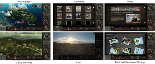
3.3.1. Main panel
Upon entering the portal, the user is invited to start the first episode (unless they clicked on a link redirecting them to the last launched episode). Two arrows on the top-left corner enable users to navigate through already released episodes. The island in the background is animated: the clouds slowly move over the island and the names of the 13 inhabitants move along small portions of the paths, as if following them. The number of the current episode is displayed next to the name(s) of its main protagonist(s). User must “enter the episode” to start interacting with the scene, as we describe in Section 3.4. A small frame on the bottom-left corner shows a picture of the narrator, a Slovenian writer who came to the island to write his last novel.
3.3.2. Bottom panel: Menu
The panel at the bottom enables users to access different features, namely, from left to right:
Souvenirs. The chest of drawers on the left has three drawers containing multimedia souvenirs that the user collects at the end of some episodes, including pictures, videos, texts (e.g., cooking recipes mentioned in the documentary, poems), and audio files (e.g., a song). When clicking on each drawer, a gallery showing the collected souvenirs is displayed ( top-left), and users can click on each souvenir to enlarge it in the main panel.
News. The bottle with a parchment inside is the icon for the “News.” When clicked on, a short description of the last episode launched is displayed together with a screenshot of its video ( top-right).
Chat. The menu icon representing a cage with birds inside allows registered users to open the chat with persistent messages and to communicate with other users present on the portal ( bottom-left).
A link to the iOtok augmented reality mobile app that enables users to create their own virtual islands from the drawn contour lines on a white sheet of paper.
A link to the “Postcard” project, which enables users to view virtual postcards of virtual islands ( bottom-right) created using the described mobile app and vote for the best one. We will refer to this feature as “Postcards.”
No additional features can be accessed while a video is being played.
3.3.3. Right panel
The right panel initially contains the sign in or register form on the top. Once logged in, this space is occupied by the porthole picture (see, e.g.,, top) and by clicking on it users can watch a short concept video of a fishing game. Chatroom also occupies this space (see bottom-left) if selected on the bottom panel. The element below shows the name and number of the current episode. Further down the scattered five buttons in the form of bottle tops enable users to display the window in full-screen, send an e-mail, share the episode on Facebook, turn on and off the sound, and watch a short promotional video of the web documentary.
3.4. Interactivity
3.4.1. Usage scenario
In this section, we describe in detail how a user could navigate the portal for Episodes 2, 3, 4, 5, 6, and 8, which all follow the same structure. A screenshot of each step is visible in .
Figure 2. Screenshots of the different steps described in.Section 3.4.1
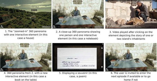
When clicking on “enter episode” (“vstopi v epizodo” as seen in ), the main panel is changed from the 3D island to a zoomed-in portion of the island on a 360 panoramic photo. One element of the scene (e.g., a building) is interactive and is highlighted by a light gray outline that gently flickers. When the user hovers it, the element stops flickering.
When the user clicks on that interactive element, the scene is again updated to a new 360 panoramic photo that shows a close view of the main protagonist(s) of the episode. A 10 to 20 seconds narration is played giving an explanation of the scene. The picture of the narrator is animated with a few soundwaves and a replay and mute buttons are displayed next to the picture. When the narration finishes or when the user clicks on the “mute” icon, one element of the scene is once again highlighted.
When the user clicks on that element, a video is played. Users can close the video at any time.
When the video is closed or at the end of the video, the main panel shows the panoramic scene from 2) again, with a new interactive element (an object such as a pot or a tool).
When the user clicks on this element:
For registered users, a souvenir is displayed.
For unregistered users, a pop-up window appears with a form to sign in.
For registered users only:
When the user closes the received souvenir, a short sound is played, the souvenir drawers are highlighted and a text reading “new souvenir stored” is displayed. The user is then invited to return to the initial 3D island from where they can enter the next episode.
Other episodes are very alike and are described in detail in Appendix A. All episodes have a linear narrative, except Episodes 9 and 12, which have a fishbone narrative that allows viewers to veer off but always return to the main thread of the story. None of the episodes used a more complex branching, parallel, threaded, or concentric narrative.
3.4.2. Animation of and interaction with the panoramas
As illustrated on , 360 panoramas are used in steps 1, 2, and 4. Once displayed, and until users click on one element, the camera slowly rotates from left to right to show the surroundings. Some elements of the panoramas are animated, such as the smoke that emanates from the houses’ chimneys or the flames under a pot and flare effects that appear from the direction of the sun. In addition, the panoramas are enhanced with a continuous audio background in order to further immerse the user into the island, such as birds twittering, waves splashing, or wind blowing.
Users can explore the surroundings of the island by changing the camera’s point of view. With the mouse or keyboard, users can rotate and zoom. However, it is not possible to change the position of the camera within the panoramic image. It can also happen that by either automatic or manual change of the camera view, the interactive elements move out of sight.
3.5. Promotion of the documentary
As mentioned before, the web documentary was intended to Croats and Slovenes as it was available and advertised in these two languages. Several media were used to reach these audiences.
Three online news portals published an article regularly every week (mostly on Mondays) after the release of each episode: dnevnik.hr (a major newspaper in Croatia, 14 articles published); rtvslo.si (a national radio and TV broadcasting corporation RTV Slovenia, 13 articles published); enavtika.si (a dedicated news portal for maritime themes in Slovenia, 13 articles published). During the first month at least one article about iOtok was published by print nationwide newspapers (Slobodna Dalmacija – Croatian, Večernji list – Croatian), magazines (Globus – Croatian, Val Navtika – Slovene), and online newspapers/news portals (dalmatia.hr, dnevnik.si, morskoprase.hr, 24ur.com – Slovene). There were also some TV and radio interviews as well as news clips mentioning the documentary.
iOtok was also promoted using two Facebook pages (one in Croatian and one in Slovene). One regular post was published for each episode on Friday and “boosted” one day before the release of the episode (i.e., on Sundays). One event was also created for each episode and posted on Sundays. There were several other Facebook pages that reposted some posts of new episodes (Pokret otoka, Split i oko Splita, Otok Hvar, …). Finally, a newsletter was sent every Monday morning at 6.45 a.m. to all registered users. The newsletter contained a short description of the episode as well as a link to that week’s episode.
4. Data collection and analysis
In order to understand the benefits and pitfalls of interactive web documentaries, we collected data from the first episode onwards. Episodes were officially launched every Monday from 16 January (first episode) to 10 April (last episode). The data that support the findings of this study are openly available in the Open Science Framework at http://doi.org/10.17605/OSF.IO/4WJMZ.
4.1. Data collection
Three main sources of data were used: logs of users’ interaction with the web portal, online questionnaire that opened up to registered users at the end of Episode 13, and Mailchimp (the web service used to distribute newsletters). Data from the Facebook pages of the web documentary and from Google Analytics were also used when relevant.
4.1.1. Interaction with the iOtok web portal
Users’ interactions with the web portal were recorded and saved in a database through web server log files. Each event was saved alongside the corresponding user ID (either a 16-digits token or the user name for registered users), the timestamp of the event and the platform used (mobile or not mobile). The following events were recorded:
Within the main panel: clicking on “enter episode”; clicking on interactive elements; closing the video; finishing the video; beginning and end of the audio narrations; finishing the episode; clicking on “next episode.”
Interactions with the bottom panel: opening the gallery of souvenirs; clicking on one souvenir; closing the souvenir; opening the news; entering the chat; leaving the chat; opening the postcards voting contest; clicking on one postcard; closing the postcard; displaying a postcard in full-screen; voting for a postcard.
Interactions with the right panel: clicking on the register button; clicking on the login button; opening the concept video of a fishing game; opening the trailer.
4.1.2. Online questionnaire
The questionnaire was created with Google Forms. Questionnaires were sent to registered visitors through the last newsletter. In addition, at the end of the last episode, a link to the questionnaire was shown on the web portal. The questionnaire was composed of 21 questions related to users’ interaction with iOtok (other questions were related to the social impact and understanding of iOtok and are not discussed in this article):
5 questions covered personal information (email, age, gender) and familiarity with novel technologies.
12 questions were about the web portal: when and why visitors watched the episodes; which episodes they watched; whether they faced any difficulties; what they thought about the length of the episodes; what they would change on the portal; would they like to watch similar documentaries in the future.
4 questions were related to the additional features: which ones visitors used, preferred, or would like to see in future similar web portals, as well as what would they change.
4.2. Statistical analysis
In accordance with recommendations from the APA organization (APA, Citation2010), we report effect sizes with 95% Confidence Intervals (CI) instead of p-value, the use of which has been criticized (see (Cumming, Citation2014) and (Dragicevic, Citation2016) for instance). We report means or medians and 95% bootstrap CIs for all values, including pairwise comparisons (i.e., differences between registered and unregistered users). For proportions, we report the 95% CI interval using the Wilson score interval.
5. Interaction with the web portal: The results
5.1. Preliminary remarks on the dataset
5.1.1. Logs
Due to delays in the delivery of the production ready data logging functionality, some pieces of information were not recorded from the beginning of the documentary series (16 January). The diagram in indicates the dates from when the logs exist for different metrics. We report all results accordingly (i.e. 21 January, 4 February or 21 February) up to 16 April (included). Although data were available after 16 April, we chose to focus on the 13 weeks of the documentary distribution. The final dataset contains 210 686 events that are listed and described in Section 4.1.1. This includes the interaction events and some automatic events (e.g., audio and video finished).
Figure 3. The development of logging capabilities of the iOtok web portal over time.
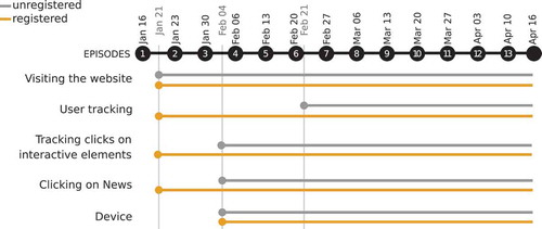
5.1.2. User tracking
Unregistered users were identified with a 16-digit token that was automatically generated when they visited the website. Registered users were identified by the username saved as a cookie on their devices. Due to initial developers’ decision the unregistered returning visitors had been given a different 16-digit token each time they visited a website until 21 February (see user tracking in ). After this date the token was saved as a cookie on the user’s device (as it was done for registered users since 21 January) and remained the same for subsequent connections unless the user: (i) cleared his/her browser cache; (ii) used a different browser; (iii) used a different device; or (iv) registered and logged in – such users are identified by their username instead of the token in the database. Due to developers’ decision, it is not possible to match registered users with IDs they were assigned before registering.
A total of 1520 people registered on iOtok. However, to avoid any bias in our analysis, we excluded all events triggered by users who registered before 21 January. Overall, 860 people registered between 21 January and 16 April.
5.1.3. Sessions
We identified sessions using the following method: if no event was recorded for 30 minutes, then the next registered event was considered to be the first event of a new session. The length of 30 minutes is standard for web analysis.Footnote13 The final dataset contains 24 537 sessions, including 15 668 sessions with more than one event.
5.2. Audience overview
5.2.1. Number of users
A total of 860 people registered between 21 January and 16 April. Among them, 698 users triggered at least one event in the database, meaning that 162 users did not interact with the website after registering. As for unregistered users, due to the delay in the implementation of user tracking (see ), we can only report the number of 11 123 unregistered users between 21 February and 16 April.Footnote14
Figure 4. The age and gender groups for the Facebook followers.
5.2.2. Nationality, gender, and age groups
Among users who watched at least one video, 58.0% of the visitors watched the videos in Croatian language, 33.2% in Slovene and 8.8% watched videos in both languages. However, it should be noted that the Slovene and Croatian languages share a number of similarities and a certain percentage of Slovenes could have watched the videos in Croatian and vice-versa. In addition, the default language of the documentary was Croatian and users had to click on one button to switch to Slovene. Data from the registration form indicate that among registered users (N = 860), 63.0% reported Croatian as their language of choice for the documentary and 37.0% of them choose to access it in Slovene.
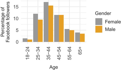
Data from two Facebook pages created for the documentary (one in Croatian, with 1907 followers and one in Slovene, with 647 followers) give additional insight on the audience, as shown in . We can see an even distribution between genders with a slightly higher number of females for the age group 25–34. The age groups show a normal distribution for both genders with the highest number of users in the age group 35 to 44.
5.2.3. Device
Data show that 16.0% of the sessions are associated with a mobile browser only, 74.0% with a non-mobile browser and 10.0% with two types of browser. Overall, 9.4% of the videos were watched on a mobile device even though the page showed the warning that it was not built for mobile experience and it was not guaranteed that everything will work as intended. In addition, according to Google Analytics, 52% of users accessed the website with a desktop device, 42% with a mobile device and 6% with a tablet device.
5.2.4. Traffic sources
shows the percentage of users who accessed the web portal, based on traffic sources. Data come from Google Analytics.
Table 3. Traffic sources.
Facebook links accounted for 96% of the traffic generated by Social network sources. As for Referral sources, 29% came from punkufer.dnevnik.hr (the website of the major newspaper in Croatia), 28% from rtvslo.si (the website of the public broadcasting corporation in Slovenia), and 16.5% from slobodnadalmacija.hr (a Croatian daily newspaper published in Split, a coastal town of Croatia).
5.3. Number, time, and duration of sessions
5.3.1. Number of sessions
shows the number of sessions per day. Since the logs were not fully implemented when the website was launched (see ), we only report results from 23 January onwards (Week 2). The majority of peaks correspond to the days when episodes were launched, i.e., Mondays. There are two other peaks for unregistered users: Wednesday 15 and Sunday 26 March. Google Analytics data revealed that more than half of the visits on Wednesday 15 were due to an article published on slobodnadalmacija.fr, while visits on Sunday 25 mainly come from Facebook. Episode 3 also experienced a low number of sessions for which we do not have reliable explanation (the only difference was that this episode was promoted on the national radio and TV broadcasting corporation RTV Slovenia at 8.45 while others were promoted at 6.45). It has to be noted that registered users have no unexpected peaks and show a consistent pattern.
Figure 5. Number of sessions per day, for registered and unregistered users.
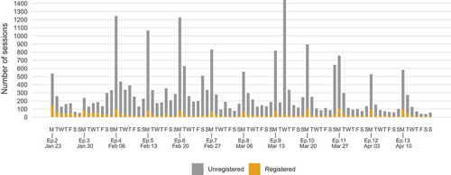
The average weekly number of sessions was mean = 240, 95% CI [210, 290] for registered users and mean = 1800, 95% CI [1400, 2300] for unregistered users. The difference of weekly number of sessions between registered and unregistered users was diff = -1600, 95% CI [-2100, -1200]. Data also show a higher variability in the number of sessions per week (SD = 68.2 for registered users; SD = 835.5 for unregistered users).
For registered users, the average number of sessions per user was mean = 4.1, 95% CI [3.7, 4.6]. Due to the absence of tracking (see ), we cannot report this number of unregistered users.
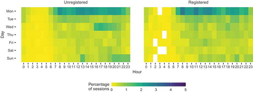
5.3.2. Day and time of sessions
shows the percentage of sessions for each day and each hour. It shows that both registered and unregistered users mainly accessed the web portal on Mondays between 7 a.m. and 10 p.m. There is also a higher percentage of sessions on Sunday evenings, for registered and unregistered users (when a Facebook post was boosted). The highest percentage of sessions on Wednesdays afternoon for unregistered users is mainly due to the peak observed on Wednesday 15 March. The highest percentage of sessions for registered users was on Mondays between 8 a.m. and 10 a.m.
Figure 6. Time (day and hour) at which the sessions occurred for unregistered users (left) and registered users (right).
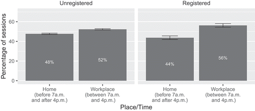
Considering that users were at work from Monday to Friday and from 8 a.m. to 4 p.m. (which are the usual working hours in Croatia and Slovenia), shows that users were more likely to access the web portal at work than at home. The mean difference in percentage between Home and Workplace was diff = -13%, 95% CI [-15, -10], for registered users, and diff = -4.6%, CI [-5.5, -3.6], for unregistered users.
Figure 7. The percentage of sessions occurred during work hours and at home considering usual working hours from 8 a.m. to 4 p.m. We take into consideration the time from 7 a.m. since anecdotally people arrive to work earlier to avoid traffic and because of the coffee culture.
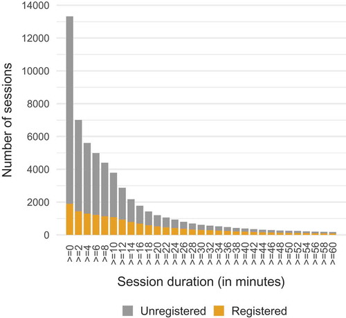
5.3.3. Sessions duration
As indicated in , data for the analysis of sessions duration is available from 4 February onwards for unregistered users (i.e., when tracking clicks on interactive elements was implemented). In addition, session duration can only be computed for sessions with more than one event. The average session duration in minutes was mean = 17.6, 95% CI [16.4, 18.9] for registered users (including all sessions) and mean = 5.6, 95% CI [5.4, 5.8] for unregistered users (from 4 February onwards). The difference between registered and unregistered users was diff = 11.8 minutes, 95% CI [10.6, 13.2].
shows a more detailed analysis of the sessions durations for all sessions after February 4. Very short sessions are less frequent among registered users than among unregistered users. In addition, the majority of sessions that lasted more than 30 minutes were done by registered users.
Figure 8. Cumulative number and duration of sessions (in minutes), for registered and unregistered users.
5.3.4. Total time on site
We refer to the total time spent on site as the sum of all session durations of each user. As mentioned before, session duration can only be computed for sessions with more than one event. For registered users, all available sessions were taken into account, i.e., from 21 January to 16 April. shows how many registered users spent more than 10, 20, 30, etc., minutes on the website. On average, the total time on site for registered users was mean = 61.7 minutes, 95% CI [56.3, 68.4]. Due to the method used for calculating sessions times (i.e., elapsed time between first and last recorded interaction), the time on site metric underestimates the true value because users can be engaged with the website even though they do not interact with it. For example, the time users spent watching a video would not be accounted for if they close the browser before the video finishes. This is a common shortcoming of such metric in web analytics.
Figure 9. Total time on site (in minutes) for registered users. The dashed line highlights a change of intervals range on the x-axis.
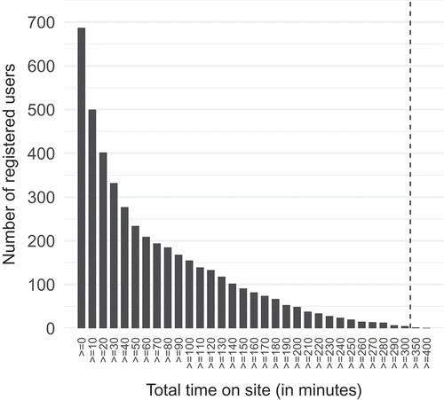
As for unregistered users, given the issues with tracking, we cannot compute the exact time on site. To make comparison possible, we compute the time on site for both registered and unregistered users by taking into account sessions from 21 February and onwards only (i.e., when tracking clicks was implemented for unregistered users as well, see ). The average time on site was mean = 62 minutes, 95% CI [56, 70], for registered users and mean = 8.7 minutes, 95% CI [8.3, 9.1], for unregistered users. Although this is a low estimation for both groups, it shows differences in behavior between the two groups. The average difference between registered and unregistered users was diff = 54 minutes, 95% CI [47, 61]. indicates the percentage of users for different time on site intervals for this time period. It shows that 48% of unregistered users spent less than 2 minutes on the website, whereas 53% of registered users spent more than 30 minutes on the website.
Table 4. Percentage of users who cumulatively spent time on site in a particular time interval (subset of data, from 21 February to 16 April).
5.3.5. Focus on registered users
5.4.1.1. Number and time of registrations
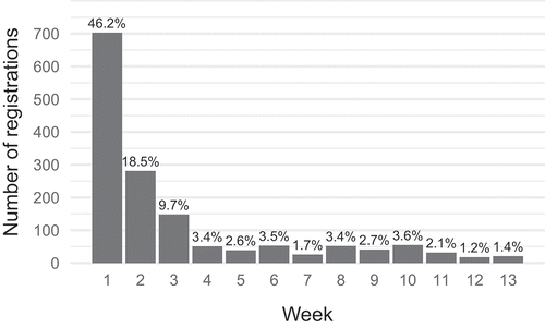
shows the number of registrations for each week, including all registrations (from 16 January, N = 1520). Seventy-five percent of users registered during the first 3 weeks (46% registered during the first week, 19% during the second week and 10% during the third week). Between Weeks 4 and Week 13, the average percentage of registrations was mean = 2.5, 95% CI [1.8, 3.2]. This was expected since the majority of media coverage happened in the first couple of weeks followed by weekly promotion by major web media companies as detailed in Section 3.5.
Figure 10. Number and week of registration.
5.4.1.2. Returning registered users
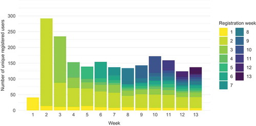
shows the number of unique registered users who interacted with the website per week, as well as the week during which users registered. It shows that users who registered during the first 2 weeks (yellow and bright green) represent the majority of users of the following weeks. The return rate for registered users (N = 860), which equals to (number of registered users with more than one session/number of registered users), was 45.8%.
Figure 11. Number of returning registered users each week. The color indicates in which week users registered. Therefore, for each week, the top bar depicts newly registered users. As a reminder, 160 users did not interact with the website after registering and are therefore not visible in this graph.
5.4. Navigation within the main panel
5.4.1. Detailed analysis for each episode
As described in Section 3, visitors had to click on several interactive elements to progress through the episodes and reach the videos and then the souvenirs. In order to understand if (and when) did visitors quit the web portal, we provide a detailed analysis for each episode. To do so, we took into account all sessions for which tracking clicks logs exist, i.e., all sessions for registered users and all sessions from 4 February for unregistered users (see ). Events related to the interactive elements could be repeated, for example, if the users clicked several times on the element. We therefore kept only the first event for each step, episode and user.
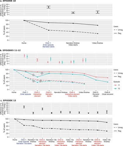
shows the percentage of users at each step, for three types of episode. Episode 1 contained one video that was launched automatically after entering the episode (similar to Episode 10); episodes 2 to 8 have a linear structure with several clicks required before reaching the core video (similar to Episodes 11 and 13); Episode 9 has a fish-bone structure with different paths available (similar to Episode 12). Graphs for Episodes 10, 11, 12, and 13 are shown in Appendix B. The graphs in show, for each step:
Figure 12. Upper-part (average difference in percentage of retained users): for each step, there was a higher percentage of registered users who proceeded to the next step. Lower-part (percentage of users who reached each step): the percentage decreased from one step to another, especially for unregistered users. Drop-offs were more prominent before users clicked on “enter the episode” (click 1 in blue) or before they clicked on one interactive element (clicks in red).
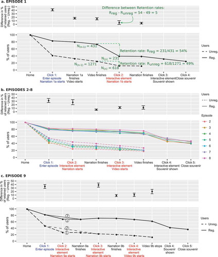
Upper-part of the graph: the difference in percentage of retained users (users who proceed to the next step) between registered and unregistered users. The percentage of retained users was first calculated for registered and unregistered users as follows: number of users on step n/number of users on step (n-1). We then computed differences between registered and unregistered users (see annotation on ). A positive value indicates that compared to unregistered users, a higher percentage of registered users proceeded to the next step. When several episodes are shown on the same graph (), we report the average difference and its corresponding CI.
Lower-part of the graph: the percentage of users reaching each particular step, i.e., number of users on step n/number of users on the first step (landing on the “home” page, which shows the “enter episode” button, see ). In addition, we highlighted particular steps that we analyse further in Section 5.4.2, namely: (i) a click on the “enter episode” button (in blue); and (ii) a click on one interactive element of the animated panoramas (in red). The steps on the x-axis are either completed automatically or initiated by users. The labels of the later are marked with “Click #”.
shows the two main paths of Episode 9 (identified with one circle): 83.1% of registered users who entered the episode chose the first path, 12.0% chose the second one and 4.9% dropped out; 57.1% of unregistered users who entered the episode chose the first path, 11.4% chose the second one and 31.5% dropped out.
All graphs show a similar pattern. Firstly, all graphs show that the percentage of users decreased from one step to another (see lower parts of the graphs). In other words, each step led a certain amount of users to leave the website before reaching the core video. Some steps are associated with particularly high drop-off rates. For Episode 1, 46% of registered users and 51% of unregistered users who finished the video did not click on the first interactive element (, Click 2). For Episodes 2 to 8, around 20% of unregistered users who entered the episode did not click on the first interactive element (, click 2); however, the drop-off for this first click was much lower for registered users (, Click 2). The same behavior can be observed for other episodes (see Appendix B).
Secondly, regardless of the episode and the step, registered users were more likely to proceed to the next step than unregistered users (see upper parts of the graphs). The average retention rate (excluding the steps to collect souvenirs), defined as “number of users on step n/number of users on step (n-1)”, was mean = 93.5%, 95% CI [91.3, 95.5], for registered users, and mean = 77.6%, 95% CI [73.4, 81.3], for unregistered users. The average difference in retention rate between registered and unregistered users was diff = 16.0%, 95% CI [11.4, 20.6].
Regarding Episode 9, it is worth noting that its fishbone structure did not affect registered users as much as unregistered users. The retention rate between Click 1 and Click 3 was mean = 86.7% for registered users and mean = 47.7% for unregistered users. The difference in retain rate between registered and unregistered users for this step was the highest among all episodes (39%).
5.4.2. Retention rate based on the type of interactivity
In this section, we provide data to better understand whether visitors were less likely to proceed to the next step when they had to click on a certain type of interactive element. We focused on two types of events: (i) clicking on the “enter episode” button (blue labels on ); and (ii) clicking on the interactive element of each animated panorama (red labels on ). For this analysis, we did not take into account the steps corresponding to the souvenirs (opening or closing a souvenir after seeing the episode’s video). shows the percentage of users for each type of step as well as the differences between groups.
Figure 13. Focus on two types of clicks: clicking on the “enter episode” button and clicking on an interactive element in panoramas. On the left: average rates for the two types of click and for each group of users. On the right: differences in retention rates between registered and unregistered users.
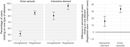
Data show that overall, unregistered visitors were less likely to click on interactive elements than registered users. On average, 51.3%, 95% CI [47.5, 55.6] of unregistered visitors who accessed the web portal clicked on the “enter episode” button, vs. 84.8%, 95% CI [82.3, 88.2] of registered users. The difference in percentage between registered and unregistered users for this step was diff = 33.3%, 95% CI [28.2, 38.1]. The percentage of users who clicked on the elements of the panorama were also reliably different: on average, 15.7% more registered visitors clicked on these elements than unregistered visitors.
5.4.3. Audio narrations
During the interaction course of all episodes, users had to listen to short audio narrations that briefly introduced the episode (the narrator is seen in on the bottom left side of the screen). At the end of audio narrations or if users clicked on the “mute” button, an interactive element on the panorama was highlighted and users could progress in the episode.
shows the percentage of users who listened to whole audio narrations or who muted them (“narration finishes” in ; we discuss the case when users muted the audio in ). On average unregistered users were more likely to quit the web portal before the end of the audio narration than registered users, although the retention rate is high for both groups (mean = 98%, CI [97, 99] for registered users and mean = 93%, CI [89, 95] for unregistered users).
Figure 14. Percentage of users who listened to the audio narration or muted it (i.e., all users for whom an “Narration finishes” event was triggered).
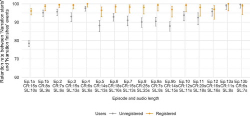
Figure 15. For each user, time spent listening to the audio narration. Black lines show the length of the audio files in Croatian and Slovene. Users who quit the portal before the end of the narration are not represented.
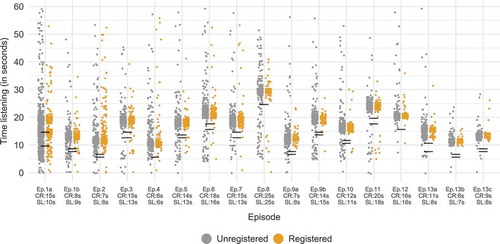
shows the time users spend listening to the audio narration before clicking on the next interactive element, on the mute button or on the arrows to navigate between the episodes. Therefore, it does not show users who quit the website before the end of the narration. Except for the first episode, the majority of users listened to the entire audio narration without skipping it, showing that the “mute” button was rarely used.
Both and show that the first episode differs from the others in two ways: (i) the percentage of registered and unregistered users who listened to the audio narration is lower than for other episodes; (ii) the difference in percentage between registered and unregistered users is the biggest across all episodes. This means that a high number of users entered the first episode and then quit the portal very quickly, most probably because they were not willing to listen to the narration or because they realized that they have already watched this episode. In fact, for users who typed in the URL in the browser’s address bar or found the portal in a web search engine, the portal always showed the first episode. Users may have clicked the “enter episode” button that started the audio narration before realizing they have watched it already. After that, they might have stopped the audio by clicking the “next episode” arrows or by quitting the portal.
5.5. Number of videos watched
In this section, we take into account the core videos only, i.e., we do not take into account the secondary short (approx. 1 minute) videos of Episode 9 and of Episode 13. In addition, we kept only the longest video per user per session per episode, so that multiple attempts to watch a video (e.g., by reloading the page) are not taken into account.
Registered users watched 2706 videos (from 21 January to 16 April); unregistered users watched 5151 videos (from 4 February to 16 April). At least one video was watched by 569 (66%) of registered users.
The number of videos watched per week was reliably constant over the 13 weeks for registered users (mean = 220, 95% CI [200, 260]) but varied more for unregistered users (mean = 430, 95% CI [300, 530]). shows the number of videos watched per week and per episode. Due to missing data (see ), some values are low estimations: videos that were watched before 4 February by unregistered users and before 21 January by registered users are not included. In addition, videos watched after 16 April were discarded.
Figure 16. Number of videos watched per week and per episode, for registered and unregistered users.
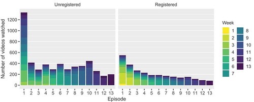
For unregistered users, the number of videos watched per episode slightly varies over the weeks, with the exception of the video of the first episode that was viewed approximately three times as much as other videos. As for registered users, the number of videos watched decreases progressively from Episode 1 to Episode 13 (except for a slight increase for Episode 10, which is probably due to the fact that this video, such as video 1, was launched automatically when users entered the episode). For both groups, the video from Episode 1 was the most viewed. It is interesting to note that each episode’s video was viewed in all consecutive weeks.
5.6. Interaction with the additional features
5.6.1. Overview
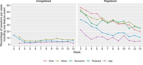
The bottom panel included five additional features to the documentary: the Souvenirs, the Chat, the News, the link to Google Play Store to download the mobile app, and the Postcard contest that enabled users to view and vote for virtual postcards (see Section 3 for a detailed description of these features). Unregistered users could not access any of these features: an icon reading “register” appeared when hovering over these links and a pop-up window invited users to sign in or to log in when these links were clicked on. shows the percentage of sessions per week that included at least one interaction event related to the additional features. Despite the icon warning users to register first, around 10% of the sessions of unregistered users included at least one click on these features. We describe the use of each feature by registered users in the following sections.
Figure 17. Percentage of sessions including at least one interaction with one of the five elements of the bottom panel (Souvenirs, News, Chat, Google Play, and Postcard).
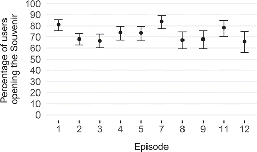
5.6.2. Souvenirs
At the end of all but Episodes 10 and 13 registered users could collect a souvenir. shows the retention rate between users who reached the panorama showing the interactive element that would open the souvenir and users who actually clicked on it (e.g., between “Video finishes” and “Click 4” in ). Overall, visitors were slightly more likely to click on the souvenir on the first episode than on the other episodes, except on Episode 7. However, in Episode 7, after the core video, a video icon was shown next to the interactive element as the souvenir was a video. Some users may therefore have not realized that this element was a souvenir.
Figure 18. Retain rate for the souvenirs for each episode, i.e., number of users who clicked on the interactive element/number of users who accessed the panorama with the interactive element.
By clicking on the chest of drawers in the bottom panel, the main panel displayed the souvenirs that users collected thought the documentary watching. Users could then open (enlarge) souvenirs by clicking on them (see ). The average weekly number of distinct users displaying the gallery of souvenirs was mean = 72.8, 95% CI [57.5, 105.6], and the average weekly number of distinct users opening one souvenir was mean = 22.7, CI 95% [18.5, 27.2]. The number of users displaying the gallery of souvenirs decreased over the week, from 180 during the second week to 40 during the last week.
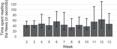
5.6.3. News
shows the time spent reading the News where this information is available since it is not possible to infer the time reading the news if users closed their browser or the tab. The graph reveals that users kept reading the news over the weeks. In addition, it is worth mentioning than in 26.3% of cases, users’ next action was to click on the button inviting them to enter the episode (the button was located within the news post). Only 7.2% of users who read the news did not continue exploring the website afterward.
Figure 19. Average time spent reading the news in seconds, for each week (registered users only).
5.6.4. Chat
Five hundred and thirty registered users joined the Chat at least once, i.e., 61.6% of registered users. However, only 108 users sent a message (including users who registered before 21 January). One hundred and ninety-five messages were exchanged using the Chat, including 69 during the first week.
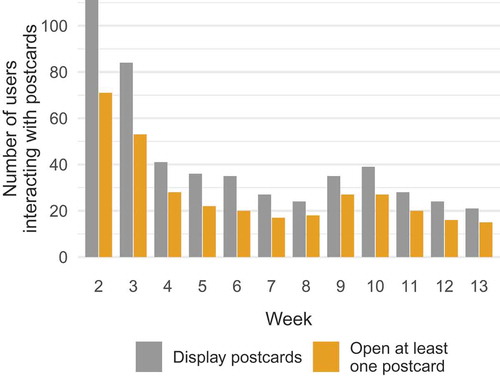
5.6.5. Postcards and link to the mobile application
Twenty-eight postcards were shared on the web portal. These postcards were made by 10 different users. The number of users interacting with this feature decreased over the weeks as visible in . The average weekly number of distinct users displaying the gallery of postcards was mean = 42.1, 95% CI [31.0, 63.6] and the average weekly number of distinct users opening one postcard was mean = 27.8, 95% CI [20.9, 41.3]. We can see a slight increase in week 9 and week 10 which corresponds to two peaks in the number of sessions that can be observed in .
Figure 20. Number of distinct-registered users displaying the gallery of postcards at least once and opening at least one postcard.
6. Questionnaire
Fifty-six users answered the online questionnaire (14 women and 42 men). The average age was mean = 43.7, SD = 12.3. As only eight users were unregistered users, we do not report results for the two groups of users.
6.1. Context of use and motivations
indicates in which context visitors visited the website, what lead them to visit the website, and what motivated them to watch the next episode.
Figure 21. Percentage of respondents who (a) watched the episodes at home (on the couch or at the table) or at work; (b) watched the documentary because of an online article, recommendation, social network posts or the topic itself; (c) watched the next episode because of one of the five proposed design features.
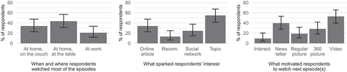
Data show that visitors were more likely to report watching the episodes at home than at work. This finding differs from the analysis of the logs that showed that registered users were more likely to watch the episodes at work. Interestingly, more than half of the visitors reported that they watched the episodes because they were interested in the topic. Because users could not choose multiple answers, this answer does not reveal if users started watching the documentary because of an online article, recommendation, social networking post, or any other trigger. Thus, the percentage of any of these answers should be higher. The least frequent reported reason was “recommendations from other people.” When asked about the reasons that motivated people to return to the web portal to watch another episode, the most frequent answer was the videos, followed by the newsletter. Only 10% of the visitors reported that the interactivity of the documentary was an important factor.
6.2. Interaction with additional features
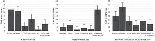
indicates which additional features were used and preferred by the visitors, and which they would like to see in a future version of the web documentary. As already discussed in Section 5.6.4, the Chat was rarely used by the visitors, while the News and Souvenirs features were used most. Although 18% of the respondents interacted with the Postcard feature, only 4% of them reported that it was their preferred one. In fact, more than 30% of respondents did not specify their favorite feature. However, 64% of the respondents stated that they would like to interact again with the News.
Figure 22. Left: most used features. Middle: preferred features. Right: preferred features for a future documentary.
7. Newsletter
As mentioned before, we used Mailchimp for distributing newsletters. shows the number of people who received the newsletter (recipients), alongside the number of people who opened it (unique opensFootnote15) and clicked on the link redirecting them to the web portal (unique clicks).
Figure 23. Number of unique users receiving the newsletters; number of unique users who opened it; number of unique users who clicked on the link. One newsletter was sent for each episode.
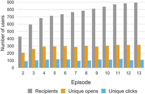
Figure 24. Newsletter open rate for each episode (one newsletter was sent for each episode).
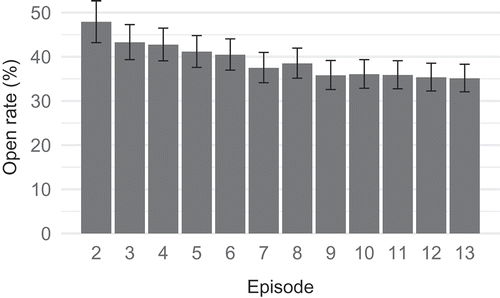
The average open rate was mean = 39%, 95% CI [37, 42], and the average click rate was mean = 15%, 95% CI (K. Nash, Citation2012b; Nogueira, Citation2015). The open rate slightly decreased from the first newsletter (47.9%) to the last newsletter (35.3%), as shown in . A last “thank you” newsletter was sent 1 week after the last episode. It was sent to 1489 users and the open rate was 40.64%.
Figure 25. Example of a registration form included in the narrative of the web documentary. Snapshot from Prison Valley.
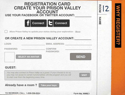
Figure 26. Interaction graphs for Episodes 10 to 13. Upper-part (average difference in percentage of retained users): for each step, there was a higher percentage of registered users who proceeded to the next step. Lower-part (percentage of users who reached each step): the percentage decreased from one step to another, especially for unregistered users.
8. Discussion
8.1. Device, time of watching, and video length
iOtok was designed for desktop environments and users were discouraged from visiting the website on a mobile device (a warning message informed them that it might not work properly, yet users could dismiss it proceed to the web portal). Nevertheless, around 16% of the sessions were associated with a mobile browser, 9% of the videos were watched using a mobile browser and according to Google Analytics, 48% of visits were made from a mobile or a tablet device. This echoes a report for Hot Docs (Docs, Citation2018), which aimed at better understanding documentary viewing habits in Canada. Their survey revealed that among platforms used to watch documentaries, television was the most obvious choice for respondents, but 29% watched documentaries on a tablet, 22% on a mobile phone, and 59% using a computer. This is also supported by reports saying that video watching used up to 60% of mobile network traffic in 2018Footnote16 and that 70% of YouTube views came from mobile devices in 2017.Footnote17 With the large widespread of smartphones and tablets, designing for desktops and mobile seems crucial for documentary filmmakers to reach the largest possible audience.
In addition, the website was mainly visited on Mondays between 7 a.m. and 4 p.m., i.e., during working hours, illustrating how technology blurs the boundaries between work and private life (Anderson et al., Citation2019, Czerwinski et al., Citation2004). Activities related to private life and performed at workplace can be explained by boundary theory (Ashforth et al., Citation2000). The theory divides people into four different groups based on the permeability of the role boundaries between the work and private spheres: (i) segmenters who do not mix private and work-related activities, (ii) integrators who mix them, (iii) private-first who carry out private activities at work but not the other way around, and (iv) work-first individuals who carry out work activities in their private lives. Two groups of people thus allow private activities to take place during work hours and it is not surprising that we observed this same phenomenon in the case of iOtok.
Interestingly, the HotDocs report (Docs, Citation2018) states that for traditional documentaries, “viewings are largely taking place at home (94%),” which is not what we observed for iOtok. One reason could be that the short format of the videos, as compared to a traditional long-form documentary, might invite people to access them even at work, in an environment that is a priori not convenient. It is also worth mentioning that promoting iOtok during working hours was a deliberate choice of the documentary filmmaker, who targeted a specific audience (administrative workers).
Overall, enabling users to select which content to access based on the device they used, their location, and the time of the day may enable documentary filmmakers to reach a larger audience. This could include reducing the number of clicks needed to reach the content on mobile phones, providing videos of various lengths (or divided into chapters that users can skip), or designing various content (audio, video, texts, etc.). In addition, if users are likely to access the web documentary at different times and using different devices, a system could enable them to seamlessly transition from one device to another and continue their experience where they left it on the last-used device.
8.2. Effectiveness of different media to promote new episodes
The number of sessions during the 13 weeks (around 15 000 sessions with more than one event) indicates that a relatively large audience was reached. Compared to some web documentaries as cited in Section 2.2.2, this is a relatively high number. For example, Hollow received 77 000 visits in 6 months; Black Coal Book received 25 000 visits in 1 year, and Journey To The End of Coal received 200 000 visits in 5 years. This number should also be interpreted in light of two facts: firstly, Croatia and Slovenia, the two countries in which the documentary was distributed, have a population of around two and four million respectively; secondly, the web documentary was only available in Croatian and Slovene. As a consequence, the “pool” of visitors was certainly much smaller than for other documentaries that were produced and/or distributed in English-speaking countries. Therefore, one could say that the promotion of the web documentary was successful – but which communication channels were particularly efficient?
The final questionnaire sent to registered users show that more than 50% of respondents visited the website because they were interested in the topic or because they read an online article about the documentary. Therefore, online articles appear as a good candidate to reach new users. This echoes another key finding of the Hot Docs report, stating that respondents mainly discover documentaries thanks to “articles and/or reviews (be they online, in print, on the radio, or on TV). (72%)”, recommendations from friends and family (70%) or thanks to social media (44%). Interestingly, although referrals were ranked third in traffic sources (see ), Google Analytics data revealed that the highest number of sessions observed for unregistered users on 15 March was due to an article published online.
Facebook also played an important role, as shown by Google Analytics data. Firstly, 36% of traffic came from Facebook. Secondly, the peak in the number of sessions observed on 26 March was mainly due to Facebook. We also observed a higher number of sessions by unregistered users on Mondays, that could also be explained by Facebook posts that were “boosted” 1 day before the release of the episodes. In addition, 25% of respondents came to the website because they heard about it on social media.
As for registered users, different results indicate that the newsletter played a crucial role. Firstly, 40% of the respondents answered that the newsletter motivated them to watch the next episode. Secondly, the open rate of the newsletter was 40% on average (with 15% click rate), which is approximately two times above the average open rate of newsletters according to Mailchimp.Footnote18 Thirdly, the higher percentage of sessions of registered users occurred on Monday morning between 7 a.m. and 10 a.m., i.e., just after the newsletter was sent. The newsletter thus acted either as a gateway to the documentary portal or as a reminder for later watching.
8.3. Engaging audience over time: Benefits and pitfalls of serialization
A key aspect of this web documentary was the fact that it was distributed in a serialized manner, over 13 weeks. As such, one crucial aspect was to reach new visitors across that time period, while encouraging visitors to return to the website regularly in order to access new content.
8.3.1. Number of sessions and time on site
The number of sessions was reliably constant over the 13 weeks with regular peaks every Monday for registered and unregistered users, showing users’ interest in consuming new content whenever available (see ). Although we could not compute the returning rate of unregistered users, the high returning rate of registered users (45.8%) indicates that serialization and strategies to promote new episodes over time were efficient in encouraging people to revisit the website.
A clear indicator of the serialization impact is the overall time on site, i.e., the sum of sessions’ duration for each user. On average, registered users spent 62 minutes on the website, while unregistered spent on average 9 minutes. Even if this latter result is an underestimation (due to the absence of user tracking for the first 4 weeks), it is still reliably higher than for existing documentaries mentioned in the Related work (see and ), for which reported time on site varied between 2 and 5.5 minutes, with the exception of Journey to the End of Coal (10 minutes out of 20). The time on site reported for registered users is particularly remarkable. As a comparison, producers of Prison Valley, one of the most successful web documentaries (with a budget of 230 000€ for the website only), reported that after one year, 20% of users who registered went through the whole narration, i.e., at least 59 minutes.Footnote19 In the case of iOtok, 30.4% of registered users spent at least 60 minutes on the website (taking into account data for 13 weeks only).
8.3.2. Differences in engagement between registered and unregistered users
According to the questionnaire, more than 50% of the respondents visited the website because they were interested in the topic. As most of those respondents were “registered users”, we could expect these users to be willing to explore most of the content of the web portal and to return to it regularly. Data collected on the web portal seemed to corroborate this hypothesis.
The number of unique registered visitors who visited the website only slightly decreased over the weeks (see ), and remained overall relatively stable. The return rate for registered users was 45.8%, but because of the missing data we could not compute it for unregistered users. This rate is hard to compare to other similar portals since corporations do not reveal such data. For web creations mentioned in and , all reported return rates are below 26%. However, return rates were not reported separately for registered and unregistered users (when relevant) and content was not distributed over several weeks. One interesting finding is that the majority of returning registered users were users who registered during the first 2 weeks, showing that registered users tended to be “committed” to the website from the beginning ().
As shown in and Appendix B, registered users were also more likely to enter the episodes and less likely to quit the website. In addition, 25% of registered users watched seven or more videos, once again showing their engagement over time and their interest in watching different episodes. Another interesting result concerns the average session duration, which was also much higher for registered users (around 17 minutes) than for unregistered users (around 6 minutes). Although 6 minutes are similar to the average visit duration reported by other web documentaries, 17 minutes are strongly above average. In fact, the majority of short sessions were made by unregistered users while the majority of long sessions were made by registered users (cf. ).
Therefore, it seems that in the case of a serialized web documentary, registration may play an important role in audience engagement: (i) it makes it possible to send newsletter to users in order to invite them to explore the new episodes; (ii) it may create a sense of commitment that leads to longer sessions – users are less likely to quit the web portal before they watched the new content. Although users who are already interested in the topic may be more willing to visit the website and register, it is possible to encourage all users to register, e.g., by including exclusive content for registered users or by including the registration process in the narration itself, as in Prison ValleyFootnote20: after watching a short introductory video, users are invited to check-in at a hotel in order to pursue their investigation; the check-in form is actually the registration form (see ).
8.4. Benefits and pitfalls of interactivity
8.4.1. Interaction with the 360 scenes
The rationale behind the use of a 360 representation of the island was to increase the sense of immersion and to make the whole experience of the website more ludic. However, data collected on the web portal show a decrease in the number of user every time they had to click on one interactive element. The average drop-off rate between each step (including automatic steps such as audio/video ending and interactive steps and excluding souvenirs) was 6% for registered users and 22% for unregistered users. A more detailed analysis focusing on clicks only revealed that drop-off rates were particularly high for unregistered users (Section 5.4.2 and ): on average, 49% did not click on the “enter episode” and 20% did not click on the interactive elements in the panoramas. The retention rate for interactive elements in the panoramas was 16% lower for unregistered users.
One explanation might be that most users were not familiar with the concept of virtual 360 scenes and may have not known how to navigate or interact with the scene. In addition, the interactive elements within the panorama were not always easy to identify, as they were only highlighted by a light outline. While registered users may have learned what to look for in the scene, unregistered users who were visiting the website for the first time might have not been able to always find the interactive elements. One result supports this idea: for the first episode, the retention rate for the first click on an interactive element was particularly low for both groups (54% for registered users and 49% for unregistered users, hence a difference of 5%). However, for subsequent episodes, the retention rate for the first click on an interactive element was much higher for registered users than for unregistered users (mean difference in retention rate for Episodes 2 to 8 for the first click: 27%).
Interestingly, the highest difference in retention rate was observed when users had to choose between different paths (see , for Episode 9). For Episode 12 as well, when users had to choose between two paths, almost 100% of registered users chose one of the paths whereas only 82% of unregistered users did so. This again suggests that registered users knew better than unregistered users how to navigate or that they were more willing to interact with the web portal in order to reach the core video than unregistered users.
In addition, the questionnaire showed that the interactivity of the documentary did not encourage users to revisit the web portal to watch new episodes (around 10% of the respondents reported that they revisited the website because of its interactivity, whereas more than 50% of them returned to the website because of the videos).
The potential negative effects of interactivity have been discussed by Forceville (Forceville, Citation2017) based on his analysis of five interactive documentaries: he suspected that not all users might be motivated enough to “spend time figuring out how things work” and that “many users will plunge in straightaway, without reading the `about´ section.” In her lab study on Bear71, Pettengil (Pettengil & Bear 71, Citation2017) also noticed that the lack of guidance regarding how to navigate the web documentary lead users to experience “psychological strain and frustration.” She recommended that users’ actions should have some effects on the story; otherwise, “they will desire a way to absorb the same information or experience in a way that is less energy-intensive.” Our findings corroborate these previous observations and also reveal different behaviors between registered and unregistered users in terms of wayfinding.
Therefore, each interaction step needs to be carefully thought when designing for interactive web documentaries. Other approaches might result in a higher retention rate such as animated “zoom in” from the island’s overview to a particular spot, which would allow users to “travel” and understand the space and context of the reached video. Given users an idea of how far they are from the core content could also motivate them to click on the elements. For example, Forceville (Forceville, Citation2017) discussed how “a lack of transparency about total duration may not bother people who are happy to browse around, but may deter people who prefer a complete viewing experience and want to know in advance how long such an experience will take – and who may thus decide very quickly to abandon the viewing, or not to start engaging with the documentary in the first place.”
8.4.2. Use of audio in web documentaries
Another interactive feature of iOtok was the use of short audio narrations at the beginning of each episode. Data show that although not detrimental, the use of audio did lead some users to quit the portal before reaching the core video (2% of unregistered users and 7% of registered users). Interestingly, the percentage of users who did not proceed to the next step after listening to the narration was higher for the first episode. This could be due to the fact that users were not interested in the audio narration or that they realized that they had already watched the episode. Therefore, the use of an audio narration as the first media of the web documentary may have had a negative impact on users.
Although the website enabled users to skip audio narrations by muting them, this feature might have not been very visible (too small) or it was not really self-explanatory since a pictogram depicting muted audio does not mean to stop it. It is therefore not surprising that very few users muted the audio narrations, as shown in . Perhaps if users had been offered a more obvious choice to skip or mute the audio narrations, the drop-off due to the audio narrations could have been reduced.
8.4.3. Interaction with the additional features
The aim of the additional features was to further engage the visitors (e.g., with the Souvenirs and the Postcards), to encourage them to revisit the website (e.g., with the News), and to trigger discussions around the topic of Biševo through the Chat.
8.4.3.1. News
The News appeared as the most successful feature for registered users, as shown by the answers to the questionnaire (64% of the respondents stated that they would like to interact again with the News) as well as the percentage of sessions including news reading (from 50% of the sessions during the second week to 25% during the last week). The time spent reading the News also seem to indicate that users did use this feature to gather information on the current episode and optionally (in 26% of the cases), to access the episode through the News. Only 7% of users quit the portal after clicking on the News.
8.4.3.2. Souvenirs
The Souvenirs appeared less efficient in engaging users over time, as shown in and : the drop-off rates before opening a souvenir increased from 20% for the first episode to 30% for the subsequent episodes. In addition, once the souvenirs were collected, very few users interacted with the Souvenir drawers to display them and even fewer clicked on one souvenir to enlarge it. However, 40% of the respondents of the questionnaire said that they would like to see this feature in the future. This might indicate that despite the fact that the Souvenirs were not systematically collected and viewed, they might have played a role in the overall user experience, maybe by inciting some users to watch another episode to collect a new souvenir, or by enriching the website and providing users with various possibilities to interact with it.
8.4.3.3. Postcards and mobile app
The Postcards feature was one of the less “efficient” feature in terms of engagement: (i) very few people actually used the mobile app to create and share their virtual islands; (ii) the percentage of sessions including an interaction with this feature was relatively lower compared to the others (from 30% during the second week to 10% during the last week); iii) only 4% of respondents choose this feature as the best feature of the website and it was ranked last in the list of features to be used again in the future. This might be due to the fact that only a couple of users were interested in the mobile app and/or to the fact that the link between the mobile app and the Postcard contest might have been unclear. This suggests that seamless integration of transmedia features (e.g., from mobile to desktop) is important to avoid time-consuming or complex interaction.
8.4.3.4. Chat
iOtok can be considered participatory since users had the ability to co-create and co-produce a (small) portion of the content by taking part in the chat or uploading virtual postcards (Aston & Gaudenzi, Citation2012). It can be also considered as a collaborative web documentary with the possibility to build a community through discussions (K. Nash, Citation2012a). Social aspects and community building are seen as one of the major advantages of delivering documentaries over the web since such features are not directly available for classic TV documentary watching. Indirectly this is possible via online platforms such as Twitter but these solutions disconnect the content and the discussion around it. The integrated chat session tried to avoid such disconnection. Despite this, the chat did not prove popular. This could partially be attributed to chat being disabled once video was played. Also, people watched the episodes at different times and were not able to synchronously interact with each other. Lastly, the chat was the same for all episodes so users were not able to comment on each particular episode on the portal, although they were able to do so indirectly on the Facebook pages. A dedicated space with multiple threads of discussion, similar to the one of Prison Valley, might have led to more contributions. However, and as discussed by Nash in her analysis of a Facebook documentary (K. Nash, Citation2012b), a low number of contributors does not mean that the space allowed for discussion is not perceived as important for users who simply read and listen to the comments. A detailed analysis of the Facebook discussions and community building is planned for a future publication.
9. Design considerations: Summary of main findings
summarizes the main findings of this article and provide recommendations based on these findings. Although we acknowledge the singularity of each web documentary, we believe that these recommendations could help documentary filmmakers understand the impact of their design choices on audience reception and user engagement.
Table 5. Summary of the main findings of the study and data-based recommendations.
10. Limitations and future work
Conducting user studies in the wild comes at a cost. In our case, the delay in the implementation of the web portal resulted in missing or incomplete information. However, although we discarded 660 users who registered before January 21, the number of registered users that we took into account (N = 860) is still very large compared to traditional user lab studies. In addition, an exploratory data analysis including these discarded users revealed the same trends. As for unregistered users, the inability to track them until Week 6 prevented us from providing a comprehensive set of metrics for this group. However, the amount of data collected for unregistered users (N = 11 123) after 21 February was substantial enough to provide important insights. In addition, some decisions that were made by the developers and/or the director prevented us from acquiring some data. For example, the use of autoplay feature for videos disabled YouTube metrics (e.g., video consumption metrics) and the use of event tracking API to integrate Google Analytics disabled audience metrics (e.g., audience demographics, interest, etc.).
Using log events to analyze users’ activities on the website also means that several measures are estimations only. This is particularly true for sessions’ duration: firstly, the duration of sessions with one event only cannot be computed; secondly, the length of the sessions is a low estimation as the event of users closing the documentary’s web browser tab or window cannot be captured (the session length is thus only recorded until the last triggered event even though users might have spent time watching the video after the last recorded event). These flaws are however inherent to web logging. In addition, because we only took into account data during the first 13 weeks, the number of videos watched (per episode and per user) and the time on site are also low estimations (as users may have accessed the portal after 16 April). In all cases, we strived to make it clear whenever the results presented are low/high estimations, and we also took into account these limitations in the discussion.
This article focuses on audience reception and user engagement, including users’ interactions. As mentioned in the introduction, others topics would be worth investigating further, such as the social impact of iOtok, the reception of the documentary after the 13 weeks or even the analysis of the messages from the Chat. We plan to address these questions in future publications. In particular, we plan to use additional data to better understand why some people quit the web portal before reaching the core video: was it a lack of interest or was the interface not intuitive enough? Eye-tracking could, for example, provide relevant data to answer these questions. The perception and retention of the messages conveyed by the documentary filmmaker are other lines of research that we would like to pursue, e.g., to investigate to what extent interactivity improves or impedes retention or emotional engagement compared to traditional linear documentaries.
11. Conclusion
This article provides an in-depth analysis of the audience reception of iOtok, an interactive and serialized web documentary composed of 13 episodes. We analyzed over 20 000 sessions to understand which media were efficient in promoting the documentary and reaching users over the 13 weeks, how users interacted with the web documentary and to what extent they consumed the available content. Our main findings highlight the importance of online newspaper articles as well of social media for promoting the documentary. The newsletter sent to registered users also proved highly efficient. Difference in behavior between registered and unregistered users were observed, the former being more engaged and less likely to quit the web portal when faced with interactive elements. We also found that each additional step (click) required to reach the core video lead to a considerable number of users dropping off (around 20% for unregistered users), while serialization led users to revisit the website and therefore consume more content. We also discussed the relevance of audio narrations as well as additional features. We believe that the discussion and numerous data analyses provided in this work will help practitioners to better identify which aspects of a web documentary should be carefully designed to encourage users to engage with the available content over time.
Disclosure of potential conflict of interest
No potential conflict of interest was reported by the authors.
Acknowledgments
The authors would like to thank Miha Čelar (documentary filmmaker), CORA development team (iOtok website) and developers of Weekend Labs (iOtok mobile app). The authors also acknowledge the European Commission for funding the InnoRenew CoE project (Grant Agreement 739574) under the Horizon2020 Widespread-Teaming program and the Republic of Slovenia (Investment funding of the Republic of Slovenia and the European Union of the European Regional Development Fund). The research was also supported by Slovenian research agency ARRS (P1– 0383, J1–9186, J1-1715, J5-1796 and J1-1692).
Additional information
Notes on contributors
Julie Ducasse
Julie Ducasse, is a post-doctoral researcher at the University of Primorska, in Slovenia, where she works on interactive documentaries and Augmented and Virtual Reality. During her PhD at the University of Toulouse, France, she worked on the accessibility of maps for visually impaired people.
Matjaž Kljun
Matjaž Kljun received the Ph.D. degree in computer science from Lancaster University, Lancaster, U.K. He is an Assistant Professor with the Department of Information Sciences and Technologies and the Head of HICUP Lab, University of Primorska. His research interests span across various fields related to human-computer interaction.
Klen Čopič Pucihar
Klen Čopič Pucihar received the Ph.D. degree in computer science from Lancaster University, U.K. He is an Assistant Professor with the Department of Information Sciences and Technologies, and a Researcher with the HICUP Lab, University of Primorska. His research interests include augmented, mixed and virtual reality, and ubiquitous computing.
Notes
2. https://iotok.eu.
6. https://www.lemonde.fr/asie-pacifique/visuel/2008/11/17/voyage-au-bout-du-charbon_1118477_3216.html.
13. Analytics help: How a web session is defined in Analytics. https://support.google.com/analytics/answer/2731565?hl=en.
14. Based on the average number of sessions per user and the average number of users per week from February 21 onwards, a rough estimation of the number of unregistered users over the 13 weeks would be 17 000 users.
15. Unique opens represent the number of unique individuals that opened the e-mail. Unique clicks represent the total number of times users clicked on the link for the first time.
16. Ericsson, Mobile traffic by application category, https://www.ericsson.com/en/mobility-report/reports/june-2019/mobile-traffic-by-application-category.
17. ComScore, Unlocking Mobile Measurement for YouTube in the U.S., https://www.comscore.com/Insights/Infographics/Unlocking-Mobile-Measurement-for-YouTube-in-the-US.
19. https://hypermedia.typepad.com/blog/2010/04/prison-valley-analyze-dun-chef-doeuvre.html [in French].
24. Ibid.
26. http://www.honkytonk.fr/index.php/webdoc/.
27. “The return rate was 20 percent, with half of those returning more than three times.”
References
- Alkarimeh, B., “User and interactive documentary: An experimental study of user engagement with interactive documentary,” Library and information sciences. Université de Toulon 2019.
- Almeida, A., & Alvelos, H. (2010). An interactive documentary manifesto. Lect. Notes Comput. Sci. (Including Subser. Lect. Notes Artif. Intell. Lect. Notes Bioinformatics), 6432(LNCS), 123–128. https://doi.org/10.1007/978-3-642-16638-9_16
- Anderson, C., Heinisch, J. S., Ohly, S., David, K., & Pejovic, V., “The impact of private and work-related smartphone usage on interruptibility,” in Proceedings of the 2019 ACM International Joint Conference on Pervasive and Ubiquitous Computing and Proceedings of the 2019 ACM International Symposium on Wearable Computers, United Kingdom, London, 2019, pp. 1058–1063.
- APA, Manual of the American Psychological Association. 2010.
- Ashforth, B. E., Kreiner, G. E., & Fugate, M. (2000). All in a day’s work: Boundaries and micro role transitions. Academy of Management Review, 25(3), 472–491. https://doi.org/10.5465/amr.2000.3363315
- Aston, J., & Gaudenzi, S. (2012). Interactive documentary : Setting the field. Studies in Documentary Film, 6(2), 125–139. https://doi.org/10.1386/sdf.6.2.125_1
- Aufderheide, P. (2015). Interactive Documentaries : Navigation and Design. Journal of film and Video, 67(3), 69–78. https://doi.org/10.5406/jfilmvideo.67.3-4.0069
- Cumming, G. (2014). The new statistics: Why and how. Psychology of Science, 25(1), 7–29. https://doi.org/10.1177/0956797613504966
- Czerwinski, M., Czerwinski, M., Horvitz, E., & Wilhite, S., “A diary study of task switching and interruptions,” in Proceedings of the SIGCHI conference on Human factors in computing systems, Vienna, Austria, 2004, pp. 175–182.
- Docs, H., “2018 Documentary Audience Research,” Canadian International Documentary Festival called Hot Docs, 2018. https://www.hotdocs.ca/i/doc-audiences
- Dragicevic, P. (2016). Fair statistical communication in HCI. In Modern Statistical Methods for HCI (pp. 291–330). Cham: Springer.
- Dubois, F. (2018). Interactivity as a key feature redefining documentary reality Images. The International Journal of European Film, Performing Arts and Audiovisual Communication, 21(30). https://doi.org/10.14746/i.2017.30.03.
- Epstein, M., & Knowlton, M., “The promise and realities of creating immersive media projects - Best practises,” Filmmaker Magazine, 2015.
- Forceville, C. (2017). Interactive documentary and its limited opportunities to persuade. Discourse, Context Media, 20(3), 218–226. https://doi.org/10.1016/j.dcm.2017.06.004
- Galloway, D., McAlpine, K. B., & Harris, P. (2007). From michael moore to JFK reloaded: Towards a working model of interactive documentary. Journal of Media Practice, 8(3), 325–339. https://doi.org/10.1386/jmpr.8.3.325_1
- Gaudenzi, S. (2013). The Living Documentary: Fromrepresenting reality to co-creating reality in digital interactive documentary. University of London.
- Gifreu-Castells, A., “Proposed methodology for studying and analysing the new documentary forms,” DOC online - Revista Digital de Cinema Documentário, no. 2017S, pp. 6–42, 2017.
- Harvey, K. (2012). ‘Walk-In Documentary’: New paradigms for game-based interactive storytelling and experiential conflict mediation. Studies in Documentary Film Experimental Conflict Mediation, 6(2), 189–202. doi:10.1386/sdf.6.2.189_1
- Jansen, B. J. (Jim), Understanding User-Web Interactions via Web Analytics, vol. 1, no. 1. 2009. SAGE.
- Nash, K. (2012a). Modes of interactivity: Analysing the webdoc. Media, Culture and Society, 34(2), 195–210. https://doi.org/10.1177/0163443711430758
- Nash, K. (2012b). Goa Hippy Tribe: Theorising documentary content on a social network site. Media International Australia, 142(1), 30–40. https://doi.org/10.1177/1329878X1214200105
- Nash, K. (2014a). Clicking on the world: Documentary representation and interactivity. In New Doc. Ecol. Emerg. Platforms, Pract. Discourses (pp. 50–66). London: Palgrave Macmillan.
- Nash, K. (2014b). Strategies of interaction, questions of meaning: An audience study of the NFBs Bear 71. Studies in Documentary Film, 8(3), 221–234. https://doi.org/10.1080/17503280.2014.958904
- Nogueira, P. (2015). Ways of Feeling: audience’s meaning making in interactive documentary through an analysis of Fort McMoney Punctum.. International Journal of Semiotics, 1(1), 79–93. https://doi.org/10.18680/hss.2015.0006
- O’Brien, H. L., & Toms, E. G. (2008, April). What is user engagement? A conceptual framework for defining user engagement with technology. Journal of the Association for Information Science and Technology, 59(6), 938–955. https://doi.org/10.1002/asi.20801
- O’Flynn, S. Documentary’s metamorphic form : Participatory and beyond documentary’s metamorphic form : Webdoc, interactive, transmedia, participatory and beyond. (2012). Studies in Documentary Film, 6(2), 141–157. 19 pag. https://doi.org/10.1386/sdf.6.2.141_1
- Pettengil, J., “Bear 71: How Interactivity Affects User Experience In Interactive Documentaries,” Ball State University Library, 2017.
- Vázquez-Herrero, J., & Gifreu-Castells, A. (2019). Interactive and transmedia documentary: Production, interface, content and representation. Studies in System, Decision and Control, 154, 113–127. doi:10.1007/978-3-319-91860-0_8
- Zamith, R. (2018). Quantified Audiences in News Production: A synthesis and research agenda. Digital Journal, 6(4), 418–435. https://doi.org/10.1080/21670811.2018.1444999
Appendices
13.1Appendix A: Detailed Structure of Each Episode
Table Appendix A Interaction process for each episode. The changes happen either when users click on elements of the web site (marked with Click #) or they happen automatically (marked with A). Each interaction step is divided into an event and what is the result of this event. The interaction with episodes 2-8 is described in more details in the text. Blue text marks the initial click, red text marks the clicks on interactive elements on panoramas, green text marks the last event. Blue highlights mark the core video of the episode. Yellow/red highlights mark the same result in the non-linear episodes (Episode 9 and Episode 12), meaning that users could return to the main branch.
Appendix B: Retention Rates for Episodes 10 to 13
Figure B.1.b shows the two main paths of Episode 12 (identified with one circle): 64.7% of registered users who entered the episode chose the first path, 31.9% chose the second one and 0.03% dropped out; 55.9% of unregistered users who entered the episode chose the first path, 26.1% chose the second one and 18.0% dropped out.