
Abstract
The survey found that many interactive interfaces of apps developed for the elderly on the market do not align with the visual characteristics of the elderly in terms of color configuration design. This mismatch greatly diminishes the usability and experience for elderly users. This research offers a meticulous analysis of user interface (UI) design for smart applications (APPs) specifically tailored for elderly users, focusing on enhancing visual functionality and protecting elderly users’ physical & mental health through scientifically configured colors. Against the backdrop of China’s aging population, this study implements the Hue, Saturation, and Lightness (HSL) model, and integrates methodologies from design, color theory, psychology, and statistics. Through visual simulation experiments, exhaustive questionnaires, and in-depth interviews, it was proposed that an APP interface color configuration design that meets the conditions of warm hue, high lightness, and medium saturation in the HSL model is most suitable for the elderly. The study also reveals a distinct aversion among the elderly toward colors with low lightness and specific cool hues.
1. Introduction
1.1. Research background and purpose
The concurrent trends of global aging and the progression of information technology have resulted in a surge of elderly smartphone users, prompting a strategic pivot toward this demographic by institutions and corporations (Demirbilek & Demirkan, Citation2004). Although technological advancements have been leveraged to produce products that superficially cater to the elderly, current designs of intelligent APPs and services scarcely meet the genuine needs of elderly users, notably in the interface design (Alsswey et al., Citation2023; Gomez-Hernandez et al., Citation2023; Johnson & Finn, Citation2017, p. 27; Kim et al., Citation2023; Wong et al., Citation2018). This deficiency is particularly evident in the color configurations of interactive APP interfaces, which may inadvertently cause negative user experiences for the elderly.
The phenomenon of physiological aging is represented by a decline in visual and color discrimination abilities, making the elderly more prone to visual fatigue when using smart APPs (Ya-Feng et al., Citation2022). This fatigue can manifest as challenges like color clutter interference, and impaired text and interface icon recognition (Zhou & Gao, Citation2021, p. 1249), underscoring the need for intelligent APP interface designers to possess a keen awareness of the elderly’s physical condition. This awareness is crucial to ensure not only the precision and efficacy of product functionalities but also to enhance the appeal to an elderly user base (Hsiao et al., Citation2017; Liu et al., Citation2023; Secchi, Citation2023). As a result, designers must make judicious adjustments in interface color design to adequately serve elderly users.
This study aims to transform subjective perceptions of color comfort among the elderly into an objective assessment, following exposure to experimental subjects with features of visual fatigue. The results provide a pathway for refining the color design of existing APP interfaces for elderly users, with an aspiration to develop an elderly-centric visual interface color framework and explore color configuration standards that optimally conform to the visual characteristics of the elderly demographic. It is noteworthy that the research involved in this article was carried out in the China context.
1.2. Research trends review
Current research on human–computer interaction (HCI) indicates that there is a research gap in the interface color configuration standards that are most suitable for the elderly physiological characteristics in intelligent APPs specifically developed for the elderly. Research institutions and scholars mainly focus on designing diverse service APPs tailored to the life and consumption scenarios of elderly users, instead of focusing on aging-friendly colors on the APP interface. The studies by Hsiao et al., Liu et al., and others, while addressing various aspects of interface design for elderly users, collectively present a lack of color configuration strategies that match the physiological aging characteristics of the elderly.
Hsiao et al. focus on natural interaction design, incorporating gesture recognition for elderly users (Hsiao et al., Citation2017). This study, although innovative in interaction methodology, does not specifically address how color schemes can be optimized for the elderly’s changing vision. Similarly, Liu et al., Yamamoto et al. and Zajicek’s research on icon cognition for older users highlights the effectiveness of certain icon styles (Liu et al., Citation2023; Yamamoto et al., Citation2015; Zajicek, Citation2004). But falls short of establishing a systematic approach for color design that accommodates age-related visual impairments, such as reduced color sensitivity and contrast perception. Yu et al. and Sin et al.’s investigation into the elderly’ struggles with feature-rich UI introduce voice-activated search as a solution (Sin et al., Citation2023; Yu et al., Citation2023). However, these approaches circumvent rather than directly address the need for a color scheme tailored to the elderly’s visual capacities. The research by Brewer et al. and De Barros et al., while insightful into the interaction patterns of the elderly with technology (Brewer et al., Citation2022; De Barros et al., Citation2014), does not contribute to a mechanism for color design in HCI, either. Siran et al. and Al-Razgan et al. highlight the disconnect between elderly users and current product designs (Al-Razgan et al., Citation2012; Siran et al., Citation2018). But again, the systematic standard of color design that is empirically grounded in the physiological changes associated with aging remains absent.
To sum up, while there is a growing body of research on enhancing HCI for the elderly, a systematic, comprehensive color design framework specifically for color configuration in APP interfaces, grounded in the physiological characteristics of aging, is notably lacking. This gap underscores the need for focused research and development in this area to improve the accessibility and usability of design for older users.
2. Basic overview of visual characteristics of the elderly and the color configuration design method of the APP interface
2.1. Analysis of the visual characteristics of the elderly population
As physiological age progresses, a tangible decline in organ functionality is evident, with the visual system being notably impacted (Andersen, Citation2012; Freeman et al., Citation2005; Madden & Whiting, Citation2003; Omori et al., Citation2008).
Physiological Changes in the Aging Visual System:
Retina: The elderly typically experience a diminished perception of light and a compromised ability to perceive details in various light conditions (Nagarajan et al., Citation2022).
Cornea: Alterations in the cornea often lead to presbyopia, adversely affecting daily activities and causing challenges like astigmatism and blurred vision (Freeman et al., Citation2005; Madden & Whiting, Citation2003; Omori et al., Citation2008).
Crystalline Lens: Aging lenses witness pigmentation and fatty deposits, which can impair the recognition of certain colors and potentially cause “night blindness” (Nagarajan et al., Citation2022).
Vitreous Body: The vitreous body’s hardening with age contributes to “presbyopia” (Andersen, Citation2012; Madden & Whiting, Citation2003).
Pupil: Age-related muscle degeneration results in decreased pupil adaptability to light variation, reducing the light transmitted through the elderly pupil under analogous external conditions (Bringmann et al., Citation2022).
Psychological Consequences of Visual Deterioration:
Diminished Sense of Security: Reduced visual sensitivity can inhibit the elderly’s ability to discern objects and may compromise their sense of security in low light situations (Starkstein & Kremer, Citation2001).
Psychology of Loss: Realization of declining physical functionalities, particularly in the visual system, can induce psychological distress and potential mental illnesses in the elderly (Navarrete-Villanueva et al., Citation2021).
Bipolar Psychological States: The elderly, experiencing psychological disparities due to visual degradation, might oscillate between emotional states, potentially veering toward bipolar depressive states (Taylor et al., Citation2019).
Visual deterioration can elicit various physiological and psychological effects in the elderly, thereby necessitating designers to consider these comprehensive characteristics when crafting color designs for APP interfaces targeted at this demographic.
2.2. Comprehensive methods for APP interface color design
2.2.1. Harmonizing color in APP interfaces
The essence of APP interface color design lies in achieving color harmony, a concept deeply rooted in color science and the work of pioneers like Isaac Newton, Robert Dorr, and Jogannes Ltten (Gage & Grovier, Citation2023, p. 56; Tokumaru et al., Citation2002). D.B. Judd’s “Color Harmonies” theory highlights the importance of harmonizing color, as well as the effective use of contrast to establish order and stability in color configurations (Silver & Ferrante, Citation1995; Wandell, Citation1995, p. 310). These foundational principles are further refined by the hue, saturation, and lightness (HSL) model, which offers a systematic approach to color scheme categorization, and can quickly create the best and most mature color configuration scheme in the aging-friendly APP interface.
2.2.2. Adapting color design for the visual needs of the elderly
When designing APP interfaces for the elderly, it is crucial to consider their unique visual needs. The aging process often leads to reduced visual acuity and color discernment, with colors like blue and purple becoming harder to perceive, while red and yellow remain stable (Cernin et al., Citation2003; Hegde & Hustvedt, Citation2011; Kline et al., Citation1982; Nagarajan et al., Citation2022; Wijk et al., Citation1999). Therefore, color design for the elderly should focus on more easily recognizable colors and clear contrasts to facilitate object shape and color identification. Incorporating primary, standard, and accent colors can create a user-friendly interface. In detail, the primary color sets the overall tone, the standard color (often a bright color background) forms the backdrop, and accent colors are used to direct and highlight key elements, ensuring a more navigable interface for senior users (Liao & Tsai, Citation2022; Li & Luximon, Citation2020; Salman et al., Citation2023; Ya-Feng et al., Citation2022).
3. Experimentation and analysis of APP interface color design for the elderly
Based on the analysis of section 2 on the visual characteristics of the elderly and the color configuration design method of the APP interface, section 3 proposes to conduct further explorations accordingly. To objectively assess the needs of the users’ group, in-depth interviews with the elderly have been conducted accompanied by complementary questionnaires. These results offer to investigate the best APP interface color scheme for the elderly with the HSL model.
3.1. Requirements for in-depth interviewers and questionnaires screening criteria
All the experiments involved in this article were based on the age-bracket standards of the elderly population as stipulated by the Law of the People’s Republic of China on Protection of the Rights and Interests of the Elderly (Government of China, Citation2018, p. 2), and took the elderly as the research object. Accordingly, the samples participating in this social experiment were all 60 years old and above.
The user samples involved in this article should meet the following criteria: (a) age≧60 years old; (b) clear-minded, articulate, and long-term (≧5 years) smartphone users; (c) no congenital or acquired color vision disorders (including but not limited to color weakness, color blindness, and cataracts).
The research team initially conducted in-depth interviews with a random sample of 20 elderly individuals drawn from three distinct nursing homes in Beijing, China. Subsequently, following the completion of the in-depth interviews, an article questionnaire was distributed among 200 elderly individuals, also randomly selected from the same sample pool across the three nursing homes. The validity and authenticity of all raw data have passed a double check that in-depth interviews and large-scale questionnaire surveys.
In section 3, the in-depth interview and questionnaire objective was to explore and understand the needs and true feelings of target users. Questions setting in the in-depth interview & questionnaire primarily focused on two aspects. The first pertained to the samples’ basic personal information, such as gender, age, physical condition, and education level. The second explored the frequency of smartphone and related APP usage, as well as detailed user experiences, such as text clarity, color comfort, and operational smoothness.
3.2. Experiment on the color configuration of the APP interface for the elderly: Using the in-depth interview method
To directly obtain the target users’ behavioral habits of APP interface, an in-depth one-to-one interview method was conducted with 30 min duration. The sample capacity for the in-depth interview is 20 people.
At first, a selection of 3 interfaces (login and registration page, homepage, menu function page), from each of the 10 existing Chinese language elderly APPs in the application store,Footnote1 with a total of 30 screenshots as test samples was conducted. Then the hue, saturation, and lightness (HSL) of the images were extracted with Adobe Photoshop software.Footnote2
3.2.1. Experimental process and analysis of color lightness
3.2.1.1. Experimental methods
According to Adobe Photoshop color picker’s lightness extraction, the value of Lightness (L) is 43, which gives the intensity value of the main color hue in this image is 43 (see ).
Figure 1. Extraction of lightness value from a sample image.
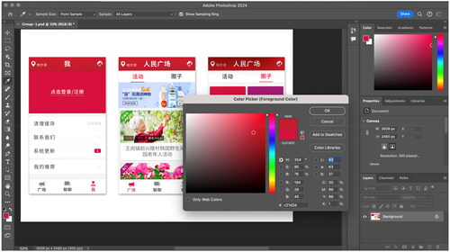
Figure 2. Test zone of the saturation of the sample images.
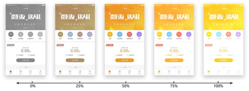
Table 1. Frequency statistics: when each color test image ranked first by the interviewees.
Table 2. Questionnaire basic information statistics (total number: 108).
Table 3. Physiological function decline in the elderly.
Table 4. Frequency of using smartphones and related APP.
Table 5. Interface elements that affect the smoothness of operating the APP.
Table 6. Preferred color scheme for the elderly.
Table 7. Representation of seniors’ perception of different lightness and saturation colors.
Afterward, the information on these 30 sample images was hidden, and only assigned numbers were reserved. Subsequently, images were observed by interviewees, given keyword descriptions, and scored on a scale from low (1) to high (10). Results showed that high lightness value images were rated higher than low lightness value ones.
3.2.1.2. Analysis of experimental results
The main colors and standard colors in APP interface design are part of the background colors at the visual level (Liao & Tsai, Citation2022). The scoring and keyword description results revealed that colors with low lightness were more likely to induce depressing feelings for elderly users, which calls for the usage of high lightness color style to compensate for duskiness anxiety due to aged visual function (Kuo et al., Citation2022; Takei & Imaizumi, Citation2022). Hence, colors with higher lightness are recommended when designing the color configuration of the APP interface for the elderly.
3.2.2. Experimental process and analysis of color hue
Besides lightness, the elderly’s perception is also impacted by color hue. Previous analysis showed that a cool hue was correlated with cold and lonely feelings, while a warm hue was associated with happiness and soft feelings (Liao et al., Citation2022; Zhou, Du, et al., Citation2023). Consequently, color configuration with the warmer hue of the APP interface will bring the elderly feelings of being cared for and partly relieve loneliness.
3.2.2.1. Experimental methods
Our research team selected 10 menu function pages from 30 APP interface screenshots as subjects in the experiment. After removing one duplicate red, one duplicate blue, and one duplicate green page, there were seven images left, which could roughly be classified into seven color hues, namely Red, Green, Yellow, Orange, Cyan, Blue, and purple. The subjects were first asked to rank 7 tested images from 1 (the most preferred) to 7 (the least preferred). After ranking, in-depth interviews were conducted with the elderly to obtain keywords for the main hue in formation.
3.2.2.2. Experimental analysis
According to the results, we can see that the elderly rated orange, yellow, and green samples highly and agreed on similar warmth feelings in interviews. shows the number of times for 7 test images were ranked, respectively first by anonymous interviewees in this experimental section. To that end, it is roughly concluded that these 7 basic hues are in the following preference order: Orange > Yellow ≈ Green > Red > Blue > Cyan > Purple. The warm hue colors represented by Orange are the most popular in the user preference test.
3.2.3. Experimental process and analysis of color saturation
3.2.3.1. Experimental methods
Based on the hue experiment, more popular images of Orange, Yellow, Green, and Red were selected as the main hue. The color saturation adjustment function in the Adobe Photoshop software was used to alter the sample image saturation, with the premise not to change the hue and brightness of each image group. In practice, the appropriate saturation was positioned within a certain range, which was continuously adjusted by the interviewees’ real-time feedback (see ).
3.2.3.2. Experimental analysis
Results showed that more than half of the interviewees adjusted to a range of 30–40% for Orange saturation, 28–36% for Yellow, 40–50% for Green, and 29–39% for Red. Overall, the saturation adjustment range of test images was 31.75–41.25%, in which the medium saturation colors were chosen predominantly.
3.2.4. Experimental results of color lightness, hue, and saturation
The preferred HSL model of APP interface by the elderly was studied and several conclusions were drawn:
The tested elderly preferred colors with high lightness.
For color hue, seniors prefer warm hue colors, such as yellow and orange.
For color saturation, colors with medium saturation were more popular.
3.3. Determining the color design direction of the APP interface: Using questionnaires method
After conducting in-depth interviews, the team screened the collected questionnaire responses based on the “3.1. Requirements for In-depth Interviewers & Questionnaires Screening Criteria.” After removing invalid samples, the effective sample size proceeding to the formal analysis stage was 108 individuals. Subsequent data consolidation and statistical analysis were conducted using SPSS. The following reflects the basic characteristics of the respondents.
showed that there were 50 males and 58 females in equal proportions, with no significant differences; the age groups were slightly higher in the 60–64 and 65–69 age groups, with 31.5 and 46.3%, respectively. The proportion of subjects in the 70–74 and the ≧75 age groups was relatively low.
Meanwhile, information about the elderly’s physiological declines was also collected and listed in :
As can be seen from above , the changes in physiological function decline in the elderly are a multiple-choice question in the questionnaire, and the statistical results show that: Vision Loss, Hearing Loss, Memory Loss, Reduced Responsiveness, and several Other Issues are common, the proportion of statistical results on each type of physiological decline feature is relatively close, with a proportion basically maintained at around 20%.
As an important supplement, the elderly’s smartphone using frequency is inquired and shown in :
Apparently, the proportion of high frequency users is undoubtedly the highest, with a cumulative total of 92 (85.2%); the proportion of low frequency users is relatively low, with 14.8% of Occasionally Used. It is clear that smartphones are also relatively popular with older users.
Furthermore, the correlation of interface elements and operating smoothness was examined and relative results are shown in :
The interface elements impacting the smoothness of operating the APP include Font, Graphic Symbol, Button Layout, and Background Color. Results show that all four factors are present, and the cumulative proportion is relatively similar, all above 20%.
Finally, the information about the elderly’s preferred color schemes is also collected in :
The elderly’s color scheme preference was divided into four main color types: Blue, Red, Orange, and Green. The questionnaire results showed that the preference for Orange was higher, with a total of 65 (around 60.2%) people choosing it; the other three color types were similar in proportion. This indicates that elderly people preferred warm colors represented by Orange as the color scheme. The questionnaire results once again strongly supported the conclusion in part 3.2.4.
4. Color design strategies for age-appropriate interfaces based on visual characteristics
In part 2.1, it is analyzed that the decline of the visual system of the elderly will cause a decrease in visual sensitivity to light and darkness, and a decrease in the ability to distinguish the outline of objects and colors. In section 3, three design principles were proposed with the HSL model after the research team’s experiment and questionnaire study, namely, the principles of improving the color functionality, reducing the visual fatigue, and enhancing the visual comfort.
4.1. The principle of improving color functionality
The experimental findings of section 3 indicate that elderly users prefer warm hue colors, with a particular affinity for hues like yellow, orange, and green. This preference stems from the association of warm hue colors with comfort, care, and health, as opposed to cool hue colors, which may evoke feelings of coldness and loneliness. While elderly users show a general preference for warm hue colors, but designers still have many precautions when using colors from warm hue colors during the interface design process. For example, red should be used cautiously. The red of warm hue colors can sometimes trigger the emotional stress reaction in the human body, such as nervousness and irritability, leading to hyperactivity and elevated blood pressure (Coryell, Citation2003; Dijkstra et al., Citation2008; Kang et al., Citation2022; Khaleghimoghaddam, Citation2023; MirMashhouri et al., Citation2022). On this account, the balanced use of warm hue colors, avoiding large areas of red, is crucial. This approach is in accordance with the experimental results, suggesting that the aging-friendly APP interface needs to have a moderate warm hue to ensure visual comfort, and positively impactful on the physical and mental health of elderly users. It is worth noting that the use of warm hue colors in the APP interface is significantly constrained by the background color. Pereira et al.’s study has confirmed that visual color sensitivity significantly decreases when older adults browse orange and yellow information content on a light background, especially lemon yellow (Pereira et al., Citation2022). Therefore, this article suggests that the best way to use warm hue colors, such as orange and yellow in the aging-friendly APP interface is to use them as standard colors, and form the page background, rather than using warm hue colors to display a large amount of information content on the lightful background.
Contrastingly, cool hue colors, often used in the popular elderly APPs in the commercial market today, can evoke feelings of loneliness and isolation. Thus, a softer warm hue color configuration that can improve object visibility and create warmth is recommended to avoid visual fatigue and negative associations. Warm hue colors, being more visually expansive and eye-catching (Suk & Irtel, Citation2010). They provide comfort and enhance visibility, making the text and icons in the APP interface appear clearer, more harmonious, and more user-friendly (Quinton et al., Citation2023; Wang et al., Citation2022).
4.2. The principle of reducing the visual fatigue
The experiment in section 3 revealed that elderly users preferred medium to high saturation levels for colors, based on warm hue colors. This preference suggests that while colors should be vibrant enough to maintain interest and readability, they should not be too intense to cause discomfort. Elderly users are particularly vulnerable to visual fatigue from high saturation colors due to visual system decline (Ya-Feng et al., Citation2022). This can cause physical discomfort, and previous literature shows that visual fatigue increases with color saturation beyond a certain level (Fan et al., Citation2021; Lin, Citation2003; Pastoor, Citation1990). Saturation levels around 31.75–41.25% for warm hue colors were found to be optimal with our experimental results. This medium saturation prevents colors from being overly bright or intense, which can lead to visual strain and fatigue.
When using high saturation colors on large areas, it can induce physiological discomfort symptoms, such as tension, dizziness, fatigue, etc. in humans (Wilkins, Citation2016). Nevertheless, high saturation colors still have positive effects when used in small, emphasized, or transitional areas, assuaging negative emotions in humans (Valdez & Mehrabian, Citation1994). This targeted use of more intense colors in specific parts of the interface can draw attention or delineate sections without overwhelming the entire visual field. For example, using high saturation greys can alleviate the sense of depression in areas with adjacent or similar colors, creating a visual break that reduces the strain of processing a monotonous color scheme (Takashima et al., Citation2022). Furthermore, including complementary colors in the interface design also helps in reducing visual fatigue (Holtzschue, Citation2012, p. 57). This diversity in colors provides a visual balance, preventing the monotony of a singular color palette that can strain the eyes over time.
4.3. The principle of enhancing the visual comfort
Elderly users often prefer bright backgrounds in APP interfaces, which facilitate information recognition and suppressing negative emotions triggering, such as depression in mind (McLaughlin & Pak, Citation2020). Concurrent APPs for the elderly mostly feature high lightness color schemes or large high lightness backgrounds. Nonetheless, the balancing of this brightness is vital. For example, a less bright menu bar compared to the background creates interface hierarchy and reduces visual stimulation (Bennett et al., Citation2012, p. 1177; Johnson, Citation2020; Ya-Feng et al., Citation2022). This approach is supported by experimental results of section 3, which showed that elderly users favor high lightness colors, suggesting the use of bright but not overpowering backgrounds in APP design. This balance is key to enhancing visual comfort and providing a user-friendly interface for elderly users.
Moreover, , the Background Color factor discussed earlier, Font, Graphic Symbol, and Button Layout, are also core factors that affect the smooth use of smart apps by elderly users. Among them, the design of Symbol and Button graphics should also be more concrete and less abstract, avoid using visually simplified and minimalist style. The informal abstract icon design within the APP interface can make most elderly people feel stressed, panicked, and frustrated due to graphic comprehension disorder (Pereira et al., Citation2023).
4.4. Pay attention to the emotive function of color
In APP interface design, color elements are the most intuitive source of visual perception, especially for the elderly whose declining eyesight makes them more dependent on this obvious source of visual information (Siran et al., Citation2018). Besides, color resonates faster with people’s emotions than other design elements, thanks to its obvious sensory perception benefits (Jiang et al. Citation2024; Zhou, Du, et al., Citation2023).
Reviewing the perception descriptions of different saturation colors among 20 anonymous elderly interviewees recorded during the in-depth interview process, it’s clear that older people generally don’t like or don’t adapt to low lightness colors and prefer warm hue colors to cool hue colors in terms of their individual subjective emotions, which is also in line with results of the questionnaire (see ).
When investigating existing color configurations of seniors’ APP in the market,Footnote3 we found that most of them use white as the background color (standard color). This is because white indicates clean and pure color emotion and is easy to convey text messages (Bates, Citation2022). Nevertheless, in-depth interview and questionnaire results show that these APP produce dull feelings after using it for a long time and too much white inevitably makes seniors feel icy. Thus it’s necessary to add some warm hue colors to the main color to improve the whole APP interface and to convey emotional resonance.
The datum in indicates that if the lightness factor of colors is excluded, pure high saturation colors may not necessarily have a general subjective emotional appeal to elderly people. Warm and soft colors reflect the preferences of elderly people better than strong and dazzling colors, which is consistent with previous theoretical analysis.
To summarize, when designing the color scheme of APP interface for the elderly, it is important to consider not only the elderly’s visual characteristics but also the emotional function of the color, i.e., the psychological feeling that colors bring to people. The use of a warm hue color with medium saturation and high lightness as the main color in the color scheme of the APP for the elderly produces a positive psychological hint. In addition, the use of colors in other areas should be relatively soft in contrast to avoid depressing and negative psychological impacts on the elderly. Through the emotional function of color, these can help the elderly with a better visual experience and emotional service (Navarrete-Villanueva et al., Citation2021; Zhou, Tan, et al., Citation2023).
Regardless of users age group, the color design of the interface must follow the principle of harmonization (Liu et al., Citation2022). Usually, it takes a longer time for the elderly to adapt to the switch between different color interfaces. So in terms of color coordination, the utilized HSL model developed by designers must be harmonized, which is a physiological, emotional, and psychological requirement for the elderly.
5. Conclusion, limitations, and future research planning
In conclusion, this article presents a comprehensive approach to designing age-friendly APP interfaces for the elderly, namely optimizing color configurations based on the visual characteristics and needs of the elderly. The research identifies a preference among elderly users for warm hue colors, medium saturation, and high lightness, suggesting that the color configuration of the APP interface that meets these parameters contribute to elderly users achieve a more comfortable and efficient experience. This preference is attributed to the aging-related changes in visual acuity and color perception.
Without doubt, the study also has certain limitations. Firstly, this study was conducted within a specific Chinese cultural and demographic context, and due to significant differences in the language usage habits of the elderly, scenarios of the elderly using APPs, the acceptance level of digital information, and other factors, among the seven geography regionsFootnote4 within China’s vast territory. As a consequence, the academia still needs to conduct the same tracking research on elderly people in other geographical regions of China based on the results and experimental methodology of this article, to obtain the most complete and optimal APP interface color configuration scheme for the physiological characteristics of Chinese senior citizen. Presently, the sample data in this article only represents the color preferences of the elderly population in North China (NC), with Beijing as the core. Additionally, the study focuses primarily on color design, leaving other critical aspects of interface design, such as layout and typography, for future exploration. Continuous technological advancements and everchanging user preferences call for ongoing research to ensure that interface designs remain relevant and effective for the aging population. This study serves as a foundational step toward creating more inclusive and user-friendly digital environments for the elderly. The findings herein do not only catalyze the formulation and refinement of APP interface color schemes that are resonant with elderly visual characteristics but also emphasizing the pivotal role of amalgamating technological design with the sophisticated visual and psychological necessities of aging demographics.
Ethical approval
To ensure that the data from in-depth interview is universal and reference value, the project team has obtained official permission from the operators of the nursing homes in this sample and the academic research privacy permission of all interviewees in the sample, then looked up the age files of interviewees. The involved human participants in in-depth interviews and questionnaire surveys were reviewed and approved by the University of Edinburgh in the UK & Zhejiang University in China. The personal information of participants was strictly erased and only appointed random numbers as distinguishment. Written informed consent for participation was not required for this study, which is in accordance with relative national legislation and corresponding institutional requirements.
Author contributions
Bai Liu: conceptualization; data curation; funding acquisition; investigating; methodology; software; writing-original draft. Chuncheng Wang: formal analysis; data curation; project administration; software; investigating; validation; writing–review and editing.
Acknowledgments
Special thanks to the three for-profit nursing home enterprises involved in this study (From Shunyi District and Miyun District, Beijing, China) for their generous support and assistance to the multinational research team in this health interaction design research. Lastly, we would like to thank Dr. Agnese Sile from the University of Edinburgh warmly recommended the International Journal of Human–Computer Interaction to us.
Disclosure statement
No potential conflict of interest was reported by the author(s).
Data availability statement
Data sharing is applicable to this paper, and all the original data involved in this research process can be used for subsequent research in relevant fields. *Nevertheless, due to the routine confidentiality regulations of the University of Edinburgh in the UK and Zhejiang University in China on laboratory raw data, if readers need to obtain the specific statistics details and questionnaire setting information in this research, please firstly contact the Corresponding Author (Bai Liu).
Correction Statement
This article has been republished with minor changes. These changes do not impact the academic content of the article.
Additional information
Funding
Notes on contributors
Bai Liu
Bai Liu, currently pursuing a Master degree and as a Research Assistant at the University of Edinburgh in UK. At present, his research focuses on People-oriented Design, Ethic Criticism of AI-generated Art, and XR Immersive Media.
Chuncheng Wang
Chuncheng Wang, currently pursuing a PhD degree at Zhejiang University in China. At present, his research focuses on quantification of fibrous structure organization in biophotonics.
Notes
1 To ensure the objectivity of the experimental samples, this study selected 10 APPs related to the elderly population. Then the research team downloaded severally 5 equal number of APPs from both the Android App Store and the Apple App Store (Download Time: August 2023; Test Time: September 2023).
2 The Adobe Photoshop software used in this study is the genuine 2024 version, and has Adobe Education License Agreements authorized by Adobe to the University of Edinburgh in the UK. The dissemination of the article does not involve infringement of Adobe’s rights.
3 See note 1 above.
4 The seven geographical regions of China are EC: East China, MC: Middle China, NC: North China, NEC: Northeast China, NWC: Northwest China, SC: South China and SWC: Southwest China. Each region has a complex & diverse language system, lifestyle, cultural & educational environment, and ethnic composition.
References
- Al-Razgan, M. S., Al-Khalifa, H. S., Al-Shahrani, M. D., & AlAjmi, H. H. (2012). Touch-based mobile phone interface guidelines and design recommendations for elderly people: A survey of the literature. In T. Huang, Z. Zeng, C. Li, & C. S. Leung (Eds.), Neural information processing. ICONIP 2012. Lecture notes in computer science (Vol. 7666). Springer. https://doi.org/10.1007/978-3-642-34478-7_69
- Alsswey, A., Al-Samarraie, H., & Malak, M. Z. (2023). Older adults’ satisfaction with mHealth UI design-based culture: A case study of Jordan. Journal of Human Behavior in the Social Environment, 33(4), 565–577. https://doi.org/10.1080/10911359.2022.2074183
- Andersen, G. J. (2012). Aging and vision: Changes in function and performance from optics to perception. Wiley Interdisciplinary Reviews. Cognitive Science, 3(3), 403–410. https://doi.org/10.1002/wcs.1167
- Bates, V. (2022). Cold White of Day: White, colour, and materiality in the twentieth-century British hospital. Twentieth Century British History, 34(1), 1–37. https://doi.org/10.1093/tcbh/hwac020
- Bennett, K. B., Nagy, A. L., & Flach, J. M. (2012). Chapter 42: Visual displays. In Salvendy & Karwowski (Eds.), Handbook of human factors and ergonomics (4th ed., pp. 1177–1208). John Wiley & Sons, Inc. https://doi.org/10.1002/9781118131350.ch42
- Brewer, R., Pierce, C., Upadhyay, P., & Park, L. (2022). An empirical study of older adult’s voice assistant use for health information seeking. ACM Transactions on Interactive Intelligent Systems, 12(2), 1–32. https://doi.org/10.1145/3484507
- Bringmann, A., Barth, T., Wiedemann, R., & Wiedemann, P. (2022). Age-and sex-related variations of individual retinal layer thickness in the foveal center of healthy eyes. Experimental Eye Research, 219(6), 109038. https://doi.org/10.1016/j.exer.2022.109038
- Cernin, P. A., Keller, B. K., & Stoner, J. A. (2003). Color vision in Alzheimer’s patients: Can we improve object recognition with color cues? Aging, Neuropsychology, and Cognition, 10(4), 255–267. https://doi.org/10.1076/anec.10.4.255.28971
- Coryell, J. A. (2003). The therapeutic use of color in a clinical environment [Doctoral dissertation]. The Wright Institute. ProQuest Dissertations & Theses Global. https://www.proquest.com/dissertations-theses/therapeutic-use-color-clinical-environment/docview/305293341/se-2?accountid=10673
- De Barros, A. C., Leitão, R., & Ribeiro, J. (2014). Design and evaluation of a mobile user interface for older adults: Navigation, interaction and visual design recommendations. Procedia Computer Science, 27, 369–378. https://doi.org/10.1016/j.procs.2014.02.041
- Demirbilek, O., & Demirkan, H. (2004). Universal product design involving elderly users: A participatory design model. Applied Ergonomics, 35(4), 361–370. https://doi.org/10.1016/j.apergo.2004.03.003
- Dijkstra, K., Pieterse, M. E., & Pruyn, A. T. H. (2008). Individual differences in reactions towards color in simulated healthcare environments: The role of stimulus screening ability. Journal of Environmental Psychology, 28(3), 268–277. https://doi.org/10.1016/j.jenvp.2008.02.007
- Fan, X., Yan, Y., Yin, E., Cai, M., Xie, L., & Wang, N. (2021). Evaluation of VR/AR visual comfort based on color perception. In T. Z. Ahram & C. S. Falcão (Eds.), Advances in usability, user experience, wearable and assistive technology. AHFE 2021. Lecture notes in networks and systems (Vol. 275). Springer Nature. https://doi.org/10.1007/978-3-030-80091-8_14
- Freeman, E. E., Egleston, B. L., West, S. K., Bandeen-Roche, K., & Rubin, G. (2005). Visual acuity change and mortality in older adults. Investigative Ophthalmology & Visual Science, 46(11), 4040–4045. https://doi.org/10.1167/iovs.05-0687
- Gage, J., & Grovier, K. (2023). Colour in art. Thames & Hudson.
- Gomez-Hernandez, M., Ferre, X., Moral, C., & Villalba-Mora, E. (2023). Design guidelines of mobile apps for older adults: Systematic review and thematic analysis. JMIR mHealth and uHealth, 11(1), e43186. https://doi.org/10.2196/43186
- Government of China (2018). Chapter I: General provisions-law of the People’s Republic of China on protection of the rights and interests of the elderly. In National Law and Regulations Database of the People’s Republic of China. Standing Committee of the National People’s Congress of the People’s Republic of China.
- Hegde, A. L., & Hustvedt, G. (2011). Young designers and design sensitivity to the aging eye. Design Principles and Practices: An International Journal—Annual Review, 5(1), 39–48. https://doi.org/10.18848/1833-1874/CGP/v05i01/38007
- Holtzschue, L. (2012). Understanding color: An introduction for designers. John Wiley & Sons, Inc.
- Hsiao, S. W., Lee, C. H., Yang, M. H., & Chen, R. Q. (2017). User interface based on natural interaction design for seniors. Computers in Human Behavior, 75(10), 147–159. https://doi.org/10.1016/j.chb.2017.05.011
- Iancu, I., & Iancu, B. (2020). Designing mobile technology for elderly. A theoretical overview. Technological Forecasting and Social Change, 155(6), 119977. https://doi.org/10.1016/j.techfore.2020.119977
- Jiang, Q., Deng, L., & Zhang, J. (2024). How dose aesthetic design affect continuance intention in in-vehicle infotainment systems? An exploratory study. International Journal of Human–Computer Interaction, 1–16.
- Johnson, J. (2020). Designing with the mind in mind: simple guide to understanding user interface design guidelines. Morgan Kaufmann.
- Johnson, J., & Finn, K. (2017). Designing user interfaces for an aging population: Towards universal design. Morgan Kaufmann.
- Kang, J., Park, Y. E., & Yoon, H. K. (2022). Feeling blue and getting red: An exploratory study on the effect of color in the processing of emotion information. Frontiers in Psychology, 13(6), 515215. https://doi.org/10.3389/fpsyg.2022.515215
- Khaleghimoghaddam, N. (2023). Understanding the interplay of light, color, and interior design in healthcare spaces. Journal of Design for Resilience in Architecture and Planning, 4(2), 219–231. https://doi.org/10.47818/DRArch.2023.v4i2094
- Kim, J. C., Saguna, S., & Åhlund, C. (2023). Acceptability of a health care app with 3 user interfaces for older adults and their caregivers: Design and evaluation study. JMIR Human Factors, 10(1), e42145. https://doi.org/10.2196/42145
- Kline, D. W., Ikeda, D. M., & Schieber, F. J. (1982). Age and temporal resolution in color vision: When do red and green make yellow? Journal of Gerontology, 37(6), 705–709. https://doi.org/10.1093/geronj/37.6.705
- Kuo, L., Chang, T., & Lai, C. C. (2022). Multimedia webpage visual design and color emotion test. Multimedia Tools and Applications, 81(2), 2621–2636. https://doi.org/10.1007/s11042-021-11684-4
- Li, Q., & Luximon, Y. (2020). Older adults’ use of mobile device: Usability challenges while navigating various interfaces. Behaviour & Information Technology, 39(8), 837–861. https://doi.org/10.1080/0144929X.2019.1622786
- Liao, C. C., & Tsai, K. I. (2022). Effects of different combinations of text lightness and background colour on the visual comfort, recognition and preference for packaging labels. Journal of the International Colour Association, 30(3), 35–49. https://aic-color.org/resources/Documents/jaic_v30_04.pdf
- Liao, S., Sakata, K., & Paramei, G. V. (2022). Color affects recognition of emoticon expressions. i-Perception, 13(1), 20416695221080778. https://doi.org/10.1177/20416695221080778
- Lin, C. C. (2003). Effects of contrast ratio and text color on visual performance with TFT-LCD. International Journal of Industrial Ergonomics, 31(2), 65–72. https://doi.org/10.1016/S0169-8141(02)00175-0
- Liu, H., Wang, W., Liu, Y., Song, F., Wang, S., & Guo, H. (2023). Study on the differences of icon cognition of graphical interface for age-friendly design. Journal of Gerontological Social Work, 66(5), 662–679. https://doi.org/10.1080/01634372.2022.2139319
- Liu, M., Duan, Y., Ince, R. A., Chen, C., Garrod, O. G., Schyns, P. G., & Jack, R. E. (2022). Facial expressions elicit multiplexed perceptions of emotion categories and dimensions. Current Biology, 32(1), 200–209.e6. https://doi.org/10.1016/j.cub.2021.10.035
- Madden, D. J., & Whiting, W. L. (2003). Age-related changes in visual attention. Advances in Cell Aging and Gerontology, 15, 41–88. https://doi.org/10.1016/S1566-3124(03)15003-1
- McLaughlin, A., & Pak, R. (2020). Designing displays for older adults. CRC Press.
- MirMashhouri, A., Bastanfard, A., & Amirkhani, D. (2022). Collecting a database for emotional responses to simple and patterned two-color images. Multimedia Tools and Applications, 81(13), 18935–18953.
- Nagarajan, N., Assi, L., Varadaraj, V., Motaghi, M., Sun, Y., Couser, E., Ehrlich, J. R., Whitson, H., & Swenor, B. K. (2022). Vision impairment and cognitive decline among older adults: A systematic review. BMJ Open, 12(1), e047929. https://doi.org/10.1136/bmjopen-2020-047929
- Navarrete-Villanueva, D., Gómez-Cabello, A., Marín-Puyalto, J., Moreno, L. A., Vicente-Rodríguez, G., & Casajús, J. A. (2021). Frailty and physical fitness in elderly people: A systematic review and meta-analysis. Sports Medicine, 51(1), 143–160. https://doi.org/10.1007/s40279-020-01361-1
- Omori, M., Miyao, M., Kanamori, H., & Atsumi, B. (2008). Visual cognitive performance of elderly people: Effects on reading time of age, character size and visual distance. Behaviour & Information Technology, 27(4), 313–318. https://doi.org/10.1080/01449290701760583
- Pastoor, S. (1990). Legibility and subjective preference for color combinations in text. Human Factors, 32(2), 157–171. https://doi.org/10.1177/001872089003200204
- Pereira, L., Martins, N., & Brandão, D. (2022). Color sensitivity in digital interfaces designed for elderly people. In N. Martins & D. Brandão (Eds.), Advances in design and digital communication II. DIGICOM 2021. Springer series in design and innovation (Vol. 19). Springer Nature. https://doi.org/10.1007/978-3-030-89735-2_7
- Pereira, L., Martins, N., Ferreira, S. D., Neves, J., Silva, J., & Brandão, D. (2023). Iconography design for digital applications developed for the elderly or senior user. In D. Raposo, J. Neves, R. Silva, L. Correia Castilho, & R. Dias (Eds.), Advances in design, music and arts II. EIMAD 2022. Springer series in design and innovation (Vol. 25). Springer Nature. https://doi.org/10.1007/978-3-031-09659-4_8
- Quinton, S., Treveri Gennari, D., & Dibeltulo, S. (2023). Engaging older people through visual participatory research: Insights and reflections. Qualitative Research, 23(6), 1647–1668. https://doi.org/10.1177/14687941221110163
- Salman, H. M., Wan Ahmad, W. F., & Sulaiman, S. (2023). A design framework of a smartphone user interface for elderly users. Universal Access in the Information Society, 22(2), 489–509. https://doi.org/10.1007/s10209-021-00856-6
- Secchi, S. (2023). Designing age-friendly emerging digital products. Leveraging the potential of prospective seniors to co-design future experiences [Master’s thesis]. Aalto University. Aalto Thesis Database. https://urn.fi/URN:NBN:fi:aalto-202306183875
- Silver, N. C., & Ferrante, R. A. (1995). Sex differences in color preferences among an elderly sample. Perceptual and Motor Skills, 80(3 Pt 1), 920–922. https://doi.org/10.2466/pms.1995.80.3.920
- Sin, J., Munteanu, C., Chen, D., & Threatt, J. (2023). Avoiding mixed messages: Research-based fact-checking the media portrayals of voice user interfaces for older adults. Human–Computer Interaction, 38(3–4), 235–258. https://doi.org/10.1080/07370024.2022.2098129
- Siran, Z., Abidin, S. Z., & Anwar, R. (2018). Design elements: The interaction of elderly people on product interfaces. In R. Anwar, M. Mahamood, D. Md. Zain, M. Abd Aziz, O. Hassan, & S. Abidin (Eds.), Proceedings of the Art and Design International Conference (AnDIC 2016). Springer. https://doi.org/10.1007/978-981-13-0487-3_9
- Starkstein, S. E., & Kremer, J. L. (2001). Cerebral aging: Neuropsychological, neuroradiological, and neurometabolic correlates. Dialogues in Clinical Neuroscience, 3(3), 217–228. https://doi.org/10.31887/DCNS.2001.3.3/sestarkstein
- Suk, H. J., & Irtel, H. (2010). Emotional response to color across media. Color Research & Application, 35(1), 64–77. https://doi.org/10.1002/col.20554
- Tabi, Y. A., Maio, M. R., Attaallah, B., Dickson, S., Drew, D., Idris, M. I., Kienast, A., Klar, V., Nobis, L., Plant, O., Saleh, Y., Sandhu, T. R., Slavkova, E., Toniolo, S., Zokaei, N., Manohar, S. G., & Husain, M. (2022). Vividness of visual imagery questionnaire scores and their relationship to visual short-term memory performance. Cortex, 146(1), 186–199. https://doi.org/10.1016/j.cortex.2021.10.011
- Takashima, R., Inoue, T., Yoshida, Y., Sakaue, M., Suzuki, T., & Ogasawara, K. (2022). Effects of colour narrative in community-dwelling older adults: A mixed methods study. Scandinavian Journal of Occupational Therapy, 29(7), 542–554. https://doi.org/10.1080/11038128.2020.1849395
- Takei, A., & Imaizumi, S. (2022). Effects of color–emotion association on facial expression judgments. Heliyon, 8(1), e08804. https://doi.org/10.1016/j.heliyon.2022.e08804
- Taylor, M. E., Boripuntakul, S., Toson, B., Close, J. C. T., Lord, S. R., Kochan, N. A., Sachdev, P. S., Brodaty, H., & Delbaere, K. (2019). The role of cognitive function and physical activity in physical decline in older adults across the cognitive spectrum. Aging & Mental Health, 23(7), 863–871. https://doi.org/10.1080/13607863.2018.1474446
- Tokumaru, M., Muranaka, N., & Imanishi, S. (2002). Color design support system considering color harmony. In 2002 IEEE World Congress on Computational Intelligence. 2002 IEEE International Conference on Fuzzy Systems. FUZZ-IEEE'02. Proceedings (Cat. No. 02CH37291) (Vol. 1, pp. 378–383). IEEE. https://doi.org/10.1109/FUZZ.2002.1005020
- Valdez, P., & Mehrabian, A. (1994). Effects of color on emotions. Journal of Experimental Psychology. General, 123(4), 394–409. https://doi.org/10.1037/0096-3445.123.4.394
- Wandell, B. A. (1995). Chapter 9: Color. In Foundations of vision. Oxford University Press, Incorporated.
- Wang, Z., Liu, W., & Yang, M. (2022). Data-driven multi-objective affective product design integrating three-dimensional form and color. Neural Computing and Applications, 34(18), 15835–15861. https://doi.org/10.1007/s00521-022-07232-2
- Wijk, H., Berg, S., Sivik, L., & Steen, B. (1999). Color discrimination, color naming and color preferences in 80-year olds. Aging Clinical and Experimental Research, 11(3), 176–185. https://doi.org/10.1007/BF03399660
- Wilkins, A. J. (2016). A physiological basis for visual discomfort: Application in lighting design. Lighting Research & Technology, 48(1), 44–54. https://doi.org/10.1177/1477153515612526
- Wong, C. Y., Ibrahim, R., Hamid, T. A., & Mansor, E. I. (2018). Usability and design issues of smartphone user interface and mobile apps for older adults. In N. Abdullah, W. Wan Adnan, & M. Foth (Eds.), User science and engineering. i-USEr 2018. Communications in computer and information science (Vol. 886). Springer. https://doi.org/10.1007/978-981-13-1628-9_9
- Ya-Feng, N., Jin, L., Jia-Qi, C., Wen-Jun, Y., Hong-Rui, Z., Jia-Xin, H., Lang, X., Jia-Hao, W., Guo-Rui, M., Zi-Jian, H., Cheng-Qi, X., Xiao-Zhou, Z., & Tao, J. (2022). Research on visual representation of icon colour in eye-controlled systems. Advanced Engineering Informatics, 52(4), 101570. https://doi.org/10.1016/j.aei.2022.101570
- Yamamoto, G., Hyry, J., Krichenbauer, M., Taketomi, T., Sandor, C., Kato, H., & Pulli, P. (2015). A user interface design for the elderly using a projection tabletop system. In 2015 3rd IEEE VR International Workshop on Virtual and Augmented Assistive Technology (VAAT) (pp. 29–32). IEEE. https://doi.org/10.1109/VAAT.2015.7155407
- Yu, J. E., Parde, N., & Chattopadhyay, D. (2023). “Where is history”: Toward designing a voice assistant to help older adults locate interface features quickly. In Proceedings of the 2023 CHI Conference on Human Factors in Computing Systems (pp. 1–19). https://doi.org/10.1145/3544548.3581447
- Zajicek, M. (2004). Successful and available: Interface design exemplars for older users. Interacting with Computers, 16(3), 411–430. https://doi.org/10.1016/j.intcom.2004.04.003
- Zhou, J., & Gao, Q. (2021). Chapter 48: Design for aging. In Salvendy & Karwowski (Eds.), Handbook of human factors and ergonomics (5th ed.). John Wiley & Sons, Inc.
- Zhou, J., Tan, R., & Lin, H. C. (2023). Development of an integrated conceptual path model for a smart elderly care information system. Universal Access in the Information Society, 22(3), 785–810. https://doi.org/10.1007/s10209-022-00879-7
- Zhou, Q., Du, J., Gao, R., Hu, S., Yu, T., Wang, Y., & Pan, N. C. (2023). Discriminative neural pathways for perception-cognition activity of color and face in the human brain. Cerebral Cortex, 33(5), 1972–1984. https://doi.org/10.1093/cercor/bhac186