Abstract
The data illustrate outliers that are not mistakes and not observations that are unusually high or low. The reasons for them are all interesting historically. They illustrate that “outliers” need not be errors but may instead be particularly interesting cases. The data also illustrate that different data displays may differ in their ability to reveal interesting data structure.
1. Introduction
For many years I have been urging my students to scan data for outliers. There are two common definitions of what an outlier is, and I have a strong preference between them. One definition concentrates on outliers that are unusually large or small. Here is an example from CitationBluman (2000, p. 123):
An “outlier” is an extremely high or an extremely low data value when compared with the rest of the data values.
Boxplots implement a specific version of this definition. However, this definition does not generalize well beyond a single variable.
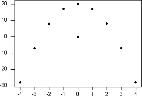
Nine points of the pseudodata in fall on a perfect parabolic curve while one point is quite far from that curve. However, neither the vertical nor horizontal coordinate of the “outlier” is unusually large. In fact, both coordinates are exactly equal to the mean (and median) of the corresponding coordinate of the other nine points.
I prefer an admittedly more subjective definition that covers a much wider class of situations. Here is an example from CitationRoss (1996, p. 59):
… “outliers” … are data points that do not appear to follow the pattern of the other data points.
To get my students started thinking in these terms, I wanted examples of data on a single variable for which the outliers were not very large or very small values. Such points are important in research as well as in teaching. They are called “inliers” by CitationWinkler (www.census.gov/srd/papers/pdf/rr9805.pdf). His concern is with identifying such points when they represent errors in the data that are not apparent because they are not unusually large or small values.
In my classes, I use some pseudodata examples, such as
We might imagine this as prize monies in athletic events, with one peak representing males, another females, and an “outlier” in the middle that needs further investigation. Once again the “outlier” is at the center of the rest of the data.
2. Data
Recently I became aware of a real dataset that can serve my purpose and also illustrates the strengths and weaknesses of different data displays. It would give away too much to tell you just what the numbers represent (though I should warn you that residents of the United States will have an advantage in guessing where these data came from), so let us begin with some displays.
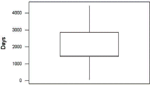
At first glance, the boxplot in suggests symmetry with no outliers – until we notice the location of the median at one end of the box, something beginners might not notice immediately. To more experienced eyes, this suggests a (single) sharp peak around 1500.
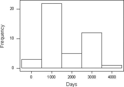
The histogram in suggests a bimodal distribution with no outliers.
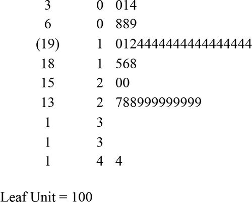
The stem and leaf in suggests a bimodal distribution with a mild outlier at the high end.
The dotplot in is the most revealing of our displays. Most of the observations fall in two peaks around 1500 and 3000. Since the majority of the observations fall at these two sharp peaks, we might consider all of the remaining data to be “outliers”.
We can look at the data in greater detail by tallying the values.
Table 1. Tally of Days.
shows that the peaks are very sharp indeed. There are 14 observations at 1460-1461 and 9 at 2921-2922. More than half the data take on one of these four values. It is interesting to note that the values at one peak are about two times the values at the other. Can you guess what these data are? (Hint: 1460 = 4 × 365)
Days
Days (sorted)
3. Context of the Data
Table 2. Past Presidents of the United States.
Table 3. Past Presidents of the United States (sorted).
The two peaks in the data represent presidents who served one (1460 or 1461 days) or two (2921 or 2922) full terms. The fact that there are two values at each peak is due to changes in how the starting and ending dates of a standard term are defined. This is more pronounced in the case of Washington, who is actually a part of the upper peak. He served two full terms but his “start-up” term as the first President of the United States was shorter than subsequent terms. If we count Washington, there are 24 Presidents “in the pattern”. The remaining 19 Presidents (44%) that fall off the two peaks are “outliers” in the sense that some explanation is required as to why these Presidents failed to serve one or two full terms.
Franklin Roosevelt is the one high outlier because he was the only President elected to more than two terms. He was actually elected to four terms, but died in office during his fourth. This is probably the only outlier that is covered by the “too big or too small” definition of outliers. That depends, of course, on your cut-off points for too- extremeness. For example, the definition built into the boxplot doesn't tag Roosevelt as an outlier.
4. Discussion
Some of my students subscribe to the OWTH (Off With Their Heads) school of thought on how to deal with outliers. They simply want to delete them. This dataset is a case where that is clearly a foolish policy. What we generally want to do with outliers is investigate them more fully and find out why they are special. Often this has some significance in the realm where the data were collected. Here are some examples that can be turned into exercises for students. In many cases the Presidents who failed to serve one or two full terms died in office. (Who are they?) But for each of those, there is another who served a partial term by serving out the remaining term of the president who died. (Which Presidents are these?) There is also a President who resigned from office, and a matching one that served out his term. (Who are they?) Finally, there is the current President, whose term is not yet over. For him, there is no other President associated with the remainder of his term. (Should he even be included? Is the number of days served accurate in his case? Is he an outlier?) In general, there is a reason for each “outlier” that can be discovered by looking into the context of the data. (I should note that one outlier was removed in the data gathering process. David Rice Atchison may have been Acting President for one day in 1849. See www.senate.gov/artandhistory/history/minute/President_For_A_Day.htm
The clear links with history make this a good dataset to use with a colleague in that discipline. One possible exploration might involve the names listed twice on the list of Presidents. Your colleague can help your students look into history to find explanations for these apparent duplications. Some are father-and-son, one pair are grandfather-and-grandson, and the two Cleveland's are the same man, elected to two nonconsecutive terms. Here we could discuss whether this is an “outlier” in the sense that it needs fixing. For some purposes it might make more sense to list Cleveland but once and total his days in office. Apparently not for every purpose, though; the U. S. State Department has ruled that Cleveland shall be counted as both the 22nd and 24th President.
One might also note that in addition to being an outlier as a result of being elected to the Presidency four times, Franklin Roosevelt also served a truncated fourth term due to death in office, and, like Washington, a truncated first term because the date of inauguration was changed.
Your students may have an almanac, a friendly, nearby history teacher, or their own knowledge of U. S. History to fall back on to answer such questions. In real studies, it may be that peculiarities in the data have no ready explanation. Then the analysis of the data may stimulate new research to find an explanation. A famous example from the history of science is the discovery of unknown planets, see CitationO'Connor and Robertson www-gap.dcs.st-and.ac.uk/∼history/HistTopics/Neptune_and_Pluto.html. Here peculiarities in the data on the known planets suggested where to look for new planets.
My goals with this data are more modest than discovering new planets. I hope to illustrate an underappreciated kind of “outlier”, to have students see that data displays can tell us much about the underlying situation, and that we may have to delve into the originating discipline to understand what we see in our displays.
5. Getting the Data
The file outlier.dat.txt is a tab delimited text file containing 43 rows. The rows, in chronological order, list the President's name (with no embedded spaces) and his number of days in office. The file outlier.txt is a documentation file containing a brief description of the dataset.
References
- Bluman, Allan (2000), Elementary Statistics, brief version, New York: McGraw-Hill.
- O'Connor, J.J. and Robertson, E.F., “Mathematical discovery of planets”, www-gap.dcs.st-and.ac.uk/∼history/HistTopics/Neptune_and_Pluto.html.
- Ross, Sheldon (1996), Introductory Statistics, New York: McGraw-Hill.
- Winkler, William, “Problems with Inliers”, U.S. Census Bureau, www.census.gov/srd/papers/pdf/rr9805.pdf.


