
 ?Mathematical formulae have been encoded as MathML and are displayed in this HTML version using MathJax in order to improve their display. Uncheck the box to turn MathJax off. This feature requires Javascript. Click on a formula to zoom.
ABSTRACT
Boxplots are statistical representations for organizing and displaying data that are relatively easy to create with a five-number summary. However, boxplots are not as easy to understand, interpret, or connect with other statistical representations of the same data. We worked at two different schools with 259 middle school students who constructed and interpreted boxplots. We observed that even students who were able to create boxplots had difficulty interpreting data represented in a boxplot. After sharing specific difficulties that we observed students having, we discuss ways to help students to make sense of data presented in boxplots.
1. Introduction
Many reform documents, such as Principles and Standards for School Mathematics (National Council of Teachers of Mathematics [NCTM] Citation2000), and the Common Core State Standards for Mathematics (National Governors Association Center for Best Practices and the Council of Chief State School Officers [CCSSI] Citation2010) have identified standards addressing students' mathematical and statistical understanding. Representations play a crucial role as students build and improve their conceptual understanding in statistics. Data analysis as addressed in school mathematics curricula involves the use of such representations as boxplots, dot plots, scatterplots, stem and leaf plots, bar graphs, histograms, and so on as part of the tool kit for analyzing data.
As we help our students improve their statistical thinking and reasoning, they need to go beyond constructing, organizing, and reading statistical representations. We also want our students to make connections among different representations and use them while conjecturing, reasoning, and solving problems. However, research demonstrates that many students have difficulties in interpreting, reasoning with, and even reading, statistical representations (Biehler Citation1996; Friel and Bright Citation1996; Konold et al. Citation1997; Friel, Curcio, and Bright Citation2001; Ben-Zvi and Garfield Citation2005; Capraro, Kulm, and Capraro Citation2005; delMas, Garfield, and Ooms Citation2005; Lem et al. Citation2013a, Citation2013b). delMas, Garfield, and Ooms (Citation2005) discuss students' misconceptions about different statistical representations and conclude that students have many difficulties when reasoning about the graphical representations of data.
1.1. Boxplot Research and Conceptual Framework
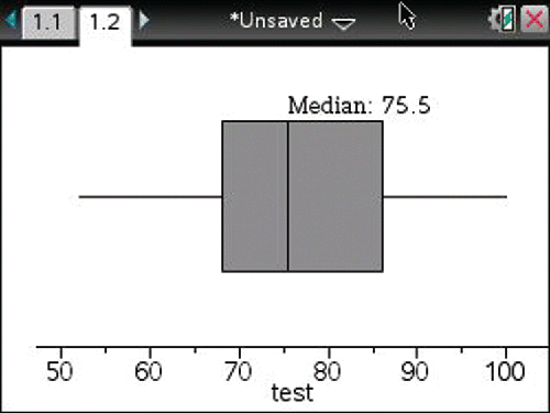
Both of the aforementioned standards documents place making and interpreting boxplots in grades 6 and 7 (NCTM Citation2000; CCSSI Citation2010). Boxplots are statistical representations for organizing and displaying data that are relatively easy to create. One only needs a five-number summary of the dataset to create a boxplot. The five-number summary includes the minimum, lower quartile, median, upper quartile, and maximum values. For example, suppose that test grades for a class of 20 students were as follows: 75, 89, 61, 68, 59, 68, 100, 62, 89, 72, 52, 79, 78, 92, 76, 69, 76, 68, 83, and 91. To identify the five-number summary, students could first order the data from smallest to largest:
Now, the minimum and maximum values are easily identifiable. Next, the data can be separated into four groups, each containing five data points in sequence:
Once that has been done, the lower quartile, median, and upper quartile can be identified as the numbers half-way between the highest value in one of the groups and the lowest value in the next consecutive group. Thus, the lower quartile is 68, the median is 75.5, and the upper quartile is 86. Finally, a number line can be drawn, the five summary points can be located, and the boxplot can be drawn immediately above the number line. The completed boxplot appears as .
Figure 1. A completed boxplot.
Following Curcio's framework (Citation1987) for interpreting data from a statistical representation and its interpretation by Friel, Curcio, and Bright (Citation2001), we see that different levels of information can be extracted from a statistical representation: reading the data, reading between the data, and reading beyond data. Simply put, reading the data would be defined as “lifting information from the graph to answer explicit questions for which the obvious answer is in the graph” (Friel, Curcio, and Bright Citation2001, p. 130). Reading the data would entail reading values of the five-number summary from a boxplot such as the one in . When we say read between the data, we envision students beginning to think about the structure of the boxplot; for instance, reflecting on the boxes and whiskers, comparing the boxes and the whiskers, the range, interquartile range, and so on. Lem et al. (Citation2013b) stated that this could be problematic for many students. Because their attention goes to the salient area of the box itself, “many students did not see the whiskers of the box plot as representing data, meaning they ignored half of the data” (p. 168). Noticing that the range from the first quartile to the median is smaller compared to the ranges of other sections of the boxplot in is an example of reading between the data (Curcio Citation1987; Friel, Curcio, and Bright Citation2001). Reading between the data also requires students to make inferences based on the data in the representation. For example, “What percent of the data is above first quartile?” Finally, reading beyond the data would require students to make predictions and extensions. An example of this would be asking students what the value might have been if it is known that it exceeded the upper quartile.
Pfannkuch (Citation2007) provided evidence from the literature that “students tended to reason with and compare the five-number summary cut-off points when dealing with boxplots. The researchers theorized that the boxplot's visual representation seems to lead students to focus intuitively on comparing cut-off points” (p. 150). It is not unexpected that students use those five summary numbers to create a boxplot. However, their attention apparently remains fixed on those five individual points. Watson (Citation2012) and Biehler (Citation1996) warned about using percentiles to structure boxplots, as students may have difficulties with percent and percentile concepts. This observation is particularly relevant with regard to middle grades students (typically 11–13 years old). For this reason, Watson suggests teaching or reviewing concepts involving percent as precursors to boxplots. Doing so better equips students to read and understand boxplots.
DelMas (Citation2005) believed that “boxplots remove much of the detail from a dataset to make certain features stand out (e.g., central tendency, variability, positive or negative skew). Understanding how the abstract representation of a ‘box’ can stand for an abstract aspect of a dataset (a specific, localized portion of its variability) is no small task” (p. 87). This echoes Biehler's thought that a boxplot contains much information within a single display. “It allows the comparison of distributions by median, quartiles, minimum, maximum, quartile range, and range. The selection and synthesis of these various aspects is not an easy task for students” (Biehler Citation1996, p. 176). Perhaps that is why Bakker, Biehler, and Konold (Citation2004) questioned whether young students should be taught boxplots. They listed young students' difficulties as follows:
boxplots generally do not allow perceiving individual cases;
boxplots operate differently from every other display students encounter;
the median is not as intuitive to students as we once suspected; and
quartiles divide the data into groups in a way that few students (or even teachers) really understand. (p. 164)
One particular difficulty with boxplots for many students is to see what the aggregated data might be like if they were disaggregated. Bakker, Biehler, and Konold (Citation2004) reported that students “attempted to identify individual cases within histograms and boxplots, perhaps in an attempt to recall how the plots encoded data values” (p. 165). Even college students had difficulty with the idea of data being aggregated and represented as a boxplot. “When asked whether a certain value was observed, students did not see that this was impossible to know” (Lem et al. Citation2013b, p. 169) when working with boxplots. Bakker, Biehler, and Konold (Citation2004) also highlighted that “though the median is relatively easy to learn as a procedure for finding a middle value or as a cut point in a dot plot, it is more difficult to recognize it as a measure of center for the group” (p. 171). Again, the difficulty lies in looking at a representation of the grouped data, but not at an individual data point, as Pfannkuch (Citation2007) pointed out above. This nature of boxplots pushes students to read between the data.
Another major difficulty highlighted by many researchers is students having trouble with the density representation in a boxplot. This is nonintuitive for many students, because it conflicts with their previous knowledge (Biehler Citation1996; Bakker, Biehler, and Konold Citation2004; Pfannkuch Citation2007; Watson Citation2012; Lem et al., Citation2013a, Citation2013b):
In contrast to most other displays, density is inversely related to the size of box-plot components: the smaller a component is relative to the others, the more densely values are packed in that range. Thus, the portions of a distribution that are most pronounced in other graphs (e.g., the area with the tallest bars or highest density of values) are least pronounced in a box plot, where the smallest sections have the highest densities. We assume that this difference between boxplots and most other displays contributes to making box plots particularly difficult for students to understand (Bakker, Biehler, and Konold Citation2004, p. 166).
Lem et al. (Citation2013a) studied a further complication, hypothesizing that when interpreting boxplots, people often rely on heuristic reasoning which is an unconscious, automatic, fast, and undemanding way of thinking, rather than applying more conscious, deliberate, slow, and effortful analytic reasoning. Among their findings is that misinterpretation of boxplots is closely connected to the heuristic reasoning that is so often used in an attempt to make sense of them. They also noted that the saliency of the box in a boxplot representation can be overpowering, thus leading to the use of heuristic reasoning by many of the college students they studied.
Boxplots may not be difficult to construct. However, as the research has shown, they are not so easy to understand, interpret, compare with one another, or match with other statistical representations of the same data. Lem et al. (Citation2013b) stated that their college-age “participants could be expected to possess the required knowledge to interpret boxplots and histograms correctly…but they still failed to provide the correct responses” (p. 170) when asked to work with different representations of the same data on the same task. In our work, we studied middle school students who constructed and interpreted boxplots. In particular, we asked them to read between the basic data values and think about the values that are represented by the boxes in a boxplot. First, we will share some successes and difficulties that students had, and then we will discuss things we have done to help students to make sense of data presented in boxplots.
2. Setting
We worked with convenience samples of students in two middle schools in a large metropolitan area in the Midwestern United States. One of the schools (n = 132) is located in an affluent suburb. The students from that school were all in grade 6, ranging from 11 to 12 years of age. The second school (n = 127) is located in a much less affluent suburb. All of the students from the second school were in grade 8, ranging from 13 to 15 years of age. The gender distribution in both schools was approximately 50% female and 50% male. The teachers in both schools assured us that the students in our sample had previously studied boxplots.
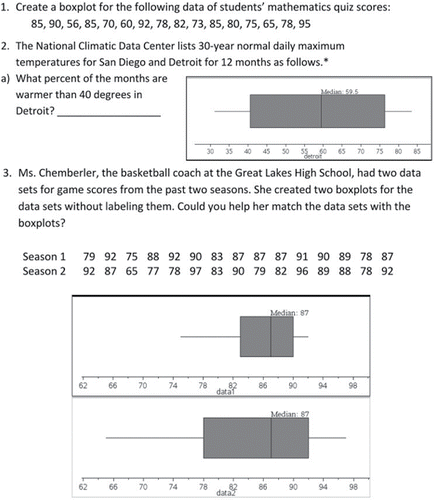
First, we asked students to complete a paper and pencil task. depicts only the questions from that task that we will discuss in this article. Then students completed a boxplot activity that used TI-Nspire calculators. None of the students in either setting had used TI-Nspire previously. The class periods were of approximately 50 min duration in both settings.
Figure 2. Sample boxplot tasks.
3. Students' Strengths and Difficulties
While the first question in asks students to create a boxplot from raw data, the next two questions ask them to read and interpret data represented in a boxplot. We made four major observations based on these students work with boxplots:
Some students were good at using a five-number summary to construct a boxplot.
They were also good at reading a five-number summary from a boxplot.
Boxplots were counterintuitive for many students for various reasons.
Data aggregated in a boxplot were difficult for many students to interpret.
3.1. Using a Five-Number Summary to Draw a Boxplot
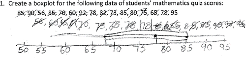
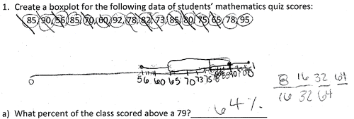
Seventy-eight of the 259 (30.1%) students were able to create a correct boxplot, 83 (32%) made incorrect boxplots or made an attempt to answer the question and, 98 (37.8%) simply did not answer the question. Even though only a smaller percentage of students than we expected were able to create correct boxplots, the students who provided correct boxplots were good at using a five-number summary. When asked to create a boxplot, we observed students using the five-number summary (minimum, first quartile, median, third quartile, maximum) in conjunction with other strategies: drawing a number line, making an organized list, and drawing some other kind of graph (e.g., dot plot, stem-and-leaf plot). Many students used a combination of these other strategies, most commonly creating an organized list and using a number line, which 56 students (22%) employed. These students, for the most part, would organize the data in an ordered list, then create a number line, and, for those who attempted it, create a boxplot on or above the number line (see ). Thirty-three of the 56 students who used this combined approach (59%) were able to create a correct boxplot. This represented 12.7% of the total sample.
Figure 3. This student created both a number line and an organized list.
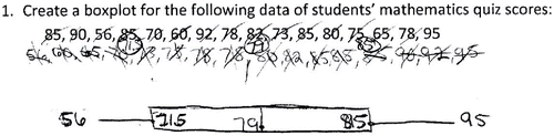
Students who created an organized list often used some form of tally marks to count and keep track of the number of data points in clusters that numbered one-fourth of the total number of data points. In this way, they were able to identify the quartiles of the dataset, and with the maximum and minimum values at the extreme ends of the list, they had created the five-number summary. Notice that in the first quartile (71.5), median (79), and third quartile (85) have been circled in the organized list and written in appropriate places in the boxplot.
Figure 4. This student has created an organized list.
3.2. Reading a Five-Number Summary from a Boxplot
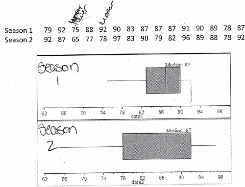
Students were also good at detecting the five-number summary from a boxplot. This is in line with Pfannkuch's (Citation2007) results. Instead of asking for the minimum, the first quartile, median, third quartile, or maximum from a boxplot directly, we asked students to match two datasets with two boxplots (see ). The datasets had the same median; so students were encouraged to locate other key information from the datasets and the boxplots. As the student whose work appears in explained: “My reasoning is because first I looked at the lower and upper extremes for Season 1 and tried to match it to one of the plots. Seeing that the top one was 75 for lower and 92 for higher I picked the first one for Season 1.”
Figure 5. In this task, students matched boxplots to their datasets.
3.3. Counter-Intuitiveness
We found that a student's ability to construct a correct boxplot for item 1 was not a good predictor of the correctness of the student's responses to questions which asked students to provide the percentage of the data points lying above the median value or the percentage of data points lying above the first quartile. In particular, of the 78 students who were able to construct a correct boxplot, only 42 of them (54%) were able to correctly state that 50% of the data lies above the median. Of those same students, only 25 (32%) correctly stated that 75% of the data lies above the first quartile. Thus, we concluded that the ability to construct a correct boxplot from a set of data was a weak predictor of being able to answer a straightforward question about a key summary point in a boxplot (p < 0.0001 in both cases).
Interestingly, if a student had responded that 50% of the data were above the median, this was also a weak predictor of a correct response that 75% of the data lies above the first quartile. Of the 88 students who correctly responded that 50% of the data lies above the median, only 31 of them (35%) provided a correct response that 75% of the data lies above the first quartile (p < 0.0001). Thus, we concluded that, for these students, neither constructing a correct boxplot, nor correctly answering a question about a key summary point in their construction, was a good predictor of correctly answering a similar question about a boxplot that they had neither constructed nor had access to the underlying raw data.
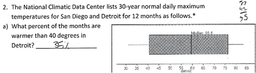
There are many reasons why boxplots can be counterintuitive for many students. Just as Biehler (Citation1996), Bakker, Biehler, and Konold (Citation2004), Lem et al. (Citation2013a), Pfannkuch (Citation2007), and Watson (Citation2012), we observed students' prior knowledge conflicting with the notion that the density of the data points represented in a boxplot is inversely proportional to the size of the box. Thus, when our students brought their prior knowledge about bar graphs to the interpretation of a boxplot, they expected that the longer the box, the more data there would be. This basic misunderstanding might have persuaded them to use additive thinking when interpreting a boxplot. Perhaps that is why some of them resorted to a subtraction approach when trying to find the percentage above the first quartile as shown in : 77−42 = 35. Moreover, this student ignored the upper whisker, just as the college students in Lem and her colleagues' study (Citation2013b) did, and focused only on the box itself. In fact, based on our observations of the middle school students in our study, the saliency of the box might have been even more of an issue for these younger students.
Figure 6. Note the use of additive thinking.
3.4. Aggregated Data
When students have access to aggregated data only, as in a boxplot, their interpretations of that data appear to be more vulnerable. Thus, when our participating students attempted to answer a question about the data for which they had just been asked to construct a boxplot (what percent lies above the median), many of them had great difficulty making sense of the data as aggregated in the boxplot (Bakker, Biehler, and Konold Citation2004). Sometimes, as was noted by Biehler (Citation1996) and Watson (Citation2012), student's difficulties with the percent concept got in the way of their interpretation of a boxplot. As you can see in , this student was able to create the boxplot correctly, but the student reverted to the raw data to calculate the percentage. However, despite finding the correct fraction and several equivalent forms of that fraction, the student was not successful in converting to 50%.
Figure 7. This student worked with raw data.
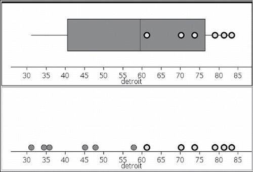
Proving even more challenging for many students was a similar question about data for which a boxplot was provided, but the raw data was not. When participants were asked to state the percentage of the data above the first quartile for temperatures in Detroit, only 16.6% of the students provided the correct percent, probably because, for this question, they lacked access to any raw data. A common approach was to do something with numbers from the boxplot display. For example, in answer to the percentage above the lower quartile, some students just copied a number from the graph and others appeared to use some visual clue the graph provided.
4. Research Informing Practice
In analyzing our observations of these students in light of the observations of others (Biehler Citation1996; Watson Citation2012), the importance of students' knowledge of percent and the ability to connect that knowledge to the concept of percentile became clear to us. Since the crucial percentages for boxplot construction and interpretation are 25%, 50%, and 75%, in preparation for work with boxplots, we believe teachers, should emphasize the equivalence of those percentages with the fractions ¼, ½, and ¾, as well as different ways of finding 25%, 50%, or 75% of a whole (e.g., multiplying by the decimal, dividing by 4 or 2, dividing by 4 and multiplying by 3). Then, to connect percentage to percentile, students can be asked to calculate that 75% of a class of 24 students is 18, and reason that if their score on a test that all 24 students took was at the 75th percentile, that means their score was greater than or equal to the scores of 18 of the students in the class. Doing these things in preparation for the study of boxplots is particularly important for students in the middle grades.
Ideas for dealing with some of the other struggles we observed in the students we worked with are captured in . These teaching tips are based on both the research literature mentioned in the previous sections and our own experiences when working with middle school students.
Table 1. Teaching tips.
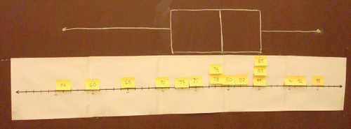
In addition to the teaching tips provided in , let us now visit two classrooms to observe how teachers can enhance students' experiences with boxplots. One teacher designed a more concrete activity for his class to introduce what it means to aggregate/disaggregate data. In the activity, each data point (e.g., 85, 90, 56,…) had been written on a sticky note. Students placed each sticky note onto a number line that was taped to the board, as in . When there were duplicate numbers, they were placed one above the other.
Once all of the data points had been placed on the number line, students were asked to separate the dataset into four equal subsets (see hash marks on the board in ). This allowed them to identify the minimum, first quartile, median, third quartile, and maximum, the five summary points needed to construct a boxplot. Then, a boxplot was drawn directly above the number line with the sticky notes, as shown in . The whole class discussion of different lengths of whiskers and boxes in the boxplot allowed students to focus and reflect on the variation in the data. Seeing that each box or whisker has the same number of data points, the potential misconception of “the longer the box, the more data,” was exposed for discussion and reflection. Representations such as this helped the students to connect the raw data with the aggregated data in a boxplot. This, in turn, helps them to see the differences between the box representation in a bar graph compared to that in a boxplot.
Figure 8. Sticky notes have been placed on a number line for each data point.
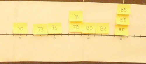
Figure 9. A boxplot has been drawn on the board directly above the number line.
In another class, the teacher used dynamically linked features of TI-Nspire that offer the capability to create dynamic representations of boxplots and dot plots of the same dataset on the same screen (Özgün-Koca and Edwards Citation2013). This is similar to the Minitool 2 applet designed originally by Cobb et al. (Citation1997) and revised by Bakker (Citation2004) for use with middle school students. In conjunction with the technology, the teacher used an instructional strategy similar to Think-Pair-Share (Kagan Citation1989). Students began by answering questions on a worksheet such as
Why is the upper quartile box narrower than the lower quartile box?
Why is the left whisker longer than the right whisker?
For questions such as these, which ask for students' observations, students were instructed to write their individual responses before sharing them in a discussion with one other student. These pair discussions were followed by a whole class discussion. This format brought students' own understandings out in the open before they discussed them in pairs or with the whole class.
When answering why a box or whisker is longer, some students stated, “Because there are more values.” The teacher then demonstrated the creation of two representations of the same data on a split screen (see ). This allowed students to click on a box or whisker, and see the data points in both representations. In this way, they saw that whiskers also contain data. Next, they concluded that the data points in an upper or lower quartile box or an upper or lower whisker each constitute 25% of the data. The activities used in both of these classroom vignettes are aligned with the intervention suggested in Lem et al. (Citation2013c, Citation2015). The use of multiple external representations “has proven to be able to yield better interpretation of boxplots by students” (Lem et al. Citation2015, p. 924). When the same data are presented using multiple representations, students can “confront information they extract from a certain representation with information from other representations, and learn to translate and switch between representations” (Lem et al. Citation2013c, p. 17).
Figure 10. Technology allowed students to visualize the data in a boxplot.
Finally, the students were able to see that together an upper quartile box and an upper whisker would constitute 50% of the data (see ). We believe that the reason they so easily reached these conclusions is 2-fold. First, the split screen showing the dot plot along with the boxplot gave them access to the raw data. Second, having brought their misconception out in the open, the technology allowed that misconception to be confronted with data. This aligns with Shaughnessy's instructional model (Citation1992) in which students' misconceptions are brought face-to-face with stochastic data that they have collected themselves.
5. Summary Thoughts
Just as many studies have already iterated, we observed that boxplots are counterintuitive for many students (Bakker, Biehler, and Konold Citation2004; Biehler Citation1996; delMas Citation2005; Pfannkuch Citation2007; Watson Citation2012). We also observed in our sample of middle school students many similar difficulties with boxplots that Lem et al. (Citation2013a, Citation2013b) observed in their samples of university students. Watson (Citation2012) highlighted that students' better understanding of percent and percentile concepts is essential to understanding boxplots. Our observations confirmed this also. Moreover, we also observed that attempting to use previous knowledge and skills to construct a boxplot or make sense of a boxplot often interferes with understanding this new way of representing data.
When previous knowledge and experiences provide an insufficient basis for students to learn and think about a new concept, new ways of introducing the concept must be used. As previously shown, with boxplots, we can get help from technology, which offers new ways of visualizing and experiencing statistical representations with an access to dynamically linked multiple representations. Using these novel capabilities of graphing calculators or virtual manipulatives, students can create mathematical representations that they can act upon and interact with. Connections between two statistical plots, whether of the same type or two different types can be highlighted. For example, being able to display more than one representation in a split screen allows data points to be highlighted in multiple graphs, as one of our classroom examples showed. We believe that using these hot linkages between multiple representations of the same data might help students begin to approach and interpret statistical representations in more powerful and efficient ways (Özgün-Koca and Edwards Citation2013).
We knew that students have difficulties reading and interpreting boxplots, as well as other statistical representations (Biehler Citation1996; Capraro, Kulm, and Capraro Citation2005; delMas, Garfield, and Ooms Citation2005; Friel and Bright Citation1996; Friel, Curcio, and Bright Citation2001; Konold et al. Citation1997, Lem et al. Citation2013a, Citation2013b). One of the major difficulties observed in these studies derives from the fact that boxplots represent the data in an aggregated form. When the students we observed had access to raw data, we frequently observed them using the raw data instead of the boxplot. When they had access only to the aggregated data presented in a boxplot, we observed that they were more vulnerable, usually generating incorrect responses, or no response at all, to questions about the data represented in the boxplot. These observations lend further evidence to the likelihood middle school students will struggle with data aggregated in a boxplot.
The Common Core State Standards (CCSSI Citation2010) expect that sixth grade students will “display numerical data in plots on a number line, including dot plots, histograms, and boxplots” (p. 45). There is no companion statement regarding the interpretation of such displays of data, although being able to interpret a boxplot also seems to be a logical expectation. However, the research base cited earlier, together with our own observations of the middle school students in our study, provides ample evidence that being able to display data in a boxplot does not guarantee that one can correctly interpret a boxplot for which there is no access to the raw data. Similarly, in Principles and Standards for School Mathematics (NCTM, Citation2000), it is noted that “… boxplots can provide effective comparisons between two datasets because they make descriptive characteristics such as median and interquartile range readily apparent” (p. 251). But those characteristics will be readily apparent only if the boxplot representation is understood well enough to allow interpretation of it.
Despite the recommendations in these Standards documents, a careful consideration of the research base continues to suggest that the study of boxplots ought to be delayed until students have a firm grasp of the percentage concept, some facility in dealing with aggregated data, and the knowledge to step beyond the counter-intuitiveness of how density is displayed in a boxplot, things that are not likely to be the case for many, perhaps most, sixth grade students. Therefore, we believe that research supports delaying the study of boxplots to grade 7 or 8 at the earliest.
In summary, research clearly demonstrates that being able to construct a boxplot does not imply that students of all ages can interpret one efficiently. Using students' strengths (such as their understanding of a five-number summary), teachers can use the research-based tips we shared above to strengthen student understanding. By preparing students to work with the percentages associated with quartiles, as outlined above, and via kinesthetic or technological activities, boxplots can be introduced in ways that are more accessible to students. In this way, teachers can use the ideas we have suggested to inform their practice, thereby bringing to life via powerful representations at least two of the Common Core Standards for Mathematical Practice: Use Appropriate Tools Strategically and Reason Abstractly and Quantitatively (CCSSI Citation2010).
References
- Bakker, A. (2004), Design Research in Statistics Education: On Symbolizing and Computer Tools, Utrecht: Freudenthal Institute.
- Bakker, A., Biehler, R., and Konold, C. (2004), “Should Young Students Learn About Box Plots?” Available at http://www.fisme.science.uu.nl/staff/arthur/bakkerbk-boxplots2005.pdf
- Ben-Zvi, D. and Garfield, J. B. (Eds.) (2005), The Challenge of Developing Statistical Literacy, Reasoning, and Thinking, Dordrecht, The Netherlands: Kluwer Academic Publishers.
- Biehler, R. (1996), “Students' Difficulties in Practicing Computer-Supported Data Analysis: Some Hypothetical Generalizations from Results of Two Exploratory Studies,” available at http://www.stat.auckland.ac.nz/∼iase/publications/8/14.Biehler.pdf
- Capraro, M. M., Kulm, G., and Capraro, R. M. (2005), “Middle Grades: Misconceptions in Statistical Thinking,” School Science and Mathematics, 105(4), 165–174.
- Cobb, P., Gravemeijer, K. P. E., Bowers, J., and Doorman, M. (1997), Statistical Minitools: Computer Software, Nashville & Utrecht: Vanderbilt University, TN & Freudenthal Institute, Utrecht University, Retrieved from. www.wisweb.nl
- Curcio, F. R. (1987), “Comprehension of Mathematical Relationships Expressed in Graphs,” Journal for Research in Mathematics Education, 18(5), 382–393.
- delMas, R. (2005), “A Comparison of Mathematical and Statistical Reasoning,” in The Challenge of Developing Statistical Literacy, Reasoning, and Thinking, eds. D. Ben-Zvi and J. Garfield, (pp. 79–95), Dordrecht, The Netherlands: Kluwer Academic Publishers.
- delMas, R., Garfield, J., and Ooms, A. (2005, July), “Using Assessment Items to Study Students' Difficulty Reading and Interpreting Graphical Representations of Distributions,” in Proceedings of the Fourth International Research Forum on Statistical Reasoning, Thinking and Literacy, ed. K. Makar, Auckland, New Zealand: University of Auckland. available at http://srtl.fos.auckland.ac.nz/?page_id=123
- Friel, S. N., and Bright, G. W. (1996), Building a Theory of Graphicacy: How Do Students Read Graphs? Retrieved from ERIC database, (ED395277).
- Friel, S. N., Curcio, F. R., and Bright, G. W. (2001), “Making Sense of Graphs: Critical Factors Influencing Comprehension and Instructional Implications,” Journal for Research in Mathematics Education, 32(2), 124–158.
- Kagan, S. (1989), “The Structural Approach to Cooperative Learning,” Educational Leadership, 47(3), 12–15.
- Konold, C., Pollatsek, A., Well, A., and Gagnon, A. (1997), “Students Analyzing Data: Research of Critical Barriers,” in Research on the Role of Technology in Teaching and Learning Statistics: Proceedings of the 1996 IASE Round Table Conference, eds. J. B. Garfield & G. Burrill, (pp. 151–167). Voorburg, The Netherlands: International Statistical Institute.
- Lem, S., Onghena, P., Verschaffel, L., and Van Dooren, W. (2013a), “The Heuristic Interpretation of Boxplots,” Learning and Instruction, 26, 22–35.
- ——— (2013b), “On the Misinterpretation of Histograms and Box Plots,” Educational Psychology, 33(2), 155–174.
- ——— (2013c), “External Representations for Data Distributions: In Search of Cognitive Fit,” Statistics Education Research Journal, 12(1), 4–19.
- Lem, S., Kempen, G., Ceulemans, E., Onghena, P., Verschaffel, L., and Van Dooren, W. (2015), “Combining Multiple External Representations and Refutational Text: An Intervention on Learning to Interpret Box Plots,” International Journal of Science and Mathematics Education, 13, 909–926.
- National Council of Teachers of Mathematics [NCTM] (2000), Principles and Standards for School Mathematics, Reston, VA: Author.
- National Governors Association Center for Best Practices & Council of Chief State School Officers [CCSSI] (2010), Common Core State Standards for Mathematics, Washington, DC: Authors.
- Özgün-Koca, S. A., and Edwards, T. G. (2013), “Interpreting Boxplots with Multiple Linked Representations,” Mathematics Teaching in the Middle School, 18(8), 508–513.
- Pfannkuch, M. (2007), “Year 11 Students' Informal Inferential Reasoning: A Case Study About the Interpretation of Box Plots,” International Electronic Journal of Mathematics Education, 2(3), 149–167.
- Shaughnessy, J. M. (1992), “Research in Probability and Statistics: Reflections and Directions,” in Handbook of Research on Mathematics Teaching and Learning, ed. D. A. Grouws, (pp. 465–494), New York: Macmillan.
- Watson, J. M. (2012), “Box Plots in the Australian Curriculum,” Australian Mathematics Teacher, 68(3), 3–11.