
ABSTRACT
Bar graphs and histograms are core statistical tools that are widely used in statistical practice and commonly taught in classrooms. Despite their importance and the instructional time devoted to them, many students demonstrate misunderstandings when asked to read and interpret bar graphs and histograms. Much of the research that has been conducted about these misunderstandings has been with students in introductory statistics classes at the college level. In this article, students in grades 6–12 completed multiple-choice and constructed-response questions about bar graphs and histograms as part of a larger study. The same misunderstandings that college-level students demonstrate were found in these younger students.
1. Introduction
Bar graphs and histograms have been used for hundreds of years. While William Playfair and Karl Pearson are commonly cited as the creators of the bar graph (Spence Citation2005) and histogram (Magnello Citation1996), respectively, the origin of these displays is somewhat messier. Precursors to the bar graph can be traced to Nicole Oresme in the 14th century and Joseph Priestley in the 18th century, a few decades before Playfair's supposed creation (Beniger and Robyn Citation1978). Similarly, Guerry's displays of crimes grouped by age predate Pearson's use by several decades (Beniger and Robyn 1978). Pearson is credited with coining the term histogram (Beniger and Robyn Citation1978), though its exact etymology is unclear. One purported etymology fixates on the connection to the word history and the histogram's usefulness for displaying data arising from a fixed period of time (e.g., Rumsey Citation2009), while another makes a connection from the tall bars used in its construction to the Ancient Greek term ἱστός, meaning “mast” (“histogram, n.” Citation2014). Even with their origins not as clear as the data they display, these graphs have secured their place as commonly used statistical tools.
Because of their ubiquity in statistical practice, histograms and bar graphs (sometimes called bar charts) have been included among the expected mathematics content for students in grades 6–12 (National Council of Teachers of Mathematics [NCTM] Citation2000; National Governors Association Center for Best Practices [NGACBP] and Council of Chief State School Officers [CCSSO] Citation2010). Cooper and Shore (Citation2010) provided examples and potential clarifications of histograms and two closely related but different types of bar graphs: case-value bar graphs and distributional bar graphs. Students and teachers in grades K–12 are asked to learn and become comfortable using data displays that are not only visually similar and used for related purposes but took humanity millennia to develop. Although they may appear in the school mathematics curricula, these data displays—like the mean and median (Bakker and Gravemeijer Citation2006)—are complex topics that have not been perceived as obvious for most of human history. Still, without understanding these fundamental data displays, more advanced statistical topics (e.g., the central limit theorem) may be inaccessible for students (Cooper and Shore Citation2008).
This article presents findings from the pilot and operational implementations of the Levels of Conceptual Understanding in Statistics (LOCUS) assessments, the result of an NSF-funded project (DRL-1118168). The results presented below report on understandings and misunderstandings about bar graphs and histograms based on multiple-choice and constructed-response items taken by students in grades 6–12. A review of the literature regarding students' understanding of bar graphs and histograms follows.
2. Literature Review
The Guidelines for Assessment and Instruction in Statistics Education (GAISE) Report: A Pre-K–12 Curriculum Framework (Franklin et al. Citation2007) outlines three developmental levels—A, B, and C—through which students should develop and mature. Franklin et al. (Citation2007) suggest statistical topics that are associated with each of these levels. At level A, students should be familiar with bar graphs, and at level B, students should be familiar with comparing bar graphs and histograms. The comparison of bar graphs at level B therefore presumes familiarity with clustered bar graphs. The Common Core State Standards for Mathematics (CCSSM) (NGACBP & CCSSO Citation2010) prescribe a similar progression. Bar graphs first appear in the CCSSM (NGACBP & CCSSO Citation2010) in the Measurement and Data strand in Grade 2 (2.MD.10), and histograms appear in the Statistics and Probability strand in Grade 6 (6.SP.4) and in high school (S-ID.1). Under the CCSSM, students are expected to use both bar graphs and histograms. Beyond their inclusion in major curriculum documents of the United States, bar charts and histograms are core statistical tools and are of broad interest for statistics education internationally.
Bar graphs and histograms are generally considered common data displays and are frequently taught in introductory statistics courses or are assumed as a prerequisite for enrollment. Bar graphs and histograms are included in both the Advanced Placement (AP) Statistics Course Description (College Board Citation2010) and Agresti and Franklin's Statistics: The Art and Science of Learning from Data (Agresti and Franklin Citation2013). Which have been used as barometers for consensus-curriculum introductory statistics courses (Roberts, Scheaffer, and Watkins Citation1999; Tintle et al. Citation2011). Despite the considerable attention that both bar graphs and histograms receive in curriculum documents, there is evidence of a lack of familiarity with and misunderstandings of these topics. Much of the literature related to these misunderstandings focuses on students' understandings of histograms or students' confusion between bar graphs and histograms.
As important statistical tools commonly taught in or before introductory statistics courses, students' understanding of bar graphs and histograms has been the subject of numerous studies in various contexts. These studies have shown that bar graphs are accessible to elementary school students (English Citation2013), middle school students (Bright and Friel Citation1998; McClain, Cobb, and Gravemeijer Citation2000; Bakker and Gravemeijer Citation2004), high school students (delMas, Garfield, and Ooms Citation2005), and college students (delMas et al. Citation2005).
Even some young children are capable of understanding bar graphs. English (Citation2013) worked with first grade students to support and scaffold their development of data representations. Students were asked to classify objects from a story and to make representations of their classifications. In this context, one group of students initially made a vertical pictograph of objects within their categorization system and then created a formal bar graph displaying the same data (English Citation2013). While this use of bar graphs was not demonstrated by every group of students, it does illustrate that bar graphs may be a topic understandable by some students as early as first grade.
Teaching experiments conducted with middle school students in the United States (McClain et al. Citation2000) and in the Netherlands (Bakker and Gravemeijer Citation2004) have demonstrated that these students can use bar graphs to support statistical arguments. McClain et al. (Citation2000) taught seventh-grade students for 12 weeks using an instructional sequence that had been designed to address statistical topics often found in middle school curricula in a cohesive way that was supplemented by the use of computer tools. One of these computer tools displayed horizontal bar graphs, and students were able to use these graphs to support statistical arguments (McClain et al. Citation2000). Bakker and Gravemeijer (Citation2004) reported on results of a similar study with seventh-grade students in the Netherlands and found that students were able to use the graphs to support statistical arguments. In Bakker and Gravemeijer's study, students became comfortable finding the mean while using the horizontal bar graphs.
The work of Bright and Friel (Citation1998) also illustrates that middle school students can correctly read bar graphs. In a task administered to 76 students in Grade 6 and 71 students in Grade 8 before and after instruction on bar graphs, students tended to do better on the bar graph task post-instruction (Bright and Friel Citation1998). Additionally, students in Grade 8 tended to do better than students in Grade 6 on the preinstruction task (Bright and Friel Citation1998). In general, studies that focused on student understanding of bar graphs did not report specific misunderstandings that were typically encountered. In their study, however, Bright and Friel noted that a common misunderstanding evident in the preinstruction responses was interpreting each bar as representing a single value rather than using the height of the bar to determine the number of values represented.
Student understanding of bar graphs has not been studied as extensively with high school and undergraduate students as it has with younger students, possibly because it is often included in standards for elementary and middle school students (e.g., NGACBP & CCSSO Citation2010). However, delMas et al. (Citation2005) administered the Comprehensive Assessment of Outcomes in Statistics (CAOS) instrument and Assessment Resource Tools for Improving Statistical Thinking (ARTIST) scales to both undergraduate and high school students. The high school students in this study were ostensibly enrolled in AP statistics courses and not on-level statistics courses because the recruitment targeted AP teachers. Data were collected from 97 high school students and 812 college students using the CAOS instrument, and from 205 high school students and 350 college students using at least one ARTIST scale (delMas, Garfield, and Ooms Citation2005). Results from 14 items related to bar graphs and histograms were presented, and on each item the high school students performed better than the college-level students (delMas et al. Citation2005).
While bar graphs are generally understood by and can be used by students, studies of student understanding of histograms have revealed numerous misunderstandings and areas of confusion. delMas and Liu (Citation2005) worked with 12 students enrolled in an introductory statistics course by having them manipulate data values displayed in histograms using a computer program during interviews. To assess conceptual understanding of histograms, students were asked to display histograms that showed the smallest and largest standard deviation. Through several iterations of making these displays and justifying their choices to the interviewer, delMas and Liu found that students' conceptions of the standard deviation were quite varied with some displaying reasoning consistent with only “a cursory and fragmented level of understanding,” others having conceptions that were “closer approximations to an integrated understanding” of standard deviation, and still others whose conceptions were “inconsistent with a coherent conception of the standard deviation” (p. 79). delMas and Liu did find that students' conceptions generally moved toward a more integrated understanding as the interviews progressed.
A variety of misunderstandings have been identified by researchers. Among the most widely reported misunderstanding about bar graphs and histograms is that the variability in the data is represented in a histogram by variability in the heights of the bars. That is, histograms that appear flat are incorrectly interpreted to mean that there is little or no variability in the data represented. Using an assessment designed to measure reasoning about center and variability administered to 186 undergraduates, Cooper and Shore (Citation2008) found that 50% of their sample demonstrated this misunderstanding. This misunderstanding has also been noted in undergraduates by delMas et al. (Citation2007); Kaplan, Fisher, and Rogness (Citation2009); Turegun and Reeder (Citation2011); and Rumsey (Citation2002).
Item 15 of the CAOS instrument assesses the misunderstanding that “when comparing histograms, the graph with the largest number of different values has the larger standard deviation (spread not considered)” (delMas et al. Citation2007, p. 46). In their validation study, delMas et al. (Citation2007) found that there was a statistically significant increase in scores on Item 15 from pretest to posttest but that the total percentage of students responding correctly was still less than 50% on the posttest. In a small study with community college students, Turegun and Reeder (Citation2011) found that this was the most common misunderstanding about histograms and variability in their sample. In their work with undergraduate students in statistics courses as part of a larger project to create teaching experiments using Japanese Lesson Study, Garfield, delMas, and Chance (Citation2007) describe this as a “stubborn misunderstanding that appears difficult to overcome” (p. 134).
Another misunderstanding that students have demonstrated is that that “a bell-shaped bar graph [can] represent the distribution for a quantitative variable,” which is assessed by Item 6 on the CAOS instrument (delMas et al. Citation2007, p. 46). This confusion between bar graphs and histograms was one of the four misunderstandings found in data collected from 341 undergraduate students by Kaplan et al. (Citation2014). Kaplan et al. also found that students got confused between the horizontal and vertical axes (i.e., confused the frequency and data value), and thought that there was a time component associated with the x-axis of a histogram, and the aforementioned misunderstanding that flatter histograms showed less variability.
There have been other misunderstandings about bar graphs and histograms that have been reported in the literature in individual studies. Cooper and Shore (Citation2008) gave 186 undergraduate students in first courses in statistics an assessment for reasoning about center and variability when data are displayed visually. On one item where data were displayed using a histogram, 36% of respondents incorrectly calculated the median as the midpoint of the horizontal axis and ignored the heights of the bars (Cooper and Shore Citation2008). Meletiou and Lee (Citation2002) reported that a few college students in their study confused histograms with scatterplots. At last, delMas et al. (Citation2005) found that students seemed to have difficulties reading histograms and bar graphs when the bars represented intervals rather than single values.
3. Methods
The LOCUS assessments were developed using a modified version of evidence-centered design (Mislevy and Riconscente Citation2006). This iterative design process began with the construction of a conceptual assessment framework that included a mapping of the CCSSM onto the GAISE framework (Haberstroh et al. Citation2015). This conceptual assessment framework was in turn used by test development committees to write a pool of over 150 items used on the pilot administration of the assessments. Results of the pilot administration informed further revisions that resulted in the finalized versions of the assessments and the operational administration. More details are given by Jacobbe et al. (Citation2014) and Haberstroh et al. (Citation2015).
The specific research question answered by this study is What are the understandings of bar graphs and histograms among students in grades 6–8 and 9–12? Data for this study are drawn from both the pilot and operational administrations of the LOCUS assessments. Two versions of the LOCUS assessment exist, a Beginning/Intermediate version designed to assess understanding associated with GAISE levels A and B, and an Intermediate/Advanced version designed to assess GAISE levels B and C. details the number of students that took the Beginning/Intermediate and Intermediate/Advanced versions of the assessment in the pilot and operational administrations. Over 3000 students in grades 6–12 (aged 11–18 years) took the assessments in both the pilot and operational implementations. LOCUS assessments were administered in Arizona, Colorado, Florida, Georgia, New Jersey, and Ohio, because these states included statistics in their standards prior to the adoption of the CCSSM and the LOCUS development team had contacts in these states. Because of how items were distributed among the forms in these administrations, only subsets of these respondents are used in this study. Quantitative measures reported below are based on classical test theory analysis (Crocker and Algina Citation1986).
Table 1. The number of students taking each level of the LOCUS assessments during the pilot and operational administrations.
An overview of the items used in this study is given in . High school students responded to all five of the multiple-choice items and one constructed-response item; middle school students responded to the other constructed-response item and one of the multiple-choice items (Item 3R). Results for this item are disaggregated for middle school and high school. Each of the multiple-choice items in this study was written to align with the Collect Data or Analyze Data components of Level B of the GAISE framework (Franklin et al. Citation2007). Each item was also aligned with CCSSM (NGACBP & CCSSO Citation2010) and was appropriate for students at the high school level. The multiple-choice item that middle school students responded to assessed a CCSSM Grade 6 standard.
Table 2. Summaries of what graphs were used and from which student's data were collected.
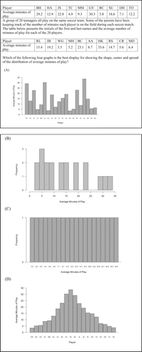
Item 1, shown in , assess whether students know when a histogram is appropriate when presented with three case-value bar graph distractors. The correct answer is Choice B. Distractors A and C were both designed to resemble the types of graphs that popular spreadsheet programs such as Microsoft Excel are likely to provide for the data when using default options. This behavior is widely known in the statistics education community (e.g., Cryer Citation2001; Petty Citation2012). Distractor D was created because members of the test development committee believed that students possess a misunderstanding that bell-shaped graphs are preferable to others.
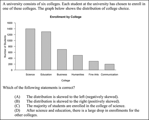
Item 2, shown in , assess whether students know appropriate interpretations of a distributional bar graph. The correct answer is Choice D. The categories represented are displayed in decreasing order based on the value of the response variable, a common way of creating graphs. Distractors A and B were included to assess whether students understand that skew is associated with distributions of quantitative variables rather than thinking that any bar graph arranged in increasing or decreasing order displays a skewed distribution. Distractor C was included to assess the misunderstanding that the category with the greatest value represents a majority of responses (rather than a plurality).
Figure 2. The full text of Item 2. This item assesses the collect data step at GAISE Level B and CCSSM 6.SP.4 and S-ID.1.
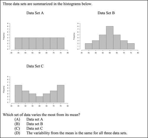
Items 3 and 4, shown in and , respectively, were designed to assess the misunderstanding that variability in histograms is represented by differing heights of the bars. The correct answer for Items 3 and 3R is Choice B, and the correct answer for Item 4 is Choice C. Item 3 appeared on the pilot administration and later appeared on the operational administration with minor revisions as an equater that was on all forms (Item 3R). The choices were designed so that, of the three data sets summarized in the graphs, one would vary least from its mean and one would vary most from its mean. Distractor A was included to assess the misunderstanding that a flat histogram indicates little variability in a dataset, that is, that variability is represented in a histogram by differing heights of the bars.
Figure 3. The full text of Item 3. This item assesses the analyze data step at GAISE Level B and CCSSM 6.SP.5c and S-ID.3.
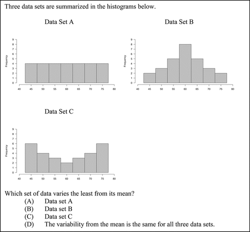
Figure 4. The full text of Item 4. This item assesses the analyze data step at GAISE Level B and CCSSM 6.SP.5c and S-ID.3.
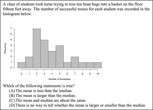
Item 5, shown in , assesses whether students can determine information about the mean and median of a dataset when presented with a frequency histogram. The choices were designed to assess each of the three possible relationships between the mean and median and to assess the misunderstanding that such a comparison is not possible using a histogram.
Figure 5. The full text of Item 5. This item assesses the analyze data step at GAISE Level B and CCSSM 6.SP.5c and S-ID.2.
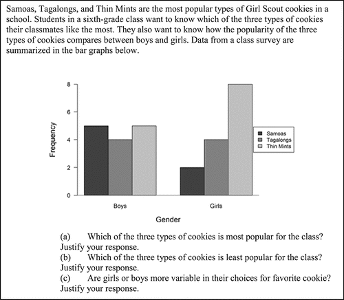
Item CR1, shown in , asks students to interpret two distributional bar graphs and to compare their variability. To answer the first two parts of this item, students need to collapse the data across the variable gender. The third part of this item assesses understanding of variability with categorical variables.
Figure 6. The full text of Item CR1. This item appeared on the Beginning/Intermediate version of the assessment and assesses CCSSM 1.MD.4, 3.MD.10, and S-ID.3.
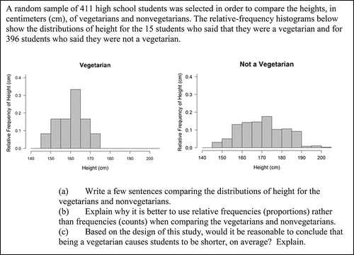
Item CR2, shown in , asks students to compare the distributions of two quantitative variables when presented with relative frequency histograms. The context of the item is observational, and students are asked if causal claims can be made. In this item, the sample sizes differ greatly which motivates the use of relative-frequency histograms. Additionally, the context of the item is students' heights, and this assessed a misunderstanding that heights of the bars of histograms represent the heights of individual students in the sample.
Figure 7. The full text of Item CR2. This item appeared on the Intermediate/Advanced version of the assessment and assesses CCSSM 7.SP.3, 7.SP.4, S-ID.2, S-ID.3, and S-IC.3.
4. Results
Results from the multiple-choice items are given in , and results from constructed-response items are given in . Results for individual items follow.
Table 3. For each item, the percentage of students that chose each response and the total number of students responding to the question.
Table 4. Percentage of students receiving each score for the constructed-response items.
For multiple-choice Items 1–5, the point-biserial correlations were 0.37, 0.43, 0.24, 0.41, and 0.17, respectively, indicating generally good discrimination, that is, the students that perform well on the assessment overall tend to answer the items correctly, while the students who perform poorly overall tend to answer the items incorrectly. The point-biserial correlation takes values between −1 and 1 with higher, positive values indicating better discrimination.
Scores for Items CR1 and CR2 are given in . These constructed-response items were graded holistically with a minimum score of 0 and a maximum score of 4. While detailed quantitative information about how students responded within each score-point is not available, we report here on trends in how students responded to specific parts that were noticed during the summer scoring sessions with examples of student work.
4.1. Item 1
Item 1 provides students with the average minutes of play for 20 soccer players indexed by their initials and asks students to choose from among four displays the best for showing the shape, center, and spread of the data distribution. As shown in , only 20.70% of students chose the correct answer, a histogram. Nearly half (47.77%) of all students chose a bar graph displaying the average minutes of play for each individual where the bar heights were arranged so that the display resembled a bell-shaped distribution. This suggests that students are familiar with bell-shaped distributions in the context of shape, center, and spread. A bar graph showing each individual's average minutes of play but displayed in the order that the data were presented rather than rearranged was less popular, with 28.66% of students selecting this distractor. Still, both bar graphs were more popular than the histogram—the correct answer. The final distractor, a bar graph showing the frequency of each value of average minutes of play has all bar heights equal and was the least popular choice (1.27%). Distractors A and C were both designed to resemble the types of graphs that popular spreadsheet programs such as Microsoft Excel are likely to provide for the data when using default options. This behavior is widely known in the statistics education community (e.g., Cryer Citation2001; Petty Citation2012).
4.2. Item 2
Item 2 provides a bar graph of enrollment at a university broken-down by individual colleges and asks students to select the correct statement from four choices. The colleges are sorted by enrollment to make a Pareto-style chart, that is, from highest enrollment to lowest enrollment. A plurality of students (40.06%) chose the correct answer that indicated that the colleges of science and education account for a large number of students and that enrollment drops off in the other colleges. However, 41.67% of students chose an option indicating that the distribution is skewed (option A or B) indicating a lack of understanding about uses of a bar graph. Because sorting the colleges by enrollment is a (very) reasonable way of displaying the data, that 40% of students saw this as skew is disconcerting. The remaining 16.99% of students indicated that a majority of students were enrolled in the college of science, an incorrect statement that equates the modal category with representing the majority; it is clear from the display that the college of education and any other single college will have a greater combined enrollment than the college of science.
4.3. Items 3, 3R, and 4
Items 3 and 4 differ by a single word: The former asks students to identify which of three histograms varies the least from its mean, while the latter asks which varies the most from its mean. Item 3R is the same item as Item 3 but with minor, nonsubstantive revisions. In each of these items, the distractor that “the variability from the mean is the same for all three data sets” was chosen by between 11.78% and 20.27% of the students indicating a lack of understanding about how to read a histogram.
On Item 3 (the least item), 33.12% of students chose the correct answer. However, 46.50% of students chose the distractor that displayed a uniform distribution with equal bar heights indicating the misunderstanding that variability is assessed in histograms by comparing the heights of the bars.
On Item 4 (the most item), 46.08% of students chose the correct answer, and 31.05% of students chose the distractor with the bell-shaped distribution. Of the three distributions in the problem, the bell-shaped distribution varied the least from its mean. This suggests that some students were comparing bar heights within the displays and thought that they varied the most in dataset B, the same misunderstanding represented by the choice of dataset A on the Item 3. On the most item, the uniform distribution was the least-selected distractor (4.25%).
On Item 3R, the general trend in responses mirrored those of Item 3 (see ), though students taking the Intermediate/Advanced form (students in grades 9–12) did better on the item than the students taking the Beginning/Intermediate form (students in grades 6–8); this is expected because the students are both older and have received more schooling. The most striking difference between the responses to Item 3R on the Beginning/Intermediate and Intermediate/Advanced forms is the point-biserial correlation. On the Intermediate/Advanced forms, the point-biserial correlation is 0.35, indicating a reasonable amount of item discrimination, that is, that higher performing students tended to answer the item correctly, while lower performing students tended to answer the item incorrectly. However, on the Beginning/Intermediate form, the point-biserial correlation was −0.04, indicating essentially no relationship between student performance on the overall assessment and student performance on this item. In fact, examining when students selected option A—the uniform distribution where the bar heights did not vary—reveals a point-biserial correlation of 0.25, a reasonable value. This suggests that higher performing, younger students tend to answer this item incorrectly because they focused on the heights of the bars. As students grow older and receive more instruction, this misunderstanding may be addressed; based on these data—which were not longitudinal—we cannot confirm this hypothesis.
4.4. Item 5
Item 5 presents a histogram and asks students to choose the correct statement from a list of four statements about the mean and median. The correct statement—that the mean is larger than the median—was chosen by 53.00% of students, making this item the only one of those presented where a majority of students answered correctly. The most common distractor was that the mean was less than the median (19.56%), followed by that the mean and median are about the same (16.09%) and that there is no way to tell whether the mean or median is larger from the display (10.73%). Student responses on this item suggest no known pervasive misunderstandings about histograms other than perhaps unfamiliarity with their use.
4.5. Item CR1
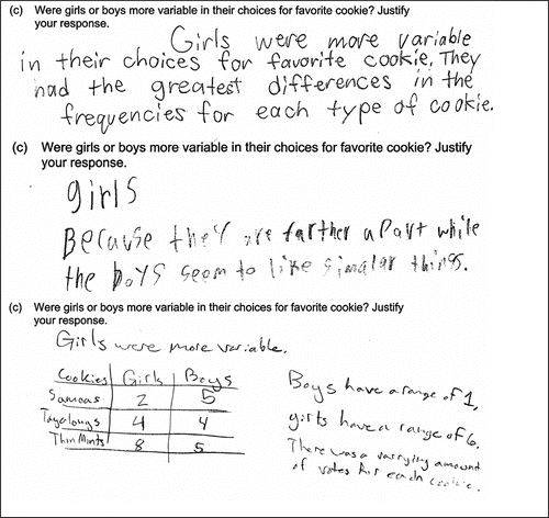
Item CR1 provides categorical data displayed in a clustered bar graph. The first two parts, (a) and (b), ask students to identify the most and least popular cookies in the class, respectively, which requires students to collapse the data across the gender variable. For many students, this was a straightforward task and further examination of these parts of the item is not considered here. In part (c), students are asked to determine whether girls or boys were “more variable in their choices for favorite cookie” and to justify their response. Student responses to this item revealed a misunderstanding.
Three correct student responses are given in . These student responses correctly identity that that the boys were more variable in their choices for favorite cookie because the data show less agreement; each of the three cookies has about the same number of votes from the boys. The girls displayed more agreement about their choice in cookie—a majority preferred Thin Mints—and thus there was less variability in their responses. When working with categorical data, greater variability indicates more disagreement in the data.
Figure 8. Example correct student responses to part (c) of Item CR1.
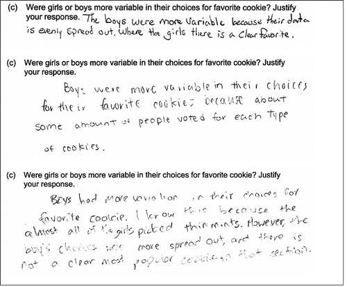
Many lower scoring responses instead focused on comparing the heights of the bars to ascertain the variability within each group. These responses perceived a greater difference in bar heights as evidence of greater variability when, in fact, this is evidence of greater agreement in the data. Examples of these responses are given in . As in the third response in , some students knew that the range is a measure of variability and that higher values are associated with more variability but incorrectly used it with a categorical variable.
Figure 9. Example incorrect student responses to part (c) of Item CR1.
4.6. Item CR2
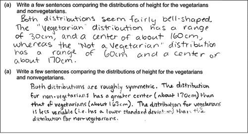
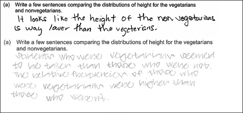
Item CR2 was difficult for students with a majority (50.27%) receiving a score of 0. Parts (b) and (c) are not discussed in this manuscript because they do not focus on the data display. In part (a), students are asked to compare two distributions using histograms. Many students correctly compared the distributions of heights of vegetarians and nonvegetarians by attending to shape, center, and spread, as shown in .
Figure 10. Example correct student responses to part (a) of Item CR2.
Some responses, such as those given in , focused on the heights of the bars rather than on the position of the distribution with respect to the horizontal axis. This misunderstanding may have been exacerbated by the context of the problem, that is, heights; students may have been more prone to thinking that taller bars represented taller people than if the context had been different.
Figure 11. Example incorrect student responses to part (a) of Item CR2.
5. Discussion and Conclusion
5.1. Summary of Findings
The LOCUS assessments were administered to over 3000 students spread across six states in each of two administrations. These states were chosen for inclusion in this study because their standards included statistics content before the adoption of the CCSSM and the researchers had contacts with schools; this was important to ensure that a systematic lack of preparation did not depress scores and contribute to floor effects. However, of the five multiple choice items that were included in this manuscript, only on Item 5 did a majority answer correctly. On two of the others items—Items 1 and 3—the correct choice was not the most commonly chosen option. For the constructed-response items, scores were generally low: Fewer than 10% of students scored a 3 or a 4 on Item CR1 or Item CR2.
Beyond the overall performance on these items, student responses—distractors in the multiple-choice items and handwritten responses on the constructed-response items—indicate misunderstandings about bar graphs and histograms. These misunderstandings extend beyond unfamiliarity with reading histograms as revealed in the incorrect responses to Item 5. Instead, deeper misunderstandings, such as confusing bar graphs with histograms and interpreting large differences in the heights of bars as evidence of greater variability in both bar graphs and histograms, were present to a large degree.
Previous studies have shown that a common misunderstanding held by some students is to focus on the vertical rather than horizontal variability when interpreting histograms (e.g., Garfield et al. Citation2007; Cooper and Shore Citation2008; Kaplan et al. Citation2012). When working with histograms, as in Items 3, 4, and CR2, students displaying this misunderstanding focus on vertical rather than horizontal variability. This has been previously reported on with the CAOS instrument (delMas et al. Citation2007) and in a different LOCUS item (Whitaker and Jacobbe Citation2014). In Item 3, students thought the histogram that varied the least from its mean was the one with equal bar heights. Kaplan, Rogness, and Fisher (Citation2012) argue that this misunderstanding may be due to lexical ambiguities in the word spread, which students may associate with spreading evenly (as in jam on toast).
When comparing bar heights in bar graphs, this misunderstanding leads students to an interpretation that is antithetical to the correct one. On Item CR1, students that focus on a greater difference in bar heights as evidence of greater variability fail to recognize that such a display indicates greater agreement among the data. In the context of this item, high-scoring responses recognized that the votes for cookies represent part of a consensus-building process and that more agreement is associated with less variability. Because the context involved people voting (and people have agency and can agree and form a consensus), it may be easier for students to understand what little variability looks like in the data. It remains to be seen if this context is indeed more accessible for students than similar problems in a different context.
Students could demonstrate confusion between bar graphs and histograms on Items 1 and 2. In Item 1, about half of the students chose a bar graph that had been arranged to resemble a bell-shaped distribution, suggesting that students were seeking a familiar, symmetric shape in their response. This is consistent with the finding reported by delMas et al. (Citation2007) with undergraduate students. In Item 2, two distractors inappropriately discussed the skew of the categorical distribution, and about 40% of students selected one of these choices–more than selected the correct response. This is similar to previous work that suggests that many students confuse bar graphs and histograms (Kaplan et al. Citation2014). A related aspect of this misunderstanding was revealed in responses to Item CR1, where students attempted to use the range to compute the variability of bar graphs, suggesting a lack of understanding about displays for categorical and quantitative variables.
5.2. Implications for the Classroom
Our findings suggest that many of the misunderstandings discussed in the literature with undergraduate students can be found in younger children. This suggests that the time to address these misunderstandings may be while students are still in middle or high school (or earlier) and not waiting until college; this may help alleviate some of the “stubbornness” (Garfield et al. Citation2007) of this problem. Additionally, because of the widespread confusion between bar graphs and histograms, students should be encouraged to create data displays without prompts specifying a specific type (Chance Citation2002). The ability to choose an appropriate data display is a key statistical activity—transnumeration (Wild and Pfannkuch Citation1999; Pfannkuch and Wild Citation2004)–associated with statistical thinking.
5.3. Implications and Future Directions for Research
The LOCUS assessments provide a snapshot of students' understanding of many statistical topics assessed in different ways, including bar graphs and histograms. The multiple-choice and constructed-response items included here illustrate that many students are not comfortable with the differences between bar graphs and histograms and possess deeper misunderstandings. Despite the multiyear, iterative process to design these items, the resulting data are still limited. While the distractors for each item were carefully chosen to enable data to be collected on specific misunderstandings (as reported above) and the constructed-response items allowed students to respond using their own words, these items do not allow researchers to capture the type of rich data that would come from cognitive interviews and think-aloud interviews with students as they progress through school and mature in their statistical thinking. Furthermore, these data represent a snapshot of student performance; longitudinal studies can provide more detailed information about changes in students over time.
Additionally, the differences in responses to Item 3R between students in grades 6–8 and 9–12 should be examined further in future studies. That older students should do better on this item is not surprising, though histograms have been an expectation for students in grades 6–8 for some time (NCTM Citation2000; NGACBP & CCSSO Citation2010). While earlier studies suggest that middle grades students may be comfortable using bar graphs that are designed to act as antecedents for histograms (McClain et al. Citation2000; Bakker and Gravemeijer Citation2004), little is known about how students in grades 6–8 interpret histograms.
When taken by students in grades 9–12, Item 3R has a point-biserial correlation of 0.35, a moderate value indicating the degree to which higher performing students tend to answer the item correctly while lower performing students tend to answer the item incorrectly. When taken by students in grades 6–8, this same item has a point-biserial correlation of −0.04, indicating essentially no correlation (or even very slightly negative correlation) between overall performance on the assessment and answering this item correctly. The reason for the disparity in point-biserial correlations is not known, but it may be indicative of students that are maturing over the hypothesized GAISE levels. Item 3R was written to assess GAISE level B, and it may be the case that older, more mature students more often attain this level. Additionally, the distractor displaying the uniform distribution has a point-biserial correlation of 0.25, potentially indicating that higher performing students tend to display the misunderstanding about relative bar heights in grades 6–8. Further work in this area is needed. One possible explanation for this is that younger students may have only been exposed to bar graphs and not histograms and thus are unfamiliar with the need to assess variability by reading the display horizontally. This explanation would suggest that the students are demonstrating the misunderstanding that even bar heights are evidence for low variability.
Researchers are invited to use the LOCUS assessments, which are freely available online at http://locus.statisticseducation.org, in their own work and to contact Tim Jacobbe ( [email protected]) with inquiries and requests.
Funding
This work was supported by a National Science Foundation grant (DRL-1118168).
References
- Agresti, A. and Franklin, C. A. (2013), Statistics: The Art and Science of Learning From Data (3rd ed), Upper Saddle River, NJ: Pearson.
- Bakker, A. and Gravemeijer, K. P. (2004), “Learning to Reason About Distribution,” in The Challenge of Developing Statistical Literacy, Reasoning and Thinking, pp. 147–168. Springer. Available at http://link.springer.com/content/pdf/10.1007/1-4020-2278-6_7.pdf
- Bakker, A. and Gravemeijer, K. P. E. (2006), “An Historical Phenomenology of Mean and Median,” Educational Studies in Mathematics, 62, 149–168. Available at: http://doi.org/10.1007/s10649-006-7099-8
- Beniger, J. R. and Robyn, D. L. (1978), “Quantitative Graphics in Statistics: A Brief History,” The American Statistician, 32, 1–11. Available at http://doi.org/10.2307/2683467
- Bright, G. W. and Friel, S. N. (1998), “Students' (Grades 6–8) Understanding of Graphs,” in Proceedings of the Fifth International Conference on Teaching Statistics (pp. 656–662). Voorburg, The Netherlands: International Statistical Institute. Available at http://iase-web.org/documents/papers/icots5/Topic6b.pdf
- Chance, B. L. (2002), “Components of Statistical Thinking and Implications for Instruction and Assessment,” Journal of Statistics Education, 10.
- College Board (2010), AP Statistics Course Description. Available at http://apcentral.collegeboard.com/apc/public/repository/ap-statistics-course-description.pdf
- Cooper, L. L. and Shore, F. S. (2008), “Students' Misconceptions in Interpreting Center and Variability of Data Represented via Histograms and Stem-and-leaf Plots,” Journal of Statistics Education, 16.
- Cooper, L. L. and Shore, S. F. (2010), “The Effects of Data and Graph Type on Concepts and Visualizations of Variability,” Journal of Statistics Education, 18, 1–16.
- Crocker, L. M. and Algina, J. (1986), Introduction to Classical and Modern Test Theory. New York: Holt, Rinehart, and Winston.
- Cryer, J. D. (2001), “Problems with Using Microsoft Excel for Statistics,” in Proceedings of the Annual Meeting of the American Statistical Association. Atlanta, GA.
- delMas, R., Garfield, J., and Ooms, A. (2005), “Using Assessment Items to Study Students' Difficulty Reading and Interpreting Graphical Representations of Distributions,” in K. Makar, ed. Proceedings of the Fourth International Research Forum on Statistical Reasoning, Thinking and Literacy. Auckland, New Zealand: University of Auckland. Retrieved from https://www.causeweb.org/artist/articles/SRTL4_ARTIST.pdf
- delMas, R., Garfield, J., Ooms, A., and Chance, B. (2007), “Assessing Students' Conceptual Understanding after a First Course in Statistics,” Statistics Education Research Journal, 6, 28–58. Available at https://www.stat.auckland.ac.nz/∼iase/serj/SERJ6(2)_delMas.pdf
- delMas, R., and Liu, Y. (2005), “Exploring Students' Conceptions of the Standard Deviation,” Statistics Education Research Journal, 4, 55–82. Available at http://iase-web.org/documents/SERJ/SERJ4(1)_delMas_Liu.pdf
- English, L. D. (2013), “Surviving an Avalanche of Data,” Teaching Children Mathematics, 19, 364–372.
- Franklin, C., Kader, G., Mewborn, D., Moreno, J., Peck, R., Perry, M., and Scheaffer, R. (2007), Guidelines for Assessment and Instruction in Statistics Education (GAISE) Report: A Pre-K-12 Curriculum Framework. American Statistical Association. Available at www.amstat.org/education/gaise
- Garfield, J., delMas, R., and Chance, B. (2007), “Using Students' Informal Notions of Variability to Develop an Understanding of Formal Measures of Variability,” in M. Lovett & P. Shah, eds. Thinking with Data (pp. 117–147).
- Haberstroh, J., Jacobbe, T., delMas, R., Hartlaub, B., Miller, D., Scheaffer, R., and Watson, J. (2015), “LOCUS Evidence Model,” Available at https://locus.statisticseducation.org/about-locus/evidence-model
- histogram, n. (2014), OED Online. Oxford University Press. Available at http://www.oed.com/view/Entry/87286
- Jacobbe, T., Case, C., Whitaker, D., and Foti, S. (2014), “Establishing the Validity of the LOCUS Assessments Through an Evidenced-Centered Design Approach,” in K. Makar and R. Gould, eds. Sustainability in statistics education. Proceedings of the Ninth International Conference on Teaching Statistics (ICOTS9, July, 2014), Flagstaff, Arizona, USA. Voorburg, The Netherlands: International Statistical Institute. Available at http://icots.net/9/proceedings/pdfs/ICOTS9_7C2_JACOBBE.pdf
- Kaplan, J. J., Fisher, D. G., and Rogness, N. T. (2009), “Lexical Ambiguity in Statistics: What do Students Know About the Words Association, Average, Confidence, Random and Spread,” Journal of Statistics Education, 17, n3.
- Kaplan, J. J., Gabrosek, J. G., Curtiss, P., and Malone, C. (2014), “Investigating Student Understanding of Histograms,” Journal of Statistics Education, 22.
- Kaplan, J. J., Rogness, N. T., and Fisher, D. G. (2012), “Lexical Ambiguity: Making a Case Against Spread: Lexical Ambiguity: Making a Case Against Spread,” Teaching Statistics, 34, 56–60. Available at http://doi.org/10.1111/j.1467-9639.2011.00477.x
- Magnello, M. E. (1996), “Karl Pearson's Gresham Lectures: W. F. R. Weldon, Speciation and the Origins of Pearsonian Statistics,” The British Journal for the History of Science, 29, 43–63. Available at https://doi.org/10.1017/S0007087400033859
- McClain, K., Cobb, P., and Gravemeijer, K. (2000), “Supporting Students' Ways of Reasoning About Data,” in M. J. Burke & R. F. Curcio, eds. Learning Mathematics for a New Century, 2000 Yearbook, Reston, VA: National Council of Teachers of Mathematics. Available at http://citeseerx.ist.psu.edu/viewdoc/download?doi=10.1.1.471.6638&rep=rep1&type=pdf
- Meletiou, M. and Lee, C. (2002), “Student Understanding of Histograms: A Stumbling Stone to the Development of Intuitions About Variation,” in Proceedings of the Sixth International Conference on Teaching Statistics, Cape Town, South Africa. Available at https://www.stat.auckland.ac.nz/∼iase/publications/1/10_19_me.pdf
- Mislevy, R. J. and Riconscente, M. M. (2006), “Evidence-Centered Assessment Design,” in S. M. Downing & T. M. Haladyna, eds. Handbook of Test Development (pp. 61–90). Mahwah, N.J.: Lawrence Erlbaum Associates.
- National Council of Teachers of Mathematics. (2000), Principles and Standards for School Mathematics. Reston, VA: National Council of Teachers of Mathematics.
- National Governors Association Center for Best Practices, & Council of Chief State School Officers. (2010), Common Core State Standards for Mathematics, Washington, D.C.: Authors.
- Petty, N. W. (2012, November 12), “Beware of Excel Histograms.” Available at https://learnandteachstatistics.wordpress.com/2012/11/12/beware-of-excel-histograms/
- Pfannkuch, M. and Wild, C. (2004), “Towards an Understanding of Statistical Thinking,” in The Challenge of Developing Statistical Literacy, Reasoning and Thinking (pp. 17–46). Springer. Available at http://link.springer.com/chapter/10.1007/1-4020-2278-6_2
- Roberts, R., Scheaffer, R., and Watkins, A. (1999), “Advanced Placement Statistics—Past, Present, and Future,” The American Statistician, 53, 307–320. Available at http://doi.org/10.1080/00031305.1999.10474482
- Rumsey, D. J. (2002). “Statistical Literacy as a Goal for Introductory Statistics Courses,” Journal of Statistics Education, 10.
- ——— (2009), “Teaching Bits: “Random Thoughts on Teaching,” Journal of Statistics Education, 17. Available at http://www.amstat.org/publications/jse/v17n1/rumsey.html
- Spence, I. (2005), “No Humble Pie: The Origins and Usage of a Statistical Chart,” Journal of Educational and Behavioral Statistics, 30, 353–368. Available at http://journals.sagepub.com/doi/pdf/10.3102/10769986030004353
- Tintle, N., VanderStoep, J., Holmes, V., Quisenberry, B., and Swanson, T. (2011), “Development and Assessment of a Preliminary Randomization-Based Introductory Statistics Curriculum,” Journal of Statistics Education, 19, 1–25.
- Turegun, M. and Reeder, S. (2011), “Community College Students' Conceptual Understanding of Statistical Measures of Spread,” Community College Journal, 35, 410–426.
- Whitaker, D. and Jacobbe, T. (2014), “Lessons from the LOCUS Assessments (Part 1): Comparing Groups,” Statistics Teacher Network, 13–15. Available at https://ww2.amstat.org/education/stn/pdfs/stn83.pdf
- Wild, C. J. and Pfannkuch, M. (1999), “Statistical Thinking in Empirical Enquiry,” International Statistical Review, 67, 223–248. Available at http://iase-web.org/documents/intstatreview/99.Wild.Pfannkuch.pdf