
ABSTRACT
Everyday encounters with graphical representations include a variety of graphs that superficially appear similar due to their use of bars. This article examines students' conceptions and misconceptions regarding the interpretation of variability in histograms, bar graphs, and value bar charts. A multiple choice assessment with brief written justifications was administered to students in an introductory level college statistics course. Assessment items included comparisons of variability among same-type graphs and questions regarding students' ability to identify key features of the graphs. The study revealed that students struggle to make sense of the underlying structures of the various types of graphs and often disregard graph type as they transfer correct conceptions of variability for one type of graph erroneously to other types of graphs.
1. Introduction
Graphical representations abound in everyday life, appearing in popular media, printed news, and in professional pursuits. Visual presentations of data provide an avenue to express trends in data, to discover unusual values, to identify center, and to gain insight regarding the variability of the data. These ideas are consistent with “shape, center, and spread” expressed in various guidelines and standards: Guidelines for Assessment and Instruction in Statistics Education (GAISE) Report (Franklin et al. Citation2007), the Common Core State Standards Initiative (Citation2010), and The National Council of Teachers of Mathematics' Principles and Standards (Citation2000). However, the discussion of “shape, center, and spread” within the secondary school mathematics curriculum generally focuses on numerical measures of center and spread, along with the interpretation of graphical representations that illustrate the distribution of values of a quantitative variable—dot plots, box plots, and histograms. Similar discussions focusing on categorical data are largely missing. Though shape is not an attribute of categorical data, the concepts of center (mode) and variability remain relevant and important to discussions of categorical data. A similar pattern of attention to graphs and measures of center and spread for quantitative data is also found in the descriptive statistics component of introductory level college statistics courses. Kader and Perry (Citation2007) noted a lack of attention to the concept of variability of categorical data within introductory level college texts to the extent that many students and instructors may be unaware that a measure of variability, the coefficient of unalikeability, for categorical data exists. “The impression is thus given that there is no concept of variability for a categorical variable, or, if there is one, there is no known way of measuring it” (para. 1).
Being able to recognize and interpret variability is fundamental to statistics and remains the key concept of statistics from introductory to professional levels. Restricting discussions of variability within descriptive statistics at the secondary school and introductory college levels to quantitative datasets and, in particular, to numerical measures of variability of those datasets does not reflect the breadth of statistical reasoning that students need. Formal measures of variability do not supplant the need for students to be able to recognize and interpret variability in graphical representations, as this is a medium that students will often encounter outside their statistics classroom. Rather, students' understanding of variability in graphically presented data should reinforce and be reinforced by their understanding of numerical measures of variability such as, in the case of quantitative data, the mean absolute deviation and standard deviation.
Previous studies have indicated that students struggle to determine which of two or more datasets represented by similar scaled histograms has the greatest or least variability (Cooper Citation2002; delMas et al. Citation2007; Cooper and Shore Citation2008; Chaphalkar and Leary Citation2014; Kaplan et al. Citation2014). One commonly reported misconception is that the variability of data in a histogram is judged by variability of bar heights; such that the greater the variability of the bar heights, the greater the variability of the data (Cooper and Shore Citation2008; Lem et al. Citation2013; Chaphalkar and Leary Citation2014) and that levelness of bars indicates little variability (delMas et al. Citation2007). A second misconception reported in the literature is that some students equate a histogram with level bars as having the greatest variability, even in comparison to a U-shaped histogram (delMas et al. Citation2007).
Far less attention has been given to comparing either the variability of categorical data presented graphically (e.g., bar graphs or pie charts) or of comparing the variability of quantitative data presented in the nondistribution representation of a value bar chart (aka “case value graph” [delMas et al. Citation2005], “case-value plot” [Garfield and Ben-Zvi Citation2008], and “ordered value bar graph” [Lappan et al. Citation2014]). The bar graph and value bar chart, along with the histogram, are of particular interest to this study as they share the attribute of bars. Yet these three graphs vary across data type (quantitative vs. categorical, a.k.a. qualitative), meaning of axes, and whether or not the graph illustrates the distribution of values of a variable. Several studies have reported that confusion exists in distinguishing the features of the various types of graphs that use bars (e.g., relevance of ordering values or cases along the horizontal axis and meaning associated with the axes) and that this confusion can lead to student difficulty in interpreting data in graphs using bars (Bright and Friel Citation1998; delMas et al. Citation2005; Garfield and Ben-Zvi Citation2008; Kaplan et al. Citation2014).
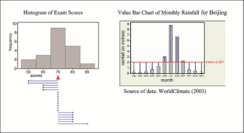
Two of the types of graphs that use bars, histograms, and value bar charts, illustrate quantitative data. A histogram is a distribution graph with bar heights indicating the frequency or percent for a data value or interval of values; whereas, in a value bar chart the bar heights are the values for cases enumerated along the horizontal axis. In a histogram, the center or mean is identified as the point along the horizontal axis that balances the weight of the bars taking into account their location along the horizontal axis. In contrast, the mean value of a value bar chart can be viewed as the average height of the bars. Variability in [nonskewed] quantitative data is viewed by deviations from the mean. from Cooper and Shore (Citation2010) uses visual aids to illustrate the spread of the data from its mean value for a histogram and a time plot, a special case of a value bar chart.
Figure 1. Visual aids to view variability in graphical representations of quantitative data (Cooper and Shore Citation2010).
The third type of graph employing bars and considered in this study is a [distribution] bar graph. Bar graphs and histograms are similar in the sense that both illustrate the distribution of a variable. However, in a bar graph, the variable of interest is categorical (nominal or ordinal) and thus the bar heights indicate the frequency or percent of the categories of the variable. Whereas variability in quantitative data can be expressed in terms of how much the data values differ from the mean, variability in categorical data is judged by how often the observations differ from one another. Kader and Perry (Citation2007) referred to this notion as “unalikeability;” the more unalike or diverse the values of categorical data, the more variable the data.
This study focuses on assessing students' understanding of variability in histograms, bar graphs, and value bar charts as these are graphs that, while not always a focus of classroom discourse, are commonly encountered outside the classroom where the reader is assumed to understand their structures that superficially appear similar. Students were asked to determine which pair (or trio) of same-type graphs has greater(est) variability. To be able to successfully compare variability across all three graph types, students must be able to associate meaning to variability in terms of data type (quantitative vs. categorical) and connect to the underlying structures of the various types of graphs as variability manifests itself differently across these three graph types. In addition to investigating students' understanding of variability within each graph type, this study explores patterns of reasoning about variability that persist across graph types and basic understandings of the underlying structures of the three types of graphs. This study expands efforts of previous research that focused on investigations of students' conceptions of variability about data represented by histograms to bar graphs and value bar charts, and in so doing draws attention to the complicating, but realistic, factor, cited as a source of confusion in the literature, that students must be able to differentiate various underlying structures of graphs as they make sense of the data represented by these graphs. Student thinking is gleaned from multiple choice responses and open-ended written justifications supporting their responses.
All research questions in this study pertain to undergraduate students in an introductory calculus-based statistics course prior to the introduction of course content on descriptive statistics.
| i. | What understanding do students have of interpreting the variability of data presented in a graphical representation?
| ||||||||||||||||||||||
| ii. | Are students able to delineate graphical representations that represent the distribution of a variable from those that do not?
| ||||||||||||||||||||||
2. Methods
2.1. Participants
The sample consisted of 23 undergraduate students from one section of a multi-section introductory calculus-based probability and statistics course at a mid-sized metropolitan university. The course is required for both computer science majors and mathematics secondary education majors, and serves as an elective for other majors. All students had at least sophomore class standing. Nine students within the course were mathematics secondary education majors, 13 were computer science majors, and 1 was an economics major. Sixty-one percent of the students reported to have taken either the AP Statistics course while in high school or a college level introductory statistics course prior to this course. displays the partition of the sample by major and prior experience with a statistics course.
Table 1. Distribution of subjects by major and prior experience with statistics.
2.2. Assessment
A nine-item assessment was developed to reveal student thinking about comparing the variability of graphically represented datasets and to investigate students' ability to identify the data and underlying variable being graphed. The first part of the assessment investigated students' abilities to compare the variability of a pair or trio of datasets presented graphically. It consisted of six items, two items focusing on each of the three types of graphs: histograms (Item 1 and Item 5), bar graphs (Item 2 and Item 4), and value bar charts (Item 3 and Item 6). Throughout the entire assessment, there was no identification of graph type. Within each item students first completed a multiple choice question comparing the variability of pairs or trios of same-type graphs, followed by the prompt to “briefly explain your reasoning.” The responses to the multiple choice questions included two to three choices that identified one of the datasets as having greater/greatest/least variability along with two statements, Impossible to tell from the given information and I don't know. The last two choices were used to distinguish students who believed it was not possible to make a comparison about variability with the given information from those students who were unable to make a comparison. Pairs or trios of graphs were intentionally constructed to facilitate comparisons. For example, each pair or trio within an item had a common vertical scale. Pairs or trios of histograms also had a common horizontal scale and shared a common mean, median, and range to simplify the comparison of deviations from the mean. Pairs of bar graphs shared a common set of categories and pairs of value bar charts shared a common number of data values whose means were approximately equal. Item 1 was modified from a graph that was used in a previous study by Cooper (Citation2002), revised by using ungrouped data instead of grouped data. Items 2, 3, 5, and 6 were modified from graphs presented in Cooper and Shore (Citation2010).
The second part of the assessment consisted of three items that investigated students' ability to identify whether or not a graph represented the distribution of values of a variable and their ability to identify the variable and specific data values from the graph. Items 7, 8, and 9 included a graphical representation of a histogram, value bar chart, and bar graph, respectively. Recognizing that the phrase “distribution of values of a variable” might be unfamiliar to students, a brief introduction to terminology was included and available for reference at the top of each page for Items 7, 8, and 9. Within each of the three items, students were first asked to indicate (1) whether or not each graph illustrated the distribution of values of a variable; and (2) if so, to identify (a) three data values, and (b) the variable associated with the data values. To perceive variability in graphical representations, Cooper and Shore (Citation2010) concluded that one must be attentive to the underlying structure of the graph type, including being able to identify the type of data and on which axis it is plotted. Items 7, 8, and 9 were thus structured to provide insight into students' understanding of the structure of various types of graphs.
2.3. Data Collection Procedure
The course content was divided and sequenced into three main parts: basic probability, descriptive statistics, and inferential statistics. The assessment was administered after the completion of the probability section, but prior to the section on descriptive statistics. Students had not yet discussed how to measure variability for quantitative data, nor had they discussed variability in terms of categorical data. Students were instructed that the short assessment was being used to collect data as a pretest related to upcoming course content with the potential to be included in a study on students' understandings of statistical ideas. No student identifiers were included on the assessment. Students were told that the assessment was anonymous, and results would not (and could not) affect their course grade in any way. Students were given 30 min to complete the assessment with the explicit directions not to revisit a problem once completed as there was concern that students could learn about judging variability from the assessment itself. To that end, only one item was presented on each page. Participation in the study was voluntary and one student opted not to participate. A request for exempt status for Human Subjects Research was submitted and granted by the researcher's Institutional Review Board. The Assessment is provided within the Appendix, which is available in the online supplemental files..
2.4. Analysis Plan
With regard to overall scores on the first part of the assessment, a Mann–Whitney test was used to compare the number of correct responses of those who had taken a previous statistics course with those who had not. Levene's test examined whether or not there was a difference in variability of assessment scores for these two groups of students.
The distribution of multiple choice responses for comparisons of variability of pairs or trios of same-type graphs was reported as percentages for each question within the six items of the first part of the assessment. Item 5 contained two questions, thus there was a total of seven questions within the first six items. After reviewing the breadth of the brief justifications that students chose to write to support their multiple choice responses, these justifications were then grouped by similarities. The groupings were then used to discover consistency of reasoning about variability for each graph type in addition to whether or not students erroneously transferred a pattern(s) of reasoning that was correct for one graph type to another graph type(s) where this reasoning method was incorrect.
For each of the final three assessment items (Items 7, 8, and 9) of the second part of the assessment, which asked students to identify whether or not the graph represented the distribution of values of a variable, the percentage of “yes” and “no” responses were reported. For the two graphs (Items 7 and 9) that illustrated a distribution of values of a variable, students were asked to identify the variable and three data values, and the corresponding percentage of correct responses was reported. Patterns of incorrect responses associated with identifying the variable and its values were noted and reported.
3. Results
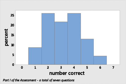
On average, the 23 students correctly compared the variability for 3.2 out of 7 pairs (or trios) of same-type graphs on the first part of the assessment with a standard deviation of 1.3 correct responses. Seventy-four percent scored between two and four correct answers ().
Figure 2. Distribution of the number of correct responses on part I among all students.
3.1. Examination of the Effect of a Prior Statistics Course
More than half of the students reported that they had taken either Advanced Placement Statistics in high school or a college level introductory statistics course prior to their current statistics course. and illustrate greater variability in the number of correct responses for the group that had not previously taken a statistics course; however, this difference was found not to be statistically significant (p-value = 0.453).
Figure 3. Distribution of the number of correct responses on part I by prior statistics course.
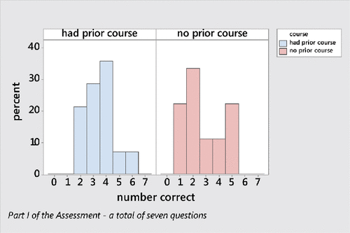
Table 2. Number of correct responses (out of 7) on part I by prior statistics course.
Though both the mean and median were greater for the group of students that had previously taken a statistics course, a Mann–Whitney test found that the mean rank of that group was not statistically significantly greater than the mean rank of the group with no statistics course (p-value = 0.116). Thus, no further comparisons on individual items were made between those with or without a prior statistics course.
3.2. Student Thinking About Comparisons of Variabilityby Graph Type
For the first six assessment items, the distribution of student responses for each of the multiple choice questions is presented with the correct response in boldface type. Included in the discussion of each item are typical justifications provided by students to support their multiple choice answers. These brief explanations added critical insight in elucidating student reasoning about interpreting variability in data represented by a graph, both in terms of uncovering misconceptions specific to a graph type and by revealing patterns of thinking that persisted across graph types. The average response rate for brief explanations was 88% across the first six items, ranging from 74% for Item 6 to 100% for Item 1. The original comparison graphs of each item are included within the text to provide context and clarify students' open-ended explanations, which are sometimes rough in description.
3.2.1. Histograms
The first item () assessed students' ability to compare the variability of two datasets represented by histograms. As variability in quantitative [nonskewed] data can be understood in terms of deviations from the mean, the more concentrated the data are around the mean, the smaller the variability; the greater the deviations from the mean, the greater the variability. Thus, comparing the two bell-shaped graphs in , the greater peak of Class 1 is indicative of a greater concentration of data values around the mean and therefore less variability.
Figure 4. Assessment item 1—histogram.
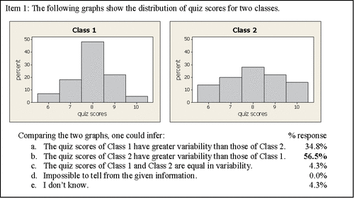
A majority of the students, 56.5%, correctly responded that the quiz scores of Class 2 were more variable than those of Class 1. The elaboration of student reasoning, prompted by the assessment's directive “Briefly explain your reasoning,” varied in sophistication.
Of the students with the correct response, who also provided a brief justification to support their reasoning, 22% (2 of 9) described variability in terms of deviations of data from the mean, a key concept in comparing variability of quantitative data. Selected responses are provided.
Student 9 [S9]:“More of the scores of Class 1 are closer to the mean than those of class 2.”
S18: “Variability is how many quizzes are away from the mean and how far away they are so the class with more quizzes further from the mean has greater variability.”
The remaining 78% (7 of 9), who correctly answered the question and provided a justification, referred to either the greater concentration of scores on a common value in Class 1 or the more evenly distributed scores of Class 2.
S12: “Class 1 kids have almost 50% of the kids getting the same score while class 2 has a more equal percent spread of scores.”
S16: “The grade for class 2 has a fairly equal percent for each score.”
From this item alone, it is not possible to surmise the role that “levelness of bars” or “clustering of data” played in students' reasoning about variability in histograms. Reference to “levelness of bars” for Class 2 compared to the peaked distribution of Class 1 might be correctly understood in this comparison to indicate a greater overall deviation of values from the mean. However, without further insight, “levelness of bars” could also indicate an understanding of variability that is inappropriate for quantitative data found in histograms, but akin to that of categorical data where variability is perceived as “unalikeability” or diversity of the data.
The most common (34.8%) incorrect answer was “The quiz scores of Class 1 have greater variability than those of Class 2.” Each of these eight students provided a justification that centered on the heights of the bars, the percentages associated with the various quiz scores.
S7: “Range of percentage of scores for class 2 is lower; range from 15% to 25%. Class one ranges from 9% to 45%.”
S8: “The percentages are closer together for class 2”
S22: “The change from 7 to 8 is huge in class 1. Class 2s percentages are more uniform.”
The prevalence of the misconception that greater variability in bar heights is indicative of greater variability of the data was also reported in earlier studies (Cooper Citation2002; Cooper and Shore Citation2008; Chaphalkar and Leary Citation2014; Kaplan et al. Citation2014). A similar set of comparison graphs as found in Item 1 were presented in a study by Cooper and Shore (Citation2008): the bar heights were the same, but data values on the horizontal axis were grouped in intervals instead of the ungrouped presentation in this study. The distribution of student responses in Item 1 was largely consistent with that of a subgroup of similar students (enrolled in a calculus-based probability and statistics course) in the earlier study: 50% of students (n = 40) were able to identify the class with greater variability; 33% incorrectly identified the graph whose bell-shaped curve had a higher peak as the class with greater variability, and 17% incorrectly indicated that the class scores were equally variable. However, the assessment in the earlier study (ibid) was administered after students had covered the descriptive statistics course material, although not necessarily directly aligned to the assessment items; whereas, the assessment in this study was administered prior to instruction in descriptive statistics.
Item 5 of the assessment () involved two comparisons of a trio of histograms. The comparison of least and most variable ages among three tennis leagues provided an opportunity to further delineate students' understanding of variability.
Figure 5. Assessment item 5—histogram.
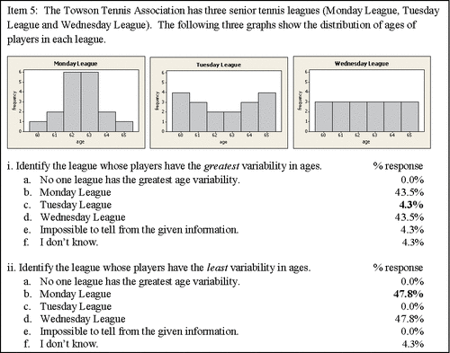
Of all the items on the assessment that asked students to compare the variability of same-type graphs, Item 5i proved to be the most challenging. As variability for quantitative data can be judged in terms of deviations from the mean, the Tuesday League exhibits the greatest variability in ages. Many players of the Tuesday League have ages at either extremity while only a few have ages near the mean.
Only one student, S18, chose the correct multiple choice response, reasoning that “Wednesday has equal distribution. Monday and Tuesday have approximately the same mean but Tuesday has more players with ages farther from the mean than Monday." Together, this explanation with the student's earlier explanation from Item 1, “variability is how many quizzes are away from the mean and how far away they are so the class with more quizzes further from the mean has greater variability” supports a sophisticated understanding of variability of quantitative data being measured in terms of deviations from the mean.
Bimodally, the students identified the Monday and Wednesday Leagues as having the greatest variability of age. Forty-three and one half percent of the students incorrectly indicated that the Monday League, categorized by a prominent mound-shaped distribution, to be the league with the most variable ages. All written justifications (9 of 9) supporting a choice of Monday League focused on the heights of the bars and were consistent with the misconception encountered in Item 1 that greater variability in bar heights is indicative of a greater variability in the data.
S8: “62 and 63 are much larger than 60 and 65.”
S13: “Frequency differs dramatically.”
S22: “The jump from 61 to 62 and 63 to 64.”
S23: “The frequency of age is least consistent.”
An equal percent, 43.5%, of students incorrectly chose the Wednesday League to be the most variable. Of the students who offered an explanation supporting their choice of the Wednesday League, nearly 90% (8 of 9) referenced in some way the uniform distribution of ages, consistent with the notion of “unalikeabilty” or diversity of data indicating great variability in categorical data.
S4: “They are all equal on Wednesday, giving it the most variability because all outcomes are equally likely.”
S9: “Wednesday League: One has an equally likely chance of being any given age.”
S15: “Most even distribution”
The two prominent competing notions for judging variability continued to be exposed in Item 5ii, the third and final comparison of variability for histograms. Whereas Item 5i had asked students to indicate the league with the most variable ages, Item 5ii asked students to identify the league with the least variable ages.
As with question 5i, student responses to question 5ii were again bimodal with 47.8% of students identifying the Monday League and 47.8% identifying the Wednesday League as having the least variable ages. All students who had identified Monday as the league with the greatest variability of ages now chose the Wednesday League as having the least variability of ages. Those who chose Wednesday as the league with the greatest variability now chose the Monday League as having the least variability of ages. The discrepancy between the 43.5% for the bimodal response of 5i and 47.8% for the bimodal response of 5ii was due to an additional student each choosing the Monday and Wednesday Leagues for 5ii. The only student who had correctly chosen the Tuesday League for 5i incorrectly chose the Wednesday League for 5ii, and a student who had responded Impossible to tell from the given information for question 5i correctly chose the Monday League for 5ii.
All written justifications (8 of 8) of those students who correctly identified the Monday League rested on the observation that ages in this league were concentrated on 62 and 63 years. Given that the mean age of the Monday League is 62.5 years, the students' observations of clustering of ages on these values were consistent with variability being measured as deviations from the mean; however, their justifications did not explicitly mention the idea of deviation from the mean or from each other. Thus, the possibility that some students were incorrectly judging variability of quantitative data in terms of degree of “alikeability” associated with categorical data could not be ruled out.
S6: “It is centered specifically towards a group that appears the most.”
S15: “Most clumped grouping.”
S19: “Most of the members are 62 or 63.”
All 47.8% of students who incorrectly identified the Wednesday League as having the least variability provided written justifications that focused on the level bar heights of that league. Students offering this justification appear to have lost connection to the original data as they focused on the variability of the frequencies associated with the data values instead of the variability of the data values themselves.
S2: “The data stays the same.”
S7: “Same amount of people in each age group.”
S22: “All values are the same.”
S23: “All ages have the same frequency.”
S2 and S22 explicitly confused the data with frequencies. If the data were to stay the same (all values were the same), all ages would have one common value and the histogram would have one bar centered over that common age.
The consistency of responses was evaluated for the three questions involving histograms (Item 1, Item 5i, and Item 5ii). No student answered all three multiple choice questions correctly. Forty-four percent of the students (10 of 23) answered both Item 1 and question ii of Item 5 correctly. Thirty-nine percent of the students (9 of 23) answered neither Item 1 nor question ii of Item 5 correctly: Thirty percent (7 of 23) consistently, in terms of both multiple choice responses and written explanations, erroneously interpreted that greater differences in bar heights [percentages or frequencies] indicated greater variability (Item 1 and Item 5i) and that levelness of bars indicated least variability (Item 5ii).
3.2.2. Bar Graphs
Items 2 and 4 assessed students' ability to compare the variability of two datasets represented by bar graphs, which show the distribution of categorical data. As variability of categorical data is understood in terms of the degree of unalikeability, or how often data values differ from each other, bar graphs with level bars are indicative of great variability.
Item 2 () illustrates the distribution of blood type for two ethnic groups. The Lapps have high concentrations of Type A blood (63%) and Type O blood (29%) with little concentration of either Type B (4%) or Type AB (4%) blood, indicating a great alikeability of blood types and thus little variability among data values. In contrast, the blood type of the Japanese is spread more evenly among the four blood types, with percentages for the four blood types ranging from 10% to 38%.
Figure 6. Assessment item 2—bar graph.
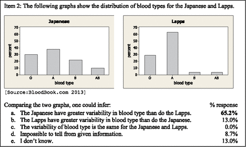
A majority of the students, 65.2%, correctly responded that the Japanese have greater variability in blood types than the Lapps. Of the students with the correct response, who also provided a brief justification to support their reasoning, 79% (11 of 14) observed that the percentages of blood types (heights of the bars) in the graph for the Japanese are more similar or evenly distributed as compared to the percentages of blood types of the Lapps which indicated a concentration of blood types. This type of reasoning supports the notion that an even distribution of values across categories is indicative of great variability in a bar graph.
S1: “The Japanese would have greater variability due to having different but relatively equal proportions of the different blood types.”
S4: “The Lapps have a large percentage of type A blood, but barely any B or AB type blood, while the Japanese have a lower percentage of A, while having more B and AB type blood, offering more variability due to more even distribution.”
S12: “About 65% of Lapps have the same blood type while the Japanese have a more equal chance of having any of the 4 blood types.”
S15: “The blood types of the Japanese are more evenly distributed while the Lapps are more concentrated.”
Thirteen percent of the students incorrectly responded that the Lapps had more variable blood type. Two of those three students stated that they used the same reasoning as the preceding item. S5's elaboration draws attention to the variability of the bar heights as opposed to the variability of the data: “Same reason for previous question. Lapps has a greater difference in distribution between each probability of blood types.” It is important to note that the previous item referenced by the students involved a histogram of quantitative data and not a bar graph of categorical data. Visually judging variability differs for these two types of graphs; supportive reasoning should also differ.
Item 4 () was the second item that assessed students' ability to compare the variability of data represented by bar graphs.
Figure 7. Assessment item 4—bar graph.
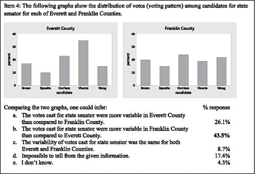
The difference in magnitude of variability between the two datasets illustrated by bar graphs in Item 4 () is less than that illustrated by the graphs of Item 2 () and may have made the comparison more challenging for some students. Though the correct response was still the modal response, fewer students (43.5%) correctly identified the bar graph with more variable data in this second assessment item devoted to bar graphs. Brief justifications of reasoning were similar to those reported for the bar graph comparison in Item 2. Of the students with the correct response, who also provided a brief explanation, 80% (8 of 10) observed that the percentages of votes per candidate (heights of the bars) in the graph for Franklin County were more similar (level) than the percentages (heights of the bars) in the graph for Everett County. An even distribution of values across categories is indicative of great variability in a bar graph.
S1: “Franklin County's elections have a very equal number of votes [per candidate] with the largest difference being less than 10%. This means there is an equal chance of seeing any one of the candidates.”
S9: “A vote from Franklin has a more equally likely chance of being for any given candidate than one from Everett.”
S15: “Franklin County had a more even distribution of votes than Everett County.”
Twenty-six percent incorrectly reported that the votes of Everett County were more variable. Those that offered explanations consistently (5 of 5 students) focused on the variability of the percentages (heights of the bars). Students appeared to lose context with the data as they compared the variability of the percentages instead of the variability of the votes.
S7: “Everett has a low of 10% and a high of 35%. Franklin on the other hand has a low of 15% and a high of 22%.”
S18: “The values of percentages of votes for Franklin seem more consistent while Everett varies more.”
S23: “The % is more varied in Everett Co.”
Twenty-six percent (6 of 23) of the students' stated within their written explanations that they had used the same reasoning for this item (Item 4) as for the previous item (Item 3). However, the previous item compared the variability of value bar charts and thus correct reasoning about variability for the two graph types should have differed. The referencing of “same type of reasoning” as the previous item occurred within both groups, those who correctly (B) identified that votes cast in Franklin County were more variable and those who erroneously (A) indicated that votes cast in Everett County were more variable.
S6: (A) “Same as previous reason.”
S7: (B) “Same type of reasoning.”
S15: (B) “Same as before.”
S20: (B) “Same thing. The votes varies more in Franklin County.”
The consistency of responses was evaluated for the two items involving bar graphs. Roughly 44% (10 of 23) of the students correctly identified both the ethnic group with greater variability of blood type (Item 2) and the county with greater variability of votes for state senator (Item 4). Thirty-five percent of the students (8 out of 23) answered neither Item 2 nor Item 4 correctly: Three of these students consistently and erroneously indicated that levelness of bars indicated little variability, while four responded Impossible to tell from the given information or I don't know.
3.2.3. Value Bar Charts
Unlike either histograms or bar graphs, value bar charts do not illustrate the distribution of values of a variable. Rather, value bar charts are an illustration of quantitative data where the height of a bar corresponds to the magnitude of the data value. Variability can be viewed as deviations from a horizontal mean line, the average bar height. In this case, greater variability of bar heights does correspond to greater variability of the data values.
Item 3 () is a time plot, a special case of a value bar chart characterized by the ordinal values of time placed on the horizontal axis. It was the first of two items to assess students' ability to compare the variability of two datasets represented by value bar charts. Toronto's rainfall [height of the bars] varies little month to month from the mean of 2.4 inches. In contrast, the monthly rainfall for Beijing varies greatly from the mean of 2.1 inches with July and August experiencing 9 inches and 6 inches of rainfall, respectively, compared to less than one inch of rain each month from October through April.
Figure 8. Assessment item 3—value bar chart.
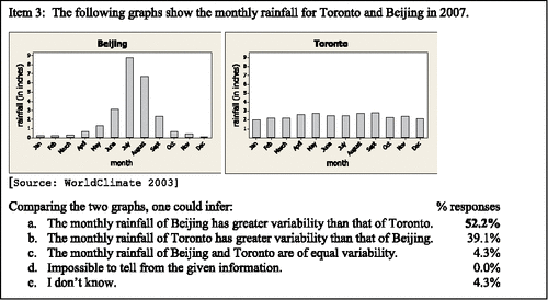
Fifty-two percent of the students correctly identified Beijing as having more variable rainfall. Of the students with the correct response, who also provided a written explanation, nearly 92% (11 of 12) either noted the consistency of rainfall (levelness of bar heights) of Toronto or the greater variability of bar heights associated with the Beijing graph. These observations are consistent with the notion that greater variability of bar heights corresponds to greater variability of the data values.
S2: “The Beijing graph has greater variability than Toronto graph because the Toronto has stagnant data across the board.”
S7: “Toronto seems to be getting around the same amount of rainfall every month.”
S11: “Toronto – rainfall about 3 [inches/month] all year.”
S18: “Beijing rainfall is between 0 & 9 but Toronto is all about the same 2–2.5ish.”
S20: “Greater difference between high and low months.”
Roughly 39% of students incorrectly chose Toronto as having more variable rainfall. Of those who chose Toronto as having the more variable rainfall and also provided a written explanation, 56% (5 of 9) observed that Toronto's rainfall was approximately the same each month; however, they did not equate that as meaning little variability. Rather, the levelness of the bars, the “equal rainfall” was perceived as “lack of pattern” or “equal likeliness associated with the months,” and interpreted as indicating great variability. Some students appeared to lose context with the data, the amount of rainfall, and instead erroneously described the likelihood of the month based on the amount of rainfall. This type of reasoning is akin to interpreting the distribution of rainfall over the categories of months, as if the variable of interest was the month instead of the amount of rainfall.
S1: "Although Beijing has a lot of rainfall in the June-July-August months, Toronto has equal rainfall for all months. This means there is an equally likely chance to pick any month when deciding on rainfall.”
S4: “The rainfall in Toronto is all fairly equal, not showing a clear pattern, which gives more variability. Japan has more rainfall in the summer, giving it a low variability.”
Similar to the transfer of method of reasoning expressed in the written explanations associated with the bar graphs, three of the students indicated that they had used the same reasoning for Item 3, a value bar chart, as for the previous Item 2, a bar graph.
Item 6 () was the final question on the assessment that asked students to compare the variability of datasets of same-type graphs and the second item pertaining to comparing variability of data represented by value bar charts.
Figure 9. Assessment item 6—value bar chart.
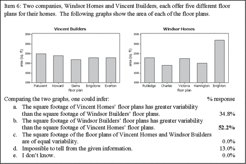
As with Item 3, 52.2% of the students correctly identified the value bar chart illustrating greater variability of data, in this case the graph for Windsor Homes. Of the students who correctly answered Item 3 and provided an explanation, 82% (9 of 11) focused on the differences in bar heights and deviations from the mean value.
S3: “Most of Vincent Builders homes have similar square footage, while there is less of a uniform distribution for Windsor. An average square foot measurement across all Windsor models would not be close to some of their models actual footage.”
S18: "The Windsor Homes seem less centered around a mean value” [mean bar height].
S20: “There is a bigger difference in the heights of the data.”
Approximately 35% of the students erroneously indicated that Vincent Builders had the more variable floor plan. Of the students with this incorrect response, who also provided an explanation to support their reasoning, 83% (5 of 6) indicated that they perceived some characteristic within the Vincent Builders graph to be “more evenly distributed” or “equally likely.” Similar to incorrect explanations provided in the previous comparison of value bar charts (Item 3), these students appeared to lose context with the data. Their descriptions about what they perceived to have an even distribution were either incorrect or not clearly identified, and they did not reference the variable being measured, in this case the area of the floor plan.
S4: “Vincent is more evenly distributed, giving higher variability.”
S9: “Probabilities are more equally likely for Vincent.”
S15: “Vincent has more even distribution than Windsor.”
Student 4's explanation that an even distribution implies greater variability is consistent with a correct interpretation of variability within a distribution bar graph where the heights of the bars [percentage or frequency along the vertical axis] would indicate how the data values are distributed over categories.
The consistency of responses was evaluated for the two items involving value bar charts. Thirty-nine percent (9 out of 23) answered both items correctly. Slightly less, 35% (8 out of 23), answered both items incorrectly: 26% (6 out of 23) chose incorrect responses each time that were consistent with the interpretation that levelness of bar heights indicated great variability.
3.2.4. Overall Trends
In general, when asked to compare the variability of a pair or trio of same-type graphs, students committed themselves to identifying one graph as illustrating more variability than its comparison graph(s). The percentage confident or willing to identify a graph with more (most) variability, or least variability in the case of 5i, was greater when analyzing graphs illustrating quantitative data, histograms (at least 91%), and value bar charts (at least 87%), as compared to each of the two bar graphs (78%) that illustrated categorical data. Relatively few students opted to choose one of the two multiple choice responses that did not specifically identify a graph with the greater(est) / least variability: Impossible to tell from the given information or I don't know. Five students accounted for these two responses, which collectively were observed 18 times across the seven questions. Three students, S2, S8, and S16, accounted for 80% (8 of 10) of the responses of Impossible to tell from the given information. S8 and S16 provided written explanations, and both, on multiple occasions, referenced the lack of knowledge about the population size within their justifications. One student, S17, accounted for 75% (6 of 8) of the responses of I don't know and several times provided the written justification, “I actually don't know what variability means.” Student 3 pointedly expressed confusion only with bar graphs as s/he attempted to compare the variability of categorical data.
S3 (Item 2): “The Japanese feature a more even distribution between blood types, however I don't remember if variability refers to differences from expected values or simply more variation in values.”
S3 (Item 4): “I don't know what the expected values would be to make a comparison. Variability seems like a weird way to measure the results of this data.”
In comparison to the apparent confidence or willingness to indicate which graph they believed depicted the dataset with greater variability, students struggled to correctly compare the variability of data illustrated by same-type graphs. Examining the percent of correct responses across individual assessment items, excluding Item 5i, students were able to successfully identify the graph whose dataset had the greater (or in the case of Item 5ii, least) variability between 43.5% and 65.2% of the time. Only one student, 4.3%, correctly identified which of three histograms (Item 5i) had the greatest variability. With the exception of Item 5i, the correct response was either the modal response or one of two bimodal responses.
Two prominent and competing modes of visualizing variability arose: (1) greater variability of bar heights indicates greater variability of data; and (2) levelness of bar heights indicates greatest variability of data. Previously discussed as both correct conceptions and misconceptions for judging variability dependent on the graph type, these two approaches for judging the variability of graphically presented data were sometimes held consistently across graph types ().
Figure 10. Student thinking about variability transferred across graph types.
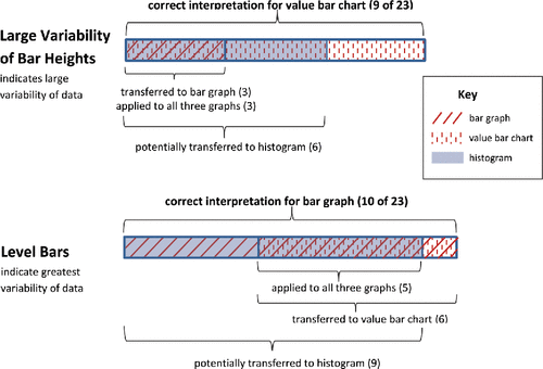
The conception that variability of data can be judged by variability of bar heights is a correct interpretation of variability when data are presented in a value bar chart where the height of each bar represents an individual data value. However, students who extended this notion of variability to histograms and bar graphs failed to connect the data values to their frequency or percent occurrence. In other words, they were not attending to the interplay between the axes for graphs that illustrate the distribution of values of a variable. Thirty-nine percent of the students (9 of 23) chose multiple choice responses consistent with this understanding of variability to correctly identify the dataset with greater variability in both comparisons involving value bar charts. Six students, notably a subset of the nine, erroneously extended this model of understanding variability to all three comparisons involving histograms. Three students, again, notably a subset of the nine, erroneously transferred this understanding to both questions involving bar graphs. Furthermore, these three students (13.0% of the total) held the understanding across all three graph types (). Not only were their multiple choice responses for all items (1-A, 2-B, 3-A, 4-A, 5i-B, 5ii-D, 6-B; ) consistent with the notion that the greater the variability in bar heights, the greater the variability of the data, all written justifications provided by these three students reflected this conception.
The second conception that some students held consistently across all three graph types was the notion that level bars indicate great variability of the data. Level bars in a bar graph do indicate great “unalikeability,” great diversity of values, an even spread of values among categories, and thus great variability for categorical data. However, extending this understanding of variability fails in the evaluation of variability of quantitative data illustrated by either a value bar chart or a histogram. Level bars within a value bar chart indicate equal magnitude of the values of the individual cases and therefore a lack of variability. Thus, the presence of level bars indicates the greatest possible variability for a bar graph and the least possible variability for a value bar chart. In the case of a histogram, the observation of level bars is indicative of neither the greatest or least amount of variability possible. Variability of data represented by histograms is judged in terms of a combination of bar heights and their corresponding distances from the mean value along the horizontal axis. Thus a histogram with level bars is indicative of greater variability than a mound-shaped histogram [assuming a common range of data among graphs]. However, a U-shaped or reverse bell-shaped histogram indicates greater variability than a histogram with level bars. True to the understanding of variability in terms of deviation of values from the mean, the histogram with greatest variability would divide the data evenly between the lowest and highest values.
Forty-three percent of the students (10 of 23) chose multiple choice responses consistent with the notion that level bars indicate great variability to correctly identify the dataset with greater variability in both comparisons involving bar graphs. Nine students, notably a subset of the 10, chose responses for all three histogram comparisons that were consistent with the notion that level bars indicate great variability. Though the consistency of the responses supports an incorrect use of the notion that level bars indicate great variability, it is not clear whether students had a tenuous understanding that variability in quantitative data is understood as deviations from the mean or whether the students were consistently viewing variability in terms of diversity of values, regardless of whether the data was quantitative or categorical. Both the notion of level bars and the notion of overall greater deviations of values from the mean as indicative of greater variability would result in the correct response for Item 1, which compared the variability of two mound-shaped histograms. Item 5 presented the student with three histograms, one each of the following shapes: mound-shaped, level, and U-shaped. The mound-shaped histogram of Item 5 would have been found to have the least variability (question 5ii) regardless of whether the student employed the notion of level bars or greater deviations from the mean as indicative of greater variability. The one comparison that could delineate these competing understandings was that of question 5i where students were asked to identify the dataset with greatest variability. Only one student out of 23 correctly identified the U-shaped histogram as having greatest variability: Ten students, including the nine students of who consistently applied the notion of level bars indicating great variability for all three questions involving histograms, chose the histogram with level bars as having the greatest variability. Six students, notably a subset of the 10 who correctly interpreted level bars as indicating great variability for bar graphs, erroneously transferred this interpretation of variability to both questions involving value bar charts. Furthermore, the responses of five students (21.7% of total) were consistent across all three graph types (bar graphs, histograms, and value bar charts) with the notion that level bars indicate greatest variability and clustered data indicated by a few bars of great height indicates little variability. In addition to their multiple choice responses for all items (1-B, 2-A, 3-B, 4-B, 5i-D, 5ii-B, 6-A; ) being consistent with this understanding, the written explanations of their reasoning consistently reflected this same notion. However, with only Item 5ii able to differentiate between the notion that level bars indicate greatest variability and the notion that the greater the deviation of data values from the mean, the greater the variability, the extent to which students erroneously held the former notion of variability for histograms remains unclear.
Nearly 35% of the students responded across all graph types with responses consistent with one of these two prominent conceptions: the greater the variability in bar heights, the greater the variability of the data and level bars indicate greatest variability. [A caution is again noted in not being able to clearly differentiate between the notions of level bars versus greater deviations from the mean indicating greater variability in histograms.] Underscoring a tendency to interpret variability in graphically presented data without regard to data or graph type, 26.1% of the students at least once specifically offered a written justification of “same as previous question” or a variation thereof, even though no two consecutive assessment items involved the same graph type.
3.3. Student Thinking About the Underlying Structures of Graphs
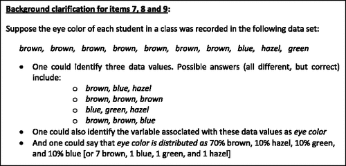
The last three items of the assessment () addressed students' understanding of the structure of the three types of graphs explored in this study: histograms, bar graphs, and value bar charts. One item was devoted for each type of graph. Within each item students were asked, “Does this graph illustrate a distribution of values of a variable for a dataset?” If, and only if, students responded “yes,” were they asked to continue and complete two follow-up questions within this item. The first follow-up question asked students to “Identify any three data values.” The second question asked students to “Identify the variable associated with these data values.” Concerned that the terminology may be unfamiliar to the students, at the top of each page prior to the assessment item was a section titled “background clarification for Items 7, 8, and 9” that consisted of an example of a simple listing of values for a dataset along with an introduction to the terminology of distribution, data values, and variable as applied to that example (). Students were able to refer to this example as they answered questions about distribution, data values, and the variable of interest in each of Items 7, 8, and 9.
Figure 11. Assessment items 7, 8, and 9.
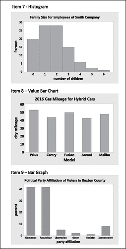
Figure 12. Reference for the terms distribution, data values, and variable.
Ninety-one percent of the students (21 out of 23) correctly answered “yes” to the initial question of Item 7 that identified the histogram as a graph that illustrated a distribution of values of a variable for a dataset; 39% also correctly identified three data values and the variable associated with the data values. Seventy-four percent of the students (17 out of 23) correctly identified the bar graph of Item 9 as a graph that illustrated a distribution of values of a variable for a dataset; approximately 35% also correctly identified three data values and the variable associated with the data values. All students who correctly identified the bar graph of Item 9 as a distribution graph (74%; 17 out of 23) also identified the histogram of Item 7 as a distribution graph. Within Item 7 and Item 9, incorrect responses for identifying data values consisted of listing the labels for both axes, listing a value from the horizontal axis along with its corresponding percent, and simply listing percentage values (bar heights). Incorrect responses for identifying the variable associated with the data values included the same errors as those for identifying the data values in addition to listing values from the horizontal axis and simply stating “percent.” Students were challenged to recognize that the value bar chart of Item 8 was not a graph illustrating a distribution of values of a variable: More than half (52%) incorrectly identified it as a distribution graph.
4. Conclusion
As the assessment was administered prior to the coverage of descriptive statistics, the results of this study provide insights into conceptions and misconceptions that college students in introductory level statistics may bring to the classroom regarding variability in data presented in three types of graphs that share the superficial characteristic of bars (histograms, bar graphs, and value bar charts). As each graph type has a different underlying structure, variability must be perceived differently. Variability of categorical data is perceived in terms of how diverse or unalike the data values are. For bar graphs, this results in the correct conception that level bars indicate the greatest variability of the data. Variability for quantitative [nonskewed] data is perceived in terms of deviations of data values from the mean. In value bar charts this results in the correct conception that level bars indicate no variability of the data, or analogously that greater variability of bar heights indicates greater variability in the data. In histograms, greater variability is manifested by having a greater concentration of data (bars of higher height) at the lower and upper end of the range of data values with fewer data values (bars with little or no height) located near the mean.
The prominent misconception of interpreting variability within bar graphs was revealed as greater variability of bar heights indicates greater variability in the data. The most common misconception in interpreting variability within value bar charts was that level bars indicate great variability, as students erroneously interpreted the level bars to indicate equal likelihood of the cases. Both misconceptions, greater variability of bar heights indicates greater variability in the data and level bars indicate the greatest variability, were observed in students' interpretation of variability within histograms.
This study found that correct interpretations of variability for one type of graph were often erroneously transferred to interpreting variability in other types of graphs (). More than one-third of the students provided responses on all seven questions of Part I of the Assessment that were consistent with one of two prominent misconceptions. Thirteen percent of students consistently held the conception across and within all three graph types that greater variability of bar heights indicates greater variability in the data. In general, these students considered the bar heights to be the data, regardless of graph type. Nearly 22% provided responses to comparisons across and within all three graph types consistent with level bars indicate the greatest variability of data. One inference could be that students always perceived variability in terms of diversity of data values, regardless of data type. However, as correct responses for two of the three questions involving histograms could be supported by either the correct understanding of variability in terms of deviations from the mean or in terms of the incorrect application of level bar heights indicating greatest diversity of values, further investigation involving a greater variety of comparisons is needed to clarify the degree of prevalence of the misconception as it applies to histograms.
Table 3. A summary of students' visual (mis)interpretations of variability by graph type.
After being provided with examples to support the terminology of distribution, data values, and the variable associated with the data values, students were generally successful in identifying both the unnamed [in regard to graph type] histogram and bar graph as graphs illustrating a distribution of data values, though little more than a third of the students could identify data values and the associated variable for each of the graphs. More than half of the students incorrectly identified the value bar chart as a graph that illustrates the distribution of values of a variable. Students struggled to delineate the underlying structures of histograms, bar graphs, and value bar charts, compounding their efforts to interpret variability of data represented by graphs.
Variability is the key component of statistics. While the content of introductory level statistics courses generally includes measures of variability for quantitative data and perhaps may include discussions about variability of data represented by histograms, discussions regarding the meaning of variability of categorical data or how it is expressed in bar graphs generally is given little to no attention. Additionally, value bar charts are generally not included in discussions of introductory level statistics courses. However, outside the classroom, students will encounter all three types of graphs (without the benefit of delineation or identification by type). If we expect students to be able to interpret the variability of data represented in the variety of graphs that they encounter in everyday life, the conversation within the classroom needs to expand. To better prepare students to be able to assess the variability of data represented by histograms, bar graphs, and value bar charts, the following implications for instruction are suggested:
| 1. | In addition to the usual discussion of variability of quantitative data expressed in terms of deviations from the mean, instructors should introduce the notion of variability of categorical data in terms of “unalikeability.” An explicit contrast should be made that variability of quantitative data is understood in terms of “how much” the data values deviate from the mean while variability of categorical data is understood in terms of “how often” the data values differ from one another (Kader and Perry Citation2007). It is important to consider that students, who have not developed an understanding of variability of quantitative data in terms of spread from the mean, may default to interpreting variability in terms of “unalikeabilty” or diversity of data values, regardless of data type | ||||
| 2. | Students need to connect to the data within a graph to assess its variability. Instructors should provide opportunities to compare and contrast the underlying structures of graphs, including identifying (1) whether or not the graph illustrates the distribution of values of a variable; (2) the data values and the axis on which they are graphed; and (3) the variable associated with the data values. | ||||
| 3. | The statistics community needs to become consistent with its use of the terms bar graph, histogram, and value bar chart. Too often, the term bar graph is ubiquitously used to describe any graph that uses bars. Though there has been a trend in the literature to delineate the graph referred to in this study as a value bar chart from that of a bar graph or histogram, the name used to identify this type of graph varies greatly. Value bar charts are also known as case value graphs, case-value plots, and ordered value bar graphs. | ||||
| 4. | Early discussions regarding interpreting variability of data in graphs should be focused on the concepts of variability (deviations from the mean vs. unalikeability) rather than on quantifying variability by a measure. The use of comparison graphs (same-type graphs, usually with common scales) can be used to encourage such discussions. | ||||
There are two important limitations to this study to note, sample size and representativeness of students in introductory statistics courses. The results of this study are based on a small sample of only 23 students. Statistical tests to detect differences in means and differences in variability for those who had taken a previous statistics course compared to those who had not were not found to be statistically significant. It would be interesting to see if a large sample study would be able to detect such differences. Furthermore, a large sample study would allow for a group comparison of students who had a previous statistics course versus those who had not in terms of their ability to compare variability for each of the three subgroups of graph types (histograms, bar graphs, and value bar charts). Due to the small sample size of this study, the power of such multiple comparisons would have been very small. Finally, the subjects were students in a calculus-based statistics course. As their general math skills may have been more sophisticated than that typically found in a statistical literacy course, the results of this study may not necessarily be generalized to all introductory statistics courses.
UJSE_1473060_Supplemental_File.zip
Download ()References
- BloodBook.com. (2013), “Racial and Ethnic Distribution of ABO Blood Types,” [online]. Available at http://www.bloodbook.com/world-abo.html
- Bright, G. W., and Friel, S. N. (1998), “Graphical Representations: Helping Students Interpret Data,” in Reflections on Statistics: Agendas for Learning, Teaching, and Assessment in K-12, ed. S. P. Lajoie, Mahwah, NJ: Lawrence Erlbaum Associates, pp. 63–88.
- Chaphalkar, R., and Leary, C. (2014), “Introductory Statistics Students' Conceptual Understanding of Variation and Measures of Variation in a Distribution,” in Sustainability in Statistics Education. Proceedings of the Ninth International Conference on Teaching Statistic, eds. K. Makar, B. de Sousa, and R. Gould, International Association for Statistical Education. Available at http://icots.info/9/proceedings/contributed.html#128
- Common Core State Standards Initiative (2010), Common Core State Standards for Mathematics, Washington, DC: National Governors Association Center for Best Practices and the Council of Chief State School Officers.
- Cooper, L. (2002), “An Assessment of Prospective Secondary Mathematics Teachers' Preparedness to Teach Statistics,” Dissertation Abstracts International, 64, 89A. ( University Microfilms No. 3078386).
- Cooper, L., and Shore, F. (2008), “Students' Misconceptions in Interpreting Center and Variability of Data Represented Via Histograms and Stem-and-Leaf Plots,” Journal of Statistics Education, 16, 1–13.
- ——— (2010), “The Effects of Data and Graph Type on Concepts and Visualizations of Variability,” Journal of Statistics Education, 18, 1–16. Available at http://www.amstat.org/publications/jse/v18n2/cooper.pdf
- delMas, R., Garfield, J., and Ooms, A. (2005), “Using Assessment Items to Study Students' Difficulty with Reading and Interpreting Graphical Representations of Distributions,” in Proceedings of the Fourth International Research Forum on Statistical Reasoning, Thinking, and Literacy, ed. K. Makar, Auckland, New Zealand: University of Auckland. Available at https://apps3.cehd.umn.edu/artist/articles/SRTL4_ARTIST.pdf
- delMas, R., Garfield, J., Ooms, A., and Chance, B. (2007), “Assessing Students' Conceptual Understanding After a First Course in Statistics,” Statistics Education Research Journal, 6, 28–58 [online]. Available at https://www.stat.auckland.ac.nz/∼iase/serj/SERJ6(2)_delMas.pdf
- Franklin, C., Kader, G., Mewborn, D., Moreno, J., Peck, R., Perry, M., and Scheaffer, R. (2007), Guidelines for Assessment and Instruction in Statistics Education (GAISE) Report, Alexandria, VA: American Statistical Association.
- Garfield, J., and Ben-Zvi, D. (2008), Developing Students' Statistical Reasoning: Connecting Research and Teaching Practice, Netherlands: Springer
- Kader, G., and Perry, M. (2007), “Variability for Categorical Variables,” Journal of Statistics Education [online], 15.
- Kaplan, J., Gabrosek, J., Curtiss, P., and Malone, C. (2014), “Investigating Student Understanding of Histograms,” Journal of Statistics Education [online], 22.
- Lappan, G., Fey, J. T., Fitzgerald, W. M., Friel, S. N., and Phillips, E. D. (2014), Data About Us, Boston: Prentice Hall.
- Lem, S., Onghena, P., Verschaffel, L., and Van Dooren, W. (2013), “External Representations for Data Distributions: In Search of Cognitive Fit,” Statistics Education Research Journal, 12, 4–19.
- National Council of Teachers of Mathematics (2000), Principles and Standards for School Mathematics, Reston, VA: NCTM.
- WorldClimate (2003), “World Climate” [online]. Available at http://www.worldclimate.com