
Abstract
This article describes a collaborative project across three institutions to develop, implement, and evaluate a series of tutorials and case studies that highlight fundamental tools of data science—such as visualization, data manipulation, and database usage—that instructors at a wide-range of institutions can incorporate into existing statistics courses. The resulting materials are flexible enough to serve both introductory and advanced students, and aim to provide students with the skills to experiment with data, find their own patterns, and ask their own questions. In this article, we discuss a tutorial on data visualization and a case study synthesizing data wrangling and visualization skills in detail, and provide references to additional class-tested materials. R and R Markdown are used for all of the activities.
1 Introduction
Computation is a fundamental tool that underlies much of modern statistical practice (American Statistical Association Citation2014; Horton and Hardin Citation2015; Nolan and Temple Lang Citation2010). With the rise of data science, there is now a focus on providing undergraduate statistics students with the modern tools necessary to work with today’s datasets, which are often very large and messy. Though statisticians have always worked with data, data science requires a different set of skills and techniques to gain insight from data. Thus, instructors should strive to develop computing skills in their students throughout the entire statistics curriculum. This is a noble goal but requires designing new illustrative examples, case studies, homework assignments, and projects for inclusion in a wide-range of courses. While there are some existing resources, such as the Stat 101 Toolkit (American Statistical Association Citation2014), the statsTeachR repository (http://www.statsteachr.org/), and those related to the mosaic R package (Pruim, Kaplan, and Horton Citation2017), more are needed. Many institutions are creating stand-alone courses or programs in data science to meet student interest and demand (Baumer Citation2015; Hardin et al. Citation2015; http://datascience.com munity/colleges lists 500+ programs in data science); however, this may not be practical at all institutions, where there may be a limited number of instructors or resources to create new courses within their curriculum.
The goal of this project was to design, develop, and evaluate a set of data science materials that could be incorporated into current undergraduate courses within our respective institutions. We created a series of tutorials highlighting basic tools of data science, such as visualization, data manipulation, and database usage that instructors at a wide-range of institutions could incorporate into existing statistics courses. In addition to the tutorials, we also created a set of case studies that build upon the tutorials by showcasing an interesting dataset whose analysis involves integrating multiple skills. Each tutorial focuses on incorporating a fundamental data science topic into the statistics curriculum. We provide nine tutorials on the following topics: (1) tidy data, (2) data wrangling, (3) merging data, (4) data visualization, (5) working with shapefiles, (6) working with dates and times, (7) working with text data, (8) data scraping, and (9) classification and regression trees.
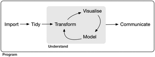
Each case study builds upon the tutorials to emphasize key components of the data-scientific cycle outlined by Grolemund and Wickham (Citation2017), which is shown in . Each of our six case studies guide students through a small research project, then provides open ended questions to encourage students to create their own research question and explore the data to find an answer. Topics for our case studies include: (1) is there evidence of discrimination in the New York Police Department data? (2) finding patterns in global terrorism, (3) what influences salaries in baseball? (4) changes in Oklahoma earthquakes over time, (5) finding sentiments in twitter data, and (6) modeling tornado patterns in Texas.
Fig. 1 A flowchart outlining the data-scientific cycle discussed by Grolemund and Wickham (Citation2017).
Our intent is to introduce a set of freely available materials that are flexible enough to fit a wide set of curricular goals. Instructors from a variety of disciplines, with little knowledge of R, can use these documents to teach themselves these new techniques. In addition, by providing the source documents, instructors can adapt the materials to suit the needs of their unique classroom settings. For example, the authors have used these materials for in-class activities in lower-level courses and have assigned them as flipped activities in upper-level courses; undergraduate students have also used these for an independent study.
More specifically, our materials:
start with a modern and engaging question;
teach programing and data-science skills;
allow students to experiment with data, find their own patterns, and ask their own questions;
are flexible enough for students of all abilities and backgrounds to get involved.
To encourage students to gain more experience with reproducible research methods, each tutorial and case study was written with R Markdown (Rmd), an R package for dynamically creating documents with embedded R code (Allaire et al. Citation2015). In this article, we will discuss one tutorial on data visualization and a case study synthesizing data wrangling and visualization skills. Full versions of all of our materials can be found online at https://github.com/ds4stats with additional instructor resources at http://bit.ly/RTutorials.
2 Example Tutorial: Data Visualization With ggformula
Graphics have long been a foundational topic in the introductory statistics course (see, e.g., De Veaux, Velleman, and Bock Citation2004; Lock et al. Citation2013; Moore, McCabe, and Craig Citation2012). In such texts, the focus is typically on choosing the appropriate graphic and not on how to design the plot for highest impact and aesthetics. With the increased adoption of R in statistics education this has begun to change, and we wish to support a broader discussion of graphics in the curriculum.
In the “Data Visualization with ggformula” tutorial, we explore the Ames housing dataset (De Cock 2016) while emphasizing how the ggformula R package provides the grammar to consistently describe graphics across the curriculum (Kaplan and Pruim Citation2018; Kaplan Citation2015). This is a rich dataset with 2930 observations and 82 variables. For simplicity, we limit the description to three key variables in this example and then encourage students to explore more options on their own.
SalePrice: The sale price of the home.
GrLivArea: Above grade (ground) living area (in square feet).
KitchenQual: A categorical variable ranking the quality of the kitchen (Ex: Excellent, Gd: Good, Ta: Typical/Average, Fa: Fair, and Po: Poor)
2.1 Overview of the ggformula Framework
The ggformula package is based on another graphics package called ggplot2 (Wickham Citation2016). ggformula provides an interface that makes coding easier for people new to R, following the same intuitive structure provided by the mosaic package (Pruim, Kaplan, and Horton Citation2017). In particular, students are quickly able to connect the relationship between a graphic and corresponding statistical model. All plots are created using the following syntax:
goal(y ∼ x, data = mydata)
For example, to create a scatterplot in ggformula, we use the function gf_point(), to create a graph with points. We then specify SalePrice as our y variable and GrLivArea as our x variable. The scatterplot created below is shown in .
Fig. 2 Scatterplot of the sales price against above-ground living area for homes in Ames, IA.
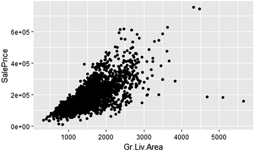
library(ggformula) AmesHousing <- read.csv(”data/AmesHousing.csv”) gf_point(SalePrice ∼ GrLivArea, data = Ames Housing)
A wide variety of other graphics, such as gf_boxplot() and gf_violin(), can be used when the explanatory variable is categorical. It is also easy to make modifications to the color and shape of the points in a scatterplot. For example, the following code creates navy points and the shape is open circles.
gf_point(log(SalePrice) ∼ log(GrLivArea), data = AmesHousing, color =“navy”, shape = 1)
Additional layers are incorporated into a graph using the pipe operator % >%. This provides an easy way to create a chain of processing actions by allowing an intermediate result (left of the % >%) to become the first argument of the next function (right of the % >%). Below, we start with a scatterplot and then assign that scatterplot to the gf_lm() function to add linear regression models. Then the result is again passed to the gf_labs() function, which adds titles and labels to the graph.
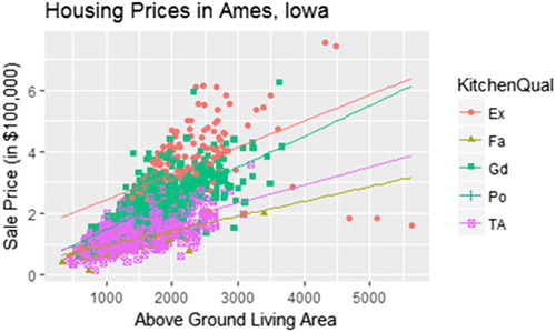
gf_point((SalePrice/100000) ∼ GrLivArea, data = AmesHousing, shape = ∼ KitchenQual, color = ∼ KitchenQual) % >% gf_lm() % >% gf_labs(title = “Housing Prices in Ames, Iowa”, y = “Sale Price (in $100,000)”, x = “Above Ground Living Area”)
Students naturally start to explore the relationship between living area and sale price using a scatterplot (). After the core scatterplot graphic has been introduced, we can gradually introduce a few customizations:
Fig. 3 Scatterplot of the sales price against above-ground living area for homes in Ames, IA. Color and shape represent the quality of the kitchen.
The scatterplot in suffers from overplotting—that is, many values are being plotted on top of each other many times. Use the alpha argument (in the same way we use a shape or color argument) to adjust the transparency of points so that higher density regions are darker. By default, this value is set to 1 (nontransparent), but it can be changed to any number between 0 and 1, where smaller values correspond to more transparency.
The facet option can be used to render scatterplots for each level of an additional categorical variable, such as kitchen quality. In ggformula, this is easily done using the gf_facet_grid() layer.
To help focus the viewer’s attention on the trend, a regression line is easily added. To add a smoothed curve instead of a simple regression line, we use the gf_smooth() command in place of gf_lm(). This can motivate a nice discussion on which model is better. For example, it becomes clear that creating a more complex model does not necessarily improve our ability to estimate the sale price of large houses. Students also quickly see the importance of incorporating a third variable into a regression model. In , students recognize that knowing the quality of the kitchen does appear to improve our ability to estimate sale price.
The default color schemes are often not ideal. In some cases, it can be difficult to perceive differences between categories. This is an opportunity to discuss these difficulties and present options to overcome them. For example, we describe below how to use Brewer’s recommendations for color selection (Brewer Citation2017). If you do not wish to dedicate class time to this discussion, then it is an opportunity to point interested students to outside materials, such as Roger Peng’s discussion of plotting and colors in R, https://www.youtube.com/watch?v=HPSrjKt-e8c, or the R Graph Gallery, https://www.r-graph-gallery.com/.
We use the tutorial to walk students through numerous plot types, as well as additional customizations, but refer the reader to the supplementary materials for the full tutorial.
2.2 Univariate Data: How Much Did a Typical House in Ames Cost?
Students may grapple with this question in numerous ways, but one of the first is likely to be a univariate graphic, such as a histogram or density plot. The functions associated with these plots are gf_histogram() and gf_density() (see ). Notice that for all univariate graphics, we do not have a y variable, but follow the same syntax.
Fig. 4 A histogram (left) and density plot (right) of the sales price of homes in Ames, IA.
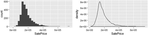
gf_histogram (∼ SalePrice, data = AmesHousing) gf_density (∼ SalePrice, data = AmesHousing)
After introducing students to the basic commands for creating histograms and density plots, it is valuable to have them make alterations to reinforce what they have learned. Possible examples include:
Edit the x-axis label to make it more informative.
Consider different bin widths to see if the shape of the distribution changes.
Pick another quantitative variable from the dataset and describe its distribution, including what a typical value may be.
Set fill =“steelblue2” in a density plot and then create a second density plot setting fill = ∼Kitchen Qual. Notice that fixed colors are given in quotes while a variable from our data frame is treated as an explanatory variable in our model.
After working through the initial questions in the tutorial, students are encouraged to dive deeper into the dataset and explore new patterns within the data; this provides them with opportunities to engage in discussions related to the display of multivariate relationships. If interesting questions are posed, then it is easy for students to consider multiple graphics in an effort to craft an answer. While the primary goal of this tutorial is for students to learn how to create graphics, it is important to also stress what can be learned from graphics. Thus, asking students to interpret the plots they have created and to compare what is easy/hard to learn from a plot are important exercises.
3 Example Case Study: Exploring the Lahman Database
A relational database is a collection of data stored in tables and organized for easy access and management. However, we rarely discuss data organized across multiple tables in undergraduate statistics courses. By working directly with a relational database, students see how the commands provided by dplyr can be used with relational databases; this requires little additional class time or effort. In this case study, we explore Sean Lahman’s baseball database (Lahman Citation2017) to investigate how team payroll is related to team performance.
The supplemental materials contain a SQLite database containing the 2016 version of Lahman’s database in the file lahman.sqlite. It is possible to work with the data tables in Lahman’s database by simply loading the Lahman R package (Friendly Citation2017); however, this approach misses the opportunity to introduce a common relational database management system, and many students may not realize that it is not always possible to read all data tables into R for this type of workflow.
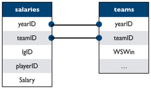
Lahman’s database consists of 26 tables containing performance metrics for Major League Baseball (MLB) players since 1871, as well as supplementary information, such as salaries and franchise information. To introduce relational databases, we start with two data tables: salaries (player-level salary data), and teams (team-level performance metrics and standings by season). We believe that focusing on salary and winning should make this case study accessible to students who may not be familiar with baseball. shows the relationships between key variables.
Fig. 5 A schematic displaying the relationships between key variables in the salaries and teams data tables.
Of particular interest in this case study are
teamID: a unique team identifier
yearID: season
playerID: a unique identifier for each player
salary: a player’s salary in a specific season, on a specific team
WSWin: did the team with the World Series? Y = yes, N = no
Before starting this case study, we suggest students complete the ggformula and the dplyr tutorials.
3.1 Overview of Relational Databases Using the Lahman Data
In addition to having students complete the prerequisite R tutorials, we recommend taking a small amount of class time—perhaps 15 min—to introduce key ideas behind relational databases.
The tables in a relational database obey a few simple rules: a row corresponds to an individual observation, a column corresponds to a specific variable, and a table records information on a single type of observational unit. While databases can simply be a collection of flat files on a hard disk, more elaborate relational database management systems (RDBMS)—such as MySQL, PostgreSQL, Oracle, Microsoft Access, and SQLite—are commonly used to solve a variety of problems including, but not limited to
Size: While you can store extremely large files on your hard disk, flat files can become too large to read into R’s memory (RAM) all at once. Further, even if it is possible to read the file into R’s memory, files can become large enough to substantially slow down computation. RDBMS provide tools that eliminate the need to read the full dataset into memory by running subsetting commands to extract the relevant data prior to reading it into memory. These queries are run using the structured query language (SQL); but we will use commands in dplyr to write the SQL queries for us.
Collaboration: Having the same dataset copied onto each team member’s computer can lead to reproducibility issues when new data are acquired, or when data entry errors are corrected. A client-server RDBMS allows many members of a team to access the data simultaneously and asynchronously. Further, if an error is corrected it will be available to every team member once the fix is made.
Security: DBMS allow permissions to be granted on a user-by-user basis. For example, all faculty and staff may have access to directory information at your institution, but only a select few IT staff members may be able to edit that information.
Having been introduced to the basic format and ideas behind a relational database, students can explore how dplyr allows them to work with the lahman.sqlite database without the need for many additional commands.
When working with a database, we want to perform as much data manipulation as possible before reading the data into R since the data may not even reside on the local computer or on any single computer. To do this we must allow R to send commands to the database, and for the database to send the results back to R—that is, we must establish a connection between R and the database. In R, we accomplish this by running the following command:
library(dplyr) library(RSQLite) lahman_db <- src_sqlite(”YOUR FILE PATH/lahman.sqlite”)
Notice that you must specify the file path of the database (which is simply the file name if you have changed your working directory to the folder containing the SQLite database). Typing the name of the database into the console reveals the RDBMS version (src) and what data tables are contained in the database (tbls).
lahman_db ## src: sqlite 3.19.3 [data/lahman.sqlite] ## tbls: allstarfull, appearances, ## awardsmanagers, awardsplayers, ## awardssharemanagers, awardsshareplayers, ## batting, battingpost, ## collegeplaying, fielding, fieldingof, ## fieldingpost, halloffame, ## homegames, managers, managershalf, ## master, parks, pitching, ## pitchingpost, salaries, schools, ## seriespost, teams, teamsfranchises, ## teamshalf
Now that we have an open connection to Lahman’s database we can proceed with the investigation.
3.2 Using dplyr to Calculate Team Payroll
The central question guiding the case study focuses on overall team payroll for each season; however, the salaries data table provides player-level salaries. Consequently, the first step in our analysis is to aggregate the data within the salaries data table up to the team level for each season.
To work with the salaries table much like we would a data.frame we map the salaries data table in the lahman_db database to a tbl object in R called salaries_tbl using the tbl() function found in the dplyr package:
salaries_tbl <- tbl(lahman_db,” salaries”)
Next, aggregate the player salaries by team (teamID) and year (yearID) to produce team payrolls for each season.
payroll <- salaries_tbl % >% group_by(teamID, yearID) % >% summarize(payroll = sum(salary)) head(payroll) ## Source: query [?? x 3] ## Database: sqlite 3.19.3 [data/lahman. sqlite] ## Groups: teamID ## ## teamID yearID payroll ## <chr > <int > <int > ## 1 ANA 1997 31135472 ## 2 ANA 1998 41281000 ## 3 ANA 1999 55388166 ## 4 ANA 2000 51464167 ## 5 ANA 2001 47535167 ## 6 ANA 2002 61721667
At this point it is important to note a few technical details about how dplyr talks to a database:
dplyr does not actually pull data into R until you ask for it. This allows dplyr to perform all of the manipulations at once. Consequently, common commands, such as summary(payroll) and payroll$payroll, will not work as expected until the data table is converted into a data frame.
The collect() command tells dplyr to pull data into R. The following command allows us to create a data frame where typical commands, such as summary(payroll) and payroll$payroll work as expected.
payroll <- collect(payroll)
Once the data of interest are obtained, we reinforce various ggformula functions from the data visualization R tutorial by constructing boxplots of team payroll over the years. Since students have completed the dplyr R tutorial, it is also possible to adjust the salaries for inflation after extracting the appropriate multipliers from the Bureau of Labor Statistics. The case study guides students to join the payroll and inflation data frames and calculate a new column as the product of payroll and multiplier.
inflation <- read.csv(”data/inflation.csv”) payroll <- payroll % >% left_join(inflation, by = c(”yearID” =“year”)) % >% mutate(adj.payroll = payroll * multiplier)
By comparing the boxplots produced before and after adjusting for inflation, students see that context is important. This reinforces the idea that we need to fully understand our data to interpret our results correctly.
3.3 Joining Tables for More Advanced Explorations
Once students have worked with the database via the tbl() and collect() commands, they can explore how team payroll is related to team success. At this point, we recommend asking students how they would define team success and using that answer to guide the remainder of their exploration. Common answers that we have seen include:
Winning games (this could mean wins per year, percentage of wins per year, or wins in playoff games)
Reaching/winning the World Series
Clinching a playoff berth
Once students have defined how they will measure a team’s success, then they should consider the following questions:
Do the variables of interest exist in one of the data tables? If not, how will you define them?
Do data tables need to be merged for the variables of interest to ultimately be in the same data frame?
How will you explore the relationship between payroll and your definition of success? If you will explore it graphically, what type of plot will you use?
As an example, consider exploring whether payroll is associated with winning the World Series. The variable, WSWin, representing whether or not a team/year won the World Series, is available in the teams table. We merge relevant team information into the payroll data frame using the left_join() command, as described within our “Merging Data Tables in R” tutorial.
payroll_teams <- payroll % >% left_join(lahman_db % >% tbl(”teams”) % >% collect(), by = c(”teamID”,” yearID”))
Now, we have variables for payroll and winning the World Series (WSWin) so we can create a plot to explore the association.
library(ggformula) payroll_teams % >% gf_point(adj.payroll/1e6 ∼ yearID, color = ∼WSWin) % >% gf_labs(x =“season”, y =“payroll (millions)”, color =“World Series\nChampion?”, title =“Can you buy the World Series?”)
provides numerous opportunities for discussion that students should be able to address if they have completed the recommended tutorials.
Fig. 6 Team payroll for each MLB team since 1987. Color denotes whether or not a team won the World Series in that season.
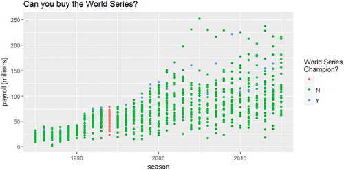
Why is the color scheme different for the 1994 season? There was a player strike that began on August 12, 1994, resulting in the cancelation of the rest of the season. We realize that most students will not be aware of this strike, so this is an opportunity for you to ask students to pretend to be statistical consultants and do some research on a topic they are not familiar with. There are often peculiarities in datasets that we must understand, so this is good practice, even for students unfamiliar with the context.
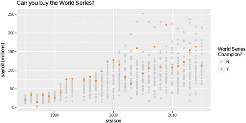
Is there a better color palette to focus attention on what we want the graphic to show? Plotting the non-winners in gray and the winners in a brighter color will draw attention to the winners first while still enabling comparison with the other teams. An example of this is given below in . This illustrates the cyclical nature of creating insightful graphics, something we rarely discuss but that students need to appreciate.
Fig. 7 Team payroll for each MLB team since 1987. The winner of the World Series in each season is highlighted in orange.
Is payroll associated with winning the World Series? Plotting reveals that while many high-payroll teams have won the World Series, numerous moderate-payroll teams have won. There does, however, seem to be some indication that teams need to spend a bit of money to win the World Series, as very-low-payroll teams are not winning the World Series.
The World Series question required relatively straightforward extensions of visualization and data wrangling tools that students were expected to have seen. Some questions will be more difficult to answer, so instructors may wish to provide additional guidance. For example, to explore the relationship between payroll and playoff berths an indicator variable must first be created from variables in the seriespost table that specify the winner and loser of each playoff game each year.
4 Implementation
The materials discussed in this article, were formally class tested in three very different courses at Lawrence University and Grinnell College during the Fall 2016 semester: a writing-intensive freshman seminar, a no-prerequisite introductory course, and an applied second course in statistics. In this section, we detail how the materials were used in each course.
4.1 First-Year Tutorial, a Writing Intensive Freshman Seminar
First-year tutorial is a required first-semester course for all incoming freshman that emphasizes writing. The class sessions met for 80 min, two days a week throughout the semester. The instructor chose the topic, “writing with data,” and 13 students were assigned to the course. Four of the R tutorials were used as in-class activities to teach students the basics of data manipulation and data visualization. Most students had no previous programing or statistics experience. In this course, the tutorials (in R Markdown form) and data (in CSV formats) were made available by the instructor on a shared school RStudio Server. Students worked in small groups of 2 or 3 in-class during the fifth and sixth week of the semester. Most student groups were able to easily complete the tutorial questions during class time. For an out-of-class assignment, students were asked to develop their own question about the data and use the tools from the tutorial to find an answer. Students presented their work to the class at the beginning of the following class period.
4.2 Introduction to Statistics
The data visualization and data wrangling tutorials were tested in two sections of a no-prerequisite introductory statistics course. The class sessions met for 70 min three days per week. The course used the simulation-based approach of Lock et al. (Citation2013) and required students to use R throughout the course for their analyses, starting in the first week. Few students had prior programing experience, so the tutorials were used as in-class labs intended to teach necessary computational skills while giving students time to practice these skills with instructor support.
During the first week of class students were introduced to statistical thought, tidy data, statistical graphics, and R/RStudio via traditional lecture. The data visualization tutorial was assigned as an in-class lab during the fourth day of class. At the beginning of the lab, the instructor took approximately 15 min to introduce R Markdown and guide students through the process of: (1) obtaining the lab files, (2) opening an RStudio project, and (3) knitting their first R Markdown file.
The data wrangling tutorial was assigned during lab the next week, after spending two class days discussing summary statistics. No pre-lab discussion was necessary because the content had already been discussed during the previous class periods. The instructor did review a few common roadblocks that were encountered knitting R Markdown files during the previous lab and on the homework.
Students were assigned to lab groups consisting of four students in a manner that balanced prior experience with statistics and coding. Each lab group was asked to complete the tutorial and submit it via Moodle by the beginning of the next class period. Students submitted both the original R Markdown file and rendered PDFs for grading.
4.3 Statistical Modeling
Statistical modeling is an applied course with one introductory statistics course as a prerequisite. This course is capped at 20 students and focuses on proper data analysis for research in multiple disciplines. Historically 75% of the students enrolled in this course have majors outside the mathematics and statistics department. Using the text, Practicing Statistics (Kuiper and Sklar Citation2012), students are required to use R throughout the course. Since few have prior programing experience, adapting to R has been problematic for many students in the past. On the first day of class students logged into the RStudio Server and typed in basic commands. Tutorials emphasizing tidy data, data wrangling, and data visualization were given as out-of-class assignments during the first week of the semester. The tutorials (in R Markdown form) and data (in CSV formats) were made available on a shared school RStudio Server by the instructor. The instructor and a class mentor were available outside of class for assistance, but a relatively small number of students asked for help. Students submitted either an R script or R Markdown file with selected solutions from the tutorial.
In both the statistical modeling and the introduction to statistics courses, the use of R reduced the amount of statistical content that was covered compared to semesters when other software, such as Minitab was used. However, the R tutorials seem to provide a much smoother transition to R for most students. In both statistics courses, having a student mentor or teaching assistant available during class or out of class to answer student questions for the first few labs was invaluable.
5 Discussion
5.1 Adaptability
The tutorials and case studies can be modified by instructors to meet the needs of their own students. For example, below are several ways to adapt the data visualization tutorial to fit a particular course:
Instructors who are familiar with ggplot2 syntax can use the gf_refine() function. It allows users to incorporate any ggplot2 function within the ggformula framework. For example, the following layer can be added to any graphic to specify the colors, using the color brewer suggestions:
gf_refine(scale_color_brewer(palette = “Dark2”))
These tutorials provide step-by-step guidance using just a small set of variables in order to focus on exploration and core programing skills. Instructors could choose to create a” cleaner” version of the Ames housing dataset, which consists of 2930 observations and 82 variables, perhaps by renaming the categorical variables, removing some of the variables, or removing the unusual observations as suggested in the original paper (De Cock Citation2011). Students would then not need to spend time combing through a codebook deciphering variable names.
To ensure students truly comprehend the material, each tutorial also includes an optional “on your own” section that asks additional questions to challenge students to truly integrate the core ideas discussed within the tutorial. In addition, each case study provides enough source material for students to build on the original question to develop and complete a final class project.
5.2 Teaching Assistants
When using these materials as in-class activities, we highly recommend having an upper-level student present to help answer questions during these class times. Some institutions have been hesitant to have student teaching assistants in their classrooms. However, this is a very low-cost option that enhances student learning and also greatly benefits the teaching assistant.
At first, students typically struggle with syntax (e.g., failing to close parentheses or forgetting to use the % >% operator to add a layer in ggformula), but we believe this is a productive struggle that is necessary to learn the R language. Instead of taking valuable class time to resolve such issues, in-class student teaching assistants can help individual students with their R difficulties, which would greatly reduce pressure on the instructor. Student teaching assistants have also been used to hold evening office hours one to three hours a week.
5.3 Choosing R
We developed the R tutorials and case studies to help students develop facility with statistical software for data management and visualization, key recommendations from the recent “Curriculum Guidelines for Undergraduate Programs in Statistical Science” (American Statistical Association Citation2014). While R is certainly not the only choice, we believe it is the best choice when adding these topics to existing statistics courses for the following reasons:
R is one of the most popular programing languages in the world (Cass Citation2017).
R was developed by statisticians for statistical analysis, making it is a natural choice for a statistics course. Additionally, there is less overhead required for tasks, such as data visualization than in Python (another popular language for data science), especially when using packages, such as mosaic and ggformula, which are designed to be easily accessible to people with no programing background.
R is open source, so students are learning a toolkit that will still be accessible to them after they complete the course.
RStudio is consistent across operating systems, eliminating the need for multiple sets of instructions. This is not the case with other software packages—even Excel is not identical across platforms. Additionally, your institution can set up an RStudio Server for your students to ensure that everyone has exactly the same version of R, the necessary R packages, and even datasets (Cetinkaya-Rundel and Horton Citation2016).
R makes reproducibility easy. For example, if you share your dataset and R Markdown document, then your analysis can be easily rerun by another researcher.
Graphics, data, and R Markdown files are easy to export into other formats.
5.4 Teaching a Reproducible Workflow
Following the recommendations of Baumer et al. (Citation2014), we wrote the tutorials and case studies in R Markdown to encourage both instructors and students to embrace a reproducible workflow. During class testing, we provided students with the data files and R Markdown templates, and asked them to complete their work in R Markdown. Students were able to quickly adapt to this reproducible workflow, and by the end of the course were able to create their own R Markdown documents. While more in-depth discussion of the importance of reproducibility is recommended at some point in the curriculum, requiring students to create reproducible reports is a natural first step that can be incorporated starting in the first course.
5.5 Common Pitfalls
While the advantages of requiring students to use R Markdown outweigh the drawbacks, it is important to be aware of a few common challenges. First, the error messages produced by knitting an R Markdown file are often harder to decipher than the errors produced within code chunks. Providing a list of common errors along with solutions can reduce both frustration and time spent troubleshooting student files. Second, students often have trouble reading their own data into R within R Markdown documents if they do not save the data in the same location as the .Rmd file. (In our experience, students tend not to organize their files, leaving any downloaded file in their Downloads folder.) We have found introducing R using a web-based RStudio Server dramatically lowers student frustration within the first few weeks of any course. The server option ensures that datasets and .Rmd files are easily accessible and all students are using identical versions of each package. Having these materials already available in a web-based RStudio account eliminates most file path issues or struggles with creating a project in RStudio. If, however, this is not an option, then we recommend providing zip files containing the RStudio project and all associated files so that students can simply open the project and start working. This can easily be done by creating a GitHub repository for the lab or assignment containing the necessary file and using DownGit (https://minhaskamal.github.io/DownGit/) to create download links.
5.6 Assessment
These materials were formally class tested in three very different courses at Lawrence University and Grinnell College during the Fall 2016 semester. The assessment is described in the supplemental materials. Overall, students and faculty using these materials have responded very positively.
6 Conclusion
Computation has become a central pillar of the statistics curriculum as we strive to teach students to think with and about data. To fully prepare students to do statistics we must equip them with the skills to manage and explore realistic datasets. We have found these tutorials and case studies to be a very effective way to include data-scientific tasks into existing statistics courses. In our experience, these materials equipped students to work more effectively with data and eased the burden on the instructor. We encourage instructors to use these materials for self-study and to adapt them to meet the needs of their students.
Supplementary Material
https://github.com/ds4stats - The current versions of the R Tutorials and case studies can be downloaded directly from GitHub.
http://bit.ly/RTutorials - Shonda Kuiper’s website presenting links to each R Tutorial, along with necessary prerequisites. Instructors do not need to be familiar with GitHub to access materials here.
Assessment - The description and results of the assessment of these materials is available in the supplemental materials.
Supplemental Material
Download Zip (386.8 KB)Acknowledgment
The authors thank the reviewers and associate editor for their helpful comments and suggestions.
Additional information
Funding
References
- Allaire, J. J., Xie, Y., McPherson, J., Luraschi, J., Ushey, K., Atkins, A., Wickham, H., Cheng, J., Chang, W. (2015), rmarkdown: Dynamic Documents for R. R package version 1.6. Available at https://CRAN.R-project.org/package=rmarkdown.
- American Statistical Association (2014), “Curriculum Guidelines for Undergraduate Statistics Programs in Statistical Science,” Available at http://www.amstat.org/asa/files/pdfs/EDU-guidelines2014-11-15.pdf
- American Statistical Association (2015), “Stats 101 Toolkit,” December 14. Available at http://community.amstat.org/stats101/home.
- Baumer, B. (2015), “A Data Science Course for Undergraduates: Thinking With Data,” The American Statistician, 69, 334–342. DOI: 10.1080/00031305.2015.1081105.
- Baumer, B., Cetinkaya-Rundel, M., Bray, A., Loi, L., and Horton, N. J. (2014), “R Markdown: Integrating a Reproducible Analysis Tool Into Introductory Statistics,” Technology Innovations in Statistics Education, 8, 1–29.
- Brewer, C. (2017), “ColorBrewer: Color Advice for Maps,” available at http://colorbrewer2.org/.
- Cass, S. (2017), “The 2017 Top Programming Languages-IEEE Spectrum,” IEEE Spectrum: Technology, Engineering, and Science News. Available at https://spectrum.ieee.org/computing/software/the-2017-top-programming-languages.
- Cetinkaya-Rundel, M., and Horton, N. J. (2016), “Technology Lowering Barriers: Get Started With R at the Snap of a Finger,” Presented at the Electronic Conference on Teaching Statistics. Available at https://www.causeweb.org/cause/ecots/ecots16/breakouts/7
- De Cock, D. (2011), “Ames, Iowa: Alternative to the Boston Housing Data as an End of Semester Regression Project,” Journal of Statistics Education, 19, 1–14.
- De Veaux, R. D., Velleman, P. F., and Bock, D. E. (2004), Intro Stats. London: Pearson.
- Friendly, M. (2017), Sean “Lahman” Baseball Database. R package version 6.0-0. Available at https://CRAN.R-project.org/package=Lahman
- Grolemund, G., and Wickham, H. (2017), R for Data Science. Newton, MA: O’Reilly.
- Hardin, J., Hoerl, R., Horton, N. J., Nolan, D., Baumer, B., Hall-Holt, O., Murrell, P., Peng, R., Roback, P., Temple Lang, D., and Ward, M. D. (2015), “Data Science in Statistics Curricula: Preparing Students to ‘Think with Data’,” The American Statistician, 69, 343–353. DOI: 10.1080/00031305.2015.1077729.
- Horton, N. J., and Hardin, J. S. (2015), “Teaching the Next Generation of Statistics Students to ‘Think With Data’: Special Issue on Statistics and the Undergraduate Curriculum,” The American Statistician, 69, 259–265. DOI: 10.1080/00031305.2015.1094283.
- Kaplan, D. T. (2015), Data Computing: An Introduction to Wrangling and Visualization with R. St. Paul, MN: Project MOSAIC Books.
- Kaplan, D. T., and Pruim, R. (2018), ggformula: Formula Interface to the Grammar of Graphics. R package version 0.7.0. Available at https://CRAN.R-project.org/package=ggformula.
- Kuiper, S., and Sklar, J. (2012), Practicing Statistics: Guided Investigations for a Second Statistics Course. Boston, MA: Pearson Addison- Wesley.
- Lahman, S. (2017), “The Lahman Baseball Database [Dataset],” available at http://www.seanlahman.com/baseball-archive/statistics/.
- Lock, R. H., Lock, R. H., Lock Morgan, K., Lock, E. F., and Lock, D. F. (2013), Statistics: Unlocking the Power of Data. Hoboken, NJ: Wiley.
- Moore, D. S., McCabe, G. P., and Craig, B. A. (2012), Introduction to the Practice of Statistics. New York: WH Freeman.
- Nolan, D., and Temple Lang, D. (2010), “Computing in the Statistics Curricula,” The American Statistician, 64, 97–107. DOI: 10.1198/tast.2010.09132.
- Pruim, R., Kaplan, D. T., and Horton, N. J. (2017), “The Mosaic Package: Helping Students to ‘Think with Data’ Using R,” R Journal, 9, 77–102.
- RStudio Team. (2016a), Data Wrangling with dplyr and tidyr Cheat Sheet. RStudio, Inc. Available at https://www.rstudio.com/wp-content/uploads/2015/02/data-wrangling-cheatsheet.pdf.
- RStudio Team (2016b), RStudio: Integrated Development Environment for R. RStudio, Inc. Available at http://www.rstudio.com/.
- Wickham, H. (2016), ggplot2: Elegant Graphics for Data Analysis (2nd ed.), Berlin: Springer.