
 ?Mathematical formulae have been encoded as MathML and are displayed in this HTML version using MathJax in order to improve their display. Uncheck the box to turn MathJax off. This feature requires Javascript. Click on a formula to zoom.
Abstract
Through a series of explorations, this article will demonstrate how the Kentucky Derby winning times dataset provides various opportunities for introductory and advanced topics, from data processing to model building. Although the final goal may be a prediction interval, the dataset is rich enough for it to appear in several places in an introductory or second course in statistics. After adjusting for the change in track length and track condition, winning speed has an interesting nonlinear trend, with one notable outlier. Student investigations can range from validating the phrase “the most exciting two minutes in sports” to predicting the winning speed of next year’s race using parallel polynomial models.
1 Introduction and Background
The Kentucky Derby is an annual horse race run at Churchill Downs in Louisville, KY, USA, on the first Saturday in May, timed well for when we are often first discussing regression in my introductory course or prediction intervals in my regression course. In 1875, 10,000 people gathered for the first horse racing spectacle in the US. Now, the Derby is the longest running sports event in America, and brings in a crowd of over 150,000 each year—more than the Super Bowl and the World Series. Although viewership has been in slight decline in recent years—about 16 million viewers tune in to NBC—betting totals are constantly on the rise. Wagering on the race alone brings in $150 million. As the fastest breed of horses, thoroughbreds can maintain a speed of 45 mph for over a mile, and thus the race is known as the “Most Exciting Two Minutes in Sports.” Since 1949, every winning time has been within 3 sec of the average of 2:02.34. It seems that thoroughbreds have plateaued, but humans are still improving running speeds; so, is there a limit to how fast an animal can run?
I originally encountered this context in multiple regression homework exercises in The Statistical Sleuth. The third edition of the text (Ramsey and Schafer Citation2013) uses data from 1896 to 2011, with speed already computed for the students. I have continued to add to the dataset, primarily using data collected from kentuckyderby.com. Currently, it is not feasible to send students directly to the site to access the data (the historical data became more hidden, often cannot be copied and pasted, some browsers may block churchilldowns.com). The DoubleCone package (Meyer and Sen Citation2017) in R has the same variables from 1896 to 2012. The website horseracingdatasets.com includes some of the same variables and some additional variables as a GoogleDoc (Raceday 360 2015). The contribution of this article is access to an annually updated version of the dataset (all runnings of the race since 1875) and detailed discussion of how it may be used to discuss additional topics such as data processing, polynomial regression, transformations, and centering, in a manner that encourages students to take some ownership of the data.
2 Classroom Use
Rather than use this dataset as a stand-alone class activity, I tend to sprinkle it into the course at various points to illustrate key ideas and reinforce broader topics. For example, in the regression course with 35 students, each at a computer, I have students get their hands dirty with the data in an interactive class discussion. The first introduction early in the course focuses on preprocessing the data. Later, we return several times to the cleaned dataset when building regression models. Alternatively, the data lends itself well to a series of homework problems across 2–3 assignments. The following sections illustrate how the dataset can be applied across several topics, with possible extension questions depending on the exact material being covered in your course. See the Appendix for example class examples and homework problems.
3 Data Processing
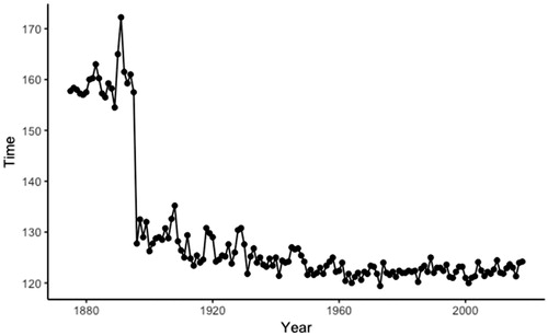
With a focus on predicting the winning time in a particular year, students first examine a scatterplot of the winning times versus year. They immediately notice a large gap in the times (). This is easily explained by the track length changing in 1896 from 12 furlongs (1.5 miles) to 10 furlongs (1.25 miles). Students can focus on the distribution of winning times in more recent years (which have been surprisingly stable, especially if we focus only on the fast track conditions). This can be contrasted with other events (e.g., Olympic sports) where records continue to be set, though often due to changes in venue and equipment.
Fig. 1 Timeplot of winning time of Kentucky Derby (through 2018).
Students can also be asked to create a new variable that computes the winning horse speeds, adjusting for the change in track length.
TEACHING TIP: See whether students can data sleuth and conjecture the explanation before you tell them about the change in track length (have them explore the data on their own, have them search online about the race). Deriving the formula for speed will be nontrivial for many students. Students can also use Excel to convert the times separately before and after 1896. Students should be able to confirm that the resulting values make sense in context (e.g., around 35 miles per hour). You can also provide students with the formula but ask them to explain why it works.
You can also ask students to compare the speeds before and after the track length change to determine whether the track length appears to impact speed. Students need to be aware of the confounding between year and track length through the remainder of the analyses. This analysis could point to deleting the years before the track change from the dataset instead.
For 2019, you could debate including the time of the fastest horse (later disqualified) or the time of the winning horse.
4 Initial Explorations
Students can be asked to subset the data after the change in track length and compare the distribution of winning times to the claim of the “Most Exciting Two Minutes in Sports.” They can also be asked to conjecture reasons for the variability in winning times from year to year, even after subsetting to the same track length.
TEACHING TIP: A one-sample t-test (H0:) using the times after 1896 is actually highly significant as only two horses have finished in under two minutes (Secretariat in 1970 and Monarchos 2001). The questionable validity of such a test on census data could lead to a discussion of population versus process—does the p-value still measure the strength of evidence against this type of data occurring by chance alone from a random process?
One variable students have access to is “track condition” as announced by the race organizers at the time of the race. There are currently over seven different track conditions, so students can also be asked to recode these as “fast,” “good,” and “slow.” Simple graphical explorations show that the winning speeds are related to these track conditions in the expected ways, but students might already begin to question the unequal sample sizes of these groups (see Section 7).
TEACHING TIP: Consider giving students the opportunity have their own opinions on how to recode the data! (I have put “dusty” in the “good” category, but most of the other categories were grouped into “slow.”)
POTENTIAL PITFALL: If this is a homework assignment and you want students to all produce the same output, then be prescriptive in telling them how to create the categories and be ready to tell students how many races they should have in each category to check their work before they continue their analysis.
Another variable students have access to the surface of the track. You can ask students to consider whether surface is likely to be a useful variable in predicting speed, but preliminary exploration of the data reveals that at Churchill Downs that has always been dirt. Not only will the analysis not run with a constant variable with SD = 0, they should be reminded from earlier class discussion how standard errors of slopes have more precision for variables with more variation. They can consider the benefits of gathering data for more surfaces, with the drawback of losing the homogeneity of a single track. An extreme example, but also important to remind students to examine a variable before blindly adding to the model. I also sometimes ask students the obvious question of whether these data can be used to predict performance on a different type of surface.
The Sleuth data includes number of starters and students can investigate whether the number of horses in the race affects the winning speed. Another variable is pole position. Students may be interested in exploring the distribution of the pole positions of the winners. Another interesting question is how to take into account the number of starters in this comparison.
In the full dataset, even after adjusting for track length, there is a notable outlier, the 1891 race won by Kingman. Students can do some sleuthing, but other than the jockey being the only black jockey that year and possible collusion by the other jockeys to slow down the race, there are not good explanations for this record slow winning time (Churchill Downs Incorporated Citation2018).
TEACHING TIP: In the regression models discussed below, the 1891 race does stand out as having a large Cook’s Distance compared to the other races, but smaller than 0.50, one of the commonly suggested cut-offs. Students can also perform a test of significance using the studentized residual for the outlier, highly significant even after a Bonferonni adjustment. Students can be asked to explain why the Cook’s D value is not especially large when the winning speed is so unusual. It turns out that there is not enough leverage for the observation to be largely influential.
5 Simple Linear Regression
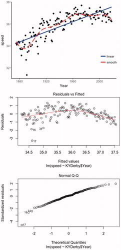
Once the response variable of speed has been created, students clearly see that the relationship between speed and year is curved and/or reaching limiting behavior and students can provide explanations for that behavior ().
Fig. 2 Graph of speed versus year with LOESS smoother and residual plots from linear model.
TEACHING TIP: This is a good use of a smoother to see the form of the association as well.
If a linear model is used, residual plots () easily show the curvature as well, but also some evidence of decreasing variation in the residuals over time. The normal probability plot of the residuals is reasonably linear, though a test of normality will provide a small p-value (in large part due to the outlier).
TEACHING TIP: Students can be reminded that although residual plots help identify an issue, they are not always helpful in pointing to a specific choice of remedy.
Students can consider whether a transformation on speed or time is likely to be successful. In particular, a transformation on the response variable could remedy all three violations. One observation is that neither variable shows a change in magnitude (e.g., the largest year is not more than 5 times larger than the smallest year).
POTENTIAL PITFALL: Another model assumption to consider is the independence of the observations. This is time series data. Not accounting for autocorrelation can lead to biased estimators and standard errors, resulting in model misspecification. I actually ignore this assumption when I use this data in my introductory and secondary course for nonmajors.
6 Polynomial Regression (With Centering) and Transformations (With Shifting)
A quadratic model actually fits the data reasonably well () and both the linear and quadratic terms are significant. The best feature is asking students to conjecture why the times would increase at a decreasing rate as represented by a positive coefficient on year and a negative coefficient on year2. Perhaps changes in technology have improved speeds but at a decreasing rate due to a physical limit of performance.
Fig. 3 Graph of speed versus year and quadratic models of speed versus year and versus year – mean(year).
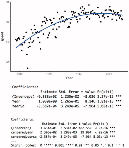
TEACHING TIP: Ask students to use the equation to make several predictions at different years, and see how the predicted increase in speed is decreasing as the year2 term begins to dominate.
However, students will be able to point out a weakness in the quadratic model assuming that this trend will continue (i.e., predicting winning times to eventually decrease). Students can also be asked to interpret the intercept of the equation and how it is too much of an extrapolation for these data to be meaningful.
The polynomial model has large variance inflation factors indicating a strong correlation between year and year2, so this provides a good opportunity to discuss how centering variables can remove that multicollinearity (and reduce the standard error of the year slope coefficient) as well as provide a more meaningful intercept.
TEACHING TIP: Although students can immediately understand why the multicollinearity is high between year and year2, it is more difficult to help them see why it is not between centered_year and centered_year2. Have them create the scatterplots of the two pairs of variables and think about how it is linear association that’s problematic, not merely association, when fitting the response surface.
HELPFUL HINT: Some software packages (e.g., JMP) will automatically center the quadratic term but not the linear term. This makes interpretation of the intercept difficult. So I usually have the students first center the variable. Make sure students center the variable (or standardize) before squaring, rather than squaring and then centering.
In order for a log transformation to work well, the data should first be shifted (to have more change in magnitude in the variable and so the “curve” associated with the log function will match appropriately the location of the curve in the data). Students can subtract 1874 from each year and then compare the performance of the model of speed versus log(year - 1874) to the quadratic model (). The graphs will not provide a clear “winner” between the two models but students can be asked to think about the curved relationship vs. limiting function, especially in predicting future observations.
Fig. 4 Linear, quadratic, and shifted log transformation of speed versus year - 1874.
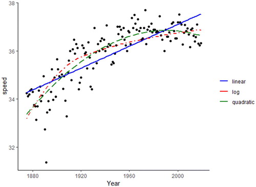
TEACHING TIP: Students can compare R2 and s between the models as we have transformed the explanatory variable rather than the response variable. (Other fit measures such as AIC, BIC, and PRESS can also be compared.) Have students practice interpreting the slope and the intercept with this shift and log transformation. The residual plots do look much better for the quadratic model.
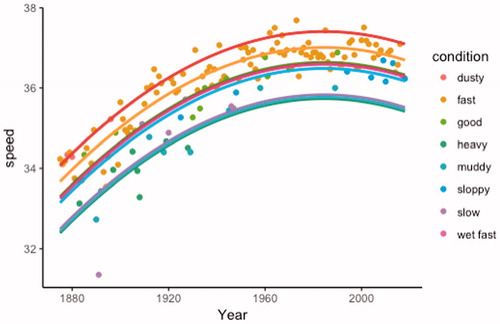
7 Categorical Predictors
A scatterplot of the winning speeds versus year, coded by track condition (perhaps after recoding some of the categories), provides a nice visual display that makes sense to students (). It is also informative to have students overlay the model for each track condition and to think about the relative distances between the speed predicted in a year for each condition (e.g., good and fast are more similar to each other than slow, but there hasn’t been a slow track since 1947).
Fig. 5 Quadratic model with separate fits for each track condition.
POTENTIAL PITFALL: Creating a visual like is trivial in some computer packages but will require careful instruction in others.
Students can also be asked to think about how the model is assuming the same relationship for each track condition, even the track conditions with only a few observations. We are able to make predictions for those rare track conditions, as long as we are willing to make that assumption.
This is good practice for interpreting regression coefficients from effect or indicator parameterization and comparing the different p-values. This is a good use of a partial F-test for assessing the significance of the track condition variable, after adjusting for the year of the race. Students can compare the performance of this test before and after recoding the track condition to a smaller number of categories (and consider the “cost” of the extra degrees of freedom with more conditions).
POTENTIAL PITFALL: Many software packages now allow you to include a categorical variable directly, without needing to create indicator variables. However, students will often struggle for a while in making sense of the different parameterizations (e.g., 0–1 coding with a reference group vs. –1/1 coding reporting of the effects).
Students can also explore the nature of an interaction between track condition and year. The interaction is statistically significant (another good partial F test example), and students can describe how the “effect” of track condition is narrowing over time, especially for the slow condition.
TEACHING TIP: Here it would be appropriate to compare the R2 values (for example) across the models with different codings for track conditions, but also caution your students on overfitting the data.
POTENTIAL PITFALL: I have usually found this context of sufficient interest to students that they don’t mind repeated looks at the same data (about 10% of my regression students will list this context as their favorite of all the data examples we look at in the course, third to sports data and the Donner Party), but it is important not to overdo this.
8 Prediction Intervals
Students can be asked to predict the winning speed for the next year’s race, though students should also realize that this prediction is not very helpful in predicting the actual winner! Students can be asked to do this for different track conditions (which won’t be known very far in advance) to compare the results. They will also notice that 95% and 99% prediction intervals include all the recent races and falling inside this prediction interval is not particularly impressive. After the race is run, students can compare their predictions to the actual outcome (converted to speed).
TEACHING TIP: Ask students to reconsider the residual plots and model assumptions (e.g., normality) before paying too much attention to these prediction intervals. Students can also compare the performance of the model with and without the race from 1891.
It should be pointed out that there are still some issues with the model assumptions, namely the heterogeneity in the residuals over time. Students can be asked to consider what impact this has on their predictions, for example, perhaps giving wider intervals for the more recent years than necessary. They can also be reminded that, for a confidence interval of the average time, the normality issue is less of a concern when the sample size is large, whereas normality of the population is still a requirement for validity of the prediction interval.
Again the issue can be raised that although this model explains a lot of the variation since the first running of the race, there is still a relatively large amount of unexplained variation in the past decade that these models are not sensitive to. Students can also consider which years are most informative in building this prediction interval; should we look at all races, races with a certain number of starters, or races in the most recent years? Students can use the prediction interval to decide whether Secretariat’s record speed (1:592/5, 1973) is considered an outlier.
9 Conclusions
Over this series of small explorations students have witnessed, in a genuine context, several important modeling principles, including:
The need for preliminary examination of the data and data preprocessing steps such as re-expressing variables and eliminating variables with too little variation.
Awareness of model assumptions (e.g., speed is not related to track length, using the same model across track conditions with fewer, older observations).
Consideration of multiple strategies for modeling nonlinear data, strengths and weakness of each approach, and how to interpret those models in context:
The ability of a quadratic model to “turn” with the data, though also consideration of how an ultimately decreasing trend may not make sense in context.
The ability for transformations to simplify relationships, especially for variables that change by an order of magnitude, and the ability of a shift in the data to improve the fit of the model.
The ability of power transformations for monotonic data to provide a model of observations approaching a limit and when that could make sense in context.
A reminder that not all behavior can be easily described by a simple mathematical model.
Advantages of centering or standardizing variables to improve the fit of a model (reduce multicollinearity in polynomial models) and the interpretability of a model.
Use of categorical variables, including considering issues associated with choice of number of categories, and assumptions in parallel curves model.
Consideration of an outlier and its impact on the model.
Consideration of violations in model assumptions, why they are more critical in some situations than others, and the impact on the conclusions drawn from the model.
Consideration of subsetting the data to utilize data of most relevance to a particular prediction (sometimes using all the data is not the best strategy).
Application, interpretation (including with transformations), and critique of prediction intervals in this context. Ability to compare predictions to subsequent real-world outcomes.
Different elements can be selected and perhaps even expanded upon depending on the particular course content being covered. For example, in a data science course, students can design a scraping algorithm to extract the data from the website directly. Or in a time series course, students could consider the implications of using “time” as the independent variable and explore the statistically significant autocorrelation.
Name: KYDerby17.txt (tab delimited)
Type: Census data on all runnings of the Kentucky Derby
Size: 143 observations, 5 variables
Year = year of race (1875–2017)
Winner = First place winner (Horse name)
Surface = surface of track (always dirt for this venue)
Condition = rating of condition of track at start of race
Starters = number of horses lined up at the start of the race (including last minute scratches in many cases and horses that did not finish)
PolePosition = the winning horse’s starting gate
Time = winning time of the race (sec)
Speed = speed of the winning horse (miles per hour)
Supplemental Material
Download Zip (4.7 KB)References
- Churchill Downs Incorporated (2018), “1891,” available at https://www.kentuckyderby.com/history/year/1891.
- Meyer, M., and Sen, B. (2017), “DoubleCone: Test Against Parametric Regression Function,” R Package Version 1.1, available at https://CRAN.R-project.org/package=DoubleCone.
- Raceday 360 (2015), “Kentucky Derby Winners—1875—Current: All Data,” available at https://docs.google.com/spreadsheets/d/1glkkoJip82ZrejP8Qn6drkmgbHhRbvPOQJWLZ\_KnIrc/pubhtml.
- Ramsey, F., and Schafer, D. (2013), The Statistical Sleuth: A Course in Methods of Data Analysis (3rd ed.), Boston, MA: Brooks/Cole, Cengage Learning.
- Data Sources
- Wikipedia provides a page summarizing each year’s race https://en.wikipedia.org/wiki/Kentucky_Derby
- The Kentucky Derby website maintains a lot of statistics, but are sometimes hidden. Currently, you can access the charts for results table for each year in the following url: https://www.kentuckyderby.com/media/reference
- For example, https://www.kentuckyderby.com/uploads/wysiwyg/files/2016/02/u10/DERBY_CHARTS_1885-1918.pdf
- Some students appreciate viewing the original data source like this. Some can write a scraping algorithm to loop through the pages.
- Data on the pole positions were confirmed at this site: https://www.kentuckyderby.com/uploads/wysiwyg/assets/uploads/Post_Positions__Kentucky_Derby__2018__1.pdf
Appendix
Sample Class Examples
Example 2
The Kentucky Derby is a horserace held annually, the first Saturday of May, at Churchill Downs in Louisville, KY. The file KYDerby11.xls gives the winning times (in seconds) of the Kentucky Derby from 1875 – 2009 (kentuckyderby.info).
(a) Plot the winning times vs. year. What is the overall pattern? Why does this make sense?
(b) Do you notice any unusual features? Can you suggest an explanation? What would you suggest as the next step in modeling these data?
(c) In 1896, the race changed from 1.50 miles to 1.25 miles. Create (and name!) a new variable that reports the speed of the winning horse:
MTB > set c5
DATA > 21(1.5) 116(1.25)
DATA > end
(feet per second)
(feet per second)
(d) Plot speed vs. year. What is the overall pattern? Any unusual observations? Is it linear? Is it monotonic? Are there any outliers or unusual observations to investigate?
(e) What step would you suggest next in modellingmodeling this relationship? What are some reasons this may not work?
A special case of multiple regression is inclusion on polynomial terms (Section 5.1.3). A quadratic (second-order) model has the form: . Note this is still considered a linear model!
(f) Create a new variable: year2 and regress speed on year and year2. Record the R2 value and s. Is the overall regression model significant? Is the quadratic term significant? The linear term? Lack of Fit Test? Residual plots? Variance Inflation Factors?
(g) Why is it not surprising to have such large values for the VIFs?
One strategy for dealing with multicollinearity with polynomial terms is standardizing (even just centering).
(h) Fit the regression model with the standardized variables. Examine the variance inflation factors. What is the correlation coefficient of these new variables?
(i) Provide an interpretation of the intercept in the above model.
(j) What are the signs of the two regression coefficients? Explain what this means about the behavior of the model. [Hint: What happens for larger values of year?] In particular, how does the behavior differ from how a transformably linear model (one we could have linearized with a transformation) could behave? Does this behavior make sense in this context?
(k) If , write out the two equations for
, with x and
, what is the difference in the two
values? Is it constant? How do we interpret the “effect” of increasing x by 1?
Example 3
Consider the winning times (in seconds) of the Kentucky Derby from 1875–2014 (http://www.kentuckyderby.com/)
(a) What is the overall pattern in these times over the years? Why does this make sense?
(b) Do you notice any unusual features? What step would you suggest next in modeling these data?
(c) From KYDerby14Cleaned.xls, plot speed vs. year. What is the overall pattern? Any unusual observations? Is it linear? Is it monotonic? Are there any outliers or unusual observations to investigate?
(d) What step would you suggest next in modellingmodeling this relationship? What are some reasons this may not work?
(e) Fit the quadratic model, how would you interpret the intercept?
(f) What are the signs of the two regression coefficients? Explain what this mean about the behavior of the model. [Hint: What happens for larger values of year?] In particular, how does the behavior differ from how a transformably linear model (one we could have linearized with a transformation) could behave? Does this behavior make sense in this context?
(g) Use this model to predict the winning time for 2015, with 95% confidence. Be sure it is clear how you/the computer are doing so.
Sample Homework Problems
9 HW 2 Problem
The KYDerby16.txt file contains information on the 142 Kentucky Derby races held on the first Saturday of May every year since 1875. The race is known as the “Most Exciting Two Minutes in Sports,” and is the first leg of racing’s Triple Crown.
(a) Produce (and include) a scatterplot of the winning time (in seconds) vs. year. What is the overall pattern in these times over the years? Why does this make sense in this context?
(b) The Derby was first run at a distance of 1.5 miles but in 1896 the distance changed to its current 1.25 miles (2 km). Create a new variable that calculates the horses’ speeds, taking into consideration track length. (Save your file!)
JMP: Use the formula editor (see next line)
Explain why this formula works. What are the measurement units of speed here? [Hint: Roughly how fast does a racehorse run?]
(c) A polynomial regression model includes type terms in the model, e.g.,
Explain why this is still considered a “linear” model!
(d) Fit a quadratic model to predict speed from year and year2. How much of the variation in speeds is explained by the year?
JMP: I would use year and then cross year with year to create the year2 term.
R: I would create a new variable: year*year and add that to the lm
(e) Use the model from (d) to predict the winning speed in 2017, with 99% confidence.
(f) There is one unusual observation in the dataset but there is no good explanation for removing this observation. Is this race influential in this model?
Return to the (cleaned) Kentucky Derby data set.
(a) Fit a quadratic model to predict speed from year and year2 and track condition. How much of the variation in speeds is explained by the track condition, after adjusting for the year? (Include appropriate calculations.)
(b) Is the track condition factor statistically significant after adjusting for year? (Include a detailed statement of the null and alternative hypothesis, test statistic, degrees of freedom, p-value, and conclusion.)
Hint: In JMP, see the “Effect Tests” output.
There are difficulties with using so many track conditions, e.g., some only have a few observations, it takes more degrees of freedom, and some of these descriptors aren’t really used any more. So let’s group some of the categories together.
JMP: Highlight the column and select Cols > Utilities > Recode
Report the number of observations in each of the three categories.
(c) Refit the model using the simplified track condition variable. Compare the adjusted R2 of the two models, does this simplified model perform about as well as the more complicated model? Be sure to look at the fitted line plot. Interpret the three condition coefficients and why they make sense in this context.
(d) (d) Use the model from (c) to predict the winning speed in 2017 on a fast track, with 99% confidence. How does it compare to your interval from problem 1? (Discuss both the midpoint and the width.)
(e) (e) Now fit a model that includes interaction terms between Year and condition. Interpret the signs of the two interaction terms. What do they imply in this context? Would it be reasonable to remove both interaction terms from the model, or are we convinced at least one” population” slope is not zero? (State appropriate null and alternative hypotheses, one test statistic, df, p-value, and state your conclusion in context.)
HW 3 Problem
The dataset KYDerby16.txt contains information on each running of the Kentucky Derby since 1875. The speeds of the winning horses have been calculated (taking into account the change in track length in 1896).
(a) Produce a scatterplot of speed vs. year with a smoother. Fit a linear model and examine the residual plots. Use the residual plots (being clear how you are doing so) to evaluate the linearity, equal variance, and normality assumptions of the linear model.
(b) I suggest transforming the explanatory variable rather than the response variable here. Why?
(c) Does the power transformation ladder suggest increasing or decreasing the power of the explanatory variable?
(d) In this case, the largest x is not more than 5 times larger than the smallest x. To improve the performance of the power transformation, we can first subtract off a “starter” value. Create a new variable that is year – 1874 (still keeping all the values positive).
(e) Fit the regression model to predict speed from log10(year-1874) and include a graph showing the fitted model on the scatterplot. Also examine the residual plots. Does this model appear to be valid? Provide an interpretation of the intercept.
(f) Alternatively we could try a quadratic model. Explain what feature to the relationship a quadratic model would allow that the power transformation does not. (This might be easier to answer after you answer question g.) Does this feature make sense in this context?
(g) We will see later that one way to “improve” a quadratic model is to center the variables first. Create two new columns year-mean(year) and [year-mean(year)]2.
(h) Fit the quadratic model (speed regressed on centered year and centered year
and include a graph showing the fitted model on the scatterplot. Might need to get creative here, one option in JMP is to go back to Fit Y by X have it fit the quadratic model of speed on centered year. Also examine the residual plots. Does this model appear to be valid? Provide an interpretation of the intercept.
(i) Which of these two models would you recommend and why?
(j) For the model selected in (i), predict the winning speed for this year’s race, with 95% confidence. Be sure to explain how you find the interval. Do you consider this interval valid for these data?
(k) For the model selected in (i), determine the studentized residual for the outlier. Compare this value to a t distribution with 142-3 degrees of freedom, using the Bonferroni adjustment. Do you consider it a statistically significant outlier?
JMP users: You can calculate the real studentized residual from the standardized residual (, that JMP calls the Studentized residual, using the following formula
[Normally we would investigate the outlier, but I haven’t been able to find much reason for the super slow times other than possible collusion due to the ethnicity of the favored jockey…]
(I) Do you consider the observation in (k) influential to this model? Provide appropriate statistical justification/output.
HW 5 Problem
Reconsider the cleaned Kentucky Derby data (KYDerby16cleaned.txt)
(a) Run the regression model predicting speed from year and year2. (Make sure neither variable is centered.) Interpret the sign of the coefficient of year2: what is the predicted change in speed between 1870 and 1871? What is the predicted change in speed between 2000 and 2001?
(b) Analyze the residuals, do they indicate any problems with the model?
(c) Is there evidence of multicollinearity?
(d) Now center year and use that in the quadratic model (predicting speed from centered.year and centered.year
. Is there still evidence of multicollinearity?
(e) Add centered.year3 to the model. Is it a statistically significant addition? What about then adding centered.year4? Why don’t we just keep going?
HW 5 Problem
Now consider the variable for the condition of the track, coded as slow, good, and fast. (The original condition variable had 7 categories, several with only 2 or 3 observations. For example Cols > Utilities > Recode in JMP.)
(a) Examine a labeled scatterplot of speed vs. year, using the condition variable. Based on the scatterplot alone, does there seem to be any differences in speed due to the track conditions? Describe.
(b) Run the regression model (predicting speed from centered.year and centered.year
that includes the condition variable.
Write out the three regression equations being produced.
Create a visual that shows the three equations superimposed on the scatterplot.
(c) Using the model in (b), estimate, with 95% confidence, the winning speed for this year’s race on a slow track. Do we capture the actual speed? (Cite your sources!)
(d) Using the model in (b), what is the estimated difference, with 95% confidence, in average speed between fast and slow tracks, after adjusting for year.
(e) Determine whether condition is a statistically significant predictor of winning speed after adjusting for year. State hypotheses, determine the test statistic, df, p-value, and state your conclusions.
(f) Now add an interaction between condition and year.
Interpret the signs of the coefficients on the interaction terms. Do they make sense in context? Explain.
Carry out a test of significance on the interaction. State hypotheses, determine the test statistic, df, p-value, and state your conclusions in context.