
 ?Mathematical formulae have been encoded as MathML and are displayed in this HTML version using MathJax in order to improve their display. Uncheck the box to turn MathJax off. This feature requires Javascript. Click on a formula to zoom.
Abstract
We performed an empirical study of the perceived quality of scientific graphics produced by beginning R users in two plotting systems: the base graphics package (“base R”) and the ggplot2 add-on package. In our experiment, students taking a data science course on the Coursera platform were randomized to complete identical plotting exercises using either base R or ggplot2. This exercise involved creating two plots: one bivariate scatterplot and one plot of a multivariate relationship that necessitated using color or panels. Students evaluated their peers on visual characteristics key to clear scientific communication, including plot clarity and sufficient labeling. We observed that graphics created with the two systems rated similarly on many characteristics. However, ggplot2 graphics were generally perceived by students to be slightly more clear overall with respect to presentation of a scientific relationship. This increase was more pronounced for the multivariate relationship. Through expert analysis of submissions, we also find that certain concrete plot features (e.g., trend lines, axis labels, legends, panels, and color) tend to be used more commonly in one system than the other. These observations may help educators emphasize the use of certain plot features targeted to correct common student mistakes. Supplementary materials for this article are available online.
1 Introduction
The R programming language is one of the most popular means of introducing computing into data science, data analytics, and statistics curricula (Çetinkaya-Rundel and Rundel Citation2018). An advantage of the R ecosystem is the powerful set of add-on packages that can be used to perform a range of tasks from experimental design (Groemping Citation2018), to data cleaning (Grolemund and Wickham Citation2017; Ross, Wickham, and Robinson Citation2017), to visualization (Wickham Citation2009), and modeling or machine learning (Kuhn Citation2008).
While these packages make it possible for users of R to accomplish a wide range of tasks, it also means there are often multiple workflows for accomplishing the same data analytic goal. These competing workflows often lead to strong opinions and debates in the literature, on social media, and on blogs (e.g., (Mejia Citation2013; Hejazi Citation2016; Leek 2016; Robinson Citation2016; Yau Citation2016)). One of the commonly debated aspects of data science education within the R community is the plotting system used to introduce students to statistical graphics. The GAISE report states that a primary goal of introductory classes is that students “should be able to produce graphical displays and numerical summaries and interpret what graphs do and do not reveal” (GAISE College Report ASA Revision Committee Citation2016). The challenge then becomes finding the graphics system that best facilitates this goal. Generally, the two main systems under consideration are the base graphics package in R (called “base R”) and the ggplot2 graphics package, which is based on the grammar of graphics (Wickham Citation2009). The grammar of graphics is a syntactical framework designed to clearly and concisely describe essential visual features of a graphic, such as points, lines, colors, and axes. The hope with such a grammar is that the syntax needed to produce a plot feels more natural, like spoken language.
There has been some online and informal debate about the general strengths and weaknesses of these two systems for both research and teaching (Leek 2016; Robinson Citation2016). Generally, proponents of the ggplot2 system cite the harmonization of the tidy data mindset (rows are observations and columns are variables) with ggplot2 syntax for mapping between variables and visual plot elements. They also appeal to the modular nature of the syntax that gives rise to the ability to build plots in layers. Proponents of the base R system cite its power to create nearly any imaginable graphic by acting on individual plot elements such as points and lines. Although this makes base R very flexible, this also means that the syntax can be daunting for beginner R students. Making plots in the base R system also increases exposure to for-loops (and related ideas), which can be helpful specifically to students during their data science training. It is important to note that these aspects of the two plotting systems are general opinions and not based on formal scientific assessments (Leek 2016; Robinson Citation2016).
Beyond discussions of the general strengths and weaknesses of the two systems, there have been conversations surrounding the systems’ advantages and disadvantages for specifically teaching beginner analysts (Robinson Citation2014). Robinson cites that legend creation in ggplot2 is automatic and that faceting in ggplot2 creates subplots without the need to use for-loops. Both of these features allow beginner students to focus on the primary goal of using graphics to communicate about data. In a related vein, there has also been a surge in the creation of resources that focus on ggplot2, and more broadly, the encompassing tidyverse framework (Grolemund and Wickham Citation2017). The Modern Dive open-source introductory textbook for data science education with R is one such example (Ismay and Kim Citation2017). Ross, Wickham, and Robinson (Citation2017) describe a full data analytic workflow in this framework. We note these examples to emphasize that despite the growing ease of teaching graphics with ggplot2, it is still worth investigating how the base R plotting system would compare in terms of what students are able to learn and produce.
Ideally, pedagogical choices should be informed by formal comparisons of the two systems, but the community has collected relatively little information about the way that the base R and ggplot2 plotting systems are used in the hands of end-users beyond informal observations and word-of-mouth discussion. One study examined student experiences when using base R and ggplot2 in the classroom (Stander and Dalla Valle Citation2017). In this investigation, Stander and Dalla Valle provide instruction in both plotting systems for a class exercise. The authors focus on reporting broad qualitative observations about students’ submitted work and student feedback about how the activity helped them learn. However, they do not report on comparisons of the two plotting systems because they espoused the view presented in Robinson (Citation2014) that “it is better to focus on ggplot2 because it provides a more structured and intuitive way of thinking about data.” We feel that the outcomes reported in this study are a step in the right direction toward building a formal evidence base for pedagogical choices regarding data graphics, but we also believe that a formal comparison of these two popular plotting systems is needed. This is the objective of this work.
Plotting systems differ in many respects, but the primary difference is the syntax that is used to create different visual elements. Because our main interest was in pedagogy surrounding statistical computing, we wanted to focus the comparison on graphics features that are essential to effective scientific communication. Such features include creating the appropriate plot type to answer scientific questions and ensuring that the plot is sufficiently labeled to be a standalone figure (Leek Citation2015). In our opinion, these features are essential for beginner analysts who are learning how to communicate about data using scientific graphs.
To this end, we seek to better understand how plots created by introductory students using the base R and ggplot2 systems differ in how they are displayed and how they are perceived by peer student-raters. We study this in a group of students in an introductory Coursera course on Reproducible Research. Specifically, we report results from a randomized experiment in which students were randomized to complete identical plotting exercises in either the base R or the ggplot2 system. Students were then asked to evaluate plots from their peers in terms of visual characteristics key to effective scientific communication.
2 Methods
We ran a randomized experiment from July 2016 to September 2017 within the Reproducible Research course in the Johns Hopkins Data Science Specialization on Coursera. Previously, the Coursera platform placed students in cohorts where courses started and ended on specific dates. Currently, it uses an open-enrollment, on-demand system in which students can enroll in the courses anytime they choose. Our experiment spanned about a one year window of this system. This online course covers the basics of RMarkdown, literate programming, and the principles of reproducible research. The course that precedes the Reproducible Research course is Exploratory Data Analysis (EDA). EDA covers data visualization with both the base R and ggplot2 systems as well as other tools for data exploration (e.g., clustering). In the last week of the EDA course, students practice their technical skills with data case studies. After completing EDA, students should be comfortable making plots in both the base R and ggplot2 systems and in analyzing the effectiveness of a plot for answering a given scientific question. Since the launch of Reproducible Research, 187,617 students have enrolled, from which 29,534 have completed the course. Demographic information summaries are available in . This demographic information is specific to this offering of the Reproducible Research course on Coursera, but it is not necessarily specific to the students who participated in the experiment. For privacy reasons, we could not link demographic information to students who participated in our experiment.
Table 1 Student demographics in the Reproducible Research course.
About midway through the material for the Reproducible Research course, students had the option of completing a nongraded, peer-evaluated assignment to practice the plotting skills they learned in the previous EDA course. Students saw a statement about the assignment and its use for research. The statement communicated the nongraded, purely optional nature of the assignment and relevant privacy information about what data would be reported. Students who consented to take part in the experiment could proceed to view the assignment, and students who did not consent could skip over the assignment and continue with the other parts of the course. We received International Review Board (IRB) approval to conduct this experiment.
The assignment involved the creation of two plots: one showing the relationship between two quantitative variables and one showing how this relationship varied across strata of two categorical variables. The data given to the students contained information on medical charges and insurance payments, which were the two quantitative variables. The data also contained information on 6 states and 6 medical conditions. These were the two categorical variables that students were to use in the second plot. In total, there are 36 state-medical condition combinations. The first plot will be referred to as the “simple” plot, and the second will be referred to as the “complex” plot.
The Coursera platform allowed us to randomize two versions of this peer-evaluated assignment across students. Students were randomly assigned to the base R arm or the ggplot2 arm prior to the assignment. After the randomization had already taken place, they were able to consent or decline to take part in the experiment. The assignment is shown below for the base R arm:
To practice the plotting techniques you have learned so far, you will be making a graphic that explores relationships between variables. You will be looking at a subset of a United States medical expenditures dataset with information on costs for different medical conditions and in different areas of the country.
You should do the following:
Make a plot that answers the question: what is the relationship between mean covered charges (Average.Covered.Charges) and mean total payments (Average.Total.Payments) in New York?
Make a plot (possibly multi-panel) that answers the question: how does the relationship between mean covered charges (Average.Covered.Charges) and mean total payments (Average.Total.Payments) vary by medical condition (DRG.Definition) and the state in which care was received (Provider.State)?
Use only the base graphics system to make your figure. Please submit to the peer assessment two PDF files, one for each of the two plots. You will be graded on whether you answered the questions and a number of features describing the clarity of the plots including axis labels, figure legends, figure captions, and plots. For guidelines on how to create production quality plots see Chapter 10 of the Elements of Data Analytic Style.
In the ggplot2 arm of the experiment, students instead saw the sentence: Use only the ggplot2 graphics system to make your figure. shows sample submissions for both arms of the study and both the simple and complex questions. We emphasize that as part of the assignment prompt, we tell students how their plots will be evaluated (“You will be graded on whether you…” in the assignment text above) so that students in both arms had opportunities to specifically work on these aspects of their plots. We also point them to a resource from a previous course in the specialization that discusses precisely these points. Thus, differences between arms are not attributable to a lack of awareness about assessment criteria but more so to students’ skill with the two plotting systems.
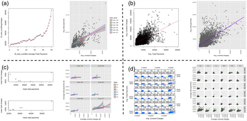
Fig. 1 Sample student submissions. The top panels show example student submissions for the simple plot that are of low (a) and high (b) quality. The bottom panels show example submissions for the complex plot that are of low (c) and high (d) quality. The left-hand plots in each section were made in base R, and the right-hand plots were made in ggplot2. For privacy reasons, none of these figures were made by students. These figures are recreations that show general types of figures that were commonly made by students.
After completing the assignment, students were asked to review one or more assignments from their peers via an online form through the Coursera platform. Students reviewed other students’ assignments that used the same plotting system. The structure of this peer review is due to the functionality available within Coursera. The course platform only allowed students to review plots of other students who used the same plotting system, and we were not in control of how plot submissions were assigned to students for review. The review rubric is shown in . For the question, “Did they upload a plot?,” we provided three response choices for the simple plot to determine if the student uploaded a plot using the correct plotting system. Because the peer review rubric starts with the evaluation of the simple plot, we operated under the assumption that this compliance status also applied to the complex plot. For this reason, there are only two answer choices for this question for the complex plot. The rationale for the rubric questions comes from our desire to understand students’ expository graphics skills. In our opinion, the relevant features of effective plots for communication purposes include creating the appropriate plot type to answer scientific questions and creating clear labels. These features are discussed in The Elements of Data Analytic Style (Leek Citation2015), a book referenced in the plotting assignment text shown to the students and which also informs instruction in a previous Coursera course, EDA.
Table 2 Peer review rubric.
In addition to analyzing student responses to the peer review rubric, for each plot in a random sample of n = 60 submissions three experts’ responses to the rubric were analyzed and compared. To complement information from the peer review responses, we also annotated all submitted plots by examining specific plot features detailed in . For each of these features we viewed each submitted plot and manually coded the presence or absence of the feature. These features were determined after manual inspection of a large number of plots as being primary sources of variation among submitted plots. We also expected these features to relate to perceptions of clarity. As part of our analysis, we compared these annotated plot features to student perceptions of overall, standalone, and legend and label clarity from the peer review rubric.
Table 3 Annotated features of plots.
3 Results
In our presentation of results, we will first report information about the experiment’s participants and about sample sizes for different units of analysis (Section 3.1). Next we will present results for the seven rubric questions (Sections 3.2 and 3.3). Except for the first rubric question, these results come from student peer review rather than our expert analysis. After this, we will present a comparison of expert review and student review of submitted plots using the peer review rubric (Section 3.4). Finally, we will present the results of our expert manual annotation to give context to patterns observed in the peer review (Section 3.5).
3.1 Participants and Demographics
A total of 979 students participated in the trial: 412 in the base R arm and 567 in the ggplot2 arm. The universe population is calculated as everyone who took the Reproducible Research course during the period in which students were participating in the experiment. We calculated that 5055 individuals took the course during the same time span but chose not to respond to our questions. The percentage of students who participated in the experiment was 13.7% in the base R arm and 18.7% in the ggplot2 arm. Given the limited demographic data available, we find that 22.5% of respondents and 19.8% of nonrespondents are female. While 35.1% of respondents are from the United States, 42.5% of the nonrespondents are from the United States. Moreover, 65.8% of respondents, and 72.4% of nonrespondents are employed full time. In terms of educational attainment, we find that 17.1% of respondents and 10.7% of nonrespondents have a PhD; 42.7% of respondents and 46.6% of non-respondents have a Master’s degree; and 32.2% of respondents and 33.7% of nonrespondents have a Bachelor’s degree.
Among these students, there was a 100% response rate for all items on the review rubric. Each student was required to review the submission of one other student. Students who wished to review more submissions were able to do so. In the base R arm, the number of submissions reviewed by a student ranged from 1 to 34, with a mean of 3.3 and a median of 3. In the ggplot2 arm, the number of submissions reviewed by a student ranged from 1 to 25, with a mean of 2.7 and a median of 2. There were 1267 total peer reviews in the base R arm and 1440 in the ggplot2 arm. In the following results, we remove peer review responses for which the reviewer answered “No” to the “Did they upload a plot?” question. This was done separately for the simple and complex plots because some students submitted one but not the other. After this removal 1246 simple and 1245 complex reviews remained in the base R arm, and 1428 simple and 1425 complex reviews remained in the ggplot2 arm. On average, a submission was reviewed by about three different student reviewers.
3.2 Analysis of Rate of Compliance
In this section, we present results on the first question of the peer review rubric. This question was intended to let us check whether students submitted plots that were made in their assigned plotting system. If, for example, a student in the base R arm submitted a plot made in ggplot2, this would be a noncompliant submission. Students scored the compliance of a submitted plot using the “Did they upload a plot?” question on the review rubric because there were two “Yes” options: one indicating a lack of compliance with assigned plotting system and the other indicating compliance. Although students scored compliance, we carried out the analysis of compliance using the expert reviews because we better trusted our judgment in determining whether a plot was made in base R or ggplot2.
Rates of compliance are shown in . A very small number of submitted files had broken links or were blank PDF files and were thus not annotated, so compliance rates are shown as a percentage of the plot submissions that could be annotated. A greater percentage of ggplot2 submissions were compliant as compared to base R submissions, and this difference was more pronounced for the complex plot. (Difference in proportions, 95% confidence interval. simple: 6.7%, 3.9–9.6%. complex: 12.2%, 8.7–15.7%.) The higher rate of compliance in the ggplot2 arm, particularly for the complex plot, was expected given the more concise syntax of the ggplot2 system. Students who reported that a submission was made in the opposite plotting system still evaluated the plot with the rest of the rubric.
Table 4 Compliance rates.
Students in the base R arm were more likely to be compliers for the simple plot and noncompliers for the complex plot. In the base R arm, 361 students submitted both the simple and complex plots, and 17 of them complied for the simple plot but switched to ggplot2 for the complex plot. In the ggplot2 arm, 519 students submitted both plots, and only 1 student complied for the simple plot and switched to base R for the complex plot.
3.3 Analysis of Plots by Student Peer Reviewers
In this section, we present results from the student peer review on evaluating the quality of visual characteristics in their peers’ scientific graphics. Peer review outcomes for all students are displayed in . Review outcomes for visual characteristics were similar between the base R and ggplot2 systems. For most characteristics, the systems differed by only a few percentage points, but positive plot qualities were more often seen in plots made in ggplot2. Further, positive qualities were more often seen in the simple plot than in the complex plot for both systems.
Table 5 Comparison of peer review responses in the base R and ggplot2 arms (all student submissions).
In terms of general aesthetics (“Is the plot visually pleasing?”), plots made in ggplot2 were slightly more highly viewed as visually pleasing, and this difference was more pronounced in the simple plot than in the complex plot (simple: 80.5% vs. 73.7%. complex: 60.6% vs. 59.5%).
Ratings of overall clarity (“Does the plot clearly show the relationship?”) were higher for figures made in ggplot2 for both the simple and complex plots, and the difference between the systems was larger for the complex plot (simple: 89.7% vs. 86.2%. complex: 83.6% vs. 72.3%). We also assessed plot clarity through the two questions: “Can the plot be understood without a figure caption?” (standalone clarity) and “Are the legends and labels sufficient to explain what the plot is showing?” (legend and label clarity). For these two questions, ggplot2 graphics were perceived to be more clear than base R graphics. These differences between the two systems were quite small for the simple plot (0.1% and 1.4%, respectively) and still small, but more pronounced for the complex plot (4.7% and 4.5%, respectively).
For both the simple and complex plots, there were only small differences in tendencies to use full words versus abbreviations between the two plotting systems. This is sensible given that users create the text of plot annotations in nearly the same way in both systems. For the complex plot, graphics made in ggplot2 less often had plot text and labels that were large enough to read. This may be due to the nature of text resizing when plotting with facets in ggplot2 and to a lack of instructional time spent on fine-tuning such visual aspects within the course.
We also examined peer review outcomes on the subset of students that complied with their assigned plotting system in case that selection biases related to compliance influenced the comparisons. We observed that results were almost identical to the results discussed above for the full set of reviews (supplementary materials).
3.4 Analysis of Plots by Expert Reviewers: Rubric Scoring
To better understand any biases and variability in the student peer review responses, three of the authors regraded a sample of submitted plots using the same peer review rubric that the students used. We will refer to this regrading as “expert grading.” We sampled 60 plots from each arm (base R and ggplot2), and within each arm, we randomly sampled 20 simple plots and 40 complex plots. We compared rubric responses among the three experts and also between the experts and students.
First, we assessed agreement among experts by computing the percentage of the 120 selected plots for which there was perfect agreement or disagreement among the experts for each rubric question on visual characteristics (, “Among experts” column). We determined perfect agreement or disagreement for a particular selected plot if all three answered positively (“Yes” or “Somewhat”) or if all three answered negatively (“No”). (The answer of “Somewhat” only applies to the “Is the plot visually appealing?” question.) The questions regarding standalone clarity and legend and label clarity had the lowest rates of perfect agreement (30% and 37.5%). The rate of perfect agreement for the overall clarity question was a little bit higher (57.5%) but still fairly low. The general aesthetics and full words questions had similar rates of perfect agreement (63.3% and 60%). The text size question had the highest rate of perfect agreement at 74.2%. This overall low rate of agreement among experts highlights subjectivity for most of the rubric, stemming from differing criteria used by individual reviewers. For the three clarity questions, in particular, the experts had different levels of stringency regarding titles, labels, and legends. For the text size question, the experts generally described consistent criteria about being able to see all labels naturally without needing to zoom in on the plot, which explains why this question had the highest level of agreement.
Table 6 Agreement in expert and student responses to the review rubric.
Next, we assessed agreement between experts and students. As in the within-expert analysis, for each plot submission and rubric question, we computed the percentage of students that answered positively to the question. We compared these percentages to the corresponding percentages among the experts. Across the 120 regraded plots, students more often reviewed plots positively than did experts. To more easily understand specific aspects of agreement or disagreement between experts and students, we used majority voting to categorize the percentage of positive responses for both groups. That is, if more than 50% of students answered positively to a rubric question for a particular submission, this was summarized as being a positive response for students as a group. If exactly 50% of students answered positively, this was summarized as being a split response. Finally, if fewer than 50% of students answered positively, this was summarized as being a negative response. The same was done for experts, but the split response was not possible because there were three experts. If the summarized responses of students and experts were either both positive or both negative, this was considered an agreement. Rates of agreement between students and experts were modest (, column “Between students and experts”). The agreement was highest for the general aesthetics and text size questions and lower for the other rubric questions, but for all questions, students and experts agreed for the majority of plot submissions.
3.5 Analysis of Plot Features by Expert Reviewers
Our manual annotation of the submitted plots allowed us to identify the presence or absence of specific plot characteristics that contributed to the students’ perceptions of clarity. The presence of each of these features was a desirable characteristic in a plot. For the results in this section, the base R plots are made up of any plot made in the base R system, regardless of the randomized group. The same applies to ggplot2 plots.
shows the percentage of base R and ggplot2 plots that had each annotated feature. Plots made in base R showed the raw data points in a scatterplot slightly more often than plots made in ggplot2. Axis labels on both axes were more common in ggplot2, particularly for the complex plot, but custom axis labels (typically more clear than the default variable names used as labels) were more common in base R plots. Trend lines were much more common in ggplot2 plots. Guidelines were uncommon overall but were slightly more often made in base R plots. Labeling of the trend and/or guidelines was overall uncommon but was more common in base R plots. Complex plots made in ggplot2 much more commonly had a legend than base R plots. Labels were much more often cutoff in ggplot2 plots, but this is likely explained by the fact that the full medical code labels (often several words long) were used. This is in contrast to base R plots, which tended only to use the medical code number, but which did not explain what the medical code number meant. Lastly, plots made in ggplot2 much more commonly had fixed x- and y-axis scales, which is sensible given that this is the default plotting behavior.
Table 7 Presence of plot features in student submissions.
In addition to analyzing how common each feature was, we also examined the relationship between the presence of plot features and student-perceived clarity (). For every feature, we estimated the following two conditional probabilities for both the simple and complex plots: in blue and
in red. The event “perceived as clear” was determined from student review responses to the three clarity questions on the review rubric (overall, standalone, and legend and label clarity). To illustrate the interpretation of , we go through the reading of the top-leftmost entry. This corresponds to the simple plots made in base R. We are looking at the “Is scatterplot” feature, and overall clarity is being assessed. There are 66 student reviews for simple plots made in base R that are not scatterplots (red number), and there are 1102 student reviews for simple plots made in base R that are scatterplots (blue number). Of the 66 reviews for non-scatterplots, 42% (red dot) reported their peers’ plots as being clear for the overall clarity question. Of the 1102 reviews for scatterplots, 88% (blue dot) reported their peers’ plots as being clear for the overall clarity question.
Fig. 2 Student perceptions of clarity in plots with different features. The denominators of these fractions are the two colored numbers to the left of the dots. They represent the number of reviews for the plots that had the indicated feature (blue) and that lacked the indicated feature (red). Dots represent the fraction of those reviews indicating that the submitted plot was clear. Certain features were annotated only in the simple plots or only in the complex plots (). When the dots are close together, students’ perceptions of clarity (column questions) were not very dependent on the presence of the plot feature.
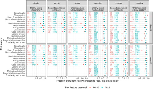
Generally, the presence of the plot feature corresponded to an increase in the fraction of students who perceived clarity in the plot. One notable exception was the “Shows points” feature for the complex plot in both base R and ggplot2. Plots lacking points (but almost always showing a smooth trend line) had a greater fraction of students perceiving the plot as clear than plots with points. It is possible that students felt that with the complex plots, showing all of the points was an overload of information and that the accompanying trend lines sufficed to clearly show the relationships. Another observation is that having fixed x and y axis scales did not seem to affect students’ perceptions of plot clarity. Having fixed scales is key to facilitating visual comparisons, but the students did not seem to be considering this in their evaluations.
We combined two of the annotated features (number of panels and color) to create a feature describing plot type. Examples of the different types of plots are shown in . The prevalence of the 6 most common plot types in the base R and ggplot2 arms is shown in . In these results, we count base R and ggplot2 plots according to our manual annotation of the plotting system used, not by the actual experimental arm in which the student was enrolled.
Fig. 3 Examples of types of complex plots. (a) A typical 36 panel plot. (b) A typical 12 panel plot with coloring has panels for the 6 states colored by medical condition and panels for the 6 medical conditions colored by state. A typical 6 panel plot would show one of these two rows. (c) A typical 2 panel plot has one panel colored by the 6 states and a second panel colored by the 6 medical conditions.
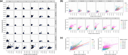
Table 8 Types of complex plots.
Before completing the annotations, we hypothesized that the percentage of students making the full 6-by-6 panel of 36 scatterplots would be much higher in the ggplot2 arm because of the ease of syntax within the facet_grid() function used for creating panels by categorical variables. This was indeed the case as 54.4% of the ggplot2 submissions were 36-panel plots, compared to 31.9% for base R plots (). The 6-by-6 panel of scatterplots is of pedagogical interest because this figure allows students to fully explore the interaction between the two categorical variables (medical condition and state). Although a 36-panel plot is the most concise formulation in the ggplot2 system, a 12- or 6-panel scatterplot that colors points by the remaining categorical variable (the one not used to define the panel) is perhaps more effective for making visual comparisons (). Such a figure places trends to be compared on the same plot, which better facilitates comparisons than the 36-panel plot. We see that all plot types aside from the 36-panel plot were more likely to be made in the base R submissions (). This may suggest interesting differences between the systems in how students process or approach the syntax needed to create such figures. We also see that the 36-panel, the colored 12-panel, and colored 6-panel plots were the most highly rated as clearly showing the intended relationship, as measured by the overall clarity rubric item (). Ratings of clarity in these six plot type subgroups are generally higher for plots made in ggplot2.
Table 9 Clarity of the different types of complex plots.
4 Discussion
We performed a randomized trial in a group of beginner students to understand their perceptions of statistical graphics made by their peers in the base R and ggplot2 systems. We will start with the level of participation in the two arms of the experiment and compliance. Then we will discuss results from student and expert analysis of the submitted plots by starting with the general aesthetics question, following with the text size and full word questions, and lastly the three clarity questions. We will end our discussion with observations about the different types of complex plots made and summarize our overall findings and the limitations of our study.
Many more students elected to take part in the study in the ggplot2 arm (567) than in the base R arm (412), and the percentages of students who participated were 18.7% (ggplot2) and 13.7% (base R). This differential participation could be due to students feeling less comfortable with base R graphics than ggplot2, causing them to abstain from the assignment once they saw the assignment directions. This could also explain the increased compliance in the ggplot2 arm. In particular, the increase in compliance was much higher for the complex plot, suggesting a possible increased comfort level with ggplot2 for the types of plots required for displaying the complex relationship. In fact, we found that several students (17) in the base R arm were noncompliers only for the complex plot.
There were also notable differences between the arms in terms of the students’ perceptions of visual characteristics. Students perceived ggplot2 plots to be more visually pleasing for both the simple and complex plots, but more often for the simple plot. Even though this question of general aesthetics is quite subjective, it was actually the question that had the highest rate of agreement between students and experts. There was very little difference between the two systems in terms of text size and using full words. Text size was the least variable of the rubric questions in that agreement among experts and between students and experts was fairly high. There was a lower agreement for the full words rubric question because of differing criteria of what abbreviations were common enough to be left that way. The intent of this question was to encourage students to be mindful of clear scientific communication and to remind them that graphics not only aid one’s personal exploration, but are also used to tell an audience about data.
Three of the rubric questions involved clarity: overall, standalone, and legend and label clarity. For all three questions, ggplot2 plots were perceived to be more clear. The clearest differences between the two systems were for overall clarity, and the differences were most pronounced for the complex plot. These three questions had the lowest rate of agreement among experts and among the lowest rates of agreement between students and experts, likely for the same reason that criteria for defining clarity are subjective.
Some context for these findings might arise by looking at the results of the expert manual annotation. It was much more common for ggplot2 plots to show a smooth trend line (simple plot: 17.8% higher; complex plot: 21.1% higher). This might be because the syntax for adding such a smooth (geom_smooth()) is short and similar to other parts of the syntax for creating the plot (like adding points with geom_point()). We saw that the presence of a trend line was linked to higher rates of students perceiving overall and standalone clarity. Even though these trend lines were less often labeled as coming from a linear or local regression fit, students did not seem to consider this heavily in their perceptions of clarity of legends and labels. Linked to trend lines was the presence or absence of points representing the raw data in the scatterplots. Plots made in ggplot2 were slightly less likely to show points (simple plot: 0.04% lower; complex plot: 2.8% lower). Perhaps this is because the students felt that a trend line would suffice. Although this goes against good visualization practice to always show the raw data, students actually reported that not showing points in the complex plots helped with overall and standalone clarity. They may have felt that the multi-panel plots were too cluttered with the raw data points.
Complex plots made in ggplot2 more often had both x- and y-axis labels (16.6% higher), which were linked to higher rates of students perceiving all three types of clarity. The default behavior of ggplot2 is to include an x- and y-axis label that is common to all panels in a plot. Students in the base R arm were able to recreate this behavior by placing labels in the margin (likely with the mtext() function) or by labeling all panels individually, an option which they might have felt was too cluttered. Although ggplot2 plots were more likely to have default variable names as axis labels (simple plot: 3.6% higher; complex plot: 10.2% higher), this was not immensely important in the students’ perceptions of clarity because the variable names were readable English words separated by periods. Plots made in ggplot2 also more often had a legend present (13.7% higher). In fact, all complex plots made in ggplot2 had a legend. This speaks to default plotting behavior in both systems. In ggplot2, adding color, shape, or a similar visual grouping feature forces a legend to be made. In base R, legends must always be created manually. Complex plots made in ggplot2 also more frequently used full medical code text and thus more frequently had labels cut off because the medical codes were often several words long. The fact that base R requires much more manual input from the user might explain this. Students in the base R arm tended to put the two categorical grouping variables (state and medical code) in the title of the individual panels. In ggplot2, this is handled with a single title for an entire row or column of panels and is created by default. A hypothesis is that the manual input of labels by students in the base R arm encouraged them to choose more concise labels that would fit well, but in the process, the labels were made too concise such that clarity decreased. Finally, we noticed that plots made in ggplot2 much more frequently used fixed x- and y-axis scales (53.4% higher). This is crucial to facilitating comparisons between panels, but surprisingly, this was not a significant consideration in students’ perception of overall and standalone clarity. The default behavior in ggplot2 is to fix x- and y-axis scales, but in base R, this must be deliberately enforced when setting up the axis limits.
We also find that students tend to make different types of paneled plots in the two systems. Specifically, we saw a higher rate of students creating a full grid of scatterplots (36 panels) to answer the complex question when using ggplot2 than when using base R (22.4% higher). This is in line with the relatively straightforward syntax for creating faceted plots within the ggplot2 framework. For the same figure to be made in base R, the students would have to use two nested for-loops, which may be an idea with which they are less comfortable. Despite the increased programming skill required, the most common type of plot made in the base R arm was a 6 panel figure that did require the use of a single for-loop. We note that while the 36-panel plot does allow students to fully explore the interaction between the two categorical variables, it is not necessarily the most effective visualization because it requires the viewer to jump their eyes back and forth between panels to compare trends. A more effective plot collapses some of the panels by adding color, which was a more frequently made plot in the base R arm. These observations suggest student ease with the syntax used to create scatterplot grids in ggplot2. However, this ease might encourage students to default to this syntax, discouraging them from consciously creating more effective visualizations that use a slightly different syntax.
Before we conclude, it is crucial to address the limitations of our study. First, many of the findings presented here rely on subjective student peer review. These reviews are very likely biased in that students often tend to rate their peers more highly out of kindness. It is likely that a lack of training with the rubric and practice with evaluating plots also contributes to this bias. We did indeed observe high ratings from student reviewers when we compared student reviews to expert reviews. Further, our peer review questions were worded to permit different reviewers to use different evaluation criteria, which makes interpretations of differences less clear. Indeed, the variability in rubric questions was supported by the expert grading we performed.
Further, there are limitations stemming from our study design. Due to the capabilities of the Coursera platform, students could only see other submissions within the same arm. Ideally, students would have been able to see plots from both systems to directly compare the clarity of plots. Related to this is the limitation that students reviewed plots using their own submission as a baseline. A design in which students could see many examples of poor and high-quality plots would have aided the consistency of reviews and led to more meaningful comparisons between the arms.
Further, the scope of our plotting assignment is limited in terms of the breadth of statistical graphics that are used in practice. However, it does cover the concepts of bivariate relationships and looking at relationships in subgroups, which are core ideas in data analysis in introductory statistics courses. In particular, multivariate thinking is a key aspect of the 2016 GAISE report. The observed increase in student-perceived ability to demonstrate a bivariate relationship for ggplot2 figures suggests that students have more favorable evaluations of these plots than plots made in base R. It is unclear whether this perceived increase in clarity is actually a result of more favorable aesthetic evaluations, but even if this is the case, students may be able to extract more scientific meaning from these plots simply because they are more comfortable with this plotting style. Related to the scope of our plotting assignment is the limitation that we only asked about perceptions of clarity. A worthwhile supplement to this study would be to have additionally asked students to infer patterns or relationships directly from their peers’ submitted plots. This would allow us to understand not only opinions of clarity but more concrete scientific understanding of the content of these plots.
Lastly, in our comparison of expert-annotated plot features and student clarity reports (Section 3.5), we compared groups formed from student self-selection rather than from randomization. That is, we compared reviews for base R plots with reviews for ggplot2 plots, but the base R plots were made up of any plot made in the base R system, regardless of the randomized group. The same applied for ggplot2. It is likely that students who were randomly assigned to one system but submitted a plot made in the other system were more comfortable and skilled with the latter system. It is also likely that student skill directly affects the plot features (e.g., trend lines) used. If student skill also has a direct effect on student-perceived clarity, then we would have biased comparisons of clarity between plots with and without the visual features. We expect that the expert-annotated plot features explain a large part of the variation in student-perceived quality such that the magnitude of this bias would be small.
In summary, we observe based on subjective student peer review that students perceive plots made in ggplot2 to be slightly more clear in terms of overall clarity, legends and labels, and ability to serve as a standalone graphic without need for additional captions. The largest effect seen was for overall clarity in the complex plot. Complex plots made in ggplot2 were much more often perceived to be clear overall than plots made in base R. Although we acknowledge that student peer review can be favorably biased and variable, we feel that these results can be useful for educators in light of the expert analysis. The lower agreement among experts in the expert analysis does highlight the variability in the rubric questions. However, the relatively higher rate of agreement between students and experts as a whole helps give some confidence that there is agreement about patterns in the differences between the base R and ggplot2 systems. We feel that the strength of this study is the context that we can give to the review rubric grading by looking at concrete features of the submitted plots. The slight increases in perceptions of clarity for ggplot2 plots can be explained by the inclusion of trend lines, display of raw data points, axis labels, legends, and the use of panels and color. Our results suggest that some of the default behaviors in ggplot2 create a better starting place for beginner students in terms of creating clear and well-labeled plots. We do remind readers that aspects of ggplot2 syntax may increase the tendency to create plots that are not optimal for answering scientific questions. However, we feel that educators can look at the differences in tendencies to include certain plot features to help tailor their instruction in plotting, regardless of the system that they choose.
Supplementary Materials
The Supplementary Materials include the consent statement shown to students before agreeing to take part in the study and a table similar to that contains only peer review responses for plots submitted in the assigned plotting system.
Data and Code Availability
Code and data to reproduce the analyses here is available at https://github.com/lmyint/ggplot_base.
Ethics
This research has been given an Exempt determination under 45 CFR 46.101(b), Category (1) from the Johns Hopkins School of Public Health Institutional Review Board, IRB no: 00005988.
Supplemental Material
Download PDF (30.1 KB)Additional information
Funding
References
- Çetinkaya-Rundel, M., and Rundel, C. (2018), “Infrastructure and Tools for Teaching Computing Throughout the Statistical Curriculum,” The American Statistician, 72, 58–65. DOI: 10.1080/00031305.2017.1397549.
- GAISE College Report ASA Revision Committee (2016), “Guidelines for Assessment and Instruction in Statistics Education College Report 2016,” Technical Report.
- Groemping, U. (2018), “Cran Task View: Design of experiments (DoE) & Analysis of Experimental Data,” available at https://CRAN.R-project.org/view=ExperimentalDesign.
- Grolemund, G., and Wickham, H. (2017), “R for Data Science,” available at https://r4ds.had.co.nz/.
- Hejazi, N. (2016), “R Graphics—ggplot vs Base,” available at https://blog.nimahejazi.org/posts/r-graphics-ggplot-vs-base/.
- Ismay, C., and Kim, A. Y. (2017), “An Introduction to Statistical and Data Sciences via R,” available at http://www.moderndive.com.
- Kuhn, M. (2008), “Building Predictive Models in R Using the caret Package,” Journal of Statistical Software, 28, 1–26. DOI: 10.18637/jss.v028.i05.
- Leek, J. (2015), The Elements of Data Analytic Style, Victoria: Leanpub.
- Leek, J. (2016), “Why I Don’t Use ggplot2,” available at https://simplystatistics.org/2016/02/11/why-i-dont-use-ggplot2/.
- Mejia, M. (2013), “10 Reasons to Switch to ggplot,” available at https://mandymejia.com/2013/11/13/10-reasons-to-switch-to-ggplot-7/.
- Robinson, D. (2014), “Don’t Teach Built-in Plotting to Beginners (Teach ggplot2),” available at http://varianceexplained.org/r/teach_ggplot2_to_beginners/.
- Robinson, D. (2016), “Why I Use ggplot2,” available at http://varianceexplained.org/r/why-I-use-ggplot2/.
- Ross, Z., Wickham, H., and Robinson, D. (2017), “Declutter Your R Workflow With Tidy Tools,” PeerJ PrePrints, San Diego.
- Stander, J., and Dalla Valle, L. (2017), “On Enthusing Students About Big Data and Social Media Visualization and Analysis Using R, RStudio, and RMarkdown,” Journal of Statistics Education, 25, 60–67. DOI: 10.1080/10691898.2017.1322474.
- Wickham, H. (2009), ggplot2: Elegant Graphics for Data Analysis, New York: Springer.
- Yau, N. (2016), “Comparing ggplot2 and R Base Graphics,” available at https://flowingdata.com/2016/03/22/comparing-ggplot2-and-r-base-graphics/.