ABSTRACT
Since the publishing of Nolan and Temple Lang’s “Computing in the Statistics Curriculum” in 2010, the American Statistical Association issued new recommendations in the revised GAISE college report. To reflect modern practice and technologies, they emphasize giving students experience with multivariable thinking. Students develop multivariable thinking when they analyze real data in the context of investigating research questions of interest, which typically involve complex relationships between many variables. Proficiency in a statistical programming language facilitates the development of multivariable thinking by giving students tools to investigate complex data on their own. However, learning a programming language in an introductory course is difficult for many students. In this article, we recommend a set of computational skills for introductory courses, demonstrate them using R tidyverse, and describe a classroom activity to develop computational skills and multivariable thinking. We provide a tidyverse tutorial for introductory students, our course guide, and classroom activities. Supplementary materials for this article are available online at https://github.com/bryaneadams/Computational-Skills-for-Multivariable-Thinking-in-Introductory-Statistics.
1 Introduction
Ten years ago, Nolan and Temple Lang (Citation2010) described the time as a critical tipping point in the field of statistics and called for reforming the curriculum to include more computing. Specifically, they argued for curriculum changes in undergraduate and graduate statistics majors to broaden statistical computing and deepen computational reasoning and literacy in the context of using data in the practice of statistics. Today, the introductory course is at a tipping point of its own on its way to becoming a truly modern introductory course in statistics. The American Statistical Association’s revised GAISE college report emphasizes developing multivariable thinking in such courses (Carver et al. Citation2016). It implores teachers to go beyond the univariate and bivariate focus of traditional introductory courses and develop students’ capacity to explore the types of complex relationships we typically find in real-world applications (Wood et al. Citation2018). In the wake of this revised report and the ten-year anniversary of the Nolan and Temple Lang article, it is important to consider the computational skills required to support multivariable thinking in introductory courses. In this article, we present a set of computational skills appropriate for introductory students and provide instructional materials used in the classroom to develop multivariable thinking in a modern introductory course.
One of the biggest impacts of the revised GAISE college report in terms of driving changes to the curriculum is its emphasis on developing multivariable thinking in introductory courses. As statistics educators, this recommendation caused us to reflect upon our course. Were we investigating sufficiently rich questions throughout the course to expose students to the complex relationships that typically exist among multiple variables? Were we emphasizing the right computational skills to facilitate these investigations? It became apparent to us we could not develop multivariable thinking with sufficient depth if we continued to progress sequentially through univariate to bivariate to multivariate statistics. Instead, we needed to leverage stratification and multivariable visualizations from the start of the course, instead of waiting for the introduction of more complex models later. Also, we placed causality and confounding as central ideas in the course. These are important concepts in multivariable thinking that many students have little to no experience with in introductory courses. (Horton Citation2015; Cummiskey et al. Citation2020; Lübke et al. Citation2020). For these changes to be effective, they need to be accompanied by the right computational skills.
In most instances, it is not feasible to explore multivariable relationships without the use of statistical software, and students who become proficient in computing can address more sophisticated problems on their own. However, learning a programming language in an introductory statistics course can be a difficult and frustrating experience for many students, and most instructors face class time constraints that create additional challenges. Nolan and Temple Lang suggest statistics educators focus on encouraging students to understand how to (a) learn new technologies on their own, (b) extract and transfer concepts among languages and environments, and (c) use computing programs to access, manipulate, analyze and present data within the context of solving a scientific problem (Nolan and Temple Lang Citation2010). Instructors who want to encourage multivariable thinking, by reducing technology barriers to engagement, should consider these recommendations when selecting statistical software to implement in their courses.
This article is organized as follows. In Section 2, we recommend a set of computational skills tailored to the multivariable focus of the modern introductory course and provide practical guidance for their implementation in a typical course. In our course, we teach R tidyverse (Wickham Citation2017) and, in Section 3, we demonstrate the functions we emphasize to facilitate multivariable thinking. We focus on a small set of functions to avoid overwhelming students with programming tasks. In Section 4, we outline a classroom activity that combines computational skills with multivariable thinking. We have used the resources described here in the introductory statistics course offered in the Department of Mathematical Sciences at West Point. Sample lesson plans, student activities, a tidyverse tutorial for intro students, and other resources are available at https://github.com/bryaneadams/multivariable-thinking-with-tidyverse.
2 Computational Skills for Introductory Courses
contains computational skills and associated supporting tasks we recommend to facilitate multivariable thinking in introductory courses. These skills are appropriate for a wide variety of introductory courses. In developing this list, we wanted to capture a minimal set of skills, reflecting the reality that there are many other concepts in introductory courses. Importantly, students can learn these minimal skills in any of the statistical software packages commonly used in introductory courses.
Table 1 Computational skills for multivariable thinking in introductory courses.
2.1 Skill 1: Summarize Relevant Conditional Distributions of Data
Students should be able to identify appropriate variables to stratify on based on a research question and calculate summary statistics of quantitative and categorical variables after stratification. Stratification is an important tool for introductory courses because it allows students to investigate the relationship between several variables at the very beginning of the course, before more sophisticated methods are introduced. For example, students can gain intuition for confounding in observational studies by performing two-variable analyses within strata of the confounding variable. In this way, the instructor can develop multivariable thinking early in the semester prior to the introduction of multivariable models. From our experience, students frequently struggle with determining which variable to stratify on and which measures to compare to answer the research question.
2.2 Skill 2: Visualize Multiple Variables Simultaneously
Multivariable thinking is greatly assisted by the ability to visualize three or more variables at one time (Wang, Rush, and Horton Citation2017). Examples of such plots are (1) stratified boxplots for assessing the relationship between a quantitative variable and categorical variable after stratifying on second or third categorical variables and (2) scatterplots assessing the relationship between two quantitative variables with the size and color of the markers depicting third or fourth variables. Students more easily understand important concepts such as confounding through visualizations produced while answering a question of interest to them. As with stratification, we typically find students have difficulty determining the appropriate type of plot and order of variables to answer the research question.
2.3 Skill 3: Fit Multiple Regression Models
Students should be able to fit and interpret multiple regression models, obtain and interpret confidence intervals on parameters, and assess the fit of a model. While these models are new to our students, we leverage Skills 1 and 2 early in the course to develop multivariable thinking before introducing multiple regression models. Ideally, students will view multiple regression as simply a more powerful tool for answering their research questions. For students, it is very difficult to learn a new statistical method and develop multivariable thinking at the same time. When Skills 1 and 2 are not sufficiently developed, we find the most challenging aspect of multiple regression is interpreting effects as conditional upon the other variables in the model.
2.4 Curriculum Implementation
Here are important considerations when implementing these computational skills in the curriculum.
2.4.1 Choosing Appropriate Technology Tools
It is important to select appropriate technology tools based on the objectives of your course, student population, and other course materials. In our course, we require students to perform data analysis and visualizations in R to gain computing experience but encourage them to use web-based applets (Rossman and Chance Citation2020) for simulation-based inference. These web-based applets use visual aids that are familiar to students, such as tossing a coin or drawing a playing card, to illustrate how students can construct simulated null distributions. In the course guide, we provide students with snippets of code that they can use to perform simulation-based inference in R as they become more confident in their understanding of the statistical principles and programming skills. Instead of web-based applets for simulation-based inference, there are easily accessible approaches in R such as the mosaic (Pruim, Kaplan, and Horton Citation2017) and infer (Bray et al. Citation2018) packages. These packages are excellent and deserve the attention of instructors seeking to integrate simulation-based inference into their curriculum. However, we use the web-based applets because they closely mimic tactile simulations and provide a visual representation of the underlying concepts with minimal programming requirements. For more about choosing technology for the statistics classroom, see Garfield, Chance, and Snell (Citation2001), Meletiou-Mavrotheris (Citation2003), Chance et al. (Citation2007), Verzani (Citation2008), and Gould (2010).
2.4.2 Integrating Technology Tools With Course Materials
We provide students a detailed course guide, found in the supplementary materials, which replicates examples using technology. These snippets of code help students through many challenging problems and allow them to build their confidence. While there are many online R resources, we find that introductory students frequently lack the technical vocabulary to easily find assistance online. In addition, we provide our tidyverse tutorial to students, which they complete prior to the first lesson. While there are many high-quality tutorials on the internet, most are not tailored to introductory students.
2.4.3 Structuring the Course Effectively
It is important that students become proficient in Skills 1 and 2 at the beginning of a course to support multivariable thinking. Our goal is for students to gain an appreciation for how these new skills will help them think about data and investigate research questions, thus providing incentive to learn the language. Once they have these skills, they can employ them throughout the course to investigate complex datasets without having to learn them at the same time as other topics.
We created a tidyverse tutorial students complete on their own prior to the first lesson to introduce them to basic data structures, tidyverse functions, and basic visualizations. In class, we dedicate our first two lessons to developing these computational skills. Instructors lead the class through an investigation of a rich dataset to model the types of thinking we want to develop in our students. For example, many instructors investigate real estate prices using data from redfin.com. While there are many real estate websites, redfin.com easily exports to csv format, allowing students to perform the analysis on their hometown as they follow along with the instructor. Students enjoy investigating something personal to them and discussing their results with the class. After the two introductory lessons, students use data from Gapminder to investigate factors associated with GDP per capita in a guided homework activity.
From the beginning of the course, it is important to develop students’ confidence in their ability to troubleshoot programming errors. Students can easily become dependent upon their instructor to fix errors. Instructors with good intentions foster this dependence when they fix every error students encounter. We require students to do two things when they encounter an error before they can ask us for assistance. First, they must cut and paste the error message into a search engine to get more information on the cause. Second, we require them to ask a classmate for assistance with the error. If students do these two things and still have an error, we gladly assist them.
2.4.4 Incorporating Multivariable Thinking With Traditionally Sequenced Textbooks
With some notable exceptions (Kaplan Citation2011; De Veaux, Velleman, and Bock Citation2014), most introductory texts follow the traditional pattern of one-variable and two-variable inference first. When taught sequentially, multivariable statistical methods appear only at the end of the semester. This presents an important question: how do instructors develop multivariable thinking throughout a course when their texts introduce multivariable statistical methods only at the end? First, instructors must understand multivariable statistical methods and multivariable thinking are different skills. Multivariable statistical methods such as two-way ANOVA and multiple regression are tools used to model multivariable relationships. On the other hand, multivariable thinking is a broader pattern of thinking that appreciates several variables are often interrelated in complex ways. Multivariable thinkers can employ an intuitive sense of concepts such as confounding, mediation, association, interaction, and causality to create a more complete understanding of relationships in their data. A multivariable thinker may not know any statistical methods or even know formal definitions of these concepts. Many corporate and government leaders are highly proficient multivariable thinkers yet could not tell you the first thing about multiple regression.
Second, given this understanding that these are different skills, instructors must develop activities early in the course specifically designed to develop multivariable thinking with the tools students have available at the time. We recommend students discuss relationships between variables in observational studies and formally depict them using diagrams (Cummiskey et al. Citation2020). The use of rich scenarios and multivariable datasets to introduce descriptive statistics and data visualizations at the beginning of the course is a great opportunity to foster multivariable thinking. The interested reader can find examples specific to multivariable thinking discussed in American Statistical Association (Citation2016).
3 Example Using Tidyverse
In this section, we use data from the newly developed tidycovid19 package to demonstrate the computational skills we develop in our students. The tidycovid19 package provides tools to import, organize, and visualize COVID-19 data (Gassen Citation2020). These data include COVID-19 case data from Johns Hopkins University and the European Centre for Disease Prevention and Control, non-pharmaceutical interventions data from the Assessment Capacities Project (ACAP), trends data from Apple and Google, additional country data from the World Bank, and data from several other sources. The download_merged_data function in the package imports a dataset by country and date from these sources with over 20,000 observations.
In this example, we use an investigation into the relationship between a country’s wealth and COVID-19 cases to demonstrate the types of thinking we want our students to develop. Prior to collecting and analyzing data, we encourage students to discuss the importance of the research question. In this case, understanding the relationship between wealth and COVID-19 could provide valuable information on whether interventions have been successful, and we could learn about whether people in countries with fragile health systems are at increased risk. In addition, we discuss the variables and how they are measured. For example, should we use gross domestic product and total reported cases, or should we use per capita measures?
To develop multivariable thinking, we ask students to identify other variables related to both wealth and COVID-19 cases. For example, wealthier countries may have more resources to test for the virus and a lack of reported cases in developing countries could indicate a scarcity of testing. Therefore, when assessing wealth and COVID-19 cases, we should be cautious when comparing countries with different testing rates. In addition, evidence suggests age is an important factor in COVID-19 infection and mortality (Jordan, Adab, and Cheng Citation2020). Therefore, we should be careful when comparing countries with higher proportions of older inhabitants to other countries. Using diagrams to depict multivariable relationships is helpful for students.
To better understand the data, students employ Skills 1 and 2. First, they calculate summary statistics by geographic region. This calculation uses an important concept in tidyverse of splitting a dataset on a variable, applying a function to each split, and combining the output to form a new dataset. Typically, this new dataset has a different observational unit. In this case, we split the dataset by geographic region, calculate summary statistics, and combine the results. The observational unit of the new dataset is geographic region instead of country. The group_by and summarize functions provide a flexible framework for completing this type of task. The code below produces results in .
Table 2 Summary statistics for confirmed COVID-19 cases as of October 1, 2020 by region.
library(tidycovid19) covid19 <- download_merged_data(cached = TRUE, silent = TRUE) covid19%>% filter(date == "2020-10-01") %>% group_by(region) %>% summarize(cases_per_100k = sum(confirmed)/ sum(population) * 100000, population = sum(population)/1000000, countries = n())
We recommend students visit https://github.com/joachim-gassen/tidycovid19 where they can find functions to create several visualizations of the data in R. In this example, we use the package’s plot_covid19_spread and map_covid19 functions.
is the number of confirmed cases per 100,000 inhabitants in the first 60 days after the country passed 50 confirmed cases per 100,000 inhabitants. To make it easier to see individual lines, we exclude countries with fewer than five million inhabitants or fewer than 50 confirmed cases per 100,000 inhabitants. Dot markers on the country lines indicate the country implemented a lockdown intervention according to ACAP. The seven labeled countries have economies in the world’s top ten in terms of gross domestic product. The other countries in the top ten are China, Japan, and India. These three countries are not depicted because they reported fewer than 50 confirmed cases per 100,000 inhabitants.
Fig. 1 Reported confirmed cases per 100,000 inhabitants for countries with at last five million inhabitants and 50 confirmed cases per 100,000 using the tidycovid19 package (Gassen Citation2020). Labeled countries are in the top ten in terms of gross domestic product.
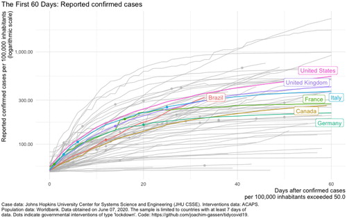
In , we see seven of the world’s ten largest economies in the middle of the plot. It is helpful to remind students how to read a logarithmic scale (a linear increase on a logarithmic scale corresponds to an exponential increase in cases), and encourage them to think of questions that naturally arise from looking at the figure. For instance, why are these seven countries clustered in the middle? Are countries with very high and low cases per capita just smaller, and therefore subject to more variability, or are there characteristics these countries share? Why do China, Japan, and India have so few cases that they do not appear on this plot? What other variables might contribute to a more complete understanding of wealth and COVID-19?
covid19_5mil <- covid19%>% filter(population > 5000000) # plot_covid19_spread( type = "confirmed", covid19_5mil, intervention = "lockdown", per_capita = TRUE ) #
Fig. 2 Confirmed cases (cumulative) as of June 6, 2020 using the tidycovid19 package (Gassen Citation2020).
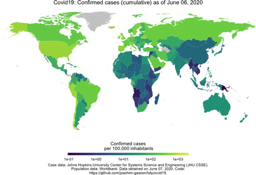
covid19%>% map_covid19()
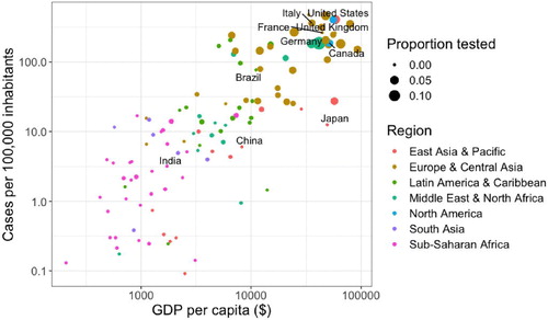
To further understand the relationship between wealth and COVID-19, we look at a cross-section of the data on May 10, 2020 in and . It is helpful to remind students that cross-sectional data are not suitable for many analyses and in some instances it may be more appropriate to look at the data in other ways (e.g., days after 1000th case). The code below produces a cross-section of the data, calculates cases and COVID-19 tests per capita, and produces a plot similar to . Note the use of the filter and mutate functions.
Fig. 3 Confirmed cases per 100,000 inhabitants, gross domestic product per capita, and COVID-19 testing rate by country on May 10, 2020. Labeled countries have one of the world’s ten largest economies.
covid19_subset <- covid19_5mil %>% filter(date == "2020-05-10") %>% mutate(cases_per_100k = confirmed/ population * 100000, tests_per_capita = total_tests/ population) # covid19_subset %>% ggplot(aes(x = gdp_capita, y = cases_per_100k, size = tests_per_capita, color = region)) + geom_point()
depicts strong, positive relationships between the following pairs of variables: wealth/COVID-19 cases, wealth/COVID-19 testing, and COVID-19 cases/testing. Note the use of two plot attributes (size and color) to depict additional variables. From our experience, students find the capability to easily depict additional variables a very exciting feature of ggplot.
At this point, we encourage students to write short paragraphs with explanations consistent with . One explanation is wealthy countries were more vulnerable early in the pandemic because international transportation networks facilitated the virus’s spread, and testing increased as countries responded to reported cases. In other words, wealth is a cause of COVID-19 spread, which itself causes increased testing. In this explanation, developing countries may see increased cases in the near future as the virus spreads there. Another explanation is wealthy countries were able to perform more frequent testing, which means they detected more cases. In this explanation, developing countries already have infection rates similar to wealthy countries but lag behind in reported rates due to deficiencies in testing. Multivariable thinkers understand both explanations are consistent with the cross-sectional data and can propose further analyses to refine their explanations.
Next, we ask students to fit a multiple regression model (Skill 3) to get additional insight into the data. For this exercise, we fit a multiple regression model for cases per 100,000 inhabitants with wealth and testing rates and extract the coefficients using the broom package (Robinson, Hayes, and Couch Citation2014). Interestingly, there is a strong, positive association between wealth and COVID-19 cases even after adjusting for testing rates. In other words, differences in testing rates do not completely explain the variability in COVID-19 cases associated with wealth. This suggests that we may want to look at other variables such as population age distribution, population density, or income inequality. We insist students review model diagnostic plots and comment on the appropriateness of their model for the data. For tidyverse-friendly model diagnostics, we recommend the ggfortify package (Tang, Horikoshi, and Li Citation2016).
covid19_subset %>% lm(log(cases_per.100k) ∼ log(gdp_capita) + tests_per_capita, data =.) %>% tidy() Coefficients: Estimate Std. Error t value Pr(>|t|) (Intercept) -6.2697 0.8789 -7.134 1.10e-10 *** log(gdp_capita) 1.0056 0.1095 9.187 2.84e-15 *** tests.per.capita 28.7700 12.4491 2.311 0.0227 *
The analysis presented above gives students an introduction to the types of complex relationships that often exist between variables. We have only scratched the surface of our understanding of wealth and COVID-19. We encourage students to propose new research questions based upon the limitations and findings of this investigation. For example, a more thorough investigation would want to address mortality, not just confirmed cases.
4 A Classroom Activity to Integrate Computational Skills and Multivariable Thinking
In this section, we outline one of several classroom activities we use in our course to integrate computational skills with multivariable thinking. Each activity requires students to investigate a research question using the six-step investigative process of Tintle et al. (Citation2015). Prior to the activity, students read a scientific or news article related to the research question. Students work in small groups on the activity during a class period and turn in the assignment at the beginning of the next lesson.
In this activity, the research question of interest is: Does political party affiliation affect a person’s belief about whether social media sites like Facebook censor political viewpoints they find objectionable? This topic has received extensive news coverage recently as social media companies decide how to handle political speech on their platforms. The Bloomberg news article “Most Americans Think Facebook and Twitter Censor Their Political Views” is a nice primer for students on the issue (Griffin Citation2018).
Students use data collected as part of Pew Research Center’s American Trends Panel (Pew Research Center Citation2018). We provide students with the uncleaned data, survey methodology, and questionnaire. The raw data contains 190 variables based on dozens of survey questions asked of 4594 participants. The variable names are codes for questions in the survey, so students have to use the survey methodology document to identify the variables. A nice feature of this additional step is students can see the other survey questions and generate research questions of their own. Also, this data is “messy” with missing responses, requiring students to make decisions and discuss these observations.
Next, we ask a series of questions inspired by Allan Rossman related to study design (Rossman Citation2019). For example, we ask students about observational units, sample size, types of variables collected (categorical/quantitative), and to identify the explanatory and response variables. In this case, the explanatory variable is political party affiliation and the response variable is the person’s belief about biased social media site censorship (“Yes, it is likely” or “No, it is not likely”). To develop multivariable thinking, we have them consider potential confounding variables of this relationship such as education, socioeconomic status, and social media use.
In this example, we restrict the analysis to participants who responded “Democrat” or “Republican” for political party affiliation. Using R, students calculate relevant sample proportions using Skill 1 (). They find participants were likely to believe social media sites censor political viewpoints they find objectionable (Yes—71%, No—29%). However, these beliefs differ greatly by political party—Democrats: Yes—58.5%, No—41.5%; Republicans: Yes—88.4%, No—11.6%. depicts a mosaic plot using the ggmosaic package (Jeppson and Hofmann Citation2018) of censorship beliefs and political party. On the x-axis, we see a slight majority of the participants are Democrats. On the y-axis, we see the difference in censorship beliefs by political party. This type of plot will be useful when we add additional variables, and seeing the two variable version first helps students.
Fig. 4 Mosaic plot depicting participants by political party and whether they believe social media companies censor political viewpoints they find objectionable.
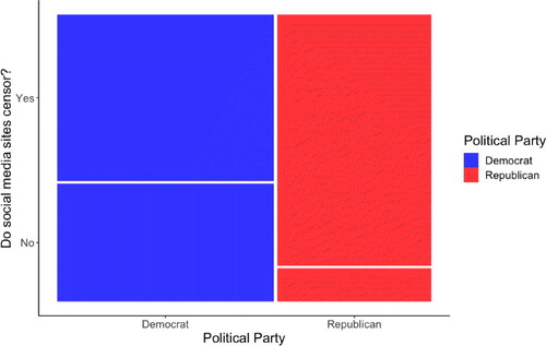
Table 3 Number of participants (percent of column) by political party and whether they believe social media companies censor political viewpoints they find objectionable (Pew Research Center Citation2018).
Next, students consider potential confounding variables of the political party/censorship beliefs association. One such variable is education attainment, which we define here as whether or not the participant was a college graduate. College graduates in the study were more likely to be Democrats and less likely to believe social media sites censor. Students can gain further insight by analyzing political party and censorship beliefs after stratifying on college graduate category (Yes/No). They find there is a strong association between political party and censorship beliefs even within college graduate category (). This provides evidence Democrats and Republicans differ in their opinions on this topic for reasons other than that they simply differ in education levels. Further analyses of education should also consider other ways of defining educational attainment.
Table 4 Number of participants (percent of column) by political party, educational attainment, and whether they believe social media companies censor political viewpoints they find objectionable.
Interestingly, education appears to have an effect on Democrats’ censorship beliefs with 52.8% of college graduates versus 67.3% noncollege graduates believing social media sites censor (). A similar difference was not observed in Republicans (87.0% vs. 89.6%). In other words, the censorship beliefs of Republicans were consistent across education levels, while they differed considerably for Democrats.
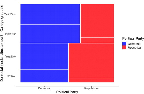
depicts the relationship between political party and censorship beliefs after stratifying on college graduate status. To help students interpret this plot, note it is the same as the two variable plot in , except the college graduates are stacked on top of the noncollege graduates. On the x-axis, we see a larger proportion of college graduates are Democrats, while the noncollege graduates are split pretty evenly between party. On the y-axis, we see college graduates make up a little over half of the participants. Comparing college graduates to noncollege graduates, we see the proportion of Republicans who believe social media sites censor is similar, but is very different for Democrats.
Fig. 5 Mosaic plot depicting participants by political party, college graduate status, and whether they believe social media companies censor political viewpoints they find objectionable.
While we do not cover it in our intro course, more advanced courses could further investigate political party affiliation and censorship beliefs using logistic regression. For example, the data contains several other potential confounding variables (sex, race, age, etc.). The unadjusted odds ratio in the one-variable model for believing social media sites censor political beliefs comparing Republicans to Democrats is 5.38 (95% C.I.: 4.41, 6.61). A logistic regression model adjusting for the participant’s sex, race, age, education, and income results in a similar adjusted odds ratio (). These results suggest the differences in Republicans and Democrats beliefs on social media are not just the result of demographic and socioeconomic differences, but may be rooted in ideology.
Table 5 Odds ratios (95% C.I.) for believing social media sites censor political viewpoints they find objections comparing Republicans to Democrats and college graduates to noncollege graduates for various models.
Lastly, students formulate conclusions, discuss the limitations of their analysis, and propose future analyses to address these limitations and other questions raised by their work. Students answers questions such as “Based on your analysis, do you believe a person’s political affiliation impacts their beliefs on whether or not it is likely that social media sites intentionally censor political view-points that they find objectionable?” and “Do you feel comfortable generalizing your conclusion to all Americans?” Strong responses will incorporate their analysis of confounding variables.
5 Discussion
In our courses, we have found balancing computation with other statistical concepts an important and challenging consideration in course design. Too much computation overwhelms students with programming tasks and distracts from other concepts. For example, during one semester, we broadened our use of simulation-based inference with the goal of fostering conceptual understanding of inference. However, we required students to program several simulation-based methods in R. Unfortunately, we found students focused more attention on the programming tasks (looping, initializing arrays, etc.) than the statistical concepts. In future semesters, we adjusted by encouraging students to use applets for simulation-based methods and R for other tasks such as data analysis, model fitting, and traditional inference. Alternatively, too little computation limits students to simple datasets and prevents them from developing multivariable thinking.
There are several challenges to using tidyverse with introductory students. First, students without programming experience often get frustrated when encountering errors. Their frustration is understandable; the computer programs they use regularly such as social media and word processors do not return errors. Students are busy and just want “the computer to do what it’s supposed to.” It’s important to provide students assistance in class and gradually increase their capability to fix syntax errors on their own. Initially, telling students to search the internet when they get an error is not helpful (although we often tell them to anyway for practice). Most students lack the technical language to describe syntax errors in a way that will likely result in helpful search results. In other words, it is hard to find something if you do not know what you are looking for. In large enrollment and remote classes, we recommend assigning students to formal groups so they have other students to help them. We also found that simply managing students’ expectations (“it’s normal to get errors!”) and communicating our thought process when we encounter errors are helpful techniques.
In addition, students confuse two commonly used tidyverse functions, mutate and summarize. It is helpful to point out that mutate calculates functions of variables (i.e., columns) and summarize calculates functions of observations (i.e., rows). For example, when calculating COVID-19 cases per capita, we used the mutate function to divide two columns (confirmed cases and population). When calculating the total population by region, we used the summarize function to sum rows (populations of individual countries).
We also encounter some students who have experience in base R and are reluctant to learn tidyverse. For basic tasks like calculating the mean of a vector or plotting a histogram of one variable, tidyverse syntax appears complex compared to the simple functions in base R. However, tidyverse more easily extends to multiple variables. From our experience, reluctant students warm to tidyverse when they see how easily it handles multiple variables when using group_by and summarize together and plotting in ggplot.
Lastly, computation in introductory statistics courses inspires many students to join our profession. Our statistics and data science majors frequently cite an experience with an interesting dataset in the introductory course as the reason for choosing their major. When students have the right computational skills, they can be creative and investigate interesting questions in their own way. They see how statistics is relevant in their lives and how further study provides them with valuable skills. Most importantly, they feel the excitement and curiosity that we as statisticians feel when we approach our work everyday.
Acknowledgments
We thank our West Point colleagues Krista Watts, Nicholas Clark, Mason Crow, Shaw Yoshitani, Diana Thomas, Rob Lasater, Dusty Turner, and James Pleuss for their many great ideas to improve this material. We are very grateful to Joachim Gassen for developing the tidycovid19 package and allowing us to demonstrate some of its features here. In addition, we thank Nathan Tintle and Beth Chance for their assistance with our curriculum. Thank you to the associate editor and reviewers for their great suggestions for improving our work.
Supplementary Materials
The supplementary materials are available on GitHub at the following link: https://github.com/bryaneadams/Computational-Skills-for-Multivariable-Thinking-in-Introductory-Statistics.
Tidyverse tutorial:This tutorial is an intro course-friendly introduction to R and tidyverse we created for our course. Students learn to navigate RStudio, read in data files, use dplyr verbs to analyze data, and create visualizations with ggplot2. The dplyr verbs covered in the tutorial include summarize(), filter(), select(), mutate(), and group_by().
Classroom activities:We provide classroom activities used in our introductory course.
Course guide:Our course guide assists students with using technology to address the concepts in our course text.
ORCID
Kevin Cummiskey http://orcid.org/0000-0002-9537-3381
References
- American Statistical Association (2016), “Teaching Intro Stats Students to Think With Data,” available at https://magazine.amstat.org/blog/2016/03/01/introstats16/.
- Bray, A., Ismay, C., Chasnovski, E., Baumer, B., and Cetinkaya-Rundel, M. (2018), “infer R Package,” available at https://infer.netlify.app/index.html.
- Carver, R., Everson, M., Gabrosek, J., Horton, N., Lock, R., Mocko, M., Rossman, A., Roswell, G. H., Velleman, P., Witmer, J., and Wood, B. (2016), “Guidelines for Assessment and Instruction in Statistics Education (GAISE) College Report.”
- Chance, B., Ben-Zvi, D., Garfield, J., and Medina, E. (2007), “The Role of Technology in Improving Student Learning of Statistics,” Technology Innovations in Statistics Education, 1, 1–26.
- Cummiskey, K., Adams, B., Pleuss, J., Turner, D., Clark, N., and Watts, K. (2020), “Causal Inference in Introductory Statistics Courses,” Journal of Statistics Education, 28, 2–8. DOI: 10.1080/10691898.2020.1713936.
- De Veaux, R. D., Velleman, P. F., and Bock, D. E. (2014), Intro Stats, Boston: Pearson.
- Garfield, J., Chance, B., and Snell, J. L. (2001), “Technology in College Statistics Courses,” in The Teaching and Learning of Mathematics at University Level, eds. D. Holton, M. Artigue, U. Kirchgräber, J. Hillel, M. Niss, and A. Schoenfeld, Dordrecht: Springer, pp. 357–370.
- Gassen, J. (2020), “tidycovid19,” available at https://github.com/joachim-gassen/tidycovid19.
- Gould, R. (2010), “Statistics and the Modern Student,” International Statistical Review, 78, 297–315. DOI: 10.1111/j.1751-5823.2010.00117.x.
- Griffin, R. (2018), “Most Americans Think Facebook and Twitter Censor Their Political Views,” available at https://www.bloomberg.com/news/articles/2018-06-28/most-americans-think-social-media-giants-censor-their-views.
- Horton, N. J. (2015), “Challenges and Opportunities for Statistics and Statistical Education: Looking Back, Looking Forward,” The American Statistician, 69, 138–145. DOI: 10.1080/00031305.2015.1032435.
- Jeppson, H., and Hofmann, H. (2018), “ggmosaic: Mosaic Plots in the ggplot2 Framework.”
- Jordan, R. E., Adab, P., and Cheng, K. (2020), “Covid-19: Risk Factors for Severe Disease and Death,” BMJ, 368, m1198.
- Kaplan, D. (2011), “Statistical Modeling: A Fresh Approach,” Project Mosaic.
- Lübke, K., Gehrke, M., Horst, J., and Szepannek, G. (2020), “Why We Should Teach Causal Inference: Examples In Linear Regression With Simulated Data,” Journal of Statistics Education, 28, 1–17.
- Meletiou-Mavrotheris, M. (2003), “Technological Tools in the Introductory Statistics Classroom: Effects on Student Understanding of Inferential Statistics,” International Journal of Computers for Mathematical Learning, 8, 265–297. DOI: 10.1023/B:IJCO.0000021794.08422.65.
- Nolan, D., and Temple Lang, D. (2010), “Computing in the Statistics Curricula,” The American Statistician, 64, 97–107. DOI: 10.1198/tast.2010.09132.
- Pew Research Center (2018), “American Trends Panel Wave 35,” available at https://www.pewresearch.org/internet/dataset/american-trends-panel-wave-35/.
- Pruim, R., Kaplan, D. T., and Horton, N. J. (2017), “The Mosaic Package: Helping Students to ‘Think With Data’ Using R,” The R Journal, 9, 77–102. DOI: 10.32614/RJ-2017-024.
- Robinson, D., Hayes, A., and Couch, S. (2014), “broom R Package,” available at https://broom.tidymodels.org/.
- Rossman, A. (2019), “Ask Good Questions,” available at https://askgoodquestions.blog/2019/09/.
- Rossman, A., and Chance, B. (2020), “Rossman/Chance Applet Collection,” available at http://www.rossmanchance.com/applets/.
- Tang, Y., Horikoshi, M., and Li, W. (2016), “ggfortify: Unified Interface to Visualize Statistical Results of Popular R Packages,” The R Journal, 8, 478–489.
- Tintle, N., Chance, B. L., Cobb, G. W., Rossman, A. J., Roy, S., Swanson, T., and VanderStoep, J. (2015), Introduction to Statistical Investigations, New York: Wiley.
- Verzani, J. (2008), “Using R in Introductory Statistics Courses With the pmg Graphical User Interface,” Journal of Statistics Education, 16, 1–17.
- Wang, X., Rush, C., and Horton, N. J. (2017), “Data Visualization on Day One: Bringing Big Ideas Into Intro Stats Early and Often,” arXiv no. 1705.08544.
- Wickham, H. (2017), “tidyverse: Easily Install and Load the ‘Tidyverse’,” R Package Version 1.2.1.
- Wood, B. L., Mocko, M., Everson, M., Horton, N. J., and Velleman, P. (2018), “Updated Guidelines, Updated Curriculum: The GAISE College Report and Introductory Statistics for the Modern Student,” Chance, 31, 53–59. DOI: 10.1080/09332480.2018.1467642.