Abstract
Research shows that prescription drug labels are often difficult for patients to understand, which contributes to medication errors and nonadherence. In this study, the authors developed and qualitatively evaluated an evidence-based bilingual prescription container label designed to improve understanding. The authors developed several prototypes in English only or in English and Spanish. The labels included an image of the drug, an icon to show its purpose, and plain-language instructions presented in a 4-time-of-day table. In 5 focus groups and interviews that included 57 participants, patients and pharmacists critically reviewed the designs and compared them with traditional medication labels and reformatted labels without illustrations. Patients strongly preferred labels that grouped patient-relevant content, highlighted key information, and included drug indication icons. They also preferred having the 4-time-of-day table and plain-language text instructions as opposed to either one alone. Patients preferred having pertinent warnings on the main label instead of auxiliary labels. Pharmacists and Latino patients valued having Spanish and English instructions on the label, so both parties could understand the content. The final label design adheres to the latest national- and state-level recommendations for label format and incorporates additional improvements on the basis of patient and pharmacist input. This design may serve as a prototype for improving prescription drug labeling.
Medication errors are a leading cause of morbidity and mortality in the United States. The Institute of Medicine estimates that at least 1.5 million people are harmed annually, leading to more than US$3.5 billion in costs (Institute of Medicine, Citation2006). Nearly one third of these errors occur in the outpatient setting (Gandhi et al., Citation2003) and have been linked to problems with prescription drug labeling (Institute of Medicine, Citation2006), often an important source of medication information for patients.
Research has shown that these prescription drug labels suffer from poor design and readability, which limits their usefulness for the average consumer and which may contribute to medication errors (Kimberlin & Winterstein, Citation2008; Shrank et al., Citation2007). For example, medication container labels use large print and colors to draw attention to the pharmacy logo rather than to items of greater importance to patients such as the dosing instructions (Shrank et al., Citation2007). The font size is too small for many adults, and instructions may be printed in all capital letters (Shrank et al., Citation2007), which are more difficult to read (Doak, Doak, & Root, Citation1998). Dosing instructions often are worded in an imprecise manner, such as “Take two tablets twice daily,” and patients express confusion about the exact times a drug should be taken (Wolf et al., Citation2007). In addition, the content of prescription drug labels is highly variable (e.g., use of text vs. numerals, inclusion of the drug indication, and inclusion of special instructions for administration) depending on the how the physician writes the prescription (Bailey, Persell, Jacobson, Parker, & Wolf, Citation2009) and how it is interpreted by different pharmacies (Shrank et al., Citation2007).
Understanding prescription drug labels is challenging especially for patients with limited health literacy. Health literacy refers to the constellation of skills that is needed to function effectively in the health care environment. According to the National Assessment of Adult Literacy, 36% of Americans have limited health literacy skills, functioning at a basic or below basic level (Kutner, Greenberg, Jin, & Paulsen, Citation2006). Among Latinos, the fastest growing segment of the United States population (Agency for Healthcare Research and Quality, Citation2012), 66% scored at the basic or below basic level (Kutner, Greenberg, & Baer, Citation2005). Research from a variety of settings demonstrates that patients with limited health literacy are less likely to understand their own medication regimen (Kripalani et al., Citation2006; Marvanova et al., Citation2011). In one study, 46% of patients from federally qualified health centers were unable to read and correctly state the instructions from a prescription drug label (Davis, Wolf, Bass, Thompson, et al., Citation2006).
What exacerbates the challenges posed by limited health literacy is that many Latinos also face language-related difficulties as they attempt to navigate the U.S. health care system. A large percentage of the Latino community (39%) is not proficient in English (Taylor, Lopez, Martínez, & Velasco, Citation2012). Despite a widespread need for medication instructions in different languages, most prescription drug information is provided only in English (Weiss et al., Citation2007). And although some pharmacy computer systems have language translation capabilities, these translations may not be accurate (Sharif & Tse, Citation2010).
Regulatory agencies are taking steps to promote greater standardization and understanding of prescription drug labels. In 2011, the State of California implemented legislation that requires a standardized, patient-centered prescription drug label for all prescription drugs dispensed to patients in California. Similarly, the U.S. Pharmacopeia issued guidelines to describe prescription container label standards that promote patient understanding (U.S. Pharmacopeial Convention, 2012). These regulations call for the organization of the prescription label in a patient-centered manner, the use of simplified language, the use of specific directions to describe dosage intervals (e.g., “Take 1 pill in the morning and 1 pill at bedtime” rather than “Take one tablet twice daily”), enhanced readability through typography and layout, and provision of labels in a patient's preferred language. Yet, there are limited examples of labels (Bailey, Sarkar, Chen, Schillinger, & Wolf, Citation2012; Wolf, Davis, et al., Citation2011) that incorporate the latest evidence-based guidelines and address new regulations (State of California Board of Pharmacy, Citation2010).
To fill this gap, we aimed to develop and refine an evidence-based, bilingual, prescription container label that meets regulatory guidelines and includes additional enhancements to improve understanding, through focus groups and interviews with English- and Spanish-speaking patients and pharmacists.
Method
Study Participants
Ours was a qualitative study of Latino and non-Latino patients as well as pharmacists. Participants were recruited from two safety-net clinics (clinics caring for a high proportion of low-income patients, including those without health insurance) and a university pharmacy in Nashville, Tennessee, from February to June 2011. Patients were referred to the study by clinic staff or were approached in the waiting room by research staff and invited to participate. Patients were eligible if they spoke Spanish or English, were at least 18 years of age, and were taking at least one chronic medication. Patients were excluded if they had poor hearing, a speech deficit, or corrected visual acuity >20/50 using a Rosenbaum Pocket Screener, as that would limit their participation in a focus group or interview. Eligible consenting patients were scheduled into a focus group session, or if they could not return for a focus group, they were invited to participate in a one-on-one interview at the time of enrollment. Pharmacists were affiliated with a university pharmacy and were recruited through the use of flyers and word of mouth. They were scheduled for a separate focus group.
The study was approved by the New England Institutional Review Board, an independent institutional review board. Informed consent and Health Insurance Portability and Accountability Act authorization were obtained in English or Spanish depending on participant preference.
Baseline Data Collection
Baseline data collection included demographic items, cognitive testing using the Mini-Cog (Borson, Scanlan, Watanabe, Tu, & Lessig, Citation2005), and a single item health literacy screening test (Chew et al., Citation2008) which has been validated among English and Spanish-speaking patients (Sarkar, Schillinger, Lopez, & Sudore, Citation2011).
Label Development
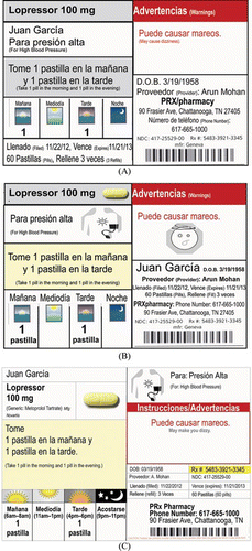
Using current literature, published best practices, and regulations from the Tennessee Board of Pharmacy and those of California (State of California Board of Pharmacy, Citation2010), New York (New York State Education Department, 2010), and Texas (Texas Administrative Code Rule 291.33), we developed a prototype of an easy-to-read, patient-centered medication label (henceforth called the patient-centered label). These guidelines vary significantly, but in general require that content be organized and displayed in a way that is sensitive to limitations in visual acuity and health literacy. As shown in Figure , the patient-centered label grouped information that is most relevant to patients (e.g., drug name, dose, instructions), used 11-point font for all patient-centered material, used plain language (e.g., “Take 1 pill in the morning and 1 pill in the evening,” instead of “Take one twice daily”), and included drug indication. In addition, we showed the dosing instructions in a table that anchors dosing in four times of day—morning, noon, evening, and bedtime. We have previously used this format successfully in several other settings (Kripalani, Citation2011), and it has been called the Universal Medication Schedule (Institute of Medicine, Citation2008). Last, we made several additional enhancements such as including a picture of the medication, icon for drug indication, and warnings on the main label rather than on separate stickers. Icons were developed previously through an iterative process of patient-centered design, resulting in depictions for a list of approximately 100 possible drug indications determined by physicians and pharmacists. A version of the prototype was created in English only and another version in Spanish and English.
Figure 1 Evolution of patient-centered medication label. (A) The initial Spanish-language prototype. A process of iterative, patient-centered design was used to develop further versions such as (B) this version and, ultimately, (C) the label. (Color figure available online.)>.
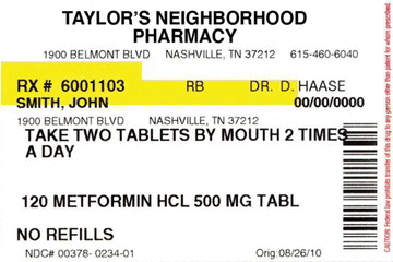
As part of an iterative process (Schuler & Namioka, Citation1993), we conducted five focus groups with patients (two in English and three in Spanish), one focus group with pharmacists, and five in-depth personal interviews (3 patients and 2 pharmacists) from February to June 2011 with a total of 57 participants. We used a process of participatory design to elicit patient preferences and refine the drug label. During the focus groups and interviews, participants were initially shown a traditional medication label (Figure ) and asked general questions such as the following:
Figure 2 Traditional medication label: Example shown to patients for purpose of discussion. (Color figure available online.)
What parts of the medication label are most important to you (or to the patients you care for or assist)?
How do you think that information can best be presented?
Participants were subsequently presented at least 3 prototypes of the patient-centered label, affixed to empty pill bottles (Figure ). The prototypes varied certain design elements, such as yellow highlighting of the medication name, specific time windows for the Universal Medication Schedule, images of the medicine under the Universal Medication Schedule instead of a number (e.g., 2 pill images instead of “2 pills”), an icon for the indication, and an icon with each warning.
Participants were asked what they liked or thought was particularly useful about the labels, as well as what they disliked or considered confusing. They were asked specific questions about the different design elements. Participants were asked what label content they considered most important. They also were invited to provide suggestions to improve the labels in any way.
In subsequent focus groups, we presented additional prototypes, incorporating the feedback that had been received previously. This iterative process allowed for us to revise or incorporate new elements and patient preferences and then confirm these ideas independently in the following session. We ultimately developed and discussed nine versions of the patient-centered label.
Two researchers attended each focus group. One bilingual moderator (M.B.R.) with qualitative research experience led each focus group, and a bilingual research assistant took additional notes. The bilingual moderator conducted interviews with patients who could not attend a focus group. In addition, the sessions were audio recorded. Focus groups lasted 90–120 minutes, and participants received US$40 as compensation. Interviews lasted 60 minutes, and participants received US$30 as compensation.
Data Analysis
The interviews and focus groups were transcribed and translated into English. Unabridged transcripts along with field notes and interview summaries served as the basis for the qualitative analyses. Data were analyzed according to grounded theory (Corbin & Strauss, Citation2008), a method in which data are categorized and explanatory theories emerge from the data. Evaluators carefully reviewed each transcript and categorized participant responses using a framework that mirrored the content and structure of the moderator's guide. Dominant themes and divergent opinions were noted, discussed, and summarized by topic area. Two of the authors (A.M. and M.B.R.) independently reviewed each transcript, and themes were checked for consistency. Last, relevant patient quotations were extracted to help illustrate common themes.
Descriptive statistics were used to analyze demographic information, which included gender, level of education completed, and health literacy level of participants, using SAS 9.2 (SAS Institute, Cary, North Carolina).
Results
Participants included 30 Latino patients, 18 non-Latino patients, and 9 non-Latino pharmacists. Characteristics of participants are presented in Table . On average, Latino patients had a mean age of 51.0 (SD = 10.5) years, whereas non-Latino patients had a mean age of 40.3 (SD = 18.0) years and pharmacists had a mean age of 43.7 (SD = 14.4) years. Mean years of education among patients was higher among non-Latinos (12.7 vs. 9.5) and highest among pharmacists (19.7). Latino patients generally spoke no or very limited English (70%). On the basis of a single health literacy screening question, 80% of Latino patients, 16.7% of non-Latino patients, and 0% of pharmacists had inadequate health literacy. Only 1 (5.6%) non-Latino patient screened positive for cognitive impairment using the Mini-Cog.
Table 1. Participant characteristics
Patients and pharmacists alike described numerous communication barriers regarding medications. These were rooted in the poor quality of written information, such as leaflets and medication labels, as well as verbal communication. Communication barriers were most pronounced among Latino patients who also noted some language-related barriers. Participants noted that most pharmacies did not provide information in the patient's preferred language, or when they did, it was only upon request. Participants' views on medication labels are presented first for traditional medication labels and then for patient-centered labels.
Traditional Medication Labels
When asked about what elements of traditional labels were most important, participants felt that the name of the medication, strength, instructions, indication, quantity, and warnings were the most important pieces. A few participants also pointed out that they referred to the pharmacy's phone number, expiration date, number of pills, and refills remaining, although these were considered less critical. Pharmacists also felt that including prescriber information, prescription number, and who filled the medication was important, though this was not brought up by patients.
When asked how prescription labels could be improved, participants made several observations. First, most participants agreed that language used in medication instructions was often difficult for patients to understand and should be made more clear. One pharmacist noted that language such as “Take 1 tablet by mouth,” was not “real English,” but acknowledged that it would be difficult, “to create standardized labels that have meaningful context across different cultures.” Patients noted that to improve comprehension, the directions for use ought to be very specific. In particular, patients wanted information on how a medication should be taken (e.g., with food) and specific times of day. One non-Latino patient said:
How many times a day, and be specific, like she said 1 in the morning, like 12 hours apart, or 8 hours. You know … details!
Second, drug indication was widely regarded among patients and pharmacists as a critical feature of the medication label. However, patients repeatedly noted that such information was rarely included. Exchanges such as this were observed in nearly all the focus groups:
Participant 1: It [medication label] doesn't say what's for.
Participant 2: It's that they hardly ever say what it's for.
Participant 3: [Nods head in agreement] The majority of … medicines don't say what it's for.
Pharmacists were concerned that including an indication may be difficult to implement in practice. One pharmacist said:
What happens if the physician doesn't write an indication on the script? Do you just leave that blank? Do you call the physician? Because I mean metoprolol, that could be for like one of eight different things. So, you can't really guess with all of them.
Third, participants also noted that the font size should be increased. Several patients noted they had vision problems and the small size of the text (approximately 9-point font) made the label unusable in most instances. One participant joked about the label's readability saying, “First of all, I would have to do this” [pulls it 2 inches from her face and laughs].
Fourth, although participants agreed that side effect warnings were important, they were divided as to the usefulness of currently available warning labels. Several patients felt they were useful, whereas others felt there were too many of them and they were difficult to understand and should be improved. In addition, there was disagreement among pharmacists about the specific warnings to include with any given medication.
Last, patients and pharmacists felt that one barrier to comprehension was the amount of information conveyed on the prescription drug label. Speaking to the amount of information on labels, one pharmacist noted:
I think they can be useful, but there's so much information on there. A lot of times it's medical jargon and maybe they don't understand it … the labels are, um, very busy. There's a lot of information that's required by law to be on those labels, so they're very busy, and they're not very reader friendly.
When asked what could be done to reduce the amount of information placed on labels, pharmacists thought it would be difficult because of medico-legal reasons. As one pharmacist put it:
We're continuously trying to put auxiliary labels and things that might get missed in that initial interaction … . That [way], if you don't tell them, it's on their bottle, you feel safe, and they'll read the auxiliary label.
Overall, patients and pharmacists were dissatisfied with current prescription drug labels which they felt contained excess information, were difficult to comprehend, were not provided in a patient's preferred language, and lacked key information that patients desired in a user-friendly format.
Patient-Centered Medication Labels
Overall, participants preferred the patient-centered medication label stating that it was “much less confusing” than traditional labels. Comments from these two pharmacists were typical:
Participant 1: “I really like this side of it … I like that you've got name, date of birth, you've got your patient information, then you've got your, your drug, what it's for, and you've got your directions. I like how it flows. I think it's easy to read.”Participant 2: “Yeah, I think it's organized pretty well. Like the warnings by the pharmacy information, and I think that's good because I don't think the person necessarily needs the warnings like where the information is … So I think the organization is pretty good.”
Patients and pharmacists preferred how the patient name, medication name, dose, and instructions were grouped together. Most participants preferred that directions for use and warnings receive attention through the use of bolding and colors. Patients also requested that the prescription number be highlighted because they used the number when obtaining refills. Of note, most participants did not want warnings incorporated into separate stickers, but rather in the body of the label itself.
To incorporate a larger font size and more information, an earlier version of the label was longer and the portion that was not affixed to the bottle was folded against it. Participants consistently found those difficult to use and they were removed in later versions.
When asked about the 4-time-of-day dosing instructions (i.e., Universal Medication Schedule), participants generally had positive feelings. Several iterations allowed participants' preferences and recommendations to be incorporated into a final design. For example, an initial version of the Universal Medication Schedule showed illustrations for morning, noon, evening and night, without text. Patients noted that the illustrations should be labeled, and they also preferred versions that indicated specific times of day (e.g., 7 am–9 am). Similarly participants preferred that the dosage form be included for greater clarity (e.g., “2 pills” rather than “2”).
Patients preferred to have illustrations for morning, noon, evening, and night, rather than having only text to note the time of day. In addition, they thought that the use of illustrations in conjunction with indication and warnings enhanced the label's readability. The preference for illustrations was especially clear among Latino patients who frequently noted that the use of illustrations would make it easier for patients who could not read well. The final label incorporated a pill image, illustration for the indication, and illustrations for times of day. Participants agreed that such illustrations were useful adjuncts to, but did not replace plain language text instructions (e.g., “Take 2 pills in the morning”). Illustrations for warnings were not included primarily because of space limitations.
With regard to font size, patients were satisfied with the 12-point font size for patient-centered content. However, to meet patients' preferences for additional information such as illustrations, as well as regulatory requirements to include other information (e.g., drug manufacturer, brand, and generic names), we reduced the font size for most patient-centered content to 11 point. Other content of less importance to patients was printed in a smaller size. Most patients felt this was an acceptable tradeoff.
When asked about language, Spanish-speaking patients and pharmacists agreed that instructions in English and Spanish would be helpful. Pharmacists sometimes did not use available label translation software because it produces instructions in Spanish only, which a non–Spanish-speaking pharmacist cannot verify. However, providing Spanish and English on the same label serves the needs of patients and health care professionals.
Discussion
In this qualitative study, patients and pharmacists affirmed numerous challenges concerning the readability of traditional prescription drug labels. When offered a prescription bottle with patient directions written in typical format, participants found traditional labels difficult to understand. The amount of information presented, layout, and font size commonly made the information difficult to understand. In contrast, patients preferred a patient-centered label that grouped together content most important to patients (e.g., drug name, dose, indication, and directions for use), used plain language instructions in a larger font size, used a 4-time-of-day schedule for dosing instructions, and included illustrations to facilitate understanding. Latino patients, as well as pharmacists, valued the incorporation of Spanish and English instructions on the same label, so both parties could understand the content. The final label design incorporated these and other design elements and is being evaluated in a randomized controlled trial.
The new, patient-centered prescription drug label meets standards recently developed by the State of California (Herold, 2011) and the U.S. Pharmacopeia (United States Pharmacopeial Convention, 2012), which are taking steps to promote greater clarity in patient-provider communication. We provide additional evidence that labels formatted to such standards are not only acceptable to patients and pharmacists, but are preferred to the traditional label. This was true among Latino and non-Latino participants and across levels of health literacy.
Our findings add to a growing body of literature that support the use of plain language medication instructions and illustrations to enhance communication about prescription medications (Bailey, Sarkar, et al., Citation2012; Katz, Kripalani, & Weiss, Citation2006; Wolf, Curtis, et al., 2011; Wolf, Davis, et al., 2011). We found that illustrations to denote the drug indication as well as the time of day could further enhance comprehension and patient satisfaction, although not all investigations have found this (Wolf, Davis, et al., 2011), underscoring the importance of graphic development and testing. We used illustrations that were developed through a participatory process with the target population, which is critical for comprehension as noted in previous research (Katz et al., Citation2006). Further work is needed to assemble a library of prescription-related illustrations that are well understood by a diverse population of patients.
Despite the positive response to a more patient-centered label, our research also indicates certain challenges that must be overcome to disseminate this in pharmacy practice (Bailey, Hasnain-Wynia, et al., 2012). First, space limitations were constraining. Long medication names and instructions, inclusion of information in Spanish and English, and numerous legal and regulatory requirements forced us to make some compromises in the design. Although a larger standard prescription drug bottle may ease these challenges and facilitate adherence to recommendations from various organizations, further research is needed to identify the optimal balance between these sometimes competing elements. Second, although drug indication was widely preferred, this is not routinely provided by the health care provider. Efforts to standardize prescription-writing as well as prescription drug labeling will be important. The growth in e-prescribing in recent years may facilitate this (Surescripts, Citation2011). Last, there was disagreement about the content and format of the warning labels and about which warnings to include with a specific medication. Regulatory and professional agencies should provide guidance to pharmacists to ensure that warnings are well understood and are appropriately associated with the medication. Our label accommodates 2–3 warnings depending on their length.
Limitations
Limitations of this study include that it was qualitative in nature, and therefore, it is not possible to draw firm conclusions. We conducted the study among a convenience sample of patients recruited from two safety-net clinics as well as pharmacy faculty and staff from a university in Nashville, Tennessee. The views expressed in focus groups and interviews do not necessarily represent those of the broader community. Nevertheless, the findings of this study are congruent with other research demonstrating poor readability of prescription drug labels (Davis, Wolf, Bass, Middlebrooks, et al., Citation2006; Davis, Wolf, Bass, Thompson, et al., 2006; Holt et al., Citation1992).
Conclusions
In conclusion, patients and providers strongly preferred a patient-centered medication label to the traditional one. The revised label incorporates plain language, the Universal Medication Schedule, grouping of patient-centered content, and illustrations. The revised label meets regulatory requirements from state pharmacy boards and is consistent with published recommendations for effective health communication. Future research should investigate the effect of patient-centered medication labels on patients' understanding and use of prescription medications.
Acknowledgments
This research was supported by Small Business Innovation Research award R43 MD004048 (Riley/Boyington), from the Department of Health and Human Services and National Institute on Minority Health and Health Disparities. The content is solely the responsibility of the authors and does not necessarily represent the views of the NIH or NIMHD.
Related Research Data
References
- Agency for Healthcare Research & Quality . ( 2012 ). 2011 National Healthcare Disparities Report . Rockville , MD : Author .
- Bailey , S. C. , Hasnain-Wynia , R. , Chen , A. H. , Sarkar , U. , Schoua-Glusberg , A. , Lindquist , L. A. , … Wolf , M. S. ( 2012 ). Developing multilingual prescription instructions for patients with limited english proficiency . Journal of Health Care Poor Underserved , 23 , 81 – 87 . doi: 10.1353/hpu.2012.0000
- Bailey , S. C. , Persell , S. D. , Jacobson , K. L. , Parker , R. M. , & Wolf , M. S. ( 2009 ). Comparison of handwritten and electronically generated prescription drug instructions . Annals of Pharmacotherapy , 43 , 151 – 152 . doi: 10.1345/aph.1L388
- Bailey , S. C. , Sarkar , U. , Chen , A. H. , Schillinger , D. , & Wolf , M. S. ( 2012 ). Evaluation of language concordant, patient-centered drug label instructions. Journal of General Internal Medicine. doi: 10.1007/s11606–012-2035–3
- Borson , S. , Scanlan , J. M. , Watanabe , J. , Tu , S. P. , & Lessig , M. ( 2005 ). Simplifying detection of cognitive impairment: Comparison of the Mini-Cog and Mini-Mental State Examination in a multiethnic sample . Journal of the American Geriatrics Society , 53 , 871 – 874 .
- Chew , L. D. , Griffin , J. M. , Partin , M. R. , Noorbaloochi , S. , Grill , J. P. , Snyder , A. , … Vanryn , M. ( 2008 ). Validation of screening questions for limited health literacy in a large VA outpatient population . Journal of General Internal Medicine , 23 , 561 – 566 . doi: 10.1007/s11606–008-0520–5
- Corbin , J. M. , & Strauss , A. L. ( 2008 ). Basics of qualitative research: Techniques and procedures for developing grounded theory () , 3rd ed. . Los Angeles , CA : Sage .
- Davis , T. C. , Wolf , M. S. , Bass , P. F. , Middlebrooks , M. , Kennen , E. , Baker , D. W. , … Parker , R. M. ( 2006 ). Low literacy impairs comprehension of prescription drug warning labels . Journal of General Internal Medicine , 21 , 847 – 851 .
- Davis , T. C. , Wolf , M. S. , Bass , P. F. , Thompson , J. A. , Tilson , H. H. , Neuberger , M. , & Parker , R. M. ( 2006 ). Literacy and misunderstanding prescription drug labels . Annals of Internal Medicine , 145 , 887 – 894 .
- Doak , C. C. , Doak , L. G. , & Root , J. H. ( 1998 ). Teaching patients with low literacy skills () , 2nd ed. . Philadelphia , PA : Lippincott .
- Gandhi , T. K. , Weingart , S. N. , Borus , J. , Seger , A. C. , Peterson , J. , Burdick , E. , … Bates , D. W. ( 2003 ). Adverse drug events in ambulatory care . New England Journal of Medicine , 348 , 1556 – 1564 . doi: 10.1056/NEJMsa020703
- Holt , G. A. , Dorcheus , L. , Hall , E. L. , Beck , D. , Ellis , E. , & Hough , J. ( 1992 ). Patient interpretation of label instructions. American Pharmacy, NS32, 58–62.
- Institute of Medicine . ( 2006 ). Preventing medication errors . Washington , DC : National Academies Press .
- Institute of Medicine . ( 2008 ). Standardizing medication labels: Confusing Patients Less Workshop Summary . Washington , DC : National Academies Press .
- Katz , M. G. , Kripalani , S. , & Weiss , B. D. ( 2006 ). Use of pictorial aids in medication instructions: A review of the literature . American Journal of Health-System Pharmacy , 63 , 2391 – 2397 . doi: 63/23/2391[pii]10.2146/ajhp060162
- Kimberlin , C. L. , & Winterstein , A. G. ( 2008 ). Expert and Consumer Evaluation of Consumer Medication Information-2008. Final report to the U.S. Department of Health and Human Servics and the Food and Drug Administration. Washington, DC: Food and Drug Administration. Retrieved from http://www.fda.gov/downloads/AdvisoryCommittees/CommitteesMeetingMaterials/RiskCommunicationAdvisoryCommittee/UCM117149.pdf
- Kripalani , S , Henderson , L. E. , Chiu , E. Y. , Robertson , R. , Kolm , P. , & Jacobson , T. A. ( 2006 ). Predictors of medication self-management skill in a low-literacy population . Journal of General Internal Medicine , 21 , 852 – 856 .
- Kripalani , S. ( 2011 ). Prior experience with universal medication schedules in 4 controlled trials . Archives of Internal Medicine , 171 , 1510 – 1511 . doi: 10.1001/archinternmed.2011.381
- Kutner , M. , Greenberg , E. , & Baer , J. (2005). National Assessment of Adult Literacy (NAAL). A first look at the literacy of America's adults in the 21st century. Retrieved from http://nces.ed.gov/naal
- Kutner , M. , Greenberg , E. , Jin , Y. , & Paulsen , C. ( 2006 ). The Health Literacy of America's Adults: Results from the 2003 National Assessment of Adult Literacy (NCES 2006–483) . Washington , DC : U.S. Department of Education, National Center for Education Statistics .
- Marvanova , M. , Roumie , C. L. , Eden , S. K. , Cawthon , C. , Schnipper , J. L. , & Kripalani , S. ( 2011 ). Health literacy and medication understanding among hospitalized adults . Journal of Hospital Medicine , 6 , 487 . doi: 10.1002/jhm.998
- New York State Education Department . ( 2012 ). New York State Board of Pharmacy Rules and Regulations Section 29.7. Special provisions for the profession of pharmacy. Retrieved from http://www.op.nysed.gov/title8/part29.htm#pha
- Order of Adoption: Specific Language to Add to Section 1707.5, Section 1707.5, Article 2, Division 17, Title 16 C.F.R. (2011).
- Sarkar , U. , Schillinger , D. , Lopez , A. , & Sudore , R. ( 2011 ). Validation of self-reported health literacy questions among diverse English and Spanish-speaking populations . Journal of General Internal Medicine , 26 , 265 – 271 . doi: 10.1007/s11606–010-1552–1
- Schuler , D. , & Namioka , A. ( 1993 ). Participatory design: Principles and practices . Hillsdale , NJ : Erlbaum .
- Sharif , I. , & Tse , J. ( 2010 ). Accuracy of computer-generated, Spanish-language medicine labels . Pediatrics , 125 , 960 – 965 . doi: 10.1542/peds.2009–2530
- Shrank , W. H. , Agnew-Blais , J. , Choudhry , N. K. , Wolf , M. S. , Kesselheim , A. S. , Avorn , J. , & Shekelle , P. ( 2007 ). The variability and quality of medication container labels . Archives of Internal Medicine , 167 , 1760 – 1765 .
- State of California Board of Pharmacy . ( 2010 ). Report to the Legislature. Prescription drugs: Labeling requirements. Retrieved from http://www.pharmacy.ca.gov/laws_regs/labeling_requirements.pdf
- Surescripts . ( 2011 ). The National Progress Report on e-Prescribing and Interoperable Healthcare. Retrieved from http://www.surescripts.com/about-e-prescribing/progress-reports/national-progress-reports.aspx#summary
- Taylor , P. , Lopez , M. H. , Martínez , J. H. , & Velasco , G. ( 2012 ). When labels don't fit: Hispanics and their views of identity. Retrieved from http://www.pewhispanic.org/2012/04/04/iv-language-use-among-latinos
- Texas Administrative Code Rule 291.33. Retrieved from http://tinyurl.com/ydrqfyf
- U.S. Pharmacopeia Convention . ( 2012 ). United States Pharmacopeia and National Formulary (USP 36-NF 31). Rockville, MD: Author. Retrieved from http://www.usp.org/sites/default/files/usp_pdf/EN/hottopics/c17.pdf
- Weiss , L. , Gany , F. , Rosenfeld , P. , Carrasquillo , O. , Sharif , I. , Behar , E. , … Mangione , R. ( 2007 ). Access to multilingual medication instructions at New York City pharmacies . Journal of Urban Health , 84 , 742 – 754 .
- Wolf , M. S. , Curtis , L. M. , Waite , K. , Bailey , S. C. , Hedlund , L. A. , Davis , T. C. , … Wood , A. J. ( 2011 ). Helping patients simplify and safely use complex prescription regimens . Archives of internal medicine , 171 , 300 – 305 . doi: 10.1001/archinternmed.2011.39
- Wolf , M. S. , Davis , T. C. , Curtis , L. M. , Webb , J. A. , Bailey , S. C. , Shrank , W. H. , … Wood , A. J. ( 2011 ). Effect of standardized, patient-centered label instructions to improve comprehension of prescription drug use . Medical Care , 49 , 96 – 100 . doi: 10.1097/MLR.0b013e3181f38174
- Wolf , M. S. , Davis , T. C. , Shrank , W. , Rapp , D. N. , Bass , P. F. , Connor , U. M. , … Parker , R. M. ( 2007 ). To err is human: Patient misinterpretations of prescription drug label instructions . Patient Education & Counseling , 67 , 293 – 300 .