
ABSTRACT
Although there are various preferences for color, the city color planning in South Korea is dominated by the government, and the city color preferences of residents are considered to a less extent. Therefore, it results in a question of how to accommodate the diversity of individual preferences. This study took Busan City as an example, using the data collected by the questionnaire survey, first through the chi-square test and nonlinear canonical correlation analysis model to analyze individual attribute factors that distinguish the diversity of city color preferences. It was found that age significantly impacted city color preference, followed by occupation, residential type, educational background, residential location, sex, and monthly income. Regarding the three elements of color, the most significant differences in city color preference were chroma and hue, with slight differences in value preference. Finally, the results were compared with city color guideline to identify the potential conflicts. The findings can provide some recommendations for bottom-up city color planning, and be applied in architectural design and urban regeneration.
1. Introduction
City color is composed of artificial colors, like those of buildings, external facilities, roads, and billboards, as well as natural colors, such as those of mountains, rivers, rocks, vegetation, and other natural elements (Wang, Zhang, and Gou Citation2020). It is an important component of the urban landscape environment, as well as a carrier of the history and culture of the city. It symbolizes the city’s cultural taste, helps present the image of the city, and represents the degree of civilization development in the city. It also reflects the level of urban management, thereby signifying one of the conditions for the city’s sustainable development (Zhang, Liu, and Nie Citation2014). At the beginning of the 21st century, Korea recognized the importance of urban color, and to enhance urban landscapes and city images, many cities successively launched city color guidelines (Seokhyun Kim Citation2017). For instance, in 2008, Seoul enacted the city color planning, and Busan launched the city color guideline in 2009. However, the majority of the city color guidelines are a result of government-led top-down planning in Korea, and it considers the residents’ color preferences to a less extent. Color preference has always been a popular topic in the field of color research. Although many studies have confirmed that people with different individual attributes, such as sex, age, educational background, monthly income (Eysenck Citation1941; Wijk et al. Citation1999; van der Voordt, Bakker, and de Boon Citation2017; Gou and Shi et al. Citation2021) have different color preferences, there are relatively few studies on city color preference. This leads to the question that top-down city color guidelines could potentially conflict with the color preferences of residents with different individual attributes. To analyze these conflicts, this study takes Busan Metropolitan City as an example and addresses the following sub-questions: (1) What individual attributes, such as sex, age, educational background, occupation, etc. are related to city color preferences? (2) What is the potential conflict between the city color preferences of residents with different attributes and the city color guideline? The research results are intended to be used as a reference to update and develop the Busan City Color Guideline, and to seek the direction of a bottom-up method to city color planning. The remainder of the article is structured as follows: section 2 surveys existing literature, section 3 the methodology, section 4 presents the results, section 5 discusses the results, and section 6 concludes the paper.
2. Literature review
2.1. Individual nature attributes and color preference
In existing literature on color, color preference has always been a popular topic of study by researchers from various fields, such as planners, psychologists, and artists. Early research on the influence of personal traits on color preference focused on natural attributes such as sex and age. J. Jastrow (Jastrow Citation1897) pointed that there were striking sex differences in color preference; specifically, men preferred blue to red and women liked red more than blue. S.T. George (St. George Citation1938) surveyed college students’ color preferences and found that male students preferred orange more than female students, and that female students preferred yellow more than male students; however, no other significant sex differences in color preference were discovered. Wijk H. et al. (Wijk et al. Citation1999) argued that there are no sex differences in color preference. However, L. Ellis et al. (Ellis and Ficek Citation2001) investigated the color preferences of North American college students according to gender and sexual orientation, and found that more men prefer blue than women. Moreover, it is speculated that the lack of sex differences in color preferences of previous studies may be because the participants were all older individuals; as such, sex differences might potentially dissipate with age. W. He et al. (He et al. Citation2011) pointed out that the contradictory results regarding the color preferences of different sexes may be owing to a lack of consistent controls for color stimuli. It seems to be a constant debate about whether there are sex differences in color preference. Overall, other evidence supports that on average, men and women have different preferences for colors (Elliot and Niesta Citation2008). In addition to studying the color preferences of different genders, scholars have studied the color preferences of different ages, and almost all studies agree that there are age differences in color preference. Wijk et al (Wijk et al. Citation1999) discovered that with advancing age, the preference for blue decreases, whereas the preference for red increases. L.C. Ou (Ou et al. Citation2004) found that young adults preferred achromatic colors more than older individuals. S.M. Gong (Gong and Lee Citation2017) also confirmed that color preference was influenced by age and the brightness of the color has a greater impact on young people than on the olderadults. Y.J. Zhang et al. (Zhang et al. Citation2019) discovered that the preferences for orange and several dark colors for Chinese adults increased with age, whereas those for bluish, purple, yellow, white, black, and light colors decreased with age.
2.2. Individual social attributes and color preference
Unlike the natural attributes of individuals such as sex and age, social attributes are formed by experience, such as education, occupation, and monthly income. The influence of social attributes on color preference has also been examined by several scholars. Y.S. Park (Park and Guerin Citation2002) studied the color preferences of participants from different cultural backgrounds in the United States, the United Kingdom, Japan, and South Korea, and found significant differences in color preferences between Eastern and Western cultures. I. Bakker et al. (Bakker et al. Citation2015) and Voordt et al. (van der Voordt, Bakker, and de Boon Citation2017) surveyed the color preferences of Dutch people and found that educational background had a significant impact on color preferences. Through a questionnaire survey in Shanghai, A.P. Gou et al. (Gou and Shi et al. Citation2021) discovered that monthly income also affects color preferences. As shown above, several scholars believe that there are cross-cultural differences in color preferences. M. Saito (Saito Citation1994) conducted a cross-cultural study of color preference in three Asian cities: Tokyo, Taipei, and Tianjin. Consequently, she (Saito Citation1994) investigated the color preferences in China, Japan, and Indonesia, and found that the residents of these Asian regions have a particular preference for white. Color preference is considered a cultural phenomenon, and color perception is affected by geographical and cultural factors (Ou et al. Citation2004; Je and Kyoung-Hee Citation2011; Jac et al. Citation2021).
2.3. City color planning and Busan city colors
In addition to the research on color preferences, there have also been studies on “object preference” for colors, such as architectural colors, clothing colors, and product colors (Fortmann-Roe Citation2013; Sakamoto Citation2014; Serra, Manav, and Gouaich Citation2021). In relation to buildings, research is most actively conducted on exterior and interior colors. J. Serra et al. (Serra, Manav, and Gouaich Citation2021) discovered students’ overall preferences for the interior color of a bedroom. W.X. Huang (Huang and Weiguo Citation2009) investigated the preference of Beijing residents for apartment interior colors, including ceilings, walls, floors, interior doors, and sofas. M. Baniani (Baniani and Yamamoto Citation2015) conducted research between personal backgrounds and interior color preferences, and found that blue was used mostly by groups living in coastal areas. However, research on urban color preference is still relatively lacking. A.P. Gou et al. (Wang, Zhang, and Gou Citation2020) explored the preference of city color image; later, they (Gou and Shi et al. Citation2021) studied the color preferences of residents for different kinds of buildings in Shanghai. However, the preference of city color imagery is only in terms of the residents’ perception of colors, such as vitality, warmth, and openness, not real colors. It is crucial to realize that different people may perceive colors differently.
It is generally believed that the modern systematic study of urban colors began with the study of Turin’s urban colors by Giovanni Beino in the 1950s (Brino Citation1993). In the 1970s, combined with the spread of Jean-Philippe Lenclos’s thoughts on “the geography of color,” color scholars, planners, and policymakers realized that the creation of urban colors must consider the city’s natural geographic environment, national characteristics, and residents’ customs. With the extension of Lenclos’ thoughts to Asia, considerable research results and practical experiences have been accumulated, especially in Japan. In addition, Japan has also developed a quantitative color analysis method and has made great contributions to the management of urban color planning, as well as the formulation of related laws and regulations (Kodera Citation1993). In 2009, Busan Metropolitan City established City Color Guideline by referring to local and international examples, such as Yokohama, Japan, and Seoul, South Korea.
To date, the Busan Urban Color Guideline has been implemented for 13 years; however, studies on the urban colors of Busan are lacking. Most research has focused on the microscopic aspects of urban color and the color design of the environment for specific groups. J. H. Chung (Chung Citation2016) analyzed the determining factors in the selection of house exterior colors in hillside towns of Busan. W. Kim et al. (Kim et al. Citation2017) investigated the environmental color of the senior welfare centers in Busan and put forward suggestions for color planning. H. Kim et al. (Kim, Oh, and Park Citation2020) investigated the color status of parks with a high proportion of older people in Busan City and found that these neighborhood parks lacked environmental colors suitable for the visual characteristics of the older residents. N. Zhang et al. (Ning, Ziqi, and Ying Citation2021) researched the color of four types of building in Huinnyeoul Culture Village of Busan and proposed a color plan for the exteriors of the buildings.
In summary, although many researchers have committed to analyzing the color preferences based on different personal characteristics (Gong et al. Citation2017) – mainly sex, age, and education (Saito Citation1996; Ou et al. Citation2012) – other personal aspects such as residential location, occupation, and other possible influencing factors have received less attention (Wang, Zhang, and Gou Citation2020; Saito Citation1996). Moreover, these personal attributes may affect color preferences and influence each other, and relatively few studies have considered these personal characteristics cumulatively when conducting research. In addition, research on the city color preferences of residents with different attributes is lacking. Notably, existing research on color preference mainly focuses on hue preference, there is a paucity of research on brightness and chroma preferences. In fact, A.L. Hegde (Hegde and Bishop Citation2018) indicated that the chroma of a color is an important component, and that its application can provide a supportive environment for individuals of all age groups and visual capabilities. Yokosawa K et al (Kazuhiko Yokosawa et al. Citation2016) discovered that in Japan, differences were prevalent in the chroma-value preferences between sexes, and that women were more willing to choose light colors than men.
3. Materials and methods
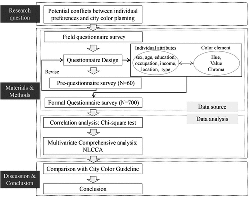
In light of the above, this study examined the potential conflict between city color guidelines and individual color preferences. To this end, we considered Busan Metropolitan City as an example and obtained research data through a field questionnaire survey firstly to analyze the general city color preferences of residents in Busan. Then, the correlation between personal attributes and color factors was analyzed using a chi-square test, and personal attributes with significant impact on color preference were identified. Following this, a multivariate analysis was carried out using nonlinear canonical correlation analysis (NLCCA) to determine the comprehensive influence of significantly correlated individual attributes on city color preference, and to discover the specific color preferences of residents with different attributes. Finally, the results were compared with the city color guideline to identify potential conflicts. The specific materials and methods used in this study are shown in the flowchart in .
Figure 1. The research flowchart.
3.1. Questionnaire survey
3.1.1. Questionnaire design and pre-questionnaire survey
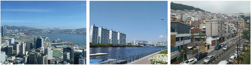
Busan Metropolitan City (35◦05’ N, 129◦04’ E), which is the second largest city in South Korea, was selected as the research site. It is located on the coast, and the most densely built-up areas of the city are situated in many narrow valleys between the Nakdong and Suyeong Rivers, with mountains separating most of them. The data for this study were sourced from a field questionnaire survey. In line with our research purpose, the questionnaire comprised questions and color cards. The question contained two parts: the first part included personal attributes and the second part included color choice. Based on previous research (Saito Citation1994; van der Voordt, Bakker, and de Boon Citation2017; Huang and Weiguo Citation2009), five types of personal attributes that potentially affect city color preference were selected, including sex, age, educational background, occupation, and monthly income. Among them, sex and age were individual natural attributes, and educational background, occupation, and monthly income were individual social attributes. In addition, the natural environment of Busan comprises harmonious relationships between mountains, rivers, and the sea. Therefore, the urban landscape of Busan is divided into ocean area, river area, and mountain area, and the landscape and colors of these different areas vary. As shown in , the ocean area is dominated by office hotels with blue and white, the river area is mainly apartments with white and grey, and the mountainous area is dominated by single and multi-family dwellings in various colors. Based on this, the present study newly introduced two factors that may affect city color preference, residential location, and residential type.
Figure 2. Ocean area, river area, and mountain area in Busan.
Moreover, because value preference and chroma preference may also be different, the color preference in this study includes hue preference, value preference and chroma preference. At present, the color expression systems in the world include the Munsell System, Natural Color System (NCS), Ostwald System, CIE System, and Practical Color Coordinate System. Existing color cards, such as the NCS INDEX 1950 ORIGINAL, have an excessive number of colors, making selection difficult. Accordingly, to facilitate the investigation in this study, a color chart with fewer colors was used as a stimulus. Moreover, because the Munsell color system is the most widely used (Robertson Citation1984), including in Korea, and the Munsell notation corresponds respectively to the hue, lightness, and saturation of the color (Pastilha et al. Citation2019), it was selected for the scientific statistical analysis. Therefore, regarding the color card, Munsell hues are divided into 40 hues at 2.5 intervals, such as 2.5 R, 5 R, 7.5 R, and 10 R for the preliminary survey.
Before the formal survey, a preliminary survey was conducted in May 2021. A total of 60 valid samples were collected in the pre-questionnaire survey; these were excluded from the formal survey. The analysis of the pre-survey results found that people with different attributes have different color preferences, including hue, value, and chroma preferences. The results of the pre-survey completed demonstrated the necessity of this study.
3.1.2. Formal questionnaire contents and color cards
The formal questionnaire also contained two parts, the specific content was revised based on the results of the pre-survey, especially regarding age and monthly income. Specifically, in the pre-survey, almost no one chose the option of “age under 18 years.” Considering that the undergraduate graduation age in South Korea is about 25 years, the minimum age option was revised to less than 25 years old. Moreover, since few people chose the option with monthly income greater than 5 million won in the pre-survey, the highest option for monthly income was revised to more than 4 million won. The specific contents of individual attributes are listed in .
Table 1. The specific contents of formal questionnaire.
In terms of color cards, the results of the pre-survey showed that almost no one chose P (purple) and RP (red-purple). In fact, there are fewer colors in the purple series in the NCS color system, which is based on how we perceive color visually (Pastilha et al. Citation2019). This stems from the difference between the Ostwald color system, which is based on human vision as a color gamut standard, and the Munsell color system, which is an optical classification. The study was also based on human visual perception; therefore, P and RP were reduced in the formal color card. In addition, according to the results of the interrelations between the NCS and Munsell System of F.W. Billmeyer (Billmeyer and Bencuya Citation1987) and color distribution of NCS, the quantitative proportions of each hue in the color chart in the formal survey were determined. Ultimately, the stimulus comprised a “color chart” with 233 colored chips, including 227 chromatic colors and 6 achromatic colors, as shown in and Figure S1.
Table 2. The composition of color card.
Based on the fact that architectural colors comprise a large proportion of city colors, as well as on the pre-survey resident interviews, this study replaced the city colors with the exterior colors of a building. Therefore, the question regarding the city color in the survey was, “if a new building was being constructed near your home, what color would you prefer as the main color (more than 70% of the total color area) for its exterior?”
3.1.3. Procedure of formal survey
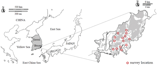
Significant differences exist in the human perception of summer and winter landscapes (Kuper Citation2013; Wang and Ming Citation2021). To reduce the potential seasonal impact, the formal questionnaire survey was mainly conducted in the urban area of Busan from June to August 2021 (summer) and January to February 2022 (winter). Considering the different colors recommended for each zone in the Busan City Color Guide, 14 representative regions of Busan were selected for this survey, covering ocean, river, and mountainous zones, as shown in . Questions about individual attributes were all multiple-choice questions, and residents could choose only one option according to their own situation. The question of the dependent variable was combined with the color card, requiring each participant to write the serial number of the preferred color.
Figure 3. The specific survey locations.
3.1.4. Participants of the formal survey
The participants of the survey were residents of Busan, excluding tourists and foreigners. A total of 700 questionnaires were returned in the formal survey, of which 665 were valid, with an effective rate of 95%. The 665 samples consisted of 338 (51%) men and 327 (49%) women, as shown on Supplementary Table S1. Regarding the age group, 168 (25%) respondents were younger than 25 years old, 216 (32%) were between 25 and 40 years old, 143 (22%) were between 40 to 60 years old, and 138 (21%) were older than 60 years. There were 199 (30%) respondents with a high school or lower educational background, 395 (59%) with a college or university degree, and 71 (11%) with a master’s degree or above. The most-common occupation, comprising 192 (29%) participants, was student, followed by company employees and self-employed, comprising 105 (16%) and 87 (13%) participants, respectively. The sample sizes for civil servants, professionals, service industries, housewives, and unemployed were similar, at 43 (6%), 67 (10%), 67 (10%), 46 (7%), and 51 (8%) participants, respectively. There were 385 (58%) people with a monthly income below 2 million won, 215 (32%) people with a monthly income between 2 to 4 million won, and 65 (10%) people with greater than 4 million won. Regarding residential location, 142 (21%) respondents stayed near the ocean, 102 (15%) near the river, and 356 (54%) near the mountains. Among the respondents, 103 (15%) lived in single houses, 45 (7%) in row houses, 94 (14%) in multifamily houses, 386 (58%) in apartments, and 37 (6%) people in office hotels.
3.2. Correlation analysis of individual attributes and color preference using a chi-square test
Correlation analysis is a term used to denote the association or relationship between two (or more) quantitative variables. It is fundamentally based on the assumption of a linear relationship between the quantitative variables, and the Pearson correlation coefficient is usually used for analysis (Gogtay and Thatte Citation2017). However, sex, educational background, occupation, hue, etc. are all nominal variables in this study, therefore, the chi-square test which determines whether there is a correlation between two nominal variables was chosen s (Arnholt Citation2007). The chi-square test conducts the correlation analysis by comparing the frequencies observed in the cells with those that would be expected if there were no correlation between the two nominal variables (Dulan and Cho Citation2020). Since the expected frequencies are based on the absence of an association, the greater the association between the two nominal variables, the greater the difference between the expected observed and expected frequencies. If the p-value is small enough (usually p < 0.05 or p < 0.1), it can be concluded that there is significant evidence against the null hypothesis of independence and that there is an association between the two variables in the population. In the study, the chi-square test was used to examine whether there is a correlation between individual attributes and hue, value, and chroma. It was performed using IBM SPSS Statistics version 26.
3.3. Nonlinear canonical correlation model
The introduction of the chi-square test had great significance to this study, but contributed only to a separate analysis of each individual attribute and color element. The study, however, has multiple dependent and independent variables, with potential mutual influence. Therefore, this study required a multiple comprehensive statistical model for deeper research. Multiple statistical methods, such as logistic regression, discriminant analysis, factor analysis, and canonical correlation analysis (CCA) are limited to numerical and categorical variables of the dummy type (Chung and Song Citation2018). Among them, although a CCA can be used for a correlation analysis between multiple sets, it can only manage scaled interval or dummy variables. As the sex, occupation, residential location, residence type in the independent variable set, and hue in the dependent variable set of this study, are all nominal variables, CCA is not suitable.
Based on the above, the NLCCA model was applied in this research. The NLCCA was developed to conduct integrative correlation analyses among multiple sets. In this model, variables with different scaling levels, including numerical, ordinal, and nominal variables, can be introduced (Frie and Janssen Citation2009). The aim of the NLCCA is to explain, as much as possible, the variance in the relationships among the sets in a low-dimensional space (Okata and You Citation2004). The OVERALS command in the SPSS software can be used to assess the relationships and similarities among and within the sets of variables in the NLCCA. OVERALS is considered as the most general technique in the Gifi system of nonlinear multivariate analysis (van der Burg, de Leeuw, and Dijksterhuis et al. Citation1994). The Gifi system is characterized by the optimal scaling of categorical variables, and is implemented by alternating least squares algorithms (van der Burg, de Leeuw, and Dijksterhuis et al. Citation1994). As noted above, the correlation analysis was performed using OVERALS in IBM SPSS Statistics version 26.
4. Results and analysis
Hue, value, and chroma preference for city color of residents
, Table S1, Table S2, and Table S3 show the overall hue, value, and chroma preference of the residents in Busan for city colors. The results showed that the most popular hues of Busan residents were N-Neutral colors (17.29%), especially white (9.32), followed by GY-Green Yellow (15.94%), Y-Yellow (15.64%) and PB-Purple Blue (14.59%); the least popular were P-Purple (2.11%), G-Green (2.86%), and RP-Red Purple (2.86%). In general, the hue preference of the residents of Busan for urban colors was consistent with the color preference of the Japanese (Saito Citation1996), that is, the preference for white and the non-preference for P and RP. However, this differs from the results of North Americans. According to L. Ellis’s (Ellis and Ficek Citation2001) findings, North Americans choose cool colors such as blue and green at a high rate, while warm colors such as yellow are particularly low. By contrast, the proportions of Busan residents choosing the yellow series, including Y, YR, and GY were overwhelmingly high, accounting for 46.60%. In terms of Neutral colors, North Americans preferred black to white, whereas, Koreans and Japanese prefer white to black.
Figure 4. Hue, value and chroma preference of residents in Busan.
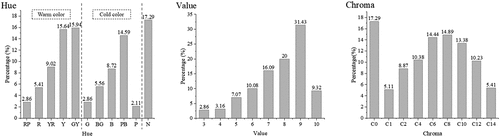
The value preference trend for urban colors was distinct. In particular, for the selection frequency of dark colors, i.e., value 3 was the lowest, accounting for only 2.86%; it gradually increased, reaching its peak at value 9, accounting for 31.43%. In other words, residents preferred the city colors with high value. Regarding the chroma preferences of residents, it can be shown that there were diverse preferences. In general, however, residents preferred the city colors with medium and low chroma.
4.1. Results of chi-square test
In this study, p < 0.1, indicating a significant association between the individual attributes and color preference. The results of the chi-square test presented in shows that the attributes significantly related to hue preference, were age, education, occupation, income, location, and residential type. The attributes significantly related to value preference were sex, age, education, occupation, income, and location; simultaneously, sex, age, education, occupation, location, and type were associated with chroma preference. The larger the chi-square test value (i.e., X2), the stronger the correlation; hence, the attribute most associated with hue preference was occupation (X2 = 159.484), followed by age (X2 = 89.257), residential type (X2 = 85.156), location (X2 = 59.067), education (X2 = 43.204), and monthly income (X2 = 37,104). The attribute with the strongest correlation with value preference was also occupation (X2 = 83.977), followed by age (X2 = 63.126), location (X2 = 44.930), education (X2 = 29.864), income (X2 = 26.155), and sex (X2 = 14.867). Moreover, the correlation between occupation (X2 = 130.672) and chroma preference was also the most significant, followed by age (X2 = 90.777), type (X2 = 52.102), education (X2 = 48.974), location (X2 = 33.938), and sex (X2 = 19.000).
Table 3. Results of Chi-square test.
4.2. Nonlinear canonical correlation model results
4.2.1. Set composition and model fit validity
According to the research content, the research variables were divided into two sets for the NLCCA. The first set was the personal attributes, and the second set was the color attributes, including the hue, value, and chroma of the color. As the seven attributes of sex, age, education, occupation, monthly income, residential location, and residence type were significantly correlated with hue, value, or chroma preference, the first set contained all individual attributes. Among them, the variables of sex, occupation, location, and type were nominal variables, while the rest were ordinal variables. The specific details of the sets and variables are shown in .
Table 4. Summary of variables in nonlinear canonical correlation analysis.
presents the fit results for the similarity between the two sets. Among them, the fit and loss values showed how well the OVERALS solution fits the optimally quantified data with respect to the association among the sets (Ayşe Canan et al. Citation2010). The eigenvalue, in which the maximum value is 1 and the minimum value is 0, indicates the level of the relationship shown by each dimension (Thanoon, Adnan, and Safari Citation2015). The eigenvalues of this study were quite high (0.713 and 0.682). Moreover, the real value of the fitting was 1.395, indicating the sum of the eigenvalues calculated for the variation. As a two-dimensional solution was used in this study, 70% (1.395/2) of the differences were calculated. In addition, 51% (0.713/1.395) of the actual fit was calculated using the first dimension, and 49% (0.682/1.395) was calculated using the second dimension. The loss values represented the difference rate in each object’s scores in each dimension and set. In other words, the loss values indicated how small or large the multi-correlations were between the total weighted variables with optimal scales and between dimensions; that is, a small loss indicates large multiple correlations between the weighted sums of optimally scaled variables and dimensions (Ayşe Canan et al. Citation2010). The mean value is the average rate of loss of the sets, and represents the number of dimensions (maximum fits) minus the fit value (actual fits); in this study, it was 0.605 (2–1.395), which was relatively low.
Table 5. Model fit.
4.2.2. Analysis of correlations between individual attributes and color elements
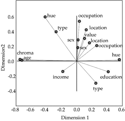
shows the component loading for the two sets describes the loading ratio, that is, the correlations between the object scores and optimal scaled variables for each variable in each set and each dimension. In this study, there were two dimensions. In a case with no data loss, the component loadings are equal to the Pearson correlations between the quantified variables and object scores. Multiple nominal variables have two component loadings. Owing to the quantifications of this type of variable, they can differ for each dimension (Ayşe Canan et al. Citation2010). demonstrate that the latent variables, chroma and hue, are the most important variables in the first and the second dimensions, respectively. In other words, in the first dimension, chroma has the most significant impact on the correlation between the two sets. The other important variables in the first dimension are age, hue, educational background, type, occupation, income, location, value, and sex in sequence. Similarly, in the second dimension, hue has the greatest influence, followed by occupation, location, type of residence, value, sex, education, income, chroma, and age.
Table 6. Component loadings.
The columns in are coordinates of the variable points on the diagram shown in . In the component loadings, the distance from the origin to each variable point approximates the importance of that variable (Chung and Song Citation2018). Hence, the most effective variables in the relationships among the variable sets are the ones positioned far away from the origin. It can be clearly seen from that there is a clear correlation between personal attributes and color preferences. Specifically, the variables including hue and chroma of the dependent variables, and age of the independent variables are the most effective in the relationships between the two sets because they are the farthest from the origin. In addition, the variables such as occupation, type, education, location, and value are moderately effective, whereas sex and income have little effect on the relationships between the sets, because they are extremely close to the origin of the coordinates. In other words, the color elements affected by personal characteristics are mainly hue and chroma, and the personal attribute that has the most significant impact on color preference is age, followed by occupation, residential type, educational background, residential location, with sex and monthly income being the weakest.
Figure 5. Component loadings.
4.2.3. Color preference analysis based on centroids plot
The interpretation of which variables are related, and the extent to which they are related is based on the centroid plots. This plot shows how well the variables separate groups of objects. A centroid represents the center of gravity of an object (Ayşe Canan et al. Citation2010). In this method, it is estimated that there is a correlation between orthogonal factors or factors existing in the same quadrant (Chung and Song Citation2018). Furthermore, in a quadrant, the close variables have more similarities than variables that are far apart. , and Table S4, and S5 show the centroid plots diagram of each individual attribute and color attribute. These centroid plots illustrate the comprehensive relationship between seven individual attributes and the three color elements.
Figure 6. Centroids plot of each independent variable.
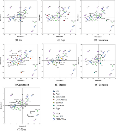
-(1) shows that men preferred GY with higher chroma (10, 12, and 14, and medium value of 5, 6 and 7), whereas women preferred YR and BG with lower chroma (1, 2, and 4). There were no sex differences in the preference for the hues of N, P, RP, R, and B located in the upper left and lower right quadrants of -(1). In terms of age, the color preference of the older people (over 60 years old) was the most significant, and they were more willing to choose colorful colors such as R, RP, B, and G. By contrast, those aged 25 to 40 years preferred achromatic colors. People younger than 25 years old tended to choose BG and YR with lower chroma (1, 2, and 4), whereas those between 40 and 60 years of age were most associated with GY with high chroma. Regarding educational background, both highly educated (Master’s degree and above) participants and those with a relatively low level education (high school and below) had significant color – mainly hue – preferences. Residents with high levels of education are more inclined to choose neutral colors; conversely, people with less education preferred RP, B, R, and G. -(4) shows the correlation between different occupations and the three attributes of color. Among them, company employees preferred neutral colors, whereas, housewives, those unemployed, and service industry workers preferred RP, B, R, and G. Self-employed people and professionals were more willing to choose GY with high chroma (10, 12, and 14), whereas students preferred BG and YR with low chroma (1, 2, and 4). Regarding monthly income, high income groups preferred GY with high chroma, whereas low income groups were more willing to choose BG and YR with low chroma. As far as residential location is concerned, groups living near rivers preferred neutral colors. By contrast, the groups living near the mountains preferred RP, B, R, and G, although the correlation was weak. People living near the ocean were more inclined to choose BG and YR with low chroma (1, 2, and 4). -(7) shows that residence type also impacts color preference. Participants who lived in multi-family houses and office hotels preferred neutral colors, whereas those living in single and row houses preferred vibrant colors, such R, B, RP, and G.
Figure 7. The method for establishing the Busan city color guideline.
Moreover, according to , in the first and second dimensions of , the latent variables chroma and hue were the important grouping characteristics, respectively. Based on the distribution of variables in the top-right and bottom-left quadrants in , and the multiple adjustments of variables in , the run of the curve can be interpreted using “chroma.” Specifically, the groups in the top-right quadrant prefer colors with low chroma of 1, 2, and 4. In general, this group was highly correlated with YR and BG, consisting mostly of students younger than 25 years old, those living near the sea, and with lower monthly incomes. However, residents in the bottom-left quadrant on the opposite side were more willing to choose high chroma colors, such as 10, 12, and 14. This group was significantly associated with self-employed and specialized occupations, with a preference for GY. Furthermore, they were generally high-income groups. The direction of the top-left to the bottom-right quadrant demonstrates variables that can be differentiated by the latent variable “hue.” On the top left is the group that prefers vibrant colors, especially RP, R, B, and G. These groups generally comprise housewives, service industry employees, and the unemployed. They are generally older people (over 60 years old) with a low level of education. Moreover, most of their residential types are single houses and row houses. In addition, although the correlation is low, this group of residential areas is associated with mountainous areas. In contrast, the hue preferences in the opposite bottom-right quadrant are achromatic colors, especially white (10 N) and light grey (9 N). Those who tend to choose neutral colors have the highest level of education, are aged between 25 and 40 years, and are generally company employees. Moreover, most live in multi-family houses and office hotels, generally around rivers.
Overall, it can be seen that the personal attributes and color preference attributes sets influence each other, especially through certain variables. This implies that personal characteristics influence the preferences of Busan residents for the exterior colors of buildings – a critical part of the city’s coloring. Moreover, groups with different characteristics have different color preferences, including hue, lightness, and chroma preferences.
5. Discussion
5.1. The correlation between individual attributes and city color preference
Regarding the individual natural attributes, city color preference was mainly affected by age, whereas the difference in color preference between different sexes was relatively small. The age difference of color preference found in this study is similar to Y.J. Zhang et al.’s results (Zhang et al. Citation2019). However, although sex differences in color preference have long controversial, the results of this study show that the difference is slight. Combined with the independent chi-square test results, it can be seen that the sex difference is mainly reflected in the value and chroma, while hue difference is not significant. Therefore, it is speculated that some studies confirming no sex difference in color preference do not consider the influence of value and chroma of color; rather they only examine the influence of hue. In terms of individual social attributes, occupation and residence type have the most significant impact on city color preference, followed by educational background and residential location, whereas income has the least impact on color preference. In sum, social attributes have a considerable influence on urban color preference. However, several studies in the past have mainly focused on natural attributes, and research on social attributes has mainly emphasized nationality, occupation, and educational background. This study newly introduced two factors, residential type and residential location, according to the geographical characteristics of Busan, and found that they have a significant impact on city color preference. Moreover, the origin of the color identity of cities was from the limited range of local colors which developed radical differences between color identities of cities of different regions. Even cities located in the same region had absolutely different colors owing to their altitude and type of geology (Molavi Citation2015). Furthermore, it is worth discussing why there are different color preferences in different locations or residential types in the same city. It is believed that residents who actively choose the same residential location and type may have some of the same characteristics. From , the residents aged 25–40, with high educational background choose office hotels near the river, whereas older adults generally choose a single house instead of an apartment in Busan. In addition, for some residents who passively choose the location and type of residence, such as living near the sea with their family since birth, the nearby environment may shape some of their attributes, resulting in specific color preferences. Therefore, the natural environment and regional city culture are interactive, indicating that individual preferences change the environment, and the environment also shapes personal attributes and preferences to a certain extent. Regarding the three elements of color, it was found that preference could be converged with respect to value with the mean was 7.6, as such, the city color preferences of people with different attributes were mainly distinguished from hue and chroma, whereas most residents preferred city colors with high value.
5.2. The conflict between city color guideline and color preference of residents
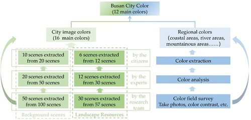
According to the above results, age, occupation, residential type, educational background, and residential location had a significant impact on city color preference, whereas sex and monthly income had less effect. Therefore, the potential conflict between city color and individual attributes was mainly age conflict, occupation conflict, residential type conflict, educational background conflict, and residential location conflict. Thus, the city color preferences of residents with different ages, occupations, residential types, educational backgrounds, and residential locations should be considered emphatically in the formulation of city color guidelines, to reduce conflicts as much as possible. The potential conflict between the Busan City Color Guideline and individual color preferences first goes back to the formulation method of the Guideline. The method for establishing the Busan City Color Guideline is shown in the . Specifically, the formation process of Busan city colors mainly includes two aspects: the formation of image colors and regional colors. Among them, the extraction of city image colors primarily comes from urban background scenes and landscape resource scenes. First, 50 background scenes and 30 resource scenes were selected by the research team from 100 background scenes and 57 landscape resource scenes, respectively. Then 20 background scenes and 12 resources scenes were selected by the experts, and finally the 10 background scenes and 6 landscape scenes were selected by the ordinary citizens. The city image colors are extracted from the final 16 scenes, including 16 main colors. In addition, the Busan City Color Guideline classifies planned zones according to natural environments such as coastal areas, river areas, and mountainous areas, and made different requirements for the colors of different zones, that is regional colors. The regional colors are mainly extracted by taking mid-range photos and on-site color research. Finally, some colors are extracted from the city image colors and regional colors to form the city landscape colors, including 12 main colors.
First, comparing the results on city color preferences of residents with the 12 main colors of Busan City Color Guideline in shows that the main landscape colors recommended by the Busan City Color Guideline are mainly consistent with the color preferences of young and middle-aged people with high education in the first group and fourth group in , while the color preferences of the elderly and low-educated group are excluded. The reason is related to the formulation method of the Busan City Color Guideline. Looking back at the formulation of the Busan City Color Guideline, it is a top-down planning process that primarily reflects the color preferences of highly educated researchers and experts. It is a conflict of age, occupation, and educational background. Second, according to the research in this study, different nature environment was significantly related to city color preferences, and the first (upper right), second (upper left), and fourth (lower right) groups in -(6) corresponded to the color preferences of residents in the coastal, mountainous, and river areas, respectively. Therefore, the color zoning in the Busan City Color Guideline is reasonable from this viewpoint. However, the colors recommended in each zone did not match the color preferences of the residents, as shown in . For example, the recommended R and B colors in the coastal and river areas were not preferred by the residents, on the contrary, these colorful colors are preferred by the residents in mountain area, but the recommended colors in the mountain area are very monotonous and do not include these colors. It is a conflict of residential location. As shown above, the recommended colors for each area are mainly extracted by taking mid-range photos and on-site color research. In theory, this is a simple mechanical restoration, and several details are bound to be lost during the restoration process. In fact, the city is a complex system, and simple restoration make it difficult to interpret the whole scenario. Moreover, the architectural colors extracted from photographic photos are mainly the colors of large-scale buildings, and the colors of these buildings mainly reflect the color preferences of small populations such as government workers, developers and designers. In fact, ordinary residents are the main body of the city. With advancement in development and evolution, it is difficult to separate the local residents from the local environment and culture. They influence each other and shape each other. The urban color preference of residents is also the result of the combined effect of natural factors and artificial factors, and finally forms a relatively stable and unique color preference. Just as the preliminary survey and formal survey results of this study, it is found that local residents have a preference for yellow and achromatic colors. This overall preference result has nothing to do with the attributes of the residents, it has become a unique cultural phenomenon. Therefore, when carrying out city color planning, whether it is the main colors of the city or the recommended colors of each zone, the color preferences of residents with different attributes should be considered emphatically.
Figure 8. 12 main colors in Busan city color guideline.
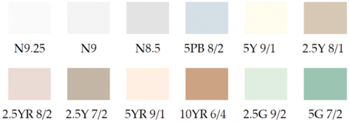
Table 7. The colors recommended in guideline and the preference of residents.
5.3. Limitations and strengths
Notably, this study provides some suggestions for bottom-up color planning by revealing the correlation between individual attributes and urban color preferences and gets four groups of city color preferences determined by multiple individual attributes. There is no doubt that it has a certain reference value to facilitate the update and development of the Busan City Color Guidelines. Moreover, it can also be applied in the fields of architectural design and urban planning, especially in landscape plans according to different individual attributes, such as revitalizing residential areas for the older adults, urban regeneration programs that attract young people. In addition, this study also has some limitations. First, because it is not a study based on a large project, the sample size of the current data is relatively small, and there may be variables that cannot be addressed in this study. If an adequate sample was ensured, we can get a more precise grouping of city colors. Second, the monthly income in the questionnaire has the potential for dishonest responses, resulting in subtle biases. Moreover, the surveys were conducted on different days and times, and although the weather was sunny, the light may still have been different. In future studies, scholars should analyze the underlying mechanisms of city and color preferences based on the multiple individual attributes, such as color emotions, color perceptions, and color images, so as to provide more references and suggestions for bottom-up urban color planning.
6. Conclusion
To explore the potential conflict between the city color guideline and individual preferences, this study taking the Busan Metropolitan City as an example, used the data from the questionnaire survey to analyze the general city color preferences of residents. Moreover, we analyzed the correlation between two personal natural attributes of sex and age, five individual social attributes of educational background, occupation, monthly income, residential location, and residential type and hue, value, and chroma of city color through Chi-square test. Then the NLCCA model was employed to investigate comprehensively which individual attributes distinguish the diversity of city color preferences. Finally, to identify potential conflicts, the results were compared with the Busan City Color Guideline. The meaningful findings are as follows.
First, city color preference was mainly affected by age, whereas the difference in color preference between different sexes was relatively small. The correlation between social attributes and urban color preference was also significant, specifically, the correlation between occupation and city color preferences was the most significant, followed by residential type, educational background, residential location, and monthly income.
Second, the city color preferences of residents with different attributes were mainly distinguished from hue and chroma, whereas most residents preferred city colors with high value.
Third, the potential conflicts between the guidelines and individual color preferences are mainly age conflicts, occupational conflicts, educational background conflicts and residential location conflicts. The Busan City Color Guidelines mainly reflect the color preferences of highly educated and middle-aged researchers and experts, whereas the color preferences of low-income and older adults groups were excluded. Furthermore, although the color zoning was reasonable in the guideline, the regional colors recommended do not align with the residents’ color preferences. The results of this study can be used as a reference to update and develop the Busan City Color Guideline, and to seek the direction of a bottom-up method to city color planning in South Korea. The color preference results for residents with different attributes can also be applied in the fields of architectural design and urban regeneration projects.
Acknowledgements
We would like to express our gratitude to Professor Woo Shin-koo for his academic advice and financial support and Professor Jun Eun-Jung for her administrative support. We also would like to thank undergraduate students of the department of architecture who helped with the questionnaire survey and local residents of Busan who gave answers kindly to the questions.
Disclosure statement
No potential conflict of interest was reported by the author(s).
Data availability statement
The data that support the findings of this study are available from the corresponding author, [JHC], upon reasonable request.
Additional information
Funding
Notes on contributors
Yajun Wen
Yajun Wen is currently a Ph.D. candidate under the supervision of Prof. Jaehoon Chung in the Department of Architecture at Pusan National University, Korea. She received her M.S. from Henan University of Science and Technology, China. Her current research interests focus on city color and landscape planning.
Yuka Himeno
Yuka Himeno is currently an Associate Professor at Oita University, Japan. Ph.D. in Urban Planning, BS, MS in Architecture, Oita University, Japan. After receiving a Ph.D. in research interpreting and evaluating the scenery of the Japanese hot spring area by multivariate analysis, she continues to study the Japanese endemic landscape characteristics.
Jaehoon Chung
Jaehoon Chung is currently an Associate Professor in the Department of Architecture at Pusan National University, Korea. Ph.D. in Urban Planning/ BS in Architecture, Seoul National University, Korea. Dipl-Ing in Architecture at TU Darmstadt, Germany. He received a Ph.D. in a thesis on landscape colors and has been continuing research related to the urban landscape of Korea.
References
- Arnholt, A. T. 2007. “Statistics: The Art and Science of Learning from Data.” The American Statistician 61: 181–182. doi:10.1198/000313007X190808.
- Ayşe Canan, Y., E. Öğüş, H. Ankarali, and F. Gürbüz. 2010. “An Application of Nonlinear Canonical Correlation Analysis on Medical Data.” Turkish Journal of Medical Sciences 40: 503–510. doi:10.3906/sag-0803-47.
- Bakker, I., T. van der Voordt, P. Vink, J. de Boon, C. Bazley, et al. 2015. “Color Preferences for Different Topics in Connection to Personal Characteristics”. Color Research and Application 40: 62–71. doi:10.1002/col.21845.
- Baniani, M., and S. Yamamoto. 2015. “A Comparative Study on Correlation Between Personal Background and Interior Color Preference.” Color Research and Application 40: 416–424. doi:10.1002/col.21906.
- Billmeyer, F. W., and A. K. Bencuya. 1987. “Interrelation of the Natural Color System and the Munsell Color Order System.” Color Research and Application 12: 243–255. doi:10.1002/col.5080120505.
- Brino, G. 1993. “The Colours of Historical City Centres in Europe Restoration Experience, 1972-1992.” AIC Colour 93: 11–25.
- Chung, J.-H. 2016. “An Analysis on the Determining Factors in Selection of House Exterior Colors in the Hillside Towns, Busan.” Journal of the Architectural Institute of Korea Planning and Design 32: 43–50. doi:10.5659/JAIK_PD.2016.32.3.43.
- Chung, Y., and T.-J. Song. 2018. “Safety Analysis of Motorcycle Crashes in Seoul Metropolitan Area, South Korea: An Application of Nonlinear Optimal Scaling Methods.” International Journal of Environmental Research and Public Health 15: 2702. doi:10.3390/ijerph15122702.
- Dulan, S., and N. Cho. 2020. “The Analysis of Association between Learning Styles and a Model of IoT-based Education: Chi-square Test for Association.” Journal of Information Technology Applications and Management 27: 19–36.
- Elliot, A. J., and D. Niesta. 2008. “Romantic Red: Red Enhances Men’s Attraction to Women.” Journal of Personality and Social Psychology 95: 1150–1164. https://psycnet.apa.org/doi/10.1037/0022-3514.95.5.1150.
- Ellis, L., and C. Ficek. 2001. “Color Preference according to Gender and Sexual Orientation.” Personality and Individual Differences 31: 1375–1379. doi:10.1016/S0191-8869(00)00231-2.
- Eysenck, H. J. 1941. “A Critical and Experimental Study of Colour Preferences.” American Journal of Psychology 54: 385–394. doi:10.2307/1417683.
- Fortmann-Roe, S. 2013. “Effects of Hue, Saturation, and Brightness on Color Preference in Social Networks: Gender-based Color Preference on the Social Networking Site Twitter.” Color Research and Application 38: 196–202. doi:10.1002/col.20734.
- Frie, K. G., and C. Janssen. 2009. “Social Inequality, Lifestyles and Health – A non-linear Canonical Correlation Analysis Based on the Approach of Pierre Bourdieu.” International Journal of Public Health 54: 213–221. doi:10.1007/s00038-009-8017-5.
- Gogtay, N. J., and U. M. Thatte. 2017. “Principles of Correlation Analysis.” Journal of the Association of Physicians of India 65: 78–81.
- Gong, S.-M., and W.-Y. Lee. 2017. “Colour Preference Model for Elder and Younger Groups.” Journal of the International Colour Association 18: 33–42. http://www.aic-colour.org/journal.htm.
- Gong, R., Q. Wang, Y. Hai, and X. Shao. 2017. “Investigation on Factors to Influence Color Emotion and Color Preference Responses.” Optik 136: 71–78. doi:10.1016/j.ijleo.2017.02.026.
- Gou, A., B. Shi, J. Wang, and H. Wang. 2021. “Color Preference and Contributing Factors of Urban Architecture Based on the Selection of Color Samples – Case Study: Shanghai.” Color Research and Application 47 (2): 454–474.
- Hegde, A. L., and N. Bishop. 2018. “Saturation Based Color Appearance of Objects: A Comparison between Healthy Elderly, Young Adults, and Young Adults Wearing Goggles Simulating Cataract.” Building and Environment 127: 148–156. doi:10.1016/j.buildenv.2017.11.007.
- He, W., Y. Zhang, J. Zhu, Y. Xu, W. Yu, W. Chen, Y. Liu, et al. 2011. “Could Sex Difference in Color Preference and Its Personality Correlates Fit into Social Theories? Let Chinese University Students Tell You”. Personality and Individual Differences 51: 154–159. doi:10.1016/j.paid.2011.03.035.
- Huang, W., and X. Weiguo. 2009. “Interior Color Preference Investigation Using Interactive Genetic Algorithm.” Journal of Asian Architecture and Building Engineering 8: 439–445. doi:10.3130/jaabe.8.439.
- Jac, T. M., E. R. Davis, S. Lew-Levy, K. Neldner, R. Kapitany, M. Nielsen, and M. Hines. 2021. “Cultural Components of Sex Differences in Color Preference.” Child Development 92: 1574–1589. doi:10.1111/cdev.13528.
- Jastrow. 1897. “The popular aesthetics of color.” Popular Science Mon. 361ff.
- Je, G.-Y., and L. Kyoung-Hee. 2011. “Color Preference and Color Meaning of University Students.” Journal of the Korean Society for Clothing Industry. Ind 13: 346–352. doi:10.5805/KSCI.2011.13.3.346.
- Kazuhiko Yokosawa, K. B., M. A. Schloss, S. E. Palmer, and S. E. Palmer. 2016. “Ecological Effects in cross-cultural Differences between U.S. and Japanese Color Preferences.” Cognitive Science 40: 1590–1616. doi:10.1111/cogs.12291.
- Kim, S. 2017. “An Analysis Current and Improvement Methods of Landscape Color Guideline in Korea.” AIC, Jeju. 375–378. http://www.dbpia.co.kr/journal/articleDetail?nodeId=NODE07993935
- Kim, H., J. Oh, and H. Park. 2020. “A Study on the Color Environmental of Neighborhood Parks considering the Visual Characteristics of Senior Citizens.” The Journal of the Convergence on Culture Technology 6: 163–169. doi:10.17703/JCCT.2020.6.1.163.
- Kim, W., S. Yang, and T. Lee. 2017. “A Study on Senior Welfare Center Color Environment-Focused on Busan City.” AIC 2017 Jeju 14–17.
- Kodera, S. 1993. “Laws. Ordinances and Regulations in Japan Concerning Colors of Various Structures.” AIC, Japan Color. 15–35.
- Kuper, R. 2013. “Here and Gone: The Visual Effects of Seasonal Changes in Plant and Vegetative Characteristics on Landscape Preference Criteria.” Landscape Journal 32: 65–78. doi:10.3368/lj.32.1.65.
- Molavi, M. 2015. “Preserving City Color Plan, Surveying Iranian Submontane Cities.” Urbanism Architecture Constructions 6: 7–18.
- Ning, Z., Y. Ziqi, and Z. Ying. 2021. “Research on the Color Design by Building Use for the Classification of Tourism and Residential Areas.” Journal of the Korea Convergence Society 12: 153–161. doi:10.15207/JKCS.2021.12.1.153.
- Okata, Y., and H.-S. You. 2004. “Market Segmentation Analysis of Young Japanese Travelers to Korea Using Nonlinear Canonical Correlation Analysis.” Journal of Tourism and Leisure Research 11 (16): 27–42. http://www.dbpia.co.kr/journal/articleDetail?nodeId=NODE00918242.
- Ou, L. C., M. R. Luo, P. L. Sun, N. C. Hu, and H. S. Chen. 2012. “Age Effects on Colour Emotion, Preference, and Harmony.” Color Research and Application 37: 92–105. doi:10.1002/col.20672.
- Ou, L.-C., M. R. Luo, A. Woodcock, and A. Wright. 2004. “A Study of Colour Emotion and Colour Preference. Part II: Colour Emotions for two-colour Combinations.” Color Research and Application 29: 292–298. doi:10.1002/col.20024.
- Park, Y., and D. A. Guerin. 2002. “Meaning and Preference of Interior Color Palettes among Four Cultures.” Journal of Interior Design 28: 27–39. doi:10.1111/j.1939-1668.2002.tb00370.x.
- Pastilha, R. C., J. M. M. Linhares, A. I. C. Rodrigues, and S. M. C. Nascimento. 2019. “Describing Natural Colors with Munsell and NCS Color Systems.” Color Research and Application 44: 411–418. doi:10.1002/col.22355.
- Robertson, A. R. 1984. “Colour Order Systems: An Introductory Review.” Color Research and Application 9: 234–240. doi:10.1002/col.5080090409.
- Saito, M. 1994. “A cross-cultural Study on Color Preference in Three Asian Cities: Comparison between Tokyo, Taipei and Tianjin.” Japanese Psychological Research 36: 219–232. doi:10.4992/psycholres1954.36.219.
- Saito, M. 1996. “A Comparative Study of Color Preference in Japan, China and Indonesia, with Emphasis on the Preference for White.” Perceptual and Motor Skills 83: 115–128. doi:10.2466/pms.1996.83.1.115.
- Sakamoto, K. 2014. “Cultural Influence to the Color Preference according to Product Category.” KEER, Linköping.
- Serra, J., B. Manav, and Y. Gouaich. 2021. “Assessing Architectural Color Preference after le Corbusier’s 1931 Salubra Keyboards: A Cross Cultural Analysis.” Frontiers of Architectural Research 10: 502–515. doi:10.1016/j.foar.2021.03.002.
- St. George, M. W. 1938. “Color Preferences of College Students with Reference to Chromatic Pull, Learning, and Association.” The American Journal of Psychology 51: 714. doi:10.2307/1415705.
- Thanoon, T. Y., R. Adnan, and S. E. Safari. 2015. “Generalized Nonlinear Canonical Correlation Analysis with Ordered Categorical and Dichotomous Data.” Jurnal Teknologi 75: 91–99. doi:10.11113/jt.v75.3602.
- van der Burg, E., J. de Leeuw, G. Dijksterhuis, et al. 1994. “OVERALS.” Computational Statistics & Data Analysis 18: 141–163. doi:10.1016/0167-9473(94)90136-8.
- van der Voordt, T., I. Bakker, and J. de Boon. 2017. “Color Preferences for Four Different Types of Spaces.” Facilities 35: 155–169. doi:10.1108/F-06-2015-0043.
- Wang, Y., and X. Ming. 2021. “Electroencephalogram Application for the Analysis of Stress Relief in the Seasonal Landscape.” International Journal of Environmental Research and Public Health 18: 8522. doi:10.3390/ijerph18168522.
- Wang, J., L. Zhang, and A. Gou. 2020. “Study on the Preference of City Color Image Selection Based on the Logistic Model: A Case Study of Shanghai.” Color Research and Application 1: 1–16. doi:10.1002/col.22487.
- Wijk, H., S. Berg, L. Sivik, and B. Steen. 1999. “Color Discrimination, Color Naming and Color Preferences in 80-year-olds.” Aging 11: 176–185. doi:10.1007/BF03399660.
- Zhang, Y., P. Liu, B. Han, Y. Xiang, and L. Li. 2019. “Hue, Chroma, and Lightness Preference in Chinese Adults: Age and Gender Differences.” Color Research and Application 44: 967–980. doi:10.1002/col.22426.
- Zhang, S., Y. Liu, and H. Nie. 2014. “Geographical Feature Based Research on Urban Color environment-taking Wuhan as an Example.” IERI Procedia 9: 190–195. doi:10.1016/j.ieri.2014.09.061.