
ABSTRACT
How do governments visually communicate policies, and what does this reveal about actors’ political objectives? Governments strategically narrate their priorities, yet few studies examine this process through visual modes. We contribute to theoretical and empirical understanding in policy studies by focusing on the UK government’s COVID-19 response through its daily press briefings during the first wave of 2020. Combining quantitative changepoint and content analysis with qualitative discourse analysis, we examine all 79 sets of slides when briefings occurred. We identify a reactive phase focused on communicating knowledge about the pandemic in a boundedly rational manner, and a proactive phase that created new policy-based narratives of the pandemic. Besides contributing to emerging pandemic-related policy scholarship, we argue that conceiving these visualizations as visual narrative assemblages is relevant more broadly because it shifts attention to the interaction and interdependence of multiple visualizations as they enable policymakers to perform their authority to govern.
Introduction
During the initial wave of the global COVID-19 pandemic in early-2020, several media outlets published quantitative public health data using visualizations and infographics (Financial Times, Citation2022; Roser et al., Citation2021). Visualization, or how messengers convey information using visual and graphical forms to achieve different goals such as generating understanding or eliciting emotional responses (Kirk, Citation2019), was central to communicating about the crisis. Yet much of the data underpinning these visualizations – as well as many of the visual objects themselves – originated from government sources and aimed to communicate policy. On the one hand, this is a continuation of longer-standing trends: policymaking and government communications have always included aspects of visual messaging (Bekkers & Moody, Citation2014a), although this has grown with the rise of data-driven governance that seeks and prioritises quantitative forms of information (Amit-Danhi, Citation2022a; Bandola-Gill et al., Citation2022; Nash et al., Citation2022). Generally, citizens usually encounter and engage with data through these visuals (Engebretsen & Kennedy, Citation2020) as they form attitudes and preferences on political issues (e.g., Hill, Citation2017; Rall et al., Citation2016). Nonetheless, COVID-19 created an emergency context where formerly mundane visualization practices were highly publicized and linked to rapidly changing policy decisions that would eventually have far-reaching and costly consequences even as they addressed the loss of human life. This reflects how crises serve as stress tests of political systems and institutions, by requiring action under pressurized and uncertain conditions (Boin et al., Citation2016).
Most work to date on the supply side of COVID-19 visualizations tends to identify how the pandemic has been represented in journalistic settings (e.g., Aiello et al., Citation2022; Brennen et al., Citation2021; Pentzold et al., Citation2021). By contrast, we focus on the ways that governments and policymakers have used visualization to communicate their priorities and objectives during the pandemic (while acknowledging how some of these outputs were later modified by and appeared in media and civil society outlets, too). The few studies examining governments’ pandemic responses through visualizations suggest that these objects enable citizens to understand and respond to public health policies (Zhao & Ye, Citation2022; in the case of Shenzhen, China). Further, these studies also identify where these governmental strategies have been used (Falisse & McAteer, Citation2022; in the cases of crowdsourced dashboards tracking global policy responses).
Looking to explanations for European governments’ varied responses to the pandemic more generally, there is growing evidence that policy narratives surrounding the negative impacts of lockdowns and the extent to which the general population was vulnerable were central to shaping the stringency of subsequent restrictions (Boswell et al., Citation2021; Narlikar & Sottilotta, Citation2021). However, there has not been a systematic examination of how these narratives were actually deployed in government communications beyond political speeches and particularly in visual forms that convey policy ‘stories’. This is a striking gap because governments bore – and continue to bear – much of the responsibility for dealing with both the proximate public health threat and subsequent economic and social impacts of policy actions such as lockdowns (Xiang et al., Citation2022).
Therefore, in this paper we contribute novel evidence of how political elites used visualization to communicate policy objectives during the pandemic. Specifically, we examine a series of near-daily televised press conferences led by government officials and public health officials in the United Kingdom (UK) in early-2020. In ordinary times, press conferences are important means for political elites to communicate their preferred messages both through attending media representatives and directly to citizens (Eshbaugh-Soha, Citation2013). Yet during the COVID-19 crisis, these events became regular fixtures in several countries during which visualizations were fully on display: with millions watching (BBC, Citation2020), ministers gave presentations of graphics punctuated by the phrase ‘next slide please’.Footnote1 Although limited scientific knowledge on COVID-19 was available at this time, policymakers still had to make and communicate extraordinary policy decisions as the UK faced exceptionally high mortality rates globally (Our World in Data, Citation2022). Therefore, while visualizations were both made and used under conditions of high uncertainty, press conferences were moments when these representations of scientific data might offer some understanding and control even as members of the public were confined to their homes and in mortal danger.
We ask two questions in this study. First, how did the UK government use visualization – comprising both visual representations of data and infographic-style images – within its daily press briefings? Second, what did these usages reveal about its evolving response to the crisis? To address these questions, we applied quantitative changepoint and content analytical methods alongside qualitative critical discourse analysis to all 79 sets of slides used during the UK government’s press briefings that were held between 30 March and 24 June 2020. Our results document the types of visuals used during this period, as well as their dynamics of appearance and disappearance over time. We identify two communication phases: (1) a reactive phase that focused on knowing this novel virus and relied predominantly on responding to scientific information about the virus and its spread; and (2) a proactive phase that focused on managing the crisis by constructing policy-based narratives of the pandemic. This second phase, we argue, contains evidence of the government’s attempts to govern the ungovernable by visual means in two ways: dropping politically inconvenient graphics that depicted the UK’s especially high mortalities relative to its high-income peers, and combining infographics and data visualizations to shift responsibility for achieving policy objectives onto citizens rather than ministers. Then, by focusing on the content and order of specific images appearing at key moments, we demonstrate how practices of repetition and layering characterized the usage of these visualizations during the press conferences. Finally, we argue for conceiving of visualization as collections of material practices, political actors, and policy objectives (what we call ‘visual narrative assemblages’) that policymakers come to use in order to perform their authority to govern (Hajer, Citation2009). This novel conceptual analysis opens avenues for examining how visualization and visualization practices contribute to policymaking in both crisis and ‘ordinary’ periods.
The functions and politics of visualization in policymaking
Our theoretical starting point is that visualization is a means by which policymakers gather evidence bases to effectively communicate their preferred policy objectives. We make our argument in three steps. First, we outline the ways that evidence is generally used in policymaking processes during ‘normal’ periods. These correspond with rational, boundedly rational, and strategic uses. Second, we introduce visualization as a communication mode which brings its own affordances for conveying evidence and evidence-based claims. Specifically, it aligns policy attention towards identifiable goals, brokers knowledge among policy communities, and constructs policy objectives. Third, we consider how fast-moving crises present specific challenges for policymakers as they try to make sense of the available evidence through visualization.
Evidence and evidence-based policymaking: three main uses
When crafting and communicating decisions, policymakers can draw on various types of evidence including research and data. As both evidence and policymaking studies (EPS) and science and technology studies (STS) have demonstrated, this process takes different forms and leads to different outcomes (Boswell, Citation2009; Boswell & Smith, Citation2017). First, policymakers might consult evidence in a rational manner that informs their decision-making and evaluation largely along technical lines. This is particularly the case in policy areas that have clear and widely agreed-upon objectives for which measuring progress is useful. Second, policymakers can consult evidence in a boundedly rational manner where decisions are made in light of available information but face constraints presented by previous experience and administrative capacities. Third, policymakers might view evidence as a legitimizing resource to advance established political agendas or aims. This strategic use is particularly visible in settings where there is little or no available consensus on appropriate objectives, or in policy domains that are publicly salient and politically consequential for decision-makers such as elected ministers.
We argue that the initial wave of the COVID-19 pandemic represents a situation where policymakers had access to relatively high levels of information and public health infrastructure that could generate evidence, but were confronted by a fast-moving and highly uncertain crisis which did not have a clear endpoint towards which this evidence could be applied (Cairney, Citation2021). As the situation unfolded, governments developed their own priorities and objectives in response, while sometimes justifying these choices with reference to (and necessarily constrained interpretation of) other countries’ ongoing experiences that fitted existing narratives either about the negative impacts of lockdowns or the scale of vulnerability within the general population (Narlikar & Sottilotta, Citation2021). Moreover, the UK’s (and specifically the English) response was complicated by domestic ‘court politics’ (Boswell et al., Citation2021) that likely also featured in the decisions of then-Prime Minister Boris Johnson and ministers. Therefore, we expect that features of boundedly rational and legitimizing uses of evidence are more likely to appear in the UK government’s communications material during this period.
Visualization as means of aligning, brokering, and constructing policy problems
Visualization is a specific mode in which evidence can be used in the previous three ways. Following prior theorisation and insights from design practice, we delimit visualizations as comprising visual representations of data to convey messages (Engebretsen & Kennedy, Citation2020; see also Kirk, Citation2019) that have their own affordances which distinguish them from solely text-based communication. Here, we draw attention to three main functions: aligning policy interest, brokering evidence among constituent policy communities, and constructing the nature of policy problems to be solved.
First, visualization targets, outlines, and constitutes groups of stakeholders around issues, functioning as an ‘alignment device’ (Bandola-Gill et al., Citation2021) that orients these actors towards common goals. It does so by registering relevant events, increasing transparency (or the impression of its presence), and developing a common understanding across different perspectives (Bekkers & Moody, Citation2014a). Yet both the direction of alignment as well as the process of achieving it are contestable: individuals and groups located outside mainstream policy circles – such as activists (Fileborn & Trott, Citation2022) and opposition political figures (Amit-Danhi, Citation2022a) – can and do challenge policymakers’ objectives through alternative visual renderings.
Second, visualized outputs move and mediate knowledge among policy communities as well as public audiences. They are necessarily touched by multiple hands beyond policymakers’ own, including press officials, scientific researchers, and graphic designers in processes of ‘visual brokerage’ (Allen, Citation2018). Of course, conventional policy outputs lacking visual elements such as briefings and memos share this function. Yet in public-facing settings characterized by social and digital media, and when audiences are likely receiving data-based evidence by largely visual means (Engebretsen & Kennedy, Citation2020), visualizations potentially have greater reach and significance for shaping understandings of policy topics among the public as well as policymakers and bureaucrats working in adjacent areas (for examples from the domains of climate change, abortion, and human right advocacy respectively, see: Engebretsen, Citation2020; Hill, Citation2017; Rall et al., Citation2016).
Third, visualization outputs construct policy problems in ways that prioritize and foreclose some responses over others. Here, the growing body of work on visual rhetoric demonstrates how visualization can be a tool of persuasion and ideological communication (Amit-Danhi, Citation2022b; Hullman & Diakopoulos, Citation2011; Kennedy, Kennedy, Hill, Aiello, et al., Citation2016; Pandey et al., Citation2014). At the level of description, visual artefacts such charts are explicit examples where underlying numbers make some problems evident while obscuring others (Espeland & Lom, Citation2015). Moreover, they reduce complex issues and summarize what remains (Falisse & McAteer, Citation2022), while following established visual conventions that shape decisions about form, colour, and design that are themselves reflective of social and cultural norms (Allen, Citation2021; Byrne et al., Citation2016; Pentzold et al., Citation2021). Meanwhile, at the level of interpretation, they display creators’ choices of which policy dimensions are more important (Bekkers & Moody, Citation2014b) while imbuing the objects with emotional content (Kennedy & Hill, Citation2018). In total, whether through the specific visual content or the interfaces in which it is communicated (such as slides as used in our empirical materials: see Kaplan, Citation2011), visualization does more than merely serve as a vessel for datasets: it actively contributes towards policymakers’ understandings of those datasets and the people they may represent, as well as the possibilities for action based on them. Consequently, visualizations are key places to look for ‘data politics’ (Bigo et al., Citation2019; Ruppert et al., Citation2017), or the ways that quantification and aggregation create new kinds of subjects, relationships, and avenues for power.Footnote2
Visualization and crises: performing policy responses
These functions and affordances of visualization are particularly salient during fast-moving crises, during which leaders must understand the available information; make decisions and coordinate action; craft and communicate persuasive messages about the crisis and responses to it; explain the rationale for any actions taken; and learn from the present crisis to apply that knowledge to future crises (Boin et al., Citation2016). Here, we draw inspiration from Maarten Hajer’s (Citation2009) work which contends that most policy situations require political actors to operate as ‘performers’ in highly mediatised environments. Rather than conceiving of policymaking as occurring in conditions of stability and apparent clarity, a performative perspective acknowledges how elites use expertise and forms of numerical evidence to create and sustain their authority (Callon, Citation2008). This may be particularly dynamic during crises, when the supply and quality of evidence can be volatile, and the intended outcomes of action may not be clearly known either by policymakers themselves or by the affected public. Moreover, policy objectives – whether publicly stated or privately discussed – may shift over time as a crisis and knowledge about it develops.Footnote3
Materials and methods
We draw on a dataset comprising 79 sets of slides used during press briefings between 30 March and 24 June 2020 (HM Government, Citation2022). While this is mostly a continuous series, there some gaps when there were no scheduled briefings. All materials were downloaded from the UK government website on 25 June 2020 to avoid concerns about these documents being removed later in time. Our primary units of analysis are individual visual elements, i.e., a single chart or infographic. This means that one slide could contain multiple visual elements, such as when several graphics appeared together.
We analysed these materials using a combination of quantitative and qualitative methods. First, we used changepoint analysis via the changepoint package in R (Killick & Eckley, Citation2014) to identify whether and when the mean number of unique visual elements in these briefings significantly shifted.Footnote4 By identifying these moments (‘changepoints’) across the series, we produced a measure of the briefings’ visual density. We used the binary segmentation approach, which searches for a changepoint across the whole series, divides the series at that point if one is found, and then repeats the procedure on the two resulting series (before and after the first changepoint) until no further changepoints remain.
Second, we used content analysis (Krippendorff, Citation2013) to trace the dynamics of how some elements appeared, disappeared, and reappeared over time. Besides allowing us to identify whether known key moments corresponded with substantive changes in either the quantity or nature of visuals, this approach also enabled us to compare the proportion of data visualizations (which contained quantitative information) relative to infographics (that lacked quantitative information) over the period. Since the visual elements had clear titles indicating their topics and remained largely consistent across usages, we chose not to conduct formal intercoder reliability tests, although all authors checked the accuracy of the content analysis.
Third, we applied qualitative critical discourse analysis (CDA) to the visual elements that the previous two methods revealed to be particularly key in terms of their regularity, modification, or exceptionalism. In this stage, two of the authors independently examined the slides and associated documentary evidence to place individual visuals in context. CDA is an appropriate tool for analysing visual objects with respect to policymaking outcomes because it acknowledges how these artefacts potentially shape and perpetuate specific understandings of society, politics, and culture (Aiello & Parry, Citation2020; Fairclough, Citation1985). Such processes are central to the ways that legislators and politicians use policy to achieve their objectives. In our study, we used CDA to capture and systematically examine visual imagery, discourses, and political context in a holistic way.
We argue our multi-method approach displays strengths over alternative designs relying entirely on one method. Sequencing these techniques allowed us to identify large-scale patterns to which we could apply more intensive investigation that developed deeper familiarity with the materials but at significantly higher time costs. As has been demonstrated in text-based settings, concatenating techniques preserve gains in efficiency when studying relatively large numbers of documents, and provide a way of justifying researchers’ decisions about which aspects might be worth further qualitative examination (Allen & Easton-Calabria, Citation2022; Baden et al., Citation2022).
Tracking visual elements in UK COVID-19 press briefings
Shifts in the quantity of visual elements
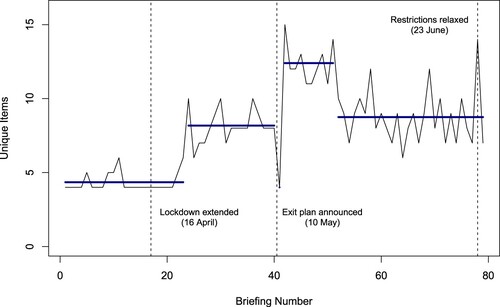
displays the number of unique visual elements within each briefing, then overlays the four changepoints identified in the series at briefings 23 (22 April), 40 (9 May), 41 (11 May), and 51 (21 May). This divides the period into five sections with distinct means, as indicated by the solid horizontal lines: since there was no briefing on 10 May, the second and third changepoints appear consecutively which generates a single point at briefing 41. The three vertical lines indicate key moments known a priori: the extension of the first lockdown on 16 April, the announcement by then-Prime Minister Boris Johnson of a phased ‘exit plan’ from lockdown on 10 May, and the announcement of restrictions being relaxed on 23 June.
Figure 1. Changepoints in Total Graphical Elements per Briefing (30 March–24 June 2020). Note: Changes identified by breaks in the solid lines at briefings 23 (22 April), 40 (9 May), 41 (11 May), and 51 (21 May).
Changes in visual content
shows the distribution of all 54 graphical elements across the 79 briefings. These are grouped into five categories alongside ‘UK Cases’ and the ‘Statistical Annexe’ which are displayed separately. Each shaded rectangle corresponds with one briefing that contained a particular element. As in , the three vertical lines correspond with the three key policy moments.
Figure 2. Timeline of Graphical Elements in UK Government COVID-19 Briefings (30 March–24 June 2021).
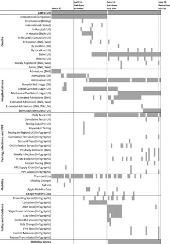
Two elements were consistently present throughout this period: the number of UK cases, and the number of hospital admissions – the scope of which eventually expands to include the devolved governments of Scotland, Wales, and Northern Ireland. Meanwhile, two elements regularly appeared at the beginning of the period, then either became more irregular or disappeared altogether as time progresses. First, a chart placing the UK’s cumulative mortalities in comparative perspective consistently concluded the presentations through 9 May, then never reappeared. (Variations using different metrics, such as deaths per capita, sporadically appeared three times alongside this image). Second, a chart tracking UK transport use regularly appeared through the end of April, then less frequently until its eventual removal from the slides towards the end of the period.
By contrast, some elements were introduced later in the period. Daily UK deaths, as well as data tracking the locations where these deaths occurred (e.g., hospitals, care homes, private homes), began appearing towards the end of April and remained a fixture in the slides. Meanwhile, as testing became more available, charts showing these developments appeared from early May. Charts and graphics communicating aspects of infection spread (e.g., the ‘R’ reproduction rate) also became more regular as data became available.
Some graphical elements underwent subtle yet significant changes even as their thematic content remained largely the same. The best example of this relates to data on critical care beds. Initially, briefings included a chart presenting the proportion of these beds that were being used by COVID-19 patients. Then, from mid-May, this chart changed to reflect the proportion of available mechanical ventilators being used. Later, it was further modified to report the gross number of ventilators available rather than the proportion.
Finally, there were elements that were distinctively connected to specific periods or policy announcements. First, a set of infographics consistently appeared together in the days after the plan for exiting the first lockdown. Notably, this included a color-coded ‘alert system’ (see Figure S1 in the supporting information) that briefly reappeared at the end of this period. Second, later in the period, there was a pair of infographics that communicated ‘five tests’ for the staged removal of restrictions (Figure S2).
Reading these results alongside the changepoint analysis reported in reveals shifts in attention that did not always correspond with policy announcements. At first, even as the initial lockdown period was extended, the average number of visual objects in each briefing remained at its lowest level. Then, as the lockdown wore on and different kinds of data became available, details about critical care beds, testing, and infection rates became more prominent features of the briefings alongside core data involving cases, mortalities, and hospitalizations.
Then, the announcement of the country’s ‘exit plan’ from lockdown on 10 May marked a key inflection point. The following day, the government’s slides solely focused on the criteria and pathway towards relaxing restrictions, centred around the ‘alert level’ infographic. During this period, the average number of graphical elements in each briefing jumped to about 12. The additional items included new charts conveying community transmission rates based on representative surveys as well as an infographic explaining the mathematical mechanism (the ‘reproduction rate’) driving the spread. Also, a statistical annexe – essentially a collection of links in small print at the end of each briefing – became a fixture of these materials that would remain in the slides. Finally, in late-May as all the main indicators showed clear declines, several graphics were removed from the slides, including the infographics relating to alert levels and preventing transmission as well as charts about transport use and mobility. Taken together, the changepoint and content analyses make two contributions: first, they show how multiple visuals were concurrently used to communicate the government’s response, which suggests there is value in treating them as collections of images; and second, they demonstrate how the forms and content of visuals in the slides changed relatively quickly as the circumstances of the crisis developed.
Making COVID-19 governable: the changing political roles of visuals
Next, we focus on specific moments and graphics within this period to demonstrate how the visualization of available evidence made the unfolding COVID-19 crises governable. Informed by the previous quantitative analysis, we identify two phases of the UK government’s response: an initial ‘crisis mode’ period that took a boundedly rational approach to communicating and displaying the emerging sources of public health data, followed by a shift towards using more figurative imagery that legitimized still-emerging policy objectives.
Phase one: 30 March-9 May
During this period, the visuals during the press conferences focused on measurements of transport use, cases, hospitalizations, and deaths. The first UK-wide lockdown (a national ‘stay at home’ order with legal enforcement) had begun just a few days earlier on 26 March. Therefore, these press events – in an unusual, nationally televised daily format which was broadcast in the early evenings – took place in the context of a deeply felt crisis.Footnote5
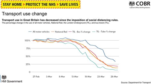
The first graph () concerns transport use: this graph consistently appeared first in the presentations, and displayed large declines for bus, rail and tube transport ‘since the imposition of social distancing rules’. In a few cases, the transport graph was replaced by or coupled with one mentioning ‘mobility’ that featured data supplied by Google or Apple. These charts included figures on walking and cycling, which showed increases in levels compared to other transport modes in decline or stabilizing at comparatively low levels.
Figure 3. Chart displaying transport use changes over time, 30 March.
After the transport and mobility graphs, the next image usually referred to the numbers of new COVID-19 cases. At first, as shown in , this was a bar chart which was later modified to distinguish between cases identified from the public National Health Service (called ‘pillar 1’) and those from commercial testing providers (‘pillar 2’).
Figure 4. Chart displaying new COVID-19 cases in the UK, 10 April.
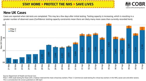
The placement of the chart within the structure of the slide presentations demonstrates its double function as a means of signalling both scientific legitimacy and uncertainty: it consistently appears after the transport slide, but precedes the charts depicting rising hospitalization and mortality levels. On the one hand, it provides critical evidence regarding pandemic levels in the UK. On the other hand, its caption explicitly highlights the ambiguities and limitations of the developing data sources due to changing testing capacities. Thus, despite the scientific envelope, uncertainty is also embedded in these graphs (Pentzold et al., Citation2021).
The next set of visuals in the slides usually relate to hospital admissions (). Although the theme of the images remains the same, the specific data series within them change. After starting with England-only data, they expand on 6 April to include data for the entire UK. Then, the next day on 7 April, a data series on ‘critical care beds’ appears. This is followed on 8 April with further charts that replace general ‘hospital admission’ with details distinguishing between ‘people in hospital beds with COVID-19’ and ‘COVID-19 patients in critical care’.
Figure 5. Charts displaying critical care patients (upper panel) and hospital bed usage (lower panel), 8 April.
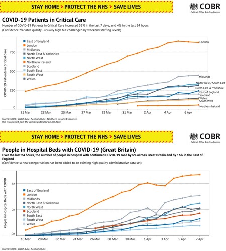
Although these additional charts about critical care convey the growing seriousness of the crisis, they still communicate uncertainty. On two occasions in this phase, the hospitalization data is temporarily replaced with an ‘estimate of COVID-19 hospital admissions’ for England. While we cannot know for certain why these replacements occurred, it would be reasonable to expect that delays in fast-moving data collection might be the reason. Even so, throughout this period, a warning that ‘different health systems collect this data differently’ accompanies the images which emphasises how these visualizations are themselves the products of aggregating multiple data streams with varying conventions. Moreover, this illustrates how textual and visual elements in these objects play different roles: despite the text-based disclaimers clearly acknowledging uncertainty and varying levels of data quality, the visual components are less ambiguous in how they construct the problem at hand (Bekkers & Moody, Citation2014b).
Finally, in this phase, visualizations of COVID-19 related deaths consistently remained the final images discussed during the press briefings. Topically, they were the most negative and became one of the most widely publicised sets of images. As such, they served two communicative functions for the government. First, they conveyed how the UK government was performing ‘better’ than its peers in terms of total number of deaths. As shown in the upper panel of , there were indeed initially fewer deaths in the UK compared to the United States and several European neighbours. Even by May, the UK still had fewer mortalities than the US. As such, the visual potentially presented the government in more favourable light: since preventing mortalities was the overriding public health and policy objective for most countries at this stage, highlighting metrics indicating that the UK was outperforming its peer group of high-income countries could communicate competence to viewers. Reaction to the government’s decision to subsequently drop this image from the slides on 10 May (see the timeline in ) illustrates this political use of visualization: on 13 May, the opposition leader Sir Keir Starmer argued “when we did not have the highest numbers in Europe, the slides were used for comparison purposes, and as soon as we hit that unenviable place they have been dropped’ (Hansard, Citation2020).Footnote6
Figure 6. Charts comparing UK mortalities to other peers on 8 April (upper panel) and 3 May (lower panel).
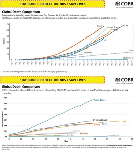
Second, the ‘global death comparison’ visualization was key for justifying the ongoing lockdown. Repetition played a key role in constructing the pandemic narrative at this stage: it established the key dimensions of knowing the pandemic but also normalised the otherwise shocking death figures. Through repetition of slides, media and public attention was drawn to other failings, such as the lack of personal protective equipment (PPE) and the number of deaths occurring in care homes. Given the repetitive character of the graphs, new slides that related to these issues of public interest moved into the spotlight, such as a graphic outlining ‘five tests for adjusting the lockdown’ that appeared for the first time on 2 May. As this phase ended, addressing the high mortality levels would be crucial for allowing a change of policy direction that would be more concerned with exiting lockdown in a manner justified both in terms of public health and political expediency.
Phase two: 11 May-23 June
The second stage of the government’s response to the pandemic was characterized both by clear changes in policy objectives (towards exiting lockdown) and a new slogan on its outputs (‘Stay Alert, Control the Virus, Save Lives’). Notably, as seen in the selection of images in from 12 May, the visual character of the press briefings shifted. The simplistic style of the slides in the first phase gave way to a more colourful style reminiscent of infographics with elements such as shaded circles serving decorative purposes. Furthermore, the design of the charts and slides became more sophisticated, consistent, and professionalised. During the first phase, the slides predominantly displayed a single chart, description, slogan, and government logo. By contrast, during the second phase, the slogan and logo became smaller and were moved to the bottom of the slide which left more room for the title of the charts. The design of the charts also became more elaborate: now, trend charts depicting regional and country differences were split into multiple panels.
Figure 7. Charts displaying changes in transport use and attitudes (upper left), tests and case numbers (upper right), weekly deaths including by place (middle left), overall cases (middle right), hospital admissions and critical care beds (lower left), and hospitalizations by region (lower right), 12 May.
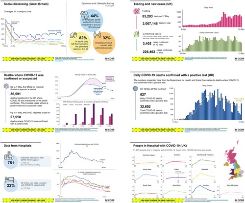
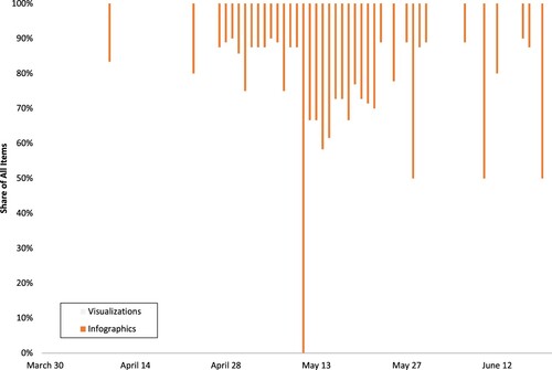
demonstrates this shift more comprehensively by displaying how the proportion of infographic elements compared to data-based charts changed at this point. As such, we observe how the visuals during this phase engaged in more interpretive rather than descriptive work as they attempted to highlight key aspects of what was quickly becoming a large set of distinct data streams (see the timeline of ). We argue the visual elements during this phase reflect policymakers taking a more proactive rather than reactive role in constructing the pandemic as the goals of the visual messaging evolve from information to interpretation and construction of political narratives of the pandemic. As the public became more accustomed to the key pieces of information and their interpretation (a goal achieved predominantly through the repetition of slides), the role of visualisations evolved from supporting sense-making to enabling ‘sense-giving’ on the part of the government. This is evident in how the presentations’ structures changed to feature more political and policy-based messages at the beginning of each briefing, before moving onto the standardized and familiar charts from the previous phase
Figure 8. Shares of Visualizations and Infographics per Briefing Between 30 March–24 June 2020.
There were five main visual objects in addition to the graphical elements (see Supporting Information for examples): (1) a color-coded alert level system; (2) the envisioned path towards removing restrictions; (3) a series of evidence-based tests to accompany each step in that path; (4) behavioural guidance; and (5) the meaning of the ‘R’ or reproduction number. These slides extend and reinterpret elements of the visual toolkit established in Phase One. By adding new components, the visual narrative changed in terms of what the policy goal was (existing lockdown), the criterion for knowing when that goal was reached (the R number), and how the population would share responsibility for achieving it (the behavioural guidance). As such, the visuals were robust enough to carry the key understanding of the pandemic response while also flexible enough to accommodate changing policy goals.
COVID-19 alert levels
This infographic (Figure S1) was the first one presented in this phase. Instead of merely describing the dynamics of the pandemic, it delimited the possible directions of the crisis. Specifically, its five levels had policy actions assigned to each of them. As such, it aimed to both communicate the high (but manageable) level of urgency, and construct the pandemic as a problem that now had a clear endpoint: reaching Level 1 would signal the elimination of COVID-19 in the UK. Yet this infographic was abandoned on 22 May (although re-introduced on June 19 when the alert level was downgraded to Level 3). One possible explanation for this disappearance is that its practical implementation did not respond quickly enough, opening the government to criticism that it was not acting forcefully. Repetition, in this case, became double-edged: while it was the key mode through which the pandemic became (and remained) governable by establishing which aspects were subject to monitoring, it also risked emphasizing a lack of change that could suggest inactivity on the part of the government. This illustrates how producing convincing and favourable visual narratives involved both adding and removing elements.
Steps for adjusting social distancing measures
The second policy-related graphic (Figure S2) outlined the future possible directions of the pandemic and the planned responses. This future is divided into three steps, informed by measures of the reproduction (‘R’) number, and features increasing levels of openness: first, to exercising and use of public spaces; then, to opening schools and non-essential retail; and finally, to allowing hospitality, leisure facilities, and places of worship to operate. By doing so, this visual delimits the policy problem and focuses attention on a new policy goal: how to ease lockdown. As was the case with the alert level graphic, it communicates both a degree of urgency and a trajectory towards the policy solution by invoking a visual convention of indicating forward movement from left to right.
Five tests for adjusting the lockdown
During this phase, the press briefings also featured graphics (examples appearing in Figure S3) describing five specific criteria by which ministers would evaluate the crisis against the steps outlined in Figure S2. During the briefings, ministers used these graphics to outline the overall criteria before moving systematically through each ‘test’ and referring to available data – most of which had been regularly appearing in the earlier phase. This approach to visualisation most closely resembles data-driven decision-making by mixing key messages with conventional charts. What is more, the textual and visual elements had different purposes compared to the first stage: the text explicitly communicated the goals, while the visuals tracked progress towards those goals. This fulfilled a legitimising function of evidence by justifying the government’s policy decisions using seemingly objective and apolitical data.
The reproduction (‘R’) number
Central to the eventual likelihood of moving through each step in the UK’s plan discussed in the preceding section were measures of the R rate. Figure S4 depicts the infographic used in the briefings to explain this concept to the public. On the one hand, it served a scientific function by visualizing the definition of a ‘reproduction rate’, the consequences of it taking different values, and the current R measurement. On the other hand, it served a legitimizing function by summarizing the state of the pandemic into one quantity – a practice that was consistently criticized by epidemiologists at the time – that reduced the complexity of the crisis to make it more legible and governable (Baele et al., Citation2018; Scott, Citation1998).
Behavioural infographics
Finally, this phase introduced two charts communicating appropriate behaviours (Figure S5). Unlike other infographics, these images and their accompanying text cast the crisis and its successful management in personal terms. For example, as shown in the lower panel of Figure S5, a flow diagram summarises public health policies to guide viewers towards taking appropriate steps – which was particularly relevant at this stage of the pandemic when the UK’s Test and Trace service became operational. Meanwhile, the title (‘We can help control the virus if we all stay alert’, upper panel of Figure S5), squarely assigns the task of ‘controlling the virus’ to the public. This shift in the narrative during the second phase served not only behavioural purposes but also political ones
Discussion
How did the UK government use visualization – comprising both visual representations of data and infographic-style images – within its daily press briefings during the initial phase of the pandemic in 2020, and what did these usages reveal about its evolving response to the crisis? We addressed these questions by presenting a novel longitudinal perspective on all 79 sets of slides used during press briefings covering the UK’s initial crisis response. By doing so, we make two contributions to public policy scholarship. The first is empirical: we identified a visual shift from reactive to proactive communication as the crisis unfolded and the government formulated its policy goals. Documenting this shift extends the evidence base on the possible causes and consequences of governments’ varied responses to the early stages of the pandemic to consider widely-circulated visual components (Narlikar & Sottilotta, Citation2021). It also demonstrates how quantitative analysis can be productively connected to qualitative interpretive techniques in ways that widen the scope for different kinds of inputs for multi-method public policy analysis.
The second contribution is theoretical, and the one on which we focus for the remainder of the discussion. We propose conceiving of the uses of visualization in policy domains as a means of building what we call ‘visual narrative assemblages’.Footnote7 These assemblages – comprising material practices, political actors, and abstract policy objectives – create and communicate new logics for delimiting available policy problems and solutions. In this way, visualization is not just a passive ‘inscription’ (Latour, Citation1986) of political reality by elites, but rather a vector for performance that creates new political worlds and possibilities in their own rights (Gregson & Rose, Citation2000).
As such, visualizations are essential elements of the dramaturgy of political authority-making (see Hajer, Citation2009). For example, our analysis demonstrates how the visual character of the briefings shifted after the government announced its plan for exiting lockdown on 10 May. Prior to this point, visualization served more of a boundedly rational function by attempting to capture and describe the dynamics of the crisis while also acknowledging the limitations of emerging (and changing) data sources. Policymaking and political communications were more concerned with sense-making the novel virus and reacting appropriately. However, after this point, visualization acquired more of a meaning-making function (Boin et al., Citation2016) that aimed to communicate and support the shifting policy goals of the government – notably, to proactively take steps towards easing lockdown and learn how to ‘live with’ the virus and its consequences.
This shift raises deeper questions about the nature of the UK government’s eventual policy responses. The press briefings increasingly layered new and different kinds of data on top of the ‘core’ descriptive data that repeatedly appeared throughout this period. These were usually delivered by scientific and public health experts rather than political ministers. Having established the epistemic nature of the briefings during the first phase (i.e., 30 March to 9 May), the second phase (12 May to 23 June) built upon their scientific legitimacy by overlaying them with policymaking objectives. Visually, this was achieved by interspersing new and coordinated infographics among the already established and familiar charts of the first phase.
Yet these new infographics did not carry any information, at least in the form of quantitative evidence as the earlier charts did. Rather, they provided behavioural ‘nudges’ which served two functions. First, they enabled the government to publicly demonstrate how the available scientific data was ‘feeding into’ decision-making, thus creating a very public and daily reminder of their widely used ‘Follow the Science’ slogan. Second, they shifted the responsibility for achieving policy goals away from the government and onto the public: unless there was sufficient compliance with public health measures, lockdowns and their negative consequences would have to be extended. In this regard, our analysis corresponds with the conclusions of prior work on visualization, which argues that visuals become instruments of political persuasion (Bekkers & Moody, Citation2014a; Byrne et al., Citation2016; Kennedy, Kennedy, Hill, Aiello, et al., Citation2016; Pandey et al., Citation2014) while aggregating emotions, statistics, and political actors into temporarily coherent visual narratives (Amit-Danhi, Citation2022a; Hullman & Diakopoulos, Citation2011). As such, having mixed data charts and infographics, new narratives emerged that created new lines of accountability (Bekkers & Moody, Citation2014a). These new visuals made a direct, and often causal, link between the public’s behaviour and the government’s success in ‘controlling the virus’.
These subtle but consequential shifts in the UK government’s use of visualisations for political communication represent an eloquent empirical case of the ways visualizations provide performative spaces for policymakers and political elites. Particularly in mediatised settings (Couldry & Hepp, Citation2013), authority is enacted through discursive, material, and dramaturgical elements whose powers derive from the communicative affordances of visualization (Byrne et al., Citation2016; Hajer, Citation2009). Specifically, as we discussed, the practice of layering rather than replacing communicative elements within the slides gave the visualizations a multivocal quality. Meanwhile, repetition of slides and data-based content facilitated a transition from scientific to political communication modes (Bandola-Gill, Citation2021).
As such, we propose conceiving of visualizations as visual narrative assemblages – comprising conditions, objects, and agents (Nail, Citation2017) – that communicate and justify policy goals. This involves situating individual visual objects within their wider policy and contextual conditions (such as an ordered slide presentation during a press conference), and by attending to the shifting political interests of policymakers in such conditions. Moreover, an assemblage lens highlights the cultural, social, and – as we have focused here – political consequences of visualization: visualization produces value-laden visions of the world that render some policy-based realities possible while making others impossible or even invisible (see also Latour, Citation1986; Pauwels, Citation2021).
Therefore, the power of these slides as a form of crisis and political communication was achieved not through any single image, but rather through the interaction and interdependence of a collection of images. Despite possessing some generic qualities (Aiello et al., Citation2022), they were nevertheless performatively effective (MacKenzie, Citation2003) as they combined a range of evidence, public health messaging, rankings, and forecasting (Amit-Danhi, Citation2022b). Collectively, these elements created a single visual narrative assemblage that established the staging of political communication and the drama of authoritative policy-making in a critical time of disruption and uncertainty. What is more, repetition and addition gave this assemblage life and soul: from the ever-present verbal cue of ‘next slide place’ to the introduction of novel infographics at crucial moments.
In total, our study extends established theorization about the role of data and evidence in policymaking into the visual realm. By focusing on a specific moment of crisis, and by exploiting an unusually regular series of public events, we have shown how governments can construct, justify, and communicate their policy objectives to citizens through the mode of visualization. As such, it opens new avenues for comparative attention – not only about the pandemic as it continues to have uneven impacts and varied trajectories, especially in low- and middle-income countries (Xiang et al., Citation2022), but also about other politically important issues that attract the creation of policy narratives in both ordinary and extraordinary times.
Supplemental Material
Download MS Word (3 MB)Acknowledgements
An earlier version of this paper was presented at the 2022 European Consortium for Political Research Joint Session on ‘Governing with Evidence: Making Sense of Current Uses and Models of Evidence based Policy’ (19-22 April, online). We would like to thank the participants in that workshop for their helpful feedback, as well as the three anonymous reviewers for their further constructive suggestions.
Disclosure statement
No potential conflict of interest was reported by the author(s).
Additional information
Funding
Notes
1 This phrase became a motto for evaluating how these press conferences used visualization to present COVID-19 information: see https://www.dataiq.co.uk/articles/next-slide-please-how-covid-made-data-literacy-a-public-skill.
2 Although we focus on the policy aspects of visualization from the perspective of elites who were supplying and communicating these objects, acknowledging the data politics of visualization (in Evelyn Ruppert’s and her colleagues’ sense of the concept) is important because these images and the public health dynamics within them were used to justify strong interventions by the state that curtailed freedoms and rights.
3 While we focus on identifying the forms of visualization as supplied in these national press briefings, it is important to acknowledge how the limited experimental and observational studies examining whether common COVID-19 data visualizations (and design choices within them) impacted public understandings and behaviours during the early stages of the pandemic have come to mixed conclusions (Crepaz & Arikan, Citation2021; Li & Molder, Citation2021; Sevi et al., Citation2020). This suggests that more systematic work examining the demand-side of visualization – i.e. how members of the public actually understand and make sense of these images – is needed: see Kennedy, Hill, Aiello, et al. (Citation2016) for an overview of this agenda.
4 Changepoint analysis is more typically usually used to detect shifts in data series involving climate change (using temperature readings) or medical diagnoses (using physiological measurements).
5 Despite the contemporary dominance of social media and digital communications work, the daily press conferences created situations of families and friends gathering around screens. This parallels images of people gathering around radios in WWII to listen to developments about the war. Moreover, the ritual and presentation style (e.g., entering the room before speaking to the cameras) may have given the sense of the country being on ‘war footing’ that heightened the urgency of the situation: see Wodak (Citation2021).
6 Theories of ‘benchmarking’ make similar arguments in the context of economic voting: when voters are deciding whether to support incumbents at the ballot box, they consider how their country has performed economically compared to other countries that have faced similar problems, and attribute better or worse performance to government policies (Hansen et al., Citation2015; Kayser & Peress, Citation2012).
7 Our use of the term ‘assemblage’ in this context builds on specific use developed by Thomas Nail (Citation2017).
References
- Aiello, G., Kennedy, H., Anderson, C. W., & Mørk Røstvik, C. (2022). ‘Generic visuals’ of COVID-19 in the news: Invoking banal belonging through symbolic reiteration. International Journal of Cultural Studies, 25(3–4), 309–330. https://doi.org/10.1177/13678779211061415
- Aiello, G., & Parry, K. (2020). Visual communication: Understanding images in media culture. SAGE Publications Ltd.
- Allen, W. (2018). Visual brokerage: Communicating data and research through visualisation. Public Understanding of Science, 27(8), 906–922. https://doi.org/10.1177/0963662518756853
- Allen, W. (2021). The conventions and politics of migration data visualizations. New Media & Society, 1–22. https://doi.org/10.1177/14614448211019300
- Allen, W., & Easton-Calabria, E. (2022). Combining computational and archival methods to study international organizations: Refugees and the International Labour Organization, 1919-2015. International Studies Quarterly, 66(3), https://doi.org/10.1093/isq/sqac044
- Amit-Danhi, E. R. (2022b). Strategic temporality: Information types and their rhetorical usage in digital election visualizations. International Journal of Communication, 16, 3354–3378. https://ijoc.org/index.php/ijoc/article/view/18500/3823
- Amit-Danhi, E. R. (2022). Facts of (financial) life: Political power and Re-visualization strategies. Convergence: The International Journal of Research Into New Media Technologies, 28(1), 92–108. https://doi.org/10.1177/13548565211045533
- Baden, C., Pipal, C., Schoonvelde, M., & van der Velden, M. A. C. G. (2022). Three gaps in computational text analysis methods for social sciences: A research agenda. Communication Methods and Measures, 16(1), 1–18. https://doi.org/10.1080/19312458.2021.2015574
- Baele, S. J., Balzacq, T., & Bourbeau, P. (2018). Numbers in global security governance. European Journal of International Security, 3(1), 22–44. https://doi.org/10.1017/eis.2017.9
- Bandola-Gill, J. (2021). The legitimacy of experts in policy: Navigating technocratic and political accountability in the case of global poverty governance. Evidence & Policy, 17(4), 615–633. https://doi.org/10.1332/174426420X16000980489195
- Bandola-Gill, J., Grek, S., & Ronzani, M. (2021). Research in the sociology of organizations. Research in the Sociology of Organizations, 74(2), 27–52. https://doi.org/10.1108/S0733-558X20210000074027
- Bandola-Gill, J., Grek, S., & Tichenor, M. (2022). Governing the sustainable development goals: Quantification in global public policy. Palgrave Macmillan. https://library.oapen.org/bitstream/handle/20.500.12657/57299/978-3-031-03938-6.pdf?sequence=1&isAllowed=y.
- BBC. (2020, March 24). Coronavirus: 27.1 million watch PM Boris Johnson’s TV address. https://www.bbc.co.uk/news/entertainment-arts-52018502.
- Bekkers, V., & Moody, R. (2014). Accountability and the framing power of visual technologies: How Do visualized reconstructions of incidents influence public and political accountability discussions? The Information Society, 30(2), 144–158. https://doi.org/10.1080/01972243.2013.873749
- Bekkers, V., & Moody, R. (2014b). Visual Culture and Public Policy: Towards a Visual Polity? Routledge.
- Bigo, D., Isin, E., & Ruppert, E.2019). Data politics: Worlds, subjects, rights. Routledge.
- Boin, A., ‘t Hart, P., Stern, E., & Sundelius, B. (2016). The politics of crisis management: Public leadership under pressure (2nd ed.). Cambridge University Press.
- Boswell, C. (2009). Knowledge, legitimation and the politics of risk: The functions of research in public debates on migration. Political Studies, 57(1), 165–186. https://doi.org/10.1111/j.1467-9248.2008.00729.x
- Boswell, J., Corbett, J., Rhodes, R. A. W., & Salomonsen, H. H. (2021). The comparative ‘court politics’ of COVID-19: Explaining government responses to the pandemic. Journal of European Public Policy, 28(8), 1258–1277. https://doi.org/10.1080/13501763.2021.1942159
- Boswell, C., & Smith, K. (2017). Rethinking policy ‘impact’: Four models of research-policy relations. Palgrave Communications, 3(44), 1–10. https://doi.org/10.1057/s41599-017-0042-z
- Brennen, J. S., Simon, F. M., & Nielsen, R. K. (2021). Beyond (Mis)Representation: Visuals in COVID-19 misinformation. The International Journal of Press/Politics, 26(1), 277–299. https://doi.org/10.1177/1940161220964780
- Byrne, L., Angus, D., & Wiles, J. (2016). Acquired codes of meaning in data visualization and infographics: Beyond perceptual primitives. IEEE Transactions on Visualization and Computer Graphics, 22(1), 509–518. https://doi.org/10.1109/TVCG.2015.2467321
- Cairney, P. (2021). The UK government’s COVID-19 policy: Assessing evidence-informed policy analysis in real time. British Politics, 16(1), 90–116. https://doi.org/10.1057/s41293-020-00150-8
- Callon, M. (2008). What does it mean to say that economics is performative? In D. MacKenzie, F. Muniesa, & L. Siu (Eds.), Do economists make markets? On the performativity of economics (pp. 311–357). Princeton University Press.
- Couldry, N., & Hepp, A. (2013). Conceptualizing mediatization: Contexts, traditions, arguments. Communication Theory, 23(3), 191–202. https://doi.org/10.1111/comt.12019
- Crepaz, M., & Arikan, G. (2021). Information disclosure and political trust during the COVID-19 crisis: Experimental evidence from Ireland. Journal of Elections, Public Opinion and Parties, 31(sup1), 96–108. https://doi.org/10.1080/17457289.2021.1924738
- Engebretsen, M. (2020). From decoding a graph to processing a multimodal message: Interacting with data visualisation in the news media. Nordicom Review, 41(1), 33–50. https://doi.org/10.2478/nor-2020-0004
- Engebretsen, M., & Kennedy, H.2020). Data visualization in society. Amsterdam University Press.
- Eshbaugh-Soha, M. (2013). Presidential influence of the news media: The case of the press conference. Political Communication, 30(4), 548–564. https://doi.org/10.1080/10584609.2012.737438
- Espeland, W. N., & Lom, S. E. (2015). Noticing numbers. In M. Kornberger, L. Justesen, & A. K. Madsen (Eds.), Making things valuable (pp. 18–37). Oxford University Press.
- Fairclough, N. (1985). Critical and descriptive goals in discourse analysis. Journal of Pragmatics, 9(6), 739–763. https://doi.org/10.1016/0378-2166(85)90002-5
- Falisse, J.-B., & McAteer, B. (2022). Visualising policy responses during health emergencies. Learning from the COVID-19 policy trackers. Convergence: The International Journal of Research Into New Media Technologies, 28(1), 35–51. https://doi.org/10.1177/13548565211048972
- Fileborn, B., & Trott, V. (2022). “It ain’t a compliment”: Feminist data visualisation and digital street harassment advocacy. Convergence: The International Journal of Research Into New Media Technologies, 28(1), 127–149. https://doi.org/10.1177/13548565211045536
- Financial Times. (2020). Coronavirus tracked. https://www.ft.com/content/a2901ce8-5eb7-4633-b89c-cbdf5b386938.
- Gregson, N., & Rose, G. (2000). Taking butler elsewhere: Performativities, spatialities and subjectivities. Environment and Planning D: Society and Space, 18(4), 433–452. https://doi.org/10.1068/d232
- Hajer, M. (2009). Authoritative governance: Policy making in the age of mediatization. Oxford University Press.
- Hansard. (2020, May 13). Prime Minister’s Questions, 13 May 2020. https://hansard.parliament.uk/commons/2020-05-13/debates/7F8336E1-EDA2-4AF8-9923-A65B8A9B3F7E/Engagements.
- Hansen, K. M., Olsen, A. L., & Bech, M. (2015). Cross-National yardstick comparisons: A choice experiment on a forgotten voter heuristic. Political Behavior, 37(4), 767–789. https://doi.org/10.1007/s11109-014-9288-y
- Hill, R. L. (2017). The political potential of numbers: Data visualisation in the abortion debate. Women, Gender & Research, 26(1), 83–96.
- HM Government. (2022). Slides, datasets and transcripts to accompany coronavirus press conferences. https://www.gov.uk/government/collections/slides-and-datasets-to-accompany-coronavirus-press-conferences.
- Hullman, J., & Diakopoulos, N. (2011). Visualization rhetoric: Framing effects in narrative visualization. IEEE Transactions on Visualization and Computer Graphics, 17(12), 2231–2240. https://doi.org/10.1109/TVCG.2011.255
- Kaplan, S. (2011). Strategy and PowerPoint: An inquiry into the epistemic culture and machinery of strategy making. Organization Science, 22(2), 320–346. https://doi.org/10.1287/orsc.1100.0531
- Kayser, M., & Peress, M. (2012). Benchmarking across borders: Electoral accountability and the necessity of comparison. American Political Science Review, 106(3), 661–684. https://doi.org/10.1017/S0003055412000275
- Kennedy, H., & Hill, R. L. (2018). The feeling of numbers: Emotions in everyday engagements with data and their visualisation. Sociology, 52(4), 830–848. https://doi.org/10.1177/0038038516674675
- Kennedy, H., Hill, R. L., Aiello, G., & Allen, W. (2016). The work that visualisation conventions do. Information, Communication & Society, 19(6), 715–735. https://doi.org/10.1080/1369118X.2016.1153126
- Kennedy, H., Hill, R. L., Allen, W., & Kirk, A. (2016). Engaging with (big) data visualizations: Factors that affect engagement and resulting new definitions of effectiveness. First Monday, 21(11), https://doi.org/10.5210/fm.v21i11.6389
- Killick, R., & Eckley, I. (2014). changepoint: AnRpackage for changepoint analysis. Journal of Statistical Software, 58(3), 1–19. https://doi.org/10.18637/jss.v058.i03
- Kirk, A. (2019). Data visualisation: A handbook for data driven design (2nd ed.). SAGE.
- Krippendorff, K. (2013). Content analysis: An introduction to its methodology (3rd ed.). SAGE.
- Latour, B. (1986). Visualization and cognition: Drawing things together. Knowledge and Society, 6, 1–40.
- Li, N., & Molder, A. L. (2021). Can scientists use simple infographics to convince? Effects of the “flatten the curve” charts on perceptions of and behavioral intentions toward social distancing measures during the COVID-19 pandemic. Public Understanding of Science, 30(7), 898–912. https://doi.org/10.1177/09636625211038719
- MacKenzie, D. (2003). An equation and its worlds. Social Studies of Science, 33(6), 831–868. https://doi.org/10.1177/0306312703336002
- Nail, T. (2017). What is an assemblage? SubStance, 46(1), 21–37. https://doi.org/10.1353/sub.2017.0001
- Narlikar, A., & Sottilotta, C. E. (2021). Pandemic narratives and policy responses: West European governments and COVID-19. Journal of European Public Policy, 28(8), 1238–1257. https://doi.org/10.1080/13501763.2021.1942152
- Nash, K., Trott, V., & Allen, W. (2022). The politics of data visualisation and policy making. Convergence: The International Journal of Research Into New Media Technologies, 28(1), 3–12. https://doi.org/10.1177/13548565221079156
- Our World in Data. (2022, October 31). Coronavirus (COVID-19) Deaths. https://ourworldindata.org/covid-deaths.
- Pandey, A. V., Manivannan, A., Nov, O., Satterthwaite, M., & Bertini, E. (2014). The persuasive power of data visualization. IEEE Transactions on Visualization and Computer Graphics, 20(12), 2211–2220. https://doi.org/10.1109/TVCG.2014.2346419
- Pauwels, L. (2021). Validating visuals: A socio-semiotic instrument for an informed production and use of visual representations. Social Semiotics, 1–20. https://doi.org/10.1080/10350330.2021.1874241
- Pentzold, C., Fechner, D. J., & Zuber, C. (2021). “Flatten the curve”: data-driven projections and the journalistic brokering of knowledge during the COVID-19 crisis. Digital Journalism, 9(9), 1367–1390. https://doi.org/10.1080/21670811.2021.1950018
- Rall, K., Satterthwaite, M. L., Pandey, A. V., Emerson, J., Boy, J., Nov, O., & Bertini, E. (2016). Data visualization for human rights advocacy. Journal of Human Rights Practice, 8(2), 171–197. https://doi.org/10.1093/jhuman/huw011
- Roser, M., Ritchie, H., Ortiz-Ospina, E., & Hasell, J. (2021). Coronavirus pandemic (COVID-19). Our World in Data. https://ourworldindata.org/coronavirus.
- Ruppert, E., Isin, E., & Bigo, D. (2017). Data politics. Big Data & Society, 4(2), 1–7. https://doi.org/10.1177/2053951717717749
- Scott, J. C. (1998). Seeing like a state: How certain schemes to improve the human condition have failed (UkOxUb13170700). Yale University Press.
- Sevi, S., Aviña, M. M., Péloquin-Skulski, G., Heisbourg, E., Vegas, P., Coulombe, M., Arel-Bundock, V., Loewen, P., & Blais, A. (2020). Logarithmic vs. Linear visualizations of COVID-19 cases Do Not affect citizens’ support for confinement. Canadian Journal of Political Science/Revue Canadienne de Science Politique, 53(2: Special Section: COVID-19 Short Research Papers), 385–390. https://doi.org/10.1017/S000842392000030X
- Wodak, R. (2021). Crisis communication and crisis management during COVID-19. Global Discourse, 11(3), 329–353. https://doi.org/10.1332/204378921X16100431230102
- Xiang, B., Allen, W. L., Khosravi, S., Kringelbach, H. N., Ortiga, Y. Y., Liao, K. A. S., Cuéllar, J. E., Momen, L., Deshingkar, P., & Naik, M. (2022). Shock Mobilities During Moments of Acute Uncertainty. Geopolitics, https://doi.org/10.1080/14650045.2022.2091314
- Zhao, L., & Ye, W. (2022). Visualization as infrastructure: China’s data visualization politics during COVID-19 and their implications for public health emergencies. Convergence: The International Journal of Research Into New Media Technologies, 28(1), 13–34. https://doi.org/10.1177/13548565211069872